[Editor’s Note: Paul is on vacation this week, but today we have a DIY project from reader Matt Malinoski. Enjoy.]
By Matt Malinoski
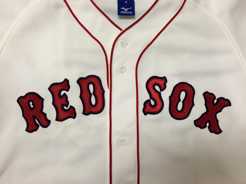
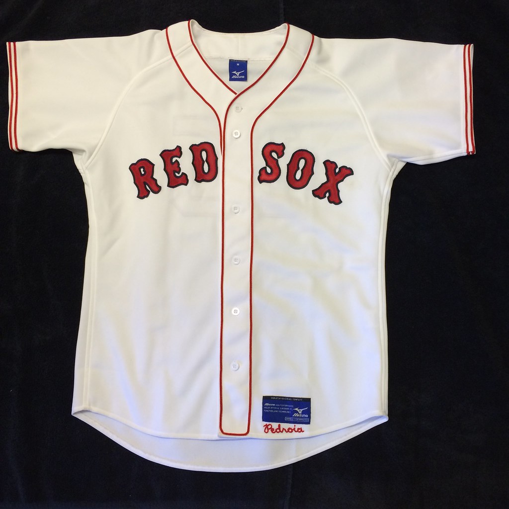
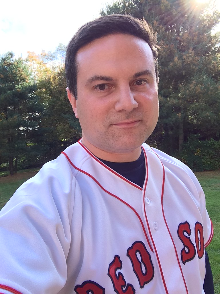
I love the look of 1960s Red Sox jerseys with the copious amounts of red trim on the headspoon and sleeves. The problem is I can’t find a replica with the correct McAuliffe lettering — the letterforms are always subtly wrong. So last fall, using an old Lady Kenmore sewing machine that my grandmother had given to me, I set out to make my own 1967 throwback jersey with matching pants.
Going into this project, I had no prior experience with a sewing machine. I learned how to sew by watching videos online and practiced sewing trim and letters onto a cloth diaper before I tried it on an actual jersey. Even then, I destroyed two jerseys before I found a technique that worked for me.
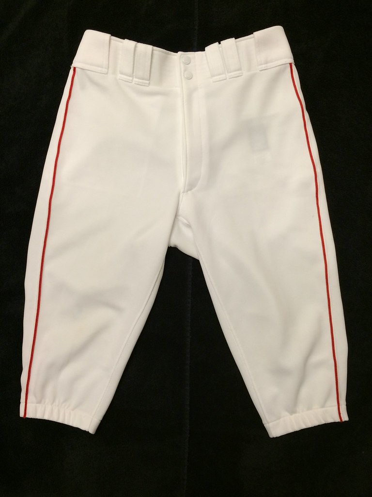
I bought a blank Mizuno jersey from Amazon. They also make matching knee-length pants that I wear for softball and I wanted the fabric to match.
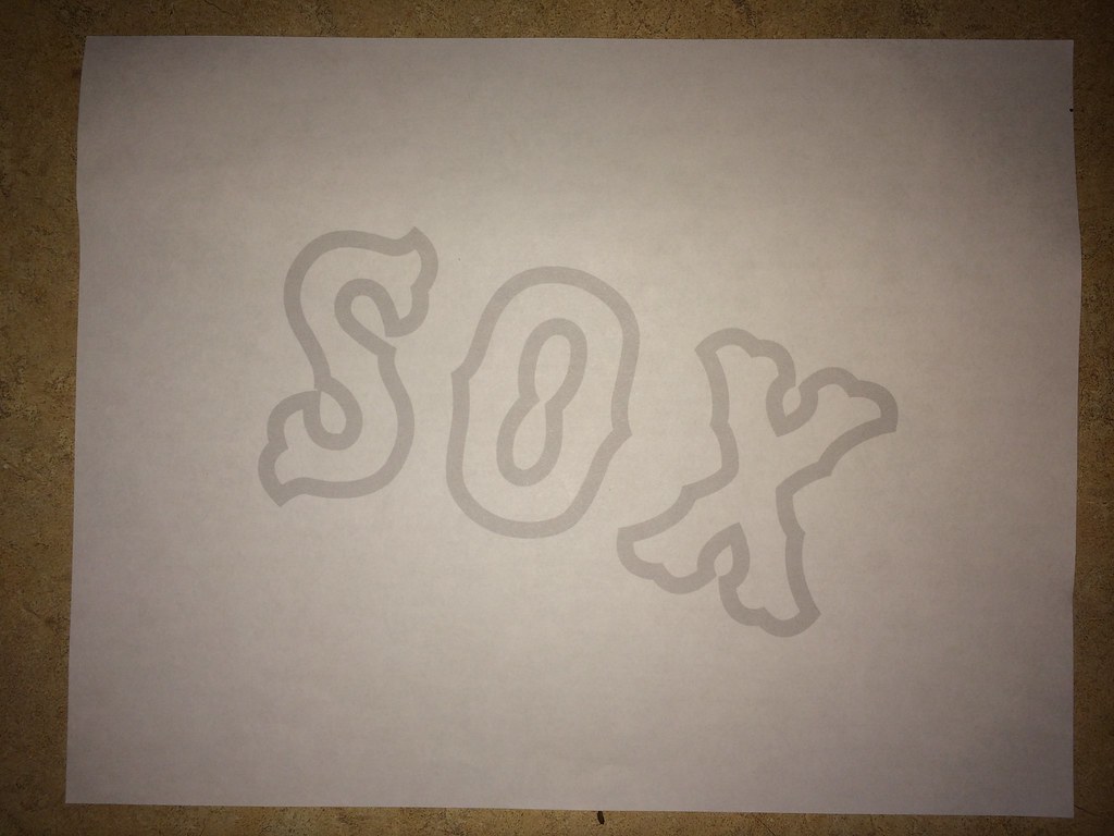
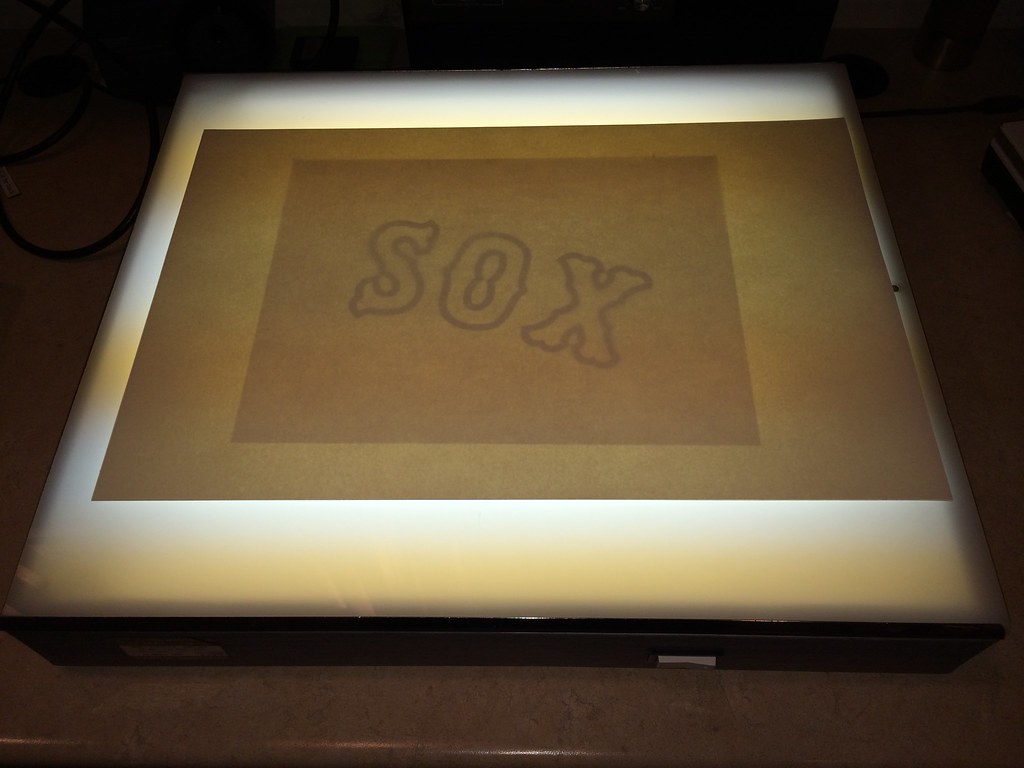
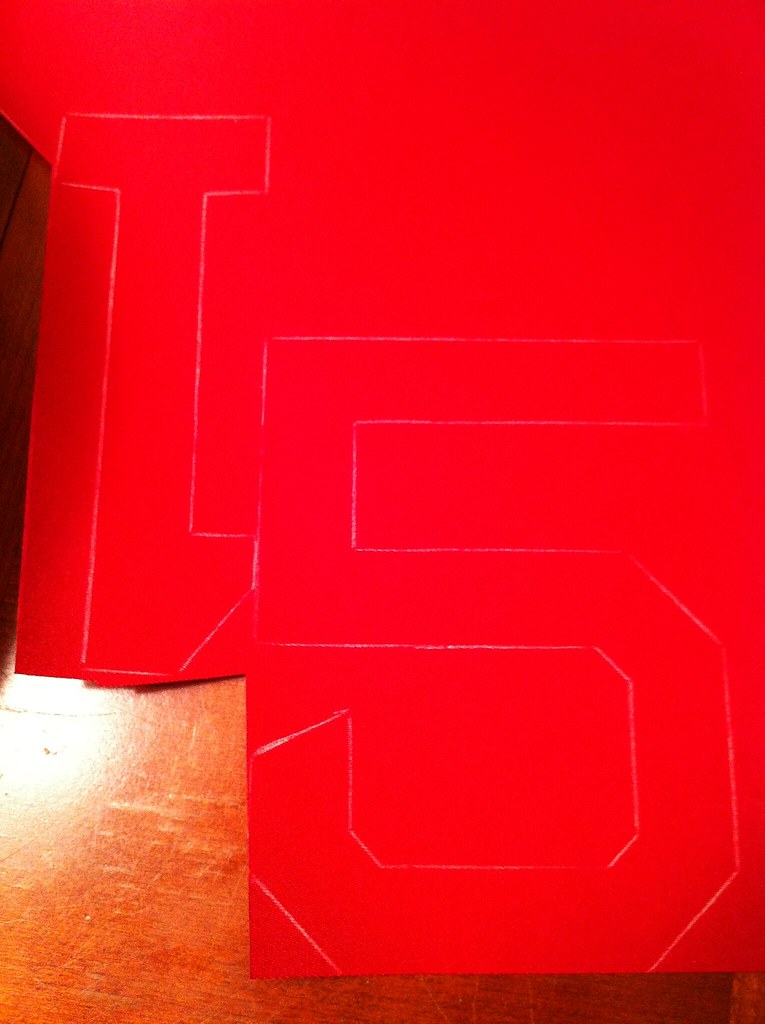
Next, I scaled and printed my vector drawing of the lettering and numerals, which I then traced onto thick construction paper to make stencils using a lightboard — a narrow set of letters for the red and wide for navy [for all of these images, you can click to enlarge]:
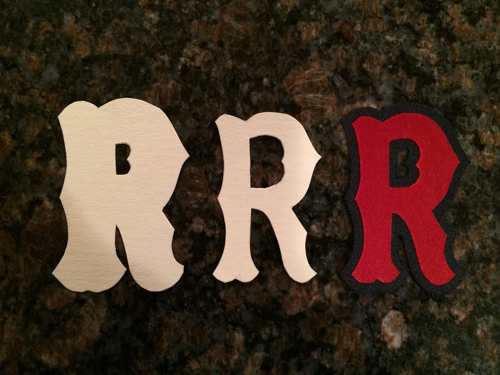
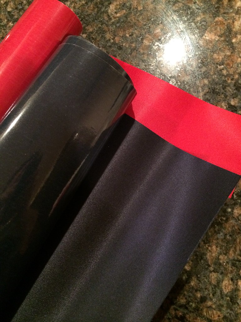
I don’t have a heat press, so I bought rolls of red and navy self-adhesive tackle twill fabric. I traced around the stencils onto the fabric with a white colored pencil and cut out the letters and numbers with scissors:
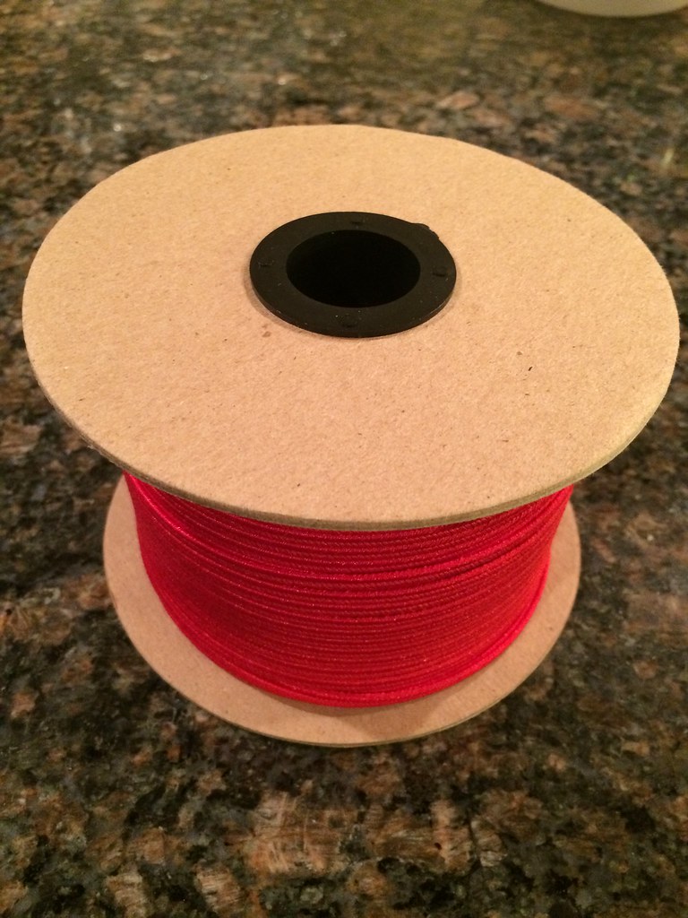
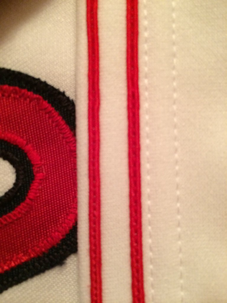
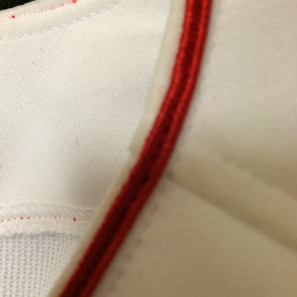
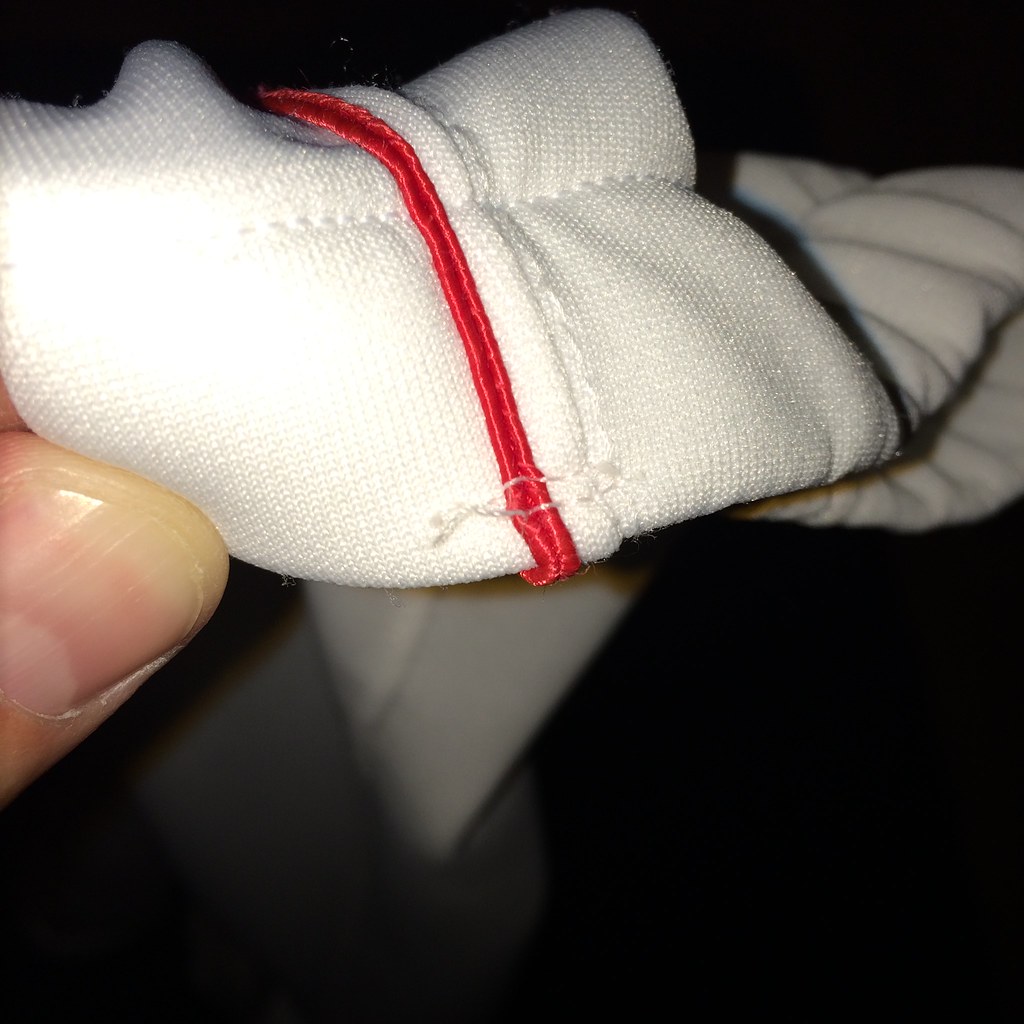
For the headspoon and sleeve trim, I bought several yards of 1/8″ red rayon soutache. It’s very inexpensive, but hard to work with and prone to fraying:
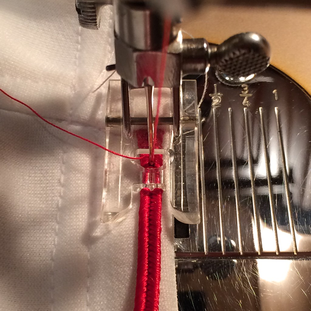
Luckily, my sewing machine had a buttonhole foot that can be used as a cording foot. The protrusion in the middle of the foot stays in the groove in the soutache:
The sleeve trim was difficult because I first had to use a seam ripper pop the existing seams where the sleeve was sewn together, and then stuff the end of the trim in the gap that this created, and then start sewing it onto the sleeve. It was a challenge keeping the trim straight along the edge of the sleeve because the soutache is also prone to wrinkling if it’s not held perfectly still:
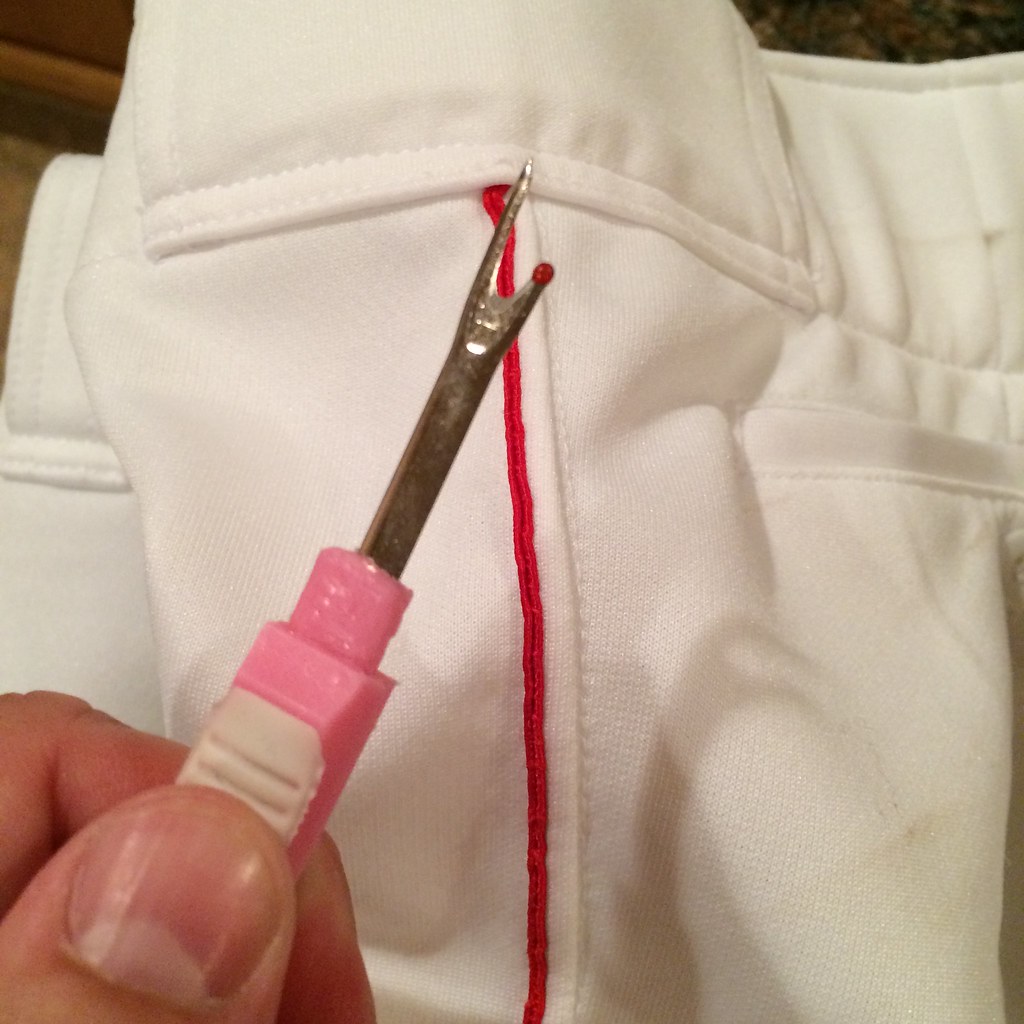
I used a red thread in the needle above the fabric and a white thread in the bobbin underneath so that the stitch couldn’t be seen on the inside of the sleeves. After the trim was sewn on the sleeves, I used white thread to sew the seam back up. Each sleeve took about two hours:
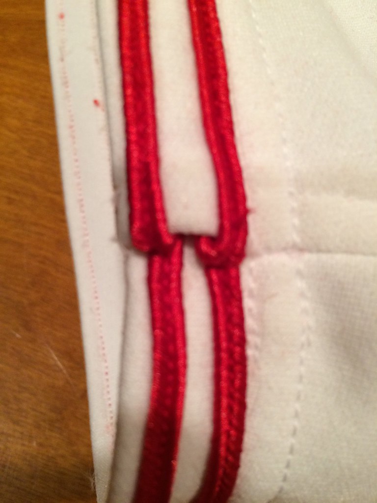
The headspoon was tough, because it’s about seven yards of continuous trim. So if the soutache frayed, I had to rip it all out and start over. In this picture, I folded the soutache at the endpoints and sewed over it to prevent fraying:
Another obstacle was that there were a couple of seams so thick that I had to turn the clutch wheel by hand to get the needle to pass through all of the fabric. At one point I actually broke a needle doing this. All in all, the headspoon took about six hours to complete. Here’s an example of one of those thick seams:
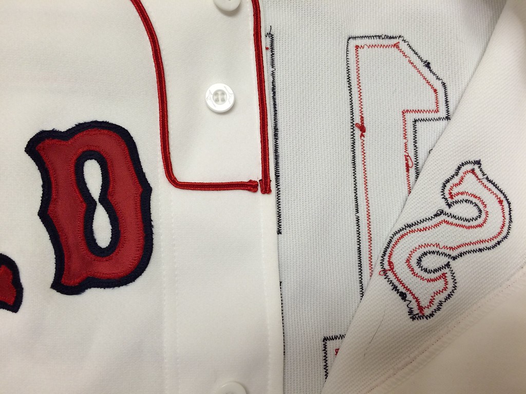
I stuck the letters onto the jersey but also secured them with pins because the adhesive didn’t stick as well as I would have liked:
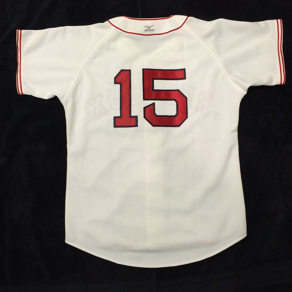
I then sewed the lettering onto the jersey with a zigzag stitch and sewed the red and navy outlines through the fabric. Each letter took about 30 minutes. The numbers were comparatively easy, because they were comprised of all straight lines.
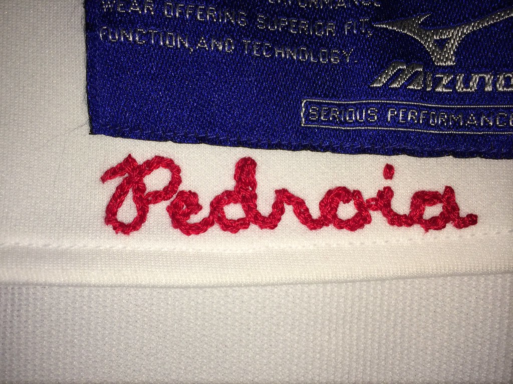
I chain stitched the player’s name onto the shirttail by hand using a needle and three strands of embroidery thread. Again, I learned how to do this by watching videos online. It’s not as hard as it looks, as long as it isn’t rushed. This took about two hours to complete:
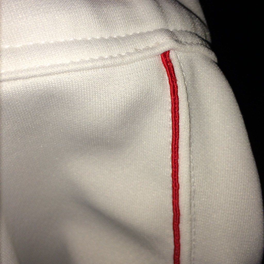
The pants were very easy to do. I had to pop a few seams where the outer leg seam met the waistband, stuff the end of the trim in the gap, sew the trim down the leg, sew the seam back up, fold the end over at the bottom of the leg, and sew a couple of seams across the end of the soutache to keep it from unraveling:
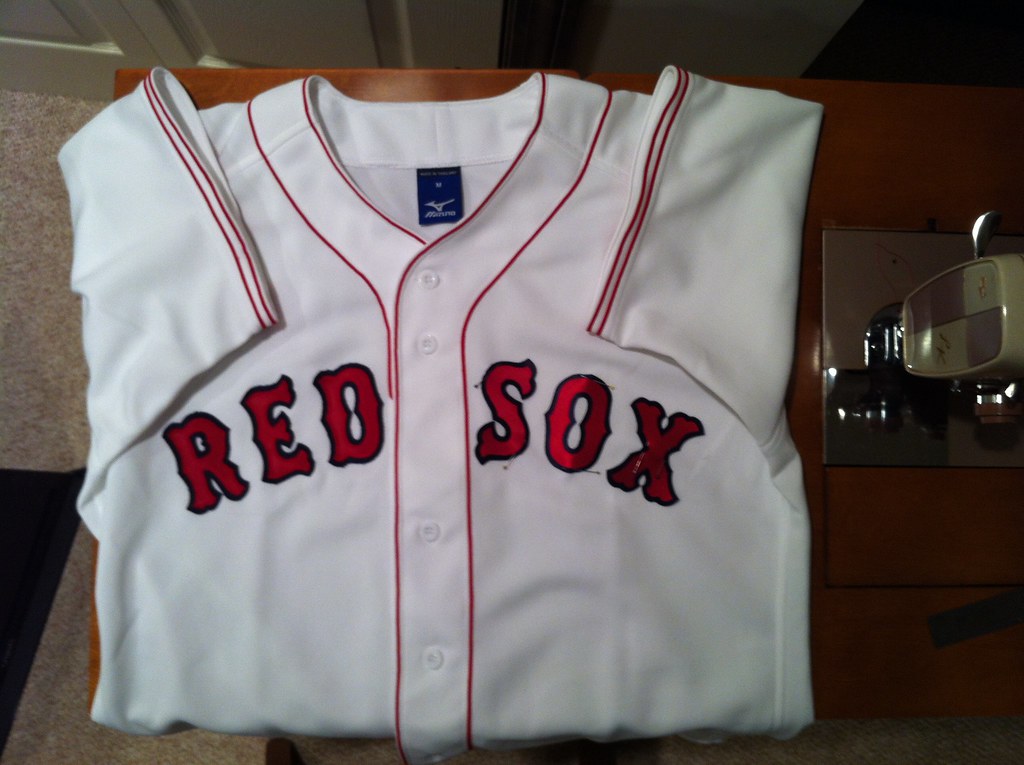
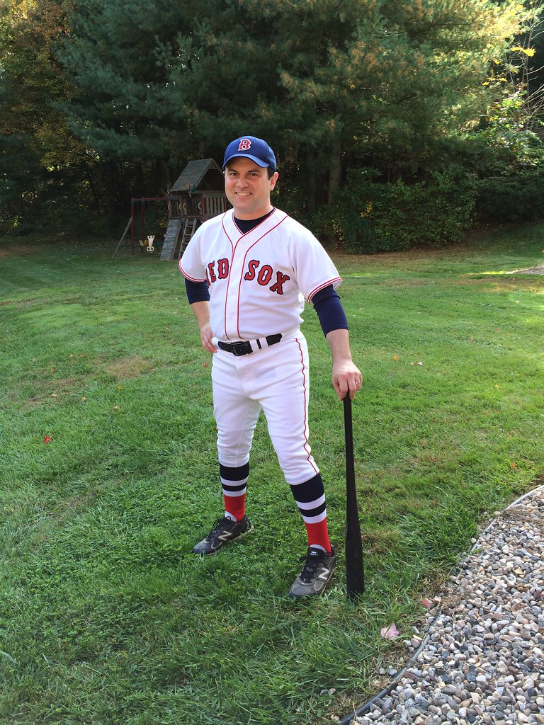
Here are the final results — not bad:
And here I am wearing it. There are no 1967 caps available, the cap I’m wearing is a 1946”“54 style, which was also worn with this style jersey from 1951”“54. The stirrups came from Robert Marshall, of course:


Collector’s Corner
By Brinke Guthrie
The World Series starts tonight in KC– you might have read about it- so we’re all Series today. We’ll start off with this 1972 A’s @ Reds game program– I was at this game. Riverfront was barely two years old at this point, and already hosted an ASG (1970, weeks after the stadium opened) and now the Series, the second of four it would host during the decade.
Onto other Giants and Royals items:
• KNBR is still the home of the Giants, as they were back in the 1980s when you could sport these on your bumper.
• Here’s a 1970s orange Giants replica pullover — they used this as a throwback a few years ago and I wish they’d use this on a regular basis. Such a cool look.
• This 1970s Royals Wilson jacket looks no different than the look they sport today. That, my friends, means a timeless design. The Lan-Mar company of Kansas City, Mo., made ’em too, it seems.
• Here’s a 1960s Giants inflatable doll — “when it’s squeezed it makes a squeaking noise.” OK then.
• Got Milk? The Royals George Brett hopes you do, and here’s a 1980s growth chart to track your progress. If milk wasn’t quite your style, here’s a promo mug for Miller Lite with the Brett tie-in. Love the use of the yellowy-gold background on this 1970s Royals thermal cup!
• We’ve got a DeLong hooded Giants parka here- I had a Reds version of this and let me tell you, it felt and wore great.
• Here’s a George Brett Puma ad sans MLB branding — “If you’re not the predator, you’re the prey.”
• If you’re wearing this 1980s Giants sweatshirt — it leaves little doubt as to who you are pulling for.
• Very nice looking Reebok Royals pullover — these were made — if my memory serves as I had a Cowboys one — with a neat smooth type of microfiber or…something. Well made.
• KERO-TV in Bakersfield held a Series party in the early 1960s, and these pens served as party favors.
• “KC ain’t no cowtown.” Says so on this 1985 I-70 Series T-shirt. Pair it with this old-style 1985 World Series Champions cap.
• Here’s a 1970s Giants Bullpen Buggy still on the card!
• Cheer on the San Francisco Giants (at the Stick) with this 1960s Rah-Phone plastic megaphone!
• Seen a lot of NFL plaques by Kentucky Art — but this 1970s Giants version is the first I’ve seen for an MLB team.
A Most Unscientific Poll…
Yesterday in the comments, I mentioned how sometimes success in a particular uniform can affect whether or not people perceive that uniform to be “good.” I pointed to the Mets “racing stripe” uniform of the 1980s as being an example of what (in my opinion) was not a particularly good uniform — but since the Mets achieved great success in that uniform, fans loved it. I personally feel that’s just not a good looking uniform, but maybe I’m wrong.
So, last night, I posed a very unscientific “poll” on Twitter, asking folks which is the better uniform — the “plain” Mets button-front, or the “racing stripe” uniform. I fully expected the Mets uniform I grew up with (the button-front) to be far more popular than the racing stripes. I was wrong.
Here’s a look at that tweet– as of last evening, “FAV” (favorites) far outpaced “RT” (retweets) by a more than 2:1 margin.
Better Mets uni: plain button-front or pullover with racing stripes? RT for plain, FAV for stripes pic.twitter.com/zylxNfZkEU
— Phil Hecken (@PhilHecken) October 20, 2014
I figure much of that can be attributed to both the unscientific nature of the ‘poll’ and the fact that twitter users skew younger … if that’s your first memory of the Mets or Mets uniforms, you probably prefer it — I know I have a certain fondness for many early and mid-70s uniforms that today many of you look back upon with dread, horror or surprise. But I’m curious what the Uni Watch Community thinks. So I’m going to ask you guys the same question, just in poll form. Take a minute to vote, won’t ya? Thanks.
Uni Watch News Ticker
[Today’s ticker was mostly written and compiled by Garrett McGrath]

Baseball News: Kansas City Royals hats being emblazoned with the World Series logo (thanks, Phil). … Matt Duffy of the Giants has a cool Duffman sticker on his bat knob (from Mike Engle). … GQ compares and contrasts three eras of Royals and Giants uniforms before the start of the 2014 World Series (thanks, Phil). … “Last night, I spotted a box of Super Pretzel in the grocery store freezer and noticed Mike Trout on the outside,” says Chris Bruno. “I noticed a few things about the jersey right away; they obviously didn’t have permission to keep ANGELS on the front, but it also has the 2012 All Star patch and the Majestic logo clearly visible on the sleeve. Seem that this was taken during All Star week in Kansas City.” … Check out these cool artist renderings of some notable World Series moments (from Mike the Intern). … San Diego State University will be wearing this Tony Gwynn patch next season (h/t @UniNationBlog). … Is this a photo of the old Philadelphia Athletics? Nope — it’s the Congressional Republicans, in an undated photo (from Sully).

NFL News: New New York Jets wideout Percy Harvin will wear number 16. What do Brad Smith and Vinny Testaverde fans think? (thanks, Phil). … TV station uses a photo of Gary Payton while talking about Peyton Manning’s TD record (from Gordon Blau). … “This may have been on Uni Watch before, but what a beautiful piece of memorabilia!” writes Leo Strawn, Jr.. He adds, “Of course, we all know that the pro football title game was called the “AFL-NFL World Championship Game” prior to the game being called “Super Bowl”, which wasn’t until the third contest, the AFL’s first historic win. Here’s the listing in case you happen to have an extra $2400 laying around you don’t know what to do with.”

College/High School Football News: Louisville will wear these helmets on Thursday. … Do you agree with this list of five throwback college uniforms that should be permanent? (thanks, Phil). … The Fighting Illini are wearing “Gray Ghost” alternate uniforms on October, 25th. … NJ.com is having an online pool to determine the best high school football helmet in the state (from Fred Provencher). … There is a brand of pretzels in the UK called “Penn State Pretzels.” The story is explained here (from William Yurasko). … Next up in the S&S decal brigade is Fresno State, who’ll be wearing that on November 1st (thanks to Jared Buccola). … Also with the S&S thing is the University of Incarnate Word (h/t UniformNationBlog). … The Utah Utes have a new matte black helmet.

Hockey News: The Buffalo Sabres are retiring legendary netminder Dominik Hasek’s “39” jersey in the new year (thanks, Phil). … Cool Colorado Avalanche franchise jersey history from The Hockey Writers, including a bit about the Quebec Nordiques period from 1979-1995.

Grab Bag: Mascot Watch: A search engine for team mascot/nicknames from high school to the professional (from Ed Westfield, Jr.). … Article about high school mascots in Southern New Jersey (from Kurt Esposito). … An article summing up all of the ads on uniforms phenomenon (thanks, Phil). … How one audio company competes with the big brands (from Tommy Turner). … Is Reebok on the block? (from Brinke). … A five-year-old Shiba Inu (that’s a breed of dog), with a significant social media presence, does a brisk business in sponsored posts and endorsements (from TommyThe CPA). … The new NBA D-League Austin Spurs have introduced home and away uniform wordmarks (via Conrad Burry).
And that’s all for today — big thumbs up to Matt Malinoski for that amazing DIY article, Brinke for the CC, and Garrett for the ticker. Ek’s on ticker duty tomorrow, and I’ll be handling the loading and piecing together all the entries for the rest of the week. — Phil
“Yes, I am insane. What sort of sane person puts “The” before their own first name?”
— The Jeff.

Hey, Brinke, wasn’t the Series also at Riverfront in 1970?
At the risk of being pedantic, the “1970s” didn’t begin until January 1, 1971. Making the 1972 WS the first of three that Riverfront “hosted in that decade,” since technically-speaking the 1970 WS took place in the 1960s.
i’m Still Calling It The 1970’s.
How is 1970 not in the 70’s?
It’s 70, the very definition of a member of the 70’s.
On the calendar, yes, ’70’s began in 1970. Methinks you are confusing the decades with the centuries. For example, the 21st Century did not begin until Jan 1, 2001, because there was no Year 0.
Culturally, I have a theory that you can pin down when each “decade” began to a single day/event. Looking back, what we think of for each decade does not correspond directly to the calendar in terms of history, music, fashion, cars, etc. So, I would argue that the following decades actually began on these dates in the United States (and yes, this is totally my opinion and subject to debate — but that’s what makes the debate fun)
1930’s – Began with the stock market crash on October 29, 1929 (“Black Thursday”)
1940’s – Began on December 7, 1941 (“A date which will live in infamy”)
1950’s – Began on January 20, 1953 (Eisenhower’s Inauguration)
1960’s – Began on November 22, 1963 (Kennedy’s assassination)
1970’s – Began on May 4, 1970 – (Kent State) (I would also accept June 17, 1972, Watergate break-in)
1980’s – Began on January 20, 1981 – Reagan’s Inauguration / Hostages released).
You can’t really categorize sports this way. But it might be nifty if somebody tried.
I think you could argue that the 60’s began with Kennedy’s Inauguration rather than his assassination. Seems unfair to not include the Cold War/Cuban Missile Crisis and Civil Rights Movement advances that happened during his term when they lead directly to so many of the protests and countercultures that are synonymous with the decade.
Also, I would consider Kent State (along with Altamont) as the end of the 60’s rather than the beginning of the 70’s, although I’m not sure where I would say the 70’s began (maybe Munich?) Just my two cents…which is probably worthless considering I wasn’t around yet.
I think you could argue that the 60’s began with Kennedy’s Inauguration rather than his assassination.
Agreed, although I would choose election over inauguration as the watershed moment.
If you’re going to break up decades this way, Kennedy has to be included in the 1960s. After all, that was when “the torch has been passed to a new generation of Americans, born in this century.” So much of what he did in office remains iconic of the 1960s, and other decade touchstones like the Moon Landing can be traced back to him.
It makes no sense to associate Jack Kennedy’s presidency with the 1950s.
And I think the 80s ended, conveniently enough, in 1989. That was George H.W. replaced Reagan, Ollie North taking the stand and the S&L scandal took some gloss off the go-go years, and the Berlin Wall fell.
I think the 90s, were essentially two different decades – the Bush and early Clinton years marked by unrest in the Balkans, the recession and recovery, and Generation X being total downers (if also really creative).
But in 1994, Kurt Cobain died, the Republican Revolution changed the way politics was done (while energizing the Clinton presidency) and pop culture took a decidedly upbeat turn. While the Dot Com bubble bursting was huge, the decade effectively ended with 9/11.
1990s – Began on November 9, 1989, with the fall of the Berlin Wall.
2000s – Began on September 11, 2001, with the terrorist attacks in the United States. We may still be in the 2000s, so defined.
The idea of equivalent sports decades is intriguing. Some ideas:
1950s – Began on April 15, 1947, with Jackie Robinson’s MLB debut.
1960s – Began on February 25, 1964, when Clay defeats Liston.
1970s – Began on January 12, 1969, with Super Bowl III.
1980s – Began on July 7, 1978, with Martina Navratilova’s first Wimbledon victory.
1990s – Began with the 1991 NBA Finals. (Or possibly with the 1987 NBA All-Star slam dunk contest. Either way, Michael Jordan.)
2000s – Began with the 1998 MLB season, which was really the opening curtain for the era when controversy over doping dominated fan awareness of most pro sports.
2010s – Began in October 22, 2012, with Lance Armstrong being stripped of his Tour de France titles. Anyway, sports has felt different to me since that particular doping scab was ripped off the public pyche.
I’d say the 1950’s began with the construction of Levittown.
Twenties: 11/11/18 the great Armistice
Thirties: agree with Wriggle Man
Forties: 9/1/39 the German invasion of Poland
Fifties: 6/25/48 the Berlin airlift and start of the cold war
Sixties: 1/8/59 Fidel Castro takes over Cuba
Seventies: 7/20/69 the moon landing
Eighties: 5/13/81 the assassination attempt on Pope John Paul II
Nineties: agree with arrScott
Oughts: agree with arrScott
Teens: 1/4/11 the beginning of the Arab Spring
1970 is part of the 1970s; it’s just not part of the 198th decade. How’s that?
Here’s the music-world version of when decades start:
Fifties: “Rock Around The Clock” hits the top of the charts, 1955
Sixties: “I Want To Hold Your Hand” and the Beatles on the Ed Sullivan Show, Jan-Feb 1964 (in Europe, Beatlemania and therefore the 60s started the year before)
Seventies: tough…you could go with the announced breakup of the Beatles in April 70, or as late as ’76 when you had things like Frampton Comes Alive, the first Boston album, the first Sex Pistols album, and a bunch of big disco records around the same time
Eighties: Thriller, late 82 (or the Motown 25 performance of “Billie Jean” early the next year)
Nineties: “Smells Like Teen Spirit” and “OPP”, September 91
uh, what?
Since this thread has morphed into a discussion of when decades began from a cultural perspective, how about sports uni decades? I’d organize as follows:
1940s – Began April 1942 – MLB puts the “Health” shield patch on team uniforms, an early example of using sports uniforms as a canvas to promote social policy and patriotic ideals.
1950s – Began September 1948 – The Los Angeles Rams debut the first football helmets featuring logos on them – a set of curling yellow horns, each one hand painted by team member Fred Gehrke.
1960s – Began November 1, 1959 – Montreal Canadiens goaltender wears a plastic full-face goalie mask in a regulation game for the first time.
1970s – Began July 16, 1970 – To commemorate their move to Three Rivers Stadium, the Pittsburgh Pirates debut buttonless pullover jerseys and beltless pants made from stretchy nylon-blend knit fabric, ushering in what would become known as the polyester double-knit era in baseball.
1980s – October 1984 – Michael Jordan wears the first pair of Nike Air Jordan I basketball shoes in a game for the Chicago Bulls, turbo-charging the concept of sneakers as fashion.
1990s – December 2, 1991 – Michigan’s heralded “Fab Five” freshmen class takes the floor wearing long, baggy shorts, permanently altering the way basketball players wear their uniform shorts (except for John Stockton).
2000s – September 1, 2000 – The University of Oregon debuts sleek new modern football uniforms designed by Nike, kicking-starting the Nikefication of college football.
2010s – July 4, 2008 – MLB teams wear special “Stars and Stripes” caps on the field for the first time, fostering a cultural environment in which sports teams begin literally wearing their patriotism on their sleeves.
I think the point wasn’t about “decades” but the fact that the Reds were in the Series the year they moved into Riverfront, thus 1972 was not their “first” at Riverfront ever. The mention of “the seventies” was probably only because they were so prolific from 1970 through 1979, making six NLCS appearances, playing in four World Series, and winning two. They weren’t “The Big Red Machine” for nothing.
Matt Malinoski has just been beatified by Pope Francis. Canonization secure. What a great story and what a great uni.
Amen! Three cheers aren’t enough for Matt’s work, his meticulous documentation of it, and his generosity in sharing it with us. (I’ve bookmarked today’s entry for future reference, a Uni Watch first for me.) Five cheers! Six!
But a big fat raspberry to Phil for the headline. Matt built a more accurate Bosox uni. A “better” Bosox uni would involve swapping the navy elements out for green. [ducks]
Speaking of better unis, good gosh those olden-times congressional Republicans look good. Night and day between the class of a team all wearing the same uniform versus the slapdash modern congressional practice of every member wearing some local team’s jersey to pander to his constituents. There’s a metaphor there, I suppose, for the dysfunction of the contemporary United States Congress compared to the virtues of our earlier republic.
“But a big fat raspberry to Phil for the headline.”
~~~
You can (justifiably) give me shit for a lot of stuff on UW, but that’s actually Paul’s hed — I just uploaded the lede today (which contained the headline already set).
But I’ll echo your and Conn’s praise for Matt’s work — it’s stellar!
I was kidding about the headline!
Oh, sure, blame Paul while he’s gone!
;D
In all seriousness, that is one impressive piece of work.
“Sufferin’ soutache” that uniform turned out phenomenal.
Might have to see if I can find a buttonhole foot that will work as a cording foot for my machine.
Great job for someone that has used a sewing machine for many years never mind the first time. Shows what research, practice, the right tools, and patience can create. I’m lucky if I have 2 out of 4 working for any of my projects on any given day.
Awesome job, Matt! That jersey looks SHARP! Love to see other DIYers out there diving right in and figuring it out.
Stunning work! I wish I had the drive to polish my own projects so well.
I don’t generally toss out a lot of compliments, but let me echo this: Wow. Great stuff. Looks really, really sharp.
The 1972 World Series was Riverfront’s second series. The Orioles and Reds played games 1 and 2 at Riverfront that year. While the Super Bowl name did not become “official” until the third game it was already commonly referred to as the Super Bowl as early as the first game. Sports Illustrated’s coverage of the Chiefs / Packers game was already calling it the “Super Bowl”.
Absolutely on the Super Bowl. Probably the ONLY ones calling the Super Bowl the “AFL-NFL World Championship Game” in the early days was NFL Commissioner Pete Rozelle and a few of his cronies/lackeys. EVERYONE ELSE was calling it the Super Bowl once word got around. The NFL simply caved into popular demand.
The roman numeral pretentiousness did indeed start with the fifth version (Colts-Cowboys) and went retroactive to I, II, III and IV.
Just one more case of revisionist history, I reckon.
It is amazing to me to see how skilled people can be with a sewing machine. You did a remarkable job Matt.
Excellent work, Matt! I always loved the extra trim on those Sox jerseys. That, combined with those stirrups, should be their full-time home look.
Matt!! Great job on that uniform!!! Amazing!!!!
Racing stripes on a baseball uniform are fine, but the 1980s Mets home uniform always struck me as too busy; the road look was better. Plus a buttoned jersey is always preferable.
Interesting thing about the NJ.com poll to determine the best helmet in the state, is the number of logos or parts of logos stolen that are on that list.
UIW = University of the INCARNATE Word, not “Immaculate”
Whoops! Now fixed.
REQUEST: Looking for a uni concept to scratch up a quick idea for baseball jerseys in the theme of the Giants and the Royals for a friendly wager I’m having between two medical blogs. Email me via GMAIL -> ctsinclair
Would be willing to donate something to a local hospice on your behalf. Timeframe is short.
(Sorry if requests like this don’t belong here, just a long time reader and knew this would be a good crowd to ask.)
Here are the final results – not bad
Not bad? Matt, the final results are freaking fantastic. Amazing work!
Great line on Sportscenter this morning about how SF radio stations are banning Lorde’s “Royals” during the series… The host apparently wondered what this would mean for “They Might Be Giants” music on KC radio stations.
Considering my love for TMBG and the fact that they haven’t seen terrestrial radio airplay in probably more than a decade, I would say the Program Directors have been positively prescient.
“Of course, we all know that the pro football title game was called the “AFL-NFL World Championship Game” prior to the game being called “Super Bowl”, which wasn’t until the third contest, the AFL’s first historic win.”
Maybe that was the league’s official name for it, because Lamar Hunt thought “Super Bowl” was insufficiently dignified, but link of link still called those link the “Super Bowl”.
It just took the NFL a couple years to finally accept the name everyone else had already bestowed upon it.
A line from the article on ads on uniforms in the Grab Bag:
“Moreover, sports marketing experts doubt that most fans would raise a fuss over corporate logos on jerseys.”
They apparently don’t read Uni Watch.
Great work Matt!
Time saving tip for you…always sew the top letter layer onto the outline layer BEFORE putting them on the jersey. This will make it much easier for you, and probably save you a few hours.
Since you have the twill with the sticky back, this means the blue that you use needs to be the regular heat press applied twill. Just cut out the red letters, stick them to the blue and sew them on, cut the outline around the letter that you have sewn (this will take some practice), then use spray tack to apply them to the jersey. They will stay in place much better. Or just get a heat press off of ebay! I have one and it makes things so much easier!
Thanks for the tips, Joe! Is there any type of heat press better suited for this type of work? Does the press ever shift the letters before they are pressed?
Yes, I agree that the five “throwbacks” should be permanent, especially Pitt and Oregon. Add Baylor to the list, too (from the 1980s Grant Teaff era). Just about every team that has “Nikefied” has gone downhill in the uniform department. Case in point: SMU, which went back to pseudo-Pony Express era uniforms this year only put stripes on the gray pants (gray pants? – that’s Hayden Fry era SMU) and not white, and the stripe on the helmet is too narrow.
Bah, humbug to Nike!
Would have to disagree on SMU… I thought the gray pants with stripes looked great with the lighter blue jerseys! Mostly out of all things SMU the thing I want most is stripes on the pants (whether they are gray or white)!
Hmmm…
Being an Oregon alum (Duck U, 82) I had mixed feelings when I watched the game Saturday with my son, who is 14. On one hand, I loved seeing the iconic UO lemon and green again in Autzen Stadium. Until last Saturday, about the only aspect of Oregon football I shared with my son was the rich voice of PA announcer Don “It Never Rains in Autzen Stadium” Essig, who also called the games when I was at UO from 1978-82.
However – my son and I have not shared the heartbreaking defeats that were a common aspect of Oregon football in my undergrad and young adult days. As happy as I was to see the Ducks run onto the field in those wonderful 1994 uniforms, it also brought about a funny feeling of dread. I watched more Oregon games than I can remember when the Ducks ran out in those gorgeous uniforms, only to suffer a painful loss. A friend of mine referred to the phenomenon as “Silver Medal Saturday.”
Since my son was born in 2000, the Ducks have won three of every four games they have played – 140 through last Saturday. At least part of that run is attributable to Oregon’s non-traditional image on the field. I am very pleased that for one special Saturday, the Duck image of my youth returned. Unfortunately, I doubt Oregon’s program would be what it is today minus the gaudy uniforms.
Oregon’s success is more directly attributable to the amount of money poured into the football program and the success of Bellotti and Kelly as coaches. While their uniform carousel has given them some headlines, it certainly isn’t a major factor to their success. Ask Indiana.
Correct – which the uniforms symbolize, more than anything else.
Excellent job Matt! This is how the Red Sox should look. Complete with the stirrups. If I’m ever a multibillionaire and owner of the team (it could happen), first thing I’m doing is going back to this for our home unis.
As for the Matt work…I am amazed at the talent, gifts and devotion some folks have on this board. Kudos to Matt, to say the least.
Makes me feel incredibly inadequate and talentless.
Nice DIY today! Great job. I learned a couple of techniques I will definitely be stealing.
Kind of tying in to the lede today is this gem off of Twitter (thanks to Chris Creamer): a link.
Let’s see… 1970s style pullover? Name and number on back for a player who never wore either for the Sox?
Hmm… did the Red Sox ever have a day honoring the Babe at Fenway in their pullover period? Maybe they could’ve had such a jersey for his daughter Dorothy to wear for such an event, and–yeah, I don’t think that’s pretty likely.
From a pure uni standpoint, I obviously like the button down over the pullover. HOWEVER, Strawberry wore the racing stripes and I feel like the racing stripes sets the Mets apart from the Yanks – and that is how I voted. So, be careful with your conclusions…
Re: Do you agree with this list of five throwback college uniforms that should be permanent?
Pretty much no… except for Pitt and Oregon.
“I figure much of that can be attributed to both the unscientific nature of the ‘poll’ and the fact that twitter users skew younger ”
Phil, when the results of a poll don’t go the way you expected or wanted, sometimes you have to accept that the larger community doesn’t agree with you.
Here’s one more suggestion: the larger community has a different view than hardcore Mets fans. The 99% of us who don’t have anything invested in the Mets actually think that the racing stripe jersey is their best jersey.
Imagine a poll for “best Astros jersey ever”. I bet it would be 100% in favour of “rainbow guts” among those of us who watch the Astros from a distance, but very different among actual Astros fans.
“Phil, when the results of a poll don’t go the way you expected or wanted, sometimes you have to accept that the larger community doesn’t agree with you.”
Thanks, Mike.
While I don’t disagree, it just proves the point that polls are, for the most part, not representative if one does not take into account the demographic.
The poll I posted on here, for example, is just the opposite — slightly less 2:1 in FAVOR of the Mets “plain” uni.
Here’s a screengrab I just took.
Should I conclude from this one that I’m vindicated? Of course not, but it does confirm my belief that UW readers tend to skew toward the more “classic” uni while twitter users are younger and therefore will choose something more modern.
I wouldn’t use either poll to “prove” my own personal contentions — I just found it interesting.
Yesterday, when I called the racing-stripe uni the “second best” the Mets have ever worn, what was unstated was that I regard their original flannels as the best Mets unis ever. Their colors just work so much better for me in the more muted medium of wool than in modern synthetic uniforms. So while I am a huge fan of the Mets in racing stripes, I had to vote for the original unis.
But make it a vote between the racing stripes and anything the Mets wear today, I’ll vote for the racing stripes every time.
“Imagine a poll for “best Astros jersey ever”. I bet it would be 100% in favour of “rainbow guts” among those of us who watch the Astros from a distance, but very different among actual Astros fans.”
It’s very likely that the 1965-1970 ‘shooting star’ jersey would best ‘Tequila Sunrise’ among Uni Watchers?
Shooting Star would certainly get my vote. Here’s a thing I’ve noticed: Fans of Rainbow Gut Astros uniforms generally never had to wear that jersey on a ballfield, particularly against other boys in youth ball. I did, for two seasons, and let me tell you: Sending preteen boys out to play baseball in a rainbow shirt is just this side of child abuse. Though it must be said that the kind of teasing that craptacular jersey provokes does, in the long run, build character.
Among committed Astros fans, I suspect that their 1994-1999 navy and gold uniforms would score highly.
“Among committed Astros fans…”
~~~
Voluntary or involuntary?
When I was ten (early 80s) my little league had every team in a different color variation of the Astros tequila sunrise jerseys. My team was shades of blue. At the time I thought it was awesome and I still think it was awesome.
But I recall the cheap polyester shirt felt like sandpaper on a hot summer day…
At this point, I’d think anyone who’s still an Astros fan regards it as involuntary. It’s like Sean Connery’s character replies in The Untouchables when Elliot Ness asks why he didn’t demand proof when Ness identified himself as a Treasury agent: “Who would claim to be that who was not?”
Of course, there is also the thought that the majority isn’t always right. What may be the “best” uniform (which, granted, is subjective) may not be the most popular.
I am also of the opinion that in Twitter polls, whatever option is set as “Fav” has a huge advantage. Anyone will Favorite anything. RTing something requires you to care enough about the poll that you are also interested in your followers seeing it.
Totally agree that Oregon, ASU and Pitt should revert to their “throwbacks” permanently. Totally disagree on HI and ISU.
Was always partial to the early 80s Mets’ link…
Yep. A Mets jersey without either the “racing stripes” (a term I never heard before outside of UW) or sleeve/neck piping looks way too plain. Sure, the original flannels are great, but the current white pinstripes, or the all-whites are just missing something, in my eye.
FWIW, off-white on modern polyester looks awful. Makes those 80s jerseys look so much better.
Is that a Swany gamer?
Awesome DIY jersey! I’ve considered investing in a serger when funds permit (not that I know how to use one yet!)
I recall seeing photos/videos from the Packers/Giants on Uni Watch, showing which machines they use. It would be cool to know what brands/models each team uses – if only I could afford the top of the line machines they have. Hard to determine which models will get the job done, without spending a fortune.
It would be awesome if at least one brand started marketing their equipment towards DIY jersey people.
REDSO X
5 throwback college unis:
isu? no way the throwback(other then the helmet logo) is anywhere near as good as what they wear now. their current look is one of the best in ncaaf.
oregon? no the current set is a perfectly modern if they could be a little less silly with frills and changes.
asu? yes on the throwback, what they ditched was pretty great.
pitt? duh, obviously being the only team in mustard is the way to play it, especially when you go royal instead of navy.
hawaii? one of the all time greats. even if they updated it and butchered it, how can you not like a 5 colour uni for being a standout?
As an Iowa State alum, I have no desire to see the team bring back the early 2000s uniforms. Not so much because of the Open link in a new window or tab: link, which was goofy but fun. In fact, the school still has a Open link in a new window or tab: link in its aesthetic repertoire.
It has more to do with the color scheme. The schools’ colors are cardinal and gold. Those old Seneca Wallace-era uniforms featured quite a bit of navy trim (not an official school color) and a bright, almost scarlet shade of red. Plus, the repeated letter “I” all along the collar and the bottom of the sleeves looked like freaking dog bones or something.
(Sigh… correcting HTML coding fail)
As an Iowa State alum, I have no desire to see the team bring back the early 2000s uniforms. Not so much because of the link, which was goofy but fun. In fact, the school still has a link in its aesthetic repertoire.
It has more to do with the color scheme. The schools’ colors are cardinal and gold. Those old Seneca Wallace-era uniforms featured quite a bit of navy trim (not an official school color) and a bright, almost scarlet shade of red. Plus, the repeated letter “I” all along the collar and the bottom of the sleeves looked like freaking dog bones or something.
Fantastic job, Matt! Thanks for sharing your efforts (and results) with the rest of us!
JJ Watt’s helmet last night had a new inflation hole right above the nose bumper
The DIY Red Sox jersey is cool.
Nice job.
So can you now fix the away jersey so it doesn’t look lopsided?
Thanks, Anthony. I think the only way to get it to be balanced is to split the “S” over the edge of the placket but that usually looks bad, so the best thing to do would be to spread the “TON” out more than the “BOS”, like it was on the 1990 road jersey, which is one of my upcoming projects:
link
“I’ve never seen anything like those shiny new chromified, oversized logo-ed helmets from that university football team.” – Said No One Ever
Nebraska baseball wore costumes for their final fall scrimmage.
link
Guelph’s uniform for their game against Western Ontario. I don’t mind the checkerboard on their shoulders yet their TV Numbers could be better.
link
Almost didn’t notice the piddly sized shoulder numbers at first with the pink/red colour clash overwhelming everything ‘Moo U’ was wearing. Pinktober can’t end soon enough.
Thanks, everybody, for the high praise! Glad you enjoyed it!
Because the world needs special NIKE shoes for specific high schools… link
Great job on the BoSox uni. The Red Sox do sell a version of this uni BTW
link