Screen shot by Treg Harris
We’ve seen several NFL officials wearing the wrong number font over the past season and a half. But as you can see above, things were even odder in last night’s Vikings/Packers game, as one of the officials — I’m told it was the line judge — was missing his number and position designation. Come on, guys, get it together.
As you can also see in that photo, Pinktober officially got underway last night. There was the usual assortment of pink towels, gloves, shoes, wristbands, helmet decals, and all the rest. Plenty of photos here.
Meanwhile: New ESPN column today — the annual NHL season preview. Enjoy.

’Skins Watch: Here’s first-person account of a Native American who took part in The Daily Show’s recent segment on the ’Skins. Compelling reading — highly recommended. ”¦ At least one FCC commissioner doesn’t think the agency should ban the ’Skins name from the public airwaves. ”¦ If you think the ’Skins name is bad, check out Wynnewood High School in Oklahoma, whose teams are called the Savages. And just for good measure, they’ve gone with TNOB. “I believe there only about 13 sports teams at any level in the entire nation that still use this team name,” says Chance Plett, whose wife teaches and coaches at the school. ”¦ The Packers’ team president says NFL owners have discussed the ’Skins name, although it hasn’t been as high a priority as, say, dealing with concussions and domestic violence (from Tommy Turner). ”¦ There will be an anti-’Skins rally in Minnesota on Nov. 2, prior to the Vikings/’Skins game later that day (thanks, Phil).

Baseball News: There’s been some chatter about the Mets making a minor uni adjustment for next season. I know what it is and am not allowed to talk about it, but I can confirm that it’s genuinely minor and not a big deal. ”¦ Speaking of the Mets, this is pretty good. Well, except for the drop shadows. ”¦ Reprinted from yesterday’s comments: Good look at the logo histories of this year’s playoff teams. ”¦ Two years ago, the Nationals distributed red rally towels for the postseason. This year they’re switching to white (from Tommy Turner). ”¦ For reasons that aren’t clear, at least to me, Bryce Harper was wearing a football helmet yesterday, complete with an MLB logo on the nose bumper. ”¦ Did you know the Padres drafted Johnny Manziel in the 28th round earlier this year, as a publicity stunt? They did — and then they started selling Manziel jerseys (thanks, Phil).

NFL News: Several readers have noted that Saturday Night Live mixed and matched the old and new NFL logos during a skit last weekend. … A pair of old-ish Packers fans apparently still get frisky! Reminds me of the bathroom doors at Hot Doug’s in Chicago. ”¦ Ever wonder what it’d be like to assign emoji to every NFL team? Me neither, but here it is anyway (from Kary Klismet). ”¦ No photo, but the Titans are adding a memorial decal for Rob Brionas (thanks, Phil). ”¦ Several problems with this graphic that ran on the NFL Network’s website yesterday. For starters, the Vikes didn’t wear white pants last night, but we’ll give them a pass on that — maybe they didn’t know in advance. The bigger problem is that the striping on the pants is wrong. Also, the Nike logo on the sleeve is facing the wrong way (from Joshua Kramer).

College Football News: Oregon went full-on Pinktober last night. Coach Mark Helfrich even wore a pink belt. Lots of additional photos here. ”¦ Houston did the stars/stripes thing last night. ”¦ Blackout on tap for Rutgers but no SOB (which was missing a period at the end anyway). ”¦ Harvard RB Andrew Casten wears an Eric Dickerson-style neck roll (from Matt Steinmetz). … Interesting detail from last weekend: Georgia changed the color its captaincy “C” from white to black. “Seems like a peculiar time to make the switch,” says Britton Thomas. … Mississippi State will wear the centennial uniforms this weekend (thanks, Phil). … New helmets this weekend for Virginia. … “Just heard a radio commercial on ESPN 980, which is owned by Dan Snyder, for the Notre Dame vs. Navy game on Nov. 1 at FedEx Field,” says Bryan Firvida “Dring the commercial they say ‘Come see both teams sporting their new Under Armour uniforms!’ FedEx Field is not the easiest to get to — Metro is over a mile away and traffic and parking are always a mess — so I guess they’re pulling out all the stops to get people to go to the game.” ”¦ Here are this weekend’s outfits for Toledo, Minnesota Duluth, and Illinois.

NBA News: New court design for the Pelicans (thanks, Phil). … The Nuggets are unhappy about their live mascot making an unauthorized appearance at a Republican Party rally (from Yusuke Toyoda).

College Hoops News: New uniforms for Kansas and Florida, the latter of which has an alligator sweatback pattern. ”¦ New uniform font for Iowa.

Soccer News: A novel approach to Pinktober: Two Seattle Sounders players wore pink tutus over their uniforms (from Yusuke Toyoda). … Also from Yusuke: “Indy Eleven hasn’t been great on the field, but they’ve been putting out some nice gameday posters.” And one more from Yusuke: The Washington Spirit are hold a design contest for scarves that will be given to season ticket holders. ”¦ “The Melbourne Knights wanted to play in their Football Federation Australia Cup round of 32 match against Brisbane Olympic wearing a shirt bearing the name of their major supporter – Melbourne Croatia Soccer Club,” says Graham Clayton. “Football Federation Australia refused the Knights’ application, based on their National Club Identity Policy, which restricts new clubs from using languages other than English and symbols with ‘any ethnic, national, political, racial or religious connotations either in isolation or combination’ in their names or logos, as well as any existing clubs that are seeking to change their names or logos.”

Grab Bag: Big Boi from Outkast wore an assortment of uni-related garb during the duo’s recent shows in Atlanta (from Britton Thomas). … I like these Northwestern-striped beer mitts (from Jimmy Lonetti). … Rugby stripe-o-rama! That’s Bath on the left and Northampton Saints carrying the ball (big thanks to Eric Bangeman). … “Australian rugby player Kurtley Beale is in trouble because he was asked to change from a T-shirt into a team polo, which led to an argument with team management,” says Caleb Borchers. “No word yet if this was about sponsors and branding, or just team protocol.” ”¦ Saw this chick on the subway last night wearing boots that had shoelaces, buckles, and zippers. What, no snaps? ”¦ Happy Yom Kippur to all who are observing tonight.

Awesome Hot Doug’s shout out on the weekend they close for good!
“There will be an anti-’Skins rally in Minnesota on Nov. 2, prior to the Vikings/’Skins game later that day (thanks, Phil).”
Please post photos when 23 people show up and are ignored by everyone except the media.
“Here’s first-person account of a Native American who took part in The Daily Show’s recent segment on the ’Skins. Compelling reading – highly recommended.”
“Funny” Indians attempt to take Paul Lukas/Jon Stewart-approved “humor” on the road, run into white people who don’t think it’s as funny, gets scared as shit, runs to the internet to complain about it. Was compelling, but not for the reasons you think.
Maybe white people aren’t as far gone as we think.
Sounds like somebody’s cranky.
“run into white people who don’t think it’s as funny”
Are you talking about the lady who called the humor police? Wait, she called the *actual* police!
John Oliver did Saturday Night Live one better when he used an NFL logo that combined the old and the new one, with the current stars and the old letters:
link
The Vikings v Packers graphic also features TLOB? Team logo on back.
No Nike logo on the Packer players????
Is it me, or is the Packers helmet stripe bent at the base of the helmet?
That’s because of that helmet type.
On the NFL emojis link… Anybody notice the NFC East teams listed?
NFC EAST
Eagles
Cowboys
Giants
Washington
I’m not sure if that really means a whole lot, given that they also spell Titans as Tightens with a wrench icon, and represent the Colts with a gun rather than something horse-related.
I’m certainly not feeling any desire to start using those things.
I think it’s known in some parts as “joke” or “taking the piss” or “having a tongue in one’s cheek”.
Can someone find me a Chinaman to translate that thing they used for the Redski… er, Washington?
I think it’s supposed to look vaguely like the white house… That’s what I saw anyway.
It’s the Chinese (and Japanese, if you’re counting) character that roughly translates to “nothing” or “none”.
“Chinaman”
~~~
Seriously?
“Chinaman” is a term of honor and respect, and it represents pride in the way Asian-Americans live. It can only be offensive when taken out of context.
Oddly enough, it’s an old-school (very old school) Chicago term for one’s political sponsor.
Well, a Wop, Spic, Dago, or Redski, er…Native American probably can’t translate it!
Fair enough (You learn something new everyday). The always reliable wiki does have this note:
I was always under the impression the term was, as wiki notes, “strongly discouraged,” I do see there are other uses that are, if not reverential, certainly acceptable.
Good to know!
Also, Dude, Chinaman is not the preferred nomenclature. Asian-American, please.
Phil, you could’ve saved yourself a few clicks if you’d gone to ChinamanFacts.com.
*I was just paraphrasing Dan Snyder. But I understand – I miss sarcasm all the time (scroll down a little and you’ll see).
Dear friends (and yes, I consider you all friends),
I can only hope that my use of epithets as a trolling/humor device (in this forum–and under these circumstances–and in regard to the topic at hand) weren’t taken as anything but inane idiocy, aimed only to be sarcastic, mocking, and/or ironic.
They certainly weren’t intended as an intelligent response to said topic or previous comment. That’s just not my style. Well, not usually.
Also, Dude, chinaman is not the preferred nomenclature. Asian-American, please.
Great minds…
This comment really ties the room together.
The Chinaman is not the issue, Dude.
nice new “Catch of the Day” link. enjoyed seeing those photos.
Perhaps the Line Judge was a reserve, covering for another missing official? They’d probably have to have a generic jersey for last-minute eventualities (kind of like Rugby blood jerseys)
I would think ALL officials, whether on-field or on stand-by, would be assigned uniforms and numbers. Maybe the reserves wouldn’t have position, but I’d think a number.
Interesting to find out.
All NFL officials are assigned numbers.
These were the ones who were listed as working the game last night:
Referee – Brad Allen (#122)
Line Judge – Thomas Symonette (#100)
Head Linesman – Jim Mello (#48)
Field Judge – Doug Rosenbaum (#67)
Umpire – Butch Hannah (#40)
Side Judge – Tom Hill (#97)
Back Judge – Perry Paganelli (#46)
If that’s the Line Judge (one of the two wing officials on the line of scrimmage), it might very well be Thomas Symonette. (You can see him in link.
It’s not link, the Head Linesman.
The most likely explanation is that something happened to Symonette’s regular shirt and he had to wear a spare.
But if that’s the case, why not just have plain stripes on the back, without the blank white panel for the number and position?
I guess the jersey stripes are sublimated to include the white space at production; they then screen the number/position onto the already white space.
I agree that a reserve would have a unique number probably… Maybe it is a spare jersey for an official who forgot to bring his, or damaged it somehow?
In a similar vein, just about a year ago, I read somewhere that the NHL requires all teams have spare jerseys for NHL Referees and Linesmen at officials’ dressing rooms in all NHL arenas in case the on-ice officials normal unis get lost or stolen in transit.
The spares are specifically numbered (I can’t remember exactly, but something like 35 for referees and something like 55 for linesmen) to indicate to the off-ice officials and media that the unis are spares.
It’s very likely that all officials’ uniforms are created the same way and that a stash of unnumbered, unlettered ones may be kept in each NFL stadium or carried by each crew.
I’m sure David P is correct – the ref shirts have the white box sublimated-in. Not uncommon for soccer shirts; you can see it on link – black and white stripes, but a solid back.
Maybe the Wynnewood Savages could just change to “Savage”. You know, the adjective.
Wild anyone?
Or they could use The Macho Man for a logo. That’d be better.
/it’s too bad that dropping the elbow on the QB is a 15 yard penalty
Better than the Fred Savages because then they’d have to wear vintage Jets unis.
The Wynnewood FredSavages would be FANTASTIC — especially if they could get Daniel Stern for the PA gig.
Or Dan Savage, and the slogan could be something like “It gets better…. after we kick your ass.”
And their crosstown rivals could be the Santorums. That could be a fun logo design project.
Maybe they’re named after Michael Savage.
I always wondered when my parents alma mater would show up in this discussion…
Regarding the Nationals hats and logos, I live in the Washington DC area, aka the DMV (rolls eyes) and the red hats with the curly W was indeed seen by some as a partisan symbol for the GOP and our then President George W. The road blue hat was seen as a Democrat symbol. Some just bought the interlocking DC logo hats despite the team not wearing that on the field. This was trumped again by people claiming the DC logo on hats stood for Dick Cheney. The ridiculousness rolled on. Sometimes a hat is just a hat people.
Maybe they preferred CVS.
I understand the idea behind “W” simply because there were two George Bushs and it’s a way to tell them apart.*
But that “DC is for Dick Cheney”? I geek out a bit on politics and it’s the first I’ve heard of it.
How many people believe Dick Cheney acutally wanted to be known publicly among the hoi polloi as to have his intials on a hat? It’s not like a pinstripe #2 jersey or the “Re2pect” emblem.
He’s an operative, a behind the scenes guy. More like an athlete’s agent than the athlete: Not so famous to the public at large as his “client” is.
(And, of course, the geographic lettermark on a baseball cap is traditional, so there’s that too.)
I can vouch for this. I showed up at an election-eve rally for Jim Webb (Democratic candidate for U.S. Senate) with speakers including Bill Clinton in Alexandria in 2006 wearing, as was the style at the time, a link. And got yelled at, by more than one person in the crowd, for “supporting” President Bush. Thank heavens that madness passed. (I honestly replied, the first time, “The W stands for ‘Washington.’)
I’ll admit, I much preferred the Nats blue curly W cap to the red back in the Bush era, but not on account of party loyalty. It’s a race thing. You’ve gotta have some skin color – that is, ancestry from somewhere other than Western Europe – not to look all washed-out-pasty in a bright red cap. I’m just too white to really pull off a solid red hat.
I think people who believe all that need to have their own hats relined with tin foil.
I have a tin foil lining in my Nationals felt gnome hat. works like a charm. The NSA hasn’t been able to track my movements around the garden for weeks.!
Some of us still wear Expos hats
Paul, you missed the apostrophe catastrophe in the back of the second image of the link to the BigBoi concert photos.
Apparently “teacher’s deserve more”. LOL
Not sure if that is clever or tragic.
I’d go with neither. It’s certainly not clever … but technically and classically speaking, it’s closer to pathos than to tragedy.
Pretty sure it was ironic. Andre 3000 is a pretty sharp guy.
Explain the irony.
That he represents unintelligence indicating that his education suffered due to teachers not making enough money?
That he either bought or had made a t-shirt that not only makes him look dumb but makes the manufacturer look unintelligent?
I fail to find irony in either of those.
Interesting to make that statement while performing in a city where school teachers and administrators are currently on trial for a huge cheating scandal.
Sucks for the Melbourne Croatia Soccer club. I guess they found out they are just the “lightest” of the “wogs”.
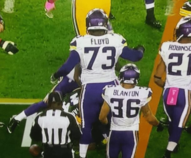
Paul, how about the different number 3s on Floyd’s jersey vs Blanton’s jersey. WOW.
Tens digit vs. ones digit. That’s the Vikings’ (idiotic) style.
At least the Vikes makes some sense (though I hate it).
The CBS-TNF logo has (seemingly random) pointy parts.
link
PHILADELPHIA EAGLES TO GO KELLY GREEN:
link
Whoa! It’s early enough in the morning, I’m adding that to today’s entry!
Nah, check that — too iffy. Will wait to learn more.
Interestingly, the Eagles use two different “grays” on their uniforms–on specifically/exclusively for the helmets as noted on the slick:
link
It’s noteworthy that a third (charcoal) gray is used only for the twill uniform numbers on gamers. This gray is not used on the retail jerseys (only the lighter gray is).
I generally don’t like to be a Photoshop truther, but there are several red flags. Fine print issues noted in the article aside, the treatment of the background for the wordmark looks a little amateurish.
At it seems strange to do a uniform redesign without changing the number font too.
Definitely some issues with that image. It shows 6 different views of the helmet – only one of them has a gray facemask, the rest are still black. Also, the “gray” listed in the team color section specifically says “for facemask only” when the uniform obviously has gray pants & a gray jersey. Plus, the wordmark as you mentioned… some issues next to the 2nd E… green box in one usage, white in another.
I mean, unless that picture was taken while the image was actively being worked on, but that didn’t look like a screen you could do much editing from. (Though I don’t know what program that actually is, and other tools could be on top where they’re cut off in the picture, so maybe I’m wrong there)
unless that picture was taken while the image was actively being worked on, but that didn’t look like a screen you could do much editing from.
Yeah, I guess it’s possible that the logo slick’s a work in progress, but I don’t think the designer would be making edits on the PDF. They’d likely import the elements onto the page after editing.
If that’s a genuine logo slick generated by the NFL creative team, I find it hard to believe the text on the slick would have defaulted to Myriad Pro. Why would there be a rogue computer at the NFL that doesn’t have its brand typeface (Endzone) installed on it?
So it’s either a really sloppy fake or a really sloppy work process. Sloppy all around!
The other thing about that word mark with the logo is the current on faces left. Why flip it on the word mark but not the actual logo?
You’d have to ask the Eagles about that one, that’s not a photoshop/fake issue. That’s what the team actually uses, although I think the wordmark/eagle combo logo isn’t used very often anymore.
Definitely fake. As andyharry pointed out, the font defaulted to Myriad Pro, which means that the NFL’s Endzone font isn’t installed. Having worked in pro sports graphic design briefly, this doesn’t happen— even the lowliest intern gets access to the fonts.
Secondly, it’s clearly a recolored version of the old logo sheet. The article notes the old NFL HQ address, which would have been updated, but more importantly, the jersey template is the old Reebok one, not the new Nike one.
Finally, nothing is removed from the old logo sheet— on the jerseys, the numbers and logos are in exactly the same position. The only things different between the “leak” and the original sheet are the colors (an easy change to make) and the winged design on the alternate- which happens to be pretty much identical to Oregon’s. Throw in the crappy fill-bucket job on the wordmark, and you’ve got yourself a fake. We’ll have to wait a bit longer for Philly’s return to visual glory.
Why would the NFL not embed its logos into the PDF?
Bironas, not Brionas.
Small typo: “new helmest for Virginia.” Should be “helmets.”
Thanks. Fixed.
Also, there is a rumor floating around that the green Nike “flywire collar” jerseys are in from Nike and will debut in the Rams game this Sunday.
Last night the Orioles’ Jonathan Schoop was wearing the Adam Jones Edition striped throwback socks, and I thought at first glance they were stirrups with ORANGE sannies which, you know, awesome…
But it seems now that the orange was a flap on the cleats, kind of like the ones that used to flip down over the laces, but they weren’t flipped down. I haven’t seen (or maybe just not noticed) those in recent years.
link
link
I cannot believe I called them “cleats”. It’s baseball; they’re spikes. And that’s always been one of my pet peeves.
*strikes self in head*
just curious – but if they were rubber or plastic instead of metal but still used for baseball would you still call them spikes?
I would.
Maybe it’s a regional thing? I’ve heard both football and baseball shoes referred to as cleats. Spikes are golf shoes.
Baseball shoes are “spikes.” Which is why when, for example, Jackie Robinson was deliberately stepped on by racist ball players attempting to injure him, the phrase was “Robinson was spiked.”
what does the Eagles slick say under the first silver listed?
“For … and jersey only.” Looks like inbox or fanbox?
Any guesses?
Marks.
He means on the legitimate (current) logo slick. It is not “marks” it looks like fanbox or something.
That’s because the resolution is low and causing the ascender on the ‘k’ to disappear and characters to blend into each other.
The first silver is for use on marks and jersey and the other is for use on helmet decal only. That makes sense, right?
but the word definitely ends in an “x” There is no “k” in the word at all. PAUL: please settle this debate once and for all. Thanks. O is that thanx?
Did you miss my point about how the poor image quality obscures the ascender? The resolution is pretty low, so it could be a lot of things, but it doesn’t “definitely” end with an ‘x’.
It actually looks like it ends with an ‘s’, but that’s enough squinting for me.
“For facemask only”. You can see one of the helmets has been recolored with a gray facemask.
The charcoal swatch is labeled “For uniforms only.”
Has anyone noticed that the 3 on Floyd is different from Blanton’s 3. Look at the top right side of the 3s.
As already noted in an earlier comment thread: Tens digit vs. ones digit. This is the Vikings’ (idiotic) style.
I get emails about this almost every week. It’s interesting to me that people still haven’t picked up on how the team’s numerals work. I don’t think this is because people are stupid; I think it’s because the number system is stupid. People’s continuing befuddlement over it shows that it’s a failed design.
A failed design that is easily improved. If they wanted to go with the “horn” theme on the numbers, they should have just rounded the leading edge of all the numbers and put the “horns” on the trailing side of all the numbers.
It would still be unnecessary and kind of stupid, but would have been symmetrical and eliminated confusion.
Not just Vikings, Paul, but a Nike design element. Oregon used to have different tens digits and ones digits with the Belotti Bold font and they also do this with Washington State’s current uniform set. University of Washington might have this too with one of their uniform sets, but I can’t remember off the top of my head.
It is silly but I guess consumers are supposed to think it is “cool” and they’ll be inspired to spends hundreds on a jersey.
It is stupid. 100% stupid. It isn’t even the little horns themselves on numbers (if that’s what you want to call them), it’s that they are different. They should be on both or not at all.
I remember this from when they unveiled the uniforms last year. Honestly, they don’t look bad when they nest into each other (like the number 29) but when you look at number 22, it looks incredibly lame.
It’s not stupid. We use capital letters at the beginning of sentences, right?
Yeah, but there’s no such thing as upper or lower-case numbers. Numbers are numbers.
I think if they’re consistent in terms of all tens digits have the horn serif on the left and all ones digits have it on the right…
…but that’s not the case.They’re not balanced.
We do use capital letters at the beginning of sentences, but under that logic, players names are incorrect for using ALL CAPITAL LETTERS.
I am speaking purely in a visual term.
I mean, seriously, if I am Harrison Smith, I request a new number:
link
It doesn’t make it right, but Oklahoma is full of terrible names like the Savages. In the past few years, Dennis Rodman’s alma mater Southeastern Oklahoma State changed from the Savages to the Savage Storm and Northeastern Oklahoma State went from Redskins to River Hawks. An interesting side note is that James Allen put Wynnewood football on the map as the No. 1 high school running back in the country according to Parade Magazine. Kind of a disappointing college career at Oklahoma, but he had some brief NFL success. link
On behalf of everyone, I’d like to apologize for Oklahoma as a whole and that high school team name specifically.
*facepalm*
Well you might as well go ahead and apologize for the name of the state. Oklahoma is a Chactaw word for “red people.”
link
I don’t think “Oklahoma” was ever commonly used as a pejorative/link (or defined in dictionaries as such).
If you don’t think “Oklahoma” has been used pejoratively, you don’t know anybody from Texas.
This is what’s known in the logical fallacies circle as equivocation.
Thanks professor. I bet you’re fun at parties.
Ain’t no party like a pedant party ’cause no two parties held at different times in different locations with different attendees could possibly be the same.
We’ve already seen the “1491” comedy troupe and the “Fighting Whiteys”. Is there any Native American group ready to turn the tables on that nickname and use it, cheekily, in reference to the “invaders” at Jamestown or Plymouth Rock?
If done right it could be pointed and funny.
(I’m thinking of the song “Savages” from “Pocahontas”, sung in cut-screen, separately but at the same time, by both the natives and the English settlers, enumerating the ways in which they each think the other is completely uncivilized.)
Ugh.
Unclear grammaring: “Turn the tables on that nickname”, meaning “Savages” (not “Fighting Whiteys”).
You can’t blame Snyder for the location of Fedex Field, nee Jack Kent Cooke Stadium, for its location away from everything. Cooke sited and built the stadium specifically miles away from everything so fans would have to pay for parking. Taking Metro to RFK was easy – the station was less than three blocks away – but there was very limited parking at RFK as well.
FLOYD THE GIANT?
Why does Floyd (listed as 6-3 on vik’s website) look so big compared to Blanton (listed as 6-1) in the numberless NFL official photo? Is this forced perspective?
The Library of Congress yesterday released newly discovered newsreel footage of Game Seven of the 1924 World Series.
link
In high-contrast black and white, shot from a long way away, pretty much the only way to tell the players apart is by their socks, but the two teams have sufficiently different stocking styles that you can always tell who’s who. (Well, that and the one team with the sidearm pitcher is obviously the Senators.)
It looks like that last night the New Jersey Devils test ran a system that would put virtual ads around the boards. The ads would only appear when watching the televised game, but the boards had to be tinted yellow to make the system work. Wrong on so many levels.
Here’s where I found this:
link
Very interesting.
Have to say, though, the boards don’t look all THAT yellow in these game photos:
link
Canucks have been doing that on the end boards for a couple of years.
Just thought Paul Lukas would appreciate this: link
In the same vein of calling baseball shoes spikes instead of cleats: the “skits” on SNL are properly called “sketches.”
Today’s ESPN column is up:
link
I think the prank Lightning jerseys with the palm trees are better than the real “Bolts” jerseys.
You would.
But he’s right. They’re both terrible, but if you’re going to be ugly, naive ugly is better than slick ugly.
The actual jerseys certainly look better, but to actually wear a shirt that says “Bolts” continues to define stupidity. And I’m not a fan of how they filled the white strokes with blue on the socks but not on the jersey. I think this was because it looks better with black instead of blue but they wanted some differentiation from the Kings.
And, re: the NHL column, I continue to think Paul has it backward on the Caps WC unis. The stripes are good (though admittedly feeling a little forced onto the tapered shoulder panels), and the chest crest is painfully bad. It looks like someone at a local sporting-goods store took whatever generic letters s/he had lying around, cut a point onto the top of the big W, sewed them onto the jersey, went out for an early lunch and called it a day. Boring typefaces are great for numbers (and, often, NOBs), but I need more out of a big, front-and-center logo. Maybe it would work if there was some other element tying together the pointy W and the generic block text.
Ugh. White thunderbolt on black sweater; boom, we’re done.
The Caps have always been behind the curve regarding crests. Maybe they should arrange 5 stars in a “w”, a la Cassiopeia.
“The actual jerseys certainly look better, but to actually wear a shirt that says “Bolts” continues to define stupidity.”
Or, you know, appealing to people who actually buy tickets, not anonymous people on the internet who never go near the market.
Alabama has “BAMA” on uniforms. But, wait, their name isn’t “Bama,” it’s “Alabama.” How can they not use the official, full and utter name? Maybe because to the locals, that’s totally fine. To people in Lincoln? No. But who in Tuscaloosa really cares about what people in Lincoln think?
The Pelicans have had a uniform set with “NOLA” on it. But, how can that be? The full, official name of the city is “New Orleans.” It’s “defining stupidity” to not use to the official name of the city. Maybe because to the locals, that’s totally fine. To people in Portland? No. But who in New Orleans really cares about what people in Portland think?
Get it?
It’s not for you. It’s for us. Your opinion makes no difference.
If my opinion made a difference, I probably would be talking about it in some meeting and not on an Internet discussion board. Thanks for the heads-up, though.
I’ve got no problem with an abbreviation on the uniform, but I do with an unrelated nickname. I think using a nickname of a nickname is stupid. (Team “nicknames” are probably technically just names, nowadays–I’m guessing the Lightning aren’t actually called the Tampa Bay Professional Hockey Club–but the point stands.
A better example to counter mine would be Portland, where presumably someone likes having the absurd nickname “Rip City” on the Blazers’ alternate jersey. The problem is that, too, is incredibly stupid, much like other uniform decisions criticized on this board, from monochrome football uniforms to black for black’s sake to all the poor suckers that are part of Team Adidas.
The crest and numbers on the “new” Flyers jersey will be made of felt. The letters on the namebar will also be felt. The namebar itself will be twill.
CONFIRMED!
Source?
eh?
L.A. Kings Luc Robitaille seems to be putting the kabash on the gold throwback jerseys by only allowing them to be worn 3 or 4 times this season and they will not be worn until Feb. 2015. WOW! The gold look is going to be awesome, why not wear it more often?
Because it’s off-brand.
M. Willis’ take on the branding of Apple Watch.
link
A nice MLB Playoff bracket on sportslogos.net
link
Finally, sweet moments shared by the North & South Korean women’s soccer teams as they picked up the gold and bronze medal respectively.
link
Interesting article by the Native-American comedian, specifically about his experience at “‘Skins Nation” (“I’ll cut you.”). It amazes me how completely irrational we can get in the name of team loyalties. Quick story: I grew up and remain a Jets fan (preemptive thanks for all of your sympathies). I now live in the KC area, and a few years ago attended a Chiefs/Jets game at Arrowhead Stadium. I chose to wear a green Jets t-shirt to the game, and figured I’d get some good natured ribbing. As I walked through the parking lot upon arrival, not ten steps from my car, a child (perhaps 8 or so), walked in front of me to block my path and began yelling at me about how the Chiefs (he referred to them as “we”) were going to kick “our” asses, etc., and it only got worse from there. I stood there incredulously, and then glanced over at what I assume were his parents sitting near by. His father stood up from his lawn chair and in all seriousness said, “I’ve raised him right!” Unfuckingbelieveable. Although I’m always disturbed by fans’ stupidity when I hear stories like that, I’m never surprised given the over-importance we place on sports and fandom in this country. You stay classy football fans.
Example No. 713 of why we were all better off when fans wore regular clothing instead of jerseys and other team gear.
I’m pretty sure that the home fans were still assholes towards opposing fans then too, it just took longer for it to emerge.
I agree with both sentiments. My point was that beyond those statements, there’s something really wrong with how irrationally invested we allow ourselves to get with this shit. As a much younger man, I found it funny and even a little honorable when I heard the story (probably made up) about Woody Hayes pushing his car into Ohio from Michigan across the state line because he refused to buy gas in Michigan. I now see it as a really sad example instead. The fan’s comment that she’d cut the comedian for what he was wearing is just another sorry-ass example.
Isn’t there a surplus of cruelty, nowadays?
I went thru much the same thing wearing a Broncos jersey in Jacksonville about 12 years ago.
Man, I wish the Devils would wear the green-trimmed uniforms permanently. They are so much better looking than the red/black version IMHO.
Probably won’t happen. The Devils in black+red have a formal element; people compared the white ensemble to tuxedos. In green+red, they’re giddy-looking but lack gravitas. The expansion-year sweaters are fun as throwbacks, like the tequila sunrise Astros.
Didn’t know if people had seen this.
link
Wow. They mixed and matched my quotes to create composite quotes. Like, a LOT.
Holy shit. Those “Catch of the Day” photos are terrific!
Paul:
I know you can’t tell us what the Mets’ changes are — but can you tell us what it isn’t?
In other words —
— It’s not re-adding the black drop shadow.
— It’s not changing the pinstripes to white from cream
Etc.
I know it’s a stretch, but I thought I’d try. Thanks, regardless.
We’re not going to play 20 questions, sorry.
It’s a minor thing, trust me. You’ll find out when the team announces it, or when the person who gave me the info releases me from my promise not to reveal it. The end.
Can you tell us when the team plans to announce it?
I don’t know.
Couple of Nats items:
* Bryce Harper’s DCFD helmet is link
* Washington Post is using a Real Madrid-like typeface for its link
This seems right up the Uni Watch alley. Footage from the 1924 World Series. link
There’s a high school in rural Alaska called the Half-Breeds.
I won’t ask Paul to confirm or refute this publicly or privately, but I have a feeling the Mets’ tweak might be something I’ve been suggesting for a while: swapping the fabric colors of the home pinstripes and white alts so that the former are white and the latter are off-white. I mentioned this to one of the Mets guys at the QBC back in the winter and he seemed quite taken with the idea.
It could also be that they’re dropping the alternate cap, or removing the white outline from its logo crest.
Or putting the standard primary logo on the blue alts’ sleeves.
Or adding a grey-billed cap to go with the road blue alts.
Personally, I hope it’s the first one. Whatever it is, anything that doesn’t involve bringing back the black is probably an OK thing.
I bet it’s a squatchee color change.
Could be that too; good call.
Or bringing back glacier twill.
Or shrinking the “Mets” script on the home unis a little bit (it’s always looked too big ever since they ditched the black and fixed the “M”).
Or adding a batting helmet that matches the alt caps.
Good to see that you’ve narrowed it down….
:) Just trying to cover the bases (no pun intended). Like putting a chip on every number at the roulette table. Still betting on/hoping for the fabric swap….
I hope they fix the fat e in the script that looks stupid…and ditch the headspoon on the blue alts and go with soutache on the neck and sleeves
So many guesses…
Paul would never describe a squatchee color change as “genuinely minor and not a big deal.”
My guess: They’re increasing the size of the non-outlined cap logo by a quarter inch.
Sports fans are classy people, Vol. 973:
link
Wow. This makes me genuinely worried about the human race.
Maryland’s hand-painted helmets have apparently spread to the field hockey team; the goalies are wearing a version of the Maryland Pride hand-painted numbers that the football team is wearing tomorrow.
In their game today, the opponent was Ohio State. The OSU goalie was wearing a silver helmet with red and white stripes over the center, just like the football team.
I don’t have screen caps; can you help a UniWatch brother out?
Notice how Rod Langway won the Norris Trophy twice in 1982-83 on the Washington Capitals Awards Timeline.
NNNOB: No Name OR Number on Back
Shouldn’t it be NNONOB?
You could definitely see your expertise in the article you write.
The sector hopes for more passionate writers such as you who aren’t
afraid to mention how they believe. All the time follow your
heart.
Hello there! I know this is kinda off topic but I’d figured I’d ask.
Would you be interested in exchanging links or maybe guest writing a blog post or vice-versa?
My site covers a lot of the same topics as yours and
I think we could greatly benefit from each other.
If you’re interested feel free to send me an email.
I look forward to hearing from you! Fantastic blog by the way!
It’s rather a nice and valuable part of information. I’m contented you contributed this useful info with us. You need to stop us advised in this way. Many thanks for discussing.