Screen shot by Seth Moorman; for all photos today, click to enlarge
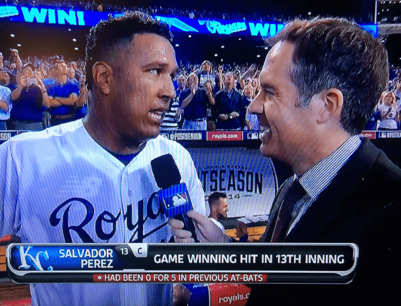
Arguably the most uni-notable moment in last night’s American League play-in game came during the postgame interview with Royals catcher and walk-off hero Salvador Perez, when we all got a clear look at the New Balance logo on his undershirt. That’s the thing with these Cool Base fabrics — they’re so diaphanous that they’re sometimes translucent. Did someone from Nike, which has MLB’s base-layer contract, have a conniption upon seeing the NB logo peeking through Perez’s jersey? One can only hope.
This also makes the second day in a row that New Balance has been mentioned here on the site (they showed up in the college football section of yesterday’s Ticker) — probably a record.
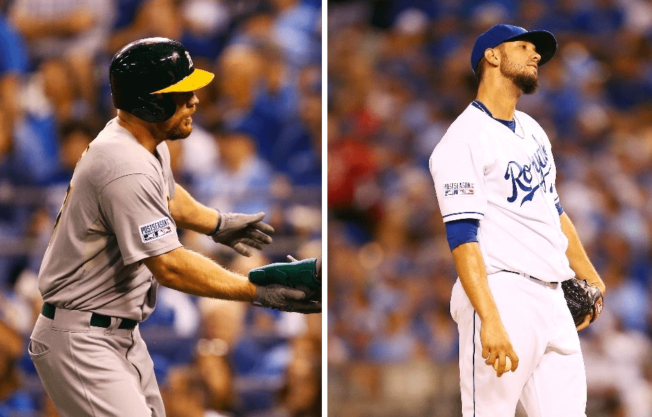
A few other notes from last night’s ballgame:
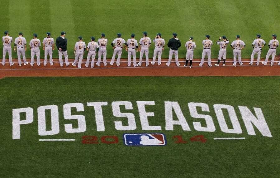
• Both teams wore “Postseason” patches on their sleeves and caps, along with a decal on their helmets:


• The “Postseason” branding also appeared on the field:
• James Shields honored former Rays coach Don Zimmer by scratching “Zim” into the back of the mound, which I’m now told he’s been doing ever since Zimmer died. Obviously, Shields played for the Rays for many years before being traded to the Royals, but it’s still odd to see a player from one team memorializing a coach from another team, especially on his team’s home mound:

• • • • •

Baseball News: The Angels gave Big Bang Theory actress Melissa Rauch a jersey. Granted, she’s small, but look at the size of that uni number (from Jonathan Daniel). ”¦ Carl Yastrzemski’s son, Mike, played for Florida State in the early 1980s and had a “Yaz” nickNOB (from Jared Wheeler).

College and High School Football News: USC’s helmets this Saturday will reportedly have a shinier finish (thanks, Phil). ”¦ Also from Phil: Syracuse is planning an orange-out for the Louisville game. … Kudos to the U. o Virginia, which is telling its fans to wear whatever they like as long as they’re loud. Such a rational, reasonable concept — it obviously has no chance of catching on (from Tommy Turner). … Here are Oregon’s Pinktober unis for tomorrow’s game against Arizona. ”¦ “Salt Lake City has a very high population of Pacific Islanders compared to the rest of the United States,” says Dom Lewis. “That’s why Taylorsville High School in Taylorsville, a Salt Lake City suburb, has a Polynesian pant stripe similar to what the University of Hawaii used to have.” ”¦ I think we’ve seen Dartmouth’s new alternate helmet already, but here’s a much closer look. “It’s intended to invoke a granite feel for a team from the Granite State,” explains Tris Wykes. ”¦ More “U! S! A!” nonsense, this time from Houston. ”¦ Very shiny shade of blue on BYU’s helmet this Friday. ”¦ Here’s Maryland’s uniform for this Saturday.

Hockey News: Islanders captain John Tavares had his number retired by his old major junior team, the Oshawa Generals. … Awesome catch by Michael Hersch, who noticed that the Red Wings have changed their helmet wordmark lettering from solid to outlined. And no, this isn’t one of those preseason-only things like the Wings’ NOB lettering. Last preseason the helmet lettering was solid. Same thing the year before that. ”¦ Very disappointing to see that the Flyers are bringing back their ice girls. Why not just have go-go girls in cages suspended above the ice? At least that would be more honest (from A.J. Frey).

NBA News: Jeremy Lin, now with the Lakers, threw out the first pitch at Dodger Stadium last Saturday but his jersey didn’t have a front number. … Reprinted from yesterday’s comments: New court design for the Cavs.

College Hoops News: New uniforms for Navy, with the same stripe motif used on the Midshipmen’s football uniforms (thanks, Phil). ”¦ Daniel Listoe was waiting for a bus in downtown Chicago and spotted someone wearing Indiana basketball striped warm-up pants.

Soccer News: Portland soccer jerseys showed up at a girls’ soccer tourney in Nicaragua. ”¦ Pinktober kits for Monterrey Rayados, who play in the Liga MX.

Grab Bag: Here’s a photo gallery of custom shoes that Fizik made this season for pro cyclist David Millar, who has now retired (from Sean Clancy). … “The Duggar Family of the TLC Reality series 19 Kids & Counting apparently uses ‘Nike’ as a code word,” says Gregory Koch. “Due to the family’s strict religious beliefs, the daughters will call out, ‘Nike’ to warn their brothers and father to avert their eyes from immodestly dressed women.” ”¦ New package design for Hershey’s Miniatures (thanks, Brinke). ”¦ Interesting article about some old grain silos in Buffalo being repainted to look like a six-pack of Labatt’s. ”¦ Here’s a look at a Pym Technologies logo from the upcoming Ant-Man movie. ”¦ New logo for LSU-Eunice athletics (from Jarrad Tauzin).

diaphanous.
nice.
RE: Hershey’s Miniatures. The wrapper on actual chocolate pieces have a change too. The candy name is bigger and on an angle.
After bruising his elbow in last week’s game against Georgia, Tennessee QB Justin Worley will be wearing a sleeve against the Gators on Saturday: link
“It fits so tight that you don’t really notice it’s there. It’s not necessarily a fashion statement. It’s there for protection.”
“Interesting article about some old grain silos in Buffalo being repainted to look like a six-pack of Labatt’s”
Yeah, it would interesting to SEE A F**KING PHOTO of the silos.
Dammit I HATE(!) stories/articles about visual things that don’t SHOW you the visual thing.
Jeezus Khrist!!
Yeah, I was wondering where the pictures were. Didn’t quite understand why they’d talk about it and not show it.
link
Might be a copyright or clearance issue on the only picture they have on hand?
I would think that one would be freely allowed to take a photo of something that’s out in the open and meant to be seen.
Better yet, you can go link to see photos of the original grain-silo-six-pack that Buffalo is ripping off, in scenic LaCrosse, Wisconsin.
Was just about to post that, although I always remember them link, as they used to be.
Likewise, the two giant Budweiser cans and a giant Budweiser bottle on the grain silos at the old Anheuser-Busch malting plant in Manitowoc, Wisconsin. link
Plus those aren’t grain silos but storage tanks for beer. Does what it says on the tin.
Oh, man, I can’t tell you how many times I’ve driven by that and just assumed it was a grain silo. I guess growing up in the shadow of link, I just sort of assume anything that shape holds grain!
“I guess growing up in the shadow of this, I just sort of assume anything that shape holds grain!”
Mmmm… I can almost smell the Cap’n Crunch through that picture…
The latest Maryland costume makes them look like link.
The crash test dummy looks better.
I think James Shields should stick to just a Z to honor Zimmerman (if he really has to do that at all), because when I see “Zim” I instantly think of a green cartoon alien, not a former coach.
The Zimmer Man?
The Zim Merman? That just makes me think of Zim with a fish tail.
Note that the post game interview with Perez shows his game winning hit in the 13th inning – not 12th.
Does anyone know if that got corrected? I had turned it off before the 12th. Maybe the TBS guys were super sleepy and had lost count.
Referring to the lead graphic, I thought the Royals won it in the bottom of the 12th, not the 13th?
I think the hate against color-outs on here is kind of unfair. You’ve used the term “you must wear this color”, and it’s kind of a misnomer. Nobody’s forcing you to wear anything, the team is simply *requesting* it because they think either a) it looks cool (to at least a fair amount of people who are willing to participate) and/or b) it’s for the most part fun for the participants. If you don’t want to participate but still want to come to the game, no one’s going to stop you. You probably won’t even get a whole lot of guff for it from the people around you in the crowd.
Of all the ways stadiums try to “improve” the atmosphere of a game, this is a fairly innocuous one in my opinion. I’d much rather do away with the incessant pumped-in music or other between-innings/commercial breaks gimmicks and promotions.
For what it’s worth, Paul did give his (grudging) approval for Tennessee’s attempt to checker Neyland Stadium this week.
Nobody’s forcing you to wear anything…
Never said they were. But there’s a strong coercive element, and the groupthink factor is distasteful, at least to me. If you feel differently, that’s fine, but that’s a difference of opinion, not an example of “unfair[ness].”
I’d much rather do away with the incessant pumped-in music or other between-innings/commercial breaks gimmicks and promotions.
In a world that doesn’t hew to binary either/or formulations, I don’t see why we can’t do away with both.
I wonder how much the groupthink distaste comes from the often contrived nature of color-outs. The team announces it way in advance, sometimes coinciding with special uniforms for that day and/or give aways like branded towels or tee-shirts. That can lend it the sense of feeling prefabricated.
I’ve only participated in one color-out and that was the 2008 AL Central one game playoff between the White Sox and Twins. Since the game was organized just 24 hours in advance, the ensuing Blackout felt like it had been improvised on the fly. Fans only found out the day of, the White Sox wore their traditional home white, and the black rally towels the team handed out had no markings on them and looked like they had been purchased from Bed Bath and Beyond that morning. It gave the occasion a more random, organic feeling.
link
Isn’t being a fan of a team a form of group think?
50,000-100,000 people all spend money and take time out of their lives to go to a stadium to cheer on a team (visiting fans not included). How is wearing the same color as each other much more of a leap?
Do you also oppose the “coercive element” of audience participation during concerts?
Do you also oppose the “coercive element” of audience participation during concerts?
I don’t know if I’d say I “oppose” it, but I think it’s pretty stupid. Fortunately, I mostly go to the kinds of music venues, and see the kinds of bands, where that kinda shit doesn’t happen.
It’s a little comical to hear you complain about groupthink … but ok.
Would you care to explain what you mean by that? Details, please.
and the groupthink factor is distasteful, at least to me
Isn’t that how a lot of people feel about the Redskins issue?
Nobody’s TELLING anyone what to do regarding that issue. We’re all just trying to convince/persuade others. That’s a lot different than telling people what they have to wear.
I think you don’t understand what “groupthink” means.
Nobody is forced to wear the certain color for a “black-out” or a “checkerboard”, they’re just trying to convice/persuade them to do so.
Seems like the same thing to me.
There’s a big difference between intellectual debate (primarily on the internet) and telling people how to behave while surrounded by thousands of people who’ll give them shit if they don’t conform.
You and I can get as nasty as we want in this discussion (or any discussion), but we’re still sitting at a computer at our home or office. That’s pretty different than being surrounded by thousands of people who treat you like a “bad fan” if you don’t conform.
Basically, one scenario has a coercive element; the other doesn’t.
Ehhh.. The problem, I think, is trying to nudge the crowd to behave a certain way. I don’t doubt that certain schools are of a mind to wear school colors at the game, just as other schools are inclined to “go casual”. That is simply the local custom. I suppose I expect an institution of higher learning to have a better understanding of regional customs.
I have a pretty high tolerance level for “color-out” games. The effect is usually pretty visually interesting, especially for events like Tennessee’s link or Iowa’s link
But I hate color-outs that involve non-school colors. link, for example. How does wearing black show school spirit for a team whose colors are royal blue and white – especially when the opponent’s school colors prominently feature black?
You know, they can tell me exactly what they want me to wear to the game and I’ll wear it. But I’ll be damned if they’re going to tell me how loud I need to be.
That decal on the BYU helmet appears to be in 3D… seems to have a raised Y?
looked like that to me too. weird.
It is a 3D decal.
Thanks – i stared at that for awhile as well.
I noticed that too. Perhaps Paul or someone else can talk more about that. Is it a rare thing to have a raised decal on a helmet? I can’t remember any other examples of something like that. Anyone else?
duggars code word should be “birth control”
I’m not sure which is really worse… that they need to use a stupid code word to tell the men not to look at other women, or that we know who they are in the first place.
Fuck reality TV shows.
Maybe we can work on the Duggar dad being a little less stimulated. Good gosh (sorry for the harsh language).
Could be worse you know. Could be like fundamentalist Islamics who don’t divert their eyes but demand women cover up head to toe. Don’t take away my viewing pleasure because you don’t like it!
God, deliver me from your followers.
What does this thread have to do with uniforms?
It refers to 2nd item in today’s Grab Bag section.
Yeah. I meant the comments.
The idea that it’s the women’s responsibility to keep the men from being tempted, instead of the men’s responsibility to KEEP IT IN THEIR PANTS FOR CRYING OUT LOUD makes me more upset than Paul would be if the Washington football team kept their name but changed their colors to purple and off-black, added stripe of Nike logos down the sides of their pants and slapped ads on their shoulders.
There. I tied this conversation to uniforms.
Why would Oregon’s Pinktober uniforms still be the 2013 Hypercool template?
Using one-off promotions to empty the coffers of old stock, perhaps?
Probably, but introducing a (semi) new Uni is an opportunity to use the new template. Without doing that, Oregon risks being “uninnovative”. Hang on a second, I think Phil Knight and the other Nike douchebags just shat themselves.
I wonder if Paul is as jacked up about Oregon wearing pink and black unis as he is about everyone else wearing stars/stripes in logos?
Pretty fired up to see such awesome uniforms in the postseason this year and especially so that it was home whites and away greys last night. I hope the Pirates and Giants do the same tonight, but I’m doubtful about Pittsburgh.
Pirates probably wearing black, as they did last year. One of their players via Twitter called on fans to dress in black at PNC Park.
Maryland’s uniform for this Saturday vs. Ohio State is exactly what they wore in link.
This is a very minor thing but in the second inning of last nights game Omar Infante work mismatched batting gloves for an at bat. He struck out swinging and nearly fell down.
It was on his top hand as you can see in this picture.
link
The rest of the game he wore a matching pair on Franklin’s like you can see in this picture.
link
Yes, that is a minor thing. But that’s what this site is all about!
“it’s still odd to see a player from one team memorializing a coach from another team, especially on his team’s home mound”
Yeah, but it’s for loveable Zim, a lifetime baseball guy all around the leagues who no one seemed to hate, so it’s cool. Not like a memorial for LaRussa (after he passes) or someone like that.
There are plenty of Red Sox and Cubs fans that hate Zimmer. Ask Bill Lee what he thinks of “The Gerbil”.
That being said, I find it strange that Zimmer is some how remembered as a Tampa Bay Ray. I realize he held a basically ceremonial position with the Rays when he passed, but I think of him as a Dodger, Met, Red Sox, Ranger, Cub and Yankee long before the Rays. There are other teams too — Reds, Padres, Expos, Senators. But I guess that proves your main point, that he was a baseball guy and should be remembered throughout baseball.
I agree completely.
Why don’t they serve ice cream in helmet cups at hockey games? Seems like a hockey helmet would be an even more natural shape for a sundae cup than a baseball batting helmet. (This question has been driving me batty since it occurred to me a day ago.)
Because there’s no collectability factor for hockey helmets.
Surprising they haven’t fixed that “problem” yet. It wouldn’t be that hard to throw some striping and/or a logo on a hockey helmet.
Agreed. I called for this nearly a decade ago in an ESPN piece (most of which now sounds silly, but I stand by the helmet section):
link
In the ’70s a few teams or players experimented with this. Andre Boudrias on the Canucks and Vaclav Nedomansky for the Toronto Toros both, at various times, had stripes and/or decals decorating their helmets. They didn’t look like official team initiatives, more likely the player or equipment manager having some fun.
I miss the simplicity of Page 2.
Why not? There’s the color, and teams do have graphics on their helmets, admittedly small ones. But there’s no rule they couldn’t slap the team primary or secondary on the front of the souvenirs. And I think the ear flap is easily designed around. After all, baseball helmet sundae cups don’t have ear flaps. But a pair of rounded bumps on either side would suffice.
Raises what should maybe be a first question: Do they even sell ice cream at hockey games? I don’t recall eating at any of the NHL games I’ve attended, except the one time I was at a corporate suite with posh catering, which doesn’t count. So maybe my premise is wrong from the start!
“Do they even sell ice cream at hockey games?”
They do at link. Though may not be the best representative sample of NHL arenas.
What about the collectability of (mini) goalie masks?
link
I think the helmet color and decals would enough, but then hockey helmets would need the ear loops and vents that might be hard to pull off in a cheap molded bowl. It wouldn’t look right without them.
The Phoenix (now Arizona) Coyotes had an ice cream helmet a few years ago. You can see it in the back, left of this picture of my helmet collection.
link
Thanks! See how awesome that is, every other NHL team?
Very cool. What are the big ones in back?
My guess is nachos.
link
That’s right. They are nacho helmets. The one shaped like a star is from Angel Stadium in 2010 when they used the All-Star Game logo throughout the year.
The only reason the New Balance logo was showing was because he had just gotten a Gatorade shower and the jersey was wet, Here is the video of the whole interview, no NB logo pre soaking
link
Not to be nitpicky but Dartmouth is misspelled “Dartmoth”. I am sure Dartmouth readers would appreciate the fix.
I despise the blackout, whiteout, colorout, checkerboard or whatever else -out that is done for games. Idea is to get fans fired up I know but maybe the performance of their team should do that and not gimmickry.
Not nitpicky at all. Fixed.
And that helmet’s “granite” paint scheme looks too much like the paint scheme on my neighbor’s Toyota Camry.
Don’t touch my Camry…
I dig the granite look, the problem I have with the helmet is all the unnecessary clutter: the “D” and the “Green” nose bumper, not to mention the ludicrous face mask (we’re talking Dartmouth, fer chrissakes). The irony being, however, that the helmet postdates the so-called Granite Bowl, in which they wore while helmets (and by the way got walloped by like 35 points).
link
Love this site, morning ritual w/ a cup of coffee. That said, big friggin deal about the ice girls in Philly. Aesthetic site should not be so concerned about stuff like this, let it go. (Skins watch, same thing)Other than that great site keep up the good work!
Aesthetic site should not be so concerned about stuff like this
It’s about what the ice girls are wearing. Could you please explain how that is NOT relevant to Uni Watch?
Not arguing for/against ice girls themselves in this thread. Only for their uni-relevance.
Because its not about style and design . . . it devolves into hardcore political group think.
Aside from that, whoever posted the ticker said it was disappointing that they revived the practice as a whole . . . which isn’t a statement about outfits.
Comedian Bill Burr was on Conan last night talking about women and the NFL, and he brought up “Pinktober” and how players will all be dressed like newborn baby girls. Funny bit.
link
The Dartmouth helmet stripes reminded me of a past Cornell helmet.
In this photo Robert Weggler even cut his hair to match the stripes!!
link
Bob Blackman used that design template while coaching at Cornell, Illinois and Dartmouth. Only Dartmouth still uses it today.
The reason the USC helmet looks so shiny isn’t really the helmet shell; it’s because they switched from a gray face mask to a red one.
USC is still playing with grey facemasks.
The photo shown in the link above is a prototype(?) of what may be used this season.
The Jeremy Lin thing in the Ticker has got me wondering. When you have a cross-sport event like that, how do you decide whether it would go in the baseball or NBA section? I would have thought it would go in the baseball section since it’s a baseball jersey at a baseball game. I half expected Lin to be wearing purple and yellow before I clicked on it.
I actually went back and forth on that one. Eventually decided to put it in the NBA section because there was only one other NBA news item, so the section benefited from the additional item.
Re: Houston. The Coogs will be wearing the flag logo decals to honor the memory of former letterman and 82nd Airborne SFC Sam Hairston who was KIA in Afghanistan in August of this year. Our players are also wearing #34 and #46 decals on their helmets in memory of Hairston and UH alum Robert Newhouse.
link
Minor pedantic note:
Oshawa Generals are a canadian major junior hockey team, not a minor league team.
Not pedantic at all. Will fix!
Away kit for away kit’s sake for link (black instead of purple-red vs sky blue) and link (yellow instead of blue vs green/white).
Thanks for the photo credit, but as cool as it would be to have the surname Yahoo, my last name is Moorman.
Fixed. Showed as Yahoo in my in-box.
” Awesome catch by Michael Hersch, who noticed that the Red Wings have changed their helmet wordmark lettering from solid to outlined.”
That wordmark screams “1970s”
Thanks Paul! Cheers!!
Rams to honor ’99 team vs 49ers on the 13th:
““Our fans will definitely recognize that we are honoring the ‘99 team,” Eversgerd said. “Everything in the stadium – from the end zones to the midfield area, to the jerseys on their backs – it’s all throwback.”
link
Everything but the helmet? Or can they recreate the old look with decals?
Yes — that.
I understand that us in the Uni-verse feel the need to fein shock when the powers that be react predictably to certain situations. But I had Nike as a client for 7 years and my GF now works for a major competitor, so I get it. They paid millions for that photo op. Having NB steal that moment hurts and they should push their partner MLB to make that not happen. Otherwise why pay them millions?
They paid millions for that photo op.
Your comment is premised on the notion that the above-quoted statement is OK, appropriate, acceptable, etc.
But that premise is false. It is NOT acceptable. It’s vulgar, undignified, an affront, a symptom of a massive cultural problem (i.e., that every moment of time and every bit of space is for sale).
That’s why it’s necessary (and, yes, fun) to mock them when situations like last night’s photo-op come up.
Indiana pants spotted in downtown Chicago.
Jimbo?
Was anyone watching/recording the opening to Baseball Tonight at 6p ct tonight? They showed the Pirates “P” being placed on the dirt. I always thought they painted the logos on, but it was VERY clearly colored dirt/sand being drizzled into the stencil from a plastic cup.
By the way, isn’t the whole concept of a sports team, groupthink?
I think you and I define “groupthink” very differently.
Regarding the Nike undershirts, it looked like James Shields either colored the swoosh on his undershirt blue or has as a blue on blue version of the shirt. At least it looked that way on TV, couldn’t find a good up-close picture but this one at does show that the logo couldn’t be seen from a distance link
Line judge in MINN-GB game has no position or number.