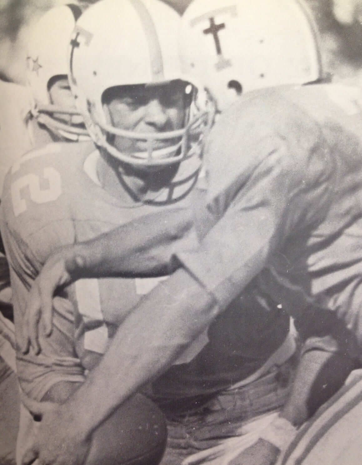
Courtesy of the Tennessee Athletics Dept.; click to enlarge
When I wrote last week about Arknsas State modifying a cross-shaped memorial decal due to Constitutional issues, several readers noted that the Tennessee had worn black crosses in 1965 after three coaches died in a car crash. Unfortunately, none of those readers was able to provide a game photo, but I recently procured one from Tennessee, as you can see above.
That’s one of many examples teams and athletes wearing religious imagery, which is the subject of my new ESPN column. Check it out here. ”” Paul
NFL Superhero Project
By Thomas Correia
Thanks for all the positive comments on last week’s NFL superhero installmet. We’re going to do this every Thursday, with superheroes representing the Thursday-night NFL match-up. Here’s the one for tonight’s Bucs/Falcons game:
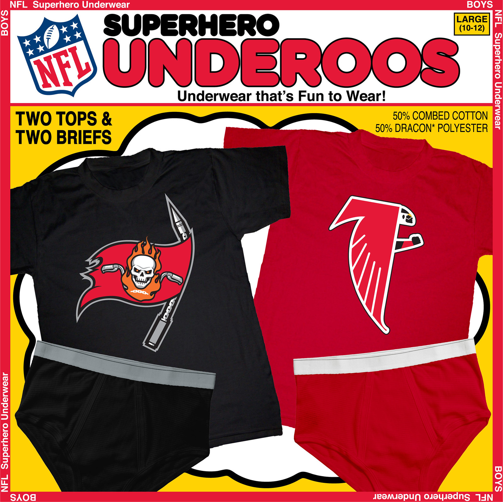
With the focus being on the skull, Ghost Rider seemed like a good choice to represent the Bucs. To carry that through, the crossed swords became motorcycle handlebars. Also, I turned the orange football into the flames around his head and included the penance stare eyeballs. Lastly, the large sword holding the flag became Ghost Rider’s chain weapon.
For the Falcons, I went with — duh — the Falcon. Using the throwback Atlanta logo is an ideal fit for the throwback look of the Falcon’s original costume. Obviously, the name and the red, white, and black colors fit perfectly with both team and hero. All it really needed was a new head and to replace the claw with an arm. Wish they were all this easy.
Next week: Giants vs. Washington. Which characters do you think will represent them?

Mike’s Question of the Week
By Mike Chamernik
We definitely like more than just sports aesthetics around here, of course. What’s your favorite non-sports logo? I always loved the colors and simplicity of the Union 76 ball. I’m also fond of the 1970s and ’80s Pepsi logo, the NBC peacock and Vinnie, the Vitner’s Chips bag.
Any non-sports logos or characters that you hate? And, are there any logos that are so successful that they overinflate the product’s value for you? For instance, Punchy makes me want Hawaiian Punch even though Hawaiian Punch is marginal at best.
As always, post your responses in today’s comments.
Uni Watch News Ticker
By Mike Chamernik

Baseball News: Bryan Cranston did a commercial for MLB Postseason on TBS and he wore a bunch of uniforms for it. … Bud Parks attended the Orioles’ division clincher Tuesday night and got a cap with the postseason patch on it. It’s not a chromaflex patch, he says. … Umpire Joe West was suspended one game for grabbing Jonathan Papelbon’s jersey during an altercation Sunday. … The Padres will wear brown this Saturday (from Brady Phelps). … Barstool Sports is selling an Orioles Natty Boh shirt. Check out Mr. Boh’s stirrups. ”¦ Speaking of the Orioles, here’s a photo that shows some old versions of the cartoon bird that you might not have seen before (from Kevin Walsh). ”¦ Astros OF Jake Marisnick dove for a ball last night and broke his belt. You can see it coming loose here. Someone had to run out from the dugout to give him a new one (from Sam Selker). ”¦ Mariners 1B Justin Smoak has some kerning issues on his NOB (from Stephen Hayes).

NFL News: Nike suspended its endorsement deal with Adrian Peterson (from Phil). … The Dolphins are holding an aqua-out for Sunday’s 4pm game against the Chiefs. “What makes this particularly interesting is that the Dolphins have not worn aqua jerseys at home for a day game since Joe Montana’s final game, December 31, 1994 — the AFC Wild Card game, also against the Chiefs,” says Bob Gassel. … Titans DE Derrick Morgan posted a photo on Instagram of him wearing black tights that have some sort of design on them (from Josh Williams).

College/High School Football News: Red jerseys for Cincinnati (from Phil). … A writer named Joshua Kagavi set out to find the jersey worn by Jack Trice, Iowa State’s first black player, when he died after sustaining injuries during his first game in 1923 (from David Cline). … Rutgers will wear American flag helmets against Navy (from Phil). … Oklahoma will wear alternates Saturday (from Phil). … Fort Knox High School (Kentucky) is gearing up for Pinktober (from Josh Claywell). … Maryland is auctioning its Star-Spangled uniforms will all proceeds going to the athletic department’s scholarship fund (from Phil). … SMU will wear chrome helmets against TCU. I say BFD.

Hockey News: The NHL will not have uniform ads. For now, at least (from Phil). … New logo (kinda) for the Regina Pats (from Phil). … The Rangers will wear jerseys with computer chips in them to track player movement and speed (from Phil). … In recent screenshots and clips from the NHL 15 video game, the Blues’ jerseys have not been updated to the changes they made this summer. “In fact, they are wearing the uniform worn by the Blues pre-Reebokification (circa 1998-2007),” says Mark Richter. “Maybe EA knew about the switch to more traditional striping but didn’t have the specifics in time, so just used the old uniform instead?” Perhaps the game will have a downloadable uniform update.

Basketball News: NBA 2K15 will allow gamers to add 3D renditions of their faces onto created players within the game. … Here’s a cool interactive graphic on NBA travel (from James Comfort). … New court for UC Irvine (from Phil). ”¦ “I play club team handball at Illinois State, and we practice in Horton Field House, which used to house ISU basketball until Redbird Arena was built in 1989,” says Chris Frank. “During most of the year, they leave the old court out in the building for extra practice space. Tonight after practice I realized our only really good player, Doug Collins, played on that court and so I decided to take some pics.”

Soccer News: MLS has unveiled its new logo. … The Los Angeles Galaxy has commissioned artists to create posters to commemorate each match this season (from Yusuke Toyoda).

Grab Bag: The French sports paper L’Équipe is holding a poll to determine the best-looking jersey in the French Rugby Union Championship (from DTE). … Brown will wear throwbacks in six sports in honor of the school’s 250th anniversary (from Joel Mathwig). … The Rugby Football Union is being criticized for incorporating the Victoria Cross into its new kit (from Eric Bangeman). … Star Wars: Episode VII will reportedly rely more on practical effects rather than CGI, so the actor who plays C-3PO will wear the character’s costume on the set (from Brinke). … Great shot of KISS playing touch football in the mid-1970s (from Jim Vilk). … Members of the Republic of China Military Police go through insane amounts of discipline to maintain their uniforms, posture, and form (from Brinke). … Burger Kings in Japan are releasing a BFBS burger (from Kary Klismet). … “Here is the 1975 Scanlens footy card for Ken Fletcher of Essendon,” says Graham Clayton. “Note the orange shorts, which are definitely not official uniform.” … Mental Floss compiled a list of “strange and wonderful” niche blogs, and Uni Watch didn’t make the cut. Perhaps we’re not strange, wonderful or niche-y enough.

Here’s images of the new MLS logo, which is sort of meh. Though, I do like the color changing based on team unfiorm (a la MLB)
link
As is, it is quite meh. We’ll see how they use it. Interesting how they say the individual club logos are more important. Slow and steady progress towards more independent administration (away from the complete single-market approach)
Although the Crew logo will change next month, their colors won’t, so that’s the version you’ll see next year in Columbus.
“We’re sending a very strong message that the club marks are the most important. The clubs are really the primary connecting point for our fans.”
More important than the giant sponsor logos??
No more Village People logo for the Crew?
We don’t know that. Could be an entirely new group of Village People.
My first reaction was, so when do they finish it?
It works better when the bottom half uses a darker color. For example, Real Salt Lake works well. I think it looks like crap for any team using white or light blue.
The other problem is while it works OK on some unis, it doesn’t work as well as a standalone logo for the league. I wouldn’t want to use it on stationery or on a website.
“…MLS has unveiled its new logo. …”
I like it. I don’t like the flimflammery of the language about it, but it I like.
Agreed. The white bottom halves look unfinished and empty.
Interesting point about the minimalism, however: “There isn’t much to the logo on the surface. But they would argue that there isn’t much to Apple’s apple, AT&T’s globe or Nike’s swoosh, either, at least at first glance.”
I’m totally cool with this, and “Meh” is okay here. The league should be secondary to club and country (sorry for the MLS corporatespeak). It’s nice and understated, as it should be.
One thing that gives me pause is the involvement of Andrew Hauptman, the owner/operator of the Chicago Fire. As we Fire fans well know, the man is a Reverse Midas.
What worries me about the way they are pushing this “clubs over the league” spiel is that it seems to me to be a precursor to more significant decentralization and devolution of the league’s central authority. One of the greatest advantages MLS has in my eyes (eyes that are now in a perpetual roll at the financial anarchy that reigns in England and other dangerously unregulated European leagues) is that a strong central governance ensures the integrity of the sport wins out over frivolous financial interests. It’s much more than a logo, it’s a subtle manifesto for an ideology of deregulation that could ruin the league.
I think you’re reading way too much into the marketing nonsense.
The point is that marketing nonsense is usually used to make the the brand in question seem more important than it is whereas this is doing pretty much the opposite. Modesty has no place in marketing speak unless there is some ulterior motive and I think in this case such an ulterior motive is obvious.
I think you’re reading way too much into the marketing nonsense.
Overall, I think it’s an upgrade to the current logo (which is no great shakes). Also, I’m happy that they didn’t get caught up in the over correction era (Real SL, Sporting KC, “FC”, etc) and try too hard to make it an “authentic football crest”
The inferiority complex continues. None of the major European nations use crests.
link.svg
link
link
link
link
Uhh… how exactly is it an inferiority complex to use a crest if none of the other major leagues do so? They’re actually doing something unique, and not imitating everyone else. That seems like the opposite to me.
Yeah, but the NFL uses a shield and everyone wants to be like them!
Anyway, it’s better than the current one which is too derivative of the MLB and NBA logos. At this point, nothing says “minor league” than a colorblocked silhouette logo (see also NLL, WPS).
“None of the major European nations use crests.”
I’m sorry, you’re going to have to explain what you mean by that. I don’t understand your point.
If you mean most major European leagues don’t use shields, preferring standard logos without outlines, that’s kind of correct. But those same leagues that don’t use contained logos in their regular business often use something akin to a shield logo link.
And what does that have to do with an “inferiority complex”? For years, the standard lazy attack was that MLS was trying to be “too European,” now their design is too unlike foreign leagues?
I really like that it looks like no other sports logo, soccer or otherwise. Hooray for the new MLS visual identity.
The MLS crest seems to leave room for a title sponsor — Barclay’s Premiership, TIM Serie A, or La Liga BBVA, for example.
And just about each of these leagues has their logo on their jersey sleeve. Just like MLS does now.
Really like that it will be changed per team colors. It will look more like a feature on the kit than stand out by itself.
Over on reddit, people have taken to filling in the blank half of the new logo with other icons or designs. I have to admit some of them work well.
For example, you could take the guys from the old Columbus Crew logo and stick them in the blank half of the MLS. Doesn’t look bad.
link
Well, link
It’s not great–I don’t think I should have to read the mumbo jumbo explaining the 45-degree slash through the crest–but it’s certainly an improvement on the dated logo devised some 20 years ago. I like seeing it rendered in club colors, too.
Maybe now US Soccer will follow suit & come up with their own new logo.
While I agree the new logo/crest is kinda “meh” it is INFINITELY better than the original, which is just a juvenile-looking, cheap rip off of the MLB and NBA logos. Clearly made to appeal to American sport sensibilities back in the mid-90s. The shoe and ball are just awful.
Match day posters? A non-League English club, Lewes FC, have been producing really high quality individually specific ones for ages
link
These posters are GREAT, George! What does “non-League” mean and imply? How does one pronounce Lewes? What are the the socio-culturo-economic indicators of the fan base? Who ARE these clever bastards?
Non-league means outside the top 92 – Premier League and Football League. They play in the Isthmian League (and don’t ask me how to pronounce that) which is in the 7th tier of English football. The Leagues go down to Level 4. The real implication is pure and simply money. Higher up the leagues, the more wealth.
The whole set-up from top to bottom is called “The Pyramid”, and theoretically a team can work their way from the bottom to the top, although it will take time, and there are obstacles on the way as ground fitness considerations are put in place at certain levels (eg above a certain level grounds must have floodlights).
link
And Lewes is pronounced as Lewis as in “Lewis and Clarke”.
As for who they are, who knows. It’s from a fairly affluent area, so expect some cleverness, but that can be said of any club in the whole League structure down to grassroots. I suspect they have some knuckledraggers too – like every club.
And Lewes is pronounced as Lewis as in “Lewis and Clarke”.
Or like the beach in Delaware, where a lot of DC folks drive to in the summer.
They play at the Dripping Pan? Sign me up!
Also, instead of renting a suite for a game, you can rent a beach hut to watch a match.
Non-league means they don’t play in the upper four levels of English football. They play in Isthmian League Premier Division which is the seventh (?) level of English football.
The club is completely fan-owned and link, which gets you a vote for pretty much every decision the club makes and some tchotchkes. I’m thinking about buying in.
“Non-league means they don’t play in the upper four levels of English football.”
The dividing line between fully- and semi-professional soccer is between the fourth and fifth, so “non-league” is also a shorthand for “semi-pro”.
It dates back to the time when the top four divisions were run as the Football League, before what was then known as the “First Division” spun off to become the Premier League. The remaining three divisions still keep link. So literally, any team that played below the top four levels was a “non-League” club.
I thought the NBA Travel graphic was going to be about Kobe’s multi step trips to the hoop
Logos I hate? Easy ones to start, Nike swoosh and adidas triangular looking 3 stripes. I have always thought the Shell Oil logo was cool for whatever reason. And you can’t beat the Kool-Aid iced down pitcher, Kool-Aid Man.
Ooooh Yeeeeaaaaah! Kool-Aid Man is awesome.
I love Puma’s logo, both the cat and the shoe stripe. Also NASA, ARCO, Prudential, Atari, Safeway, Anheuser Busch, Saturn and the old Continental and Rockwell logos, to name a few.
I don’t like Microsoft’s logo.
How dare Tennessee offend so many with that logo in 1965. What it should so isn’t how far we’ve come but how far we have descended when a logo like that makes people so angry. Why be angry over it?
If you’re referring to the recent Arkansas State situation, nobody was “angry” or “offend[ed]” by the cross on the ASU helmet. Rather, some people — including the university’s own legal counsel — felt that the cross was unconstitutional.
And how was it not unconstitutional then in 1965? It became considered unconstutional because people complained that they were offended. The US Supreme Court doesn’t always get it right either. Remember, they upheld Jim Crow laws at one time.
Thinking something is unconstitutional doesn’t mean you’re “offended” by it.
Please stick to the facts of the case and don’t use inflammatory language. Thanks.
It was unconstitutional then too but nobody pointed it out because either they didn’t know it was unconstitutional or didn’t care.
It strikes me as disingenuous to say “no one was offended by” the helmet cross. The complaining attorney’s peremptory tone and conclusory characterization of it as a “clear” constitutional violation (which, it’s not) evince a degree of offense taken, and per the USA Today article an outfit called the Freedom From Religion Foundation (a member of Atheist Alliance International, whose homepage features a “Calling All Non-Believers Out Of The Closet” campaign, fer chrissakes) was nearing the point of involving itself in the matter. A little hard to believe THEY weren’t “offended.”
Something I didn’t realize until re-skimming that USA Today article: the idea for the crosses was generated by a leadership committee of the players, i.e., it wasn’t a top-down decision of the coaching staff.
It’s entirely possible to think something is unconstitutional or inappropriate without being “offended” by it. The university’s own counsel advised that the decal was likely unconstitutional; she sounded neither angry nor offended when she gave that advice.
We had a robust discussion of this case last week. Let’s not go thru that again. I ask again — respectfully but firmly — that if you feel the need to reference the case, please do so without using inaccurate and inflammatory language like “angry” and “offended.” Thanks.
In 1965 the country was a far more conformist society than nowadays. If a person were inclined to burrow into ulterior meanings of a black cross on a uniform, they’d still be loath to speak up about it.
I’d also say that in 1965 the country was far less American than nowadays.
We inch ever closer to the promise of our nation. Which is why “we’ve always done it this way” is such a bad defense of any practice.
I suppose that depends on how you define the word “American.”
“My family has had trouble with immigrants ever since we came to this country!”
(Source: Either Yip Harburg from “Finian’s Rainbow”, or my great-grandmother, from Alsace-Lorraine, for whom I’m a Metz fan.)
Prayer wasn’t banned in the public schools until 1963, so its totally possible, that no one even thought about Tennessee wearing a black cross in 1965.
In addition to that, we’re also a much less religious society today. The percentage of Americans who identify as Atheist or Non-Religious is higher now than at any other point in history, so the separation of church and state has become much more important today than it was in the mid 1960’s.
We’re not only less religious, we’re much less homogeneous in our religious preferences. So even, hypothetically, if the numbers of those who identify themselves as “religious” were to remain constant (which it is not), the percentages of those identifying themselves a members of a particular religion is changing.
I think that may be a bigger problem (to some) than whether or not people identify themselves as “religious” per se — whether they identify themselves as of a different religion than their own.
And even within Christianity, the mainstream is changing. In 1960, people openly asked if the nation was ready for a Catholic POTUS. Now? Catholic justices form a majority in the SCOTUS.
MLS logo is almost a direct copy of the Development Academy logo, which I think is probably intentional.
QOTW:
While there from a style point the Shell logo (mentioned above) is likely better than the Beaver gas one (I believe Shell Canada owned – but phased out by Shell a few years back) I still have a bit of a soft spot for that logo:
link
The Parks Canada has a better beaver than the Beaver Gas one:
link
The old CBC is still one of my favourites:
link
Any gas station logo that’s not this logo is no better than the second-best gas station logo:
link
Q: Is there a better national animal than the Canadian beaver?
A: No.
Damn you, Jefferson! We could had the turkey instead of another boring eagle.
Have you ever had Canadian beaver?
Not yet, but I don’t think my girlfriend would approve if I tried one anytime soon.
As a graphic designer, my list of logos I love is enormous… so here are just a few that come to mind:
Shell
World Wildlife Fund
Coca-Cola
CNN
Mobil
UPS (old logo)
AT&T (both old & new)
Penguin Books
And the list goes on and on…
My dad spent his entire career at AT&T Long Lines, so I have a long-standing fondness for this logo:
link
I prefer the link, myself.
On his radio show Wednesday, Les Miles says that LSU’s helmets will remain chrome-free on his watch: link
In this link for NHL 15, they show the Blues in their 2007 Edge uniforms. And EA has usually included throwbacks, so the pre-Edge uniforms being in the game shouldn’t be much of a surprise.
Though, with fan reaction being rather negative due to the various missing features in the game in its eighth-generation console debut, patching in new uniforms might be the least of EA’s worries.
In NHL15, the Blues default primary home/aways are their 2007-2014 Edge design. You’re right, the pre-edge unis (shown in the ticker) are a throwback option, just like their late 60s design is an option.
In recent titles EA had been locking out primaries and alts letting you know that the Jersey Code will unlock them, but they don’t have any kind of visual cue this year, not even for all the un-unveiled Alts coming out this year.
EA NHL always (at least from ’07-’14) has the new uniforms for all the teams by way of an update, so even with the amount of content missing from the game, I think there’ll be a jersey update by November, but that’s speculation.
WVU/Oklahoma is going to be visually atrocious. If it weren’t for the SMU’s, WKU’s, and the like with their (insert random color) chrome helmets and zany “we may go 1-10 but you’ll remember us for SOMETHING!” Uniforms then it would be a lock for Sunday morning’s “&1”.
That Bryan Cranston commercial for the MLB Postseason was incredible, really funny!
But black shoes with an Athletics uniform? Tsk tsk, Bryan.
I guess if you’re gonna do the superhero thing for Giants/Washington next week, it would have to be Giant-Man and the Vision.
Hadn’t thought of the Vision. If his outfit wasn’t Packers-colored, it would be a fantastic idea. It’s still a good one, though.
I believe Superman was called Big Blue (like the Giants) or the Big Blue Cheese, but Hank Pym’s Giant Manwould be the logical choice.
Hank Pym/Giant Man for the Giants. Has to be, right? Washington is a little more tricky. Warpath from the X-Men maybe?
Other Washington suggestions: Forge of the X-Men, Apache Chief of the Super Friends, Manitou Raven of the Justice League Elite, Dawnstar of the Legion of Super-Heroes.
All great guesses. Overall, I stayed away from lesser known characters and stuck to characters that were more well known, especially through the popularity of recent films . . . With Washington, I stayed away from the Native American angle and leaned toward a different focus. That’s all I will say, but I’m very interested in what all of you will think of it.
Cap’n America!
Hmmm. Other thoughts for Washington were Green Arrow/Hawkeye because of the arrow imagery, but I think those would be better suited for the Chiefs.
The Falcon’s actual original uniform was very different:
link
WOW great catch Rick! I guess I should say the red/white costume is “the more recognized uniform” associated with The Falcon.
Not his “logo” per se, but the Captain America shield has become pretty iconic.
That Falcon graphic is amazing, BTW. I bet you could sell a lot of those to Atlanta fans if you printed them up.
It would be nice to sell these, but the Licensing between the NFL/Marvel/DC would likely be a huge pain… Thx for liking it.
The NFL has its own superheroes anyway – and link Somehow I didn’t know about that, and I stumbled across the series last night while flipping channels.
Of course, the NFL could always re-team with Marvel and bring back link!
Haha . . . I actually collected NFL SuperPro comics when I was a kid. Also, my 6-yo son and I watch NFL RedZone too.
QOTW: When I think of some of my favorite logos, a lot of them come from the side of hot rods. As a kid I grew up making model cars and a lot of them came with decals of various specialty auto parts manufacturers.
Some of my favorites are:
Thrush
Mooneyes
Cherry Bomb
Hooker Headers
More likely just nostalgia, but I do think there’s a vibrancy to some of the designs.
Also, anything by Paul Rand. August 15th would have been his 100th birthday.
I saw Rand speak at a conference in the early 1990s. One of the high points of my life.
I think some rock bands through history have had great logos. The name/logo Beatles certainly comes to mind. Also Chicago, the Byrds, and others I will think of right after I post this. Some newspaper mastheads I think are well done, as well.
link
Some of the best high school helmets in Michigan, with pictures. Check it out. Lots of poaching from NFL/NCAA logos.
Get your Paw Paw Redskins apparel here!
link
Hey my high school is in there! Pinconning. And yes, they do poach Michigan State, including the colors.
Fellow ISU alum here, GO Birds!
It looks like Derrick Morgan is wearing these tights from 2XU link
QOTW: Favorite logos? Wow, so many to contemplate, so many different fields. And so little ability to link! If any of these insignias interest you, try a Google Image Search: Bachman-Turner Overdrive’s Gear, The KISS logo, UFO’s warped initials, Angel’s ambigram, Yes’ melty letters, Expo 70’s cherry blossom, the Knoxville World’s Fair’s ball of fire, the Sinclair brontosaurus, the Mobil Pegasus, the Esso oval, Flying A, Mercury Records’ bust, Asylum Records’ floating door, Chaos Records’ squiggle, Chevrolet’s bowtie, Dodge’s fratzog, Imperial’s eagle, Pontiac’s arrowhead. I’ll be thinking of more than I could ever write down.
…And all of the Apollo Mission patches!
Speaking of logos for bands, I always liked this Fleetwood Mac penguin logo.
link
Today’s ESPN column is up:
link
While it’s become a common non-religious symbol, I’d assume the Taoist yin/yang symbol has appeared on numerous uniforms, and probably every Korean national team.
QOTW:
Joel K is thinking along the same lines as me – link, link, link,
More logos: link, link, link. (I like wings)
Gotta concur that if ever there was a product category where the manufacturer’s logo instantly told potential purchasers all they needed to know, it was the independent record company logo, specifically on 45 RPMs (where the logo dwarfed even the artist name/song title). Far far far too many of which there are to even begin to list.
My all-time favorite non-sports logo:
link
Very nice.
STP’s logo is not a sports logo in and of itself, but it is iconic in my mind due to the brand’s association with motorsports, specifically the longtime association with Richard Petty and the #43 Cup car.
QOTW: Volkswagon logo… of course.
You know I am ashamed to say I had no idea what the VW logo was about until I was almost 30! Then I realized it is a small V inside a W. Now I can’t unsee it like before.
“The Rugby Football Union is being criticized for incorporating the Victoria Cross into its new kit”
As well they should. This sums up my reaction:
In the Times, Matt Dickinson wrote: “It would seem incongruous at best and crass at worst to associate bravery on a rugby field with the sacrifices made by those who have received the Victoria Cross, which is awarded ‘for most conspicuous bravery, or some daring or pre-eminent act of valour or self-sacrifice, or extreme devotion to duty in the presence of the enemy.'”
It’s shameful.
No doubt. And Padday posted link with RFU’s apology yesterday, but it looks like the Brits have yet to master the art of sincere-sounding apologies:
“We would like to apologise to those who may have taken offence with our new kit.”
Apologize for something you did, not for how someone else felt. And definitely don’t apologize for theoretical people who aren’t quite sure about how they feel.
“Apologize for something you did, not for how someone else felt. And definitely don’t apologize for theoretical people who aren’t quite sure about how they feel.”
This is why I don’t consider most public apology statements to be actual apologies. I’m glad I’m not the only one who notices this. I’ve mentioned this same point to other people, who respond with blank stares.
Neither here nor there, but the city-specific posters for link is pretty nice.
Ah crap, wrong place.
QOTD: I’m not sure if it some sort of fondness for post WWII Americana or they just made really great designs in that field but I love most all of the well-known gas station logos, especially the more retro-looking ones.
Faves:
Shell
Gulf
Sinclair
Unocal 76
Amoco
Texaco
Phillips 66
Does the non-sports logo have to be a brand of some kind? Pink Floyd’s Dark Side of the Moon prism could be put on anything and think it’ll look good.
I agree.
You know who won’t? Jim Vilk.
We don’t need no Pink Floyd logo.
link
Why is your Sex Pistols link taking me to the FBI’s homepage?
No idea. Try this instead:
link
As a both a radio amateur and devotee of the Fred and Ginger musicals, I’ve always enjoyed the link.
RCA wordmark with the lightning bolt too.
I like the old Westinghouse logo, as well as their Group W broadcasting logo.
link
One would think I wouldn’t like the font, but one would be mistaken in this case.
Another Paul Rand joint.
Basically, I like anything Rand and Saul Bass did.
As for something more recent, I think the Target logo is perfect. It’s so simple yet instantly recognizable.
Ooh, kicking it old school!
I’m exposing my weakness for anything from the “wonder days” of radio where a lightning bolt or “rays” of any sort represented the waves and it was a bit mysterious.
See also, for sheer beauty and strength, link.
Brilliant.
Classic.
link
What’s an RKO radio picture?
A picture of an RKO radio.
#RHPS
QoTW:
Favorite non-sports logo: SEPTA (Southeastern Pennsylvania Transportation Authority) “S”…
link
Non-sports logos/characters I hate: Buster Brown and Tige.
Logo that is so successful that it overinflates the product’s value: NBC’s Peacock.
The Mobil Pegasus logo has to be my favorite, but that may be because it’s been used on so many different types of race cars over the years…so may not be purely “non-sports”
link
link
link
QotW:
I’ve always been partial to the old Northwest Airlines logo:
link
…as well as the North Central Airlines logo:
link
…and the Pan Am logo:
link
How old am I? So old that when you said “the old Northwest Airlines logo”, my brain went link.
I cannot look at the Northwest Airlines logo without thinking of the jingle with the gong note between Northwest Orient and Airlines.
So much to like about that Northwest logo, very subtle but it said a lot. The N is obvious, but it took me a couple years to see the W (the N, the triangle, and the space in between). for years, I thought that the triangle was nothing but a compass pointing northwest. The fact that the whole thing is slightly off center, giving the appearance of moving forward (or backward, for our Arabian friends), makes it a classic logo. Too bad their service didn’t match; they genuinely earned the nickname ‘NorthWorst’.
I was looking for the old Eastern Airlines logo of the white plane on the blue background and came across this gem.
link
QOTW:
I am a sucker for the BMW logo:link
I am not even sure why. The color blue is very pleasing to my eye.
AMC (the TV channel) is awesome in my opinion: link
It is telling me this is quality TV programming (though I only actually watch a few shows on it).
Which leads me to Breaking Bad:
link
I love the periodic table of elements use in the logo with the smoke-like “reaking ad” to finish off title.
The Americans: link
I love the simplicity of the logo with the red hammer and cycle. I mean, this is visually telling you what the show is about.
I do like the Nike swoosh. I remember in the 90’s, the basketball shoes would be different between models. And sometimes within the same shoe: link
Although I am not a fan of their products (or the company for that matter, but the logo in and of itself I do like).
I am a fan of Jack White and his logo is pretty cool. Again, that blue gets me. link Although, for being a fan, I don’t know if he actually Jack White “the third” or, as I do know, he is a fan of the number 3.
Which brings me to his records label: link
Which is kind of cool. Again with the “three” thing. I think this was named after a Hitchcock movie? Yellow and black, like the Pirates. It’s a great combo.
And little known band from Chicago, Local H logo:link
I think it is a nice logo but somehow reminds me of some surfwear logo. But hell, they are my favorite. So I put it here. LOL
Check out the lyrics to “Ball & Biscuit” from The White Stripes’ Elephant. I think that’s what the label name refers to, not the Hitchcock thriller…
One of my favorite songs. I will have to do that.
“I think this was named after a Hitchcock movie?”
Eeek! No, not Hitchcock, Carol Reed, and starring Joseph Cotten and Orson Welles. One of my 10 favorite movies ever, can’t tell you how many times I’ve seen it.
You are right, I don’t know where Hitchcock came from. It was Orson Welles (I think JW likes Orson Welles as one song directly references a song from Citizen Kane).
Question of the Day: I always liked the Detroit Diesel logo: link
I love that.
Cheap Trick’s logo is great
Cheap Trick’s logo is great
Cheap Trick’s logo is great
Cheap Trick’s logo is great
Cheap Trick’s logo is great
Cheap Trick’s logo is great
Created by one of the greatest graphic designers of the past generation, Paula Scher (now a partner at the design giant Pentagram, although that wasn’t the case when she created the Cheap Trick logo).
I edited a book by her about 20 yrs ago. Not a pleasant person, which was very disappointing, given how much I admired her work.
Hmmmm,…. The CT website indicates a different origin.
link
Yes, interesting to hear this. Been a CT fan since ’80 (first concert Richfield, (OH) Coliseum). Never heard of Ms. Scher. Great rock logo!!
She did link for them – perhaps that’s what Paul was thinking of?
“Gary (Bettman) and owners like the money, but they don’t want to be first out of the box with this in North America,”
Gary Bettman is a waste of oxygen.
I hate this old Great Bear Auto logo
link
because, if you look CAREFULLY at his hand, there is no way that is the #1 finger he is holding up… no, he’s giving you THE FINGER.
-Jet
Looks like he’s giving himself the finger, Pete.
I’ll second the 76 logo, and I also like the Milwaukee tool company logo
It’s been beaten to death lately, but Black Flag’s bars is still a great logo.
Agreed. There’s an excellent book about people who’ve gottne that logo as a tattoo, and it’s amazing how many people of various ages and persuasions have embraced it:
link
Wow. Something new for the stack.
I have always liked this Sun Oil Company logo: link It’s simplistic and effective, especially when rendered 30 ft tall and 80 feet wide on the side of an oil storage tank.
Speaking of the Orioles, here’s a photo that shows link that you might not have seen before
Delightful. Mascot logos for the win.
QOTW: My favorite band logo is A Perfect Circle’s double crescent moon logo (or whatever it’s supposed to be). My brother in law has a tattoo of it and it looks awesome.
I also love the FedEx logo. I love looking at the hidden arrow.
Great stuff as usual, everyone. I totally forgot about the band logo subsection.
The right-wing news site One News Now is now claiming that its parent organization, the American Family Association, has convinced Arkansas State to go back on its prior decision. link I don’t see this on a legitimate news site yet.
Disgusting. If this is true, I hope someone will organize a counter-protest to oppose the AFA. It’s a classified hate group, and I hate to see organizations give in to its efforts to impose Christian speech on everyone.
Being reported that Arkansas State will permit players to restore the crosses as long as they’re “NCAA-compliant” (whatever that means).
link
I think Paul requested earlier in the comments a moratorium on the use of inflammatory speech, BTW.
Inflammatory speech like the statement that all Muslims should be deported? That gay people are automatically unfit to hold public office? Or that Native Americans are “morally disqualified” from owning land in the US?
“Hate group”, though accurate, is *far* too kind for the AFA.
ASU’s new policy (which has now been incorporated into my ESPN column):
link
Let’s not start debating the merits (or lack thereof) of the AFA — neither here nor there. Thanks.
I’m enjoying the link hashtag right now.
Re: Brown University’s “fauxbacks.”
I think I remember the Olde English wordmarks from old photos from the 80s, but they’re not as throwback-esque as they could be.
The field hockey uniform wouldn’t be a top and kilt; it would be a white dress shirt and a pinafore:
link
Though it’s indistinguishable, it appears by this photo that Brown FH was sporting some sort of jersey logo as far back as the 1940s or thereabouts. Which would make them incredibly fashion-forward:
link
There are three car logos I love: Lincoln, Mitsubishi and that Dodge link. I like the new logo for Mayflower moving and Thyseen Krupp (an elevator at work).
I’ve long found it funny that Nike’s logo is so similar to that for Newport cigarettes.
I strongly dislike the new Pepsi logo, but I’m not in their target market.
Not sure if it’s been mentioned before, but this car logo is total perfection.
link
One of my favorite non-sport logos has always been Michelin Man or “Bibendum” as shown in the attached link. This early version is a bit creepy, but thought it was interesting.
One of my favorite non-sport logos has always been Michelin Man or “Bibendum” as shown in the attached link. This early version is a bit creepy, but thought it was interesting.
link
If I had encountered one of those guys in real life as a kid I most certainly would have had nightmares.
-Jet
QOTW:
A local company here in Cleveland – I drive by their building from time to time and this logo looks even better at night.
link
Favorite non-sports logo has to be the Chicago logo right? I mean it’s never changed in 45 years, and it definable with that band…
link
Frank
A Hall-of-Fame-worthy logo for a Hall-of-Fame-worthy band. Why they’re not enshrined yet is a mystery.
I like The Who’s logo, too.
I like their music, but I definitely do not like the Eagles’ logo.
link
OMG, 2:51 PM and NO mention of the CBS eye???? In my humble opinion, the most recognizable corporate logo in the USA and still strong 63 years after its creation.
Also, the General Electric logo that is over 100 years old and still strong as well.
Yes, my two favorite logos are very old. And enduring.
I thought about them earlier…all three of the former Big Three networks, actually…but I listed quite a few others and thought, eh, someone will mention them.
‘Bout time, Timmy. ;)
QOTW:
1) Any of the link featuring Nipper the terrier used by RCA Victor, Duetsche Grammpohon and various other studios.
2) Any link used prior to 2002. (And all Pringles logos, even the new one, work as logos that are “so successful that they overinflate the product’s value” for me. They’re one of my few impulse buys at the grocery store if they catch me at the right time.)
3) The link logo. Seeing their intro before the start of a film still makes going to the movies feel like a big event to me.
4) The logo for the musical link. (Yep, sports uniform nerd and musical theater nerd. Guilty as charged.)
sports uniform nerd and musical theater nerd
Don’t think you’re alone on that one. ;)
I always loved the logo for link, even though it continued to use the original mask and not link that was introduced in previews and became one of the musical’s most iconic images.
“I always loved the logo for Phantom, even though it continued to use the original mask and not the distinctive half-mask that was introduced in previews and became one of the musical’s most iconic images.”
Me too. I’ve heard varying stories about why the mask was changed. Most of them involve accounts that Michael Crawford found the original style of mask too confining when he sang. I’m having trouble finding anything to confirm this on the internet, though.
Musical theater nerd here.
link
Always loved the reboot of “How to Succeed in Business Without Really Trying” H2$ logo as well…
link
I’ve always really like the logo for Hawaiian Airlines
link
Yes, that’s a good one.
RE: that photo of Kiss playing football. Not sure why it says that it’s from Richfield Coliseum, when it looks like it might have been taken during the two days they spent in Cadillac, MI, around 1975 or so. The visit was well documented, and Gene and someone in Hollywood is working on a movie about it.
The site showed the playlist for their Coliseum appearance, but I don’t know why they included that photo with it.
Speaking of the Coliseum, the first vending company they employed had a nice logo.
link
Not really Uni related, but the city-specific posters for VW Golf are quite nice. Here’s link, link, link, link and link.
Not bad but for Volkswagen I don’t think they will ever top their vintage ads from around the 1960s.
link
link
The Quaker Oats Guy gave me the willies as a kid. Staring at me with those beady eyes each morning.
link
Apparently even The Cap’n went BFBS at one time:
link
“Ooh, I hated link, with his wee beady eyes and that smug look on his face! ‘Ohh, you’re gonna buy my chicken!'”
Some of my favourites:
Scissor Sisters – the logo totally matches the band name:
link
Target – once again, the logo totally matches the company name:
link
Fascinating story about the hunt for Jack Trices jersey.
I imagine there has to be more old jerseys out there someplace. Not just saying the Trice one.
The article says gold jersey? I though it was maroon or burgundy.
“The article says gold jersey? I though it was maroon or burgundy.”
The same author has a detailed explanation of his hypothesis that the jerseys were gold. You can link.
In summary, the only images that existed of the jersey were black and white photos, so the true color was not known for certain. It was long assumed that the jerseys were dark red based on Iowa State’s school colors (cardinal and gold). And, in fact, Iowa State link based on that assumption.
But doing an analysis on the way certain colors look as shades of gray in black and white photos, the author presented a convincing argument that the jerseys were likely dark gold. His hypothesis was proven correct by the unearthing of this old jersey.
Darren Rovell tries to dis Kevin Durant – re: Uni Swag.
Result: Rovell looks dumb (again).
link
Wow. Falcons uniforms are looking dated
I got a sneak peek at the Penguins new third jersey and it’s pretty sweet. I didn’t get a close up view so I didn’t see the little details.
Favorite corporate logo for me has been Red Bull. I think it looks great on the New York Red Bulls too.
Someone mentioned record label logos. I did an 8-part series* of blog posts with a ton of 45 labels here: link
*apparently parts 1 and 2 have disappeared from the internet.
Hawaiian Punch marginal??? You obviously never had it back in the day when it came in those large, metal oil cans. For whatever reason, it was always better pouring out of those.
High end sports cars have cool logos.
Corvette – cross flags are sweet
Viper – both the old and new logo are badass
Ferrari – the fighter pilot inspired black stallion is classic
From the Muscle car era, loved the Dodge “Super Bee” and GTO “Judge” logos