Only right that part of him stays on the field with us @BraxtonMiller5 pic.twitter.com/9y3YvXx2PV
— Jeff Heuerman (@JHeuerman86) August 30, 2014
By John Ekdahl
Last week, Braxton Miller underwent season-ending surgery to repair a torn labrum in his throwing shoulder.
Braxton Miller won’t take the field for Ohio State this season. However, it appears that his No. 5 jersey will.
Ohio State senior tight end Jeff Heuerman put a photo on his Twitter account before the game today of a No. 5 jersey with Heuerman on it. Heuerman normally wears No. 86, but for this opener against Navy, he’ll pay tribute to his fellow captain Miller.
His surgery was successful. Here he is posing with Dr. James Andrews afterwards.
Troy State will be wearing a helmet sticker honoring Jadarius Garner.
Troy is wearing memorial sticker for Jadarius Garner, who die in the offseason (h/t @drryanbohannon) pic.twitter.com/giUCE8QRjd
— Phil Hecken (@PhilHecken) August 30, 2014
Garner was found dead on a Mississippi highway earlier this year. His death was later ruled “accidental”.
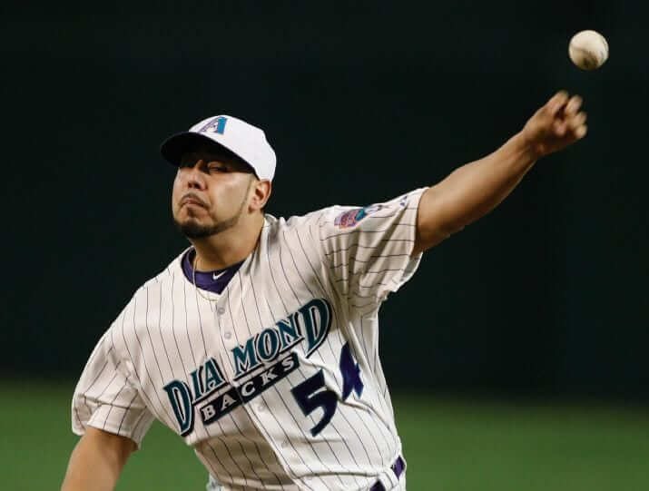
The Diamondbacks broke out their purple-and-teal 90s-era unis last night. More photos available here.
It was “alumni night“.
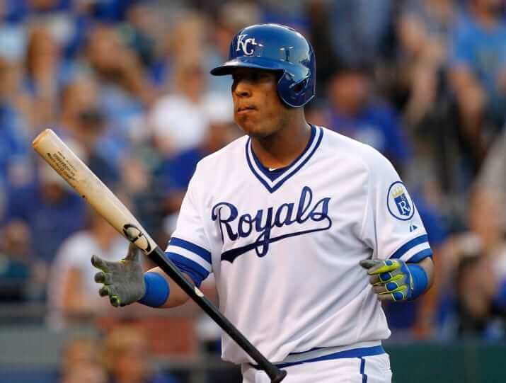
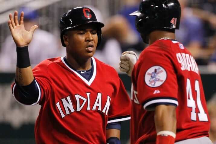
The Royals and indians both wore throwbacks last night. From the Royals’ press release:
The Kansas City Royals will host Retro Night at Kauffman Stadium on Saturday, August 30 when the club takes on the Cleveland Indians and celebrates the year 1974. First pitch is set for 6:10 p.m.
As part of the festivities, both the Royals and Indians will wear throwback uniforms from the 1974 season. Please see the attached image of Alex Gordon and Eric Hosmer of the Royals and Mike Aviles of the Indians modeling the retro jerseys.
SDSU will be wearing a memorial sticker honoring Tony Gwynn this season.
#NeverForget Tony Gwynn. #GoAztecs pic.twitter.com/Y3K3d8qvun
— SDSU Equipment Room (@SDSU_EQ) August 30, 2014
Keep an eye on this today, Hurricanes fans. Announcement should come at 4PM.
24 hours from now we will begin revealing Monday's uniform… #BeatLouisville #RenewedIDENTITY pic.twitter.com/StJNLMdLOy
— Hurricanes Football (@CanesFootball) August 30, 2014
I really enjoyed seeing the Royals and Indians throwbacks last night. However, can someone tell me why MLB is so insistent that the road team cannot wear white pants in the road? The Indians used to wear that red jersey at home and on the road with white pants. It looks much better with white pants. I understand why you would not want both teams to wear white jerseys, but for MLB to insist that the road teams not wear white pants is wrong!
It wasn’t MLB’s decision, it was the team’s.
Didn’t the Indians wear red pants with that jersey on the road? I thought they wore the white pants with that jersey at home.
I think they did that occasionally, but it probably wasn’t the standard road uniform.
They did not wear the red pants until the 1975 season. But I do agree about the white pants.
You know what? I’d go one further–they should have had the Indians wearing the red shirts with the white pants, and the Royals should have worn their road blues! Why? Because the throwbacks the Royals wore, while lovely, just aren’t much different from what they wear now. It’s basically the same design without the number on the front. (Yeah, it’s a pullover, but that’s not a difference with a big impact.) I was looking up the different uniforms, and on Heritage Sports Art’s site, the first thing it says about that uniform is “Note how similar this 1971 home uniform is to the 2001 home uniform.” The 2001 is still in use.
So I just waited 2 hours for a bunch of twitter re-post? Figured it was taking a while because there was going to be a long detailed entry today with all of yesterdays uniform match ups, but no…….what a waste of time.
Did you keep your receipt? You should ask for your money back.
DBacks should have been wearing the purple hats. White hats were worn with pinstriped vests
There was so much wrong with the 90s, but those Diamondbacks uniforms are one of the shining exceptions. Same with the early Marlins.
I don’t know what you’re talking about, the 90’s were awesome. Sure, a certain color was a bit overused, but it wasn’t until 2002 or so that things went totally downhill.
IT HASN’T BEEN “TROY STATE” IN 10 BLEEPING YEARS!!!!!!!!!!!!!!!!!!!!!!!!!!!!!!!!!!!!!!!!!!!!!!!!!!!!
Insert “I’m still calling them Troy State” t-shirt image here.
HAHAHAHAHAHA! Well played.
No mention of the White Sox wearing the beach blanket throwbacks last night. It was to honor Tony LaRussa.
From what I remember about those Diamondbacks throwbacks, I think the first year, the ‘A’ logo on the cap was much bigger.
I notice a trend where more pictures/slides/videos are in each post. Maybe it’s because I have an oldish computer, but it really slows down the page load. I prefer the earlier Uni-Watch posts with one picture and a bunch of links to the other content.
Am I the only one with this issue?
You’re not alone. It’s (computer) age discrimination, I tell ya!
I always start with UW on the iPad. It won’t show the slideshows, but the rest loads quickly. If there are no slideshows then I can read it on my older PC as well.
My nominees for a few for the 5:
Oregon and South Dakota. The Coyotes jerseys look fabulous except for the three stripes on the shoulders. Adidas – you can do better. Their helmets look awesome and the contrast to the Ducks White over Green was amazing. Liked the Ducks look, too!
Mizzou and SDSU – SDSU has one HECKUVA helmet sticker. That stylized SD reminds me of the olden days of baseball when that was the norm. Under Armor did a pretty good job with their shoulder stripes. Mizzou’s “black out” unis weren’t too bad either.
West Virginia and Alabama – WVU’s Storm trooper look won me over. Alabama is Alabama – classic and simple.
Navy and OSU
Rice and ND
UVA and UCLA – Welcome back Clarendon!
and more and more… welcome back football!!
The UCLA jerseys looked great (aside from the UCLA stripes), but the white pants are terrible. The gold pants are far superior.
link
Oregon/SD was a good choice (I had to look it up). The best I saw was Wisconsin/LSU.