Click to enlarge
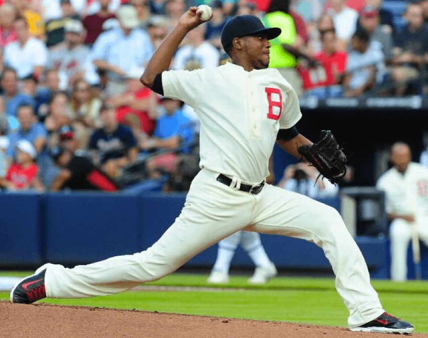
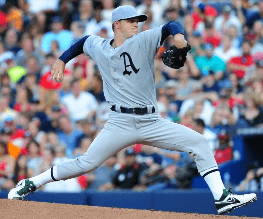
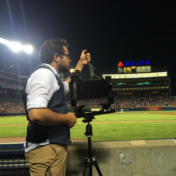
Paul here, still pinch-hitting this weekend. The Braves and A’s wore turned back the clock 100 years last night, as both teams wore 1914 throwbacks. How’d they do? First let’s take a look at the original 1914 designs that the throwbacks were based on (keeping in mind that the teams were known as the Philadelphia Athletics and Boston Braves back then):
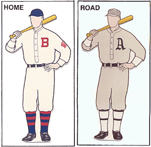
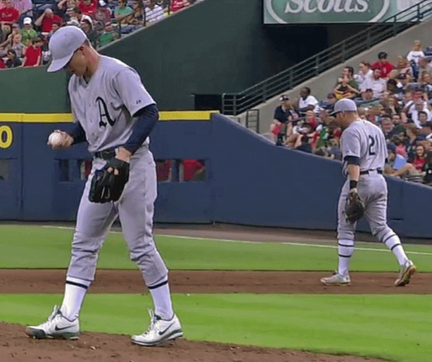
First let’s list what they got right: As you can see from the photos at the top of this page, both teams wore period-appropriate four-button henley pullover jerseys, the Braves wore plain navy caps, and the A’s went high-cuffed.
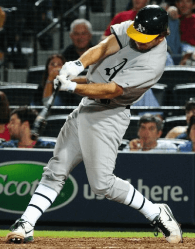
But there were also some inaccuracies and disappointments. For starters, the A’s just wore plain gray caps instead of striped pillbox caps (here’s an original game-worn specimen). Also, the Braves inexplicably went low-cuffed:
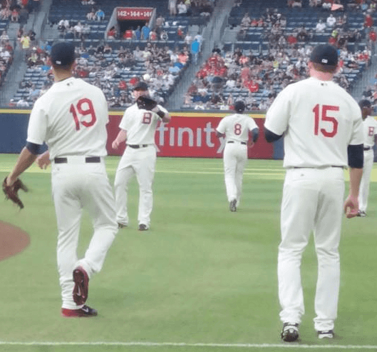
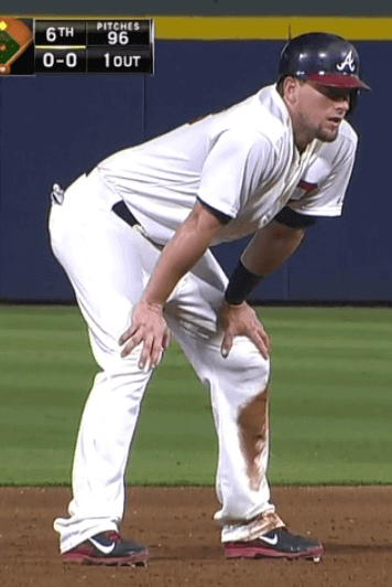
At one point I saw a Braves player pull up his pant leg to readjust something, and he wasn’t even wearing red-striped throwback socks — he just had the Braves’ standard navy socks. So what we had here was the odd spectacle of a throwback game in which the road team put more effort into getting the proper look than the home team did. Kudos to A’s equipment manager Steve Vucinich for getting his team to show their hosiery:
Unfortunately, both teams wore their regular batting helmets:
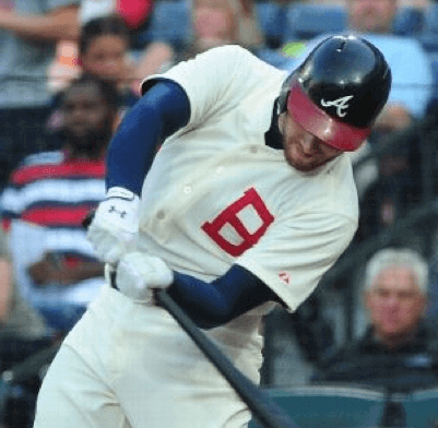
But the most intriguing historical inaccuracy involved the Braves’ left sleeve. Back in 1914, they wore an Indian head sleeve patch. Last night, though, it was nowhere to be found:
You might think this reflects some sort of cultural sensitivity (or just being gun-shy) on the Braves’ part. But remember, they did wear a period-appropriate Indian head patch when they wore 1969 throwbacks in Chicago last month. Seems like a surprising inconsistency.
On the plus side, the Braves’ team photographer got into the retro spirit with a vintage camera:
Braves first baseman Freddie Freeman isn’t a fan of the throwback scene. He offered his comments after the game, which you can read toward the end of this article.
Eagles update: As I wrote yesterday, the Eagles can’t wear their green jerseys in the preseason or in the early weeks of the regular season because Nike is having trouble the team’s shade of midnight green. I spent part of yesterday trying to learn more about this.
First I contacted an Eagles spokesman. In the interests of transparency, here are the questions I asked him via email:
1) Can you confirm [the basic storyline that the green jerseys aren’t yet available]?
2) If the Eagles can’t wear green when the season starts, will they wear black for home games, or will they wear white at home?
3) If the Eagles plan to wear black at home, will they seek (or have they already received) a waiver from the NFL rule that normally restricts teams to wearing an alternate jersey no more than twice during a given season?
4) When did the team become aware that the green jerseys wouldn’t be available?
5) Has Nike indicated when the green jerseys will be ready?
6) Can you explain what’s so difficult about midnight green? I realize it’s a “custom color,” but many NFL teams have custom colors. What’s so challenging about this particular hue?
7) The black jersey has green trim on the collar and sleeves, and the white jersey has green numbers. Are those elements appearing in the proper shade of midnight green, or is Nike having difficulty with those elements as well?
The spokesman wrote back to me a few minutes later and provided the following statement, which he said had also been issued to reporters prior to Friday night’s preseason game:
The Philadelphia Eagles have upgraded their uniforms for the 2014 season by taking advantage of the NFL Nike Elite 51 fabrication. As a result of this upgrade, the Eagles will have the Elite 51 technology for all three of their jerseys (White, Midnight Green and the alternate Black).
The Eagles will use their white and black jerseys throughout the early portion of the season, including tonight’s game at New England in which they will wear their black jerseys and white pants. The Midnight Green jerseys require extra time to produce since it is a custom color and will not debut until later in the 2014 season.
According to Nike, the Elite 51 uniform chassis offers a fully integrated uniform system rooted in body-led design. The NFL Nike Elite 51 uniform chassis is built for a body-contoured fit resulting in zero distractions to help amplify speed.
Obviously, that didn’t directly address any of my questions, so I wrote back: “Thanks. But can you address any of my other questions — i.e., when will the green jerseys be ready, and have the Eagles decided whether to wear black or white for home games in the interim, and so on?”
His response: “We typically wear white jerseys at home early in the season anyway.”
My response: “So is that officially the plan? Also, sorry to be pain, but has Nike indicated when the green jerseys will be ready? When did the team become aware that the green jerseys wouldn’t be available in time for the start of the season? What is so challenging about reproducing the Eagles’ shade of green?”
His response: Silence.
I find it tremendously frustrating when publicists behave this way. If you can’t address my specific queries, just say, “We can’t offer any further details at this time.” Dodging or ignoring my questions puts me in the position of having to ask them again and again, which casts me in the role of a pest (“Sorry to be a pain, but…”) when in fact I’m just doing my job. Sigh.
I also posed a similar set of questions to Nike. No response yet. Granted, it’s still the weekend — maybe they’ll respond on Monday. Stay tuned. (Meanwhile, reader Dan Fuller has written a good account of why colors like midnight green present production challenges — recommended.)
Click to see full photo gallery
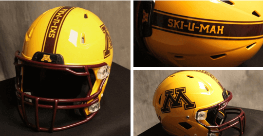
New helmets for the Gophers: Minnesota unveiled a new gold alternate helmet yesterday. It will be worn for a few games in the upcoming season. For those unfamiliar with the school’s traditional rallying cry, “Ski-U-Mah” dates back to 1884. Further info on it can be found here. (My thanks to Phil for letting me know about the helmet.)
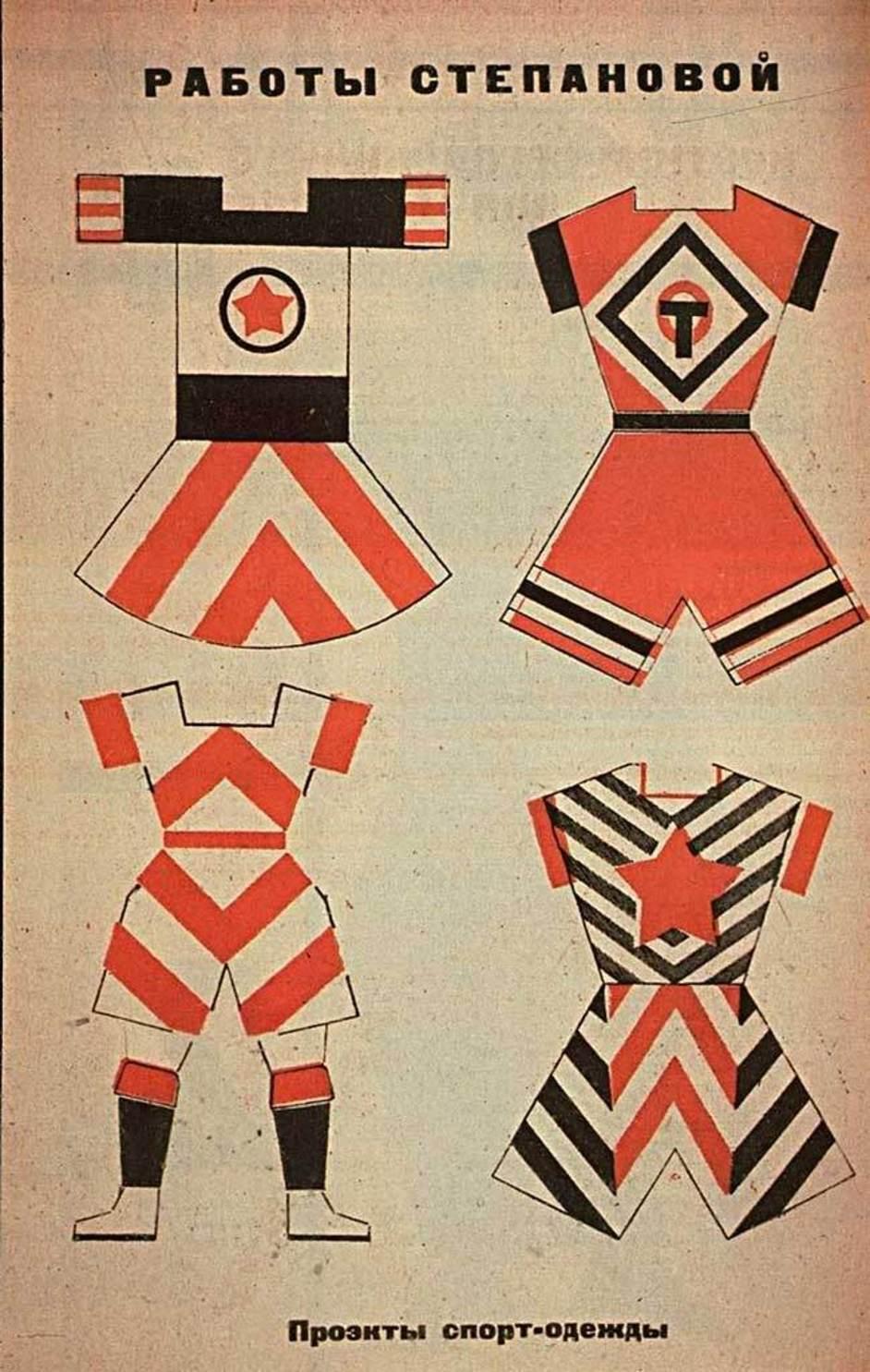
Click to enlarge
The unisex uniforms shown above were designed in 1928 by the Russian artist Varvara Stepanova. She was married to the great artist/designer Alexander Rodchenko and shared his Constructivist aesthetic. Further details on these uniforms can be found here. (Big thanks to my pal Laura Forde for bringing this one to my attention.)
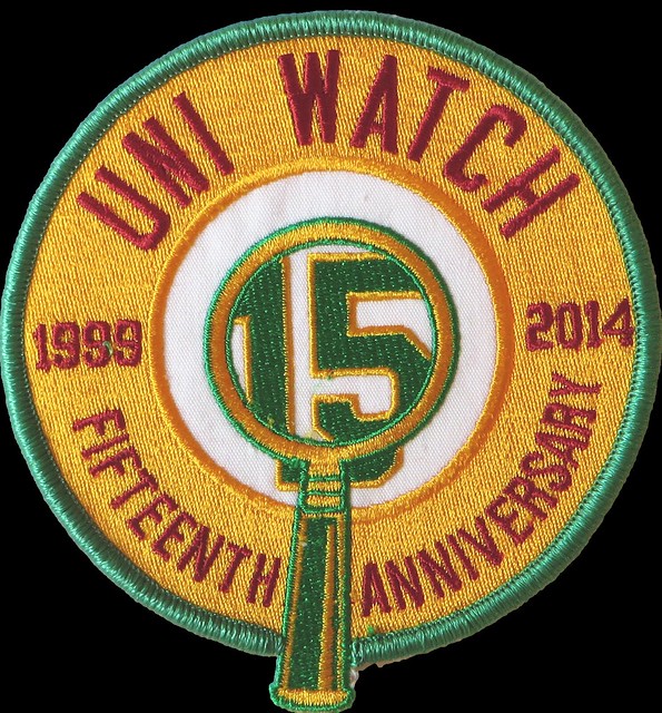
Friendly reminder: In case you missed it this past week, the Uni Watch 15th-anniversary patches are now in stock and available for ordering. If you’ve been thinking about getting one, there’s no time like the present. Thanks.

Baseball News: Cubs OF Chris Coghlan was missing his batting helmet logo last night (thanks, Phil). ”¦ Bit of a fuck-up on the Tigers’ Miguel Cabrera giveaway bobblehead (from David Murray). … Love the little illustrations on this 1941 Phillies program cover (from Bruce Menard). ”¦ Brewers 1B Mark Reynolds lost the “a” from his “Milwaukee” script last night (from Matt Harris). … Boyz II Men wore Mets jerseys while performing a postgame concert at Citi Field last night.

NFL News: Here’s a story on the evolution of the Levi’s Stadium inaugural-season logo (thanks, Brinke). … “I just learned that Southland Athletic of Terrell, Texas, closed their doors for good on Aug. 1 after 68 years in business,” writes Terry Proctor. “Their claim to fame was that they made the Dallas Cowboys’ uniforms from 1960-1981. And as far as I can tell they also made the original brown and gold uniforms for the Broncos. Sad day for the industry. They were one of the last independents to shut down. Impeccable quality and American-made.” There’s a video showing their factory in operation earlier this year here. ”¦ Sometimes something looks weird at first and then you get used to it. And then, on the other hand there’s the Bucs’ number font. ”¦ Jared VanderWeele points out that Packers RB Michael Hill was missing his TV numbers last night. That prompted Phil to point out that Hill’s teammate Kevin Dorsey had the same problem last week. ”¦ Vikings LB Gerald Hodges had some problems with his jersey last night (from Chris Hortness).

College Football News: Black jerseys appear to be a good luck charm for Oklahoma State (thanks, Phil). … Pitt is using a series of retro program cover-style illustrations for its season tickets (Phil again). ”¦ New uniforms, including a mono-red option, for Northern Illinois (Phil yet again).

Grab Bag: Here’s a slideshow of the worst uniforms in Aussie football history (from Coachie Ballgames). ”¦ Here’s something you don’t often see: a center-ice hockey logo that’s oriented to face one of the ends instead of facing the sides (from David Raglin). … Soccer news: Interesting NOB for Swansea City’s Ki Sung-Yueng (thanks, Phil).

But remember, they did wear a period-appropriate Indian head patch when they wore 1969 throwbacks in Chicago last month. Seems like a surprising inconsistency.
I thought the home team provided the uniforms for both teams for throwback games. If that’s the case, then it’s not actually inconsistent for Atlanta, unless they’ve done another throwback game at home with an Indian patch of some kind.
Also in light of the current Eagles situation, I would just like to take a moment to beg my Raiders to never switch to the new Nike template. Our colors are black and silver, and switching would turn that silver into matte gray, and that’s just not cool.
I thought the home team provided the uniforms for both teams for throwback games.
Yes, but in consultation with the road team. In other words, the Cubs wouldn’t have provided them with the Indian head patch unless the Braves were OK with it.
My favorite organization is getting lazy! Even their farm hands at Gwinnett an Rome do not play the game of baseball with any enthusiasm. It’s rare that any of them even attempt to beat out a close play at first. The entire Braves organization has issues
Your use of the word “rare” is an exaggeration, in my opinion. This season I have seen in person plenty of Atlanta, Gwinnett, Rome, and Lynchburg players go all out, hustle to first, score from first, and play the game with enthusiasm. Every organization has issues. Every personnel move made by the Braves may not have been a success, but the team is in playoff contention with 40 games to play, despite numerous season-ending injuries that have yielded several corresponding positive player additions.
I do agree that the lack of proper hosiery is a disappointment. Though I missed last night’s game, the Freeman article pointed out the jumbotron displayed an old-timey scoreboard.
Keep in mind that Ki is actually the last name, and it is always listed first in the naming convention. It’s not uncommon to have the other parts of his name shortened to initials.
The obvious advantage, of course, is that the kit man doesn’t have to cram Ki’s whole name on the back of the shirt.
Another choice would have been simply to use “Ki” on the back of the shirt.
“Braves first baseman Freddie Freeman isn’t a fan of the throwback scene. He offered his comments after the game, which you can read toward the end of this article.”
I miss the days when a) there was no closer because the team’s best reliever came in when the game was on the line and pitched 3 or 4 innings if he had to do so and b) when there was no batter-up music or pitcher entrance music.
How about this spoiled baby take one night to pay proper tribute to the guys? Good grief.
Spoiled baby is right! Also, thumbs down to the entire Braves team for going with the pajama look. What a bunch of wall flowers!
“Fans are coming here to have an experience and there is nothing on the Jumbotron, no music is playing…(W)hen the best closer in the game comes in and there are not flames (on the scoreboard)…”
~~~
(sigh). Is this what baseball has come to? Fans don’t come to the park to, ya know, actually watch a goddam game, but to have an “experience” that involves basically nothing about the game itself?
I know I’m a relic from another time, but all those things that Freddie Freeman just described are all the things, in my opinion, that ruin the ballpark experience, not enhance it.
But then, I’m not in my teens and 20s anymore.
Baseball is better in person than on TV, but it’s still kinda boring at times. Of course the fans are there for the “experience”.
I went to a Mariners throwback game last year and there was no electronic music…just the ambient sounds of thousands of people gathered to watch a game. People engaged in conversations, observing, daydreaming.
It was delightful.
I especially liked when he lamented the lack of flames accompanying Kimbrel’s entrance. “especially when the best closer in the game comes in and there are not flames (on the scoreboard), nothing like that”.
Freddie Freeman, Get. Off. My. Lawn.
Man, screw your lawn!
*kicks your pink flamingo*
So that was you who kicked over my flamingo!
Phil, we may not agree much on uniform looks/tastes but I totally agree on this. I live in a market with a healthy minor league sports scene, hockey, baseball, and formerly Arena Football. This drives me crazy about going to those games. I hate all the ads and all the extra crap going on. If you want to go to the arena/ball park watch the damn game. If you want to be entertained go to a movie, go to an amusement park, or go to the arcade (they still have those, right?).
Two overused buzzwords really get me riled up: in business, the word “solutions,” and in spectator sports, the word “experience.”
I’m there to “experience” the game. The game. You know what I do between innings? I watch the outfielders play catch. I ignore whatever other stuff the “fan experience” personnel are doing with whatever schlub they plucked out of the stands. Unless they’re firing hot dogs into the stands…then you’ve got me for a couple of seconds.
If the game itself doesn’t interest you, perhaps you shouldn’t be there.
“But Jim, that will mean less people in the seats, which will mean less money for the owners,” you might say. To which I would respond, don’t interrupt me.
You want more people in the seats, enforce the rules regarding the pace of the game and play at decent hours so the kids can get home and go to bed. And make everyday dollar hot dog day. Go ahead and charge ten bucks for a beer, but make at least one thing a bargain for the family.
I go to Rockies games for the Comfort Dental tooth/toothbrush/toothpaste link. And the scene at link. And the link. Wait, did you say there’s a game going on down on that big field in the middle?
Nothing to see there. It’s just a filler between t-shirt & hot dog tosses & the wrap a half drunkard up in tires & roll them around the field contest. Ignore the people hitting the ball around.
Oh, Stepanova! Those Constructivist unis are great. Another example of Uni Watch sophistication, and I really dig it.
“… … Love the little illustrations on this 1941 Phillies program cover (from Bruce Menard). … ”
And this is pretty awesome too.
Thanks Connie! Those old score cards can be pretty amazing…
Question regarding team publicists: how common is it for them to provide an honest answer as opposed to something evasive or that sounds like it was cut and pasted from the manufacturer’s marketing hype?
Does it ever happen that they would admit someone dropped the ball or what the real problem is? Just curious as I don’t know how any of this works.
Depends on the situation, and the publicist.
I don’t mind a publicist saying, “We have no other comment at this time.” Like, that’s a little frustrating, but I understand that he’s just doing his job.
But I *do* mind a publicist just ignoring my queries as if I hadn’t even asked them.
White Sox, please take note that actual white socks can be part of a baseball uniform in the 21st Century (even as part of a contemporary uniform, instead of a throwback)
One good thing about the Buccaneers’ uni numbers: They take the attention off that huge flag decal on their helmet, almost making the helmet look good by comparison.
Mark Reyonlds is not missing an A. That gold spot is usually covered when the jersey is buttoned. The A is on the half of the jersey that would cover it. I think he just missed a button and we are seeing it from an odd angle.
Confirmed. I was watching the game on TV and he was doing some classic Pedro Porthole action.
Seems the Braves don’t go high-cuffed gor throwback games at all lately, they were low-cuffed in Chicago at Wrigley and were low-cuffed at Turner Field earlier this year for that game they honored Hank Aaron.
I don’t know if there was some sort of change in thinking from either the manager or equipment manager because the Braves once showed proper hosiery with throwbacks (2008? at Wrigley and 2011? At Dodger Stadium).
Ki Sung-Yueng’s name appears on the back of his jersey as “KI. S. Y”, but shouldn’t it be “KI S. Y.”? His last name (Ki) is not abbreviated, but Yueng is.
As many have noted before, the details in these throwback uniforms are sometimes lacking. But I wasn’t surprised at all to see the A’s without the period-correct pillbox hats.
Had the A’s remained the Philadelphia all these years,(and the Phillies departing)there’s absolutely no doubt the history would have been upheld, and the pillbox hats would have made multiple appearances over the years. Folks in Philadelphia would have had much stronger ties to those teams and players.
Ditto for the Braves, they weren’t going to go overboard with detail with the sleeve logo when none of their fans cares or can name a single Boston Brave from that 1914 team. Geography is so important.
Your average fan anywhere isn’t going to able to name a player on any team from 100 years ago.
More important than geography is actually giving a crap. If this was a minor or collegiate league doing a throwback I could see major things (such as a totally wrong cap) possibly being excluded due to lack of money and/or resources.
MLB teams sure the hell don’t lack either. Involve sports museums and historical societies, do a little research, and care enough to follow it through.
19th century base ball leagues, like those involved in the Vintage Base Ball Association (VBBA), have a lot less of either but care a lot more.
link
link
Reading that Crossing Broad article really makes me feel old (33). Kids are yearning for the Eagles uniform of the late 90’s? (socks, pants, etc.)
I’m waving my cane at you…
I hope the Bucs are the laughing stock of the league with that number 8. If Lurie does anything stupid like that… Seriously, doesn’t the owner request a jersey sample showing each numeral instead of looking at a drawing?
Just asking: Hypothetically, if a new jersey bombs at the register, does the NFL waive the 5 year rule? How bad does it have to sell for that to happen?
Just use a kelly green-ish jersey with a block font. Every Nike innovation gets copied in China instantly (badly, but still copied) so don’t muck up a uniform like the Bucs, hoping they can’t be copied.
Another note about the Crossing Broad article: they assume China makes the retail versions, like most non-uni-watchers.
The game jerseys are made in the USA, and all retail versions are currently made in Central America. What is the origin of the fabrics for both? Is it China? The labels don’t say. I’d bet that they do come from China, to be assembled elsewhere as mentioned.
Thanks for the correction. I’ve updated the article.
5 year rule: The Jaguars only used the Reebok re-design from 2009-2012 (4 seasons), but there was a change in ownership. Being that it was the Jaguars, I’m sure sales weren’t /great/, but I’m equally sure that the NFL wouldn’t consider low sales figures [for a Jaguars jersey, at least] to be a reason to re-design, and the ownership change probably involved an item to change the uniforms. Completely guessing, but maybe it stipulated keeping the logo generally as-is with just a minor refresh.
It would be interesting to find out if there is a sales floor which causes them to scrap a design.
To me, the interesting aspect of the Athletics-Braves throwback is the similarity of both teams in terms of their franchise location history, i.e., that both teams have been located in three cities, with the second city for each having had relatively short tenures:
Boston Braves (1876-1952) – Philadelphia Athletics (1901-54)
Milwaukee Braves (1953-65) – Kansas City Athletics (1955-67)
Atlanta Braves (1965-Present) – Oakland Athletics (1968-Present)
I love that gold helmet for the Gophers but the stripes need to be widened and that slogan needs to be removed. Looks really bad. But at least it’s not chrome or matte that I can see, doesn’t have a gray facemask, large/oversized logos, or numbers on the sides so I still consider it a win.
The Eagles? Other than the number font I’m one of the very few that likes the current color scheme vs the Kelley green. I’d be OK with going back to the Cunningham era look but still prefer this.
But why can’t they just roll out the old template of the green from last season & re-nameplate the ones that need to be updated for this season until the new template is ready? I’m sure there was a leftover supply from last season somewhere. Of course they usually do wear white at home early in the year so there would probably only be an issue if they go on the road and are going against a team that wears their whites.
Why do people/the Eagles keep saying that the Eagles “usually wear white early in the season”?
In 2013 and 2012, they wore white for their first home game of the regular season, and exactly zero time other than those two times.
In 2011, they didn’t wear white at home at all.
The Eagles have worn white at home the last two season openers, but otherwise they wear green at home.
Lee
(author of the Crossing Broad article and frequent Eagles watcher…)
I think it’s because if they were white at home even once in September, it averages out to wearing white three times in the opening month (2 away games, usually in white, 2 home games, with 1 or both in white) seems (weasel word, I know) like “THE EAGLES EXCLUSIVELY WEAR WHITE IN SEPTEMBER!” I’m not saying this is good logic, but it’s the human propensity to find patterns in things. (They did it last year, so they must do it every year, despite evidence to the contrary!)
Besides, speaking of weasel words, I said they “sometimes” wear white at home in the beginning of the season; it was the PR rep that said “typically.” I guess the PR guy’s wording is slicker than mine, though…
“According to Nike, the Elite 51 uniform chassis offers a fully integrated uniform system rooted in body-led design. The NFL Nike Elite 51 uniform chassis is built for a body-contoured fit resulting in zero distractions to help amplify speed.”
I love how this pile of product-speak B.S. gets thrown in the Eagles’ press statement as if it somehow justifies the delay in having the jerseys ready on time. “Oh, this jersey has body-contoured fit resulting in zero distractions to help amplify speed? In that case, Nike, take all the time you need!”
(HTML fail. Corrected.)
“According to Nike, the Elite 51 uniform chassis offers a fully integrated uniform system rooted in body-led design. The NFL Nike Elite 51 uniform chassis is built for a body-contoured fit resulting in zero distractions to help amplify speed.”
I love how this pile of product-speak B.S. gets thrown in the Eagles’ press statement as if it somehow justifies the delay in having the jerseys ready on time. “Oh, this jersey has body-contoured fit resulting in zero distractions to help amplify speed? In that case, Nike, take all the time you need!”
Now now. Let’s be fair. Maybe the Iggles dropped this bomb on the Swooshies last week or something so they have to really rush to get everything done in time for that big Pinktober showdown at home against whatever team it is they play that month. Wait, the Swooshers knew about this a long time ago & still can’t get it done? Too busy focusing on Tampa Bay, Cleveland, and the Oregon Ducks?
I was at the Braves game last night, and we did get an experience. Four security guards sacked the world’s laziest streaker in short center field about halfway through the game…plus, I’d never heard “Welcome to the Jungle” played on an organ until Kimbrel came in.
What was the motivation for throwing back to 1914 in the first place? The original uniforms were not worth remembering and yesterday’s versions have very little appeal. How does it “grow the game”?
100th anniversary of the 1914 Miracle Braves.
The Miracle Braves beat the Athletics in the World Series.
I’m watching Mexico/Japan little league game. Bases loaded and pitched ball bounced and got stuck in catcher’s chest protector. Ball was clearly visible to everyone except to the catcher so the pitcher went over and grabbed it. Umps ruled it a dead ball and awarded all runners an extra base. So Japan has catcher switch to chest protector with less flaps. Something is seriously wrong where a rule causes a young kid to wear less protection behind the plate.
Honestly the number font is the least bugging thing about the Bucs uniforms for me. I’m more distracted and annoyed by the “Bucs” on the sleeve, the overblown new & much worse logo on the helmet & the stupid chrome facemask to even notice how bad the numbers look. And they do look terrible so that’s saying something for that helmet. It’s pushing Jaguars levels of bad.
One of the Turner Field experiences I enjoy is listening to the organist, who usually comes up with witty songs to introduce the opposing players. His playlist is wide and varied, with older tunes mixed in with current songs. During the game he monitors his Twitter feed, taking requests and responding to comments from fans. He has to do something while all that piped in walk-up music is played.
It’s my understanding that in between songs, a baseball game is being played.
Since the Eagles are gonna do black at home for a little while, do you think they’ll go black over green like they did years ago?
I hope the Eagles just go white at home while this midnight green nonsense is resolved. I HATE the black unis with a passion – and it has nothing to do with the site-wide hatred. They’re possibly some of the worst unis in all of sports, and I cringe every time they wear them. I went to a game when they wore black over green pants…I wanted my money back. It also didn’t help that they lost in OT.
One minor detail missed in the Fresno State write up was that the helmet stripe now tapers in the opposite direction. Instead of coming to a point in the front like last year, it tapers to a point in the back, almost pointing to the “V”
The fact the Braves didn’t wear hosiery in their throwback game against the A’s was an epic fail. The pillbox hats should have been part of the uniform as well. The Braves get low points for this half hearted effort. Boo.