Never a dull moment in the NBA, as another barrage of news bulletins began circulating yesterday. Some of these just repeat or amplify things that we already knew, but others are genuine news. Por ejemplo:
1. The Blazers’ “Rip City” jersey will now have sleeves:
New Trailblazers "Pride" uniform pic.twitter.com/b2yM5rkuAp
— darren rovell (@darrenrovell) July 21, 2014
Further info here. Personally, I can’t get worked up about this one way or the other. If you had asked me whether the “Rip City” jersey already had sleeves, I would’ve had to look it up. Honestly, who can keep track of which NBA alternate jerseys are sleeved and which ones are tank tops these days? It’s all a blur.
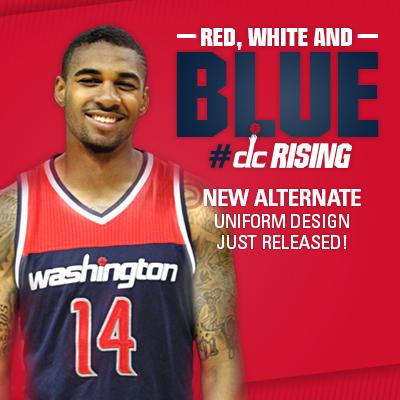
2. The Wizards now have a new set of blue alternate shorts:
New Wizards alternate shorts with "monument" logo pic.twitter.com/BNcmfLqPMV
— darren rovell (@darrenrovell) July 21, 2014
So does this mean the Wiz are getting a blue alternate uniform? ’Twould appear so. Remember, they were on the list of teams with a new alternate uni that we haven’t seen yet.
Update, 11:05am: The Wizards have now released the alternate jersey to go along with the shorts (further info here):
3. We pretty much already knew about this, but the Celtics have made it official: They have a new alternate logo:
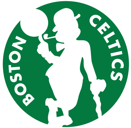
The team’s official press release on the logo is here, and there are some additional images here. Personally, I think it’s fine but unnecessary.
4. Last week we saw a small mock-up showing that the Lakers’ BFBS alts would have sleeves this fall. Now we have a photo of the actual jersey:
Lakers new "Hollywood Nights" sleeved jersey, neck as @uniwatch noted has # of titles (16x) pic.twitter.com/RnAlBHtg8M
— darren rovell (@darrenrovell) July 21, 2014
5. I had already exclusively reported that this year’s Christmas Day uniforms would have drop-down NOBs featuring the players’ first names instead of their surnames. Now that’s been confirmed:
Back of Miami Heat Christmas Day uniform. Back will have first name only pic.twitter.com/Q2Grordae7
— darren rovell (@darrenrovell) July 21, 2014
So I guess that tells us that Miami is one of the teams that will be playing on Dec. 25 (not exactly a surprise).
6. This barely even qualifies as news, but the Knicks will wear their orange alternates again in 2014-15, even though the orange alts were winless last season.
7. Finally, there had been some chatter over the weekend about the Thunder possibly wearing the gold championship tab to represent the Sonics’ title, but now they’ve decided not to do that.
There are still several more alternate and “pride” uniforms still to be revealed — or leaked, as the case might be. I haven’t seen any of them, but the NBA and Adidas haven’t been very good about keeping their goods under wraps, so I’m assuming we’ll see them soon enough.
Collector’s Corner
By Brinke Guthrie
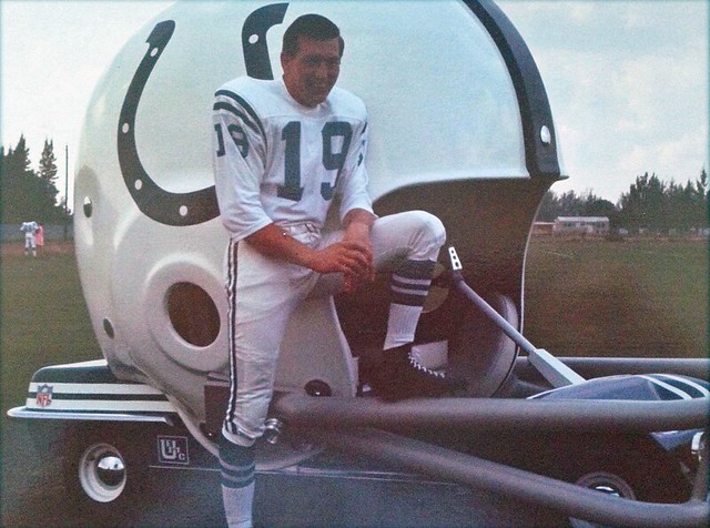
John ”¦ Constantine ”¦ Unitas. Johnny U. The Golden Arm. Acclaimed as perhaps the greatest quarterback ever to play in the National Football League. (Say that out loud in a Howard Cosell voice!) And here’s Johnny U. posing with a Colts helmet buggy. His backup Earl Morrall took his turn, too. Also: Look at the seller’s name!
Okay, now you can turn off your Cossell voice and enjoy the rest of this week’s eBay picks:
• My friends, take a look at this 1967 Philadelphia Eagles Media Guide. That is the look they should be wearing — not that midnight green, or whatever it’s called.
• Can’t you just imagine John Facenda intoning as the snow falls, “Tarkenton on the sidelines, alone with his thoughts, preparing to return to the field of battle as the Metropolitan Stadium crowd roared for Packer blood. The clock said 2:00 remaining — it was to become his mortal enemy.”
• Technigraph alert! Boy would I love to have this 49ers plaque. That same seller has some great stuff, incidentally.
• Check out the artwork on this 1970 Fleer baseball card: Birds stall the Big Red Machine. I still distinctly recall watching the Series in our grade school classroom at Stivers Elementary in Louisville — they wheeled in TVs so we could watch Brooks beat the Reds over and over and over. [That is probably the greatest Fleer card I’ve ever seen. Awesome! ”” PL]
• Did you have a Sunbeam NFL Trading Card set from 1976? I’ve seen that artwork on other items, notably the Bengals artwork on my bedroom switchplate, but I’ve not seen this album before. You get 22 out of a possible 29 cards in this auction.
• This 1970s Red Sox plush doll could use some TLC but would be great for a Sawx fan’s collection.
• Perfect for Brownie fans: this 1965 Blanton Collier cup celebrating the teams NFL title, with artwork by the Master, Nick Volpe. (Dave Boss is the other Master.)
• I know we’ve shown this 1960s NFL poster before. But it’s so cool, I hope someone here grabs it. The auction text says “1970s or 1980s,” but they must not Get Itâ„¢: It’s a 1960s poster due to the three stripes on the Dallas QB’s sleeve (must be Meredith) and the spear on the Washington helmet.

Facebook update: Now that you’ve read Brinke Guthrie’s latest “Collector’s Corner” column (which he contributes to the site on a weekly basis), here’s his latest endeavor: Brinke is now the editor of the Uni Watch Facebook page.
As I mentiond a week or two ago, the site’s Facebook page had pretty much fallen into disuse. Brinke is going to change that. Here’s what he’ll be doing with it:
• Each morning Brinke will add a summary of (and link to) that day’s entry, to make it easier for you folks to share Uni Watch content with your friends.
• Brinke will also be periodically posting photos or Ticker-ish items for discussion. Most of these items will show up in the next day’s Ticker. (I do the same thing with the Uni Watch Twitter feed, posting breaking items or just items of interest that show up in the Ticker the following day.)
• We have no plans to post dedicated Facebook content that won’t also be appearing here on the site, at least for now.
If you haven’t already “Liked” the Uni Watch Facebook page, please consider doing so. Brinke and I will do our best to make it worth your while.
Design contest reminder: In case you missed it last week, I’m currently accepting entries for an ESPN contest to redesign the Cavaliers. The entry deadline is this Friday, July 25. Full details here.
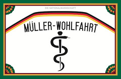
Membership update: Last week I Ticker-linked to a jersey for Germany’s World Cup team physician, and now Alex Field has adopted that design for his membership card (shown at right).
The next batch of membership cards will be going to the printer in a day or two, but we have two open slots on the current sheet. So if you sign up today, you’ll get your card very quickly, with little waiting. Just sayin’.
As always, you can sign up for your own custom-designed card here, you can see how we make the cards here, and you can see all the cards we’ve designed so far here.
Tick-Tock: Today’s Ticker was compiled and written by Garrett McGrath.

Baseball News: An extremely dedicated — and scary-looking — Washington Nationals fan has created a unique beard based on the team’s logo (from Brady Phelps). … Reader question: “What do you think is going on here with Eric Hosmer’s pants?” asks Craig Mellish. “Do you think these are very deep pockets for holding a lot of sunflower seeds or inside pockets for inserting sliding pads. None of the other Royals seemed to have them during the game.” … Rare color match-up for last night’s Mets/Mariners game royal blue versus teal.

NFL News: The Detroit Lions will be honoring William Clay Ford with a memorial patch this season (thanks, Phil). … The Jacksonville Jaguars will have 20th-anniversary patches on their 2014 jerseys (thanks, Phil). … Eagles coach Chip Kelly believes that uniforms should be worn uniformly to reflect a team-as-one mentality. Search on the word “uniform” for more (from Rahul Vyas).

College Football News: The Arizona Wildcats may be returning to red and blue stripes down the middle of their helmets. They had them most recently as 2012 (thanks, Phil). … Last week, we posted a picture of college football’s new championship trophy. Here are some internet memes of things that inspired the design. … “Uni Watch covered this last year following the Georgia Tech versus Virginia Tech game,” says Britton Thomas. “You posed the question ‘Can’t Russell Athletic Do Anything Right?’ Almost a year later, the answer to that question is still a resounding no. Their uniform outfitter still cannot count to three. … Texas Tech is planning on wearing Zach Thomas-era throwback jerseys against Arkansas on September 13th. … The Big Ten Network had a football uniform poll and Ohio State came in at number one (thanks, Phil).

Hockey News: This is just plain wrong: The Hockey News has ranked the New York Islanders logo as the 25th-best in the league. Are they out of their mind? How are they worse than the Jets, Predators, Wild, or Ducks? [Note: Garrett is an Islanders fan. ”” PL]

NBA News: We came, we saw, we Concord: Matt “Red Mamba” Bonner of the champion San Antonio Spurs took the Larry O’Brien trophy on tour of his hometown of Concord, New Hampshire.

College Hoops News: The Marquette University book store is selling a great and wide selection of throwback basketball uniforms (thanks, Phil).

Grab Bag: Here is a great (and untrademarked) late 1970s Auburn Tiger logo (thanks, Phil). … NASCAR has rounded up the best paint schemes on cars (thanks, Paul). … Here’s a quiz on the fonts of some of the world’s most distinctive logos (thanks, Phil).

What Paul did last night: A longtime friend of mine is a writer for The Daily Show. I don’t know why I never hit him up for tickets to the show’s taping, but I never did — until a few weeks ago, when the New Girl said, “Why don’t we go see the show?” So I asked my friend for some tickets, and there we were in the audience for the taping of last night’s show.
Like many TV shows with live studio audiences, this one has a fluffer — a comedian who’s supposed to warm up the crowd. It’s hard to describe how awful he was. Loud, boorish, insulting, self-loathing — he embodied everything I generally dislike about stand-up comedy. The whole shtick was embarrassing.
The show was good, although I was disappointed that there were no segments featuring Jessica Williams or Samantha Bee, both of whom I really like. The guest was Sue Turton, an Al Jazeera America reporter who talked about how several of her colleagues were arrested, convicted of trumped-up charges, and imprisoned in Egypt — interesting but not all that entertaining. (By contrast, tonight’s guest is Richard Linklater.) Anyway, the opening sequence was very funny — here, see if you can pick out my laughter from all the rest:
You can see the rest of the show here.

I was scrolling through the ugly NBA jersey pics/logo and then like a pot of gold at the end of the rainbow, see a fantastic picture of Johnny U in the classic Colts uniform.
+1
The most striking thing to me about the Unitas & Morrall pictures is that both of them are sporting 3/4 length jersey sleeves. Which got me to thinking, wasn’t that an outdated look even then? Well, if you were a Baltimore Colt at least, apparently not:
link
Though the look was by no means ubiquitous:
link
But wearing 3/4 length sleeves if you were on another NFL team? Not quite so common:
link
link
Apart from an inconclusive message board discussion, I couldn’t find any other information about the transition from long-to-short-sleeve-jersey in the NFL, and even that discussion theorizes that “by 1964 short sleeves were prominent among skill players”:
link
Yet here’s both Johnny U. & Morrall bucking that supposed trend some 6-7 years later. Though in fairness it warrants mention that in NFL history you’ll never find a pair of more hidebound traditionalists than that flat-top/high-top duo…
Even more rare than long sleeved jerseys worn in the NFL this late, the Colts were doubly unique in wearing long sleeved MESH jersey – which were incredibly rare in the NFL. The Colts (some of them – Unitas included) wore long sleeved mesh jerseys in Super Bowl V vs. the Cowboys. I also saw Unitas wearing long sleeves into the mid-1970s.
The last NFL team to wear long sleeves is also the last team to regularly wear durene (non-mesh) jerseys – the Steelers. Some wore long sleeves while others did not.
Long sleeve mesh jerseys were very rare. I was able to buy a long sleeve mesh mid-1970s University of Pittsburg jersey on Ebay …. I have seen no others …
“…even though the orange alts were winless last season.”
~~~
I chuckled at this. The Knicks were winless while wearing the orange alts — although one could make the argument that the unis themselves were responsible.
fyi- Typo on Arizona Wildcats
Thanks. Fixed.
Sorry Brinke, I had to read all your entries in Cosell’s voice. Even the Facenda reference couldn’t derail it and get Howard out of my head. It’s like a earworm of vintage sports narration!
Can someone explain to me why the NBA names it’s championship trophy after Larry O’Brien? I know, NBA Commissioner, friend of JFK, target of Watergate burglars……but why is his name on the trophy? Thanks for the feedback!
From Wikipedia: He was appointed in 1975 by the National Basketball Association to serve nationally as its commissioner, where he directed the successful ABA-NBA merger that brought the American Basketball Association into the NBA, negotiated television-broadcast agreements with CBS Television, and saw game attendance increase significantly. He continued this service through 1984. In 1984, the NBA Championship Trophy was renamed the Larry O’Brien NBA Championship Trophy, in honor of his service to the sport.
So, basically, he was really important to NBA history, since without that merger, who knows what sort of league we’d have today.
And I hope they don’t change the name. I’m sure there will be those who say it should be named after David Stern, but they can give him something else.
Like a swift kick in the ass.
My mom always told me it was “an alternate logo” if they wore it every other day.
There must be some alternative to that word.
;)
It’s their “occasional” uniform. You know, they wear it every other occassion!
Seems like the biggest story here is that Mario Chalmers is changing his name.
How do you pronounce that?
Hate to tell ya, Mike, but I probably woulda ranked the Isles logo even lower than 25th. Very much like the Oilers logo, the Islanders logo is very dated and not particularly strong to begin with, but represents too much success (indeed, the teams’ ONLY success) to ever change.
Islander fan here, I’d probably rank it around 20ish. There are some worse word-only logos, Ducks, Capitals, Rangers etc which I think would be lower. Curious to see where the Rangers rank, because that means that any team below them just has to put their team name angled in block letters and drop shadow on their jersey and instant logo upgrade.
I think they’d probably consider the Rangers’ shield as being the logo, no? Rangers are an odd case, what’s on the jersey isn’t technically the logo (though you can’t deny it looks swell).
The Ducks have finally finished the final 10% of the the identity overhaul they started in 2006 and just put the damn duck foot-shaped D on their jerseys. That horrible wordmark-as-logo look was easily worst in the NHL.
It seems to be the team logo from the start, but wasn’t it only on the jerseys for one season? In that case I guess it is the logo and valid for those rankings, but as a logo it is somewhat uninspiring.
The Islanders’ insignia is a bit cluttered, but it’s in the top half of NHL symbols. They would have done better to hire the artist of their expansion twins, the Atlanta Flames. But of the post-1970 teams, they are closer to the cream than the dregs.
The thing about the Isles’ logo is that the organization is incapable of successfully rolling out a new look. The fishsticks, the zigzag orange/blue alts of the 00s, the primary RBK Edge redesign, the weird black alts, the stadium series uniforms were all failures. They need to just stick with their classic look for everyone’s benefit.
White, Blue and Orange jerseys, all the same template would have been a great set of jerseys. I liked the orange but the zig zag pattern was a little off. If they had their classic template on white, blue and orange jerseys, it would rank, as a set right up there with blackhawks white, red and black set.
Funny, what gets deemed “dated” and what gets deemed “classic.” Someone elsewhere asked about the Bruins logo – it sure will be in the top 15 if not top 10, but what about it is so a great? It’s a B and spokes. It’s cool, but besides the fact the Bruins have worn it since the 1950s people don’t often have many other reasons for why they like it. I think the Islanders logo is awesome (and I’m a Rangers fan). It’s bold, recognizable, not cluttered with tiny, unnecessary, details that are invisible beyond two feet away, and immediately identifiable. What else should a logo be?
No secret here, Original Six logos are judged by a different standard. Part of the equation amounts to what a seamstress could cobble together with thread and felt; another part involves the loyalties/vocation of the team’s founder. They certainly didn’t run their ideas past a committee. One person’s “bland” is another’s “dignified”, one’s “cluttered” is another’s “ingenious”.
I disagree wholeheartedly. I think the Bruins logo is brilliant because it’s NOT the logo they wore in the 50’s— it’s been updated. It’s the same basic design (a B with spokes) but they’ve kept it modern. Same applies to the rest of the Original 6 (although I’m not sure Toronto went the right direction)— same design since forever, just cleaning it up and modernizing it as need be. More recent examples include San Jose, Vancouver (stick-in-rink), and Pittsburgh (if you forget robopigeon happened). Now, I think NYI— and Edmonton, for that matter— have absolutely horrible, dated logos, because neither team has dared touch it. A lot of people revere them as “classic,” but I see designs that have potential but are stuck in the 70’s. It doesn’t help when their attempts to modernize backfired completely (fisherman and navy/copper) making everyone love the “classic” look more.
TL;DR: NYI need to update their logo, but not necessarily completely redesign it.
I actually kinda think the Leafs have not just tweaked but have really altered their logo every couple decades or so, moreso than the B’s. There’s at least three drastically different Leaf logos – the feathered, many-pointed, veined Leaf from early on, which has been harkened back to recently; The sharp-angled block leaf of the 1960s, and the rounded-angled block, less-pointed, Leaf of the 1970s-80s. I think the many-pointed, veined Leaf is most people’s favorites, and I’d probably agree, but every so often I think the 1960s version is super awesome. There are variations on some of those themes too.
Agreed about the Bruins B with the spokes. I was looking at it before and it’s just not that great.
Kind of like the Yankee’s uniforms. In a vacuum it’s a terrible set. If someone introduced that today it would probably be one of the most disliked uniforms in MLB. But there’s history there so that begins to skew opinions from a purely aesthetic standpoint.
I’m kind of used to the Islander logo but other than tradition there probably isn’t a lot going for it. You’d think by now they could at least have come up with something different and good looking at least for a 3rd jersey.
If viewed in a vacuum the middle of the Islander logo is a poor entry in a Rorschach test – that chunk of land is not in an eye appealing shape. It has mediocre lettering below it and a one trick pony in the NY hockey stick with four stripes on it on top of it.
“… An extremely dedicated – and scary-looking – Washington Nationals fan has created a unique beard based on the team’s logo (from Brady Phelps). …”
Whoa!
Don’t worry, Paul, I read your memo the other day on the Redskins’ beat, and you may be anxious not to follow this path this morning; but USA Today ran a splashy feature on the PAC Bell Cultural Sensitivity policy, and I wondered if you wanted to weigh in.
The two best points touched upon were: The potential for stadium security to flag seatholders wearing apparel of the Cleveland Indians or the Atlanta Braves. If Chief Wahoo and the Braves’ tomahawk are sanctioned trademarks of MLB, there might be a conflict of interest, no? Secondly: April Negrette, one of the American Indians arrested at PAC Bell, endorsed the right to free speech for fans wearing Indian apparel at the game, provided her rights to confront such fans remain unabridged. A touch of grace.
Whoops, I mean “AT+T Park”. You know, I said that to myself, and then said, “No, I’m thinking of the football Giants”.
Are the Buffalo Bills switching back to the Flywire collar this year?
On the team’s webstore almost every jersey features the flywire or some variant, including the new ones with the RCW patch.
link
Another reason to think that they are switching back is that they have Stevie Johnson’s non-flywire collar jersey listed as a 2013 jersey and the flywire listed as just a Stevie Johnson Jersey…
link
link
I really hope this isn’t true. I think the yolked look of the flywire is just atrocious.
This may be an issue for the Denver Broncos, too.
link
Compare recent signee DeMarcus Ware’s jersey to those of the other Broncos players who were with the team last year. Ware’s jersey is a reversion to the faux neck roll style the Broncos wore in 2012, while the rest of the jerseys all show the solid, contrasting color collars worn for the 2013 season.
That said, the Broncos had a large surplus of the jerseys with the faux neck roll collars and were still selling them in the team store in Sports Authority Field as recently as the end of this past season. Maybe they’re just slapping Ware’s name and number on old jerseys to use up their extra stock.
I lost interest in the NBA years ago, and would only occasionally watch to check out the uniforms. But now with the sleeves and the gimmicks and the templates and the impending ads, in additon to the unattractive style of play, I think I’m ready to write it off completely.
You don’t watch the Spurs, do you?
link
Don’t go by what you saw years ago. Teams are going to start copying the Spurs, so look for the league to improve as a whole.
And the uniforms are nowhere near as bad as they were in the 90s. Come back, BigMatt.
Wait, what? The 90’s NBA uniforms were awesome.
(Sighs heavily, walks away shaking his head)
Although, it could be said that the Suns never looked better than they did in the 90s. And that’s it.
Re: Hosmer’s pants. I recently noticed other players with the same thing (maybe while looking at pics from the All Star game?). Looks like reinforcement, like they have in the knees. Built in sliding shorts, if you will.
Here’s a picture of Andrew McCutchen wearing those pants:
link
And another:
link
Mike Trout:
link
It’s Howard Cosell, with one “s.”
Fixed.
and Mike Wazowski with one “i”!
I know War Eagle isnt the Auburn mascot but I’ve always been suprised that Auburn doesnt have a current eagle logo. They have that old school logo that looks like Anhiser Busch but nothing current
They ought to have a tiger striped Griffon for a logo. It’s the best of both worlds.
My friends, take a look at this 1967 Philadelphia Eagles Media Guide. That is the look they should be wearing – not that midnight green, or whatever it’s called.
That, people, is how you make a UCLA stripe.
The Wizards now have a new set of blue alternate shorts…So does this mean the Wiz are getting a blue alternate uniform?
Not necessarily. Remember, this is the team that gave us this:
link
Ah, but yes they will.
Longtime Wizards fan (yes, we exist). I think the new alt is okay, but would have been a slam dunk without the red chest stripe. They removed the 2nd (white) one. Why not go all the way and just have a super-clean all navy look?
Either way, I’m good with this. They coulda screwed us with a red top/blue shorts combo. This is okay.
That’s an improvement. They should get rid of the second stripe on all the jerseys, or get a more readable number font if you’re going to keep it.
Haven’t said this since the Bullets era, but I’d wear that alt.
I like it — including the single red stripe — and agree w JV about the number font.
So speaking of the New York Islanders’ logo (as we are), am I right to assume that link is meant to represent link and excludes Brooklyn and Queens? If so, what happens to the logo when the team moves to Brooklyn? Will it be tweaked to include the rest of the island, including the New York City boroughs?
Am guessing it will be tweaked to include Brooklyn and Queens, the two boroughs that are technically on the island. Although wouldn’t it be a great little quirk if they don’t change it, and the team actually ends up playing outside of the geographic element on their uniform? Huge trivia question right there.
The team has stated that there will be no change, which I think is stupid, but whatever.
It’s link, maybe they’ll sneak it by without even bothering to announce it.
Great news about the ‘zona helmets. It’s a distinctive look and it complements one of the better CFB logos.
Do you believe this fuckin’ guy? (see comment string).
Yes, I’ve been trolled, and I should know better, but this irks me to no end.
Is there a reason why front and back aren’t even?
That is some good trolling though. “High side front year,” well done.
I was looking for the link to the Hockey News logos, and came across the 2008 article. In 2008 the Islanders were #11, Wild #7, Nashville #14, and the Ducks at #30.
Looks like the biggest fall so far is the Canucks, from #17 in 2008 to #27 in 2014.
link
Re: Lions WCF patch
Why did the Lions use a font where the width of the W is greater than the width of the C and F? The C is off-center compared to the vertical stripes, which throws off the symmetry of the patch.
I don’t like drop-down NOBs in the WNBA, where they’re an all-the-time thing. Perhaps I’ll like them once in a while in the NBA.
Maybe my eyes are a bit slow today: I did not see the Washington Monument in the Wizards’ alt logo until I read the caption.
Wait! Since when is the Wild logo not genius?! Did I miss something? Not defending its use or the uniforms or anything else… But we collectively slurp the ball n glove and Whalers all the time. Wild is similarly executed; probably better given how abstract the nickname is.
If the poll is logo, not brand? How would Wild not be top 10?
I have always loved the Wild’s logo — one of my favorites. But a lot of folks, for reasons I’ve never understood, really seem to dislike it.
Like some other folks said, it’s too busy. Also, as other discussion implied, the wild beast is ambiguous: is it a bear, a cat, a bearcat, a mutant gopher?
Yes, that’s exactly why I don’t like it.
I’m not much of a hockey fan, but I think the Wild’s logos and unis are easily the class of the NHL.
For a good two or three years I just thought it was a forest-y scene in a weird shape and it just seemed weird. Then I realized it was in the shape of a bears head, the (north) star is the eye, etc, and thought to myself now that’s a great logo. I even bought a Wild baseball hat I liked it so much.
Just like the Atlanta Hawks…
Also, the river/stream doubles as the bear’s mouth.
It’s definitely a logo I’ve grown to appreciate more over the years.
Having grown up as a North Stars fan (and still, to this day po’ed at Norm Greed), even though I don’t have nearly the same attachment to the Wild, their logo is one of the best ever created in my opinion. It’s absolutely brilliant.
Just having written that, it brought to my mind, I wonder how the North Stars logo would have been updated if they had continued to remain in Minnesota. I know they did that Stars logo shortly before they left (which always gave us the impression that he was planning on moving it as soon as he bought it), but I imagine it would have been updated further, maybe going back to a more moden version of the N-Star logo.
Couldn’t see the forest for the trees?
I never noticed the bear head ’til some logo review poll site/article pointed it out. And this was after the team had been around for 10 years or so. I can see the forest and the bear now too, but I think the dual-image thing works too well, that it works against itself, for a sports logo. Just a little too much going on there.
That logo makes me think of something one might see on the Games ‘n’ Puzzles page in a children’s magazine.
You know, “Find all the hidden elements in this fun picture, kids!” Interesting for a second, then you turn the page, and it is forgotten about. Unfortunately, the page can’t be turned here.
Cliver For Clever’s Sake.
Unfortunately, the Wild began on the wrong foot with the “scrawl” wordmark. They raised their game with the unusual color scheme, the number font with the burrs, and an ace white jersey. But like the New Jersey Devils’ logo, the Wild emblem is too clever by half. In the name of good taste, one should probably leave something off.
And yet, having said all that, I think it’s on a par with the Islanders rondel.
Agreed. It’s clever, but it’s just too much. Sterling mentioned the ball and glove. It is clean and simple. The Wild is “hey, this can be a mouth, and this an ear, and an eye…” And the color scheme was at least ten years out of date the moment it was released.
The Wild logo is as awful as their name (which is the worst nickname in all of the major sports — and it’s not even close on that one).
And it’s a cat, not a bear.
Lee
Nope, it’s a bear; I am the Anna Wintour of hockey insignias.
2014 is a view-it-as-a-bear year.
“I am the Anna Wintour of hockey insignias.”
~~~
Tremendously well played, sir!
Re the NASCAR paint schemes. I love that they’ve been showing us the weekly paint schemes ahead of time and that they’ve done a Best of 2014 entry, but it would really, really help if they could include an overhead view instead of just the side view.
I love that PL included this!
That Best Of list is sort of heavy on the patriotic(couldn’t the compiler settle on just one?), and I’m surprised that none of the #3’s schemes made the list since it’s been off the track in Cup for so long.
I grade them on the Driver Suit Blog all the time, and I can agree with most of them…except the Danica Patrick one. I described it as “It looks like two people designed this car, and they didn’t talk to each other while designing it.”
Totally agreed. That Danica paint job is pretty horrific. Her normal bright green scheme is solid though. It’s distinctive/stands out without being boring a la Menard’s standard bright yellow.
So I guess that tells us that Miami is one of the teams that will be playing on Dec. 25 (not exactly a surprise).
I wouldn’t take it to the bank:
Last year there were 10 teams playing on Christmas Day:
Bulls
Nets
Knicks
Thunder
Heat
Lakers
Rockets
Spurs
Clippers
Warriors
We “know” that Cleveland will join that list this year (can’t have a league showcase w/out the league’s best player) and I wouldn’t be surprised to see Indiana in the mix too. Someone’s gonna have to get bumped and a Heat team with no LeBron and only part-time Wade isn’t as compelling as years previous.
I’m not sure which part of that tweet you didn’t read, but it clearly states that that is the Heat’s Xmas Day uniform. They will be wearing it on Xmas Day.
You misspelled Christmas…
Using the letter X has been an acceptable substitute of Christ since he rolled away the stone. X=Chi=Christos.
In silhouette, the Celtics mascot looks like The Grinch, in a derby.
Somewhere in that all white Boston alt, there’s a Larry Bird joke, struggling to get out.
I don’t know why this is my breaking point, but for some reason, it is. There was something so stupid and so unnecessary about the Celtics going the Casper route, that it’s broken me. I no longer care about sports uniforms.
Now I can’t unsee that.
Thanks a million.
I prefer the letter font that the TrailBlazers have chosen on an NBA jersey rather than block lettering.
The Hockey News group are clueless. A small market (yes Toronto Canada is a small market when it comes to North America folks) that has a marginal staff who have part time jobs because they are not paid enough (because of Canadian Tax and Health Insurance) who are narrow minded and think anything new is “cool” hence the reason they put the Islanders logo at 25th.
Any links to watch the Daily Show clip in Canada “Sorry this video is not available in your location. In case you can’t give up your free health care and move to America, You can watch The Daily Show with Jon Stewart at the ComedyNetwork.ca”
No, I can’t video don’t play for me at the comedy network .ca
Any other places that might work?
Academias de ingles Oxford School soria, Supera todos tus exámenes en nustro centro.academias , academias soria ,escuela de idiomas.