Click to enlarge
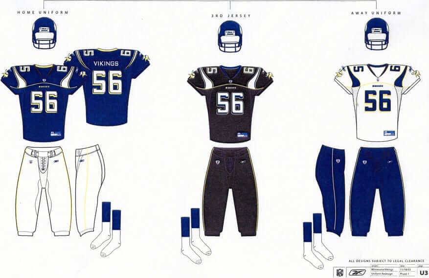
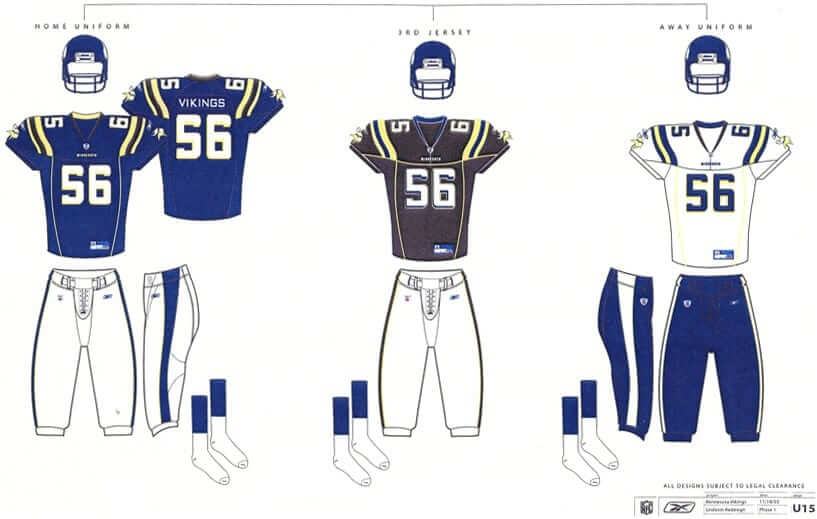
Hmmm, what have we here? It’s two sets of Vikings prototype designs that were prepared by Reebok in 2003. I got them from a source and confirmed their legitimacy with another source who used to work for the Vikings. And there’s a lot more where these came from — the second source says he has a big packet of uni designs that Reebok proposed along with these two. He’s going to send them to me shortly and will also provide info on the internal deliberations about them.
It’s interesting to see that the Vikings (or at least Reebok) were considering going BFBS more than a decade ago. Glad they didn’t go that route. Also, note that all of these jerseys had seam stripes going across the yoke and/or down the torso — ewwwww.
Of course, it’s not surprising to learn that a pro team was considering uniform changes, or that a uni manufacturer was coming up with design proposals for a team — that kind of stuff is happening all the time without our knowing about it. For every design we see on the field, there are dozens more that were rejected. But we usually aren’t privy to those details. In the case of the early-2000s Vikings, however, we’re about to get a peek behind the curtain. I hope to be able to share more images from my source’s cache within the next week or two — stay tuned.
Collector’s Corner
By Brinke Guthrie
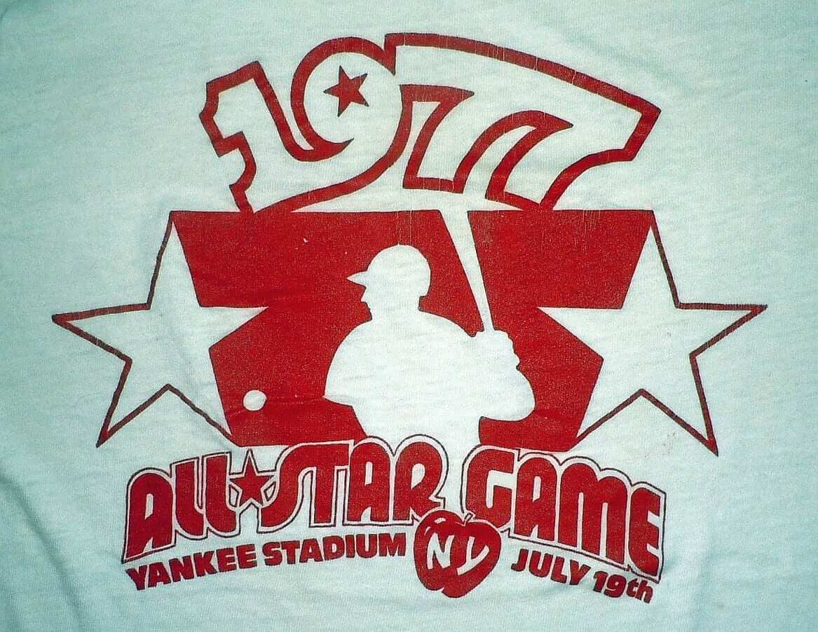
Tonight’s the MLB All-Star Game, so our leadoff offering is this 1977 T-shirt from the 1977 ASG at Yankee Stadium. Always liked watching the game growing up as a Reds fan, ’cause you could count on the Big Red Machine wearing white or red shoes, as opposed to the silly team-mandated all black.
Here are the rest of this week’s vintage finds:
• This 1960s/1970s Cowboys helmet bank looks familiar. This one says “South Oak Cliff Bank.” Mine says Commonwealth National, and I remember going over to open the account there!
• Looks like the Niners are facemasking Earl Morrall on this 1969 Charlton Comics NFL issue.
• Get your 1970s WHA Cincinnati Stingers glasses right here! This set of two also includes the WHA logo player in team colors.
• Paul, you need this 1970s Mets mini-poster cardboard sign for Uni Watch HQ!
• Dave Boss alert! Lotta great NFL posters from The Master available from this eBay seller.
• This 1970s Hallmark NY Jets bumper sticker coulda been designed a bit better, eh?
• Check out the graphics on these 1980s NFL bedsheets. And these NFL curtains have all the team wordmarks, yet generic-looking players.
• Great look on this 1970s NFL sleeping bag. [Wow, that’s a beauty! ”” PL]
• This vintage Browns helmet radio needs a tiny bit of TLC for the helmet stripe but otherwise looks pretty good.
Tick-Tock: Today’s Ticker was compiled and written by Garrett McGrath.

Baseball News: Notes from last night’s Home Run Derby: Jeff Samardzija wore a league-neutral All-Star cap, and ESPN’s graphics department had several goofs. ”¦ The All-Star players aren’t the only ones assembling in Minnesota — there’s also this gathering of MLB mascots (thanks, Phil). … “On Sunday, the Minneapolis Star Tribune ran a special section with a cool rendering of All-Stars past and present in a dugout at Target Field,” says Michael McGivern. “Of course Harmon Killebrew, Derek Jeter, Willie Mays, and Sandy Koufax had the historically inaccurate NOBs. No big deal but still interesting.” … Yesterday’s Ticker a photo of a Giants fan wearing a No. 138 jersey. Two readers have sent in possible explanations: Justin Criado says, “It’s most likely a reference to the Misfits song ‘We Are 138.’ During the Giants 2008 World Series run they called themselves ‘misfits.’ T-shirts with the punk band’s iconic crimson ghost skull were sold in black and orange, and one crimson ghost logo even had a beard like reliever Brian Wilson’s.” But Jeff Dahl is convinced that it signifies section 138 of the bleachers. What does everyone think? … The Brooklyn Cyclones are wearing hockey-themed jerseys this Thursday (thanks, Paul). … The Richmond Flying Squirrels are wearing powder blue throwbacks this weekend (from Raymond Parrish). ”¦ The Triple-A Home Run Derby was also held yesterday. “A few players had these things on their headwear,” says D.P. McIntire. “It appears to be either a camera (although they didn’t show images from it on the scoreboards) or a device that tracks bat speed (which was mentioned several times during the event).” ”¦ ESPN Radio guys Mike and Mike were wearing both versions of the ASG logo — Twins-branded and MLB-branded (from Paul Gaylord).

NFL News: A bull mastiff dog named Swagger will lead the Cleveland Browns onto the field next season. It is an attempt to reconnect with Cleveland’s Dawg Pound of the past. Wait a second, I thought the Manzielf was the one with swagger (from Leo Strawn, Jr.). ”¦ A video preview of the new Madden game has given us our first look at how the Bucs’ new uniforms might look on the field. “I actually like that chrome facemask in the light,” says James Comfort. But those orange horns — not so much.”

College Football News: New uniforms for Duke. The helmets have chrome decals on the black shell. Here’s a video of the reveal (thanks, Phil). … Here’s college football’s new championship trophy. … Hmmm, will Penn State have numbers on its helmets in 2014? (Thanks, Phil). … Tulane has shared new unis as well.

Hockey News: In 1995, graphic designer Ken Loh — the designer behind the Kings’ infamous “Burger King” design and the New England Patriots’ “Flying Elvis” logo — presented the Flyers with these concepts as a possibility for a third jersey. Time does not heal all wounds (thanks, Phil). … The Hockey News has begun ranking the NHL logos from worst to first, beginning at the bottom with the Carolina Hurricanes (from Barry Brite).

Soccer News: New home kit for Wigan. “Too similar to Sheffield Wednesday for my liking,” says George Chilvers. ”¦ New kits for UNAM as well. “I’m biased because they’re my team, but I like them,” says Pedro Naranjo.

Grab Bag: The University of Utah football and men’s basketball teams will be getting new uniforms. … Yikes, check out these pit crew uniforms for the STP-sponsored No. 40 car that Parnelli Jones drove in the 1967 Indianapolis 500 (from Graham Clayton). … Australia’s National Rugby League will wear Marvel superhero-inspired uniforms (from Leo Strawn Jr.). … Cooper Union, the NYC university with programs in architecture, engineering, and the arts, built a new structure at 41 Cooper Square in hopes of landing a naming-rights gift that never arrived (from Tom V.). ”¦ The Australian Football League is selling hijabs in team colors.

What Paul did last night: On Friday I was reading this weekly list of interesting NYC events and happenings for the upcoming week, and I was struck by the following listing for an event taking place on Monday (i.e., yesterday):
My name is Brian Beattie, and I’m a record producer and musician from Austin, Texas. My wife — the artist Valerie Fowler — and I have created something called “Ivy and the Wicker Suitcase,” which we call an Illustrated Earmovie Musical. … Set in 1938, it’s a new Depression-era folkmyth about a 10-year-old girl who falls into the underworld.
Valerie and I are bringing “Ivy” on the road. … I recite an epic poem called “The Backstory Ballad of Ivy Wire,” and then I sing the songs from the musical, and interspersed throughout the performance are four “Crankie Shows,” which are 30-foot-long illustrations that Valerie cranks along in our homemade Crankie Box while I sing the accompanying song. It functions as a sort of hand-drawn video, a low-tech immersive multimedia marvel.
“Ivy and the Wicker Suitcase” is also available as a fully illustrated 62-page book plus a CD featuring Daniel Johnston, Bill Callahan, Will Sheff, K. McCarty, James Hand, and starring Grace London as Ivy Wire.
That sure sounded better than sitting on the sofa and pretending to give a shit about the Home Run Derby, so last night I drove out to this little theater/performance space called Standard ToyKraft to see “Ivy and the Wicker Suitcase,” which turned out to be a completely wonderful piece of homespun musical theater.
I shot a video of one of the songs, and unfortunately it turned out to be the weakest song of the bunch, but it still gives you a sense of how cool the Crankie Shows were (the female singer is Brian and Valerie’s teen-aged daughter, Ramona):
Most of the tunes were much snappier and more dynamic than that one (and were sung by Brian, who’s a much better vocalist than his daughter).
Want to know more about the whole “Ivy” thing? Look here. Want to see if “Ivy” is coming to your town? Look here.

The link to the gathering of mascots in the baseball section is broken/incomplete
Thanks — fixed.
Here’s the proper link:
link
I believe someone was missing from that mascot picture. link And of course, three teams don’t currently have mascots.
It’s interesting to see that there is no consistency in what jerseys/colors the mascots are wearing. Some have home whites, some have alts, and Wally the Green Monster is in an away gray. Of course, the Orioles bird is nude other than his hat, and Bernie Brewer has his own “Bernie” jersey.
Looks like The Phanatic is wearing an ASG T shirt.
I wish the Nationals had sent Teddy Roosevelt instead of the eagle. He’s not really the mascot, but he’s way cooler.
You know who else was missing from the gathering of the mascots?
link
Not, technically, “missing,” and not, technically, a mascot, but the greatest ever: link
I’d like to see a mock-documentary, VH-1 Behind The Music style, about what’s happened to Youppi, now that the Expos are no more. We’d find out that he battled a deep depression, every time the Nationals came on the TV he’d go ballistic. He went through a down period, they’d show him working in fast food, battling alcholism and sleeping in the gutter. But it’d have a happy ending, they’d show that he’s now on the road to recovery, mascotting for a low-A ball team. Sure the pays not great, but he’s got a new love in his life, and he’s heard there’s an opening next year in AA ball, and he thinks he’ll have a shot, if the interview goes well.
Isn’t Youppi with the Canadiens now?
COTD
The device on the catcher’s helmet at the Triple-A home run derby is a GoPro camera, not something that would track bat speeds. GoPro cameras can transmit pictures in real time using wifi, but it’s not the most reliable system, and interfacing it into the stadium display system wouldn’t be the easiest of things to do. Most likely something that would be used for highlight footage after the fact.
Great info, Martin — thanks!
Wow! I thought everyone these days knew waht a GoPro was. They have become pretty ubiquitous (right word?) it seems to me.
also, they could have used a mount combination that wpould allow the camera to be set straight up, not at such a rakish angle.
GoPros are the most brilliant and frustrating piece of technology/camera ever. Anyone who has one likely shares my view to some degree.
GoPro has been in the news lately due to their recent IPO and subsequent roller coaster stock price, which has moved as much as 35% on some days.
What Martin said above.
Interestingly, they were using something called an iON camera during the MLB ASG HRD (e.i.e.i.o.)…
I hadn’t heard of the iON until last night, but it looks to be a competitor of the GoPro.
The Vikings concepts remind me of what Reebok did in the CFL about a decade ago.
Those Viking prototypes actually look better than what they ended up going with.
The generic-colored hats looked pretty bad last night. I almost looked forward to the clash of BP jersey and normal hat color. That’s way better than seeing a Yankees or Orioles hat in red.
Love that Cincinnati Stingers logo!
I googled images for “STP pajamas”. Lots of photos!
Of course you know, Parnelli Jones has a son nicknamed “PJ”.
I wonder if those STP threads had anything to do with that.
Some of those Vikings prototypes actually look better then what they came out with in 2006. Whoever suggested the Vikings wear black needs a mental evaluation. Black is not a Vikings color, never has, never will be. The Arizona Cardinals look bad enough with their black.
All I can say is Nike did a phenomenal job with the Vikings makeover last year and it was arguably the best re-design of them all. Simple and modern, but yet traditional at the same time.
Agreed, except for the new number font, which looks like hell.
Whoever mandated a change to the Vikings in 2005/06 needs to be punched in the throat.
And the Nike redesign looks good mainly because the previous set was so very awful. They still aren’t as good as what the Vikings had before the Reebok redesign.
Lee (biased Vikings fan)
Agreed with the “punched-in-the-throat” comment. What the hell were the team marketers thinking?
* Stick with classic 1960s design forever, like main rivals Green Bay and Chicago.
* Suddenly! out of the blue switch to a “Denver-style” uniform. Nevermind that Denver did it like ten years previous and it’s no longer trendy or interesting.
I like the new uniforms, but only to the extent that they imply the team will eventually go back to something like the Viking classics.
Maybe it’s just because I’m a Pirates fan, but I noticed right away in the Star Tribune that McCutchen’s number is in a more generic block font, and Clemente’s is in the proprietary font the team uses, whereas it should be the other way around.
Also, Yankees and Giants jerseys with NOBs just seem weird to me.
The best hats were the ones the competitors didn’t wear in the HRD.
I hate the principle of homogeneity in the MLB ASG. The developed paradigm is one where you see all the different uniforms. Give me that green Oakland hat.
That being said, thanks to Spike Lee, the red Yankees hat doesn’t look atrocious. If I ever see it on closeout, maybe I’ll buy it with spare Chanukah money.
The Bucs new uniforms just kill me because they were so close to being a nice upgrade. That number font, however, just looks ridiculous. Its one of the dumbest ideas Nike has done since taking over. If the Bucs uniform had simply been a total train wreck like the Jaguars, I could at least dismiss it. Instead its tantalizingly close.
“…That number font, however, just looks ridiculous. Its one of the dumbest ideas Nike has done since taking over…”
Perhaps the team should have rejected it. Buc’s fault too.
What are you talking about? The new Buccaneers uniforms BLOW. The colors combination, the brown leggings, the flatness, the number font.
Hate ’em.
Lee
Replace the Pewter Yoke with either White or Black, have the orange horns extend to the collar, and get rid of the unbalanced logos and you have a winner.
There are times when I see the new look and think, that doesn’t look as bad as I remember thinking it was when they unveiled them. And I chalk that up to the fact that while there was no need to do much modifying to the previous unis (seriously just make the font more stylized, as in a more legible version of their Practice Jersey font), that the new unis have some good ideas executed poorly.
Pewter should have remained only on the pants and helmet and they should have stuck with the same Number color layout, but adding a contrasting yoke wasn’t a bad idea.
And for God’s sake Nike, spend the money figuring out how to make your “high-tech” pants shiny, Pewter without shine is a drab brown, and the Saints look bad with Tan pants and numbers. Also work on getting the color green down so the Eagles and maybe even the Packers will move to your new templates. The Packers still wouldn’t change their design, the Eagles might, but they would likely make the switch if you could get your greens to match, and the Jets wouldn’t look like garbage.
Hmmm… are you SURE that STP sponsored that race team? I’m not completely certain….
Re: ESPN Graphics errors.
I watched the entire Derby simply because it was Target Field and I am from MN. But ESPN did do a poor job of the event I think. I am not a sports director or anything but far too many times, I felt, the camera cut to some stupid stuff. Missed homeruns, wrong angles, and the wrong graphics and info.
Clearly it was amateur night at ESPN.
Thankfully, they are not responsible for the actual game.
Agreed, the whole thing was an atrocious piece of television.
I avoid it every year simply because Chris Berman calls it…
I look forward to seeing more Reebok uniform proposals. I love these type of things.
Interesting that the Viking patch link is looking backwards – wonder if that was a deliberate style choice, or sloppy photoshopping?
The Giants jersey “138” is most definitely from the “Bleacher Bums” of Section 138. Season ticket holder since the Candlestick days
Definitely the bleacher section. It was very common for many years after the park opened.
The jersey # for the Vikings prototypes is 56 but the tv numbers make it look like the jerseys are #65. Is that a normal design for a prototype or an error?
It seems like the numbers are facing the helmet instead of facing the shoulder. This is weird. Those numbers typically face the shoulder, don’t they?
They’re not facing the wrong way; if they were, the player’s left shoulder would read “59”. The designer just made a mistake and put 65 on the sleeves.
Sorry Paul, you won’t like MLS Expansion team. Orlando City’s kit choice
link
I really like the logo, but think the “shield” is totally unnecessary. Would be a much more unique look if instead of shield and text there was just a large lion’s head.
I’ve voiced my affinity for the Red Bulls giant chest logo/sponsor, wish MLS would think a little further outside the box.
I hate the name Orlando City with a passion. Nothing here is called Orlando City, feels completely forced. And lions in Orlando? No local connection. A few years back the minor league hockey team was named the seals. Someone pointed out there really aren’t seals in FL, more of a California thing. /rant off.
I don’t think the lion thing is such a big deal. Consider Sporting Lisbon, they have a lion as their crest, or FC Porto, nicknamed the dragons, I think the symbolic value of a certain animals works, even if they’re not native to an area (or not in existence, period, like dragons lol)
I think a combination of the two things is what really kind of bothers me.
I hate the name Tampa Bay with a passion.
The city is named Tampa, not Tampa Bay, yet each of their professional sports teams feel the need to be named Tampa Bay rather than just Tampa.
Yeah, you’re right. Screw the people in Pinellas. They don’t need to come to the games. Move the baseball team over to Tampa where the hockey and football team is, and then you don’t even need to cross a bridge, unless you want to go to a beach.
The fact is, it is the combined population of Clearwater, St. Petersburg and Tampa, and the neighboring areas, that make the Tampa Bay Area “major league”. If you went just by Tampa’a population, you wouldn’t rank it very high among major metropolitan cities in the U.S. population-wise.
And the next person that calls them the Tampa Rays, the Tampa Lightning or the Tampa Buccaneers — they are the ones that should be punched in the throat!
Because you live in Pinellas means you can’t go to a game, or be represented by a team from Tampa? Not sure what the population of Tampa has to do with what you call the team. Are the populations of Columbus OH and Hartford CT that much?
I remember when the Florida Panthers came into the league, and they said they were naming the team “Florida” because they wanted to represent and draw fans from the entire state. Hogwash.
I have never lived in Green Bay. Didn’t ever dull my enthusiasm for the Packers.
Then I suppose you’d agree the Twins should either be the Minneapolis or the St. Paul Twins, right?
All I’m saying is the cities of Clearwater and St. Petersburg are as integral a part of the population of the whole area as Tampa is. They are not “suburbs” of Tampa, no more than St. Paul is a suburb of Minneapolis or vice versa.
The people in Pinellas do not desire to support a “Tampa” team, and the people in Hillsborough do not desire to support a “Pinellas” team. The area is very binomial in nature (probably due to the eight mile long bridges separating the two) and neither side wants to be looked at a the “little brother” of the other.
If you grew up in Tampa, you felt like the water tasted funnier, crime was higher and the women were uglier in Pinellas. But if you grew up in Pinellas, you knew the water tasted funnier, crime was higher and the women were uglier in Hillsborough.
The only way to get both sides to support the team would be to call them the “Tampa Bay” whatevers. In Clearwater, the Tampa Buccaneers would have felt like a team only representing the other side of the bay. And the St. Petersburg Rays (and Clearwater Phillies and Tampa Yankees) were minor league baseball teams. A major league team would have to represent all of Tampa Bay.
Such provincialism isn’t exactly the mark of a good sports market….
Well, we are talking about Tampa Bay… All I can tell you is growing up in Clearwater, I wouldn’t have given two shits about them had they been the Tampa Buccaneers.
Is that confirmed, or a placeholder?
I do like it – nice and simple. Well, about as simple as an Adidas shirt can be. And I love that they’re owning the color.
It’s a place holder. The photo of Kaka is from his intro a few weeks ago and there’s no sign of that jersey anywhere on Orlando City’s web/Twitter. The web shop still has the same generic gear it had with the logo launch. I can’t imagine any brand releasing a new jersey and not having them up for purchase immediately.
That’s my sense as well, especially since they’re still playing one more year in USL Pro, and just link. They’re trying to sell those at the moment, so MLS jerseys can wait until October.
Interesting to see how the two new expansion teams are treating their signings, considering neither has a uniform yet.
NYCFC had David Villa holding up link with number and FNOB. They’re selling link that may or may not give us a clue to the actual jersey, which they haven’t even confirmed is blue. That one at least has the right font.
Orlando City used an Adidas jersey link, just not necessarily their jersey. Orlando is also selling t-shirts, but with link on the front instead of an on-field representation. And man, is that really how they’re handling his acute accent?
The 138 on the SF Giants fan’s jersey definitely refers to bleacher section 138 and the Misfits song. They have been wearing them since the park opened, and that fan was in section 138 when the original picture was taken on Sunday.
*and NOT the Misfits song
Yes, that is correct. Click on the link of the seating chart of AT&T. link
Odd that an Australian rugby team would wear Captain America uniform.
While departing last year’s Futures Game I saw humans carrying what I figure was the mascot uniforms in suitcases. All of the macots had been at the game. They humans would not talk to me and my kids.
A few years ago I had the pleasure of helping the Washington Capitals’ mascot, Slapshot, at a local event. It was funny meeting the human and the mascot. I also play Santa for the Fire Dept and I understand the “deception” needed for the job.
Wait, I’m confused about all this… the human and the mascot? Humans carrying mascot suits? The mascots wear suits? And where are the mascots, when the humans are carrying their “suites”?
Next thing you’ll be telling me Santa isn’t real, either.
I used to steward for Wigan Athletic (I was in charge of the tunnel area) and one rugby game we actually ejected a mascot from the ground.
Bradford Bulls rugby league were the visitors to Wigan Warriors, and we tried to enforce an “everyone sit down” rule (yes, I know, I know). We had just managed to get all the Bradford suporters to comply when along came “Bully” the mascot, and waved all the supporters to their feet.
“Throw him put” came the call over the radio. :)
Just to concur the Giants 138 jersey is in reference to the bleacher section. There are a few 138 (and 139) jerseys that have been around since 2000.
Sections 138 and 139 used to have a pretty good rivalry (different chants and such) in the early years of then Pac Bell Park.
From the article detailing the new Univ. of Utah uniforms:
“The Utes will also wear a specially designed jersey to honor the Ute Tribe at a home game in November.”
Has this design been released?
Someone should tell Dana O’Neil (ESPN.com) that isn’t just “because [she’s] a woman” that she Gets It(TM).
link
Pretty much agree with the entire list, though she went easy on Nike in #8.
For No. 4, she said “Catchy Logos,” but I think she meant “Catchy Slogans.”
Surprised no editor caught that.
Congrats for the shout out over on deadspin.
link
Surprised I saw no mention that these prototypes look more Blue than Purple. Maybe its because they are 11 years old (don’t know when they were scanned), or is it possible Reebok was trying to get them to change colors (though I doubt Minnesota would go with the Packers former colors, that they occasionally throw back to, so its not like any attempt would have been seriously considered).
Also its funny that the font looks very similar to what they have now, I wonder if the Vikings liked the numbers and asked Nike to see what they could do with them, or maybe someone working on these protoypes is now at Nike. Its also worth noting that the font kinda looks like the Falcons font that they started wearing in 2003.
these prototypes look more Blue than Purple
That could just be the reproductions. They’re pretty low-res, could be scans.
Then again, that’s a standard problem with the color. It seems to be more susceptible than others to appearing different under different conditions; even the real uniforms can look very blue.
Those Tulane unis would be fantastic if not for the 2nd outline on the number (I’m assuming that the outtermost outline is that dumb grey they have been using recently). The sleeve design is beautiful, hopefully Grey is not shoe-horned in on the green jersey. Would love to see a Sky Blue jersey before they wear those grey jerseys ever again.
I kinda like the Duke jerseys, I like that they kept them tame, keeping the black to the BFBS jersey and sticking with Blue and white on the other 2. But they look like something a high school would wear, I feel they would have been better served going with just the number and now outline.
Tons of NBA leaks today: link
The Pacers & Raptors should still be wearing those full time. Best looks each franchise has had.
“Boston” on the road I can take or leave because they’ve worn it before. So it’ll look weird but I’m OK with it.
That gold patch will look absolutely stupid. But at least it’s not an add patch! (yet)
The pride jerseys are stupid and need to go away, along with any sleeved jerseys.
All in all though. As long as there’s no adds (yet) these changes are more of the “good” than “stupid”.
I find it odd, in a good way, that Pete Rose was included in that dugout painting with other All-Stars.
Lose the stupid gold horizontal stripe & add real purple-gold-purple pants stripes on the home & white-gold-white on the purple pants and I’d love that first prototype. A lot nicer than what they went with now.
“During the Giants 2008 World Series run they called themselves ‘misfits.’”
That was 2010. They only won 72 games in 2008.
yeah I wondered about that.
Two comments: first,, re. All Stars present and past photo, it’s not just a font issue. Clemente never wore a jeresy with NOB, especailly niot a vest.
Seconbd, re. Cyclones. The Cyclones aee giving that hocley jersey to fans as a sga, they are not wearing it. Even on special nights like Irish heritage, the Cyclones never wear the same jersey they give away.
(corrected)
Two comments: first re. All Stars past and present, Clemente never wore a NOB jersey, especially the classic vest.
Secondly, the Cyclones are giving away the hockey style jersey as a SGA. Even on special occasions like Irish heritage night, they never wear the same jersey as they give away and later auction them off for charity.
Anybody else find it ironic that a person named Jeff Dahl is commenting on the 138 jersey? Or am I the dumb one for not knowing that the Jeff Dahl referenced in the column is in fact the Jeff Dahl of punk rock music fame?
The Richmond Braves throwbacks look bad… The cap are navy-red which looks like 87-present era Braves, but the jersey looks like 80-86 Dale Murphy-era Braves. Not saying that’s not what Richmond wore at a particular time, just that it looks bad.
You’re right, the Richmond caps should be more similar to the blue Atlanta caps of that era. Not sure why they can’t get that detail correct
Now after seeing the All Star game caps during the introductions showed me how bad some logos really are: Miami, Boston, Milwaukee..
Best looking: Blue Jays, A’s, Orioles..just a quick look and run down of both.
There’s a Marlins’ gray jersey sighting in Minnesota! Man those look good.
So, at AT&T Park the bleacher sections start at 136, that was section 138. The season ticket holders in 138 are very loyal and passionate and treat each other as family. Many wear jerseys with 138 on the back or T-Shirts with 138.
138 refers to the section at AT&T Park. The bleacher sections in LF have tight knit groups.