[Editor’s Note: Paul is on vacation. Today we have a guest entry from Parker Martin, who wants to examine the flag designs of some of the World Cup nations.]
By Parker Martin
With the World Cup now underway, and with many World Cup kits being based on the colors and/or designs of national flags, I thought it would be useful to examine the history and symbology of the national flags represented at this global event.
For today, I have chosen four nations competing in the World Cup. So while this will not be an exhaustive list of the 32 nations competing in the World Cup, I hope it will serve as a starting point for understanding the visual identities of different countries.
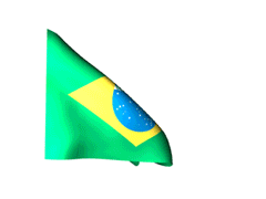
Brazil. Because Brazil is the host nation, derivatives of the Brazilian flag can be seen throughout the World Cup. The current flag, designed by Raimundo Teixeira Mendes, was adopted in 1889 as the flag of the Federative Republic of Brazil. The green base and yellow rhombus in the backfield are a continuation of the Portuguese House of Braganza and the preceding flag of the Empire of Brazil. The blue circle centered in the forefront and the positions of the stars signify the sky as seen over the city of Rio De Janeiro. The 27 stars represent the various states and federal district of Brazil. The sash inscription, “Ordem E Progresso,” is derived from the French philosopher Auguste Comte. It translates to “Order and Progress,” marking the optimism of the then-new Brazilian state. While it could be argued this design is overly busy, I believe the combination of colors, shapes, and history creates a well-rounded flag that also makes the basis for an iconic uniform.
Nigeria. Although the continent of Africa features some very unique flag designs and use of symbols (I’m looking at you, Swaziland), the Nigerian flag is simplicity itself. Adopted as the winner of a design competition in 1960, this vertical triband flag makes use of only two colors: green, representing Nigeria’s forests and natural wealth, and white, symbolizing peace. It should be noted, however, that this winning flag, submitted by an England-based Nigerian student, originally included a red sun, but that element was removed by the competition judges. Given Nigeria’s diverse ethnic groups and history, I am disappointed in the final product. Even with the original sun and rays, this flag fails to represent Nigeria’s uniqueness, especially when surrounded by other nations who make better use of storytelling in their flags.
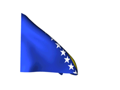
Bosnia and Herzegovina. In a continent of what can be considered boring triband flags, the Bosnian flag is a welcome variation. Adopted in 1998, it illustrates the progress this country has made following the Bosnian War of the early ’90s. The yellow right triangle, breaking up the blue background, represents the three major ethnic groups that make up this Balkan country: Bosniaks, Serbs, and Croats. The stars running parallel to the triangle’s hypotenuse are intentionally cut off by the flag’s border and symbolize the greater Europe. If you look carefully, you can see that the two stars cut off by the borders of the flag fit together to form one never-ending loop. To me, this flag serves as a welcome break from the monotonous flags across Europe and creatively combines ethnic cooperation and a sense of European unity. (Plus it utilizes one of my favorite color combinations.)

Ghana. Known as the bane of recent U.S. World Cup teams, Ghana is again paired with the United States in the group of death. The country’s flag, adopted in 1957, uses a charged horizontal triband design. The three are based on the Pan-African colors, which can be found throughout Africa (Cameroon and Senegal) and globally (notably the Rastafarian Movement). For Ghana, these colors represent the blood of those who fought for national independence (red), the mineral wealth of the country (gold) , and the natural beauty of its forests (green). The black star in the center — also the basis of the national team’s nickname, “The Black Stars” — symbolizes Ghana’s freedom from colonialism. Although these colors and design are not unique to Ghana, their symbology and application to Ghana’s history makes for a great combination.
Thanks, Parker. We may do more of these flag pieces as the World Cup progresses.
And as long as we’re talking flags: Designer Craig Robinson has reconfigured a bunch of national flags as golden rectangles. Really interesting stuff — highly recommended. — Paul

Yesterday afternoon, the Cubs continued their season-long throwback uniform parade, by hosting the Pirates. The decade for this throwback was the 1950s, and the year was 1953. This year was selected as it was Mr. Cub (Ernie Banks) rookie season.
As far as throwbacks go, these were pretty tame — the Cubs that season had a VERY plain uniform, with no sleeve or pants striping, and a slightly different “Cubs” logo from their current one. They also sported a wishbone “C” on their caps. The blue was also slightly lighter. Their jersey was a zipper front, and the stirrups had three red stripes on a blue base. How’d they look yesterday? (Click on images to enlarge)


The Cubs did a pretty good job approximating the 1953 uniform — cap looked good (wishbone “C”? check), zipper-front shirt? check, stripeless unis? check. But what about those stirrups? Well — those had white lower halves — like the 1942 throwback they wore against the Marlins last time they threw back. Lame — they just reused the stirrups, instead of getting period correct ones (they also reused the 1942 caps, but they still had those in 1953, so that’s cool).
How about their opponents, the Pirates? In 1953, the Pirates’ road uniforms had “PITTSBURGH” spelled out in a radial arch across their chests. According to Okkonen, it appears they were zipper-front as well, but a game used version shows it button front. There was no front uniform number How’d the Pirates do?


Looks OK — might have been nice if the players went high cuffed, but what’re ya gonna do? The 1953 and 2014 uniforms are actually not all that different — the main differences being the front number (in 2014) and a slightly less arched wordmark:

And of course, in 1953, neither team had a NOB (and the Cubs had a curved number font, similar to what they wear today). Of course, as we have seen with every throwback without NOB, the numbers were placed too low relative to the collar:


Not a bad looking game (and beautiful under the bright sun in Chicago), but it might have been nice if the Pirates had at least played along by showing some hosiery. Other than the Cubs wearing the “wrong” stirrups, they looked mighty fine.
I’ve always liked the 1953-style uni, and it would be great if they’d consider going back to it — but like many (most?) throwbacks, it needs to pick its color up from undersleeves and socks/stirrups, so if this were to ever become the main uniform, I fear we’d just have some big white pajamas.
You can see more photos here.
Readers, what say you? — Phil
Magazine reminder: In case you missed it last week, you can now order your favorite magazines from the Uni Watch Magazine Shop. Full details here. — Paul
Uni Watch News Ticker:

Baseball News: The Triple-A Lehigh Valley IronPigs are looking to cash in on the World Cup frenzy by promoting a “Pee-nalty Soccer Shootout”. … This item was in yesterday’s ticker, but Sean from Winston was at the Durham Bulls game where they wore pink for cancer. … Take a look at this picture of Adam Wainwright in USA facepaint. If you’re eagle eyed like Zack Kurland, you would notice the name embroidered on the Cardinals jersey to Wainwright’s right. Says Zack, “Did a quick search and it seems like the Cardinals don’t have the player’s name embroidered on the front of every jersey but they do have examples throughout their history.” He also wonders if “there is a rhyme or reason for embroidering the name? Seems like a nice quirk to bring back from the old days and I’d be interested to learn if there are other major league teams that do this.” … Check out this beautiful old photo of great Yankees skippers taken in 1951 (from Bruce Menard), who posted that on his blog in honor of Yankees Old Timers’ Day. During yesterday’s Old Timers’ game, the Yanks had the former (and present) NYY managers in attendance line up for a photo, including Buck Showalter, Joe Torre, Bucky Dent, Gene Michael, Stump Merrill and Joe Girardi (unfortunately there is no photo of this gathering). … Here’s the patch on the Yankees caps for yesterday’s Old Timers Day (thanks Garrett) … The Greenville Astros, a Houston farm team, had their Hawai’ian shirt day yesterday (h/t Anil Adaynthaya. Didn’t look much better on the players (via Andrew Guydos. … What if the BlueClaws were the Lakewood Pine Barons? Yesterday, we found out (via MiLB Promos). … Wow, check out this great photo of NY Giant HOFer Mel Ott — and look at all those belt loops! … Joel Gray grabbed this screen shot from the 1995 playoffs and said, “I don’t remember the umps wearing white tops.” I tweeted at Kevin Martinez (Mariners Marketing VP) who maintains that they were light blue, not white.

NFL News: Good spot by Joseph Bailey who writes, he “noticed this advertisement for Buffalo Bills player CJ Spiller at a mall near Rochester, NY. As you may be able to see he’s all decked out is Adidas gear – even holding an Adidas ball. However, the shot of the autographed ball shows it’s clearly a Wilson ball. Looks like they covered up any nfl markings on the ball. Why leave the Wilson mark?” … Check out this collection of NFL fishing lures. Says submitter Douglas Ford, “I have never seen these before.” … Pretty sure we’ve discussed this before, but Dave Kelly was watching a replay of SB XXIII and “I noticed that Boomer had the number 63 hand written on the side of his helmet – has this ever been addressed?” The #63 on Boomer’s helmet was worn to honor 13-year veteran tackle Joe Walter, who had been waived during the 1997 season. UPDATE: Although Esiason did wear #63 on his helmet in 1997, the handwritten 63 was worn by Boomer in the 1988 Super Bowl (thanks, THE Jeff). More explanation in the comments below.

Hockey News: Possible new St. Louis Blues unis coming? Reader Jonathan Karberg writes, “After checking the 14-15 schedule, I checked the Blues twitter page. 25% off of home and away jerseys til 7-5. Nothing stated on 3rd jerseys, but saw on the Icethetics blog that the 3rd is still in the Reebok catalog, and that the home and road are TBA. To me, it seems that they’d be ditching navy completely, but apparently not for the 3rds.”

Soccer News: In this short video sent in by Andrew Rader, we learn the ‘secret’ behind the U.S. crest for the World Cup shirts. … If you watched yesterday’s World Cup draw between the US and Portugal, you might have noticed something odd on Jermaine Jones’ knee. It’s not an injury, it was America (h/t Brian Floyd). … It’s not uncommon, but yesterday superstar Christiano Ronaldo switched jerseys between the first and second halves — how he could wear a long sleeve jersey in that heat and humidity continues to mystify (pic via Cork Gaines). … Hmmm, was US Midfielder Michael Bradley the inspiration for Edvard Munch’s The Scream? It’s possible (via James Creighton). … If you’re wondering about the USA’s chances of advancing out of the Round Robin, this easy-to-read chart should help. Basically, the US needs a win or draw, or a draw by Ghana/Portugal. Any USA loss and that chart needs to be figured out.

Grab Bag: Graham Clayton notices: “Halfway through the 2014 National Rugby League season, the Cronulla- Sutherland Sharks are still the only team without a shirt sponsor.” … Reader David Firestone sends us this pretty cool DIY drivers suit.

I love the lead today – always great when uni watching and vexillology intersect.
But a couple of “get off my lawn!” complaints. First, if you don’t already know exactly what the flags of Brazil, Bosnia, and Nigeria look like, the photos in the article won’t really help. Second, only a pretty hardcore flag or heraldry geek is going to know terms like “charged triband.” Jargon like that is fine, but it needs definitions.
That said, I hope this is the first of many installments! We’ve got three weeks until the final …
PS That unclosed bold coding is not me!
Fixed.
For nearly twenty years I’ve been a regular lurker at link (flags of the world). It has plenty of nifty info for anyone who wants to follow up on today’s lede. Viva vexillology!
I never miss an episode of “Fun with Flags” starring Sheldon Cooper.
Joining arrScott and the get off my lawn initiative, the Brazilian and Bosnia Herzegovinian flags are moving really, really fast. It’s kind of distracting when reading the article.
The #63 on Boomer’s helmet was worn to honor 13-year veteran tackle Joe Walter, who had been waived during the 1997 season
You got the year wrong there, Phil. I think you meant 1988 (unless Boomer actually wore that tribute for 2 full seasons, which I suppose is possible if they let him keep the same exact helmet for multiple years).
I could very likely be wrong, but I got the information from here (scroll down to Bengals vs. Steelers) — although that shows him with a “63” on the back of his helmet, not handwritten on the side. Not sure if that’s a different game or not.
Hmm. Well then this is a bigger mystery. The handwritten number is supposedly from Superbowl XXIII, which was played after the 1988 season, but the picture on your link is definitely from 1997, since that was the only year that Boomer could have worn the full tiger logo on his sleeves.
Walter did play until 1997, so that part could be right, but I don’t know why he’d have a tribute in 1988.
Ok, mystery solved.
link
Trailing 10-0 and suffering from a sprained finger, Esiason brings the Bengals back on 10-of-19 passing for 187 yards that includes the late heroics to Brown. And he has to do some of it without the protector of his blind side, right tackle Joe Walter, who tears his ACL during the afternoon.
Walter was injured and didn’t play in the Superbowl, so that would explain Boomer’s handwritten number for that game.
Good work, THE.
Man, Boomer sure had a thing for Joe Walter…guess QBs and the blind side protection is a pretty strong bond.
Thanks, Phil… I try to be useful occasionally. :)
You might want to update the ticker text though, so the people who don’t read the comments know the real story.
If I missed this above (or yesterday?), my apologies. But I see here the first appearance of helemtcap on an MLB pitcher.
link
Very Charlie Brown-ish.
link
Was in yesterday’s ticker.
I think the pitcher should be allowed to wear a batting helmet (possibly an ear-less one like the base coaches wear) if they so choose. I think the idea of a helmet cap is excellent, but damn, it looks so stupid.
Maybe an ear-less batting helmet covered in the same poly that they use to make caps would be a decent compromise.
I kinda think they’re making a big deal out of nothing. The odds of a pitcher getting hit in the face with a baseball just aren’t that high.
I suppose, but if it makes a player feel more safe, why not? I don’t think making it mandatory would be a good move, but the option should be there.
The odds of a pitcher getting hit in the face with a baseball just aren’t that high.
And the chances of the Charlie Brown cap protecting a pitcher from being hit in the face are zero. I honestly don’t understand what the helmet cap is supposed to do. If a pitcher finishes his motion standing upright, squarely facing the batter, and a line drive hits him above the forehead, it looks like it might offer some protection. So Walter Johnson and like three or four other guys in big-league history would get a little protection. Beyond that?
Odds are low, but if and when it happens, the consequence can be catastrophic.
I mean, why equip a commercial jetliner with oxygen masks and flotation devices when the odds of a plane that size crashing is so low?
Airlines don’t require every passenger to wear an oxygen mask for the duration of the flight.
But every passenger is equipped with one. Plus, you do have to sit on the flotation device for the whole flight.
Three things have to be considered in this sort of situation: Chances of the thing happening; severity of consequences if it does happen; and the costs of any given preventive or mitigating measure.
Loss of cabin pressure is actually reasonably likely. All sorts of things can cause it, including many things that are otherwise eminently survivable. The severity of loss of pressure – a whole planeload of people dying of something that would otherwise not even injure anybody – can be disproportionately high compared to the chances of it happening. And the cost of maintaining backup oxygen supply is quite small.
If all we do is conclude that because it would be very bad if the thing happened therefore anything that mitigates against it is a good idea, then we’d require batters to wear full body padding and facemasks, and we’d require that before we required pitchers to wear helmets. Batters are more likely to be injured by pitched balls than pitchers by batted balls. Therefore batters should wear full-body padding and facemasks, right?
Aesthetically, it seems like if this particular helmet does offer the pitcher some useful protection, which I can’t assume without a study, it’s a mistake to try to dress it up like a normal ballcap. If it overhangs the forehead that much, then it doesn’t also need a bill. Just stick the cap logo on the front.
This reminds me of the story with the 10,000 starfish washed up on the beach and this guy was throwing them back in the ocean one by one. Another man walks by and says, “What are you doing? You’re not making a difference, you can’t possibly save them all!” The first guy picks up another one and throws in it the ocean and says, “I made a difference to that one.”
So did they put a gigantic cap over a bike helmet? ‘Cause that’s about what it looks like. What’s better about this than a standard batting helmet?
Secret compartment for hiding pine tar.
Also, I’m thinking it stays on more securely, since a pitcher’s head moves more than an infielder’s during the pitching motion.
Looks like he borrowed that cap from the Elephant Man.
Late in the first half when Jones took a knock, the ESPN radio announcers mentioned it looked like he had some sort of brace on his knee. Must have been the tattoo!
Couple of World Cup things:
* Vincent Kompany wore his link again against Russia.
* Jürgen Klinsmann’s attempt to forge an American identity for the US national team starts with his link (they’re from Nike’s skateboarding line, in case Jim Harbaugh’s still looking for non-ugly pants).
* The Netherlands will finally wear their orange tops against Chile.
* link
But alas, the Dutch are wearing mono-orange instead of the majestic link.
Too bad. You need some contrast to break things up, especially with a color as bright as orange.
Here is Esaiason with 63 on the back of his helmet.
link
You beat me to it. I knew he had done that.
(Insert comment about reading previous comments before posting) :P
Don’t mind us. We’re having our own little thing over here.
(harumph)
So, in response to today’s main post, am I the only person who thinks that maybe more national teams shouldn’t always wear the colors of their flag on their uniforms? While there are certainly some nice looking flags out there, they all seem to use a rather limited color palette. Why can’t we have a few countries wearing silver, teal, purple, lime green, pink, brown, etc? How many countries have flags with some combination of red, white & blue? That’s just boring.
And the most famous country that has sporting colors that differ from its flag is Italy, which wears blue. Dudes, you’re not helping! Also: Japan.
Well, maybe Italy ties with Holland in that regard, and Holland does ditch the national flag of red-white-and-blue for orange, so there’s that.
For many countries, the national flag is iconic enough that drawing from it makes sense. You’re never gonna look like Canada unless you’re wearing mostly red and white. Same with England. But USA has done such a poor job of creating a stable identity that maybe we should consider breaking from the red-white-and-blue. We have a long secondary tradition of using blue and gold for national identity – officially, that is, not in soccer. It might be interesting to see the US in navy and gold. Which doesn’t entirely achieve what The calls for, but it at least breaks the direct tie to the red-white-and-blue flag.
I’d be in favor of that. British auto racers have traditionally used link.
In the pro ranks, I rather liked it when the Capitals moved to a link color scheme with gold. Looked good for our national capital, although the did manage to link.
If traditional international racing colors are used, no one can complain about the white US kits anymore. link
I don’t think anyone’s complaining about the white kits because there’s no historical precedent for the color….
I liked those colors, too, but then they had to go BFBS. At least they lost the CAPITALS across the stomach on the white one. Who ever thought that was a good idea?
Well, the Dutch didn’t ditch the red, white and blue so much as the flag ditched the orange. Orange has always (i.e., since the House of Orange took over) been the national color.
Germany only uses its link.
Also, Algeria has worn link the last few cycles, though green tends not to show well on TV.
Venezuela wears link, which is a huge departure from their flag, which is good, since their flag colors are exactly the same as Colombia and Ecuador.
And what do you mean USA doesn’t have a stable identity? These are the USA’s home unis in link, link, link, link and link. Sure, we went with a lighter shade of blue this time, but otherwise, that’s the very picture of consistency.
Prior to 2010, the US was roughly had white tops and blue shorts. Why the change to the monochromatic white top and white shorts combo? I much preferred the prior iterations.
Actually, USA has gone all-white more often than not, especially for the non-World Cup uniforms: link and link, link and link, link.
As a general rule, I prefer dark shorts with white shirts, but I’m okay with US owning the all-white look.
New Zealand, Australia, and South Africa can be added to that list (doing some research on Japan as we speak). I’d be all in favor of the US picking an unusual color for its national teams. Red for the rockets’ glare? Purple for the mountains’ majesties? Gold for Eric Heiden? Ultimately, red white+blue are simply the colors one associates with this country. It’s hard to whip a tradition up out of thin air.
Canadian cyclists have traditionally worn a predominantly pale blue uniform.
“Why can’t we have a few countries wearing silver, teal, purple, lime green, pink, brown, etc?”
Because of good taste?
Keep teal, pink, brown, etc. for the refs, goalies and bench vests.
Well Slovenia is the team for you!
Hockey- link
Soccer- link
Flag- link
I think the Swiss should adopt brown. The Canadians should use the Maple Leaf Tartan.
Swiss- link
MLT- link
Swiss should take the colors of link.
Watched the 1953 throwback game yesterday, and the word “Pittsburgh” is smaller than how the real uniforms looked at the time. 1953 was not a memorable year for either the Cubs or Pirates, the teams finished seventh and eighth respectively in the NL standings.
Ernie Banks did break in that year, but only had 39 plate appearances the entire season. Both teams were linked in a June trade which sent Ralph Kiner to the Cubs.
Kind of a boring throwback event, I’m hoping the Pirates throwback someday to the colorful 1940-41 uniforms.
Should Pittsburgh ever decide to throwback to that time period, may they do so when they play Baltimore so this can be worn:
link
“… Designer Craig Robinson has reconfigured a bunch of national flags as golden rectangles. Really interesting stuff – highly recommended. – Paul…”
Wonderful.
“… If you’re wondering about the USA’s chances of advancing out of the Round Robin, this easy-to-read chart should help …”
Thank you!
As you might guess from the above, Parker Martin, I’m grateful for your piece this morning. Total flag nut here. But also a fussy grammarian and crusty editor.
“… history and symbology of national flags…” History and symbolism, maybe?
“… the continent of Africa features some very unique flag designs…” ‘Unique’ is not properly employed as a comparative. Something is unique if there’s nothing else like it; you’re either unique or not-unique. It’s not the same as ‘distinctive’ or ‘unusual.’
But thank you for the piece. Love that tidbit about the night sky over Rio. Don’t worry, grammatical scolds like me are dying out. We know – we really do know – that languages evolve and word meanings change, and you can’t be scolding people, and don’t be such an old fart, but this site permits certain liberties, and dammit, I’m having a rough morning.
“… If you’re wondering about the USA’s chances of advancing out of the Round Robin, this easy-to-read chart should help …”
Thank you!
~~~
I was kinda being sarcastic with that.
I say we just kick it around for 90 minutes, neither team breaking a sweat, shake hands and move on to the knockout round. A draw moves both teams on — and c’mon, you know Klinsmann must, um, have some friends on the German sideline who’d be OK with drawing, ya know what I mean?
The “thank you” was sincere, baby! That chart is now stuck on the refrigerator. One cannot waste enough time on these matters.
I agree with you entirely, however, that the world would be a far better place if it were managed by Tammany Hall circa 1920.
I’m kinda being sarcastic too, but there’s precedent about both teams not trying too hard in the last game of group play:
See link.
The Germans have a track history of playing for a suitable result:
link
As Jurgen Klinsmann is an iconic figure in German football history I think it safe to say that most of the world is expecting a draw.
“I think it safe to say that most of the world is expecting a draw.”
~~~
From your lips to…
But then, Jürgen is link and burns Mexico in the process:
“The U.S. is known to give all they have in every single game,” said Klinsmann, adding: “Otherwise Mexico wouldn’t be here.”
This may be a dumb question, but why is head-to-head results only the third tiebreaker that FIFA utilizes? To best prevent chicanery, shouldn’t head-to-head result absolutely be the first? I know that in every (literally several dozen) soccer and field hockey tournaments my daughter ever played in (the latter at the national level even), head-to-head was ALWAYS the first tiebreaker employed.
Getting eliminated on the field by the same nation at consecutive World Cups is bitter-enough medicine, but it would be exceedingly cruel (and nonsensical) were Ghana to go through at the USA’s expense a third consecutive time despite actually losing to them on the field of play. I mean, I suppose the fact that FIFA runs the World Cup is explanation a’plenty, but it’s a pretty shitty one if you ask me…
scottrj: Because preventing chicanery is not the only, and apparently not the most important, goal of FIFA. Even many post-1994-minted American soccer fans may not know how desultory international soccer once was, with its conservative, highly defensive nil-nil play. Making goal differential the first tiebreaker encourages teams to seek the win at the expense of losing the tie. Including goals scored further rewards offensive performance.
Record against does create a reward for more offensive risk-taking, but to a lesser degree than the aggregate. Record against ultimately rewards the 1-0 win just as much as the 4-0 or 3-2; score the first goal and the tiebreaker incentive is to sit on the score. Whereas goal differential and goals scored offers a much stronger incentive to seek the second goal, and even to keep running up the score if you can.
why is head-to-head results only the third tiebreaker that FIFA utilizes
The reasoning I’ve read is that making goal difference the first tie-breaker rewards teams for performance throughout the group stage, rather than a single match.
Plus, it encourages teams to score more even when the game’s decided.
Now, in UEFA competitions, head-to-head is the first tie-breaker, and if there’s three-way tie, points earned in matches between the three teams.
Sorry, neither explanation makes much sense that I can see, except maybe if you’ve got a situation where three teams are stuck on the same point total after group play. But when only two teams are tied, using head-to-head result as the initial tiebreaker is the only just and logical approach. Hence why quite literally every non-FIFA tournament employing a group-stage format (Champions League, Euro Cup, African Cup of Nations, everywhere in field hockey).
So in other words, because FIFA.
the whole “it encourages teams to score more” is an absurd way to run a tournament especially one that only happens every 4 years.
It is even more absurd when you consider how uneven the tournament is set up: US has to travel the farthest of any teams in their group (and I believe out of the entire tournament), not only that but they have to play Germany on 3 days rest compared to Germany’s 4 days rest. That’s enough of a disadvantage before you consider the fact that we played in the middle of the Amazon (hot and humid a recipe for exhaustion). Not only are we dealing with these circumstances but the team that we benefit most from them winning (to avoid losing out to Ghana despite defeating them in head to head) will also be coming off of short rest and harsh conditions (this may actually benefit us if Portugal is unable do anything to break a tie).
Goal Differential should be #2 and Goals Scored should be #3. Deciding things with head to head doesn’t make a 1-0 win just as valuable as a 4-0 win. It makes a 4-0 win against the worst team in a group less valuable than a 1-0 loss to a team you are up against for advancing out of the group. If the US were to beat Germany and Portugal were to make up the Goal differential Portugal would advance out of the group ahead of the team that beat them 4-0. That is basically saying that your 5-0 win over Ghana was more valuable than their 4-0 win over you. As if by beating one team that they tied against is a better indicator of which team is better than the result of the match between the 2 teams.
I strongly feel that Goal differential should only be a tiebreaker when decided who advances between 2 teams that tied (and thus would actually need a tie breaker).
the whole “it encourages teams to score more” is an absurd way to run a tournament especially one that only happens every 4 years.
What does tournament frequency have to do with it?
Perhaps that doesn’t add to the force of the rest of his point, but it doesn’t detract from it either. And it makes light-years’ more sense than “making goal difference the first tie-breaker rewards teams for performance throughout the group stage.” That argument isn’t even remotely true – the need for a tiebreaker system’s existence arises SOLELY BECAUSE two teams performed exactly the same in the group stage.
It’s none too difficult to envision a scenario where Germany ekes out a 1-goal victory over the US by scoring in the 85th minute (b/c, as everyone knows, that’s what Germany do), while an injury-depleted, exhausted Portugal concedes early to Ghana and then throws in the towel (pulling a gimpy Ronaldo among other things), resulting in a Ghana romp. Anyone saying Ghana “deserved” passage to the knockout rounds in that scenario over the team that actually defeated them would be laughed out of the room.
Are those red, white and blue hoops link?
Awesome.
Saint Roberto Clemente?
link
(Apologies if this was covered already in the ticker and I missed it.)
Just about as cool as the Roberto Clemente article? This graphic showing the patron saints of various sports:
link
I’m dubious about that one because of the glaring omission of link noted mountaineer and sharpshooter.
Pier Giorgio Frassati is not a saint. The Roman Catholic church has beatified him (which is why he is called “Blessed”), but he has not been canonized (i.e., declared a saint).
Right, but many beati have patronages.
I’m dubious about it because of the omission of Saint Sebastian as the patron of archery.
Which I meant as a joke, but upon looking it up, Sebastian really is the patron saint of archers. Also, of athletes in general. In case you ever thought the Catholic church doesn’t have a sense of humor …
More Catholic humor: St. Lawrence, who was roasted alive, is the patron of cooks . . . and of comedians because of his smart-aleck comments to the executioners.
Fair enough, but it seems like the list is going for the “major leagues” of veneration. As to Pier Giorgio Frassati, does he have an official patronage? I don’t see anything identified in his bio or on the organizational website. St. Bernard is already the patron saint of mountaineers and hikers, and St. Gabriel Possenti has an unofficial though devoted following as the patron saint of sharpshooters.
But I acknowledge your point that the list looks rather incomplete. Besides St. Bernard (who is not listed for mountaineering) and St. Gabriel Possenti (who is not listed at all), where are the likes of St. Sebastian (patron saint of athletes) and St. Christopher (patron saint of surfer, sailors, and motorists)? I’m sure there are others who are missing, too.
Mea culpa. Bl. PGF’s only official patronages are for link and various groups of link.
I hope one day, we have Saint Clint of Nacogdoches.
A world-class performance against Germany wouldn’t hurt the cause…
Jeff Brandon “was wondering if there are any instances of logos looking backwards, such as the Philadelphia Flyers logo looking backwards in this picture.”
This tidbit from a few days ago- on a day I was away from the Internet- has been a burr under my saddle ever since I began following sports. Perhaps the worst offenders were the old Broncos’ helmets, where the horse faces the curved part of the “D”. Another one that bugged me were the expansion-year San Jose Sharks, who used the same shark-fin insignia on both shoulders, meaning one was swimming backwards.
Those button down light blue umpire shirts tended to fade rather badly. I have been ab ASA softball ump since the early 90s, and the frequent sweating/cleaning of those shirts tended to do that – not to mention old video tape washing the colors out also…
I believe also that 95 was the last year of the ELBECO button down shirts, and that 96 was the first year of the pullover mesh shirts.
link
And how can we forget the AL, which tried BRIGHT red as an alternate top for a couple of years:
link
Looking at photos of yesterday’s Cubs game while watching the World Cup, I can’t help but think that the US national team should convert that Cubs uniform, mutatis mutandis, into their regular kit. White shirt and shorts, US Soccer logo where the Cubs logo is, nice timeless number font (the USMNT already has the Cubs’ “1” on their jerseys now and the rest of the digits also look like a sharpened version of the Cubs’ font).
And keep those Cubs’ blue-and-red-striped socks exactly as they are. They work in any sport.
Based on the way many of the Cubs throwbacks games have looked this year I have come to the conclusion that the item most interfering with uniform aesthetics at the major league level are the cleats.
Every player is wearing clunky, spiked trainers which are often splashed with multiple colors. It disturbs the way the uniform flows. Normally these are covered by pajama pants but when players go high cuffed, and especially against a light sock, you can really see just how goofy those things look.
The Cubs uniforms yesterday clean and streamlined but the shoes still managed to make every player look slow.
A nudge-nudge, wink-wink draw would be easy, but I don’t think Klinsmann operates that way.
Look what the U.S. did to Panama in the final qualifier. Down 1-0, the U.S. scored two late goals to win 2-1. This not only knocked Panama out of contention, it brought Mexico back into the qualifying picture. Freaking Mexico! That’s not playing for the easy result.
Ahh… this was meant to be a reply to Phil’s sarcastic post above…. :-/
You know.. Maybe the NFL team in our nations capital should remove the offensive word.. Call themselves THE Redskins.. Logo could be a potato..
link
And this: link
And it wasn’t funny or clever even then. Much less so now.
Grrr…
The Ghana winning portion of that chart is pretty easy to decipher – if Ghana and Germany’s combined margin of victory is 3 or more goals, then the US is knocked out. 2 or less, and the US advances.
The Portugal scenario is decidedly more complex.
Saw an interview with Brett Hull this past week and he had a very interesting Blues logo on his polo shirt. Looked like the current logo except the navy was out of it and “St. Louis” was back on the logo. Maybe it was a throwback logo but it had the modern sharp edges to the logo which makes me think it might be something new. I’ll look for a screenshot.
here’s NC State’s new Bball court link
Joseph Bailey:
“As you may be able to see he’s all decked out is Adidas gear — even holding an Adidas ball. However, the shot of the autographed ball shows it’s clearly a Wilson ball. Looks like they covered up any nfl markings on the ball. Why leave the Wilson mark?”
my guess would be that they wanted to put the autographed ball in the ad, but oops, no cj spiller around at the ad agency, just photos of him in adidas gear, so they found a photo of a ball autographed by him, or maybe he signed a ball for the agency while doing the photo shoot, or maybe his autograph was ‘shopped onto a football pic big enough to not pixelate at that size on the final poster…if they didn’t have an autographed football from cj, it would have been easier to find a clean photo of an nfl/wilson football than an adidas football (?) photo, i’m sure…
having only an autographed wilson (or photo of one), no doubt the ad agency didn’t want to pay the fees to the nfl for using their logo/wordmarks, etc., in an ad…wilson probably doesn’t care…e.g., how many people do you see wearing ‘official’ nfl merch, meaning nfl made money on it, v how many people do you see walking around in a wilson t-shirt…?
that would be my educated guess… :)
I was watching a few moments of the Golf Channel yesterday (nothing better was on at the time) while they were showing Michelle Wie prepare for her final round.
Her left leg appeared to have numerous stickers or bandages in various colors and sizes. Anyone know what these are and what purpose they serve?
Probably Kinesio tape
Mexico with the ugliest uniform combination of the tournament (outside of Spain’s black and neon yellow: green, black and red.
Brazil not looking much better, wearing white shorts with the yellow shirt.
I hate, hate, HATE Brazil in yellow/white/white. Not fond of Brazil’s white socks in general.
Mexico’s look wouldn’t be so bad if they had green stripes and numbers on the shorts and a little green on socks. It’s Germany 2010.
Not sure which is worse, this or link at last years Confederations Cup. Even link is better than this.
I hate Brazil in yellow/white/white, too! Was there some sort of chance that their regular blue shorts would somehow clash with Cameroon’s green or red? Thanks, FIFA!
Mexico look like they had to borrow another teams shorts right before kickoff. Croatia in blue shorts and Mexico in their normal white would look balanced. Instead, both teams look off (and Mexico looks like shit).
Croatia is wearing its FIFA-prescribed predominantly light kit. (Since, you know, a mostly red shirt with a white checkerboard pattern on the front is everyone’s idea of “predominantly light.”) As such, Mexico is in its predominantly dark uniform.
But Mexico’s predominantly dark uniform features a red shirt. (Since, you know a mostly red shirt with black accents on the front is everyone’s idea of “predominantly dark.”) As such, they are required to where their predominantly light green shirts with their predominantly dark black shorts.
See? It makes total sense.
Wow! FIFA sure do know how to screw things up. Mexico looks awful and they could have just put Croatia in their Blues shorts and socks and keep Mexico in their white shorts and either their white socks or their half red/white socks. Pathetic.
I’m assuming Germany will play in their away kit vs the US. Does Portugal wear their away also, even though their home doesn’t clash with Ghana’s home kit?
I’m sure kit assignments are already announced somewhere, but Germany won’t necessarily wear the away kit – France was the “away” team against Switzerland, but the Swiss wore the away white and France wore the home blue.
Portugal wouldn’t change to their away because their white shirts would clash with Ghana’s home whites.
Wrong. Switzerland wore red with white shorts. France wore white with blue shorts.
link
The US is designated as the home team; they’ll wear white. Germany will wear the red and black hoops, black shorts and socks. Ghana is designated the home team; they’ll wear white, Portugal the crimson.
I was obviously distracted by the rush of goals. My apologies.
Actually they went mono red
link
I think your assumption is probably right. The US will play in our all white kits and Germany in their black kits.
I know the thing with Alex Torres and his cap was in yesterday’s ticker, but I’m kind of surprised that didn’t deserve a major story item or a follow-up today.
I thought about it but 1) Paul’s not on duty this week, and while it’s probably bigger news than just a ticker item…other than a couple pics of the cap, there’s not much there. Yes, it’s precedent setting, but not really lede-worthy. If it didn’t happen after midnight on Saturday, I’d have given it a larger section on Sunday, but it was literally the last thing that came in before I checked out for the night.
Probably could have followed up today, but as it was, I was up till after 2AM doing the ticker (I was NOT supposed to be on ticker duty last night). But other than it’s goofy looking and now he’s the first guy to wear the thing, there’s not much else to say.
You know what — I thought about it and I’ve written a follow-up piece for tomorrow — it won’t be the lede, but it will be a second story.
Probably should have done this for today.
Thanks for the prodding!
I don’t know if this is “breaking” uni news or not, but it looks like All-Star BP/Home Run Derby caps this year will be with team logo, but in league specific colors: AL red, NL blue:
link
Yeah, it’s not breaking — will be in tomorrow’s ticker. More $$$ grabbing.