When I was seven years old, my big brother Roy, who was then 22, began teaching me about hockey. Roy was a rabid Rangers fan, and I’m sure he assumed I’d be a Rangers fan as well. But he made a slight miscalculation: He gave me a hockey magazine (I no longer recall which one) that had Canadiens goalie Ken Dryden on the cover. I was fascinated by Dryden’s mask — so fascinated that I instantly became a Canadiens fan. No, that’s not particularly rational, but sports loyalties rarely are.
I soon became obsessed with the Canadiens. I learned how to pronounce “Cournoyer”; I learned the difference between Jacques Lemaire and Jacques Laperrière, between Guy Lapointe and Guy Lafleur; I drew endless pictures of Ken Dryden (never quite capturing the badass essence of his mask). Meanwhile, the Rangers became my No. 2 team. I obviously got to see lots more Rangers games than Canadiens games, but I was still a Habs fan first and foremost. And when the two teams played each other, I always rooted for Montreal.
Forty-three years later, Roy is still a rabid Rangers fan, and I’m still a Canadiens fan (although I don’t follow hockey as closely as I once did). With our two teams now facing each other in the playoffs, it seemed like a good time to invite him over to my place for dinner and a hockey game, so that’s what I recently did. Roy sometimes forgets certain things, so when I emailed him to invite him over, I made sure to say, “One caveat: I’m not sure if you remember this, but I’m actually a Canadiens fan (mainly because you gave me a hockey magazine with Ken Dryden on the cover when I was very young), so that’s who I’ll be rooting for.”
His response was funny: “Sir, you are a traitor and your sorry attempt to implicate me in your treason will prove to be of no avail.” Then he said sure, he’d come over.
I love my brother very much. But for various reasons, none of which are worth going into here, we’re not close. We have very different sensibilities and styles, one small example of which is that he doesn’t get (and, I’m pretty sure, doesn’t give a shit about) Uni Watch. I know he respects that I work hard and have achieved a certain measure of professional success, but, like many people, he sometimes seems upset by the very notion of Uni Watch, because it reminds him that there are people out there — including but not limited to his little brother — who don’t share his hierarchy of priorities. So when he came over last night, I had to remind myself not to voice any uni-related observations or point out any uni-related quirks during the game, because his response would likely be somewhere between indifference and annoyance.
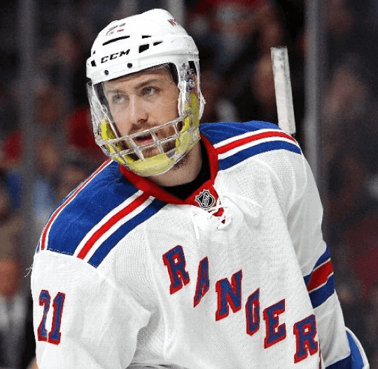
As we sat down on the couch a few minutes before the game started, the TV showed Rangers center Derek Stepan, who was returning to action after having broken his jaw two games earlier. As you can see above, he was wearing a faceguard with some extra padding.
When my brother saw Stepan’s headgear, he pointed at the TV and broke into this wheezy laugh of his, which is his aural signature. I’ve heard this laugh enough times over the years to know how to translate it, and this one translated to, “Look at that crazy thing he’s wearing! And he’s going to play — with a broken jaw! I’m tellin’ ya, hockey players are something else.”
Later on, at some point during the game, he said, “When I first started watching hockey, the red line was always a checkerboard pattern. That’s because people had black-and-white TVs, so you needed a way to tell the red line from the two blue lines.” I knew that the red line had traditionally been checkerboarded (and still is at some arenas), but I hadn’t thought about the reason for it — an excellent Uni Watch-ish observation. Maybe our priorities and sensibilities aren’t so different after all.
Stepan scored two goals, broken jaw and all, which made Roy happy. But the Canadiens won, so I was happy. And the Rangers are still leading the series, three games to two, so Roy wasn’t too upset. He gave me some shit as he left: “You’re a lousy host — you’re supposed to arrange it so my team wins.” I laughed, hugged him, and wished him a safe trip home.
Just imagine how different everything would be if he had given me a magazine with an L.A. Kings player on the cover.
Collector’s Corner
By Brinke Guthrie
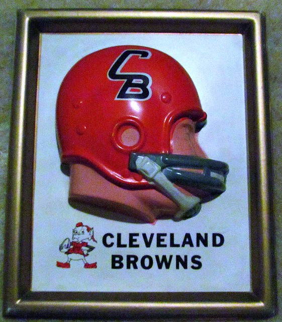
It’s not often that you see the Browns’ phantom “CB” logo and Brownie the Elf on the same item, but that’s the case with this Technigraph helmet plaque! And as long as we’re talking about the Browns, here’s a Brownie mascot seat cushion from the 1960s.
Can’t talk about the Browns without giving equal time to the Bengals. I bought one of these Pom Pom Ski Caps in the fall of 1972 when I moved to Cincinnati, and here’s a Bengals Technigraph plaque, too.
Okay, now for some non-Ohio stuff:
• This 1960s KC Chiefs T-shirt is pretty low-key as far as design goes, so I’m not sure it’s worth over $900.
• I had a low-cut pair of these Apex turf shoes — incredibly comfortable. (Knew a fellow at Apex.) And in a nice use of negative space, look closely at the stripes on the side: that’s a “1.” The company was originally Apex One, then they shortened it to Apex. Boy, did they make nice stuff. They were the official shoe of the NFL, so they were allowed to use the shield. Converse bought these guys for the license, then shut them down. Bye-bye, freebies.
• Back in the day, the Sony Watchman was the gadget to have — and this one comes adorned with the LA Rams logo.
• Found another one of the 1969 Chiquita NFL pocket transistor radios, right here.
• Here’s an early-1970s NFL tumbler. I’ve seen (and have) the thermal mug version but never spotted this style before.
• This late-1960s/early-1970s Vikings bobble is in positively perfect shape.
• Nice artwork on this 1971 San Francisco Giants poster. Note how the classic Juan Marichal pose has No. 12 rather than No. 27. And since I am featuring the Giants, let’s also mention this Dodgers poster. I’ve seen a photo of Maury Wills in that very pose, but here he is wearing No. 31 instead of No. 30.
• Interesting early-1970s electric football game — this one says “Gotham Official Electric Football.” Like … Gotham City? Didn’t realize the NFL had a franchise there.
• Can’t say that I’ve ever seen an NHL bubblegum card locker before.
Seen something on eBay or Etsy that you think would make good Collector’s Corner fodder? Send your submissions here.
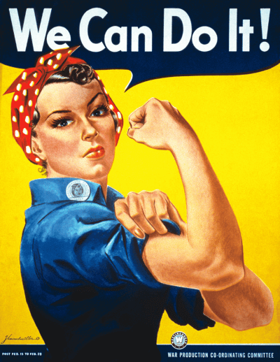
PermaRec update: My obsession with vintage employee photo I.D. badges has veered into an unexpected place: the old “Rosie the Riveter” poster. Get the full scoop over on Permanent Record.

’Skins Watch: The National Congress of American Indians and the Oneida Indian Nation are sending letters to every NFL player, urging them to speak out against the ’Skins name. Further info here (thanks, Phil).

Baseball News: If you’re among those who’ve been waiting for the Padres to bring back brown and gold, you appear to be out of luck (blame Phil). ”¦ Not sure I’ve seen a high school team using the Phillies’ 1970s-era “P” logo before. That’s Pleasure Ridge Park High in Kentucky (from Matt Dowell). ”¦ Also from Matt: The Rochester Red Wings wore 1971 throwbacks on Monday, in honor of former manager/broadcaster Joe Altobelli’s 82nd birthday. … While looking for something else, I came across an old shot of Tony LaRussa from his White Sox days, wearing a BP jersey with the uni number sewn onto its own “nameplate,” so to speak. I checked Bill Henderson’s jersey guide and found that, sure enough, that’s what they sometimes did. ”¦ Jack-o-lantern-themed jerseys on tap for the New Britain Rock Cats on May 31, I guess because it’s five months before Halloween or some such (thanks, Phil). ”¦ Jason Hillyer tipped me wise to this book about Japanese baseball uniforms. Tempting, but pricey. Hey, Mark in Shiga, can you get your hands on a copy for a more reasonable price? ”¦ Nice retro uniforms the other day for Indiana (from Pat Karasek). … Here’s a uni-based guide to the College World Series (thanks, Phil). … Here’s a soda display of Harmon Killebrew the MLB logo. “I think a white bat would have looked better, but you have to give the root beer some love too, I guess,” says Dave Sizer. … Here’s the latest on the signage plans for Wrigley Field (from Dave Flapan). ”¦ Bob Dlotkowski spotted these Brewers ball-in-glove logo cookies at the Milwaukee Public Market. ”¦ Why would a fan in St. Looie be wearing a Cardinals jersey with a Wrigley Field centennial patch? Because it’s a joke patch (thanks, Phil).

NFL News: Love this old ad for football knee pads. Note that the players are wearing neckties! (Big thanks to Jonathan Daniel.) … You’ve probably heard at one time or another that the Panthers’ logo is shaped like the outline of the Carolinas. But is it? Scroll down a bit to find the answer (from Yusuke Toyoda).

College Football News: Wowee zowee, look at this amazing Ohio State football photo from 1961. So many great details! (Big thanks, Phil.)

NBA News: Here’s designer Alexander Julian talking about the Hornets’ original uniforms — and the new ones, which will be unveiled on June 19 (thanks, Phil). … The NBA has inked a deal with the fashion company Peace Love World to beef up the league’s women’s apparel line (from Tommy Turner). ”¦ Fascinating article about how Adidas brand-polices WNBA and D-League footwear. Douchebags (from Kyle Hanks).

Soccer News: Real Madrid’s new jerseys will feature pink (thanks, Phil). … Spain has a new white third kit for the World Cup. According to that article, “[W]e could see more not-yet-unveiled shirts in the 2014 World Cup starting next month. Cameroon, in a friendly yesterday, already wore a [previously] unknown white kit, which could possibly have been requested for the match against Mexico in Brazil.” … With Landon Donovan gone, the USA team has been facing a quandary over who should wear No. 10 (thanks, Brinke). … All 72 teams in the Football League — that’s the three divisions below the Premier League — will feature Prostate Cancer UK’s logo on their uniform numbers (from Yusuke Toyoda). … Even better than de-Chiefing: de-swooshing (thanks, Phil). … Whoa, check out the exterior design of the plane for Brazil’s World Cup team. Further info here (from Gil Neumann).

Grab Bag: Hmmm, why does tennis player David Ferrer have a black cover-up patch on his shirt at the French Open? “Maybe an endorsement deal that went south,” speculates Brinke. ”¦ David Firestone has written a piece on how events 50 years ago helped lead to the development of the Nomex firesuit. ”¦ Sad news yesterday from the graphic design world, as Massimo Vignelli, the man who created one of New York’s best subway maps (among many other career highlights) passed away.

Love the CWS guide with uniforms. Can someone explain why all the jersey numbers that are visible are “14” (with the exception of Texas A&M, whose choice of “12” is obvious, if derived from the wrong sport)?
It’s not so simple as the last two digits of the year, is it? If so, that’s a trend that will stop in a few years, dontcha think?
In baseball, wouldn’t it be the 10th Man instead?
I wonder if teams are adding white kits for the World Cup to possibly wear in games with high heat/humidity.
Spain’s all-white seems to be completely FIFA-mandated, and it strike me as dumb on many levels.
* Spain/Adidas are dumb for choosing black as the away color, totally ignoring FIFA’s “predominantly light”/”predominantly dark” guideline.
* FIFA is dumb for approving Spain’s black away kit, since it clearly violates their equipment guidelines.
* FIFA is also dumb for making the Netherlands wear blue if they’re going to also make Spain wear their change kits. They could have just had Spain wear black and the Dutch wear their regular orange.
* FIFA’s broadcasters are dumb for insisting that red and blue aren’t sufficiently contrasting.
* Netherlands/Nike are dumb for also ignoring the “predominantly light”/”predominantly dark” guideline. If they’d simply worn any of the white/black/light blue away kits they’d worn in the past, this wouldn’t be an issue.
Cameroon’s white kit is even weirder, since the yellow seems to be a perfectly good “predominantly light” color.
I think you could’ve stopped at “FIFA is dumb”.
/just sayin’
That goes without saying. But here, Adidas was stupid too.
I’ve never understood the point of joke uniforms or joke patches like the one celebrating (maligning?) Wrigley Field. Outside Wrigley you can get T-shirts that look like beach-blanket White Sox uniforms reading “Sucks” and outside Comiskey you can get T-shirts that look like Cubs jerseys, except they read “Scrubs.” But then again I’m also puzzled why anyone would want an All-Star batting practice of their favorite player rendered in the colors of the host team. Did Yankees fans actually buy Mariano Rivera BP jerseys last year when they were made in Mets colors?
Yes, I have seen those Rivera (and Jeter and Cano) batting practice jerseys being worn by Yankees fans. I guess they have no objections to wearing it as they see it as an All Star jersey and not as much a Mets jersey. I do get your point, though, and that’s why I had no interest in buying those All Star Game batting practice jerseys.
I love joke uniforms or patches. Not only am I a proud, though purely hypothetical, owner of a Mets-style t-shirt that reads “Meats,” I sometimes wear it to Nats games when the Mets are in town. The point, you ask? The point is the joke. It’s on the order of a prank – very occasionally, waiting in line for wings at the Hard Times stand or something, some fully Nats-merch-bedecked fellow fan will start to lay some anti-Mets teasing on me, and only then realize that the script has an extra letter, and it’s like pulling one over on him. Only, since we’re both rooting for the Nats against the Mets, the other guy is laughing with you. It’s the rare prank, and the best kind, when you can pull it on a complete stranger and he gets to be in on the joke too.
But then again, I also love puns, the worse the better, and these sorts of things, including that beautiful Wrigley futility patch, are really just visual puns.
Right on, Scott. I also enjoy wearing that hypothetical T-shirt.
FWIW, Joe Altobelli wasn’t simply a minor league broadcaster, but also a minor & major league player and manager. In fact, he was the manager who succeeded Earl Weaver and skippered the Orioles to the 1983 World Series title (then axed in 1985, leading to Weaver’s ill-fated return). Prince of a guy, and the perfect pick to replace Weaver – but only for one year. After that his easygoing nature was his own worst enemy in getting the most out of his players.
Also, the pitcher wearing in the upper right-hand corner of that Dodgers poster linked to in Collector’s Corner looks suspiciously like Sandy Koufax:
link
Like Marichal, wearing the wrong number; but even worse, long since retired.
Go Habs Go! Go Habs Go!
Anyone know if they still yell, “Ohh, ahh, Habs on the warpath!” in Montreal? I remember hearing the crowd shout that while watching Montreal games on Hockey Night in Canada. It was then used by Sabres fans.
Not a cheer to warm the hearts of First Nations people.
I agree. Go away Habs, go away.
If you are a fan of beards, the 80’s sitcom Full House, beer league jersey’s that push the envelope or all of the above, you’ll want to take a look at this – a bit too much (sorry for sloppy link) — link
That article about the Panthers logo and the shape of the Carolinas reminded me of an article Paul Caputo recently published on Creamer’s site.
It seems that there is a natural tendency among fans to incorrectly assume that certain logos are designed to be in the shape of their states.
link
Wait, you mean the blue part of the MLB logo isn’t a stylized rendering of the state of Rhode Island?
The number 10 story has a leaked source s
I hate iphones. The number 10 story has a leaked source claiming Diskerud will take over the number. Not a bad choice, but, personally, I’d love to see Wondo take it.
I think Wondo would’ve been a more natural fit too, though like the article says, Dempsey was the most obvious choice.
Right, I agree, but he’s already to that point of fame that even fair weather fans probably know his current number choice.
Commentators last night were mentioning a funny chance that if Dempsey really is injured and it’s not just precautionary that he sat last night would they bring Donovan in? That would be funny, give someone else the number 10 and Donovan comes back? Aaawwwkwaaard.
Nike wouldn’t be happy with Dempsey switching numbers at this stage, obviously, given how all the merch out there with “DEMPSEY 8”.
I remember a while back, Argentina tried to “retire” Maradona’s jersey by having the third choice keeper wear number 10. FIFA put a kibosh on that, though.
I think Argentina actually did that–there’s no rule against the 3rd keeper wearing 10. Argentina wanted to give nobody the 10, and that’s what FIFA disallowed.
I’d like to add my own congratulations on 15 years of Uniwatch. When I saw the first Village Voice column, it was like a surprise Christmas present. I grew up trying to hand draw every uniform in every game I saw. I was hooked by an April 1962 Sporting News article “New clubs new duds” describing in minute detail the new Mets and Astros unis. The peak of my “Peanut league” baseball experience was the flannel uni and stirrups in a day when my high school baseball, football and basketball teams ALL wore stirrups. And it’s pleasure to check out uni-watch first thing every morning…Thanks for the last 15…
Thanks, Robert!
For anyone who missed it on Monday, here’s the 15th-anniversary entry:
link
I missed it as well – I was camping at Floyd Bennett Field in Brooklyn, admiring the aesthetics of a 1920s airport – but want to offer my congrats as well.
Never knew, back in the Village Voice days, that I’d get so much daily enjoyment from this over the years. Thanks again for all your work, everyone!
I too was a Habs fan growing up. Mostly because of Guy Lafleur. Not “Lefleur”!
Ugh — embarrassing typo. Now fixed.
When Lafleur came to the Rangers late in his career, I learned that he was a fairly heavy cigarette smoker. For some reason I found this tremendously disappointing. How could any top-level athlete — especially in a sport as aerobic as hockey — still be doing that in 1990? His production was way down by that point, which I’m sure was just part of any athlete’s natural decline, but at the time I attributed it to the cigarettes.
Not to mention, Lafleur was retired for a few years, because he hated Jacques Lemaire as a defensive-minded head coach. He came back to the Rangers because the coach was his friend, and then he moved on to the Quebec Nordiques to “be a big brother.” Lafleur roomed with a young Joe Sakic, and he insisted on smoking his cigarettes in the bathroom instead of the room itself.
Yep and Lafleur’s partying ways almost cost him his life. (an earlobe scar)
link
I grew up in the early 70’s in Montreal. Back then, we thought all the original US cities were rabid about hockey, as they all filled their stadiums (except Detroit back then), and they had rabid and loud fans. Now of course we know better. Chicago and Boston have both re-emerged as good (relative) hockey cities. New York from my vantage point never has, yes the Rangers sell-out, but the interest seems to have followed the same pattern as your own interest in the sport, i.e. the sport is more of an after-thought.
I was surprised to see Al Iafrate lighting up just off the ice. Baseball, I can understand. But hockey is so physically demanding. And he had such a great slap shot.
6th paragraph…I assume you sat on the couch, not Alain Vigneault.
Now that’s a good typo!
Fixed.
“… Wowee zowee, look at this amazing Ohio State football photo from 1961. So many great details! (Big thanks, Phil.)…”
Great shot. Notice that the OSU helmet in that photo features an unusually wide — very wide — red stripe on the helmet. The red covered an extra piece of foam padding fixed to the exterior of the helmet. Harvard — using virtually the same color scheme — was the only other college that I can remember that wore that particular helmet design.
[Deranged aficionados will recall that Harvard shared the Ivy football crown that season with Columbia, the last time that the Lions sat atop the standings.]
Ohio University used it too
There were several other teams that wore those. BYU and Duke did and others. Ohio State played Duke in 1959 and Duke had those helmets. Later on in the year at least one Buckeye helmet had padding as maybe a trial.
I have seen that Buckeye photo before but it was cropped more to just see mostly Bob Ferguson.
This one has more to it.
I think Gotham is the brand/company.
(maybe you were being facetious)
Lord knows what things could look like in a Tudor elec. football game!!
I think you’re right. There is, apparently, a book all about electric football (The Unforgettable Buzz) that goes into all the intrigue about the competing companies from back in the day.
link
Haven’t read it, but would like to.
I plan on getting that book too.
The book has its own webpage, and I stumbled upon link regarding Gotham’s Joe Namath-endorsed electric football game from 1969.
MLB Stadium logo re-imagined, and are in many ways an upgrade to the real thing.
link
Was in the Ticker last week.
Damn, that’s twice in a row I’ve posted something that had already been in the ticker. I have brought great shame to my family.
It’s time to hang the spikes up.
Gotham City? Didn’t realize the NFL had a franchise there.
link
Does that movie actually mention the NFL? Maybe the Gotham Rogues are part of the same league as the Miami Sharks from Any Given Sunday.
Affiliated Football Franchises of America. Oy.
Probably not. Didn’t Gotham play Rapid City in the movie? AGS listed most of the teams in the AFFA, they were in actual cities.
The Football League actually comprises of the divisions that are respectively one, two, and three levels below the English Premier League.
link
Isn’t that what he said?
All 72 teams in the Football League – that’s the three divisions below the Premier League
I’m thinking random reader missed the “the” there.
I didn’t remember seeing it there when I read it this morning. If it was already there, or added after the fact, consider my point withdrawn.
I’m pretty sure I was the only kid in Minnesota who owned that Bengals stocking cap in 1972, though I have no evidence to support this claim.
And I just love the simplicity and utility of the hockey card locker. I probably had that, too.
Any predictions for the Hornets uniforms?
I betcha its the Hornet wordmark with pinstripes
link.
When they do the inevitable throwbacks, I hope they wear the original Alexander Julian numbers, with the link.
Sorry if I’m doubleposting (my last comment disappeared), but those details (wordmark and pinstripe) are out: link
So… they’re going to look like a ripoff of the original team. That’s kinda what we expected, isn’t it?
Well, they’re “reclaiming” the original Hornets, so yeah.
The major difference, I guess, is that the original Hornets had the “CHARLOTTE” wordmark on both home and away.
Question now is:
Will the Pinstripes be like the Bobcats
link
Or will the Pinstripes be like the Original Hornets
link
I’m surprised nobody’s mentioned that the Pleasure Ridge Park High uni, while using the Phillies’ old logo, is actually based on the link.
Sure, the hat may not be a “pinwheel” design, but the rest of the uni design matches.
Absent a pinwheel cap, the only similarity to the Expos is that the racing stripe is composed of two equal-width stripes. But the burgundy era Phillies also wore racing stripes, so the high school hasn’t strayed far from the Phillies original. Just as likely that someone said, “Let’s do it like the old Phillies, but in gray instead of blue, and with two stripes instead of three,” as that someone said, “Let’s do it like the Expos, only change literally everything about it except for the number of stripes.”
Either way, or both, it’s a nice look, though a shame the school administrators think so poorly of their students’ talents to go with a pro ripoff logo instead of something original.
Spoke too soon: The number font, which on first glance isn’t actually the same as the Expos used, and so struck literal-minded me as being nothing like the Expos numbers. But it’s really not that far off, and much closer to the Spos than the Phils of the same era, so there’s that, too. Like I said, either way, you can’t go wrong basing your uniform on either Montreal or Philly from that era.
BUT the Phillies only had a single stripe (outlined in white on the road powder blues/grays), while the Expos had the two-color racing stripes. The number font on the high school team is also similar to the fancy font the Expos used.
And, of course, arrScott, you posted a response while I was composing mine. Ah, well.
Paulsboro (NJ) High wore 1970s Phillies uniforms when I was in high school. They were in our conference and their colors were red and white already so it was a decent fit – pinstripes and all. Paulsboro sits on the South Jersey side of the Delaware, and you can see Philadelphia from there.
The Paulsboro baseball team (Red Raiders?) continued to borrow uniform elements from the Philadelphia MLB team in 2013:
link
Not surprised by the update – although the Phillies had already changed to the current cap design before I was out of high school. Guess it was inevitable. And it is the Red Raiders.
Paul, I can absolutely get you one of those Japanese uniform books. This one is an update to the legendary original compiled by Ritomo Tsunashima eight or ten years ago. The cover price is something like $16, and then to ship it to the US would be about $15-20 (for airmail) down to $8-10 (for international media mail, which the USPS doesn’t offer anymore; thank you, Japan Post).
I’ll send you an e-mail tonight; I’d be happy to find one of these for you.
This one is an update to the legendary original compiled by Ritomo Tsunashima eight or ten years ago.
Ah, I see. Well, I already have that one, which I value primarily for its coverage of old, historical stuff. No need for the update, I’d say. But thanks for offering!
Re the Dodgers poster and “Maury Wills” in #31. I’m guessing that had to do with licensing, using MLB stuff in general but not players in particular. So it’s a generic player in a Wills pose wearing a number not belonging to Wills. Check the pitcher in the same poster. That’s definitely a Koufax pose, but definitely not #32.
link is the Wills pose. Hard to be more prominent than the cover of Sports Illustrated, especially back in the day.
There’s a 1968 copyright (for MLB Properties) on the bottom left corner of the poster, so I have to wonder if the artwork was actually commissioned in 1968. At that time, Wills was with the Pirates, and Koufax had retired.
Just noticed flipping between the two images that “31”‘s left hand is in a not-quite-clenched fist, while Wills had his ring and pinky fingers extended.
Today’s entry may be in my Top 5 since the blogs inception.
I thoroughly enjoy reading stories like this and those of similar ilk.
Agreed! Great entry.
My Padres rooting interest began in 1969 and ended in 1991 when they dropped the brown/gold. How do you just drop your original 21-year identity?
-Jet
As a native San Diegan who began following the Padres in 1969 as a nine year old, I can say that dropping the brown and gold for blue and whatever is just one of MANY dubious decisions they have made. I wish they’d just go back to the 1969 uniform (link)
Right, they don’t have to go with the gaudy mustard togs. That first-year design is very understated, nothing over-the-top about it.
-Jet
I wish every team would go back to their 1969 unis (excepting the Red Sox restoring their red piping).
I’m guessing it wouldn’t be particularly helpful to point out that the Padres were actually brown/orange from 1985 through 1990?
Hey, conservative town; conservative tastes. So long as they can’t strike the old designs from the throwback catalog, I’ll try to be happy with that.
I’d say SD is a right-wing town, not a conservative town.
all I see now is an F in the Falcons logo and it’s an ugly F…but a little clever I must say.
I still think that’s a stretch. It does resemble an F from the one side, but other side of the helmet is a mirror image, and thus, not an F at all. I think if the F was truly intended, they wouldn’t flip it for the other side of the helmet.
Before they tarted up that logo a few years ago it was a much better “F”, even though it was reversed half the time.
“This 1960s KC Chiefs T-shirt is pretty low-key as far as design goes, so I’m not sure it’s worth over $900.”
I’m sure it will fly off the shelf for a mere $562.50.
New Era released alternate versions of this year’s draft hats.. and boy the Seahawks one is ugly
link
Having an 11 year old son I have come to accept (somewhat) that neon colours are here for a while … but upside down lettering comes across as a mistake. That blows.
The pattern reminds me of an eighties interview backdrop, or seventies bedsheets. Neither of which I would want to wear on my head.
link…
The link aren’t bad by comparison. Of course, they don’t have all teams for these variants.
Not that it matters to me, since I don’t have any interest in buying a draft cap in any year.
Part of the collage background incorporates the Ticker abbreviation. Y’know, those were a lot more fun when they were just doodles in the margins of my notebook.
oh look the soon-to-be-arizona coyotes officially unveiled their link today can’t you just feel the excitement.
Really, the updated shoulder patch should come as a surprise to no one.
It was leaked months ago, I don’t see how it could have been a surprise.
As for the new white kits for the World Cup…
Can you tell these apart?
Spain: link.JPG
Netherlands: link.jpg
Or how about these…
Mexico: link.jpg
Cameroon: link
And as far as the debacle over who should wear the number 10 for the USA, Mix Diskerud’s answer about him wearing the number should say enough. He said(paraphrasing), “It’s not about the number or name on the back. I represent the crest on the front.” No controversy there.
“…I represent the crest on the front…”
If only the crest were the crest of the USA instead of that cockamamie US Soccer thing…
URLs aren’t working. You might want to put them inside a href tags.
nevermind, they just looked funny. But yeah, the whole color contrast business is dumb as crap.
I had one of those hockey card lockers as a kid, but mine had room for 21 teams. Man, did I abuse the hell out of that box. It was wonderful.
And that Japanese Baseball uniform book I SOOOOO want. I just picked up a new book 1000 Football (soccer) Shirts and it’s very colourful. Sponsorship aside, many kits are gorgeous and when the sponsor tries to blend their ad into the kit, it makes the kit more special. Thanks for this site as always.
“you needed a way to tell the red line from the two blue lines.”
Couldn’t the red line be distinguished by being in-between the two blue lines?
I don’t know if anyone has noticed this yet, but the A’s use a different pattern on their green alts than their gold alts, despite using the same exact design.
link
link
This is not just a mlb.com error. These are exactly what hey wear in the games.
Those A’s are totally different sizes.
Not sure if this has been mentioned yet.
Georgia Tech (via its Facebook page) released its annual football team poster this year, and it features a picture of the team in the Bobby Dodd era throwback uniforms that debuted last season in the game celebrating the 100th season played on Grant Field. Word on the street is that the older alumni love them. Does putting them on the poster mean they’re standard fare this season? I think most Tech fans are already acting like that’s exactly what it means. The carousel of designs given to us by Russell Athletic over the last five seasons has tested many of the older fans’ collective patience. For me, a younger alum, I’d like to see these uniforms rotated into the lineup but not necessarily committed to for every game of the season, because a little bit of modern might keep us in the news and help with recruiting. I love the bolder (“correct” if you ask anyone over 50) old gold of this uniform, though.
link
The Panthers logo is supposed to resemble the shape of the states of North and South Carolina. This was per team officials upon the release of the logo when the Panthers were awarded the franchise. BUT, when comparing them, you only use the head of the panther and not the neck. The ears flare out to resemble the top of the state of NC and the jawline resembles the bottom of the state of SC. Do the comparison with just the head and it fits.
…let me rephrase that. It doesn’t necessarily fit, but it “resembles”.