
For all of today’s photos, click to enlarge
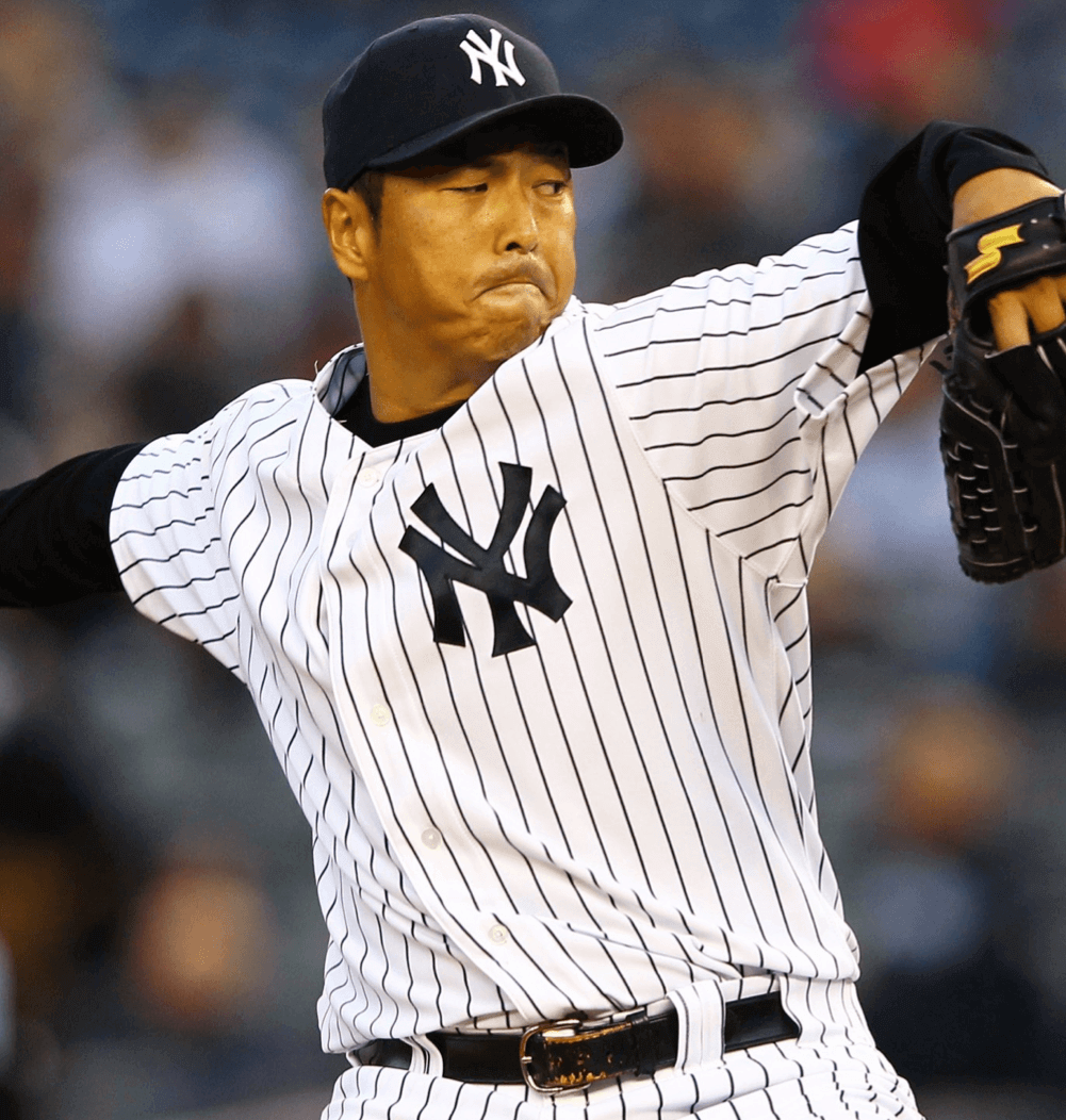
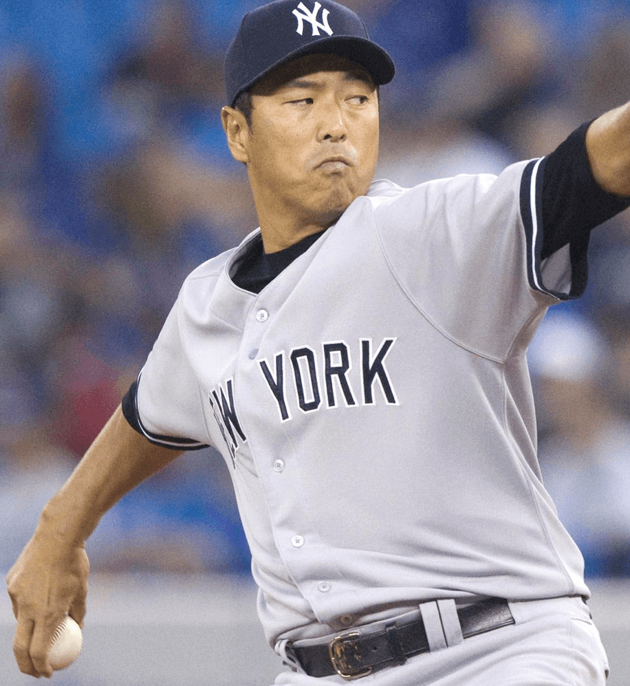
In Saturday’s Ticker, which was compiled by Phil, reader Jimmy Lonetti noticed that Yankees pitcher Masahiro Tanaka appeared to be wearing a larger-than-usual belt buckle in a recent ESPN The Mag cover photo (shown above). That jogged a particular memory for me — which I’ll explain in a minute — so I started doing a bit of digging.
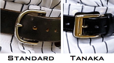
First, let’s establish a baseline of what a standard-issue MLB belt buckle — and especially a standard-issue Yankees belt buckle — looks like. These photos of Dave Robertson and Mark Teixeira should do the job:
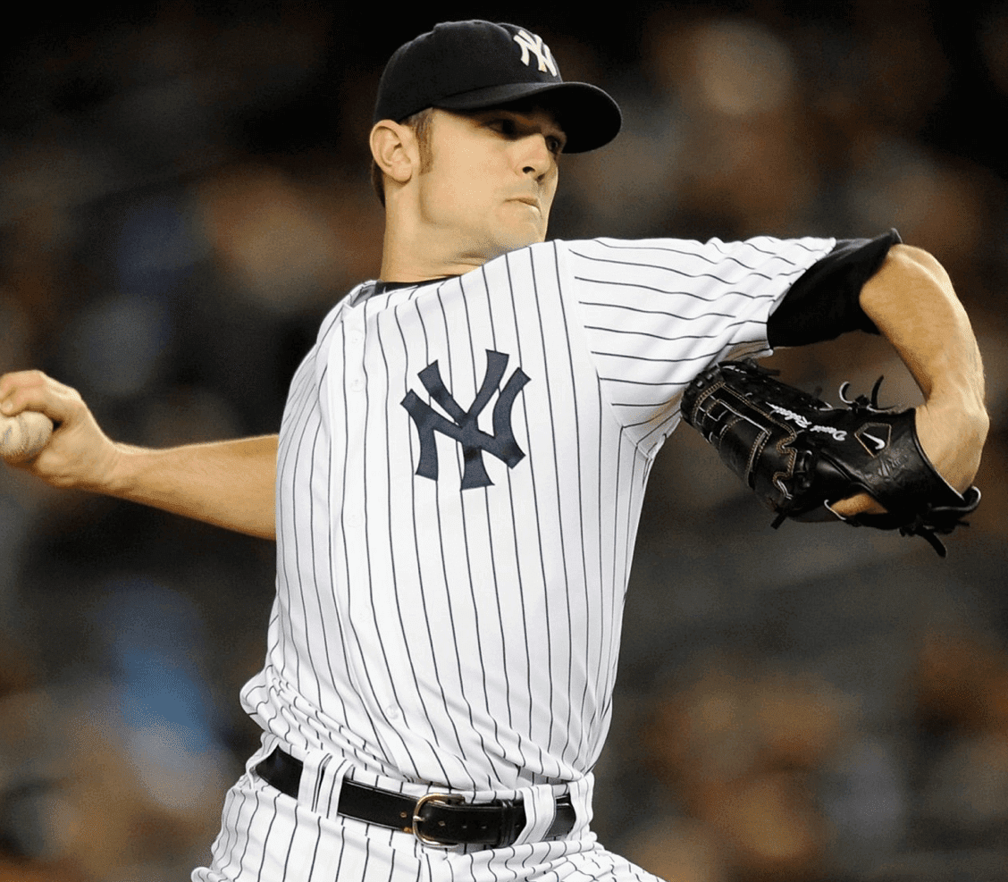
So that’s your basic Yankees belt. If you look again at that cover photo of Tanaka, he’s clearly wearing a different buckle style. But hey, maybe he just grabbed whatever belt was handy for that photo shoot. What does he wear in games?
Turns out he wears a rather unique buckle design:
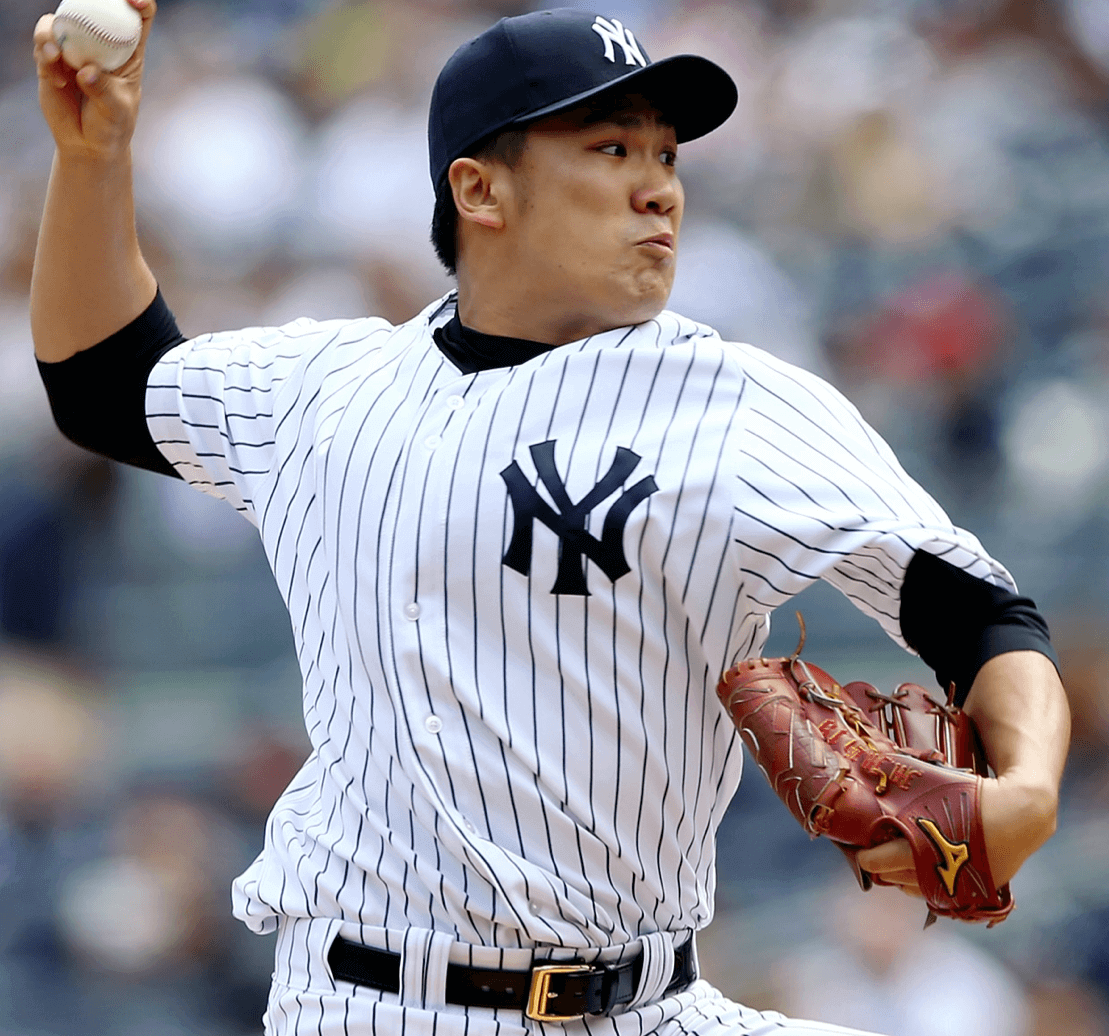
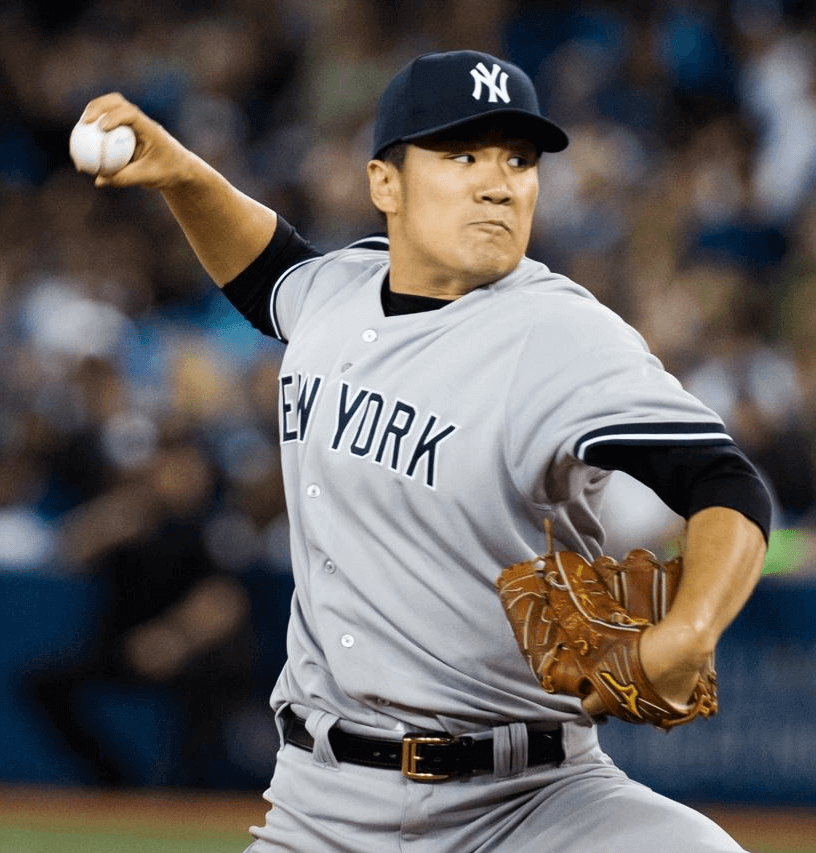
I looked at a lot of Tanaka photos while preparing this entry, and he’s worn that belt for every one of his Yankees appearances, dating back to spring training. He also wore it (or something very similar to it) while playing for the Tohoku Rakuten Golden Eagles and in the World Baseball Classic. It’s clearly his belt style of choice.
The reason this all rang a bell with me when it came up in Saturday’s Ticker is that this isn’t the first time we’ve seen a Japanese pitcher with a special belt buckle. Back in 2006, Dodgers reliever Takashi Saito wore an oversized gold belt buckle. I remembered this because I wrote a blog entry about it at the time.
So are slighty gaudy buckles a common thing among Japanese pitchers? By handy coincidence, the Yanks happen to have Hiroki Kuroda on their roster. Let’s take a look at his buckle:
As you can see, Kiroda wears the standard-issue buckle. So if the oversized buckle is a thing among Japenese pitchers, it’s definitely not a thing among every Japanese pitcher.
Meanwhile, what’s the story behind Tanaka’s belt? Like, is it a good luck thing or what? I asked a Yankees spokesman about it and got the following response: “Mizuno supplies Tanaka with his belts, and that’s what they provided him. There’s nothing more to it than that.”
So after all that, it’s just another sponsorship/endorsement thing? Man, that is seeeeriously disappointing. For what it’s worth, I did a bit of Googling on the term “Mizuno baseball belt,” just to see if I could find Tanaka’s buckle, but I came up empty (although I confess I didn’t search all that hard because I was so bummed about the anti-climactic conclusion to this tale).
This is the second time in Tanaka’s short MLB career that I’ve taken a close look at him. After his first start of the season last month, I wrote about how he was wearing the banned pant-cuff strap (which he then stopped wearing). I looked at lots of Tanaka photos while working on that piece was so focused on his pant cuffs and never noticed the belt buckle, which just goes to show that there are always more details to pay closer attention to.
Tanaka’s next start is tonight. I’ll be keeping an eye on his belt.
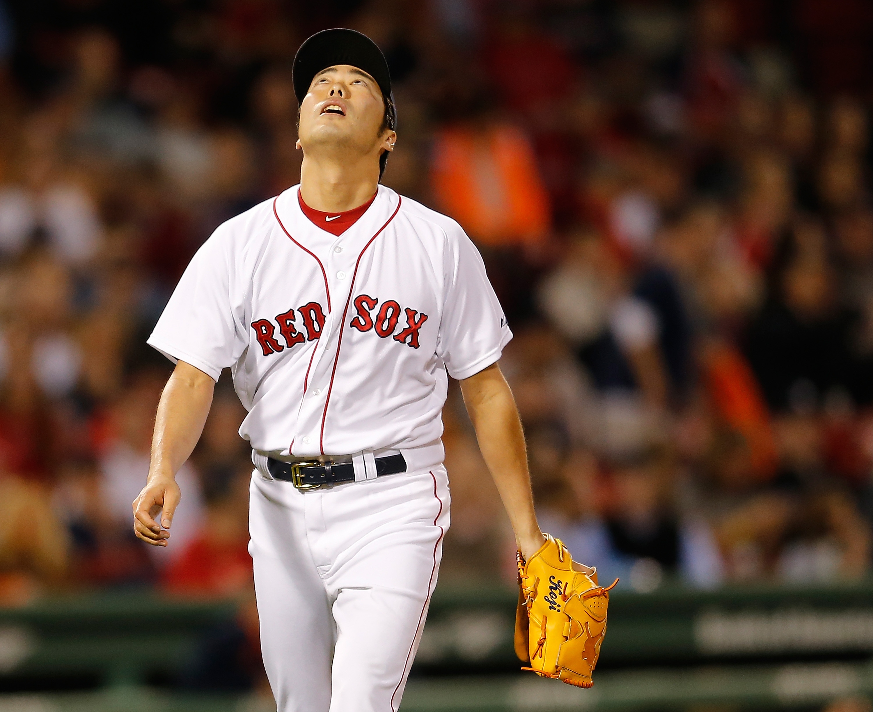
Update: Our first comment of the day pointed out that another Japanese pitcher — Red Sox reliever Koji Uehara — also wears the Mizuno buckle:
(Big thanks to Jimmy Lonetti, who got this ball rolling by spotting the buckle quirk on that magazine cover photo.)
Click to enlarge
Collector’s Corner
By Brinke Guthrie
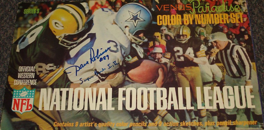
Haven’t seen this before: a 1960s NFL paint-by-numbers set. The box lid is signed by Packers great Dave Robinson, shown on the cover tackling Dan Reeves.
Here’s the rest of this week’s eBay haul:
• Nice-looking Baltimore Orioles patch from the 1950s.
• Great typeface on this 1970 New York Giants media guide.
• Oooooo, terrific 1960 NFL logo team poster!
• Where did the ABA’s Denver Rockets do their banking? At the Central Bank, of course.
• Great cover artwork on this 1968 NFL autograph yearbook.
• It’s Fast! It’s Real! It’s your “National League” (didn’t they mean National Hockey League?) electric hockey game.
• This 1982 Packers poster came inside a box of Kellogg’s Raisin Bran.
• One of my favorite bobbleheads, I guess due to my music radio background, is this Bill Graham bobble from the SF Giants’ 2011 season. (For those who don’t know, BG was a legendary music promoter back in the day.)
• Bills fans, here’s a vintage helmet pencil sharpener display with, of course, several Bills helmets on it.
• Guess they wore these hats in the famous Baltimore Colts Marching Band.
Look at the helmet wings on this 1960s Eagles bobblehead!
Seen something on eBay or Etsy that you think would make good Collector’s Corner fodder? Send your submissions here.
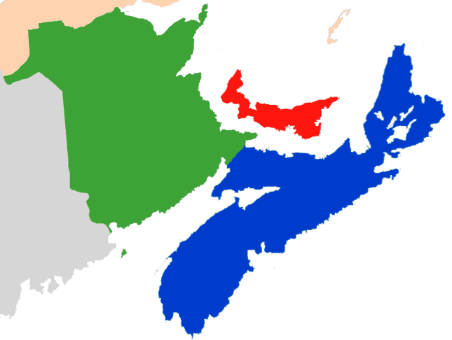
Looking northward: Paul here. I’m thinking of heading up to Nova Scotia (and maybe the rest of the Maritimes) in about a month. Never been up that-a-way, but I’m intrigued.
If you live in the Martimes, or if you used to live there, or if you’ve traveled there, I’d welcome your thoughts, suggestions, and advice. Big thanks in advance.
Sponsor shout-out: I’ve been a big fan of Amelie Mancini’s Left Field Cards project for several years now. I wrote an ESPN column about her cards in 2012, and I’ve been really happy to have her as an intermittent advertiser here on the site over the past year or so. She’s good people, and her cards are good product.
Left Field Cards is currently running a one-week sale. From now through the end of Memorial Day, you can get 20% off by entering the code “memorialday2014” at checkout. If you’re already familiar with Amelie’s designs, this is a good time to restock your supply; if you’re new to Left Field Cards, there’s never been a better time to get acquainted. Either way, get started here.
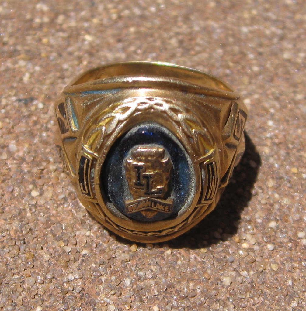
PermaRec update: There’s a really odd story behind the lost high school ring shown at right. It’s been found twice, and yet it doesn’t seem to want to go home to its owner. Full details over on Permanent Record.
Tick-Tock: Today’s Ticker was compiled and written by Garrett McGrath.

Baseball News: Yesterday, Paul covered the two throwback games but here are some more tidbits: The KC fans were dressed to the nines (thanks, Phil). … “I don’t have a picture but during Sunday’s WGN telecast of the Cubs/Brewers game, Len Kasper (who discusses uniforms quite a lot) noted that the Brewers were going with solid navy helmets in keeping with the theme of the throwback jerseys,” says Matt Hooban. “But he pointed out the notable exception of Jonathan Lucroy, who wore his navy helmet with the M-over-crossed-wheat-stalks logo.” … For their upcoming retro weekend, the San Diego Padres are wearing replica throwbacks of their white and brown 1984 uniforms. They will follow up the best-looking brown jersey in baseball history with, what else, camo (from Jared Buccola). … Here is an unofficial MLB players census, focusing on player age, salary, experience, and much more. The census has some great graphs — who knew that Houston was the number two player-producing city after Santo Domingo in the Dominican Republic (from Andrew Powell-Morse). … The Detroit Tigers have been winning a lot of games and it has nothing to do with these head-to-toe tiger print jumpsuits (thanks, Phil). … Check out 1931 and 1934 spring training video footage of the Washington Senators (from Ben Fortney). … The Nippon Professional Baseball league released this logo to celebrate the 10th season of interleague play. The league is using the logo in this video to promote the games (from Jeremy Brahm). … On June 1, the Dodgers are giving away an interesting batting helmet as a promotion (thanks, Phil). … From yesterday’s comments: Great logo on this Cincinnati Reds strength and conditioning shirt. ”¦ 1970s throwbacks on tap this Saturday for the Mariners and Astros. ”¦ And speaking of the Mariners, they’ll be giving away this “King’s Court” T-shirt when Felix Hernandez pitches on Friday.

NFL News: At least one observer thinks all NFL teams should follow the Pats’ example and offer discounts to anyone who buys a jersey of a player who is no long under contract to the team within a year of purchase (thanks, Phil). … University of Virginia graduate and ’Skins draftee Morgan Moses attended his graduation service wearing a mortarboard with his new team’s logo on the top (from Tommy Turner). … The 2018 Minnesota Super Bowl Bid Committee released an interesting logo (thanks, Phil). … Steelers third-round draft pick Dri Archer has changed his jersey number from 34 to 13 (thanks, Phil).

College Football News: “On ESPN’s college football site there is a mural depicting a bunch of different teams,” says Derek Summerville. “The mural incorrectly labeled University of South Carolina’s outfitter as Nike on its jersey but correctly as Under Armour on the helmet visor.”

Hockey News: Here are original Minnesota North Stars jersey design drawings by George Karn, a great Minnesota hockey player, coach, and organizer as well a commercial illustrator who created such characters as the Trix Rabbit and Count Chocula. One last nerdy detail: Charles M. Schultz, of Peanuts fame, served as Karn’s hockey team manager. … Yesterday, Paul asked if every team has their own strength and conditioning logo. The Pittsburgh Penguins do (from Mike Engle). … Two from the International Ice Hockey Federation tournament in Minsk, Belaurs: Check out this awesome NOB for Vadim Krasnoslobodtsev. … A behind-the-scenes video of the IIHF jersey sewing room (both from Bill Mitchell).

Soccer News: Here’s the story behind the 1994 U.S. men’s soccer World Cup jerseys, largely renowned as being among the ugliest kits ever (thanks, Phil). … Trevor Williams sent in a bunch of new uniforms. Two from French club teams: Paris SG and Stade de Reims. Two from Spanish club teams: Athletic Bilbao and Sevilla. Three from European club teams: Benfica, Udinese, and Malmo FF. One from a Brazilian club team: Cruzeiro. … Two from Yusuke Toyoda: A collection of stories about uniform mishaps at the World Cup, including England’s difficulties with light blue, how Argentina beat England wearing shirts that were sewn up just days before the match and France had to borrow jerseys from a local club team. … Watford is asking fans to decide if the team’s wearing black shorts or red shorts next season. … Official picture of the 2014-15 Barça home kits (thanks, Phil). … The NASL team Minnesota United have agreed to a shirt sponsorship deal with the Mall of America (thanks, Phil).

NBA News: Swarm to serve: The Charlotte Bobcats are having a press conference tomorrow to announce the official team name switch to the Hornets. “The only things we know are that some executives will be there to talk about the official start day of the rebrand,” says a Hornets insider. “Which could include uniform and mascot unveiling. The presser will be shown on the new website, which is now live.” (big thanks, Phil) … In honor of the name change The Charlotte Observer posted a map of the history of NBA franchises complete with logos (very cool, Chris Marsicano). … Here’s an early look at the new NBA Draft hats. … The folks at Pop Chart Lab have created a great poster showing basketball jerseys from 1921 until the present. I love the inclusion of jerseys from popular culture. You can buy the poster here. … My intern partner-in-crime Mike Chamernik sent in these cartoon trading card concepts for a bunch of NBA players.

Grab Bag: Photocrom postcards from Detroit Publishing Company, some of the first colorized photographs in America, are now collected in a new book An American Odyssey (from Yusuke Toyoda). … This couple had a Tennessee football-themed wedding (from Tommy Turner). … Here is a photo gallery of WWE wrestler’s ring gear (from James Comfort).

What Paul did last night on Sunday: Bay Ridge, Brooklyn, a neighborhood that used to feature a huge Scandinavian immigrant population, still celebrates Norwegian Constitution Day each year. The holiday takes place on May 17, but in Bay Ridge it’s always celebrated on a Sunday, and this year’s festivities took place this past Sunday, the 18th. I’m not Norwegian, and neither is the New Girl, but we like the Scandinavian scene out in Bay Ridge, so we headed out there on Sunday afternoon.
Unfortunately, we were too late for the parade, but there was plenty of eating and drinking action at the neighborhood’s various Scandinavian social clubs. These clubs are normally for members only, but they’re easy to infiltrate during the Norwegian Constitution Day festivities. We went to the Danish Athletic Club (which I’ve written about before), the Swedish Soccer Club, and the awesome Norwegian Sporting Club Gjøa, all of which were packed with happy revelers, including lots former neighborhood residents who’ve moved away but come back every year for the ethnic celebration. Many of them were in full Norwegian costume. It was a really great event to be in the middle of.
Unfortunately, I didn’t get any photos (long story — let’s just say there were technical difficulties), but I did manage to get a few minutes’ worth of video of the bandstand and dance floor scene at the Danish Athletic Club. I’m pretty sure this was the first band I’ve ever seen with two accordions. Dig:
Koji Uehara also wears a non-standard belt: link
Ah, good one! That’s also a Mizuno belt.
I’ll add that to the end of today’s entry.
Dont know if ever heard Zubaz referred to as “tiger print.”
Wasn’t that 1960 NFL poster designed by one of our fellow uni-watch readers/contributors? That looks *really* familiar.
Bingo. Featured halfway down the page: link
Doctor Who baseball jersey: link
out of the 3 most recent doctors its 11 > 9 > 10
10 gets dinged because of his companions
Hush, you. Donna Noble was one of the best ever.
“I’m pretty sure this was the first band I’ve ever seen with two accordions.
~~~
There’s probably a very good reason for that.
Hungry Hungry Hipster is into bands with two accordions because no one else is cool enough to appreciate them.
I visited Noca Scotia and I have two pieces of advice. If you visit Halifax, remember that they shoot a cannon off at noon every day. If you search out the Arcadian parts of Nova Scotia, I would also advise: do NOT eat the rappie pie. You have been warned.
Tom, it’s ACADIAN, not ARcadian.
. . . but Noca Scotia is OK?
Yeah, I saw that. But he spelled it correctly the second time. Obviously just a mis-strike between the “c” and “v” keys that are next-door neighbors. I gave him a pass.
Regarding the Collectors Corner comment about “National League” vs. “National Hockey League”, I have heard some of the older CBC announcers (e.g. Dick Irvin, Jr.) refer to the major and minor leagues as the “National League” and the “American League”, respectively. I guess in pre-MLB Canada, those were the National and American leagues, and everyone just knew you were talking about hockey.
Sid Abel would also do this on Red Wings’ radio broadcasts.
Even nowadays, I hear broadcasters refer to the AHL as the “American League” all the time.
Can’t say as I ever hear the NHL referred to as the “National League” though.
Don Cherry has always used ‘american league’.
Eric, it’s the American League. Use caps, please. And I know Grapes from his Rochester days.
The Mizuno belt appears to have a a flap under the buckle. A little extra protection against chafing, I suppose.
And man, how can you not love Kansas City? The origins and proliferation of the Dressed to the Nines thing, what a great story.
“The KC fans were dressed to the nines (thanks, Phil)”
I love that! Very cool idea…
Why not wear a coat and tie on the ballfield?! We already have floppy slacks, button down shirts, and frickin’ belt buckles on our belts!!
Baseball needs an enema, and bad. Bring back Sansabelt! Bring back ultra-tight cuffed pants (more aerodynamic anyway!). Bring back zippered jerseys… or at least no-button jerseys. Outlaw pinstripes, the ubiquity of red or blue, the flat bill cap, and no-hosery.
I’m only half-kidding here. Baseball needs somebody to shake it out of the uni-doldrums. Hopefully the trends in college baseball trickle up the ranks.
Why not wear a coat and tie on the ballfield?!
link
Exactly, why not? You can tell MLB teams want to do something different… they’re yearning for it with the Sunday alts, the tribute days, etc. Will the Cubs this year lead a uni-trend into the future?
But, really, a belt buckle on your uniform pants? We had all kinds of colored, stretchy “sports” belts as kids in the 70s and 80s… and in 2014 guys are wearing everyday suit slacks belts to hold up their baseball pants? Just flat-out preposterous.
That’s a fine looking group of ballists, right there.
the notable exception of Jonathan Lucroy, who wore his navy helmet with the M-over-crossed-wheat-stalks logo.”
I thought they were stalks of barley, not wheat.
Indeed they are.
Much as I enjoy a good weissbier.
If anyone is curious about the Japanese league interleague 10th anniversarry patch, the Japanese on it is “日本生命” (Nihon-Seimei (a life insurance company (sponsor))), then “ã‚»-パ交æµæˆ¦” (ã‚»=Central Leauge パ=Pacific League 交æµæˆ¦=Interleague Game)
That historic jersey poster is right in my wheel house. I love the funky and unique uniform styles of the NBA. That guy did a fantastic job.
One note- the last two grizzlies jerseys were never worn in an offical NBA game. The “Yellow Trim” uni was worn on a Spain road trip in the preseason and the “All Baby Blue” was never worn at all because the NBA moved the Christmas Spurs/Griz game
The Royals jersey from “1957” is totally wrong. The Royals didn’t used the vertically striped jerseys until the mid-1960s!
The whole Patriots jersey discount for traded players is nothing more than marketing genius. They invariably have discounts throughout the year anyway, so it doesn’t really cost them anything and you can usually get jerseys cheaper online (even authentic ones, as opposed to knockoffs) via various sales, etc… So this is a program that sounds nice, gets them credit, but really costs them nothing. The markup on these jerseys, especially in team stores if >>100%. Even at 25% off they are making a huge profit.
Am I getting this right? Buy one jersey for $250. Guy gets traded. You keep the jersey and get a 25% discount on another jersey?
Yep. While they look magnanimous in giving you that 25% discount.
Genius, isn’t it?
Yep, genius.
Devoted fan shells out his own money to continue serving as a walking billboard for the team and the league. And he’s thankful because he only had to pay $187.50 to buy a jersey that he already owns, except with a different name and number so the walking billboard is up to date.
. . . not to mention they make their partner/competitors look bad by comparison.
Good to see Syttende Mai getting some play!
The holiday is still celebrated in much of Wisconsin, where I grew up. My grandfather was the son of two Norwegian immigrants, so it was a fairly significant event for my family. I can almost taste the lefse now (not to mention smell the lutefisk).
Commonly celebrated across Minnesota, too. But everyone probably assumed that anyway.
Possible Typo: In the second sentence after the Teixeira photo, I think it should say, “If you look again at that cover photo of Tanaka, he’s clearly wearing a different buckle style.”
Arghh! Yes. Fixed. Thanks.
Those North Star drawings are interesting in that they all have the front upper-chest numbers that have just recently become popular. The first set reminds me of a latter-day Whalers uniform. The one on the right in Maroon & Gold looks a bit too much like the University of Minnesota. The only bad part of the Green & Gold drawing is the White sleeves on the dark sweater.
The N/* logo treatment was way too literal; glad they came up with the much more sophisticated logo that brought the star into the N itself.
From left to right, though, it reads like the Ghost of Hockey Future (green and black Dallas Stars), the Ghost of Hockey Present (green and gold North Stars – love that yoke!), and the Ghost of Hockey Past (maroon and gold Golden Gophers).
The chest numbers were more popular in the WHA which of course was extremely popular in Minneapolis thanks to the Fighting Saints. Perhaps there was some influence?
For example, the Chicago Cougars wore chest numbers in their existence, and were frequent visitors to Minneapolis when the WHA was playing there.
The WHA didn’t start until 1972-73. The North Stars debuted in 1967-68. Do the math, especially if these drawings weren’t made public until recently.
I thought someone would have suggested Sunnyvale Trailer Park by now.
Hardy har har.
That’s the first thing I thought. Have Paul look up Ricky, Julian and Bubbles. They are shooting season 9 now.
I love all those characters from the 1960s NFL/AFL logos, but my favorite detail was left out. There’s a 2nd version of the Oilers, which has the football player wearing an link Fantastic.
Good one Ben!
I’d never seen that before…
Had that on a cap once. Once of the few hats I truly miss after purging some of my collection before college.
Sort of strange that South Carolina is one of the 2 teams to have a company logo. The other is the visor on the UCLA helmet.
re: “it’s just another sponsorship/endorsement thing?”
seriously? i am as cynical as the next guy, but i doubt these players are wearing these because they are endorsed to do so. there is no makers mark, what would be the point? is it possible that the players coming over from japan find the mizuno belts more comfortable? perhaps the leather hold up longer or soesn’t stretch as much? or maybe they are better made and little metal thingy that goes through the whole doesn’t break as easy as the american made products? maybe that’s the story, american made belts are craptacular.
I think you’re reading too much into the comment.
He wears the belt because a company he endorses gave it to him. There’s no special reason — no superstition, no sentimental value, etc.
i am saying he is not obligated to wear it because the company gave it to him, but he chooses to wear it because he thinks it is better in some way then what MLB gives him. this would be easy enough to find out. i am assuming most japanese players are endorsed by mizuno, so does everyone who wears mizuno cleats wear the belt? if not, maybe MLB, like socks, has slack belt guidelines. in that case he chose to wear it for comfort, and it has nothing to do with endorsement.
again, i am not saying it is superstition, sentiment, or corpo-baggery, but perhaps a better, more comfortable product that he has access to by way of his endorsement, and not mandated by the sponsor. in this case it isn’t endorsement based, but a choice.
Exactly. I’m not decrying his belt choice; I’m just bummed that the story behind it turns out to have been no story at all.
oh i don’t know…socks, shoes, and now belts are not part of the uniform. maybe not a huge deal, but it would still have minor implications. and then there is the even smaller yet shocking story of crapy american made belts. the point is i think it worthy of note, a good find by the reader, and a good follow up, i just didn’t think it was mizuno forcing him to wear a non-branded mizuno belt.
did i need sarcasm tags on shocking?
It’s adorable that you think any baseball belts are made in the USA.
jimbo~i hate to break it to you kid, but the good folks at TCK provide the belts for MLB, and that makes them american made.
or are they?
i wanted to be sure, so i called the factory after i wrote the above but before i hit submit, and after being transferred around the offices a bit, i found out this much. they are provided by TCK, but manufactured outside of the country, i chose not to wait on hold a 4th time to find out what specific country as their MLB rep didn’t know. so american owned, not american made, sounds familiar.
as to the product, i can also attest to how thin they are, how horrible the clasp holds up, and how quickly the leather chips(as you can see in those yankee shots in the lede). which once again throws me back to my original point, the mizuno belts might be better, and that is why they chose to wear them.
*drops laptop, and goes to the post office to mail this weeks stirrups*
Wow. That sure is a lot of typing just to tell me I was right.
it says a few things, but sure.
Some on this site, like rpm, are Asperger’s types.
Are the Bucks removing red from everything or is it just me? Their website is missing the red triangle behind Bango and alot of red in general.
That would be great. Especially if it was replaced by light green…
and by “light green”, you mean link.
No, I mean link!
Bad link, Chance. link.
They have new owners coming in, so a rebrand might be in order. Though any new logo/uniform would have to be submitted a year in advance, so a total change won’t come until 2014-15 at the earliest.
Personally, I’d like to see them go back to link.
I think everyone would like to see that logo. But as far as the colors go, I’m seeing just a lot of green and white and it looks like a little lighter shade of green than normal. We’ll see.. Anything is better than what we have now.
A double-green team would look great! I don’t know why blue is the only color that ever gets “doubled.”
What Mike said.
And yes, the smiling buck logo would be great.
hmmm… the site is nearly devoid of red and then there’s link.
Are you referring to the Celebrate Dad image?
“I don’t have a picture but during Sunday’s WGN telecast of the Cubs/Brewers game, Len Kasper (who discusses uniforms quite a lot) noted that the Brewers were going with solid navy helmets in keeping with the theme of the throwback jerseys,” says Matt Hooban. “But he pointed out the notable exception of Jonathan Lucroy, who wore his navy helmet with the M-over-crossed-wheat-stalks logo.”
I can’t find a photo, and there’s no clear look in the short videos on MLB.com.
Does anybody have MLB TV? The complete game is available there.
The new Barça jersey is a nice return to basics (almost), and the Catalan flag detail on the collar looks great.
Though the dissonance between the Qatar Airways logo on the front and the UNICEF logo on the back continues to be good for a laugh.
It should be Charles Schulz, not Charles Schultz…
I have the AFL version of the NFL 1968 autograph book that Brinke highlighted above.
link
I paid much less that what that seller is asking. It was $1 back in ’68, which was a steep price for a little kid, considering comic books were around $0.25.
The cover of the AFL book is even better than the NFL version. Didn’t the AFL do everything better than the NFL?
New Hornets unis will be revealed June 19th.
Also note at the bottom of the sheet that:
Another bullshit Browns-esque move.
I guess every time a franchise moves now, teams will have to drop the name/colors/records and leave them for some future franchise? That Browns precedent was a very bad one.
Eh. My take is that while the owners may own the business entity, it’s the city and the fans who own the heritage. If they leave a city, they should leave their identity too.
Though shouldn’t the Utah Jazz disassociate themselves from their New Orleans heritage?
Agreed. We’re always talking here about how the ideal is that these teams exist as civic enterprises. That more aspects of a team’s identity remain attached to the city (and hence the fans for whom such things are most significant) as opposed to the business should surely be considered a good thing.
Certainly, having stats “returned” is idiotic, but that’s only because the very notion of a team being allowed to up sticks and move somewhere else is bullshit to begin with. That some (mostly superficial) measures be taken to ameliorate the effects of that bullshit system is hardly worth taking issue with.
In case anyone is interested, the new “Hornets” records from their time in Charlotte will be returned(?)/given to the former Bobcats. The Pelicans will retain the records of the Hornets from the time they moved to New Orleans to present. So, like the Browns, there will be a “gap”.
Cit.
And for the record (if anyone cares) — I have NO problem with (and I’m pumped for) the return of the name, retro-unis and colors of the Hornets to Charlotte. I just have a problem with the records. Because that’s bullshit. The franchise that plays there now is not, and never was, the franchise that plays in New Orleans. Those records belong with that franchise. Period.
Anyway — if anyone was wondering — that’s how they’ll split up the old records — NO years stay with the Pelicans, Charlotte years go to the new Hornets.
Those records belong with that franchise. Period.
But records are merely spreadsheet representations of memories and which would you consider a better repository of memory: a city full of fans, or a faceless business? Keeping records which were produced in Charlotte, and which matter most to people living in Charlotte, with a New Orleans organization just doesn’t make much sense.
And this is the thing, this is a very pro-fan move. It’s about saying that these records mean more to the fans and the cities than it does to the faceless corporations that happen to own them. And at a time when pro sports franchises seem to be trying their best to find new and more imaginative ways of screwing over fans, financially and otherwise, this is not an insignificant gesture.
I guess every time a franchise moves now, teams will have to drop the name/colors/records and leave them for some future franchise? That Browns precedent was a very bad one.
For the most part, teams should drop their names when they relocate. I’m sorry, but LA Lakers and Utah Jazz are stupid names. And it’s not like Lakers is some sacred founding name; the team was the Gems before it moved to Minnesota, and because at the time people weren’t entirely idiots, they changed the name to Lakers, because Gems made no sense in Minneapolis.
But anyway, the only real “precedent” here involves leagues establishing new teams with old names in a previously vacated city. Kind of a rare case, actually. Given the limited scope and application, I’m fine with it. And really, it’s about the fans, and are there like protests and online petitions from Cleveland and Charlotte to give up the old records and drop the Browns or Hornets nickname?
I mean, it’s not like the “franchise” is some magical reality. It’s just a description of a chain of (often wholly unrelated) corporate asset ownership. Very often, a change of owners amounts to the liquidation and shuttering of the formal legal entity of the team and the sale of its assets to a newly created formal legal entity. If the “franchise” is really the same entity over the course of such a transaction, then when one person dies and a survivor inherits his possessions, the heir actually becomes the dead guy. It’s as ridiculous a notion when applied to a natural person as it is when applied to a corporate person.
Sorry about the failed close-italic code there.
“For the most part, teams should drop their names when they relocate.”
~~~
Well, I’d be 100% with you if the precedent for KEEPING the name weren’t set. But it has. So, every time, for example, the Rams moved (Cleveland to Los Angeles to St. Louis), they should have changed names? Or the Chicago (and a couple names before that) Cardinals to St. Louis to Arizona — they change each time? Do the Rams (when they move from LA to St. Louis) take the Cardinals name? Or did that name never happen because the Cardinals left it (on) in Racine?
See where I’m going? Regardless of the name of the team, it’s one continuous franchise. And honestly, I’ve come around to agreeing that the city *owns* the team as much as the actual OWNER, but the RECORDS belong to the franchise, not the city. That’s not to say that the city can’t celebrate them (and they should), but they still legally AND rightfully, belong to the franchise.
I have no problem with the *new* Browns getting the name and colors, but they were STILL an expansion franchise. What, the city of Cleveland couldn’t still celebrate Jim Brown’s accomplishments if the team were no longer playing there?
People in New York still celebrate the accomplishments of Jackie Robinson and Willie Mays (and others, of course), even though the teams no longer play here. It’s really not that difficult.
Last one — what about, for example, the A’s? Do they leave their name and colors to Philadelphia (even though no new team has or will ever play baseball in that city) and take a new name in KC? Then get a new name again when they move to Oakland? And a new name again when they move to San Jose?
What about the Braves? Should they have left that name in Boston? Leave it for a future Milwaukee team?
Nay, those names had cachet, and what better way to announce to the good citizens of LA that major league baseball had arrived than to announce it by saying — it’s not only here, it the DODGERS! Move the Yankees (hah!) somewhere and you think whoever moves them ISN’T going to take that name?
It’s a tough call — it crushed my pop when his Dodgers left, but you know what? The sun still came up the next day.
But I’ll even give you that, OK, the name and colors (an argument I’ll reluctantly agree to here) can stay — but the records belong to the franchise, plain and simple. Fans don’t “lose” anything if a franchise that once called their city home moves it’s records. They were still set there and they will always have them. But if a NEW team comes in — they don’t get to take another team’s stats. No way. That part must remain with the franchise wherever it is.
You want to put into place a new *rule* that now says any team that moves CANNOT keep the name or colors (hey, maybe that will dissuade some moves), I’ll agree to it right now. But then no team who takes over should ever be allowed to take records that were not theirs to begin with. Keep the Browns name & unis in Clevo as a condition of leaving? OK — but you don’t get the franchise records. That’s a fair deal.
And if you disagree (and feel free to), then tell me how you’d address the Rams, Cardinals, Braves and A’s.
Today’s rant:
1. Isn’t the belt part of the uniform? Could not an opponent claim to the umpire that Tanaka is out of uniform? I remember some years back David Wells was required to remove the Babe Ruth cap he wore in a Yankees game because he was out of uniform.
2. What I most remember about those 1984 uniforms the Padres wore when they won their first National League pennant is that they tossed them the very next season for those ultra-bland pinstripe concoctions (especially the road uniform). I can still remember Skip Caray’s comment during a Braves telecast that season, when asked about their uniform design and color changes over the years the Padres seem to be perhaps the only team that is still seeking an identity. And what’s it been, 45 years now?
3. The Washington Senators spring training film is a reminder of how plain the Senators used to look back in the day. The only identification is that small W on the sleeves. The Senators went ultimate minimalist a few years later, dropping all stripes and uniform piping and having only the W on the sleeves.
Also, while watching the 1934 film, I remembered that this would be the spring training immediately after Washington’s last WS appearance. They lost to the Giants in five games in 1933.
4. The Mariners-Astros throwbacks are interesting. The Astros’ rainbow jersey always reminds me of that heart-stopping NLCS they played against the Phillies in 1980. But why would the Mariners want to remind people of a team that was pretty much a disaster, which they compounded by hiring Maury Wills as manager? Talk about the Dark Ages…..On the other hand, the throwback Pilots uni the M’s broke out a couple of years ago is/was awesome. From the scrambled eggs on the cap bill to the gold stripes on the socks, to the Red Sox-style numerals (fairly common in those days) that was something to get nostalgic about.
5. Kind of off-topic, but I watched part of the WWE Monday Night Raw telecast a couple of weeks ago, after having not seen any wrestling in about 15 years or so. It must be hard to be a writer for WWE because it seems to you have to keep coming up with new variations on old angles, but you’re limited by the characters, the environment and the basic structure of wrestling matches. I was surprised that nobody juiced, however.
6. Phil is right about bullshit Browns-esque crap going on with Charlotte. So…does this mean that the New Orleans Pelicans must become a “new” franchise, and everything done under the “Hornets” name reverts to the Charlotte franchise? Or does that only apply to the records, statistics, etc. of the Hornets BEFORE they moved to New Orleans?
Here’s an idea: Let’s just push “RESET” on the whole F-ing league. Everything that happened before now….didn’t happen. We’re starting over. Wilt? Magic? Michael? That was the old NBA. Everybody’s a rookie. Everybody gets a clean slate. Even the Clippers.
7. Finally, I for one loved the Tennessee wedding, and I’m not even a fan. The checkerboard endzones, the “ticket” invitation. It’s easy to see these folks wanted people to have fun. I just hope none of the guests was from Alabama. Could have gotten ugly.
While the belt may be part of the uniform, it’s really a piece of equipment or an accessory, and players have always had a bit of leeway when it comes to equipment/accessories.
Yikes!. Always proofread your copy before posting….
The Skip Caray comment on the Padres breaking out new uniforms after their 1984 WS appearance: “It wasn’t broken. Why did they fix it?”
Here is the uniform in question. And somebody should have asked a lot of questions before they broke this one out.
link
The Skip Caray comment on the Padres breaking out new uniforms after their 1984 WS appearance: “It wasn’t broken. Why did they fix it?”
The Pads probably submitted the uniform design before the beginning of the 1984 season, anticipating a fifteenth consecutive year of suck. The World Series appearance came as an utter shock, if memory serves. I bought Marc Okkonen’s book, and felt his assessment of the taco-colored uniforms was unkind; “The 1985 uniforms were an utter triumph of the traditional. You could almost hear San Diegans say, ‘now that’s a real baseball uniform.” I think I made the 1984 suits my favorites almost out of defiance, though to be honest, I prefer the pullovers and cummerbunds from the three previous seasons. At best, the 1985 uniforms were a transitional phase, more boring than the suits that preceded them, but much more outré than the bland blue jerseys that followed.
Note that for the giveaway Padres 1984 retros that they’ll wear on Saturday that they will have a Fox Sports logo where the RAK memorial letters would normally be. I wonder if the ones used on the field will have RAK on them.
When they’ve worn those throwbacks in the past, they have included the RAK.
Finally, I for one loved the Tennessee wedding, and I’m not even a fan. The checkerboard endzones, the “ticket” invitation. It’s easy to see these folks wanted people to have fun. I just hope none of the guests was from Alabama. Could have gotten ugly.
I got married last summer. My in-laws are UT fans, my family all ‘Bama fans. I decided early on that, to respect my wife’s family, I would not pursue any sports-themed grooms’ cake, use any crimson in wedding decorations, etc. I extended the proverbial olive branch, if you will. It went well.
Now, when the kids (grandkids) are born, that’s when I fear the battle lines will be drawn when it comes to their eventual fandom…
“Everybody gets a clean slate. Even the Clippers.”
You mean the Braves?
I find it interesting that the WWE gear slide show specifically references Stone Cold Steve Austin’s jorts, but not the black trunks he wore during his career.
Here’s another batch of fans with team logo tattoos:
link
Paul,
I read your column often but this is my first post. With Memorial Day fast approaching, I felt compelled to comment on a few of your oft-discussed topics in that field. As a disclaimer, I should note that I am an active duty military member and have a substantial family military history (to include my father, uncle and both grandparents, all of whom served in combat — Vietnam and WWI respectively).
First, I agree whole-heartedly that the American community completely misunderstands the purpose of Memorial Day. It is NOT a day to celebrate the military — it is precisely as you describe: to remember the fallen. I have the good fortune that none of my family members were killed in combat, although both grandparents have since passed. Even they are on the collateral fringe of the holiday, as it is intended to honor those who died while in service, which they did not. I agree that a black arm band or other understated demonstration would be appropriate, but if the public wants more, so be it.
Second, while the American community seems to take any opportunity they can to spew “support the troops” ballyhoo, I believe there is a historical reason. Our society’s current elders who are running the world are Vietnam-era veterans and citizens. They can vividly remember the time when American society was cruel toward veterans. In the same way that depression era survivors came to hoard money, so too is today’s older population going over-board in support. It is an emotional reaction (and defense mechanism perhaps?) to justify living through such a dark, tumultuous period. So, while your point is well taken, I believe we all should take a moment to understand why Americans are so eager to support the troops. That doesn’t even take into account the lingering patriotism from 9/11. I would imagine public sentiment in the 50’s in response to Pearl Harbor was quite similar to what we see today; it would have simply been less publicized with the limited technology of the time.
Lastly, while I understand your point that “not all heroes are soldiers and not all soldiers are heroes,” that idiom misses one crucial point: every service-member is a volunteer. Obviously there are myriad reasons why civilians enlist, but by and large, we all have a feeling that we owe something to our country and to those around us. That doesn’t make any of us heroes, but it does make us something more than an ordinary doctor, waiter or what have you. We are not heroes, but we are special among others and to each other. For that, even if it is exceptionally excessive (and it is), public support is deserved.
If you (or anyone) read this entire entry, thank you. I appreciate your sentiment on this topic and, to paraphrase you, that you refuse to go “support the troops” for “support the troops” sake.
Thanks for your thoughtful, well-stated comments — much appreciated.
Seconded!
This morning while I was getting ready for work, I heard an advertisement — it might have been for a grocery store; I wasn’t paying attention — and the voiceover was “Memorial Day is a time for celebration! But before you roll out the grill, get ready for savings!”
America.
I know what you mean. Anyone who needs to “roll out” the grill clearly isn’t ready for grilling to begin with.
LOVE this.
Daisuke Matsuzaka always had a fancy looking belt buckle. Google image search him…this pic is of him with the Mets, so it’s more current, but I distinctly remember seeing it on “the new Japanese guy on the Red Sox, and who I hope flames out because I hate the Red Sox.”
link
I forgot to mention, in my showing of Matsuzaka as another example, that he is not at all a Mizuno client. So for now, it looks like all fancy belts are worn by Japanese, but not all the Japanese wear the fancy belts.
Now, speaking of equipment differences that the Japanese bring over, I distinctly remember hearing that the Japanese also like toe socks, for better feelings of balance or something. Anyway, Gary Sheffield (not Japanese) picked up on toe socks, and probably got them from his old Yankee teammate Hideki Matsui.
Now whereas toe socks go on your feet, and athletes probably really want to feel good on their feet comfortable, belts intuitively feel less influential. I mean, really, belts are cosmetic to fill the loops if your pants fit correctly. And even though you can argue that some pajama pants are incorrectly too long, I’d bet they all fit the waist perfectly. So I think there will lie a subtle difference between Japanese socks and belts. Though the socks might not be very influential, the belts will probably be even less so.
I would’ve loved to have been a fly on the wall for a conversation between Matsui and Sheffield about toe socks…
I found documentation! (I don’t do “research” on a mobile device when commenting here.)
link
New style or “training” caps for NFL teams. Pretty similar to last year:
link
Full page and Links to North Star, Minnesota pics not loading up for mobile verson via Android. Just thought I would point that out.
I like the Hornets secondary logo alot- the one with the hornet basketball abdomen . I hope TV broadcasts (if Char is ever on TNT or ESPN) use that for the primary logo
Wordmark and colorscheme look good too.
Two thoughts on Kuroda: first, that is one beat-up looking belt in both the photos.
Second, his name is misspelled as Kiroda at least once.
Ichiro has his own belt, presumably a Mizuno belt, that differs from even Tanaka and Uehara. He’s had this style since he was in Seattle.
Tanaka’s belt looks like a “Mizuno Power belt DX”, which has a thicker pad in its back side.
link
I believe the “Dressed to the Nines” event at Kauffman Stadium was karmic penance for Friday’s promotion – Zubaz Night.
(Yes, my teenagers demanded that we go.)