Last week we got a look at this year’s G.I. Joe caps, which all MLB teams will be wearing on Memorial Day. Now, with virtually no fanfare, the G.I. Joe jerseys are here as well.
They appear to be the same as last year — standard game jerseys with all the chest logos, NOB lettering, and numbers rendered in camouflage. It looks awful, of course, but it looks even worse for a handful of teams that have chosen to wear their solid-colored alternates for the occasion. Check this out:


In a way, I guess you could say that it’s better to have a camo-lettered softball top than to sully your standard home whites or road grays with camo, but some these are particularly gruesome (especially that powder blue Royals design — woof!). Meanwhile, does anyone else find it odd that so many teams are planning to wear their solid-colored alts on a holiday?
Keep in mind that three teams — the Mets, Reds, and Padres — already have camouflage alternate jerseys in their wardrobes, so you’d think they could wear those for the holiday. But someone in the MLB offices apparently decided that one G.I. Joe jersey wasn’t enough for those teams.
Just like the caps, the jerseys were released with little advance notice and virtually zero sis-boom-bah. That is definitely a trend this season, or a new approach, or whatever you want to call it. Personally, I welcome the reduced fanfare, but I’m also puzzled by it. What’s the thinking there, I wonder.
Just like last year, all net proceeds from jersey sales are going to MLB’s Welcome Back Veterans project. Of course, it’s entirely feasible for MLB and its fans to support WBV (or any other charity) without the sale/purchase of overpriced polyester shirts. More to the point, Memorial Day isn’t a day to celebrate the military or even veterans — it’s a solemn day of remembrance for the fallen. A black armband and a moment of silence would be more appropriate. Or how about a for the Tomb of the Unknown Soldier sleeve patch?
Meanwhile, I’m still waiting for the special jerseys honoring teachers, social workers, Peace Corps volunteers, etc. Remember, kids: Not all soldiers are heroes, not all heroes are soldiers.
(Big thanks to Mets Police honcho Shannon Shark, who was the first to let me know that these jerseys had dropped.)
Accursed color reminder: Remember, tomorrow is Purple Amnesty Day — the only day of the year when you can order a purple-inclusive Uni Watch Membership Card (like Greg Cornwall’s LSU helmet motif, shown at right). The place to order your purple cards tomorrow — or any other card, any day — is here.
ESPN reminder: In case you missed it yesterday, my latest ESPN column looks at MLB teams with inconsistent or mismatched logos. Lots of interesting info in this one — I think you’ll like it.

Mike’s Question of the Week:
By Mike Chamernik
I was watching one of the Wizards/Pacers playoff games the other day and the camera panned to a Wizards fan wearing a Gilbert Arenas-era alternate jersey. I thought back to 2008 and remembered that I really liked that look (I still do), but most basketball fans and uni aficionados did not.
Is there a uniform out there that you like that even though it was near-universally panned? For me, I’ll also include the entire Arizona Diamondbacks set — sedona red and black all day.
Post your responses in today’s comments and we’ll see just how out of step we all our with conventional opinion.
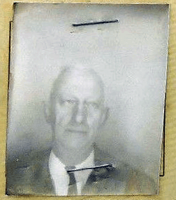
PermaRec update: The man shown at right was one of the last people granted a license to operate one of New York City’s most historic carousels. Take a look at that license, and get the full story on the carousel, over on Permanent Record.
Tick-Tock: Today’s Ticker was compiled and written by Mike Chamernik.

Baseball News: The Braves showed an artist rendering of their new park. ”¦ Here’s a decent shot of the “Reds” script on Cincinnati’s 1937 uniforms (from Phil). ”¦ The Mets and Yankees wore their BP caps again last night, just like on Monday. Not a good look for the Yankees. ”¦ A reader named Darick notes that Yasmani Grandal of the Padres wears a Captain America undershirt, which you can kinda see here. … “Today I opened an email from my beloved LA Dodgers, and it had a survey attached, so I figure, why not, maybe I will win something,” says Pete Tognetti. “So I take the survey and the entire thing is about which corporate sponsors of various products do I associate with the Boys in Blue. And it goes on like this for some time. I, for one, am so sick of ads on/in anything, but it really takes the cake to throw it in fans’ faces like this, trying shamelessly to further the association of products with baseball. When I think baseball I think of playing catch in Little League with my dad, or of going to my first playoff games with my friends in college, not Geico and Captain Morgan rum. Attached is a screen shot of one of the first pages, as you can imagine the rest of my responses were in the same vein.”

NFL News: The 49ers are slapping down a logo on the Fanwalk, and here’s a look into NFL Films’ Steve Sabol’s office, which has been virtually untouched since his death in 2012 (both from Brinke). ”¦ Maeser Anderson created a cool cartoon showing Kurt Warner’s uniform history. ”¦ As you probably recall from last week, Jadeveon Clowney signed a shoe deal with Puma. But he’s also endorsing Wilson football gloves. ”¦ Here’s a huge slideshow — over 200 images — showing the 49ers’ new stadium (from Brinke).

Hockey News: What should the proposed NHL team in Seattle be named? ”¦ Bryan Linton noticed that Martin St. Louis has black ear loops and a black chin strap on his white helmet and that he’s apparently been doing this for most of his pro career. Is there anyone else in the league that has a different chin strap color than the rest of his team?

Soccer News: New kits for Manchester City, Liverpool and Flamengo (from Trevor Williams). ”¦ Iran’s World Cup coach says the team’s shoes and socks are too small (from Jonathon Binet). ”¦ Phil sends along a good shot of the 1925 US soccer team. ”¦ Here are the new World Cup uniforms for all 32 teams participating (from Phil). ”¦ Puma players will wear mismatched shoes in the World Cup (from Yusuke Toyoda).

NBA News: The Blazers wore red socks last night (from Phil). ”¦ The Knicks’ D-League team unveiled their name and logo. Yeah, they’re called the New York Knicks! [/Grins]. But really, here is the logo (from Phil).

Grab Bag: A bunch of mementos, including jerseys and championship rings, were stolen from Georgia Tech’s assistant AD’s house (from Michael Rich. ”¦ Pro golfer Keegan Bradley has a Boston sports-themed yardage book cover (from Wade Manley). ”¦ New logo for the ACC (from David Kendrick). ”¦ Future Army soldier helmets look like they’re straight from a video game (from Brinke). ”¦ The space suit has evolved over the years (from Jarrod Leder). ”¦ Austin Peay is now a Russell Athletic school (from Phil). ”¦ An app called Instapaper now has a logo (from Brinke). ”¦ A New Hampshire policeman was killed in the line of duty this week. To honor him, the high school where his daughters play lacrosse created a memorial sticker (from Josh Jacobs). ”¦ New AFL Indigenous round jumper releases for the Hawthorn Hawks and West Coast Eagles (from Leo Strawn, Jr.). … I was out covering girls soccer in near suburban Chicago last night and I passed by Radio Flyer’s world headquarters.
I know I’m being anal here, but wouldn’t [/Grins] be “end Grins” instead of “start Grins”?
You may be right. I was thinking to use asterisks to indicate an action instead. Regardless, I grinned at my own stupid joke.
A universally panned uniform that I liked were the original Devil Rays set. I loved the rainbow gradient, the double-stacked wordmark, the futuristic font and the wacky name. It’s contrasted by my utter disdain for their current set, the plainness of which I think is totally inappropriate for the team’s young, innovative, fun identity.
I got stuck with that early Devil Rays uniform in 1999 when I coached tee-ball in Chicago. I kind of liked everything but the black. Way too much black. They shoulda used purple as their dark contrast color, with the blue-green-yellow gradient thing as the bright “color.” Still, not as bad as people remember. And the simpler green-dominant unis that followed are among my favorite underappreciated modern uniforms. I wish they would have kept the dark green and bright blue theme when they dropped the “Devil” from their name.
I wasn’t a fan of the Devil Rays original uniform, but I totally agree with you on the current Rays set. It’s boring and plain, as Paul has talked about in the past. They definitely should have kept some green somewhere in the uniform.
I still have a Devil Rays black uniform packed away somewhere in my trove. I’ll have to dig it out.
Always thought the green iteration of the DR uniform wasn’t “that” bad. The sleeveless with the green undershirt was pretty unique.
Something about Arizona’s black jersey works for me with the camo.
Or my allergies are impairing my judgement.
I agree. Scrolling through them, I stopped at that one and thought it actually looks pretty good. Still a silly/lazy way to promote Memorial Day, and an insult to ‘team uniforms’, but its a pretty pleasing look/combination.
That being said, I think it will look worse when worn with the actual uniform on the field.
I agree as well. I was okay with both Arizona’s and Colorado’s. I think it’s the contrast that causes the issue. The lettering for Colorado is narrow enough, and the jersey color for Arizona actually goes okay with the camo shade they’re using. A big part of the ugliness comes from the fact that the color of the camo clashes with the team colors.
QOTW: I’ve always been fond of the Cubs’ powder blue with white pinstripes from late seventies and early eighties.
“all net proceeds from jersey sales are going to MLB’s Welcome Back Veterans project”
How about gross proceeds…or must MLB take a cut of the sales.
I don’t think they’re taking a cut of the proceeds. I think “net” means after covering their overheads — manufacturing expenses, etc.
To answer the Q of the Day: link
I always liked the late 90s Anaheim Angels uniforms.
Add me to that list.
The Blazers watched video of the Bawston Red Sawks comeback against the Evil Empire Yanks and thus wore the crimson hosiery.
QotW: The blue and bronze Capitals. Still my favorite Caps uniforms.
The original Padres khaki set, home and road, complete with bow tie road script. One of the best uniform sets in modern baseball.
Twins road pinstripes. Even Twins fans seem mostly not to have liked this, but it’s a style that dates to 1912 for the franchise, and gave the Twins one of the most easily distinctive looks in all of baseball. With the road pins and before the Braves road cap, Twins players were the easiest to identify in TV highlight clips. Also, the M caps.
Brick and black Astros. Terrific script, and colors that actually represented the modern space program better than anything the team has ever worn. Though the home pinstripes were an ugly black eye on an otherwise strong uniform.
I’ve expressed my fondness for the Astros mid-90s uniforms many times on this blog. Thought that expressed “space” pretty well.
I too liked the Caps late 90s/early 00s unis. The first thing I think of with regard to the Caps is Olie Kolzig in one of the home whites with the blue, black, and bronze trim. The eagle looked appropriately majestic and strong without being overly caricaturized or unnecessarily fierce. I did not care for the black jerseys in that set though and preferred the blue versions that they stopped using after 99-00.
link
Nooooooo! Not the brick and black Astros! It was a terrible attempt at “traditional” uniforms achieved at the expense of any “tradition” the franchise may have had. One of my least favorite uniforms in all of sport.
The Minnesota Twins did not exist in 1912, and I seriously doubt going back to those road pins had nothing to do with the old Washington Senators. I’d bet everything I own the Twins just liked the design and went with it.
QotW: The original Phoenix Coyotes uniform set. I have both the white and the green alternate in my closet. I think these uniforms are infinity + 1 times better than what the Arizona Coyotes are currently wearing. Very excited that there will be a throwback night in the next season.
Runner-up: The Denver Nuggets “tetris” jerseys.
Honorable mention: The 2nd round series between the Anaheim Ducks and LA Kings has been very appealing to my eyes. Still surprised when I read negative comments about either set of jerseys.
YES! I was going to say the original Coyotes uniforms! I loved that coyote that they had on there. Sure, it looked a little goofy, but I felt like the design worked well with the southwestern style.
I liked the Coyotes’ original home and away somewhat, but always thought the green third was overkill.
Have you required your magnifying glass to read the wordmark on the Ducks’ sweaters?
QotD: I’ve always thought the original Maryland Pride uniforms were really cool, only because I like the Maryland flag a lot, and the two-toned helmet design is really unique (or was at the time, I guess). It would have been perfect if the helmet patterns were opposite the ones of the shoulders, though.
This one has my vote too. Who cares if a bunch of “traditionalists” thought it was stupid. I thought it was cool and unique.
The jerseys are alternative to the alternative. They are so misunderstood.
An NHL team in Seattle should be named the “Seattle Metropolitans.”
Why?
Because that name is on the Stanley Cup as the first American team to win the trophy. They PCHA Seattle team won the cup by beating the Montreal Canadians of the NHA in 1917 to become the first American based team to win the prize.
Plus I love their Old Red, Green and white color scheme. (Though it’s close to the Minnesota Wild’s current colors).
link
I think it’s fine if they have a red, green, and white color scheme. Think of how many red, white, and blue teams there are out there.
An NHL team in Seattle should steal – er, I mean, pay homage to – as much of the Metropolitans identity as possible. Everything but the name. Creating a hockey team named the Mets, on the West Coast no less, would be one of the all-time disasters in branding and marketing history.
As to the colors, if they use a bright – dare I say, “emerald” – green, they’ll be distinctive enough from the Wild.
Creating a hockey team named the Mets, on the West Coast no less, would be one of the all-time disasters in branding and marketing history.
Wondering if there’s an IP issue here as well. I know there different sports and all, but…
IANAL, but I don’t know that IP would enter into it (except in as the baseball club has already taken Mets.com, @mets and all the rest). There wasn’t an issue with the new Winnipeg Jets infringing on the football team.
Ahh Winnipeg, I was trying to think of a modern example… how soon I forget.
What if they referred to themselves as Metros instead?
I’ve long thought that Grays would be a good name for a Seattle NHL team. Not only is the sky gray for half of the year, but it would be a reference to the local gray whales. Also, I’m a sucker for color-based nicknames.
What doesn’t work for this identity is that it’s too close to the Whalers, and Grays is more of a baseball moniker. If the Tampa Bay Rays move elsewhere, I’d love to see them add a G. Indiana Grays, Carolina Grays, OKC Grays, etc.
Last season the Yankees wore the BP cap to promote cancer awareness. I haven’t heard anything about this year. Could MLB and New Era just force them to wear it to simply promote the cap itself?
Yep. The Yankees wore the BP cap against the Mets as part of Merchandise Awareness Week. All net proceeds from the sale of the BP cap went to support MLB.
Marty St. Louis also seems to have worn the black strap and loops with Tampa.
link
I actually liked the navy and gold Astros.
link
Me too. Not as much as the orange, but those were better than the brick & black era. I don’t think they were criticized that much, though, were they?
3rd’d
4th’d.
5d
Normally I have trouble coming up with anything on the questions of the week, but this one was a no-brainer: The original creamsicle Tampa Bay Buaccaneers unis. I loved the whimsical Bucco Bruce logo and the colors that were so-anti macho NFL. And so I was quite ticked when the NFL went to the one-shell rule, causing the Bucs to cancel their throwback games.
I agree, for the reasons you state.
Didn’t realize how much I loved that color scheme until it had disappeared from the league.
QOTW: I mentioned above that I like the original Phoenix Coyotes uniforms and logo. For some reason, it seems lots of folks poo-poo it. I hate their current logo and set.
I feel like the Anaheim Ducks cartoon duck goalie mask logo gets panned, too. That was a uniform that I loved as well.
Actually, from what I see, the duck mask logo itself is still somewhat popular, which is why the Ducks incorporated it into the shoulder emblem on their thirds. And the throwback game last October generally received positive reviews – I don’t recall anyone actually complaining about the one-night return of the eggplant and jade unis, at least.
The color scheme was unusual, but the Mighty Ducks owned it. They may have won a Cup with the current orange-gold-black scheme, but to me it’s just not as good.
Now, the link… actually, as crazy as it is, I kinda like the jersey. However, the team gets demerits for using Mistral for their numbers and NOBs, rendering them nearly illegible. Using the fonts from the Nike-era thirds would be an improvement.
Speaking of the Nike thirds, anyone else look at link and think link?
I agree with you. The Ducks completely owned those colors and that look. Although it always bothered me that the white jersey had no eggplant in it. I remember being in love with the Wild Wing jersey. Looking back it is hideous but at the time it was a true original. And remember when Nike made link?
The original Ducks jerseys are definitely beloved by a minority of Ducks fans. They began selling the jerseys again with 20th Anniversary patches this year and you can still see a few old Kariya and Selanne jerseys in the crowds.
My favorite from that era, however, is the alts with the striped sleeves. I still can’t stand the Wild Wing versions.
link
*By Wild Wing versions, I meant the 96-96 jumping goalie things.
Thanks guys. I knew that I loved the duck mask logo and the uniforms. I guess I don’t know how popular they still are, especially in the Anaheim area. (I’m on the east coast.)
That Wizards alternate would make my list as well, along with:
*Padres sand uniforms
*Coventry City’s brown 70s kit
link
*Seahawks neon green
*Knicks orange alts
*Found a picture of a two-fer: The Nets in script and the Knicks with the number over the “New York”:
link
The others (tequila sunrise Astros, “1979” Rays, 80s Nuggets, Twins road pins) I wouldn’t consider *near-universally* panned.
Good call on the tequila sunrise Astros! Maybe it’s because that’s the era when I was growing up and becoming aware of baseball. So I love the Astros in the tequila sunrise.
I wish they would just put the tequila sunrise stripes on the shoulders.
Shoulder stripes would make me happy.
Can’t forget to mention:
*Any team that wears brown/yellow.
MLB needs more shoulder stripes!
+1 on the neon green Seahawks – I thought it looked great.
Those Knicks and Nets unis are amongst my favourite of all time!
Remember the double-decker script on the Nets’ road uniform?
The home jersey was nice, but I loved that road jersey.
link
A tight fit, but it worked.
I liked the 2002-2010 navy blue Bills home jersey. It accomplished what I hoped the Cubs would have done – incorporate a darker blue into their look. I hated the blue shoulder on white Bills jersey of the same era. If the Cubs dod that now it would be seen as aping the Brewers.
In regards to the camo softball tops, I kind of like the Rockies jersey. Maybe it’s because their lettering is thinner so you don’t see as much camo. Plus, I also love their shade of purple. So I can imagine that that is one of Paul’s least liked.
For a long while, I was on the side of not using camo. But I think I have switched on that opinion. I’m fine with it now.
Also, yes, Memorial Day is to remember those who have fallen. But those who have fallen served. And those who serve now are remembering those who fell. So I wouldn’t say that camo is inappropriate for Memorial Day.
In the interest of full disclosure, I’m a Denver resident and Rockies fan.
If I had to “like” any of them, it would definitely be the Rockies…for the reason you mention. It’s almost so thin, you can’t even see the camo.
I’ve figured it out. Paul was touched in a bad place by a member of the military. It’s the only reason for his incessant whining and moaning about this stuff. It’s OK Paul, we understand. Rube.
Name-calling is fun. It’s also a lot easier than actually engaging with a topic and trying to argue your case on the merits.
I’ve figured it out. Brad was touched in a bad place by a member of the journalism community. It’s the only reason for his incessant whining and moaning about this stuff. It’s OK Brad, we understand. Rube.
Sorry for feeding the troll.
Geez the GI look is terrible. I agree with Paul wear a patch or something. This is less of an honor and more like pandering.
As for the Question Of The Week, I liked the original Florida Marlins teal uniform set. Especially the vest with the teal sleeves. Call me crazy.
The teal Marlins were awesome!
Loved them but for the pinstripes.
I’m on board with teal Marlins, too. Ok, maybe not so much as when they first became a team. But the black caps would be great with a teal bill and squatchie. Their current colors and uniforms are horrendous in my opinion. Regardless of what someone thinks of the color teal, they are fish! And in Miami! Teal is completely appropriate for them. And they stand out from all the red, white, and blue teams.
Not sure if this was mentioned. Jadeveon Clowney had a puma lapel pin on while waiting to be picked…once picked he did not have it on with the Commish.
link
link
I live in Pittsburgh and everyone seems to hate the the Steelers bumble bee retro jerseys they currently wear. But I love them. I am not a Steelers fan but I would buy one of these.
My other would be the Islanders Fisherman logo and jerseys. I remember seeing it in an Eastbay catalog and I wanted one so bad. I loved the wavey hemlines and the tough of teal/light blue. I thought they got too much hate.
Yancy, your taste in hockey uniforms is impeccable! ;o)
As knows, I HATED the Islander’s fisherman jersey but, if I’m being honest, it probably has more to do with the fact that they replaced perfect uniforms and not so much that they were awful. I can see how a minor league team would look decent in them but not at the NHL level.
….and now I must turn in my NYI fan card :(
that should have said…. “As TEEBZ knows…”
My main issue with the Fisherman uniforms was that link. That’s why I consider them sea-sickness jerseys.
I liked the fisherman jersey template with the original logo on it that they wore for a year or two after they got rid of Gorton.
I was a hater of the bumble bee at first, but it has grown on me for sure. Me likey now.
#1 on the Fisherman.
Paul (or someone else) mentioned the other day that Jacoby Ellsbury was wearing a cool base away uniform for the Yankees. It seemed like Masahiro Tanaka was wearing one last night as well. Also, if you look at the camo uniforms that are linked today on the MLB site, they advertise the Yankees version as a cool base jersey. Seems odd.
So the Yankees have actually started wearing Cool Base jerseys on the road since the Tampa series on their second road trip of the year. They didn’t use them during the games in Houston or Toronto to start the season.
Jacoby at the time was the only one wearing it, then David Phelps started wearing them. I actually put that up on twitter back in mid April when it started.
link
Islanders Fisherman. Hands-down, one of the best of all-time.
How much Dramamine do you take before taking a look at those things, Teebz?
In a future time, a wiser and more enlightened time, the Angry Fisherman will finally get his proper due. I agree with Teebz: that uniform is one of the best ever.
Same with the early 1980’s White Sox unis: I adore those things with a love immoderate.
I’m with you Teebz! Definitely falls into the “so bad it’s GREAT” category!
I don’t have a problem saluting teachers, social workers and others who do vitally important work. And I think I saw a minor league team planning police and firefighter jerseys. Bravo.
But I don’t think they are the in the same category as the people who volunteer to spend more than a year from their families and putting themselves in harm’s way to defend our country.
Maybe I’m wrong here, but it does seem like there is a subtle anti-military vibe that runs through the blog. (An no, I’m not saying that anyone who dislikes camo jerseys is anti-military. Not even close.)
Right, I’m “anti-military.” That’s why I just suggested that teams wear a Tomb of the Unknown Solider patch. That’s why I’ve been suggesting for YEARS that teams wear throwback uniforms of military baseball teams instead of camo. And so on.
Anti-military? Nope. Against the relentless glorifying of the military to the near-exclusion of all other sectors of society, and also against lazy kneejerk pandering gestures that are ugly to boot? You bet.
I suggest this almost every time the subject comes up, but the halftime tribute to America’s fighting men and women chapter in Ben Fountain’s “Billy Lynn’s Long Halftime Walk” brilliantly articulates the situation: our soldiers are experiencing things that most of us will never have to witness, and we feel this weird mixture of admiration, gratitude, guilt, and maybe a little jealousy. We don’t know what to say, partly because we really cant get a handle on how we feel, so everything comes out as maudlin or over the top. Meanwhile, the corporations understand that emotions are marketable, so they turn it all into some garish production.
Paul says it well: recognizing “lazy kneejerk pandering gestures” doesn’t make you anti-military.
I suspect he’s not referring to the one reference to the patch or armband, but the daily references to “GI Joe” and “Flag desercration” and the frequent mention that not all soldiers are heroes.
Certainly everyone has an opinion and is entitled to it. But you sure do lay it on thick. Obviously it’s your blog and you can do what you want.
I don’t mind it (camo, red/white/blue, etc.) as a part of Veterans Day and July 4th, but it goes a little far with Memorial Day and Labor Day. Those holidays are not supposed to be military. Memorial Day started as ANYONE that died, and Labor Day was for the unions.
They don’t do it for Labor Day.
9/11, though….
You’re off base on Memorial Day, w_c_. It began, and endures today as a salute to all those who have died while serving the United States’ military.
I share Paul’s frustration with the way professional sports pay “homage” to anything. Be it pink bats, blue bats, camo towels, or special jerseys. These don’t feel like tributes, especially when the products don’t really work. For example, using this camouflage pattern for team names. How does that salute those who have died? If they wore a simple black armband or a Tomb of the Unknowns patch that would be more appropriate. This serves to draw attention to all members of the military, which is what Armed Services Day and Veterans Day are for. This one is to honor the fallen. Most teams won’t even play Taps before the game, which should be de rigeur.
I’ve always felt like the Indy 500 does Memorial Day the best: Moment of Silence, 21 Gun salute, Taps, National Anthem. It’s powerful when you’re there, but it doesn’t feel like a promotion which is exploiting the memory of the fallen.
I was actually going to mention the Indy 500 myself before you beat me to the punch.
I don’t feel like this site is “anti-military” at all. I just think Paul is making a point that I think many Americans are not even aware of: Memorial Day isn’t a military appreciation day. I cringe when I hear people say “happy Memorial Day!” It isn’t supposed to be a HAPPY holiday. It is supposed to be a time for us to reflect on all the people (being military personnel or loved ones) who have passed away over the past year. The point I think he is trying to make is that there is a time and place to honor our military, Memorial Day on a baseball field isn’t either one. Just my two cents.
Did you ever make up a game when you were a kid? We used to do that all the time, using whatever ball we had on hand, and however many people who were hanging around, to devise some fun, spontaneous sport.
It was always a lot of fun, until the second time we tried to play it. It would always move from being fun to being legalistic, endless arguments about rules and procedures.
All of this stuff is like that. A guy whose mom died of breast cancer wears a pink towel with his uniform, and it’s touching and sincere, and before you know it, NFL Brands is selling OFFICIAL TEAM BREAST CANCER AWARENESS TOWELS, WITH OFFICIAL TEAM LOGO at $27.99 a pop.
When everything is seen as a marketing opportunity, everything is for sale.
For me it’s OVER appreciation. It’s to the point where it’s just white noise anymore. I realize what these men and women do. I have family in the military and know the sacrifices they willingly give up. It’s not that they don’t deserve the appreciation, it’s the way they are appreciated. Just feels overdone and lazy anymore. It has also created a culture where if you don’t give as much appreciation as the next guy, you are vilified…as Paul is being with some posts today and in the past.
Paul is being vilified for advocating long-standing cultural and civic traditions in our approach to honoring veterans and servicemenbers and for upholding the original and true meaning of Memorial Day. That is, Paul is advocating a deeply conservative position, which makes the attacks on him almost by definition radical.
I mean, really, did our brave heroes bleed and die at Gettysburg, in the Philippines, at Belleau Wood, at Normandy and Guadalcanal, at Chosin and Khe Sanh and Fallujah so that the Arizona Diamondbacks could cross-dress as soldiers on Memorial Day? Does anyone – anyone – think that’s what it’s all about and what the sacrifice is for?
Anything more gaudy than a black armband, a poppy, or link dishonors the memory of the fallen.
All of these “hey look at how much we care” stunts disgust me. They’re using causes – generally good causes, but the door is open for popular but unsavory causes too – as tools of self-promotion. Let baseball be baseball and let Memorial Day be Memorial Day. Mashing them up dilutes what is good about each on its own.
That Gilbert Arenas Wizards alternate makes one thing plainly obvious: The New Orleans basketball team should have copied the gold/black/white color scheme of their football team.
People may not have liked it as a ‘Wizards’ uniform, but the colors make for a gorgeous basketball uniform. Lost opportunity.
The cream of the link makes the camo lettering highly effective – you almost can’t see that it’s there.
And the all-camo treatment of the link might just make it the ugliest jersey in the history of sports. Nothing against the military here, but rendering both the script and the bat-and-birds in the same color pattern is an absolute sin. Worse: Why aren’t the beaks also camo?
It’s nice to see St. Louis give a nod to gender equity by putting link on their jerseys.
I’ve long advocated the Cards wearing female birds on their road uniforms:
link
Except they should be either a warmer gray, or more of a brown, than I made that illustration. Which you’re right, the camo does kind of approximate. Makes me rethink my criticism!
I have a feeling this is as close as we’re ever going to get to the Cardinals intentionally making the birds on their jerseys look like the female of the species.
QOTW: My favorites are all uglies! They have more character; plus it’s obvious their time is going to be curtailed, so enjoy ’em while you can. But my First-Place finishers are the Vancouver Canucks’ Flying V’s. Saffron yellow at home, Mars Black on the road!
Sentiment will be to call a Seattle hockey team the Metropolitans, but I’ll go with Thunderbirds or Satellites.
Canucks V jerseys would be the top of my list – so bad they’re good.
Though not a Nuggets fan, I’ve always liked the navy, script Nuggets alts from the Carmelo days.
Yes! I liked those more than their standard unis.
Again, why not use the naval operation bluehue camo where it matches/doesn’t clash with a team’s actual colors or where there is a significant Navy facility nearby.
They weren’t panned, but I always felt the Reds link was a tremendous look that got a bad rap.
I guess this is a comment on the article and an answer to Mikes question….
I kinda like, no LOVE the D-Backs camo jersey. Maybe because it doesn’t actually look like camo from afar, but I think it looks like something they could do everyday with the whole Diamondbacks/desert/sand theme.
The Blazers socks looked cool until I realized some players broke the effect by using black pads to near to the socks
link
Masahiro Tanaka was wearing a Cool Base jersey last night. link
That makes two Yankees who have worn them this season on the road. Jacoby Ellsbury was the first one.
QoTW:
The 1994 Dallas NFL team’s stars-on-the-shoulders set:
link
I wasn’t aware of that being a “bad” uniform. I thought everyone loved those jerseys.
Could be (I’m not a Dallas fan and figured since those uniforms were short-lived they weren’t well received).
Maybe they were considered more “bad luck” than “bad”?
I think they were only short lived because they were part of the whole 75th season thing, and the team didn’t have any plans for an actual uniform change. Most teams that year only wore their “throwback” uniforms a couple times. The Cowboys wore the double star jerseys for most of the season, including the playoffs. They were well liked (as far as I’m aware), they were just never intended to be permanent.
League rules forced Jerry Jones to drop them:
link
An NHL team in Seattle should be named the “Seattle Metropolitans”
Aside from the confusion with the baseball Mets — and you know that people would quickly cease calling them the Metropolitans — is the name is too old-fashioned. In 1970, did Vancouver call their new team the Millionaires?
I’d go with Thunderbirds. Use Pacific Northwest Indian iconography, a color scheme of navy, silver gray, and green (think the latter color scheme of the Whalers). They could use the Metropolitans identity for a throwback/third.
The logo and uniforms you’re describing sound exactly like the existing Seattle Thunderbirds WHL team
link
link
There’s quite a few maligned kits that I enjoyed:
Late 90’s Angels
Padres sand-colored aways
The white/gray cap trend of the 90’s (Pirates, Orioles, Reds, Mets)
Bucks 90’s purple and green
Original Coyotes
Islanders fisherman
Oilers navy “drip and gear” alternate
The first few years of the Kings black and purple (before switching to the crown primary logo)
QOTH: I loved the Atlanta Hawks lime green uni from the early 70’s. Few teams had alts back then, but the Hawks had three unis: lime, blue, and white.
Wish the Braves would wear the 70’s “feather” unis more often. They break them out about once every other year or so.
Also like the Steelers bumblebee and Packers throwbacks with the front number in the circle.
I don’t like everything, but I also like the drawings of the new Braves stadium.
I’ve always liked the gradient Hawks uniforms–they’re unique even though they’re not the best design.
Pirates’ red vests.DON’T JUDGE ME!!!!!!!!!!!
Also, not sure if they were universally panned, but I really like the Seahawks’ new/current set. Feels like the best “modern” uni design out there.
I kinda dug the red vests too. SO different from the norm.
Nothing to do with today’s posts….but I was wondering why the Cowboys don’t sport their late 90’s double star logo jerseys on thanksgiving?? They wore their current silver helmets with them so there would be no conflict with the new rule. I loved those jerseys!
It actually wouldn’t surprise me if the Cowboys are going through the process right now to reinstate the 1990s double-star jersey as their official third.
QOTW: I’ll probably get flamed for this, but I really liked the Mariners version of the “Turn Ahead the Clock” night uniforms. I was a kid when they did it and I thought it was super cool at the time. I’d like to say that since my taste has matured that I don’t like them anymore, but that would be a lie.
Which one? The M’s originated the TATC concept in ’98, and then they also wore the ’99 version along with everyone else.
I’m pretty sure it was the first one in ’98. I remember it was against the Royals and the Mariners had silver batting helmets with their number as the logo. As a 10 year old it was pretty bad-ass.
So ’98 it is.
When discussing the Native American issue on this site, often you will quote or link to items that quote Native Americans on their opinion on the issue.
My guess on your take, Paul,(and if I am wrong please correct me) is that the most important opinion to be heard is the one that it directly affects.
Why not, then, get the opinion of family members of the fallen, whose lives were directly affected and who best know the true meaning and significance of Memorial Day? I’m sure there is a decent percentage of people here on the site who have lost a loved one or could ask an older family member who lived through losing a spouse, a son, a daughter, etc. Or the military members who survived, but who every day think about the ultimate sacrifice their friends in arms made for their country.
Ask these people- Are the camo jerseys are an appropriate way to honor their loved one on a day of solomn remembrance? Do you even care? What would they feel would be the best way to pay tribute to them? Do they feel that the WBV is an appropriate charity to be associated with Memorial Day, considering that it is for returning Veterans, not for the fallen? All legitimate questions.
So, I will start. I lost not a family member, but a dear friend, serving in Afghanistan. I could care less about whether they wear an armband, a ribbon, a flag, or a neon sign. There is no “appropriate” way to honor the dead, military or otherwise. A black ribbon, or as you suggested, a patch, uniformly mandated to be worn by all, is a symbol at best.
Major League Baseball has partnered with the Welcome Back Veterans, and use occasions like this to promote their cause. For better or worse, a “different” jersey will bring in sales, a patch or band will not. How many jerseys do they sell? I have no idea, but I’m sure they would have scrapped the idea if it didn’t bring in dollars. In my opinion, whatever brings awareness and dollars to a worthwhile charity is worth it.
Do I wish the proceeds went to a charity like the Children of Fallen Soldiers Relief Fund, or something more directly tied to the fallen? Maybe, but I understand that MLB has its partner, and over the last few years, in my opinion, have gone above and beyond to promote it. The World Series was a good example of that.
Memorial day, is, as you mention, a day of rememberence. Unfortunately, as a country we are more likely to bemoan the weather report for ruining our barbecue fun than to take time to honor the memories of people, whether “heroes” or not, who sacrificed their life for your protection and freedom. I think MLB is way ahead of the curve, when compared to our society as a whole, in honoring them.
Finally, “Not all soldiers are heroes, and not all heroes are soldiers” is a cute phrase, and is true. It is also true of all society, every occupation, race, religion, etc. But the phrase has no buisness being talked about with this holiday. It comes off as glib and slighting, intentional or not. You don’t need to be a hero to be honored, and you don’t need to be a hero to expect a nation to be grateful for your service and sacrifice.
1) While I think it’s worthwhile to know what Native Americans think about the ’Skins, Wahoo, etc., I do not think their opinions are the only ones that matter, nor have I ever said that. The status and representation of marginalized groups is our society is something that affects *all* of us.
2) Similarly, the role of the military in our society affects all of us. Memorial Day is not a military holiday; it is a *national* holiday that belongs to all of us.
3) That said, I’m generally interested in what military people think of camouflage uniforms — not because their opinions matter more, but because they have a distinct perspective. So that’s why I asked them that very question a few years ago. Responses are compiled here:
link
4) “Not all soldiers are heroes, and not all heroes are soldiers” very much applies to MLB’s Memorial Day uniforms, because those uniforms are part of a relentless campaign of political messaging by the sports world that celebrates the military to the near-exclusion of all other sectors of society. Stating this does is not “glib and slighting”; on the contrary, the real glib/slighting behavior is on the part of teams and leagues that continue to use the same kneejerk approach (camo on everything) to “honor” the military, regardless of the specific occasion.
It’s always nice to revisit those comments on camo unis, but the only issue is that the question posed (and responded to) was about camo unis in general. I, for one, would like to see responses specific to its use by MLB on Memorial Day.
But to get an equivalent point of view regarding Memorial Day specifically, you’d have to ask the opinions of deceased soldiers, marines, sailors, and airmen. As editorial projects go, that one is, um, more difficult than Paul’s original article.
Obviously that wouldn’t happen, and that’s not what I’m looking for.
It may not be the exact same perspective, but getting opinions from survivors of those who’ve fallen – family members, and fellow unit members – those would be the opinions on the Memorial Day camo subject I’d be interested in.
Fair enough, Rob. I have war dead in my family, dating to the French and Indian War and on up to the present day, and I’m appalled by the camo jerseys. They disgust me. For Armed Forces Day or Veterans Day, camo would be gauche but not necessarily disrespectful. But on Memorial Day? What if Miley Cyrus showed up at a national cemetery on Memorial Day with a camo bikini and twerked to the tune of “Liberty Walk” – would we all be making excuses for how appropriate and respectful a display that is? I should hope not! What baseball is doing is exactly the same: Performers changing their normal clothes to include a little soldier-style camo, and then putting on exactly the same performance they otherwise would any other day of the year, and then asking the rest of us to applaud their gesture.
It’s not like our culture lacks traditions for honoring our war dead. Heck, it’s not like baseball was never played on Memorial Day prior to 2010 or something. For nearly a century and a half, Americans honored or war dead with a certain quiet solemnity on Memorial Day, and baseball added moments of ceremony – a little pre-game silence, a 21-gun salute, an honor guard, a missing-man flyover, that sort of thing – for Memorial Day. If we accept the camo today as right and proper, then by implication we declare that generations of our own ancestors, including the heroes who saved the Union and who defeated fascism, under-appreciated our nation’s fallen heroes every year.
I must confess I like 99% of all pinstriped basketball unis. Not a specific jersey, but the style itself is generally maligned.
I’m remembering back to those striped Stevie Francis era Houston Rockets jerseys and how I was disappointed with the change to the current set.
I loved the bejeezus out of those uniforms. The contrails doubling as pinstripes, the faceted numerals, the centered chest insignia. They put me in mind of the old “Colonel Bleep” cartoon.
It’s kind of funny to see space suits to seemingly get larger as the years go on. You would think with advances in material and fabrics they would get smaller.
Paul seems to dislike purple but I’m quite fond of Ravens and University of Washington colors. I also think the ARI and MIA camo jerseys kind of work. Paul and I would probably never advance past a speed date because of these revelations alone, but I’m ok with just being bros. Love you, bro
Why is it the sports world is celebrating the military to the near exclusion of other sectors? As you stated above, it is a national holiday. Get your government to declare a national holiday for teachers, or others you mentioned, then scold MLB for not acknowledging them.
But the sports world doesn’t just celebrate the military on Memorial Day, or just on Veterans Day. It has become a year-’round thing. If you follow this site (or just follow the sports world), you know that not a week goes by without some team wearing some sort of military-themed uniform. That’s why I keep referring to it as a relentless campaign of political messaging — because that’s what it is.
I think there’s a feeling in some segments of society that there’s a need for some type of amends for the vitriol that was directed at members of the military during late sixties and early seventies. It’s a relatively low-cost, high-visibility approach that doesn’t get too many folks’ noses out of joint, but it will help some people feel like they’ve made up for (that part of) the jackassery of their youth.
If by “vitriol” you mean the commonly repeated claim that returning Vietnam vets were spit upon, that claim has largely been debunked as a myth:
link
There are a lot of Vietnam Vets and established Scholars that would disagree with that being debunked as myth
Did it happen ever? Probably. But even if it did happen, was it a commonplace occurence? Worth all the ink spilled over it? Worthy of a moving Stallone monologue in the third act of an action movie? Doesn’t appear to have been the case.
The “spit on our soldiers” claim appears to have taken isolated incidents and blown them out of proportion, pretending that it was some sort of standard response all returning soldiers faced. It served a political agenda, much as the current jingoism does.
You’re old enough to remember the dominant portrayal of Vietnam veterans in pop culture starting in the early seventies and well into the eighties. Portrayals of veterans as sociopaths were the norm whether in film, TV or, especially, long-form journalism. Occasionally there would be the depiction of a veteran as a pathetic victim co-starring Agent Orange or maybe illicit drugs. Portrayals of veterans as well-intentioned folks who were acting on behalf of a democratic government were sparse until pretty well into the eighties.
Exactly – damaged servicemen and ungrateful civilians were cultural tropes. Doesn’t mean they had much basis in fact.
Last week was Public Employee Appreciation Week, a formal recognition of people working in the federal, state, and local levels. While not a holiday, there was not one gesture by sports teams to recognize the service of public employees who keep the country running
[sarcasm] That’s because public employees and their unions are leeches that are sucking our public coffers dry, unlike sports teams that eat up billions of dollars to build stadia that then serve to enrich those same teams [/sarcasm]
While there may not have been any gestures in the uniform arena with regard to Public Employee Appreciation Week, but my family attended an Angels game with a discount for those working in education (my wife works for a public university) as part of Teacher Appreciation Week. The Angels held a school supply drive before the game, and I believe people from various educational groups were recognized before the game. I assume other teams did something similar.
I recognize that this was a small gesture on behalf of the team, and not nearly to the same level that MLB recognizes the military or breast cancer/stand up to cancer groups, but it was something. Your point is still well taken.
My wife works for a public university. The idea of giving ‘formal recognition’ to public employees is ridiculous.
Some people try to elevate public employees or act like they have those positions out of some sense of civic pride. B.S. They have those jobs because they pay decent and have better than average benefits and job security. The employees she works with (including the professors) are there for their own personal gain/interest, not some altruistic sense of service to others.
If we want to ‘honor’ people for making a sacrifice, stick to the military, police, fire, etc. People who actually put themselves in harms way to do their job.
Playing devil’s advocate here, but don’t many folks in the military, police, fire, etc. have “those jobs because they pay decent and have better than average benefits and job security”?
They put themselves in harms way and gain the benefit of increased salary, job security, etc. Similarly, people who work with dangerous, toxic, or nuclear materials (whether in public or private sector) often get paid more than those who do not because of the risks they are running. Many people in the private sector also get paid more for flexibility in scheduling or willingness to travel far from home, which would be akin to some of the things people in the military give up.
Can you at least admit that being publicly employed is a thankless job, where, even as times are bad, many would like to see public jobs eliminated? Public employees may not be in harms way but they do important work for society, more than the military does on a day to day basis.
Additionally, police fire and military are folks in harms way, but people volunteer for a reason, and anecdotally I know that kids signed up for military service to get help paying for an education. It’s a calculated risk in some ways. Not to discount those who do it for civic duty, but there are perks that draw people in.
At the end of the day, a paycheck for an honest days work should be enough thanks for anyone, but it bothers me when there’s so much military appreciation at the expense of other important lines of work that do good work in our communities
Like the Westchester Knicks, if only because it reminds me of the old Albany Patroons upriver.
Like the name, hate the logo.
There’s definitely room for a slightly-updated version of Father Knickerbocker, but this isn’t it. It’s ugly, losing all the charm of the Mullin original.
In regards to the LA Dodgers game experience sponsorship survey thingie:
I took a very similar survey after attending the BRIDGESTONE NHL Winter Classic in Ann Arbor. It looks like it was done by the same company. It basically asked me how many tires I wanted to buy after the event. I supposed they asked about the other sponsors too.
I hold a spot in my heart for those god awful original Phoenix Coyotes jerseys. I dug the red rocks and cactus motif that ran along the bottom. I also like the black pants the Iron Pigs wear on Friday nights, even though all the players, and most everyone else despise them.
Yeah, those would be my pick too. I recognize they were by and large disliked, but I liked the Coyote look.
I really liked the ‘Gretzky-era’ Blues uniforms with the diagonal sheet music striping and accent. It has been lumped in with the 90s era of hubris that many teams had toward going with short-lived radical redesigns, but i think the bright blue/red/yellow really popped, and the unique striping looked great on those socks and match the jersey striping perfectly.
I liked the uniform design, but didn’t like that the numbers were cut to follow the angled waist stripes.
The Cleveland Indians all red uni that they wore from 1975 to 1977 seems to be universally panned, but I think the look was bold and unique. I’m usually not a fan of mono-chrome uniforms in baseball or football (besides white), the red color also played into the Native American theme—before you blast this comment, remember that the state of Oklahoma translates from Choctaw to “red people”. The most memorable comment on them came from a broadcaster who quipped that Boog Powell looked like a “giant blood clot.” A few years later when baseball was an olympic sport for a while, I noticed that Cuba wore the red shirts over red pants, and I think it added to their “badass” image.
Any Indians’ uniform bearing the “coffee cup from a Greek diner” lettering on the front is a good one.
Pretty sure all of my answers for the QOTW have already been mentioned, but I’ll list them anyway.
In no particular order:
Original Devil Rays, green Devil Rays, black and brick Astros, Bucco Bruce, 90’s Mighty Ducks, current blue Braves,original Marlins and the Rockies vest.
Also, not a full uniform, but I like the Twins M logo. I should hate it because it does nothing but remind me of how Ron Gant was clearly pulled off, but I guess it just reminds me of my childhood.
To flip the question, everyone seems to love all of the old powder blue uniforms, but they just don’t do anything for me. I don’t hate them, I just don’t understand why they’re so great.
Dear Paul,
I am greatly disappointed in you comment about soldiers and your questioning the need for celebrating them. You are absolutely correct that not all soldier are heroes, and not all heroes are soldiers. But ALL of them volunteer to put their lives on the line so you don’t have to. That is why they should be honored, and that is why it is wrong to see camo so blatantly disrespected in sports. I agree we should celebrate other professions, but at some point we have to draw a line. I think things like mothers, fathers, soldiers, fire fighters, police officers (this is definitely not all of them, just some to get the idea across) is about where that line goes.
And so it has come to this: Someone is complaining about camouflage sports uniforms being “blatantly disrespected.”
Think about that.
“That is why they should be honored, and that is why it is wrong to see camo so blatantly disrespected in sports.”
Tom, it’s not exactly clear if you’re suggesting that sports teams are disrespecting camouflage by wearing it outside of the context of proper military uniforms, or if you mean that those who don’t like camo sports uniforms are disrespecting the military. I’m assuming it’s the latter.
What I find “blatantly disrespectful” is when sports teams wear camouflage. They aren’t honoring the military. They’re taking a wardrobe element that members of our armed services have put in countless hours of training, hard work, and sacrifice to earn the right to wear, and then parading around in it like it’s just some trendy fashion accessory. That’s disrespectful.
If teams truly want to honor the military, there are many ways they could do it. As Paul has suggested, how about wearing throwback uniforms of historic military baseball teams? Or wearing unit patches on the sleeves? Or black arm bands with the names of fallen servicemen and -women on them? Those gestures don’t say,”Look at me and what I’m wearing (and, by the way, you can wear it, too, for just $259.99).” They say, “Look at what we support.” And that’s what real respect does.
What I find “blatantly disrespectful” is when sports teams wear camouflage.
Agreed. The teams are taking a military uniform and turning it into a costume.
What’s “blatantly disrespectful” is when cheap lip service to our veterans passes for patriotism, while substantial care for them in VA hospitals withers on the vine. Give our fighting men and women something useful and substantial, and put away the flags!
walter, as a vet I couldn’t agree more!
Sadly, unless/until the population of this country start paying attention to the issue, not much will change.
Must be a slow news day, because this post has been written several times over in previous posts. “Polyester shirts”, theme for other members of the workforce, “not all soldiers are heroes”, etc. Warn us next time so those of us who are sick of these same talking points can skip down to the ticker.
Not popular uniforms I liked:
The Steelers bumblebee uniforms grew on me after they played their first game in them. I still don’t really like their jerseys in a vacuum, but it pairs well with their helmet and the socks.
I REALLY liked the previous Seahawks uniforms, with the two different shades of blue.
The Angels late 90s uniforms with the wing has been mentioned a few times, but I’ll add my voice to that as well. It was a downgrade from their Angels in the Outfield uniforms, but the periwinkle with navy makes a lot more sense to me then their current uniforms. Red is supposed to be the color of the OPPOSITE of an Angel, right?
And while not universally panned, but certainly panned on here, I also like softball tops. A lot, actually. Baseball needs some color in it. And I like using the pants as a way to show who’s home and who’s away.
Must be a slow news day, because this post has been written several times over in previous posts. “Polyester shirts”, theme for other members of the workforce, “not all soldiers are heroes”, etc. Warn us next time so those of us who are sick of these same talking points can skip down to the ticker.
You are essentially accusing me of being consistent.
Not really…your opinions on things was not what I was pointing at, but how you express them. It’s just that it gets a little tiresome re-reading your catchphrases over and over again as a regular reader. “Polyester shirt” instead of jersey is wearing on me, in particular.
Get it?
You should get a mouse with a scroll wheel. It makes scrolling so much faster and easier, that way you can skip the part you don’t like! Btw, you are late on your membership fees….
Get it?
Actually, you *are* accusing me of being consistent. It just happens to be a consistency you don’t care for.
That’s your prerogative, just as it’s my prerogative to say what I say in the most effective way I know how. I see no reason to change to a less effective way.
I will keep referring to overpriced polyester shirts as “overpriced polyester shirts” because (a) that’s what they are and (b) I think the spread of uniform merchandising is bad for the uni-verse, so using a term that connotes mockery, outrage, and despair is entirely appropriate.
I appreciate that you come to the site often enough to have become familiar with certain recurring terms and phrases. Thanks for that.
When Keith Tkachuk was on the Blues he was the only player that wore white ear loops with the Navy helmet.
link
Ditto for his time with Atlanta. He definitely wore white loops in Phoenix.
link
Great stuff everyone. I’m totally with you guys on the late 90s Angels set, the 90s Pistons set, the original Coyotes look, the Islanders unis… OK, basically anything from the late 90s.
Special mention to the people who said they like the 2000s Bills jerseys and the red Pirates alternate vest. You guys might be all alone on those picks, but that just means you gave an excellent answer to my question.
I agree that the Pirates’ red vest is a particularly brave, inspired choice!
Seattle hockey team name: the Seattle Needles. I haven’t heard that one yet.
QOTW:
Football: I haven’t made a secret of my appreciation for the Denver Broncos’ contemporary uniform set. As far as modern uniform design goes, I think they’re some of the best.
Even though I’m more of a traditionalist, I tend to like “softball tops” in baseball. I think they should only be worn with white pants (preferably without pinstripes), though. The color jerseys just don’t pop the same way with gray road pants.
Finally, one of my favorite soccer kits of all-time was link. Their supporters were exceedingly vocal in their disdain for that kit, and I’ve never understood why.
Finally, one of my favorite soccer kits of all-time was Manchester United’s gingham jersey. Their supporters were exceedingly vocal in their disdain for that kit, and I’ve never understood why.
Neither have I. I loved that shirt.
QOTW:
Generally I am a traditionalist. Most of my favorite teams — the Bears, Nebraska, Braves, Cubs — wear traditional uniforms that I cherish. And I love the classic looks of teams like the Cardinals and Dodgers.
However, I’m with you — the Broncos’ contemporary uniform set seems great to me. I think the Broncos navy blue jerseys and white pants with the modern design were fantastic. It bugs me they discarded the blue jerseys.
To a lesser degree, excluding the number font and striping on the pants, I actually also prefer the Seahawks contemporary look…
“I think the Broncos navy blue jerseys and white pants with the modern design were fantastic. It bugs me they discarded the blue jerseys.”
The Broncos still have the navy blue jerseys as their alternates. They only wear them link, though.
Surprised no one has mentioned 1994’s US World Cup kit, the denim stars one. Often derided, I see it as one of the truly unique designs in soccer.
Good point! It’s a design that has aged surprisingly well.
Bucks: link — loved it then, still dig it now.
I’d like to see them attempt an updated version of this with their current color scheme.
1st
In response to the question:
MLB: The Pirates’ early 2000s black alt. I tended to wear it more often than the road gray in MVP 2005. I’m also a fan of the White Sox pinstriped vest (1999-2007) and the Blue Jays’ “T-Bird” set from 2003.
NBA: The Warriors’ mid-2000s navy jersey. It was a major departure from the team’s main identity, so I can understand why people hated it. The white and orange versions of that jersey were horrendous, but the navy is an underrated uniform.
NFL: I sort-of liked the Vikings 2006 redesign when it came out, but after about three or four years they just looked like another team trying to copy the Patriots’ design.
NHL: I’m going to be made fun of for this, but I think the Buffaslug was an improvement. Not as good as the classic Sabres, but better than the horrendous black and red set.
I liked the Blue Jays “T” hat. Just saw a pic of Roy Halladay wearing it. I also thought the original steel gray/pewter hat was nice too.
And I majorly agree with the Buffaslug. It got a bad rap because people wanted the original logo and colors back after the red & black era. Although, I did like the Sabres red alt jersey from that period.
“I liked the Blue Jays “T” hat. Just saw a pic of Roy Halladay wearing it. I also thought the original steel gray/pewter hat was nice too.”
I always thought the execution of the Blue Jays’ mid-2000s uniform set could have been better, but I really liked the concept of the slate gray cap they wore. The prominent use of gray as an official team color on the home uniforms was an innovative idea that I wouldn’t mind seeing some other team experiment with in the future.
If they only hadn’t gone overboard by reducing blue to a trim color.
Gray can be a fantastic color for sports teams. I loved link.
Nice! Interesting color scheme and fun logo. And who knew that the Brewers had a hockey farm team? ;-)
Wow, the size of the crest on the 1925 US team shirt! Also, it seems like it might be an early example match team names and date customization on shirt?
Aww, I was hoping the Kurt Warner cartoon would have his Arena uniforms too.
+1
I have to admit, I’ve had a fascination with the link for several years now. Not really sure why, since they are about as garish as you can get, but I like ’em. Though I do like the 82-85 variant, with the sleeve numbers moved up on the sleeves, than link link link, which had the sleeve numbers down by the cuffs, where they could be obscured by the larger gauntlet-like gloves of the day.
I have a semi-pro Penguins 1996-2002 jersey, link. While I generally favor these link link link, I’ve always liked this one, even if the mismatched sleeve striping looks weird.
I preferred the design before the Reebok jersey which you linked to on “designs”.
That’s not a Reebok jersey. Those predate Reebok’s buyout of CCM.
I always loved the Jets’ throwback Titans uniforms, both home and away (although I like the aways better). Just liked the color combination. Now, if they only wore the socks with the “T” on them I’d like them even more!
With hockey jerseys… I am a fan of the Home Flying V Canuck jersey(yellow) and the hybird Islander (Old Logo on the waves).
I have a soft spot in my heart for the link. I wish there was still room for that color scheme in pro sports.
The near-universally-panned uniform that I liked is the White Sox late-70s uniform: link (though not with the shorts).
The only flaw of this uni is the faux collars; the collars should have gone all the way around the jersey.
This uni violates one of my personal rules: I don’t like pullovers. Yet the lettering and the numbers made it work for me.
I agree completely, I didn’t like the shorts or the collars, but otherwise this is close to my favorite MLB uniform ever, the all-navy road set is fantastic and the “Chicago” lettering an all-time classic. A great, great update of one of the most distinctive looks of the early 20th century.
QOTW:
Soccer jersey collars can really vary. A lot of people dislike having an actual collar as opposed to a crew neck or v-neck. I’ve always liked collared jerseys, perhaps because the first Chelsea kit I ever purchased was the collared 1998 kit.
link
I’m particularly fond of the England kits from 2006 which have really short collars that can easily be worn regularly or flipped up.
link
On the accusation of being “anti-military”: Paul has already clarified that he does not consider himself as such. Further, the point has been made that an aesthetic objection to the cammo jerseys does not equate to an “anti-military” point of view.
However, I’d like to state that it is wrong to use that description as an epithet, with the implication that to be “anti-military” would be unacceptable. I would definitely call myself “anti-military”; in the context of my being a U.S. citizen, this means that I am opposed to the U.S.’s role in the world, and am generally anti-imperialist.
Similarly, we frequently see the the term “unpatriotic” hurled as an epithet, as though everyone has to be patriotic. Please be aware that there are indeed people who not only are not patriotic, but who are opposed to patriotism/nationalism, considering it to be a terrible poison.
(I am aware that there are those who try to make a distinction between what they would term a healthy nationalism and an ugly jingoism. I do not subscribe to this viewpoint.)
So neither patriotism nor a pro-military stance should be assumed to be universal or unanimous.
It’s not that “anti-military” is unacceptable, it’s just delusional. Saying you are against the military is just like saying you are for world peace. It sounds good on a bumper sticker or coming out of a megaphone at a rally, but is a pipe dream of the highest order.
Now, criticisms of specific engagements, the appropriate size of the military’s budget, and concerns over honoring the military trending toward jingoism are different discussions entirely.
If an anti-military attitude is “delusional,” then the United States is founded on a delusion. Read the Federalist Papers sometime, and especially read the Antifederalist writings that Hamilton, Madison, and Jay were responding to. The fundamental issue of American politics at the birth of our republic was fear of and opposition to a national army. The basic objection to the Constitution was that if we had national laws and national taxes, then enforcing the laws and collecting the taxes would require raising an army and sending it into every town and village in America, where the unaccountable soldiery would eat the bread and despoil the women of every honest farmstead in the land. A standing army meant tyranny, rapine, and destruction.
To which those supporting ratification of the Constitution replied, well, yes, that’s exactly what a national army would mean, but here’s why we can have a few national laws and some minor national taxes without the national government needing to raise an army. (Then the Constitution was ratified, and the first time a few hicks on the frontier objected to federal regulations and taxes, Washington raised an army and sent it in to whip the yokels into line, and the Antifederalists were all like, “Look! See? Told you so!”)
When anyone denounces overtly anti-military viewpoints, what he or she is really saying is, “America’s Founding Fathers were un-patriotic idiots.”
“anti-military” sounds like you are against all things military. Based on what you wrote, that isn’t the case. You are against the role our government is playing in the world currently (and the military action is just a product of that role). “anti-foreign policy” or “anti government involvement in foreign regions” would more accurate represent your standing.
As a veteran of the US military, “anti-military” sounds like you are against folks like me (that had no say in where we were sent and what we did when we got their).
The U.S. military has been a force for evil in the world for many decades. This offends me not only on the human level, but also as a citizen and taxpayer who is ultimately forced to pay for these misdeeds which are committed in my name. And even when a particular military operation is itself not overtly evil or imperialist in nature, its deeper purpose is to further U.S. interests in the world; this is a goal that runs directly counter to my values, which center upon the empowering of workers to rule ourselves.
Like anyone else, I am to some extent a product of my environment. While I do not identify with the label “American”, the fact that I am a native-born U.S. citizen means that I see the military question through that lens. So I am comfortable calling myself “anti-military”.
By contrast, if I were a citizen of a country that has needed to defend itself against U.S. aggression (such as Chile, Cuba, Vietnam, etc.), then I’d probably be more likely to see the military as heroic defenders. But in the context of the U.S., that viewpoint would be absurd, as the U.S. military doesn’t defend; it’s always the aggressor.
It was nearly 50 years ago that Martin Luther King noted ruefully that “the greatest purveyor of violence in the world” was “my own government”. And this mournful observation has only become truer over time.
Re: Mike’s Q of the D: I’m always surprised when the Astros’ tequila sunrise unis are posted on “ugliest uniform” lists, because I loved ’em when they wore ’em and I continue to love ’em now.
Also, I have to confess an affinity for the Cleveland Indians’ blood-clot duds during the Frank Robinson era. I’m sure nostalgia has something to do with this (I was a Tribe fan as a young ‘un in the eraly ’70s, when my family made annual summer trips to take in a ballgame.
Great picture of the 1937 Reds and the 2 guys with suits and hats. Too bad we cant see the Reds part completely.
link
The ’37 Cincinnati MLB team wore navy caps with red bills, so perhaps the pic in the Ticker is from 1936?
I like the ‘rainbow skyline’ Nuggets jerseys, The ’94-’99 Astros, every Sonics uniform ever created, the ’94-’99 Brewers, and the 80s-2000s Mavericks.
I love the 94-99 Brewers unis and logo. The Mavs old unis and Cowboy hat logo has grown on me, too.
love the 94-99 Brewers unis and logo
Yes, yes, yes. Criminally underrated.
I had a second cousin who played for the Padres in the late “60’s and early ’70’s, so I loved the all gold set with the brown trim and hat. link
Major bummer when they switched to a blue based set. I still hold out hope for a return to brown for them.
I also love the Steelers bumble bee alts. Different and instantly identifiable.
The uniform that does it for me is the 1980s one with the white cleats and brown/orange/yellow cummerbund.
Jeff, was Mike Corkins your second cousin? If not, who was? (I grew up in SD in the late 60s/early 70s, so I’m curious to know…)
As a Mets fan I miss the black alternate caps (both) and the black road jersey with “New York” spelled out.
I also think the Padres grey road uniform with the brown pinstripes and the brown cap with orange interlocking “SD” is still the best uniform they ever wore. Which is not saying much, because most of their unis over the years have been horrendous.
A fan of the Mets in black? Here? Didn’t think I’d see the day….
I’m with you there! Loved the Mets’ black unis, especially the “New York” black alt.
just more crap to buy…to make owners rich!!!!!!!!!!!!!!!!!!
QOTD: It’s clearly nowhere near as good as what they rock now, but I always kinda liked link for the Bills. Contrast yoke FTW.
Another reason not to name a Seattle NHL team the Meteopolitans: that is now a name of one of the NHL divisions. (Stupid as that might be)
No Mas should have an “I’m Calling It the Patrick Division” shirt. (And matching shirts for Adams, Norris, and Smythe.) Maybe have the official division name crossed out on a puck in the middle.
And yes, I would buy them.
Re: 1925 US jersey.
There have been many times when the name of the opponent and the date have been stamped on a jersey — Holland has done it a lot the last few years, and DiCanio had that enormous paragraph on his Australian league shirt the day he broke some sort of goals record.
But these letters are enormous!
I LOVE the original Diamondback sets. They won the World Series when I was in 7th grade and I went to game one. I love the purple (sorry, Paul) and teal. I also have a soft spot for ugly 90s basketball jerseys. The Grizz, Pistons’ horse/piston teal jerseys, and yes: the RAPTORS! All ugly. All beautiful.
I’m sure there’s more, but those jump out.
I was waiting for someone to say the ’90’s raptors and vancouver grizzlies! I know I shouldn’t like them, but I certainly do.
NHL in Seattle? Would be great but I love the idea of a team in Milwaukee. The team would have an arena already built and Badgers hockey is supported strongly. Team colors could be Packers style.
As a Wild fan and native Minnesotan, I’d love an NHL team in Milwaukee. It’d be the team I’d root hardest for the Wild to beat – and also the team I’d root for anytime it wasn’t playing the Wild.
But green and gold? No way. Milwaukee deserves better than Green Bay or Northstars hand-me-downs. Start with cream and build from there. Heck, cream and green, sort of in the style of the Leafs or Red Wings, could work.
I’m not sure if the Tampa Bay Buccaneers old creamsicle uniforms are as universally panned these days, but, it’s always been one of my favorite unis. Love the orange and red, Bucco Bruce…fantastic.
I was a big fan of the WLAF’s Orlando Thunder. Those neon green jerseys were hated by just about everyone but I thought they looked great!
I think I may be the only Mets fan that liked the “black era”. Still have both hats and three black jerseys. Kinda miss the black drop shadow too.
For what it’s worth, I drank loads of Crystal Pepsi back in the day. Still my favorite Pepsi of all time.
“Heck, cream and green, sort of in the style of the Leafs or Red Wings, could work.”
Wouldn’t that look a little too much like what the Wild link?
Hey, what’s Paul’s favorite ugly uniform?
QotD: 2008 Georgia Tech football uniforms… When they were in the right light that Old Gold was beautiful, and I don’t think the design was all that garish, certainly different. Problem with these was that the Gold didn’t hold up in all lights, I think they would have been received better if Russell Was capable of perfectly replicating Old Gold on their material.
Also Current Jaguars Alternate Jersey (though if this has to be an entire uniform then throw this out cause that helmet looks bad no matter what else they are wearing). The Jags belong in Teal and Gold with heavy White and Black accents. I really hope they come to their senses and swap their two dark colored jerseys (and get rid of the 2-toned helmet).
QotD: Also pretty much every Graphic heavy 90s Basketball uniform. Pistons, Raptors, Rockets, and to a lesser extent the Hawks, Suns, and Sonics. I loved that phase the NBA went through.
OOTD
NCAA: I’ve liked a lot of the nike Pro-Combat unis worn in NCAA over the years. Boise State’s look against Georgia (who looked terrible) in the dome was a good look- especially the enlarged bronco on the helmet. Other good looking ones include TCU and Oregon’s 2011 National Championship Game.
MLB: I think the Rockies’ purple softball tops have always been a good looking set. I also have a soft spot for the Braves’ red uniform (sorry Paul).
NFL: I know there are a lot of folks who don’t particularly like the odd shade of green on the Eagle’s current set, but I like the uniqueness of it plus along with the font. Count me in also on the Seahawks’ lime green.
The military has not always enjoyed respect from American society. I was refused a hotel room in Va Beach in the summer of 1981 while wearing my Marine Service Uniform. I remember stopping at a diner in NC where they stared at me the whole time. I am glad the present members of our Armed Forces are getting the respect they are due. to me they are all heros.
Nice job on the ESPN article Paul
Mike Modano used to always wear a white chin strap and white ear loops, regardless of helmet color. The rest of the Stars players always had black with their black lids.
Hey, it’s late, but the Gator baseball team is celebrating having clinched a share of the SEC title this year with a sepia-toned photo of the whole team high-cuffed wearing striped stirrups. If I’m not mistaken, the team’s been rocking this look all season:
link
and also:
link
MLB really needs a new apparel deal – Majestic is simply awful.