
Sometimes you see a memorial patch and think, “Yup, they nailed that one.” That was my initial thought with the Trail Blazers’ patch for Dr. Jack Ramsay, which was released yesterday afternoon, worn for the first time in last night’s game against the Rockets, and will be worn for the rest of the postseason. The plaid background pays tribute to Ramsay’s sartorial style and the “77” refers to the Blazers’ 1977 Ramsay-coached championship team — nice, right?
The more I looked at it, though, the more I realized I had some quibbles. To wit:
• At first glance, the typeface looks like the one the Blazers used in 1977. But it’s not — the “a” doesn’t match (see how the negative space in the original is vertical, while the new one is round), and you can see that the “d” doesn’t have the same style as the old “b” either (same issue — negative space is round instead of vertical). Looks like they used the font from their “Rip City” jersey, which is based on the ’77 font but is not the same thing. So the design is more fauxback than throwback.
• The uni numbers on those ’77 unis were block numerals, not the same font as the lettering, so it would’ve been better if they’d used block for the “77.” (Oddly, they didn’t match the “Rip City” number font either.)
• Personally, I would’ve liked it better if they’d included an apostrophe before the number. But then they might have pulled an apostrophe catastrophe and positioned it backwards, so maybe it’s better off this way.
The plaid motif is still the main thing, of course, and that’s a great design choice. I just wish they could’ve nailed the rest of the details.
Meanwhile: New ESPN column today, about MLB uniform firsts and lasts. Enjoy.

Mike’s Question of the Week (aka “I Wanna Know”): Each week intern Mike Chamernik poses a question to the Uni Watch readership. Here’s this week’s installment:
A few weeks ago I saw that one of my Facebook friends had gotten a new tattoo. The guy, like me, is from the Chicago area, so his tat was a combination of the Cubs, Bears, Bulls and Blackhawks logos, all into one. After seeing it, I basically thought he was tooliest tool who ever tooled.
Not that the tattoo was a bad job or anything. I just thought it was so … stupid to get a tat of a team logo. I’m not a tattoo guy anyway (personally, I subscribe to basketballer Charles Jenkins’ wisdom), but if I were, the last thing I would get would be a sports logo. Really, that’s what’s most important in my life?
The one rationale I’ve heard for this kind of tat is this: My junior year P.E. teacher had a Bears logo tattooed on his leg, and he explained that basically everything in his life could be fleeting. His wife, he said, could leave him. His Bears fandom is permanent.
So here’s what I wanna know: Would you get a pro sports-related tattoo? (I say “pro sports,” because a college logo is a little different if you’re a proud alum or something.) Why or why not? If you have one, please share. Conversely, if you would get a pro sports tattoo, what logo or design would you get and where on your body?
As always, you can post your responses to Mike’s query in today’s comments. And for the record, I like tattoos and am a huge Mets fan, but there’s no way I’d ever put their logo on my body. But hey, that’s just me. If you have a team logo tat, send me a photo of it and I’ll feature it in a future blog post. Thanks.
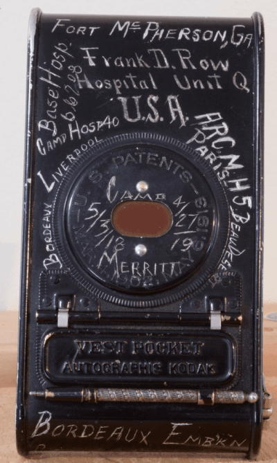
PermaRec update: A vintage camera inscribed with a series of handwritten annotations (shown at right) gives up its secrets in the latest entry on Permanent Record.
Tick-Tock: Today’s Ticker was compiled and written by Mike Chamernik, except for ’Skins Watch, which was handled by Paul.

’Skins Watch: A Native American group is pressuring Nike to stop producing Chief Wahoo merchandise, proving yet again that only white people care about this issue (thanks, Phil). … The teams at Neshaminy High School in Pennsylvania are called the Redskins. The student newspaper’s editorial board voted last year to boycott the team’s name in their stories, but now the school board has reversed that policy. … A Saskatoon high school will no longer call its teams the Redmen and is asking the public for help in choosing a new name. … Senate majority leader Harry Reid, referring to the Donald Sterling situation, thinks the NFL should follow the NBA’s lead and scrap the ’Skins name.

Baseball News: The Cardinals opened their new hall of fame museum last month. Tod Meisner made the trip there already and snapped a bunch of pictures. “Not only is it an impressive collection of all sorts of franchise artifacts (also the St. Louis Browns have a sizeable presence as well),” he says, “but because of the nature of the iconic ”˜birds on the bat’ the place is very uni-centric.” ”¦ Reprinted from yesterday’s comments: Here’s a good slideshow of MLB players wearing glasses (from Gil Neumann). ”¦ Nice infinite regression in this televised shot of the Cardinals’ Ballpark Village (from Patrick Walsh). ”¦ The Reagan Presidential Library in Simi Valley, California, has a “Cooperstown Quality” baseball exhibit through early September. Included are displays of Dodgers, Yankees, and Negro Leagues jerseys (from Steve Tilders). ”¦ A former Mr. Met was interviewed on NPR (from Dave Rakowski). ”¦ The Sandy Koufax-era Cincinnati Bearcats had a great logo on their jerseys. Sandy is in the top row, fifth from the left in that photo (from Patrick O’Neill). ”¦ The “G” on David Freese’s Angels jersey was riding a bit low the other day (good spot by Tony Andela). ”¦ County Community College’s Chris Burns III was seriously bundled up during a game Tuesday. “Yes, it’s been this kind of spring in the northeast,” says Jon Rathbun. ”¦ The Giants and Padres wore red ribbons last night for “Until There’s A Cure Night,” which promotes HIV awareness and funding (from Phil). ”¦ In 1976, the White Sox took the field wearing sombreros for “Salute to Mexico Day” (from Phil). ”¦ Yasiel Puig is 6-foot-3, but he still shows signs of a Napoleon Complex (from Phil).

NFL News: The Silverdome is still standing but it is rotting away. The Lions’ field turf and much of the stadium’s signage are still intact (from Chris Flinn). ”¦ Looks like there are some helmet inconsistencies in this Professional Indoor Football game. Note the matte black helmet (from Ryan Robey). ”¦ Donte Whitner will not change his last name to Hitner after all. ”¦ A guy at the Texas Rangers game last night wore a Johnny Football Cowboys jersey (from Phil).

College Football News: Oregon will wear these shoes for its Spring Game, as Tweeted by WR B.J. Kelley. “Looks like the feather design is going to be used on more equipment this year,” says redsoxtruex (obviously a screen name; his given name is whitesoxtruex).

Hockey News: “I came across this National Film Board of Canada production called ”˜Just Another Job’ which essentially is a collection of vignettes leading up to the Quebec Nordiques first game in the WHA in 1972,” says Ted Arnold. “One of the segments features the designer of the logo and uniforms who talks a bit about his design and the colours he chose versus what the team ended up choosing. The designer’s part starts at 13:10 and runs until 14:45.” ”¦ Rangers center Derick Brassard was missing the front numbers on his helmet last night (from John M).

Soccer News: Corinthians players entered the field yesterday night wearing helmets to mark the 20th anniversary of the death of Brazilian Formula One driver Ayrton Senna. ”¦ New uni sets for — deep breath — European clubs Juventus, AC Milan Third, Wolves, Dundee United, FC Groningen, AC Fiorentina, Stade Rennais, Borussia Mönchengladbach; South American clubs Cruzeiro, Paysandú, Fluminense, Grêmio; and non-World Cup countries Namibia, Togo and Senegal (all from Trevor Williams).

NBA News: The back cover of yesterday’s New York Post showed a photo of the Clippers’ DeAndre Jordan, only it’s an old photo. He switched from No. 9 to No. 6 in 2012 (good spot by Adam Treiber). ”¦ In the wake of the Donald Sterling ban, a Houston AAU team is changing its name from the Clippers to the Cyclones, and in the meantime before the new jerseys arrive, the team is taping over the ”˜Clippers’ script on its unis.

Grab Bag: A zonkey (that’s a zebra-donkey breed) was born last week in Mexico and it looks like it’s wearing striped socks! Awwwww (from Paul Ricciardi). ”¦ “Check out this article on the uniforms worn during the ”˜Duck & Cover’ period of the U.S.,” says Phil. “I remember watching those films, Paul probably does too.” I wasn’t around for it, but I do love South Park’s version of Duck & Cover. ”¦ North Carolina’s Pinehurst No. 2 is ready to sell some merchandise when it hosts the men’s and women’s U.S. Opens next month. ”¦ Black Sabbath’s Geezer Butler is letting fans design a new logo for him (from Adam Herbst). ”¦ NASA showed off a new prototype spacesuit (from Stephen Boyd). ”¦ The New Yorker explored the backstory behind NYC subway signs (from Jake Kessler). ”¦ New logo for PayPal. ”¦ Army soldiers are rushing to get tattoos before new anti-ink restrictions take effect.
There may be no apostrophe on the Dr. Jack patch because his “retired number” banner has 77 on it. Also, Black Sabbath rolls on with Geezer (an Aston Villa fan) continuing to play bass.
Today’s ESPN column is up:
link
What team was the first to wear a patch, memorial or otherwise, on the chest area of the uniform? I believe the Athletics and Reds wore flags on their chests during the 1990 World Series, and the Reds wore the 125th patch above the uniform logo during the 1994 season.
1969 Cleveland Indians wore the 100th anniversary patch just above the number on the front of their vested jersey:
link
The best reason I can explain the Reds putting the numbers on the right side of their jersey in 1993 was for consistency: that’s where it was on their home uniform. Customarily, baseball teams with an off-center chest insignia (Expos, White Sox home) have the number on the right where there’s more space. Teams with a script place numerals on the left since script nearly always goes uphill. And a team with an arched title (Mets road, Rockies) puts them on the left to take advantage of the slight surplus of material on the left of the placket. By 1998, there was confusion where to put the front numbers in Cincinnati.
I love the patch. The only bad thing it, since Ramsay died so late in the season, we’ll only see it a few more games.
It’s unique, I’ll give them that. I wish they would’ve done something a little more creative with the plaid though: plaid trim around the shoulders? plaid chest stripe?
I have a tattoo of the NFL logo on my arm… my brother was getting one and at the last minute asked if I’d get one with him, so I didn’t have anything prepared. it was the right choice for me because I love the nfl, but never have truly had a favorite team. Case in point… huge Manning fan and when he went to the Broncos I switched my rooting interests. When he retires I’ll just go back to enjoying all the teams like I did as a kid.
I have no tattoos, but have considered greatly a sports logo themes one. I’d get the old English D. Growing up in the Detroit metro area, Southeastern Michigan is a part of my identity. It’s the sports teams, but it’s also things like my Michigan accent, my love of winter, hankerings for a Coney Island restaurant etc. For me wearing a Tiger’s cap is the easiest cultural marker to declare my Michigan origins, so a tatt would be the same. Somehow the English D would seem better than a map of the state or a text saying “Michigander.”
I’ve seen a few Michigan state-shape tattoos, and they always look awkward due to the state being in two pieces.
Interesting piece on the glasses article, since baseball is one of the few sports where it would be practical to wear glasses-I imagine other sports you’d have to wear contacts-but they left off the closer of the 1979 World Series champions. link
As for the Silverdome–I thought it had reopened some time ago, but for relatively minor events? Somebody seriously needs to tear it down and the Astrodome down, just to put them out of their misery. And to think, people here wanted to save the Civic Arena.
I still miss the Igloo every time I’m across the street.
An interesting redevelopment plan had been floated. They would put a roof over the lower seating bowl, and turn it into a community center (concerts, gymnasiums, etc). The upper seating bowl would become the new seating bowl for an outdoor soccer stadium (the soccer field would be built over the new roof). I guess that fell through.
Man, I love that Nordiques documentary!
Canada had a law (they might still have it) requiring a percentage of each TV broadcast day be devoted to “Canadian Content.” I remember watching dozens of National Film Board-produced featurettes, all aired to fulfill the Canadian Content requirement.
Check out the “Adieu Alouette” opening: it’s the most Seventies thing you’ll see all day.
SCTV spoofed the Canadian Content law with a sketch called Canadian Corner, which evolved into Great White North. And that’s how we got Bob and Doug McKenzie.
Believe me, Alanis Morissette thanks God EVERY SINGLE DAY for Canadian content rules. One of my station presets is based in Windsor, and since their antenna is south of town, and Windsor is south of Detroit, and Detroit is — never mind, I’m right in the line of fire. Used to be a favorite station until they narrowed their playlist, but I digress. They must adhere to CanCon rules, albeit (I believe) somewhat relaxed due to their proximity to the States, so we get more than our fair share of Alanis, Tragically Hip, Death Cab for Cutie, etc. Alanis is an automatic punchout on the radio buttons.
I didn’t know DCFC was Canadian?
They’re from Washington, I’m pretty sure. Ben Gibbard is a huge Mariners fan.
SCTV spoofed the Canadian Content law with a sketch called Canadian Corner, which evolved into Great White North. And that’s how we got Bob and Doug McKenzie.
And that right there justifies the CanCon law, no matter how much Alanis Morissette PaulS must endure as a consequence.
Does William Shatner make original-series Star Trek qualifying Canadian Content? Or is film & TV judged by the producers’ nationality? And if so, shouldn’t musicians also be judged on the basis of producers, lyricists, and songwriters, not performers? Morissette, for example – most of her, um, popular songs are actually co-written and entirely produced by an American. So Alanis Morissette songs are no more “Canadian” than an episode of Kirk-era Star Trek. They’re both American productions that happen to have a Canadian lead performer.
Anyway, if only American TV also had a higher percentage of Canadian content. Corner Gas aired here only too briefly, and I would kill for the chance to watch Blackstone.
CanCon is a tricky subject.
For instance, I do a radio talk show. If we play any music, 33% of the time it has to be sung, written, or produced by a Canadian for it to count. Basically, if a Canadian gets his/her name on the credits for singing or writing or is the person that brought it together, all good.
Canadian television gets extremely murky. Star Trek does not count because it was produced and filmed in the US. Doesn’t matter if the entire cast is Caandian – it has to be produced and filmed in Canada (more or less).
Again, TV is very murky compared to radio when it comes to CanCon rules.
Heh. I’m working on learning to play Stan Rogers’ “Northwest Passage” on ukulele. If I ever get it down, I’ll send you a recording to help you fulfill your CanCon requirements, since it’s written by a Canadian.
Trust me, I love Bob and Doug Mackenzie; I even paid to see ‘Strange Brew’ in a theater. God bless SCTV, Kids in the Hall (my wife is a teacher, and she’ll still crush heads of students that desperately need it), and Red Green (Duct Tape wallet = best Christmas gift ever).
McKenzie Brothers was not really spoofing Can-Con laws. It was created in response to network (CBC) asking for content that appeared more Canadian.
In some cases even if the singer is Canadian a song won’t qualify as CanCon.
“Bob and Doug McKenzie were an accidental creation of the Canadian Broadcast Corporation. The CBC show was two minutes longer than the American syndicated show because it had less commercial content. So the CBC asked for two minutes of distinctly Canadian programming. Andrew [Alexander, the producer] had the hideous job of coming in and telling us this….Rick [Moranis] and I railed at him, ‘What do you want us to do? Throw up a map of Canada and sit there wearing tuques and parkas?’ Andrew sat back, smiled, and said, ‘Yeah, and if you could have a Mountie in it that would be great too.'”
–Dave Thomas
The show did parody a lot of Canadian-centric things: I remember John Candy doing a voiceover for a documentary called “Our Friend, The Beaver”. And of course, the Toronto Bay Leafs film, “Face Off”.
Cort, the Dave Thomas quote is supporting my post. They weren’t spoofing the Canadian content laws. They were spoofing the CBC idea of what a Canadian program should look & sound like.
Entirely true, Iain.
Bryan Adams’ album Waking Up the Neighbours doesn’t qualify as CanCon because it was recorded in England and the music and lyrics credits are shared by him and “Mutt” Lange. Therefor, doesn’t meet the CanCon requirements.
I know the Dave Thomas quote supports your statement, Iain.
You had your facts right, and I wanted to show that I recognized that.
I must be feeling defensive.
I’m glad that you pointed out my error. It justified me wasting 45 minutes I should have been doing Productive Things, reminiscing about SCTV.
I’ve never fired a gun, not even a BB gun. I’ve never owned a pair of Nike sneakers. And I’ve never been tattooed.
No plans to any of them.
Not sure if there’s a logical connection between these three factors, but I’m enjoying the mental image of some heavily tattooed dude shooting sodapop cans with a BB gun while wearing a bright orange pair of Nike Shox.
There’s no connection, none whatsoever.
As a man grows older, he finds himself taking inventory. What have I done with my precious time here? How have I been a force for good? What is my legacy?
The best I can come up with is that if I continue on my present course, I will leave this mortal coil with my fingers free of powder residue, my body un-tatted, and my feet swoosh-free.
The Hawks are giving out these shirts to fans at tonight’s game. I’m wondering if they might be wearing throwbacks or some sort of throwback/modern uni hybrid based on the updated logo.
link
Not a tattoo guy. I also don’t see the wisdom in getting a pro logo tattoo. You never know when a logo will be changed or if your team will move away altogether.
Unrelated, I took a snarky shot at the Clips after their initial uni-protest in the comments. I believe now that they handled it about as well as they could have, and I believe the players were ready to take a substantive action if the league did not respond as forcefully as it did.
I have a pro sports tattoo, so I suppose I’m pretty “tooly”, but I love it. And to counter your point I also have tattoos of both of my children’s names. I happen to enjoy tattoos and choose to view them as snapshots of a point in my life. I have a regrettable one, but I still like it and get a chuckle out of it because it reminds me that I was once a 19-year-old idiot. They all have a story. Here’s my pro sports tattoo (I’m guessing I’m pretty safe with this logo. Don’t think it will be changed anytime soon)
link
Are you from the St. Louis area? I think that is a little different. Someone else mentioned the olde english D from the Tigers as an identifier for the region they live in. I don’t see any issue with that.
Actual logos of pro sports teams is a little odd.
I am from the St. Louis area and did consider that when deciding on the STL as opposed to any actual Cardinals logos, so I see what you mean.
It’s kind of crazy that the Neshaminy school board seems to be mandating that the school district’s newspaper use the name “Redskins.” I’m sure the school board is ultimately responsible for the newspaper, but so much for encouraging the students’ own “freedom of the press.” It’s not like they’re trying to publish classified documents and embarrass someone. From the little that I know and understand, I’d assume that they are trying to be more sensitive. But hey. Whatever.
I’d be curious to see what would happen if the paper continued their policy in spite of the resolution from the board. That would be the true ‘freedom of the press’ test.
And one that the students might actually win if it were ever litigated. While students have significantly reduced civil rights in school, there is a huge practical difference between the school board ordering the student paper not to do something – say, ordering it not to use a certain word – and the school board attempting to force students to use a certain word. While there is much precedent for the school board’s power to prevent the student newspaper from doing something, including both prior restraint and post facto punishment, I have a hard time imagining a judge interpreting the First Amendment as giving the school board the power to prevent publication or punish students because they wrote “the Neshaminy varsity team” instead of “the Neshaminy Redskins.” Even if the school board has the legal power to do so, and it probably does, I don’t see any plausible, limited enforcement mechanism short of the school board actively reviewing and editing the entire student paper before publication and making the changes itself. So if the school board is not willing to step in as the paper’s editor and publisher, then it’s probably out of luck with regard to forcing the students to use the word “Redskins.”
It sounds to me that the Neshaminy BOE committee is not “mandating that the school district’s newspaper use the name Redskins”; rather, they feel that student reporters (present and future) who so choose to call the athletic teams by their proper name should be permitted to do so. Those who decide that an abbreviation/contraction of the word Redskins in their reporting is accurate enough will most likely continue that practice and will be able to do so as well.
So in effect, the school board is banning school newspaper editors from changing one particular word when editing reporters’ stories? While that’s a much more defensible exercise of authority, from the point of view of both legal precedents and the practicality of the enforcement mechanism, it’s completely insane. Even if I agreed with the school board on the merits, and I actually kind of do, I would regard the school board’s active involvement in copy editing a student newspaper’s sports section as a statement that those who voted for the measure have run out of legitimate things to do and so must be voted out of office. Is copyediting the student newspaper really what anyone elected their school board member to do?
“The plaid motif is still the main thing, of course, and that’s a great design choice. I just wish they could’ve nailed the rest of the details.”
Maybe the Blazers DID nail the rest of the details. Perhaps the choices they made were made for a reason? We’ll probably never know.
I agree. The lettering is obviously based on that from the jerseys first worn in the 77/78 season (which is what the current “Rip City” lettering replicates), and while the Blazers didn’t wear numerals matching the lettering, I don’t see it as a problem because the patch isn’t supposed to represent a physical uniform.
“77” is the way the Blazers chose to incorporate him into their history when they put it on a banner for him even though he wasn’t a player. Sure, they presented it as if it was a uniform number, but it’s more of a fun gesture than a serious retirement, similar to the Seahawks having a 12 banner for their fans.
Visually, keeping the lettering consistent with something in the Blazers’ history (and that they have resurrected and are using to this day) and maintaining its use throughout the patch makes for a cleaner, more focused design statement that bridges the past and present better than adding a third lettering style to the mix would have. It might not be “authentic,” but then again, the Blazers never wore a plaid jersey and Dr. Jack never wore a “77” on his sport coat, did he?
The patch might not match the uniform font, but it’s exactly the same as the lettering used in the Blazers’ logo from ’70-91 (as is the font on the Rip City jerseys).
The ’77-78 uniforms used the same font as the championship unis, with the vertical negative space inside the ‘a’, and they kept that font until they modernized their look in 1991. It always bugged me that they used different fonts for their unis and logo…
Ah, so it is. The Drexler Hardwood Classic seems to be incorrect, then, because it has the logo lettering.
Geezer Butler is not “formerly” in Black Sabbath…he most certainly is still IN Black Sabbath.
That is correct.
I personally would not get a pro sports logo tattooed, but I can understand that some people would. Perhaps the team was part of many special moments (father-son days, for example) and it serves as a reminder for that time. I personally was never a 49ers or a SF Giants fan, but they were my mom’s teams, and ever since she passed 5 years ago I’ve held a much stronger rooting interest for them, in her honor. Even when I was an obnoxious teenager with barely enough time for her, we could bond over watching the games on TV, and were I to consider a tattoo in her memory, one of their logos would be as tangible a memory as anything.
I don’t have any pro sports tattoos but I plan on getting a few when I get my next tattoo. It’s going to be a half sleeve and feature a symbol or mark from everywhere I’ve lived and a few of the ones I’m doing are the St. Louis STL (favorite baseball team) & My college’s logo (which I designed). I’m also thinking about getting one of my favorite team’s logos elsewhere, but again I designed it so I’m not sure if that counts the same way.
I initially get a little upset and defensive when people make fun of tattoos and such. Although I try my hardest not to judge anyone’s tattoos because they aren’t for me, they are for the person getting the tattoo, I can’t help myself with some tattoos I see and I’m right there with you going “I’d never get _______ on me!” So I certainly can understand people thinking something I get tattooed on me is stupid.
I’ll leave with one of my favorite quotes in regards to tattoos: The difference between people with tattoos and without? I don’t care that you don’t have any.
It’s better to criticize people who are thinking about getting a tattoo than those who have already gone under the gun. Once somebody gets a tattoo, it becomes a part of their body. If you’re criticizing a permanent part of someone’s body, there is really no defending that behavior. The recipient of the criticism has little opportunity (save expensive and painful laser surgery) to alter that portion of their body, so criticism is likely to make the person attach shame to that part of their body for the rest of their lives.
I have an hilariously regrettable tattoo, but fortunately I was cognizant enough as a younger man to have it applied to my body where it is concealed–except at the beach. If people criticize it, they are criticizing the thought processes of who I was 10+ years ago. It’s a little awkward, but you just have to own it.
No tattoos of any sort but certainly would not entertain the idea of a sports tattoo.
My fanaticism is unwavering and eternal, and has continued to sail through horrible losing periods (Raiders and Dodgers haven’t won championships since the 80s), terrible ownership (Frank McCourt), and periods featuring star players I don’t really care for (Lakers – Kobe Bryant). I’m still a fan and always will be, far as I can tell from this vantage point.
However, the idea of getting myself a sports logo tattoo has never crossed my mind.
Isn’t the “proving yet again that only white people care about this issue” thing getting a bit tired? I don’t think I’ve seen anyone use that counter to an anti-Skins argument in a very long time.
When the issue started picking up steam, there was validity in questioning the degree to which it was ‘offensive’, based on the fact that a vast majority of the demand for change, and the loudest/most prominent voices were those of white people. ‘Offense’ is subjective, and it wasn’t fully established on this front (And still isn’t universal among Native Americans).
Now, of course, the issue has gotten much more attention, and more Native American organizations have gotten louder and more active in the discussion/movement. Hence, the ‘only white people care’ argument has become invalid, and your quip feels tired and unnecessary. It feels a bit like seeing a successful female CEO/leader and having a women’s rights activist say “still think women don’t belong in the workplace???”
Isn’t the “proving yet again that only white people care about this issue” thing getting a bit tired? I don’t think I’ve seen anyone use that counter to an anti-Skins argument in a very long time.
You’re not privy to the emails I receive that make that argument on a regular basis.
Fair enough. I guess I just haven’t noticed it.
“Isn’t the “proving yet again that only white people care about this issue” thing getting a bit tired? I don’t think I’ve seen anyone use that counter to an anti-Skins argument in a very long time. ”
I encountered it twice yesterday on a pro-sports-related blog.
I’d be curious to know how many of those who make the “only white people care about this issue” argument are themselves white. My guess would be 100% – maybe even higher.
Yeah, a better rejoinder would be “Only white people want to *keep* the ’Skins name.” Probably closer to the truth (although ultimately irrelevant, of course, because this issue concerns all of us and we’re all qualified to express an opinion on a matter of public concern).
I was amused a couple years ago that Vince McMahon should buy the Silverdome since arguably the most famous eventheld there was wrestlemania III. And turn it into sonme kind of wwf/e museum or hall of fame or theme park.
Seeing the Cardinals H.O.F. reminds me again of the Stalin-like eraser of the immortal Harry Carry from Cardinal history. Harry had his greatest years with the Cards but is unrepresented in their official history. There is a bust of Jack Buck outside the stadium but nothing about Harry anywhere. If someone wants to hear the greatest announcer of all time they should look for a copy of the Card’s record album of their championship ’67 season.
I have the Jim Hartzell drawn Oriole bird from the ’50’s/’60’s. Though it was well before my time, I’ve always thought that bird was so cool & wish the Orioles would use it as sleeve patch or something.
Besides that tattoo, I’ve actually taken the sports logo 1 step further & gotten tattoos of my 2 favorite players growing up: Cal Ripken & Eddie Murray.
How could that eyeglasses-in-MLB fail to include Chris Sabo? Sabo was one of baseball’s most prominent Rec-Specs icons.
link
I played baseball for a couple of years with Sabo-like goggles – while they did improve my eyesight (duh), I found that the curve of the lens distorted depth perception and made catching a fly ball much more difficult.
Went through a 2 year stretch where, for some reason, routine pop-ups were an adventure. Got contacts, problem solved. (Also lost any remnants of a jump shot)
I still have my Sabo-style specs. They’re 20 years old and about 35 prescriptions out of date, but I can’t bear to part with them.
I’ve briefly considered adding a St. Louis Blues or Cardinals tattoo to my collection (I have 3), but I almost always quickly think better of it. I don’t think it’s just my St. Louis fandom talking when I say that tattoo sounds awful though.
While I’m not a tattoo guy, and if I were to get a tattoo, it almost certainly wouldn’t be Minny and Paul shaking hands, this is exactly the sort of thing where I only apply “rules” to myself, not to others. I certainly won’t look down on someone for having an outdated Padres logo on his calf, as a guy at my church does.
I’ve long known that if ever got a tattoo, it would be one of two options. A blue wing on my shoulder – or maybe a bluebird, I don’t know – in honor of my link. Or the link, with its eagle on a shield and a ribbon in its beak reading, “The Union and the Constitution Forever.”
But I could see considering a sports team logo, if and only if it symbolized a place that is important to me, not just the team itself. So I could imagine going for the Twins’ old M cap logo for Minnesota, or the recently redesigned Nats curly W or the Caps eagle W for Washington. The problem is, I’d figure that people would assume the tattoo referred to the team, not the city, and I probably care too much about what other people think to say “screw it” and get the sports-logo tat. For the record, that’s the story behind that Padres tattoo – the SD is about his hometown, not the Padres in particular. Guy’s more of a Chargers fan anyway.
This batting helmet must be seen to be believed. Far as I can tell, it amounts to the Stars and Stripes turned into a camo pattern:
link
However you look at it, any baseball team that doesn’t wear this helmet must hate America and oppose the troops.
I’ve been thinking about getting an Eagles logo tattoo, but I’d prefer to get one if/when we win the Super Bowl, because in Philly, the Eagles winning the big game is worthy of burning ink into your arm.
Related note; I have thought about getting link because I think it would be cool and/or it would balance out another tattoo I kinda wanna get.
I am not a tattoo fan at all and would never get one. But theoretically, if I got one, it would definitely be a Cardinals one, the single bird on bat logo. Best looking logo in sports, for a storied franchise so it’s not going anywhere. Also it’s just pretty. And the Cardinal is the state bird of the 3 states I’ve ever lived in.
The Dr. Jack patch would make an interesting tattoo.
I grew up a baseball fan in Minnesota with the initials TG. So a few years after moving away I modified the Twins “TC” logo into my initials and got that as a tattoo. I consider this more of a “who I am” and “where I’m from” tattoo than a straight declaration to a specific team. I don’t think I would ever just go with just a standard team logo. I currently live in Kansas City, and you see the Royals “KC” logo used as a tattoo around here a lot. But I think that’s more because it is a really nice logo for the city and not much to do with the team.
That TG tattoo sounds awesome! I’d love to see a photo.
Seconded.
I am a loyal reader of UniWatch, but regarding your “quibbles” with the Dr. Jack patch–come on. He passed away like two days ago; they didn’t have much time to pull something together. Considering the time, I’d say they did a pretty damn good job coming up with a nice (and good-looking) tribute.
Not a tattoo fan. One big factor in that was my Dad’s friend Jack – a terrific guy who got a couple of tattoos in the Navy in the ’40s and, by the time I came around, conspicuously regretted them. Jack was also the first of many folks I’ve known whose tattoos haven’t aged well.
My “tool” comment was probably a little harsh, but I didn’t mean it for everyone who has a sports tat. The guy I know never struck me as a die-hard Chicago sports fan! I think he’s just a fair-weather guy who got sucked up into the local teams doing well.
Among the reasons why I think a logo tattoo is ill-advised: logo changes; the team moves; the team starts to suck; something like the recent Clippers fiasco can happen to your team; other people (like me) do some judging and draw some inferences about you (both good and bad); it shows signs you are very close to literally living and dying with your team; it shows you care a little TOO much about sports; it probably doesn’t help with the ladies; and, most importantly, pro sports is a business, as has been said a million times.
The players on the team are hired guns and the owners’ primary goal is to make money. Now of course they try to make a good product, and fandom is a good thing and being passionate about your team is meaningful, but to get a tattoo… feels like a little too much, to me.
However, that’s a good reason some of you guys gave – the olde English D for Detroit and STL for St. Louis is a little deeper than the team itself, because it also represents the area. I can dig it.
Mike – I was ready to hit the “submit” button to share the story of my logo tattoo, but after reading your response here, I can see where this thing is headed, so I won’t waste your time, or any more of mine.
If you’re really interested to know why people have sports logo tattoos, or at least want to start a discussion, you probably shouldn’t just come right out and say: “I think a logo tattoo is ill-advised.”
The tattoo culture is a fascinating one on so many different levels, if you can break through the mindset of “I’m not a tattoo guy,” coupled with your desire to “do some judging and draw some inferences about” people with tattoos – while throwing in the oh-so-original ‘bumper sticker on a sports car’ cliche for good measure.
Most people with tattoos are happy to share stories or anecdotes, which often times are much more interesting than the tattoos themselves. The one thing they don’t have much interest in is justifying their decisions to people they know are just sitting there judging them.
It sounds to me like your mind is already made up on this topic, and you’re not really all that interested in learning what other people think, which begs they question: why even ask in the first place?
I am interested to hear what people think – I’ll be the first to admit when I’m wrong or, in this case, if other people have a good take or reason. I just wanted to lay out how I feel. I love logos but I would never get a tattoo of one, but maybe others feel differently (and as I’m reading, I’m seeing they do). I’m not trying to make people justify their logo tat decisions here.
I like hearing the stories behind tattoos, and there have been some good responses today. For instance, someone left a comment saying that he would get the number “27” tattooed on him in honor of his grandfather and the Red Sox. I think that’s pretty cool! Interesting backstory, creative presentation.
That’s much better, to me, than slapping a lame hybrid Bulls-Bears-Cubs-Blackhawks logo on your back.
There’s a component of our DNA that compels us to decorate our skin. All cultures have tattooing in common. But some of us have misgivings about putting permanent markings on our bodies. I notice people who have ink appear to have a more relaxed attitude about permanence and image.
No tats, no piercings.
Teenage me always thought if I was going to get ink I’d design it myself, middle-aged me thinks if I was going to get a tattoo it would be in honor of a loved one.
I might consider a small Mets NY logo, not just to delineate my support but because it’s the “alternative” logo for New York itself. Tourists wear the Yankees NY… “real fans” wear the Mets.
Snooker doesn’t get a whole lot of attention on Uni Watch, but while we’re talking about spectacled sports stars it’s worth mentioning Dennis Taylor whose frames were significantly taller than a usual pair (to the extent that they looked like he was wearing them upside down) allowing him better range of vision when lining up shots. link
Ooooh, I like!
Not an NBA guy at all, but now that the Bobcats have been eliminated, they link.
Thoughts?
We’ve known for quite a while that they were going to be the Hornets next year, so there’s really not much to think. They’re just trying to make sure that the 3 fans who managed to avoid the news are now aware of it.
Sure, but now the team is embracing the logo. Change has happened officially thanks to the Miami Heat. lol
So predictable, so safe, so utterly forgettable.
First the Pelicans, now this. Sigh.
Great question, Mike. I don’t have any tattoos yet, but I am totally planning to get one, if I come across the right motif.
I am a huge fan of Borussia Mönchengladbach, who are represented in today’s ticker, and I really like the iconic and simplistic design of the diamond-B. But I would never get a tattoo of it, even if the reason itself is somehow shallow and stupid. Over here in Germany, the people who have (visible) tattoos of their soccer team are often violent hooligans I don’t want to be associated with.
However, I am on the brink of getting just the letter B in the logo’s typeface, as it is also the number plate of the city I live in (Berlin, woohoo) and the first letter of my mother’s name. In that way, it would relate to the club I am totally crazy about and also represent those other two important aspects.
It’s about time
link
The Hawks pac man is one of my all-time favorite logos! Let’s hope this is the first step in moving back to their rightful color scheme of red and yellow.
It’s pretty amusing to me that the so-called “Pac-Man” logo debuted eight years before Namco even invented Pac-Man!
The original Pac man logo is so fine.
link
I used to gaze at it and ponder…what’s that bird thinking?
This new one–though loads and loads better than anything they’ve displayed since–gives too much away. It’s got nothing to do with “modernization” either. It’s all about some marketeer’s notion that the casual fan desires some agressive entiecement to cement devotion to the team.
link
I wouldn’t get a logo, but I have been considering getting a tattoo of the Red Sox’s retired number 27 as seen on Fenway’s facade in honor of my grandfather, whose lucky number and police badge number was 27, and the fact that I grew up in Boston and love their sports teams. I feel like it’d be a bit more personal than just the Boston Red Sox logo.
Slow clap. The no hitter that never was.
I’m glad that you picked up on the reference!
i noticed in the b&w bearcats team photo that they are wearing two different jerseys home & away, i’m guessing) and what appears to be 5 or possibly 6 (depending upon lighting) different caps…
Not sure if I could ever get a team logo as a tattoo, but I did once have a dream that I had the picture of Carlton Fisk jumping and waving the ball fair as a tattoo on my left forearm. I still think about getting it done someday.
On the other hand (foot in this case), my girlfriend has a Penguins tattoo.
RE: the Pontiac Silverdome. Sad day for everyone involved when the city sold the building, as it was a constant source of comic material. The city of Pontiac turned down a $20M offer for it a couple years prior to the actual sale. The potential buyer, a local lawyer with a pipe dream, may never have realized his plans, but at least the city would (theoretically) have money in the bank.
Fast forward a few years, and the city is under control of an emergency financial manager, who tired of the annual $1.5M maintenance bill; locals wondered if the executive director of the stadium ate his way through most of the budget (morbidly obese, at least 300 and possibly over 400 lbs), or at least could explain why a stadium with no tenant and limited activity required an executive director. So the EFM put the building up for auction — with NO MINIMUM BID. The winning bid went to a developer out of Toronto, for the grand sum of FIVE HUNDRED FIFTY THOUSAND DOLLARS.
So the city sold it (at 10% of the cost of building it, and that was in 1974-75) to a company with a spotty record on development. They’ve posted a few pretty pictures of what they say they want to do with it, but it appears that the site is gone. Plans to install a second floor as a soccer pitch, roughly level with the first row of the third deck, with a concert theater and banquet hall on the current floor, all appear to be dust.
They stopped operating the fans that supported the roof to cut the electricity cost, then claimed that the destruction of the roof was all in the plans. At one time they owed the gas company over $750k (may still owe it), and they were caught bypassing the meter to steal gas for heating. My son’s high school marching band may have been the last activity at all inside, used the field for practice in November 2012, and it was colder inside than out.
Their latest money-making scheme is to sell off the seats in the building, but this is the Lions: does anyone really have THAT many good memories of this place, worth at least $125 per seat?
Read the story on the new NASA spacesuit and was really bothered by the use of “Nasa” (can’t even get that through spellcheck), so I tweeted the paper and the author and according to her British style is the one used. This was The Guardian paper, although the reporter is based in New York.
I was very tempted to respond that when the UK has a space program they can abbreviate it any way they want.
I was bothered by “Nasa” too!
I’m pretty sure I’m not the first to suggest this, but just in case – here’s a thought
The Toronto Raptors have been considering a rebranding for sometime. My first choice would be to drop the Raptors name and adopt the Huskies. The link being – Toronto’s first NBA team was named the Toronto Huskies. I was thinking it was a long shot (I thought I heard management had decided to keep the Raptors name)
However
They’ve adopted for the play-offs, the “We the North” slogan The promotional commercial the Raptors are running, quickly flashes the image of a Husky. If you want to solidify and embrace your northern location, what better name than The Huskies. So maybe the Raptors name is on the way out, only to be worn on special occasions.
already been well stated they are not changing the Raptor name. Just colours and new logo.
We’ll see.
Here’s the video if anyone’s interested, note the almost subliminal placement of a Huskie at the 44 second mark. I agree it’s unlikely, because of past statements – but it just strikes as such a superior name. Its also interesting to see the Toronto Raptors varsity jacket – a very different (Drake influenced) look
link
There is absolutely nothing wrong with Raptors as a nickname. As far as I know. It’s unique in professional/major college sports. Huskies abound, though.
That being said, using a dinosaur as a mascot/logo is highly questionable, especially when there are plenty of link.
I think the patch lettering is fine. It may not exactly represent the ’77 jerseys, but the font is consistent with the team’s original logo, which was in use in 1977:
link
The ’77 uniforms seem to have altered the logo lettering to accommodate a vertical alignment, but rendered horizontally the logo’s lettering style looks better. So I think they made the right choice there.
After about 5 years of following UniWatch, this is my first comment. I just had to say, sometimes Paul’s pessimism pisses me off. Of course you would find something to complain about in the patch. Those are incredibly minute differences that you found, but it’s still a stellar memorial patch. In the world of sports we live in today, with so many atrocious uniform trends, this fantastic patch comes out and I expect praise! Especially from you Paul. But no, nothing is up to par for you. In fact, if they included all of the details you mentioned, I bet you would find a way to complain about it somehow – hell, maybe you’d even say it wasn’t “modern” enough. I’m constantly disappointed with your negativity. I think sometimes maybe you can just say “damn, that just looks good” and leave your bullshit behind. Sorry, I love the blog, but sheesh.
Thanks.
No, it’s really a nice patch. I felt Paul was a tad harsh in his assessment, but at least he made his reservations clear.
Oh, please. I said it was really nice, but I also said a few details bothered me. That’s not “pessimism” (look it up); that’s just my honest reaction.
You say you “expect praise.” So in other words, you’re disappointed that your own opinion wasn’t reinforced by something you read on the internet. In this regard, at least, you have plenty of company.
“[Y]ou’re disappointed that your own opinion wasn’t reinforced by something you read on the internet.
What is “a 15-word description of source of at least 87% of all Internet arguments,” Alex?
Pretty much. Any display of point of view or, worse, expertise, is labelled as “hating” or “bias”. People prefer to get their commentary from a pre-selected echo chamber or a Facebook share from their crazy old uncle who always responds “no” to “Do you believe this country is headed in the right direction?”
But isn’t that what UW is ABOUT? For all of us that notice these things? We as a whole are the people that get an eye twitch when we see the Jets in 2 different color greens or a Yankee pitcher with an upside down 8. We’re here as much for that as we are for seeing the new Florida State logos.
BTW, it IS a nice patch as would be any patch that is plaid. But I too have a major dislike of that font. But not for the same reasons as Paul.
Not a tattoo guy. But most of my acquaintances and colleagues have them, so I keep my fusty old opinions to myself. That said, sports allegiances tend to be enduring. I’ve liked the Mets since 1969. None of my rooting interests have ever been dropped, and even an unfashionable tattoo shows defiance and rebel pride. Wouldn’t those qualities be important to anybody dedicated enough to get ink?
I don’t have any tattoos at the moment, but I’m thinking about getting a Liverpool crest and/or the Hillsborough tribute flames over my heart. Watching and being a fan of English football or football in general is pretty crazy like that.
Red Sox in red facing the Rays in blue. (The Sox’ red alts are normally Friday-only, but with today being a doubleheader the alts will be pressed into use on back-to-back days.)
Couple quick things:
1. I like the sombreros far better than “Los Calcetines Blancos,” or worse, because you know they would … [sigh] … “Los Sox.”
2. The Silverdome isn’t entirely mint to what the Lions left. Much of the advertising signage you see is from one of a few different post-Lions attempts to revive the facility for other reasons (the same way much of the “advertising” left in recent views of the Astrodome wasn’t from the Astros last days but from the post-Astros filming of “Friday Night Lights”). The turf is mostly from the Lions’ days, but they replaced the midfield logo and end zones with generics. Also, it’s not like the turf has just been sitting there. The Steelers used the dome as their practice facility for Super Bowl XL and the NFL had the same field turf used at Ford Field installed at the Silverdome for that purpose. Clearly the FieldTurf didn’t stay (hopefully donated to a school or something). Just pointing out that it’s not like the place has just been sitting empty since the Lions left. The last few years, though … yeah. Seems to be a Detroit thing to just let empty buildings sit and rot.
Source on the Steelers thing: link
I have the Mets interlocking NY as a tattoo. I got it after moving to North Carolina as A)a tribute to my home region B)I am a huge fan of the team. I have no qualms about having it even though I now live back in New York. I have a feeling I won’t live here forever (it’s too damn expensive of a state) so it’s a way for me to always remember my roots and what made me.
I have the Texas Rangers “T” tattooed on my left arm. I was named after Nolan Ryan, wore number 7 and played catcher in honor of Pudge Rodriguez, and had season tickets for several years. Baseball and the Rangers played a huge role in my upbringing and I knew I would never regret getting the tattoo. Now if only I could add a 20?? World Series Champs underneath before I die…
All you people with logo tats: Send me photos!
Sent!
PL, you sir, have a pic you took of my “New York” Mets (with drop shadow) ink at Uni-Watch HQ!
*not MKTG
Pistons had some good moments in the Silverdome. Made the ’88 Finals while playing there.
My first pro sports game was a Pistons game at the Silverdome – Detroit 120, Kansas City 116 (OT), January 30, 1985. A little over a month later, the roof collapsed for the first time.
Interesting OtL discussion today. I’m guessing UW Nation is keeping an eye on it?
News to me. Details..?
They were talking about the Redskins name and if it should be changed.
As my name suggests, I am a heavily tattooed person. (22 at last count) I can’t see myself getting a sports team logo unless I actually work for the team in some way.
I’d like to see link from this link passed around, just for shits and giggles.
Plenty of tats, including a lot of logos, but no sports logos. Almost got the New Orleans Hornets’ Fleur-de-Bee on my arm years ago, but changed my mind at the last minute – glad I did. I’m tempted to get the classic Charlotte Hornets logo, but I wouldn’t know where to put it now…
Pretty sure link wore glasses during his season as Gary Carter’s backup in ’86.
I have 3 tattoos, none are logos. One is a bit of a plug for the USMNT as well as ‘Murica — I just got “Don’t Tread On Me” across my left collarbone. I liked it being a two-fold meaning since I’m American and I am a huge soccer supporter.
I won’t get a pro logo tattoo ever. I have contemplated a sleeve (to correlate to the “Don’t Tread On Me”) that is basically soccer themed to encompass everything I’ve done with and through the sport — it would include logos of all the places I’ve played/coached.
No tattoos for me. I’ve never been interested in getting one.
As long as my mother is still alive, I won’t be getting a tattoo.
I have tattoos but probably wouldn’t get a pro tattoo. Why? Well, if you check out my closet, you’ll find a wide assortment of jerseys of my favorite teams. I’m pretty sure that makes more of an impact than what a tattoo would. The closest I would come to a pro logo would be, as someone else posted, the “Don’t Tread On Me” with a snake. It’s close to the USMNT but is more of a representation of being American than anything. Of course, I’d do the “Don’t Tread On Me” with other symbols of America. Bald eagle, US flag, Statue of Liberty…you get the point.
I met a guy a few years ago who had a Daytona Cubs tattoo. I always think back to him when people ask me what tattoo I would get (because my fiancé has a bunch and where I work) and not sure about getting a Tampa Bay Rays tattoo. I feel bad for the guy because Daytona has changed their logo and he’s stuck with the old one. A tattoo has to have significance for 60 years+.
I always get a kick out of that “Just Another Job” video because they chose to feature defenseman Jacques Blain, who made the team but went on to score only one goal, and that turned out to be his ONLY “major league” hockey season in either the WHA or NHL!
Even more amusing was the legendary Maurice “Rocket” Richard as head coach… little did they know when doing that filming before the regular season started that Richard would last only TWO GAMES before quitting because he couldn’t take the stress!!
-Jet
Tattoos are personal to the wearer. The only person that should like/appreciate the ink is the person that wears the tat.
Personally, I wouldn’t get a pro team logo inked on my skin, but I have a philosophy that only personally meaningful events in my life will be inked on my skin. I do have the USMC Eagle, Globe and Anchor tattoo, but I spent many years of my life in the Corps. The other tattoos I have directly relate to incidents in my life.
I have seen some really bad tattoos though. So far, none of them were sports/logo related.
Responding to the question posed about team tats: I happen to have a Red Sox tat on my shoulder.I got it because I believe it symbolizes the region I grew up in and the great times I’ve shared at Fenway and watching games with my family.
So yeah,some can come off very “toolish” I suppose but If they represent great memories past,present and future they are actually pretty cool.I mean,we should rag on the dudes that get a barbed wire tat or something they see inked on the newest rap star than sports logos