
[Editor’s Note: Greetings once more from Bristol. I was busy dealing with ESPN business yesterday (and will be doing more of the same today), so Phil handled today’s main entry. Huge thanks to him for covering the day’s major piece of uni news. ”” Paul]
By Phil Hecken
Yesterday evening, the Arkansas Razorbacks unveiled a set of new uniforms (football, basketball, baseball, etc.) in another university-wide rebrand by Nike. It’s been a busy ten or so days for swooshie, as this was the sixth set of unis they’ve unveiled since April 11th. It’s quite possible they saved the best for last too.
We’ll start with the football. So far (and hopefully, in toto) there were just two uniforms for the squad — a cardinal home and a white road (click on any images to enlarge):


That seems to be it*. No black, no gray, no crazy invented colors — just cardinal and white. It’s possible there are other uniforms or combos, but neither appeared on Nike or the school’s websites. And I have to say, the unis are very restrained. Two helmets (crmison and white) and two sets of jerseys and pants. The red jerseys have white designs on the sleeve (I’m guessing to mimic a hogs’ tusks), and white triangular shaped inserts at the armpit. The white jerseys have the reciprocal striping, with red “tusks” on the sleeve and cardinal triangular inserts.
* I say “seems” to be it because all that was shown were the red and white uniforms. Nike’s press release indicates for secondary colors: “The color black is sophisticated and powerful, and has been added to the secondary color palette for limited use. Additionally, a neutral palette of Anthracite and Dark Steel Gray has been included to add depth and flexibility. Gray is a perfect neutral because it sits between the extremes of black and white. It is the color of intellect and knowledge, and is classic, sleek and refined.”
I just threw up in my mouth a little. Excuse me while I wash the corporate-speak from the recesses of my mind. Now then…
The pants have a tusk-shaped stripe down the legs (with the “Classic Running Razorback” logo on the upper thigh):

But the rebrand wasn’t so much about reworking the football uniforms (although they did, and they look good) — it was about establishing a school-wide team identity — across the sports. What was of greater importance was the updated brand identity, as Nike puts it, “to evolve and enhance athletic brand across all 19 sports programs.”
The school kept their current side-facing Razorback logo (“Classic Running Razorback”), adding a secondary mark (“Forward Facing Hog”), and a tertiary letter (“Script A”), which looks a lot like the Oakland Athletics’ “A”:

The other thing the University and Nike sought to do was to create a consisten look in their typography and wordmarks. The new wordmarks are thus:


The school & Nike have now created a “consistent” look across the sports, with the new “Arkansas” and “Razorbacks” wordmarks you see above. They’ve also created (shockingly) custom number fonts, but I have not seen any logo slicks — so the numbers above (and what you’ll see below for other sports) are all I’ve seen — but from what I’ve seen they are not over-the-top and highly legible. Nike bills the number fonts as “contemporary rounded numerals (which) serve as a balance to the angular wordmarks and Razorback logos.”
Not bad (so far) right? I’m not convinced there won’t be a black or anthracite uniform down the road, but if this is it, it’s very nice.
Let’s take a quick look at the other sports that were revealed last night:
Basketball:


The men’s uniforms are on the top (and there’s the promised anthracite), and the women’s are on the bottom. As you can see, it is a fairly staid design, with a little tusk-like stripe on the jerseys and an angular stripe on the pants. The Running Razorback is on the pants, with the new wordmark across the chest of the jerseys.
Baseball/Softball:


The only uniform (or part of the uniform) shown was the cardinal top — the men with a button-down jersey, and the ladies with a pullover.
Track & Field:


Soccer & Volleyball:


Not bad right? If you want to know more, you can watch a couple of videos (uniforms, “innovation” — try not to laugh too hard when Arkansas coaches fellate Nike’s design team) below, and here’s the Nike press release.
On Paul’s good/stupid scale, this one is definitely a “GOOD” (notwithstanding the fact that a black and/or gray uni set may crop up for football), and if grading, I’d give it an A-. For this rebrand, anyway, I’d say Nike has done a nice job — proving the old adage, once again, that less is sometimes more. Much more.
Collector’s Corner
By Brinke Guthrie
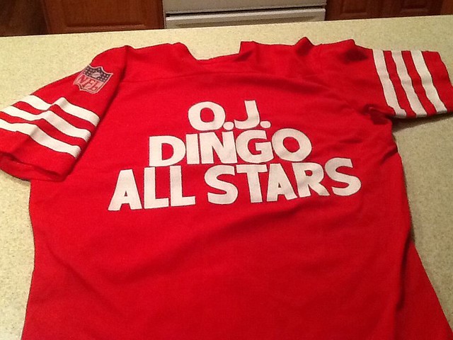
Kids, you may not know this if you’re not old enough, but OJ Simpson was once a famous football star before he became a fixture on Court TV. The Juice was loose in this “OJ Dingo All Stars” jersey, complete with the NFL shield.
Here’s the rest of this week’s haul:
ª Check out this 49ers MacGregor uniform set. Approved by “NFL Enterprises,” too. Fantastic box artwork, from Cincinnati 32, Ohio.
• Someone represented Northern California in Punt, Pass & Kick way back when — this jacket must have belonged to them.
• Look closely at the Jets helmet on this 1970s Namath thermal cup. Instead of “Jets,” you get “JWN,” for Joe Willie Namath.
• The Buffalo Bills’ future is somewhat up in the air, and will probably include a new stadium — somewhere. Here’s an early-1970s souvenir ashtray from Rich Stadium , which must have been one of the earliest corporate-named sports facilities.
• Here’s a lot of late-1960s/early-1970s Browns and Bengals posters. Why a Browns fan would also want a Bengals poster (or vice versa) I don’t know, but here you go.
• Before today’s Miami Marlinn, there were yesterday’s Miami Marlins, as shown on this nifty window sticker.
• And of course today’s San Francisco Giants were yesterday’s New York Giants, who had outstanding cover art on this 1951 program.
• Baseball’s Dave Kingman was known for his all-or-nothing approaching to hitting: He’d homer or strike out. But he was clearly King Kong on this vintage T-shirt (wearing period-appropriate Pumas, of course).
• This 1969 NBA Mini Basketball Kit is in great shape. Can’t say I have seen this design before, either. This one is marked “Midwest/Pacific” division.
• Here’s a terrific-looking 3D puzzle of Jerry World (aka Phone Company Stadium, home of the Cowboys). I like everything about it except the goalposts.
Seen something on eBay or Etsy that you think would make good Collector’s Corner fodder? Send your submissions here.
Tick-Tock: Today’s Ticker was compiled and written by Garrett McGrath.

Baseball News: The Mets debuted their camouflage jerseys last night. The unis didn’t look much better on the jumbotron. Even Mr. Met wore camo. Good thing is they won’t be wearing them again until July 7th (thanks, Phil and Michael Sand). … J.D. Martinez made his debut with the Tigers last night and had his first and middle initials on his jersey while Victor Martinez did not have any initials. So does that count as FNOB for J.D., since he uses his initials as his first name? (From Jeffrey Sak.) … We previously posted a sneak peek of what the Cubs and Diamondbacks will be wearing on April 23rd at 100th anniversary of Wrigley Field, but here is a look at the promotional jersey being given away that day (thanks, Phil). … The Red Sox wore their “Boston Strong” uniforms yesterday in honor of the Boston Marathon (thanks, Phil). … “I was up in Adamstown, Pennsylvania this weekend doing some antique/thrift hunting, and I found an Art Gaines Baseball Camp Jersey,” says Jim Adair. “It came with the camp’s brochure, which advertised Rogers Hornsby as being on hand at least once during the camp to instruct campers.” … While exploring the 1845 New York Knickerbockers’ game books, Ralph Carhart noticed that the record keeper was fastidious in keeping track of fines, including a mysterious and recurring six cent fine for “leaving with belt.” Is this for leaving with the wide, tooled leather belt or for something else? … The University of Florida softball team wore these cream-colored unis against Texas A&M over the weekend. Check out the sweet stirrups (from Andrew Gage). … The latest team to wear pink: Louisville. … The Georgia Tech baseball team is having a Twitter poll to let fans decide the design of the grass at Russ Chandler Stadium (from Britton Thomas). … As you probably know, the Rangers changed their squatchees this season from contrast-colored to cap-colored. But they must have had some old Fudd caps lying around, because Elvis Andrus went flaps-down with a contrasting squatchee last night (good spot by Joey Breeland). … Ike Davis was traded from the Mets to the Pirates last week, which means he’s now worn two different Ralph Kiner memorial patches in the same season. How often does that type of thing happen?

NFL News: Under the radar sponsorship switch: The Denver Broncos tweeted a picture of Peyton Manning working out yesterday while wearing Under Armour shoes. It looks like both Peyton and Eli switched from longtime sponsor Reebok for Under Armour and have been wearing their new gear in public recently (from David Coonce). … Two from Brinke: “Mean Jeans” Field is now covered in turf. … Here is a picture of NFL Commissioner Pete Rozelle and CBS Sports president Bill MacPhail posing with a set of bobbleheads in 1964. … New “intimidating cleats” for 49ers LB Patrick Willis. “Yeah, right,” says Brinke.

College Football News: We have a new logo for the Chicken Sammich bowl! … Interesting article on the Illinois uniform rebrand (thanks, Phil). … A Georgia high schooler has verbally committed to Auburn, and in this article he listed his reasons, including the following: “Auburn probably has one of the most superb equipment managers in the nation. He just re-invented the shoulder pads again. That’s one of the big things with my mom. She wants me to be safe” (from Greg Trandel).

Hockey News: Reprinted from yesterday’s comments: An answer to the Ken Dryden heads that Marc Hammil found at an antiques market in Ontario. “Back in the 1970’s, Colgate (the only brand that my parents bought) toothpaste in Canada had these as inserts in their toothpaste boxes for various NHL stars,” says Dave Mills. “They also had a series of player ”˜headshot’ stamps that could be licked and put in an album. Both the heads and stamps were licensed by the NHLPA but not licensed by the NHL and thus had no team logos.” Joe Szurly adds that Colgate made sixteen busts of potential members of Team Canada for the September 1972 Summit Series including Bobby Orr, Jacques Plante, and Norm Ullman — whose statue was misspelled as Ullmann. The Summit Series was an eight-game series between Canada and the Soviet Union at the height of the Cold War.

Soccer News: Sporting KC wore plain white armbands on Saturday to honor the three people killed during a shooting in Overland Park, Kansas on April 13 (from Christian Sinclair). …Two from Yusuke Toyoda: Major sporting good sports in the UK aren’t stocking the Nike England World Cup shirt because it is too expensive for fans. … Atlanta’s MLS expansion team colors will be red and black with some gold. … The rest from Trevor Williams: The Paris SG 2014-2015 home, away, and alternate kits have been leaked. … Better photos of the Arsenal 2014-2015 home and away kits. … The new Atlético Paranaense 2014 Home and Away Kits were released on Friday. … The Argentine River Plate 2014 away kit was leaked.

NBA News: Stephen Curry wore custom ankle braces with NBA logo stickers on them during Game 1 of Warriors vs. Clippers playoff series. This isn’t a new development (Curry’s been wearing braces since his ankle injuries last year) but we haven’t pointed them out before. Great close-up pictures from Joshua Buksbaum. … In an ESPN article yesterday, Jon Greenberg wrote about how Joakim Noah’s election as the NBA’s Defensive Player of the Year had to do with a change in shoes. “[Noah’s] change in footwear, from Le Coq Sportif to adidas, this season seems to have helped stave off his frequent foot problems.” (from Jennifer Hayden)

Grab Bag: Did you ever wonder who the most Googled athlete is? These infographics show who they are state-by-state, along with specific data about the Big Four sports (thanks, Andrew Powell-Morse).
On a personal note: Paul here. This little note I’m writing is the only part of today’s content that came from me. Let’s please hear it for Phil (who wrote the lede), Brinke (Collector’s Corner), and Garrett (the Ticker) for providing a great day’s worth of content. I’m lucky to have such great people who can step up when I’m indisposed — thanks, guys.
Nice of Nike to have each sport represented by the “appropriate” race in the Arkansas uni launch. Blacks playing football, basketball and running track. Whites playing baseball, softball and soccer and volleyball.
Gray … is the color of intellect and knowledge
I was enjoying the Razorbacks unis until I read this, and remembered why hatred of Nike is not simply an aesthetic preference, but a moral obligation. In heraldry, gold is the color of intellect or the elevation of the mind. More broadly, in Western culture, blue is traditionally associated with knowledge and intellect. Gray has essentially no tradition of symbolic meaning – note the nearly total absence of gray from flags.
Further, if as Nike asserts in the bit I skipped with the ellipses gray is “a perfect neutral,” then by definition it is not the “color of intellect” or anything else. If it symbolizes anything in particular, then it is not “neutral”! (In fact, gray is an effective neutral in part because it doesn’t have strong associated meanings, despite Nike’s press release lie.)
Gray: the color of corporate bullshit. Which is what makes gray uniforms so perfectly fitting for modern NCAA sports.
Well, other than that whole unpleasantness in the 1860s…
The gray of the Confederate army wasn’t a symbol for anything. It also wasn’t really gray in most cases. But gray was chosen for practical reasons: It was a very cheap dye, many Southern state militias already used gray uniform elements, and it contrasted in close combat with the blue uniforms of federal troops and many Northern state militias.
tl;dr: The Confederacy adopted gray because it’s a neutral color, not because it symbolizes anything.
Right, it didn’t have meaning then but *now* it does, at least when a school like Ole Miss with overt Confederancy references uses it.
Oh good lord, what a crock.
Sometimes gray is just gray, and 3 stripes are just 3 stripes, and a poorly drawn smiling cartoon logo is just a poorly drawn smiling cartoon logo. Stop looking so hard for a deeper meaning when one doesn’t exist.
Egad, Nazis!!!!
link
Those football uniforms are abominations. THIS is what an Arkansas football uniform should look like, you Nike fucktards!
link
That’s not Nike bullshit. It is true. Gray does have an association with intellect and knowledge; especially the Greek goddess(like Nike) Athena.
link
link
“Forward Facing Hog” would be a great name for a band.
That’s my favorite yoga position!
It reminds me of the Simpsons Lord of the Flies episode.
I’d love to see the tusk detail on the collars of the softball jerseys applied to the collar of the baseball jerseys as well. It would work just fine, aesthetically, on a button-front jersey, though I’m sure it’s much easier to sew on a v-neck jersey.
My first thought about the “tusk” was…oh, so Arkansas is going to be playing at U of Washington’s stadium? Typical template garbage from Nike (and any of those suppliers).
Make up some reasoning that “fits” a school when there’s a boring template.
Inspired by Brinke, I did an eBay search for 3-D stadium puzzles, and it turns out that’s a thing. Like, a whole genre of puzzles, and they’re all pretty awesome. Mostly famous soccer stadia, but some American baseball and gridiron temples too:
link
If I am not mistaken, aren’t the little inset triangular looking pieces on the front of the jerseys the same insets that Nike bullshitters tried to say represented U of Washington’s stadium roof? I believe they are. If that’s true, then what in the hell do these triangular insets mean for Arkansas? That they are UDub fans? Don’t even get me started on the gray BS Nike spewed forth. As I have said before, Nike operates under the old adage that a sucker is born every minute.
Jim, I caught the same thing (reference wot UW stadium).
I would guess on a second look, the little football jersey insets are supposed to represent Razorback tusks? Really? I despise Nike.
This is like the fourth straight Arkansas football uni that has had something on the uni that is supposed to represent a Razorback tusk. Dating back to 2008, which was introduced not by Nike, but Adidas.
link
I am not an adidas fan either or Under Armour. Those 3 have gone berserk in the uni world not to mention all sports from football to basketball to baseball to even freaking golf. I refuse to buy anything from those 3.
The RootHogs look great except that dangblasted white hat. Get rid of the white hats.
I remember seeing ads for Dingo boots featuring Simpson in a couple of comic books (late-70s back-issues I picked up in the mid-80s). I believe Joe Namath was also a spokesman for that brand.
Yup, O.J. and Joe Namath both endorsed Dingo. O.J. had a series of infamous “three-legged” ads, here’s one: link
Thanks for finding that! I used to see those all the time in Sport magazine in the ’70s. I believe Dingo tried to advertise the “third leg” thing as representing speed or agility or somesuch (and showing more of their product), completely oblivious to a rather common colloquial definition (e.g., what’s a nice big, um, appendage between your “other” two legs …?).
Nike logo on the thigh pad… sigh
I’ve been out of town for a few days, so apologies in advance if this has already been covered.
With Ike Davis’ trade from the Mets to the Pirates over the weekend, he has worn a Ralph Kiner memorial patch for both teams. Has any other player ever worn a memorial patch for the same person on more than one team in the same season?
Mets and Phils wore Tug McGraw memorials in 2004 but I don’t think they shared any players that year.
There’s bound to be league-wide memorials, Bart Giamatti maybe?
To my knowledge, Bart Giamatti memorials were limited to the Giants and A’s in the 1989 World Series due to timeliness and a lack of proliferation of memorial patches like we see today. But either way, there is a difference between “a memorial patch for the same person on more than one team” and “the same memorial patch on more than one team.” The former should be rarer.
“Mets and Phils wore Tug McGraw memorials in 2004 but I don’t think they shared any players that year.”
~~~
Only wives.
The way the numbers are cut off by the stomach vent thing on the football jerseys just looks sloppy and half-assed.
Why did they put UWs “iconic jaws” on the Arkansas football uniforms?
At least they’re not at a 44 degree angle.
“For more than 140 years, the University of Arkansas has been located near the 36 parallel, a significant line if latitude that spans the entirety of the known earth. The Razorback’s new custom number font is capped with angles cut at 36 degrees to represent the global reach of such a prestigious university.”
Wait, are there latitudes that don’t “span the entirety of the known earth”? Is that like the 92nd parallel? Or are there latitudes that coincide with irrational numbers like i that only exist in certain places but not others, and maybe extent into superdimensional space or something?
Also, are there still “unknown” bits of the earth?
Bad enough to have dishonest cant like this spewed at us to insult our intelligence, but to have it spewed forth on behalf of an institution of higher learning? This is why hatred of Nike is a moral imperative.
arrScott FTW
Wait, are there latitudes that don’t “span the entirety of the known earth”? Is that like the 92nd parallel? Or are there latitudes that coincide with irrational numbers like i that only exist in certain places but not others, and maybe extent into superdimensional space or something?
Yes there are, and longitudes as well. There’s all of the coordinates within the Bermuda triangle, and Atlantis, and that spot where the world shifts upside-down in that one Pirates of the Caribbean movie.
The latitude of Washington DC certainly appears to coincide with irrational numbers.
FWIW: That entire paragraph was a product of my hyperbolic imagination.
It was fantastic trolling and, I thought, evident as such. But as they say, the best satire must first of all be plausible. Many cocktails to you sir!
Thank you, sir.
If that was satire, it was brilliant. Utterly believable! My hat is off!
Arkansas doesn’t wear crimson… they use cardinal.
“Arkansas doesn’t wear crimson… they use cardinal.”
~~~
Good lord, you’re correct — now fixed. This is what happens when I’m trying to do three things at once, and late.
Nice catch.
not trying to be nit picky… I hate “that guy.” but I’m sure Arky doesn’t want to be associated with that OTHER UA school in the SEC.
I think the switch from the Manning brothers from Reebok to Under Armour had more to do with Reebok’s shift to fitness and basketball than anything.
Reebok doesn’t even have branded football cleats anymore, and the baseball selection has also shrunk. Its focus primarily fitness.
Maybe it’s more of a surprise that the Mannings didn’t do to the parent company adidas, but I don’t remember if the NFL only allowed players to wear Nike or UnderArmour exclusively. I thought RGIII got fined for wearing adidas.
I think RGIII can wear adidas cleats they just have the 3-stripes done tonally.
Looks like link, unless I’m totally missing the stripes somewhere.
Major sporting good sports in the UK aren’t stocking the Nike England World Cup shirt because it is too expensive for fans.
And people think there’s a shortage of good news these days!
But think of the supporters who can’t properly support their sides by wearing the authentic shirt! Fans will be forced to wear the cheap $100 replica versions and THAT will be the reason for England’s early exit!
Fans will be forced to wear the cheap $100 replica versions
…or **gasp** last year’s version!!!
Or, even worse, a solid red (or white) t-shirt!
Oh, typos in the ticker writeup: should be “major sporting goods stores“?
Why do you think they put the swoosh on the left side of the jersey for football and baseball, but the right side for basketball, softball and volleyball?
Certainly looks like there is room on the left for all the designs.
Doing a quick google image search, it looks like all Nike basketball unis this year had the swoosh on the right side. Even when it’s SUPER cluttered.
link
Arkansas’ Senior Associate AD Mike Waddell was on twitter fielding questions last night after the reveal and stated that you won’t see the Anthracite Football Jerseys this year. I’d guess the one time used Anthracite helmets are also gone (for now). The basketball unis will continue to have the sublimated images like the old uni. He also stated “stay tuned” When asked about nike logo gloves.
link
Mike also said that the cream baseball unis that everyone seems to love that were just brought back this year after a five or six year hiatus, are going to stick around too! I was super pumped about this.
“Maybe the dingo slashed your baby”
The ‘A’ logo for Arkansas has been used for many years, mostly in baseball and softball.
I’m also very interested in seeing the rest of the baseball unis. They’ve used the same set up for a while now; an ugly cardinal top and mirrored white top, both with white pants. A classic pinstripe set, and this year they brought back this absolute beaut of a cream set, that had been missing for five or six years. I’m being told by the athletic department via twitter that these cream unis are staying put. I’ve been campaigning for these to make a comeback since they’ve been gone.
link
As an Arkansas alum and die hard fan still living in Fayetteville, this is much better than I thought it was going to be. I was a bit afraid of the corporate doucheness that would come out for Arkansas from Nike. Finally some consistency across all sports.
The Forward Facing Hog is cool too as a secondary logo, but nothing beats our classic Running Hog logo. And this state would’ve had a shit storm if they touched that one.
Great write up Phil!
I really hate that the Under Armor logo looks like an “H”.
Am I the only one perplexed by this??
I wouldn’t say I’m perplexed by it, but it is a slight annoyance when I think about it.
It’s an interlocking “U” and “A” stacked on top of each other… I always thought it looked like an X until it hit me
Stands for, um, hardiness?
Depends on the color.
It stands for different things depending on the colors? It looks like an “H” or an “X” or a “U” over an “A” depending on the colors? It’s only perplexing/annoying based on the colors? All of the above?
It was a joke based on the previous comments on the symbolism of certain colors.
The Arkansas unis are far better than I would have expected, save for the wordmark. That’s a silly font.
Intellect and knowledge?
This is the University of Arkansas we’re talking about, right?
OK, gratuitous digs aside, it’s a nice look. No alternates, no funny colors, no weird fonts.
Florida softball top is beige, not “Cream”. It’s bad enough the antique white uniforms most teams try to pull off these days looks closer to yellow than cream, but this Florida top looks darker than the Padres “sand” road uni of a few years back.
It looks like vegas gold to me. Not far off from what the CFL’s Blue Bombers wear now, really: link
Speaking of that Florida jersey… what the heck is that girl’s jersey number? She’s got 34 on the front, but something ending with a 2 on the sleeve.
I appreciate the new logo for the Chick-Fil-A sponsored bowl, but we should appreciate how a bowl game is taking a step back and returning to its original name, the PEACH BOWL.
I don’t believe that was done voluntarily. Since they did away with the BCS, I am about 97.4% positive they are required to list the Bowl’s former name to keep the “branding” consistent with the other bowls that are in the College Football Playoff rotation (I think the Jerry … er, Cotton Bowl is the other one now in the rotation).
Let me see if I can find the cit.
OK, that didn’t take long.
From that article:
So there you go. They’d have probably kept it as just “Chick-fil-A Bowl” if they could have.
49ers LB Patrick Willis’ cleats must be Spinal Tap inspired: Smell the Shoe
Rex, if I were to ask you what’s your philosophy of life, or your creed… what would that be?
“I was up in Adamstown, Pennsylvania this weekend doing some antique/thrift hunting, and I found an Art Gaines Baseball Camp Jersey,”
Weird tag placement on that one.
Shout out to Paul, though not by name, on the Keith Olbermann show last night. While discussing the Mets’ camouflage jersey, Olbermann cited a “commentator with whom I agree on this topic” about how the use of camouflage demeans, rather than honors, the servicemen who actually wear camouflage.
Not to say that it wasn’t Paul (and I hope that’s who KO was referring to)…but there are a surprisingly large number of commentators who dislike the camo, and who feel it’s inappropriate for MLB teams to wear (for that very reason).
KO needs to have PL back on that show ASAP.
He wasn’t referring to Paul. Olbermann described him as “a right-wing commentator with whom I agree.” I don’t think Paul would consider himself a right-winger.
No, Mr. Lukas is clearly not a righty. But who isn’t at least sometimes to the right of Olbermann?
Wearing camouflage doesn’t honor the military any more than wearing a cartoon Indian head honors Indigenous Americans.
Walter, you are so right. I did military service and I support the troops to this day of all branches but teams wearing camo does nothing. Why not have the jersey suppliers donate the money those jerseys cost to a veteran’s group that could use it well I say. Or maybe donate 5 bucks for every fan who comes to the game to a worthy veteran’s charity. All these ribbons, camo and such are more for people to say “see me!” than anything else.
That 1964 pic of Commissioner Pete, CBS Sports head Bill MacPhail and 14 NFL bobblehead dolls was likely for publicity reasons. That year, the NFL and the CBS Television Network agreed to (what was then) a huge exclusive two year $28 million+ contract. Meanwhile, MLB was still on MacPhail’s CBS and NBC networks with individual team contracts for another season and still being blacked out in MLB cities. One of the big turning points in pro football’s rise to popularity at the expense of baseball.
Oh, yeah. It was also the year that the NFL first allowed teams the choice to wear either dark at home or white at home.
Not much of a fan of Arkansas but viewing these in a vacuum it’s not bad. Better than most of the new looks lately.
Yes they can do without the white helmet so there’s only the cardinal one. Since it’s Nike that number font sucks. And those pointy “tusk” things look stupid. But other than that at least these two look decent. I’d give them a solid “B” and put them on the “good” side of the GoS scale. Drop the white helmet and swap the pants so they don’t go with the seemingly now standard monochrome at home & away and I’d bump it up to a “B+” or an “A-“.
Here’s a look at the full Arkansas football unis on mannequins — with a red/red/white and white/white/red look — gotta admit, these are pretty nice.
I’m still not much of a fan of that white helmet but this looks MUCH better than the monochrome. If they go this route I’ll like it a lot better.
Arkansas has rarely gone monochrome in the past and I would expect these to be the combos seen on the field. Much improved look over the garbage they’ve worn the last few years.
For many Canadians the ’72 Summet Series was more than just a set of 8 games. It was an event that helped establish Canadian pride and unity.
I mean the “The Maple Leaf” had only been our national flag for seven whole years when the series started. Before that we flew the Union Jack. The event was watched by children in school and government officials in office and celebrated coast to coast. It made Red and White ours. Made us take pride in ourselves and our nations relatively new look.
It also made the mighty mighty (and unbeaten) Soviet Union human.
Paul’s episode of the 99% Invisible podcast is up! I can’t wait to listen to it. link
KILLER giveaway by the Cubbies