
Last week’s issue of The New Yorker had a big article about Under Armour (which, unfortunately, is behind a paywall, so I can’t link to it — sorry). It was full of interesting stuff, but I was particularly struck by this one passage where UA honcho Kevin Plank was explaining why someone might want to buy one of the company’s super-warm coats (I’m pretty sure he was referring to this one):
[Plank] knows that plenty of his current and future customers really aren’t athletes, no matter how broadly one defines the term. He says, “If I told you this jacket’s been to the Himalayas, you’re going, ‘I don’t know if I’m ever going to the Himalayas, but if anything ever happens I’ve got an extra layer of protection ”” I’ve got something you don’t.’ It’s like a superpower.
There’s something incredibly depressing about this notion that everything, even buying a fucking coat, can be reduced to “I’ve got something you don’t.” Keep in mind that this coat is not for any sport or game, it’s not for gaining an edge against anyone — it’s just a warm coat. And yet Plank somehow manages to frame it as part of a competition in which we’re all looking to beat the other guy. What exactly is the point of that? Hell, wouldn’t you want everyone to be able to enjoy a nice warm coat? Why does it have to be something that you have and the other guy doesn’t — are you really that insecure? (Never mind that this is a mass-produced item, which means literally thousands of other guys do have it, even if for some reason you don’t want them to.)
Appealing to people’s insecurities and aspirational fantasies has always been the essence of consumer marketing. That’s how flashy cars, fancy home-audio systems, and penis-enlargement pills get sold — nothing new about that. But in Plank’s world, it’s no longer enough to keep up with the Joneses; you now have to beat the Joneses (and presumably put your foot on their throat).
I don’t know if this is just Plank’s marketing shtick or if he actually views the world this way. If he does, I feel sorry for him. Either way, I feel sorry for the people who are seduced by the point of view he’s putting forth — and for all the rest of us who have to deal with such people.
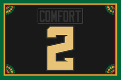
Membership update: Membership orders have slowed to a crawl lately, but three new designs have now been added to the card design gallery (including James Comfort’s card, shown at right, which is based on Baylor’s uniform from the Tortilla Chip Bowl).
I’m going to send this latest batch to the printer tomorrow, even though we have several open slots on the current sheet. This means that if you sign up for a membership card today, you’ll likely have it in your mailbox by early next week (or maybe even by this weekend). So if you’ve been meaning to sign up, this is a good time to do it.
As always, you can sign up here, you can see all the cards we’ve designed so far here, and see how we make the cards here.

Culinary Corner: Culinary Corner is usually about recipes or food-prep methods. But today’s going to be a little different — I want to talk about a really fascinating photo that ran in the New York Times food section the other day.
But before I show that photo to you, let’s start by taking a look at this photo:

We all know what that is — two chicken thigh/drumstick sections, one from each side of the chicken, connected at the center. Those are very familiar shapes, and we’ve all internalized what they signify. But here’s the thing: That’s actually a cropped version of the full photo that ran in the Times, which looked like this (click to enlarge):

As you can see, these drumsticks still had the lower portion of the legs attached, along with the feet. It’s striking to see it that way, no? We’re so used to seeing the drumstick end with that little knob at the bottom, but that’s actually the chicken’s knee, not the leg’s terminus. Seeing the entire leg, complete with the foot, is a powerful reminder that this was once a living animal. Really goes to show how some visuals become so familiar to us that we can forget where they actually come from and what they actually mean.
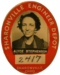
PermaRec update: We’ve tracked down the story behind the person shown on another employee I.D. badge (shown at right). Check it out on the latest Permanent Record entry.

Baseball News: Last week I asked a Red Sox publicist if the team was planning to wear gold-trimmed uniforms for the home opener and/or ring ceremony. “No plans we’re aware of,” I was told. Now a cap with a gold-trimmed “B” logo and a “World Champions” patch has surfaced on Twitter. I’ll circle back to the publicist today and try to find out if this is just a retail thing or if it’s going to be worn for the opener (thanks, Phil). ”¦ Marc, who didn’t give his last name, points out something you might not know about the Dodgers’ new alternate road jersey: It comes with its own set of alternate pants. The thinking, apparently, is that if a jersey has piping on the sleeve cuffs, then the pants have to have side piping. And, conversely, no sleeve piping means no pants piping. But come on — this is how that whole “hobgoblin of little minds” thing was coined. ”¦ While we’re at it, the Cubs are doing the same thing with their new alternate road jersey. Lame. ”¦ Someone’s selling some very nice blue Northwestern-striped stirrups. … Totally digging the chain-stitched Buick patch on this vintage jersey. If there was anything at all on the back of the jersey, I’d definitely buy that. … In case you haven’t seen it yet, here’s the scary/creepy photo of Aroldis Chapman’s head after his surgery for that line drive his took off his skull. … Here’s a great shot of George “Boomer” Scott, showing his helmet in the field, his “black beauty” glove, and his necklace (from Doug Keklak). … New Queensboro Bridge-themed jerseys for St. John’s (thanks, Phil).

NFL News: Someone on eBay is selling what he claims to be an original NFL 50th-anniversary patch from 1969 for $700. Or you could just get an NFLPA patch for six bucks and change (from David Firestone). ”¦ Gene Sanny just finished this wonderful painting of AFC quarterbacks from the early 1980s. “It’s something I always wanted to do, to commemorate my beginnings of football/art, basically so I could stare at those awesome colorful uniforms.” He plans to do an NFC version next.

College Football News: In yesterday’s Ticker, Phil mentioned that several college football teams were adopting Riddell’s new Speedflex. Another school we can add to that list: Florida (from Dan Wunderlich).

Hockey News: A disgruntled Oilers fan tossed a jersey onto the ice the other night, and goalie Ben Scrivens tossed it back (thanks, Phil). ”¦ Good article about how the NHL Shop creates new jerseys when players move around at the trade deadline. Interestingly, it looks like they left out the space between “St.” and “Louis” in the Martin St. Louis NOB shown in the photo at the top of the page (from John Muir). … Girl Scouts-themed uniforms for the Manchester Monarchs (thanks, Phil).

Soccer News: No photo, unfortunately, but Federico Higuain of the Columbus Crew had his name misspelled on his jersey on Saturday (from Jim Moeller).

NBA News: Love this vintage NBA gumball set. Never seen that particular format before (thanks, Brinke). ”¦ The Knicks wore their Spanish pajamas last night.

College Hoops News: Hmmmm, is that sublimated lettering? (From Paul Lee). … You know things have gotten out of hand when the NCAA is trying to police the presence of Fig fucking Newtons. Douchebags (from Matt Jones). … Yesterday Phil Ticker-linked to this item about round-by-round lapel pins. Now Frank Mercogliano, the Assistant A.D. for Communications at New Mexico, has checked in with some additional info: “Those lapel pins are in lieu of credentials for the 22 people on the official travel party (in UNM’s case, 13 players, two managers, six coaching staff members, and the trainer). Everyone else gets a hanging credential. As you advance to each round, the day before is a transition meeting where they go over uniform colors and hand out the pins.” … Yesterday’s Ticker also had an item about how Mercer’s outlined uni numbers from earlier in the season had been replaced by solid numbers for the tournament. Again, Frank Mercogliano fills us in: “We all had to upload our uniforms to the NCAA for approval. I can’t see what Mercer sent in, but I can tell you they uploaded their black uniforms on March 14 and then had to reupload a different set of pictures of the black uniforms on March 17. So they might have made them change the uniforms because of the ghost numbers.” ”¦ Good article on why all the NCAA court designs look the same (from Jeff Barak).

Grab Bag: Not sports-related, but check out the crazy arrows on this amazing old dress design. ”¦ A few months ago I mentioned the artist Mark Wagner, who makes amazing collages from pieces of $1 bills. Yesterday he was the subject of a good segment on CBS Sunday Morning. Recommended. ”¦ In a related item, here’s a really interesting gallery of suggested alternate designs for U.S. currency. ”¦ “Axalta Coating is run by Texas A&M graduate Charles W. Shaver,” says David Firestone. “So Texas A&M will be on Jeff Gordon’s car in April at Texas.” ”¦ Oh baby, look at this amazing bowling promotional film produced by Brunswick in 1948! It shows pins being manufactured, early pinsetting machines, and more (big thanks to Scott Little):

What Paul did last Friday night: Big thanks to the many, many readers who posted and/or emailed birthday communiqués to me on Friday — you’re all swell.
I had a great birthday full of fun activities with good friends. My friend Liz took me to lunch at Morgan’s BBQ, where I had an excellent order of turkey tails. Later on, about 15 friends joined me for dinner at Les Halles, where I had a frisee/lardon salad (heavy on the lardons, mmmm), a hanger steak, some green beans, some truffle mac-and-cheese, some pâté, a sea scallop, a few mussels, some steak tartar, and probably a few other things I’m forgetting. Yes, it was a little gluttonous, but that’s what birthdays are for, right?
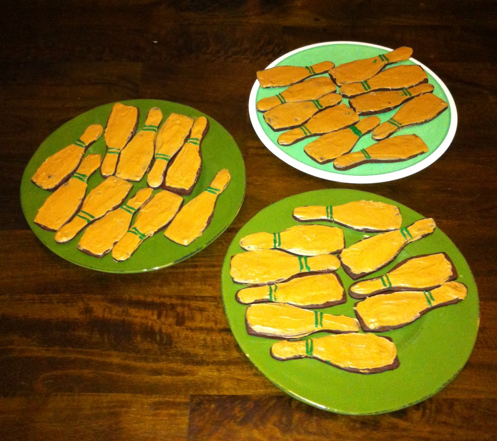
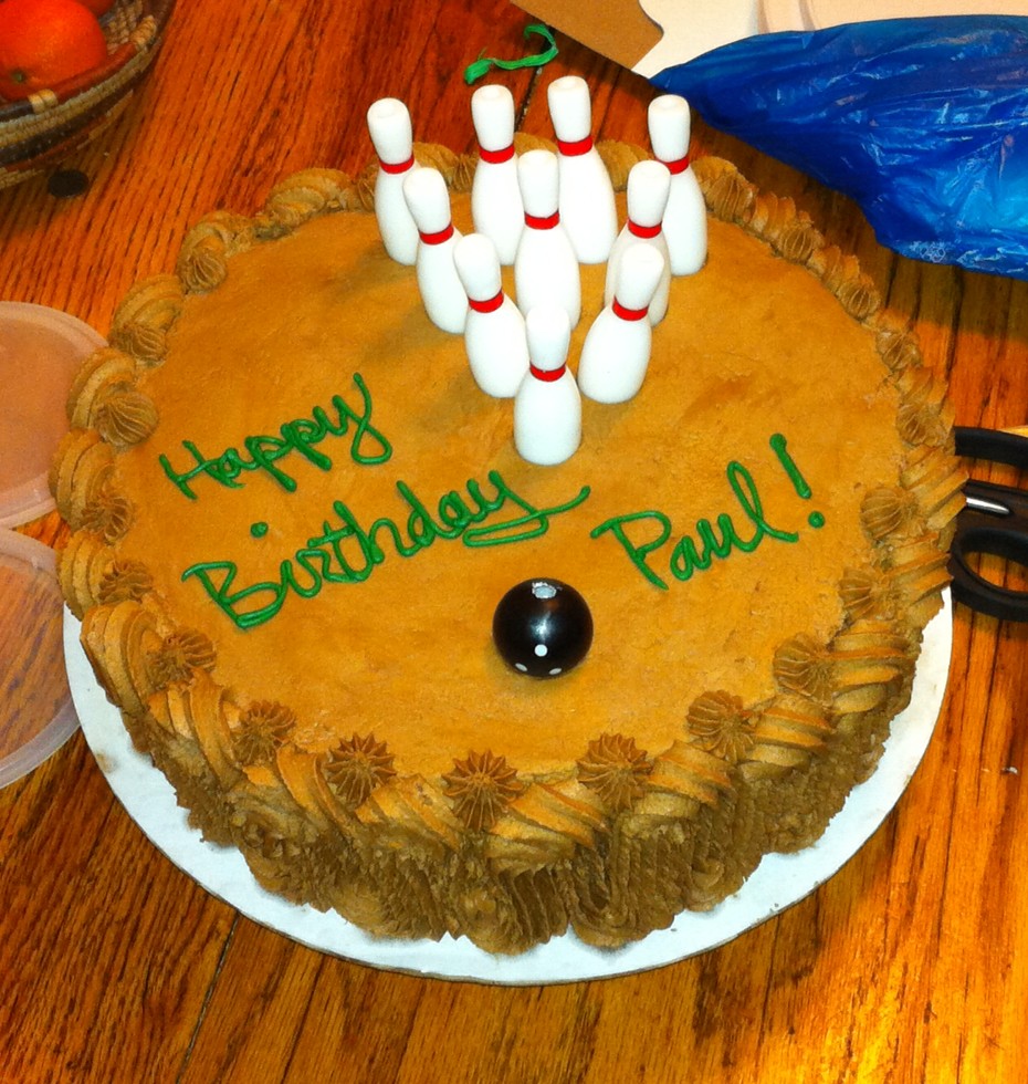
The capper was a late-night party generously hosted by my friends Garth and Nina. The New Girl and a few of her confederates had arranged some bowling-themed baked goods — all mocha-flavored (my favorite). Nothing I can say or show you can capture how wonderful this all was, or how special, fortunate, and loved it made me feel, but here are some photos that should at least give you an idea (click to enlarge):


I also received many excellent presents. Phil, for example, got me a very generous Etsy gift card, which I’ll put toward some sort of vintage goodie (thanks, buddy!). And my friend Karen got me a little bag full of drink tokens from an Elks lodge:
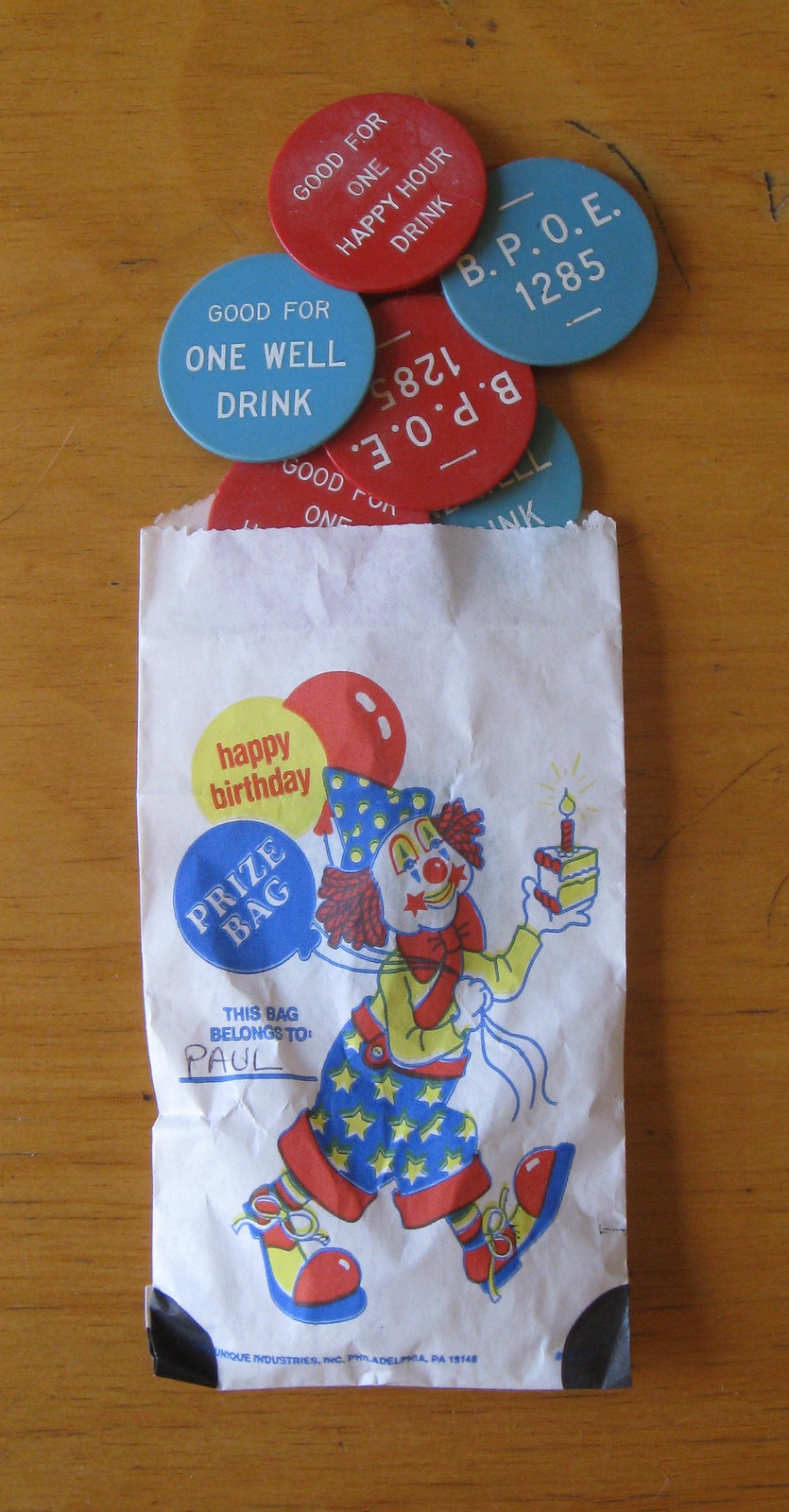
But the best present came from the New Girl. She knew I’d been newly obsessed with those photo I.D. badges but that I hadn’t actually purchased any to start my own collection of them, in part because they tend to be pretty expensive. So she got me a little starter collection of them (click to enlarge):
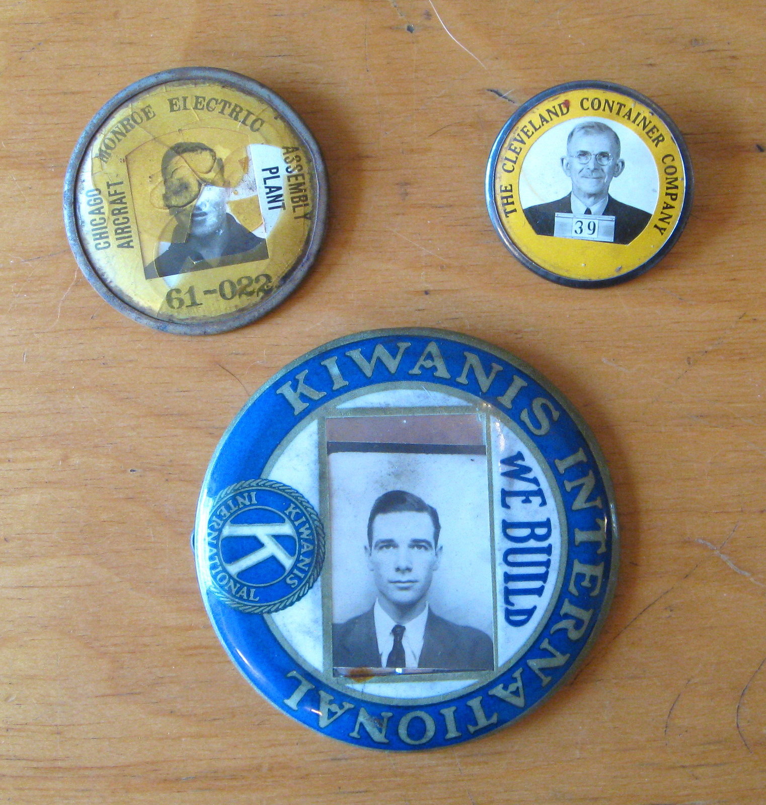
How great is that?! Answer: Pretty fucking great. Lucky fella. My thanks to everyone who helped make this one of the best birthdays ever.
Okay, I realize this was a day of not-very-uni-centric content. Thanks for your indulgence — we’ll get back to more typical Uni Watch material tomorrow.
There’s a link missing in “Good article about how the NHL Shop creates new jerseys when players move around at the trade deadline….”
THanks — now fixed. Here’s the proper link, so you don’t have to scroll back up and find:
link
Interesting how the NHL-jersey-wearing crowd now accepts poorly made jerseys with crappy heat-pressed numbers at an artificially inflated price. In the early 90s when I started paying attention and collecting jerseys, no one would customize a shirt with ironed-on numbers; sewn-on tackle twill was the way to go, even with replica jerseys. Even mass-produced replicas, for a while, had sewn or embroidered numbers/patches. Now the ratio of quality to price has flip-flopped, and people are okay with that.
I was at a minor league game the other night talking about that with the person that I was with. “Back in the day” I could buy a replica, with the logo being that screen printed twill shit that has really taken off in recent years for $60-70, or I could buy the real deal for $120-150. Every time, I’d just save up and go for the real one. Now, the replicas for the same team are now completely sublimated and are selling for $130, while the real ones are up in the $300 range. With the weight of them and the quality, or lack thereof, the current NHL replica jerseys are a joke too. The replicas that were produced prior to the Reebok Edge ones were twice the quality at half the cost. It was great to have actual shoulder patches, instead of that screen printed twill shit that I previously mentioned. I’ll never buy an NHL replica that features that screen printing on it. Thankfully my favorite team is the Red Wings, so I miss out on the crappy shoulder logos and the crappy screened on numbers (because the Red Wings only use one color on both jerseys).
So what you’re saying is that the whole NHL replica jersey market is a nonsensical, overpriced mess of which you are more than glad to continue supporting by agreeing to its bizarre notions of “authenticity” and the completely ridiculous monetary value placed on this nonsense attribute?
Huh?
In the time since the Reebok Edge has come to be, I’ve purchased 1 replica NHL jersey. The only reason I did that too was because my team doesn’t feature the screen printed twill logos or name/numbers that most other teams have.
My problem has more to do with just the broader culture that you stand for. You spent way too much for a sweaters because the people selling them to you told you it was “the real deal”, then you got pissed off when they changed what “the real deal” was. At that point, I should imagine one might realise that the whole thing is a scam but instead you feel like you’re owed something.
The whole bloody replica jersey industry is exactly what today’s lede describes: I want the real deal, authentic jersey because that makes me a better fan than everybody else. The only reason anybody pays that much for so little is if it’s been imbued with some bullshit ideology: designer handbags, dick compensating sports cars, $300 shirts with a team logo on it.
I haven’t bought an authentic jersey since the prices have increased dramatically. The last authentic one that I purchased was for around $130 several years ago, which is the price of the crappy replicas now.
I didn’t spend the extra money because somebody told me that it was the “real deal.” I spent the extra money because I felt the step up in quality was worth the extra money. Do you know how many fans are currently walking around with blank patches on either the front, or shoulders, of their jerseys? If you have a jersey with those on it you have to worry about that screen printing flaking off, leaving just a white patch in its place. It looks horrible. I didn’t want to be one of those people so I paid the extra money to get a product that I knew was going to last. I can buy one good jersey for $150ish (give or take), or one for $75 that may have to eventually be replaced for quality (or lack thereof) issues.
The thing that I don’t like about the replica market is that you’re spending almost $50 more now for a far inferior product. The current jerseys are a much lighter material than the previous ones, which to be fair, the current game jerseys are much lighter than the previous ones too. All logos (front and shoulders) on the old replicas used to be actual patches, not just the front crest. The same can be said for the name and numbers on the previous replicas. They used to be multi-layered twill, which is very similar to the game jerseys. Now, the shoulder logos and the names/numbers on the back are all a single layer of twill, screen printed to look like multi-layered twill. They’re extremely cheap looking, and as I said before, eventually that printing starts flaking off, ruining your purchase.
As far as being a better fan, buying/owning jerseys doesn’t do that for me. I’m a Tigers fan and I own one Tigers jersey. It’s a replica Prince Fielder jersey that I bought on clearance from Lids for $30 because he just got traded. Last I looked, I could still get the same jersey through the MLB store for $75. If a jersey made me a better fan, I’d have a Cabrera, Verlander, or Scherzer one, not one of a player who isn’t even on the team anymore.
Also, I never said that I was pissed that they changed “what the real deal was.” I have no problem that they switched from the CCM/Koho authentic jerseys to the Reebok Edge. As technology evolves, the equipment needs to also. As far as replicas go, I just don’t like that the quality is way down, yet the price is way up. I’d be willing that I’m not in the minority with that belief too.
If you pay $150 dollars for a replica jersey, that is too much. Even $75 is too much. You can get all sorts of Red Wings apparel for less than $30 dollars and that’s just their online store. Or, you can wear anything you want because why does anybody need to own officially licensed team merchandise in the first fucking place? Even granting that for some reason you must have a jersey, what does it matter if after a while it starts to degrade in quality? Oh, you don’t want to be “one of those people”, of course. If the quality of something is really so bad as to be objectionable, the smart thing to do consumer-wise is NOT to go and throw twice the amount of money at that same company for something marginally better.
Basically, what my point comes down to is that you have no right to complain about the price/quality of replica jerseys because you’re one of the people who gave leeway to the manufacturers to go that way in the first place. You’re one of the shmucks that said to the manufacturers, “oh, $75 dollars for a replica jersey, hmmm I’ll give you $150 if you put on the patches that don’t peel off.” To cry now that you’re being taken advantage of by the manufacturers is bloody ridiculous.
Josh, I understand every point you made. It’s why I only buy CCM throwbacks these days. (And you didn’t even mention the awful “Rectangle of Death” tag on the front of Reebok replicas, which brands you as “cheap,” even from a distance.)
That’s why I haven’t spent $150 on a replica jersey. I didn’t even spend that much on the one replica that I have that I had personalized.
You’ve done nothing but judge me from the start when you have absolutely no clue what you’re talking about. I’m glad that you have me figured out based on a couple of paragraphs. Get off of your high horse.
Is it that wrong to want a jersey, or any form of apparel for that matter, that will hold up after multiple uses and washings?
I’ve never once bitched about being taken advantage of. Since the different leagues started selling an inferior product at double the cost, I haven’t purchased hardly anything. I can’t get taken advantage of if I don’t buy anything.
Most of the jerseys I own were purchased from a clearance rack/page of some kind, or were purchased used from a secondary site like Ebay. I got a CCM Red Wings jersey from Goodwill last year for $10.
CWac19, the rectangle of death and the little slits up the sides near the hip area. Those have always driven me nuts because the real ones are rounded off, with no slits.
I agree. People’s standards have changed.I only buy pre edge jersey’s. I do own just One just so I have an example of how bad they are. I know that the NHL shop has various vendors that do their customizing work. So it is a crap shoot. Over the years I have had some very bad work from NHL shop,where I would have to take off all the stitching by hand and have them completely redone elsewhere, such as a reputable place like Action Sports in Buffalo, which have done excellent work for me in the past.
I like when baseball teams make sure that the jerseys and pants piping match, like the Dodgers and Cubs are doing. I think it’s paying attention to the details.
Can you please explain why the sleeve piping has to match the pants piping? Where is the rule that states that?
It’s overkill. Nobody needs an alternate gray jersey to begin with, and they REALLY don’t need alternate gray pants.
No, alternate jerseys and pants aren’t necessary, I agree. And the piping doesn’t have to match. I just like it when it does.
With respect Paul, but “where’s the rule that states this,” if accepted as a generally valid objection to aesthetic principle, invalidates nearly everything you profess to prefer about uniform design. This isn’t bowling, there are no rules! To assert a preference for an aesthetic principle is not to assert that there are rules in some book somewhere with the force of law behind them; it is to assert a preference.
Instead of pretending to argue a point you’re not arguing, how about joining the conversation in a positive way? What, precisely, is it that you object to with the Dodgers? Do you believe that striping shouldn’t match from sleeve to pant? Or do you object to a team having such variations over so picayune a detail? (Which is to say, you object to having two different road uniform pants, and the team should just stick with one pair, sleeve striping be damned?) I’m not sure I can imagine a third or fourth position that would lead to such strong objection to the Dodgers’ duplicate duds, but if there’s something else at issue, please share!
Personally, I prefer when stripes generally match jersey to pants (and to helmet in gridiron). But stronger than my preference for intra-uniform consistency is my preference against needless alternates. If I were emperor, a baseball team would be allowed one white or off-white uniform, one gray or pastel-colored uniform, and any alternates would have to be solid blocks of official team colors. I’d rather the Dodgers match their pants piping to their sleeve piping. But even more, I’d rather they only have one gray jersey, and if that means a pant whose piping doesn’t match the sleeve, so be it.
As I already stated, this seems like the very definition of a foolish consistency being the hobgoblin of little minds. If the Dodgers used their standard gray pants (the ones with the blue piping) with their new alt gray jersey, would anyone — ANYONE — object? Why exactly is it necessary for the sleeve piping and pants piping to match? And if they absolutely must match, then why not add sleeve piping to the new alt jersey instead of creating a new set of pants?
It’s overkill, overdesign, over-everything. And it’s going to make the equipment manager’s job unnecessarily complex. I’m willing to be right now that they by mid-season they’ll only be using one set of gray pants, regardless of which gray jersey it gets paired with. And along the way there’ll be multiple instances of a player wearing the “wrong” gray pants for a given game. The whole thing is ridiculous.
Nobody needs two gray jerseys, and that goes double for two sets of gray pants.
I’m with Scott: Superfluous, sure. Unnecessary, yup. But at least it’s consistent.
This is why I love this site. Come for the uniforms, stay for the Emerson quotes.
I feel in a way like Dodgers going with unnecessary alternate pants to go with their unnecessary alternate grey jersey is just jumping a second shark.
I feel the same way about the Braves special road pants for their blue jerseys. Its already reached the maximum level of silliness with the jersey itself. Anything beyond that cannot increase the level of silly beyond what was there to begin with.
My issue isn’t so much that they made alternate pants. I just don’t get why the alt jerseys didn’t match the regular sleeve stripe pattern in the first place. That seems like an odd point of differentiation for an alternate.
Perhaps they were going for as close to a 1972 throwback as possible? The new alt roadies are basically the Dodgers 1972 road set with the only changes being the obligatory NOB and sleeve logo. Was this their intention? Even if not, it’s a nice coincidence.
I think they look good. You’ve spent a lot of time moaning about these alts, but the bottom line is: they look good. I’m starting to suspect this is a Giants fan issue more than a uniform issue with you.
If there’s one good thing about all these extraneous uniform parts, it’s that it generates a ton of swag for us fans to buy after it’s been used. I acquired two pairs of game-used Cubs pants to wear when practicing for my amateur league team, and I don’t mind a bit that they were already “used” when I got them.
Now if the major leagues would just go back to employing more players who wear size 44 jerseys and have 30-inch waists like they did until the ’80s. The guys who get drafted these days are too big!
If there’s one good thing about all these extraneous uniform parts, it’s that it generates a ton of swag for us fans to buy after it’s been used.
“Swag” is something that’s given away for free.
What you’re referring to is not swag; it’s just more grist for the sports merch machine.
I agree Paul.
Doesn’t SWAG originally mean Stuff We All Get. You know, for just showing up.
OK, “swag” isn’t the right word. “Gear” or “goods”, maybe. But “grist for the machine” it isn’t. Even 20 years ago, it was almost impossible to get game-used goods, and if you wanted a team jersey to wear to games, you bought a replica. When you no longer wanted it, you could get maybe $10 for it at a yard sale. Today your game-used stuff will always hold some value (though it will probably decline because more and more stuff comes onto the market every year).
Game-used pants can be worn in your own league and then sold off when you’re finished. Impossible with store-bought baseball pants.
I’m with Davis J on this one. When I first read about this, I thought it was one of those cool little details/quirks that makes uni-watching so enjoyable.
Given all the attention that’s paid to such “Look at ME!” features as side panels (ugh!), material that’s .00783% lighter (double ugh!), and the like, this just seems like a fun little detail that’s being done for a sense of internal consistency. Plus, I think it looks nice, so they’ve got that goin’ for ’em, too.
Now if the Dodgers can just turn their attention toward GETTING THEIR #&!@^$ GAMES ON @*$&! TV STATIONS THAT MORE THAN 1/5 OF FOLKS IN SOCAL CAN ACTUALLY !*$&@! SEE, all will be right at Chavez Ravine …
Side panels are “Look at ME!”? Geez. I mean we can debate whether side panels look good or not, but a “Look at ME!” gesture implies a sense of needless flash, of doing something for a shock factor rather than for any aesthetic reason. With that in mind, side panels are just about one of the most benign ways of adding some colour to a jersey imaginable. So benign are they in fact, that they have been part of the standard Rawlings BP template for a few years now. After all, nothing makes you stand out from the crowd like a design element shared by every other bloody team in the league.
I don’t mean to be a pedant, but calling something in baseball a “Look at Me!” element is just one of those lazy platitudes that has become a trope of many traditionalist arguments. It’s a reductive epithet that serves little to no critical purpose.
Padday — what’s with all the vitriol toward fellow Uni Watchers today? You’re undermining your otherwise fair points with denigration of others. I don’t recall seeing that sort of thing from you before…
Thanks, Hugh.
I assume that the crown portion new Riddell Speed Flex is supposed to “flex” as some sort impact absorber, right? After seeing the Flordia picture of the helmet, I wonder if the helmet stripe will hinder some of the science behind it by not letting it flex like it was designed. You would think that the stripe should be cut at that spot. I could be way off on this since I am only guessing on what that area of the helmet is supposed to.
I was wondering about this, as well. If the stripe is not cut, we may begin to see quite a few stripe malfunctions.
The bowling ball candle looks like a Boris Badenov bomb!
Love the prize bag.
It made me think of The Big Lebowski and I’m sure that I’m not the only one there lol
link
George Scott photo: You can see his stirrups through his pants. Too bad he didn’t just wear his pants to intentionally show them.
Boomer is also wearing a pinstriped batting glove with his #5 as well.
I think I used to be the kind of guy Plank would have been marketing things to. I was competitive, wanted to look “better” than others, drive faster than everybody else, etc. Then I turned 30, got married, and life started to slow down. I started to realize that I didn’t really give a crap what others think about me.
Sadly, I think a lot of teens and 20somethings feel the same way that I used to. It’s what makes the sports apparel companies’ marketing work. Not saying Plank is in the right for doing it, but I understand why he talks/feels/addvertises that way.
Paul – re: your take on the Under Armour article. Although, I completely agree with the silliness of marketing and selling to ideal of “super powers” and “super heroes” that UA has embraced, I’m less shocked by his comments. The North Face has marketed it’s jackets for the same way forever with their extreme real world experience. From a general business standpoint, UA is in a market that is dominated by Nike, and has many larger players globally (Adidas, Reebok, Puma, etc.). As the up-start in the marketplace, they have found success in pushing the envelope and have established themselves.
Any company selling any product should have passion in its products, and should feel as though they are offering something compelling – or whats the point of even going to market? No different than Ford battling Chevy, Coke vs. Pepsi, etc.
Nike’s ethos has always been “there’s a great athlete in everyone” or something like that. UA’s mantra is basically a natural extension of that taken to comic lengths.
There’s a world of difference between “there’s a great athlete in everyone” and “we’ll make you better than everybody else”.
There’s a world of difference, but I do think it’s part of the same continuum.
There’s a great athlete in everyone. But to be that great athlete, you have to try really hard. And the motivation to try really hard is to be better than the competition, to do what the competition isn’t doing because great athletes are better than the competition. And Under Armour, theoretically and probably not actually, gives you the extra edge that you wouldn’t just get from effort.
Can you please explain why the sleeve piping has to match the pants piping?
For the same reason that the pant stripes on a football jersey should match the helmet or sleeve stripes. They just should.
Now can you tell me why kids like Cinnamon Toast Crunch?
God dammit. In my quest to be snarky I screwed that up and typed jersey instead of uniform, and I failed to reply properly. UGH!
Into the link you go!
So much to comment on here, but I have a culinary corner question. If I’m served that chicken from the New York Times photo, is it bad form to remove and discard the foot before eating? I don’t think I’d have a problem being served it, and it is thought provoking, but I’d want it to look a little more familiar before I tuck in.
Where would you discard it? Under the table??
Not sure. A side plate, or just off to the side of my plate, I suppose. Just… not attached. Is that odd?
I think many (most?) people would do likewise. I was only struck by your use of “discard,” because there’s rarely if ever a place to truly discard anything at a restaurant.
But where a restaurant serves a dish that generates waste to be discarded, don’t they usually give you a “bone dish”? I’m thinking of ribs and wings here but I’m sure there are other examples.
“Where would you discard it? Under the table??”
~~~
I want you to hold it between your knees.
/5 Easy Pieces
Why would you throw away one of the best tasting parts of an otherwise generally bland meat?
Yes, the whole issue is cultural. If it was my family dining, the feet would be the first thing eaten.
It’s not that I’m not game to try something new. I just don’t even know what part is edible.
“Why would you throw away one of the best tasting parts of an otherwise generally bland meat?”
~~~
Rocky Mountain Oysters are pretty tasty too (or so I’m told), but I’m thinking not many people would willingly eat them if they were known by their proper name or if told what part of the bull they were actually being served.
Likewise, call chicken feet by another name (especially if battered and deep fried) and you’ll probably have a much higher consumption rate.
I can only explain this from a drummmer’s POV: I’m surprised that those pins are/were made of maple. In the drumming world, a maple stick is a lot lighter than a typical hickory stick, but tend to break a lot more often as a result, depending on the stick size (ex: a Rock-sized maple stick like the Vic Firth SD1 General isn’t as likely to break like a maple 5A or 5B).
Did they change the wood/material used for modern pins, or are they still made with maple?
“…druMMMer’s…”
Goddammit. I need to go to bed.
MMMmmmmm ……. Drummers.
Ludwig Classic Maple: 8,10,12,13,16,18,22,14
I don’t know what modern pins are made of, but I’d have to think the old pins were much more durable than drumsticks due to being thicker, and the primary point of impact being the thickest part of the pin. They probably got dented a bit, but I don’t see them ever getting hit with enough force in the right place to snap the way a drumstick can.
That, and maple pins are getting hit by a huge smooth ball, instead of a maple stick hitting rims and cymbal edges at times…
Bowling pins are, to my knowledge, still made of maple. This has been the case for at least a century, and probably longer.
Yes, they’re still maple. And yes, they do break often. We give them a bath every once in a while to keep them from getting too dry/brittle, which helps.
Brunswick closed their factory in 2008, and now contracts with AMF to have pins made for them. AMF makes their pins in Lowville, NY.
Here you go: a documentary video on bowling pin construction. Maple.
link
I was at an NCAA Women’s Tournament game last night at Gampel Pavilion. Normally for events at Gampel, fans can bring in small bags, such as those from the UConn Co-op across the street, though they are subject to search. However, for this game, security told us the NCAA would not allow any bags with commercial logos in, including from the co-op, because only officially licensed merchandise is allowed inside. This also included a CVS bag, which obviously didn’t include any unofficial athletic merchandise. Last I checked, CVS doesn’t tell t-shirts or anything like that. One person came on a bus and had no idea where the bus was parked. Security was nice and tried to find out for her so she could take her bag back to the bus, but I went in before finding out if she was successful.
Honestly, it’s the same security people we normally have and I know they’re good guys. This isn’t their fault at all and I don’t blame them one bit. I made a point of telling them that as I came in, since I knew a lot of people would be taking their anger out on them. I blame the NCAA for this ridiculous rule, and for turning our event staff into agents of evil. Let me stress this again to anyone who plans on attending the NCAA tournament – if event staff tries to enforce some ridiculous policy, please don’t take your anger out on them. It’s not their fault. Event staff at the Gampel game yesterday openly admitted they found the rule ridiculous, but that there was nothing they could do about it. So take your anger out on the NCAA all you want, but don’t start yelling or cursing at the security staff who takes away your Fig Newtons or makes you track down the bus to put your CVS bag back on. Besides, if you’re nice to them they might help you track down the bus like the guy at Gampel did rather than make you do it yourself.
On a related note, Gampel Pavilion has advertising signs on each side of the video board, but they were both covered up with a curtain for the tournament last night, presumably since none of the companies were NCAA sponsors. I tried to take a photo, but my camera didn’t get a good enough shot and it just looked like it was a widescreen video board showing video that wasn’t widescreen, like when you try to watch standard definition programs on your HDTV and they have those bars on the sides. But it was obviously a curtain to someone who was actually there.
Could the bag be turned inside out, like high schools sometimes do with student T-shirts that are deemed offensive?
It looks to me like making people leave their bags behind in the bus, or even in a stadium cloakroom-type area, is eventually going to lead to problems when the wrong bag is returned to a patron.
And while bags can be left on a bus that’s going to be sitting outside the arena, what are people who walked or came by train supposed to do?
I was going to say, as dumb as the NCAA rules are, the security folks and fans missed obvious solutions and overcomplicated things. Why not just grab another, non-verbotten plastic bag and put the CVS bag inside it?
Maybe the NCAA is trying to get CVS to sponsor NCAA games. Buy your drugs at CVS, the official NCAA drugstore! Wait, that would totally send the wrong message.
I’ve attended the NCAA Final Four in Division III field hockey in 2012. Attendance: 169 (probably 98% of whom were friends & family of the teams that were competing).
There were no concessions on offer, and you were allowed to bring bottled water and/or canned soda. But only Coca-Cola products; no Pepsi, or Poland Spring water, allowed.
Sheer madness.
I went to the MAC football championship at Ford Field in Detroit this year and they enforced the same bag rules as the NFL does. It had to be a clear bag, no exceptions. As it turns out, that policy now applies to all events at Ford Field (and I’m sure a lot of NFL stadiums are the same way).
Just a note that the conventional butchering of poultry legs is with a cut at the bird’s ankle and not the knee. The bones in birds that are analagous to human foot bones (tarsals and metatarsals) are fused into one large bone, the tarsometatarsus, that does superficially appear to be an ankle. I’m a bird biologist by trade and thought that I’d offer some learning today. This is a great diagram illustrating this:
link
Great stuff — thank you!
RE: Culinary Corner
I have a couple buddies who are chefs and my other friends and I enjoy food talk. One question we talked about on several occasions was, “When does an animal stop being an animal and is just meat?”
Some say once it’s dead. Others have said once it’s butchered and cut. I say once the hair is removed. To me, it seems to me that once the animal is dead and the prep work begins for butchering by removing the hair, that’s when my mind goes from, “hey that’s is/was a living animal” to “let’s eat some meat”
Take a pig for example. To me at least, if you just kill a pig and it’s laying there, it is just a dead pig. Once you scrub it and remove the hair and get it to the point of cut and cook or just hang it to be ready to butcher, it looks like just un-butchered meat. That whole, “awww, that poor dead animal” feeling is gone and I am ready to fire up the oven/grill/spit. Same goes for cows/beef, lamb, birds (de-feathered), and so on.
Fish on the other hand, fuck fish, fish are always just fish. I suppose it’s because the eyes, those black, lifeless eyes, like a dolls eyes.
Lastly, Paul, is that the same Les Halles Anthony Bourdain used to chef at? I guessing yes.
Yes. But we were at the downtown location, because that’s around the corner from my friend Garth’s house, where we had the afterparty.
those black, lifeless eyes, like a dolls eyes.
+1, Quint.
You’re gonna need a bigger blog.
I still want Paul to try the chorizo chili recipe I sent him…
I’m not surprised at Mr. Plank’s comment. It’s common to use gluttony, lechery and arrogance as sales pitches. Envy* is just another card from the same deck.
Over the weekend my bride and I watched both the Pac-12 and big ten gymnastics championships on their eponymous tv channels. The difference in production values between the two was substantial. Pac-12 looked like a major national media operation. The big ten looked like community access. Does anyone know if that’s the case for other sports too or was this an outlier?
*While technically envy is defined as sadness at another person’s good, by extension it is also taking pleasure in the privation of another person, such as in schadenfreude.
A couple of typos in links in the ticker:
Soccer: “his namemisspelled”
Grab Bag: “ontis amazing old dress design”
Thanks. Both now fixed.
Re: AFC quarterbacks painting
Ah the QBs of my youth! I was able to recall all but 1 from memory (Colts) but it is weird to me, being a Raiders fan, seeing Houston represented by Kenny Stabler.
LOoking forward to the NFC version. Can I expect to see Lynn Dickey?
The real question is what uniform will Jay Schroeder be wearing???
(nevermind) Gah!!
The real question is are the current uniforms better than the ones the QBs were wearing in the painting?
Colts seemed to burn through qbs pretty quickly between Bert Jones and that Jim Harbaugh guy, wonder whatever became of him . . .
The Colts QB depicted IS Bert Jones.
Absolutely. I just had cognitive dissonance seeing him on the same page with Elway as I think of Bert more from around 1976-1977 than around 1983 with Elway et al.
the “Good article on why all the NCAA court designs look the same” just asks the question as to why they look the same, it doesn’t answer it.
or at least not in my browser it doesn’t.
Well, it kind of does. They just don’t want the splash of logos (especially un-NCAA affiliated logos) on the floors. The easiest way to avoid that is to just make new, identical floors for every venue.
Honestly, I hate this. Seeing the floors and the locations was one of my favorite parts of the tourney. If absolutely nothing else, I wish they would allow a little color variation in their pattern. Make the circles different colors– Spokane green, Milwaukee blue, Orlando yellow, whatever. That way at least you can instantly tell when they switch to another game and they all look at least slightly different.
I strongly disagree with the USA today article on courts. Vanilla courts? How about level playing fields? This is the least offensive thing the NCAA does. I just wish they’d play in Eugene so I could enjoy of seeing that Oregon forest nightmare covered up. Green grass (or plastic) outdoors and traditional light wood indoors. Anything else is cheating.
For better or worse, design and menu consistency was a BIG draw back in the early days of the fast feeding of America. I grew up 2 miles away from the first Golden Arches in Des Plaines, IL and we would never eat there. We learned from family food poisoning on the road to Mt Rushmore that it was easier to go to Macs or BK than to roll the dice at a greasy spoon.
Shit From an Old Notebook
link
I mean if you look at those Mercer uniforms it literally looks like they just printed orange numbers inside the black outline of the jerseys they already had
My goal for the day is to work the phrase “spanish pajamas” into a conversation
I’m just the tiniest bit jealous of the “athletic aesthetics” dessert decorating skillz displayed in the photos. Looks like the great time you thoroughly deserved.
“If I told you this jacket’s been to the Himalayas, you’re going, ‘I don’t know if I’m ever going to the Himalayas, but if anything ever happens I’ve got an extra layer of protection – I’ve got something you don’t.’ It’s like a superpower.”
The “I’ve got something you don’t” line seems to be the bit that rubs Paul most wrong in the lead article. (It’s the bit that rubs me the most wrong too!) Thing is, within the rest of Plank’s spiel, it’s a complete non sequitur. I admit, I fall all the time for the basic marketing/advertising bullshit that boils down to, “I don’t plan ever to cross Antarctica by dogsled, but if I’m going to buy a winter coat, wouldn’t it be great to buy the one that Will Steger wore when he crossed Antarctica by dogsled?” It does feel like having a little superpower!
But there’s nothing inherently competitive about that particular consumer attitude. I don’t actually have the same coat Will Steger wore across Antarctica, but I do have a hugely warm, wind-resistant down parka from the era of Steger’s expedition, which I bought in Wisconsin and have kept all these years even though it’s way more coat than I need 51 weeks of the year in DC. It’s nice to know that, yes, if the glaciers suddenly advanced to the Potomac and the world was plunged into a sudden new ice age, my winter coat would help me survive. Ridiculous as that thought is.
But there’s no value to me in my coat being warmer (or in any way better) than my neighbor’s. Hell, if the insty ice age descends, I would hope that my neighbors do have coats every bit as warm as mine! If I had a spare, I’d give it to them! I get that I’m less concerned about keeping up with the Joneses than most, but even so, even within the context of Jones-up-keeping, I just don’t see where “I’ve got something you don’t” comes into the mental calculus of product value. It’s not a superpower because you have it and the other guy doesn’t; it’s a superpower because it gives you latent potency you otherwise wouldn’t have. Otherwise, Superman wouldn’t have superpowers at all, since plenty of other folks in the DC comics have one or more of (spoiler alert!) Mr. Kent’s special abilities. Just because the Flash can run super-fast, it does not then follow that Superman’s ability to run super-fast is not itself a superpower.
I and my neighbor can have coats equally capable of keeping us alive on a dogsled trek across Antarctica, and having that coat remains something like a superpower for each of us. When Plank introduces his non sequitur about “I have it and you don’t,” I don’t think he’s expressing any actual theory of marketing or product value. He’s just being an asshole.
way more coat than I need 51 weeks of the year in DC
Well, maybe any year except 2014. Pointless note: my in-laws went to Antarctica earlier this year. During that time, it was colder in DC than in South Pole. Sure, it was summer in the Southern Hemisphere, but it’s fucking Antarctica!
Less pointless note: I think what UA captures isn’t so much people’s insecurities, but people’s competitive desire for the extra 2%. If you just do a little extra – shoot 100 extra free throws, do 10 extra reps, spend a month with a hitting guru, take some black market performance enhancer or, you know, wear special gear, you just might beat the competition. A lot of it’s placebo, but the thing with placebo is that it works.
I want to give Plank the benefit of the doubt and say that “I have it and you don’t” is more about doing everything humanly possible to gain an edge.
Agreed, Scott: superpower marketing = silly but mostly harmless (accent on the “mostly”), but “I’ve got something you don’t” = offensive. I disagree that it’s a non sequitur, however — it’s very much in keeping with the worldview that Under Armour, Nike, et al. tend to push.
I wonder if Plank is one of those rich guys who then turns around and moans about “class warfare.”
Dunno if it was mentioned over the weekend, but link Pirates will be wearing a “4” memorial patch for Ralph Kiner.
More details here:
link
Really digging the black on black. Subtle, very suitable for a memorial.
It really looks like the AFC QB’s of 1980-1981 in that painting. I’m guessing that’s Bill Kenney #9 as the Chiefs QB.
Marino and Elway don’t fit in that painting because they didn’t come into the league until 1983. He should have put David Woodley #16 Dolphins and Craig Morton #7 Broncos. I think that would have made more sense thematically.
Piping on baseball pants will always trump no piping inmy book… especially now with most players going pajama-style.
I want the pants, if isolated from the rest of the uni, to be instantly recognizable as belonging to a specific team.
If you isolate those piping-less Dodgers and Cubs pants, they are merely gray pants. They could be interchangeable with either team. And that should not be.
-Jet
If you isolate those piping-less Dodgers and Cubs pants, they are merely gray pants. They could be interchangeable with either team.
Nope — because the Cubs’ gray pants have the team logo on the upper thigh/hip area:
link
But what about the Cardinals’ pants?
Actually, a bunch of teams have stripeless gray pants.
That isn’t exactly a good thing.
“That isn’t exactly a good thing.”
~~~
No, it isn’t. But if the jerseys don’t have piping, then the pants should match. The problem, of course, is the lack of visible hosiery, not the pants’ striping.
It’s always the hosiery…
“… In a related item, here’s a really interesting gallery of suggested alternate designs for U.S. currency. … ”
Wonderful.
Mark Cuban link and is headed for “an implosion.” According to Cuban, “I’m just telling you, when you’ve got a good thing and you get greedy, it always, always, always, always, always turns on you. That’s rule number one of business.” The comic irony of this phrase coming out of the mouth of the link is just too rich. Mark, maybe it’s time you listened to your own advice.
That was the first thing I thought when I read that article. Mark Cuban: Pot. Kettle. Black.
“Pigs get fat, hogs get slaughtered.”
I did kind of pick and choose…. I jumped into football around ’82, so I went with bert jones. I went with elway and marino because they joined right after and they were more iconic. As for kenney, I liked his dunguard facemask, and wasn’t a blackledge fan. Same went for zorn over krieg… liked the grey mask better. And yes, lynn dickey is the packer choice on the NFC one:)
Friday JIm Cramer said to consider Under Armour as a tech company for investment purposes. They put out alot of stuff that can rightfully be called crap, but the basic polos, shorts, t’s and boxer briefs are great to wear in the heat here in Virginia. I get the stuff on sale and it is worth the money.
Yeah, I can put aside my dislike of UA as an awful uniform designer because for the price, their workout clothes are pretty comfortable (as long as you shop their outlet site – full price is for suckers).
I get most of my Under Armour at Dillard’s or Dick’s final end of season clearence for around 75% off. The Under Armour outlets in Virginia are pretty expensive as far as outlets go.
Paul,
How do you intend to display the ID badges? They look great, will they be going in a frame or left loose on a shelf?
Not sure yet. Now that I have a few of them, I kinda want a few more….
Love this vintage NBA gumball set. Never seen that particular format before
My brother has that set! I don’t think it’s in mint condition anymore, though. I’d still take it if he wants to part with it.
I like the matching pants piping. It looks good. Yeah, sure, maybe it’s too much. But if they are going to do the sleeve piping, I’m glad it is there on the pants too. Plus, they can’t really market or sell the pants, so it bothers me even less.
If it makes the equipment managers job more challenging, so be it. I’m sure that person is a nicely compensated professional who can handle the load of keeping track of an extra pair of pants.
I’m just worried for detail obsessed Dodgers and Cubs fans. If I followed those clubs closely I’d be watching for mismatches all summer.
The drumsticks look perfectly cooked! and the birthday cake professional looking!
We can be annoyed about most players today wearing the pajama look. It should be noted, however, that those who do wear stirrups arguably look better today than they did 20 or 30 years ago.
Is this:
link
not better than this:
link
Compared to the way players wore their pants in 1990, the pajama look at least spares us the sight faux stirrup-strips. The loosening of uniforms has done a good job to restore the fit of ball players from flannel era. Now if only they could repeat their hosery styles.
Schutt Vision camera helmet being used by Miami Hurricanes this spring. It will be interesting to see how this technology play out. It looks like it’s for practice only at present but it would be curious to see if it makes it into a game.
link
This too came to mind.
link
Yes, swag is free stuff. Plus, I always think of Monty Python’s Dennis Moore sketch:
link
‘link‘
Apparently Ben Scrivens needs his head examined.