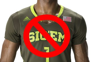
Interesting development yesterday afternoon, as the Baylor basketball team announced via Twitter that the NCAA had put the kibosh on the school’s “Sic ’Em Bears” jerseys, which had been released by Adidas just last week. Once the news broke, I quickly wrote this news item for ESPN. (As noted in that piece, Baylor will wear its regular uniforms in the postseason.)
Whether you view this as a good thing or a bad thing (and I can see arguments on both sides, frankly), I see several noteworthy aspects to consider:
• Baylor’s Big 12 tourney game last night was in Kansas City, and the team was already in KC when the announcement about the jerseys came down. So if Baylor knew in advance to bring along their regular season unis for that game, that means they knew about the NCAA’s ruling well prior to when it was announced. I asked a team spokesman if he could clarify the timeline and got the following response (which came too late for my ESPN newser but is fine for our purposes here today):
We were alerted that there might be an issue on the same day the uniforms were released. We have been working with Adidas and the NCAA to find a solution to this issue, and since a positive resolution wasn’t reached before we left Waco, we brought the regular season uniforms with us to Kansas City.
That’s pretty interesting, as is the fact that they were able to keep the problem under wraps for a week. And that leads us to our next point…
• In the course of reporting that ESPN piece yesterday afternoon, I asked Adidas if there had been any concern beforehand about the NCAA nixing the “Sic ’Em” design, or if the NCAA’s action had come as a surprise. An Adidas spokesperson told me, “We followed our standard design and development process when creating the Made in March uniform design.” That’s not a very satisfying answer, but I know from past experience that attempts to get a more specific response will go nowhere. In any case, it seems like Adidas should have checked with the NCAA on this, right? And that in turn leads us to…
• If you happen to be conspiracy-minded (which I generally am not, but it’s fun to role-play), you might be thinking this was Adidas’s plan all along. Maybe they purposefully didn’t check with the NCAA in advance, figuring they were in a no-lose scenario: If the jersey is allowed to be worn, it generates lots of attention; if it gets banned, it generates another kind of attention. It’s that whole “No such thing as bad publicity” approach.
If you want to take the conspiracy theorizing even further, consider this: When Adidas’s full slate of March Merch Madness uniforms was released last week, I thought it was odd that only one school — Baylor — was wearing a slogan. That’s usually the kind of gimmick that the outfitters get lots of schools to do at once, creating a “Team Adidas” effect (or Team Nike, or whatever). So why didn’t Adidas do that here? Were they looking for a lone guinea pig to try out the slogan-centric concept, because they knew there was a decent chance it could be rejected by the NCAA? After all, it would have been too risky to have three or four teams all being told to shelve their postseason unis. So did they pick one team to test-drive the slogan idea, just to see if they could get away with it?
We’ll likely never know the answers to those questions, but it’s good food for thought.
Finally, here’s something worth considering: Many of us, myself included, have long complained about the schools and the NCAA being more or less in the sportswear outfitters’ pockets, or about the outfitters calling too many of the uni-related shots, or about merchandising being the tail that wags the entire NCAA dog. But here’s a case in which the NCAA has said no to Adidas. So let’s give credit where it’s due: Even if you think the NCAA’s move here is misguided, you can’t say they’re just kowtowing to Adidas or chasing the easy merch lucre.
An excellent way to spend 15 minutes: ESPN’s “30 for 30” series has released a new short film about Marquette’s late-1970s uniforms, called Untucked. It’s good — like, really good. Uni Watch’s highest rating. The film should be embedded above, but the code seems to be a bit wonky, so if you’re not seeing it there, access it here. (And if you’re into coincidences, at least two of the jersey designs shown in the movie were banned by the NCAA — perfect timing in light of yesterday’s Baylor news.)
I’ll be writing something about this next week for ESPN, and I want to document as many untucked jersey designs, across all the major sports, as possible. Obviously, all hockey jerseys are untucked, and then there are the leisure-suit White Sox, and I’ll also mention the recent MLB trend of players untucking their jerseys at the end of a game (yes, I know it started with the Brewers as a tribute to Mike Cameron’s father). Anything else I’m overlooking? And how does untucking play into soccer history? Feel free to fill me in.
If you don’t have time to watch the movie right now, you can whet your appetite with these screen shots I took while watching it yesterday afternoon:
If you can’t see this slideshow, click here

’Skins Watch: The ’Skins play their home games in Maryland, which has now prompted two members of the Maryland state legislature to propose a resolution calling on the team to change its name (from David Goodfriend). ”¦ Twenty-nine schools in Maine have changed their Indian-related team names in recent years, and Penobscot Nation Chief Kirk Francis is praising the efforts to eliminate the last three that remain, thereby proving yet again that only white people care about this issue (from Tris Wykes).

Baseball News: The Dodgers — and presumably the D-backs too — will wear this cap patch for the season-opening series in Australia (from Chris Cruz). ”¦ The Kalamazoo Growlers — that’s a college summer team — has a new jersey made out of selfies. When commenter terriblehuman posted that in yesterday’s comments, The Jeff responded, “Wow”¦ those are fucking awesome. They’re just so blatantly bad that they’re good.” I kind of agree! ”¦ TV cameras inadvertently caught a funny note on the bottom of Rays pitching coach Jim Hickey’s clipboard the other day (from Charles Noerenberg).

NFL News: Bose will have its logo on NFL coaches’ headsets in 2014. Contrary to what it says in that article, the headsets had been sponsor-free for the past two seasons, not just in 2013 (from Thomas Courtman). ”¦ The folks at Skittles made a jersey for Marshawn Lynch (thanks, Phil). ”¦ Hmmmm, ya think these free agents would have signed with the Bucs if they’d known their uni numbers would look this stupid? (From Wayne Koehler.)

College Football News: Maryland is moving to the Big 10 in 2014, and yesterday the Terps released a photo showing how the B1G logo looks on their jersey. Of course, they’ll probably have scrapped that jersey and introduced 14 new ones by the time the season starts.

Hockey News: The Kings are bringing back the gold throwbacks next season (thanks, Phil). ”¦ Remember the children’s book The Hockey Sweater? That book will be the subject of an upcoming performance by the Vancouver Symphony Orchestra (from Steve Mandich).

Soccer News: What you can do with a empty cigarette box? You can turn it into a soccer jersey (from Yusuke Toyoda). ”¦ Also from Yusuke: This year’s World Cup marks the first time that Nike will outfit more teams than Adidas.

NBA News: Andre Miller of the Wizards ties his shoes behind his ankles and wears his socks inside-out (from Yusuke Toyoda). ”¦ The Heat and Nets did the nickNOB thing again last night, and I’m fairly certain exactly zero people cared (thanks for reminding me, Phil).

College Hoops News: Unexpected side-effect of March Madness: The Dayton Flyers’ original mid-court logo has been exposed. Nice! (Thanks, Phil.) ”¦ Inconsistent “3” numerals last night for Eastern Michigan (screen shot by Matthew Daley). ”¦ The first round of results from Rex Henry’s uni-themed ACC Tracker are up.

Grab Bag: I had this in yesterday’s Ticker, but the link was messed up for the first two hours of the day, so in case you missed it: Here’s a well-written but fairly boilerplate article that brings up all the familiar factors surrounding the possible use of uniform advertising by the Big Four leagues. … Here are all of this season’s F1 helmets, along with a good story about the guy who paints the Mercedes F1 cars (from Matthew Walthert). … Why paint your face when you can just slap a mask-like decal on it? (From Brice Wallace.) … Knitters across Eurpoe are celebrating the upcoming Tour de France by knitting little cycling jerseys. ”¦ Here are the best and worst tennis outfits from the BNP Paribas Open (thanks, Brinke). ”¦ Oooh, look at this great shot of a bowling alley at an abandoned hospital in upstate New York. BeeYOOteeful (big thanks to my pal/hero Jamie Jensen).
Thought your readers might like to see a photo of Penobscot Nation Chief Kirk Francis.
link
You keep f**king that chicken Lukas. He’s whiter than you! It’s pretty clear the feelings of superiority Paul feels over us dumb gun totin’, Sarah Palin votin’ “other” white people. All because he happened to hit the jackpot in the genetic lottery while most of us fell somewhere towards the fat middle. It’s be hilarious if it wasn’t so sad.
Chris is apparently confused when he sees a Native American who isn’t wearing a feathered headdress and carrying a spear.
“,,, All because he happened to hit the jackpot in the genetic lottery while most of us fell somewhere towards the fat middle…”
Yep. That must be it.
Wow. I can’t wait for Chris’ entry in the “Unmasking the Commenters” series…
Here is his picture: link
Lee
I am not exactly PRO CHANGE REDSKINS NAME but I think Paul, while he still has an opinion and does have a right to it, has been pretty fair to present both sides of the issue as it is either given to him by the UniWatch readers or found on his own.
Also, in certain circles of American society, people want people of a different ethnicity to assimilate to the idealized “American Citizen”. Perhaps that is what Kirk Francis has done. Now he is criticized for doing so.
Also, it’s not as if Paul has tried to sneak anything by anybody. He’s been extremely clear about his opinion throughout. What more do people want?
In some cases, they clearly want me to STFU, and they want the issue to go away. Neither is going to happen.
I don’t think I could tie my shoes behind my ankles. I’ll try later and tell you how it works out.
Grammar note: I’m guessing you meant “Kalamazoo” rather than “Kalamazoon”
Yup. Now fixed — thanks.
I don’t believe there is inconsistent armhole striping for Eastern Michigan. It appears that all of the players pictured aside from Hughley are wearing undershirts. No denying the difference in 3s, though.
Damn I hate Adidas and Nike anymore. I absolutely refuse to buy anything Adidas or Nike these days. My golf shoes are Ecco, my running shoes are New Balance, my basketball shoes are Ektio, my workout shoes are ASICS.
As for Native American names, I still believe there is a way to do it correctly but I also believe it requires direct involvement of the local Tribe or the Tribe whose name is represented (Seminoles as an example). Other references like Redskins need to be done away with entirely. A good example of doing it right is the Chiefs in Super Rugby. They have actual Maori directly involved with the team and the Maori approve what representations that are made of the aboriginals. For instance, there are some Maori that dress in the traditional warrior garb and are at the games but it is all authentic and done with Maori leadership approval. I don’t know that a team would go that far in the USA but I think if you are going to call yourself after a Tribe that Tribe should be directly involved with the team as the Maori have done. Just my two cents.
I think the NCAA’s move is misguided. School-sanctioned slogans should be fair game. Would the NCAA put the kibosh on link today?
In a game? No, obviously not, since Army and Navy regularly do exactly that sort of thing on their uniforms to this very day. The one-on-one environment of a single game at one school’s home field is quite different from that of a national tournament among many teams.
So in an NCAA tournament? Absolutely they should put on the kibbosh. If a school’s athletic program doesn’t have the decency and class to represent its school properly, then it’s a good thing if there’s an adult in the room willing and able to prevent such adolescent bullshit. The athletes on that team are not in the tournament to represent Sic Em Bears, they are there to represent Baylor University. Wear the damn school name! (Also, Get off my lawn!) If a slogan is to be used, it should be the school’s actual official motto, in this case Pro Ecclesia, Pro Texana.
So, one game a year is okay, but a tournament is not? That doesn’t smell right to me.
I think fans would be just fine with War Eagle, Hook ‘Em Horns, Rock Chalk, or (God forbid) Roll Tide.
Well, the NCAA governs the postseason, but the regular season is left up to the conferences.
Smells fine to me, in that I also don’t much mind all the crappy alternate jerseys MLB teams wear in the regular season, but boy howdy does it piss me off to see teams wear anything other than their home whites and road grays in the postseason.
As I suggested, the fundamental principle at work here for me may be Get-off-my-lawn! oldfartism.
Regardless, I think they’re just being heavy-handed dicks about it.
I think they’re just being heavy-handed dicks about it.
That suggests the NCAA is correct in everything but its tone. How would you suggest they change the situation to be less heavy-handed or dickish?
They would maybe, but they can’t. NCAA doesn’t really have jurisdiction over college football except for player eligibility matters.
Why doesn’t NCAA have jurisdiction over college football?
Eh, don’t mind me, I’m confusing myself.
The way I understand is that NCAA is in charge of postseason tournaments in basketball, but not postseason bowls and BCS/playoffs in football.
I don’t know if this is true any longer with the death of the BCS.
College Football Playoffs, like BCS, is still a separate organization, I think.
Just a thought on this, and I’m sure that someone far more knowledgeable on this than I can fill in the gaps, but could some of this possibly have to do with Baylor’s motto appearing both above and below the uni number? I ask because I recall some time back in the 70s the NCAA banned schools from using above-and-below names if it included the team nickname – e.g., the University of Minnesota had jerseys with “Minnesota” above the front number and “Gophers” below it. Had to change. The rationale was that it supposedly made it harder for referees to read the numbers.
Stupid thing about this was that it didn’t apply to teams such as “North Carolina,” “South Carolina,” and the like. They could continue to frame the front number with the name because it legitimately consisted of two words. That would explain why Long Beach State could have “The Beach” on their unis – nothing to do with the nickname, more to do with the positioning of the lettering. (Admission: I haven’t seen all the Adidas atrocities so I could be way off here, but it wouldn’t be the first time.) IIRC, Kansas had to change their unis at one time as well – they read “Kansas” on top and “University” on the bottom.
I don’t know whether or not this rule is still around, but it does cause me to wonder if the NCAA’s ruling is an offset of this? Anyone know more on this?
Simple solution would be for Baylor to change its official nickname to the Baylor University Sic ‘Em Bears
Or, maybe the Baylor University Powered by Adidas Coca-Cola Sic ‘Em T-Mobile Bears
Then, the university could have lots of options for what to write on the front of the jerseys.
“… What you can do with a empty cigarette box? You can turn it into a soccer jersey (from Yusuke Toyoda). … Also from Yusuke: This year’s World Cup marks the first time that Nike will outfit more teams than Adidas…”
Just the kind of soccer info I need. I especially liked the Salem Green jersey. Thank you, YT.
Those cigarette-box jerseys are terrific folk art. But there’s an even better way to upcycle tobacco byproducts: Cigar-box ukuleles.
link
The Smartkings No3 would make a nice away jersey for a top club, and Peel would’ve been a great/ugly 90s away kit.
The irony of this project is that you’ll never see cigarette ads on soccer jerseys.
Meh. I’d rather link.
The Dayton Flyers’ original mid-court logo has been exposed.
The UD Arena floor, too. That nasty Tartan surface that originally feels like rubber but becomes as hard as a rock over time.
I loved that floor! I recall Dayton being the first school to have a non-hardwood floor. About the floor: link
My high school in Ontario was one of the first schools in Canada to have Tartan flooring (1979-ish).
It was great for basketball – good cushioning, it didn’t get slick with a bit of moisture, easy to maintain. Great traction.
For volleyball (which I played) it was a complete disaster. If you went to dig a ball, you came to a complete stop when you hit the floor. It was like playing volleyball on concrete. We basically had to learn to dig-and-roll instead of dig-and-slide. Great home court avantage.
Apparently there is mercury in a tartan floor, which is probably part of the reason Dayton covered theirs with a traditional floor.
“Damn I hate Adidas and Nike anymore.”
Off topic but does using “anymore” in this context sound as wrong to anyone else as much as it does to me? I’m not slamming Jim as I’ve seen this pretty frequently the past couple years where prior to that I don’t think I ever noticed it.
I thought perhaps there was a word missing in the sentence, sounded awkward.
My in-laws in the northern panhandle of West Virginia talk like that, and it always sounds awkward to me. No idea if it is proper english or not.
Possibly a regionalism. I grew up in southern Ohio hearing that construction a lot.
Ditto from above. I think it’s pretty common in the Midwest, at least.
Can we go ahead and Make Bo Ellis an honorary Uni Watch member?
“Untucked” was also directed by Community star, Dani Pudi. Community is my favorite show, did not know he was into that sort of thing. I will have to check it out.
I was also unware that he was into a. basketball or b. filmmaking, but now that we know he is, the topic makes sense since he’s a Marquette grad.
Ahh, you had me beat, didn’t know he want to Marquette. Cool.
Huh, did not know.
Between Pudi’s filmmaking and Donald Glover’s music/’30 Rock’ writing, Alison Brie’s music/’Mad Men’ role, Jim Rash’s screenwriting, Joel McHale’s everything else and Ken Jeong’s medical degree (!), ‘Community’ arguably has the most versatile cast on TV right now.
I do not understand how “Sic’ Em Bears” is any different than “The Beach.”
The Beach isn’t the school name, it’s not the mascot, it’s a saying just like Baylor. I’m not a Baylor fan at all, I just think it’s dumb to put their foot down like this.
What if Missouri State of Mizzou wore “Show Me State” on their jersey? How would they respond to that?
This was the exact example that popped into my head. Glad that someone else brought it up.
The Beach isn’t an official name, but it’s still a name. “Sic ‘Em” is a slogan. Not that I agree with the decision, but the two clearly aren’t the same.
“Show Me State” proooooobably wouldn’t be okay, since it’s the state nickname/motto and not a school one, but it’s probably worth pumping millions into the school so you can try getting that past the NCAA
The difference between “Sic ‘Em Bears” and “The Beach” is that the former is a slogan used as a cheer or a rallying cry, while the latter is a commonly used nickname for the school. The NCAA allows schools to use place or institution nicknames on uniforms.
The University of the South link in reference to its common nickname derived from the town in Tennessee where the school is located. And the the Alabama Polytechnic Institute link on its basketball jerseys as far back as 1950, well before it officially changed its name to Auburn University in 1960.
If Long Beach State attempted to put “Go Beach” (a slogan the school link) on its basketball jerseys, then the NCAA, for consistency’s sake, would have to react the same way it did to Baylor’s “Sic ‘Em Bears” uniforms. But comparing “The Beach” to “Sic ‘Em Bears” is a poor analogy.
. . . let’s not forget the prospect of El Beach. (Yes, I know it would really be La Playa, but the way they do those things . . . . )
El DenverGregg, I didn’t get a chance until this morning to answer your question about whether you might be able to find yakburgers at the Denver County Fair. Here’s the link to yesterday’s comments in case you haven’t checked it out since then:
link
Although I don’t think you’ll find yak meat at the Denver County Fair, there are link that sell yak meat directly to the consumer, either in person along the Front Range or online.
You might also want to check in with the link, which link of exotic meat entrees. Sadly, the link does not serve yak. Or yeti, for that matter. Disappointing.
Muchos gracias.
On the Eastern Michigan pic, it’s not inconsistent striping. It’s just that Mo Hughley isn’t wearing an undershirt, while several Eastern players wear sleeveless undershirts.
As for why Hughley has a generic 3 instead of the Eagles’ custom font… oddly enough, in the Eagles’ last road game in Toledo on March 8, he had that style of 3 as shown link, while other players had link. And based on Monday night’s link, everybody else is wearing the custom font on their home jerseys as well. (Oddly enough, there’s no shot of Hughley in his jersey in that gallery.)
So, yeah, this is pretty strange.
I’ll remove the reference to the striping.
Apparently I copied the wrong link on the Eagles gallery page, as that sends you to their Senior Day game (their last regular-season home game vs. Ball State). link.
Another curiosity, the seniors were presented with older jerseys, though Hughley transferred from Cal State-Bakersfield last year. And there’s one shot of Hughley toward the end of the Senior Day gallery (going up for a dunk) that, again, shows that generic 3 on his jersey.
I posed the question to @EMUHoops on Twitter… don’t know what, if any, kind of response I’ll get.
Here is the Long Beach jersey I was talking about if anyone doesn’t know, which I doubt.
link
Does anyone know why, in the picture featuring Bo Ellis, two other players and Coach McGuire (pic 12 in the set), Bo Ellis has a different wordmark on his jersey than the other players? He is wearing the same mismatched jersey in the team shot in pic 2
I noticed the same thing on the video: at 1:00 and 7:06 you can see has Marquette in black while others have it in yellow.
While looking for World Cup teams who have been switched over from Umbro to their parent company Nike (1, England), I came across World Soccer Shop’s World Cup page.
They still have it set up with 2010’s groups and jerseys.
link
*As of 9:40 am
Why is Oregon’s “Fighting Ducks” uni allowed by the NCAA but not Baylor’s “Sic’em Bears?”
One is the name of the team; the other is a slogan that *includes* the name of the team. Not the same thing.
I’m not saying I agree with the NCAA’s move here, mind you. Just saying your analogy doesn’t hold up.
Ahhh, gotcha. I didn’t really understand the distinction, but that makes sense.
As the Game Face’s link on the Google search page says, it was featured on Shark Tank. IIRC, the product was well received and their was some competition for investing among the Sharks. Not that any of that means anything.
Just watched ‘Untucked.’ Wonderful.
I was a basketball playing/ junkie, uniform obsessed 17 year old in 1977 when those Maequette unifroms were introduced. I had served as a counselor at Al McGuire’s Medalist basketball camp the previous summer. I met Mr. McGuire and he was genuine and kind and personable. I, of course, loved the Marqutte uniforms and the fact that a player, Bo Ellis, had designed them.
Meanwhile, in the NBA, another free spirit, Bill Walton, was leading his team from far away, remote, Portland, to their first and only championship wearing another oddball uniform with the team name placed vertically on the jersey.
Great times!
Talk about your Throwback Thursday !link
I’m disappointed that he identified the Sixers’ black unis and the Bucks’ purples as alternates. Those were their team’s primary road unis in those respective eras.
I’ll give him a pass on the Magic’s pinstriped black jerseys, though, as while they were Orlando’s original road unis, they were eventually demoted to thirds in favor of pinstriped blue jerseys.
Looking at that new MLB cap “patch” I got to thinking that’s it’s not a patch at all. It’s a fabric sticker.
To me, a patch at it’s very core is something that needs to be sewn on. Especially in the case of athletics. These fabric stickers just don’t do it for me. Sew it on or embroider it. They will stop falling off that way too!
So now that Eric Decker signed with the Jets and his customary 87 has been taken by Jeff Cumberland, I wonder if he’s going to have to pay to get his jersey and how much?
Random question: Has any team worn more color uniforms than Georgetown the past few years? They have worn black, white, gray, navy blue and light blue that I can think of.
I only know this because of yesterday’s news, but Baylor has white, gold, green, black, and two different neon yellows (one with sleeves, one without).
You listed 5 for Georgetown, that seems kind of standard at this point. A good % of teams have black, white, school color 1, school color 2, plus a “special.”
FSU was first that popped into my head: black, white, red, gold, turquoise.
Notre Dame has worn, at least that I can verify on Google image search, white, gold, navy and neon green, and I’m pretty sure they’ve worn kelly green and maybe another shade of gold.
Also, Georgetown has worn link, which I think counts another color.
Nobody is saying “only white people” care about the Redskins issue. That is something you’re drumming up when spewing your vile PC propaganda. The is mainly driven by a minority of white people (the obamanuts, freaks and gross lesbians) mostly libs and the troublemaking Sharpton types. Read the damn article you posted mentioned CT Wilson (BLACK) and Lt Gov Anthony Brown (BLACK).
Sarcasm is apparently a new feature on the internet. You may want to discover it, Skins.
What i mean is that the black legislatures, elected from black districts, OF COURSE they’re going to want to change the redskins name. all they want to do is put a stick in the eye of something whites enjoy. They should have no say in the matter.
Yeah, shame on black people for thinking they have a voice. Go back to doing <a href="link.”>black people things, black people!
Like all trolls, you’re a gutless coward hiding behind the internet’s curtain of anonymity, but I’ve allowed you to keep commenting over the recent weeks and months because your particular brand of trolling is mildly amusing.
But you just crossed a line — you’re now done.
That’s a really breathtaking display of racist bigotry for this day and age. Impressive! I’m not sure even the Klan regards football as something that white people enjoy but black people do not. Plus, the thesis that the Redskins nickname is strictly for and about the enjoyment of white people as white people is, from a moral perspective, a case-closed indictment of the name. If that’s really what the nickname is about, then the name must be changed as a matter of basic American decency.
Nobody is saying “only white people” care about the Redskins issue.
Actually, manymanymanymany people are saying that only white people care about this issue. And you can look it up:
link
link
And so on.
And that’s not counting the jillions of “Only white people care” comments that have been posted on this site (and on others), or the jillions of emails I’ve received stating that same message.
The funny thing, of course, is that it’s primarily white people who are opposed to the name change.
And, of course, the whole point of the sarcastic “thus proving that only whites care about the issue” is that the linked articles debunk the whole “Native Americans don’t care about the name, this is just a PC campaign so white people can feel better about themselves” argument.
George Preston Marshall, is that you?! Damn, and here I thought you died decades ago!
When Skins unveils himself, it’ll be a picture of Archie Bunker.
I’m a firm believer that there are two sides to every issue. The group that believes that the name should stay the same 4ever needs a better spokesperson.
There may be two sides to every issue, but that doesn’t mean both sides are always equivalent.
Md. Senate President: Leave name change up to Redskins
link
ANNAPOLIS, Md. (AP) – Maryland’s Senate president says the state government shouldn’t push the Washington Redskins to change their name.
Thomas V. Mike Miller told reporters Wednesday that he is a Redskins fan himself. He says he considers the measure misguided, like trying to legislate foreign policy at the state level. He prefers leaving the issue up to Snyder and the National Football League.
And Miller is right. The state shouldn’t force Snyder to change the name. But public opinion, which kind of works in a politician’s favor, seems to indicate that this isn’t going away.
While the government shouldn’t FORCE Snyder to change the name, politicians will start joining this movement simply to garner votes. Either way, the snowball is growing.
According to the latest public opinion polls, the public is for keeping the Redskins name. It is a tiny minority in the liberal media still driving this
For a guy who was condemning Paul for not reading, it might be high time to follow his own advice.
The term “the snowball is growing” is akin to watching it roll down the mountain. It starts as a small piece of snow or ice, and gradually picks up snow and grows larger and larger as it tumbles down the mountainside. It even has a term: the “snowball effect”.
Like a snowball, this “liberal media” started off as a small group, and it is now growing. In essence, the snowball effect is taking place with this movement.
Nowhere was it suggested that the push to change the name was in a majority. All I said was that the movement was growing, and there are definitely a myriad of articles on the internet to prove that fact.
That’s the benefit that comes with reading.
But a legislative resolution calling on the Redskins to change their name is not an example of “force.” Legislative bodies at all levels pass non-binding resolutions expressing an opinion all the time, and nobody’s freedom is infringed.
It’s important to understand the differences between a law and a resolution. The former is a big deal, even when the law covers a trivial matter. The latter, lacking legal force, is not even worth the paper it’s printed on, even when it addresses an important matter.
“Force” was used in the sense that the government will nudge-nudge Dan Snyder to do the right thing. I may have overstepped the boundaries with a polarizing word.
Good clarification, Arr. Thanks for that.
arrScott,
You’re right about the distinction, but a resolution is still kind of a big deal.
My wife works a stone’s throw from Capitol Hill, both literally and otherwise, and her firm’s hard at work trying to prevent a resolution from going through, or failing that, get ahead of it. It’s not binding, but it certainly represents a not insignificant amount of political will.
Sometimes actual legislative policies that are intended to become laws by later legislation are first framed as resolutions. (The federal budget, for example, often works this way.) So I did speak overly broadly. However, the proposed Redskins resolution is not one of these cases. It’s a resolution exactly as significant as one declaring next Tuesday in Maryland to be Urban Beekeeping Day. It carries absolutely no force of ercion, co- or otherwise, and if passed wouldn’t make Snyder more likely to change the team name, not by even the tiniest degree.
A resolution can occasionally be a “big deal” in terms of galvanizing public opinion (assuming the topic of the resolution is a matter of significant public interest, like in the case of the ’Skins), but it has zero relevance in terms of making law.
Legislatures across America — from Congress to village councils, and everything in between — pass countless resolutions every day. The overwhelming majority of them are small gestures of appreciation that mean nothing to most of us.
Thanks. I’ll add that to the next installment of ’Skins Watch.
“Sic ’em, Bears”?
I object to that slogan on a biological behavioral basis: There are very few animals a human can command to “sic ’em”. At the end of the day, the best-trained bear will sic whomever it wishes.
(Slight humor intended.)
“Sic ‘Em Bears” does seem kind of an odd phrase, doesn’t it? Then again, “Maul ‘Em Bears” conjures some disturbing visuals, so maybe they should stick with something a bit tamer.
“Ride dat unicycle Bears”?
Bad: Sic ’em, Bears!
Better: Bear, sick balls!
“Better: Bear, sick balls!”
As long as they don’t go with “Bare sick balls.” (That one was for terriblehuman’s benefit.)
Ha!
We have been working with Adidas and the NCAA to find a solution to this issue
This phrase has become a real pet peeve of mine recently. It seems like anytime somebody breaks the rules or otherwise fucks up they get to pretend like it’s some ultra complex situation where the solution is to be found in some abstract compromise. This is not how rules work. If NCAA deem those jerseys to be against the rules then there is no “working together to find a solution” there is just complying with the goddam rule.
I don’t get how Baylor can’t wear a saying on their jerseys, but Oregon can wear a jersey that says “fighting ducks”, correct me if I’m wrong but Oregon is just the Ducks not the fighting ducks
Yeah, but “Fighting Ducks” is a nickname, not a slogan.
You may consider that to be a distinction without a difference, but the NCAA apparently feels differently.
I’m not saying I agree with the NCAA, but I don’t think “Fighting Ducks” is a particularly strong comparison to make in this case.
Some background on “Fighting Ducks”: link
Hearing that the LA Kings were going to wear their amazing, classic gold uniforms for certain games made my day. It is wonderful to see a team in this age of Nike and “everything for marketing” is embracing their proud past, and hopefully will make a few bucks in the process. I collect hockey sweaters, and I am putting the gold and purple (I’m sorry Paul, but here purple did work)on the top of my “get next” list to reward such an awesome move by the Kings, and to look amazing on the pond next winter.
Final Four court design: link
Also, it could be that I’m 13 years old, but every time I look at a court design, I see two hairy something or other at either end. I just can’t unsee it.
Thanks for ruining basketball courts for me forever.
Good to see the trend of incredibly boring NCAA tourney courts is continuing.
Now I can’t unsee it either. I’m pushing 40 and I still think dick jokes are funny. Maybe I’m stuck at 13?
jesus.
From the Kings throwback article:
“There are so many jerseys, so many teams, and Reebok has to have enough time to be able to make them. It’s a process. It takes about two years.” – Luc Robitaille
I read that as ‘Reebok has to have time to be able to produce a stock of replicas to have ready to sell, and Reebok can take as long as they want because they’re the NHL’s exclusive uniform producer.”
If a supplier can’t supplier it’s customer their product in a timely fashion, the team should be able to go to a different supplier.
I hate league-wide uniform monopolies so much.
I think the two-year turnaround is the same for pretty much all manufacturers. I remember Nike’s Buccaneers redesign was a 18- to 24-month process too.
Yes, but two years for a design that already exists?
Without knowing exactly what accounts for the two years, I’m pretty sure the design exploration is only a small step in the whole process. Having been through design projects myself, I can tell you that most of it isn’t “design”.
And even with a throwback, it’s not going to take any less time to figure out the production and retail parts of it.
Right, and they just wore the purple version of this same sweater a couple of years ago too.
Surprised no one has mentioned “rock chalk jayhawk” as a contender for one of these adidas stunts, and a more apropos comparison to what Baylor had. Not sure how KU fans would react to something like that
I remember when you could tell F1 drivers from each other just based on their helmets. Now, I could maybe pick out Rosberg from a crowd of drivers, but other than that they all look remarkably similar.
In the old days: Senna, yellow; Piquet, red and white with that teardrop shape; Villeneuve, black with the red jagged stripe; etc.
I feel like the abandoned hospital bowling alley is equal parts “BeeYOOteeful” and downright eerie.
why the problem over “chiefs”, “warriors”, and “braves”? Totally ridiculous political correctness gone wild. Most of the rank & file among the tribes don’t care one bit, and many of them like the names. It’s the “union bosses” of the tribes who want to have some or any kind of political clout in the state. Anything to win them sympathy that might get a casino in the next referendum vote right?
Let’s say, just for the sake of argument, that your assertion regarding “union bosses” wanting “political clout” to get more casinos is accurate.
1) Could you please explain how that has any relevance to the arguments for or against the use of Native American imagery by sports teams?
2) Could you please explain what’s wrong with Native Americans using the political process to advance their interests, just like every other sector of society does?
3) Could you also explain what’s wrong with Natives looking to exercise rights granted to them under treaties with the United States government?
Please be specific.
4) Could you please explain how publicly advocating an unpopular position generates “political clout” and “sympathy” in the referendum process?
Hey! The IU merch madness unis actually look pretty good…
…in link where you can’t really make out the “morse code” patterns.
I’ll agree with you that this is by far one of Adidas’ tamest and most well-conceived designs for their “Merch Madness” uniforms. In a vacuum, Indiana doesn’t look all that bad in those get-ups. That said, it is simply sick and wrong for Indiana to wear anything other than their classic unis with the radially arched block “INDIANA” across the chest. And I’m not even an Indiana fan!
*vertically arched. I know the difference. Temporary brain-to-typing-fingers malfunction.
The article dealing with the number of Nike teams vs. Adidas teams at the World Cup has one glaring error. It mentions that Messi is sponsored by Nike and Cristiano Ronaldo is sponsored by Adidas when it’s actually reverse. Messi wears Adidas cleats (though he plays for Nike-sponsored FC Barcelona) and C. Ronaldo wears Nike cleats (though he plays for Adidas-sponsored Real Madrid).
As atrocious as the Bucs’ jersey number font is, the alarm clock syndrome doesn’t appear as obvious as it seemed in the photos from the unveiling. But that could just be the lighting in the photo above.
It looks like the MLB Opening Series patch uses the seven-pointed star from the Australian flag between “Sydney” and “Australia”. If so, a very fitting and subtle design touch.
I think it’s partly the lighting and partly just that the home number effect isn’t as egregious.
The home numbers have reflective silver accents against white. They’ll blend in most conditions. The road jerseys have their silver accents overlapping red numbers, which breaks them up into the “alarm clock syndrome”.
But make no mistake, even discounting that effect for the moment, link.
Sorry, that was supposed to be a reply to Karim above.
Baseball inspired commemorative curved coin
link
Spinny view of said coin
link
Untucked was great, a lot of fun. Marquette, when I was a kid and early teen, was totally boss — not because of the “renegade” players, but obviously, the unis. My faves weren’t the untucked models, but the early racing stripe/circle and the bumblebees.
Here’s what I don’t get. Did Bo Ellis design the entire line of untucked uniforms? The white jersey/gold pants with the arrowheads on the sides, the all gold, and the teal?
Or just the teal?
Because the teal seems to have come later, after the team was already wearing untucked versions (white w/arrowheads).
If that’s the case, Bo took a radical concept and tweaked it.
If Ellis designed that entire collection, then that’s something — a radical departure from the norm — both the graphics and the silhouette.
Marquette’s color was really turquoise, not teal. Scott Turner? Really?
link
A few seasons ago Marquette did a giveaway poster featuring many of their unique jerseys. I’ve never researched to see how accurate it is bc I’m sure there’s problems with it and I want to be able to love it in it’s unspoiled glory. One of my favorite things in my sports room.
It was “turquoise.” Teal first came into sports as a color name with the Hornets or the Sharks (memory fails me).
The Hornets were definitely first, since they first took the court in 1988, while the Sharks didn’t even exist on paper until 1990.
Though, technically, when the California Golden Seals changed uniforms in 1974, they changed from Kelly green to Pacific teal, though the look didn’t exactly catch on.
The late 1960’s early 1970’s Oakland A’s were the first team to “push the envelope” uniform wise. The Swingin’ A’s with their handlebar mustache’s, white spikes and team in fighting broke the conservative mode of sports in the modern era. And WAY before the Marquette Warriors (the ABA was flaunting their style, hair-do’s, jerseys, and the ball)… ESPN pays way too much credit to Marquette for pushing the envelope. Also, it forgets THE MECCA design? link
link Unlike some of the NBA throwback jerseys that fans are clamoring to bring back like the Raptors, Pistons, Suns and Rockets… nobody wants the Fish Sticks back.
link
Florida and Georgia going color-on-color in 2014’s edition of the largest outdoor cocktail party.
Apparently, Eastern Michigan’s Mo Hughley’s inconsistent #3 appears on the road greens too…
link
In regards to the Bucs pic and uni numbers, I dont think they look all that bad in a solid color.Its the digital clock fill in font that looks like shit.They may not look like pirate carvings but could have potential if they kept em white or used the creamsicle orange
I may be in the minority on this, but this is one time I wish the NCAA would have ruled even more stringently than they did. Not only no slogans, but how about we restrict teams to wearing their traditional school colors? If a uniform is meant to identify a team, make the process easier. One white set, one color set. Olive green is not Baylor’s green. Highlighter yellow is not Baylor’s gold (metallic or athletic). Just my 2¢.