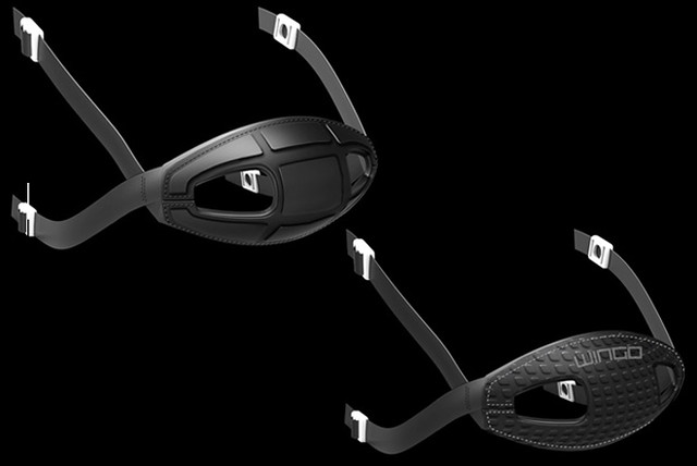
It’s not often that a Uni Watch reader designs something that makes it onto an NFL gridiron, but that’s the case with the chinstraps you see above, which were designed by longtime reader and industrial designer Michael Princip. As some of you may recall, he’s the guy behind the Bulwark football helmet, which I wrote about for ESPN back in 2011.
The strap is called the ArmorFlex, and is produced by a company called Wingo Sports Labs. I’ll let Michael take it from there:
The ArmorFlex consists of a thin, corrugated piece of flexible plastic sewn onto what is essentially a traditional vinyl/leather chinstrap. So, you get the flexibility and comfort, yet with added protection. I designed two different styles of it.
The ArmorFlex is one of a few different products I’ve designed for Wingo. They primarily deal in shoulder pad lining systems, most notably the Under Shield vest. Quite a few of the Seahawks wear the Under Shield (including center Max Unger), so they have a good relationship with the company. The team’s equipment manager, Erik Kennedy, had a few of the ArmorFlex chinstraps to offer his players, and it looks like safety Kam Chancellor was one who really took a liking to it. He was wearing it all season long, although I didn’t realize that until after the Super Bowl, when someone from Wingo told me about it.
I knew two other NFL teams had players who wore this chinstrap: the Texans and the Dolphins.
The best part of this, although Mike didn’t mention it, is that he’s a huge Seahawks fan (he even has a Seahawks uniform and equipment blog), so I’m sure he’s super-stoked to know that Chancellor was wearing his strap.
Big congrats to Mike on seeing one of his designs make it to the field. I think we’ll be hearing more from him in that regard in the not-too-distant future.

Click to enlarge
Collector’s Corner
By Brinke Guthrie
Daggone, check this out. You know I’m a huge fan of vintage NFL posters, and you’d be hard-pressed to find a better example of it than the Dave Boss beauty shown above. And here’s the best part: That poster is just one-quarter of a four-poster lot that’s currently available on eBay. You want more? Here are four Niners posters, five Rams posters, and two Broncos posters. All of these are from a single seller, and he has a ton of stuff — more than I’ve ever seen from one seller.
You say you’re into more than just posters? Okay, then:
• Here’s a terrific 1940s Carroll College varsity sweater that has a certain Windy City vibe, does it not?
• Guess the NFL was trying to get young girls interested in the league way back when.
• This 1969 NFLPA Jets gear bag is in perfect condition! And as I have said before, you do not get any better than DeLong. So take a peek at this Jets letterman jacket.
• Nice-looking vintage 1970s Trail Blazers Starter jacket with a promo patch plugging the NBA All-Star vote and Miller Lite Beer.
• We’ve all seen the gumball helmets, but I’ve never seen them with this type of presentation. The auction listing says 1970s but it’s most definitely 1960s due to the Redskins spear helmet, the black Saints, and the green Eagles. And with this helmet kit, you can join the NFL Super Pro Club.
• Never had the corresponding helmet and bat set for MLB. This one looks to be in pretty good shape, but it’s from the 1970s (not the ’60s, as the seller is claiming), given the Rangers presence.
• Reader Susan Freeman sent in some examples of tape dispense helmets. You got yer Niners and yer Ray-Duhz.
• This was never a a proposed Falcons jersey, was it?
Seen something on eBay or Etsy that you think would make good Collector’s Corner fodder? Send your submissions here.
Tick-Tock: Today’s Ticker was compiled and written by Phil, who was nice enough to handle all the incoming emails while I was away for the long weekend. Thanks so much, buddy!
Olympics News: Here’s the last on the Under Armour speed skating situation. … On Sunday, the USA hockey team wore 1960 throwbacks. So gorgeous. More information here. You can buy a replica here (thanks to David Haberman, who notes “the version USAHockey.com sells is different, starting most obviously with the placement of the Nike swoosh”). … Alternate USA Curler Craig Brown was a third in Sunday’s match against Switzerland. You may recall Craig was Paul’s skip during the 2010 House of Hearts Bonspeil. … The Jamaican Bobsled 2-man team is wearing what appear to be watermelon helmets. Here’s another view and an article on the team. … Is it really that hard to figure out the USA and Canada are not the same? … Rich Strayer noticed that Team Canada is using NHL whiteboards during the Olympics. “Notice goalie trapezoid and the smaller neutral zone (all three zones are the same size in international play),” he adds. … Nice NYT piece on all the gear of the olympics (thanks to Dave Rakowski). … For the near-medalists ”” and a few not-so-near-medalists ”” left looking up at the podium, recognition comes in the form of a personally inscribed, autopen-signed, formal Olympic diploma (thanks, Paul). … Faces of Olympic Figure Skating (from Eric Bangeman). … Better to look good: “What Really Matters at the Sochi Olympics: How You Look” (via Tommy Turner). … Jen Hayden noticed a chain or necklace around Tuukka Rask’s neck. ” I watch a fairly large amount of hockey,” says Jen, “and I don’t think I’ve seen a goalie wearing a chain.”

Baseball News: The Mets will wear a sleeve patch honoring Ralph Kiner. It will also be a logo behind home plate at Tradition Field (their spring training complex), and on the wall at Shea, er…Citi Field … The St. Louis Cardinals’ iconic birds on bat logo turned 93 on Sunday. … Check out the uniform the Tennessee Vols wore on Sunday (second pic via Andy Kroeger. … Camo caps for Northwestern on Sunday (h/t Jim Bednat). … The Oklahoma State Cowboys broke out their all-orange unis on Sunday (h/t Joshua Dwyer). … Nice! Lower case technology (aka lower case letters on jerseys) will be on the Mets jerseys this year (h/t to Jonathan Levin). … “So long Jacoby,” writes Tom Adjemian. “Looks like it’s Xander’s time to shine in the No. 2 jersey.” … Pritchard writes, “Love this look (on Mark Teixiera), though in this concussion-conscience world, it’s practically like smoking a cigarette on the field.” … The Rushmore Commanders have joined the Holiday League, and have FOUR primary logos. Of course, they are George, Tom, Abe, and Teddy (big thanks to Kevin Olivett). … Suk-Min Yoon, the Orioles newly signed Korean pitcher, will wear #18. Dave Lough will change his number to #9 to make the move possible (h/t Andrew Cosentino). … Look at this amazing 1958 New Orleans Pelicans program cover. Outstanding!

NFL News: Attention Designers! Remember that post about an NFL team in Oklahoma City? Well, they received their first submission in the design contest, but so far it’s the ONLY one. “With only one submission in two weeks, it’s not much a contest,” writes Justin C. Cliburn. C’mon you concepters, give it a shot, OK? OK!

College Football News: Is Penn State going back to different collar and sleeves? That pic was taken Saturday (great spot by David Kozak).

NBA News: If you thought Chris Bosh in a suit jacket and camo pants would look really bad — you’d be right. Just, no. … And the NBA ASG sleeved jerseys were about as bad as was expected. Well, maybe not. … NBA reference in the Daily Jumble?: From Alex Allen, “A NBA reference and a The Fish That Saved Pittsburgh uniform? Pisces and #6?” … Great spot by Randy Allemann who noticed SI was using the 2013 logo for the 2014 ASG. … Jerid Morris saw this photo from the 3-pt. contest and asks, “Anybody else think this might be a dry run for in-game jersey ads?”.

Hockey News: Dartmouth hockey player Charlie Mosey gives teammates Grant Opperman grief for inking out some of the letters in his name, thus proclaiming his prowess when playing with a man advantage (from Tris Wykes). … “My children play hockey and this weekend we were helping with the jwhl challenge cup (www.jwhl.org),” writes Ken. Here is the little Caesars u17 road uniform, which is “creamcicle (Tampa bay) Orange.” … The Philadelphia Wings (NLL) will wear Flyers-themed jerseys for an upcoming game (from Nicholas LaRosa). … There are two links from this page: an illustration of the ‘Neon Night’ jersey the Lake Erie Monsters will wear this Friday, and a picture of the Joe Haden bobblehead they’ll be giving away on Saturday (thanks to Tom Pachuta).

Soccer News: DC United unveiled its 2014 uniforms in the best way possible: at a bowling alley with season ticket holders, writes Yusuke Toyoda. “Not too shabby looking, either,” he adds. … adidas has unveiled new away kits for Germany, Argentina, Spain, Mexico & Russia.

College Hoops News: Has the Pinkuary craze finally jumped the shark? Here’s Kentucky vs. Tennessee (from Sunday) BOTH wearing pink. … Syracuse will wear new “throwbacks” Wednesday. Says submitter Rick DiRubbo, “For the record, the shorts don’t look anything like the design the 2003 national championship team wore.”

Grab Bag: There is a new documentary at Sundance about the Portland Mavericks of NWL (from Mark Viquez). Here is their unusual team photo. … “Nothing screams wounded warrior/patriotism like purple and black camo for semi-pro football in Idaho” says Derek Self. … Nice bowling alley art/table seen at an antique show in Florida Sunday (nice find by Tom Van de Kieft. “Took me a few seconds to figure out what it was, a really original piece.” … Pretty brutal Super Rugby uni malfunction spotted by Caleb Borchers. The pulls player had a front panel of his jersey start to detach — here’s what it should look like. … Aaron McHargue was watching a repeat episode of The Mentalist and found it very funny that they were so careful to cover the Apple logos of all the computers and phones, yet when it showed an incoming call toward the end, it said “iPhone” on the screen front and center of the shot. … Matt Manley checks in with American rugby news. Seattle OPSB have unveiled a new kit and color scheme. He writes, “As you can see, they are taking a cue from the Seattle Seahawks with respect to the colors they are implementing.” … Ohio State lacrosse wears a throwback jersey and football style helmet (from Jared Buccola).
I am an avid Penn State fan and I also noticed the players wearing the jerseys with the white collars and sleeve cuffs. Some players were wearing the blue jerseys like that with no names on the back. Others were wearing the all white jerseys with names on the back. I was wondering if they were going back, too. But my initial guess is that they just grabbed some jerseys for the occasion.
I think I saw players wearing the previous jerseys with the contrasting trim last year during events too. I hope that style returns, without names too. By they way, Yale wears that style now.
We’ve seen logos like the Foot Locker patch during All Star Weekend for years. I would think it’s less of a dry run for ads, more like the muse for the crappy idea in the first place.
Congratulations, Mike. It’s just too bad you didn’t recognize the strap in the Super Bowl.
Thnx, BF! Still looking for a good enough resolution pic.
Mike,
Great work! If the chin strap comes in red, I’ll buy and wear one for my upcoming lacrosse season!
Here’s a gift for you as well…Michigan just unveiled their new Cascade R lacrosse helmets:
link
Nice! I dig the spoiler/venting look at the back.
That started with the previous model, the CPX-R…
link
The Cascade R looks to have included a vent/slot:
link
Ever wonder what a Penn State helmet would look like with a helmet decal?
link
Mike,
I had just assumed that the CPX-R had the slot until I went outside and checked mine…you’re right, that’s totally new!!! Nice catch.
link
link
Really like this matte gray version as well:
link
It’s been there since at least 2011. I’m sure this is where they got the idea.
link
We’ve all seen the gumball helmets, but I’ve never seen them with this type of presentation. The auction listing says 1970s but it’s most definitely 1960s due to the Redskins spear helmet, the black Saints, and the green Eagles.
Well, that, and the four-team Capital/Century/Coastal/Central Divisions… though the helmets are definitely not placed in the correct divisions.
Interesting to see how the Rams decal has yellowed with age so it looks more like the 1950-1963, 1973-1999 logo than the 1964-1972 white horned logo.
Uni related news happened to me this past weekend: I saw a pic of Zack Wheeler who was modeling a 7 line shirt in PSL. However, it wasn’t the shirt I noticed, it was the San Jose Giants cap that he had on. Now I know Wheeler had been drafted by the Giants, but I was curious to know why he kept the hat. So I tweeted him about the hat. Although he did reply, it was a snarky “And I’m supposed to tell you this…why?” Jesus! You’d think I asked him about the details of him going to a strip club. Anyway, you can find that tweet using my twitter handle @alexgiobbi.
Maybe he likes the hat?
Here’s the exchange:
link
Here’s the photo:
link
Is it wrong of me to ask for curiosity’s sake?
I think “Uh, care to explain?” was not the right tone to strike.
It doesn’t sound like you’re curious; it sounds like you’re accusing him of something, and you’re suggesting that he owes you an explanation for some sort of transgression.
Better ways to have phrased this:
– “Is there a story behind the cap?”
– “Is it your lucky cap or something like that?”
– “How come you’re mixing Mets and Giants gear?”
Etc.
It’s a perfectly reasonable question. Wheeler may have taken “care to explain?” as more hostile than you meant it. And he’s certainly not obligated to answer your (or anybody else’s) question, or even respond.
I have always liked the color combo for the Little Cesar’s hockey program. Similar combo used by the old San Diego Gulls, another favorite of mine. Although I am not sure how it would look on a major sports team, works well in the minors.
Side note, back in the day and maybe still, they had a locker room painted with those colors in Joe Louis Arena. It was a smaller locker room off the visitors bench entrance.
Not only are the Syracuse shorts nothing like those from 2003, the jerseys aren’t either.
They aren’t supposed to. According to the linked article the Jersey is reminiscent of a design first worn in 1984, while it states that the shorts feature “trim details” reminiscent of those worn by the 2003 team, which is apparently erroneous.
Thanks for the link to my blog this morning, but not sure who Yusuke Toyada is.
Happy with the Kiner memorial patch. I think simpler is always better when it comes to memorials, and this is nice.
Any word on if the Pirates plan to do the same?
Meh, looks like someone threw it together using clip art in MS Word, but kind of what I figured when I pulled link up last week.
For something that’s going to be worn all season, you’d think they’d wait a couple of days and create something of quality. You’d think…
The patch design is fine with me…think the patch is a bit small though.
Thanks, Paul. A bonus to have the chinstrap writeup next to Brinke’s link.
Just a little tidbit about the man behind Wingo Sports, he’s the first to manufacture & distribute those mini football helmets. Hence, in the collector world, blank shells are referred to as Wingo shells/helmets.
Noticed the NFL’s “Endzone” font is being used in the Tennessee Vols locker picture for the players last name. “Owenby”
I love those Oklahoma State baseball jerseys but the horrible type setting in the bat just ruins it for me.
New Bucs stuff coming. Nikification? Hope not. Not a huge fan of the team, but the unis are distinctive. link
Wow, beat me by 1 minute haha
Apparently Warren Sapp is going around saying Tampa Bay is unveiling a new logo and helmet tonight: link
That link has it wrong. If you look at Sapp’s tweet, he says the unveiling will be on Thursday, not tonight:
link
Bucco Bruce to replace the skull and swords on the flag?
Nah, it’ll be some pirate ship thing, but on a white helmet so they can wear the bucco bruce throwbacks too. More sales that way.
First off, the logo and helmet are fine. Actually, better than fine, they’re really good. There’s no reason to replace them.
Bucco Bruce wouldn’t go well on the pewter helmet. link wasn’t bad, but here’s the thing:
1) If you’re doing it so that once a year you can trot out the Creamsicles, I’m sorry, as much as I can adore the Creamsicles now, that’s not a good enough reason by itself to change;
2) As someone who’s been with this team since 0-26, this is precisely the type of b.s. move they’d do. They’re a completely clueless organization. They’ve never grasped it. The brief period in which they DID seem to have an idea of what they were doing, they let Gruden chase off anybody who had any sense of a clue.
Just…absolutely…stupid, short-sighted, idiotic.
I’ll be shocked if the helmet shell isn’t at least mostly white so the Bucs can do their throwback game, which the NFL put the kibosh on last year for the Cardinals game. That way, all the Bucs would have to do is change the facemask if it’s not a shade of orange. I wonder what the new logo will look like.
He just tweeted again saying it’ll have a chrome facemask…
Weren’t the Bucs slated for a logo tweak last year, but backed out before the deadline?
What a shame. IMO, the Bucs’ white jersey, pewter pants look is one of the tops in football.
Pewter is a unique, good look. (I’m partial to the red jersey and white pants look, myself.)
I’d finally gotten around to really appreciating the Bucs current look. (I was not a fan at first.) It’s become one of my favorite in the NFL.
So, naturally, they’re going to revamp. And since more white helmets is pretty much the last thing the NFL needs, my money is on a white helmet.
That Dave Boss poster pictured was on my bedroom wall for years. Thanks for the memories – it was definitely a heyday for great NFL units. And the poster was pretty big – over 2’x3′.
Cuse apparently have an orange shorts option as well. I think that looks amazing. Hope they go with that instead of the blue.
link
The Little Caesar’s AAA Hockey uniforms have been that unique light orange/powder blue color since at least the 80s. I’ve always loved the unique appearance. If you’re playing drop-hockey around SE Michigan and see someone that color pants/gloves you just know what team they belong to. They recently had a BFSB accent stripe around the the yoke and striping, but it appears it’s gone now.
They’ve had some distinguished alumni over the years too (Mike Modano,John Vanbiesbrouck, the Hatcher bros)
The NFL in OKC is more likely to happen when Rams go to LA right ?
I would think less likely, because then you’d have a empty St. Louis.
Something wrong with that Jets letterman jacket. Seller mentions “Rare 1969 Champs” when the logo is clearly not from 1969 but the one first introduced in 1978.
The description isn’t entirely inaccurate, it’s just a little misleading. The reference to “1969 Champs” is because there’s a patch on the sleeve commemorating the Jets’ Super Bowl III victory.
The Super Bowl patch itself looks very 1980s in its design. I have to wonder if that was a common design they used, swapping out the colors and Roman numerals for the appropriate teams.
If anything, the Jets bag bugs me more, because while the players shown definitely points to the 1969 team, they weren’t part of the NFLPA until 1970. The NFLPA and AFLPA didn’t even meet together until January 1970.
Jerid Morris saw this photo from the 3-pt. contest and asks, “Anybody else think this might be a dry run for in-game jersey ads?”
Is this really the only mention of this over the last few days, or did I miss something? I thought this place would be going ballistic over this.
I mentioned it yesterday (“nice trial balloon, NBA …”) … but nobody followed me up. :(
I missed your mention or I would have said something, just surprised no one else did.
I must have been sleepy when I submitted the Tukka Rask photo over the weekend. I forgot to add that I’m sure that goalies do wear chains, etc. but I wonder if there’s another piece of equipment that’s usually worn, but isn’t being worn by Tukka now.
Really curious about the Bucs new helmet and logo designs. Kind of slipped in under the radar. Wonder if there will be any leaks Wednesday or Thursday leading up to the unveiling.
Also, those US Hockey 1960’s were beautiful. Nice touch.
Pretty sure Martin Brodeur wears a chain while he plays
Just curious – Why was Craig Brown needed against Switzerland? Did something happen to one of the other curlers? An injury?
I think they were just looking to change things up.
Could the purple and black camo reflect the issuance of Purple hearts for those wounded in combat and black as a near universal color of mourning?
Here’s a photo gallery from the UMASS/Ohio State lacrosse game where the Buckeyes wore the throwbacks:
link
I was super happy to see the 1960’s retro jerseys on the ice again. The jerseys that are linked to in the USA Hockey store aren’t exactly what they’re wearing in Sochi though. The jerseys in the link have a patch from the IIHF 2011 World Junior Championships (that also has a Buffalo Sabres logo?).
The pic of the Cuse throwback shorts harkens back to the Carmelo/Kansas NCAA Final…
Trajan Sucks!
link
Look at the GORGEOUS font on those KU uniforms:
Rock, Chalk, Jay, Hawk KUUUUUUUUUUUUUUUUUUUUUUUUUUUUUUUUUUU
Those Dave Boss posters are wonderful. I had the Packers poster as a kid (along with the deck of playing cards with the same design), and was fortunate enough to find another a few years ago.
Here’s a pic from the 2006 3 point contest. Same patch.
link
And one from 2012:
link
I’m fairly certain 2006 was the first year of the patch, if not earlier. Eight years is fairly long dry run. We’ve just been seeing it a lot less frequently, because recently guys have been wearing shooting shirts over their jerseys, like Kyrie Irving last year and Paul Pierce a few years before.
Gator baseball team’s been rocking some sweet stirrups and high cuffs this season. Any chance the Florida-Maryland series makes the list of best-looking NCAA baseball games of the weekend?
link
From the mid-week game against Central Florida:
link
Paul — thanks for the Rushmore Commanders & Holiday League shout out. I appreciate Kevin’s hat tip! Folks can see all of the Holiday League work at link
Cheers!
Looking for plumbers in E14, canary wharf can be a tough deal.
All of its brownies, cookies and biscotti are made-to-order and shipped fresh within hours of being removed from
the oven. ” Josh was humbled by being judged by “My favorite actress, favorite judge and favorite rocker.