[Editor’s Note: Today we have a guest entry by Marty Buccafusco, who’s recently completed a truly excellent DIY project that has nothing to do with sports or uniforms but plenty to do with Uni Watch. Enjoy. ”” PL]
By Marty Buccafusco
I was talking to my brother about the last Uni Watch party. His girlfriend, Penelope, overheard us but misunderstood and thought I was attending a unicorn watch party, giving her a serious case of the giggles. When Penelope’s Christmas wish list mentioned “a unicorn from Marty,” I was a bit confused until I remembered that little episode.
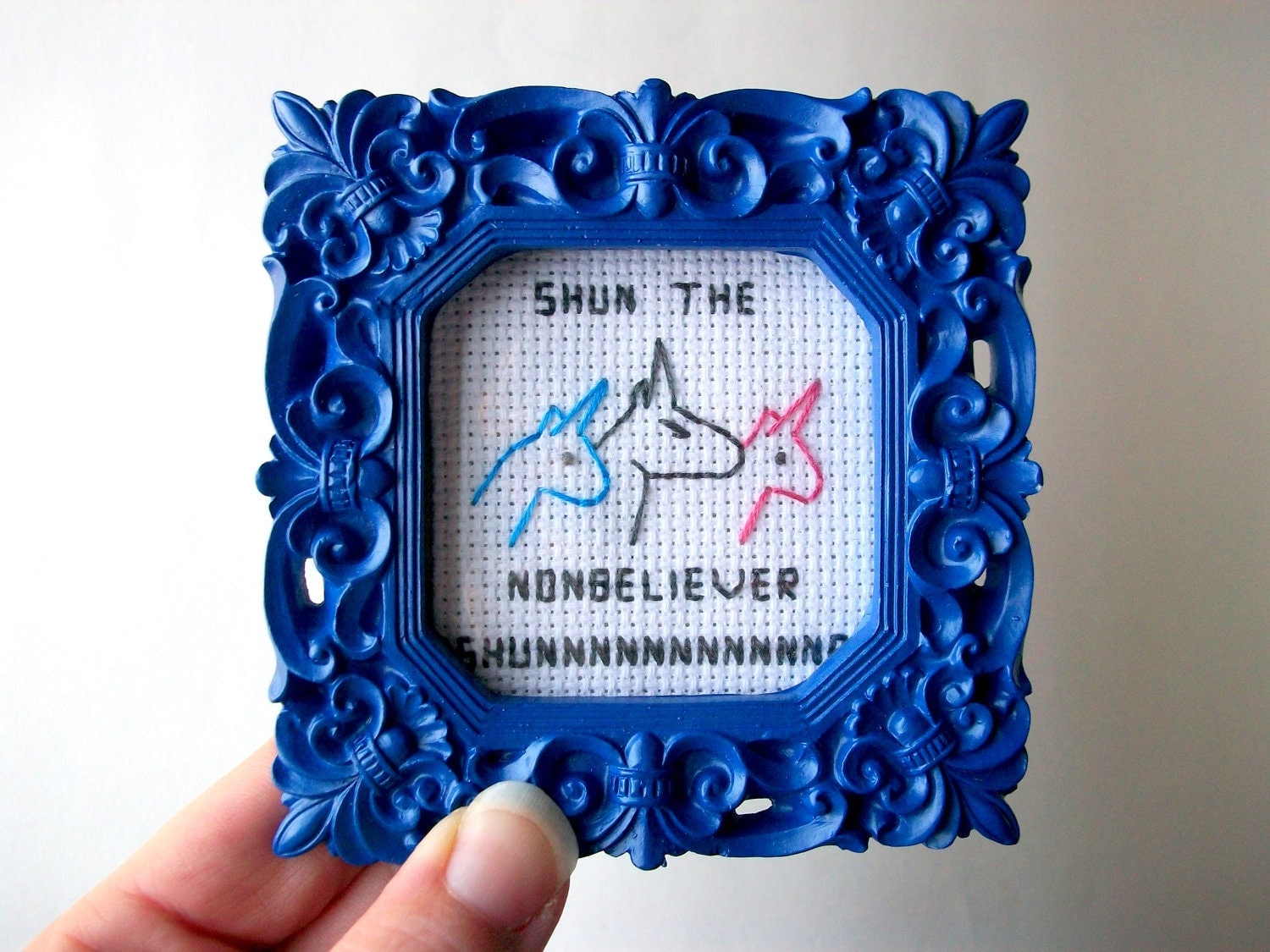
Of course, I had to do something amazing for her, so I created this Unicorn Watch Kit for her [for all of these images, you can click to enlarge]:

Here are the individual components of the kit:
1. A cross stitch of Unicorn Watch’s adopted slogan, “Shun the Non-Believer,” which I found on Etsy:
2. A Unicorn Watch spyglass (that’s Penelope using it), which is really just a bedazzled ViewMaster, along with a custom reel featuring images of Penelope with variety of unicorns in magical settings:


For the custom reel, I looked into trying to DIY one but there wasn’t enough time before Christmas. Instead, I found this place online and it was surprisingly simple. (This site has a kit that I’m considering investing in for future projects.)
3. A framed Magic Eye image of the Unicorn Watch logo (a unicorn head and the letters UW):

If that just looks like a plain blue field to you, here’s the deal: The Magic Eye (or stereogram, as it’s generically known) is one of those “hidden images” that were all the rage for like a year in the mid-’90s. Remember that Seinfeld episode where Mr. Pitt tries to see the image in the painting? Same thing. Here’s an explanation from the Magic Eye website, and a better explanation from another site. I was obsessed with these things when I was kid but almost no one else was ever able to see them. Seemed like it fit the “Non-believers be shunned” element of Unicorn Watch, but when Penelope opened it, she had no idea what it was either. “Oh, what a pretty frame!” was her first response.
———
Paul here. Awesome stuff, Marty. I think I speak for everyone here when I say I want to be on your Christmas list next year. Well done!

Just in time for the opening ceremonies, right on schedule: Received the following note last night:
My name is [redacted] and I work for the official NBC Olympics Store.
I read your article about the cool gear for 2014 Games and I thought it would be interesting for your fans to be able to purchase the cool Olympic gear and get the latest Olympic pins, jackets, T-shirts, [and] hoodies at the Olympics Store.
I would like to chat more about adding product links to your post or possible product review opportunities. If you end up adding a link to our Olympics store, please let me know and we will retweet your post @ShopTheTV and possibly NBC Twitter accounts. Thank you for your time and please let me know if you have any questions.
Let’s skip the whole “Everything’s already too retail-driven as it is” angle, which I’m sure you’re as tired of hearing as I am of reciting. I’m more interested in this notion of “adding product links” to my column. Now, I already knew (and maybe you did as well) that lots of companies attempt to bribe bloggers by offering cash payments in return for links within stories. But in this case the company looking to game the system is NBC, which should really know better. And the article to which they want the links added is one of my ESPN columns — did they really think any reputable journalist or legitimate media operation would do something so obviously unethical?
Worst of all, though, they didn’t even offer me any cash. Fuckers! Then again, who needs money when you can have your story retweeted on the prestigious ShopTheTV feed?
I’ve said it before and I’ll keep saying it: Merch sales are the worst thing that ever happened to the uni-verse. Turns everyone into douchebags.
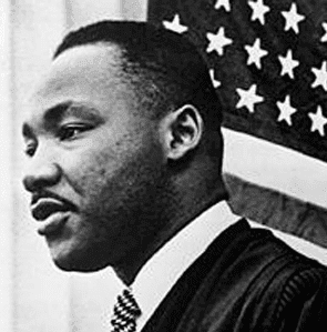
PermaRec update: Ever dream of finding something valuable at a junk shop? An Arizona woman was poking around at a Goodwill and found the only known recording of a 1964 speech by Martin Luther King. Get the full scoop on Permanent Record.
ESPN alert: I have a new ESPN column today, about the Olympic hockey uniforms. Enjoy.

’Skins Watch: I’m not thrilled with the Moose Jaw Warriors’ current logo, but it’s a lot less problematic than the old logo they’re reviving for their 30th-anniversary jersey, which they’ll be wearing throughout the 2014-15 season. Disappointing.

Baseball News: Yesterday I described what the A’s new green alt jersey would look like but couldn’t show you a visual. Then Richard Paloma sent me this, which, as it turns out, is not official — it’s a mock-up that Samuel Lam did last month. I can tell you, however, that it is 100% accurate — that’s exactly what the new green alt will look like. … Always interesting to see the Indians’ mid-1970s coach’s cap with the piping. That shot is from the infamous 10 ¢ Beer Night in 1974 (good find, Phil). … The Dodgers’ new batting helmet number decals include the uni number, the MLB logo, and the team’s script. Pro Helmet Decals honcho David Sulecki says the script was equipment manager Mitch Poole’s idea. Seems like overkill to me. … Here’s an article on what the Mets are packing for spring training (from Tommy Turner). … Here’s a decent view of the Indians’ new BP jerseys (from Nile Smith). … The Rockies will retire Todd Helton’s number in August (thanks, Phil). … Several MLB players showed up for the Texas Longhorns baseball team’s annual alumni game and wore UT caps with their MLB gear. Oh, and the “JS” patch on the cap is a memorial that’s been added this year for Huston Street’s late father, James Street, who played baseball and football for Texas (from Mike Barnes). … Mmmm, very tasty photo of the Say Hey Kid, Leo the Lip, and Cesar Cedeño (nice find, Phil).

NFL News: The world went mildly bonkers yesterday over that unconfirmed Reddit post about Nike being poised to make the Broncos “the Oregon of the NFL,” but a Broncos spokesperson says there’s nothing to the rumor. Of course, even if the rumor were 100% true, the Broncos wouldn’t admit it, at least not yet. A lot of people have asked what I think of all this, and the answer is that I have no idea. Is it plausible? Sure. But lots of plausible-sounding rumors turn out to be false. Until I get better info from a legitimate source, it’s all just noise. … Speaking of the Broncos, someone on eBay is selling several pairs of their vertically striped throwback socks in yellow and white (from David Firestone). … If you crossed NFL logos with some famous corporate logos, you might get something like this (from Jared Buccola).

College Football News: If you go to Oklahoma’s website, you’re sent to a landing page that appears to show a new road jersey and maybe a new helmet finish. Hmmmmm (from MJ B). … There’s an Australian league of American football — not to be confused with Australian rules football — that includes a team called the Queensland Sundevils, whose logo is ASU’s old Sparky design (from Michael Bonfanti).

Hockey News: The Norwegian goalies at the Olympics have very cool mask designs (from Alan Kreit). … The Florida Everblades (ECHL) will be wearing an Olympics-themed jersey that was designed by a local kid (thanks, Phil).

Soccer News: The L.A. Blues have changed their name to the Orange County Blues (from Tony Bruno). … “A goalkeeper in the Egyptian professional league was wearing a Simon Mingnolet Liverpool goalkeeper jersey,” reports Nile Smith. “As you can see, the jersey still had the Liverbird Crest, the warrior insignia, and part of the Standard Charter logo (the club’s sponsor), with the McDonald’s ‘M’ covering the rest of it.” ”¦ David Beckham’s new MLS team is looking for a name (from Francis Fay).

NBA News: The Hawks may (or may not) have a new logo. ”¦ The Grizzlies are saluting James Johnson by giving away free neck tattoos (thanks, Mike).
Olympics News: Here’s a really good PDF showing all of the Winter Olympics gold medal designs from 1924 through 2014 (big thaks to David Haberman). ”¦ Good to know that all of the Olympics’ major corporate sponsors have contingency plans in the event of any terrorism. … Here’s yet another one of those “Olympic uniforms through the years” features, although you can simply scroll through this one — no click-click-clicking required (thanks, Phil). … Best article I’ve seen so far on Olympics uniforms and the companies that make them. Great info, great reporting — highly recommended.

Grab Bag: Another new football league that’s doomed to failure has launched, but at least they have an interesting uni-related twist: No uni-numbering requirements for the offense. ”¦ As a longtime blood donor, I like this blood-donation infographic. … Here’s last week’s cyclocross world championship recapped in stop-motion Lego form (from Sean Clancy). … Here are some thoughts about designing a new NYC flag for the 21st century (from Tom Mulgrew). … For reasons too complicated to explain here, but that you can read in the linked story, the Adelaide Crows — that’s an Aussie football team — won’t be allowed to wear its preferred jumper for an upcoming match (from Lew Strawn Jr.). … RIP, Ralph. Thanks for the memories.
Gotta say Marty Buccafusco that this is perhaps my favorite DIY project that’s been featured here. I thought the ViewMaster with the unicorn horn was phenomenial enough, but the Magic Eye(which I miss and had no problem seeing) and the ViewMaster slide took this to a whole new level. Great job!
I wonder what the membership cards for unicorn watch would look like…
And can you get one in purple?
Hey Paul, that should be “Adelaide Crows”, not Port Adelaide (they are the Power).
:)
Thanks. Now fixed.
I like the new A’s jersey. The team has a solid set of unis, the only change I’d make is use a lighter shade of green.
If you gotta have softball tops, at least include piping and/or headspoon. Their old green, the Braves’ navy, and both of the Red Sox Friday alts look terrible without them.
Another new football league that’s doomed to failure has launched, but at least they have an interesting uni-related twist: No uni-numbering requirements for the offense.
Well, at least they seem to be smart enough to not try directly competing with the NFL. I’m definitely willing to watch a spring/summer league.
The A-11 Offense, by design, reduces the chances of injury while still maintaining the speed, athleticism and dynamics that avid football fans have come to expect from the game.
I’d like to know how the hell they come up with that claim, though. Just because it’s legal to throw the ball to a 300lb lineman, it doesn’t mean he isn’t going to get hit in the head.
Well, you wouldn’t have 300-pound linemen in A-11.
Also, the idea is that because the play is more spread out, you don’t get the gang tackling or the smashmouth/launching tackles that traditional offenses face.
Will they be like the other upstart leagues, with unifoms designed by a twelve year old on acid and idiotic names like the Orlando Ooze or the Philadelphia Phat? And don’t forget to dress the officials like clowns (I’m looking at you, AFL and WHA). And which football league had different colored pants for each position?
Age has made me cynical ;)
The league with the multi-colored pants idea was the WFL from ’74-75, but those only lasted a couple games, so they almost don’t count.
This new league could follow the lead of the USFL, which had decent uniforms and team names, and really only screwed up when they attempted to take on the NFL directly by shifting to a fall/winter schedule. Also, the Arena Football League managed to go for 22 years before folding, and it was resurrected and still exists today… so you could call it successful in a way.
The WFL experiment with colored pants was used in one pre-season game. And even that, I think it was only during pre-game warm-ups. I don’t think an actual down of football was played with the pants. Literally no one liked the idea once it was seen on live bodies.
Lee
The short version of the story is, things were looking promising until Donald Trump decided he was going to take on the NFL. Shocking to see someone like The Donald mismanage things and then disavow all responsibility, but there you go.
And that was a huge missed opportunity. I can’t see a spring league working in today’s sports landscape, now that NBA has overtaken the MLB in popularity and NFL’s become a year-round sport thanks to cable TV.
While totally agreeing w/ BrianC re: the uni-“quality” of most new sports leagues, I have to admit to being more than a little intrigued by the logo/apparel possibilities of the Orlando Ooze …
The guy with the years-long hardon for the so-called “A-11” offense has long claimed it’s “safer,” despite absolutely zero actual evidence of that claim.
There’s a reason there are “eligible numbers.” Football is, by its very nature, a game of deception (play fakes, draws, trap blocks, onside kicks, stunts), but having a clear idea of who is actually eligible to receive a pass helps level a playing field that has almost always been tilted towards offense. (Offense being what appears to sell tickets, that’s not completely out of whack, either.)
If you like 180-pound “linemen,” I guess you’ll like this, because there still will only be five eligible pass-receiving humans.
As for the spring football thing, yeah, whatever. Everybody always SAYS it’s a no-brainer. But let me see somebody actually not bleed money doing it.
Rovell would link it, take free product, tweet about it, and thank them over and over for it. So yeah, “journalists” do do that crap and he works for the same opperation.
Actually, no, Darren would not do that.
Darren has done that with custom batting gloves from Franklin. I remember that Dietch and him got into an argument about whether it was appropriate for journalists to do the very thing.
And he did it with a crappy Pizza Hut Pizza that was given to him within the month that looked like him.
How is this different than what I said.
link
He is giving them the pub. Linking their twitter account and mentioning that it is for their new crust.
Not the same as including links in an ESPN story.
Still pathetic to shill. That tweet is pathetic. I think you can agree with that
Sure, though I think we can also agree that there’s a clear distinction between a tweet that explicitly acknowledges a freebie, and a native ad disguised as content.
Paul;
If you dislike the Moose Jaw retro logo, you will probably not be a fan of the Prince Albert Raiders (same league) original “Sheik” logo either. Worth googling, as it’s kinda comical. They’ve since changed it to a pirate, as I suppose pirates don’t get offended.
Marty’s unicorn cross-stitch is based on Jason Steele’s awesome “Charlie The Unicorn” animated film – link
Indeed. That was going viral about 10 years ago. I recall watching it in my freshman dorm.
You’re link who thinks Moose Jaw’s WHL team should change its name. And the writer of that column is a First Nations woman.
Ironically, Moose Jaw kept the name when the team relocated from Winnipeg in 1984. The old, extremely distasteful logo was used link.
I’m not even going to bother reading that link, but there’s no reason for them to change their NAME. Warriors absolutely does not need to have any connection to Native anything. If you want to complain about the logo, that’s one thing, but the name itself is harmless.
Again, this is the problem. You’re unwilling to even listen to a reasonable argument from someone in Canada who is of First Nations heritage.
Oppression is a form of racism, Jeff.
Fine Teebz, apparently I’m racist now. I’m also an asshole. Whatever.
Look, the team could call themselves the Warriors and use a sword and shield logo, or an axe, or a Roman spear, or any other weapon of European origin. They wouldn’t be referencing any of the Native people and there wouldn’t be an issue. Warriors, as a team name, is perfectly acceptable.
Be a racist all you want. Stop oppressing those who are trying to find a happy compromise between their history being wrongly depicted by a team representing their area. They are not “warriors”. They are people.
The team doesn’t employ a logo showing anything like you described, making your argument completely irrelevant to the topic at hand. And the history of them using the logo isn’t erased either. No one is saying they need to change the history books, but those who do not know history are condemned to repeat it.
A new name and logo solves these problems. Read the damned article and stop being so closed-minded about everything on the planet.
Don’t like where this is going. Enough, both of you. Thanks.
In the interest of friendship, Jeff, I want to apologize for alluding to you being a racist. I don’t think you are at all and I’m sorry for implying it. And I certainly don’t consider you to be an asshole whatsoever. You’re passionate, and I labeled you unfairly.
Sorry, Jeff. Just wanted to clear the air because while we may disagree on stuff, you’re still a good dude. I stepped over the line, and I apologize for doing so.
No worries… it’s a touchy subject and we both got a bit… overheated. I’m at fault here as well. I should’ve actually read the article before I spouted off about it. So, I’m sorry too. If we ever meet at a future Uni Watch gathering, I owe you a drink.
Jeez, guys — get a room already….
I did read the article and was surprised to learn that “Pilgrims” was placed into the same category as “Blackskins,” “Chinamen” and “Honkys.”
My brain makes Magic Eye “images” go INTO the background, not pop OUT of the background. Am I the only one?? Always been thay way for me. ????
If I agree with DG that my brain also doesn’t process those things “properly,” what does that make me?
This is because you’re crossing your eyes, not letting them settle. Or so I’ve been told. I can’t see Magic Eye stuff at all.
Love that Moosejaw throwback!!
Ralph Kiner died yesterday at 91. The local paper found some old playing pics and it’s amazing stirrup goodness. Look at the little kid flannel uniforms!
link
I think it is about time they bring back the white elephant on the front of the A’s uniform.
Would love to see it. For the sake of “branding”, I’m sure, it seems like a large majority of sports teams these days exclusively use a logo that is a block (or script) letter. What’s the fun in that? A lot of the “fun” has been systematically removed from sports. You can’t have fun while running a business, I guess.
link
Used the New Era By You site to make a white elephant hat. Ideally it would pair up nicely with a green top matching white elephant logo, gold double piping, gold NOB, and numbers in white-green-white.
David Beckham’s new MLS team is looking for a name (from Francis Fay)
I’m going to fall back on my old favorites: “Thunderbolts” and “Meteors”.
The Grizzlies are saluting James Johnson by giving away free neck tattoos (thanks, Mike)
That’s it: The apocalypse is here! Last one out, shut the lights.
Someone on that thread coined “Armada” that received a ton of support. I like it too.
For those too young to remember, James Street didn’t merely play football for the University of Texas. He was the hero of one of the greatest college football games ever played, the 1969 “Game of the Century” b/w Texas & Arkansas (and also whom Dillon HS QB Jason Street on the TV show Friday Night Lights was named after). The pair were conference foes that each sported a 9-0 record (when the regular season was 10 games). Texas, running its fabled Wishbone offense, was ranked #1 & Arkansas #2. President Nixon was even in attendance.
Through 3 quarters Arkansas led 14-0, but on the first play of the 4th quarter Street made one of the epic TD runs in college football history, and followed up by scoring the 2-point conversion on a keeper. Then in the closing minutes, with Texas in its own half of the field and facing a 4th & 2, Street threw long, into double coverage.
Here’s a link to the game. Street’s run occurs shortly after the 43:45 mark (you can see Texas wearing their centennial helmets and a cut to Nixon in the stands shortly before it), and his throw shortly after the 1:03:45 mark (oddly, a Texas male cheerleader is doing cartwheels on the field mere seconds after the play ends). Good stuff.
Crap, forgot link
link
Thank you, was going to post something similar myself. He also threw two no-hitters for the Longhorns baseball team, one of them a perfect game.
20-0 as a starting quarterback.
“… … If you crossed NFL logos with some famous corporate logos, you might get something like this (from Jared Buccola)….”
Some of these are distinct improvements. Nice feature.
Is it just me or does it seem like an ill advised move to have on the reverse side of the Calgary 1988 medals a depiction of an Indian with a rifle pointed at the back of his head?
“…The Norwegian goalies at the Olympics have very cool mask designs (from Alan Kreit)…”
Meh. The Finnish guy’s lion is way better, and besides, “Suomi” beats “Norge.”
The Norway goalie helmet does illustrate an amusing historical development, though: the way in which the horns on Viking war helmets are now featured on paraphernalia produced by the descendants of the real-deal Vikings. Used to be that the non-Norse, Americans especially, drew horned helmets, but that the Norse themselves pointed out that historically, the old Vikings didn’t actually wear horned helmets. But then a new generation of Scandinavians, fans of Hagar (sp?) the Horrible and the NFL guy, figured what the hell, it’s a fun look, let’s go with the horns.
“Is that a unicorn horn on your View-Master? Or are you just happy to see me?”
Glad to see we aren’t the only ones deciding to make this Year of the Horse more unicorn-y.
link
Nicely done, Marty.
For Paul and anyone else that loves the texture of old uniforms, take a look at this video: link It shows the 1955 Montreal Canadians sweater of Butch Bouchard. The close-ups of the details are beautiful. It can be yours for just under $10,000. link
Classic Auctions also has other similar videos posted for their current auction. I enjoyed the videos since I’ll never be able to afford one of those beauties.
The crest-style logo for that spring football league kind of looks like AUFL which, phonetically, makes my brain think AWFUL.
Tony Bruno that submits doesn’t to the ticker doesn’t happen to be the Philadelphia sports talk personality does he?
I’m not surprised that Paul gets requests to shill for apparel companies, but I am surprised that he actually includes the link to the NBC online store. Isn’t that what they want? I mean, he calls them out on their scheme, but they still got a link, a mention and a logo.
New Red Sox road jersey has leaked:
link
I’ve known about this for a while but wasn’t able to say anything!
I liked the old design better.
Red > Blue when your name is Red Sox
So you’d prefer the Red Sox to wear red caps, right?
I like the previous ones, too. But I think these would look really nice if they’d pair them with navy undershirts. Of course, they should wear navy undershirts at home, too.
I wish it had the red sleeve piping again, but it looks SO MUCH better than the navy ones. Looked like the Yankees…
The color of the script on the road jerseys doesn’t matter to me one way or another, but the Red Sox should definitely ditch the navy road jerseys.
Dammit! I missed my window to “leak” a pinstriped Red Sox uni to social media and create a firestorm.
The real thing is a huge upgrade, obviously. Nice to see the Sawx looking like they’re from Boston again, instead of New York.
I’m torn … this is a much better “modern” uniform for the Red Sox, though the blue-lettered version definitely looks more “old school”. Either are good choices for this team, but I prefer the 2014 edition.
I have been waiting for this day since they changed to the navy text a few years ago. This looks great!
Oh thank goodness… those blue-lettered jerseys were dreadfully dreary. They were even worse as introduced and initially worn, with blue socks. They didn’t anything like a team named the “Red Sox” should look. The team quickly caved to fan pressure and brought back red sock, which gave them a delightfully clownish appearance.
Good riddance. There was no excuse to go to the blue in the first place.
Other than, of course, it being their traditional look.
I had thought the all navy Boston road set was the best in baseball. So this is a real bummer for me.
The new jersey looks fine. Maybe an improvement over the blue lettered jersey. It looks more like what they had prior to the change.
I wonder if the Red Sox would consider jumping on the gray road alt trend and use a jersey that would feature navy blue letters and numbers in a block font, similar to what they used in the 80’s?
Today’s ESPN column is up:
link
Now that I’ve seen them all, Slovakia takes the gold.
Spot on assessments, Paul.
Czech Republic is the gold medal winner.
Czech Republic looks outstanding. I also really like Latvia for some reason.
US and Canada are completely meh, Sweden could’ve been so much better, and Slovenia is an eyesore.
The rest of the world manages to make USA look pretty good this year, despite remarkably poor USA sweaters. I guess a “Thanks, Nike” is in order.
I think I’m going to have to stick with Finland in the tournament, except when the Czechs are playing in their flag jerseys. Aesthetic dark horse: Latvia.
Swedens recent jerseys have always looked stellar. Yes the subtraction of sleeve stripes and numbers makes it plain, I think it’ll look good in an actual big hockey jersey though and not that ladies medium fashion jersey.
The real terrible thing with that jersey is it used to be so simply, the three blue crowns on the yellow jersey, less was definately more, until NIKE just freaking ruined it with the swoosh. It’s not three crowns and a swoosh, it’s just three crowns. Grades: Sweden A. Nike F-.
Anyone else find it funny that a visiting team sweater features a hammer and sickle on its crest?
Czechs and Slovaks both look great, as do the Swedes and Finns.
When I heard the 2014 winter games would be in Russia, I had thought about getting a hockey sweater as a tribute to the Russian portion of my ancestry. Don’t like either option though, and the Swiss and ‘merkins (the other backgrounds among the participants) look only a wee bit better.
I think Russia should go maroon/metallic gold as the team color using the flag colors as an accent. Their set is fine but how much cooler would that red sweater looked more like the Russian soccer kits.
What is missing here are the helmets, and I have always thought USA would look much better in blue than white. Canada looks good in black, but then black goes with everything.
Heh, I’m surprised Paul didn’t put a “RIP Ralph Kiner”, seeing that he’s a Mets fan.
Of all the years he spent with the Mets as a broadcaster, people forget his playing days were mostly with the Pirates. I think even the Pirates forgot he played for them half the time, because they were so bad when Kiner was on the team.
Um, he did. End of the ticker.
Oh I see it now, never mind. Ever since Paul started splitting up the Ticker by sport I’ve ignored the “Grab Bag” section.
We should include a “For Yinzers Only” section. Then you wouldn’t need to read anything else ;)
Here’s last week’s cyclocross world championship recapped in stop-motion Lego form (from Sean Clancy).
Those are actually Playmobil figures making up the audience in that video.
One thing I noticed watching slope style snowboarding – not only is the US uniform god-awful ugly (it’s basically your grandmother’s quilt, but more beige and more ‘Murica, totally gets lost in the snow), it doesn’t take the SOCHI 2014 bib at all. I mean, like, the bib that every competitor in every event wears, and has worn since the dawn of time.
Paul — I listened to the Core77 podcast the other day while shoveling snow. Thoroughly enjoyable!
I thought I had heard your voice before, perhaps on one of the videos you uploaded to the site, but it was much deeper in the podcast than I remember — you have the pipes for a career in radio. (And you don’t look near 49…)
Thanks for the kind words, Al. Happy to assist in (or at least help you pass the time during) your shoveling!
First time I heard PL’s voice on a video or wherever, I thought——
WHOA. The new voice of NPR.
More logo thievery from that Australian American-rules football league. Bears, Jets, Steelers.
The Steelers ripoff should call themselves the Hypocycloids.
That A11FL has released names of a few teams. A few look quite familiar: San Francisco Bay Area Sea Lions, Los Angeles Express, Tampa Bay Bandits, Dallas Wranglers, Chicago Staggs and New Jersey Generals. link say two more teams are TBA.
I wonder if the Chicago team’s helmet will be maroon and feature a picture of link.
Interesting that a press release on a blog has the team names, but as of 3:36 p.m. (Pacific), the link still just has a “Team Announcements Coming Soon” notice.
I live in Moose Jaw. Logo and jersey are disgusting. Even worse, one of our local kids football teams changed their name from Falcons to RedSkins. And yes, the S is capitalized. Bizarre and sad at the same time.