Before we get started: I have an ESPN column today on the Cubs’ new throwbacks ”” enjoy.
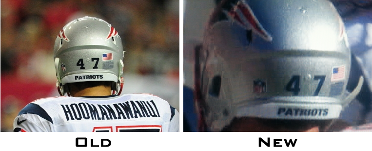
Now then: The Patriots’ season ended on Sunday, but reader Jack Phuapradit has noticed an intriguing uni adjustment they made for the playoffs: They changed their helmet number font.
To explain: The Pats have traditionally used small block-numeral decals to show each player’s uni number on the back of his helmet. But when the postseason started (i.e., for their divisional playoff game against the Colts), they suddenly had new decals, which matched the number font on their jerseys. The difference is easier to detect for some numerals than for others, but you can clearly see in these before-and-after shots of Logan Mankins, Michael Hoomanawanui, and Dont’a Hightower (for all of these, you can click to enlarge):

Interesting, right? Too bad the Pats didn’t win last Sunday, since this would make a great little detail to focus on in the lead-up to the Super Bowl.
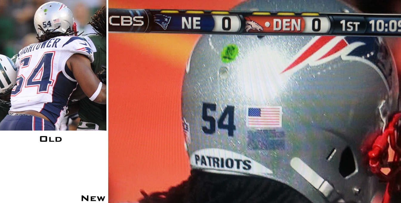
Meanwhile, here’s a thought: Have the Pats have made this same decal change in previous postseasons and we all just didn’t notice? I was really hoping so, because I love it when teams have special little rituals and protocols for the preseason or the postseason. Unfortunately, that doesn’t appear to be the case here, at least judging by this photo from last season’s Pats/Texans divisional playoff game, which shows the block numerals (click to enlarge):

It would be one thing for the Pats to have made this change at the start of a season. But in the middle of a season? Very odd. Big thanks to Jack for spotting this.
Stupor Bowl update: Meanwhile, uni-related news for the Super Bowl has begun circulating:
• To the surprise of no one, the Broncos announced that they’ll be wearing orange. This prompted Chris Creamer to write a good piece on the Broncos’ Super Bowl history wearing orange.
• The Seahawks, meanwhile, will be going white over navy — a mild surprise, at least to me, as I thought they’d go solid-white. I like this jersey/pants combo, although I wish they could add some white-topped socks to avoid the leotard effect.
• The Super Bowl jersey patch was also released yesterday. As you can see, they’re once again going with a ChromaFlex patch, not an embroidered one.
And that’s about all the uni-related news we can expect between now and the game (well, except for the obligatory photos of the patch being applied to the jerseys, and maybe some shots of the Super Bowl logo decal on the back of someone’s helmet, whoop-de-whoop).
Irish update: As we all knew already (and as this site was the first to report last month), Notre Dame has officially swapped out Adidas for Under Armour. Here’s a round-up of coverage:
• Forbes ran a good piece analyzing the implications of the deal.
• Here’s a interview with Notre Dame’s athletic director about the new deal.
• Not exactly a surprise to see that the Irish’s basketball uniform will still have a traditional look.
• Ditto for the football jersey. Here’s a closer look.
(My thanks to C.B. Ciullo, Warren Junium, and Bobby Pinkham for their contributions to this section.)
As you may have noticed by now, all of today’s content is in one place — a retreat from yesterday’s experiment of breaking up the mainbar, the Ticker, and Collector’s Corner. Part of this is because I’m taking my friend Liz out for a birthday lunch today and don’t want to be juggling different parts of the site while I’m away from home. Part of it is also that reader response to yesterday’s experiment was overwhelmingly negative.
But the biggest reason is that my own response to yesterday’s experiment was negative. I didn’t like having three separate comments sections to keep track of, I didn’t like the Ticker sitting there all by itself, and so on. When Uni Watch works the way I want it to (which isn’t always), the various parts of a day’s entry — even the parts I don’t write, like Collector’s Corner — come together as an integrated whole. Breaking up the parts yesterday made me feel like I was breaking up parts of myself, or at least parts of my own voice. Pfeh.
So we’ll stick with this format, at least for now. Thanks to everyone who gave feedback yesterday.

Baseball News: The Astros are moving some signs at their stadium (from Chris Perrenot). … Michael Clary spotted two Mets bobbleheads — similar but slightly different designs — that both have the thumb on the left hand facing the wrong way. “Having the thumb facing forward and the fingers curled upward is possible only for the extremely double-jointed folks out there,” says Michael. “Go ahead and try it!” … In a move that really scales new heights in chutzpah, Bud Selig is going to be first recipient of the Bud Selig Leadership Award. No, “>really (big thanks to Phil, who emailed me that link with the subject line “Not an Onion story”). ”¦ Last night’s installment of Jeopardy! included this MLB-related question answer (from Chris Flinn).

NFL News: The Seahawks’ on-field success has translated to increased jersey sales. ”¦ This is interesting: The Jaguars had a custom midfield playoff logo in 1999. “I can’t remember many examples in playoff history of clubs using custom-graphics at midfield commemorating their playoff games,” says Cory Gibson. … Check this out: Bucco Bruce — on a lacrosse helmet (from Matt Powers). … Following up on yesterday’s electric football entry, here’s a blog post about a CFL version of the game. “The ‘Links’ section on that site is also worth checking out,” says Ted Arnold. … More electric football news: Joe Bailey modified his field to look like the Browns’ stadium. ”¦ Michael Princip has written a good piece about the Mohawk-patterned strip on the Seahawks’ helmet. … Here’s a team logo-based infographic showing each NFL team’s last playoff appearance (thanks, Phil). … Patrick Mackin was watching an old episode of The Muppet Show and spotted a sequence that featured a Browns-esque helmet. ”¦ Joe DeAngelis recently paid a visit to the Patriots Hall of Fame, which has a display about the team’s proposed 1992 move to St. Louis.

College Football News: Yesterday’s Ticker included a claim from anonymous source regarding a Syracuse football overhaul. Now another little birdie has come forward: “I can bolster that claim,” he says. “They’ve been in the works for quite some time. A couple months after the 2012 bowl game, ending Syracuse’s reign in the Big East, Nike came to the school and offered up a few designs for select members of the football team to view/debate/vote on. The players all assumed this was for an ACC reboot, but we’re now a year late for that. Should be interesting.” … Buried within this story about new Wyoming coach Craig Bohl is the following passage: “[W]eek in and week out, they’ll wear brown and gold with pride. ‘We’re going to wear brown and gold, and the days of all these other colors are over!’ Bohl bellowed, his voice ringing above the steady waves of applause” (thanks, Phil).

Hockey News: Here’s Ranger goalie Cam Talbot’s Stadium Series mask (from Alan Kreit). … Good front, back, and side views of the Islanders’ Stadium Series jerseys (thanks, Phil). … Those Islanders shots were from an event staged yesterday at Bryant Park in Manhattan, which also featured some Rangers and Devils participants. Further info and more photos the Islanders here (Alan Kreit again). … Unusual technique by this 1932 German goalie (from Chris Mizzoni).

Soccer News: “West Bromwich Albion lost its jersey sponsor following the uproar over Nicolas Anelka’s ‘quennelle’ salute, which is considered anti-Semitic,” says Yusuke Toyoda. “And in a related item, the Chilean soccer federation has banned Palestino from wearing their Israel map jersey numbers.”

NBA News: Odd scene last night in Miami, as the Heat wore nickNOBs but the Celtics didn’t. I had been under the apparently mistaken impression that this would be an all-nickNOB game, like the Heat/Nets game from earlier this month. … Someone has posted several hundred Slam magazine covers. Lots of good stuff in there. “I love this one with the Clippers wearing the nautical flag throwbacks and the Bulls wearing the ‘Chicago’ script,” says Yusuke Toyoda. … Anyone know why so many of the Rockets and Blazers were wearing purple shoes for their MLK Day game? (As noted by Dylan Darling.) … Update: Here’s why they wore the purple shoes.

College Hoops News: Indiana didn’t wear Fruit Stripe unis last spring, but apparently those unis were in the works. “There is no way IU fans would have stood for this,” says Matt Wade, although I don’t really know what that means. Like, would they have boycotted games? Doubt it. … New Twitter handle warm-ups for Michigan (thanks, Phil). … For reasons that aren’t entirely clear, several Texas players removed their undershirts during last night’s game. “The announcers mentioned that the undershirts violated some sort of rule and that the refs made the players remove them,” says Chris Perrenot. I asked UT’s communications dept. if they could explain and was told the following: “Two NCAA rules in regards to uniforms and undershirts were enforced by officiating crew: Can’t have double logos showing from undershirt that aren’t consistent with official sponsors, and can’t have a second color visible (there was gray around the collar of the undershirt).” … As you probably heard, there was a shooting yesterday at Purdue. The Boilermakers were playing last night at Northwestern, whose fans offered this gesture of support. “Note that the ‘N’ and the ‘U’ are solid white,” says Phil.

Grab Bag: The Norwegian curling team is at it again. Further info here. ”¦ Very good article about how the apparel companies deal with various colleges, especially VCU (from Tommy Turner). … There’s a new cassette-only record label called Athletic Tapes, whose designs are based on sports graphics (good one from Jude Noel). … New logo and visual branding for Visa (thanks, Brinke). … New York City officials and the owners of several Hasidic-operated shops have settled a pending case regarding Hasidic dress codes (from the New Girl). … “There’s no database or resource that lists which designer created which uniform or logo,” says Robert Bath. “So I created one.” His listing includes about 75 designs — definitely better than nothing, but most leagues and teams these days don’t disclose who worked on what. … Here’s an imaginary sports league whose team identities are based on world history (from Tim Wood). … “Double-turtleneck Ping-Pong” sure makes for some interesting uniforms (from Ed Westfield). … Fort Campbell High School in Kentucky has some interesting wrestling singlets (from Josh Claywell).
Purple shoes “honored” MLK…and gave the corporations a chance to sell more gear.
link
I wonder of the Jags midfield logo covered up a bowl game logo?
It’s possible. I’m not sure though, considering the next week (in the AFC title game, against Tennessee) they plastered another mid-field logo in the same spot
link (blurry, but the top lettering across the arch reads ”AFC Championship Game” vs the previous weeks ”Divisional Playoffs”)
In one of my favorite little stadium traditions, the Jags used to link to their midfield logo. Maybe this was just another step in that line.
I loved that they did that. Did the No Fun League make them stop?
Semaphore is not what is on the Clippers’ shorts. Those are ICS (International Code of Signals) alphabet flags.
Semaphore is using two flags (or sticks, or lights, or whatever) and using different arm positions to indicated letters.
Right. Will adjust text accordingly.
I still love the shorts though!!
Short answer to the purple shoes question: link
link
Thanks. Will ad to the Ticker.
I was always puzzled by the yellow thing on the old VISA logo. Glad it’s gone.
My recollection is that Visa started as Bank Americard, which had a blue and yellow color scheme. As it went national, they went to the generic Visa name.
I love seeing old storefronts with Bank Americard and MasterCharge signs at the door.
I am glad to see the approach so far by Under Armour on the ND gear. I really wasn’t worried about the football team’s standard uniforms, but I am glad the basketball team went the same route. To me that uniform is ten times better than the adidas template they wear now. Now the shamrock series for football is going to be a different story altogether
The Patriots Hall of Fame, which has a display about the team’s proposed 1992 move to St. Louis.
Wait, what? The St Louis Stallions were one of the finalists for expansion in 1995, along with the Panthers, Jaguars, and Baltimore Bombers. If the Patriots were considering a relocation/renaming, I doubt that they’d have used that logo.
The Pats (under the old ownership) were looking to get a new stadium. I was 12 during that time, so my memory is a little fuzzy, but I think they considered CT as an option, and I think they wanted a Boston stadium too.
Then Kraft came in and bought the team and kept them around.
I thought the same thing. I remember the Pats being peddled around, but I am almost 100% sure that the StL Stallions was the potential expansion name, like the Baltimore Bombers.
link
I don’t think that Wiki article is entirely accurate.
link
“If there was no chance of football ever showing up, people would have been a lot more upset,” said Klose, referring to the firmly held but possibly foolish belief that St. Louisan James Busch Orthwein will move the New England Patriots to his hometown as a consolation prize.
St Louis apparently didn’t know their bid for expansion had failed until late 1993 when Jacksonville was awarded the 2nd team. I don’t doubt that there was a semi-legitimate threat of the Patriots moving, but that Stallions logo was part of the expansion bid, not a New England relocation.
I don’t think that Wiki article is entirely accurate.
Wha-?
The Pats did talk about moving to St. Louis but the Stallions were the expansion team that came after they had nothing to do with the Patriots
I think the most compelling piece of the Wyoming coach’s comment is that he understands brand identity, where so many schools have lost touch in the interest of chasing a trend to try to attract/satisfy recruits.
“I think some of it really comes into knowing who you are, knowing what Wyoming is all about,” Bohl said. …”Wyoming is not all the bells and whistles. I think I have a pretty good pulse on who we are, where we’re going and what we’re about. And part of it is our colors and our uniforms.”
The fundamental rules of brand positioning: integrity and differentiation. If Oregon owns the brand of “change,” then that means other schools are just following their lead instead of identifying what makes their own institution unique.
Kudos to Bohl for understanding what Wyoming’s identity is NOT. I think the very beginning of the backlash to “change” is upon us. Particularly, if Oregon goes “basic” next year. There will always be the occasional retro games (ND’s Shamrock Series, etc.), but I think we’ll see a return to equilibrium on the constant change nonsense.
” Particularly, if Oregon goes “basic” next year.”
Is there any indication that Oregon is going to go “basic” next year?
I thought our Duck Tracker guy displayed the Oregon unis with essentially just the wings on the shoulders, pants, numerals, etc. were all unremarkable. Of course, that doesn’t mean they won’t have 144 color combos and 10 helmets. Lol
I hope they go with the yellow or brown hats. white hats suck!!!!
“Humphries” is Humphries’ nickname. They wanted to put “Kardashian” there but he refused
the ticker includes 2 links to the story on Norwegian curling team’s pants.
Thanks. Now fixed.
Paul – I did not say the IU fans would boycott a game or anything close to that concerning the fruit-stripe uniforms. To keep it simple, history and tradition are very BIG to IU fans and they would have not been happy with those uniforms.
I did not say the IU fans would boycott a game or anything close to that concerning the fruit-stripe uniforms.
You said there’s “no way IU fans would have stood for that,” which is not the same thing as saying they “would not have been happy.”
We often hear people talking about “I’ve had it” or “I won’t stand for it,” but in the end people — especially sports fans — tend to accept what’s put in front of them, whether they like it or not. Inflammatory language sounds good, but it rarely has much basis in reality.
Im not sure why you are attacking me about this? What I said may not be the same as “would not have been happy” but it doesn’t mean “boycott games” either. Who knows what they would have done, maybe nothing, maybe something? I was just trying to contribute to your blog. Thanks for making my contribution to the ticker feel so welcomed :)
And as a side note, when Mike Davis took over at IU, he tried to get rid of the candy-striped warm up pants. He went as far as to have them ordered and delivered.
Now, did the fans boycott a game? Did they bare arms and attack Assembly Hall? I dont know, but those pants never saw the “light of day”.
Paul, he’s right on this one. IU fans would not stand for shenanigans with their hoops uniforms. Define “would not stand for,” you ask:
–Old alums would FLOOD the AD with calls and threaten to stop donating.
–The “Tan One” Tommy Crean would be blistered by those same alums and be publicly challenged for his decision-making on-air and in newspapers in Indianapolis.
–Media outlets in Indy would lap up the controversy and it would spread statewide to Fort Wayne, South Bend, etc.
I’m no IU fan, but grew up in the state and have plenty of friends/family who would follow this protocol. Those unis would be a DISASTER for IU basketball and everyone involved. It would be like a 10 year-old throwing a temper tantrum and everyone involved would hear about it.
Anyone who has spent 5 minutes talking to a long-time IU fan would have known that we would have HATED those fruit stripe unis. After what the IU fans have been through since the spring of 2000 the last thing we need is to abandon their simple unis for some marketing gimmick. Taking the court in those monstrosities would have been another straw on the camel’s back and even now it isn’t looking too strong.
It’s worth noting that the Jaguars also used to have their midfield Jaguar logo wearing a Santa hat once the calendar switched to December.
I believe they were fined the No Fun League for doing so, and it has never reappeared. Not sure how well done it was,but it was fun and cool!!
link
Oh, crumb. Should have scrolled down before I posted that upthread.
I’ve never heard that they were fined for it, though. Where did you get that?
After searching the best thing i can find is “mildly reprimanded by the NFL”, not fined. I guess I overstated it (or mis-recalled it).
I’m glad you said something about yesterday’s format, because when I stopped by to read in the late afternoon, I clicked on the titled of the first piece I saw, which happened to be the Collectors’ Corner, and just assumed there was some reason that other content had been omitted for the day. I went back & read through the Ticker & the main piece on electric football, and have mixed feelings on that format.
I get the reason behind having multiple posts during the day, and actually like the idea a little bit, myself. But perhaps there’s some way, when you begin to post the 2nd & 3rd pieces, that you could either (a) flip the order, so that the site would more or less read the way it does now, albeit with 3 comments sections instead of 1, or (b) keep it in the same order it was Tuesday, but have a link at the top of the latest post indicating there’s more below for that particular day.
Agreed. I read the morning post, then forgot to come back for the others. If it hadn’t been mentioned this AM I never would have read Collector’s Corner or the Ticker from yesterday
Yeah – worth a try, but I really like having the various items as part of a single package.
The structure of the site would need a redesign to do what he tried while avoiding the problems he experienced. Breaking the site into columns (which it already is) and dedicating one area of the columns for “Live News Updates” while the rest is more static. Something like that.
Good news on the Seahawks uni choice. That’s my favorite of their various combinations. I’d otherwise have been rooting for the Broncos, on account of being generally pro-Colorado, but given the uniform matchup, I may just be cheering for Seattle now.
I appreciate their uni choice also. Some of Seattle’s retina-burning combinations would have likely had a negative impact on television ratings.
It would be interesting to know if the league, network, and/or sponsors had any input regarding the decision.
I suspect not, since the market pressure from all parties would likely have been for a maximally retina-burning look, not the minimally retina-burning combo they’re going with. I mean, sure, the league clearly wants white-on-color, but Nike, the network, and other sponsors? They’d have all wanted Seattle to wear brand-new neon green jerseys with white trim and silver numbers or some similar shit if they’d have had a say. You know, for kids.
I think Seahawks’ uniforms would have as much effect on ratings as IU wearing fruit stripe unis would have on attendance. However much people dislike the unis, they’ll still watch.
Question: Has Tom Brady always worn the link in winter?
I noticed it at least a couple of times in December. Not sure about previous seasons.
He wears it enough to get a bobble head made wearing one.
link
I remember that Jaguars playoff logo. I believe the reason for that was to cover up the Logo used for the Gator Bowl on January 1st of that year. My guess is that the grounds crew just got creative in making the best of a messy situation.
Cool article about the SB patch – link
However, the patch in the article looks like a different molding technique that the pic linked above. Was this a prototype maybe???
In the image of the cap and jacket that appears within the ESPN article (first link of the ND/UA section), the embroidery is incorrect. The embroidery should be digitized so that the letters appear to interlock:
link
If not that, I’d say the N should be on top of the D so that the ND at least “reads” in the correct order. D on top of the N (as shown on the cap at the press conference) makes little sense.
Paul,
Do you think the NFL would ever allow a color vs. color Super Bowl?
I wish they would.
One would think that Orange v. Blue would be acceptable as they are so not in the same contrast spectrum. I could see Navy v. Midnight Green (or other “dark dark” colors being poo-poo’d
As well they should be. Orange v navy is one thing, but the colors should have a distinct contrast.
…so we can tell the teams apart on our black & white TV sets.
Yeah, that’s link.
Does anyone have an NFL rule book handy? I’d love to know what the actual rule is, because we have seen both the Broncos and the Bears wearing orange jerseys vs a navy clad Dallas on Thanksgiving, though it’s been a few years.
I suspect they let that Dallas uniform go through because of the link. And in any case, they had contrasting helmets with the Bears and Broncos.
Dont know if im a fan of the white and navy pants for seattle since they wear blue socks and have that leotard effect (even though they have the green stripe down the side which is nice). was hoping more for grey or white pants.
I agree Derek…I’m in the white on white corner myself. I wonder how many of us are routing for one team or another because of the unis? For instance, I had made up my mind that if Seattle was designated the “home” team and wore those ugly one color unis, I would definitely be for Denver. Now I’m all whacked out because I hate the Broncos’ orange jerseys with the weirdly shaped loopy numbers…so I guess I’m back in Seattle’s corner with the white jerseys. But I hate the white and blue combo!!! Jeez, this uni stuff is a real problem !!!
The striping on the UA Notre Dame basketball shorts is reminiscent of the sleeve striping Georgia Tech used to wear on its football jerseys – a look to which the Engineers should revert.
Just noticed something for the first time in the Chris Creamer post about the Broncos’ orange jerseys. In SB XII, they wore blue socks with orange/white stripes, not the more familiar orange with blue/white of the Elway era.
link
Oh god, that Jaguars midfield logo from 1999… that was Marino’s last game. 65-3 or something, sprinklers went off during the game. The last shreds of respectability for the Dolphins died a horrible death that day.
Paul, while humurous, the Sansabelt “ad” is a parody advertisement from a 2010 blog posting.
Oopsie. Thanks — will remove.
In the shot of the NY Islanders Stadium Series jerseys, I noticed that the numbers on the back and the numbers on the sleeves were different. It looks like the sleeves are standard and one the back their thinner and longer. I also noticed the people in them are probably alumni. Do you think that’s the reason, and the real players jerseys will be matching? (Numbers on the back winning out)
It is common for the back numerals to be different than the sleeve numerals in football and in hockey. The reason for this is if the rear numerals are simply decreased in size for application on the sleeves, the visual weight of them will be much less than that of the rear numerals. When I draw sleeve numerals, I usually begin with the rear numerals, then shorten and thicken them to maintain a more consistent weight relationship between the two when the sleeve numerals are decreased in size.
The Stadium Series, however, adds another wrinkle to this practice: The rear numerals were created by making the standard rear numerals taller so that they are more easily seen from the stands, which is why the difference is extra-noticeable.
Thanks for the insight.
Common, absolutely not. Other than “proportional size” I don’t know another team let alone enough to be “common.” Do you have an example?
Today’s ESPN column is up:
link
Great article. Looking at the ’37 side by side link, it appears that the Cubbies wore the multi-stripe stirrups both home and away but the away stirrups were symmetrical while the home stirrups were not. Most striking is that the home stirrups appear to be white from the bottom of the stirrup to mid-shin and belie the Creamer rendering in the corner. link
Great piece.
I love the 1937 homes (might try to go to that game, especially since the Brewers will be wearing throwbacks as well), but that road is amazing. That should have been the new road alt.
I wish the Cubs had selected link as their 1988 throwback set. That would have provided more of a contrast from their current home uniforms. Those are the uniforms that I most readily identify with the Cubs teams of the 1980s. The were one of the few teams at the time link (as opposed to gray or powder blue), and the only team, as I recall to wear white pants on the road.
You might want to check on other teams wearing white pants on the road with their colored jerseys. Some This Week in Baseballs from 1977 and 1978 have appeared recently on YouTube, and you can see Indians in red vs. Orioles in orange or Indians in blue vs. A’s in green. I wasn’t paying close attention, but they might have all been wearing white pants.
I should clarify that I don’t mean to suggest that the 1988 Cubs were the only team ever to wear white pants as part of their road uniforms. Rather, I seem to recall that the Cubs were the only ones wearing them during the time frame of the mid- to late ’80s. Those uniforms stood out to me, impressionable young lad that I was, as being unique in the sea of gray and light blue road uniforms that all the other teams wore. The 1988 MLB uniform graphics I linked to above seem to support my recollection.
In the ESPN article, the link to Uni-Watch about the 72 Cubbies jersey goes to a comment in the comments section, not to the article itself.
“The Norwegian curling team is at it again.”
Maybe my favorite sentence of all-time.
Today is a BIG day in Uniform History, and surprised no one mentioned it. It was on this date in 1929, that the Yankees announced they were going to start putting numbers on their uniforms, even though Cleveland was the first team to wear them on the field, because of a rain out.
I can’t remember the Jaguars actually making the playoffs
Rams-Raiders-Browns-Bills have longer playoff droughts.
stepping ALL over my joke… let it breathe man! LOL
That Bud Selig thing reminds me of the First Annual Montgomery Burns Award for Outstanding Achievement in the Field of Excellence!
“Webster’s dictionary defines excellence as “the state or condition of being excellent.””
Just to remind people…as was said at the press conference, those will NOT be the uniforms that Notre Dame wears next season. Kevin Plank, the UA CEO, specifically stated they were mockups for display and to demonstrate their “creative mind frame” (my words). I suspect the football jersey will look like that, but not the basketball uniform.
One thing you could count on are the particular colors used in the mockups. Swarbrick stated that they sent a football helmet and a pair of the current football pants to UA as exemplars. They might have also looked at the official ND colors; the results on display were very close.
West Bromwich Albion lost its jersey sponsor following the uproar over Nicolas Anelka’s ‘quennelle’ salute, which is considered anti-Semitic
That’s a generous desciption of the quennelle. It was created by a link who likes to describe himself as “anti-Zionist” in a similarly charitable fashion.
Anelka should be ashamed. And the FA should come down on him hard for it.
Yeah, it’s pretty obvious to anyone who sees the context that it’s anti-semitic. You either have to be incredibly obtuse to not see it for what it is – a passive-aggressive Nazi salute.
so what are you guys complaining about? He wrote it was anti-semetic… jeez. What is this, levels of outrage of the wrong-ness of something?
We can all agree it’s awful right?
Where did I complain about anything?
I’m not sure I would describe him as a “far-right French Comedian.” He’s politics skew more Islamist than fascist, which perhaps are the same thing. Nevertheless his “act” is reprehensible.
The general tone of this comment thread was complain-y like Paul (or the ticker compiler) didn’t do enought to state what the salute really was when in fact he did.
I guess as I re-read it was more a comment to Chance than you terriblehuman.
And fair enough. But I stand by my post.
The words “considered anti-Semetic” are the kind of thing a media outlet would use in an attempt to avoid “taking sides”. But I’m telling you that it’s perfectly acceptible to take sides on this, since the man behind the gesture is unquestionably anti-Semetic.
Pretending that there is somehow multiple meanings behind the quennelle obscures the real issue, in this case why the sponsor would terminate a contract over it.
Chance, a reporter or editor doesn’t just use language like that to “avoid taking sides.” He does it to be accurate. It is a true statement. Yes, it stops short of making a value judgment – or, strictly, a truth judgment about the content of the thing so considered – but so what? Do we not trust the reading public to bring its own moral sensibilities to bear? If a voice of authority does not tell us “this is, in fact, anti-Semitic,” do we really believe that the great unwashed masses of idiot plebes will conclude that it must not be anti-Semitism, and take up the mock seig heil themselves?
Me, I don’t need Paul to tell me one way or another whether a thing considered anti-Semitic is or is not actually anti-Semitic. I’m perfectly capable of recognizing the truth of the claim on my own, thank you very much.
There is no pretense in Paul’s statement, and it does nothing to obscure why the sponsor would terminate the contract.
Islamofascist?
Whatever the categorization, a Muslim comedian of Cameroonian descent and Jean-Marie Le Pen make incredibly strange bedfellows.
It’s obviously reprehensible, but I have a bigger issue with the intellectual cowardice. Apologists for the quennelle and Dieudonne hide their antisemitism behind “anti-Zionism”, and pretend their (literally and figuratively) underhanded Nazi salute as “anti-establishment”. Anelka says he was just supporting a friend, but if he’s showing “support”, then he’s obviously supporting whatever Dieudonne’s being criticized for, right?
The worst was when Anelka tried to drag Obama into this by link.
Yeah, Dieudonne likes to say that the quennelle is not anti-Semetic, but it’s “anti-system”. And then in the next breath complains about how Jews run the System for their own benefit. It’s disgusting, and I really hope the FA has an appropriate response.
ugh… with respect to your moniker, this guy seems like a “terrible human”
so i’m clear Chance, your problem is with the word “considered”?
Even if you were to take Dieudionne’s description of the quennelle as “anti-establishment” as true, it’s gone beyond that. A Facebook/Instagram meme started up where people would perform the quennelle in as “Jewish” a place as possible (in front of a synagogue, a Shoah memorial, etc.), so that it could be photographed. It was discussed that the “ultimate quennelle” would be in front of Auschwitz.
So, yeah. It’s an anti-Semitic gesture. And Anelka richly deserves the multiple-match ban the FA is soon to hit him with.
In a nutshell.
It’s like saying the KKK is “considered to be a racist organization”. Soft-selling these nutjobs gives them a patina of respectability they do not deserve.
Thanks for sharing that link to the Chris Creamer article on the Broncos’ Super Bowl performance while wearing orange jerseys. The scores in Super Bowls XXII and XXIV should have provided all the reason for the Broncos to resolve never to wear orange in a Super Bowl again. Winning their first Super Bowl in the first (and to date, only) time they wore _blue_ jerseys (Super Bowl XXXII) should have been even more reason not to wear orange.
Since the blue is actually their alt now, doesn’t it mean Denver couldn’t wear them even if they wanted to? I thought the NFL had a rule for the postseason on alts/throwbacks stemming from the Niners having to get special permission during their run in the 75th season
How about we look at it another way? The Broncos were 0-4 in the Super Bowl with their old royal blue helmets with the snorting horse “D” logo and are 2-0 with the current navy blue helmets. Denver’s current orange jerseys are so different from the orange jerseys of the old uniform set that the “curse of the orange jersey” theory seems even more contrived than other uniform curse theories.
good call… the Broncos’ redesign has been nothing but successful.
But all things old being cool again, when I see crowd shots of Denver games and see hats with that old logo on, I’m nostaglic.
Then again, I’m the guy that owns a Bucco Bruce hat, purchased a Colts throwback yesterday and am looking for a Pat Patriot hat as we speak. I don’t have a problem. I can quit anytime I want!
The NHL Stadium Series link is discombobulated.
Thanks. Now fixed. Here’s the proper link:
link
Paul:
I was thinking some more about your needs for the site … i.e. more page views at different times of the day. Yesterday’s experiment didn’t work, primarily because of the commenting issues, I believe.
My question, though….Couldn’t you simply edit/append the morning’s post throughout the day? You could start with (for example), the Ticker and then at noon, update with the main content and then a bit later add Collector’s corner or other posts? I believe you’d keep the main comment thread in tact this way.
Personally, I like everything posted at once, but wouldn’t be opposed to checking back – especially if the other post times were consistent.
Just a thought.
I was just going to make the same suggestion.
Pondering this. Thanks for the feedback!
No problem…..I may be a pain in the @ss, but sometimes……..
My $0.02: I come come back in the afternoons to read the comments… but it’s tough to see which convos have continued and which haven’t without scrolling through everything.
I know people hate change, but I’ve seen other commenting systems highlight additions, replies, etc. Would love to see that on UW.
(That said, daily additions to the morning post would have me come back as well.)
So long as we’re talking about comments… my one issue with the site’s organization is viewing comments on my phone. I lose all the threads and comments appear as one long list in the order in which they were posted.
Is that my settings, or do other people see it as well?
I’ll be a pain in the ass then.
I asked this yesterday: why are you concerned with pageviews? Normally, that’s an advertising revenue thing, and I’m not suggesting that you’re doing anything like that, Paul.
But are we talking pageviews or readers? If one person visits 100,000 times on one day, that’s great page viewership, but horrible readership. Pageviews doesn’t really tell WHO is reading as opposed to WHO stopped by. Big difference there.
“So long as we’re talking about comments… my one issue with the site’s organization is viewing comments on my phone. I lose all the threads and comments appear as one long list in the order in which they were posted.
Is that my settings, or do other people see it as well?”
I have the same issue, Chance. It’s why I often include some or all of the comment that I’m responding to in italics and quotes above my messages. I do it to give context to my comments for readers on smartphones (which does include me with some regularity).
If you’re on an Android phone or tablet, and using the Chrome browser, you can “Request desktop site” from the Chrome menu. That’ll give you a normal view of the site (not the mobile version) and threaded comments. Don’t know if iPhones have that option or not.
The Seahawks blue pants are absolutely ruined by the leotard/yoga pants effect.
This looks much better…
link
In fact, I think that’s their best overall combo.
Any chance Seattle pulls a game-day switcheroo and breaks out the mono gray? Or would the NFL have a conniption?
I wholeheartedly disagree.
During the Heat game last night, Ray Allen picked up two quick fouls early on in the 1st. On the broadcast (sorry, no screencap) they showed J. Shuttlesworth having the two fouls. Not sure if it was an accident or on purpose, but it still seemed a bit too much, even on a “nickname” night. Didn’t notice it again, but I had to switch channels b/c the announcers were horrible.
As a Seahawks fan when I was watching them play the Giants at MetLife earlier this year in their white over navy combo I was almost certain that was the combo they would be wearing if they were to make the Super Bowl. For all the things that people talk about with the Seahawks they don’t seem to mention how intentional Pete Carroll and the entire organization is with every aspect of their program. I guarantee they treated that trip as a dry run for the Super Bowl and probably did as much possible as they could to make it similar to their potential trip in February. This would have included bringing the exact uniform that would be wearing if they were to make it.
It was a very well executed trip to MetLife. Might as well stick with what works. As for the few hiccups they might have had, well now they know what to expect. One main thing to consider, they won’t be playing the Giants this time around. heh heh
I’m just happy that the britches and hats will match.
Great ESPN column on the Cubs’ many uniforms for 2014. Through 1969, they all have one thing in common: they’re better looking than anything worn since. My favorite is the 1929 design link Hope the Cubs select one of these retro designs as their new full-time uni for 2015.
A tryout for new uniforms? If so, I hope they take a good hard look at link. My link of everything they’ve ever worn, although I do like the link of the 1940s.
Regarding the Cubs throwbacks, did they have a display of the hats they will be using?
Since New Era and American Needle have settled into the same throwback hats for the last few years, these throwback games are the only time something new seems to pop up, even if temporarily.
Here are mock-ups showing the first five caps:
link
The remaining four throwbacks use the same design as the Cubs’ current cap.
The close-up shot of the UA Notre Dame football jersey shows something very interesting. The stitching on the numbers are both gold on the gold twill trim. Normally, two-color numbers are sewn one on top of the other. If this was the case, there would be one line of white thread on top of the edge of the white number and one line of gold thread on top of the outer edge of the gold outline. It appears the gold outline is then on top of the white number. I wonder how and why UA went this untraditional route. Perhaps to make the overall weight lighter?
Also, the Jeopardy question referred to the president wearing a White Sox jersey, but it was actually a jacket. link
link
Good find – but the jersey was worn during a 2005 regular season game in Chicago when he was still the junior U.S. Senator from Illinois: link. He was jacketed at the 2009 All-Star Game in St. Louis that the Jeopardy question specifically referred to: link
Bazinga.
While looking up something else, I cam across some releases about the Seahwks new uniforms a few years ago. I knew about the “feathers” and the “thunderbird totem” markings on their uniform, but I never knew they have 12 feathers on their pants to represent the 12th man. Huh.
Uni-Watch should include a little more wrestling entries because what some people do with singlets is crazy.
I guess Catherine Ryan threw a party when she found out the Seahawks were going white/navy. Personally, I find white over dark pants disgusting. Really, really disgusting.
Why don’t the Cowboys wear blue pants? Or the Steelers black pants? Look at how godawful the Giants looked–and played–when they wore blue pants from ’75 through ’78. The Bills didn’t make the Super Bowl until they ditched blue pants. How many times have the Dolphins made the Super Bowl since they introduced aqua britches? ZERO. The Lions’ blue pants were so wonderful they were ditched after one seasons. And the Colts thought blue pants were so hideous they ditched them after three inconsequential regular season games in 1995.
For as many great things as Hank Stram did, he should be cursed for making the white jersey/dark pants combination in football so fashionable. And then the ’85 Bears wore those gross navy pants after never wearing them as long as George Halas was alive. As soon as the old man dies, Ditka breaks out the putrid pants. Coincidence? Nope. Ditka knew he couldn’t get away with it as long as Papa Bear was alive.
White jerseys over dark pants belongs in 8-man football in Nowhere, Kansas, not in the SEC or Big 12, and certainly not in the NFL.
The Seahawks had such a gorgeous combination in that old royal blue/silver in the Zorn/Largent/Knox era. A green alternate jersey may have worked, but geez, why did they mess with perfection? All they had to do was update the logo on the silver helmet and they would have been set. At least Holmgren mostly refused to go white over dark with the 2002 unis, but with two manchild coaches in little Mora and Carroll, you knew the Ospreys would go nuts with the uni combinations.