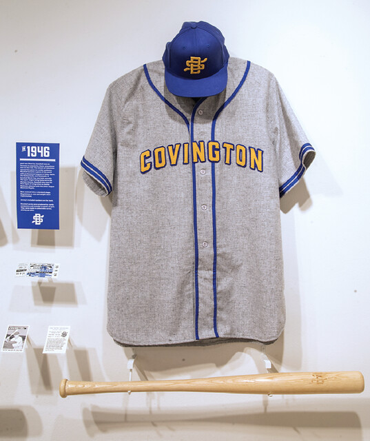
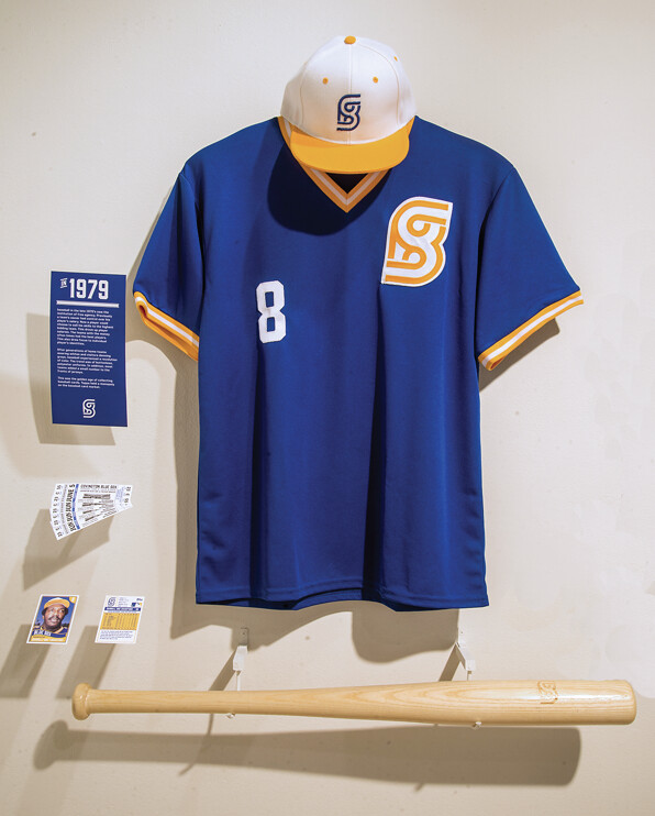
The jerseys you see above are what the Covington Blue Sox wore in 1946 and 1979 — or maybe they’re what the Covington Blue Sox would have worn if the team had existed in 1946 and 1979. In reality, the Covington Blue Sox, who were charter members of the Federal League, only existed for part of the 1913 season, after which the owners moved the team to Kansas City and renamed it the Packers.
All of which got Jake Staubitz wondering. What if the Sox had stayed in Covington? What sort of history might they have had? How would their look have evolved? Jake, a graphic designer who’s about to graduate with a BFA from Northern Kentucky University, decided to address those questions for his capstone thesis project. You can see his full re-imagining of the Blue Sox here.
Meanwhile: New ESPN column today — the annual Uni Watch Holiday Gift Guide. Enjoy!
Collector’s Corner
By Brinke Guthrie
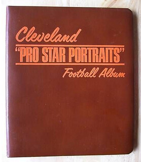
Here’s something new (at least to me) from the Volpe Files. We’ve all seen the famous Pro Star Portraits he did, but how about this Browns “Pro Star” three-ring portrait album? Seven players are included, along with a 1970 NFL game schedule. The seller also has albums from the Packers, Lions, Bears, and football Cardinals.
You say portraits aren’t your bag? Then check out the rest of this week’s eBay picks:
• Nice cover art on this 1975 Roundy’s Food Store Packers player photo album.
• From Uni Watch membership card designer Scott M.X. Turner, this Etsy collection of 1965 MLB pins from “8 Guys Potato Chips.”
• From reader David Firestone, here’s a program from the first game in Raiders history, a 1960 preseason game against the Dallas Texans!
• Here’s a nice-looking early-1970s SD Chargers poster.
• Will Scheibler sent along this 1970 St. Louis Blues Stag Beer player brochure and matching window sign.
• What makes the Juice run? Juicemobiles, of course.
• Get yourself a battery and you’ll have all you need to make this 1980s Citibank Yankees promo digital watch work. Hopefully.
• Check the logo work on this early-1970s MLB blanket!
• This early-1970s Buffalo Sabres coffee mug looks to be in great shape.
Seen something on eBay or Etsy that you think would make good Collector’s Corner fodder? Send your submissions here.
Blazers contest reminder: In case you missed it last week, I’m soliciting entries for a Blazers redesign contest on ESPN. The deadline is Dec. 9, and the results will be published on ESPN soon after that. I look forward to seeing your designs.
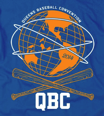
ITEM! Big event on the horizon: Shannon Shark, who runs the excellent Mets Police blog, has put together what should be a swell event: the Queens Baseball Convention, which will take place at McFadden’s on Jan. 18, 2014, from noon into the early evening.
The QBC will basically be an all-day Mets-apalooza, and there will be at least three uni-reated components:
• I will be conducting a pub quiz-style trivia content focusing on Mets uniforms.
• Mike Cesarano, curator of the Mets uniform timeline, will be conducting a presentation on Mets uni history. (I may be involved in this presentation as well, although the details are still being worked out.)
• There will be a “jersey parade,” in which fans can wear their favorite (or most obscure, or whatever) Mets jerseys. I’ll be taking part in the judging to pick the best and most interesting jerseys of the day.
There will also be lots of non-uni stuff, including autograph sessions with former Mets Ed Kranepool and Ron Darling; presentations by Daily News columnist Anthony Martino, ESPN.com columnist Mark Simon, and Faith and Fear in Flushing blogger Greg Prince; a scavenger hunt for kids; and a lot more. You can see the full schedule of events and purchase tickets ($35 for adults, $10 for kids) here.
Shannon Shark, the Mets Police honcho who’s putting all of this together, is a smart, can-do guy who makes stuff happen (he pretty much single-handedly convinced the Mets to bring back Banner Day). I’m excited to be part of his event and have no doubt that it’ll be a good time. Hope to see lots of you there.
Tick-Tock: Today’s Ticker was compiled and written by Garrett McGrath.

Baseball News: No photos, but C. Trent Rosecrans says that the Cincinnati Reds are going to unveil their new camouflage and St. Patrick’s Day uniforms on Friday afternoon at Redsfest, a two-day event happening at the Duke Energy Convention Center.

NFL News: The Arizona Cardinals will wear all-red bloodclot uniforms this weekend. … Reprinted from yesterday’s comments: What if the Panthers had been born in 1955, instead of 1995? Their visual history might look like this (from Matt Stevens). … When Andrew “The Giant” Luck isn’t quarterbacking, he is designing headphones (from Tommy Turner). … Nike doesn’t know how to spell Gale Sayers’ first name correctly (from Kyle Clifford).

College Football News: Here is a complete look at the throwback uniform that will be worn by Baylor this weekend. … The ACC revealed the patch that FSU and Duke will wear this Saturday during the conference championship game. … Fresno State will wear all-black this weekend during Saturday’s Mountain West Football Championship (from Richard Paloma). … You know those little gold pants charms that Ohio State players get after a win against Michigan? OSU QB Braxton Miller was wearing his gold pants from a previous season during last weekend’s game against the Wolverines (from Kyle Shaner).

Hockey News: Hello fellow Parrotheads! The Minnesota Wild created a customized jersey for Jimmy Buffet. … On Jan. 5, 1974 the Soviet Union hockey team traveled to America and played the Seattle Totems of the Western Hockey League. Chris Mizzoni posted a photo and background on the match-up. I also can’t resist posting this: Toronto Maple Leafs 1964 ‘Colouring’ Book, fantastic stuff.

Soccer News: David Meyler of Hull City revealed a customized shin pad with the Irish flag and the names of his father, mother, and sister on it after scoring a goal vs. Liverpool (from Tanner Welch). … An article with minimalist logos for all 19 current MLS teams (from Anthony Nuccio).

Basketball News: Ad patches are one thing, but what if NBA uniforms were basically just delivery devices for larger corporate sponsors? They might look like this (thanks, Phil). … The NBA Store in NYC started selling the Knicks Christmas Day shooting shirts. … Rhode Island College wore these illegible unis over the weekend during their loss to MIT (from Robert Gelles). … Georgia Tech wore all-black uniforms on Friday during their loss at the Barclays Center (from Richard Musterer).

Grab Bag: Interesting article on how premium seating revenue is driving stadium design (from Matthew Walthert). … You have been waiting for it, a New York City Super Mario Brothers Subway map. … Leo Strawn Jr. was helping a friend go through some old boxes when they came across lots of cool vintage stuff, including things from the WFL, NASL, and the Olympics.
Aside from the 10 year anniversary logo which doesn’t seem like something a team would’ve done back then, that 1955 Panthers concept is really good. I hope he does the same thing for the Jaguars. Both teams were born in the same year, after all.
Yeah, the 10th anniversary patch seems a bit early in NFL history to rear its head. The Seahawks and Bucs wore 10th season/anniversary patches in 1985. Maybe someone knows of an earlier example.
A quick persusal of the Gridiron Database, here are the earliest examples I could find….
1984: Cardinals and Bills wore 25th season patches
1983: Lions wore 50 year team patches
1969: All teams wore NFL 50th patches.
There are miscelleaneous City centennial, etc patches here and there for some teams
The original 8 AFL teams all wore a 25th anniversary patch in ’84…though 1 team had them sewn onto their pant leg instead of their jersey:
link
Dallas had one as well that year:
link
Pittsburgh wore a 50th season patch in 1982:
link
The Chiefs wore patches celebrating the 10th season of the AFL for Super Bowl 4; none of the other teams from that league wore them during the regular season.
OK, so it seems like the earliest examples of anniversary patches are for silver or golden anniversaries of the team, or centennial celebrations for the cities. The KC Chiefs had a patch for the about-to-get-merged League for the final game in that league’s history.
So I’ll posit a theorem: “just a” tenth anniversary patch tends to be a merchandising move for modern expansion teams who have no history to celebrate, e.g.: Tampa Bay Devil Rays, Columbus Blue Jackets, and Charlotte Bobcats.
Following the theorem, the faux-10th anniversary logo for the imagined pre-history of the Carolina Panthers, while awesome as a piece of graphic design art, is probably anachronistic. In theory, it could have been done, but in practice, it probably wouldn’t have existed.
I can imagine some sort of anniversary logo (although nothing as well-designed as what Matt did for the Panthers) appearing on stationery, but ’65 is much too early for a uniform patch.
Wow, the Carolina Panther visual history of Matt Stevens could be an entry all by itself! Great stuff and incredible details. Hopefully someone in the organization is looking /listening to Matt’s ideas. Almost everything he did (from logos to graphics) is better than what they currently have.
Ditto what ‘dumb guy’ said as the Jaguars could use a faux history as well.
Sorry that was ‘The Jeff’ whose suggested the Jags redo.
I agree that the 10th anniversary likely wouldn’t have been given a logo, I just want to say I LOVE THE 10th ANNIVERSARY LOGO! There’s a complex simplicity about it that is sorely missed from modern designs.
Wow. I love that link so much more than anything the team has ever worn. It should be link today, but only if the football is included.
Absolutely. Whimsical and fun.
I love the Panthers faux history, especially that original logo. I’m not at all a Panthers fan, but I would totally rock that logo on a Carolina blue t-shirt.
I totally agree. That panther might be the best thing I’ve ever seen on this site.
And the brilliance of the 10th anniversary logo is that it perfectly evokes the design sensibilities of the mid-sixties. It’s wonderful.
The Stag/Blues brochure is cool. I like the way they give the goalie a little inset photo of his actual face!
It’s hard to see, but I believe the photo is of coach and GM Emile Francis, who was a goalie but retired as a player in 1960, seven years before thr Blues started playing. He played for the Hawks and the Rangers.
Is it just me or link?
Same reason sports teams are – the stuff sells.
Man, I LOVE “alternate” histories like we see in these two different entries today. I have notebooks from my childhood where I designed entire leagues with uniforms, logos, etc. Now granted, most of those probably suck (even for a 10 year old), but it’s just always been something I enjoy.
The Covington Blue Sox logos and uniforms are better than anything Brandiose would do for a current minor league baseball team.
The 1946 jersey is a beaut’.
Yes and no. While I like Jake’s work better than most recent Brandiose work, Jake’s project suffers from the same basic flaw as most Brandiose work: It’s overdesigned. The 1913 and 1946 team/cap logos feel 20-30 years ahead of their times. Each is an example of what a team would design today to try to build a “retro” look, not what a team would have actually worn at the time.
Beautiful uniforms and a terrific project, but the Blue Sox exhibit is different in degree, not kind, to recent Brandiose work.
Not sure I agree, but even if I do that’s one hell of a degree.
That “C” cap logo is brilliant.
Show us a similarly rendered real team logo to either the 1913 or 1946 cap logos from <20 years of each date, and I'll reconsider. It's sort of like the difference between history and historical fiction – like a Flashman novel, Jake's Blue Sox are better than the real thing would be. (As in, the actual 1913 Blue Sox didn't look nearly as sharp as Jake's 1913 uniform.)
Which criticism in no way takes away from the overwhelming awesomeness of the project and Jake's work. It's fantastic, and I wish I could see his exhibit in person. Note how the bats are each period-correct too!
Spot-on design work, Jake!
The logos you created remind me of the ones used by pre-1910 Pittsburgh Hockey Club (Pros?) and the pre-1940’s Pittsburgh Railways Company:
link
link
Scott, I might agree if we presuppose that 1913 Covington cannot be anything special in the design department, and only produces middle-of-the-road stereotypical uniforms.
But with teams mixing their uniforms up regularly, latter-day fans remember the distinctive designs the most and push the boring ones to the background. And if we take Jake’s designs to be “the most interesting 1910s jersey” or “the most interesting 1940s jersey”, then they look just fine.
Compare his 1913 Blue Sox jersey to link. Or their link (which in fact were even better-looking than this, because they had multi-colored socks).
Jake’s Covington look fits right in with these. They’re only as ahead of their time as other teams’ real uniforms were of theirs.
Agreed on both.
Hey Jake, if you’re reading this, how did you go about getting the jerseys and caps made up? They look great!
“… All of which got Jake Staubitz wondering. What if the Sox had stayed in Covington? What sort of history might they have had? How would their look have evolved?…”
There’s hope for the world. Way to be crazy, Jake.
Hey everybody,
Thank you all for your kind words and accurate criticisms. I love the Uni Watch community and have been getting inspiration from here for years. Brandiose is an amazing company that does knock out work. To even be mentioned in the same sentence made my day.
I agree with some of the criticism of the early jerseys not being historically accurate and over designed. It was a struggle to keep true to the eras and the design in place at those time periods. The project was for my graphic design thesis though. I needed to showcase good design throughout the project.
As far as how i went about making the Hats, Jerseys, etc. I work at a small sporting goods store in Covington. There we make Varsity jackets, T-shirts, just about everything for the local area high schools. Everything was cut and stitched in Covington. I handmade the bats on a lathe and had my logos laser engraved. I got blank jerseys from Ebbet’s Field Flannel, and Majestic.
Thanks again everyone, truly, I knew you guys would appreciate all my hard work. Start looking for big things to come.
Jake
Great work. What an exciting, hands-on thesis. My business education thesis pales in comparison. Heck, I can’t even remember what is was about. No way you forget yours. Good luck!
Eggleston-Maynard???
If so, I got my high school varsity jacket there back in the day.
Simply amazing work. I love the gold on blue lettering on the grey jersey.
Today’s ESPN column is up:
link
Has anyone else noticed that the girl in this Army commercial bears an uncanny resemblance to Duke basketball coach, Mike Krzyzewski?
link
That is not a very kind thing to say…
I actually remember that Yankee Stadium watch giveaway. It was April 29, 1984, vs. Milwaukee. The Mets were also home that day, against the Phillies, and the link.
The reason I remember that is because both baseball teams had giveaways that day — Yankees watches, Mets strawberry sundaes (for “Strawberry Sunday,” as in Darryl) — and the Generals outdrew them both.
I’m going to try to attend that Queens Baseball event in January, assuming I’m not busy moving to L.A.
[BTW, in case I never mentioned it here before, and this is for Uni Watch peeps only, but I wrote most of link… :)
Got my tickets.
“Because of the double-sided tape used to stick jerseys to shoulder pads (making it harder to be held or tackled), sewing becomes a more efficient option than switching to a backup jersey”
From Pat Forde on Yahoo.com talking to Auburn’s equipment manager about using the sewing machine on the sideline.
link
That ACC championship patch is really no surprise. It’s nothing different from the one used every other year.
I think the Yankees/Citibank watch was a regular promotion for a while, I recall having an all blue one from about 1987 or 1988.
Am I forgetting a corporate logo, or are the Raptors sponsored by Sheffield Wednesday in that NBA/ad mashup thing?
It appears to be for link, Toronto native Drake’s record label.
The line-art owl has also been used by link.
“… David Meyler of Hull City revealed a customized shin pad with the Irish flag and the names of his father, mother, and sister on it after scoring a goal vs. Liverpool (from Tanner Welch). …”
Jaysus, son, get a grip.
“.. An article with minimalist logos for all 19 current MLS teams (from Anthony Nuccio)…”
Meh.
“Meh” is about right. They’re not so much minimalist as they’re just existing logos with text taken out and the edges rounded.
Yeah, the minimalist MLS logos are pretty bad. Flattening them down creates some odd distortions. Almost reminds me of 8-bit art.
Can’t say I dislike the Christmas shooting shirts. The ugly sweater is a theme I’d like to see more in sports.
Then again, why do they need shooting shirts when the jerseys are sleeved?
Just finished redesigning this website that features quality t-shirt designs of forgotten sports teams: link. Thought it would be of interest for those looking for unique Christmas gifts.
This is my favorite: link
Forgotten AND no longer trademark protected?
The way intellectual property works in this country, a trademark is only good as the legal department willing to put up a fight. So basically, if the organization isn’t actively sending cease-and-desist letters, you can infringe as much as you want.
Sad commentary.
..or limited by the integrity of people not willing to steal it.
those “historical” creations for the panthers are AWESOME! I would buy that stuff compared to the crappy USFL looking garbage they actually wear.
ABSOLUTE GENIUS!!
Don’t insult the USFL by lumping the Carolina Panthers in with it. Every USFL uni was better than what the Panthers wear (particularly the USFL Panthers of Michigan….)
Aside from the over-use of silver and gold, the USFL was a good looking league.
If I stretch my imagination, the ’84 Chicago franchise’s uniforms sorta resemble what the Carolina NFL team currently wears.
Will Ferrell as Ron Burgundy at the Roar of the Rings. Wears a kilt when joining the TSN broadcast crew. Also throws out rock at opening ceremony, Glenn Howard shares a doughnut with him, signs a cowbell for fan, etc.
link
link
here’s a longer video
link
Say what you will about his movies, but no one out hustles Will Ferrell when it comes to plugging ’em.
The Baylor throwbacks are sharp.
Ugly Jerseys for LA Kings/ Anaheim Ducks Stadium series posted:
link
link
I’m ok with the Ducks one, but for a game being played at night, I don’t think the grey Kings are going to look good. They should have gone with a bright white that would pop more.
I hate to bash someone’s work, especially another reader, but those Forward Progress gothic logo t’s just look like counterfeit shirts that don’t have the league’s license.
Hey Brinke, it’s just “Guys Potato Chips”, a long-time Kansas City brand. There are 8 pins.
I’m kind of concerned for the people who are saying this project was designed too well on account of this was a design project? I think Jake did an amazing job and really captured the essence of the age and even made improvements.
link Is it just me, or is someone at Buzzfeed bored?
Nah, that’s just standard Buzzfeed content. Listicles = ultimate click bait.
I wish I had a time machine so that I could travel back in time to five minutes ago and tell myself not to read that.
New Royals BP Cap? I don’t remember them having a gray one in 2013.
link
Good spot. Yes, that’s new.
Also wondering if the rays are going to have a new alternate jersey this year. In the majestic catalog, when it lists all the jerseys and their colors and codes it gives you, the normal rays white, gray, navy blue, and a Columbia blue jersey, but the fifth one says “navy and Columbia blue” so is there something in the works there?
BP jersey?
Question after looking at the Baylor throwback unis and having watched its basketball team wear the day-glow unis in Maui- how is it that Nike has the contract for Baylor’s football uniforms and Adidas has the contract for its basketball uniforms? I would think that both companies would insist on having a contract to outfit all of the school’s major sports teams so that they could develop a consistent look for the school.