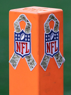
So long, Pinktober; hello, GI Joevember. That was the message yesterday in Dallas, where the Cowboys and Vikings kicked off the NFL’s annual “Salute to Service” pandering promotion. That meant lots of camo — on the goalposts, the pylons, the captaincy patches, the gloves (interesting tape job on Adrian Peterson’s bare hands in that second shot), and even the towels. In addition, both teams wore camo ribbon decals and military unit logo decals, and the coaching staffs wore olive drab sweatshirts with camo ribbon patches (which were also worn in at least one other game [also note Rex Ryan’s camo cap brim]). Whole month of this, spread out around the league, should be even more (read: less) fun than Pinktober.
• The Rams wore their royal blue throwbacks (lots of additional photos here). They abided by the NFL’s new one-helmet rule by keeping the same shells and just changing the horn decals from bronze to yellow (which I think is what they’d been doing in recent years anyway, no?). Very disappointing to see that the throwback jerseys still have the neck roll, which is unnecessary and historically inaccurate. Boooo!
• In a surprise (at least to me), the ’Skins wore throwback jerseys ). They couldn’t wear the leatherette helmets like they did last year, due to the NFL’s new helmet rule, so they went with their usual lids but removed the center striping. Lots of additional photos here.
• The Panthers wore their blue alts.
• The Bills wore white at home against the Chiefs.
• The Titans wore their Bud Adams memorial patch for the first time. Since they already had a 15th-anniversary patch, their captains had a bit of patch overload.
• Speaking of captaincy patches, Cowboys tight end Jason Witten’s was coming loose.
• See that little dark smudge at about the four o’clock spot of Steelers defensive coordinator Dick LaBaeau’s cap logo patch? That smudge is his initials — “DL.” Was it really that important for him to have that specific hat?
• The Texans wore their red alts (and J.J. Watt’s suffered a small tear).
Turning to Saturday’s college action, Phil and his contributors had a good rundown in yesterday’s entry, so you should start there. But here’s a bit more:
• Yesterday’s entry mentioned that the TV numbers on Iowa’s quarterbacks appeared to be positioned toward the front of the jersey, instead of being centered on the shoulders. Unfortunately, there were no photos, but now we have these. You can compare those TV numbers to the non-quarterback numbers shown here.
• Sam Houston and Stephen F. Austin played a particularly brutal color-on-color game. It’s the third straight year that these two teams have gone color-on-color. There’s a short video clip here.
(My thanks to all contributors, including Drew Arnson, Matt Barnett, Eric Carson, Doug Keklak, Chris Mycoski, Bill Wallis, and of course Phil.)
Raffle reminder: Today’s the last day to enter the raffle for the classic old NHL poster. Details here.

’Skins Watch: Here’s a vote for the ’Skins to be renamed as the Washington Red Clouds (thanks, Phil). … Did you know that November, in addition to being GI Joevember, is also Native American Heritage Month? It’s true! And guess who’s at the head of the line to celebrate Native American heritage? The ’Skins, of course! As you can see, in a nice stroke of irony that perfectly encapsulates how this storyline has been developing in recent months, they chose to begin their month-long celebration of Native American Heritage by posting a photo of the team’s first coach, Lone Star Dietz — a man who masqueraded as a Native American but was actually a fraud. Can’t wait to see how the rest of the month plays out! … Washington Post sports columnist and longtime ’Skins critic Mike Wise says the real problem regarding the team’s name is Roger Goodell, not Dan Snyder (from Tommy Turner). ”¦ The Niagara IceDogs — that’s a Junior A hockey team — wore throwbacks on Friday, recalling the franchise’s old days as the St. Catherines TeePees. “The team name like wouldn’t fly now,” says Daniel Pilon. “But at the time it was because the team’s sponsor was Thompson Products — TPs.”

Baseball News: You know how teams now routinely wear gold-accented uniforms for the Opening Day after winning the World Series? Someone on Reddit mocked up how those uniforms might look for all 30 MLB teams (from Zach Brady). ”¦ The Samsung Lions won their third straight Korean Series title and seventh overall on Friday. Here’s their championship logo (from Dan Kurtz).

NFL News: This is interesting: The Hungry Hungry Hipster was poking around at a vintage shop and found a bunch of old NFL apparel labels with unfamiliar logos. “I’m guessing they are all from the early ’90s and that they were meant to be sewn on NFL-licensed clothing sold outside the United States, probably the UK,” says HHH. Anyone familiar with these logo designs? ”¦ Last night’s broadcast of 60 Minutes featured a segment on Alabama coach Nick Saban, which included a glimpse of a red NFL shield (from Chris Flinn).

College Football News: A new Wounded Warrior design will be unveiled today by Northwestern (from Tim E. O’Brien). ”¦ Blackout on tap this weekend for Baylor (from Matthiew Mitchell). ”¦ Middle Tennessee State will be desecrating the flag this weekend. ”¦ Ditto for UTSA.

Hockey News: The Pensacola Ice Flyers went GI Joevember on Saturday. “Blech,” says Ryan Bohannon. ”¦ The Minnesota men’s hockey team is using the new Nike template, with the elongated/tapered shoulder yoke. “The visible stitching makes it look like an Asian knock-off,” says Michael McGivern.

NBA News: The Pistons debuted their Motor City alts yesterday. I like! ”¦ Last night was the Thunder’s home opener, and they marked the occasion buy wearing an Oklahoma-shaped patch to mark the state’s strength in the face of the devastating storms from earlier this year.

Grab Bag: Faaaascinating analysis of how people wear a backpack with one strap vs. two straps. High recommended (thanks, Kirsten). ”¦ Here’s a talk with the designer who designed the U.S. Olympic freeskiing uniforms (thanks, Brinke). ”¦ Also from Brinke: Tennis player Tomas Berdych now has his own apparel line. ”¦ I watched the NYC Marathon for about an hour yesterday (the route goes right by the corner half a block from my house), but I didn’t see this guy. ”¦ Good article on the progression of the Queensland Reds’ rugby uniforms (from Murray Conallin).
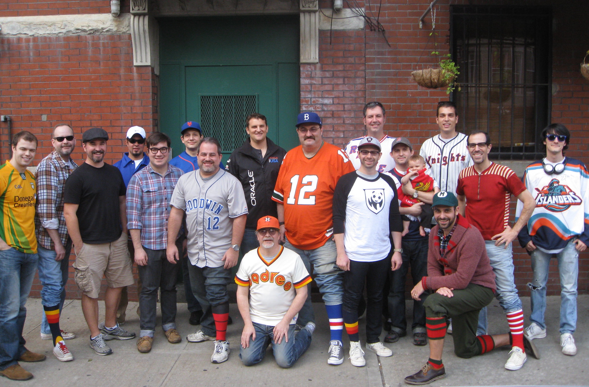
Photo by Jesse Buccafusco, diagram by Rob Holecko; click to enlarge

What Paul did last night on Saturday: Good times on Saturday afternoon here in Brooklyn, as a bunch of Uni Watch readers gathered at Sheep Station to trade stories, show off jerseys, and complain about the dire state of baseball pants (among other weighty topics). Phil and I didn’t get or remember everyone’s name, but here’s what we’ve been able to piece together:
1. Daniel Smith 2. Phil Hecken 3. Chance Michaels 4. ?? 5. Garrett McGrath 6. Marc Rivelin 7. Jay Braiman 8. Brad Eckensberger 9. Walter Helfer 10. Matt Brotman 11. Ross Bergman 12. Keith Goggin 13. Matt Solly 13 ½. Chester (aka the Littlest Uni Watcher) 14. Derek VanEmon 15. Marty Buccafusco 16. Paul Lukas 17. Sam Davison
If we missed your name or got it wrong, please let me know and I’ll update the list pronto.
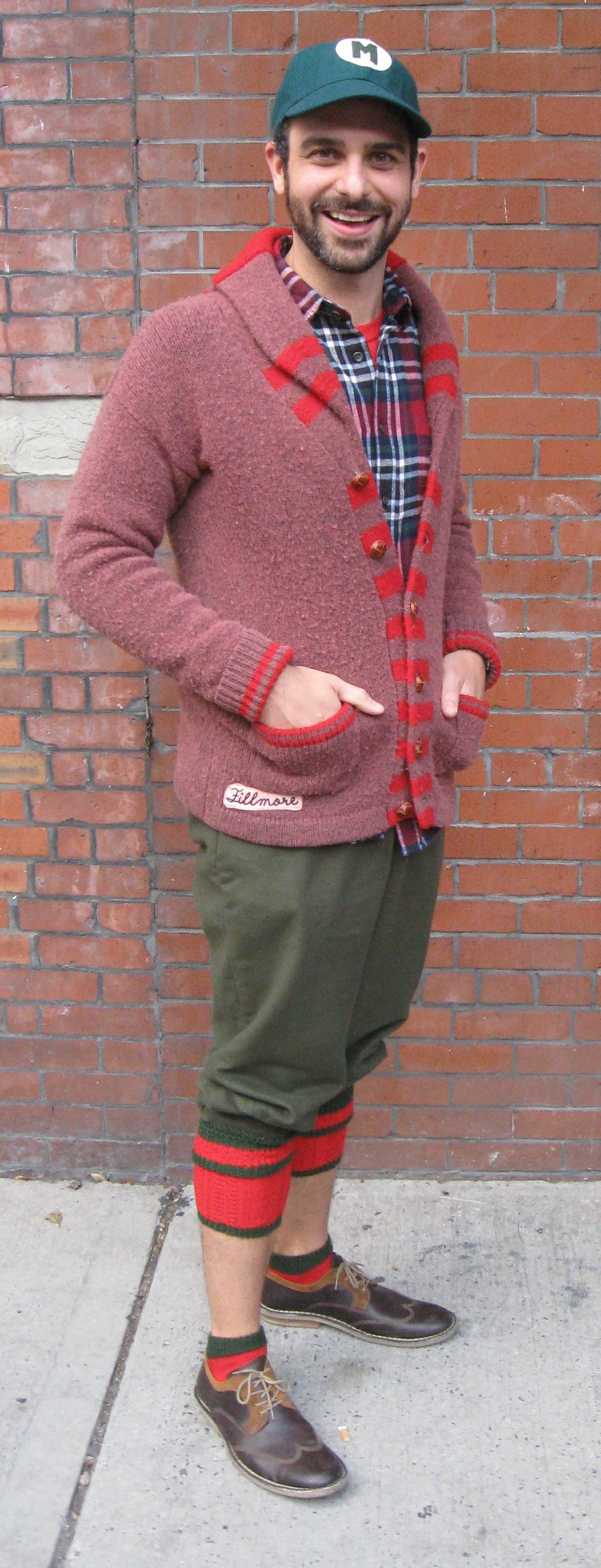
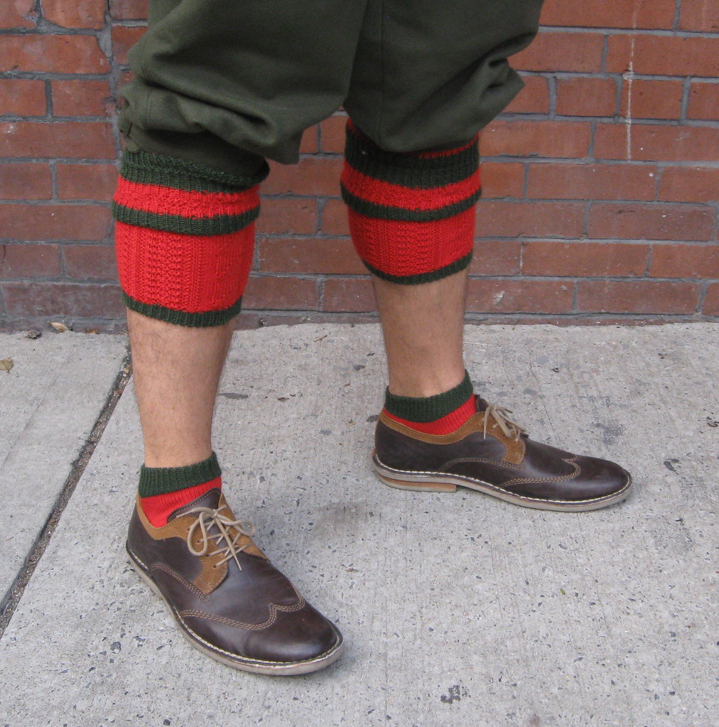
The star of the show, at least sartorially speaking, was Marty Buccafusco, who wore an All American Girls Professional Baseball League cap, a vintage curling sweater, heavy wool Scottish knickers, and some absolutely killer two-piece Bavarian socks (click to enlarge):
I was particularly happy to see longtime reader/contributor Chance Michaels, who had originally said he wouldn’t be able to attend because of his NYC Marathon preparations but managed to show up after all. He brought along something really, really cool: a set of old Milwaukee Brewers cufflinks that he found in a Milwaukee antiques shop years ago. As you can see, these are clearly from the old minor league Brewers, not the big league incarnation (click to enlarge):

I also want to thank Marc Rivelin for the very nice Mets shirt he gave me. I’ll post a photo of myself wearing it soon.
Big thanks to everyone who showed up — it was, as always, a pleasure and a privilege to meet all of you.
When i was in college in the late 80s, it was the fashion to carry a backpack with only one strap. Nowadays, it seems like younger people i know use both.
(I now always use messenger/carrier/computer bags.)
Yeah, ditto to all that (except that I was in college in the early 90s) for me.
I graduated from high school in the mid-90s and I’d say about 99.3% one-strapped. But then I spent the summer before my senior year in New York and found apparently cool kids two-strapping, and my mind was blown. That was the way of the future.*
By the time I finished college, two-strapping had began to spread.
*Another thing I saw was kids one-strapping across their chest. I believe that was the harbinger of the cross-strap messenger bags that were to become popular in the early 00s.
One-strapping was de rigueur at my small British high-school in the mid to late 90s, at least until record bags replaced backpacks around 1998. No matter how heavy your bag, wearing it on both shoulders was a quick & easy way to mockery (as I found out, every single day).
Nowadays I rarely see kids single-strapping – most of the people I see rockin’ that look are in their 30s or older.
Wow.. whenever I carry a backpack nowadays (which is rarely), I always carry it by one strap, as I did in high school/college in the early nineties, it just feels comfortable. I had no idea that was something that wasn’t done by the kids anymore.
Oh, and the Slate story gets it right – skaters and rap nerds, as well as the general acceptance of geeks made two-strap mainstream.
Skaters need balance (and a place to hang their boards), and rap nerds were walking around with a pile of CDs.
Just to add to Slate, “back-pack rap” was really a mid-90s thing in response to hip-hop becoming mainstream and very glitzy. Back-packs vs shiny-suits. Kanye’s backpacking was in homage to the earlier “era.”
One strap all the way when taking BART into SF.
At my high school in the early 00’s two strapping was the way, but you also had to let all the slack out of the straps so that your backpack drooped way down over your ass. Tightening them so that you actually had proper support was considered lame and was occasionally done to mock others.
Sounds like my late-90s high school experience.
I actually used the belt strap with both shoulders in the mid-90s in Jr. High because taking all of my books home was too heavy not to add the support. It was lame, sure, but it was a weight off of my shoulders.
Two-strapping is better for the back.
Class of ’98 in Los Angeles (South Central) two straps tight was the way to go. Although as a freshman single strap was the ONLY way. I think location of school and timeframe are the big factors.
Any word when MLB teams will start doing their “updates” for next season re:new unis/caps etc?
Even with the color clash between helmet and jersey, those Skins throwback unis are among my favorite uniforms in all of pro sports. Even if I were personally invested in keeping the name, if the team adopted something like those unis at the same time as it changed name and logo, I’d consider it a worthwhile trade. (Not really intended as a comment on the name debate, just a measure of how very much I love those Skins throwbacks.)
I thought the helmets were surprisingly nice looking without stripes.
I wonder if Snyder demanded the logo remain. ????
I’m sure that within Skins HQ, the culture is such that Snyder wouldn’t have to “demand” that. Once the queen bee says, “NEVER, and you can print that in caps,” the worker bees don’t really need the details spelled out.
Plus, my personal experience is that run-of-the-mill Skins fans generally disliked the plain, leather-look helmets last season.
Both the ‘Skins and Rams looked “not bad” in my opinion.
Somebody had mentioned this before, but I wonder if teams will start “overlaying” large decals to the existing helmets next year, now that they have time to prep.
Forgetting about the ‘Skins name issue and the throwback accuracy, just on the aesthetics, I thought the stripe-less Redskin helmet looked good.
Those that don’t like it, I think it’s just because it’s what we’re used to, just as the Bears helmet with stripes would also probably look funny to us.
Would switching out the yellow facemasks have softened the blow a bit?
The black ones the Redskins used with the leather-looking helmets are just laying around the equipment room, right?
I’m surprised someone actually took the time to do a gold accented Astros jersey to imply they won the World Series.
My sentiments exactly, but for the Cubbies.
Oh Reddit, why do you give us Cubs fans the ol’ screwgie like that? Not nice. Not nice at all.
Didn’t the NFL make a rule about not allowing alternates in Primetime national games?
I wish the Rams would stick with those unis, but get a blue helmet that matches the jerseys and throw a gray facemask on there. They do that and they have a top 5 NFL uni IMO.
I’d like to see the Rams go to something similar to that uniform, but not a direct throwback (and no gray facemask, ever), kinda like the Giants did in 2000, before they updated to be more historically accurate and uglier.
I’m also kinda curious if the Redskins’ burgundy has actually varied that drastically over the years, or if the darker color for the throwback uniforms is just the result of misinterpreting old photos.
I know Lombardi took a little heat for dressing his players in a link. Not because he was color-blind (which he was, but I don’t know what type), but because his brother worked for a manufacturer and that was the version they offered).
That headline – sheesh!
The Rams, Redskins, Panthers, and Texans all look better in their throwback/alternate unis. I know that is subjective, but seriously: all those jerseys (other than the Skins’) add a much-needed splash of color to the league. Too bad we’re restricted to only seeing those once or twice a year.
I don’t understand why the NFL won’t allow teams to switch out just the helmet shell and use the more important inside padding in the alternates. It doesn’t make any sense but I guess there’s no money in it and that is what drives every NFL decision.
Grammar question, Paul, if you don’t mind. Did you intend to use “unnecessarily” in the first bullet point? While I can read it that way, it feels clunky compared to “unnecessary.” It doesn’t really change anything, I was just curious.
Right you are — thanks. Now fixed.
It’s not just Dick Labeau that has a “personalized” Steelers hat. Many of the players have their numbers inside the logo. Here’s a shot of Ben from yesterday, with the 7 above the wordmark.
link
.. and -1 to both Paul and I for spelling LeBeau incorrectly.
Thanks — misspelling now fixed.
Where are the pom-pons for the tops of those hats????
“This is interesting: The Hungry Hungry Hipster was poking around at a vintage shop and found a bunch of old NFL apparel labels with unfamiliar logos. Anyone familiar with these logo designs?”
Don’t know about the 4 small ones, but the large one in the middle was definately on apparel sold over here. I had a Rams sweatshirt with that tag (or a very similar one) on it.
I didn’t catch the Saban interview, but from the picture I might guess that is the wall that shows all the different Alabama players in the NFL. I know a lot of schools do that for different sports. If you see this link, Notre Dame has the NFL shield in gold. link
Number 13, holding the Littlest Uni Watcher, is Matt Solly.
Got it — thanks.
Oh, those Brewers cufflinks are killer!
The Rams had a slight edge on looking the best yesterday.
I wish the Pats would spend the bye week painting their helmets white, so they can have enough time for it to cure. I realize that wearing throwbacks against the Panthers doesn’t make ANY sense, but I really want to see Pat Patriot this season.
But then they’d need another week off to paint them back to silver.
I do wonder what Pat Patriot would look like on the silver helmets with a red/white/blue/white/red center stripe. I can’t imagine it would look THAT bad..
The New England NFL team has been using the ‘Flying Elvis’ logo for 20 years. How time flies!
They could always commemorate its’ 1993 debut by throwing back to these:
link
Sure, the blues won’t match up to the helmet logo, but accuracy doesn’t seem to matter thesedays.
Teams can change their helmet logos for throwbacks, just not the shells. So those’d be good.
The flying elvis logo did use the more royal shade of blue initially, and decals aren’t too hard to do. I do think that specific jersey stood the test of time better than the two-tone soccer jerseys they wore toward the end of the decade. I do think that once the Brady-Belichick era is over the Pats should do something to bring together the three main eras of color schemes.
I hope I’m not in the minority when I say I think the NFL should allow a more consistent use of third jerseys. I don’t think the third jerseys necessarily detract from a team’s identity; case in point, Houston and New England’s uses of red jerseys are natural extensions of their color scheme.
I know the original Flying Elvis jerseys are pretty much universally panned, but I think they’re pretty cool, if only for nostalgic reasons.
I’m not able to read UniWatch every day like I used to, so perhaps this has been discussed, but do Sam Houston’s pants look like a codpiece to anyone else? Those are embarrassing.
Yes, and they also have sports bra style jerseys. It would be difficult to intentionally make a more unappealing combo.
Only bad thing that Coach Fritz has done at SHSU. The brutal thing is the my alma mater dang near lost the football game. You don’t dang near give up 28 second half points. The Bearkats need to get solid orange britches, with a blue Nike logo/SH on the left hip. Awesome!!!! Black shirts or blue shirts with orange numbers would be great as well.
Check out the flag desecration from my alma mater Wabash College of D3
link
Also notice the Makers Mark tattoo on the right leg. Kids these days
Seeing the Redskins’ normal helmets coupled with the throwbacks really emphasized how much better the darker burgundy and old gold look than the current color scheme.
Aren’t the non-Houston Texans football games at Reliant Stadium supposed to be played on AstroTurf instead? I saw that SFA and Sam Houston State played on the grass surface.
I also thought that was to be the case Marcus. Maybe it is for later in the season when numerous high school playoff games will be played at Reliant?
I don’t know if logistics played a role in the decision about the surface, but Harris County and SMG World had better be careful not to put too much wear and tear on that grass so that the Texans have a decent surface on which to play. High school games and UH’s 2013 football schedule (incl. the Rice game) were driving forces behind the AstroTurf installation for non-Texans games.
The Cougars play some games at “The Bank” (BBVA Compass Stadium). Plus its Texas Southern’s home stadium.
Photoshop is the only way the Mets will have a championship jersey in the next ten years.
Texas Tech is NOT releasing new uniforms today. They unveiled them last week
Shit — I thought they had *another* uni planned to show for today. BUt you’re right, they don’t. Will remove from Ticker.
Living in the south, I doubt we’ll have a Uni Watch gathering down here but I really enjoy the community this site has built among a fairly random group of strangers. Good job Paul and Phil for doing what you guys do.
I love traveling in the South and find myself there from time to time. So a Uni Watch party could happen there — don’t give up hope!
Also: You’re always welcome to organize your own Uni Watch party without me. Do it!
What’s up with the camo ribbons? The tradition is a yellow ribbon during wartime. Are the people in NFL HQ so disconnected from ordinary American life – and from actual military service – that they don’t know that we still have tens of thousands of servicemen and women in active combat zones? That American families experience the deployment of mothers and fathers to the Afghan theater every month? That Americans are still facing enemy fire on the front lines every day? That our brave men and women are still taking casualties every week?
Or do the people who run the NFL know full well that we’re still in a yellow-ribbon situation, and they just don’t give a shit, because they figure that camo will sell more merchandise?
Still, whatever color the ribbon, you know what would be awesome? If the NFL let all the military veterans who play pro football wear a special helmet decal or jersey patch or something to signify their service. And not just in November, but all season long.
That’s an instance where I could get behind the camo ribbon. Swap it out for the NFL shield on the helmet.
How many NFL players have been in the service????
Not a great many I should think.
^^ should read “How many active players….” (the ones wearing the helmets/jerseys).
?
I doubt it’s very many, but academy graduates do sometimes make it to the pros.
Exactly. I can think of 2 players who took time off of their football careers to serve since 9/11, and no veterans who went on to play in the NFL. Meanwhile, 14 NFL players served in uniform during WWII and Korea, which together lasted less than half as long as the post-9/11 wars. Heck, at least one Vietnam vet recovered from devastating leg injuries to play for the Steelers. Where’s today’s Rocky Bleier?
And far from “net proceeds” on some merchandise, during WWII, the NFL regularly donated the entire gate receipts of games to service charities. Pre-season games, sure, but the NFL raised more money that way than any other sports league.
But you can tell that today’s NFL is all about the patriotism, because camo ribbon and helmet flag.
Whatever the reasoning is, the most important part is the following.
” Proudly partnering with the Pat Tillman Foundation, USO, and the Wounded Warrior Project, the NFL will donate 100% of the net proceeds from Salute to Service merchandise to help honor the sacrifices made by our military. “
“to help honor the sacrifices made by our military.”
~~~
What does that mean, exactly?
“100% of the net proceeds”
Net. How marvelous.
Not trying to be difficult here, but the holiday in November is called veterans day, not active military day, so maybe that’s why it’s more broadly military, as opposed to the yellow ribbon to support active combat folks. Maybe? But the camo sellability that you argue is probably the correct answer here.
I’ll also refrain from lamenting about the lack of salute to other types of public service that are much more thankless, albeit less life threatening.
Phil, that’s exactly why I’m so bothered by the camo. Veterans don’t wear uniforms, camo or otherwise. And why a ribbon at all? What’s the cause here that requires awareness? Traditionally, what color ribbon do we tie around trees to remember our veterans? No color, because we don’t tie ribbons around trees for people who’ve already come home and left the service.
Now, many veterans do face real challenges that ought to inspire commitment and action by the general public. High unemployment. Lack of adequate medical care, especially mental health. Disrupted families. Congress cutting benefits veterans bled to earn. Whatever color ribbon stands for any of those, if the NFL switched to that, I’d be all for it.
But a camo ribbon? That says “veterans, and only veterans,” to literally nobody in America. Which is understandable, since it’s not meant to say that; read the NFL’s own press releases, which talk equally about those currently serving as veterans.
As imperfect as it is in execution, that’s why I prefer the link worn in British sports. It’s somber, noticeable yet not intrusive, and unambiguous in its aim.
The poppy in england and canada has become one of things where people get castigated for not wearing them, like american politicans who dont wear flag pins.
Great to see everyone at Sheep Station. Sorry I couldn’t stay longer – next year for sure!
How’d you do in the Marathon, Chance?
I didn’t set the world record, but I finished before Monday morning. I consider it a big win.
Hadn’t realized just how big this city is before yesterday…
Those are amazing cufflinks Chance!
I found a bunch of the laughing Braves spring training hats in a Lids this weekend. I couldn’t believe they were still floating around out there. There had to be 10 of them.
I hope you bought a few of them, as they’ll be really profitable on ebay in a couple years.
not pictured: the only female at the party – jesse!
For the benefit of those not at the party, that’s because Jesse graciously agreed to stand in the middle of Douglass Street to take the photo!
Looking at that crew, If I was the only female in attendance, I would have offered to take the picture as well.
Several things to comment on, so I’ll just have it in one long post:
1. I like the Washington football team’s helmet better without the stripe. As their current logo is similar to that of their original logo in the 1930’s, I do have to give them some kudos to keeping the current logo on the helmet. With them, Green Bay, and Pittsburgh, I guess wearing your current helmet with a throwback that dates from the leather helmet days isn’t a bad combination. Just becomes problematic when it’s from about 1950 or later.
2. The Pirates already have gold accents anyways. In fact, on the mock-up, it makes the black jersey look not that much different than normal. Also, not to be a smart-aleck, but why are there ones made up for the Cubs?
3. Paul, did Sam at your party end up getting ribbed a lot for wearing an Islanders “fish sticks” jersey? I can only imagine…
Paul, did Sam at your party end up getting ribbed a lot for wearing an Islanders “fish sticks” jersey?
Not at all. There’s now a long-established tradition of wearing unusual (or just bad) jerseys to Uni Watch parties.
Gotchya. So the next time you make a trip out to Pittsburgh I’ll have to wear my Heath Miller bumblebee jersey or, if I’m able to get one by that point, a Steelers “Batman” jersey.
I have a pike on my front lawn for anyone who wishes to insult the Fisherman.
Well-played, Sam, from one Fisherman fan to another! Any name or number on the back?
Are you having Pallfytations?
Well, I have an opinion on the Islanders in general, and that was before link. Not as bad as link, but still…
I noticed that the ‘Skins jerseys yesterday had the logo facing forward on the right shoulder, but backward on the left shoulder, which looked odd directly under the helmet logo, which faces forward on both sides. Was that historical accuracy or an oversight?
I think that was period-correct for the 1937 Redskins uniform; the change was eventually made so that both patches were forward facing and then the patches were dropped altogether a season or 2 after that.
Perhaps someday the Redskins will go back to the feather center-stripe helmet (adding a touch of gold?), which would pair nicely with yesterday’s uniform set.
At several points along the path yesterday, I couldn’t help but notice that the marathon sponsor’s color meshes quite well with NYC’s colors. It’s appropriate that the city-wide marathon should be marked in link.
Constrast that with the colors of the Brooklyn Half, which this past year was clad in the borough’s new link.
And yes, those were the kind of things I was thinking of during the race. That and marveling at all the Norwegian flags – go figure.
Its been a nice coincidence that ING (orange) was the title sponsor.
Starting next year, the title sponsor is TCS, an Indian company. Their main colour seems to be baby blue.
Harumph. I’ve not been up on the news. But link.
The Road Runners have been known to link on occassion, so a blue ribbon won’t be too out of place.
And while we’re at it, the new logo sucks. I miss link.
How was your race BTW?
I watched the race on TV and got chills with the helicopter footage of the bridge, the fireboats, everything around the start. But I still don’t regret not running it this year.
Race was good. Learned a lot.
Yeah, it was very cool at the beginning. Although I was having Saturday Night Fever flashbacks, as it was my first time actually standing on that bridge.
The Seahawks honored the 1983 squad for being the 1st playoff team in franchise history. Interesting though, they had them wear the nike jerseys instead of the correct 1983 designs. Plus they had a special 30th anniversary logo on the sleeves.
link
I believe they also had the 1983 team playing in the first half? heh heh
The Bucs have had the their 1983 team playing all season except the first half yesterday.
The real winner was whoever rocked that Donegal GAA shirt.
Did nobody else pick up that the Statue of Liberty tag patch has a glaring grammar mistake: “American Football At It’s Highest Level”?
Ack!
Good spot! I noticed too when I took the photo.
Glad Pinktober is over but GIJoevember may be worse. Army, as was said on this site yesterday, is really the ONLY team that should wear camo. It is the ARMY.
As for the Redskins being named the Red Clouds, wouldn’t that just cause another problem? I mean the Native American Nation he represented may not like it. Just sayin.
But the difference is that the name will no longer be based on the color of NA’s skin nor will it be a slur.
Lots of fans or fanbases think their teamname is dumb/bad (OKC Thunder/NO Pelicans), but at least they’re not racist.
Yeah, as soon as we wipe out all the racist nicknames, then we can start worrying about the just plain bad ones.
Key to the Redskin/Red Cloud switch is the blessing from Red Cloud’s descendants. But if that takes place, it would be an excellent outcome. Who could be against that?
Don’t disagree which is what I was getting at. Without proper blessing of the name, you are back at square one.
The problem is that Red Clouds is a lousy name for a football team. I think they should go more local if they decide to use a name with the blessing of a native group.
Red Clouds would be far from the least badass or intimidating name in the NFL. (C’mon, Dolphins?) It’d be the NFL equivalent of Blackhawks. And given that Redskins is claimed to be a reference either to events or to people in Boston, not DC, and Red Cloud the man actually spent a lot of time in DC, Red Clouds would be a huge improvement in terms of local connection. (Then again, compared to Redskins, pretty much anything this side of Wizards would be a huge improvement in terms of local connection. Even if you’re cool with using racial slurs as team names, Redskins is just plain lousy for a Washington team, 80 years of use or no.)
The reason Red Clouds seems viable to me is that adopting it, with approval and participation by family or whatnot, is that it would allow Snyder to double down on his claims that the team was all about honoring Indians all along. The claim becomes more tenuous the further from the sound of Redskins that he gets. Red Clouds is close. Powhatans or Potomacs, not so much. Chickahomanys or Mattaponis, even less. Most name changes will feel like unconditional surrender to Redskins diehards, whereas Red Clouds would almost uniquely permit Snyder to claim, plausibly, that he was validating the Redskins “heritage” rather than abandoning it.
Also, couple of problems with reaching out to local Native tribes. First, they’re few in number, with several local tribal groups having only state but not federal recognition. Second, none of them are particularly well known nationally (heck, none are even well known locally). Third, they’re quite diverse and they don’t seem to be particularly coordinated, so even if Snyder could cut some kind of approval deal with one tribal group, he’s likely to face a public backlash from any number of other groups, and for a multitude of reasons. I just don’t see a realistic way to win the PR battle on the basis of working with any local tribal group(s).
link
The article is crap, and the costume even worse. This is one of the few cases where giving up purple is a bad thing.
Northwestern Flag Desecration uni’s… Yikes.
It was my privilege to represent New Rochelle at the Saturday Uni Watch Shindig. Of course, the proceedings sounded like a 33 record played at 45 rpms. Two dozens uniform watchers with a year’s worth of pent-up uni angst and only a few hours in which to say it! There’s no geekery like uni geekery, and I was thrilled to get my nerd on.
Speaking of frauds! Your beloved Oneida Nations Ray Halbritter is NOT EVEN A MEMBER OF HIS OWN TRIBE
odd that this gets swept under the rug here at Uni W…errr My Personal Psychotic Lib Nanny State Crusade To Change the Redskins Name Watch as it should be renamed
link
Wasn’t aware of it — thanks for bringing it to my attention. I’ll include that in the next installment of ’Skins Watch.
Update: There appears to be no conclusive evidence about Ray Albritter not being an Oneida. There’s simply a state representative who “claims to have papers” indicating that he’s not, which is a McCarthyite smear tactic:
link
If she’d care to produce those papers, we’ll all have something to discuss. Until then, it’s just innuendo.
Thanks for playing — we have some nice parting gifts for you.
reading the story, it is less McCarthyism as it is this attorney trying to garner attention to the case of her client who engaged in legal action with Albritter. Maybe she does have papers as she claims but she will at some point have to produce them in the legal case I suspect. To me, it just seemed like yet another attorney grandstanding. We all know THAT never happens.
Yeah, I saw that particular nugget trotted out in a Daily Caller article, which set off immediate alarm bells for me.
Attacking the messengers rather than debate the issue on its merits?
Yep, we’re right on schedule.
But but but but but but but but but but have you read the article?
In early 2012, Halbritter attended a high dollar fundraiser with President Obama and 70 Indian leaders that raised $2.5 million for the president’s re-election campaign.
He attended a fundraiser in 2012! For Obama! In the early part of the year! ZOMG!
Y’know…
It’s not appropriate for here, but I’d love to someday see a poll conducted that asks if you’re in FAVOR of KEEPING the name, are you a registered REPUBLICAN, DEMOCRAT or OTHER; Likewise, if you’re opposed to the continued use of the name, what is your party registration.
I’m pretty sure we could all hazard a guess as to how that might break down, but still, I’d love to see one conducted.
Because more and more I’m thinking this is more about politics than anything else. Almost like a litmus test. But I’d loved to be proven wrong as well.
Hmmmmm…that gives me an idea for a new Capstone project.
Phil:
Something like this?:
link
Poll includes party affiliation and many other factors.
Well, yes. Something like that. Only more specific. But thanks for the tip.
Yes, its disgusting and pig headed when one side starts questioning the ethnicity of the other as a method to disprove their opponents stance.
Like people questioning the ethnicity of William Dietz
I can’t tell if you’re being serious, but that’s a false equivalency.
Today, pretty much everyone except uninformed ‘Skins apologists know that link. In fact, he did 30 days in jail for fraudulently claiming to be an Indian.
Meanwhile, the only source for the creepily-overexcited right wing media’s claim that Halbritter is a FAKE INDIAN OBAMA CRONY OMGZ! is based on link.
I mean, seriously, is this the type of crap you’re hanging your hat onto? Do you seriously want to align yourself intellectually with the Breitbarts and the Daily Callers of the world?
Actually quite the opposite. I am going by a simple test. Does this person look like a Native American?
In both cases the answer is yes.
That’s the kind of nonsense we heard in the Scott Brown/Elizabeth Warren race last year.
I like the MLB mockups, but I think an opportunity was missed with the A’s yellow mockup. I think a gold jersey with green accents could have worked just as well.
Oh dear lord, the Northwestern uni’s have blood spatter on them.
link
I can’t decide if this requires a 5,000 word diatribe on the state of the world, or if it’s just so beyond any comprehnsion of stupid that you can’t do anything but sigh and shake your head.
That might be the most tasteless uniform I’ve ever seen. UA has gone insane, as have whoever at Northwestern green-lighted these things.
I think it is an attempt (though poorly executed) at “aging” or “disterssing” or something–not splatter. The blue parts of the uni have been given the same treatment.
These colors don’t run … Except when Northwestern wears them.
I agree about their intent, DG, but the effect is unmistakeable. Can’t believe they didn’t anticipate it.
I agree as well. The blue is just as “distressed” but the effect isn’t as jarring there.
These uniforms are both an abomination and the natural progression of the “uni-military complex.” Whoever designed them should be referred for career counseling; whoever approved them should be fired. Intent is totally irrelevant here – result is fake bloodstains on jerseys for kids playing a game, done of course in the name of “honoring” wounded troops. Disgraceful, repugnant, & inevitable. USA! USA!! USA!!!
I know Paul doesn’t write the headlines on ESPN.com, but the headline on the Rovell story is “Northwestern to honor military.” Egads. link
The Horror…. the horror…
Nice take off of “Monday Night Football” by WOOT! “Monday Morning Coffee”…..
link
(Link will be valid until Midnight e.s.t.)
I wonder if leaving the logo decals on while removing the stripes was a subtle message from the Washington franchise that, “We are not changing our name or logo no matter what anyone says.”
They could just has easily have removed the logo decals as well, as they (and every other team throwing back to the leather helmet era) did in 1994; the cynic in me says they left them on for a reason.
All that said, I thought it looked good.
There were two “goldified” unis that I saw on the Reddit link. The Rockies’ purple, and the Royals’ Light blue. UNIte.
everything i had read about lone star dietz and that time period (shift from boston braves to boston redskins/washington redskins) stated that he was native american, and of course had gone to carlisle…and i believe i ranted on the comments once about my take on all of that…however…
knowing he was a fake puts a new light on things…
i still think the name change (braves/redskins) wasn’t malicious…moved from where the nl braves were playing to where the al red sox were playing, and i have little doubt that they went with redskins because of the similarity of the meaning (in those days) and the word “red” (to make them sound like they belonged in the red sox park, not the braves park), without really changing the nickname’s theme…
over the decades, people became more sensitive toward slurs (not judging, just observing)…i really don’t think it was malicious, that’s the way our society was, more of a “sticks and stones may break my bones but names will never hurt me” type of mentality back then…
it’s possible marshall didn’t know lone star was a fraud too, being a carlisle alum…that doesn’t make it right, i’m just saying marshall was a marketing genius, and it just so happened to be a time when native american imagery was used in sports and it was accepted at the time…i seriously don’t think any of it had to do with “hey, i think native americans are crap, so we’ll bastardize them in a nickname or logo”…it’s a sign of the times, not a malicious attempt to slam native americans with a nickname…
NA imagery was commonly used in sports in part because the common picture of them was as bloodthirsty, ruthless savages.
That’s why I don’t understand the “it didn’t used to be a slur” argument. A slur doesn’t have to describe universally negative traits – being generally humanizing can be enough.
In elementary school and middle school in the mid-late 90’s one-strapping it was the cool way to do it. By the time I hit high school, two-strapping became more common–I did it since I had too many huge textbooks. Not sure if the skaters and rap nerds had much of an impact at my school (all boys Jesuit schools in the South are not exactly hot beds for those demographics). I still switch between the two depending on much weight I’m carrying and how long I expect to wear it.
As a Northwestern alum, I have to say I’m ashamed at the flag desecration unis my Cats are wearing later this month. Ten times worse than the “Space Cat” unis they wore against Ohio State. Plus we have such nice regular kits. Thank god my home state LSU Tigers know the value of branding.