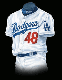
The red uni numbers on the front of the Dodgers’ jerseys, which the team began wearing in 1952, are among the most unusual uniform elements in all of Major League Baseball. For some people, they’re a nice visual accent, a splash of color, the cherry on top of a classic design. For others — many of whom have expressed their views to me over the years — the red numbers make no sense, because there are no other red elements in the Dodgers’ uniform program.
I’ve been asked many times, “Why did the Dodgers add those red numbers in the first place?,” and I’ve never had a good answer.
Until now.
Uniform designer/historian Todd Radom has uncovered the long-forgotten story, which was spelled out in the April 30, 1952 issue of the Sporting News (click to enlarge):

.
In case you’re finding that difficult to read, here’s the pertinent section:
The brand-new uniforms that the Dodgers unveiled on opening day carried five-inch identifying numbers on the left side of the shirt, below the team name, in addition to the regulation numbers on the back. This is another idea of Walter O’Malley, president of the club, and is of particular benefit to television fans who often obtain only a front view of a player before he passes out of the camera range. The stunt is one of good will to the public, and while we would like to be able to report that this is an innovation from 1952, actually the story is the result of an unhappy ending. These uniforms were made for the Dodgers to wear in the ’51 Series!
In other words, the Dodgers had created a new set of jerseys with the red numbers in anticipation of appearing in the 1951 World Series. But as we all know, Bobby Thomson and the Giants had something to say about that, and the Dodgers never got to appear in the ’51 Fall Classic. So they decided to use the number-clad jerseys as their standard home design the following year.
As soon as I read the story on Todd’s blog, I sent the link to Dodgers graphic design director Ross Yoshida, who’s a serious student of the team’s history. He responded:
I’ve heard many different reasons for the red numbers over the years:
• Walter O’Malley got the idea from watching football and liked the idea of players being identified from the front.
• Someone in the front office thought front numbers would be beneficial to home crowds at Ebbets Field. (Note that the Dodgers did not introduce front numbers on road jerseys until 1959, by which time the team had moved to Los Angeles.)
• A uniform manufacturer (most likely Rawlings) suggested the Dodgers use red numbers as a nod to the red baseball in logo used on the team’s letterhead.
• Red was suggested because it would be easier to see at a distance (since the front numbers are considerably smaller than the back blue numbers).
I’ve also heard that the front numbers were born because of increasing television exposure, as told in Todd’s blog post. Until now, however, I never knew that the front numbers were to be debuted in the 1951 World Series.
Imagine if the Dodgers had made it to the ’51 Series and worn the red numbers. Would they have kept the numbers on their uniforms the following season? Or would the numbers just have been a one-time World Series thing? Maybe the Dodgers would have revived the red numbers whenever they appeared in subsequent World Series? Would other teams have copied them by coming up with their own special World Series accents? (Yes, the White Sox lived up to their name in the 1959 Series, but otherwise special World Series uni adjustments are pretty rare.)
We’ll never know how those “What if”¦” scenarios might have played out. But thanks to Todd’s great research, at least we finally know the backstory behind this uniform element.
One final thought: 1952 is not exactly ancient history, yet this story had fallen completely out of circulation until Todd found it. Makes you realize how fragile history and documentation can be, and how easy it is for tracks to get covered up.

’Skins Watch: A Forbes magazine columnist thinks the issue of the ’Skins name change is a matter of when, not if (from Tommy Turner). ”¦ Also from Tommy: Some Indian tribes in Virginia are unhappy with President Obama’s comments about the ’Skins, although not for the reasons you might think. ”¦ Indians fans are defending Chief Wahoo (thanks, Phil). ”¦ A debate has arisen over the name of a Canadian junior hockey team called the Thorold Blackhawks (from Blair Hough). ”¦ WFAN radio talker Mike Francesa usually wants no part of any discussion about team names, logos, and uniforms (he usually derides such subject matter as silly and pointless),so I was surprised when he devoted a fair amount of time to the ’Skins controversy yesterday. He has some history with this issue, because he’s an alum of St. John’s, whose teams used to be called the Redmen before they changed it to Red Storm in the mid-1990s. His basic position on the ’Skins (I typed this while he was talking, so I may have gotten a word or two wrong): “It’s clearly an offensive term, and if some people are offended by it, why wouldn’t you change it? I don’t think the name is meant with malice, but if you were starting the team today, would you use that name? Of course not. Because it’s wrong. I’m Italian and Irish — are you gonna have the New York Dagos or the New York Micks? Of course not. And besides that, you’re in the nation’s capital and you’re defending a name that insults the people that you stole the country from!” He received a fair amount of pushback from various callers, most of whom disagreed with him.

Baseball News: MLB ump Wally Bell has died. I expect that the umps working the remainder of the postseason, who are already wearing a memorial patch for Frank Pulli, will now add one for Bell. ”¦ Mike Napoli of the Red Sox was high-cuffed at the start of yesterday’s ALCS game, but then he put his pants down to his shoetops — and promptly hit a homer for what turned out to be the game’s only run. That can’t bode well for his future high-cuffery ”¦ Jose Veras of the Tigers sure has a lot of stickers on his underbrim (thanks, Phil).

NFL News: Upcoming this Sunday: The Jags will wear their teal alts for the first time, and the Titans will wear navy for the first time since 2008 (thanks, Phil). ”¦ To the surprise of approximately nobody, it turns out that sales revenue from NFL Pinktober merch goes mostly to the retailers (which are usually NFL pro shops) and manufacturers, with only eight cents out of every dollar going toward cancer research. What a scam. ”¦ Here are some good charts showing the height and weight of every NFL player, broken down by position (from Chris Flinn). ”¦How do you personify the idea of football fighting cancer? If you’re the Lions, you create a video of Herman Moore tackling players who are wearing NOBs like “Lung Cancer,” “Prostate Cancer,” and so on. Interestingly, the press conference footage at the end of the video shows Moore wearing an old Reebok-made Lions jersey, with the NFL Equipment logo. Tsk-tsk (from Rob Siergiej). ”¦ Lovelovelove this old Broncos ski mask (great find by Jason Tierney).

College Football News: Some kid on the Western Kentucky squad takes the cake for the nastiest biker shorts look ever (from BJ Lanier). ”¦ Pinktober has spread to the Purdue marching band (from Marc Burgess). ”¦ Crown College — a D3 school in Minnesota — has no maker’s marks on its uniforms. So nice to see a uni without logo creep! (From Eric Bangeman.) ”¦ A note on this page indicates that “Nebraska wore blue jerseys out of courtesy to the visiting red-and-white-clad Sooners” when Memorial Stadium opened in 1923. Who knew? (Gil Neumann, that’s who.) ”¦ UNC is wearing black this Thursday, and Arizona State is going gold-maroon-gold. ”¦ Texas A&M RB Trey Williams scored two touchdowns wearing wearing two different jerseys and uni numbers on Saturday. “He wears No. 3, but he also returns kickoffs and there’s another No. 3 on kickoff returns, so Williams wears a nameless No. 17 jersey,” explains Glenn Stern. “On one of the early drives in the game, he didn’t change out of the 17 jersey and wore it as a RB.” You can see him scoring while wearing the two different numbers at the 0:17 and 0:46 marks of this video.

Hockey News: Here’s a small NHL change we all missed: The Blues have changed their decal on their helmets from their wordmark to their primary logo. Kinda makes you wonder why they need any helmet decal at all (good spot by Joe Mueller).

Soccer News: Yesterady I Ticker-mentioned that Oregon State appeared to be wearing numberless T-shirts for their Monday-night game, but I didn’t have a photo. Now I do. “As you can see, Oregon State was wearing a black T-shirt with a beaver on it,” says Vivek Tanna. “Our usual black jersey doesn’t look like that. They forgot their regular kits in Corvallis (where Oregon State is located) when they left to play Washington on the road.”

NBA News: The Pacers have become the first NBA team to sell courtside advertising. Can’t say I’m a fan of this, but it’s better than ads on the in-bounds part of the court — or, obviously, ads on uniforms (from Kyle Martinek). ”¦ Here’s a photo of Ed Macauley of the old St.Louis Hawks wearing No. 9 instead of his usual No. 20. “9 was the number of his teammate and basketball great Bob Pettit, so I find it amusing that Ed Macualey wore Pettit’s uniform for this photo shoot,” says Roman. ”¦ David Firestone notes that NBA 2K14 is very good at getting the details right. ”¦ Just what the world’s been waiting for: the Bobcats cheerleaders going GI Joe. Sigh (from Robert Silverman).

Grab Bag: Pinktober has its limits: a Nebraska fire department has been told not to wear pink shirts this month (from Chris Bisbee). ”¦ Unfortunately, nobody issued a similar prohibition on the Fort Gay Middle School football team’s socks — yikes (from Brice Wallace).

Let’s try an experiment: Since the ’Skins issue isn’t exactly bringing out the best in many of us in the comments section (myself sometimes included), we’re going to try something new: Today the comments will be a ’Skins-free zone. We’ll have no comments, pro or con, about the ’Skins name. We’ll also have no comments, pro or con, about how we’re not commenting on the ’Skins name, or about how some of you wish I’d done this sooner, or how others of you think it’s bullshit, or anything else relating to the ’Skins in any way. Just for today, to see what it’s like. Thanks in advance for your cooperation.
I wish there was some person that a team could fly in to fix uniforms. Jacksonville needs this miracle man or woman like six months ago.
Give me a plane ticket and a backpack full of black spraypaint, I’ll do it.
I’ll spring for gold paint only.
Wait, what? The two-tone helmet is dumb, but you’d really prefer a gold helmet on top of that uniform instead of black?
Sure, why not?
There’s already plenty of teams in the NFL that use a dark color for their helmets, and no AFC team uses gold.
Besides, the Jacksonville NFL team’s helmets appear (to me) to have more surface area that is gold already, the black part look like primer and should cover in one coat, so I should save money on the paint I’m supplying as long as your spray-painting skills are sharp.
I agree with the gold hat, if only that I don’t care for black helmets over darker home jerseys (think Eagles forest green, Ravens purple), and they may just redesign to bring back the teal as a primary or alternate home.
I like the Jags unis–except for the lid!!
I prefer the teal jerseys to the black too.
Jags have a great color scheme, and actually these uniforms aren’t as bad as they could be. There are some elements on these that work, and others that simply don’t. But certainly could be improved.
The Jaguars uniform set (helmet included) are the worst in the HISTORY of the NFL.
Lee
OK, well that settles it, then. Thanks!
Well….he’s right.
The worst part about the Charlotte Bobcats cheerleader pic….? On Twitter, it stated #loveourtroops for Columbus Day or some crazy shit. I live in Charlotte and am thoroughly embarrassed. We’re getting dumber as a society every friggin’ day
I’m glad we can stop #lovingourtroops, now that it’s no longer Columbus Day.
But seriously, is every holiday going to be America Fuck Yeah Day? I mean, I appreciate the sacrifices made by the members of the armed forces as much as anyone, but if they turn Administrative Professionals’ Day into another excuse to wear camo…
Thanksgiving is the ultimate AFYD
See, I can live with Thanksgiving, because at least there, the narrative is about connecting soldiers stationed abroad with family back home.
It’s really disappointing the Bobcats cheerleaders didn’t wear pink camo. They missed a real opportunity there.
Apparently, this was only for their rehearsal. So, what’s the big deal? I know, I know…
As much as the red numbers on the front of the Dodgers’ shirts add to the look, the LA logo on the sleeve detracts. Aside from that LA sleeve patch, the Dodgers have a stellar uniform.
I really loved today’s lede. Thank you,Todd Radom, and you too, Paul, for circling back to Ross Yoshida. Cool work.
Appreciate the comment regarding the fragility of documenting history. Who knows in our digital world how this will manifest itself in the future. Already we’ve lost how authors revise their work. We sent a gold-lated LP into stellar space expecting whoever finds it has the technology to play it. Since that time we’ve morphed through eight-tracks, cassettes, CDs and now mp3s. Does anybody have an eight-track player?
On the plus side, as long as digital technology remains a series of 1’s and 0’s, we might be able to do digital searches for “red Dodger numbers.” But the sheer volume of information might bury that information forever.
Just food for thought.
Really? Did they seriously not include a player to go with that gold LP? That’s dumb. It really doesn’t matter though, at the speed it’s traveling, we’ll have made it into space and reclaimed it for a museum before it actually reaches any other star systems.
We’d better hurry it up since we only have until 2287 to catch up to it…that’s when Voyager 1 will be destroyed by the Klingon Captain Klaa right before Captain Kirk meets God on a planet in the center of the galaxy.
link
No, they included a player for the gold LP. The player is attached/part of the hull of the spacecraft.
As I understand it, the grooves on vinyl records literally conain the waveforms of the sound (i. e., what you’d see in an oscilloscope), so there’s a good chance that any civilization would eventually figure out what to do with it. Still, you could also imagine that civilization just sitting on the artifact for centuries until someone figures it out and blows the minds of everyone in that society.
And I concur the sleeve logo just ruins an otherwise splendid jersey. Lose the extraneous LA.
Replace the LA with a 42.
In red.
I totally respect Jackie Robinson’s contribution, but could it be enough that all of the players wear his number on Jackie Robinson Day and that otherwise the number 42 has been retired by every team?
Actually, I like the idea of putting a patch featuring LA City Hall, a la the LAPD badges. link
I agree about the LA on the sleeve. I can’t stand that the White Sox got rid of the actual “Sock” and went to the logo. Looks like overkill.
Paul – Did you receive my Ticketmaster Pinktober submission?
Yes. But I had a very busy night, and a few things didn’t make the cut. Sorry.
Purdue band….
I notice the drumline has white plumes, while the band wears pink (we drummers always have to be different).
btw, ever wonder how they keep their plumes so spiffy looking (yes, you do): link
When I was in the band at Michigan, we just got a thick cardboard tube to hold the plume when it wasn’t being worn. I think they all just got tossed in a box in the tubes once the season was over. Never seen one of those fancy boxes.
The Purdue Band director lost his wife in August 2009 to breast cancer and I was a member from 2006-2010 seasons. In 2006 the band also wore a pink ribbon on the right shoulder at Notre Dame right after her diagnosis came. In May-June of 2008 in Beijing we wore lime green ribbons as a way to honor the victims of the massive earthquake in Sichuan province several weeks earlier, and for the first game of the 2008-2009 season we wore red ribbons in honor of my father who passed the day before classes began that year.
All that being said, the wristbands and plumes is a bit much, but the drumline constantly changes what kind and color sticks they use for individual shows. While it certainly appears to be a pinktober thing, it is for sure a cause near to the Purdue Band staff.
re: yesterday’s bit about the Padres’ possible return to brown
I came across link – it states there won’t be any brown for 2014 since new colors would have had to been submitted to MLB by May, and nothing’s changing because of the new ownership.
One thing I like about that Lions ad is that it’s color-on-color, providing a very striking image of “what-we’re-currently-passing-for-Honolulu-blue” vs. red, particularly with the added aspects of rainfall and darkness.
Should’ve gone with either a full-on 90s throwback or a modern Nike jersey for the presser, though. Using a 2009-11 Reebok jersey just seems kinda weak, even if the collar does look a lot better than the Nikelace.
I got lambasted last week over not liking the NFL’s Pinktober. Nobody seemed to care that it’s a scam and a way to sell more merch to women.
I don’t care if it’s designed to sell more to women. It’s the lack of funding that actually goes to the cancer folks.
But it’s not like the cancer folks are doing much with the money either. Most of the money goes to funding yet more awareness programs for a cancer that’s reached peak awareness.
Some of these causes become industries unto themselves. It is as if some people need a cause to crusade for and breast cancer is one of them even though prostate cancer is about as bad for men. You don’t have a prostate wear light blue month do you? A lot of money being made by a lot of people off the cause industry.
We don’t have anything for prostate cancer because men already watch football. Talking about dads and grandpas doesn’t help attract a relatively untapped fanbase.
Ever heard of Movember, Jim? ;)
I don’t know about you, but I don’t personally know any women who are claiming to be tuning in to the NFL because of Pinktober. They’re either fans of the game or a team on their own, or they don’t give two shits about football to begin with, and this program isn’t doing anything to increase their interest.
Stealth marketing wouldn’t be stealth marketing if the target audience of the stealth marketing was aware that it was being stealthily marketed to, would it?
It may not increase their interest, but it certainly makes the NFL more approachable. I mean, you could assume that it’s about altruism. Or you could link. Anyway, I’d spend a couple of minutes reading link before you get all flippant about it.
“It may not increase their interest, but it certainly makes the NFL more approachable. I mean, you could assume that it’s about altruism. Or you could look at the numbers. Anyway, I’d spend a couple of minutes reading this Sports on Earth piece before you get all flippant about it.”
Both hyperlinks go to the same Slate story. Can you relink the Sports on Earth piece?
My bad: link
“My bad: Sports On Earth — Pink Shaded Marketing”
Cool. Thanks!
The whole pinktober thing is most likely also used to get women at least comfortable with the nfl/football so that they’ll let their kids play the sport.
Also, even with the measly amount actually donated from pink gear royalties (as is the case with any cause marketing, really) I’d at least like to think the money from auctioned-off pink player gear goes completely to charity. Not in a position to look that up at the moment though.
The problem is that it’s not just the NFL that celebrates Pinktober. When EVERYBODY is turning EVERYTHING pink for a month, it ends up seeming less significant rather than more. I don’t mean to sound crass, because I’ve known a number of women who have suffered through breast cancer (and some who succumbed to it), and I’d just as soon keep mine healthy and cancer-free, but how much more aware of breast cancer do we need to be?
Well, there was that commercial with the woman whose life was saved because of the pink in the NFL.
That would be the Fallacy of Incommensurability.
You mean the actress they paid to say that? For Glob’s sake, there’s pink crap everywhere, even on things as absurd as cat food. If it really took NFL teams wearing pink socks to convince that woman to get checked…
What I don’t understand is, if the whole point of Pinktober was to save Tina from Staten Island, why are we still doing it? She’s saved! Mission accomplished! Let’s move on!
Well THE, I unfortunately am not in the know if that commercial was in fact using a paid actress, presumably without breast cancer. Do you have any info showing it was?
I would love to see the Umps in the sky blue shirts with a simple black armband. Memorial patches always struck me as tacky.
Shane Robinson of the Cardinals hit a pinch-hit HR in Game 4 of the NLCS last night. Derrick Goold of the St. Louis Post-Dispatch today says that Robinson switched to his home cleats instead of the ones he wears on the road before last night’s game.
The Cardinals’ backup outfielder (Robinson) told pitcher Shelby Miller that he was going to wear his lucky cleats for Tuesday’s game. Tired of wearing the same style cleats as Miller, Robinson switched to his white-toed home cleats instead of the regular-season road cleats. He’ll be wearing them again today after turning on a 1-0 pitch for his first career pinch-hit home run.
Link to article: link
Nothing new from yesterday’s World Cup qualifiers, but why did no one tell me link?
Yeah, TH, pretty cool is right. I would have punched up the red dragon more, just because a red dragon is such a fine national beast. I was interested in the way Uruguay/Argentina handled their joint ownership of azul celeste…
Btw, USA looking good and playing well. I have total man-love for Jurgen.
I was interested in the way Uruguay/Argentina handled their joint ownership of azul celeste
link is weird, but it works, and it’s certainly more contrast than link.
Like it, reminds me of a rugby jersey though.
Is the design called harlequin or something else? I know Blackburn and Feyenoord use a similar idea.
I think a Harlequin design would break the shirt into link. I don’t know of any term that describes the half/half design.
Of course, Wales can’t really do a true half/half because FIFA and UEFA regulations more or less require a solid number zone.
Wales has a pretty cool away uni.
I believe it’s called halves, and it’s an link.
What color is the back of the Jags’ teal jersey?
:^D
convo with my girl watching the game:
her: why are they all wearing pink?
me: breast cancer awareness.
her: what woman doesnt know about it?
me: ummmmm
her: the eagles arent pink they are green…its stupid.
Why haven’t you married her yet?
^^this
QOTD
Thanks for finally finding out the story behind the Dodgers red numbers. I have always wanted to know that.
The pants on that Crown college player look odd, they don’t appear to have a fly.
“The pants on that Crown college player look odd, they don’t appear to have a fly.”
That must be because the players sewed the uniforms themselves. How else to you explain the lack of logo creep on their unis in this day and age?
Brandon Marshall got a link for his neon green cleats from last Thursday’s game vs. the Giants.
Combined with the matching donation, I’d say that’s $21,000 well spent.
Yes, especially if more than $1,680 goes to the cause.
Regarding the Western KY player and his “Daisy Dukes” – I thought there was an NCAA regulation that players had to wear
knee and thigh pads? And I never understood why college players could wear low socks and have bare legs.
I never understood why college players could wear low socks and have bare legs.
Then-commish Elmer Layden instituted a rule requiring NFL players to wear high stockings in the 1940s.
The NCAA has never had such a rule.
It seems the increasing popularity of biker shorts portends the coming of flag football.
I can tell you from experience that knee pads don’t really do all that much for “protection” – they are really just annoying and do in fact slow you down.
However, the WKU player just looks stupid and I’d give the NCAA about 6 months to issue an update on it – you know – cause they have nothing else to do.
Thanks, I”ve always wondered why the front number was red on the Dodgers’ jerseys.
I wished they would go back to the road jerseys with “Dodgers” in blue with the white outline like they used from 1977-1998. I always thought those were one of the best uniform jerseys in all of baseball. This was also during a very successful time period in the franchise’s history. They won 2 WS titles, 4 N.L. Pennants, 7 N.L. West titles and 1 wild card.
There’s a break in the uniform listing from 1977-1986-1987-1998, although I couldn’t tell you what the difference is. Maybe somebody on this site knows what slight alteration was made on the 1987-1998 dodger road jersey.
To me the “Los Angles” in script seems to long and clunky for the front of that jersey. And the single color blue makes it look kind of cheap.
Eh, I like when the road jersey says the city name.
I tend to agree with you and I was so happy when the O’s put Baltimore on their roadies.
However, I’m inclined to agree with John Q in this case. San Francisco as well. Just clunky.
I think part of the problem is that they’re forced to have just a single color because the white outline made “Los Angeles” just way too big in the front of the jersey.
I think the script just makes it too long and clunky. The Mets have tried two variations of New York in script which never looked quite right on the uniform. The second version was a 3 color (blue, orange & white) in a smaller font which was a little better.
Maybe Los Angeles would look better in smaller print block letters like Cincinnati used on their away jerseys. I always like the red with the white outline that they used in the late 80’s early 1990’s.
I always thought an away jersey with an interlocking LA like the cap in blue and white in the left breast would look good. Kind of like the one San Francisco used during the mid to late 1980’s early 90’s.
I actually hate the outlines and actually find it distracting when I notice it on uniforms (such as the Tigers road uni’s).
Jose Veras’s hat stickers: is that a bar code? Meaning, was this hat pulled from the on-sale stock from the team store, rather than from the teams inventory?
I don’t know for a fact that the team’s inventory doesn’t have the same stickers (including bar code) as the retail versions. Do you?
Wondering if anyone can help us out with a mystery on Stanley Cup of Chowder. Someone posted an image of an angry version of the old “pooh bear” Bruins alternate logo from a licensed NHL hat purchased in 2006 (Image: link ) There’s a couple of desktop backgrounds floating around online with a high quality version of it, too. We’re trying to find the source of it and whether or not it ever was an official logo. The timeframe would put it during the lockout, might it have been part of a scrapped rebranding before the Edge era? Thanks!
Zephyr used to do all sorts of logos in “alternate” versions. For example, they made Minnesota Wild hats that link.
That would explain it then. Thank you!
Just for reference, they are listed as Zephyr X Line hats. They have a ton of examples on the ‘net if you search via those keywords.
Here’s a link. Zephyr seemed to do this type of cap for most of the NCAA’s popular teams, but it creeped into hockey for a short while. :o)
I love the Dodgers’ red numbers.
I was reading my old campus daily and link.
Pullquotes:
* “Dominic Morelli, UNC football’s equipment manager, said the three new sets of uniforms cost about $75,000, with Nike picking up all costs within UNC’s allotment. In a typical year with no redesign, Morelli said, the team would spend about $30,000 to $40,000.”
* “…anything that puts us in front of (recruits) one more time, every picture that gets retweeted. Anytime that we can be in their pocket, be on their phone, be in front of them, the more people that talk the better.”
* “We used to come in every game and it would be like, ‘Carolina blue again. Yeah,’” Boston said sarcastically. “Now it’s at the point where we never know what we’re going to wear.”
* “Paul Lukas, ESPN.com’s uniform columnist, thinks it’s all a crock of shit.”
Not a single mention of the 47th Annual World Conker Championship???
The grandeur, the “uniforms”, the nyumber fonts,…..
(there even a bit pink involved!)
link
Great stuff about the Dodgers uniforms. I can’t say I am a fan of the Dodgers, with me living in MN, but I do think outside of the Cardinals and perhaps Detroit, I think they are the best looking team in MLB.
Although, I don’t mind the red numbers, I sort of wish they were smaller. But who am I to argue. Love those uniforms.
I think the red front numbers are a little thick for their size, which makes the single-layer back numbers look thin and small. I’d like to see the Dodgers ditch the NOBs and make the back numbers a little taller.
The problem is not the thickness of the front number, it is the thickness of the back numbers. In 1980 when the white outline was added to the name and back blue numbers on the home jersey, the back numbers got thinner. When they were equal, they looked great.
Kobe in the Lakers black alt. on the cover of SI this week:
link
I received a mini 12 page NFL Pick catalog in the mail. The last 3 pages were for non pink jerseys. Eight centers on the dollar hmm. Sounds like the vig the NFL gets indirectly for never watched ESPN on my Mom’s cable bill.
I can tell you that umpires in the STL/LAD game had “WB” patches on their sleeves. TBS showed the pre-game moment of silence and at some point had a shot of the patch (sorry, no screen grab). I cannot speak to the ALCS as I didn’t have a chance to see the game.
I drive a pink taxi painted that way year-round because in October the company donates money to promote awareness. So many passengers don’t know that pink stands for breast cancer when they comment on the color.
Isn’t it counterproductive for the Indiana Economic Development Corp. advertisements on the Pacers floor to only be shown on local telecasts?
Kind of, but they’d still show up on local telecasts in other cities and on the NBA Network, as well as on highlight shows.
So, we still don’t actually know why the Dodgers’ numbers are red, just a couple of educated guesses?
Special splash of color for the Series!
Exactly… from the headline I was expecting an answer, but I now just have more questions.
Echoing others but today’s lede on the Dodgers’ use of red numbers is really good stuff. Its the kind of thing that originally hooked me on the site.
no maker’s marks on a jersey labeled crown… Is this a whiskey pun? if so, well done sir.
Great get on the Dodgers; I was wondering the same while watching last night.
Is the “different color number on the front and back” a much-covered subject?
(Not trying to ask a dumb question, just owning up to not reading this blog every day.)
I kind of wish you’d make a bigger deal than just a ticker item out of the eight-cents story.
I know you’ve beaten that drum before, but it bears repeating: At the end of the day, all the NFL cares about is its own bottom line. With concussions (see the discussion about adding Thursday games in the news yesterday), with Pinktober, with the issue we’re not discussing here today, all of it. It’s a cash grab. And its become so transparently so that this is why the NFL is being seen in far less-glowing light than it was under Tagliabue, when fairness, competitive balance and revenue sharing were the key issues.
And to the commenter above that said Pinktober doesn’t draw in new fans? You’re right. But it does allow (fool) the already existing female fan to think she’s buying another piece of team apparel and helping a good cause when she’s really just filling the owner’s/supplier’s coffers a little bit more. It’s deceptive and greedy, which is why it’s unsavory and, well, wrong.
This is why I’m starting to think baseball is the best league right now. Aside from the September 11 hats thing, they aren’t blatantly favoring big markets and stars (the NBA) and aren’t pulling any of this sort of junk. It’s a relief, and in a sport where cheating has long been part of the game (spitballs?), the PEDs don’t bother me.
From the idea of “100% of the profits” being donated to the cause, 8 cents on the dollar is not at all far off. Once the CEO’s yacht is paid for, salaries, manufacturing, raw materials, retail, etc, once the cost of all that is covered, 8% isn’t an unrealistic number to have left over. As long as 100% of the profits go to the cause, that’s good for the NFL. Is that happening or not? Who knows, that number is alot more difficult to get to with so many hands involved.
If their profit margin is close to 8%, they would be bad at business. I don’t think NFL is bad at business.
Or you could support hockey with their “Hockey Fights Cancer” month and lavender color (pink + blue). Just sayin’.
They’re adding games on Thursday, not adding games. What does that have to do with concussions? This isn’t the 18-game regular season proposal we’re talking about.
People can get hurt and any given second the game of football is played.
I should add, I’m against adding to the Thursday docket, it’s already watered down. Thursday night should be for the opener, Thanksgiving and maybe two more weeks in the year. NOT every week and surely not potential doubleheaders.
Fewer days of rest makes players more susceptible to all kinds of injury. It’s a general safety issue, not just about concussions, which again flies in the face of the league “caring about safety.”
Now, if you’re referring to me, I didn’t actually say it’s not bringing in any new fans; I only said that the women in my life aren’t affected by it. Either they’ve already been fans, or they’re not the type to be interested in sports at all. Either way, they’re pretty unanimous in saying that Pinktober has gotten way out of hand.
The women in your life might be that smart, but I’m willing to bet a lot of others aren’t. I’ve learned, in life, to never underestimate the stupidity of the general public.
Check out Yahoo’s “Top 5 Worst college football mascots”:
link
Is it just me, or would this list be better if it were renamed the “Top 5 BEST college football mascots.” These are awesome!
How did Oregon State forget their uniforms? I would think that would be right up their at the top of their priority list. Players? Check. Uniforms? oh yeah… oops…
Matthew, I talked to a few of the players that I know, and its just that the freshmen forgot it, apparently there was a lot of stuff going on, they managed to get their shorts though (because the person in the picture does indeed wear number 25), they just forgot their jerseys….
I get the pink thing isn’t going away. I mean they even put pink accesories on the players in Madden when playing an October game. But I wish they would do like MLB and make it just one week. The whole month of pink is just ridiculous.
A few uni-related gags in link.
Todd, you are amazing.
Thank you Chance, Connie, and everyone else for the very kind words. This postseason has been easy on the eyes, lots of visual tradition and lots of history, regardless of who our favorite teams are.
I like the Pacers ad campaign and think it makes great sense … as long as it continues to tread lightly.
It’s the slogan “A State that Works” by the Indiana Economic Development Corp. (a public-private initiative to drive jobs in the state). So, rather than another Nike or Gatorade ad (which, of course, you’ll see on virtually every courtside scorers’ table screen), we see something that’s inspirational in promoting the well being of the region.
Detroit should immediately follow suit, followed by Cleveland, Milwaukee, and some of the other Rust Belt communities. Makes sense to me.
We may have to consider the possibility the Dodgers made their front numerals red because they did not know what they were doing.
This was the first time anyone had ever tried this so there was no past comparisons to be made. I think that the Dodgers may have figured they should make them a different color so they would appear distinct from the word mark at a distance. As a contrast color red may have just been an obvious choice given its use in the letterhead.
Paul – approximately when did the site move from “uniwatchblog.com” to its current format?
The domain name change? Look here:
link
RE: The Crown College uniform
Looking closely at the image, it appears there is a mark of some sort at the bottom of the v-neck collar. It looks like an “R”, but I’m not sure if that’s what it is, or if it has anything to do with the maker.
The Dodgers are just link.
“The Dodgers are just Chunichi Dragons in disguise.”
Oh, right! Tom Selleck’s team!
link
The Dragons manager in the 80s and 90s was friends with Tommy Lasorda and got permission from the Dodgers to wear what was essentially a knockoff of the LA uniform. Now they look like they wear BP unis.
Interesting facts on the red Dodgers numbers, great material. I’ve always wondered why.
What I think would make for a great UW topic is Paul’s picks for best uni from defunct teams…has that been done here?
Early clubhouse favorite would be the green Hartford Whalers, with the negative space logo. No Cooperalls though, because hockey socks are where the stripes are! Plus, I think he would have found Pucky the Whale cute and endearing.
I don’t speak for Paul, just shooting off the cuff and taking a guess.
What I would love to see is Paul list his 10 favorite defunct team logos, 10 for each sport.
Bottom of the 2nd in the ALCS and they’re discussing Salty’s bright yellow fingernail stickers.
The Packers have added a cool cover photo to their Facebook page to reflect their throwback uniforms this weekend:
link
link to go with the Denver broncos ski mask, heres a steelers one