Click to enlarge
I was all set to say, “You have one of the most beautiful home unis in the sport, you wait over two decades to get into a playoff game, and you wear black?” But then the Pirates did something so wonderful in last night’s National League Wild Card game that I forgot all about the black jerseys.
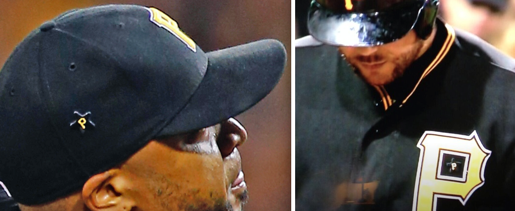
The photo on the left is a close-up of Francisco Liriano’s cap; on the right, Russell Martin’s jersey. As you can see, they were wearing little star-shaped “P” patches — an obvious shout-out to the Stargell Stars of the late 1970s. How awesome is that?! Relievers Tony Watson and Jason Grilli also wore them, as did manager Clint Hurdle, and I think I spotted Justin Morneau wearing one as well (sorry, no photo of him). You can also see someone — I’m not sure who — wearing one in the background of this shot.
The original Stargell Stars were solid gold, and then Stargell added a little “S” in the center, while last night’s stars had the team’s “P” logo (which means Martin had a P within a P). From a distance, it was hard to see the patches’ star-shaped outlines — they just looked like little “P” pins.
According to this article — which to my knowledge is the only one so far to address this storyline — the stars were the brainchild of Pirates bench coach Jeff Banister, who distributed them to every player prior to the game as a way to “take a little bit of Willie [Stargell] out on the field.” It’s not clear why some players wore the stars and others didn’t. (That article also mistakenly states that Martin wore his star on his cap, when he actually wore it on his jersey. As a catcher, Martin probably never even wears a cap unless he’s not in the lineup.)
I love it — all of it! On some level, of course, this is a uniform violation, but let’s hope MLB has the good sense not to shut it down.
A few other notes from last night’s game:
• Both teams wore MLB Postseason patches on their caps and sleeves. The cap patches looked particularly bad. They even had the patch on their BP caps. Postseason decals on the batting helmets, too. Enough!
• The cap and sleeve patches were also worn by the umpires.
• The Reds wear black shoes, but skipper Dusty Baker wore red.
• Someone at the game had a jacket that appeared to be made of old Pirates pennants.
(My thanks to all contributors, including Mike Brethauer, Jason Hillyer, Ryan Patton, Todd Radom, Nick Schiavo, Joe Sewash, Tom Shieber, Chris Tate, Jerry Wolper, Jason Yander, and of course Phil.)
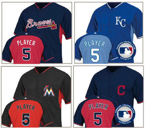
Sneak Peek: All 30 MLB teams will have new BP jerseys in 2014. The new designs aren’t slated to be unveiled for a few months yet, but I provided an exclusive first look at them (including the four shown above) in a new ESPN column yesterday afternoon.
The little seal shown on some of the designs says, “Pending League/Club Approval.” There are 36 jersey designs in total (some teams have separate home and road designs), and that seal appears on nine of them. In my experience, this has been little more than a formality — the designs that show up in the Majestic catalog, which is where these images are from, are the ones that eventually get unveiled. Moreoever, as I wrote in yesterday’s column, MLB had already confirmed to me that the designs were legit. But shortly after the column was posted, a source I trust from an MLB team got in touch to say that the design shown for his team is wrong. Sure enough, his team was one of the ones with the “Pending League/Club Approval” seal. So we should consider those nine designs to be provisional, at least for now.
Also from yesterday: My annual NHL goalie preview went live. Enjoy.

Baseball News: Here’s a nice ode to the Yankees’ logo. ”¦ “Interesting to see that the Reds’ plain black spikes were deemed sufficiently noteworthy to be mentioned on this 1981 Sporting News cover,” says Robert Eden. … The Red Sox have mowed a giant “Boston Strong” logo into their outfield grass (thanks, Phil). ”¦ Never seen this before: The tunnel leading from the clubhouse to the field at PNC Park has a big banner featuring a uni-related quote from Roberto Clemente.

NFL News: The Cardinals will go BFBS this Sunday. … You probably know that L.C. Greenwood, who recently passed away, was famous for wearing gold shoes. But did you know he also wore goggles?! I didn’t, until Maks Skuz told me. … I recently mentioned that the rise of skin-tight jerseys might be leading players to grab at their opponents’ pants instead, and that would seem to be reinforced by this shot. That’s a high school game from West Virginia, but the same line of thought applies (from Brice Wallace). … Here’s something from the relatively recent past that I don’t remember at all: In 2008 the NFL was considering a rule that would have banned hair long enough to obscure a player’s NOB (from Otto Heil). ”¦ The Broncos will wear solid blue this Sunday (from Kevin Clark). ”¦ Never seen this before: Princess Di in an Eagles jacket (from Jim Adair). ”¦ Serious corporate douchebaggery alert here: An NFL official stopped ’Skins CB DeAngelo Hall from talking with reporters in the Washington locker room following last Sunday’s game, and threatened him with a fine to boot, because he was wearing a Lacoste shirt. Note that this wasn’t at the podium where they do the postgame press conference — it was in the locker room. Unfuckingbelievable (from Yusuke Toyoda).

College Football News: Rutgers is going with solid white this weekend. … Whoa, check out these great shots of Bo Jackson (among others) from the 1986 Japan Bowl. “I love that uniform!” says Clint Richardson. So do I. … Want to put together a successful stadium color-out? Here’s how. ”¦ Not sure what the story is behind this, but Arkansas appears to have a new uniform. Hmmm, ya think they put enough razorbacks on it? Never mind, just a Photoshop job. ”¦ Nik Streng notes that Miami QB Stephen Morris has a tattoo of the team logo and his uni number on his throwing arm.

Hockey News: Lots of great old-timey hockey photos here (thanks, Phil). ”¦ The Jets will wear lavender warm-up jerseys on Oct. 22, as part of the “Hockey Fights Cancer” initiative (thanks, Phil). ”¦ New uniforms for the Pensacola Ice Flyers (from Ryan Bohannon).

Soccer News: Players having their pants pulled down doesn’t just happen on the gridiron. That’s from a game between Tottenham Hotspur and Aston Villa last week (from Andy Palmquist). … “Soccer teams usually wear away unis when there’s a color clash,” says Yusuke Toyoda. “But in Tuesday’s Champions League matches, Barcelona wore its alternate all-black and Napoli went G.I. Giuseppe, even though their home unis would’ve been fine.” ”¦ Also from Yusuke: Inaugural uniforms for the new NASL team Indy Eleven. Further info here.

NBA News: Interesting piece about how shoe and clothing companies maket their wares at the NBA coaches’ meetings (from Tommy Turner). … For a while now, the numeral “9” used in Lakers uni numbers has had a disconcertingly large hole in the center, but now they seem to have fixed that problem, or else they just used an upside-down 6. Either way, looks much better (awesome spot by Paul Lee).

Grab Bag: Several readers sent in photos of newspapers that were printed on pink paper yesterday. “Gonna be a long month,” says Jay Abbott. ”¦ Here’s what the Germans will wear for the opening ceremonies at the Olympics (from Leo Strawn Jr.). ”¦ Good article on what the Presidents Cup captains will wear (from Jason Hillyer). ”¦ What’s worse than wearing pink for cancer awareness? Guess (thanks for nothing, Phil).
I was surprised to see Marlon Byrd had so much of his undershirt showing under his jersey, which seemed to be one button shy of being done up. Is this normal for him? Photo here:
link
It has been normal since he got to Pittsburgh. Others will have to chime in on his previous uniforms.
Yes. He routinely did this earlier in the season with the Mets.
First item in the NFL ticker calls Arizona’s the “Carindals.”
Thanks — now fixed.
The models link by the Indy Eleven unis, but I like them. The checker flag theme works, and even the sponsor logo is appropriate, this being Indianapolis and all.
With Peter Wilt in charge, they seem to have a good thing going there.
Haha! If they could have their arms crossed (or be texting or something) they still couldn’t look less interested!
It might be the most genuine and honest reaction from models at a uniform unveiling we’ve ever seen in these parts.
Refreshing, I say.
But if the shirts were black or camo and there was a smoke machine, they’d be jumping up and down.
Why is Burnett considered to be wearing the wrong cap? I’m pretty sure it’s the same one they all wore (The ‘P’ with the white outline). Am I missing something?
You’re right. My bad. Will fix.
Also, if I had to guess who that is in the background of the Burnett shot, I would guess pitcher Jeff Karstens.
link
Though I guess we can’t be 100% sure.
Pretty sure those Arkansas unis are fake. The white helmet in the background look like they have a white hog, which is from last year.
Too bad, if so. That uniform would instantly be the best look they’ve had on the field in quite some time.
For me, I know Breast Cancer Awareness Month starts when Walmart puts out the pink Swiffer Wet Jets.
(Why do they sell pink Swiffer Wet Jets anyway?)
Chicks dig mops!
(oh no I di’int!)
As far as the black jersey goes, I was not surprised to see it. They wore that for many a game down the stretch and throughout the season. I think it’s part being superstitious and part whoever picks the uni for that game (AJ? Cutch?) liking that particular jersey. I wasn’t a big fan of it at first, but now I kinda like it….funny how winning changes your perception.
Those BP jerseys are awful, especially the Marlins one. Seriously, who designed them, a blind person? (and yes, I can say that because I am visually impaired). I can tell you right now, I’m glad certain teams elect not to wear their BP tops in Spring Training.
“Seriously, who designed them…?”
Gordon Gartrelle or Denise Huxtable?
link
I totally disagree with Paul’s assessment of neo-Stargell Stars here. I think it reinforces the trend of no new ideas in sports (or elsewhere) in society. The stars are hacky. And one reason I liked the Pirates is because they didn’t go for the look-at-me stuff like other teams (i.e., “beast mode”, the D-backs striking snake thing, Boston Strong) so my respect for the Pirates has dropped off considerably
Um, no. I’ve always liked the Pirates in general, never followed them closely in particular, and even I’m aware of all the look-at-me stuff the Buccos have been doing of late, just like every other team. Buctober, blackouts, Bucco-blast, yadda yadda. If you’re looking for a team that’s above all that, Pittsburgh isn’t your squad.
But I’m with you on the neo-Stargell Stars. If they had no logo on them, and if they’d been sufficiently well thought-out to be gold so they’d be visible anywhere on the Pirates unis, I could maybe get down with them. But the idiocy of handing out black stars to go on black caps and jerseys, and the brandsturbation of slapping the team logo on them, ugh. No thanks. The neo-Stargell Stars and the black jersey almost had me rooting for the Reds entirely on uni-grounds last night.
Interesting critiques. It’s true that the stars are a variation on an old idea, not a new one, but they reference an inspirational chapter in the team’s history, which doesn’t seem inappropriate for a team marking its return to the playoffs after more than two decades away.
As for the black-on-black, it made the patches more subtle, and therefore less “Look at me,” which I liked.
They didn’t make a big stink about this, they didn’t issue a press release or stage anything for the cameras — it was just a little private thing amongst themselves. Good for them.
I have to agree with Paul on this one. It was subtle, it wasn’t a big hooplah-filled “look at me” schtick.
If only I could’ve been at this one. Sounds like PNC was absolutely rockin’!
I’m with Paul on this one, too. What I loved about the Stargell-ish stars:
1. They were subtle in terms of both design (black stars on black unis/hats) and placement (different spots on different players, some wore ’em, some did not).
2. Nice reference to one of the greatest Pirates from one of the team’s greatest eras.
3. This appears to be nothing more than a team-generated gesture – not designed to boost sales via new authentic(TM) merchandise available RIGHTNOW at souvenir stands & websites near you.
I thought the “P” was for “Pops”, as in “Pops Stargell”, which made it even cooler.
You have a team that was awful for decades, had this 30 year period of greatness, and then went back to being awful again. Now they may be on the cusp of a return to greatness, and they decide to reference that former greatness, and you kvetching? It’s not hackneyed, or unimaginative: it’s great!
CortM, with all due respect, your information is factually incorrect. The Pirates have never been awful for decades before the losing streak. They had a poor 1950s, and 1890s, when the club officially became the Pittsburgh Pirates, and that’s it. I would encourage you to check the numerous winning seasons, championship teams, and high number of primary hall of fame players.
Overall, it’s been a storied and successful run, and the future is bright.
As a lifelong Pirates fan closer to 40 than 30 I’m torn on this one. I hate all things retro and throwbackish so I should hate this addition. But I liked seeing it and the fact that it was just done without any big press release to fluff it up and was just handed out to the players to wear as they chose made it a win for me.
In what way is a patch (“B Strong”) that is a tribute to those who died/ were injured/ responded to a terrorist attack that happened during baseball season in BOSTON a look at me type thing? Way off base there.
Two-tone BP jerseys are bad, but the Deutsche Olympic duds are seriously awful – one of few things occurring in my lifetime to cause me to be seriously ashamed of German ancestry. Here’s hoping the Yanks, Russians and Swiss don’t similarly screw the pooch.
“Sport-Specs” … L.C. is wearing Sport-Specs (or an equivalent brand), not “goggles.”
Abdul-Jabbar wore goggles. ;)
Those BP jerseys remind me of Starter jerseys from the 90s.
So they’re basically baseball jerseys that reference baseball jerseys that reference baseball jerseys.
They remind me of a bad sunburn. Until someone comes up with something better, I’m calling these new hitting rehearsal shirts “sunburn jerseys.” Man, are the ASG jerseys going to be brutal or what?
On the plus side, they’re full-button, so at least they’re not smocks. Nice to see MLB cementing its move back to full-button hitting rehearsal shirts.
The ones with contrasting backs, I mean, are sunburn shirts. Should have been more specific.
Another possible silver lining: The Nats are shown as possibly subject to change. Which is good, since they have one of the worst of the lot. Either ditching the sunburn or swapping their Nationals script for their W logo would be a huge upgrade.
“…Someone at the game had a jacket that appeared to be made of old Pirates pennants…”
Terrific. There’s hope for the country after all.
But not one Green Weenie sighting?
In the hockey note about the Jets, “lavender” is misspelled. I’m glad there wasn’t a photo!
The 1970s-80s Reds were mandated to look “conservative” by management. They were not permitted to have facial hair, and wore team-issued plain, black cleats and short-holed stirrups. No high stirrups or ribbon style socks were allowed, even though they were quite in vogue around the league. I distinctly remember Pete Rose complaining about the stirrup socks in particular. The cover photo Paul linked to illustrates these facts.
The ’72 World Series showcased featured the staunchly conservative looking Reds against the rebellious, long haired, multiple uni-combo A’s. It was a reflection, really, of the divide in the country at the time
showcased/featured…..um, I guess just one would’ve sufficed….where’s my editor?
Reds had the no-facial hair policy all the way up ’till 1999.
link
I’d be happy with a “No-Dusty” policy in 2014.
I will never forgive the team for letting Greg Vaughn, of all people, bring down the no facial hair policy.
Arkansas jerseys are definitely a photoshop job. Original twitter feed (@jakenevill) says so.
i like the pure red and white scheme. ua likes to use black and greys in their uniform now but the red and white looks pretty good
the arkansas jerseys look good. atleast the razorback is a good logo
Kansas wore a uniform a few weeks ago that was horrible. They had the Jayhawk logo on the helmet. Jawhawk logo on the back above the NOB and the Jayhawk logo as a patch on the right side of the jersey. talk about redundant
That is actually true of all of the uniform-helmet combos worn during KU’s first three games. But many fans have been calling for the return of the Jayhawk on the helmet for a while, so no one is complaining here.
Ah, Princess Diana… Lurie won’t even take your opinion on Kelly Green, so the rest of us are S.O.L.
I don’t see many NFL players grabbing pants, but they are definitely grabbing the lower back sweatbox intentionally.
The black Pirates jerseys would look good with black high cuffed socks – I think the bat boy was wearing them (can’t find a photo). If that was the requirement, I wonder if the players would say no to them? It didn’t work for the ’81 Reds, so forget it…
I don’t think the apparent rise of pants-grabbing is due to jerseys being tighter as much as it’s due to the NFL banning the horsecollar tackle. If a player grabs anywhere above the middle of the numbers they’re risking a 15 yard penalty, so they aim lower.
And lack of belts.
You never know about the Kelly Green…aside from a terrible marketing gimmick, there are people aplenty who wear Eagles throwback gear–I would say as plentiful as seeing people in McNabb’s or little kids wearing Westbrook jerseys.
I’m actually holding off on buying a new $100 polyester Eagles jerseyshirt until they redesign it. Because I got at least 10 Midnight Sports Teal jerseys in my closet.
I’m not sure what terrible marketing gimmick you mean; the 1960 throwbacks? I loved those! Eagles fans said the green was too bright neon-ish, but it matches the shade on the original 1960 jerseys. My authentic was even lettered at Ruberti’s, which did the team jerseys for that day. The dazzle mesh is what ruined it…
I’m that guy, wearing the throwback stuff & snubbing my nose at midnight green. Hopefully Lurie brings Kelly Green back without going all Jaguars on us.
Gerritt Cole has been wearing that look recently, and you’re right…it looks fantastic!
Thanks Rob, found it:
link
In a search for Gerritt Cole, found a shot of the bat boy:
link
I vaguely remember a photo of Diana taking a young Prince William or Harry to his first day of school, wearing a different Eagles jacket. A varsity type, like the Lions version Eddie Murphy wore in Beverly Hills Cop 2.
Looking at the 2014 BP jerseys, it looks like there will be no major uni changes this offseason.
Except possibly those “Pending League/Club Approval.”
Looking at the 2014 batting practice jerseys, Cleveland has such a good design with the block C. (Not sure when this was introduced (or re-introduced, a few years ago?) But it is such a strong design, that you could instantly lose all Wahoo references everywhere and still have a great design. It’s the easiest of all native/early/original American themes to fix and still have an instantly classic and good identity.
I like that Sporting News cover. Couple of other things to notice, Johnny Bench with a first baseman’s glove and colleges potentially fighting over television money.
Bullshit Month: Day 2:
R***r G*****l is a ****y.
Pretty easy to figure out, right?
I know I’m late to the party, but I really like the new ticker format.
Ugh…I don’t really care for the new Pirates batting practice jersey for next season. They should’ve just kept the gold jersey with the black “P” for the new template.
I do, however, like the Indians batting practice jersey with the block “C”. Hopefully, that is one of the ones that is permanent.
Except perhaps the contrasting back. Yikes.
Well I need a day or 2 to study the new BP jerseys but please New Era don’t farm the BP caps out to China. Make ’em in the USA so the crowns look right.
Sorry if this ground has been covered (nothing popped up on the search), but Kareem Abdul-Jabbar and Robert Hays have recently been filming link for the Wisconsin Department of Tourism. Apparently Roger Murdock has been link.
….and Robert’s getting laaaaarrger.
Did you guys know Mike from Breaking Bad was in Airplane!?
link
I find it interesting that James Reimer’s Optimus Reim mask uses an autobot logo that was based on Prowl as opposed to Optimus Prime
link
Regarding the BP jerseys and Pirates… I thought the Bucs were looking into a new logo for next season. Could still be so since the current pirate isn’t on either sleeve, but I figured there’d be some uni changes involved too. Wordmark appears the same as what’s on the current home whites.
Another Laker inconsistency that bothers me is the retired jerseys. It never bothered me before this past year when Shaq’s jersey was retired. His jersey banner is the current Lakers’ home uni, since most of his Laker success came in these unis, which is fine and acceptable.
link
But all the other retired Laker jerseys are in the style they wore from the 80s to late 90s with purple numbers. Chamberlain, West, Baylor, and Goodrich wore the home unis with white numbers.
link
If they wanted to stay consistent and correctly honor the players, shouldn’t the banners be in the uniform style of the era that the players played in? Just my two cents.
This is what the Utah Jazz did with Jeff Hornacek’s retired jersey: Stockton and Malone had their jerseys (the ones that look like the old New Orleans Jazz) retired instead of the ones with the mountain range in front.
The photo of Shaq’s jersey you linked to was taken during the unveiling, but quickly changed after they noticed that they had mistakenly put the last name and jersey number in front, i.e., it became NOF (or rather, NaNOF, Name and Number on Front).
I know these retired Lakers jerseys at Staples aren’t the ones that were hanging from the rafters at the GW Forum. (Are those now at the Toyota Sports Center?). But while those aren’t game-spec jerseys, either, they were closer to the real thing than the ones at Staples.
I don’t know why I can’t find any larger photos, but here are the ones that used to be at the Great Western Forum.
Kareem, Magic and Worthy’s jerseys are more accurate, but West, Wilt and Baylor’s jerseys have the purple numbers instead of white. At least there’s uniformity.
link
Found the video of Magic’s retirement on YouTube. Super close-up at the 9:11 mark.
link
Paul – the link to the prices on the 2013 version of the BP jerseys does not work. It worked yesterday, but there was no difference in the prices (it showed the current price, with a notice of a current discount promotion they are running). I went to the MLB online store this morning and the 2013 BP jerseys are still going at normal price, not at fire sale prices you said in the article.
The Broncos are going to be awesome on Sunday afternoon. I love the blue on blue
Are the Germans wearing rainbow-esque outfits in a show of solidarity with homosexual athletes, or is there some other significance of that color gradient to Germans that I don’t know about?
They claim it’s just a “fashionable” jacket.
link
I know you’re just trying to be funny, but how is “G. I. Giuseppe” not offensive?
Sure it’s intended as a harmless joke, but how is that any more acceptable than “G.I. Hymie” might be if you were writing about a Jewish team or “G.I. Jo’Van” might be for an inner-city team?
In light of all the political correctness lately, especially in this website, I’d assume that you Paul, of all people would be above making comments like that.
Seems pretty hypocritical to me. You can’t justify double standards. When you make a little joke like that, you become as guilty as those you detest.
I guess even the most mindful aren’t above making racist or ethnic jokes.
I know you’re just trying to be funny, but how is “G. I. Giuseppe” not offensive?
Could you please explain how it IS offensive?
Could you also explain how “Giuseppe” is comparable to “Hymie”?
Could you also explain how this site is “politically correct”?
Finally, could you please explain how someone here has made a “racist” joke?
Please be specific. Thanks.
I was not offended at all, and I am an Italian and my name is Giuseppe. I thought it was rather funny myself. I can’t tell you how many times I have to explain to people that when they see something with my name, and it is Joe, and they see my driver’s license, which has Giuseppe, that Giuseppe is Joe in Italian. I thought it was rather clever and creative on Paul’s part.
This is cool:
Edmonton Oilers coach Dallas Eakins wore a wacky tacky tie as a tribute to his mentor Roger Neilson.
link
That navy blue Twins BP jersey with white on red lettering is lovely. Only the Twins (and Angels) had the decency to produce a non gimmicked jersey. I.E. no colored armpit “sweat stains” or goofy back panels.
The Twins, whether they realize it or not (I think they do), have made a modern version of one of my favorite jerseys in their uniform history. The 2014 BP tops are an update to the BP tops they wore in the 1980’s before the uniform overhaul that occurred in their World Series winning campaign of 1987.
I mean, just look at how damn handsome Kirby Puckett and Gary Gaetti looked in those things…
link