Surprising news from the NBA last night, as reports began filtering out that the league will allow, or maybe even encourage, players on the Heat and Nets to wear nicknames on their jerseys for one game this season. (There’s an additional article here.)
This wouldn’t be the first time we’ve seen nickNOBs on basketball uniforms, of course. Here are some of the other players who’ve worn them over the years (yes, I know there have been others, but I got home late last night from Bristol and had to put together this entry pretty quickly):
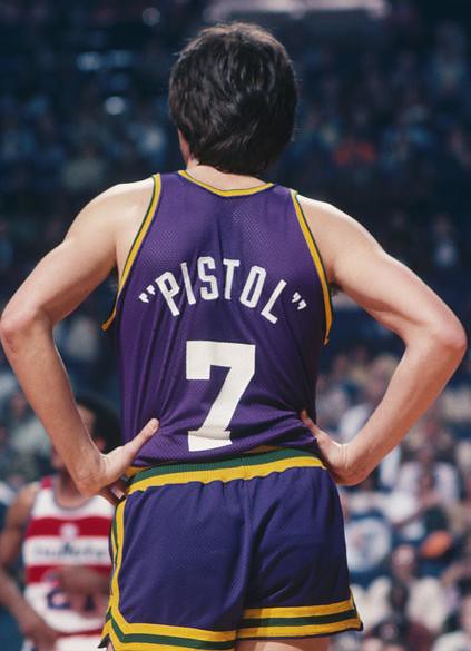
• Pete Maravich:
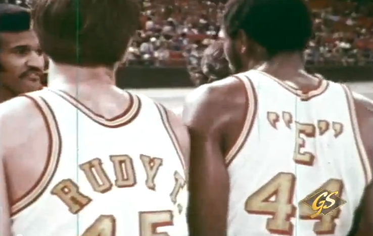
• Rudy Tomjanovich and Elvin Hayes:
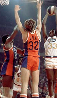
• Jan van Breda Kolff (one might argue that this is a case of IOB — initials on back — not a nickNOB, but I decided it was worth including here):
• Walt Bellamy:
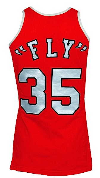
• James “Fly” Williams:
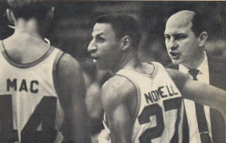
• Bob McIntyre:
Most of those examples seem harmless, playful, and fun. So why do I have a sinking feeling about what the NBA is doing with the Heat and Nets? Maybe it’s because the sports world itself seemed more harmless, playful, and fun a generation ago than it does today. Maybe it’s because the Heat/Nets thing feels more like a calculated “Look at us!” stunt than an organic development. Maybe it’s because it seems like just another way to sell jerseys. Maybe it’s because you just know a bunch of the players are going to try to outdo each other to see who can come up with the most “outrageous” nickname. Maybe it’s because it’s easy to assume the worst about the NBA’s uniform schemes these days, what with all the sleeves and the BFBS nonsense and the possibility of ads.
Then again, maybe it’s just because lots of things seem like bad news at first glance but end up seeming a lot more forgivable, or even enjoyable, in hindsight. As I’ve written several times before, MLB’s futuristic uniforms were awful, but wouldn’t the uni-verse be a duller place if they’d never happened? Maybe that’s how we’ll end up looking at these NBA nickNOBs a few years from now. Hope so.
On the other hand, imagine if this catches on and commingles with the NBA’s other current uniform trends. Imagine a team wearing sleeves, nickNOBs, and ads. Perhaps some of you graphically inclined folks would like to show us how that might look?
Meanwhile, at least one NBA player — Kendall Marshall of the Suns — doesn’t like the idea. He tweeted his thoughts last night:
Not of a fan of the nickname idea.Having your last name on the back of your jersey isn't just representing yourself, but your family as well
— Kendall Marshall (@KButter5) September 23, 2013
The nickname makes it more about the individual. It's still a team sport. Represent your team, your family, and go out there and play.
— Kendall Marshall (@KButter5) September 23, 2013
Collector’s Corner
By Brinke Guthrie
Paul had a terrific article last week that included some work by Dave Boss, who is right up there in the sports art Hall of Fame. I love any excuse to mention Boss, so here’s an auction for a set of Boss-designed game program art prints.
If I had my way, Collector’s Corner would be all Boss, all the time. But Paul says that isn’t practical, so here’s the rest of this week’s eBay haul:
• Remember these NFL books? Man, I bet I had every title in the series. The Punt Pass & Kick series was particularly great.
• Love the cover art on this 1969 West Palm Beach Expos game program.
• I’m a big fan of the helmet style shown on this NFL kids wardrobe/closet.
• Look at these stadium cereal bowls from 1969! Never seen those, ever. How cool!
• This 1970s Sand-Knit jacket looks vaguely familiar. I know I’ve seen it somewhere”¦
• The artwork on this 1970s 7-Eleven Yogi Berra cup reminds me of, well, someone else.
• Love this 1970s MLB logo. Why don’t they still use this? This gold charm is for a necklace or bracelet.
• Ah. Look at the NFL helmets on this 1969 United Airlines ad.
Seen something on eBay or Etsy that you think would make good Collector’s Corner fodder? Send your submissions here.
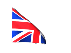
Close your eyes and think of England: The NFL is staging two games in London this season, the first of which is this coming Sunday. “As part of the festivities, the league is taking over Regent Street this Saturday afternoon for a block party,” says reader James Vetter. “Perhaps this could be a good opportunity for UK-based Uni Watchers, along with anyone crossing the pond for the game, to have an impromptu get-together.”
I love this idea. If any Uni Watch readers want to meet up this Saturday in Ol’ Blighty, feel free to contact James directly to set up a plan. And be sure to send photos so the rest of us can see how it went.

’Skins Watch: “Corey Cove of the Power Trip morning show on KFAN in Minneapolis only refers to the ’Skins as ‘the Washington R-words,'” says Brett Stone. “This morning, his co-host even said, ”˜’Skins’ and then corrected himself.” ”¦ Washington sportswriter Dave Zirin, who wrote the most thorough response to Rick Reilly’s recent pro-’Skins piece, went on W. Kamau Bell’s show and talked about why the team name should be changed (from Noah Habenstreit). ”¦ Speaking of Reilly’s piece, IndianCountryToday.com’s award-winning cartoonist, Marty Two Bulls, did a fun send-up of it. ”¦ ESPN’s ombudsperson didn’t think much of Reilly’s piece either.

Baseball News: Let no aspect of the postseason go unpatched (thanks, Phil). ”¦ “The Yakult Swallows are taking orders on a T-shirt commemorating Wladimir Balentien’s new home run record,” says Yusuke Toyoda. “But one problem: The original design featured the flag of Balentien’s home of Netherlands Antilles, which was dissolved in 2010. So the Swallows corrected the design to show the more up-to-date flag of Curaçao.”

NFL News: I’ve written many times that one of the biggest and most underappreciated changes in football over the past generation is the near-universal use of gloves. That sort of resonates a bit differently in light of what happened to Rashad Johnson on Sunday. Read that whole story — it’s incredible! Now imagine if he hadn’t been wearing gloves.

College Football News: Virginia Tech will wear stone-patterned helmets this weekend because, you know, why not? They don’t look so bad — or, rather, they don’t look like much of anything — in sunlight. Further info here (from Phil and Andrew Cosentino). ”¦ Here’s a good article about the Mississippi State training staff. “Middle of the article includes a reference to ‘Gatorade NCAA Sideline Inventory and Setup,'” says Dustin Semore. “Turns out Gatorade told teams how and where to place Gatorade cups and bottles.” ”¦ Robby Gross wants to know what the little decal is to the left of the Tennessee helmet stripe. Anyone know? ”¦ Arizona State will wear solid maroon this weekend. “According to the Twitter page of the equipment managers, there is a new wrinkle planned,” says Marc Altieri. “I don’t have confirmation but am guessing it is either maroon socks (they wore black socks for last season’s Maroon Monsoon vs. Illinois) or maybe the large pitchfork decals are going to make their debut.” ”¦ Lots of people in Alabama apparently still don’t know what houndstooth is (from Jonathan Lancaster). ”¦ Here’s a great article on using small uniform details to locate a game photo of Jack Trice, the first black player at Iowa State (from Tim Kniker).

Hockey News: The Ducks have swapped their primary and secondary logos, although the switcheroo has no practical implications for now. ”¦ Sunday night’s episode of Breaking Bad included footage from a class U. of Wisconsin hockey game. Maybe they should call it Breaking Badgers (from Jerry Nitzh).

Soccer News: Everton fans can now vote on the team’s new crest (from Mark Coale). ”¦ “Crystal Palace FC appears to be the only team in the EPL with a straight NOB,” says Brett Stone. “All other teams have vertically-arched NOBs.” ”¦ “Irish soccer player Stephen Ireland, made his debut for Stoke City wearing No. 32 the other day and as it turns out the back of his jersey is a bit of a political minefield,” says Patrick Fleming. “The significance of ‘Ireland 32’ lies in the fact that the island of Ireland contains 32 counties but six of those make up Northern Ireland. Therefore the number 32 is very heavily associated with the controversial idea of unifying the entire island as one country.”

College Hoops News: New uniforms for Virginia Tech, VCU, and Creighton (all of these courtesy of Phil). ”¦ New court design for New Mexico.

Grab Bag: New site redesign for Slate. ”¦ Abercrombie & Fitch has settled a lawsuit regarding two Muslim employees’ headscarves. ”¦ The logo for Showtime’s new show Masters of Sex makes some interesting use of negative space (from Matt DeMazza). ”¦ England’s new rugby kit is causing some blowback, but of course I like the stripes (from George Chilvers). ”¦ Starburys are back! (Thanks, Brinke.)

What Paul did last night: I spent all day yesterday at ESPN HQ in Bristol. Then I went out to dinner with one of my editors. I had already set up a main entry for today (including “Collector’s Corner,” which Brinke had delivered on Sunday evening), and I had managed to keep up with most of the Ticker submissions during my day at ESPN, so I figured I wouldn’t have much work to do once I got back to Brooklyn — maybe 20 minutes to catch up with the Ticker stuff that had come in during my drive home, and then I could relax and maybe have some quality time with the New Girl.
Got home at 10pm-ish, checked my email, and discovered that the nickNOB story had broke during my trip home. So I had to back-burner the main entry I had planned for today (it’s an evergreen, so that’s no problem) and write an entry about the nickNOBs (grrrrr).
All of which is to say: If the uni-verse could please deliver its breaking stories during the standard workday, that sure would be more convenient.
breaking bad link is broken
actually it’s just incorrectly formatted
Fixed.
still not working for me
Sorry — NOW fixed.
Ryan Lambert of Yahoo’s Puck Daddy had this figured out about an hour after the episode aired Sunday night, which was a good 12+ hours before that SI post.
link
UW made $2000 on the use of the clip in the movie. Here is how the producers went about getting the clip.
link
Just out of curiousity, how long have you and New Girl been hanging out for? Kinda random question, but something that popped up when I read about the loss of relaxation and maybe quality time.
Not much longer unless the sports godz get their act together and start breaking Unbadly…
the way “New Girl” was capitalized.. i though he was referring to the show on Fox. which would be fantastic if Zoey D wasn’t in it and it was just the 3 guys
thought*. … we really need to have the ability to edit our post lol
..then you could have also fixed Zooey’s name
It’s a shame the New Girl will never have the pleasure of being the topic of your troll’s insults (Can’t recall his name, but I know it was a big dick reference.)
If I was her, I wouldn’t feel like a proper Uni-Watch girl unless I was treated to filthy comments by Uni-watch’s official troll. It’s like she is missing out.
I will always remember the day that Paul wrote the article about Big Cock Johnson as the same day the manhunt happened in Boston. Weird day all around.
Dear Mike V.,
I agree. If Big Cock Johnson would kindly just return one more time to spew some creative X-rated venom (something involving baseball stirrups, I hope), I’d finally feel properly (and proudly) initiated into the Uni Watch world.
Sincerely,
The New Girl
Re. the straight NOBs on Crystal Palace’s shirts – both Manchester City and Cardiff City are using that style in the Premier League this season as well.
Was about to say just this, also City have traditionally preferred horizontal NOB while United has been arched since 1995
Good catch.
Thanks! Still looks odd to me. I’d prefer the arched NOB for all.
I noticed that most teams below the Premiership use horizontal letters, possibly because the number font they use in the League is so blocky and doesn’t leave room for arched lettering.
Maybe the straight NOB for Palace and Cardiff is just a holdover from their previous seasons?
Darn it, you guys beat me to it. The Premier League’s link, released with the new number set in 2007, sets guidelines for both straight and arched. It seems to imply that arched is for raglan-sleeved shirts, but doesn’t specifically require straight for set-in sleeves.
Note that the specified arching is radially-arched.
Imagine my disappointment upon clicking the picture when I saw “vertically-arched”…
The player names on most Premiership jerseys are radially (not vertically) arched.
All NickNOB NBA jerseys should be required to use quotation marks like Maravich and Hayes.
I’d go for that if every time their name was mentioned by a broadcaster on air they had to hold up their hands and do air quotes.
Man, I hate air quotes. This whole thing is silly. Inconsequential, but silly.
The Nets or Heat should sign former XFL player “He Hate Me” to a one day contract and dress him for the game. The will set the proper tone for the nickname jerseys.
I had a similar thought – I hope one of the benchwarmers on one of the teams has a sense of humor and insists on putting He Hate Me on the back of his uni. Although the average NBA benchwarmer was probably about 10 years old when the XFL launched, so maybe that’s unrealistic.
I remember having one of those NFL books called “Gamebreakers of the NFL” It had Allan Page sacking John Brodie(?) on the cover, I think. I think I was a Vikings fan at the time.
cool books
Me and my brother had the Bill Gutman football books.
He had quarterbacks: link
Mine was running backs with OJ and Larry Brown on the cover:
link
The severed finger story is one that gives me the creeps. Probably because it’s something I can imagine happening to me and I can imagine feeling it. YOUCH!!
Hack and slash movies don’t bother me cuz I can’t imagine myself getting ripped in half by zombies, or being depatitated by a chainsaw-weilding maniac.
The mention of severed fingers makes me think of Emmett Fitz-Hume:
link
It’s too bad the Wizards aren’t in the nickname game. I’d be curious to see what Nenê does.
* Pedantic comment – “Close your eyes and think of England” is accompanied by the flag of the UK.
* Non-pedantic comment – agreed that the England rugby jersey quite nice. I like sailor stripes in sports uniforms. Also, love the accompanying photos with two of Paul’s favorites – BFBS and purple.
While you are of course correct that the Union Flag is the flag of the UK, not just England, the use of the St George’s Cross flag, rather than the Union Flag, for England in sports circles is fairly recent.
During the 1966 World Cup the Union Flag was ubiquitous.
link
Good point – I noticed the same in link.
Nick Hornby makes a mention of this in his book Fever Pitch, how football fans had only recently re-claimed the flag of St George from the clutches of the far right, who had appropriated it to accentuate their (white) Englishness.
This site is full of smart guys.
Advertising Age has picked up the Washington football team story. Estimated value of rebranding: $15MM.
link
Me being pedantic again:
That would be the cost, not value, of branding (value would be how much Washington would stand to gain).
But here’s what caught my attention:
Coming up with a new moniker would only run $500,000 to $1 million, he said. The real expense would be replacing the old name and logo at the team’s FedEx Field stadium in Landover, Md., and Redskins Park HQ/training center in Ashburn, Va.
Said Mr. Adamson: “The cheapest part is coming up with the creative. The most expensive part is hoisting the new letters on top of the stadium.”
So here’s what I see happening. The FedEx Field lease ends in 2026. Snyder has said he wants to move back to DC eventually. As years pass, the old guard gets less influential and vocal, and the younger generations tend to be more progressive. So Snyder (or whomever he sells the team to) will use the move back to DC as an opportunity for a fresh start and a rebrand (and save costs).
But wouldn’t all the new merchandise they’d sell make up a lot of the expense?
Right. But there will still be a $15 million cost regardless of the potential revenue. Whether they make up the cost is an issue not covered in the article.
That said, I imagine the Redskins will do some at least a refresh of the brand in the next 15 years anyway, so they’ll end up spending a few million with or without a name change.
The question of whether changing the name is a net money-maker (due to sales of new merch) or a net money-loser (due to exorbitant rebranding costs) is a red herring. It suggests that there’s a price on doing the right thing. That suggestion itself is at least as offensive as any logo or team name.
I say it will take between 18 and 24 months before the Washington Football team announces its new name, and within a year there will be a contest (with possibly already agreed upon results by focus groups) to rename the team.
The boulder has left the top of the mount, beginning its downward rush. Snyder can continue his Sisyphean quest or choose to be on the right side of history. And while I don’t expect him to echo George Wallace’s “I was wrong. Those days are over, and they ought to be over,” change of views, I expect Snyder will see the light and embrace a new start, with a healthy RGIII leading the PR campaign after his season.
18-24 months sounds fast to me, but what do I know? I was thinking more like 5 years. The NFL needs to create a way for Dan Snyder to save face on this, as well as, maybe sweatening the pot for him a bit. Maybe something like sharing the rebranding costs or even giving him dough to offset potential branding losses on the Skins name. I’m also thinking it could take more time as I would expect Dan Snyder to fight extra hard on this. They dicked him over on the whole salary cap thing and he hates losing fights, so he’ll fit this even harder.
Oh! Letting fans vote on a Washington team name? There is still the rest of the Wizards ballot…
Dragons, Express, Stallions, Sea Dogs
I vote for Sea Dogs!
I’m just saying that when they do change the name, they can say to themselves that at least they’ll make a little money on new merchandise, and not have to just be bummed that they caved to social pressure.
I wonder which is really more likely: A full rebranding with new logos and colors, or just bringing back the spear logo and typing out Warriors in the same font the team is currently using.
For any responsible business, there is no “just bring back old logo and retype the name” as opposed to a “full rebranding.” Which might not apply, this being an operation run by Dan Snyder, except that the NFL is involved in all team branding decisions. So even if the goal at the start is “merely” reverting to an old logo and developing a new typescript, the creative costs of developing the new brand identity would be about the same. You just don’t do something like this without testing your assumptions, and somebody has to create the actual visual assets, and right there you’ve got a “full rebranding” in terms of effort and work product.
Right-o. Also, the cost of replacing signage would apply even with any rebranding, full or otherwise. There won’t be a significant difference in the price tag either way.
Which is to say, the cost of the logo is a pretty small part of a rebrand. Most of the time and cost are in the exploration and the physical deliverables.
On the Tennessee helmet, I believe that is the ‘Brick by Brick’ decal that runs off of Butch Jones’ recruiting pitch. Trying to find a site to confirm, but I am also about to meet up with some of the players in about an hour and can ask them too.
The Tennessee sticker is definitely the “Brick by Brick.” It’s two orangish bricks on top of each other with the words over it.
Yep. That is exactly what the players I just spoke to said. Orange bricks with Brick by Brick written over it
Thanks guys! Didn’t notice them for the AP or WKU games. Kinda thought it was something along those lines. Didn’t know if they were going to add one for each win since I didnt notice them for AP or WKU.
It’s about dang time that the Anaheim Ducks make the webbed foot their primary logo.
Too bad they’re not changing the jerseys just yet.
“Crystal Palace FC appears to be the only team in the EPL with a straight NOB,” says Brett Stone. “All other teams have vertically-arched NOBs.
Manchester City and Cardiff City also have straight NOBs.
Gah! I owe Jaffa a Coke. Could have sworn no one had commented on this! :-(
For some reason I thought you said Jaffe Cake.
Mmmmmm, Jaffa Cakes.
Tennessee helmets: did nobody consider the potential for ‘Rocks for Jocks’ jokes?
Make that VA Tech helmets…
That “Ireland 32” on the back of a jersey gets the Unionists all aquiver is a fine accomplishment.
Interestingly, there is a cafe in Halifax called Ireland 32, whose website (incorrectly) states: “Our owner is an Irishman, hails from Co. Donegal, Ireland. No, our owner is not 32 years old, nor was he born in 1932. The “32” is the number of counties in the country of Ireland”.
There’s also an Ireland’s 32 in San Francisco, with this amusing Yelp review:
I’m still banned. Years ago, I took a friend from Iowa here. Her first reaction was: “Geez, there sure are a LOT of IRA posters up here.” Loudly. Her follow up party foul was “Why is it called Ireland’s 32? “Doesn’t Ireland have 26 counties?” IDIOT!! Because the Irish want their 6 counties back from the limeys, you maroon.
Of course that got the Irish up of the bartender, and we were summarily tossed out, lucky to be alive
Still, there was an unfortunate time in recent history when a lot of Americans unwittingly contributed funds to terrorism through propaganda placed in Irish pubs.
“Unwittingly”? Not so much, in my experience as a child attending Irish-American gatherings in the very late 1970s and into the 1908s. I don’t for a minute believe that any adult in the room didn’t know exactly what was going on when the hat was passed for “Sinn Fein widows” or “orphans relief.”
What does shock me in nationalist Irish pubs is the bile, signs and verbal, one still finds directed at Michael Collins for “giving up” the Ulster counties in the treaty – counties that were already firmly in British military and civil control when negotiations began. You can’t negotiate to keep what you don’t possess!
Right on, Scott. Michael Collins was the truest hero of them all.
26 + 6 = 1
I should say, “nationalist Irish pubs in America.” In none of the pubs I’ve been to in the Republic of Ireland have I ever witnessed even a single shit being given about the island’s division of the history thereof.
Last year at about this time, there was the mention of the 20 year losing streak tee shirts poking fun of the Pittsburgh Pirates. How about a 50 something or 100 year something futility streak tee shirt for other sports teams who have never won, or don’t have any living fans with strong memories of winning the ultimate prize?
Shattering the losing streak with nearly a full month to play was completely unexpected, and last night’s Sid Bream in reverse win to clinch the playoffs was icing on the cake. It’s been so satisfying shutting down the naysayers and critics in the process of easily blowing up the losing streak.
During the inevitable post game celebration, there was a possible leak of the new logo. Saw a pirate skull with a hat similar to the 1968-1996 versions, but the hat was more sideways and back on the skull. Thought I saw an Underarmour logo on the shirt, but can’t be sure.
“How about a 50 something or 100 year something futility streak tee shirt for other sports teams who have never won, or don’t have any living fans with strong memories of winning the ultimate prize?”
~~~~
Hmmm. And what city/team might that be? Yeah…105 years since the last world series win is a pretty long time, but the Bucco’s accomplishment of 20 straight losing seasons is one that will probably never be broken. The next closest team (Phillies) topped out at 16. The Bucs didn’t just set the record, they obliterated it.
Don’t get me wrong, I’m very happy for Steel City and the Pirates, and I hope Buctober lasts longer than a one game-play in.
Enjoy your (well-deserved) success. Don’t strike out at other cities while you’re riding high.
But what’s the point of getting to the top if you can’t kick those who are still down? That’s the fun part.
Just kidding. As a healing Bucco fan and Pittsburgher, thanks for the “congrats”.
Wouldn’t say 20 losing seasons is untouchable by a long shot, the Phillies actually went 30 years with a single winning season, and didn’t claim a world title until 1980.
And the KC Royals have a staggering 26 year streak without the playoffs. The Tampa Bay Bucs also went meekly down with their 26 game streak, winning two meaningless games at the end of the 1977 season. So I’m hardly striking out at other cities, just pointing out other long streaks that don’t seem to get as much attention.
And whether or not the Bucs go on to advance in the playoffs doesn’t begin to define the momentum gained from this season.
This site did promote the sale of the obsolete 20 year losing streak last year, and that came off to many as a cheap shot, especially since tee shirts aren’t uniforms. I just don’t see this site promoting other streaks which are equal if not worse. It’s really an issue about fairness, and last year came off as piling on big time.
And at the end of the day, it’s still better to be a fan of a team that’s won big for a significant part of the fan base and in relation to the rest of the league as opposed to the others.
“This site did promote the sale of the obsolete 20 year losing streak last year, and that came off to many as a cheap shot, especially since tee shirts aren’t uniforms.”
~~~
How did the site “promote” the sale of said tee shirts? If you’re talking about an advertiser selling merchandise, I’m not sure that qualifies as “promoting” anything. If this was something other than an advertiser, I’m not aware of it (I’m sure I didn’t post on it, and I highly doubt Paul would).
We “promote[d]” a shirt about a losing streak?
I don’t think so. But if it’s something I’m simply forgetting about, feel free to refresh my memory.
Thought so.
Haven’t seen this mentioned yet – Fred Smoot, former Redskins player, calls Mike Shanahan “Red Lobster”:
link
Is it a coincidence that Shanahan’s “nickname” is perfect timing with the debate of the team nickname? People in the Yahoo comments debated it, saying it was “racist” and no more appropriate to Shanahan calling Smoot “brown &$*#@” or other things I won’t type.
Anybody with money to burn want to custom order a “Red Lobster” 00 jersey? Perhaps the opposing team fans can source some plastic lobsters to throw onto the field when their team scores 3 touchdowns… I’ll be here all week.
Not specifically uni-related, but Kendall Marshall will now be one of my favorite players. He said the one thing that exposes what the NBA has been promoting for the last 20+ years, individualism…and oh, my gosh, that basketball is actually a team sport. David Stern hasn’t wanted you to believe that, considering all the promotion of individual players. Instead of stating that it’s Miami vs. Los Angeles, they should just say it’s Lebron James vs. Kobe Bryant, because the other 11 players on each team don’t appear to matter. It’s the one thing that has irked me about the NBA, and why I’ve paid little attention to it since the days of the Showtime Lakers.
Smoot! Smoot’s an idiot, but that is still pretty funny.
The thing is, basketball has always been about the individual expression and moments of singular brilliance. Eras are defined by the players, like Wilt, Russell, Magic and Bird, Jordan. Rule changes are instituted because of individuals and iconic moments are usually built on players just taking over.
Basketball is like a chicken sandwich. People think the chicken is the star, and it’s what costs the most money, but it’s really just a vehicle to deliver the hot sauce to your mouth. It’s been that way long before Magic’s Showtime Lakers.
CM Punk cut a promo on Monday Night Raw last night wearing a counterfeit Blackhawks jersey. link
The Virginia Tech helmets are not just stone, it’s Hokie Stone – the stone that covers most of the buildings on campus from a local quarry.
However, as a grad of the university, I must say those helmets are turrible.
The Milwaukee Bucks are unveiling their new court design at 7 p.m. CT tonight at a sold-out event at the Milwaukee Art Museum. It’s said to be inspired by Robert Indiana’s wonderful MECCA floor design of the ’70s and ’80s. The unveiling will be streamed live at link
Paul, here’s an article about what the little sticker on the back of the Vols’ helmets might be, though looking at the images, it’s hard to tell if that is what we are seeing… “63” signifying 6 seconds per play, 3 great efforts per play. No clear pics yet. If you look closely, it appears to be a boxy 6 above a 3 forming a square
link
and some additional detail
link
Ron Ruelle
Jason Heyward wore his facemasked batting helmet during the Braves’ Post-Game Locker Room Celebration brought to you by Bud Lightâ„¢ on Sunday.
link
What made this even better is that he didn’t wear the ubiquitous Oakleyâ„¢ ski goggles that everyone wore.
Minor correction – Cory Cove of KFAN is spelled Cory, not Corey. Or Sludge works too!
Question: Is it considered a faux pas to wear a special helmet when you visit another team who is celebrating their 100 Years at their Stadium, complete with Throwbacks, a halftime ceremony, and other such activities?
It seems just seems tacky to me to essentially try and upstage your opponent’s uniform on a night like that.
Also they just ruined what would have been a beautiful game uniform-wise. I don’t see this helmet working well with any of their jerseys, either.
“Ah. Look at the NFL helmets on this 1969 United Airlines ad.”
Why didn’t the Minnesota NFL team ‘fly the friendly skies’?
Maybe the Vikings flew Northwest Orient. Which was the Cleveland Browns of airlines: for many years, the company’s logo was a stylized drawing of its planes’ plain red tail.
I kind of wish a glow-in-the-dark uniform would be what’s next. Not that it would be a total innovation: The old minor-league Casper Ghosts wore glow-in-the-dark ballcaps.
But imagine a team that plays in an arena, like basketball or hockey, where lights can be dimmed to near-total darkness, with the home team entering with their jerseys all a-glow. Talk about turning it up to 11. Kind of surprising it hasn’t happened already.
Paul interviewed (audio) on Hokie Stone helmets
here
News: I’m going to be discussing uniforms tonight on Olbermann’s show, 11pm eastern, ESPN2.
This is fantastic news. I love his new show, and to have you on discussing uniforms makes it that much better.
May we pry and ask what the discussion will specifically be about?
The current plan is for us to discuss NBA nickNOBs (and, I think, names on uniforms in general), although a lot can change between now and when the show airs.
OK — time for the daily bike ride. See you folks later.
Redskins Watch addition: On Monday’s Totally Biased, actor Jeffrey Wright came out for his interview with W. Kamau Bell in a Redskins hoodie. After short introductory pleasantries, Bell asked Wright, essentially, “What the hell’s up with that sweatshirt?” The ensuing discussion took up about half the interview, and Wright (a DC native) is pro-‘Skins. Footage here: link
Bucks new floor is unveiled. Personally, and honestly: Kind of a weak homage to the Robert Indiana floor. Stain recalls the ‘M’ and the diamond pattern, but the all-green color makes the floor seem a lot less lifeless than the Indiana floor, which was very bold and popped in the era of lowly-lit arenas on high-contrast TVs.
link
showtime, espn 2!
No ‘cream’ home uni (a Creamer rumor, natch) for the Mariners. link
Anyone else surprised that Abercrombie employees Muslims? Well,I bet they are thin…