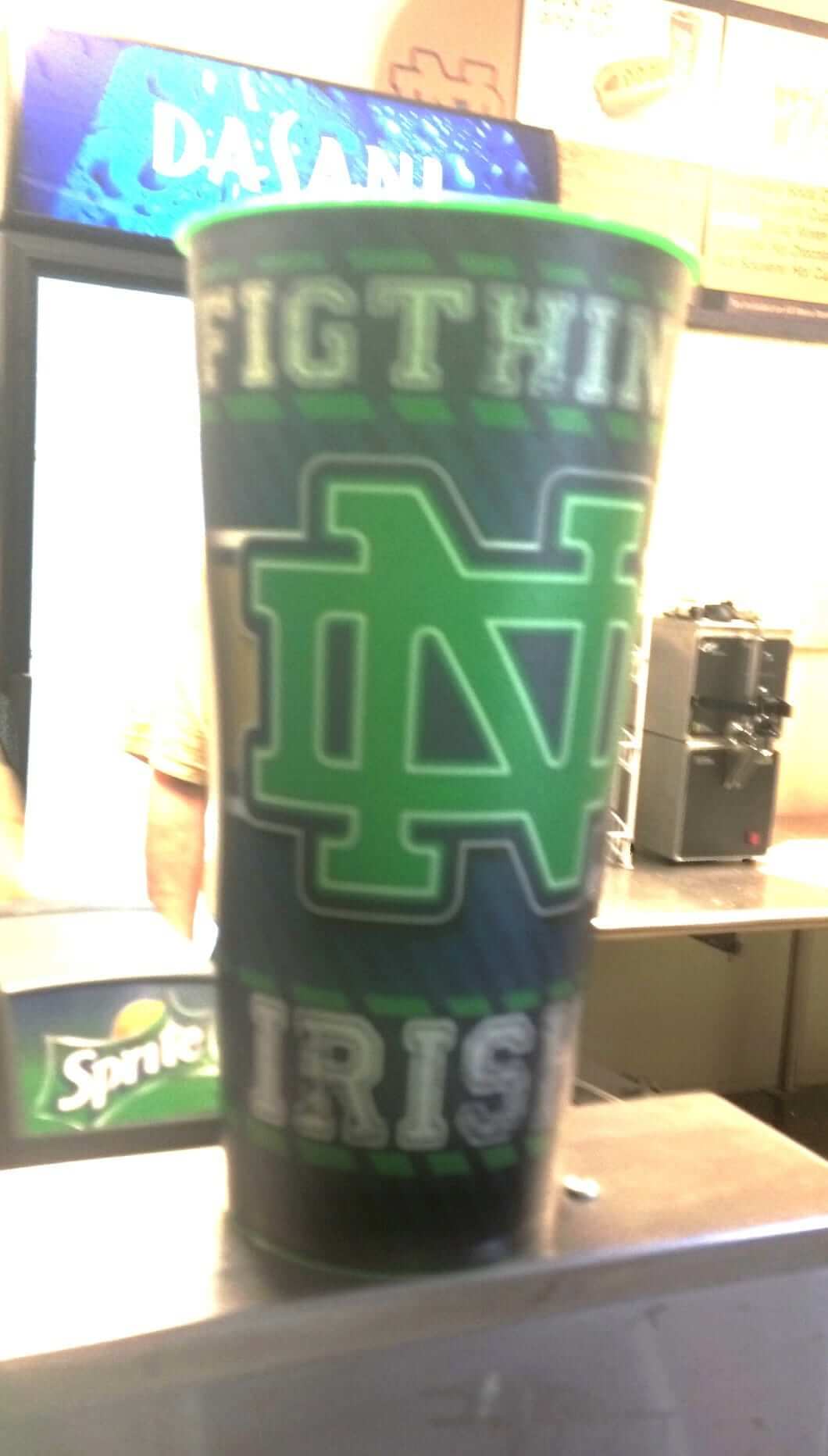
Anthony Zogas attended yesterday’s Notre Dame/Temple game, where his friend bought a drink in a collector’s cup that had a typo for the ages. Collector’s item indeed! ”” Paul
’Skins Watch: A lifelong ’Skins fan who now teaches at NYU has written a strong piece for the Washington Post about why the ’Skins name should be changed. Recommended reading (from Tommy Turner).

Baseball News: Holy moly, look at this awesome photo of a 1952 fast-pitch softball team — including the coach with the short tie! (Great find by Jon Bravard.) ”¦ We’ve all seen MLB players wearing their big league helmets during minor league rehab stints. But Bosox pitcher Clay Buchholz, currently rehabbing with the triple-A Pawsox, wore his Red Sox jersey last night. “What makes this extra-interesting is that Majestic makes Boston’s jerseys while Russell Athletic makes Pawtucket’s,” notes Aneury F. Pichardo. … Jerry Wolper has added a few games to his BucTracker page.
College Football News: In a surprising and disappointing move, San Jose State has switched from yellow facemasks to gray. Can’t say I understand the thinking behind that one. … One size fits all most. Terence Kearns spotted that guy during yesterday’s Temple/Notre Dame game. ”¦ Here’s another story about those Kevlar helmets being worn by Dayton. ”¦ Gregg Wiebusch was watching yesterday’s Syracuse/Penn State game and noticed a Syracuse player wearing a headset with last year’s Pinstripe Bowl logo. ”¦ In last night’s Oklahoma/Louisiana-Monroe game, ULM’s helmets had a decal shaped like the state of Oklahoma. Tornado victim solidarity, I’m assuming. Anyone know more? ”¦ If you go to this page and hit the right-hand arrow, you can see when Under Armour is planning to unveil new uniforms for a bunch of schools. And if you click on the teaser flags, or even just hover your cursor over them, the resulting URLs tell you what those schools will be getting:
/colorado-state-university-home-uniforms
/university-of-south-carolina-gamecocks-away-uniforms
/colorado-state-university-away-uniforms
/texas-tech-black-guns-up-uniforms
/texas-tech-gray-guns-up-uniforms
/university-of-maryland-pride-uniforms
/texas-tech-lone-survivor-uniforms
/northwestern-university-wounded-warrior-uniforms
/university-of-hawaii-rainbow-warrior-throwback-uniforms
/university-of-toledo-power-in-pink-uniforms
/texas-tech-lone-star-uniforms
“I’m excited for Hawaii’s reveal,” says Tim O’Brien. “The rest I’m dreading. Especially NU’s and Toledo’s.” ”¦ As had been rumored, Virginia Tech wore gray against Alabama yesterday. … Somewhat bizarre new helmets for Montana. … This is odd: Some of Georgia’s new jerseys have the Nikelace and some don’t.

Hockey News: No sign yet of the Sabres’ third jersey, but here are the pants that will go with it … The Wild are scheduled to unveil their new white jersey today, 12:30pm Eastern, at the Minnesota State Fair. I really like the outgoing white jersey, so I’m kinda nervous about this. Don’t screw it up, Wild!

Grab Bag: Good story on the evolution of NASCAR series logos. ”¦ Two of my all-time favorite Uni Watch readers — Comrade Robert Marshall and Marty Hick — recently met up in St. Looey. The baby is Marty daughter, Clara Jane Hick. The art on the wall is by Robert’s galpal, Kate Perryman. ”¦ Here’s a slideshow of some of the worst Aussie football uniforms since 1990 (from Graham Clayton).
I’m not sure why, but for the second season in a row, Russell Athletic has waited until opening day to unveil new uniforms for Georgia Tech. These are actually a huge upgrade. No honeycomb pattern to be found. UCLA-esque stripes that actually go all the way around the shoulder and connect. No unnecessary piping on the jerseys. Definitely a move in the right direction.
Good shot here: link
Additional photos here: link
When did Alabama start wearing dark gray as their base-layer color? They’ve been doing it for years and while a few players will wear crimson or white a lot wear the gray.
As a Bama fan, I’m ok with it. Gray has been used sparingly throughout the years here and there. “Warm gray” is actually listed as a complimentary color on the school website. Plus… you know, elephants.
While I love our traditional unis and don’t want to ever see them change, if we did another one-off alternate, I would MUCH rather see gray used than horrible houndstooth.
This is why I’ve always given Bama a pass in my gray facemask hatred. I’ve always thought of it more or less as a school color so it doesn’t look out of place with them unlike say USC or UCLA who both looked much better when they finally dropped the gray facemask for school colors before it’s unfortunate return on both not long after.
The dark gray is Nike’s “generic” color.
I noticed one of the pics in the Aussie Rules slideshow showed a GPS unit strapped to the back of a player. It got me curious as to the purpose of the GPS so I did some Googling. I found a blog post from Pro-Football-Reference.com that talks about why they are used in Aussie Rules football and also how GPS units could be used in American football:
link
Murphy’s Law strikes–there’s a typo in your caption to the typo cup photo. “Yeserday.”
Ha! Will fix momentarily.
last year, UMass Lowell’s hockey collector soda cups had “2012-2012 Schedule” printed on them.
Looks like the Wild whites are available for viewing:
link
and I love them.
Yep… the Wild jumped the gun a little last night, link.
link.
… that was supposed to be “up on” – two words. Considering the amount of typing corrections I made to that post (and this one), I’m surprised I missed that one.
And, of course, the Yahoo article mentions Icethetics – didn’t click on it and read their article before I posted above. DERP
In any case… I like it! Nice, simple, clean, fits in with their green unis, and I’d be willing to get one (though I’d yank the laces out from the collar).
Very nice!
Looks like the Wild’s webmasters took them down, but link.
And now that the official unveiling has occurred, the Wild have put them back up on their site.
That jersey template still sucks and needs to go away but the look itself is very nice. The only slight issue I have and always have for the whites would be I’d rather see the numbers green outlined in red. But still a very nice looking update for them.
There needs to be a thin stripe below the thick stripe on the sleeves and hem, right? And those thin stripes should be red. Right? That gives balance. These look incomplete.
nd take the superfluous logo patch off of the shoulder.
I haven’t found a picture yet, but Nebraska’s jerseys had the adidas stretch marks.
UAB went all white against Troy. Only the second time they’ve worn white pants and it’s the first white helmet in school history.
link
My father and I also went to the Temple/Notre Dame game yesterday and I have the same exact cup. You are correct, it is the perfect collector’s item.
As a non-Notre Dame fan: Heh, the ‘Fig-Thing Irish’.
I like figs.
Both Florida & Georgia have new fonts this year.
Georgia
Florida
They both look like improvements to me.
Seriously? You do know that UF’s new font is the one on the left, the old one is on the right.
Georgia’s isn’t bad but I’m not liking Florida’s quite as much. I want to see it on the whites before I make a final decision but on the blue that orange blends in way too much now. It needs to be thickened a bit to stand out more. Seems to be a problem in that state lately.
*the font itself it fine for both though. Just that thin orange that bugs me. Otherwise I’d say very nice improvement for both teams.
ULM was in fact wearing the Oklahoma Home decal on the back of their helmets for the Moore tornado. They talked about it on the broadcast.
WWWwwwaaaayyyyyy too many teams breaking out stormtrooper looks yesterday. Very bland and colorless day in a lot of games. I hope it was a beginning of the season special and it’ll be much less frequent as the year goes on.
Since I hate that all white on the road look anyway seeing a lot of teams add to it by the white helmets or stormtrooping at home wasn’t good. I’m hoping next week will be better because quite a few of the games yesterday were candidates for my “1 bad” this week because of the trooper look.
That UGA player does have the nikelace. He’s an lineman who had his jersey tugged on during action, and that, and the placement of the camera during the screencap obscured that. You can see photos of him (#64) the espn photo album, nikelace and all.
The Florida A&M uniform Style would’ve been nice make up and color scheme for the new Miami dolphin uniform
No.
Justin Morneau in his Pirates debut, wearing #36 but batting helmet #66. According to the tv broadcasters, he wanted #33 like in Minnesota, but that’s retired for Honus Wagner, so he’s going to end up with #66. Interesting they have a batting helmet with the correct number already and not the jersey.
link
66 is an interesting choice. Especially in Pittsburgh. Done on purpose instead of say maybe just going with 3??
Hitting coach Jay Bell wears # 3.
Jay Bell… Hitting coach… Still makes me giggle. I figured there had to be a reason he didn’t go with 3. I didn’t see any players listed but didn’t see the coaches.
Maybe it’s his tribute to Jeff Ballard.
Ohio Bobcats in great looking matte green lids.
They are very nice. I thought Buffalo’s bright blue matte ones were nice as well.
Why aren’t you posting articles that defend the REDSKINS name. There are plenty out there, in fact more people would like the REDSKINS name kept than changed. You only post articles written by spineless PC libtards
REDSKINS FOREVER
Didn’t like the vt unis at all. Looked dirty and cheap like Nike threw something together at the last second. Wish VT would take a page from alabama and stick with our classic/throwback look.
Georgia Tech’s annual uni change this year almost HAD to be an improvement after last year’s horrific ensamble. I still wouldn’t call it a huge improvement. I also like the UCLA – like shoulder stripes. After debuting a different new uni early every year and receiving a groundswell of negative feedback, I think GT and Russell learned their lesson and stopped revealing them in advance.
I am looking forward to the September 26 throwback unis.
On the subject of grey facemasks: every team should wear them. White masks look ok on white helmets and dark masks ok on dark helmets, but facemasks look terrible in yellow or red or other bright colors.
what happens when Lederhosen meet soccer jerseys => Bayern Munich’s 2013/14 away kit.
Big club. They’re German and European champs.
link
Was trying to convince myself last night the reason UGA’s collars looked inconsistent was because of the different sized pads the players wore. Murray’s collar looked much bigger than others, now I know why.
UL-Monroe did indeed wear the same “Oklahoma-HOME” decal that the Sooners wore on the backs of their helmets. This was also the same helmet decal worn by OU softball and baseball last spring after the tornado outbreaks we’d suffered. I’m sure part of the draw for ULM wearing them is that their head coach, Todd Berry, is a native of Miami, OK.
SKINS WATCH!
Well Uni Watch don’t hold your breath, the name is here to stay because Daniel Snyder says so, oh and also, people OVERWHELMINGLY love it. I’m sure it bothers you just so much that the name “Redskins”, which virtually no one has a problem with save for the typical pocket of half baked college professors, mustachioed beta-males (Paul), and your typical occupy types who show up to any event if there is free Ben and Jerry’s involved. Get off your high horse, even you don’t give a shit that their name is “Redskins”, you just want your readers to think you have some keen insight and heightened sensitivity to what amounts to a non-issue. Which by the way is par for the course in the world of the liberal faculty lounge, where I suspect this blog just may be published from. “Slowly but surely, people” oh gee wiz Paul you are just so pious in your quest to control language. Thank you so much for taking up this cause for us the uncleaned masses.
Honestly, someone needs to give you a wedgie and stuff you in a locker (again).
PS: “A lifelong ’Skins fan who now teaches at NYU…” not the best lead in if you are concerned with objectivity, which of course you’re not.
What was Virginia Tech doing in those uniforms?
1- I thought grey was a basketball alt
2- As far as I know, that Crackback jersey was used only by West Virginia
Howdy very nice web site!! Guy .. Excellent .. Wonderful .. I’ll bookmark your blog and take the feeds also?I am glad to seek out a lot of helpful info right here in the submit, we need work out more strategies on this regard, thanks for sharing. . . . . .