By John Ekdahl
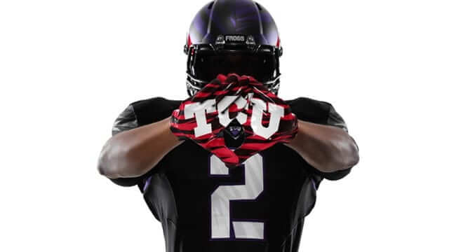
TCU unveiled their new “special edition” uniforms in Fort Worth last night. They will be wearing them for their season opener against LSU.
TCU’s brand of football is as tough as the school’s mascot, the fierce desert-dwelling horned frog. Legendary TCU Coach Dutch Meyer revolutionized football during a run to the 1935 national championship – employing the “Meyer Spread,” a formation that allowed his star quarterback Sammy Baugh to revolutionize the forward pass. The success of the 1935 team, built on a fearless and innovative attitude, defines both the mascot and the team today.
Like the horned frog, the TCU football team uses speed, quickness and innovative defense tactics to out play the competition. The frog’s scaly body armor serves as inspiration for TCU’s new football uniform aesthetic, forming a distinctive pattern on the jersey numbers, sleeves, gloves and helmet.
TCU’s all-black uniform features purple highlights and bold white numbers that reflect the new spike design pattern. The uniform also features red accents that harken back to the horned frog’s defense mechanism – a shot of blood from the eyes that repels encroaching foes. This visual reminder of the “bloodlines” and brotherhood of the team creates a head to toe aesthetic from cleat to helmet. The color scheme is mirrored in the Nike Pro Combat Hypercool baselayer, socks, Nike Vapor Jet 2.0 Gloves, and Alpha Pro red chrome-plated cleats. The helmet pulls all of these elements together in TCU’s traditional purple with a satin metallic metal finish.
Full photo gallery available here.
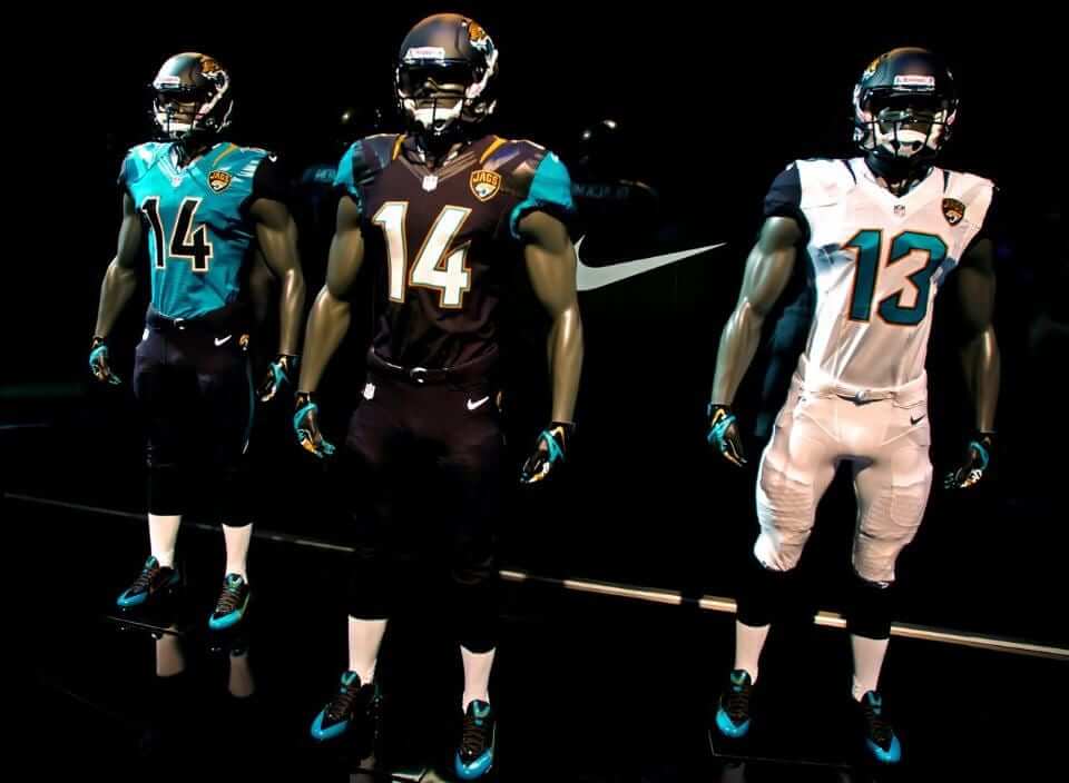
Local Jacksonville.com reporter Gary Mills noticed Uni Watch ranking the Jaguars last among all professional sports teams.
Even before hitting the field to play their third preseason game, the Jacksonville Jaguars are ranked dead last in a new ESPN list.
In his second annual Uni Watch Power Rankings ”“ an assessment of uniform sets from each of four major professional sports leagues ”“ ESPN’s Paul Lukas knocks the Jaguars new signature black and gold helmet and uniform design, revealed four months ago today, putting them at the bottom of the list of all 32 NFL teams.
And at the bottom of the list of all 122 NFL, MLB, NBA and NHL teams.
When you only have one professional sports team, that probably stings even worse.
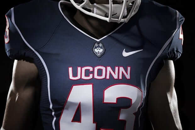
NBC Connecticut reports that not everyone is a fan of UConn’s new uniforms.
But not everybody loves the look. Take Michelle Lesniak, the Season 11 winner of Project Runway, and USAToday.com’s Jeffrey Martin, who spent way too much time critiquing the new unis.
“Meh,” Lesniak said. “The wordmark is important here – with ‘UCONN,’ there is no mistaking who we’re taking about, but now it’s official. The Husky Dog logo is a pleasant addition, neither menacing nor intimidating. What works for basketball, volleyball and other sports, though, doesn’t seem to translate to football – the gridiron uniform is underwhelming. You’d expect more from a program with such a rich tradition.”
Martin added: “I get it – clean and simple. Not too flashy… But if I was the opposing team, I wouldn’t be intimidated. In fact, I think this uniform might be better suited for the U.S. Postal Service. I could get into that.”
LOL, because the previous UCONN logo was super-intimidating…
When someone talks about uniforms in terms of whether the opposing team will be “intimidated,” I assume that he has never played organized team sports. The only times an opponent’s uniform ever affected me one way or another were when it was like a professional uniform and we were wearing cheap t-shirts, or when it was so “girly” that it felt like it would be embarrassing to lose to them. That last was the one good thing about wearing rainbow-gut Astros jerseys in youth ball: Opponents would tease you mercilessly for your sissy uniform, but that made the last laugh all the sweeter when you beat them. That’s why my theory is, if you want to psych out your opponent, you don’t dress in black with a supposedly fierce logo, you dress in pink or pastels or rainbow or something.
Great story on Slate yesterday about the worst baseball card of all time, including interviews with people involved in making it and the player featured on it:
link
Well, the Jacksonville Suns are a professional baseball team, but I’m not sure Jacksonville fans should take too much pride in their current look, either. The blue, red and bright yellow colors the team sported a few years ago is much preferable to the black and mustard yellow the team is currently using. The blue “JS” cap with a red brim was a fun cap, while the yellow “J” cap with a black brim and the black “J” on black cap are at best boring.
I am a die hard jags fan, unfortunately, and I hate the half helmet. The new jerseys are great but come on the “we ran out of paint” helmets are beyond terrible. You can’t tell me all black would not have made all the jersey combinations look so much better. Jacksonville embarrasses its fans yet again.
Agreed. I wonder how long those lids will last. Also, I’d love more gold in the uni.
Bristol Motor Speedway goes BFBS:
link
You could cut “San Diego Padres” out of my recent missives on branding and paste “University of Connecticut Football” in its place, and the narrative would be about the same. Uconn had great uniforms and a team that got off to a fast start in Division 1, and threw it all away over some misguided adherence to uniformity. Remember, “a foolish consistency is the hobgoblin of small minds.”
Why does Nike call the horned frogs “frogs?” They are lizards! I’m glad they have done their research first.
ummm, you do realize that TCU has had the horned frog as its mascot since 1897, long before Nike got involved.
He’s saying a horned frog is not actually a frog. It’s a lizard. However Nike is referring to them as frogs. Kind of like a peanut is not actually a nut. It’s a legume.
You need to be diagnosed for Aspergers disorder
I’m a very good driver.
Actually, you wouldn’t be “diagnosed for”–you would be “assessed for”, which may or may not lead to a diagnosis for some specific condition.
Thanks, autist, for the heads-up.
How about the main problem – this “Special” TCU Uniform is simply a mishmash of Nike staples in douchbaggery (BFBS top-to-bottom, the Flywire collars, sublimated patterns of what?) – Nothing notable or special or even quite like a good football uniform. It would truly be refreshing for one of these outfits to actually look good.
“But if I was the opposing team, I wouldn’t be intimidated.”
We really need to let go of the idea of a uniform design or team nickname being intimidating.
Thank you. This
link
is an intimidating uniform, because if they beat you, you’re the team that lost to Barbie at rugby. But this
link
is just a black leotard with a cartoon lizard on it. “Intimidating” is a term that no one who has ever played team sports would even think to say about a sports uniform. Which says a lot about the quality of major-manufacturer design that designers seem constantly to fixate on the concept of intimidation when creating and describing their work. Couldn’t Nike et al find any art-school grads who’d even played pee-wee football at some point? Or is it that collegiate athletic directors are so far removed from the playing field that they believe intimidation is a quality of uniforms, and push Nike et al to provide designs powered entirely by bullshit?
The Chicago Cubs.
What’s intimidating about a baby bear?
Oh dear those TCU uniforms are an absolute disaster.
For those who enjoyed my article about the best MLB promotions here is my follow up article about the worst
link
Yeah, the rich tradition of uconn football. Sure.
The Milwall story will be a great way to welcom Paul back onMonday.
They turned up for their match today without their kits.
“When a kid at school forgets his P.E. kit, they are normally told to go fish an old vest out of the lost property. Not so in Sheffield: when Millwall turned up to Hillsborough on Saturday, without any of their kit, and were handed Wednesday’s away shirt from last season — a gleaming yellow and blue number — Lomas might have been forgiven for dreaming it might inspire some Brazilian spirit in his players.”
From theGuardian
Soccer kits’ ranking: link
And the Civil Rights Game is boring uni-wise.
Both teams wearing logo patches on current unis on right chest (Umps on left) and on caps that look like it was stuck on.
Remember when they wore throwbacks to a team’s particular year?
Not intimidating enough.