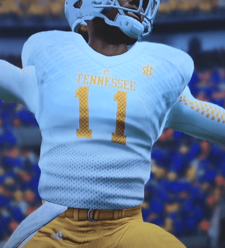
Lots more college football news to catch up on, beginning with the new Tennessee uniforms, which were leaked via a series of video game screen shots that were tweeted by Chad Fields. You can click on those thumbnails to see larger versions. Interesting that they show the Adidas stretch marks so clearly in the vid game. As for the checkerboard, I love it on the base layer and don’t much care for it on the uni numbers. Mainly, though, it makes me think of a certain pet food brand.
Some other college football items from yesterday (for the embedded tweets, you can click on the photos to see larger versions):
• Here’s a look at Baylor’s all-white uni, from the Big 12 Media Day.
• Also from that same event: WVU in solid yellow and solid white.
• Texas Tech staffers are dressing a bit less formally this season.
• Remember that matte gray Kentucky helmet that was making the rounds a few days ago? According to a Q&A with coach Mark Stoops, which you can find here, they will be worn “somewhere in the future. Probably not this year.”
• Earlier this year, UNC unveiled a blue helmet with a white logo. But now they’ve updated it to have a black logo:
Updated helmet for 2013. Black NC logo with small white border. Final version will have slightly larger logo pic.twitter.com/wxwuojXKJB
— Carolina Football (@TarHeelFootball) July 21, 2013
• I missed this over the weekend, but Florida State tweeted a photo of its “new” uniforms. I don’t see anything different from last year except the new ACC patch — am I missing anything? Are the uni numbers bigger?:
First look at the 2013 #Noles jersey. #ACCkickoff https://t.co/UoaOa9uaku
— FSU Football (@FSU_Football) July 21, 2013
• Comically bad new jerseys for Buffalo. Maybe they’re pushing the “New York” angle just a smidge to much, eh?:
Comically bad new football uniforms for Buffalo: pic.twitter.com/hFcl9iw5u5
— Paul Lukas (@UniWatch) July 23, 2013
• New gloves for USF:
Gloves for the season just hit. The detail is unreal @UnderArmour Go Bulls! pic.twitter.com/Y9vRzOdxKv
— USF Equipment (@JCLees) July 22, 2013
• Better views of Boise State’s new helmet:
Slightly new helmets for Boise State. Logo is smaller. And number is on other side. pic.twitter.com/m6BSlALGB7
— Brian Murphy (@murphsturph) July 22, 2013
Here is the other side. pic.twitter.com/KbyWLRBjGB
— Brian Murphy (@murphsturph) July 22, 2013
• We’ve had some peeks at the new Houston uniforms, but here, finally, is the full set:
New Houston unis pic.twitter.com/mjBvzNlgqm
— Phil Hecken (@PhilHecken) July 23, 2013
• New cleats for Miami:
A sample of some of our cleats for this season pic.twitter.com/hpkt51H3tq
— The U Equipment Room (@TheUEqRoom) July 22, 2013
• New American Athletic Conference patches for Rutgers:
Here are the brand new #American Athletic Conference patches for @RFootball this year. #Chop pic.twitter.com/gNzjUXV8wF
— The Emblem Source (@theemblemsource) July 23, 2013
• Fresno State apparently has a blackout uniform in the works:
Fresno State Blackout unis #uniswag pic.twitter.com/4rcbUTeB8H
— Uni Swag (@Uniformswag) July 23, 2013
Fresno State new blackout uni: pic.twitter.com/VkVYClyrvH
— Paul Lukas (@UniWatch) July 24, 2013
• I recently showed a photo of Columbia’s new uniforms, but here’s a video clip that provides much better views:
• I can also shoot down some rumors today, beginning with that chrome Ole Miss helmet from a few days ago. A source tells me that’s just a sample — not going to be used on the field.
• Similarly, remember that chatter about a possible silver helmet for Texas A&M? Apparently it’s not slated for on-field use.
• Finally, Tyler Maun has been covering the Mountain West Conference’s media shindig and has this amusing report:
[On Monday] I interviewed one of Colorado State’s players and asked him about some of the stock video shots they’d been doing with various networks (CBS Sports, Root Sports, etc.). I said, “Are you guys modeling the new threads?,” referring to CSU’s switch to Under Armour this year. He told me they weren’t and that the team hadn’t even seen the new UA unis yet. He said they were wearing last year’s Russell uniforms for their video shoots and added something to the effect of, “We’re having to tape over every little Russell symbol on them.” He was wearing an Under Armour polo but said it was the first piece of UA apparel he’d gotten. Later that day, I overheard CSU head coach Jim McElwain joking with a couple of reporters about his own polo to “make sure the tags aren’t still on this thing.” He later joked with me that he thinks his polo must have been airlifted to Vegas to get it to him in time for media days.
Seems unusual to not have any sort of apparel delivered to a team by just about a week before their fall camp gets started, doesn’t it?
(My thanks to all contributors, including Johnny Bruno, Dave Wilson, Levi Buck, Chris Howell, Andrew Cosentino, Josh Wren, Jason Cook, the Hungry Hungry Hipster, Jared Buccola, and of course Phil.)
Home Away from Home: Last night was that weird Reds/Giants doubleheader in San Francisco. The first game was a conventional game, but the nightcap was a makeup game of a game that had been rained out in Cincy, so the Reds were the designated home team, complete with home uniforms, even though the game was now being played in SanFran. The Reds didn’t exactly trot out their best home look for the occasion, though:
@PhilHecken @Reds the "home" team in this makeup game. Not their best look. The @SFGiants shoulda gone w/ away alts pic.twitter.com/pIyae1bki2
— Scott Gallian, MD (@sgallian3) July 24, 2013
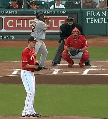
Reader Richard Craig was in attendance and offers the following report:
• Joey Votto changed batting gloves and sweatbands between games. In the first (“away”) game, he wore black and gray sweatbands with red and gray gloves. In the second (“home”) game, he wore red and white sweatbands and his gloves were white with red trim.
• Brandon Phillips also changed gloves and a pressure sleeve between games. For the opener, he wore red batting gloves and a black sleeve; for the nightcap, he wore white gloves and a white sleeve.
• The catchers’ gear for the Reds was primarily gray in the first game and red in the second game, though this might also have been because different catchers played in the two games.
• As for the Giants, Pablo Sandoval wore black batting gloves in the first game and orange/gray ones in the second game.
• Buster Posey, in contrast, had black sleeves and gray gloves in both games.
• The ballboys (“balldudes” in Giants lingo) wore white for both games.
’Skins Watch: Here’s the latest on the ’Skins name and related issues:
• Two of the greatest and most popular players in ’Skins history, Art Monk and Darrell Green, think the team should consider changing its name. Daniel Snyder was apparently unavailable for comment.
• A Wisconsin school district has defied an order to stop calling its teams the Indians.
(My thanks to Phil for his contribution to this section.)
Uni Watch News Ticker: “Arsenal wore Japan-themed kits for a preseason game against Nagoya Grampus on Monday,” says Ethan Faust. “They play one more game in Japan this Friday, so it’ll be interesting to see if they wear these again. They had been wearing normal kits for their first two games in Indonesia and Vietnam.” … Andy Chalifour notes that Bosox catcher Ryan Lavarnway, who wore a front-facing catcher’s helmet last year, has had the brim facing backwards this year. … Speaking of catchers’ headwear, Mike Vasinko notes that Indians backstop Carlos Santana’s helmet doesn’t match any other headwear in Cleveland’s wardrobe. A leftover from a previous year, perhaps..? … After being ranked the 499th-best NBA player, Kent Bazemore had “499” imprinted on his sneakers (thanks, Brinke). … Some info on how Giants equipment director Joe Skiba assigns uni numbers here (from Chris Flinn). … Rick Pitino brought a Louisville jersey to President Obama (thanks, Phil). … Yesterday I mentioned that David Wright had a Giants helmet hanging in his locker. Looks like he also has a Virginia Tech helmet (from Gabe Ortiz). … Here’s the latest teaser image from the Suns. Meanwhile, someone has taken all the teasers so far and created these mock-ups (from Paul Kos). … Looks like the Mets will be wearing orange Los Mets jerseys for Fiesta Latina Night this evening (thanks, Phil). ”¦ Bo Faulds’s great-grandpappy played for the Singer Sewing Machine Company’s baseball team in 1898, and check out his uniform! Love that ornate “SSM” chest mark. Also, note the memorial armband — wonder who that was for. … The Dolphins are still practicing in last year’s pants (from Frankie Parish). … Here’s something I didn’t know: First-place finishers in the 1896 Olympics were given silver medals, not gold. You can see this on the IOC’s own site — go here and click on “Medals” in the right sidebar. Now we just need to do an 1896 throwback Olympics, because silver is so much better than gold! (Thanks, Kirsten.) … In a related item, there’s now a call for Olympic medals to be made from sustainable sources of gold, silver, and bronze (from Tom Mulgrew). ”¦ Sporting Kansas City head coach Peter Vermes has a very cool lining to his suit (from Casey Wieder). … New basketball court for GW. “I’m very excited that part of my daughter’s $12 billion tuition bill is paying for this,” says Chris Hamilton. … Taj Tedrow’s design studio created fauxbacks for Windward High School in Los Angeles. … Jason Hammel wore stirrups last night. “First time I recall him wearing them,” says Andrew Cosentino. ”¦ Mike Monaghan just scored a bunch of Sammy Sabre stuff. “I like that the membership card is blank,” he says. ”¦ “Just got back from the county fair with my son,” says Coleman Mullins. “While there I caught some great repurposed chairs and flooring from an old basketball court, paint and all!” ”¦ Why was Brad Pitt’s childhood basketball team called the Rejects? (From HHH.) ”¦ The Texas Rangers have now put ads on the inside of their cups. And if that doesn’t make you want to put a bullet in your brain, I don’t know what will (Phil again). ”¦ Back in 2009 I wrote an ESPN column about an LSU fan named Bruce Richards, who had an unusual tailgating tradition. Bruce will be appearing on Jeopardy! this Friday, and he tells me that he got to discuss his tailgating habits with Alex Trebek. ”¦ Andrew McKillop has put together a list of every neutral-site location and/or non-league stadium that has hosted a NFL, AFL, or AAFC game, including exhibitions. ”¦ Phil is still feeling blue about Bizkit, but he asked me to tell everyone how much he appreciated all the kind thoughts in yesterday’s comments. He’ll have more to say about this tomorrow.
Hello, I must be going: Today is my last day on duty before the start of my annual month-long summer break. Beginning around midnight tonight, the Uni Watch email address will be forwarded to Phil, so all Ticker submissions will be going directly to him. If you have a question or concern that only I can deal with, he’ll send those emails back to me.
Scott Turner and I will still be processing Uni Watch membership orders while I’m on break, so you can still sign up at the usual place. If, in theory, you were interested in some theoretical T-shirts, well, we can talk about that too.
I’ll be back here on the blog on Aug. 26, but I’ll still be doing ESPN work during the next month, including a new edition of the Uni Watch Power Rankings, which should roll out during the week of Aug. 19.
Thanks for everything. See you in a month!
Adam Jones also wore “horribly awesome” (his words) stirrups last night:
link
They would look much better in orange.
Actually, they’d look much better in black and orange…
In addition to Jason Hammel, Adam Jones wore stirrups last night. Hammel’s looked much better though.
Mainly, though, it makes me think of a certain pet food brand.
Man, Purina isn’t just a brand, they’re like a pet food overlord. Cat Chow, Dog Chow, Friskies, Fancy Feast, Tidy Cats, Alpo, Beniful… they’re all under the Purina umbrella. There’s Purina One, too. I think they make literally 2/3rds of the pet food we sell where I work.
In other NCAA uniform news, if anyone wants to click on my name, I’ve recently done uniform concepts for the entire Big 10. They probably aren’t entirely realistic though, as most teams only have 3 or 4 uniform combinations rather than 256.
(Paul, feel free to delete that last part if you feel I should just email them to Phil instead of self-promoting here.)
Ugh…and I messed up the link.
Lots of good stuff (esp. Purdue, Iowa, the “state” schools and the pants striping for Sparty), but a few quibbles:
1. do you really think Chief Illiniwek would be allowed as a helmet logo at any point in the next few decades?
2. all Northwestern kits should include conspicuous Northwestern stripes;
3. the jersey and pant stripes for Michigan don’t really work.
In regards to number 1, I did mention in my comment on the page that it probably was against the rules. I know it’s controversial, but I still think it’s far better than the Giants wordmark they use on the helmet now. Ideally they should probably get a new logo incorporating the state of Illinois, but I did all 12 teams in just 2 days so I didn’t really try to create any completely new identities for any teams. I was just working with established imagery.
As for 2, yes. When you have a stripe pattern named for you, you should wear it. Or are you saying the black stripes on purple (and purple stripes on black) aren’t visible enough?
For NW striping, on my monitor that shade of purple isn’t very noticeable against black. YMMV
The block “I” that you did for Illinois would have worked as their only helmet logo. Sadly today that sounds hopelessly archaic.
I like the Wisconsin jerseys, but I might suggest having Bucky Badger facing forward on the alt helmet.
And (tying it back to sports) Purina used to own the St. Louis Blues.
Very strange story that just about ended up with the team moving to Saskatoon.
And (tying it back to sports) Purina used to own the St. Louis Blues.
Good point! Which explains why St. Louis Arena was renamed the Checkerdome for a few years in the late ’70s and early ’80s.
The, thanks for sharing your Big Ten uniform concepts. I’m a fan of your uniform design style. Classic and understated, but with a few design elements to make your concepts pop. If only Nike, Adidas, and Under Armour would show such restraint!
I like much of what you’ve done with your link in particular. It’s reminiscent of the link worn by Forest Evashevski’s powerhouse teams of the late ’50s and early ’60s. Iowa link of those uniforms about three seasons back. I’ve always thought that uniform, with an updated logo in place of the helmet numbers, would be a great look as a primary uniform.
If I could make one request, I would love to see your Iowa concept rendered with the team’s link on the helmets. The logo you used is widely reviled by Iowa fans, link
The University of Iowa introduced the logo as part of a failed attempt at rebranding the athletics department back in 1999. The fans hated it. The coaches never embraced it, either. The new logo never made its way onto any team uniforms. Today, you almost never see it, except on the occasional bit of obscure clearance merchandise.
Manny Machado wasn’t wearing stirrups, but he has gone high-cuffed the past two days, also: link
Also, been noticing the mismatched grays appearing for some Orioles players. Here’s Scott Feldman in KC Monday evening: link (it was more noticable on TV, I think)
Feldman was sweating through his jersey Monday night.
As was Adam Jones.
Jonesy was wearing stirrups: link
As for Tennessee, I like the numbers, but how do they not violate the new rules, anyway? I thought those explicitly stated that numbers needed to be solid colored.
The NY Giants helmet is still in David Wright’s locker. You can see it to the right of his head.
Those Windward fauxbacks are great. Looks like they’ve got some designs there with which they could go back even further.
Couldn’t agree more. Beautifully detailed and rendered. But how much money do they put in athletics in those high schools? Isn’t California supposed to be broke or something?
Thanks AMR + Walter. Walter, don’t know if this is going to upset you or substantiate your point…Windward is a private school. BUT we donated the uniforms because the kids are the most humble group of teenagers you’d ever want to meet. Plus it was a phenomenal experience for our designers!
I believe the Giants helmet is still in David Wright’s locker, you can kind of see it over his left shoulder.
The Giants helmet wasn’t replaced. It’s still hanging there on the left side of the locker. The VA Tech helmet is just hanging on the other end of the locker.
Got it. Now fixed.
I didn’t think the Reds looked that bad in the second game, I mean other than the score.
I think the new Buffalo uniforms are by far the worst “modern” style unis I have ever seen. The chest insignia is too large and yet somehow still finds a way to be illegible due to the tiny font above and below “NEW YORK”. Terrible decision. The other elements like the Numbers and side paneling is just “bleh”. Not offensively bad, just boring.
I get that Buffalo is not the most enticing place to live for young athletes but I cant see how pushing the NY angle along with these awful unis will help with recruiting (or sales for that matter). Bad look for Western, NY. At least the Bills got their unis right a few years back.
What I don’t understand is why they made the “New York” lettering on a freakin’ PATCH. It looks horrible centered on the front of the jersey. It’s like they literally made a last-minute decision to slap that on there. Just awful.
The other thing is, it’s not cool to have an identity crisis like that. Either call yourself “New York”, or stick with Buffalo. You can’t have it both ways. Of course, I’m assuming the SUNY system maybe won’t let them use a standalone “New York”, and this is their lame attempt to work around it.
Kyle and Chris are right on every count. This uni is notably, even historically, bad bad bad. I hope they keep it for a couple of years, though, so that the new improved version rolled out in 2015 will offer great relief to an unlucky metro area. Do you think the Bills can win more than six this year?
As a UB alum I’m conflicted on the emphasis on the NY angle but that’s a separate discussion. On a purely aesthic view it just doesn’t look good and it looks like they just patched over the “Buffalo” that was in that spot last year. They may or may not have done that, but that’s the first thing I thought of and that’s not good.
It also ignores an important sports convention: New York in sports parlance refers specifically to New York City and its metropolitan area. You’ll notice our teams are not called the New York City Yankees, the New York City Rangers, etc. Unfair and misleading? Perhaps. Among other things, it permits the Giants and Jets to have a tighter attachment to the Empire State than the Bills and Sabres. But you may not pretend it doesn’t exist.
Apparently there was an unsuccessful attempt to change the name of the school to New York State University.
link
I actually think that makes sense, and it would feel much more natural than the re-branding that is going on now, with those awful uniforms.
It isn’t all that surprising that Rutgers (The Statue University of New Jersey) has no desire to emphasize New Jersey in their brand.
Changing the name to “New York State University” is ridiculous! I assume they have never heard of that little downstate school NYU.
I understand that they are trying to market the team outside of western NY, but putting NEW YORK on your jersey will not make anyone in Albany or Brooklyn care about your team.
I graduated from UB and I don’t pay attention to their teams. They should focus on education, with sports as a compliment. This push to be a big D1 (aka semi-pro) program is misguided.
And NYU is not part of SUNY, it’s a private school.
Most states have both a “University” and a “State University”. Penn and Penn State, Florida and Florida State, Arizona and Arizona State, and so on. If Buffalo changed its name to New York State, once it established its identity, I don’t think people would confuse it with NYU.
UB is part of the STATE UNIVERSITY OF NEW YORK system, the largest state u system in the world. what is wrong with showing pride in that? My alma mater is SUNY Stony Brook. You sports guys need to do your homework on education.
John, I think you misunderstand my point. The name of the school was suggested to be changed to “New York State University”. That’s the whole name. “Buffalo” is deleted from the name. This is a bad idea because 1) it is easily confused with New York University and 2) it eliminates the unique identity that Buffalo, and each SUNY school, has.
I stick to the dictate “less is more”.
But if you think about the two big college sports and New York, you realize neither sport has a team branded with New York. College football is for the most part non-existant in NY (and for the most part of Northeast too) and doesn’t have the same following as college teams in other states. So if you suddenly brand a team as New York you’re tapping into 20M people in a state with no football team branded as their own. Not that 20M NYers care about CFB, but you’re bringing a product to a population without a product to root for. Suddenly on Saturday afternoon you’re watching TV and there’s a college team with New York on their uniforms. Score.
Um. I went to school in New York, and go for my alma mater every Saturday. It’s not Notre Dame, but go Seawolves!
I grew up 15 minutes away from Stony Brook. Keep in mind their uniforms don’t say “New York” which is the point I was trying to make, and not sure how much play Stony Brook Football gets around the area, local TV in NYC, etc.
The only time I’ve seen them nationally was last spring when they made the college world series. I was perplexed as I watched LSU Tigers playing the SB Seawolves (per the scoring bug). Took me quite some time to figure out it was Stony Brook, but was happy to finally see them on a national stage!
Sustainable: let someone else make it or do it.
Which is why sustainable is not sustainable.
California’s the perfect example: 45% of electricity imported, and most of its gas and oil.
Sustainable: let someone else make it or do it.
This definition strikes me as willfully inaccurate in all sorts of ways. Could you please explain its basis?
To be fair, I wrote my comment with a heavy bit of sarcasm.
I work in an industry that claims to be moving forward in the area of “sustainable” energy, however, this is the sentiment that we feel in our business (It has become such a open-secret with our feelings that it’s actually posted up in our offices)and I know that it usually not wise to post inside jokes that only one gets…
Don’t go there, Paulie! You were wise enough earlier this month to pull me off the bloodied body of one of the legion of climate-change deniers that haunt the Internet. This other Paul wants to pick a fight with people who say “sustainable,” essentially because they annoy him. Many of them annoy me, too, because “less carbon-intensive” is indeed not a synonym for “sustainable.” But this guy is just looking for a political/cultural fight (on a sports uniforms page).
Connie,
The company that I work for is “for profit”, and in the world of geothermal energy, it is that feeling of a slippery slope of what is good for the environment vs. is it good for business makes it difficult sometimes to balance a sense of being. If we don’t make the money, someone else will, so we will do what we have to do. It’s not like we are a connected conglomerate, many of us are working for small business with high overhead and a currently “niche” market that is not affordable to many people yet…I am not looking to start a fight..it’s the word “sustainable” that tickles me…
here’s an article that may put my comment into perspective:
link
*(note, this is NOT my company)
No extractive metal is “sustainable,” unless someone has figured out how to safely stage stellar novae and planetary nebulae on the sites of worked-out mines, but less carbon-emitting is still a worthwhile goal.
But back to uniforms, I don’t believe that modern college uniforms are sustainable. And the thing about sustainability is that anything that is not sustainable, will eventually stop.
New logo for the restructured Scottish Professional Football League:
link
“A mountain of work has been done over the summer to get to this point…” said SPFL chief executive Neil Doncaster.
…they took the English league system names (Premier League, Championship, League One, League Two), used a very similar font to the English Premier League, and added a lion, just like England.
That’s a mountain of work indeed, Neil. Too bad someone else did it.
When I read Phils link about putting ads inside the cups, I thought that was an incredibly bizarre place to put them. Then I clicked the link and saw he meant drinking cups.
Insert a well deserved rim shot here!!
Thought the same thing, and said to myself, “who the hell is going to be able to see adds in their pants?”
Here’s the latest teaser image from the Suns. Meanwhile, someone has taken all the teasers so far and created these mock-ups (from Paul Kos)
What I took away from the teasers is you could use the same graphics on the white or purple fabric and not even have to change the colors, which I’ll bet has never even been tried in basketball. Baseball does it all the time using white or grey background; look at the Cardinals. Also appreciated was the tequila sunrise pattern on the tackle twill.
Where was I when it was decided that New York meant the five boroughs and the metropolitan area? I don’t agree. The Jets and Giants are only named New York because no politician in NJ had the balls to make them do the right thing.
I had to check out that link about the ads in the Ranger’s cups – I thought you were talking about the athletic supporter type. Funny place for an ad, right?
You must of missed the fact that a large portion of the world population equates “New York” with NYC. This is why the title “New York State” is used so much – to delineate from the city. No other state in the US does that, because no other state has to deal with an eponymous city that is infinitely more recognizable.
As for the Giants/Jets… yeah, good luck. They’d move from their brand new stadium before they ever had to integrate NJ’s horrible brand.
You must of missed the fact that a large portion of the world population equates “New York” with NYC. This is why the title “New York State” is used so much — to delineate from the city. No other state in the US does that, because no other state has to deal with an eponymous city that is infinitely more recognizable.
Incorrect: Washington State.
It’s not about whether the city or state is foremost in people’s minds. It’s about avoiding any potential for confusion.
D’oh. Knew I should’ve looked at a list.
But the confusion idea is what I was trying to get at with “foremost.” “Oklahoma” doesn’t have a problem because nobody thinks OKC when you it.
The word “City” is an official part of OKC’s name. Not true with NYC or WDC.
Not true with NYC
link
Semantics… enjoy vacation.
And at the bottom of the page, it says “City of New York”.
Plus, when you send a letter to Manhattan, the address is “New York, NY”, not “New York City, NY”. You wouldn’t right “Oklahoma, OK”.
Guh. “write”, not “right”.
New York City’s offcial name is… New York.
“New York City” and “City of New York” are easy ways to distinguish the city from the state, and even the city government uses them. But if you read the charter, you see lots of references to “the city of New York”. Note the lower-case.
The Jets and Giants are only named New York because no politician in NJ had the balls to make them do the right thing.
Being in the New York metro area might have something to do with it, too.
Since I doubt the Brewers will replace Ryan Braun’s nameplate with L I A R, maybe other NL stadiums will use this as his link.
Well, we’ll have to wait until April to find out…
Ever get the feeling you’ve been cheated?
link
link
Last word for the day. Promise (unless someone starts up the NYS license plate brawl again).
The big happy headline in my cramped football-fan quarters: LIONS ROAR! / Nifty New Duds for Columbia Gridders / Busts of Ginsburg, Kerouac, and Trilling Unveiled in New CU Hall of Fame.
Belated thoughts to Phil for Bizkit. So sorry for your loss. I know how hard it is to lose a pet.
so i guess Tennessee doesn’t have to have black outline around the orange number/font
Hope not. I always hated the black outline on the numbers, particularly since there was on black outlining anywhere else on the unis.
i thought they had to because of it being difficult for spotters because the orange is too light.
Los Mets in orange is not my favorite look for the Mets. The Los and the Mets never look like a unified script font either and that always bugs me. The Wilpon script, whereas the M is not on the proper slant, is fixed but the e is too fat on the current Mets script compared to earlier decades. Still not 100% happy.
Alright, I’m just going to be the old man yelling at the kids on the lawn here. Probably been posted a million times by now, but… whenever you start writing about College athletics now I just skip over the entire section. What does the word “UNIFORM” mean, anyway? How the hell does anyone even know what team they’re watching?
I’ll take the bait… I argue with my friend about this all the time: uniform means everyone on the team/group is wearing the same thing – not that there is only 1 way to dress. That’s why a janitor’s uniform is different than a policeman’s uniform. That’s why teams have 2 different uniforms for home/away. As long as everyone on the team is wearing the same thing on a given day it’s a uniform… no matter how many sets they have.
By looking at the score bug on the screen?
While I do agree that NCAA teams are getting a bit ridiculous with the number of options, a “UNIFORM” means that everyone on the team is wearing the same thing, not necessarily that the team ONLY wears that one thing. A team that considers it’s colors to be “blue & orange” wearing both a blue jersey and an orange jersey is hardly a crime. It’s only when the “blue & orange” team starts wearing black or gray or (insert popular color here) that it really becomes an issue, and even then it really depends on the design. Some teams are able to pull off “black as a neutral color” better than others.
Maybe we should start referring to them as a “uniway”.
I’m with you Keith on the part about skipping over the entire section when College uniforms are brought up. More uniforms doesn’t make them more interesting.
Lee
Isn’t Carlos Santana’s helmet just the Indians primary hat? Navy with red brim and Chief Wahoo logo?
I believe that’s a “C” on his helmet, not Wahoo.
Yeah, I see it now. I think I had mistaken the open part of the “C” for an extra strap or something.
Re the Arsenal Japan tour, the Japanese on their shirt translates to their regular sponsor, Emirates Airlines. I was amused at Nagoya Grampus’ sponsor (Toyota) being displayed in English while Arsenal went “native” so to speak.
And the thing is, Emirates Airlines uses the same English-based logo in Japan as it does everywhere else in the world: link
Seems like JFJS (Japanese for Japanese’s sake).
Any worse than Chelsea using Thai numerals on their shirts – TFTS
link
I’ve given up on college unis. It’s just become a wall of white noise to me.
Change For Change’s Sake.
It doesn’t help that my only interest in college sports is with one school, and its immediate rivals.
I’m with you, Rob S, and Keith, above. So ugly.
I just look away and keep scrolling.
It’s clearly a contest to see who can up up with the most godawful gag a maggot hideous senseless uniform each season.
Darrel Green was just on the Dan Patrick show and said that he does not think the team should change the name. He said that he only thought there should be discussion because some people may be offended. Kind of back petaled
Agree. That was so lame.
What hat is the Reds pitcher wearing? I’ve never seen that before.
BP cap. MLB has been prodding teams to wear them during actual games of late. They might as well just stop calling them BP caps and call them alt. caps.
A thought on the memorial armband, sinking of the USS Maine or the Spanish-American War?
On a related note, this is pretty cool: link
Yesterday was the worst uni day in my memory.
I hated my beloved Man City change kits.
I hated the mess U of H, my alma mater, made of their football uniforms.
And the UB Bulls, the alma mater of three of my siblings, the school my construction worker father helped build, I hated their new uniforms most of all.
As a Unite fan Cort, I have to say I kinda like the new City change strip.
I can only imagine what Nike have in store for the red half of Manchester. Ours have not been released as yet, or maybe we’re keeping the white from last season. I hope not.
United’s change strip is released on Friday. I bet it will be worn in Japan that day.
Come on, you can’t not release a new away strip every year.
This blue/black lumberjack number has been going around the internets for a few months now: link
Seems about right, since they seem to alternate between white and blue every season.
My son likes it, too.
I just don’t get it.
As for United, it’s hard to work up ill will toward David Moyes. I’m sort of hoping he does OK — not better than Pellegrini, but OK. Ol’ Bacon Face, all he needed was to be stroking a Siamese cat on the sidelines to be a full-fledged Evil Genius.
I had a very different image in mind when Paul mentioned the Rangers selling ads on the insides of their cups. I guess the inside of the fans’ drinking cups makes more sense, in terms of reach, but you can’t beat the demographics of the much smaller, richer audience my initial reading would have meant for the inside-the-cup ads.
C’mon man, someone already made that joke 3 hours ago.
As, shoot, I looked and didn’t see it. And it’s not a joke – that’s literally what I initially expected when I clicked the link. Then the picture loaded, and I was like, “Oh. Duh.”
Jeff, I kid you not, it wasn’t a joke on my part. Extensive talk about uniforms here did lead my brain to “athletic supporter” and not “drinking cup”. The inside of a drinking cup isn’t that bad a place for an ad.
I have a thought about the UB thing.
UB is already officially known as “The State University of New York – Buffalo”, which is often shortened to “SUNYAB” or “University at Buffalo” or “UB”.
Prior to its absorption into the SUNY system, it was a private school, and most of its students came from western New York. By the late 1970s, it was essentially a “downstate” school: the vast majority of its student body came from NYC or Long Island. Local kids went to Buffalo State or Niagara or Canisius or Alfred State, if they stayed in town. UB wasn’t seen as “our” school.
The main UB campus is in Amherst, several miles north of Buffalo. It’s a suburban campus, heavily wooded on its north end, and exists more or less independent of the community.
Over the last few years, other schools in the SUNY system, particularly SUNY-Stony Brook, have been encroaching on UB’s traditional pool of students, and there simply aren’t enough kids in Western New York to make up for a dearth of downstaters. So it’s logical that they would try to market themselves to the most attractive group of potential students: New Yorkers.
I believe the university is trying to follow the model of a place like Oklahoma or Texas A&M. The geographical location is irrelevant; this is the State’s school. That makes Buffalo little more than College Station with better architecture and worse barbecue.
There has for as long as I can remember, a certain amount of animus between western New York and “downstate.” I can remember my grandfather and dad, railing about how those “New Yorkers are stealing all our electricity” and my father didn’t speak to me for a week when I walked in wearing a Yankees cap. Buffalonians don’t self-describe as New Yorkers. When you talk about New Yorkers in Buffalo, everyone understands that you mean those people who live 485 miles away, in that seething pit of excess that is sucking away all of our beautiful hydroelectric energy.
“Buffalonians don’t self-describe as New Yorkers.”
~~~
That’s because they’re not.
Doesn’t stop the Giants or Jets.
Ugh. Not this shit again.
Correction, sometime Buffalonians actually do call themselves New Yorkers:
link
The photograph of Bo Fauld’s great grandfather is just magnificent!
1898!
The uniform.
The logo.
The armband.
The carriage of the man.
And most stunning…the hillside desert background with scrub brush, a canyon, perhaps, in the distance. Wow.
Enjoy your vacation Paul. You’ve earned it.
The Numbers front numbers are larger on the uniforms, I heard somewhere that the rear numbers are too but I can’t confirm that.
I’m referring to the changes made to the FSU home jersey.
Enjoy a well deserved break from Uni-Watch Paul! You can be one of us for awhile and peek in from time to time. Daily…..in my case.
“Why was Brad Pitt’s childhood basketball team called the Rejects?”
When I was in school we called our team the Rejects because it was made up of the guys who couldn’t make the school team (the place was a hockey factory; lots of us tried out but the competition was fierce, so we had enough to form our own team).
A few years ago a buddy and I started a rec league bball team. We invited pretty much everyone from the “Needs a Team” list to join us and called our team The Free Agents. Even had team shirts made up with “Free Agent” printed on the front. I was always sorta proud of that team name.
New Miami University RedHawks football unis.
link
Yikes.
Only two good things about that kit:
1. The M centered over the bumper;
2. given the team’s location and conference I won’t have to see it in much game action.
The metallic silver trim is nice, in and of itself (can’t claim to know whether it’s appropriate for a Miami team). It’s similar to the metallic gold that Notre Dame used for those Shamrock Series monstrosities last year (I’d like to see them apply that metallic gold to their normal jerseys).
But my God! Those helmets…?! I always thought the informal rule of thumb for a great helmet was to make them the color of a great car. Not that of a bowling ball.
It’s probably been mentioned (maybe even today) that all the gold that has ever ever ever been mined in the World would form a 20.7 metre cube.
Poor Tim Hudson.
With all the alternate uniforms, chrome helmets, midfield Twitter hashtags, camouflage jerseys, sweatbacks and decorated court floors, it won’t be too long before the team that stands out is the one with the “classic” uniforms and the plain floor.
“How do you know he’s the king?”
“He hasn’t got shit all over him.”
-Monty Python and the Holy Grail