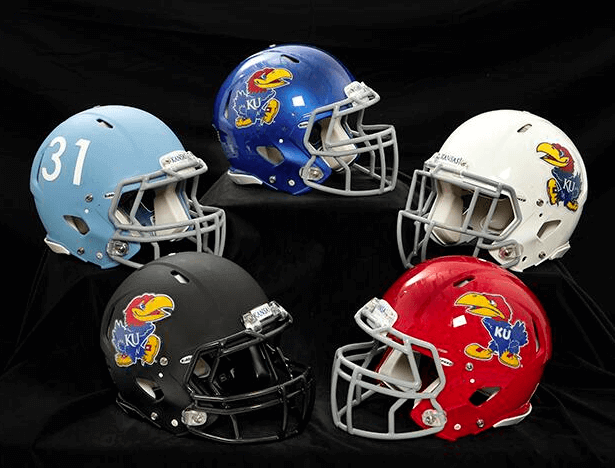
Kansas really needs to step it up. Yesterday they unveiled a mere five new football helmets — not nearly enough. Where’s the pin? Where’s the G.I. Joe? Where’s the flag-desecration? Come on, Jayhawks, the idea is to wear a different helmet every week! Well, maybe they can swap in some different-colored facemasks. You know, just to change things up a bit.
The helmets will apparently be worn with the jerseys seen in this incredibly annoying “video” (and I use the term loosely):
Further info here.
Meanwhile: New ESPN column today, about the history of MLB’s stars/stripes caps (and with not a single use of the term “flag-desecration”).
Collector’s Corner
By Brinke Guthrie
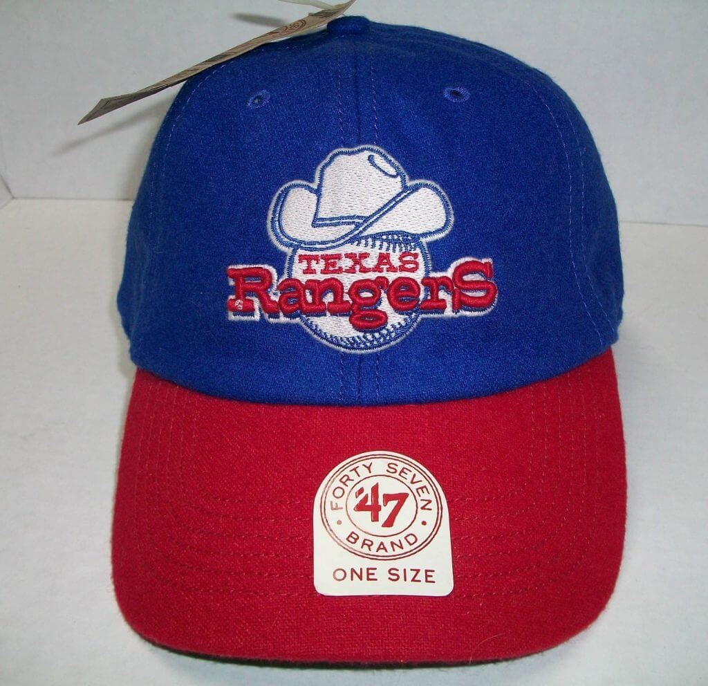
This fantastic-looking Texas Rangers cap is new, not vintage, and new doesn’t usually fly in this space. But it has the 1972 retro logo on it, and that counts for plenty, because I was living in Big D for their inaugural season there. How ’BOUT dem Rangers!
Okay, now for our usual round-up of vintage items:
• Celebrate the Blackhawks’ Stanley Cup win with this 1970s vinyl press bag.
• A Norwegian Minnesota Vikings jacket? Guess so, and I like the font on the jacket back, too.
“First time I’ve seen this Broncos logo”, says submitter Dennis, referring to this 1960s Denver Broncos window decal.
• Nice-looking Castrol-sponsored NFL 75th Anniversary tee, with that distinctive diamond logo.
• From the “Bet you can’t find this at a yard sale or Goodwill” department: Expos logo Jell-o molds! Submitted by reader Bruce Menard. [Someone needs to buy these and use the appropriately colored Jell-O to make a tasty ”” and photogenic! ”” summer treat. ”” PL]
• Dave Boss alert! Here’s one of Cowboys running back Dan Reeves, still with the three-stripe sleeves.
• These KC Chiefs Champion pullover shells were absolutely terrific. So well made. Seriously, if you’re a fan, you want this. Early 1990s, I believe.
• Always wanted this 1970s Bengals poster, but never found one while I was living Cincinnati, imagine that.
Seen something on eBay or Etsy that you think would make good Collector’s Corner fodder? Send your submissions here.
’Skins Watch: Here’s the latest on the ’Skins name and related issues:
• The ’Skins name was one of many topics that came up in some recent focus-groupery.
• The Oregon State Senate overwhelmingly passed a bill that would allow schools to keep their Native American mascots (which would reverse a decision by the state’s Board of Ed, banning such mascots beginning in 2017). As I mentioned yesterday, the governor has threatened a veto.
(My thanks to the pseudonymous terriblehuman and Phil for their contributions to this section.)
Mark your calendars: I’ll be talking about uniforms for 20 minutes next Monday, July 8, 1pm eastern, on Connecticut Public Radio’s Colin McEnroe Show. You’ll be able to use the “Listen Live” button in the left sidebar to hear the streaming audio.
Uni Watch News Ticker: The Blue Jays wore their Canada Day jerseys and maple leaf BP caps yesterday. Surprisingly, they went with standard NOBs, instead of their usual Canada Day CNOBs. … Meanwhile, one of the Jays’ minor league affiliates, the Vancouver Canadians, wore these caps (from John Cullen). … The Diamondbacks and Mets, who played each other in New York last night, responded to the 19 fallen firefighters in Yarnell, Arizona, by hanging “Yarnell 19” jerseys in their dugouts. In addition, the D-backs added a black armband. When they get back home after their series against the Mets, they’ll add a “19” patch over their hearts. … The Browns are finally scrapping the Al Lerner memorial patch (thanks, Phil). … New football helmets for FAU. … “I had never heard of Division II baseball powerhouse Cal-State Stanislaus before last week,” says Bill Hupp, “but they sure have some pretty cool uniforms.” ”¦ In that last link, look at the player on the left. He appears to be wearing a play-calling armband. We’ve seen that before in softball, but I don’t think I’ve seen a baseball player wearing one. Is this becoming a common thing in college ball? ”¦ Ivan Banco has written a piece about the space shuttle Atlantis’s mission insignias. … Way back in 1915, someone was thinking about the right uniform for winning a World Series (from William Yurasko). … Marsh Pegs, as you probably know, are the flexible pegs that anchor a hockey net to the ice, and that leads us to a good story from Charles Noerenberg: “A Chicago sports talk radio host, Dan McNeil, was at the Blackhawks’ Cup-clinching game in Boston and had been joking on his show that he was going to find a small keepsake to take from the ice or benches after the game, as he had done when the Hawks won the Cup in 2010 (a couple rolls of stick tape) and when the White Sox won the Series in ’05 (a small amount of infield dirt). He ended up with the Marsh Pegs from Corey Crawford’s goal, which his co-host grabbed without even knowing what they were. All last week McNeil joked about how he’s going to give his staff their ‘day with the Pegs’ and how he’s hired a ‘Keeper of the Pegs.’ He also did an on-air interview with Fred Marsh, the delightful inventor of the pegs, which you can listen to here.” … Here’s a memorial for the ACC logo (from Ryan Burns). … During the NHL Draft, the Jets hastily prepared a jersey for their first-rounder, Joshua Morrissey, but they were a little sloppy with the nameplate (from Daren Landers). … Here’s a manifesto calling for cycling caps instead of baseball caps to be worn on cycling awards podiums (from Sean Clancy). … Here’s what Dwight Howard might look like in assorted other teams’ uniforms (from Andrew Cosentino). … Yesterday I mentioned that the Braves retired Chipper Jones’s number over the weekend. What I didn’t mention, because I didn’t know about it until Michael Rich told me, is that they put a little Chipper jersey mock-up on the grass near third base. Too bad they used a straight NOB, which the Braves have never used on real jerseys. … CFL zebras, who had still been wearing white knickers for warm-weather games. But now they’ve apparently switched to the ugly black slacks, just like everyone else. Disappointing (from Mike Styczen). … In what can only be described as a tremendous loss for humankind, the Huntsville Stars wont be raffling off some guns at the ballpark after all. … The GFGS trend is apparently spreading to Houston’s new football stadium seating (from Jacob Lipp). … The Missouri Mavericks of the CHL are celebrating their fifth year in Independence, Missouri, by letting fans vote on the five favorite jerseys to be used during various giveaway promotions next season. “Kinda interesting to see all 30 jerseys that have been worn in just the past five seasons,” says Brad Barker. “Sure, there have been pink alternates, and of course there has to be a camo jersey, but check out the Harry S. Truman sweater.” ”¦ A liquid chrome Washington helmet is floating around. No idea if it’s intended for on-field use (from Taylor Hadley).
I’m a KU guy, and I’m digging what I call the belligerent jayhawk from the 40’s.
That said, they’re probably going to stink up the joint again!
Looking at the video, would have liked to see the blue helmet with the white shirt and red and white helmets with the blue shirt. Surprised adidas didn’t bring out the red jersey (Bill Self hates red as primary for basketball though). A little contrast would be good
That Vancouver Canada Day cap is all kinds of awesome. Here’s the different, much less awesome, cap the team lists in its online store as its Canada Day chapeau:
link
The site lists it as Canada Day Onfield 5950 Profit Cap. At first I thought they were being refreshingly honest and then I figured out that they left out a hyphen and it’s supposed to be Pro-Fit.
I had the same reaction! I’m of half a mind to send a note to the keepers of the AP Style Book asking them to declare that the hyphen in “pro-fit” should be closed, so that in newspapers across the country special-occasion caps will be referred to as “profit” caps.
If nothing else, we should adopt the term here. “The Brewers announced that they’ll be wearing their 11th profit jersey of the year…”
Well, 3 of those helmets actually look pretty good.
You mean 1 of them, and yes, it does.
All of them look better than that boring “KU” helmet they’ve been wearing for far too long.
I’ll agree with that. My comments in another discussion on this board may bemoan the lack of consistency with the rest of KU’s brand identity, but I much prefer the Jayhawk on the helmets compared to “KU” in Trajan font. At least the Jayhawk has some character.
It’s good that the Mothership column won’t use the term, “flag desecration,” because this year’s July 4 caps are not flag desecratey in my book. Since they use only the white stars on blue motif with no red/white striping within each logo, there’s no implicit flag. These caps are more like bunting than like a flag. (Note: Using an actual flag for bunting, as on a window or podium, is also flag desecration specifically mentioned by the Flag Code. Don’t do it.)
If teams put a flag patch on the back of their jerseys, though, that will be textbook flag desecration. Any player with a flag patch on his uniform who dives for a catch or slides into a base can be assumed to hate freedom. You don’t show your love for America by rubbing Old Glory in the dirt!
Couple of things:
1) “the Vancouver Canadians, wore maple these caps”. “Maple” and “these” may want to be swapped. :o)
2) “He ended up the Marsh Pegs”. Missing a “with”. :o)
3) Marsh pegs came about, for those that are interested, after Mark Howe nearly bled to death after sliding over one of the previous peg iterations. The previous pegs were metal spikes that held the net in place. Howe had slid into the net, and the link opened up a five-inch wound in his thigh. Had the net been movable, Howe’s injury may not have happened. link.
4) Regarding the Jets’ nameplate issue, the vast majority of NHL teams have nameplates ready to go so that they can pin them to a jersey once a player is picked. When a team is picking mid-round, as the Jets were, they often have to be ready at a moment’s notice depending on who was picked in front their selection. The Jets probably swapped “Domi” for “Morrissey” after Max Domi, who the Jets wanted, was selected at #12 right before their pick at #13. Morrissey’s jersey, as a result, was a bit of a rush job.
Flyers went nameplateless with their first round choice. link
If you’re not sure who you are going draft makes more sense.
Except that when you’re mid-round and trying to make some talented kid feel like he’s immediately part of the family, a personalized jersey is awesome.
They just need someone to pin the nameplate on a little better.
Two things about the Howe injury:
– the other big change is that they also got rid of the giant metal spike inside the bottom of the net, which seemed to serve no useful purpose.
– before the Marsh pegs, there were magnetic attachments for a few years. IIRC those nets basically jumped off the moorings if you looked at them wrong and that experiment went very badly with a lot of disruptions in the few years they used those.
God I hate matte helmets
Yes, they do. The black helmet would suck regardless. The blue helmet would look great if it were glossy.
I guess my favorite of the 5 is the red one. I’d give it a 7 out of 10.
That old Broncos logo is horrifying in the most literal sense of the word. Scary.
I dunno, I rather like it.
Better than their link, which was very cool but more appropriate for Bronco busters than a team named after the animals themselves.
Holy cow! How did link wind up as a Broncos logo?!
I have serious doubts about the authenticity of that Broncos logo. I’m quite certain it was never an official team logo. I suspect it’s a design created by an independent third party for some sort of series of pro football team stickers. (“Collect the whole set!!”) It’s quite possible that it was made without the Broncos’ knowledge or permission.
The Marlon Byrd eye black pic was posted in yesterday’s ticker as well.
Some baseball teams have been using the play calling band for years.
I’ve seen college catchers with play-calling armbands for 6 or 8 years at least. I seem to remember Chris Ianetta wearing them, at UNC.
Yep. And well in high school, this is really prevalent. Every damn game I ump, I got a coach screaming out “0-0-2” blah blah blah at his batter every pitch while the kid steps out to look at his wristband playbook. Get in the box and swing the bat. Its fucking annoying. Just let the kids play.
“You drive to the Stanislaus Cutoff, get out of your car, cut off your Stanislaus, get back in your car, then you drive six miles till you see …..”
(I know, I know. Don’t correct me.)
It looks like Kansas went to a sporting goods store, picked up four different colored helmets and slapped their Jayhawk bird on them.
And maybe they ripped off UNC for the light blue one. I’m joking. I’m sure UNC hasn’t used that design. But it’s certainly UNC-like colors and looks like something they would have used 60 years ago.
Actually it is a throwback-ish uniform from the 60’s. The helmet wasn’t Matte, but they were powder blue with white numbering and red trim so at least it is a callback to KU history.
Ok. Gotcha.
Love the 1915 uniform cartoon. Clearly it’s referring to the Nats (who were at spring training in Charlottesville, VA) and poking fun at their deficiencies. They’d finish 85-68, not bad but only good enough for fourth and 17 off the pace of the Red Sox who won 101.
30 Missouri Mavericks jerseys and the best one is a homage to the Kansas City Scouts.
The CHL has some of the most uninspired nicknames – Americans, Beast, Sundogs, Rush, Chill and Thunder. The Denver Cutthroats though have one of the best logos in minor league sports.
I agree about the Scouts sweater being the best of the bunch. Hope that makes it into the top 5, I’l lbe in attendance for that giveaway.
I think we’re fast approaching a day when literally every game on the schedule calls for a different uniform/helmet for some teams (and Oregon). I wish I could say that in a joking fashion, but is it really so far-fetched at this point?
Why is the jayhawk different on the red helmet, but not the others? That seems strange. I actually like four of the five. The black helmet is a stinker. Get it out of here. I thought gray was the new black, anyway? Gray would have probably looked a lot better.
The jayhawk on the red helmet was its look in the 40’s, I think I read it reflected the tough times being at war and such. They then changed to a smiling jayhawk since.
I do like the red white and blue ones. KU wore the white one with the bird a few years ago against Mizzou and it was a good look, I prefer it to the blue helmet with just the KU letters on it.
Considering how detailed NCAA regulations are, I’m surprised they don’t limit the amount of uniforms per team to home, road and alternate.
In other “Redskin” related news Mr. Peanut has released a statement saying that he will not consider re-naming his product citing that “Spanish” Redskins have no direct relationship to Native Americans link
Seems the President got in on the “Red” color of skin wagon a couple of weeks ago when he addressed the American Indian nation, saying that he had many ideas to help out his “red brothers and sisters.” Where’s the outrage?
This would be a good point, if the issue were the use of the color red. But it’s not, so it isn’t.
The main thing is that “redskin” – not “red” or references to the color in general – is a racial epithet akin to “nigger.” If the president, even the current incumbent, opened an address to the NAACP with, “Hello, niggers,” he’d catch all kinds of hell. But a president who said in a talk with leaders of La Raza, “Let’s talk about how the federal government can help our brown brothers and sisters,” might generate a widespread “Wha-huh?” from the public, but he wouldn’t be hounded from office.
Why not? Because many Latinos self-identify with the color brown as a shorthand for racial and/or cultural identity. Outsiders can, maybe not should but can, use that shorthand when likewise speaking with and about the group that has so self-identified. And likewise with Indians, who widely use the term “red” to denote distinctly Indian culture, such as the “red road.” The president’s remarks carried an air of retrograde patronization – so much for the crazy right-wing theories that Obama is some kind of radical “anti-colonialist,” since here he’s using classically colonialist forms in speaking to colonized indigenous people – but “red brothers and sisters” carries none of the racial or bigoted charge of an ethnic slur like “redskin.” Even if it is perhaps a bit tacky and over-familiar!
Outrage is selective.
As far as I can tell, Obama said no such thing. That quote seems to be entirely made up by the internet.
Yeah, a quick search for Obama red brothers and sisters on Google yields mostly nutty message boards and out of context results.
Really, what’s uniform about five different helmets, one of which doesn’t include a school color. This is getting really boring really fast. And yes, that video was beyond annoying. Who put that together. What a train wreck.
Excuse me while I drop everything to get one of those Texas Rangers’ hats. I don’t care if they used to be terrible, their old uniforms were awesome.
agreed. The Rangers uniforms could use a makeover from the “Texas Texases”. Maybe they could find inspiration from their past history.
47 does make some my-T-fine caps.
Ivan Banco’s review of the NASA badges issued for each flight of the space shuttle Atlantis is terrific. Observant and funny: “… Okay, NASA, look: You can either choose to respect your field, or you can go back to designing roadside diner place mats…”
Yeah, but he roundly panned any patch that included any design elements based on the American flag. Which is to say, I’m not sure he actually knows what the N in NASA stands for. Nor does he seem to understand that the stars on the flag are, you know, stars, intended by Congress when the flag was adopted to symbolize a “new constellation.” So having the stars in the sky blend into the stars in the flag, as they do on a couple of Atlantis patches, is a sign of awesomeness, not tackiness.
He was off-base on a lot of his comments. There is a high amount of symbolism to each of those elements in every single patch – none of which he addressed. Plus he seemed to “pick on” DoD flights which always had eagles and a military like theme of national pride. However, I must say he was right on about STS-71 and STS-79 (two of my all-time favorite mission patches).
Chacun a son tacky, I guess, Scott. I’m always surprised a little when we diverge. Once upon a time, national iconography (pre-1941FDR, for example) was conspicuously patriotic, but there was much evidence of creativity, panache, even humor. Maybe because so many excellent graphic artists were unemployed. The stars are my favorite part of USA symbolism — I love the that stars-only naval ensign in particular — so I won’t argue about the flag/heavens continuum you mention. But c’mon, so many flags? And that eagle? No, I think Banco is mostly right: too frequently cheesy, too frequently kitsch.
Oh, but that eagle is the height of panache! That’s like my favorite one, though that may just be adolescent sentiment talking; I was big into NASA as a kid and teenager, and tracked every mission, and clipped all the patches from magazines, and at the time that was one of my favorites.
I love the stars-only naval ensign as well, and mourn that we may never see it again in my lifetime. The Navy switched to “wartime” use of the First Naval Ensign after 9/11, and can’t very well switch back until some president is willing to say we’re no longer “at war” with terrorists. (“How about never – is never good for you?”) That’s maybe my least-favorite American symbol. The snake gets lost on the stripes. Makes me wish we’d adopt the Gadsden flag or one of its variants as the “alternate flag” or wartime ensign. The one positive thing I can say about the Tea Party movement is that it’s brought the Gadsden flag back into the public eye.
Regarding the UDub chrome helmet photo. The matte helmet behind it looks new too. Not sure if thats been discussed before
I noticed that too. The only different helmets I can recall UW wearing are the white ones, and even when they were BFBS they stuck with the gold lids.
it also looks less chrome and more gold which would make sense with their color scheme
You don’t need to use the term “video” lightly. That thing’s a video, baby.
In interesting Skins news, I just saw a post with a bunch of Redskins jerseys I’ve never seen before… Black jerseys and Pro Combat gloves… hmmmm… anyone know anything about these?
link
Just figured out they are the Nike Blackout Impact Jerseys. Hideous; I hadn’t seen them up close – no wonder they are at the outlet.
Thankfully, they’re just “fashion” jerseys. You won’t be seeing those on the field.
I can’t remember if I had to send in UPC bar code to get that Castrol NFL t-shirt back in the nineties, and I can’t even remember if mine was black or not, but I do remember stop wearing it after the large screened diamond logo started to come off.
Love seeing my Jayhawks on Uni Watch today.
The news from yesterday was just regarding the helmets however. All of the jerseys in that video were from the past season or two. And updated uniforms will be released before the season.
link
I should have read this more closely before I went off about the inconsistent fonts used on the jerseys. Not that there’s any guarantee the new uniforms will be any more consistent.
I have a lot of 47 Brand hats but refuse to buy any with the butt-ugly 47 on the side. Way to completely ruin a good thing you had going there.
I agree. The hats are such a good fit and I used to buy one for the home team in every major/minor league city I would visit. I stopped buying as soon as they put the 47 on the side.
I agree with both of your statements. I own 3 of the ’47 Brand hat before they started to put the ’47 symbol on the exterior. All 3 fit great, even the adjustable one.
Lost me forever as well.
My thing with the 47 Brand hats is the difficulty in finding them that fit. Apparently they only sell XXL at the stadium retail outlets, and not online. For those of us above a 7 3/4, those XLs just don’t cut it.
I have a similar problem. I wear hat size 7 3/8. The ’47 Brand size L hats are just a little too tight. The XL hats are way too big. Too bad, because I like ’47 Brand’s style.
kansas has the jayhawk back on the helmet
i like the powder blue alot but is that color even in KU’s color scheme? it looks like a ucla or unc helmet
the ref should have a color wheel of each team and if the players are caught wearing something not on the wheel then 15 yrd penalty…this is getting ridiculous
anyone see Auburn’s new green uniform? its an homage to the green grass on the plains….. (sarcasm)
The powder blue helmet and jersey is a throw back to the 1961 Jayahwk squad that won the Bluebonnet Bowl.
I have not been able to find a color photo from that game. But here is a B/W shot.
the black one has too much color to it. they should at least make the decal white/black/gray to go with the black helmet
It appears only the “key” missions were used in describing the 33 Space Shuttle missions Atlantis flew. Having worked on Space Shuttle Atlantis for 3 years (2008-2011) there was one mission that was missing in the article and it was STS-125, the 4th and final service mission for the Hubble Telescope.
link
I am with you – working at NASA for 20+ years I was put off by the lack of effort it took to put that article together. Atlantis flew THIRTY THREE missions!
I think the writer did say though that it was only a selection of patches and not all for Atlantis.
However, like you said there was a lack of effort put forth in that essay. These aren’t just thrown together and put on the spacesuits, time and thought go into those. He did a decent job describing STS-71 with the Venn diagrams but lacked on many others. Most of the elements on those patches are symbolic, and care is taken to show accurate representations of number of stars, constellations, etc.
Today’s ESPN column is up:
link
Fine piece Paul. As a Buccos fan, I always cringe watching my team on July 4th.
Just my two-cents. I think a fine Independence Day nod would a simple patch (we all love patches). I would do a simple quill pen encircled by 13 stars. Simple, to the point and it represents what the day actually stands for. Make it black on beige to represent the ink and parchment.
Did you self-censor the phrase “flag desecration caps” or did ESPN do that for you?
Nobody censored anything. My goal with this piece was simply to trace the design history of the caps.
surprised how tame you were about this subject..
a few weeks ago you said you didn’t like the memorial day hats and uniforms because of it forcing international players to recognize a holiday that doesn’t impact them. do you feel the same way about Canada Day for the Jays since their active roster composes of no Canadians (only Canadian is on the DL)
Do any of the KU fans on the board know why the Jayhawks’ BFBS jersey uses a block-style font instead of Trajan font? I thought that the University adminstrators mandated Trajan font as part of KU Athletics’ official “brand identity” about six or seven years ago. If I recall correctly, the administration’s heavy-handed enforcement of the branding program caused an uproar among KU fans because it forced the basketball team to abandon the Old West-style font they’d been using for decades. Is this a point of contention for Kansas fans?
Well, not only that, but the 1940’s jayhawk on the red helmet also has the original block KU rather than the current Trajan.
This is purely speculation, but I imagine an alternate shirt would be viewed differently than the primary jerseys, so it would be ok to have block lettering for this without affecting the overall brand.
Well, not only that, but the 1940′s jayhawk on the red helmet also has the original block KU rather than the current Trajan.
I noticed that, too. Additionally, the light blue uniform uses a varsity-style block font for the numerals. Neither of those deviations from the official brand identitiy phases me too much, because they’re retro/throwback/fauxback and designed to hearken back to history. The BFBS uniform? Not so much.
This is purely speculation, but I imagine an alternate shirt would be viewed differently than the primary jerseys, so it would be ok to have block lettering for this without affecting the overall brand.
I wouldn’t doubt that this reflects KU’s rationale for allowing Adidas to develop an alternate uniform concept that breaks with brand consistency. I would argue that the opposite should be true, especially when you’re incorporating colors (i.e., black) that aren’t part of your official palette. In order to mitigate the erosion in brand identity being caused by the unofficial colors, shouldn’t you be all the more intentional about highlighting the other features that make the brand consistent and recognizable?
Interestingly enough, the BFBS helmet does include Trajan “KU” letters on the Jayhawk’s chest. Of course, from an aesthetic standpoint, that makes for a uniform that is a mismatched mess.
So, great job, KU, on protecting that all-important “brand integrity” you were so willing to alienate fans and dispose of decades of tradition to ahcieve. But hey, at least “the kids love it,” right?
One can only link…
Another good photo of the KU helmets, with corresponding jerseys, can be found link (second image down).
This just goes to show what a mess these jerseys. That great red helmet with the retro Jayhawk logo? It’s paired with the contemporary blue jersey. That means mismatched fonts between the old-style block “KU” on the Jayhawk’s chest on the helmet and the Trajan lettering on the jersey. Wouldn’t that look better with a retro/fauxback jersey with old-timey lettering?
Same with the Trajan “KU” featured on the black helmet coupled with block lettering on the BFBS jersey. Blech for blech’s sake!
That’s not a block font on the BFBS uniforms, thats a stock font used by Adidas.
The BFBS they wore last year was textbook BFBS, there was no rhyme or reason to them all KU wanted were some black pants and black jerseys and made a call into Adidas to get the uniforms. They put as little effort into those uniforms as possible, and it shows in the final product.
I’ve heard from someone who works with the school’s Athletic Department that they will be getting new uniforms, and that the pics we see with the jerseys are more of reference points as to what the helmets will be paired up with. I imagine we will see a BFBS with the Trajan font, possibly an update in the general uniform design. All I can say for sure is that the new uniforms will be available in time for the season (it could just be that they are ordering more of the uniforms that they already have).
Hey, does anyone know if the Patriots are going to destroy the Hernandez jerseys or are they going to ship them to the third world?
Somehow I doubt the organization would respond to a query for fear of losing a competitive disadvantage, but maybe they’ve announced.
If anybody knows, I’d love to know too.
adam
They are apparently a hot commodity:
link
That may be mordantly funny, even disgracefully funny, but man, is it funny. Give me another day or two and I’ll explain how Hernandez jerseys as valuable commodities show what a great country this is or how the Last Days are near.
I imagine they will hold onto them until either he is found guilty/innocent or the evidence stacks up so high that its obvious that he’s guilty before they do anything with finality.
From what I’ve heard it doesn’t seem likely that he is innocent (even if he is only guilty of a lesser charge that would be enough for the organization to cut ties with him).
They’ll take an innocent until proven guilty stance and eventually make a decision. They don’t want to completely destroy his standing and then be in a situation where he is found innocent, cleared of all charges, and they bring him back and have to find some way to backpedal (unlikely this will be a scenario that plays out but they have to tread carefully for now).
Nothing like a linkto make the murder go away!
A kerning katastrophe between the P and the A, the little pokey-dealies half-mast on all the vertical strokes, and the meaningless serifs on the A and the T? Three strikes, it’s stupid.
Failed to notice the uncarved outer lower left corner of the O, and the S looks like it was plucked from a Syracuse helmet–without any of the nonsense the other letters got, it looks like a different font entirely. What a mess.
“In that last link, look at the player on the left. He appears to be wearing a play-calling armband. We’ve seen that before in softball, but I don’t think I’ve seen a baseball player wearing one. Is this becoming a common thing in college ball?”
I watched several games of this year’s College World Series and noticed that North Carolina’s catcher wore a play calling armband. He’d look into the dugout, then to his armband and call the pitch. Here’s the best pic that I could find of it in the limited time I had. It’s the 7th pic of a 10 pic slideshow.
link
Uniform of the Day: in Memory of the 19 Yarnell, AZ Firefighters link
That Bengals poster was the centerpiece of my bedroom wall. It thrilled me to no end that it was the only poster in that great series that featured copious negative space AND displayed horizontally.
Ehh, grey works for stadium seating. Dirt, etc. would show up on white seats, not so much on grey ones. If you are going to have 2-tone seats then grey works better, the argument for them just being read however is a solid one.
Paul, any thoughts on NFL.com’s “Greatest Uni” competitition they just put out today seeding each of the teams (buncha videos on their site, they also have a throwback bracket)? Will UniWatch be doing something similar?
Wristbands have been used in college baseball for a while. Mainly, they’re used to call pitches from the dugout. I’ve been coaching college for 5 years now and I’ve used them to call pitches since I started and I did it because I saw a couple teams using them in Omaha so it’s been going on for at least 6-7 years. There’s a company that makes a computer program that creates the charts to be inserted into the wristbands. I make my own on Excel.
link
Is it me, or do the two Stanislaus ballplayers appear to be wearing different types of hosiery?
Presumably different games. Looking at their website, they have another more conventional home uni that says “WARRIORS” that is also quite nice. Not really a powerhouse, though, they went 10-40.
On NFL.com they are doing a vote for greatest uniform of all time. Pretty cool with videos from Dave Dameshek that are his takes on teams uniforms that are pretty entertaining. Here is the link: link
I hope Dameshek has learned to stop referring to NFL helmets as “hats” which I find annoying and frankly puerile. I know both UniWatch and NFL.com had a ranking of the 32 teams last year around preseason (some people erroneously thought UniWatch had stolen the idea from , when in fact they had planned it months before and therefore it was NFL.com who either coincidentally had the same idea or outright pipped UW to the post).
Just a split second before the end of the new Kansas uniforms “video,” there’s a fleeting and very angled glimpse of the left side of the light blue helmet. Is it just me, or does it look like the helmet might have a Jayhawk logo instead of numbers on that side?
The numbers are red on that side. There’s a pic somewhere out there showing it.
College Baseball Play-Calling Armbands:
Ty Ross of LSU wore won all season: link
The cowboy hat on the Texas baseball cap needs to have a little baseball cap on it that has a littler cowboy hat on it that has a still littler baseball cap on it that has an even littler cowboy hat on it and so on …
Bill hupp, csu Stanislaus has been wearing those uniforms for years. Their head coach designed them as well as the “throwback” stadium where the warriors play. He knowsof this site and is aware his team and their unis are mentioned (this isn’t the first time).