[Editor’s Note: With Wimbledon getting underway today, tennis maven Brinke Guthrie is here with a roundup of what to look for. Enjoy. ”” PL]
By Brinke Guthrie
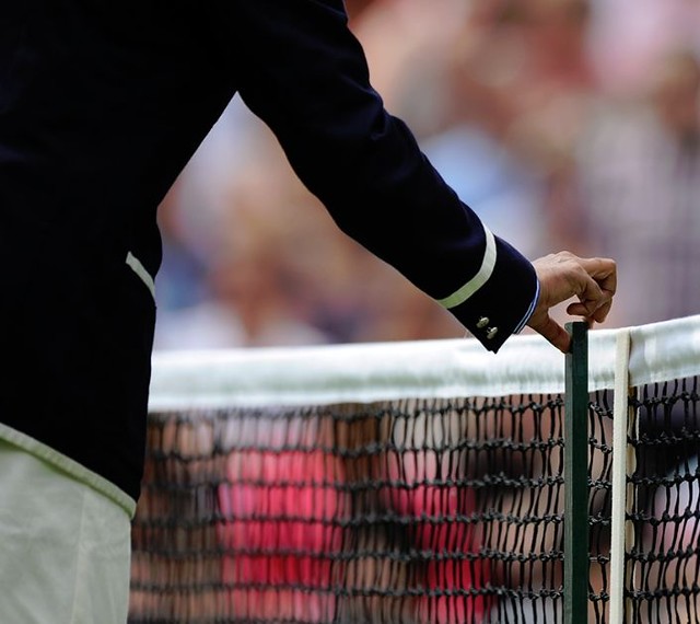
Wimbledon’s back for its annual run, and with it the usual “predominantly-white” edict from the All-England Club. Nike has most of the top players signed, and you can see the Wimbledon looks for Roger Federer, Rafael Nadal, Serena Williams, and Maria Sharapova here.
The Fed also shot a pretty funny spot for Wilson rackets — note the number of Wimbledon titles on the bag. Looks like they shot it at Indian Wells to me. Serena did one too, but after what she said last week, we’ll pass on hers.
In other Wimbledon news:
• Prince has opened up its first ever store, in Wimbledon Village.
• Bethanie Mattek-Sands, who is somewhat of a curious presence on court, wants to wear the new Google Glass computerized eye wear while she plays. Uh-huh.
• Novak Djokovic premiered his Uniqlo line in London last Tuesday.
• Ana Ivanovic will wear this style from Adidas. Novak Djokovic is also an Adidas guy (shoes only), and now he finally has a deal with them.
• The Adidas/Stella McCartney sub-brand is here — that’s what Caroline Wozniacki will wear in her first-round loss, while she uses a stealth blacked-out racquet. That usually means she’s about to walk from her current deal with Yonex, probably back to Babolat. Look closely at the photos — she even removes the butt cap logo — though you can see a tiny YY on the grip tape and vibration dampener.
• Here’s Andy Murray’s Adidas look — at least I think that’s Murray. The guy in the photo is actually smiling, so you really can’t be sure.
• Finally, there’s this: If you wore Stan Smith sneakers back in the day, here’s some good news.
’Skins Watch: News items about the use of Native American imagery in sports — including but not limited to the ’Skins name — are now coming at us on a near-daily basis. So I’ve decided to break out this news as a separate section. Today’s breakdown is as follows:
• You know the tide is turning when even Bleacher Report, of all places, is calling for the ’Skins to change their name.
• One person who’s not convinced: former ’Skins QB Joe Theismann, who’s in favor of keeping the name (and who somehow believes he honored Native Americans by suiting up for the ’Skins).
• Meanwhile, here’s a faaaascinating article about Jeep reviving the Cherokee brand, with lots of historical background on car manufacturers using Native American and other ethnic branding. Good accompanying slideshow, too. Highly recommended.
(My thanks to Dan Secord and Tommy Turner for their contributions to this section.)
OMFG: My latest One-Man Focus Group column is about the Navy’s recent move to eliminate all-caps messaging, and about the larger phenomenon of all-caps typography as opposed to boldface, italics, and other forms of emphasis.
Uni Watch News Ticker: The Brewers wore their Polish-language uniforms yesterday. By my count, that’s the 11th jersey they’ve worn this season. The other 10: home whites; road grays; home pinstriped throwbacks; home golds; home blues; road blues; Negro League throwbacks; minor league throwbacks (for a game in Minnesota); home whites with camouflage lettering; and home golds with Spanish-language “Cerveceros” lettering. … Oh baby, look at this absolutely sensational old sneaker ad. And hey, is the kid in the ad wearing a memorial armband? (Awesome find by Ricko). ”¦ Nothing says, “Yankees Old-Timers Day” like a Twitter hashtag, eh? … The Sabres will be getting a new third jersey at some point this summer (from Mike McBride). … Also from Mike: Here’s a good Montreal Canadiens uni-history page. … The Chicago Symphony Orchestra recently saluted the Blackhawks, complete with the conductor in a ’Hawks jersey. “They should have gone the extra step and added the ‘C’ to his jersey — it would fit ‘Conductor,'” notes John Muir. … Pitchers are divided over the prospect of wearing protective headgear on the mound (from Tommy Turner). … The New York Liberty honored former player and new Hall of Fame inductee Sue Wicks by having Cappie Pondexter, who wears Wicks’s former No. 23, wear a “Wicks” NOB on Sunday (from Kevin Brown). … When Tigers reliever Phil Coke came into Thursday night’s game against the Red Sox, umpire Alfonzo Marquez took the occasion to make some hosiery adjustments (screen shot by Tom Mulgrew). … Reprinted from Friday’s comments: Good visual timelines of notable soda can designs (from John Okray). … Funny piece about Phillies logos and postmodernism (from Chris Cocca). … I love these sewing machines. That’s a shot of some embroidery that was used on the jerseys for the first rugby test match between the British & Irish Lions and the Wallabies (from Eric Bangeman). ”¦ An Olympic silver medalist sprinter has had a surprisingly hard time finding a sportswear sponsorship deal (thanks, Brinke). ”¦ About 10 years ago, the New Orleans Zephyrs wore tequila sunrise throwbacks, and Alex Hassinger ended up with one of the jerseys. ”¦ The new NCAA Football 14 Teambuilder site is now available, and Nathan Anderson noticed a bunch of new things: (1) New jerseys for New Mexico State (home, road). (2) “It also looks like Boise State is keeping the file folder design for their alt orange jersey,” says Nathan, “but the number font has been changed to match the other jerseys.” (3) Old Dominion’s alt grays have blue camouflage numbers. ”¦ Jody Michael notes that the logo for the Fairview Park school district in Ohio looks a lot like MLS’s conference shields. ”¦ The Jacksonville Suns wore some really nice striped stirrups as part of a throwback night last week (photos by Matthew Lawrence). ”¦ MLB ump Angel Hernandez is still wearing an adjusta-strap cap — and with a blacked-out MLB logo! (From Michael Kotler.) ”¦ Remember my recent piece on collegiate beanies? Thom Armitage was staying at relative’s house and came across this outstanding U. of Tennessee beanie, circa late-1940s. ”¦ The Rockies wore their BP jerseys for Saturday’s game against the Nats. “Fairly certain it was to get out of the slump they’d be having,” says Matt Berning. … In a related item, the Rays wore their BP caps for Saturday’s game against the Yankees — except for reliever Jamey Wright (from James Marion). … Here’s a really good look at the Rangers’ bat knob decal, as seen on Leonys Martin’s bat (from Cody Canafax). ”¦ According to a tweet from Brewers radio broadcaster Joe Block, Francisco Rodriguez keeps the balls from his saves in sanitary socks (from Nicole Haase). ”¦ Another minor league team with mismatched grays: the Portland Sea Dogs (from Harrison Tishler). ”¦ I was out at Coney Island on Friday night and noticed that the background mural at one of the bumper car attractions included a portrait of Eli Manning in his Giants uni, but tossing an NCAA football. ”¦ New blacktop-style basketball court apparently in the works for UCF. … New soccer kits for the German soccer club Borussia Mönchengladbach. “White = home; green = away; black = alternate; gray-ish = goalkeeper,” says Tim Ruschkowski. … Some color-on-color games are more ridiculous than others. That’s from a basketball game in the Philippines (from Greg Netherwood). … Camouflage has spread to the world of cricket, where India’s wicket-keeper Mahendra Singh Dhoni was wearing camo gloves the other day (from Vasav Swaminathan). … This is pretty wild: The 1929 Bluffton football team had a big “X” on their jerseys (from Larry Bodnovich). … The new Almodóvar film, I’m So Excited!, features a fictitious airline, complete with its own logo, uniforms, and so on (from Samuel Selker). … At Saturday’s Toyota/Savemart 350, Clint Bowyer was in his No. 15 Toyota, but he had a small 56 decal on his seat, from his teammate Martin Truex Jr. (from David Firestone). … It’s common for big leaguers to wear their MLB helmets while on minor league rehab assignments. But Jose Reyes has also been wearing his Blue Jays pants and belt while rehabbing with the Buffalo Bisons. Never seen that before (from Will Edge). … Gavin Orobko checked in with some new photos of the Winnipeg Jets tabletop hockey game he’s been making. “I have finally finished the surface, and I have to say I am happy with the result,” he says. “Now till football season starts, I’m going to work on the boards and scoreboard.” ”¦ Interesting piece about the psychology of color in logo design (Brinke again). … RIP, Bobby. We’re all blue today.
I’m surprised the NCAA would allow the mostly black UCF court. With all the stupid uniform rules about jersey numbers, the fuss over Boise State’s football field, and the ridiculous number of teams randomly wearing black uniforms, I’d think that design would be violating some rule. I wouldn’t be shocked if that court gets canned before the team ever plays a game on it.
I saw it in Saturday’s comments section. I actually like the court design. It’s unique, and better than the NBA’s plans for courts next season.
Apparently The Jeff is correct. The pics in this story of the actual court look more like cement than blacktop.
link
Paul, I really need to stop reading the bottom of the ticker, thanks anyway for letting us know… RIP Blue
“… Oh baby, look at this absolutely sensational old sneaker ad. And hey, is the kid in the ad wearing a memorial armband? (Awesome find by Ricko) …”
Look for the name Arch-Gard on the insole. Look for the Red Ball trademark in the store and on the sole of the shoes. Mishawaka, Ind. Arch-Gard cushions the metatarsal arch. Arch-Gard cushions the longitudonal arch. Evans Krehbiel. Do you want greater speed, more thrill and fun in the games you play? The molded sponge rubber ARCH-GARD fits the foot.
And, of course: THE CROWD GIVES “TOUCHDOWN PETE” A HAND — HE CAN’T BE STOPPED — HE WEARS BALL-BAND.
___
There were Giants in the Earth, my friends.
Great OMFG today, Paul. Worth noting, the Navy re-teaches every sailor to write in ALL CAPS at boot camp as well, for the entry logs. I still write that way to this day because of that, they institutionalized me, man!
Some of the emails I get from military personnel are in all-caps. I never understood why until the Navy news broke a few weeks ago. All very interesting….
Yep, I remember doing push-ups for every stroke that was out of place or outside the page lines. You learn not to do something pretty quickly this way.
… I love these sewing machines. That’s a shot of some embroidery that was sued on the jerseys for the first rugby test match between the British & Irish Lions and the Wallabies (from Eric Bangeman).
… “sued”?
Thanks, now fixed.
Another typo:
The Rockies for their BP jerseys for Saturday’s game against the Nats – I suspect it should be “wore”, not “for”.
The first “for”, anyway.
Got it — thanks!
More sartorial action from the Confederations Cup in Brazil, home of the world’s coolest street demonstrators.
Mexico (white-red-white) and Japan (blue-blue-blue with gold) should have stuck with their national colors. Mexico with no green is shameful, even Canada-esque. And Japan — yeah, yeah, Blue Samurais — should never be without the perfect red sun on a white background. One of the Top Ten Flags of the World, the list of which will I will provide soon because of the groundswell demanding it.
Spain v Nigeria was a total treat. I know that Spain’s yellow faux-V-neck bothers some of us, but the overall neck-to-boot is abidingly terrific. [NB: Chromatic restraint in shorts (or American football pants, for that matter) is the great enabler of effective glitz.] And Nigeria! All white with welcome green accents. Just fabulous.
And, of course, it is SO good to have shirts that don’t say Fly Emirates.
Saw the games yesterday, and I partially agree. Mexico without and green was just… off. I didn’t mind Japan as much. I really enjoyed the red stripe down the blue jersey on Japan. But your point of the red sun on a white background is not lost on me. That is an iconic look in terms of national team kits.
Japan doesn’t really have national colors (if anything, the chrysanthemum gold is more representative). The rising sun flag was sort of a late 19th Century throwaway creation where the Western nations said, “Dude, your ships need to have a national flag” and Japan said, “Shit, we need one now? Quick, let’s think of one really fast” (I might be paraphrasing a bit).
At least in soccer, red hasn’t been anything more than a trim color. The red change kit worn by the women in the Olympics and the red numbers on the white shirts are the most red Japan has worn since the early 80’s.
Though the real crime this weekend was Brazil wearing white shorts with its canary tops, while Italy went with the all-blue pajama look: link There was no reason to change shorts when they look so good in their primary kits: link
“The rising sun flag was sort of a late 19th Century throwaway creation where the Western nations said, “Dude, your ships need to have a national flag” and Japan said, “Shit, we need one now? Quick, let’s think of one really fast” …
I’m sure you’re right, TH, but I also think that’s not so different from the way 90% of nation-states have done it. And a “late 19th century” emblem is way older than most, after all. I don’t think that every national team should wear the designs or colors of the national flag (Italy and India do well with their blues), but when your flag is as awesome as a big red dot on a plain white background, I’d say you should go with it.
Top Ten National Flags (alphabetical):
Algeria
Argentina
Brazil
Canada
Japan
Macedonia
Sweden
South Korea
Uganda
United Kingdom (of Great Britain and the Six-County Usurpation)
United States of America
To be honest, I don’t have too much of a problem with Japan incorporating more red. And it’s probably the only flag in the world that’s also a national dish: link
Though the one thing that’s always going to get in the way of seeing more red on Japan’s uniform is their archrival Korea, whose primary color is red.
As for your list of flags, there’s not much to quibble with. The US flag is very informative. The Swedish flag feels very stylish and modern, yet affordable. The UK flag is a wonderful way of incorporating three different flags and making them look like one (sorry Wales, yours got left out). And this is the first time I’m seeing the Macedonia flag, which is amazing.
But I have a soft spot in my heart for the non-rectangular flag of Nepal, and Bangladesh’s alternate color version of Japan’s flag.
With you on Argentina, Brasil, Sweden and Los Estados Unidos, I’d sub out Dominica, Dominican Republic, Jamaica, Kazakhstan, Kenya and Vatican City for the other six.
The article about Jeep bringing back the Cherokee model seemed to be going out of its way to create controversy where little exists. As it got around to mentioning at the halfway point, Jeep has been making the Grand Cherokee for two decades, so it is not as if the name had been shelved and is now being brought back from nowhere.
I have to agree with you there. There is no controversy about it. The controversy was over DROPPING the Cherokee name: when Jeep introduced the Liberty in 2002, they actually decided to continue using the Cherokee name on the vehicle outside of North America. The reason that Jeep initially dropped the name here had nothing to do with Native American sensitivity: the Grand Cherokee (a completely separate vehicle) was such a success that Jeep needed a separate nameplate just to avoid confusion. Basically, they were dropping a name when it wasn’t necessary. Then again, the Grand Cherokee was initially supposed to replace the Cherokee, but continued sales success of the Cherokee prompted Jeep to make both. The current Jeep Patriot is actually closer to the 1984-2001 Cherokee than the Liberty or the new Cherokee in spirit.
If you want to talk about controversial names, VW is the one to talk to. The VW Touareg was named after the Tuareg people of North Africa–who actually assisted the Europeans in the African slave trade during the Colonial period.
The Rockies weren’t wearing BP jerseys – they were wearing spring training jerseys. Starting pitcher Jhoulys Chacin got the idea because, he said, the hitters were really raking during spring training. According to the Denver Post, they had to get permission from MLB to wear the spring jerseys.
Also, they looked like crap, but hey, whatever works.
The Rockies weren’t wearing BP jerseys — they were wearing spring training jerseys.
You realize that’s the same thing, right?
I don’t know. This piece goes out of its way to call them spring training jerseys: link
Trust me. Same thing.
The team’s tv announcers referred to them as BP jerseys. They had quite a bit of uni banter in yesterday’s game third inning or so. One of the younger fellows – think it was Josh Rutledge – went high-cuffed.
There’s a series of tv commercials (not on you tube) that Todd Helton does for a local car dealer. He convinces the staff at the dealership to go high-cuffed and some are wearing eye black
. Pretty funny. A bit surprised he didn’t get canned from the car sales gig after his DUI.
This is pretty wild: The 1929 Bluffton football team had a big “X” on their jerseys (from Larry Bodnovich).
Damn, if only there was a hockey team in Xerox City, Xavierville or Xoxcatapetl. I would whip up some Vancouver-like sweaters that people could complain about.
St. Francis Xavier University?
link
New centennial logo for French club Valenciennes FC (Ligue 1) : link (motto translates as Our History Has Future)
no love for the Brewers Polish tribute unis yesterday?
link
Shit — totally forgot! Will add it to the Ticker now.
I fail to see how the ’70s-era Phillies “P” was postmodern. It’s very modern – futurist, free of ornament, approaching abstraction. If anything, what the Phillies wear now is postmodern, with its reference to past styles (if not complete appropriation thereof).
What the White Sox brought out in 1976, the uni with the faux collars and old-timey lettering – that would be postmodern.
“What the White Sox brought out in 1976, the uni with the faux collars and old-timey lettering — that would be postmodern.”
No, those were “posttaste” uniforms.
Folks fell all over themselves to praise the Phillies’ uniforms in the 1970s, and they should have. It had a crisp balance between modern and traditional elements. Along the way, tweaks came: They lost the zipper (unforgivable), the vertical arching of the player names (a downgrade) and the blue road uniforms (an upgrade). They aged well and Philadelphia should find a way to bring them back. Of all the things I miss, it’s the white squatchee I think I miss the most.
One minor correction on that increasingly ridiculous Brewers jersey list – the first throwbacks they wore were 1913 link, not Negro League. I don’t think they’ve worn their 1923 Negro League togs yet – I understand those will make their first appearance this season on July 20th.
So that will be an even dozen, plus there’s also the YOUniform spring training tops that we all expect will see action at Miller Park eventually.
I agree. Milwaukee’s fascination with the translating of its nickname was fun at first, but now it’s just pandering.
Somewhat on the subject, if the San Diego Padres wore jerseys that called themselves “The Fathers of St. James”, should they wear them on Latin Appreciation Night, or Independence Day?
The Great Lakes Loons, a Dodgers Single-A affiliate, are going fauxback with what appear to be a Cardinals-inspired uniform set.
link
I love that one.
Reminds me not only of the Cardinals, but link.
Awesome. What’s the story with that HEALTH badge, Chance?
The HEALth patch is the Hale America logo, which all MLB and many minor league teams wore in 1942. It was basically a physical fitness program that encouraged citizens to get in shape to support the war effort.
I’ve had the Hale America campaign on my research list for years, but haven’t gotten around to it. link is literally all I know about it.
Some more info on the HEALTH patch-it was pushed for by the highly influential Taylor Spink, publisher of the Sporting News. MLB owners voted to include the patch on all uniforms at their February 3, 1942 meetings.
Those are gorgeous. I was not aware of the Pelicans, but I see now that they were once an affiliate of the Dodgers – albeit briefly. While those uniforms are from their Cardinals affiliation, I wonder if there was overlap in the 1943 season.
Then there’s the link, although they only had one animal sitting on the bat.
Wait, did I say one?
Cutbacks, apparently, because in 1956 link.
I really love those jerseys. Shame Portland doesn’t have a team to wear throwbacks.
Those Beavers unis are great.
Shame Portland doesn’t have a team to wear throwbacks.
I took that literally at first, and had to look to see if Portland didn’t have any sort of minor league team. Turns out the closest is Hillsboro, which is an outer suburb. Makes me wonder, though: what is the largest city in the States to not have a baseball team at any professional level? If we don’t include suburbs, of course. I honestly have no clue.
If you exclude suburbs – Austin, Texas is 11th largest in the country, but the only baseball team they have is in their suburbs (Round Rock Express). Then there’s Portland at 28, not sure if I’d include Hillsborough there.
I guess if you’re going to exclude cities that have suburban teams, it’s probably Tucson at 33. They’re about to lose their temporary Padres, and I don’t know if there’s any real plan for a new team to replace them.
Two beavers! That’s great. They would make short work of that bat.
If you go by census Metropolitan Statistical Areas, there’s #27 Orlando, which only has the Gulf Coast League rookie teams of the Astros and Braves. GCL teams play at spring training complexes and charge no admission nor have no fan amenities. Daytona and Lakeland are the closest regular MiLB teams, but outside the MSA.
Then there’s #53 Tucson, which has a team now but probably won’t soon. #54 Honolulu has nothing. #57 Bridgeport-Stamford-Norwalk has only an independent team. I think that leaves #61 New Haven as the largest MSA on the mainland with currently no type of MLB, MiLB nor independent minor league team.
Those couple of GCL teams that call the Orlando area home get no exposure, no marketing, etc. I would doubt anyone from the area would know there is are teams there, so I would have to say Orlando doesn’t have baseball, which really is kind of unfathomable.
I went to an Orlando Rays game about 10 years ago (TB Rays farm team @ Disney) and there couldn’t have been more than a few hundred people at the game.
ooooh, the Pelicans…
you know, their old stadium used to have a barge canal in the outfield. So there is footage of a game going on with enormous barges floating by in the backgroud. Now filled in by the I-10!
Regarding that 1956 jersey, it’s actually a prototype or salesman sample, and not what was worn on the field. Somewhere, I have the auction listing that exact jersey came from. I attempted to win it, as the player shares my last name. Anyway, as for the Beavers, they only had one Beav on the bat, not two.
I didn’t know that – thanks!
They should have gone with it. Great design! I also liked the Cardinal stirrup stripes on the sleeves of the 1950s uniforms.
Yeah, I’m borderline link.
So other than the Beavers, who else used to carry sock stripes over to their undershirts? The link, thelink, any others?
“Borderline?”
Good decision to move the Native American team renaming news to its own section.
GMU has a vote for their A10 Inaugural Season logo:
link
Great OMFG as always.
In the last few years, my friends and I have taken to using all-caps as a sarcasm/satire indicator (Drew Magary does this a lot over at Deadspin as well).
It has the double benefit of solving that “sarcasm doesn’t show well on email” problem and creating the comic effect of sounding like Abe Simpson shouting “YOU DAMN KIDS GET OFF MY LAWN I FOUGHT THE COMMUNISTS WITH MY BARE HANDS SO YOU CAN HAVE YOUR OBAMAPHONE”.
The worst part about the skins changing their name…it’s just another chance for Nike to design a ridiculous uniform
As a Washington fan, I was a bit surprised Snyder didn’t want to make the change just based on the ability to sell more merchandise. If you think about it, if Washington changed the name Snyder still (as of now) owns the copyright protection so he could sell both Redskins and “Warriors” (I just picked that name for purposes of the comment) clothing, etc. Just like the Jets sell Jets and Titans merchandise I’m sure those who would want to hold onto the Redskins name would still purchase the “throwback” clothing. Granted I’m not sure of the costs associated with the all the things that would need to be updated to move from Redskins to “Warriors” (signage, etc).
Even if it’s the same franchise, changing the name effectively causes you to think of the new franchise as an expansion franchise in a way that a logo/color re-design doesn’t. Brand equity is what I think the fancy name for this is. The Bullets lost that something when they rebranded as the Wizards.
The Redskins have been in the top-tier of team merchandise sales for years, much to the benefit of all the NFL franchises.
Why take an unneccessary chance with a redesign when the design they’ve had for decades has been selling well?
I dunno…Nike did a pretty good job with last year’s throwback:
link
As an individual who is very tall, the name “Giant” is very derogatory to me. If you are not over 6’7″ you cannot understand how “Giant” is hurtful. Look at how “Giants” are depicted in cartoons and other media; big, dumb and slow. Yet New York and San Francisco keep this name alive in baseball and football. It’s in the same realm as calling a short person “Midget” which seemed to go through the PC channel. Why hasn’t Giant? Also look at another very tall person “Andre the Giant”. As a fan of the WWE I look back and see the way he carried himself as a wrestler and again it was another play into the stereotype. If we are going to start a campaign to get rid of Native American imagery, I think we also need to look at other team names that are considered derogatory to other individuals. If you think I’m kidding, find a very tall person and go up and say “Hey Giant, how’s it going?” and see how they respond.
“find a very tall person and go up and say “Hey Giant, how’s it going?” and see how they respond.”
~~~
I think I’d rather poke a hornets nest with at stick…
Right. Those big people are savages.
If I were a midget or a dwarf I’d rather be called that than a “little person”.
Besides, giant isn’t a slur. If I call an Indian an Indian (rather than, say tribal name) that’s not objectionable. If I call him a redskin, that’s a different case.
The Old Dominion grey jersey with the blue camo numbers isn’t new, but since they are new to FBS this year, its a look that I’m sure many have not seen before. They wore these for a number of games last year. And by the way, they really don’t look that good IMO.
Since this site focuses on the semantics of design, that Manning mural is not showing an NCAA football as the Ticker states. That’s merely a football with full stripes. College football uses half stripes, but so does almost every non NFL level of football so it would be a stretch to call it an NCAA football even if it had half stripes. But if we’re going to make assumptions about the football, let’s call it a CFL football since that’s the only place where full stripes are still widely used.
Perhaps Theismann “honored” Native Americans by being a Redskin the same way he “honored” his ancestors by crassly changing the pronunciation of his name (it was THEEZ-man originally, he changed it to rhyme with Heisman while in college as a marketing ploy). Or maybe the way he honored his hometown of South River, NJ by NEVER returning once he made it big (unlike Drew Pearson, another South River native).
I won’t argue Joe has usually been about Joe, but I will say the pronounciation change makes sense when you look at the spelling.
And in his defense, the change wasn’t initiated by him:
link
just asking because i don’t know much about Joe, but what obligation does he have to return to South River, NJ?
my opinion on such a thing… if Mom ain’t there, you don’t have to go back
Seconded, no idea why there’s an obligation to return.
Remember a few years ago when Michigan was rumored to be planning white pants for a road game in Iowa during the Rodriguez era? Validation: An Mgoblog reader has found the pants on sale. Notably, the maize stripes match the shape of Michigan’s old road jerseys of that era. I believe Paul reported on this rumor, and it looks like it was a physical possibility.
link
Once the Redskins thing is achieved-and it eventually will be-what’s the next step?
Why does there need to be a next step?
I disagree with the inevitability of a Washington Redskins re-branding, and there’s plenty of “next steps” that could be taken by any number of individuals/groups; civil litigation directed at Dan Snyder’s wallet could be just one of many subsequent courses of action?
Paul, there’s a minor debate occurring on the Creamer message boards about whether or not Phoenix will be using a purple road jersey based on a particular wordmark that appeared.
Adidas seems to like sending you things, the Notre Dame and Warriors sleeved jersey specifically, any chance you can get some clarification from them?
Thanks.
The Clint Bowyer image that I sent was from the race on Sunday, but for whatever reason, I said it was from Saturday…trying to focus on too many things at once.
I took the time to read the piece from the Allentown guy. Maybe I couldn’t grasp his intention, but he had to be the only kid between Upper Darby and Calcutta who didn’t know that logo was a P. The ’83 Wheeze Kids got their name not from the 1980 Phillies players. It was from the intervening Perez, Morgan, and other additions that increased the team’s age dramatically. Phil and Phyllis having to be a response to the swinging Padre? God, he’s just making stuff up. Rollins, Howard, Utley, etc. in the maroon P with blue backing, never except on a throwback day a few years ago. That article was written for an audience that wouldn’t know his subject, wouldn’t care enough to fact check it, and wouldn’t be interested enough to connect whatever points he was making.
OK, on to important things.
Oh no! Not Bobby ‘Blue’ Bland! Horrible, horrible news! Thank you Paul for breaking the news to me. Now to go listen to the ‘Dreamer’ album from beginning to end. R.I.P.
Yessir. I Pity the Fool. Ain’t No Love in the Heart of the City. You Ought to be Ashamed. And the very very best Stormy Monday.
PS Attila, baby, that name of yours really rocks the Magyar beat.
/s/ Married to a Girl from Tatabanya
Thanks! I hated it as a child (imagine that) but as an adult I love it. I’m first gen in the U.S.
Agreed about his being the best version of Stormy Monday. Also he does a fantastic version of (I Really Got To Use)My Imagination. But the title track ‘Dreamer’ is by far my favorite song of his. It sounds like Pink Floyd (who I despise) with soul.
Chargers make their tweaks official:
link
Newsworth quote (maybe): “Last year we had a white collar that ended in a square and there were comments about it looking like a neckroll. The Chargers are not alone, there are six teams changing their collars this year without making major changes to the uniform just as we are.”
Did any of the teams come out and say “We’re changing because the neck roll collars look incredibly stupid and we were saps for letting them talk us into adapting them.”?
Bingo!
I am hurt that the Bobby Blue Bland has passed as well.
“Let it shine, shine, shine, let it shine…”
On Saturday, the Houston Dynamo played their first home game since the May 31 hotel fire that killed four Houston Fire Department members, and players and fans were in full memorial mode.
To start, the team wore a memorial patch on their jerseys. It’s a black silhouette of the typical FD cross, with “HFD” in white lettering.
Pic (h/t Dynamo social media):
link
Fans also did a two-sided card stunt during the 51′ and 68′ (#s of the affected fire houses). Interesting to see team crest used like this.
51 side: link
68 side: link
There were fan tributes as well. Here’s the tifo from El Batallon and Brickwall Firm supporters groups:
link
Finally, game worn jerseys are being auctioned off for the 100 Club, a charity that provides benefits to SE Texas public servants killed in the line of duty:
link
Suns reportedly wearing sleeved alts next season (no visuals yet):
link
I wonder if the NBA is switching to sleeves to ultimately provide space for advertising.
Interesting thought
That’s a common speculation. But the whole point of uni ads is to provide visibility, and the most visible moment in an NBA game is when a player is shooting a free throw and there’s a prolonged shot of his chest. That’s where the ads are likely to go — the chest, not the sleeves — assuming they follow thru with the ad initiative. #NoUniAds
It’s worth noting that it is when free throws are being taken that someone is most likely to make a remark about how many tattoos the players have.
So its not like people aren’t paying attention to the sleeves during that time. And while I am all for the #NoUniAds campaign they would not be nearly as bad if they were on the sleeves. It’s still bad but at least it wouldn’t be messing with the visual identity of the team, kinda like how in the NHL, Reebok has the logo creep going on but it’s on the back of the neck (and the sleeve that is pretty much always covered by the glove), and not right above the Team’s Logo.
When did Reebok add a sleeve logo to the on-ice/ authentic sweaters?
I don’t have any NHL gamers, but my authentic Malkin (ca. 2010 w/ vector logo on back) doesn’t have it. Ditto my Aeros (AHL) gamers and authentics. The replicas have had them for years back to the Koho/ CCM days, and I always saw the lack of branding as part of the allure to the top-of-the-line product.
RE: The Suns: I find it really unsettling that the NBA has damn near dropped all pretense and said ‘forget on court performance or team identity, we want to sell more gear!’
Seems to me that the experiment is being done by a few teams in the WNBA.
I think more of it is selling merch to middle-aged folks who wouldn’t go sleeveless in public. But probably some of each.
I have to agree with that. What decision isn’t made by the marketing department these days?
FYI Old Dominion’s grey alternates have always had the camo numerals, or at leas they had them when they wore them last year.
Also New Mexico State wore those jerseys all year last year.
And I was not aware that Boise’s numbers were ever any different from the rest of their numbers.
I run a thread that keeps track of all the uniform changes on sports gaming site (as a reference for EA to make the changes through DLC/the next iteration of the game), and while I have mainly only browsed Teambuilder looking for what is missing (and not so much what is new), the only new information I have managed to find is that certain jerseys/uniforms have been retired from use.
For example the uniforms Georgia Tech wore last year have all been added except for the Gold jersey (worn against Boston College), and the white pants that were worn with that Gold jersey (these are the same pants that were worn with the “main” White jersey with the collar bone stuff and the crisscross on the sides).
I have a theory that this is because Tech will be using the same template used against VT (and for the Navy jerseys) across the board, and that they didn’t have those available when NCAA Football 14 came to get the reference photos. I am basing this entirely off of the promo pic Tech is using for their pocket schedules (the jersey being worn is the alternate white one(the ones with the Gold nameplate)), the fact that that design is better than the crisscross version, and now the fact that the pants and gold jersey are missing from this game (We already have the White and Navy jerseys in that template, all we need is a Gold version to complete the set).
Thought you might be interested in the Nashville Predators 15th year logo: link
Of course, they’re mistakenly calling it the 15th Anniversary, but it’s actually the 15th Season. Whatever, I like the simplicity, and the nice use of the fang.
We as Americans have a long history of taking words and changing their meaning. What’s stopping us from doing this with Redskins?
I honestly never once thought anything negative about it until the minority started complaining. Only in America would we make such a big deal about such a small detail.
Like I say, remember folks there are people starving in this world and we’re complaining about whether or not a word is too racist. We’re being spied on by our government, yet focused on being PC.
“…We as Americans have a long history of taking words and changing their meaning…”
You mean “We as Homo sapiens,” right? I can name a dozen cultures that have transformed insults into badges of pride, and vice-versa.
“… I honestly never once thought anything negative about it until the minority started complaining…”
Kinda like nigger and kike?
“… Only in America would we make such a big deal about such a small detail…”
There are riots and assassinations all over Asia and Africa about the use of cultural/tribal nicknames and the offense taken when they’re employed. Americans go online.
“… Like I say, remember folks there are people starving in this world and we’re complaining about whether or not a word is too racist…”
I take it all back. Sorry. It’s because you care about starvation, and people who are “politically correct” have no sense of proportion.
Side note.
I feel once the Skins name is changed, the white, middle class will pat themselves on the back and move on to their next challenge.
Meanwhile, Natives will still be struggling in poverty, with drug and alcohol addiction and a general lack of support from their tribes as well as state and federal government.
But priorities must take precedent.
Luke, if you have something constructive to add to the question of whether a certain team name is or isn’t appropriate, we’re all anxious to hear it.
But your attempts at armchair sociology are misguided and embarrassing. No more of that, please. Thanks.
the ball eli manning has in the bumper cars…
well it would be a high school football.
used full stripe until i was in high school during late 80’s when it changed. my dad and uncle both coached high school football before my dad returned to youngstown state, being a former equipment manager and a coaches kid i had footballs from every level and brand.
Other RIPs today
Memphis wrestling legend Jackie Fargo
TV producer Gary david Goldberg (sit ubu sit)
Sci Fi writer Richard Matheson
Okay. You took my comment out of context and used it against me. I think my previous comments were pretty accurate. I don’t see the people upset over naming rights doing anything else to assist Native American issues, but I digress.
I feel that Redskins name can have it’s meaning adjusted in a similar way to other, previously offensive words, have been adjusted. I believe the Redskins, with a proper marketing campaign, can create a win, win situation by A. keeping the team name and B. insuring it’s use is not meant as derogatory regardless of past use. If Rebels, Fighting Irish and Devils can have a positive image, so can Redskins.
Rather than eliminating Native American imagery, why not change it’s message to a positive one?
I have never once heard “redskin’ used as a derogatory term.
You must not get out much…
I believe the Redskins, with a proper marketing campaign, can create a win, win situation by A. keeping the team name and B. insuring it’s use is not meant as derogatory regardless of past use. If Rebels, Fighting Irish and Devils can have a positive image, so can Redskins.
Wait, so you’re saying that the whole issue will go away if benevolent white man Dan Snyder spends a few million bucks telling you that “redskin” is a perfectly nice word and those silly people who think it’s a slur will say, “Oh look how wrong we were! The multimillion-dollar media buy has set us straight by helping us ignore all context and history! And nobody ever brings up ‘heritage’ or ‘tradition’ when they defend the Redskins name!”
Hmmm.
On second thought, that other idea you had about how we keep using the slur until we solve all Indian-related problems doesn’t sound so crazy.
I remember playing against the Orlando Cubs in a double-A game back in 1992 or ’93 and Mike Harkey was making a rehab start for them. They wore solid white uniforms but he wore his MLB Cubs pinstriped pants with the solid white top. It looked awful.
I have enjoyed this site since very early on. I am really getting tired of this anti Redskins crusade. Some of us don’t agree with the point of view expressed here. I know it is your site and can do as you please, but I think it’s a bit much too continually portray this like some crusade that is gaining steam. Just because some blog like BR and other journalists write an article doesn’t mean anything. The name represent the Washington Football team, nothing else. I have NEVER heard it used for anything else ever!