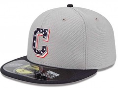
Well well well, what have we here? It’s a flag-desecration cap with the Indians’ block-“C” logo. And MLB says this is what the team will be wearing on July 4 — not the Manifest Destiny cap that we had previously seen.
This story was broken by longtime Uni Watch reader Cork Gaines, who wrote about it for Business Insider. Cork got his info from a source in the MLB office, who said the Chief Wahoo cap photo was circulating because New Era mistakenly “released the wrong image.”
Uh-huh. This sounds a lot like the Braves telling us that the Indian head BP cap was just “one option we were considering,” right? Everyone knew that was bogus. And sure enough, several batches of that cap eventually showed up at retail and were even shipped to MLB.com mail-order customers, so that design was obviously put into production before the Braves backpedaled. It’ll be interesting to see if the Manifest Destiny cap shows up at retail as well. If it does, we’ll know this was another case of MLB (a) rethinking its use of Native American imagery and (b) refusing to acknowledge same.
(For the record, the Wahoo cap has been removed from New Era’s Facebook posting of the July 4 caps. As of this morning, no replacement image had been posted.)
Whatever you think of all this (and I’m sure you can guess what I think), the “C” cap makes more sense, because the Indians will be on the road on July 4 and the “C” is their road cap logo.
Discuss as you see fit, with one proviso: As most of you know by now, the nonsense term “politically correct” is not welcome here, so please refrain from using it. Thanks.
ESPN reminder: In case you missed it yesterday, my latest ESPN column is about the NBA Finals.
Uni Watch News Ticker: The 76ers are reportedly redesignating their blue alts as their road unis, with the red design now being relegated to alt status. I’ve always preferred the blues over the reds, so this move gets a thumbs up from me (thanks, Phil). … New home kit for Man U. … Jake Kessler DIY’d himself a very nice pair of star-emblazoned stirrups. … Oooh, dig this cool Orioles lapel pin (from Patrick Boateng II). … The Islanders have created a logo for their draft party (from John Muir). … Good interview with uniform design Todd Radom about the psychology of uni changes (from Ben Fortney). … Heavyweight boxer Adonis Stevenson did an interview while wearing a jacket with his own name misspelled (from Steve Hudgin). … I’m still calling it the Shark Tank (thanks, Brinke). ”¦ You want a busy logo? Here’s a busy logo. “It’s supposed to mimic the ballpark exterior,” explains Brice Wallace. ”¦ Some absolutely sensational old minor league and college hockey program covers on display here (from HHH). ”¦ The House Armed Services Committee has voted in favor of the various branches of the U.S. military all having the same camouflage patterns, which you’d think would have been pretty obvious all along (from Kyle Kalkwarf). … Fairly boilerplate but well-stated manifesto on the subject of college football alternate uniforms (from Aaron Telecky). … Here’s a cool old Rawlings baseball uniform ad featuring a Notre Dame uni. … And here’s a really awesome flier from a sporting goods outfit, on spectacular letterhead. … Annoying trend: I’ve noticed an increasing number of baseball broadcasters referring to any non-fastball pitch as “little,” as in “That’s that little slider of his” or “There’s a little cutter.” Enough! ”¦ Speaking of baseball broadcasters, there was a brief clip of Brooks Robinson during last night’s Mets/Nats game, prompting Mets analyst Ron Darling to say, “I love that short brim [on his batting helmet] that you don’t see anymore.” Actually, Ron, you never saw it on anyone but Brooksie. ”¦ The Rays wore their BP caps last night. “I think it is a superstitious move,” says Cork Gaines (who in addition to breaking the Indians cap story also runs a Rays blog). “They went 4-0 against the Marlins while wearing the BP caps. Then they wore them in the first two games over the weekend against the Indians, even though MLB only requested them for the Marlins series. After losing on Saturday, they went back to their main caps on Sunday and Tuesday in Detroit. But they lost big on Tuesday night with the regular cap, so they went back to the BPs on Wednesday.” ”¦ Check out this Pistons/Bullets Franken-hoodie. “A friend of mine found it in a lost and found bin at our school in Baltimore,” says Rob Heubeck. ”¦ A youth travel baseball team in Kentucky is using Miami Heat logos (from Josh Claywell). ”¦ I had no idea that the Seahawks once had this secondary logo. “There is a huge painting of this logo when you enter Century Link Field,” says Ahmed Darrat. “Interesting that it gets away from the neon snot green.” ”¦ “I got really bored during the NBA lockout a while back and went on an eBay binge to create this display of NBA Finals patches,” says Dave McMenamin. I have to say, I didn’t realize there had been so many different versions of the O’Brien Trophy patch. ”¦ Johnny Herrera of the Rockies was forced out at second base during a double play last night and spent most of the next half-inning with one leg high-cuffed and one leg down. “He eventually fixed it while on the field, but you’d think he would’ve done it while in the dugout between innings,” says Bo Baize. ”¦ Tyler Maun has a friend who’s pitching for the Lotte Giants in the Korean league, who reports that the team wore camouflage jerseys yesterday. “The big change from the usual treatment, though, is that they included his native flag (he’s Australian) on the chest,” says Tyler. “Somewhat counters the idea of wearing a jersey that’s supporting the military in a country you’re not from.” Interesting. ”¦ If the Raptors abandon their name, Kyle Shaner thinks it should be used in Utah. ”¦ Here’s a roundup of every jersey President Obama has received while in office. ”¦ Remember Mark Willis, who did the awesome “Soccer Out of Context” series of baseball teams reimagined as soccer teams? He’s now started a soccer-themed T-shirt line. You can see his first two designs here and here.
So that Cleveland Block-C Grey Flag Desecration cap is probably the finest-looking flag desecration cap I’ve seen. Some minor-league team could use that as a regular cap.
The stars could be moved to better fit into the shape of the C, but otherwise…
The Nats version also looks good, though it’d look better in gray than white. But yeah, put aside concerns about Chief Wahoo as Chief Wahoo: The C cap is by far the better of the two treatments of the stars-and-stripes theme. Filled in with the star-spangled field, Chief Wahoo is just an indeterminate blob. The C still reads as a C even as the stars and blue field read clearly as the union of the flag.
Agreed. And even without the unintentional blackface, Chief Wahoo just feels outdated. Its value is mostly camp, like its 1978 San Diego Padres logo or the old New England Patriots logo.
“Camp?” Really?
And I’m referring to the old Pats logo, as well as the ’78 Pads. Both are hardly “camp.”
They’re camp in that their present day appeal is not on pure aesthetics or design, but because they’re relics of an era gone by, and we know those logos wouldn’t fly if they were announced today, for better or worse.
From worst to first!
To borrow from some(five&)one who appreciates the uni-styings of another Cleveland team (and who’s sorely missed)…”I’d wear that”.
I think it would make a great cap for the Columbus Blue Jackets.
I love the NBA Finals patch project. There is just one more that I would add, though it’s been impossible for me to find.
link
Thanks to Franken-hoodie, I have a new word: “Pistlet!” Imagine the uses!
I picture it as a tiny pistol, but I’m sure there are other interpretations.
Johnny Herrera looks like he rode his bike to work.
“C” No Evil: just another Uni-Watch invented controversy.
Are you suggesting Paul made up a story about how MLB initially came out with a Stars & Stripes treatment for Chief Wahoo, then veeeeery quietly replaced it with the block ‘C’? Because that’s the only way it could be “invented” by Uni-Watch.
I’m suggesting the blog writer creates an issue when none exists, except in his own manner of thinking.
So it’s not news that an MLB team changed its July 4th cap? That’s a non-issue to you?
It’s not news that other outlets are reporting on that change? That’s also a non-issue to you?
Maybe the real invention here is your own conception of these events, and how they register in YOUR manner of thinking.
That seems to ignore the facts at hand, but sure.
I think that’s what a journalist does… Bring things to people’s attention.
A commentator at Hardball Talk pointed out that the Chief Wahoo logo is still on that image…in the reflection of the plastic label on the brim.
They simply photoshopped the “C” logo onto the image of the original released hat. Which means that they don’t have an image of the “C” hat with the Independence Day design. Which means there’s no “wrong hat” that was accidentally posted.
There was an issue.
Could you explain exactly what the controversy is, and how Uni Watch invented it? Please be specific.
Ah!
So this is where all the fake news is created. Who knew that a humble uni-watchin’ website was actually the center of the liberal media conspiracy. How clever of you to figure it all out Mr. Gary.
We all failed to notice Paul’s bald head, furry white cat and retro Mao attire. Who knew that Arrr Scott was actually a super genius of the “Billy Quizboy” level and that these evil schemes were all created at the super secret Candela Lair.
Or maybe you feel that racism and bigotry that sadly is also part of the American sport experience isn’t worth discussing since you don’t feel it qualifies as news?
This doesn’t qualify as a candela, does it?
link
I won’t go as far as calling it an invented controversy or whatever, but I do think that perhaps Paul is a little bit more influential than he thinks he is. This site is read by 10s of thousands of people, most of whom agree with him and some which do have connections to other media outlets. I don’t think it’s unfair to wonder if the Indians and MLB would have changed the cap this quickly if Paul hadn’t used it as a lead photo and made the blackface/smallpox comments. If Paul’s article about the July 4 caps had just used a Yankees cap didn’t bother to picture or mention Chief Wahoo at all, would he still be reporting a change today?
Yes, you can tell how much influence I have. Just look at all the stirrups out there, the paucity of purple, the decreasing prominence of maker’s marks, Nike’s declining presence, and Dan Snyder rushing to change his team’s name.
And for my next trick, I’ll bring sleeves back to football jerseys.
I agree with The that you might be a wee bit more influential than you think (or are willing to admit) but I don’t think you needed to point out the resemblance to a blackface caricature to make this change happen.
As soon as I saw the image on my monitor, that’s the first thing that popped into my head. Later that night, I showed the photo to my wife with zero preamble. Her jaw literally dropped when she saw it and she had the same thought.
Decreasing prominence of Maker’s Mark? Paul, what do you have against whiskey?
I’ll settle for you using your influence and power to bring back the blue sleeves and striped stirrups to the Red Sox uniforms…
I’m not sure if it’s Paul’s influence, per se, but the popularity of this site certainly shows people making decisions that there is a critical mass of people who care about how these sports costumes look and will raise a stink when something sucks.
Seriously: I don’t think I had anything to do with this Indians thing. (Although if I did, then I’m glad.)
But I do think Uni Watch has helped lead to a climate of greater awareness of certain issues, and that climate has probably contributed to certain decision-making processes. All of which I’m happy about.
I agree completely with The Jeff.
I would wager good (Canadian) money that immediately after an unveiling, the powers that be are checking out the reaction on social media, and the reaction of America’s leading uniform critic is the top of the list.
Except Nike – I’m pretty sure they only read positive reviews.
I know for a fact that lots of people at Nike read this site regularly.
It wouldn’t surprise me if they do so just for a laugh. Or for a boomerang litmus test (i.e., “If Lukas hates it, we’re on the right track”). But nonetheless, they do follow the site.
Paul – Didn’t you have a ticker at one time tracking the number of visits the site got from people on Nike’s internal network?
Yes, but that was many years ago (’06, I think) and is not what I was referring to when I said I knew for a fact that plenty of swooshkateers follow the site.
I remember that Seahawks alternate logo floating around here and there but yeah they never really used it too much.
Another obscure bit of Seahawks history like the plain silver helmet in 1976. I still can’t believe they haven’t gone with a plain helmet in a throwback game for those of us who remember that first season.
That flying Seahawks logo is beautiful. Except for the colors it reminds me of the 1946 Miami Seahawks of the All-America Football Conference. That Miami team moved to Baltimore in 1947 as the original Colts.
Never seen that logo before either, but it’s a beut. Insanely detailed and probably looks terrible the smaller it gets, but wow that’s purdy.
Why isn’t that alt logo the team’s primary logo? It’s beautiful! Just the right amount of menacing, without looking like they were intentionally going for a menacing look.
Too detailed.
I thought the blank helmet was only on Topps football cards.
It was.
That logo is remarkably similar to the old Eagles logo. Even the same claw is extended.
Two notes about the flag desecration caps (link)
1) The new Cleveland cap would seem to extra-confirm that these are game caps made using the new meshy BP fabric. Normal game caps offered in the meshy fabric can’t be far behind, right? And once they’re offered to players, every player wearing that version all the time is probably a matter of weeks away. Seems like July 4, 2013 is likely to be marked as the turning point in the decline and fall of solid-fabric wool/poly-blend caps.
2) The Nats are STILL using the 2005-2010 version of the Curly W logo for the flag desecration caps, even though the extra-wide outline and drop shadows emphasize the main flaws in the design that were fixed when the team tweaked the Curly W in 2011. To date, the redesigned Curly W has not appeared on ANY Nationals game cap or jersey. I’ve tried to dig for an answer on why this is so, but my tenuous connections in and around South Capitol Street go stone silent when I raise the issue.
As much as I prefer non-synthetic fabric, I’ve often wondered why a sports played outdoors in the summer continued to use wool (have they learned nothing from the Costanza debacle of 1994?). Sartorial considerations aside, it would make sense to use a different material for, at least, day games in the warm months, right?
The Costanza debacle was due to the use of cotton, not wool.
“Oh my God, Mattingly just split his pants!”
Thin wool is actually a very good “performance” fabric. So the longevity of wool caps in MLB doesn’t surprise me.
…and your cap won’t catch on fire if you get too close to the radiant heater in the dugout.
Can you explain the redesigned curly W? I’m looking at link and not seeing a difference between the 2005-10 and 2011-pres W’s. Is there a specific part I should be focusing on? Thanks in advance.
Open the old and new Ws in two different tabs, then click back and forth. You’ll see it. Major difference being the pointed serif in the upper left.
I put together this overlay.
link
The key points are:
1. The top-left of the W now has a sharp angle, instead of a flat notch; and
2. Where the loops cross at the bottom center, the lines on either side of the crossing point now line up with one another. They used to be badly out of alignment.
Thanks!
they added the correct hat to the FB page and fixed the reflection
link
Ahead of the North Carolina vs South Carolina matchup in the College World Series super regionals, the official UNC athletics store is selling a “The True Carolina” t-shirt:
link
I guess these have been around in off-campus stores, but I haven’t seen it in the official store before.
Love the Globe Sporting Goods letterhead with the Archer medallion. Ironically, Archery is apparently NOT one of the sports they supply goods for.
I to love the Globe letter but for a few different reasons. It was written on March 14, 1947 which was exactly six months to the day before I was born.
As an old sporting goods dealer this letter was typical of early-season special offers that manufacturers would make to the stores. A $6 dealer-cost uniform in today’s dollars would now go for $60 so it was probably a decent quality uniform.
One thing though, sending out such a baseball letter in mid-March was a little late. We usually had all of our stock baseball/softball orders placed before the Holidays for February delivery.
And no Paul, I’m not familiar with Globe. New England’s best-known athletic manufacturers were Stall & Dean, Tim MacAuliffe (actually made by Stall & Dean) and Lowe and Campbell (a Wilson subsidiary).
Those soccer inspired t-shirts are great. I hope he designs more soon!
I have to point out, in service of the idea that the block-“C” caps were a rush job to replace the original offensive caps, that if you look closely at the plastic 59-Fifty label on the brim, the reflection is not of a block-“C”, but actually Chief Wahoo.
This suggests to me that the caps on New Era’s Facebook posting–including the original Chief Wahoo cap–were actually physically produced and photographed (because photoshopping a distorted reflection for like that for every logo wouldn’t be worth the effort), whereas the photo of the block-“C” cap is just a photoshop job of the original Chief Wahoo cap and they forgot to remove BOTH Wahoos.
I’m surprised they didn’t just slap a block-“C” image on a blank template cap – why bother re-doing the Wahoo cap if you don’t want to use Wahoo, especially when every team’s basic cap is the same?
Ooh, good catch.
Wow! It’s really noticeable after you first see it.
That is a great observation. Well played, sir.
Excellent!
Although I am one of the few on here that do not mind Native American logos to be used as logos/names in sports, I was not in favor of MLB using Chief Wahoo for their 4th of July caps.
After seeing this obvious cover up by MLB now with seeing the reflection in the sticker, MLB is caught like a rat in a trap. How can they squirm their way out of this one? Why can’t they just say, “Hey, our bad. We used a Native American image and slapped stars and stripes on his face. That obviously shouldn’t have happened, and we are changing it.”
Bigger/clearer version of the reflection:
link
On closer examination of the fabric, you can see the photoshop clone edits too.
yup, the clone edits faintly show you where Chief Wahoo was before.
They have now changed (or put up a new) picture on the New Era Facebook page and the reflection is a C.
As if we needed another, this is just one more reason you should just take that fucking sticker off your brim already.
Comment of the day.
What Paul said.
*slow golf clap*
That is awesome, I can’t believe I missed that. This season is the season of the epic Native American imagery cap backpedal.
Wow – fantastic observation, Ryan!
From this day forward I will replace the phrase “smoking gun” with “reflected Wahoo” in my everyday vernacular thanks to Ryan Frazer.
I for one love how UW has become more than “the study of uniform aesthetics” and just as much a discussion of the outside forces that influence those aesthetics. In fact, 100 years ago uniforms were about 2 things: aesthetics, and identifying players and teams. If you’re going to discuss uni aesthetics today, you must discuss them with full understanding that the tail now wags the dog in most cases.
Kudos to Paul (& the majority of the commentors) for seeing the big picture. Whether you agree with the views or not is your opinion, but to refer to it is a non-story is simply intellectial laziness.
Intellectual…sure…but not the il·lit·er·ate …can you say that word…I know you can…can you function without spell check…I know you “get it”
one-handed man thinking faster than he can type. good for you for being a better speller than a thinker. hope it gets you where you want to be in life.
*Follow-up*
First, thanks all for the kind words. All in a day’s work.
Second, the replacement image they posted on Facebook (link) is still not perfect, but at least they tried a little harder with the reflection of the block-“C”. However, if you compare this cap to all the other stars and stripes caps in the gallery, you’ll notice the stupid sticker is missing two things: 1) no text below the “MLB Authentic” logo; 2) the block-“C” is reflected, but the front panel’s mesh fabric is not. See the Cubs hat with similar brim color for comparison: link . That’s why the Indians brim sticker looks much blacker than any other cap’s sticker.
Just more evidence that those caps have still not made it into production yet.
From the Obama jerseys link:
This is strange because both Real Salt Lake and Colorado went with the #10. Salt Lake won it in 2009–but met with Obama the next summer, in 2010. The Rapids actually won it all in 2010. So, two #10 jerseys for Obama. This could also be a nod to Pele, the most famous soccer player of all, who wore that number…
It’s pretty simple – #10 is the most desired number in soccer. I guess Pele is the most famous one, but the best (attacking) player on a team usually wears the #10 (i.e. Messi, Zlatan, Robben). For a commemorative shirt, it makes more sense than #1 (the goalie number, which looks weird on a field player shirt) or #44 (high numbers are for reserves and usually aren’t desired, and some competitions don’t allow numbers higher than the 20s).
The Galaxy, who won back-to-back titles, basically gave Obama the same jersey two years in a row.
Ah, but in soccer, we get new kits every year now.
I am happy that the 76ers made the decison to have the blue jerseys become their road uniforms while making their red jerseys alternates. I was always a fan of their blue uniforms.
This is the second time a Native American related hat has had to be pulled in a few months.
What’s strange is that the Tribe is really focused on that block C these days. It’s their normal road cap so why wouldn’t they wear that symbol for a game on the road?
My question is who is working at New Era that keeps putting this out? These things don’t just happen. Some at the company decided the screaming Indian was a good idea just as the flag over wahoo was probably proposed as a goo idea. What are the inner workings here?
You can’t solely put the blame on New Era, they have to submit the designs to the teams. So the Chief Knockahoma BP hat was okayed by the Braves and same goes for the Chief Wahoo S&S hats, who had to get permission from the Indians before it could go into production.
all that being said, I am a unapologetic fan of the Chief Wahoo design being a Tribe fan all my life. But when the S&S hats were revealed, i was hoping for the Tribe to use the C, soley on the fact it would make for a better looking hat.
Serious question: do the teams really have the power to approve certain designs without MLB looking over their shoulder? I find that strange, if true. And if that’s the case, how can MLB be dumb enough to not run their concerns by Cleveland before allow the Wahoo design to surface?
Nothing is slated to go on the field — NOTHING — without the involvement and approval of MLB Properties.
So teams have no say in the matter and are unable to disapprove (does MLB dictate the styles of what will be worn for league-wide holiday/historic observances), correct?
I didn’t say that. I said nothing gets on the field without MLB signing off on it.
Some things (like, say, a throwback) are done at a team’s initiative, with MLB’s involvement; other things (like, say, the stars/stripes program) are done at MLB’s initiative, with team input.
Sometimes teams can opt out of certain promotions, like the TATC thing back in ’99. Other things are mandatory, like the pink ribbons on Mother’s Day.
The one constant is that nothing happens without MLB Properties signing off on it.
It’s apparent that the Indians are making Chief Wahoo less prominant at the ballpark)which is ownership’s call, not MLB’s, right?)but the logo is still present every time they take the field.
Are you suggesting that New Era’s actions are deliberate attempts to spark outrage/manufacture controversy in order to force a retirement of Chief Wahoo?
There might be something to that, but it’s just speculation that there’s an agenda…or an ax-grinder?…behind the Indians ‘error’ cap style(did MLB/Indians execs fail to preview/review the content of the release? Do they ever/always do so?).
More questions than answers.
I don’t really know what it is I just want to know the process. It could just be some innocent marketing design over at New Era who likes Native American logos aesthetically. It could be an effort at nostalgia (Wahoo and Knockahoma are both dated emblems). It could be someone into comparative marketing looking enviously at the Chicago Blackhawks. It could be any combination of things but that this happens again since the new BP style hats have come out strikes me as odd.
The last time the Tribe wore Chief Wahoo in a star spangled pattern was 2008. So for five years they’ve used the block C for all “patriotic” items.
This was a story when MLB first rolled out the patriotic hats back in 2008. Since then they’ve dropped Chief Wahoo. link
Do the Indians still list the Chief Wahoo hats as the primary hats in the style guide? If that’s the case, and they’re stealthily phasing out Chief Wahoo, then I could see that confusing vendors like New Era.
it’s an alternate hat now, which they still wear on occasion
I think the Chief Wahoo navy/red cap is the Indians’ primary home cap, while the all-navy Chief Wahoo cap is the Indians’ road alt (paired with the navy jersey).
I’d love to see a breakdown of MLB cap sales, I’d bet dollars to donuts Wahoo is on the upper half of the list and the C is much further down.
And as we all know, sales figures are the only legitimate barometer of quality (or anything else).
Well, it is to New Era, who’s probably not aware of or concerned about the sensitivities of the Indians organization.
The $$ was my point – I’m sure they’re totally aware of the sensitivities and the growing movement against the logo, but NE will keep putting Wahoo on caps until the outcry overtakes the dollars they’re raking in (which was my point with their sales numbers comment.)
Until then, Wahoo will be there default logo for Cleveland caps.
I may owe everyone a dollar (or a donut), an unscientific search of baseball caps on Amazon has the navy block C cap in the top 100 selling caps, Wahoo is not.
Setting the filters a little differently, both the navy and the red block C show up before Wahoo.
Actually, money probably is the root of turning out a Chief Wahoo cap, knowing there will be outcry. Now New Era has created two caps for Indians fans to buy, the star spangled C cap, and the hard to find star spangled Chief Wahoo cap. Sure they’ll say they decided not to produce the Chief cap, but since we’ve already got a bunch manufactured, why not “accidentally” ship them to a few outlets and put some extra coin in their pocket?
Ben, anecdotally, and keep in mind I live and travel almost exclusively in parts of the world that are not northern Ohio, in the last two years I see fewer Chief Wahoo caps than I can ever recall, and I’ve seen more of both the red and navy C caps than I’d ever have guessed. I’ve been pleasantly surprised by how the block C is catching on. “Politics” of the logo aside, the Indians just plain look better with the block C and the associated unis, and I think I’m far from alone in that opinion. Which I sort of thought I would be.
Seems the block C has gone away from facebook and the cap now has a rounded C that makes me think of Colorado more than a baseball team in Cleveland.
That rounded C cap would be the Cubs. You’re right though, as of right now there isn’t an Indians cap on the page, no Wahoo, no C, nothing.
Now there is, just below the Red Sox hat and to the right of the Reds hat.
Last year, I visited New Era corporate headquarters, which are housed in what used to be a Federal Reserve branch in downtown Buffalo. The building has what appear to be gunner’s nests, a vestige of its former life.
The main floor is a retail store and a small hat museum. I jokingly asked a sales clerk if they still had machine guns in the perches. He said, “Hey, we gotta do something to protect our new designs before they leaked on the Internet!”
So I’m guessing they’ve laid off their snipers.
Gus Johnson still calls it the Shank Tark.
link
That Seahawks alt logo looks like a detailed version of my high school alma mater’s alt logo that we’ve used for years on our football jersey’s sleeves and as the logo for our merit decals. Since the dates on the Seahawks logo was from 2002-2011, I really hope (but I know it’s probably not the case) where the little guy actually told the big guy to stop using our icon!
Seahawks (again):
link
Rockhurst Hawklets:
link
If I recall correctly, that Seahawks thing was actually a painting somewhere inside the stadium. I don’t think it was ever actually used as, or even intended to be, a “logo” for anything.
No; The Sixers look better in red. They don’t need to be in blue like every other freakin’ NBA team. Well, I could go for some red numbers with a white outline, but the blue with white just doesn’t mesh with me.
Yes, Kyle Allebach speaks the truth.
I don’t know, it seems like there’s a pretty even divide between red teams (Bulls, Rockets, Wizards, etc) vs blue teams (Pistons, Knicks, Warriors, etc). And most of the blue teams wear darker blue anyway.
In the eastern conference, it’s pretty well split between blue and red but in the west it’s just the Clippers and Rockets who use red as their primary road uni color.
Re your link to ManU’s new home kit, the Guardian has a slideshow of various shirt designs for 2013-14:
link
New away jersey for Chelsea, like this look a lot.
link
Today was í˜„ì¶©ì¼ (Memorial Day)in Korea and the Lotte Giants and NC Dinos wore special uniforms.
link
Great, it’s spreading…
FWIW, Korea has compulsory military service, so you could argue that the players (at least the Korean ones) have earned their camos.
During World War Two, Japanese teams had to replace all western script on their uniforms with kanji. Eventually, ballcaps were replaced by kepis, like the soldiers wore. And all team insignias gave way to the emblems of various military organizations and patriotic symbols.
US ballclubs occasionally went jingoistic (the White Sox in 1918, for instance, or the PCL Oakland Oaks ditching their green and red color scheme for red, white, and blue), and they did community service things, like the “HEALTH” patch, but they never went martial.
So the camo unis and the flag desecration unis are a 1940’s Japanese innovation. In the immortal words of Cotton Hill, “It was the Tojos what done it.”
Tampa Bay should make the “sunburst” their primary cap logo. Way more interesting than the TB. (More yellow too.)
it’s be slightly better if the Sunburst had the TB in .. or at least identifying mark so you knew it was a TB rays hat
When Wayne Hagin gets another announcing gig, you can bet he’ll describe someone throwing a “special little slider”.
I get that Paul is using the word “desecrating” sarcastically. That being said, these caps do not break any flag code. It’s a printed design. They’re not using actual flags. The spirit of the law was not to restrict patriotism. It was to prevent actual American flags from being used as clothing or patches. I’m what many god fearing bible thumpers would point and scream to as a liberal. I believe that Redskins, Indians and Chief Wahoo are as offensive and dated as Speedy Gonzalez, Slow-Poke Rodriguez and that woman who owned Tom the cat. I say this so people don’t think I just popped out of a rusty pickup with 14 images of the confederate flag and a bumper sticker saying “America! Love it or leave it!” to call Paul a commie. I’m just suggesting that maybe some on here are interpreting the law to today’s standards instead of the times when it was written. Back then people cut up fabrics to patch on clothing, or would sew a small flag on clothing. If printing the image is “desecrating” then how many violators walk the streets of America today? Just go into any Army or Air Force base to their stores and you’ll see plenty of printed designs. Just saying sarcasm is one thing, but actually claiming these break the flag code is a reach.
From the US Flag Code:
“The flag should not be used as part of a costume or athletic uniform, except that a flag patch may be used on the uniform of military personnel, firefighters, police officers, and members of patriotic organizations.”
By that definition, isn’t the use of the stars and stripes in MLB’s 4th of July caps indeed breaking US Flag Code? Or am I missing something?
That really depends on how exactly you define “the flag”. No one cut up a flag to make the logo patches, which is what Anthony is talking about.
Of course, the whole thing is both unenforceable and unconstitutional, so it really shouldn’t be brought up every damn time these uniforms are discussed. There’s plenty of things wrong with them without resorting to Flag Code.
But can you really claim first amendment protection and then celebrate totalitarianism at the same time?
The destruction of the flag is already covered under US Flag code. Therefore, “the flag” has been defined as it’s symbolism, not the material flag itself, in the context of what Johnny O quoted from the Flag Code.
By the way, the Flag Code is advisory rules and has no penalty for failing to comply. It’s constitutional because it’s advisory and not law.
The use of stars and/or stripes doesn’t make it flag desecration.
There are a fair number of non-USA Uniwatchers. What do you think of American attitudes toward Old Glory?
It seems like people in other places don’t go all Shroud of Turin when it comes to their nations’ colors.
(Those hats? I’m aginn’ ’em. I also really, really hate when people have star-spangled running shorts, or cowboy shirts that look like the Texas Lone Star flag. But we do seem to have made a fetish of the flag, which seems a little weird.)
I love my country a lot and can’t imagine living anywhere else. But we haven’t consecrated our symbols (maple leafs and beavers) into pseudo-religious icons.
I don’t understand why patriotism requires you to genuflect before national symbols instead of celebrating them joyfully.
link
Thank you. I love your country a lot, too. You gave us John Candy. And the Nordiques sweaters.
I don’t think he is using it sarcastically.
Flag desecration seems to be an issue of strict versus loose interpretation.
From the code:
“The words “flag, standard, colors, or ensign”, as used herein, shall include any flag, standard, colors, ensign, or any picture or representation…..”
My take: If the flag is meaningful because of what it signifies and represents, then representations of the flag should be held to the same standard because they are meant to be equal representations of the flag.
That said, I’ve always wondered about where the line is between actual representation and motif. Accounting for intent only seems to be part of it. I actually like the new CLE hat, and I’m very aggressive when it comes to issues of the flag code. The ones that really bother me are the ones that take the flag (stars, strips, and colors) and force that design into an inappropriate shape (like the UofL Card logo – so fucking ugly and wrong).
Here’s a good play on the flag motif:
link
That strikes me as the right way to do it – it invokes the flag but is not the flag forced into a sports logo. But, I like the new CLE hat too as it “invokes” the flag more than visually represents the flag.
The point is that the flag is always a symbol, a representation. That’s what a flag is. By definition. A “representation” of the flag is the flag, in exactly the same way that this representation – A – is the letter A.
So the rules that apply to the “real” flag apply equally to a flag patch or to a flag lapel pin, because a flag patch or a flag pin is a flag.
Personally, I find the use of the blue starry field by itself in these July 4 caps to be just abstracted enough from the specific form of the flag that it doesn’t trip my Flag Code fundamentalist alarms. I mind them because they’re ugly and gaudy and they teach exactly the wrong lesson about what “patriotism” is and means – it’s not a special outfit you wear once a year! – but I don’t actually find them offensive, from a stop-burning-the-flag point of view.
“A — is A.”
Ayn Rand school for tots!
here’s one we all should learn:
“Helping is Futile.”
link
What’s with the number font on the Ravens jersey?
Aside from the lighting washing out the gold so the white looks wider than it actually is… those 4’s look about right to me.
link
Vonta’s 44 looks a bit taller than Mr. Presidents:
link
nah, look at the seams below and above the number in both photos, they are the same.
The Arizona Sundogs, of the Central Hockey League, are asking fans to design a jersey link
I think the logo should be a small mixed breed, lying on its side, panting heavily, tongue lolling, eyes dim with exhaustion and ennui, while squirrels gleefully raid his master’s bird feeder, and brazenly feast on peaches from his master’s tree.
Because that’s what dogs in the sun do. They are useless creatures.
What’s a Sundog?
The natural enemy of the fabled Mooncat, obviously.
Of course.
A sun dog is much more “intense” than you could’ve ever imagined link
Speaking of C-ing no evil, Bolton Wanderers have pulled out of their sponsorship deal with QuickQuid, a payday loan company after much supporter outrage. Also, new shiny crest!
link
Football announcers have been using the word “little” to describe plays for the past few years: “that little pitch to the running back”; “that little side-step move”; “that little sweep”. Baseball only recently caught up. It’s the most annoying thing this side of people complaining about Indians mascots and the use of the flag on uniforms. Of the three, I have more patience with the announcers. Let it go, man. The teams are called what they’re called. Get over it.
Wow. That’s a stellar argument. That’s one step above (below?) dropping the forbidden term.
“Get over it” is not an argument. It’s a way of avoiding the argument, and is almost always invoked by people who have neither the compassion nor the intellectual capacity to see things from any perspective but their own.
I’m ready to hear someone use the defense, “Haters gonna hate”.
I use that phrase all the time, mostly because it’s age-inappropriate (I’m fifty-one). There’s a place for rebel pride, and I like to speak up for people who dig their heels in when confronted. That said, there comes a time for your better angels to take over, probably a while after your detractors get to claim a complete victory at your expense.
You know with all these jerseys that the presidents get, and I believe that when they leave office they aren’t allowed to take any gifts like that with them – they stay with the office of the Presidency — I’d like to think that that basement bowling alley they have under the White House should have on it’s walls the most epic floor-to-ceiling, wall-to-wall collection of framed sports jersey anywhere.
That would be a sight!
Agreed, but I think the rule is, if a gift is not too valuable (I forget the cutoff), the President can buy the gift at face value to make it his personal property. So if President Obama wanted to buy that Bears jersey he was presented, I think he could.
Relevant follow-up
link
So seeing that most presidential vanity jerseys are given by an American citizen or corporation, the $350 cutoff doesn’t even apply. The President could accept any or all of the jerseys upon the stipulation that he has to pay taxes on it.
The Braves hat floated out there for weeks, and we didn’t get word of a new hat until the Pitchers and Catchers reported for Spring Training.
With the Indians hat it was posted on here earlier this week and we had a new picture 3 days later.
I think if they opted to go in another direction they made that decision before it showed up on Uni-Watch, because the turnaround time was so short.
Also keep in mind they are going to be at home on September 11, there is a chance that that was the intended hat for that day and New Era messed up and put it with the July 4th hats.
But then would not the Chief Wahoo cap be white/red rather than the gray/blue shown?
Sometimes a mistake is just a mistake.
Also, since the 9/11 game is an afternoon game, would the Indians normally be wearing their cream/red alts with the red C caps(I don’t know if those are just a Sunday alt or if they are trotted out for all days games like the Phils do with their alt set)?
I don’t know, I was just proposing a situation in which the Wahoo hat would be real despite not being something they will be wearing/were planning on wearing for July 4th.
I for some reason though that the wahoo cap was white (just checked Monday’s post and it clearly isn’t).
FYI the bills aren’t color-coded based on whether they are being worn away or at home. There are blue bills on grey and white caps.
My main argument is that I don’t think the change was a result of backlash, I think New Era came up with versions of both and Cleveland opted for the C cap and that decision simply wasn’t reflected in the album New Era posted. I say this because they had hat ready for display no longer than 3 days after they showed off the hats. The Braves obviously elected to go with Chief Nockahoma but after backlash changed things up and didn’t show anything until the the pitchers/catchers reported.
Cleveland is well aware that Chief Wahoo is not popular among large segments of the population. There is no way they would wait and gauge the outrage before making the decision.
Cleveland is well aware that Chief Wahoo is not popular among large segments of the population. There is no way they would wait and gauge the outrage before making the decision.
Right. But MLB might do that, because these caps are an MLB-driven program, not a team-driven program.
I’m not saying that’s definitely how it played out. I’m just saying that your last statement is based on a faulty premise.
And why would the picture shown be photoshopped then, with the clearly visible reflection showing something that obviously is NOT a “C”. If they really were planning on using the “C” hat all along (or at least thinking about it), would they not have an actual hat they could have taken a picture of instead of having to photoshop the Chief Wahoo one?
They have a real hat, its the one on their facebook page
link
that is odd that they would have it photo-shopped in one place but not the other.
Just received a nice Knish!
I highly recommend it.
Paul, if you could have a say in restoring sleeves to football jerseys, that should help you to receive a uniform equivalent of the Nobel Prize. Whatever they are, football jerseys without sleeves aren’t jerseys.
You said it, Mr. Thompson.
In response to the suggestion of Raptors to Utah:
This type of talk is old hat. I’ve been flamed badly on the Creamer boards for making this suggestion, but that little ticker note makes me want to say it again.
Raptors to Utah
Jazz to Nola
Hornets to Charlotte
Bobcats to Toronto
Never going to happen, but the thought is pleasing to the type a crowd.
Fun fact: Bobcats was second to Raptors in the original fan vote twenty years ago, and if not for Steven Spielberg….. (Now I know why the Canucks on the creamer forum tore me a new one)
NBA: Phila 76ers look good in either red or blue IMO. Golden State and Washington are my fav unis.
NHL: Definitely will always be the Shark Tank!
Isles, give it up! No need for new logos. Done deal. Hello Brooklyn!
As much as I would love for the Islanders to remain on the island, having a team in Brooklyn sounds good.
The NY Islander logo will remain one of the best along side Hartford Whalers.
“As much as I would love for the Islanders to remain on the island, having a team in Brooklyn sounds good.”
Brooklyn is, technically, still part of Long Island. Shhh; don’t tell the hipsters.