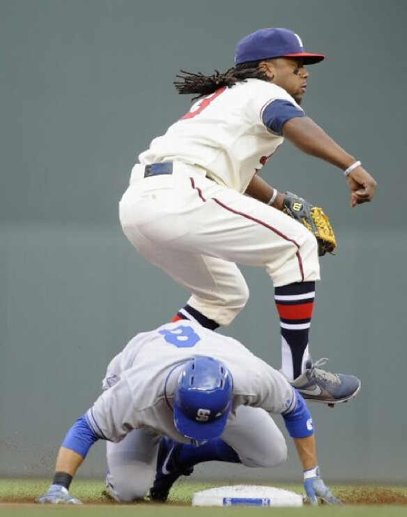
Very nice throwback game last night in Minnesota, as the Twins dressed up as the old St. Paul Saints and Brewers become the minor league Brewers, both from 1948. As you can see above, Rickie Weeks of the Brewers showed some nice blousing, which is the kind of thing that does my heart some good.
A few other notes from the game:
• The most unusual thing about the uniforms was that the Twins wore gray at home. According to what I’ve read, they opted to wear the Saints’ road uniforms because they wanted their local-born players, like Joe Mauer, to be able to wear “St. Paul” on their jerseys.
• The Twins wore throwback batting helmets, but the Brewers kinda half-assed it: They just removed the logo decals from their regular helmets. Still had the numbers on the back, however, which created a clash of fonts. (Also worth noting: Milwaukee catcher Jonathan Lucroy didn’t remove the logo from his catching helmet.)
• As far as I coud see, everyone went high-cuffed. The Brewers all wore beautiful Northwestern-striped stirrups, while the Twins went with a mix of stirrups and high socks.
• If you look again at that last shot, you’ll see that Chris Parmalee, at far right, was wearing his left stirrup backwards but appears to have had his right stirrup properly oriented.
• Pedro Florimon also had the “one backwards, one forwards” thing going on.
• Both teams wore the MLB logo on the back of their caps but not on the back of their jerseys. There seems to be little consistency regarding these elements in throwback games — sometimes they’re there, sometimes not.
• In a really nice touch, even the grounds crew wore throwbacks.
Finally, reader Tim (who didn’t give his last name) says we could have seen these uniforms earlier in the week:
The Twins proposed having the two teams wear the throwbacks early in the week in Milwaukee and then again Thursday in Minneapolis, as the teams were playing four consecutive games this week, two in each city.
Problem was, Milwaukee chose not to host a throwback game with these uniforms, since they felt they were wearing enough throwbacks at home already this year.
And there we are. I leave you with one final, pleasing image from the game:
As most of you know, I’m generally opposed to the corporate incursions into public space. A particularly absurd example of that has been unfolding in Atlanta, as reader Austin Gillis explains:
Atlanta has an ordinance stipulating that streets cannot be named for corporations, but they can be named for people.
Ford had a large plant in Atlanta, and the street it was on was named after Henry Ford II. Then the Ford plant closed down. Porsche is now building a new plant on the same site.
Porsche did not want to move their new plant onto a street named after Henry Ford, so paperwork was filed to re-name the street after Porsche. But due the no-corporate-street-name ordinance, it was decided to name the street after Porsche’s founder, rather than the company itself.
But there was a problem: Porsche was founded by Ferdinand Porsche, who was a Nazi. So the city of Atlanta lifted its no-corporate-street-name ordinance and is allowing the street to be called “Porsche Avenue.”
The city fathers point out the obvious, that they shouldn’t have to keep the Henry Ford name, and they shouldn’t name the street after a Nazi, but nobody seemed to ask the question about why the street had to have a Porsche-related name to begin with, instead of some generic name.
Further info about all of this can be found here.
Uni Watch News Ticker: Here are the medals for the 2014 Winter Olympics. The are reportedly “the largest and heaviest Olympic medals ever,” which of course means they’re the best. … A new pizza joint in Greenville, South Carolina, is using the Yankees’ logo. “Wonder how long the Yankees will let them get away with it,” says Ronnie Poore. … There’s been some big controversy brewing up in Canada over the introduction of new mandatory box lacrosse facemasks. Here’s a petition to change the rule (from Mack Abbott). … Gorgeous striped stirrups — with yellow sannies! — for Mira Costa High School in Los Angeles (from Matt Shevin). … Twenty-three workers at a Nike factory in Cambodia were hurt, and thousands more protested, in a dispute over low wages (from Kyle Allebach). … Fun story about how two Mississippi high schools came to call their teams the Tartars and the Urchins (from Brad Jackson. ”¦ The Rolling Stones’ 50th-anniversary tour came to Chicago the other day, which explains why Ron Wood was wearing a No. 50 Blackhawks jersey (from Bob Gassel). ”¦ Eye black stickers now come in war paint-ish shapes (from Bob Nolte. ”¦ Also from Bob: New Era is now offering a bunch of caps with green underbrims and gray underbrims. ”¦ “Last week, San Francisco honored Steph Curry with the key to the city,” writes Gary Yamada. “For the ceremony, Mayor Ed Lee wore a blue blazer with the famous ‘The City’ logo. I guess he was making his pitch for the Warriors return across the Bay.” ”¦ Hmmm, maybe the Bills didn’t scrap the neck roll after all (from Charlie Pritt). ”¦ The Avs have created a Patrick Roy infographic (from John Romero). ”¦ The new Cardiff City kit, which featured mismatched shorts, sparked an outcry from fans, so now the team is letting fans choose the shorts color (from Trevor Williams). ”¦ Charles Woodson, still holding out for No. 24 but unable to get Tracy Porter to part with it, has been practicing in a numberless jersey. ”¦ Holy freakin’ moly! That’s the 1973 Pearl High School baseball team from Tennessee. They almost look like unitards! (Awesome find by Tommy Allred.) ”¦ John Antonio, who designed Clemson’s tiger paw logo, has passed away. “That obituary has a few good snippets about how the logo was made from an actual mold of a bengal tiger’s paw and of course the telltale ‘c’ in the lower-right corner,” says Benji Boyter. ”¦ The Blackhawks recently let a fan be an “equipment manager for a day.” Details in this video clip. You may be particularly amused by the bit at the 35-second mark (from Jennier Hayden). … Next-to-last graf of this item indicates that the Angels will be adding a memorial patch for Dr. Lewis Yocum, who passed away last weekend (from Brett Crane). … The name and logo for Ottawa’s new CFL team have leaked (from Matthew Walthert). … Esquire printed an “interview” with David Wright that’s actually just a stroke job for New Era. Among other things, we learn that Wright doesn’t understand the meaning of Memorial Day (from Tommy Turner). … Speaking of New Era, they just came out with a new video for the BP caps, which includes a glimpse at what appears to be two alternate Blue Jays designs (from Robert Beau Schott). … Good article on how Red Sox catcher David Ross has gotten added protection inside his hockey-style mask after recently suffering a concussion (from Joe Giza). … Salty wore a righty batting helmet while batting lefty last night (from Timothy Burke). ”¦ Here’s a look at some of the best and worst uniforms in White Sox history (thanks, Phil). ”¦ Also from Phil: This year marks the 100th anniversary of the T-shirt. ”¦ Check out the logo I’ve circled in this MLB gamecast screen shot. “It appears to say ‘America’s Pastime,'” says Ryan Mallon. Not sure I’ve ever seen that before. Anyone..? ”¦ Good question from Scott Moody, who writes: “Why do they still force NBA players to sit on standard folding chairs while on the bench? Out of all the pro sport ‘benches,’ NBA benches have to be the most uncomfortable, given the height of the players plus the fact they are forced to sit so close together. Couldn’t they provide the players with chairs designed for more legroom?” ”¦ This is pretty funny: John Hodgman talking about his love for the Hartford Whalers’ logo. “The best part is when he actually points out the negative-space ‘H’ in the design,” says the long-lost Hungry Hungry Hipster. “And guess who is in attendance? None other than Peter Good, who designed the logo!” ”¦ In Aussie football news, Brisbane’s fans are calling for uni changes (from Leo Strawn Jr.). ”¦ Fresno State football has announced a slew of uniform details and plans for the coming season, including a BFBS uni and helmet on Nov. 2 (Phil again). … Jockey, the underwear company, has come up with a new bra-sizing system. … That Coors Light can with the controversial logo has been pulled. ”¦ If you’re gonna go to prison, it may as well be for something good.
That MLB “America’s Pastime” logo has been a part of the ballpark graphics (to use in place of actual ballpark advertising) in the MLB The Show series for PlayStation for several years, which explains why it was on the MLB.COM gamecast (they use Sony’s template). Not sure I’ve seen it in wide circulation elsewhere, though.
Thanks! It was bugging me. That’s what I get for not being a gamer.
Oh Atlanta… you’re gonna name a road for a car company, and not call it “____ Drive”? How disappointing.
/at least it’s not another variant of Peachtree
In Oakville, Ontario west of Toronto off the Queen E the Ford Motor Company plant is located on Ford Drive.
The Puerto Rican flag on the Coors can reminds me of the Seinfeld episode “The Puerto Rican Day.” Kramer accidently burns the PR Flag, and people go nuts. It’s the only episode of Seinfeld not to be syndicated, though it’s starting to reappear. TBS still doesn’t show it.
ooops, shoulda started a new thread!
The logic from Atlanta is stunning.
We can’t name this street after a Nazi, so we’ll name it after the company named for that same Nazi.
Say it was named after Gerald Ford.
“I’m Calling It Henry Ford II Avenue”.
Naming a street after a historical figure with a dubious record of racism, political affiliation or treason is not a first for the Metro Atlanta area. Heck, they carved three of them into a side of Stone Mountain.
Removing the name of one anti-semite and replacing it with another is just par for the course, down here.
I think you’re thinking of Henry Ford. The street was named for Henry Ford II. Different guy, who, to my knowledge, didn’t have his grandfather’s reputation for anti-Semitism.
Those Pearl High School uniforms were pretty far out even for 1973. I’ll wager that the uniforms were made by Sand-Knit based on the way the waistband is on the pants. If you look closely at the caps you can see that they are tri-color like Les Expos.
Does anyone know what Pearl High’s colors were? They merged with Cohn High in 1983.
link A comment link says they were red and white.
Sorry, HHH. The “best part” of that Hodgman video is at the end, when he plays Brass Bonanza. (By the way, the Quinnipiac band played Brass Bonanza once a game during the Frozen Four.)
The note on David Ross has him toiling for the Pale Hose instead of our beloved BoSox.
The Twins went further with the St. Paul uniform theme and wore royal blue cleats. It’s a nice look, but I’m quite sure the original Saints didn’t wear royal blue cleats.
Basketball benches look more comfortable to me than hockey benches (tight, and you often have to climb over a wall to get to them) and baseball benches, both of which are truly benches. Nice padding, great corporate logos on the back (ok, that part sucks), and the best view of the game. Although maybe not as good as a couple years ago as teams have started selling seats next to the benches for beaucoup bucks, which leaves less space to expand the benches.
Yes. Higher, wider seats for players = fewer “courtside” and “right behind the bench” seats to be sold to fans.
Remember when teams used to sit right next to the scorer’s table? Now they are pushed down toward the baseline and beyond so that the teams can sell those seats.
Oops, looks like you beat me to it.
If NBA teams had any sense, they’d install racing style seats and sell sponsorship to an auto parts brand: link
If the NBA goes that route, it might be helpful for them to contact Brad Daugherty.
link
Don’t forget that basketball has the assistant coaches sitting in an additional row of chairs behind the players, and during time outs they need to be able to get to the floor to go over any points they want to discuss with the players or head coach. The chairs have to be able to move to let the coaches on to the floor as well as give the head coach a place to sit facing the players during the time out. Plus, a rack of folding chairs takes up much less space than a bench does for storage, especially in a multipurpose stadium where everything needs to be cleared out to bring out the ice below the floor.
As for the comfort level, I was fortunate enough to work as a ball boy for a few years a long time ago. I’m a big guy (6′ 6″) and I can tell you that the chairs are much more comfortable than they look, or at least they were in our building. You can move them back a bit for more leg room and they have really thick padding on the seats, they are far from “standard folding chairs” like you would see people hitting each other with in the WWE.
I saw an interview years ago with Mark Cuban and Daniel Snyder and Cuban said he designed bigger seats to accomidate NBA players.
The White Sox history uses a grey 69-70 road uni on a baseball card as an example of powder blue. We’ve had this discussion before. Idiot.
Yeah, I’ve got some other complaints.
The monochrome in my mind is a fantastic look. I know a lot of folks around here who would love to see it brought back in some capacity.
Of course the 1923 looks generic, they hadn’t invented the more complex looks yet.
Having the 72 set over the 59 is just sacrilege somehow.
Check out the white t-shirt worn by the guy on the end of the second row in that 1959 team photo!
Flying sock, with script ‘Chicago’ over it, AND reversed arched ‘White Sox’ underneath!
I must have it!
link
looks like a guy on the right has the same design but it’s a left chest placement.
“Idiot” is a bit harsh — but I don’t get the love for that ’89 set at all. The ‘C’ logo always looked hopelessly amateurish to me. And why that’s “classic” while the ’23 set is “generic” seems purely subjective.
yeah I never liked the 89 set or even the 83 set either. Not having the 1917 set on the best list is ridiculous!!!
Hey guys, I wrote the Sox piece. Thanks for clicking over and giving it a few more eyeballs. Anyway, yes, the article was purely subjective. I’ve always love the 1972 unis, so I ranked it as such. Tried to give enough reasons and evidence to back up my claims a little. Different strokes, different folks.
The 1923 unis are generic even for that time period for the Sox. Just a few years before, the Sox had some nice home pinstriped unis and a cap with a logo. They scrapped all that for whatever reason in the early 1920s.
And I don’t get the 1969-70 comment. The Luis Aparicio pic – isn’t that powder blue? I see that in ’69 the team wore gray, but that pic looks blue to me. If I screwed up, then I screwed up, but I’m not seeing that right now.
Good point about the generic for the time period. Still, in my mind that 23 set is pretty good. Like the ’72 unis its all relative.
The error regarding the ’68 unis is that the Sox changed uniforms in 1969.
link
The 1967-68 set had a powder blue away set, matched with blue pins home set, wherein the script on the away jersey was blue with no outline.
link
In 1969 they switched to a snow white home set with blue piping, and a road jersey with white letters not blue.
link
You can see the State of Illinois patch on this one. link
Ahhhhh I see. Thanks for clearing this up. My bad on that one. Sure looks blue, though! I’ll fix that error.
Well you are 100% correct that the ’68 is in the top 3 in Sox history. Depending on how you feel about the present set, I can see at worst top 4.
The Sox current home and road set is one of the best in MLB. As we can see, the Sox have mixed up their look so much over the years that everyone’s got different favorites and least favorites. That’s a cool aspect of the club.
Mike-
There are SO many quality photo’s of the 69-70 roads that aren’t baseball cards:
link
link
There’s only one person who might agree with you about those being powder blue, and I haven’t seen any posts by him here lately. (Hope you’re all right, Ricko!)
Now would they look awesome if they were powder blue? Yes, definitely.
Do they seem “Kinda-sorta” blueish? My theory is the cotton denim has a mix of grey and blue threads in it, thus giving a blue-ish tint under certain lighting conditions. See the Cincinnati uni behind the last pic? No blueish tint. But they’re grey:
link
Sorry for harshly calling you an idiot. Otherwise a fine article.
Now you can call someone an idiot when this comes up again in a few years.
Thanks Michael, and thanks for the feedback and photos. Bad job by me using the original Aparicio photo; I just went with the first blue-ish Sox photo I found, and I should have searched for one that wasn’t grainy and only 300×500. I could’ve caught it then. The legit powder blues are really nice.
link
Like the Twins playing at home in gray jerseys, the Birmingham Barons played their annual Rickwood Classic Wednesday afternoon wearing 1948 road Black Barons uniforms. Their opponents, the Tennessee Smokies, wore 1935 home Knoxville Giants jerseys.
Ugh. Can all the Braves fans that LOVE those stirrups line up right here? Sure wish we got to see those on a nightly basis. What a beautiful uniform.
“… I leave you with one final, pleasing image from the game:..”
It’s a beaut.
I wonder why Reed Johnson doesn’t wear those. Is he not allowed to?
Yeah, I wonder if it’s his preference not to, or if the clubhouse is just totally dropping the ball on supplying him with the right ones. Atlanta has worn them multiple times the last few years, so one would think there would be a few pair available for him to use.
I don’t think those are part of the Braves uniform. They wear them with the throwbacks but the standard socks/stirrups are solid navy.
The “war paint” eye-black could also double nicely for a Fu Manchu mustache. I’m just sayin’.
Good thing each sticker comes with a little R and L indicator. Else how would you know which one goes on which cheek?
Pearl HS… P(r)i(so)n Stripes?
According to my wife (yes, I have one) exercise bras come in 3 sizes: “Smash”, “Super Smash”, and “I don’t have 30 minutes to try to get in and out of this thing”.
… This is pretty funny: John Hodgman talking about his love for the Hartford Whalers’ logo. “The best part is when he actually points out the negative-space ‘H’ in the design,” says the long-lost Hungry Hungry Hipster. “And guess who is in attendance? None other than Peter Good, who designed the logo!” …
Thanks, Triple H! What a great great logo.
I’m surprised at how much I like that link on the Brewers’ throwbacks. The Bears are famous for doing that, as are the ’50s Phillies, and the Cubs did for a brief time. Have any other teans done it?
The Raptors use an un-serifed numeral 1:
link
I like this style a lot as well.
I don’t pay enough attention to basketball; I ‘d forgotten about the Raptors. Didn’t the Bucks do this too? (link)
The only problem is that whoever gets stuck wearing numers 1 and 11 doesn’t look too good. 11 looks particularly bad if they put the digits too close together. (Is it #11, or is it #1 in the Blue Jays’ font?)
And now that I’m thinking about that… it seems like some teams, no matter what font they’re using, put the digits in the number 11 right up next to each other so that it’s as wide as a single digit, whereas others add a little bit of space, but not so much that each “1” is as wide as one of the other digits would be. I can’t think of as many great players wearing #11 as I can for 10 or 12. Maybe people just look at a badly-aligned #11 jersey and think it looks “off” somehow.
Perhaps the other 11’s look spaced farther because of the serifs? Is that what you mean?
There’s probably a bunch more, but somehow I forgot the obvious Falcons.
link
I like that they close together for football jerseys. I think Julio Jones has started a trend for thin receivers – wear less fabric. Hard to say if that’s why Mike Wallace is now 11 for the Dolphins, but it could be:
link
If that is the reason, perhaps the league will catch on and shrink all the numbers from their current gargantuan sizes. They just don’t fit the new style jerseys in their 10.5″ front & 12.5″ back old school sizing.
They may seem too close without the serifs; I don’t think they should be spread further apart. In the NFL, this works to a smaller receiver’s advantage not having the massive numbers (less fabric). Julio Jones of the Falcons is another one we missed that doesn’t have a serif:
link
Now Mike Wallace is #11. Just speculation, but that could be the reason they are choosing 11:
link
Oh hey! It’s the thick block numbers from the orange Bears throwbacks! Love ’em!
Not sure if it has been mentioned over the past few days…. but it’s been very disappointing to see Youkilis and Teixeira going pajama-style in their double-A rehab with the Trenton Thunder (the rest of the program is high-cuffed). It gives the impression that they are “big-timing” their team members by not going with team policy. Just something that sticks in my craw.
link
link
The perks of being a big leaguer. They probably also don’t have to wear double-flapped helmets or take the team bus, either. I don’t have a problem with that.
Forget about a rehab stint in double-A, I’m disappointed by pajama-style by anyone, at any level of baseball.
“Why do they still force NBA players to sit on standard folding chairs while on the bench? Out of all the pro sport ‘benches,’ NBA benches have to be the most uncomfortable, given the height of the players plus the fact they are forced to sit so close together. Couldn’t they provide the players with chairs designed for more legroom?”
The answer, as always, is money. The most expensive tickets in the arena are for courtside seats. Making those seats comfier would require more room and hundreds, if not thousands of dollars in lost revenue per game. Watch an old NBA game, and you’ll see how the bench areas have been shoved to the corner.
pretty sure the Dallas Mavericks have custom designed bench chairs that are larger. I believe Cuban himself thought of the idea.
Did chair designers freak out that he didn’t ask them to come up with an idea?
Lee
Maybe I missed this discussion in the past day or two after the confirmation of the Oklahoma light blue undershirt quandary earlier this week.
I’m surprised no one’s mentioned the Nike “branded recovery” of the Okla tragedy.
The reason the color is what it is … is likely because Durant (& the Thunder) chose it to match his brand identity.
link
Also, the TNT guys intro’d the campaign last night, but Ernie Johnson inaccurately reported Nike’s commitment as “all proceeds” benefit the recovery … when it’s actually sales of the one shoe online b/w 5/23 – 6/15.
A terrific community service nonetheless, yet it’s another case of inaccurate reporting these days.
link
Or maybe the Oklahoma State flag is light blue, and you’re reading a little too far into it on this one.
link
I like those New Era green underbrim caps but I won’t buy them because of the white sweat band. Two weeks of wearing it and it looks embarrassing to take off in public. The skid mark of hats…
The serious hat collectors demand the attention to detail (a lot of them are “throwback” designs) so it is what it is.
First fitted I ever bought was an inaugural Rockies cap, green underbrim white sweatband.
Also, those aren’t standard NE issued caps, they’re custom made. As I understand it, the store (ECAP City) designs them and NE produces them in limited runs.
Despite wanting an all wool Mets cap (the blend just doesn’t “shape” right) I’ve resisted the urge to get the 1986 WS one they offer – <a href="orange squatchee is link.
Hmm, never noticed this until just now: The link of Jessie Orosco on his knees after the ’86 Mets WS win shows a gray underbrim.
I always thought all the underbrims were green until the 90s.
Ben, this website (which I believe was discussed on Uni Watch before) has the 69 Mets with green underbrim & blue squatchee:
link
Not sure how different 69 is from 86…
Hey Cardiff City and Everton fans,
Sure, your owners are tone deaf. But at least you’re not expected to advertise a predatory lender like Bolton Wanderers are doing next season:
link
Didnt Newcastle have a lender as a sponsor recently, that was protested?
I thought it was funny that no one minded betting shops as shirt sponsors, but lending companies were unsavory?
What about the Kappa logo on the Fulham kits?
Newcastle actually sold naming rights to St. James’ Park to Wonga, but quickly backtracked.
They’ll still wear Wonga on their shirts in the upcoming season, though there’s a chance that their Muslim players will wear unbranded shirts, as usury violates Sharia Law:
link
You’re right though – it’s funny that no one bats an eye when an online casino shows up on a shirt but payday loans are a no-no. Then again, bookmakers accepted as legitimate businesses and you see them everywhere.
I don’t know about the link, but I am absolutely all in for the Ottawa RedBlacks/Rouge et Noir. Absolutely love both names.
I know grammar is different from language to language and all, but if they’re the Rouge et Noir en Francais, shouldn’t they be the Red and Blacks en Anglais? Or les Rouge-Noir in French?
Personally, “RedBlacks” sounds to me like a 2000s minor-league mashup nickname like RiverCats. “Red and Blacks” sounds like a real team name to me.
Not a French speaker but I believe you’re correct in including the “and” in English.
The name gives me a small chuckle as “Le Rouge et Noir” was a nickname jokingly applied to my college’s link
The French-language logo I saw on Creamer’s site read “RougeNoir d’Ottawa.”
Look again: The Francophone logos have a little “et” tucked between Rouge and Noir:
link
If you’re trying to go apples to apples, it should be “Red and Blacks.” I’m not sure why you necessarily have to do that though.
I see what you’re saying about it sounding like a 2000s matchup, but I think it’s still the better option. Throwing the “and” in there disrupts the flow when spoken. It comes out either like a throwaway syllable if spoken more casually (Redden Blacks)or a complete momemtum killer if fully emphasized (RED AND BLACKS.) RedBlacks falls trippingly off the tongue (at least mine.)
You’ve a point about the “and” being swallowed. But that’s also true in French. It’s not like Francophone speakers will be stopping mid-nickname to say, “rooj EIGHT nwahr” – it’s more like “ROOJ-eh-NWAHR”. Anyway, the letters “D-B-L” don’t exactly drip off the tongue like honey. The extra vowel of “and,” even if it’s just pronounced as “en”, helps me not stumble over that jumble of consonants.
Then again, I don’t have any trouble saying “JetBlue,” so your point is probably more valid than mine!
You’re right about the flow of saying the name, but the opposite is true for chanting it at the game. Say Redblacks five times fast… Red & Blacks! Red & Blacks! Red & Blacks!
The name reminds me of the Simpsons, when Homer arm wrestles in a league and faces a guy named “Lefty the right-handed left-right”. Maybe that doesn’t make sense, but that’s what it reminds me of.
Love the logo’s sawblade, given that’s where the name “Rough Riders” came from, and they used those pike-poles in previous logos.
Does Horn Chen still own the original Rough Riders moniker?
I love the CFL. I love their idiosyncratic nicknames, and their enormous field, and their three down madness. But this Ottawa stuff…I don’t like this Ottawa stuff.
The logo for the RedBlacks looks like something that hangs in front of a shop that sells circular saws. “RedBlack” sounds like a beer produced by a mega brewery, but named to make it sound all artisan and crafty. And “RougeNoir” is is either an exotic dancer, a perfume sold by the quart at drug stores, or a cheesy late-night detective show on USA Network.
Should have been either Rouge & Black or Red & Noir
(I speak some french but not enough to know if it should be noir or noire)
Reminds me of the Fort Wayne Komets logo (of various older iterations).
link
I’m no expert on the subject of French language standards (maybe someone out there is) but French has very strict usage rules. Perhaps “RougeNoir” violated one of them.
With regards to last nights Brewers/Twins game, I think the uniforms look awesome. And it has struck me lately that while many players go with high socks they usually go too high. The pants edge should be down a handful of inches from the knee. The players last night look like they got it right- I wonder why everyday high-sock players insist on going so high?
I love it when its that high. I remember the early ’90s when plays wore the 2-in-1’s at below the calf level. I hated that look. Even if it is a little too high, its better than the alternative.
I really liked the Twins/Saints throwbacks last night. They reminded me of the old Detroit Lions throwbacks. Something about the simple blue and gray combo with no trim just appeals to me I guess.
The stirrups are so pretty…it brings tears to my eyes.
Anyone have thoughts on the new American Athletic Conference logo?
I hate it. It looks so dated. Looks NOTHING like a conference logo. Why is it a block A? Why is the star in the A crooked? Totally bush-league if you ask me. They could of had a cool, simple logo. Maybe just a star like captain america’s shield? who knows. But a block A? that will look like crap on jerseys as a patch and stupid on courts/fields for conference branding. bush league.
It SHOULD look dated.
The conference is essentially a reconstituted version of the original Conference USA, circa 1995.
A dated logo for a dated idea.
Better question: why did they give the conference such a horrible name?
Of course, at the rate conferences are expanding/changing, what are the odds the AAC (even the acronym is terrible) will exist in 10, 15 years?
The Weekly Howl, a feature of the British magazine/website When Saturday Comes, has an entertaining critique of Everton’s much reviled new club crest.
It’s available by email subscription, and I think it may be archived at howl.wsc.co.uk
Best line:
“Where previously the tower had appeared as one might in a dream of remote yearning for something unattainable, now it simply resembles a cupcake, which is, in truth, easier to reproduce in the digital age and possibly more manageable an image for Chinese wage-slaves to render for the low-end replica kit market.”
Cardiff City are the BLUEbirds so the fact that people are voting on which shade of red they wear is 37 different shades of ridiculous.
I was quite vociferous when they announced the change to red.
But to be honest, it DID bring them luck, didn’t it?
Were the minor league Brewers’ uniforms influenced by the Boston (and soon-to-be Milwaukee) Braves? The look appears very similar, and I seem to remember that Milwaukee was the Braves minor league affiliate at the time. Maybe Chance Michaels knows more…
Somebody call me? ;)
Yes, those uniforms were influenced by the Braves. The Brewers had been an independent club for (almost) all of its existence when Braves owner Lou Perini bought them in late 1946 and made them the top of his farm system.
Over the course of the next several years, the Brewers’ uniforms evolved to reflect the Braves. The navy/red/navy piping was first, in link, and in link they adopted an “M” version of the Braves’ block-B cap. By 1951 they even lost their link in favor of link (check out the Greek “e”s, and the “w”s are just two “v”s together).
SF mayor Ed Lee is a weasel. he wore the same blazer to when they named the new Niners stadium. Of course, the new Niners stadium IS IN SANTA CLARA. Like HE had anything to do with the new place!! Just riding along for the pub, like a predecessor weasel, Slick Willie Brown. So now, he’d like to make amends for losing the Niners (which actually goes on Gavin Newsom, another weasel) by swiping the Warriors. Makes me ill.
Actually, the “swiping” of the Warriors is already a done deal. They’ll link.
I agree he’s a showboat though – I’ve been pretty disgusted how visible he’s been with the whole Santa Clara stadium thing and the Super Bowl bid. I’ve never seen a mayor hitch his star so much to a team that’s leaving town.
Throwback helmets? There were no helmets in 1948. So what difference does it make?
Dallas Stars tequilla sunrise concept over at Icethetics.info.
Just warms my heart.
link
oh… my… win!!!
that is WAY too cool!!!
It was cool that the grounds crew at the Twins/Brewers turn back the clock game wore Lexington Park on their jackets. Last season though as the Minneapolis Millers the grounds crew wore the nice authentic Ebbets Field Flannels ground crew jackets for Nicolet Park. Last night in was just a modern style jacket with Lexington Park on the back.
Here is a follow up to the Nike Story.
link
Name yourself after an Indian ethnic group, bad. Name yourself an Asian one (Tatars), “fun!”
name yourself after a white one (vikings), even more fun!
“Name yourself after an Indian ethnic group, bad. Name yourself an Asian one (Tatars), ‘fun!'”
Paul said it was a “fun story” about the origins of two Mississippi high schools’ sports team names. Just because he liked the story does not mean he’s expressing an opinion on the nickname.
Even so, this actually does present an interesting point for discussion. Does the use of “Tartar” as a sports team name implicate the same issues involved in the use of Native American team names? While there is an extant ethnic group known as the “Tatars,” the historical people known as the “Tartars” are not precisely the same. link provides some interesting insight about the distinction:
“In modern English only Tatar is used to refer to Eurasian Tatars; Tartar has offensive connotations as a confusion with the Tartarus of Greek mythology, due in part to the popular association of the ferocity of the Mongol tribes with the Greek sub-underworld. In Europe the term Tartar is generally only used in the historical context for Mongolian people who appeared in the thirteenth century (the Mongol invasions) and assimilated into the local population later.”
So are the Taylorsville Tartars like the Washington Redskins and Cleveland Indians? Or are they more like the Michigan State Spartans or Minnesota Vikings, whose names evoke notions of romanticized but defunct historical cultures?
found this on zazzle. for paul, obviously
link
I was happy to see the Twins players all (or almost all) go with the stirrups/socks. Last year’s Minneapolis Miller throwback game against KC saw the entire KC squad doing the socks right and only 2 or 3 Twins total. Much better show this year!
Article on the Bears retiring their last number. I’m very happy to see that most of the commentators like the idea of not retiring numbers and sticking to the “wall/ring of honor” system. I think all teams should immediately un-retire all their numbers and go to this so that by AD 2050 we aren’t seeing (particularly in baseball) every single team top-heavy with silly-looking numbers.
Or reserve the honor for more than just play on the field.
Georgia Tech only has one number retired in football, that’s #19 worn by Clint Castleberry who finished 3rd in the Heisman (highest by a freshman until Johnny Manziel, and highest by an underclassman until Archie Griffin), then joined the war effort in WWII where his plane was lost.
Paul, GREAT summary of last night’s goodness.
The only thing I have to add is that they put throwback logos link. You can almost see them in that top photo of Weeks.
link I’ll reserve judgement until I see em on the field, but I’ve always been a fan of the gray.
Hmm, wasn’t expecting that gray in the striping. Those are gonna look pretty good, they’ll pick up the gray facemask.
I am enjoying the link on that page to the gallery of Giants’ uniform history. How have I not seen this facemask before?
link
That place in Greenville with the Yankees logo is odd, since the city has a Red Sox affiliate.
Live webcam at the University of Arizona stadium, where there adding the “Bear Down” graphics onto the new artificial turf.
link
Uni-centric quiz on Sporcle:
link
Even though the so-called “Rivalry Week” is over, the Rays are still wearing their BP caps. No photo yet, since they only just started after a nearly 2-hour rain delay, and as of this writing it looks like there’ll be another.
Paul, maybe you should check with the team to see if they just decided to start wearing them full-time.
link
Someone pointed out earlier this week that every team in the WNBA is using the same uniform design (this is apparently the second year of that).
The design is weak and has way too much influence from adidas, and they all have a big Boost Mobile ad on them. The worst part though, is the fact that many teams have dropped the team/city name in favor of a sponsor. Only half of the league sports their name, 5 of them have ads on the home and away jerseys and the LA Sparks appear to have versions of their uniforms with their name and ones with a sponsor.
The oddest one to me being the Indiana Fever who are coming off of a championship, and are celebrating by removing their team name from their uniforms…
Are these teams going with European style jerseys for the money because it’s what makes them profitable? or are they ditching their names to make more money despite already being financially viable?
See, I actually understand the argument for the WNBA having Ads (I don’t like seeing them replace the team name), for the NBA its purely a money grab. It’s not like teams will be getting rich off of them (only $3M/year), nor will it do much in the way of bolstering teams (everyone will have $3M, so its basically a wash). So when I see the WNBA wearing ads I legitimately wonder if they need those ads or if it is a money grab.
If teams are going to start with the Ads in the WNBA then I think they should be allowed to have their own designs. For instance the Dream had very unique uniforms which incorporated elements from it’s identity (stars), and while I hope they never go the European route, but if they had their old uniforms they would at least still have a unique look.
Interleague fact but useless information: Rays have never played in Dodgers Stadium, same with Padres in Toronto, Braves in Kansas City and Cardinals in Anaheim.
Interesting, though the Braves will play in KC later in the season, so they won’t be on that list for much longer.
Of course the rib robber had a knife. He has to cut the ribs to eat them, after all…