We’ve known for several months now that MLB teams would be wearing G.I. Joe caps on Memorial Day. But reader Brendan Hickey has picked up on something that hasn’t yet been officially announced: If you go to each MLB team’s online shop and go to the listing of men’s authentic jerseys, the first item listed is a jersey with camouflage numbering and lettering, similar to the ones worn this past Saturday by the Angels and White Sox (that was for Armed Forces Day). In each case, the team’s online shop only shows a home camo jersey or a road camo jersey — not both — depending on whether the team is playing at home or on the road next Monday. Tucked away in the fine print is the following line: “As worn on-field Memorial Day May 27th, 2013.”
So every MLB team will be wearing G.I. Joe jerseys next Monday (yes, even the Yankees), in addition to the G.I. Joe caps. How wonderful.
It’s been said many times before, but it bears repeating: Memorial Day is not a day for celebrating the military. It’s a day for honoring the military dead. A more appropriate gesture would be an MLB-wide black armband. An even better gesture would be a pregame moment of silence, without anything on the uniform. But as is so often the case nowadays, merchandising and pandering trump common sense.
Meanwhile, yesterday morning — before I knew about the G.I. Joe jerseys — I received an email from a publicist, reminding me about the caps. I asked the publicist why the caps are called “Stars & Stripes” caps when they have neither stars nor stripes. His response: “They are part of the ‘Stars & Stripes’ program. These caps [for Memorial Day] are the first in a series of three, with the others coming out around July 4th and September 11th. Both of those caps will contain stars and stripes.” And based on what we’re seeing for Memorial Day, it’s reasonable to assume that these flag-desecration caps will be joined by flag-desecration jerseys. Grreeeaaaaaat.
I could go on about the twisting of civic values here, but I believe that sound in the background is reader R. Scott Rogers typing up a stinging indictment that does just that. Go get ’em, Scott.
French Open Overview
By Brinke Guthrie
The second Slam of the year is here: Paris is once again hosting the French Open. So pack your bags and let’s see who’s wearing what:
• Ana Ivanovic has a blue Adidas dress, notable for the French Open logo on the chest, intead of the Adidas logo. I think they did this last year too, as Adidas is a prime French Open sponsor.
• Rafael Nadal is the greatest clay court player in men’s tennis history. Unless the world stops spinning, he’ll be wearing this Nike stuff when he holds up his latest French Open trophy.
• France’s top-ranked male is Jo-Wilfried Tsonga, and Adidas held a Twitter-based contest so fans could design the shoes he’d wear on the French Open’s Kids Day.
• As of this writing, Andy Murray’s status in Paris was iffy. If he plays, here’s what he’ll be wearing.
• Roger Federer shocked the world with his new haircut last weekend — and then proceeded to lose to Nadal in the Italian Open final. Must’ve been the hair, not the shoes. He’s got some cool shoes in this video, though. Here’s the Nike gear he’ll wear in Paris.
• More French Nike gear, including the Serena and Sharapova lines, here, with shoe close-ups here.
• Novak Djokovic’s clothing sponsor is Japan-based Uniqlo, but it seems they can’t be bothered to have anything new on their site, which showcases Djokovic’s Australian Open gear from January. Memo to marketing: Update the site before one of the Grand Slams.
• Fila’s various women’s player lines — for Jelena Jankovic, Julia Goerges and Nadia Petrova — are shown here.
• Also of note, Andre Agassi is “back home” with the Swoosh, after several years in the Adidas wilderness.
Finally, if you miss the 1980’s tennis look as much as I do (I played and wasn’t too bad unless I had to hit a backhand), you’ll love this site. You can see one of my favorite looks from that era here.
Collector’s Corner
By Brinke Guthrie
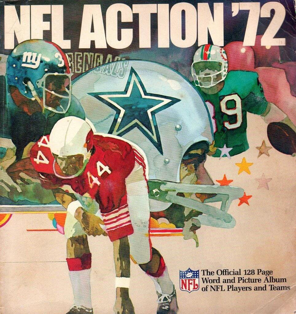
Remember when you got that Sunoco NFL ’72 sticker book, like the one shown above, for Christmas? That scene on Christmas morning might have looked something like this. (If you’re not familiar with these great Sunoco sticker books, look here.)
Okay, so a photo of a cool item is one thing, but how about the actual items? Here’s this week’s haul:
• Michael Clary rides again. After a lengthy hiatus, he’s back with more eBay finds. Maybe you’re in the mood for an inflatable Boston Bruin mascot? Check. Or an NHL skate bottle opener? Double-check. And we have a nice photo of a 1960s 49ers helmet buggy.
• Here’s a game-worn St. Louis Cardinals baseball dugout jacket from the 1960s.
• Never seen this LA Rams sweater design before. Almost looks like a DIY job, except that you can see there was once a label sewn into the inner collar.
• Looks like a sturdy 1970s NHL lunchbox here.
• If you’re a Colts fan who still wishes they’d never left Baltimore, then this 1970s Sears helmet plaque is for you.
• Bears fans, maybe your youngster will like this 1970s Bears sweatshirt (size small) from Sears.
• Dave Boss alert, featuring the New York football Giants.
• Nothing says retro NFL quite like this Cowboys Starter jacket I had this very model, in fact: My boss at Q102 at the time was Jim Fox, a diehard Cowboys fan, and he gave me one of these for Christmas.
Seen something on eBay or Etsy that you think would make good Collector’s Corner fodder? Send your submissions here.
OMFG: My latest One-Man Focus Group column is about the new logo for Little Debbie snack cakes, shown at right. (If you view the column in Safari, the photo at the bottom may look weird. If so, try a different browser. Thanks.)
Uni Watch News Ticker: The Battle of the Uniforms is over, and the O’s stand victorious. Who’da thunk? … More than 200 Mavs uni designs have been submitted in response to Mark Cuban’s invitation last week. You can see some of them in this ESPN piece I wrote yesterday afternoon. … In other NBA news, Bobcats owner Michael Jordan will discuss the team’s upcoming name change, to the Hornets, at a news conference today. ”¦ New basketball court design for George Washington (from Peter Kirschenbaum). … Meanwhile, James Madison wants a new court but is inviting fan submissions for the design (from Andrew Rader). … Yikes! That’s a throwback worn by South Adams High in Indiana (from Craig McKean). … Arouna Koné, who plays for Wigan Athletic (EPL), has an unusual NOB (from Max Weintraub). … Jimmy Griggs notes that Ole Miss baseball’s road uniforms appear to have mismatched shades of gray. … Speaking of mismatched grays, look at Bobby Gritch and Brooks Robinson in this shot from the 1972 All-Star Game. Looks like two different uniforms! (Good spot by Adam Garrettson.) … The new basketball arena down the road from me has its own distinctive aroma. Gross (thanks, Kirsten). … The Mets are conducting “Celebrate Israel Night” tonight, which means Mets-themed yarmulkes. … Brian Fitterman was looking in a 1962 prep school yearbook and came across this photo of a very unusual facemask. … New home kit for England — their first done by Nike, instead of Umbro (from Danny Garrison). … Check out No. 55 in the front row. Any idea who that is? Give yourself a pat on the back if you knew it was none other than Pete Rose, circa 1958. And speaking of Rose, did you know he has a Mr. Redlegs tattoo? (Both of these from Michael Clary.) … Oooh, coupla really nice old racecar photos here. When I see cars like those, the word “roadster” immediately comes to mind. … Yesterday’s uni-numerical note regarding Rick Barry (who wasn’t allowed to wear No. 24 with the Rockets, so he who wore No. 2 at home and No. 4 on the road) prompted this note from Terence Kearns: “Lewis Holtby was signed by Tottenham Hotspur in January, after trading away GK Carlos Cudicini, who wore No. 23. Holtby took 23 for all matches but UEFA Europa League, where he wore No. 14, because of some rule with registered numbers on a team.” … That same item about Barry also prompted this from Eric Holm: “When Rick Rickert played for the University of Minnesota, he wanted to wear 14, but he couldn’t, because the Gophers had retired number 14 for Lou Hudson. Rickert instead wore 1 at home and 4 on the road. Somewhere in my sports card collection there’s a collection of Gophers basketball cards that includes the Rick Rickert as No. 1 and No. 4.” ”¦ New football helmet for DePauw (from Joe Mueller). ”¦ New logo and uniforms for the Peoria Rivermen (from Josh Petty). ”¦ Reprinted from yesterday’s comments: New kits for Queens Park Rangers (from Jason Halpin). ”¦ Mikhail Herrera notes that Brett Gardner of the Yankees has been wearing one of those thingies on his sliding hand. ”¦ New football turf for Ohio University (from Leo Strawn Jr.). ”¦ Is Phil Jackson opposed to advertising on jerseys? Sounds like it, at least judging by “>this article, in which Jackson says the NBA should be more soccer and then adds, “Although their jerseys are a mess” (from Mike Cooperman). … Speaking of Jackson, check out him and Clyde Frazier wearing belted shorts in 1967 (nice find by Tom Farley. ”¦ The Philadelphia Soul — that’s an arena football team — wore orange socks on Saturday to raise awareness of chronic obstructive pulmonary disease (from Lee David Wilds). ”¦ ’Skins GM Bruce Allen says the controversy over the team’s name is “a non-issue” (from Tommy the CPA). ”¦ Phil tipped me off to a photo of a new EMU helmet that was circulating, but the original source appears to have been an Instagram link that’s now dead, so draw your own conclusions. ”¦ In college baseball, Prairie View (purple) and Jackson State (navy) went color on color last night. “Might be the one of the worst-looking games I’ve ever seen,” says William Thomas. ”¦ Here’s a Cuban soccer player wearing an Adidas kit and Nike shoes. “Don’t know if this has to do with the peculiarities of Cuba’s economy or if the player’s just doing it on his own,” says Norm Johnson. … Here’s an amusing debate over whether the basketball rim should be raised.
Received an e-mail this morning from FansEdge, stating the camo uniforms were part of the “USMC” collection. Found that entertaining, as an AD Marine.
I am surprised that MLB is using the appropriate garrison seasonal pattern. Though, this is no doubt just a coincidence.
Two comments.
First, I wouldn’t mind the G.I. Joe caps and related items if MLB and the maufacturers would donate 100% of their profits to Veterans’ group such as Wounded Warriors, Honor Flight, etc. After all, there are exploiting the military for commercial gain.
Second, regarding the 1960’s game used Cardinals’ dugout jacket for sale on eBay…it’s magnificent; simple and elegant! Attention Majestic, Nike, etc., this is the style and design of jacket you should be producing, not the stuff you’re currently churning out, you know, the jackets in multiple colors or with geometric side panels in contrasting colors.
Not profits. Revenues. Donate 100% of revenues generated from sales of the merch and I’ll get off MLB’s case on this crap.
I’m not asking MLB to lose money; their expenses should be covered. I just don’t think it would be fair if they made money on the deal.
For what it’s worth, I think MLB could afford to take the loss for charity.
Right-o. It’s not a principle until it costs you money.
More to the point, it’s not charity if it doesn’t cost you anything.
My favorite quote about charity: “Charity is not giving a bone to a hungry dog. Charity is giving a bone to a hungry dog, when you’re just as hungry as the dog is.”
Ted:
Welcome Back Veterans is the MLB’s military-centric charity of record:
link
…”MLB Advanced Media and MLB Properties will donate all net proceeds received from sales of the caps to Welcome Back Veterans as part of the overall $10 million donation.”
Not sure if the proceeds of the jersey sales are also part of this contribution.
Thanks Chris for the information. It would be interesting to determine whether jerseys fall within the parameters of the donation. Nevertheless, a $10 million dollar contribution is nothing to sneeze at, but it would be nice if all the proceeds were to be donated, irrespective of the self-imposed limit.
Read that again, carefully: The more of this merch we buy, the less of its own money MLB will contribute. So the purely rational thing to do to maximize aid given to military charities is to boycott MLB and its merchandise this weekend, and then donate whatever you would have spent on a jersey, t-shirt, or cap directly to a charity other than Welcome Back Veterans. That way, the total donation is MLB’s $10mil plus your money, instead of minus your money.
To be fair, it looks like WBV does some very good work above and beyond the slightly scammy aspect of using money “donated” by MLB to “purchase” game tickets from MLB teams to give to vets and their families.
Western Michigan had a new helmet last year (link) which looks mighty similar to the EMU one in the ticker. Considering they are rivals that might have something to do with it. Also they are both Adidas schools.
Typo patrol:
first graf, penultimate sentence, last word “Mondah”;
final Ticker item “wether”.
Thanks, Gregg — now fixed.
Those ugly hats appeal to the hunting crowd. And that’s about it.
not even.
There’s a typo in the ticker. Your apostrophe next to the O is right side up.
Hahahahahahahahahaha.
Sorry, not FansEdge but MLB.com has the “USMC” camo collection.Rather silly.
I figured that was just because they’re using a USMC-style camo pattern. What’s silly is that our services even have distinct camo patterns from each other.
Look at the All-Star game photo closely…shouldn’t Reggie’s jersey have the Expos-like number on the right front?
Nope, the A’s got rid of the front number in ’72 when they switched to pullovers.
Um, except they had front numbers, with the pullover jerseys, in the 72 Series:
link
According to Bill Henderson’s Guide, yes. The A’s used the front Expo numbers for 1972 only.
As to the Baltimore uniforms Henderson notes that the Birds got their first set of road knits from Spalding for the ’71 post-season. Bobby Grich was a ’71 late-season call-up from the Rochester Red Wings (right during the Little World Series-the Wings still won) but was not on the post-season roster. So maybe Bobby’s uniform wasn’t made until ’72, possibly explaining the color difference.
Nah, fuck it. If America really has become a country where we no longer honor active troops on Armed Forced Day, war dead on Memorial Day, veterans on Veterans Day, and the entire nation’s liberties on Independence Day, and instead we just want to have four Worship the Military Like a Soviet May Day Parade holidays, fine. Far be it from me to object to the throwing away of our proud republican virtues in favor of the cheap theatrics of a banana republic while young men of military age who have chosen not to serve their country play dress-up in soldier camo.
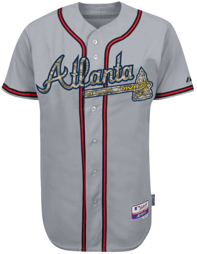
Instead, I’ll focus on the unis themselves. If you’re going to wear camo – and I’m not opposed to doing so, on either Armed Forces Day or to honor sportsmen, say for Bass Pro Shops Ammunition Night (first 15,000 fans .22 and up) – then this is absolutely the way to do it. Using camo as the shirt fabric is all kinds of ugly, and it subverts the meaning of camo. But using it as a color/pattern for the script and lettering works. Team colors still dominate, unless you’re the Cardinals and have no trim or anything elsewhere on the jersey. And the camo hats tie it together reasonably well. I’m honewtly tempted to pick up a Nats camo cap to wear on the river when I go fishing. (My current go-to fishing hat is an old teal Marlins number, on account of the fish in the logo.) But the camo lettering works much better for teams with across-the-chest scripts, like Atlanta up there, than for teams with left-breast insignia, like the Nats. For the latter teams, the team-color and camo elements are too separated.
Bottom line: Of all the camo jerseys I’ve seen on a baseball diamond, these are the best and most tasteful. If they’d just wear them on the appropriate holiday, like thoe Angels and Sox did, I wouldn’t mind a-tall.
Excellent commentary
Totally agree. A more thoughtful, less merchandise-focused tribute would be much better, but the unis aren’t as offensive as I would’ve expected them to be.
-an active duty soldier
“… Nah, fuck it. If America really has become a country where we no longer honor active troops on Armed Forced Day, war dead on Memorial Day, veterans on Veterans Day, and the entire nation’s liberties on Independence Day, and instead we just want to have four Worship the Military Like a Soviet May Day Parade holidays, fine. Far be it from me to object to the throwing away of our proud republican virtues in favor of the cheap theatrics of a banana republic while young men of military age who have chosen not to serve their country play dress-up in soldier camo… ”
You do not disappoint, Scott. Doleful truth: we are, most of us, unschooled about the existence, much less the attributes, of “proud republican virtues.”
I agree…of all the camo jerseys I’ve seen, if they HAD and felt absolutely compelled to do camo jerseys, putting the camo inside the logo is the best way to do it.
The Pirates camo look from the other day was just awful.
The thing is, I think the Braves have seriously excellent uniforms. Well, their home uniform, anyway; they’ve completely ruined their road unis the last couple of years. But Atlanta’s home uniform is, to my eye, top 3 all-time in MLB. And the camo-lettered version up there doesn’t feel like a downgrade at all to me. It’s like 98% as beautiful as the regular Braves jersey for me. Same with most teams. The few clunkers are mostly like the Nats, where the camo element is too isolated from the remaining team-color elements.
So aesthetically, this is an absolute clinic on how to use camo on a sports uniform. Maybe someone in MLB will realize that the lesson applies to other pattern treatments, and down the road we’ll get some interesting non-camo, non-special event jersey script treatments out of the deal. If so, it’ll be all to the good.
In the Nats case, though, the problem would be mostly solved by making the camo-W outline red instead of navy.
I can’t decide if this is a good idea, or a horribly, horribly schmaltzy one.
If I owned the Nationals, I’d send them out on Memorial Day in white uniforms — no logo, no nameplates, no advertising bugs. The white would evoke the headstones of Arlington. Caps would be white with blue brims. Instead of the usual “W”, they’d feature the res stripes and stars symbol of the DC flag, which was inspired by George Washington’s personal crest, which reminds us that our military is populated by volunteer patriots, that “Spirit of Cincinnatus” notion so admired by Washington.
Solemn, but not somber. Respectful, not exploitative.
Cort, if I owned any baseball team, I’d send them out in Memorial Day wearing their regular home whites or road grays, without modification save possibly a black armband. When asked, I’d tell the press, “Baseball is America’s national pastime. This team’s uniform is always patriotic.”
That is better.
There are so many “special” uniforms to commemorate “historic” events that it’s become like Catholic feast days, or Yankees retired uniform numbers: inflated to meaninglessness.
The simple black armband carries tremendous emotional power. I love this idea!
Why doesn’t the Navy get some love? Out by me near great lakes training center you see a lot of this multi-blue aqua camoflague. Would work good with the Mariners, Dodgers, Padres, Rays, Cubs, Brewers, Mets and whoever has a Naval installation nearby.
I know that 1972 NFL catalog is just an illustration, but I don’t ever recall the Cardinals having stripes on their red jerseys. In fact, according to the Gridiron Uniform Database, the last time the Cards had stripes on their red jerseys was link. Maybe they were contemplating adding stripes to the red jerseys so that they could match the white jerseys, no?
Not only that, but his socks are too low, exposing his knees. Gonna get fined!
Ha! Wasn’t even paying attention to that.
In all seriousness, though, I always liked the striping pattern the Cards had on the sleeves of the white jerseys pre-2005. I think they should go back to those uniforms full-time, but use the updated aggressive cardinal head. If they insist on having a BFBS jersey, use the white jersey as a template and incorporate the stripes. I think that would be a nice compromise.
Many days I biked the two miles to the one Sunoco station in town to acquire those stickers in the summer of ’72. (You didn’t have to buy gas, I recall. Maybe a pack of 10 stickers was a quarter? I dunno.) Anyway, what struck me as most unusual about that cover was the inclusion of the Bengals logo. How it sneaks in there, uninvited, like a little brother. You never saw the Bengals logo highlighted anywhere in a national publication like that (and, yes, I understand why).
Usually, gas station merchandise that you have to pay for, you don’t have to buy gas. I still have a Sunoco basketball I got as a kid at one of the Sunoco’s along the PA Turnpike. (Despite being EVERYWHERE in Pittsburgh, I almost never go to Sunoco for gas, preferring Exxon and Marathon.) I also remember as a kid, right after BP converted the Sohio stations over to BP, we bought some Peter Cottontail books or something along the lines of that, sponsored by BP. In PA, Sohio was called Boron, and I remember as a kid making the short drive to Ohio to see these stations be exactly the same as Boron, but called Sohio instead. It would be years later before I found out that Sohio was the original Standard Oil that John D. Rockefeller founded and that they were only allowed to use Sohio in Ohio, and had to use other names like Boron elsewhere. I was six or seven when BP switched them over to BP so after that it was a moot point anyways.
In Nebraska it was DX (subsidiary of Sunoco), which is no longer around anymore. Anyone remember in Peanuts that all the baseball cards Charlie Brown got were all of Joe Shlabotnik? When we went to the DX station, most of the stamps were of Saints running back Bob Gresham.
I really wish one of the teams had the balls to go against the mandated jerseys and simply wear a black armband or something. Do you really think MLB would publicly chastise them for honoring the dead? I think more teams would follow because they see one of the teams “gets it”.
The grainy B&W photo of the “weird” 1962 football helmet facemask is actually a conventional single bar facemask with a second, seperate old-style “eyeglasses” facemask set above it. These eyelasses facemasks actually date back to the Leather Helmet era and were actually used even before the single bar facemasks that were popular in the 1940s-1960s. There are many older films and photos showing players wearing these “eyeglasses” facemasks on teams where none of the players had any facemasks of any kind. I have purchased 1-2 Leather Helmets on Ebay with the “eyeglasses”facemask” attached.One was attached not by screws or attachments, but by leather straps that tied the facemask to the helmet.
There is an old Jerry Lewis movie where he plays the son of a famous football player, and his charecter is really an unathletic kid pushed to follow his father’s college football star footsteps. None of the team wears a facemask – but Jerry Lewis – who wears nerdy glasses in charecter in the movie – wears the “eyeglasses facemask” on his leather football helmet ….
Great info — thank you!!
Hey lady! Do you enjoy the football with the tackling and the passing and OH NO I think I hoit myself.
link
Does anyone know if the Univ. of Hawaii is going to change their football uniforms no that they have re-adopted the nickname “Rainbow Warrors”?
Last week I saw and older-style White helmet with a retro logo, but with a Black facemask – which was never used in the previous White helmet-era. Any info out there?
That thingie on Brett Gardner’s hand is an elbow protector that has been cut and has one side sewn shut.
You get a free MLB beach towel if you spend over $99 on the camo gear. Using Memorial Day as a marketing opportunity like this isn’t a great idea in my opinion.
link
When I see cars like those, the word “roadster” immediately comes to mind.
Roadster is a fun word. Roadsters are pretty much always open-roofed or convertibles.
As the only Uni-Watch member with a Hornets design, let me just say that I’m beyond excited that the name is coming home.
Its a very strange feeling. Its like someone is coming back from the dead. I grew up with the hornets. They had alienated the entire town that by the time they left, we’d all done our grieving already. Then the NBA dumped the Robertcats on us. We never loved them. They were the rebound girl that we never wanted.
Cynics will say its just a name change. Thats true. The team still sucks. But its worth a shot, to get the city to buy in. The Hornets name dates back to the revolutionary war. Perhaps its fitting that yesterday was the anniversary of Mecklenburg County declaring independence from England. (Charlotte is in Mecklenburg County, and we were the first people in all of America to declare Independence on May 20, 1775)
I just hope the organization isn’t afraid to use the actual Hornets colors. When I was a kid I loved watching the Mourning/Johnson/Bogues trio (even had a Mourning jersey). If they aren’t teal and purple, I will be seriously disappointed.
Paul wouldn’t let me have a Hornets design on account of the purple (this was in the pre-amnesty days)…:b
I still have mixed feelings about the Hornets name returning to Charlotte. I stuck with the team throughout the losing seasons, playoff flameouts and relocations (although having no geographical ties to the team helped with that), and whilst I hate the Pelicans name & colours, I’m not going to stop supporting that team – I’m a firm believer that when you pick a team to support, you support them for life, no matter how much their identity sucks.
But with the Hornets name (and possibly colours, logo & unis) going back to Charlotte, there’s going to be a new team using the identity that I fell in love with all those years ago, and that’s hard for me to take. Sure, I could adopt them as my second team, but again, the thought of “cheating” on my team rankles with me.
I know it’s just business, and compared to all the shit going on in the world it’s insignificant, but the whole thing just makes me a little uneasy.
In regards to the Cuban football kit/shoe post at the end of the ticker:
Here’s a US player with Nike kit and Adidas boots: link
Look here’s another! link
Has nothing to do with economy, it’s just that soccer players on both club and national teams usually have the freedom to wear whatever cleats they’d like, no matter the brand of jersey they wear.
Correct. A few years ago, IIRC, the French national team’s deal with Adidas included uniforms and shoes; that was very much the exception to the rule.
Yep – all French players at the 1998 World Cup wore adidas, and every Brazil player at the 1994 World Cup wore Nike, regardless of individual sponsorships. And that’s about all I can think of for players having to wear the sponsored boots for the national team.
Exactly.
Players are dictated on what boots they should wear. Players get sponsored footwear, just like in any other sport.
Beat me to it.
Christiano Ronaldo is a Nike guy but wears an adidas uni for Real Madrid. Lionel Messi is an adidas guy but wears a Nike uni for Barcelona. The two biggest stars in the game now and here’s the prime example of that. Remember when Beckham played for Manchester United, arguably the best well-known Nike team? We all know he was adidas’ biggest guy they had in soccer.
Was there any truth to the report that Nike was trying to finance Cristiano Ronaldo’s move back to Man Utd? It must drive them nuts, considering how much money jersey sales brings, and to think Ronaldo is bringing in boatloads of money for adidas (and Messi doing the same for Nike).
There were rumors to that effect. I think it more likely that United will wait one more year if they want CR7 back; after next season, a new shirt sponsorship with Chevrolet kicks in for almost double the current deal with Aon.
God forbid any of us say we hate these camo uniforms. We will be called “un-American”, and people will accuse us of hating our military.
It’s a fight I get into every year with my friends who don’t generally get it. I say I don’t like the use of camo (or pink) on sports uniforms, and they mock me, question my morals, and overall just think I’m a bad person for not following the sheep.
Like others have said before, if ALL the procedes from this stuff goes to charity, I am all for it. But until then, I will still hate it.
Its funny, using the flag on uniforms is specifically barred by the US Flag Code: (j) No part of the flag should ever be used as a costume or athletic uniform.
However, a flag patch may be affixed to the uniform of military personnel,
firemen, policemen, and members of patriotic organizations. The flag
represents a living country and is itself considered a living thing. Therefore, the
lapel flag pin being a replica, should be worn on the left lapel near the heart.
So technically, all of these times when teams use the flag on a uniform, they are breaking the law. There are no fines or penalties for breaking these laws. Still though, its disrespectful.
link
Texas v. Johnson, 491 U.S. 397 (1989);
United States v. Eichman, 496 U.S. 310 (1990).
Punitive enforcement of the Flag code would be violate the First Amendment right to free speech.
Thus, the Flag Code only controls how the United States Government acts with regard to the national colors.
Carry on.
It is still against the law, but there are simply no punishments. Its essentially what you’re supposed to do, but don’t have to do.
Commercial speech can be restricted. You cannot use the flag as an advertisement in DC. Not that they ever would do this, but since team uniforms are a form of commercial speech, I think they could bar the use of the flag on them.
Bear in mind, that would never, ever happen.
The important thing is not that it’s against the law, or whether the government can enforce the law. The important thing is that the Flag Code is the common standard for flag etiquette. Everyone means well. Hell, people who burn the flag in anger mean well and in most cases honestly regard themselves as making a patriotic statement out of love for America. So the Flag Code serves as the standard by which we judge whether an otherwise well-intentioned display respects the flag or not. So putting the flag on an athlete’s uniform disrespects the flag. Even though everyone involved has good intentions: It’s still flag desecration.
How do they feel about Captain America?
The flag code only applies to the use of an ACTUAL flag in these cases, not the stars and stripes print. Often times you’ll find women wrapped in an actual flag as part of a photo shoot. That violates flag code due to its use as clothing or a uniform. If you go to a fabric store, buy flag print and use it for anything, you are within your bounds to use it how you please.
False. According to the Flag Code, anything that looks like the flag, is the flag.
This is actually pretty simple. A flag is a symbol. It’s equivalent to a letter of the alphabet. As such, it’s meaningless to say that one symbol that looks like the flag is an actual flag but another symbol that looks like the flag is not. It makes exactly as much sense as saying, “That’s not really the letter A when you see it on a computer screen; it’s just a symbol that stands for the letter A.” Yeah, no, it’s the letter A. And so with the flag: If it looks like the flag, it is the flag.
This is both elementary logic and express language of the Flag Code. Making pillow shams out of fabric printed with the flag really is flag desecration. One still has every right to desecrate the flag, but the Flag Code really, truly doesn’t contain any loopholes for your pillow shams.
Full disclosure: I have a throw pillow made from that flag-printed fabric they sell at craft stores. I’m not saying it’s like evil to violate the Flag Code, just that we shouldn’t lie to ourselves about it when we do so. That pillow was a gift from a family friend, and the sentimental value just outweighs my general bias in favor of upholding basic flag etiquette.
I just gave the code a quick once-over again, not too comprehensive so I may have missed it, but I didn’t read anything defining a flag. The only thing close to it was 8. Please direct me to where it states what is a flag and what isn’t. Im just saying if I buy stars and stripes fabric from a fabric store, thats not a flag. Yes, I can make a flag from it, but until that process is complete, it’s only stars and stripes fabric.
Note that federal law defines the flag as a pattern of stripes with a star-spangled union. It does not specify that it takes a particular form, such as “sewn with grommets so as to be flown from a pole.” And then later on in Title 4, federal law makes explicit what its earlier broad definition makes implicit:
UNITED STATES CODE
TITLE 4
CHAPTER 1 – THE FLAG
§1. Flag; stripes and stars on
The flag of the United States shall be thirteen horizontal stripes, alternate red and white; and the union of the flag shall be forty-eight stars, white in a blue field.
§ 3. Use of flag for advertising purposes; mutilation of flag
The words ‘flag, standard, colors, or ensign’, as used herein, shall include any flag, standard, colors, ensign, or any picture or representation of either, or of any part or parts of either, made of any substance or represented on any substance, of any size evidently purporting to be either of said flag, standard, colors, or ensign of the United States of America or a picture or a representation of either, upon which shall be shown the colors, the stars and the stripes, in any number of either thereof, or of any part or parts of either, by which the average person seeing the same without deliberation may believe the same to represent the flag, colors, standard, or ensign of the United States of America.
link never gets link.
The inflatable Boston Bruin bears more than a passing resemblance to Captain Kangaroo‘s link who, I see, link
As I have discussed with Phil in the past. A more appropriate, and definitely traditional way to recognize the fallen on Memorial Day, would be wearing a poppy flower patch. And, handing out those little poppy flower pins that distributed by veterans groups on Memorial Day.
In Canada and Britain.
The Barclays Center “smell-o-vision” has deep roots in the ‘Merican show “bidness” experience Paul. As my former and your current employer, the big Mouse, pioneered nearly three score years ago.
Most of us that are regular Asperger syndrome watchers, I mean Uni-Watchers, know that Disneyland, Disneyworld and all the Disneyparkistans in the world bombard the visitor with smells (popcorn first – then fresh baked cookies – not to mention the rides themselves).
Disney has bombarded the senses in the hopes that it will enhance the entertainment experience (and buy more stuff, mostly that). For more on the story check out…
link
My own take on all this scents and scentsabilities, when I first started out at Disney (as a janitor working graveyard shift) was that all exterior smell pumpers at the park were turned off at closing – for cleaning by an assigned brown person – I mean janitorial crew. The smell pumps inside the rides (not to mention the sound effects, lights, water filters, et al.) never stopped.
I had to clean the Pirates of the Caribbean ride and never figured out how they got the salt air smell machine to work since someone else had to clean that thing. I was stuck with cleaning out the ashtrays (Yes, I know it’s been a long time since I worked there) and scraping gum off the streets.
Vegas casinos do the scent thing too. One lost my business because its scent was so reminiscent of blood.
It’s surprisingly apropos, though. Gotta give them that.
IMO, Mandalay Bay is the best though. smells of tea tree. so beautiful!
I like how Abercrombie & Fitch basically tells me to stay far, far away by pumping out their scent.
Couple of things in today’s column resonated with my youth, namely the facts that Dick Allen wore his batting helmet during the pre-game intros even (I wonder if he even owned a basic cap), and that I still pull out my completed 1972 “NFL Action” sticker set every now & again. I worked HARD to accumulate those suckers.
Congratulations to the Tufts Jumbos, who not only won the NCAA D-III softball championship yesterday, but did so in a sartorial style that can only be called “impeccable”:
link
link
Ooops, copied and posted same link twice. Intended this one instead:
link
Those white unis are spiffy!
How difficult is it to get a young lady to agree to play for a team called the “Jumbos”? Most guys would love to have that word splashed across their clothing, but . . .
Well, given that college kids have a “sophomoric” sense of humor, I’d wager they think the connotation mildly humorous. If they even think of it.
Tufts students do take pride in their mascot’s uniqueness, though, both zoologically and historically.
I checked the MN Twins site… They have nothing
Oh really?
link
Just checked twins site only shows hat. Checked a few other some have multiple shirts along with Jerseys and Hat, some others just the jersey and hat. Kind of peculiar for them to not have at least a majority of the teams offering the same items.
Besides the camo crap issue, dealt with ably by Scott and others above, there are three additional phenomena in today’s ticker that have been pre-certified as important:
1. Link to Paul’s coverage of the hilariously minimal re-do of the Little Debbie logo. PL notes inverse relationship of Little Debbie’s chemical-intensive ingredients and Little Debbie’s wholesome, old-timey mascot.
2. New crapola kits for England soccer. It just drives me completely nuts that England wears navy when the Cross of St George and centuries of military tradition are red. I am not one of those Irish persons who reflexively dislike England and the English. [C’mon, they’re an amusing bunch of fuckers, cultural powerhouses, and London is right up there with New York and Rome.] But England has to follow the strictures of the Great Chromatic Peace Treaty of the Archipelago: Scotland is blue; Ireland is green; Wales is green-and-red; England is red. Period.
3. I forgot Number Three. Oh yeah, that photo of Phil and Clyde, 1967.
No, England is white. Most often with dark blue trim and shorts.
Consider rugby, as well as football. Also, consider the kit of the British and Irish Lions, the all-star team of the four Home Nations that make periodic trips to Australia, New Zealand, and South Africa. A red jersey, from Wales. White shorts, from England. Dark blue socks with green tips, combining the colors of Scotland and Ireland.
Now if you’re talking the English football change kit…that is best when it’s strawberry red, with white shorts. Just like on July 30, 1966.
* – “tops”, not “tips.”
Yes, England’s main color is white. But if there is to be colored trim on the shirt, it shouldn’t be navy. And if it is to be navy, there should be at least a little red to balance it out.
I don’t mind the navy crest (though I prefer the brighter one Umbro introduced), but the navy collar does really bother me.
The navy is way too dark, and apparently, the German media is mocking the design for looking too much like their 1970s look (though as the article points out, the Kiwis might have a more legit gripe): link
And “You look like Germany” is probably the worst taunt for an England supporter.
We haven’t seen the numbering. Red would be very nice.
“… Now if you’re talking the English football change kit…that is best when it’s strawberry red, with white shorts. Just like on July 30, 1966…”
We agree, mon vieux. England all-white is good, fine, maybe with a little red trim, and the change kit should indeed look like Bobby Moore.
As for the rugby kits, England should wear white or red or red-and-white for those as well. Cuz I say so.
I was okay with the all-white for England (and it was certainly better than the white/royal that they wore for like 3 matches in 2011).
But I hated the all-red change kit and I dislike the general trend towards monochrome national uniforms that FIFA is apparently encouraging. I call it pajamafication, and I’m afraid we’re losing the flair that we used to have in international matches, with France wearing tricolores and the Netherlands with the white shorts to break up the head-to-toe orange. It was disheartening to see Spain play France in all-red vs all-navy, instead of the usual red/blue/red.
As for the rugby kits, England should wear white or red or red-and-white for those as well. Cuz I say so.
I hardly think an English rugby fan would want his or her team to look like the Welsh.
I don’t have a beef with the design. It does indeed “look like England.” The whole Germany comparison is a bit overstated.
I’m just sad that Umbro isn’t designing them anymore.
As a Canadian and a Blue Jays fan I’m pretty disturbed by the Jays being pulled into celebrating an American holiday, especially considering its militaristic nature and not a celebration of the war dead.
And using the trademarked United States Marine Corps camo pattern as well.
I guess when you guys get around to starting your own army we’ll let you put their pattern on the Red Army Day caps.
Really, Chance?
We fight side-by-side with Americans on a daily basis, do most of the clean-up in terms of the peacekeeping after your boys have gone home, and link without the fanfare that Zero Dark Thirty seems to generate for the American military. In short, link.
So take your condescending bullshit elsewhere and celebrate your faux holidays like the rest of your country. We, as a country, are eternally grateful for those men and women who gave their lives to stand on a wall and say “Not on my watch.” And we certainly don’t stomp on the deaths of the courageous men and women who gave their lives to uphold the Canadian way of living by shitting all over a holiday meant for them.
Have a little respect before you spit that crap out.
Sorry, Teebz. I really thought my sarcasm was too heavy, not too light. I apologize for not directly marking it as such (beyond calling this MLB event “Red Army Day”), and I apologize for offending you in the process.
Seconded. There’s much talk about “peacekeeping” as a mission for a military force. The Canadian military doesn’t use it as a platitude; they really believe in it. They deserve better than ignorant insults.
Which would explain why the Canadians were smart enough not to get involved with Vietnam.
Seriously, Teebz, I’m embarrassed. I guess the line between parody of ‘Murican and parroting ‘Murican is a lot thinner than I thought. Please accept my apology for the confusion.
Teebz! DJ! Chance was joking. It was a parody. Chance is probably one of the few people around here who can say Lundy’s Lane, Vimy Ridge, and Dieppe. That he apologizes is in keeping with his courteous self, but you guys are a tad tetchy…
Chance, I do apologize for the vitriol sent your way. I fully accept the apology, although I just wanted people to realize that the joke – and yes, we know it’s a joke – wears thin when it comes to how our military is perceived when compared to the bravado of the American military. Something else set me off this morning, and then that just tipped the kettle. I apologize for how strongly I came across as well.
We deploy our guys to places where others have left a trail of bodies and collateral damage, and work to keep the peace after the dust has settled. Some men and women never come back from peacekeeping missions because Canadians and Americans are viewed as one because of how closely we work together.
I know a half dozen guys in the Army, and they always get a kick out of how much press is given when Americans kill one guy, but nothing is said about 50 guys the Canadians took down to get to that guy. It irks them, but they deal with it because they don’t want the parades and marching bands. All they want is a “thank you” and to see their loved ones again.
Chance, we’re still good, and we always will be (at least from my view). Maybe just add a ;o) or [sarcasm] tag to the end so I don’t lose the connotation in a rather crap morning for me. But otherwise? We good, bro. We good. Sorry about my demeanor this morning. :o)
I always love to see people work things out. Warms my heart.
Even though Memorial Day is an American holiday, the use of poppies to celebrate it derives from the poem “In Flanders Fields.” That poem was written by a Canadian lieutenant in the Great War, John McCrae.
In my opinion it would be a great showing of decency and friendship if the American teams would show more respect to Canada.
Good call Teebz.
We’re always good from my end, Teebz.
Ironically, the USMC’s “digital” camo pattern is based on Canada’s earlier CADPAT digital camo.
Pittsburgh already busted out the camoed-up caps and jerseys as well, but I can’t remember if it was over the weekend or earlier last week. Whenever they played the Astros.
Yeah, but they wore a full-on camo jersey, not a jersey with camo lettering:
link
They’ll be wearing the camo-lettering version on Monday:
link
Also: The Mets are holding “Military Appreciation Night” this Sunday. No indication as to whether they’ll be wearing the G.I. Joe gear for that game (in addition to wearing it on Monday like everyone else), but it seems likely.
Let no game go un-camo’d!
The funny thing about the ones last week is that they kinda blended into the backstop at PNC Park.
So much better than the full-on camo. But dear God, yellow and camo do not mix. That yellow outline with the camo shading is awful.
yellowsports and camo do not mix.Fixed that for ya.
That picture of the All-Star Game is so close to uni perfection. If some of the players were wearing their cuffs a tad higher we’d have excellent views of the White Sox sock logo, as well as OAK’s great gold-green sannies/stirrups combo and beautifully striped stirrups from BOS, BAL, and DET. Now that’s an All-Star Game.
Paul, have you noticed the apostrophe on the new Men’s Fitness logo? That’s the first time I’ve seen the negative space used for an apostrophe (or punctuation in general).
oops, here’s a link: link
That’s not really negative space — it’s a superimposed reverse-field. And no, I’ve never seen that.
Just last night, however, I noticed the interesting placement of the apostrophe in the Modell’s logo:
link
What these two logos have in common is that they haven’t added any space between the next-to-last letter and the “s,” despite the punctuation mark in between. In the case of Modell’s, the shape of the “L” gave them a big empty field in which to put the apostrophe; in the case of Men’s Fitness, they created their own space by putting the apostrophe in reverse-field. Either way, it makes for snug, orderly kerning, which I’m generally in favor of.
Meanwhile, the dude on the cover of that Men’s Fitness issue really captures the joylessness of the bodybuilding scene, no?
And speaking of Men’s Fitness:
link
Ha! To be fair, I don’t think the readers know the difference between MF and MH.
Also, that’s Vin Diesel. It’s so easy to forget that Vin Diesel’s name is Vin DIESEL, which is arguably the greatest stage name in the history of cinema.
“In each case, the team’s online shop only shows a home camo jersey or a road camo jersey – not both – depending on whether the team is playing at home or on the road next Monday.”
The Marlins’ camojerseys are shown as gray:
link
If this is what it takes for them to ditch the black tops for the gray aways, even if it’s for just one game, I’m all for it.
Sadly, the score after Monday will be:
“G.I. Joe” Caps – 1
Orange Caps – 0.
Interesting that the White Sox where visiting the Angels on Sunday and those jerseys are not available on mlbshop.com, but the White Sox will be at home on Monday and the Angels will be on the road on Monday
White Sox:
link
Angels:
link.
Will the jerseys from Saturday’s game also be made available to the public?
It was disheartening to see Spain play France in all-red vs all-navy, instead of the usual red/blue/red..
I prefer the old school strips for France and Spain as well. I think that recent Spanish kit was just a one-off because France was in all-blue. The unveiling pictures I saw of the current Spanish kit had navy shorts.
I think you’re right.
Though I’m still disappointed that France’s all-bleu forced the change, and that all-red was an option.
I watched that match on TV. I remember the commentators saying that Spain was wearing all-red for the first time, and was justifying it as living up to their nickname “la Furia Roja” (the Red Fury).
David Brown of Yahoo!’s Big League Stew picked up your blog today, Paul.
link
I have two brothers who are United States Marines, and I do honor their sacrifice and dedication, but not specifically this weekend. This weekend it’s all about the friends they lost in the desert. (And, of course, all the others who made the ultimate sacrifice.)
The MLB follow-up note is rich. So they should get a pass for getting it wrong because they are trying to do “right”?
Gonna have to disagree with you on the “roadsters”. My mind immediately goes to the beautiful cars turning laps at the Indianapolis Motor Speedway in the 50s and 60s. The 97th running of The Indy 500 is this weekend for all interested. Still the greatest race in the world.
link
I’m with you. Those 60’s roadsters looked like cars, not Transformers.
I even liked the last generation car a lot over the current one. I think there’s talk of axing the rear wheel bumpers in the future but it’s hard telling at this point. That said, last year was one of the raciest 500s I’ve attended and that’s definitely a good thing. Can’t wait to be back this weekend!
Oddly, it doesn’t look like they even matched the different MARPAT camo patterns between the hats and jerseys(for the Phillies, at least:
link
A very informal (and incomplete) search of MLB Shop makes it look like the hats all use the Desert pattern and the jerseys all use Woodland.
Shameless self-promotion:
link
Phenomenal COTD, especially the pre-1950 pieces. Outrageously good lettering and design. Love the “don’t block the emergency exit” and carbon monoxide posters.
Agreed. Those are fantastic.
My grandfather and father both served in the USMC (as I did), both fought for the USA and both were die hard baseball fanatics.
They are both gone, but would have loved that MLB is honoring them on the field.
Unfortunately, some folks feel we should honor our fallen troops only in ways they deem correct. Regardless, I’ll be at the ballpark, cheering on my team and eating a hotdog. That’s how I choose to honor my families service. I’m a horrible person.
Agreed. With all due respect to Paul, I don’t see what harm these jerseys do.
If Booger’s father and grandfather did not fall in combat, then Memorial Day isn’t about them. Memorial Day is about remembering our war dead. Veterans Day is the day set aside to honor all veterans; we celebrate it in November.
That confusion about what the holiday means is the harm. It’s as simple as this: If the purpose of the holiday is to honor our war dead, and we tack on also honoring all veterans, then we cheapen the honor we pay to our war dead. Imagine if we further expanded it, and said we’ll also honor everyone who served in the Merchant Marine. And teachers, too, because they serve the republic in difficult conditions. And park rangers, and Bureau of Land Management accountants, and IRS agents and … you get the idea. Surely it’s apparent that doing so would distract from or cheapen the honor shown to military veterans. Well, just so with turning Memorial Day into a catch-all “troops and veterans rah rah” celebration, rather than honoring our war dead.
Now, to the extent that the camo pays specific tribute to our honored war dead, as opposed to generalized “yay troops and veterans”, then it’s all to the good. But it doesn’t do that. It just doesn’t: Nowhere else in America is it regarded as a respectful, dignified Memorial Day observance for civilian adults to dress up in camo and prance around playing games.
But I should add, I don’t think anyone’s heart is in the wrong place. The urge to pay tribute to veterans is always a decent and noble one. It’s just that on this one day, it happens to be a bit of a distraction from another, equally important observance.
The idea that soccer jerseys are a “mess” is absolutely absurd. People who oppose advertising on jerseys obviously don’t understand why those sponsorships are on the jersey. It’s a stupid argument.
So… blatant greed is a good thing?
Little league teams need sponsors, professional teams with multi-million-dollar payrolls do not.
I do think there’s a middle ground – top teams and leagues have just a single sponsor on their shirts, so the look is *mostly* clean and nothing like the NASCAR-like logo fest that the “mess” descriptor might evoke.
Once you get to the lower leagues, the sponsor logos become more cluttered, so they can be a mess, sure. But no matter what anyone thinks of jersey sponsorship, I think it’s hard to describe, say, a Manchester United jersey as a “mess”.
It may not be a “mess”, but it’s completely unidentifiable to a non-fan because the sponsor logo is the most prominent feature. If I saw this: link without having specifically searched for Manchester United, I’d be left wondering who AON is, and only knowing what team it was because of the lettering on the plaque being just barely readable.
Sure, but from Manchester United’s point of view, there are relatively few people who can’t identify a ManU jersey in markets that make them money (Europe and Asia). And even in the U.S., replica soccer jerseys are becoming more common now that fewer and fewer people are confused by seeing “QATAR FOUNDATION” since Barcelona’s colors are pretty identifiable. As soccer becomes more popular, I think the sponsor issue will disappear.
That said, I don’t like the sponsored jerseys, and much prefer the cleaner national team jerseys. But aesthetically, I don’t think sponsored jerseys in soccer are a big deal, especially compared to motorsports or European hockey.
People who oppose advertising on jerseys obviously don’t understand why those sponsorships are on the jersey.
Perhaps you could explain it to us then? Please do!
NFL owners have voted that the 49ers new home, Levi’s Stadium in Santa Clara, will host Super Bowl L in 2016. w00t!!!!
link
They are exploiting Memorial Day, a day to honor those killed while serving. Check out this article: link
Meant as a reply to “Booger”.
#KeepPaulLukas
++++1
Thanks, guys, but don’t worry — I’m fine.
For those who don’t know what this thread is referring to:
link
Hard to believe the U.S. Military would be responsible for the shortening of the Braves’ tomahawks …
link
HO LEE SHIT! Is the script on the Braves’ road jerseys really THAT obnoxiously huge? (link.) That L looks completely ridiculous.
Why have I never noticed that before?
The link is so mmuch better (size-wise). I hope this is a sign of things to come for their regular road unis.
I concur. The regular jerseys always looked fine … until I compared them to the proportionately-designed camo duds. Now they look almost as clownish as the Astros’ tequila sunrise set.
Setting aside whether or not the jerseys should be created, which of the Monday jerseys are the worst from a purely visual perspective? After viewing all of them (why did I subject myself to this?)
I think the worst are the Mets (the cream looks awful with the camo)
link
and the Cardinals, those poor birds rendered in camo
link
They might need to wear those beautiful “St. Louis” slts the next night, just to make up for Monday’s jersey.
Miami’s also merit dishonorable mention.
Nice new graphics on GW’s court, but they apparently missed the memo about Twitter hashtags now being illegal on NCAA courts and fields.
I have that NFL Action ’72 book!!!! …somewhere
-Jet
The Cleveland Indians are wearing their cream home/ weekend/holiday alts tonight for the second straight day. Anyone know if they changed the status of the weekend alts? Am I missing something here?
I find it quite nice that dpu has opted for a pop warner style helmet. It sure fits their style of play in the Bell Game recently. WABASH ALWAYS FIGHTS
Love the fact that the SWAC baseball tourney is getting some love today.
I don’t even know the way I appeared right here, however I imagined this upload once were terrific. I can’t understand individual preference may be but you will your well-known doodlekit should you are usually not by now. Kind regards!
RE: North Adams Starfires.
It looks like the school was only opened in 2009. That uniform can’t be a “throwback,” per se.
Nice Rainbow Guts, however!
I’m a few days late getting to the ticker but am I the only one surprised at the allowance of the hashtag on George Washington’s baseline after the NCAA ruling last month about not having them on the football field? What’s good for one major revenue stream isn’t good for another?
This is a superb article. I be happy to see even more.