
Yesterday was Mother’s Day, which means MLB diamonds were awash in pink ribbons, pink wristbands, pink shoes, pink shoelaces, pink batting gloves, pink necklaces, pink sleeves, pink-laced baseballs, and so on, all in the service of raising awareness of breast cancer. Reed Johnson of the Braves even wore pink sanitaries under his stirrups, which I believe is a first.
Lurking beneath all of this, however, was a subplot that didn’t get as much coverage as it should have (although Phil briefly mentioned it yesterday).
Here’s the deal: You know those pink bats that players use on Mother’s Day? It turns out that Louisville Slugger is the only bat manufacturer allowed to put its logo on those pink bats — an exclusive status that it purchased by making a large donation to the breast cancer charity group Susan G. Komen for the Cure. Other bat manufacturers can make plain pink bats, as long as they have “no ribbons, corporate logos, distinguishing marks or names of charities are included on the bat.” The bat manufacturer MaxBat violated this rule by producing pink bats with its own logo and shipping them to several MLB players. Those players were told that they couldn’t use the pink bats because of the MaxBat logos. Just to make things messier, two of those players are Nick Markakis of the Orioles and Trevor Plouffe of the Twins — both of whose mothers are breast cancer survivors.
After Jeff Passan of Yahoo Sports broke this story on Friday night (his piece is excellent — highly recommended reading), MLB issued a clarification, stating that MaxBat and any other bat manufacturers could include their logos on a pink bat — as long as they made a contribution to Komen for the Cure.
What a disgrace. There’s plenty of blame to go around here. In descending order of loathsomeness:
• MLB: I’m not sure which is worse — designating an official bat of cancer awareness or then deciding that you can blackmail other manufacturers into making a donation to your designated charity. The whole thing is disgusting and really shows how the culture of branding and sponsorship has overtaken any semblance of common sense. I mean, the idea here is supposedly to help save lives, not to worry about logos or to push some corporate marketing agenda.
• Louisville Slugger: Once Jeff Passan broke the story, Louisville Slugger issued a bunch of tweets and statements trying to save face. They pointed out how much they’d donated to cancer research over the years, blah-blah-blah. But the whole point of charity and philanthropy is to be, you know, charitable and philanthropic. You don’t do it with one eye on your image and another on your balance sheet, and you definitely don’t do it as part of marketing plan designed to freeze out your competitors. If Louisville Slugger really cared about cancer research, they wouldn’t worry about whose logo was on a freaking bat and they wouldn’t want any sort of exclusive status. They’d welcome pink bats from other manufacturers, logos or no logos.
• Komen for the Cure: By now people are starting to realize that Komen is primarily just a cog in the corporate marketing machine. (There was even a movie about that in 2011. You can see the trailer here.)
• MaxBat: This whole mess could have been avoided if MaxBat had simply shipped plain pink bats, without their logo, per MLB’s rule. On the other hand, it’s a ridiculous rule, and we wouldn’t have known about all this if MaxBat hadn’t violated it. So I’m kinda glad they did.
A Louisville-based journalist suggested that the whole thing was no big deal because MLB would look the other way if anyone used one of the banned bats. We’ll never know, though, because Markakis followed the absurd rule and didn’t use his pink-labeled MaxBat. Ditto for Plouffe. Ditto for for Adam LaRoche. So congrats, MLB and Louisville Slugger — you maintained your precious brand integrity.
I’m lucky enough not to have had my life touched by breast cancer. But cancer, in its other varied forms, is no abstraction for me. It killed my grandmother, my brother, and both of my sisters-in-law. It would have killed my father if an intestinal problem hadn’t killed him first. It is currently killing one of my dearest friends, who I’ll be visiting this weekend, probably for the last time. I want the thing solved and cured; I don’t want a bunch of corporations behaving like 12-year-olds over who gets the credit and how much additional pink merch they can sell along the way.
But even if you’ve never dealt with cancer in any capacity, it shouldn’t be hard to see how this episode reflects everything that’s wrong with corporate branding and sponsorship in sports. Given the number of folks who ended up with egg on their faces here, MLB will probably change the rule next season. But what really needs to change is the mentality that led to the rule in the first place.
(My thanks to reader Marty B. for the photo of Reed Johnson’s pink sannies.)
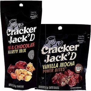
OMFG: My latest One-Man Focus Group column is about a comically bad product line from Cracker Jack. I had fun with this one, and I think you will too. Enjoy.
Show & Tell update: Participants, objects, and stories from the latest installment of Show & Tell are now available on the S&T website.
Membership reminder: Purple Amnesty Day — the one and only day of the year when you can order a purple-inclusive Uni Watch membership card — is this Friday. Mark your calendars, etc.
Uni Watch News Ticker: “Word on the street” is that the ’Skins are scrapping the neck roll on their white jersey. I asked the editor of that site what he meant by “word on the street,” and he said, “One Redskins employee told me, ‘Oh, yeah, Nike confirmed the change a few weeks ago,’ and then a few other employees agreed with him.” So there you go. ”¦ Here’s a good photo gallery of the Bills’ rookies getting fitted for their new helmets and other gear, and here are similar galleries for the Broncos and Chargers (all from Rocky Lum). … New kit for the Leicester Tigers (from Josh Jacobs). … Also from Josh: Awesome new striped socks for the Seacoast rugby squad. … “I live in Foxborough, Mass., about a mile from Gillette Stadium,” writes Jon Conti. “I brought my car in for a repair at Rodman Ford, which is across the street from the stadium and whose lot serves as a parking area during games. Tucked away downstairs in their service department is this random display case of old NFL helmets. Unfortunately there wasn’t anyone around to provide some history as to how and when they got the collection. But I believe the Rodman family has had the dealership for decades and has a business relationship with Kraft, so I’m assuming they also were tied in with the Sullivans back in the day.” … The Dalai Lama wore a purple, swoosh-emblazoned, U. of Portland visor the other day. “That’s wrong on so many levels!” says Mark Snider. … New kit for Bayern München (from Todd Usher). … “Here’s a music video by Macklemore and Ryan Lewis, the guys behind the hit song ‘Thrift Shop,’” says Andy Otto. “In this song, titled ‘Flight,’ Macklemore attacks Nike, challenging Phil Knight, the Swoosh, and Jordans. It talks about the obsession with the brand and its cult status.” … No photo, but an interesting observation from Beni Boyter, who writes: “While watching Round One of the Players Championship, I noticed something I’ve never seen before. Tiger Woods was leaning over to putt on the 17th hole and the camera was at an angle behind him. The middle belt loop on his pants featured his interlocking ‘TW’ logo. I have followed golf and specifically Tiger for years. I also work in men’s golf merchandising and have three pairs of pants from this year’s Nike TW collection. Those pants don’t feature this logo, but Tiger’s do. Looks like another chance for Nike to put one of their logos somewhere on their products.” … New 10th-anniversary logo for the Australian soccer team Adelaide United. “I have to say I’m impressed with the look of the whole thing,” says Adelaide resident Kasey van Puijenbroek. “Fan reaction has been overwhelmingly positive.” … New logo for Paris St. Germain (from Mark Fisher). ”¦ Cardinals closer Jason Motte had season-ending arm surgery last Tuesday. But he showed up in a local bar in a Cards jersey a few days later (from Jim Walaitis). … New logo for Nissan (from Mike Cooperman). ”¦ This is pretty funny: a history of ballpark nachos (rare non-Pittsburgh-centric contribution from Jerry Wolper). ”¦ Oregon athletics is auctioning off its VW bug helmet car (from Andrew Greenblatt). ”¦ Norris Cole of the Heat suffered a torn jersey on Friday night (screen shot by Kawika Asuncion). ”¦ Steven Wojtowicz notes that Ike Davis has been using Justin Turner’s bat. ”¦ Wanna see some fascinating uniforms? Check this out. That photo was taken on Friday in Karachi, Pakistan. Not sure if the uniformed guys are police or EMTs. Either way, pretty wild uni. … The 16th item on this trivia list is about the Kentucky Wildcat logo. I’d never heard that one before, and it sound apocryphal. Anyone care to chime in? (From Kurt Esposito.) … The Cubs’ batboy had an upside-down helmet logo on Saturday (good spot by Frank Manganello). … Odd move on Saturday by the Reds, who wore their “Los Rojos” jersey and their road BP cap. … Here’s a nice shot of international volleyball officials’ jersey patches (from Jeremy Brahm). … New bullpen buggy for the Rochester Red Wings (from Ryan Hare). … The Florida Gators softball team has been wearing striped white stirrups over white sannies (from Kevin Wright). … Someone at last Tuesday’s Isles/Pens game showed up wearing a Nets-style Islanders jersey (from Aaron McHargue). … Check out this UNC baseball player wearing a shinguard on one leg and a foot guard on the other. Alex Kupchak says that’s actually one piece of equipment, with the lower portion detached and worn on the other foot. … Here’s another cream-vs.-white college baseball game: Kentucky vs. Vanderbilt, from Saturday (from Josh Claywell). … As most of you know, the Indians have been wearing the solid-navy block-“C” helmets for all games this season. “But for Saturday’s game, catcher Carlos Santana wore a blue helmet with a red bill and the block ‘C,'” says Chris Marcinko. “That’s a look that hasn’t been worn since the mid-1980s.” Sorry, no photo. … Someone has been committing a string of bank robberies while wearing a Jets jersey (thanks, Brinke). … The Red Sox’s game notes still use the outdated Blue Jays logo (from John Sheehan). ”¦ Here’s a really unusual baseball jersey format. “I wonder if this was an economical way to recycle a jersey — by sewing a patch over the top of the old name instead of removing it,” speculates Pete Woychick. ”¦ Maple Leafs’ goalie James Reimer took a shot to the facemask in the first period yesterday. “He came out for the second period with a different mask,” says Aaron McHargue. “Then, seven minutes into the second period, he put his original back on after the equipment manager made adjustments. Within a minute, he put the replacement back on.”
Battle of the Uniforms: My ESPN.com colleague Jim Caple and I have put together a “Battle of the Uniforms” project that will roll out today (similar to the “Battle of the Ballparks” series that Jim handled last year). Basically, we’ve set up a uniform bracket, and readers will get to vote on the winners. There will also be sidebars written by me and Jim, slideshows, videos, and so on. CHeck it out here.
What’s up with the Bears’ helmet in the display case?
…and the Redskins too! ??????
Possibly rejects that were given to corporate buddies.
A couple of thoughts on the display:
1. No Lions.
2. With six shelves, they could arrange the helmets by the old divisional alignments (though the NFC Central would be missing the aforementioned Lions).
Yeah, the Bears’ one jumped out at me.
And it would be fabulous if they all had the single-bar facemasks.
Unusual baseball jerseys have a clever product tie-in: they look like someone ran over the jersey.
Carlos Santana’s been wearing the red-billed C helmet all season. Here’s a couple looks at it…
link
link
not that Jason brought it up, but its not quite what they wore in the 80s, as that was a block C outlined in white.
link
Either way, less wahoo is better.
I wish they would add that white outline, the current hats look too drab without it.
You call it “drab.” I call it “looks like Cleveland.” And not in a bad way – I mean, what with the Browns and all, that kind of exaggerated simplicity in design just sort of says “Cleveland” to me. Add the white outline, and they might as well play in Charlotte or Chicago or Chattanooga.
I LOVE the old helmets in the Rodman Ford pictures. Interesting that they display 27 of the 28 helmets, they are missing the Lions helmet.
Especially interesting that a Ford dealer would be sans Lions.
Those helmets bring back great memories!! To me, the 70’s NFL was the best!!
Just wasting away down in a basement – I would love to have something like that to display!!!
Our family bought a couple cars from Rodman back in the 80’s and from what I remember, the helmets used to be very prominently displayed in the dealership.
I actually had some of the pizza flavored Cracker Jack’d this weekend. Awful shit, I had to do a double take when my buddy said it was Cracker Jack.
It always looks crazy to me to see modern guys wearing football helmets with no masks (ala the rookie fitting slide shows).
I see the Charger rookies are getting photographed in “no number” jerseys. Another odd thing to see these days.
Did anyone else notice in slide 18 of the Bills rookies when one is being measured for his helemt that the New Era logo os all over the measuring tape?
*Helmet. Sorry!
Love the righteous indignation over pink cancer merch! Agreed 110%.
I rejected the third-party pink peddlers long ago and donate directly to front line institutions who actively research the disease and treat cancer patients. The focus needs to be doing things to make those battling cancer comfortable and well again instead of promoting ‘awareness’ and pumping out items designed to make donors feel good and look trendy. I fear that too many folks donating to Komen have no idea that their money is going to many things that have zero to do with researching/treating/curing breast cancer.
^ Exactly this.
Cracker Jack has never been the same since they stopped putting “3-dimensional” prizes in the pack. I think a mini-pinball game just made it taste better! ;^)
Candy-coated popcorn, PEANUT, and a prize!
What do you call a kid
Who can dive like that?
You call that kid a Cracker Jack
And what do you call a kid
Who can give the ball a whack?
You call that kid a Cracker Jack
And what do you call a snack
With the secret toy surprise in the pack
Peanuts and popcorn to make your lips smack
It’s caramel-coated Cracker Jack
When you’re really good, they call you Cracker Jack
Wow. This is inspiring, PL. What’s the history? Even superannuated me doesn’t recall it from the childhood memory bank.
I do, of course, frequently pay homage to the last line in your poem/lyric: “She is totally cracker-jack” is a big encomium around here. Ditto “She’s a pistol.”
The first three stanzas are the lyrics to a song from a Cracker Jack commercial; the line at the end was spoken in a voiceover at the end of the commercial. Can’t recall exactly when it’s from, but definitely from the mid- to late ’70s or early ’80s.
Can’t believe it’s stuck in my head all these years. (Read: I watched way too much TV as a kid.)
I remember that jingle too from the 70s.
Ha! It wasn’t that I was too young to remember, it’s that I was too old.
“…(D)efinitely from the mid- to late ’70s or early ’80s…” That means the era when I was a worthless hophead who never watched TV. More’s the pity, I guess.
Oh, wow. Flashback.
Maybe they’ll cut the peanut in half so it will look like two per pack.
Okay,
so here it is… discoey but the lyrics are the same
link
Kentucky logo thing is true. I remember that and how quickly the old logo disappeared once the story came out. Example
link
Yep! So true! I was in college working at a sports store and remember the “panic” of management to send back all our Kentucky gear. I never thought it was a big deal though
The Kentucky penis logo exists. I work at a TV station in Lexington where we still have posters with the original logo’s tongue blacked out with Sharpie.
Same here, my dad had a hoodie I now have and wear that has the logo and I did not realize or hear anything about it till I got to College in all places 30 minutes outside of Knoxville, Tn and a Professor of mine pointed it out in which I had never noticed. As the others have said it is definitely true.
Looking at the Broncos fitting slideshow, slide 8 of 30 stood out to me. Look at the helmet stripe on the Rev Speed. The blue of the helmet stripe is different than the helmet color, same goes for the outline of the Bronco. I always thought it was just an orange stripe down the middle, not orange printed on a blue layer??? Maybe it is just the lighting???
I think it’s just the lighting. Pic 23 and some others look fine.
Is it on a blue layer or on a clear layer? i always thought it was clear.
Wow, that story about the pink bats was a seriously aggravating eye-opener. Kudos for calling BS on all of them…now let’s see if they actually do anything about it (hopefully).
Nice OMFG read on Cracker Jacks. Gotta say I got tempted at a convenience store and tried the cheddar BBQ. Actually kind of liked them. But I would trade all the “Jack’d” flavors for sure if Frito Lay would just bring back the bags of just the Cracker Jack peanuts.
link
Those were great. Something about that sugary/salty coating.
The Pakistani uniforms belong to the CHHIPA Welfare Association (link), which according to their website provides (amongst other things) ambulance services. Love everything you do Paul, keep up the good work!
Ah, good info. Thank you!
Given that every other person on a gurney is completely shrouded, and that the people looking at the poor bloody guy are wailing in grief, it sure seems that this is a temporary morgue.
CHHIPA’s “amongst other things” is clearly “snappily dressed undertakers.”
Are Rodman Ford’s showroom and finance department open on game days? If “yes”, I’d keep a breathalyzer unit on the premises too.
We usually tailgate at the hotel next to Rodman, I don’t think they are.
And here’s a link to a recent video of them working using what are apparently fairly new uniforms:
link
Between this and last year’s Planned Parenthood snafu, seems like Komen is its own worst enemy on the PR front. For so long, people simply didn’t question Komen – we all love our moms so who’s going to criticize a foundation apparently helps so many moms? Breast cancer rates dropped dramatically! And it would be a total untouchable brand if it wasn’t for the hubris, thinking people wouldn’t notice the overt cynicism or political overreach.
Anyway, this recent NY Times Magazine article is a good use of 5, 10 minute: link
As of October 2011, the Komen Foundation hadmore than 180 trademarks: link
and if you use a name similar to one of those, get ready to hear from their lawyers: link
Fighting breast cancer is big money.
Using the fight against breast cancer to raise money is big money, which is a little different.
Thank goodness for Jerry Lewis. I remember being a kid, watching that oleaginous, chain-smoking, cummerbunded maniac, yammering away, and thinking, “I don’t know what this is all about, but it sure isn’t about people with muscular dystrophy!”
He taught me to have an intense distrust of almost all charitable foundations.
A jokey post on Deadspin reminded me of how Livestrong had basically become Lance Armstrong’s slush fund before the two parties severed ties this year: link
So the two charities most closely associated with sports are both cynical moneygrabs for their top execs. That’s just peachy.
Jason Kipnis of the Indians was standing a little too close to the dugout heater yesterday in chilly Detroit and burned a hole in his pants. He played on.
His tweet (with pic): link
Video: atmlb.com/15DEJ4F
That Macklemore x Ryan Lewis song is called Wing$, actually. The NBA edited it and used it as the intro to this year’s NBA All Star Weekend, as well.
I had some good friends who facilitated a 5k race in honor of thier mither who had died of breast cancer. They did it all on thier own, and all of the funds were to go to a local breast cancer care facility. They named it after thier mom and called it a “run for the cure”. Susan G. Komen Foundation attempted to sue them for over $400,000.000. The entry fees and sponsor donations brought in about $8,500.00. A judge threw it out, but the damage had been done. Susan G Komen is a horrible corporation, profiting at every angle. Thier board makes millions of dollars and they they regularly vote on raises for themselves. Sick.
Hear, hear! Paul, I could not agree with you more. Philanthropic deeds done with an eye on “the brand” are not philanthropic.
The photo of Jason Motte isn’t of him in a jersey, he’s wearing a Cards t-shirt.
The Bills still honor OJ?
link
Whatever.
Well, I guess you can pretend that he didn’t run for 2003 yards in a 14-game season because he “allegedly” committed murder twenty years later. Wouldn’t that be like not putting Pete Rose in the Hall of Fame? Oh, wait…
*-note I only said “allegedly” because he wasn’t convicted, not because I think he didn’t do it
The “Battle of the Uniforms” is up and running:
link
Ready!
Shouldn’t the “softball tops” be pictured too? I mean, you’ve teams like the Yankees who don’t use one, then there’s the Marlins who probably wear black more than they wear gray. If you’re trying to rank and compare uniforms, that has to be a consideration.
The Marlins WEAR their gray tops?
That’s almost like saying they wear their black caps more often than their orange ones.
Should the bill of a cap be as profoundly curved as Christina Hendricks or as flat as the Marlins’ offense?
Best sentence I’ve read this morning, somebody get that man a Pulitzer.
You mentioned the Rox’ horrific black vests as an offender. FYI I haven’t seen them wear any vests this season. Just the home, road, one-game throwback and purple alt (which is the one I thought you’d really slam).
Bad description of the White Sox uniforms in the seedings; the Old English Sox logo was not from the Winning Ugly (1983) team, but from the Go Go Sox teams of the 1950s.
The sad thing is that the uniforms the Sox did wear when they were “Winning Ugly” were worn just LAST NIGHT! ON NATIONAL TV!
Perhaps that’s why the error was made; the Winning Ugly team was fresh in his mind. Oh well, it’s not of major consequence.
Caple needs to do some research on the White Sox Winning Ugly uniforms…..The current SOX logo does not come from those uniforms.
I’m surprised that bank robberies can still happen in the 21st century in Midtown Manhattan of all places.
Re: the recycling of uniforms.
Happened all the time in the wool flannel era. The Washington Senators would send their wools to Trenton in the late 30s and would stitch a diamond and a T over the W on the sleeve.
Was wearing a beat up old hockey jersey from the thrift store to the dock at work. Wondering why it had diamonds on the shoulder because it had nothing to do with the sponsor on the front of the jersey. Found out later when the screen/vinyl printing on the front started to peel off to reveal the previous sponsor of Murillo Jewelers.
the 2013 Memorial Day Hats
link
Those would be great hats – for Armed Forces Day. Which is Saturday, May 18. Raises the question: If MLB actually “honors” and “supports” our troops, why does the league completely ignore the one national holiday that actually honors currently serving soldiers, sailors, airmen, marines, and guardsmen?
Like the new Jags helmet or not … I’m TOTALLY fascinated by their ability to make them (from what it looks like, anyway), metallic gold and matte black. How is that even possible?
link
Looks like they aren’t using the new helmets at Jags rookie camp.
link
1 can of glossy gold metalic spray paint, 1 can of flat black rusto baby…that’s how.
If the colors stayed that way, I’d agree, but doesn’t the helmet change appearance depending on the angle? How can the same part look matte from one angle, shiny from another?
In the photos I see from the rookie camp, the black is matte and the gold is glossy, at all angles. I don’t know what you are seeing.
OK … maybe I’m misunderstanding the helmets. I thought that like those cars you see that appear purple from one angle, green from another, that each part of the helmet would appear black from one side, gold from another, but now that I’ve looked at video, it looks like the black is only in front, and gold only in back.
Re Uni bracket:
Jays vs As appears to be the cream of the first round matchups, and somehow the Nats are beating out the Mets? C’mon Fans of Flushing, cast those ballots.
Yeah man, that should have been the 8-9 matchup that feels like an 8.5-8.5 toss up. Awesome typography versus green and gold yielded a really hard choice!
Hey Paul – I noticed the voting for the Twins/Angels is off from the pics of the Uni’s. The radio button for the Twins is next to the Angels uni and vice-versa (If this has been mentioned in prior comments, apologies I didn’t read through). Wanted to mention it before there are complains or we have to go into recounts and “hanging chads”
Thanks. I’ll alert the proper authorities.
Damn, should have looked here before I emailed you about it, Paul. Disregard!
Maybe the MLB front office should pay more attention to enforcing game changing rules such as replay reviewed HRs & illegal pitching changes & not worry about pissant details like who can make pink bats.
Or the strike zone. Worry more about the location balls being thrown over the plate than about the color of the bat being swung through it. Last couple of weeks, there’ve been too many games with outcomes influenced by terrible umpiring around the bases and especially at home plate.
You are under the impression that MLB is about playing baseball rather than making money.
The interesting tidbit in the Nissan piece is that they apparently have resurrected the Datsun brand.
Announced that last year: Datsun will be a low-end brand aimed at emerging markets. India and Russia, if I recall, and maybe a few others. No new Datsuns in America, alas.
link
For me the Datsun name evokes images of automobiles from decades ago (70s/early 80s?) who’s “names” were numbers and letters and that you could almost watch rust develop on.
Yep–back when I was in late high school (late ’70s), I really had my eye on a Datsun B210: link
When I think of 70’s/early ’80s products whose names were numbers and letters, I don’t think of Datsun…I think of this guy:
link
Re PSG’s new logo: downgrade in my opinion. The stylized link is one of the most unique marks in European football, why they’d shrink it is beyond me.
Also, wonder if removing the cradle, which wikipedia says is an homage to Louis XIV, had some political undertones to it.
I think the owners are trying to market PSG world-wide. The cradle has resonance only in France; the name “PARIS” and the Eiffel Tower design have meaning everywhere.
Huh. I never noticed the cradle until today. But now that it’s more prominent, the fleur-de-lis is really distracting to me.
Hypothetical question, Paul (or anybody else with knowledge about it). Say the Pacers decided they wanted to break out the 90’s Flo-Jo jerseys for a game or two in this playoff series against the Knicks for a real throwback flavor. Would that be allowed at all? I’m assuming now, but I’m curious of the reasoning. Would they have had to submit the request before the season started, or is the window for that sort of idea much smaller?
My guess would be that the throwback uniform had to be a throwback they used during the current season, then the NBA would need to give the ok.
Here are the new Olympique Marseille uniforms for next season. The away jersey is modeled after a pair of blue jeans. I really don’t even know what to say…
link
Well, it’s better than the ’94 US World Cup “blue jeans’ attempt.
If only they could keep the sponsors off the 2 main kits.
Often, OM make their change kit in the colors of one of their various ultra groups (one year, red/yellow/green; another, orange). I wonder if this is a nod to the hip-hop scene that’s growing in Marseille.
Another website tells me that it’s an attempt to represent universality. Everyone wears denim: rich, poor, young, old, white/black/brown. OM view themselves as a club for everyone; they wear an appropriately universal fabric.
Or so they say. It’s typical PR BS, but it is an interesting concept.
Caple’s AL bracket is seriously wacky.
#4 Astros: Bullshit.
Astros, Royals, Twins and Angels ahead of #10 Athletics: No Way.
Royals ahead of Blue Jays and Athletics: Come on.
I had a helluva time picking the Jays/A’s matchup. Still not sure I went the right way.
Yeah, the Astros may have made a vast improvement over the brick-red era, but their uniforms are pretty average compared to the Orioles’. Downgrading Baltimore because of the home cap’s white panel? In the words of Ozzie Guillen, “Pssh… please!”
I completely agree.
That Orioles uniform is beautiful, and the white panel is satisfying nostalgic for many of us.
The Astros design is a failure. Returning to navy and orange is admirable. The update of the classic cap is fantastic. The orange alt is great (I wish orange and blue would become to Houston what black and gold are to Pittsburgh). But the whole product just doesn’t work. It’s so boring, so generic.
Design the Dallas Mavs’ next uni: link
Now Uni-watch readers can design their own uniform, for real.
Yes, let’s all help billionaire Mark Cuban save a few bucks… I hate the word “douche”, but it seems perfectly appropriate here.
Seriously crowdsourcing design is the worst. And the “don’t take part if you don’t like it” disclaimer totally misses the point.
No major league sports franchise or a Fortune 500 company ever holds a contest to provide free consulting or crowdsourced legal advice. But it’s “fun” to put in unbilled hours for a billionaire?
As mentioned above, the Kentucky logo fiasco is indeed true. I was an undergrad at UK during 1994. The only real surprise was that it took the administration so long to figure it out. I still have some UK gear from the “phallic tongue” era.
A better look at that Bayern Munich 2013/14 home kit. Classy!!!!
link
Regarding those link, purely as a design question, teams with white cap logos seem to have taken one of two approaches:
(1) Just slap the regular cap logo on the tan camo, with a thin outline if none is normally used; or
(2) Change the white to a dominant team color.
Teams in category 1 include the Yankees, A’s, Dodgers, White Sox, Astros, and Tigers. Teams in category 2 include the Red Sox and Rangers.
Gotta say, the caps in category 1 are underwhelming. The white logo on tan just doesn’t pop at all, even with an outline. Heck, in the case of Houston, the white H gets completely lost even when surrounded by a bright orange star. Teams with white cap logos really should have switched to a team color for more impact.
“The white logo on tan just doesn’t pop at all, even with an outline. Heck, in the case of Houston, the white H gets completely lost even when surrounded by a bright orange star.”
~~~
Um…they ARE camouflage caps, R.
You’re spot-on regarding Komen. It’s a big scam. People feel good while a number of women get rich for doing nothing but raising “awareness”.
There are plenty of good organizations that actually do something bout breast cancer.
Stop supporting Komen.
I don’t see what the big deal is about someone robbing banks in a Jets jersey; Mark Sanchez has been doing something similar for years.
Carlos Santana has worn that helmet behind the plate all season