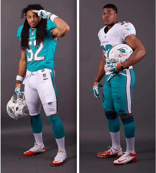
In Monday’s comments, reader Preston Feiler suggested that the Dolphins’ new uni set might actually have two sock designs — the standard aqua over white, and also a similar design with navy at the top. His basis for thinking this was this photo from the unveiling. As you can see, it looks like Mike Pouncey (No. 51) may have been wearing navy-topped socks.
That was a good spot by Preston, but I didn’t put much stock in it. I figured Pouncey might simply have been wearing blue tights (or even black tights). And besides, why would the Dolphins create a separate color-blocked sock design? If they wanted something different from the aqua-topped sock, wouldn’t they go with the white sock with the stripes? In short, I thought Preston was overthinking things.
Yesterday, however, the Dolphins posted some new player portraits on their site, including the two you see above. And as you can see, Preston was absolutely right. It appears that the aqua pants will be paired with blue-topped socks. (You can see additional examples by clicking through this slideshow.)
I’m glad that the aqua pants won’t be part of a full-on aqua leotard effect, but I can’t say I understand the thinking behind this sock design. Blue has almost no presence elsewhere in the new Dolphins uni, so why put it in the socks? And what was wrong with the white sock design with the stripes? Why not just use that?
The main takeaway here is that NFL socks are in a state of disarray. The whole point of football socks is to provide a contrast to the pants (that’s why teams with colored pants have traditionally worn white-topped socks, and teams with white pants have traditionally worn color-topped socks), but sooooo many teams now go for the leotard effect. The new Vikings uniforms don’t even offer a white-topped sock to go with the purple pants. Compare that to the socks the Vikes wore with their purple britches back in the 1960s — much better.
At least the Dolphins won’t be pairing aqua-topped socks with aqua pants. But white socks would’ve been so much better. This feels like another case of Nike trying to fix something that wasn’t broken.
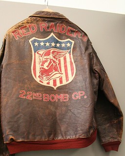
PermaRec update: The latest entry on the Permanent Record Blog is about a gorgeous World War II bomber jacket (shown at right) that was found at Goodwill and then returned to the soldier who first wore it in the 1940s.
Uni Watch News Ticker: The Washington DC Council wants to change the Redskins’ name to Redtails. “I didn’t realize the name’s significance until I read that ‘Redtails’ was a nickname for the pilots who broke the color barrier in WWII — the famed Tuskegee Airmen,” says Tom Mulgrew. “That name would be a 180-degree turnaround for the organization having one of the most denigrating names in America.” ”¦ “I was watching the NHL Network and came across the story about the Oilers’ 1984-85 Smythe division banner,” says Matthew Dever. “When the banner was being made, they were out of 5s and instead improvised with an upside-down 2. When new banners were made some years later, a 5 was correctly used, but then they remade the banner using an upside-down 2.” ”¦ The new Grand Theft Auto promo video shows a guy wearing a very L.A. Kings-esque T-shirt (from Thomas Frank). ”¦ So much going on in this 1942 college hoops photo. That’s NC State in the dark jerseys, South Carolina in white. Both teams are wearing sleeves, South Carolina has amazing striped socks and nothing but uni numbers on the front, one player has just one knee pad, and check out the referee’s outfit. While we’re at it, check out UNC wearing sleeves, also from 1942 (big thanks to Garrett Sumner). ”¦ Yet another minor league team is wearing that Chewbacca-themed jersey: the Kane County Cougars (from Benjamin Gordon). ”¦ Leland Privott notes that in ECU’s spring game, the purple pants had a white stripe, which I believe is new. Or else it’s old (i.e., maybe they were recycling pants from several years ago). Anyone know? ”¦ Get this: Brayan Pena is batting with a Cool-Flo (from Mitchell Barbee). ”¦ Have the Calgary Flames sold ad space on their practice pucks to FedEx? Looks like it. “Very few people see the first warm-up before a game, let alone what’s adorning the practice pucks,” says John Muir. I wonder who thought, ‘If 10% of fans who catch errant pucks during warm-ups see that we’re the official shipper of the Flames, we’ll increase profit by 0.007%.'” ”¦ A Dallas Stars beat reporter says the team will unveil its new uniform and logo during the first week of June. ”¦ Oooh, dig this: The Rainbow Warriors used to have rainbow shoulder stripes! That’s the Hawaii football team, circa 1959 (great find by Chris Weber). … New uniforms in the works for Hooters (from Chris Bisbee). … Boston College football is going NNOB (from Ryan McSheffrey). … Pretty impressive to see a Browns-themed truck that includes the old “CB” phantom logo (from Dillon Dalton). … Still more Star Wars shenanigans, this time from Real Salt Lake (from Sean Lewis). ”¦ Mmmm, love the uniforms on this 1942 women’s bowling team from Manitowoc, Wisconsin (big thanks to Jeff Ash). ”¦ Red Sox went back on the road last night and were still wearing the black armbands from their previous road trip. The lone exception: No armband for Big Papi. He was on the DL during the previous road trip, natch, but you’d think they could’ve sewn an armband onto his jersey at some point during the 10-game homestand that the Sox just completed (from James McNamara). ”¦ No question about it, teams that use Native American imagery bring out the best in their fan bases. Hey, it’s a gesture of respect, am I right? (From Nicole Haase.) ”¦ I generally don’t care what fans wear on their jerseys, but I like what this Rangers fan did (thanks, Phil). ”¦ Fun news from gumball helmet king Bill Jones, who writes: “Three other collector/historians and myself recently completed a set of football cards for the 1974 season of the World Football League. We are currently working on Series 2, for the 1975 season. Gridiron Greats magazine has seen our cards and has asked us to do an interview with them, so all four of us will be featured on a live podcast.” It’ll take place tonight from 8:20-8:50pm Eastern, and you can listen live or download the podcast here. ”¦ Can anyone explain what’s going on in this photo? Cuz I sure can’t (from Jayson Best). ”¦ Congrats to Eephus League honcho Bethany Heck, whose latest Kickstarter project — to fund the production of a new scorecard design — is already more than halfway to its goal, plus it was featured on Gizmodo. ”¦ Here’s a really, really interesting and well-presented article logo appropriation, focusing on the skate brand Supreme. Even if you don’t care about skatewear (I don’t), it’s an excellent read — highly recommended. ”¦ Last night my longtime pal Robin Edgerton and I attended a tremendous presentation about an Illinois company called DeMoulin Bros., which specialized in bizarre prank devices for fraternal lodge initiations, plus they also made regalia for the various lodges. What does that have to do with uniforms? This: DeMoulin Bros. is still in business, only now they specialize in marching band uniforms. I’ll probably have more to say about all this in the near future.
ECU is also using the old “ECU” logo on their helmet. I believe they wore the skull and crossbones logo all of 2012.
ECU uses those as practice helmets. The skull and crossbone are still the helmets they will be using I believe.
link Here’s what $500 million in and around a 100 year-old ballpark will get you. I’ll tell you – I’m not horribly offended, but I’m a Cub fan, so it obviously takes quite a bit to ruffle my feathers.
I like the layout of the site. I don’t care what happens, but man would it be fun to be in on the designing of a facility like that!
Those Rainbow Warrior uniforms are spectacular. There’s a throwback uniform I’d like to see on the field. I’d even support a permanent switch.
I love the 1960s Hawaii uniforms. There is something elegant about block numbers, a plain helmet with a single stripe, and a classic one-bar facemask.
Three cheers for those unis. Absolutely terrific. The rainbow pops off the uniform in an amazing way.
Interestingly enough, because the ‘rainbow’ now symbolizes LGBT unity, I imagine we’ll never see it return to Hawai’i or any other sports apparel. Hawai’i had some great designs in the late-80s heyday of ‘college crest’ sweatshirts.
On the rainbow as a symbol, I think it’s likely to be a passing thing. For now, a rainbow strongly symbolizes either gay-ness or acceptance/inclusion of gay people. But once that ceases to be a “thing” – say, 20 years from now, when acceptance/inclusion of gay people is a near-ubiquitous norm, I think it’s likely that a rainbow will once again just be a rainbow.
On the unis, I have one gripe. The green stripe in the rainbow bleeds into the rest of the uni, and really deadens the whole thing for me. Make the shoulder green more of a lime color, and the rainbow would pop for me.
Yeah. The jerseys look like they have red, orange and yellow stripes, then one disjointed blue stripe on each shoulder to me.
I wonder if their white jerseys of that era had the rainbow shoulders. I bet those would have looked pretty great. A white yoke/sleeves would have done wonders for the green jerseys.
Completely agree. That’s what it’s all about right there.
They are great. That’s how it’s done. A splash of eccentricity, just enough to make a statement.
Sublime.
That photo made my day! Those instantly became my favorite football uniforms, ever!
I loved that Rainbow picture. It made my day too.
Also dug the 42 basketball images. Good stuff guys.
Speaking of Sox, I found this baseball card of a White Sox player from the early 90’s. Anyone know what’s going on with the hat?
link
It’s a Chicago American Giants hat. I think in the early years of the White Sox’ tributes to the Negro Leagues, they’d simply wear the cap.
South Carolina hoops photo:
One knee pad?? No, it’s down by his ankle. It took me a minute to figure out what that thing by his foot really was!
Man, I thought I knew the World Hockey Association inside-out but check out this video about the first-year Minnesota Fighting Saints
link
They had an alternate yellow home uni that I’ve NEVER SEEN BEFORE. It looks like they wore it on opening night and I wonder in how many other games because in all of the hockey photos I’ve looked at over the years, this is a new one on me. The WHA uniform database even has it. Also watch the video for the clear plexiglas boards at the home arena.
-Jet
“The Rainbow Warriors use to have rainbow shoulder stripes! ”
Grammar Nazi here…. I think it should be “used to” in this case.
Typo on my part. Will fix.
I have always felt the absolute best rebranding of the Redskins would be “Pigskins”. It has a football motif, historically harkens images of the “hogs” and fans can still refer to the them as the “Skins”. They also wouldn’t have to make many changes to their classic fight song.
And they’d join an elite group of pro teams named after their own sports’ equipment: Nets, Red Sox, White Sox, and so forth. And the colors needn’t change.
But Redtails offers much more interesting possibilities for uniforms, especially helmet designs. Though the colors would likely need to change. And then there’s the thing where every time the team loses, every headline writer in America will at least try a variation on “Cowboys Kick Tails.”
“Cowboys spank Redtails”
On the flip side, “Redtails Strafe Cowboys / RGIII Passes for 316 in Playoff Win” has a certain ring.
Funny, I was just going to post that, although “Redtails” does absolutely nothing for me as a team name, in my mind it’s preferable to “Pigskins.” Obviously this is one of those “Your mileage may vary” moments.
I hope red pants would not be mandated.
RE: Browns truck…
It bugs me that the helmet is facing toward the back of the truck. Maybe it’s just me.
I’m more bothered by the fact that it isn’t a white truck.
And I’m bothered by the fact it has a “dawg” on it. I hate that F’in’ thing. It should have died when they moved to Baltimore, but the NFL being the NFL, they decided it was best to have a contrived nickname/personality they could use to sell stuff with rather have it develop naturally like… y’know… the original “dawgs*?”
* The name “dawgs” shoulda been retired when the actual “dawgs,” Hanford Dixon and Frank Minnifield, retired.
Manitowoc bowling link isn’t working.
Thanks — now fixed. Here’s the photo:
link
The Dolphins new uniforms and logo look like the kind you would see on old football video games when the software company couldn’t get the official NFL licensing. Or simply: GENERIC.
Perhaps, but I prefer they error on the side of caution instead of going overboard…
Or better yet, sticking with the classic design. Drop the navy accents, orange alternates and 3D numerals and use the early Marino era look. That was a classic.
I’d make one tweak to the Marino set: instead of the dolphin wearing a helmet with “M” on it, make it an infinite regression of dolphins wearing helmets.
Actually, when I look more closely now at those Dolphins pics… Navy seems to be a VERY subtle accent used throughout the uni. The bottom shadow of the new Phin logo; a thin (middle/secondary?) outline on the numbers on the white jersey and the helmet; the stripe on the white pant. From a distance it’s unnoticeable, but it does add a little to the uni combos, makes them a little less washed out.
As long as they don’t go white-over-white… I don’t mind lots of white (Dodgers) but on a football uni it just seems like too much.
Never. Dark pants are awful in ALL sports. Only yellow is acceptable (Packers/Steelers) Otherwise stick with the clean whites. The Colts roadies are awesome. Remember their awful short lived blue pants? WHOA!
Wait, what? You’re not seriously saying you’d prefer the Raiders or Lions in white pants… are you?
Acceptable pants colors:
White
Gold
Silver
Yellow
Orange
That’s it.
And…
Black
Blue
Red
Green
Gray
That’s it.
Indeed, JTH. Ignoring that the Ravens look pretty good in purple over black, I could agree with Bernard’s list if it applies only to pants worn with dark jerseys. With a white jersey and a colored helmet, colored pants look perfectly fine. Just look at Chicago or KC.
“…the Ravens look pretty good in purple over black?” Yeesh. They look like an XFL team. I’m with Bernard on this one.
I’m with Bernard, too. I can’t stand the Ravens’ purple-over-black, and I’m not a huge fan of the Saints’ spandex pants look either, regardless of the jersey color.
That being said, I don’t much care for white-over-white, either. I’m a Rams fan, and to me, the only acceptable road combo should be white over gold (or yellow). I hate the all-white they trot out every now and then, but the navy pants aren’t any better.
100% disagree. The all white look is my least favorite look in football. And I actually liked the Colts blue pants. I wish they’d bring them back along with the blue facemask. Teams with no grey in their color scheme wearing grey facemasks is my 2nd least favorite look.
The DC football team also rocks the yellow (or gold) pants, whether their matched with the burgundy jersey or the white top. Either way, one of my favorite unis ever.
Gah. I meant “whether they’re matched…” not “whether their matched”.
The Redskins’ burgundy-over-yellow is indeed fantastic, but the white-over-yellow…not so much.
The Redskins won 3 Super Bowls in the white-over-burgundy; that could have something to do with it.
This recap of the Dolphins uni changes includes charts of their newest and previous color pallettes.
New: Aqua, Orange, Blue, White
Old: Aqua, Coral, Navy, White
So a darker blue still exists, it just doesn’t belong on their socks like that (imho).
link
Dig those link
That photo makes me long for NFL jersey sleeves.
In reference to the Brayan Pena helmet- isn’t that a double earflap helmet? Didn’t the rule change say that the double earflap helmets did not have to be the new, safer helmet?
Yes, hes a link….I’m pretty sure link double flappers wear the cool flo. Except link
To follow with Keith’s statement above. I think the “blue” on “blue” sock is definitely a nod to the new logo. An attempt to strengthen what has been universally seen back here as a generic nod to a modern design.
Will it matter much when they never take the aqua pants out of the box?
May the Dolphins fortunately do to their aqua pants what the Marlins have regrettably done to their gray tops.
New branding/uniforms for the Islanders?
link
The “Hipster Heaven” picture is priceless.
Already in the Ticker a few days ago.
I sense a “New Coke” situation on the horizon with Hooters. They’ll change the outfits, and people will be pissed… then they’ll change them back to what they are now, and people that haven’t been there in years will go back (for a short honeymoon period, anyway).
What I find most disconcerting about this post is that people will genuinely be pissed that Hooters waitresses are changing their outfits. As well, that people will stop visiting because of it.
BUT I THOUGHT PEOPLE WENT THERE FOR THE WINGS!!!
I don’t know, are people really that emotionally attached to the Hooters look? Would they really care as long as the unis remained skimpy?
It’s really not a flattering look, especially with materials available today, and has a very early-80s-B-movie feel. It was due for a change 20 years ago, but I guess better late than never?
I’ve never been to Hooters, but it sure seems to me that “a very early-80’s-B-movie feel” is EXACTLY what their clientele demands? I always assumed that you walk in, and Corey Feldman is sitting at the bar, drinking Zimas and telling stories about The Old Days.
You’re right – the unintentional kitsch is part of the appeal for their existing customer base.
But I’m guessing their clientele is getting older and not being replaced by young folks.
example of “new coke” in sports:
San Francisco 49’ers adding black and gold to the uniforms in the late 90s-2000s.
Though I always thought the black drop shadow was a take on the 1994 throwbacks (they just replaced the white elements in the throwbacks with gold). It wasn’t bad for what it was.
Maybe this has been covered before, but the Vikings purple pants image from the 1960s shows something I’ve never seen: white jerseys for both teams. Any story behind it that I’ve missed?
That’s the famous Vikes/Lions game where both teams brought white jerseys. The Vikings switched to purple jerseys (while retaining the purple pants) midway thru the game:
link
I took a picture a few years back at Wrigley with a guys wearing a beer personalized Cubs jersey.
link
Could the socks in the dolphins photo just have the top folded back over and the inside of the sock is darker making it look blue-topped?
No.
Look thru that slideshow I linked to — all of the aqua-pantsed players have the blue-topped socks. None of the white-pantsed players do.
“DeMoulin Bros., [specializing in] bizarre prank devices for fraternal lodge initiations….”
That’s the heart of America right there. It’s like something from a Ben Katchor cartoon!
Overnight shipping pucks: their ad campaign is working. Just by linking to it, writing about it, etc, they are getting the marketing they want. Albeit not by pucks in the arena but close enough.
Many clichés are false. Among them: “No such thing as bad publicity.”
That scorebook is pretty boss!
I just donated and you should too!!
I know this is heresy for this site, but I was a die-hard paper scoring advocate, until lI started scoring my son’s little league games on my tablet… So much more detail, and more specific than I’ve ever been able to pull off from manual scoring.
I use iScore, and I love it. I appreciate what she’s doing, but this seems like an area where we should embrace what new technology affords us.
I guess orange is now officially the Dolphins’ tertiary color.
What a shame.
At least the Marlins have been wearing their orange alt jerseys more often since the Dolphins unveiling.
Free The Orange Caps!
Orange is a beautiful color. Several teams have returned to it, or made it a feature in their schemes, and it looks good everywhere it appears.
It feels like the Dolphins are behind the curve here.
Naranja es muy bueno!
The Bengals give it a bad reputation: link
It seems to me that so much of the sock trouble stems from an inability to wear solid, all-white socks.
For some teams wearing striped socks with dark pants fits naturally into their uniform style. link
However, teams which use more modern templates can create a disconnect by randomly applying a vintage sock style to a modern uniform. link
A solid white look would at least get rid of the leotard effect without disrupting the overall flow of the uniform. link
I believe the NFL actually has very strict rules that prevent this, similar to the rules which prevent solid colored socks and bare legs. It’s a shame that the viewer has to be subjected to such silliness over an old rule.
You don’t like the Pats’ triple-striped socks with the navy pants??
I sure like them!
As for the NFL’s rule, the only rule is that socks must be white from ankle to mid-shin and “team color or pattern” from mid-shin to just below the knee. Obviously, tons of players violate this rule in all sorts of ways, and enforcement is rather haphazard. But that’s the rule as currently written.
I always felt weird looking at the Pats’ socks. Three navy stripes seemed random. On their own they look better than most elements in their set but in context it always seemed odd to me.
Lots of variation in the way players wear their socks which one way or another creates chaos. Nonetheless I think that mandating “team color or pattern” causes too much leotard/unitard looks which could be improved by going solid white.
The socks the Pats wear with the blue pants aren’t the problem. The blue pants the Pats wear with the white socks are the problem. They should wear the silver pants at all times (unless they decide to trot out those silver alt jerseys again).
Yup.
Re: the Brett Gardner photo. I remember that. He slid into home and his pants, which he usually wears at the knee, rode up to mid-thigh. Unfortunate, but that’s all it was.
Thanks for that. I saw it and it looks they are tailored that way in the photo and I couldn’t imagine a scenario n which he would be wearing pants like that.
That U of Hawaii uniform is now my all-time favorite.
Agreed….nice name btw.
For some reason these Dolphins uniforms are starting to grow on me. I don’t like them as much as the set they replaced but as long as they stick to the aqua over white at home at night, all white at home during the day, and white over aqua on the road I don’t think I’ll hate the look as much as I thought I would.
Still needs an aqua facemask though and replacing the socks with navy top with a pair of white with stripes would be much better. The number font is still a bit too weird but I can live with it.
Good find on the bowling pic. And of course in typical 1940’s women sports, the women are wearing skirts. Aside from tennis, are there any sports today that women have to wear a skirt in?
Field hockey (I think the men have to as well?)?
Male hockey players wear shorts: link
On the other hand, Highland Games participants wear kilts: link
A lot of female field hockey players consider playing in skirts a badge of honor of sorts, something that sets them apart from women’s sports like soccer or lacrosse. They’re all wearing compression shorts underneath them anyway, sometimes ones that are built-in.
link
Don’t women’s lax players wear skirts (or skorts)?
Figure skating, if you consider that a sport (which I don’t, but many folks do).
Didn’t think of that, but I don’t. Then again, I don’t consider NASCAR or any form of auto racing a sport. But for some strange reason, I do consider link and link sports when they blatantly aren’t.
Sport: An objectively scored game of physical skill.
Chess: An objectively scored game of mental skill. Not a sport.
Figure skating: A subjectively scored game of physical skill. Not a sport.
Bar fight: An objectively scored contest of physical skill, but without the shared rules necessary to be a game. Not a sport.
NASCAR: Objectively scored, and a game. But it is mainly a game of physical skill? I honestly don’t know, but that’s where the definition hinges for me.
Bar fighting should be a sport. Maybe we should give Vince McMahon a call. Dana White wouldn’t be interested.
figure skating is not alone in that.
By that logic, boxing isn’t a sport
Female tennis players don’t have to wear skirts/dresses. Pretty sure that both Martina Navratilova & Venus Williams have worn shorts & of course Anne White wore a body suit.
I did think of Serena when I typed the first post, but then I noticed pics of her wearing a skirt while playing. IDK, to be honest, tennis is one sport where women wearing skirts actually isn’t bad, both ascetically and practicality. I can only imagine what it was like for women to wear skirts while playing baseball, basketball, bowling, etc…
The rules of netball require that women where skirts.
Ballroom dancing.
In the Real Salt Lake link, I found it interesting that they are extending their gun ban in the stadium to the fake weapons – “That means no lightsabers, blasters or any other Star Wars related weapons.”
Well that makes sense. Getting smacked with a plastic lightsaber still kinda hurts.
How ’bout The Force?
You’d think they’d make an exception for fans who come dressed as the worst shot in the galaxy far, far away…
link
ECU has had the Purple pants with the white stripes for a few seasons. They came out the same year that the white with purple stripe came out. I’ve only seen it worn a few times because they’ve been going a lot of White on White on the road lately. At home, when they wear the all Grape uni, they usually wear a solid purple pant.
No question about it, teams that use Native American imagery bring out the best in their fan bases. Hey, it’s a gesture of respect, am I right? (From Nicole Haase.)
That breaks my heart. I’d make them relinquish their Blackhawks sweaters on the spot.
I am sure this question has been asked before, but why is it that behemoth offensive linemen have to wear skin-tight jerseys, so there is nothing for opposing players to grab, but defensive backs can have dreads halfway down their backs?
Hair pull in the defensive backfield is way easier to spot than a shirt grab, right?
Though there was Larry Johnson stopping Troy Polamalu by the hair.
Page 12 of the DeMoulin catalog….
“Ladies and Gentlemen…Virginia’s Finest: the James Madison University Marching Royal Dukes!!”
JMU! JMU! JMU!
Ike Davis going hi cuffed today, first time I can recall him doing that. Looks terrible.
Maybe that’ll help his sub-.200 average. Probably not.
Actually, looks like someone showed him how to blouse, link from earlier in the game.
Man, I like that gray-lettering Mets alt more every time I see it. I mean, in theory, it’s terrible. But seeing it in action, it somehow just works for me.
this is off-topic but I noticed that Byron leftwich is the last nfl player to wear this facmask link
link This was released a month ago regarding the new Stars Unis, looks pretty legit to me.
Until you look at the date of the story on Creamer’s website.
April Fools jokes stopped being funny when I graduated into the 2nd grade…
Question for you guys… My brother and I have a small bet, but this had ballooned into a minor controversy within our circle of friends who are all uniform fanatics. I suggested contacting you for your opinion and/or definitive answer on this subject.
Back when the Steelers decided to change the uniform numbers from the classic block design to the current abomination of slanted numbers with the rounded style, I noticed immediately that the numbers matched the font of the numbers on the helmets. I also noticed that the slanted numbers on the jerseys matched the slanted numbers on the helmets.
I noticed the slanted numbers on the helmets way back in the 1970’s, but never thought much about them because I always figured it was put on my a hurried equipment manager or something. Ow ever, the number you can really see this on is “10”. If you look at pictures of Roy Gerella’s helmet numbers in the 70’s, you can tell the “1” is slanted. When Kordell Stewart wor the number, again the helmet numbers were slanted. The top of the “1” is closer to the center yellow stripe than the bottom of the “1” is.
I have found photos to prove my point, but my brother does not believe me. Instead, he clings to the idea that the stickers were put on crooked by the equipment manager. You can even see it on Bradshaw’s helmet back in the 70’s. This used to annoy me as a kid, but now that they are wearing those numbers on a slant on their jerseys, I have really come to hate their jerseys.
So, do you know what the answer is? Did the Steelers match their jersey numbers to their slanted helmet numbers when they re-did their jerseys, or is it just a coincidence? Or, is the font that is being used for the numbers naturally slanted?
If pictures are required, I can either post links to your blog, or if thereis a better place to do it, just let me know.
Thanks,
Steeler fan who hates slanted numbers! (Can someone get me in touch with Dan Rooney please?)
PS. I cannot find it right now, but I do have the official name of the font being used for the numbers. And the font is NOT italicized by default.
Gotta say, I like the Wrigley renovations. They are desperately needed.