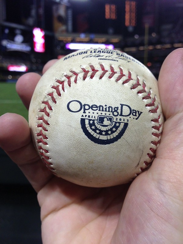
Uni Watch reader Ryan Stone caught this ball at last night’s Cards/Diamondbacks game in Arizona. “My first ball with a special insignia on it,” he says. “Didn’t know these existed!”
Down on the field, there were lots of oddities and glitches involving MLB’s Sandy Hook memorial jersey patch yesterday. Most teams wore it above the heart, but the Pirates wore it on the other side, presumably because they didn’t want the patch to bump up against their chest logo (although the Nats apparently had no such concerns).
Meanwhile, several players had patch issues: Wilson Ramos of the Nats didn’t have a patch; Yanks starter CC Sabathia was patch-clad at the start of the game, but then at some point his patch disappeared; Giants infielder Marco Scutaro came up to bat in the top of the 1st with his patch briefly stuck upside-down on his sleeve (it fell off completely after two pitches); and a Getty photographer captured Cubs started Jeff Samardzija’s patch coming loose from his jersey in the 1st inning! (I realize that almost looks like the patch logo was Photoshopped onto the photo, but it’s legit, trust me.) He pitched the rest of the game patch-free.
Then there was Billy Butler of the Royals, whose patch was coming loose during as he batted during the 8th inning. So he removed it from his jersey and put it in his pocket.
In other Opening Day news from around the majors:
• Bosox rookie Jackie Bradley Jr. had JrOB. I’m fairly certain that’s an MLB first. (No, Junior Griffey never did it, neither did Cal Ripken Jr., neither did Tim Raines Jr., or anyone else. We’ve been through this before.)
• Rockies reliever Adam Ottavino wore No. 37 in spring training but had announced his intention to switch to No. 0 once the regular season started. Sure enough, that’s what he was wearing. Although several MLB pitchers have previously worn double-zero, including Bobo Newsome, Curtis Leskanic, Omar Olivares, and Rick White, I believe Ottavino is the first big league pitcher to wear single-zero.
• The Cardinals wore red caps on the road after all. Maybe that reflects the voting from their recent internet poll, or maybe not.
• The Giants are wearing a championship patch.
• For years now, David Wright has worn an orange undershirt, instead of the Mets’ usual blue. The thing is, the collar has always been the only orange-visible part of the shirt. He’s never worn orange sleeves extending below his jersey sleeves — until yesterday. Remember, this is the same David Wright who opted not to wear a captain’s “C” because, as he himself put it, “the uniform is uniform for a reason.” Not sure if this more orange-aggressive move was just an Opening Day thing or what, but I don’t like it, nossir. The team’s undershirt color is blue — just wear the blue like everyone else. (On the plus side, as you can see, Wright maintained his longstanding protocol of going high-cuffed for day games, but it looked like shite cuz his socks didn’t match his sleeves.)
• John Buck, now with the Mets, is the only MLB catcher who can wear a custom-painted mask. He was wearing a standard two-tone model in spring training (that’s the basic template that most hockey-masked catchers are using this season), but he broke out a new design yesterday.
• First game of the season and Yanks reliever Joba Chamberlain is already breathing Ethier.
• Joe Torre threw out the first pitch in Cincy while wearing his USA WBC jersey. I realize he managed that team, but I still think that’s kinda lame-o. The WBC is over, and this was supposed to be MLB’s day.
• Meanwhile, out in L.A., Magic Johnson wore a No. 13 Dodgers jersey. Of course his usual No. 32 is retired for Sandy Koufax.
• A young Braves fan found a way to salute both Upton brothers with one T-shirt.
• And in one of the most hallowed rites of spring, Uni Watch reader Elena Elms made her annual batch of Opening Day baseball-themed cookies for her office. Nice!
(My thanks to all contributors, including Chuck Brehm, Jimmy Couto, Kevin Cunningham, Cork Gaines, Mike Monaghan, and Matthew Solly.)
Radio Free Uni Watch: If you read this by 9:15am Eastern, you can hear me talking about the new Dolphins logo on WAXY 790 in Miami. Use the “Listen Live” link on that page to hear the streaming audio. Never mind, was just cancelled. May be rescheduled for later in the week.
Uni Watch News Ticker: Fernando Torres of Chelsea wore a uni-numbered mask in the game against Southampton over the weekend (from Michael Orr). … Reprinted from yesterday’s comments: Interesting article on what criminals wear, including sports gear, while committing crimes (from Dave Plante). … Here’s a time-lapse of the floor being installed for the Final Four (from Brig Slaughter). … This is pretty cool: “At the U18 IIHF Division II-B Championships, Estonia has gone with white pants to make their kit look like their flag,” says Alec Pappas. ”¦ One of the better April Fool gags from yesterday involved a new Houston Cougars helmet logo (from Chris Flinn). ”¦ When brothers Markieff and Marcus Morris played together at Kansas, they had awkward NOBs. Now that they’re together in Phoenix, they’re just going with their surnames (from Joe Nguyen). ”¦ A Georgia Tech alum is putting together a GT ticket stub archive. If you have any old Georgia Tech football ticket stubs, he wants to talk with you (from Michael Rich). ”¦ New uniforms for USA rugby (from Josh Jacobs). ”¦ LSU baseball will commingle two of my least favorite tropes today, when they wear purple-lettered G.I. Joe caps (from Troy Gaulden). ”¦ Another uni-related April Fool’s prank, from Curtis Herd: “The chairman of the Tennessee Smokes (AA baseball) is Cleveland Browns owner Jimmy Haslam. They posted a fake release saying that they were changing their name to the Tennessee Browns. It was complete with logos and uniforms. They also sent out a release to their list of media. And according to a comment on their site, they’ve been answering the phones as the Tennessee Browns.” ”¦ Hefty price tag, but check out these great custom-painted Blackhawks figurines (from Mathieu Santos). ”¦ “I work at a sports apparel store in San Diego, and every so often the Padres will have us customize jerseys for people throwing out the first pitch,” says Jared Bremseth. “They recently asked to do jerseys for the new Chargers head coach and GM, so we added a bolt sleeve patch for the occasion.” ”¦ New uniforms for the Boise Hawks (from Aaron Bernstein, among several others). … “Was listening to the Baseball Today podcast and John Kruk offered up an interesting tidbit about Bruce Bochy back when he played,” says Mario Fontana. “Apparently Bochy’s helmet was a size 8, and ABC (the manufacturer) had stopped making them in that size. So every team Bochy went to, he had to have his helmet repainted. Apparently every time he got angry and spiked his helmet, the paint would chip.” … Notice anything odd about the Falcons helmets shown here and here? The striping pattern is the reverse of what was actually worn on the field (from Leo Strawn Jr.). … Jeremy Donovan asks a very simple question that I’d never thought of before: We all know Jackie Robinson wore No. 42, but why did he wear it? Was there a particular reason? Was it just randomly assigned to him? The highest number the Dodgers issued in 1947 — Jackie’s first year — was 43, so he was at the far end of their numerical range. Any significance to that? Anyone know more? … This is interesting: In this portrait of 1963 Michigan baseball team, the players are wearing a cool NCAA championship patch. “It features crossed American and Japanese flags,” notes Brian Igoe. “Evidently, after winning the College World Series in 1962, Michigan went to Hawaii and played in something called the International Collegiate World Series. They won that tournament as well, with a three games to two series victory over Hosei University.” … Oh baby, check out this absolutely sensational photo of a very young Lew Alcindor. Man, that’s a beauty. … In a small victory for sanity, the private prison company that had bought the naming rights to Florida Atlantic’s football stadium has backed out of the deal (from Mike McLaughlin).
Here’s a request for some detail-oriented Uni-Watcher (probably from DC, but not necessarily): Could someone please track Bryce Harper’s cuffs/pajamas/stirrups this season?
I had thought he had a pretty steady “high cuffs for day games, pajamas for night games” rule, but when I commented that he wore pajamas during yesterday’s day game Opener, I was informed that Bryce is all over the map.
I lack the… gumption… to track it myself (and I couldn’t make a fun infographic anyway). Just throwing it out there!
I could not detect any method to his cuffs/stirrups last season, but maybe I’ll do a tracker. Day 1 – pajama pants. I’m going forgive him though, he hit two homers in his first two at bats and started an excellent 7-2-3-4-2 DP.
Ryan Zimmerman always goes high cuffs for day games. Denard Span was also going high cuffed. Stephen Strasburg is always high cuffed when he pitches, but not always on off days.
Thanks — it’ll be fun to see how they track!
I kind of like the Tennessee Browns uniforms. A logoless cap is rather nice.
“Smokies” always makes me think of tiny sausage links. And state troopers.
mmm sausage
As far as I know, the Smokies are the only Minor League team whose official on-field caps are ONLY available in the low-crown option. That’s why I like ’em.
John Buck, now with the Mets, is the only MLB catcher who can wear a custom-painted mask.
This is really, really dumb on multiple levels. Not only is it stupid to even allow, but in the article it says he’s not allowed to use the team name or logo on his masks – and that’s the one thing that actually should be on the damn thing.
Why should it not be allowed? Personally I feel the opposite–it’s ridiculously dumb that it’s not allowed for everyone else, which is because of some sort of licensing agreement that all others have to be made by some company which doesn’t allow the custom paint jobs I guess and Buck was grandfathered it.
Don’t see how Buck could have grandfathered it–lots of catchers had custom jobs before MLB struck the deal with one company. Stupid deal, anyway. I enjoyed the different designs.
I like the custom helmets and hope they can come back. I’m a hockey fan too though, so that is probably why I like them.
For the “traditional” catching helmet, is MLB enforcing a policy of wearing one that matches the batting helmet? I know Ivan Rodriguez used to sometimes wear a red helmet when the Nats were on the road wearing blue caps/helmets. Joe Mauer and Matt Wieters wore catching helmets with their team’s old cap designs too, didn’t they?
It’s worth looking for the Idahopress.com gallery of the Boise Hawks unveiling. The colors are interesting enough — green, red, yellow and slate grey — but oy! what they’ve done! There’s a alt jersey that looks very much like a Turn Ahead The Clock design. There’s a faux sleeveless jersey. The sleeve patches are all screen printed (which I guess makes sense for a minor league team on a shoestring budget). Instead of stripes, the pants legs feature talons trailing red, jagged lines, giving the impression that the players have been mauled by enraged birds. Kind of a mess.
Wow. Those are a mess. For those of you who refer to team-colored MLB jerseys as softball tops, please take note. These Boise Hawks jerseys are softball tops.
Looks like for one of the jerseys they borrowed the “turn-ahead-the-clock” template from the MLB uniforms from 1999. The “scratch mark” identity is also pretty lame; I’m sure most people associate that kind of identity with mammals, not birds.
Love the colors…hate the uniform.
Speaking of the colors, the home uni slide here:
link
Includes a text arrow pointing to a blank spot on the jersey; the text says “Name Plate: Tampa Bay Green”. Given the context of the rest of the redesign, I’m guessing that it means that on the home uni, player names will be some color of text (white, yellow, or red) on a green nameplate above the green number.
Which, if the case, would be yet another example of how the new Boise uniforms are speaking in non-baseball idioms. It reads a lot more like a hockey or football uniform set than a baseball uniform.
If you’re going to show off your official style standards, shouldn’t your two different 2s match one another?
“The colors are interesting enough – green, red, yellow and slate grey – but oy!”
Leading up to the unveiling they had a teaser that opened up the possibility of going back to their prior colors of Red/Blue.
The green/red/yellow/orange/grey combo is bad enough on its own, but throw in the requirement of Cubs farm teams to wear blue shoes and you have a complete mess on your hands.
Did any other team execs wear the Newtown memorial patch on their suit lapels like Nats GM Mike Rizzo did in pregame festivities yesterday? Photo from Getty:
link
Though not an exec, ex-Braves manager Bobby Cox was wearing a lapel patch last night:
link
Well…it’s more of a sport coat patch than a lapel one.
That’s some impressive moire patterning going on with Cox’s shirt there!
Don’t know how legit this is, but Griffey may have had Jr.
link
found this too, so I’m not sure it’s legit
link
That’s just a replica, and the info stated on the Flickr page is wrong, as you can see here:
link
As I said in today’s text: We’ve been thru this already.
It looks like Paul is likely right here, but as Bill Henderson says in his book, you can never say never…unless someone could produce photos from every game the Griffeys played together.
I was about to point out that Griffey Jr. did wear Jr. at some point during the WBC years ago, but once I found photo link, I realized that it was from link and it was only a BP jersey.
Cards wore red hats on the road…and lost. It’s like the collapse of the Mets once they added black back into the rotation last season…back to the blues Cards!!!!
I hope they won’t switch back, despite the loss–red is so much more Cardinal-y. The navy cap is so dreary with the grays.
Disagree. The navy caps actually ADD color to the road scheme. Quite the opposite of “dreary.”
Agreed. The navy on the road looks a lot better than the red.
“… And in one of the most hallowed rites of spring, Uni Watch reader Elena Elms made her annual batch of Opening Day baseball-themed cookies for her office. Nice!…”
Fabulous. Bake on, Elena.
Is this orange-sleeve wearing David Wright the same David Wright who said his reason for not wearing a Captain’s “C” on his jersey was “a uniform is a uniform for a reason…”?
Zackly.
Actually, that’s really good — I’m gonna put that in the main text!
One possibility here, knowing Wright…the last Met Captain link Franco wore his father’s DSNY shirt. Perhaps Wright wanted to honor Franco and make sure everybody saw it.
“… New uniforms for USA rugby (from Josh Jacobs). …”
Looks like this link isn’t working, Paul. It takes you to the uni page of some country called “Fly Emirates.”
I saw Lew Alcindor when he was a high school freshman (All Hallows HS) play against my father’s alma mater (Regis HS). Word had spread quickly about this new kid, and the gym was completely stuffed with roundball fanatics who had to see for themselves. One of those memory-images that never fade.
USA Rugby link now fixed.
The link is now going to a Google Docs page (which is blocked at my work so I can’t tell if anything is there). I think this is where the link went to before: link
I’m not digging the red hoops on the home jersey – it has a weird abdominal band effect, especially on the female player.
And I get that sponsor logo is a reality in international rugby, but it’s weird when a national team has a sponsor logo that specifically names another country.
Completely agree on the red “hoops” that are so thin they look like blood stripes. I especially hate the effect on the two-themed, “Harvey Dent” alternate. That said, it’s a heck of a lot better than the soulless look we’d been sporting before.
I really like the sevens’ uniforms. They have a unique look for international rugby, and a simple, classic design, with the one large hoop across.
But the question for me is this: why don’t we wear the red, white and blue hooped kits that we sported in Las Vegas last month for the USA sevens (link to a pic below)? With apologies to the ‘Quins, All Blacks, and any other ruggers out there (terriblehuman, Caleb Borchers) but those were the best looking shirts I’ve seen on a rugby pitch. And I’m only being slightly biased here.
Anyone have any idea why we can’t see those full time?
link
My interview on the Miami station was just cancelled. Scheduling issues.
Billy Butler video seems to be down
It’s a wonky link, but it works. Or at least it just did for me.
Might be time for an article about MLB mustaches, after seeing the Joba ‘stache.
One or more other leagues might work, too.
Joba better keep that trimmed, given the Yankees facial hair policy…look at a link
Did Magic Johnson choose that jersey # to avoid getting hassled?
Perhaps it’s just simply that it’s now 2013. Has he done any first pitches in previous years? Maybe he’s got a full closet of Dodgers jerseys numbering from 1-12 already.
I’m sure it’s just the year. At least I hope it is. Teams shouldn’t be preventing athletes from other sports from wearing banned (er, I mean, “retired”) numbers in pre-game ceremonies.
The Dodgers un-retired the #32 for someone who wasn’t even an athlete for a ceremonial first-pitch just last season:
link
Do you even un-retire a number for someone who isn’t on the official roster of a team? Retired or not, a ceremonial jersey is ceremonial. It would be like teams having to pay a player who has the number for said ceremonial jersey (say if someone wanted to give a ceremonial Jets #15 jersey, would they pay Tebow for #15?).
Stupid is as stupid does, I suppose.
Magic Johnson probably felt compelled to use a different number considering that they invited the retired Sandy Koufax to throw out the first pitch. Classy move by the organization to bring back Sandy for the opening day celebration.
FYI – Koufax’s arm may be old, but he still had the distance in his opening day pitch.
I was thinking a whole different thing, unrelated to the Sandy Koufax presence. A certain “youth organization” that has a lot of Dodger fans who attend games and also ike the color blue….
He could have worn 33, his number at Michigan State. It isn’t retired and no current Dodger wears it.
Too bad that Boise uniform unveiling wasn’t an April Fool’s joke. Wow. Pretty horrible.
The link isn’t working now.
Try this link: link
So this set would fit in well in Japan. Well, maybe a little too subtle for NPB.
By the standards of the minor leagues, I don’t think the new Boise unis are all that bad. Some interesting looks. The only really outre element is the bloody claw-scratch pants stripes. But that’s only because we’re not used to seeing that sort of thing in baseball; in literally any other sport, that’d be a ho-hum uni element.
The tragedy is that these are monstrously bad uniforms by the standard of the Boise Hawks; since 2007, they’ve had some of the best uniforms in the minor leagues. They’d have been top-20 in MLB, easily, in my book as well. They’ve gone from among the best in the minors to somewhere in the bottom half of organized baseball. A real uni-loss.
Now this is one thing about those Boise uniforms that I really like:
“The numbers have been increased on the backs of all jersey’s from 8 inches to 10 inches”
Disregard that superfluous and ignorance-revealing apostrophe; it’s the content that counts. Ten-inch numbers should be standard on all baseball jerseys. Ditch the names, link
Just in case the uniforms don’t clash themselves enough already (from the linked article):
The Hawks will continue to wear blue cleats, a standard throughout the Cubs’ organization.
One of the things that I noticed yesterday during Opening day is that the new batting Helmets (Rawlings) have the same ear hold as the Rawlings football helmet. I assume it is either 1) Because of an actual saftey performance reasons or 2) more likely, trying to create a brand awareness across sports.
Regarding Jackie Robinson’s number 42, I once played football with a guy (a wide receiver, of course) who always demanded the lowest number on the team…just so his name would appear first on the numerical roster. Perhaps, by issuing number 42 to Jackie Robinson, the Dodgers were trying to avoid calling attention to him by burying his name way down the roster. Just a theory…
I doubt anyone in the Dodgers front office was foolish enough to think such a thing would work. But a slight modification of that hypothesis would be more plausible to me: Perhaps the 42 was part of the Dodgers spring training program of sheltering Robinson (including going back to Havana for the spring). People looking at the roster might assume that Robinson was not a lock to make the big league team – and in case Rickey had changed his mind about Robinson, it would have been a more plausible cut than if Robinson had spent the spring wearing #9 or something.
To be fair, this was a time when people thought and said a lot of foolish things about race.
I’m guessing everyone’s generally right that the Dodgers wanted to avoid putting too much scrutiny on Robinson by giving him a higher, lower-profile number.
As for the Jackie Robinson number thing I recall reading once that it went down like this.
Robinson gets to the Dodgers in 1947 and the plan was to play him at 2nb base (4) and have him bat second (2) hence the number 42. Seems logical to me.
He didn’t play 2nd base once in 1947, so I’d guess that’s not the reason.
Should be, “they’re just going with their surnames.”
If you’re looking for hockey action, the Women’s World Championship starts tonight with the classic rivalry. Team USA and Canada meet up to do battle.
USA will wear red-white-and-blue. Canada will wear yellow-and-black as per the LiveStrong agenda.
As a cynic who really has no interest in modern pro sports, I gotta say some of those MLB uniforms look sharp. It’s refreshing to see teams wearing traditional-looking designs as opposed to the gaudy, trendy looks seen in football and hockey.
-Jet
From link:
“Robinson was simply issued No. 42 as a matter of course by equipment manager John Griffin upon his arrival in Brooklyn a day before the 1947 season. “
They probably would have held the #9 jersey (Jackie’s number in Montreal) for Arky Vaughan a future HOFer even though he had sat out for three years due to a disagreement with Durocher.
Somewhat surprised that the USA Sevens team didn’t bust out the new unis this weekend in Japan.
I don’t want to complain or anything, as I still can’t get over how great the Mets look without the black, but I still think the “Mets” script on the home jerseys is too big. Especially the “M”.
Graf,
You are correct to say something doesn’t look right with the Mets script since they took the dropshadow off. They did correct the slanted M (Wilpon script problem)…but check out these comparisons I made:
link
link
To my eye the problems are that the script is too thick and the outline too thin…the M and e are too far apart…and the left side of the e is way too fat. Probably 99.9% of the fans will never notice, but this is Uni Watch and we obsess here. Rawlings never made these unwelcome tweaks. Hopefully it corrects itself eventually. The Dodgers had a big problem with their script a few years ago and their art department restored it and re-issued it to the suppliers.
First ticker item should read “Fernando Torres of Chelsea”.
Thanks. Now fixed.
From Chris Creamer: link
Bruce Bochy is a hero to this big headed baseball fan. The only benefit of having a huge noggin is if they have fitted hats on clearance you can usually find your size because no other big headed people may have not been in there. Plus when looking for fitted hats you know to go right to the back of the stack. Minor benefits but I take what I can get.
as an aspiring Uni Watcher I am trying to notice the small details loved by the site so was kind of proud that when watching the end of the Mariners game noticed Felix was without the memorial patch(I missed most of the game due to a signifigant time zone problem). After watching the highlights on the team website the first I could see without was the 6th.
New rule: If a baseball team claims to be wearing special caps or unis to “honor the troops” or veterans or whatnot, and its unis are not reproductions of the ones in the photo atop this article, it’s because the team actually hates America:
link
Hey Paul. Another good uni-related April Fool’s gag: The SF 49ers had a section of their website announcing a new clothing/apparel line launched by Coach Harbaugh (you know, the guy who always wears khaki pants and a black mock-T). When you clicked on the link, it apparently read “April Fools!”
For our host: I just got an e-mail from the Georgia Alumni Association announcing a new branding program for UGA athletics developed “in partnership with Nike.” A link to the press release and images for the “new brand identity system” can be found link
My initial impression is not one of total outrage as the basic design elements of the uniforms remain in place. Still the system as a whole leaves me feeling that the Nike tail is wagging the Georgia dog.
Agreed. I wish we would’ve had the opportunity to vote before having this shoved down our throats. The new font and secondary logo look like something from an EA sports create-a-team feauture, circa 1998. The line that kills me: “We present our new logo, font and identity, which Nike helped us create.” That’s paraphrasing, but close enough. I find it hard to believe that a program that annually finishes in the top five in sales revenue needs a new identity…other than to sell more merch. And, it could just be my eyes, but the away pants look white, while the home look gray, surely they didn’t tamper with the silver britches…
Is it really a new identity when the biggest change is the number font? They’re still wearing a Packers logo on their helmet.
If I’m not mistaken, I think the bulldog logo is updated.
Anyway, I think it’s not so much a change as it is making the color and logo treatments consistent throughout the athletic department.
Linky to photos of the re-branding-
link
Gotta say I am NOT a fan of the new number font. The modern look just doesn’t look right.
And I HATE the sweatback hoop unis. Awful.
Not feeling the sans serif font myself, especially since the photo purporting to be of Herschel Walker still shows athletic block numbers on the helmet. I am grateful that the helmet, jersey and pants striping have stayed pretty much intact. As for the silver britches, I’ve noticed (and I think it’s been mentioned here) that in recent years they have looked less silver and more a very light gray. That could be a function of the fabric being used, but without that metallic sheen it’s hard to call them “silver.” A fan in the stands at the WLOCP should be able to look at link and tell where the jersey stops and the pants begin.
I do like that the Arch is showing up – an acknowledgement that the University is more than just the athletic department – but not in that sweatback. It could have been worked into the side panel striping or set off as a patch on the pants or at the neck where, of course, it would compete with the SEC logo and the swoosh.
Related: Best comment I saw on a UGA blog re the rebrand photos was “Herschel is coming back for his final year…cool… So’s Dominique.”
Oh my. I like the secondary logo with the bulldog head, but that number font is just… no. I actually feel sorry for you guys. You probably had my second favorite SEC football uni, but that number just ruins things.
Oddibe McDowell wore a single zero during his time with Texas in the late 1980s. Although as I recall the joke was that it was an “O” for “Oddibe.”
He wasn’t a pitcher. Neither were any of the other MLBers who’ve worn 0.
There was a Japanese pitcher who wore regular zero a few years ago; I’ll have to look up who it was. Many Japanese teams assign both 0 and 00 even to players who don’t ask for them. Has a major league team ever given either of these numbers to a player who didn’t specifically ask for it?
link.
First Ranger to hit for the cycle too, apparently.
Pittsburgh Tribune-Review writer Dejan Kocacevic has just tweeted the following:
“RIP to franchise’s worst — and most cursed — sweater. Memo to NHL: Next alternate design, remember team’s first name, too. Black & gold.”
And NONE of that stinkin’ “vintage white” bull either!
Leave the off-white cream colors to baseball.
Check out the color difference between Koufax’s jersey and the rest of the jerseys at yesterdays Dodgers game:
link
Everyone else is wearing a current Majestic authentic; Koufax is wearing a Cooperstown Collection throwback (with his name and year embroidered into the shirttail).
Going to risk sounding dumb here… who is #12 in that picture? He looks like Billy Dee Williams, but something tells me that’s not right.
My guess would be Tommy Davis.
Isn’t it Dusty Baker?
Dusty Baker was in Cincinnati managing the Reds. :P
Definitely not Dusty, though don’t know who it is.
It is link
Tommy Lasorda looks pretty good.
That’s Kareem Abdul-Jabar, not Lew Alcindor…? I’m very confused
Wow, I never knew they were the same person. *Basketball idiot*
This has nothing to do with anything, but it’s the end of the day, and no one is paying attention anymore, so what the heck?
I spoke at the Houston regional convention of the Daughters of the Utah Pioneers, which is sort of like the DAR, except for descendants of Utah pioneers. (My topic was gravestone symbolism and iconography, but that’s irrelevant.)
So I finish up, and one of the leader gets up to speak. She’s in her seventies, and feisty. She tells a story about admiring her grandmother’s tattooing, which “she did by hand, all by herself.” My interest in pioneers immediately increased dramatically: crossing the plains, carving a life out of the remorseless desert, inking themselves up. These ladies were something!
It turns out that she meant to say “tatting”, which is a Victorian era technique for making doilies.
I was very disappointed.
I’m here, I saw it, and I’m amused. Thank you!
Thank you!
Estonia’s football (soccer) team have worn the blue-black-white combo since independence
link
For some reason that link doesn’t work for me second time – try this
link
“This is pretty cool: “At the U18 IIHF Division II-B Championships, Estonia has gone with white pants to make their kit look like their flag,”
In that case, shouldn’t they be wearing a blue jersey, black pants and white socks? Black-white-black doesn’t mimic their flag.
Shite – the never-ending wave of corporate advertising – encroachment went a bit further tonight. The Blue Jays – have painted on their field, in foul territory , next to first base, the Honda logo. Has that happened anyplace else in the majors? The tv commentators are referring to it as “Honda Opening Night”
Upon closer look – the Honda logo is also next to third base, between the 3rd base bag and the 3rd base coach’s box
Hmm – apologize for this running dialogue, the network might be super-imposing them on the field, other camera angles don’t appear to be picking them up – but it’s odd if they were going to do that stunt, I would have thought it would be in a more commonly viewed place.
The Astros are wearing the navy caps again tonight.
Free the Orange Caps (and Helmets?): 2013!
Indians catcher Santana is wearing a blue batting helmet with a red brim block C, behind the plate tonight. I have not seen this combo before. The rest of the team is wearing all blue batting helmets with the block C.
If anyone is reading — at 10:44 ET — Yu Darvish is perfect thru 8 (Houston v. Texases). You can watch the game on MLB Extra innings (free preview this week).
So yes, Magic Johnson wore number 13 when he took the field yesterday. But did anyone notice that in the promotional video they showed on the scoreboard before the first pitch that he was wearing number 32? First thing I noticed when they switched from the pre-recorded video to the live feed was that his number was different.
Those ads with the Falcon helmets looked concocted to me. I do not recall any Falcon player ever wearing either of those masks. Looked like a Saints helmet with a Falcon logo.