
Click to enlarge
Got a note yesterday from reader Nic Schultz, who’s been working on an interesting project. “For the last couple of years, I’ve been designing custom March Madness brackets for myself and my wife,” he said. “They function like scorecards. We carry them around while watching the games and use Sharpies to track our progress.” Simple, fun, nice — right?
This year, though, Nic decided to take things to another level. His bracket for this year’s tourney are shown above. Here’s his explanation of the story behind it:
I tried to teach myself 3-D rendering through the project. I took each round and assigned it a different uniform element. So for the round of 64, I used the teams’ jersey wordmarks; 32 got baseball cap logos, 16 and eight got mascot or secondary logo marks, and the rest kinda doubled up on text.
I had to dig through online media guides, schedules, graphics standards manuals, and so on to find the vector files for all the logos, although I had to re-create some of them myself in Illustrator. The process took a lot more time than I care to admit, although few outside the uni-verse would be able to fully appreciate it.
Pretty cool. Here’s how the laminated version of Nic’s bracket looked after the first weekend of games, with his incorrect picks blocked out in red (click to enlarge):

As most of you know, I’m not a bracket guy myself (I’ve literally never filled one out), but I really like this project. My thanks to Nic for sharing it with us.
Click to enlarge
Collector’s Corner
By Brinke Guthrie
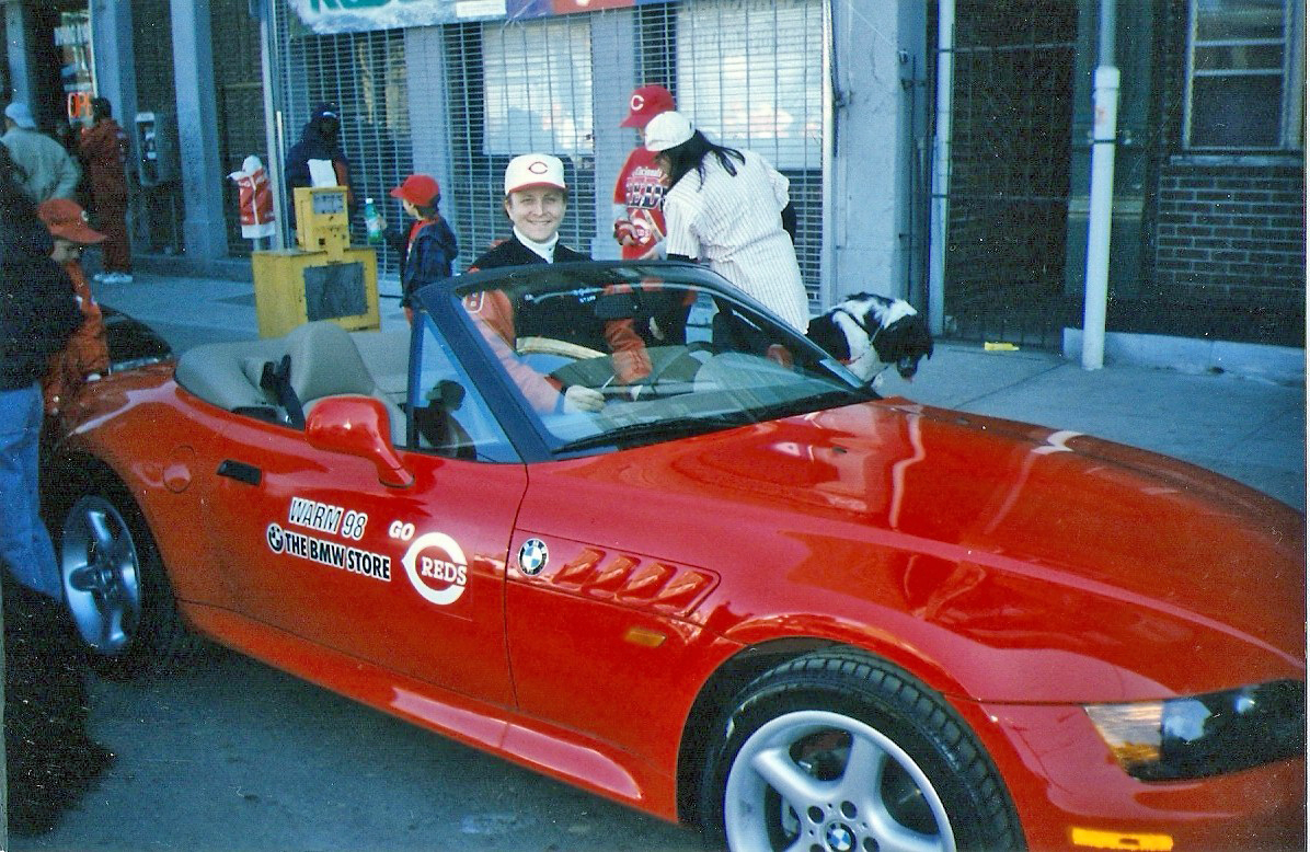
Growing up in Cincinnati — and reader Frank Bitzer will back me up on this — Opening Day was an official holiday. The city just shut down. The Opening Day Parade was a huge deal, and when you work in radio, as I used to do in Cincinnati, you get to be in the parade, and borrow a red Z3 from a local dealership (yup, that’s me in the photo shown above). Used to be, your school would let you skip if you could produce a ticket, although I don’t think I ever tested that theory.
So with all of that in mind, let’s start this week’s CC with this nice set of 1970s Cincinnati Reds yearbooks. Had every one of these except the ’78, and I even remember copying the line drawings off the back of the ’73. Then we’ll go with this 1970s Reds belt buckle, a 1970s Reds clubhouse chair, this 1970s Reds/Kool-Aid promo bat, and this 1980s T-shirt.
As for non-Reds finds:
• Check out this cool 1970s NHL Hockey Pencil Stick Sharpener!
• Also from the 1970s, this Canadian company called Vachon marketed its own line of Expos posters, like this one from Ron Fairly.
• No NFL branding allowed in this Tony DorSETT Converse T-shirt.
• Submitted by reader Dennis Jones: Here’s a game-worn helmet from the 1982 NFLPA All-Star Game. I don’t recall there being such a thing!
• A bit of poking around on Etsy reveals a cool vintage Texas Rangers jacket; a 1970s Mets sweatshirt [looks more DIY than vintage to me ”” PL]; and this authentic LA Rams Jim Everett jersey.
• Haven’t seen one of these before: It seems that in the 1960s, at least, NFL Punt, Pass & Kick participants were given or could buy cool varsity jackets, like this one for the Niners.
• Staying with the 1960s and the Niners, how about this classy copper Niners copper plaque!
• Shane Earnest submitted something that Paul will probably flip out over: this Rawlings baseball uniform catalog, complete with fabric swatches! [Very nice, and definitely up my alley, but the lack of illustrations is disappointing. I think I’ll pass on this one. ”” PL]
• And we conclude with this nice 1970s Oakland A’s baseball bank.
Seen something on eBay or Etsy that you think would make good Collector’s Corner fodder? Send your submissions here.
Uni Watch News Ticker: Yesterday I mentioned that the Yanks and Red Sox would be wearing this Newtown memorial patch on Opening Day and that “other teams are expected to get on board soon.” I didn’t realize that all 30 MLB teams were now on board (my thanks to Travis Martin for setting me straight). … Another follow-up from yesterday: I mentioned that Prince Fielder appeared to be wearing a pair of those briefs with the built-in thigh pads, but I didn’t have a photo. Now I do. Looks weird to see that on a baseball diamond, no? ”¦ Remember how the Browns were going to have new uniforms in 2014? Scratch that — it won’t happen until 2015 (from Jason Hillyer). … What the hell is this logo trying to tell us? It’s a little hard to see, but the letters are “RGS,” for Rutherford Grammar School. The photo is from 1911 (from Bill Grindler). … What’s going on here? “It’s a Diet Mountain Dew guy shooting a Sunkist basketball while being defended by a Mountain Dew opponent,” explains Brice Wallace. … Rutgers football will be wearing a Hurricane Sandy support uniform for its spring game. … Cupspiracy update from Taylor Atkinson, who writes: “I attend Iowa State University and am a marketing intern for the athletic department. This weekend we hosted the NCAA Division 1 Wrestling Championships in Des Moines, so I worked basically as a volunteer. Saturday the championship matches were televised on ESPN. About 10 minutes before airtime, a woman ran down the media table, which faces the camera, with a large stack of the light-blue NCAA Powerade cups. She was forcing each person to pour their Coke into the cups and throw away the cans. I thought it was interesting since Coke owns Powerade. During our televised events at Hilton Coliseum, we could have any old Coke product in open view.” … FC Kansas City, a tea in the new National Women’s Soccer League, has unveiled its inaugural uniform set. This comes just a few days after another NWSL team, the Portland Thorns, stopped selling a T-shirt with the slogan “Feelin’ Thorny?,” which had drawn complaints. “I thought it was kind of strange that FC Kansas City can have a boxing gym logo on its shirts, but the Thorns can’t sell a t-shirt with a slogan that is only mildly ribald,” says Kenn Tomasch. “Because, as we all know, women can be fighters, but they can’t be lovers.” … The NHRA is inviting diabetic children to create a hot rod livery design (from Alan Feller). … New logo for the ECAC hockey championship. “They’re moving it back to Lake Placid next season after three miserable years in Atlantic City,” says Eric Sundermann. … Awesome Redd Foxx joke that I used to know, then totally forgot about, then recently heard again: “What’s the difference between a pickpocket and a peeping Tom? A pickpocket snatches watches.” … Here’s one of the best photos I’ve ever seen of Crosley Field. Check out the incline in left field! (Big thanks to Tom Farley.) … The Maple Leafs wore the blue alts on the road last night, prompting the Bruins to wear white at home. “I don’t know if there’s any special occasion going on, other than a pair of Original Six teams looking mighty sharp,” says James McNamara. … Yesterday I asked if the “A” Scott May’s jersey was missing or just obscured by a fabric fold. Now Cork Gaines has found an AP shot of May cutting down the net at the end of that game. “The ‘A’ is definitely there, so it must have been a fold,” he says. … Dwayne White recently visited the Louisville Slugger Museum and took a buncha cool pics. … Professional poker player Greg Merson likes to wear baseball jerseys at the poker table (from Tyler Schmitt). … Danny Garrison’s latest set of NFL teams recast as soccer teams is for the AFC North. ”¦ I’m not the only one who can make creative use of the term “OMFG.” ”¦ Amusing look at the lining in Jim Boeheim’s suit (from Sean Keeley). ”¦ Tons of great pics featured on this St. Louis sports history page. “It’s obviously St. Louis-based, but there are some pics featuring games of rivals,” says Chris Mayberry. “I was up waaaay past bedtime going through it.” ”¦ “My friend went to Russia, and when he landed in Moscow, this San Jose Sharks display was at the airport,” says Phillip Garza. I’m assuming this has something to do with a Russian player on the Sharks’ roster. Anyone know more? ”¦ 140th-anniversary jumper on the way for Essendon (from Leo Strawn Jr.).
My guess on the Shark display is that is for Artùrs Irbe. But that’s a guess.
A good guess, Jeff, but it has to be for someone else for a few reasons.
First, Irbe would never have worn those skates.
Secondly, Irbe is Latvian, not Russian. He refused to play for the Soviet Union at the World Championships in 1991 after Latvia declared their independence. He carried Latvia’s flag at the 2006 Winter Olympics.
Thirdly, he never once wore a hybrid mask like that.
…or Evgeni Nabokov who was a Sharks goalie from 2000-2010. He joined the Islandres after the Sharks signed FA and Stanley Cup winning goalie Antii Niemi from the Blackhawks prior to the 2011 season.
oops…Islanders
“oops…Islanders”
~~~
Yeah, that’s our alternate name for them out here on the Island.
That style Sharks jersey, worn from ’98-’07, was what Nabokov wore for most of his career, too. Additionally, Nabokov played for Moscow Dynamo HC for 4 years prior to being drafted by the Sharks in 1994.
I imagine the cups are probably the biggest clue towards the identity of the honoree, but I have no idea what they’re from or what they might represent.
I agree with the Evgeni Nabokov guesses, he has also been the starting goaltender for the Russian Olympic team for at least the past two Winter Olympics
Is it possible that it is for a local team that poached the Sharks’ logo? I don’t see anything in that display that says it’s definitely the San Jose Sharks.
Indiana didn’t play Long Island.
They played James Madison.
Sorry, I didn’t realize it was a bracket bracket.
(not a basketball guy, just a JMU fan)
The Shark’s display may be in honor of Daniil Sobchenko, a draft pick of SJ, who was killed in the plane crash that wiped out the Lokomotiv Yaroslavl team.
Could be, but there were others on that plane drafted by NHL teams who had NHL futures. For example, Alexander Vasyunov was 23 and a New Jersey draft pick.
Also, Daniil Sobchenko was also Ukrainian, not Russian. It would be weird to honor someone with a lasting memorial who isn’t from your country. Granted, he played for Russia’s national teams, so it’s still a possibility. But why have a goalie mask in the memorial if it was for Sobchenko? Sobchenko was centerman.
There’s still too many loose ends on this one.
Brinke, it is still the same. My son’s school will allow him to have an excused absence next Monday if he can show his teacher a ticket to the game. The only holiday more important in Cincinnati is Christmas. Go Reds!!!!!!
“Excused absence”?
Oh no!
There goes Johnny’s Perfect Attendance Award!
He’ll have a blemished Permanent Record!
Cmon…It’s Opening Day for Pete’s sake!
Used to be, in Philly at least, that if you & your old man already had tickets you were expected to ditch school and take the hit; mom always knew the score so there’d be no fallout. If not, and if you were a gutsy middle/high schooler, you’d ‘cut’ after attendance was taken and take SEPTA down to Pattison Ave. with some pals, using your lunch money for carfare; you could get a walk up ticket (lots of lean years at the Vet!)or sneak in if you were savvy enough. You’d be home by suppertime (it’s not like anybody went right home from school back then)or close to it. Teachers would be a bit jealous if you were AWOL after first period, but they’d never do anything about it. It’s very sad that the ‘old ways’ are just about gone.
Did Mariemont approve of this dodge?
Clemson’s ballpark has a terraced outfield styled after Crosley like that. Bill Wilhelm, the coach when our park was built, said he liked the look of Crosley and wanted it replicated.
Where were Crosley Field’s dugouts?
LOVE THE CROSLEY FIELD SHOT!
My high school baseball field had an incline like that in right field. We didn’t realize it at the time, but we were actually running uphill to get to first base, as well! The field has since been reworked, and is now perfectly level.
Does MinuteMaid Park still have the hill AND a lighpost in the outfield?
I remember hearing somewhere that Wake Forest added a slope in the outfield when it renovated the stadium a couple years ago because the coach (maybe Athletic Director?) grew up watching games at Crosley Field and loved the slope.
Albuquerque’s Isotopes park has an in-play incline, and Johnson City’s Howard Johnson Field did, as well, for many years. Tiger Stadium and even Comerica initially had a flag pole in play.
The best picture of Crosley that I have seen, also! Exactly like the pictures in my mind from July 1969 when I was 8 and saw my first big league game there. Gorgeous!
Never made it to Crosley–my first Reds game was April 71 I think–then we move to Dallas!
I wonder also…looks like they could only be towards those paths leading away from the home plate area.
… and *serious* amount of foul ground. Only Oakland would be close to that today …
Anyone spot the rainbow in the upper right?
I was inspired to check out Baseball Fever’s Crosley Field thread and found many more photo’s taken the same day, plus some text explaining which day and all, from poster alpineinc
link
I’m sure I’m not the first to do that today, but here’s the link.
Speaking of DIY projects … I mentioned here a week or two ago that I was making my own Cubs jersey, using the walking cub on a snow white jersey with a blue headspoon. Turns out the one I ended up buying is mesh, where I want a full-cloth/polyester-type. Any suggestions on someplace to go to find a blank white jersey with Cubbie Blue headspoon for a reasonable price?
While we’re on the subject, I’m looking for a blank poly (or non-mesh) jersey in ivory or cream. I’ve tried a couple of Google-advertising team uni sites and Eastbay to no avail. Help?
Would link fill the bill? It’s not unlike last year’s ’24 Nats TBTC jersey.
Oh. My. God. No, not that that’s exactly what I’m looking for (massive thanks for finding & sharing). But that I’m really so thick that, in looking for what I kind of assumed would be a Majestic product, I didn’t even think of seeing if Majestic has a website and sells stuff. Like, you know, a business would.
I can find what would work for me on that Majestic site as well for $54 … I always hear of people buying blank jerseys for like $10-20 online. Are those just cases of finding hidden gem, legitimate quality at reasonable prices, or, like the mesh one I bought, never as good as expected?
Arr Scott: Is it the Majestic logo on the sleeve that kills it?
JimWa: In my experience it’s been more the latter. Outlet stores sometimes hold hidden gems, though more often those are in unpopular styles or colors. For example, I remember seeing a lot of adidas clothing in Tennessee orange but without Tennessee logos in an adidas outlet far away from Tennessee.
Stumbled across this site the other day while looking to create some shirts for my softball team: link
teenchy, no, the Majestic logo is fine. I can live with a maker’s mark on the sleeve. (But not on the chest, Nike.) The link you provided is exactly what I’m looking for but couldn’t find, on account of apparently being a complete idiot.
Thanks, Ben! I now have this beauty ordered, and can’t wait to attach my walking cub! I love that this style comes with sleeve stripes. Now I just have to figure out what shoulder patch would be appropriate …
That Redd Foxx joke is in extremely poor taste, as I’m sure the thirty-four people I sent it to would agree.
Agreed. That was in truly poor taste and not remotely uniform related….
Nonsense. “Redd Foxx” rhymes with “Red Sox”.
And he got his surname from Jimmie Foxx
This one might be worse….
Whats the difference between a gang of peewee con-men, and a girls track team?
One’s a bunch of cunning runts.
A “gang of peewee con-men” was not part of that joke as it was told ’round my schoolyard.
We’re not allowed to say midget anymore, remember?
Okay,try this one: “Those people eating all those healthy foods and doing that exercise are sure going to be upset when they’re lying in the hospital, dying of nothing.”
My guess on the Sharks display in Moscow is that it is for Vladislav Tretiak, a one-time goalie coach for the Sharks. Yes, that is a pair of player skates (not goalie skates), but coaches wear player skates because they are more comfortable and it is easier to skate from station to station. Honoring a true Russian without using CCCP stuff is about as logical as possible here. This is a pure guess with absolutely no research, but it is my best guess on a Tuesday morning before my coffee.
Close, Mike, but get that coffee in you. ;o)
Tretiak was never a goalie coach in San Jose. He was Belfour’s goalie coach in Chicago under Mike Keenan. Belfour switched to #20 in San Jose as a tribute to the former Soviet goalie due to how much he taught Belfour. Tretiak left that position in 2004 and now runs a bunch of goaltending schools in North America.
Aside from the gorgeous baroque and hard-to-read lettering on the jerseys, those 1911 Rutherford schoolboy baseballers look pretty sharp. Jerseys with striped sleeves; then non-descript pants; and then stripes again on the high socks… that basic pattern of the early 20th Century is still a winner. Due credit to the otherwise loathsome Ivy League institution in central New Jersey.
One great aspect of that Crosley Field photo is the multiple Wiedemann Beer signs. That’s a former local brew that is making a comeback. A simple search of Cincinnati brewing history will result in some very interesting reading if you are bored. There are local tours of the former brewery district as well – if there’s ever a Cincinnati Uni-Watch party it would be worth your time Paul – that and the neon sign museum.
There’s a neon sign museum?!
Actually, it’s just a sign museum (including, but not limited to, neon):
link
The Neon Museum is in Vegas:
link
I haven’t been to either one. But both are on my list.
Cincy (like just about every American city with a sizable German immigrant population) used to have a seriously bustling brewery scene. I went to some sort of beer museum thingie when passing thru Cincy during a x-country road trip in 1997. Can’t remember what it was called, but it was informative. I liked!
If you ever return to Cincinnati, I highly highly recommend the Cincinnati Museum Center, in the old train station. It has one of the most amazing model train exhibits I’ve ever seen. A scale model of Cincinnati in the mid 20th century, complete with Crosley Field …
link
The Crosley Field photo is just incredible.
Interesting detail: Look at the people in the crowd. They’re wearing, you know, regular clothes. Not a Reds jersey to be found. Imagine that.
I noticed the fans’ garb as well. It struck me that t-shirts and jerseys were absent, we were starting to see some relaxation among the fans. Check out the untucked dress shirts.
I’m 9 years and about 361 days younger than Paul, but even so, like him I’m old enough to remember when men mostly wore collar shirts, suitcoats or sportcoats, and, on weekdays, ties to sporting events. Now that I’m the nigh-middle-aged man at the ballpark, I waffle back and forth. Yes, I have some jerseys – not $200 polyester shirts in my case, but only because I strictly follow the injunction to Never Pay Retail – and sometimes I wear a jersey to a ballgame. (Though I have a personal rule: I never wear “matching” cap and jersey to any ballgame. As in, if I wear my 2005 Nats home jersey, I don’t wear the red home cap. Also, number but no NOB, ever.)
But other times my basic cultural and aesthetic conservatism overwhelms, and I just can’t bring myself to wear a jersey. Mostly, in those instances, I wear a Hawaiian shirt, which is its own kind of formality. Back in the first postwar decades, when men usually wore suit and tie to the ballpark, Hawaiian shirts were treated as a form of semi-dress in the warm months or in warmer climates.
I found myself a cheap red-and-white argyle sweater vest this winter, and I may try doing the whole shirt-vest-and-tie thing at a Nats game this year. Just for old-fashioned-ness’ sake.
my basic cultural and aesthetic conservatism overwhelms, and … I wear a Hawaiian shirt…
Does. Not. Compute.
Like I said, Hawaiian shirts originated as a kind of formalwear, largely on account of vets returning from Pacific service in WWII and Korea and transiting through Hawaii, where they were widely worn an lieu of shirt and tie. Hawaiian shirts (or, more properly sez I, aloha shirts) still function as such in some professional circles in Hawaii.
See also Harry Truman, Bing Crosby, and other male celebrities from the postwar era, who popularized the semi-formal use of silk or rayon aloha shirts.
link
“I found myself a cheap red-and-white argyle sweater vest this winter, and I may try doing the whole shirt-vest-and-tie thing at a Nats game this year. Just for old-fashioned-ness’ sake.”
~~~
So, like a red and white striped bow tie and a straw “vaudeville” hat?
Well, maybe not so much the straw boater, but a bow tie might be just the thing …
Paul, you think you got it bad when Shea begat Citi. Can you imagine going from this cathedral to your first visit to Riverfront?
I’m sure the fans were thrilled. The news articles about Riverfront and Three Rivers and all the concrete doughnuts really celebrated the modern age and were more than happy to see the classic stadiums disappear.
Surely there’s a girl in a pink Reds jersey juuuust off the frame.
Comment of the day
And as a car guy, I just love that Dodge advertisement for a new Dart at the low low price of $2086.
Paul – the tour I took was very cool, including tours of the tunnels that ran under the street from the brewery to the bottler (in order to avoid taxes). Very interesting and highly recommended to anyone that finds themselves in the Queen City.
Quite possibly the best page from that St. Louis sports history website. Drool…
link
-Jet
Very nice!
Can’t say I recall the Lions using that logo though.
As a Giants fan, it pains me to say this, but that Eagles logo is awesome.
I want a shirt made up with that Cardinals logo! That would also be an amazing banner…
* The muscular St. Louis Cardinal is a surprise
* I’m digging the logos with people, specifically, the half man/half Yankee Stadium guy for the Giants and the 49er doing the Yosemite Sam dance.
Hey Brinke,
That Oakland A’s logo, on the bank, was introduced in the mid 80’s, used through the mid 90s.
Right! I usually go with the text of the ad. Unless it’s a total foul-up, which I didn’t catch, duh.
Thanks for the Crosley Field photo and the Redd Foxx joke.
Here’s another great shot of Crosley looking down the RF line: link
It’s amazing how foul territories have shrunk over the years… the dugouts are so far back from fair territory that they aren’t even visible in the ticker photo.
Great picture. The right field stands were known as the “sun deck” for day games and the “moon deck” for night games. The hill in the background is Clifton Heights.
Nice pic! What I want to know is, who is playing CF?!?!
MEANS – Thanks…..now that’s going to bother me all day!
Holy moly!! What is going on there?
Would love to know the deal with that. Doesn’t look to be any type of radical shift on. Maybe they played with 8?
If you want to see an awesome style of bracket, go to champsring.com.
Cool bracket project. When I was a kid, my dad and I used to actually draw an entire poster-sized bracket by hand and fill in the team names with varying degrees of artwork. We’d just write in the lower seeds with pen, but our favorite teams and family schools would get a full color treatment and occassionally a complete recreation of their logo if we were feeling ambitious. Fun project, but incredibly time consuming.
No one has mentioned the Browns. I hope they don’t go down that horrible, horrible path of pleasing kids who have not yet developed the reverence for tradition, nor actual tastes. Keep the Browns as the Browns! Say no to change for the sake of change!
You do realize that nearly every sports uniform change in history has been for the sake of change, right? There are very few instances where the reason for a change doesn’t boil down to “because we wanted to”.
What tradition do the Browns even have anyway? The Cleveland Browns tradition died when the team disappeared for 3 seasons. The New Browns have no tradition. They’ve worn multiple uniform combinations (orange pants, brown pants, orange jerseys, etc) and they’ve had a whopping 2 winning seasons since being resurrected. Those are not the ingredients of a “Proud Tradition”. Hell, even if you choose to accept the NFL’s official lie that the Browns are the same franchise that formed in 1946, all of the team’s success took place over 40 years ago, and 7 of the team’s 8 championships were won wearing a helmet which was NOT the current blank orange with brown-white-brown stripes. (Nevermind that 4 of them were before the team even joined the NFL and probably shouldn’t be given equal value.)
Pretending to be the old Browns is the new Browns’ tradition. It’s kind of meta, but assume that to be true and both the team’s actions and fan expectations make sense. It’s the Grand Unified Theory of Cleveland Football.
Not that I’m disagreeing with you about how we should regard the Browns! I’m OK with the logo-less helmet – it’s one of those things that at least one team in the NFL ought to do – but everything else is wide open for rethinking and improvement in my book.
Goodell lied, people died.
Worrying about official franchises and all that is just having a wank.
I mean, really. It is. The people in Cleveland have the Browns. They have the memorabilia and records and memories. God forbid those people believe they’re living a lie.
What “Ricko” termed(?) the ‘Browns Anomaly’ rears its’ ugly head yet again!
Not sure which is less appealing…the Browns’ current uni set or the potential of re-hashing that classic debate topic of 2010:
link
Is change for the sake of change any worse than nostalgia for the sake of nostalgia?
When he says he used “baseball cap logos” does he mean the logos on the caps the actual baseball team wears or just logos that the marketing department puts on baseball caps?
Because the Cal (for example) Baseball team doesn’t wear the script they wear a block C:
link
I think he uses the term loosely – Wisconsin doesn’t even have a varsity baseball team.
A comment on the MLB Aztec-striped caps that were featured the other day: The first thing that came to mind were the Zuni blankets that amateur car customizers used to throw over the seats of their hot rods. Cheaper than upholstery, and very, very cool.
Love the Crosley photo. Best part for me is Pete Rose, almost posing for the shot. His confident (and so typical of Pete) stance just jumped out at me.
The Crosley field shot is amazing… I wonder where the dugouts are too?
DOES ANY ONE ELSE see the Rainbow in the upper Right ocrner of the picture, aka over LEFT FIELD?
And who else is at the cage other than ROSE???
Cardinals’ Facebook page is announcing a fan vote to choose between red and navy hats on the road this year!
link
I’d like to see a Red/Navy Blue brim option or… Yellow brim!
I’m a Cardinals fan, and I hate this. I’m all for fan input in the creation stages of a uniform concept, but they’ve already released the style guide which indicates that the red hat is to be worn for road games.
I also know that it was announced that the blue hat would be available as an alternate, but it shouldn’t be worn for all of the road games. Incidentally, this option is winning right now.
Major sad face.
agree 100% ryan
I was so happy to see this today, glad ya beet me to the ticker with it, but im seriously happy the blue is winning it ties in to most of their history and has been nice to have one of each the last twenty years
The Cardinals fan base has been split on the navy cap since its re-introduction in 1992.
I think that the navy cap with the gray unis is a great look. It gives a nod to the past and creates a good contract between home and road games. I especially like how Yadi Molina pairs the navy blue catchers gear with the road uniform.
The Bruins and Maple Leafs were playing a home-and-home. Sometimes the teams agree to wear the same uniforms for both games, but the Maple Leafs were wearing their regular home blues for the first game of the series. Still, I’m guessing that’s the reason.
Toronto did the same exact thing in Boston once last season, too.
It will take Jimmy Haslam 2 years to put heat pressed vinyl on the shoulders of the Browns jerseys?
Hopefully in the next 2 years Nike moves onto something else and stops beating that dead horse…
Is that Rams jersey really from the 80’s? It has the NFL logo on the neck which makes me think more 90’s. I have an authentic Isaac Bruce jersey from 1997 and it’s identical to this, except made by Wilson. I’d never charge even $200 for it!
You’re right, it is a 90’s jersey. Its one of the nicer ones IMO, with the side splits at the hem, which wasn’t common for Russell retail.
The guy might think it is a gamer, but it is a retail version. There are other sellers selling 90’s retail jerseys on ebay asking similar prices (I see the same ones on there for over a year or more, so nobody’s biting). Most of the never worn ones are manufacturer flaws anyway.
I believe that Sharks player being paid tribute to is probably Arturs Irbe. Since that jersey if from the original days of the sharks back in the early-to-mid 90’s.
I already posted the reasons it wouldn’t have been Irbe above, so I won’t repeat myself here.
However, the Sharks wore that style of white uniform from 1998-2007, long after Irbe had moved on from the team. Irbe left San Jose after the ’95-96 season, playing in Dallas (’96-97), Vancouver (’97-98), and Carolina (’98-99 thru to ’03-04).
As stated above, this is not his uniform nor does it represent him in any way.
I’d love to see Nic Schultz update that bracket with the actual winners after the tourney. It’s a really nice representation of the teams; love the variety of logo treatments throughout.
Yes, there were a couple of NFLPA All-Star Games played during the 1982 strike. There were supposed to be a bunch of them. They were ragged and not well-attended or watched.
The first one saw the NFC beat the AFC 23-22 on a late field goal by Mark Moseley in front of 8,706 at RFK Stadium on October 17, 1982.
The next day, 5,331 fans watched at the LA Coliseum as the AFC beat the NFC 31-27.
I’m not a bracket guy either. I mean, how can you realistically expect to try and predict the outcome of games being played in a tournament featuring SIXTY-EIGHT freakin’ teams, especially ones you’ve NEVER seen play before or read anything about?
I mean, I thought Uni Watch was nerdy enough. Are there seriously people out there who get as much of a buzz out of reading stat sheets and box scores of ridiculously obscure schools just so they can try and predict if an 8 seed underdog can beat a better ranked 7 seed? Come on!
I could see if there was such a thing as fantasy college basketball that those who played it would have a pretty good shot at filling out a bracket accurately, but otherwise it’s a waste of time. Since logic tells me to always go with the odds, if I ever DID fill out a bracket I would just always pick the lower seeded team to win. And that completely takes the fun out of it.
Now, if there was a college football tournament, I could see myself filling out brackets for that because there’s less games to watch during the season and the games during the season are almost always played on Saturdays. It’s a lot easier to follow and get an idea and feel for the teams involved. Too bad the NFL doesn’t use a typical tournament format because I think filling out NFL Playoffs brackets would be pretty fun as well.
It’s just for fun. Having some $, bragging rights or whatever riding on games makes it more interesting. At least that’s why I do it, I’m not a big basketball guy… and that’s why someone who knows nothing about basketball always wins it.
Great piece on the T1D/NHRA dragster. That’s a pretty unique way to raise money for a good cause. I like it!
It looks like the Giants will be using an alternate white set of pants this year.
link
Right on!
So it’s ONLY the pants. Not the jersey or the helmet? I had been hearing about them going back to this time period for the alternate, but I don’t understand why only the pants….
Jersey number shenanigans for the Pittsburgh Penguins, after their flurry of trades.
Doug Murray takes #3.
Dustin Jeffrey shifts to #17, allowing former Winnie Jet Tanner Glass to take #15, which finally frees #10 for Brenden Morrow.
Now, your scorecard should be correct for tonight’s game, which is a huge one. GO HABS GO!
(I’d be remiss without crediting my source. @RealDanaHeinze, the Twitter feed of the Penguins’ head equipment manager, Dana Heinze. I’m not a Pens fan, but he’s a great follow. Thanks to one of the yinzers here for tipping me wise to that.)
Watching Spain take on France and really enjoying the gold(yellow) chevron/headspoon minus the handle on Spain’s jersey. Was this kit covered here and i missed it?
Harkens back to I believe their shirts in 1924.
Very cool.
I’m not digging the pajamafication of national team uniforms though. I like it when Spain wears red and blue, and France wears blue, white and red, not all red and all blue.
Meanwhile, England is all white and the Netherlands have gone all orange.
Nationals are adding a alternate hat, read with blue brim. link
Well, dammit, if the Twinks won’t don that beaut, then at least someone will…
Sioux Falls Fighting Pheasants change their name back to the Canaries. As a Sioux Falls native, all is right with the world again. link
Check out the silhoutted Canarie. Sweet!
link
“Quite possibly the best page from that St. Louis sports history website. Drool…”
I wish the Giants would somehow squeeze that logo somewhere in their apparel, a classic IMO.
Mexico in all black, US in all white.
Winnipeg Jets goalie Pavelec wasn’t wearing front neck jersey strings in tonight’s game vs Carolina Hurricanes, wondering if that’s against NHL uniform regulations