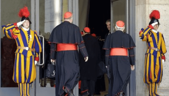
Yesterday I came across a news story about Catholic Cardinals arriving in Rome to select the next Pope. It was accompanied by the photo you see above. Naturally, I loved the striped uniforms being worn by the two saluting gentlemen. According to the caption, they were “Vatican Swiss guards.” I googled that term and was rewarded with a bonanza of stripeage. This may all be old news to those of you who follow the Vatican, but it was new to me — I wanted to know more.
As I quickly learned via assorted items on the web (a good place to start is here), the Vatican’s corps of Swiss guards was founded in 1506 by Pope Giulio II. The guards are all Catholic Swiss males between 19 and 30 who have completed their mandatory Swiss military service. Their striped uniforms date back to the early 1900s. (There’s some very dense info on their earlier uniforms here.)
You can see a guardsman being fitted for his uniform here. From a distance, the uniform looks like striped fabric. Upon closer inspection, however, you can see that the shirt and pants are actually comprised of individual strips of colored fabric. That’s pretty fascinating, although it seems like it might be awkward to get around in.
The guardsmen normally wear black berets, but they switch to red-plumed helmets for special occasions, like Pope Benedict’s recent retirement.
I’m sure many of you know much, much more about the Swiss Guards than I’ve presented here. Feel free to enlighten us in the comments.
Collector’s Corner
By Brinke Guthrie
The calendar says March 5th — less than a month before the defending World Series champions return to the diamond. So let’s check out a few SF Giants items, eh? First, a set of 1960s vintage Giants drinking glasses, from nearby Santa Rosa. Then, a very pricey Willie Mays bobblehead from the same period — but free shipping! And then there’s a Cliff Engle Giants sweater from the 1980s.
As for non-Giants items:
• Mets fans, here’s an old team-issued Mets vinyl travel bag.
• Hockey fans will love this set of five 1970s NHLPA lunchboxes.
• Speaking of hockey, the old WHA Stingers played at what was then known as Riverfront Coliseum, which opened in September of 1975. (It’s still there with a different name — its fourth.) Here’s a glass from that era, with “WLW Radio 7” on it.
• Very cool Atlanta Falcons jacket by DeLong.
• I didn’t know 1970s WFL footballs looked like this. Orange stripes?
• Packers fans, here’s a cool Adidas polo shirt with the Packers logo on the chest and “NFL Alumni” on the sleeve.
• This seller has several 1960s NFL David Boss paintings up for auction.
• Gotta love this sensational 1960s United Airlines MLB cap poster.
• And we wrap this week with a submission from, yes, Michael Clary, who sent in a pair of 1940s molded plastic football players, here and here. (And here’s a PS from Michael regarding the shout-out I gave him last week: “Thanks for the little blurb in the last Collector’s Corner. I’m guessing people think I probably live in my parents’ basement and deliver the morning newspapers. It made my day.”)
Seen something on eBay or Etsy that you think would make good Collector’s Corner fodder? Send your submissions here.
OMFG reminder: In case you missed it yesterday, my latest “One-Man Focus Group” column is about U.S. coin designs.
Uni Watch News Ticker: New logos and uniforms throughout the entire athletics program for Oregon State. That new logo is weak — not quite cartoonish enough, not quite photo-realistic enough. By trying to have it both ways, they end up having it neither way. But I confess that I like the way the multi-colored football facemask simulates a beaver’s buck teeth. ”¦ A Montana State track and field athlete has leaked what appears to be the school’s new logo. ”¦ A Cal football helmet got a huge hole in the cranium area during practice (from Kyle Mackie). ”¦ The 2014 World Cup will feature special seating for obese fans (thanks, Phil). ”¦ According to this article about the Mets’ new BP caps, MLB teams “are allowed to wear the [BP] caps for regular-season games, though the Mets declined to say whether they would.” The article also has lots of info about the BP cap program as a whole — recommended reading. ”¦ Two of my worlds colliding: Several universities are now offering team-branded meat. ”¦ Fun submission from Max Crofts, who writes: “A restaurant in Thailand called Cabbages and Condoms promotes sex education and has a Tiger Woods mannequin with a Nike shirt and hat made of condoms.” … The North Face logo has been showing up a lot on 60 Minutes, but CBS says it’s just a coincidence, not product placement. … There have been complaints about some of the rocks at the Canadian men’s curling championships (from Roch Smith). … A source who claims that his wife works for Under Armour says that UA will soon be making a major announcement about becoming the primary apparel supplier for the U.S. Olympic team. I checked with an Under Armour spokesperson, who said, “We don’t comment on rumors or speculation.” That’s the right thing to say in any case, of course. … Here’s a funny story involving former Laker Mark Landsberger, his road jersey, and a chocolate milkshake (from Matt Beahan). … Swell-looking striped stirrups being worn this year by Appalachian State (from Jeff Mendenhall). … New logo for the Livestrong Foundation. … In a related item, Team Canada’s women’s hockey team is defending its decision to wear Livestrong colors (from Will Leslie). ”¦ Good piece on how to break in a big league glove (from Sean Clancy). ”¦ Also from Sean: Lots of really cool bicycle head badges in this gallery from the North American Handmade Bicycle Show. (In case you don’t recall, I wrote my own fun piece about head badges a little over a year ago.) ”¦ Mariners prospect Brad Miller is old-school — no batting gloves, no wristbands, high cuffs (from Keith Chaiet). ”¦ “I was at a spring training game and Anthony Rizzo of the Cubs was just about to go to bat,” says Kyle Campbell. “The ‘C’ on his batting helmet was askew and on the brim, so the bench coach called him over and readjusted his logo just before he went to bat.” ”¦ Not uni-related, but this is really great: an article and video report on a company that makes tags and labels (big thanks to Gretchen Mittelstaedt. ”¦ If you’ve ever wondered what Spongebob would look like in a hockey uniform, you’ll love this Islanders ad (from Aaron Scholder). ”¦ Oh baby, check out the stirrup stylings of Dodgers prospect Zach Lee. “He’s worn his stirrups that way in the minors for some time,” says Ross Yoshida. “Hopefully he’ll keep the look if and when he makes it to the bigs.” ”¦ Speaking of stirrups, look at this great 1978 family portrait of Louis Gaunch’s family. “From left to right, that’s my sister Angie in her t-ball uni; me in my Redlegs Little League uni; my mother Marilyn in her church softball uni; and my father Ed (who had a sip with the Pirates in mid-’60s) in his softball uni,” says Louis. ”¦ Did you know there was once a set of baseball cards featuring players and their dogs? Most not have been MLB-licensed, since the uniform logos were airbrushed out (from Mark Kaplowitz). ”¦ Remember how Ilya Bryzgalov repainted Yoda on his mask? Turns out he did that at Lucasfilms’s request (from John Sheehan). ”¦ Football teams routinely use different-colored practice jerseys for QBs, but Texas appears to be adding a center helmet stripe. Never seen that before (from Andrew Matthews). ”¦ The Blackhawks will wear jerseys with Marian Hossa’s No. 81 and his NOB during pre-game warmups for tonight’s game against the Wild. “It’s in honor of Hossa having played his 1000th game on Sunday,” explains Terry Mark. ”¦ “While sifting through some game-used NHL jersey porn the other day, I came across a delightful quirk on an old Roberto Luongo Florida Panthers jersey,” says Charles Noerenberg. “The jersey is from the 2002-03 season, and its hem had been lengthened by sewing another hem onto the bottom of it, creating a double-NHL shield effect. I’ve never seen anything like this before. I did some quick photo research and was able to find images of Luongo wearing jerseys with the same double-logo effect for at least three seasons in Florida, as you can see in these shots from 2001-02, 2002-03, and 2003-04. It appears that he did not sport a double shield his rookie year for the Islanders in 1999-2000, nor did he during his first few pre-Edge seasons in Vancouver.” ”¦ Also from Charles: “Driving on the West side of Chicago the last week, I passed a Chicago Streets and Sanitation building and immediately pulled over once I saw what was parked in their lot: three awesome customized street sweepers — one each for the Blackhawks (here’s another view), White Sox, and Cubs (not pictured, sorry).” ”¦ Some U. of Illinois students are trying to bring back Chief Illiniwek. ”¦ Here’s another look at those awesome Vancouver Millionaires throwbacks that the Canucks will be wearing in a few weeks. ”¦ Everyone knows you can’t online-order a jersey with an NOB of “Go to Hell” or anything else considered offensive. But get this: If you go to the Reds’ online shop, you can’t order a No. 14 jersey with “Rose” as the NOB. “Very interesting that Rose’s ban extends even to this,” says Alex Bernhard. ”¦ Daniel McLaughlin says he’s “on a one-man mission to get South African rugby more prominently featured on Uni Watch.” With that in mind, he sent along the five South African Super Rugby teams: the Cheetahs (“No change from their 2012 Puma unis,” says Daniel, “but it’s worth noting that their logo is a bit Jaguars-esque“), the Sharks (“Slight change from last year”), the Bulls (“No change to their blue homes or away pinks, but they also have a new 75th-anniversary kit, which they’ll wear against the Cheetahs”), the Southern Kings (“a dump of a uni that’s as boring and dreadful as the team is”), and the Stormers (“as part of Western Province Rugby Union, they’ve tried to keep their kit similar to that of the famous blue and white hoops of Western Province Rugby”). ”¦ For all you Seattle-area readers: Scott M.X. Turner’s band, RebelMart, will be playing this Thursday, 8pm, at the High Dive. You know what to do.
The reason you can’t order a “Rose” on a Reds jersey does not have anything to do with his ban from baseball. You cannot order the name of a player on a team’s jersey if they retired from that team. You can either personalize the jersey (meeting the guidelines) or you can have a current player’s name and number on the jersey.
Yeah, here are the rules from the MLB Shop…
link
Here’s an interesting note on Rose and bans though. In the 2013 Topps Series 1 set, the back of the cards features records that the player could break. For instance, Hunter Pence’s says “With 516 RBI, Pence is 1,781 away from Hank Aaron’s all-time record of 2,297.” But anybody with one concerning hits, such as Joe Mauer, says “With 1,270 hits, Mauer is 2,986 away from the all-time record of 4,256.” No mention of Rose on anyone’s card.
Rose has been “missing” from Topps cards off and on for the past few years. Some years they have his Hits record with no mention of his name, and other times they do. link
As for Rose and not being able to order a jersey wiith his name on it, it dose not have to do with his ban, but more with his ties with the MLBPA. With that said, the Reds team shop does sell #14 jerseys, but no ROSE on the back due to Rose’s ban. Just crazy how things still are affected by his ban…even in small ways.
This also happens with the NFL. I’m not allowed to buy a #7 Elway jersey
All the more reasno to only wear NNOB jerseys, and, if your team has always worn names on all their jerseys, change your allegiance to a team with more sense.
Yeah, it has to do with the MLBPA and retired players. I learned this years ago when my friend lamented that he couldn’t customize a name-and-number T of his favorite childhood Yankee, Mike Pagliarulo. (As wrong as they are, Yankees fans LOVE their name-and-number T-shirts. They’re everywhere in the summer.)
Did Dick Allen retire as an Oakland A?
I just requested a personalized A’s jersey with #60 Wampum-OB and it was acceptable.
It’s that way for any team, whether the player played for them or not. So for this example, you couldn’t Get 14 and Rose on a Pirates jersey, say, or any other team.
But yes, Allen retires with the A’s
Funny, because when i saw a game in Pittsburghlast year, the most popular item being worn was either aclemente t-shirt or jersey.
This is old news in regards to the BP hats being allowed for regular season use. The Blue Jays announced on the first spring training broadcast that they would be wearing the maple leaf bp caps for The Canada Day game, now I’m curious to see how they’ll look with the red jerseys they wear every year!
The thing about the custom Pete Rose Reds jersey makes sense. I just heard him on the radio yesterday talking about how Topps has excluded his name from records lists on this year’s cards. He seemed pretty miffed.
Also, I just learned that he was once piledriven by Kane at Wrestlemania. So at least he has that.
Sorry, didn’t see this comment before I posted mine above!
Lot’s of good stirrup action today+
I like the shape of the new Oregon State logo, but I feel like there should be a little more to it…the uniforms all look great though. I really like the new word mark.
As a big Beaver fan, I am dismayed at the choice of this amateurish piece of crap. The uniforms for the most part are pretty sweet. Love the basketball, and soccer uniforms. Track looks like the simply placed a sticker on an existing pattern. Football uniforms are pretty sweet depending on the combo (I hope we NEVER wear monochrome orange!) The black and orange aren’t bad but the stripes are too wide. The white would be sweet without that damn nutria. Love the numbers on the Orange lid. I love bringing back the OSU instead of the OS. The font is nice but the old font was more unique and wasn’t broken… overall my biggest question is: Why in the hell did OSU let a Duck Alum spearhead this change… again..It really reminds me of the first time Tinker Hatfield messed with the uniforms and delivered sports bras…so close to being a nice look if they had finished the yoke..but instead left it looking unfinished and amateurish… The reaction to the logo can be easily summed up (by most Beaver fans) by my 7 year old daughter: “it’s yucky! weird and kinda creepy.” Epic Fail Nike…Seriously think Oregon State should consider switching to the other Oregon based apparel company….I could only think Adidas couldn’t do any worse.
The stripes are terrific. The logo, while weak, needs to be about 20 percent larger on those helmets to compete with the stripes. And yes, the “teeth” are a nice touch.
UConn has a font that was almost identical to your now obsolete ones. The 4s are different and I think some of the serifs had slants to them, while UConn’s were not, but that’s pretty much it when it comes to differences.
I’ve never seen anything as close to the new font as I had with y’all’s last set, but it does look familiar (kinda like an amalgamation of a bunch of different fonts)
I love the Armada font Oregon State used, now their number font looks similar to the font Russell uses for Louisiana-Lafayette. The stripes are simple on the football unis, and I love they are integrating the shoulder square the Dutch team used for their 2012 Euro kits… just the number font, at this moment, frustrates me.
I’m not seeing the Oregon State mask as being buck teeth at all. I would have never made that connection, and still don’t.
Really? Not even for the helmet on the left?:
link
Sure looks like a buck tooth to me.
That one may look like it but it is really just continuation of the strips on top for all three helmets.
Do you really think *nobody* at Nike or Oregon State realized it would look like beaver teeth? Please. It took me all of three seconds to make the connection, and I won’t be the only one.
Honestly I didn’t and it may be because I saw individual pictures of the other two helmets first where I saw that it was a continuation of the stripes from the top so when I saw the white ones I just viewed it as a continuation of the strips.
Since beaver teeth are orangish it would have been better to put a center black stripe flanked by an orange stripe on each side. Then the tooth look would have been right on.
The Orange uni is purdy to me.
Am I the only one who saw an N in the teeth? As in Nike? Could that be more obvious?
I can see the shape, but it’s hard to believe that was deliberate, since Nike has never branded itself with its first initial.
I was at the event. It is supposed to be buck teeth
Cal helmet blowout…..
Bad technique maybe??
That helmet blowout is just too perfect a circle to look real. What gives?
link
Never seen the Pete Rose van!
(I think someone meant “ban”)
Already fixed!
I’ve heard of the Pete Rose Bandwagon!!
Regarding the stripe on UT’s quarterback’s helmets: we did this at Texas Tech under Tuberville when I was an equipment manager there. The stripe is for the coaches using film to see which way their qb looks when reading the defense during a play. Helps to see if they are going through their progression properly.
Clever!
I was just about to post something similar. WVU puts white stripes on DBs’ helmets to see where they’re looking.
Mississippi State did this the last couple of years, until they put center stripes on all their helmets. I hadn’t figured out the reason why; thanks for the info Damon!
I would like if the U.S. of A. would go the Canadian/European route and put the kibosh on the one dollar bill. It would just be more efficient in terms of vending machines and giving out change in those change dispenser things. Also, the multicolored, different sized bills would help, especially after I watched a special on ABC News about blind people trying to buy stuff and they can’t tell the bills apart.
have you ever gotten change at a NJTransit vending machine and you get a bunch of dollar coins? That’s annoying.
I’ve had the wonderful experience of being given $5 worth of dollar coins as change from the DC metro and then having the machine refuse to take $3 worth of the coins it had just dispensed to me as I tried to purchase a second fare card. Dollar coins are the worst, and they haven’t cought on in years and won’t, unless the government stops producing dollar bills.
How about Canadians and Europeans come on board with the US and return to using more paper for currency?
Indeed, the $2 bill needs more love.
Another thing that can be done for blind people is to put raised dots in certain patterns and in certain positions so that they can be differentiated by touch. Japan does this, and I think the euro bills do too.
And while I like the addition of color to the new bill designs, I’m not a big fan of the big ugly number in the bottom right corner (even if it is in the otherwise-timeless Helvetica font). Colors should do the job for people with impaired vision; you don’t need to uglify it this much.
The other thing I don’t like about the new multicolored bills is that the color scheme resembles that of Monopoly money far too much.
Didja ever see Australian currency?: link
And if that’s not bad enough, the $ 2 coin is about half the size (about the size of a US dime) of the $ 1 coin (about the size of a US quarter) – took some getting used to when I was there on holiday
As far as the colour in the new U.S. banknotes I don’t think they went far enough. The addition of colour is much too subtle and in some cases just gives the bill a washed out look. If each bill had it’s main colour different, it would be more vibrant. It would also be much easier for visually impaired and others to quickly tell bills apart.
What is the general opinion of those in the United States on the addition of a little colour to their bills? Do you think even more colour added would been considered at this point in time too radical of a change by those in the U.S.?
I don’t think the $1 dollar coin would have been eventually embraced in Canada if we kept producing and didn’t remove the $1 dollar bill (even with $1 not being worth much).
Put me down as someone who has supported all the recent changes to U.S. currency. As far as I’m concerned, they should adopt the changes Canada has implemented, and phase out the dollar bill and penny. Most of the objections I’ve heard have to do with old habits.
Worthwhile Canadian Initiative indeed. Couldn’t agree more. Most of the changes to US coins and currency since 1996 have been positive, but the overall effort has suffered from too much aesthetic conservatism. (Which I normally regard as a virtue!)
It’s understandable; our money had been left untouched for so long that people came to regard designs not much older than WWII as sacred relics of the early republic or something. Also, the dollar was and is the dominant global currency, and so there’s a tendency to regard its aesthetic stability as having something to do with its value stability.
Two biggest changes needed: Kill the dollar bill entirely, and totally redesign the size and weight of the dollar coin. Yellow quarters don’t cut it; we need either something thicker and heavier, like a pound or a euro, or we need something broader, like the old Eisenhower dollar.
Arr, I assume this is the headline to which you’re referring
link
I don’t know… the more I look at Oregon State’s new logo, the less I hate it. I’m loving all of those football unis, and I think I even like the addition of metallic bronze as an accent color. YES. I am on board with OSU’s makeover.
Some good deets about the Swiss Guard from a vexillological standpoint link. The flag uses three coats of arms: that of the current pontiff, that of Julius II (a/k/a Guilio if you’re feeling more Italian) and that of the current commandant.
The Vatican itself uses link in place of the papal arms during a period of sede vacante. Some nifty link with the device have been released and coins will be forthcoming.
A couple interesting points about the flags of the Vatican and the Swiss Guard:
– The Vatican is one of two countries in the world with a square flag (the other is…you guessed it…Switzerland)
– The Swiss flag is square because the cantons (states) that formed the country had square flags
– The Swiss Guard, in the tradition of the Swiss flag, also use a sqaure flag
– When the Lateran Treaty was signed in 1929, creating Vatican City as an independent country, the Vatican adopted a square flag based on the Swiss Guard’s flag
Also, re. the Swiss Guard’s uniforms (and it might be in one of the links Paul posted), when the modern uniforms were developed in the early 1900s, they were based on paintings of the uniforms of the early Swiss Guards (in the 1500s), whose uniforms were, according to legend, designed by Michaelangelo.
Matt beat me to the Michaelangelo thing. Fascinating because most people who are aware of the Swiss Guard will tell you Michaelangelo designed the uniform, but the Vatican says that isn’t accurate.
The flag of the papal states was square prior to the Lateran Treaty of 1929. It was red and yellow prior to 1808 when it was changed to white and yellow to distinguish it from the predominantly red French cockade of Napoleon.
Mind you the banner prior to the conquests of Napoleon stood not just for the Vatican but also the Papal States which included all of Lazio, Umbria, Marche, and most of Romagna. It may certainly have been changed to a square in honor of the Swiss Cantons between 1929 and the 16th century but the exact time is uncertain.
link
link
It is certainly true that the official Vatican flag is square, but it is also a fact that every time I’ve seen that flag on a flagpole in NYC and DC, it’s been in a more conventional oblong shape.
In “multinational” settings, such as the UN and Olympics, national flags are set at a uniform standard size to emphasize equality. The obvious exception is Nepal; no getting around that one.
Even then, I’ve seen the Nepalese flag rendered in 3×5 form, with the remainder of the banner being white.
. . . but still no word where I could score a pair of Swiss Guard socks? I’d wear that!
Can’t you just repurpose your ’60 Broncos socks?
These look like broader stripes and I don’t think the yellows even match, let alone that I know no one to make my brown stripes blue.
“I know no one to make my brown stripes blue.”
~~~
Tell me no secrets, tell me some lies
Give me no reasons, give me alibis…
I’m sure you can find someone to make your brown stripes blue…
Didn’t know if anyone on this site – other than Ricko of course – was old enough to catch that ref.
I think Ricko may have dated Crystal Gayle
Oh AND, Appy State link on the diamond. I’d love to get a better look at that white panel cap. If that is link logo, and I believe it is, I need one of those, not now but right now.
“… … Daniel McLaughlin says he’s ‘on a one-man mission to get South African rugby more prominently featured on Uni Watch.’ With that in mind, he sent along the five South African Super Rugby teams:…”
Commendable mission but — forgive me, Dano — underwhelming exemplars.
daniel mclaughlin may be on a one-man mission to get SA rugby more pub on uni watch, but he would do well to actually watch the games, because he’s spreading misinformation.
the southern kings uniform is, indeed, quite boring and unoriginal, but the team played great in their first official game as a super rugby franchise. they were far more exciting to watch than either the bulls or the stormers, my local team, have been in any of their games so far this season. hell, the kings provided more entertainment in their one game than the lions, the team they replaced, did in their last two super rugby seasons combined.
perhaps this isn’t the place for a comment like this, but if not here, where?
I’d say it’s a valid discussion. Opinions fuel the community, after all.
As for the unis, sometimes less is more. I can’t help but notice that they aren’t defaced with a sponsor logo, unlike the other ones.
That and the fact I know that the Stormers and Bulls jerseys were in the ticker, just a year or two ago when they were originally revealed.
Along that note, all the Kiwi franchises have new jerseys, but I think they were linked in the ticker when they came out. Here are some galleries of them in action:
link
link
link
That last gallery includes a special one off jersey for the Blues in a harlequin style, featuring the blues of Northland and Auckland, and the red/purple of North Harbour. Woof!
More choices is always better than fewer. Fair play, Daniel!
The Free State Cheetahs (the Currie cup version of the Super Rugby franchise) have a much better logo
link
What if your last name is rose? You are totally screwed if you want a personalized reds jersey.
Yeah — if not being able to buy a $200 polyester shirt fits your definition of being “totally screwed.”
DIY!
Looks like you can put in any combination of the letters R-O-S-E, just not in that order. So order a jersey with RSOE on the back and revise the letter order yourself.
Or you could avoid being That Guy and not get your own name on a jersey of a team you never played for.
You can buy a Reds jersey with the name “ROSE” on the back, so long as you don’t pair it with Pete’s number.
Wow… my condolences, Oregon State fans. I thought that new logo was awful a few weeks ago when it first surfaced on here, and I still do. It’s like they went “modern for modern sake”, but didn’t even try to make the logo look, you know, GOOD.
The team-branded meat reminds me of the University of North Carolina branded Pop Tarts we bought for our daughter a few weeks back….Not that we’re UNC fans, but they were on clearance at our local supermarket….
I can buy UGA branded Pop Tarts down here all year long…
The helmet stripe for Texas is to give secondary players a guideline (no pun intended) for following the QBs eyes as he makes reads. UAB did this last year, which lead to them actually wearing a helmet stripe against Memphis: link
that is a nice looking Falcons jacket by DeLong. odd that the Falcons logo is left-facing. it is usually presented right-facing so that it makes an “F”.
I had never heard of the “falcon makes an F” thing until recently. I *guess* it does. I’ve looked at their helmets/logo for 40 years and never made that connection. It’s a bit overly subtle for me I guess.
Quite frankly, it’s always looked like a bird with a cape and his hand sticking out (ala Dracula). I know, birds don’t have arms.
One of my favorite emblems. Atlanta should rue the day they retired the red helmets. It also hasn’t escaped my attention that it depicts a “black hawk”, and in so doing suggests a theme the Chicago hockey team might pursue should the Indian portrait fall from favor, God forbid.
Not sports-related, but the TSA has inked a deal with a uniform supplier:
link
That MLB/United Airlines poster is awesome. Interesting that the Yankees are not on there. Anyone know the year? Looks to me like 1967/68-ish with the green KC Athletics.
Logo-patch caps for the Mets and Pirates?
No Dodgers either — weird. At first I thought it was cities served by the airline, but no NY or LA?
As for the year, I’d say ’66 or ’67 based on the Braves.
Later than that – at least 1968 due to the red Nats cap.
Ah, great catch; I didn’t realize the Sens didn’t go red until then. And of course couldn’t be ’69 without expansion (No Royals, Pilots, ‘spos, Pads).
As is usually the case with these things, licensing issues, I’ll bet.
I’m pretty sure that those are all teams that flew with United. Which is why some aren’t represented.
Check out the United Airlines cap in the middle row, second from the left. Pretty cool.
yes, brinke, wfl balls looked like that in the first season (1974), they went to traditional looking brown balls in the ’75 (last) season…
link
I recall that they thought it would somehow help the players see the ball better during night games.
I believe this is also about the same time period that Charlie Finley wanted MLB to use an orange baseball.
Sports related Swiss Guard fact:
They make up most of the squad of the Vatican’s “national” soccer team. They’ve only played 5 games, including a 0-0 tie with San Marino, and a 9-1 loss to Palestine.
Vatican winning the World Cup = biggest longshot in all of sports
A link with a photo:
link
Though the story claims the Vatican players in the 9-1 rout were mostly Italian priests, not Swiss Guards. Still, the gold and blue kit definitely looks to be inspired by the Swiss Guards uniforms, rather than the Vatican flag.
MLB may *say* you can’t have a retired player’s jersey, and yet 6-7 years ago — when they had the same restriction — I went ahead and ordered a Cardinals jersey with FLOOD 21 on the back and they delivered it with no fuss. I don’t know if they slipped up or what, but if I wanted a Rose jersey I’d at least try to order one and see what happens.
The system that MLB uses to check it has some names & numbers entered, so it automatically catches them (like Rose 14). In other cases, if the computer system doesn’t catch it, it is up to their Quality Control team to stop it. If they miss it, you are home free. That’s why FLOOD 21 made it through. I’ve heard of it working with obscure players from the 80’s all the time, because the people doing the QC & customizing at MLB Shop aren’t checking for people outside of HOF’ers.
I tried to get BIANCALANA, and they caught it. Bastards.
I’m wondering if there are going to be accompanying compression sleeves for the OSU football uniforms that finish off the “O” on the sleeves?
Nike sponsors Oregon State too? Wow, I didnt realize that.
The Beaver logo reminds me of Oregon’s Duck wings…its more streamlined. I actually like the logo. The football helmets look like crap. And the unis could of been done better.
And the Orange unis with “OSU” is a little confusing. Doesn’t Oklahoma state have the same colors with the OSU? Fail.
It’s not really a fail, they’re both OSU and they have the same color scheme. It’s just gunna happen…
Oregon State is also an older school than Oklahoma State. They are not just going to change their colors all of a sudden
The NRA 500? Wow NASCAR went big in admitting anyone who pays the bill to be a title sponsor.
link
They are definitely NOT helping to combat the worst stereotypes about the kind of people who watch NASCAR.
You mean…Paul?
Firearms have always played a role at this event; the pole winner is awarded a rifle and the race winner traditionally fires twin “6-shooters” (I’m not a expert, so I don’t know what the official designation/classification is)…loaded with blanks.
Bring back the Bud at the Glen!
Who cares? They have an audience (a large, loyal one), and they’re proud of it. This strategy is working for them, whereas the opposing strategy rarely does. We’ve already seen one major league over-expand into territory it had little business entering in an attempt to become more mainstream, all but alienating the core of its fanbase in the process.
There’s a difference between overexpanding and entering sponsorship deals with overtly partisan political groups. The comparison is not the NHL moving to Florida – that would be NASCAR building a racetrack in Vermont – but the NHL changing the name of its championship trophy to the Socialized Healthcare Cup.
Personally, I’d be royally pissed if any of the nonprofits I supported sponsored a major athletic event like this. If Trout Unlimited or the Theodore Roosevelt Conservation Partnership could afford to sponsor a NASCAR race, then they wouldn’t need my money.
I think I like the new OSU football uniforms. The curved stripes on the sleeves work for me as a nice unique, somehow retro touch. Not happy about the use of bronze as an accent. White, orange, and black contrast well enough, no need for bronze bumper stickers.
Anyone else notice that only the white helmet has the logo on it? The black helmet appears to be completely plain, flat finish and the orange helmet has numerals on the sides. I wonder how much mix and match they’ll end up doing.
Wonder what sort of arrangement Oregon State made with Oklahoma State, given that “OSU” is registered in the name of Oklahoma State University with the U.S. Patent and Trademark Office.
Is that why the Buckeyes are THE OSU?
The official name of the school is The Ohio State University, it’s been that way since the 1800s.
The OSU used on Oregon State’s uniforms is simply the initials of the school using the school’s new font. It’s no different than the various Techs across the country use only TECH somewhere on their uniform, or the same with State.
There would be some legal waters to navigate if they developed a logo that resembled OK State’s but they didn’t do that. Its a word-mark and it doesn’t resemble anything out of OK State.
Oregon State used to have the “OS” college lettering logo
I don’t understand your comment…
There is a reason they went only with OS, they certainly have the right to use OSU in a logo but they would have to be able to make the case that their logo is different enough from OK State’s in order to use it. For example: if they kept that cascade style and added a U there would be no way OK State could prevent them from using it however if they had a logo that looked like oSu then OK State could block the use of it (if they wanted to do so).
You can’t copyright letters you can however protect how they are arranged (see the Southern Cal v. South Carolina “SC” battle, South Carolina wins the argument that you can’t copyright using SC, but Southern Cal has countered that the arrangement is what would lead to brand confusion and that is where the court has ruled in their favor).
Oregon State University uses ‘OSU’ for its university logo:link
Also, They’ve used ‘OSU’ at various points on their jerseys for years: link
I think it’s more of a preference and identity thing, like TheOSU using the Block O.
The OSU logo is the primary logo for Oklahoma state. The OS logo was Oregon state. I’m not talking about copyright or anything like that. I’m just referring to brand confusion. Personally I liked the interlocking OS. The new wordmark lettering for Oregon state’s OSU is to generic and blocky. So I betcha more people will be confused with the OSU basketball uniforms then the old OS interlocking logo. Just my opinion.
Not a fan of the chrome trend, especially the warmer the colors get. I do not like the orange helmets for Oregon State and hope they rarely wear them.
Aside from that the only issue I have with the uniform is the “Metallic Bronze”. The release said it will be used sparingly and the uniforms confirm this (only the football unis have bronze on them). The issue is on the Orange jerseys they went with Black numbers outlined in Bronze and Orange, instead of going with a White outline to really make the numbers pop. On the black and white jerseys they once again use the bronze as a outline, but it looks like they used to have a silver outline and the orange bled onto it.
They also got a tartan (its the last bit of info on this page and at the end of the slideshow of pictures).
link
Love it – mostly – except for the “notches” in the warp and the weft
OSU got buffaslugged. That logo looks like a Halloween cupcake with a bite out of the corner.
I was still a kid when the Rockies came into existence and I remember discussion about the caps. The CR logo irritated many folks, some thought it looked like “Castle Rock” — a small city near Denver — some thought local Crips gangs would appropriate it. Hogwash to all that. Anyway, the owners at the time stated that their first choice was to have the mountain+ball on the caps but couldn’t because of an MLB rule disallowing depictions of baseballs on the field of play. Obviously things have changed, what with sleeve patches and BP hats. Anybody know more?
The Rockies had a keeper in their expansion-year insignia, with the small, centered baseball on the purple mountain. It would have been a clever and retro-looking cap insignia. Making the ball bigger cocked it up, IMHO, and nicked the Dodgers’ logo in the process. I’ve had a thumbs-down vote for the CR monogram since it began and think the Rockies could do much better.
At the time I thought the team name should have been “Denver” rather than “Colorado”. Now I’d be fine with making them just “Rockies”, or for more formal settings “National League Baseball Club of the Rockies”. If freaking Douglas County can claim a piece of ’em, so should Thermopolis, Wall and Tucumcari.
The Monus group was dumb enough they probably did think that a 7/8″ circle would be forbidden. The rule was to thwart hidden ball tricks and to avoid batter confusion. A cap logo would surely have been allowed.
No, I think a location name is important. While I usually prefer cities as a rule, “Colorado” works fine here.
I don’t know how hard-and-fast that rule prohibiting depictions of baseball is, or if link was simply grandfathered in.
The Phillies caps from the ’80s also had a baseball depicted inside the “P.”
Definitely going to be interesting to see if those Vancouver Millionaires uniforms are truly a one-off event – or whether they prove popular enough to be added to the Canuck’s rotation. When I first saw that picture, I did a bit of a double take, a couple of the players in the back row almost look like they could be from that era.
I love them, but now that the Canucks have a solid identity I’d hate to see them dilute it on a regular basis.
That “V” patch in white and blue would make a good secondary on their shoulders, though, and would allow the Canucks to take “Vancouver” off their chests.
Not at all uni-related, but since a fair amount of branding talk goes on here, I found a article on knock-offs and Sharpies.
link
RE: collectors corner, what’s the deal with those Cliff Engle sweaters they look nice and all but who pays 100+ for a plain cotton sweater? Give me cashmere at least. My biggest gripe/concern/question is how do all these eBay guys have 20+ year old sweaters NWT? Did they buy all these up in 1988 & store em? Who does that?
Re: Pete Rose custom MLB Reds Jersey
I typed in “P Rose”, 14 and it worked
I also typed in “Pete Rose”, 14 and it worked
werid
The autmoatic filter obviously isn’t very sophisticated, but as mentioned above it would also have to get through an actual human (if not more), and the order would likely be cancelled at that point.
But to be clear, this Rose thing (mentioned in these comments as well as all the other comments above) is the same as all other retired players and has nothing to do with his being banned, right?
Why don’t you try it with a few others and see? Start with, say “AARON” and 44 with the Braves, or “MAYS” and 24 with the Giants and if those are rejected, then you have your answer, right?
Tried Mays 24…did not work, but Mays with other numbers worked.
I just was pointing that out for the others — not trolling for a “let me Google that for you” type response, Phil. :)
Wasn’t trying to be a wiseass, Rob. Since you ended your sentence with a question mark, rather than a period, I thought you were asking a question. Seriously.
Hard to tell intent on these here Interwebs, sometimes.
New identity/kits for the newly-renamed Minnesota United FC by Twin Cities-based Zeus Jones. link
Sorry if this has been brought up before, but is there any reason why Baylor Men’s basketball has Adidas uniforms, yet Baylor Women’s basketball wears Nike, and it looks like the baseball/softball teams wear Under Armour?
Not every school signs a school-wide deal. Some schools find it more advantageous (financially, aesthetically, whatever) to cut separate deals for separate sports.
The NZRU, the organization in charge of all New Zealand Rugby from All Blacks to kids rugby, just announced $16 million in funding to grass roots level. One of the things that cash will go to is background checks on coaches, making sure youth coaches aren’t pedophiles and such.
I mention it here, only because the money is only available due to the $80 million deal with AIG which put a sponsor on the ABs jersey. I, for one, hated the All Blacks adding a sponsor and it still turns my stomach to see. On the other hand, this news hammers home how the fact that the distance between professional sport and local kids teams is not so great in this case. I have no problem with local businesses supporting little league teams. So, is it inconsistent for me to dislike the NZRU leveraging the All Blacks brand, if it means pumping millions into youth and rec league rugby?
From Baseball Reference’s Today in Bullpen History, March 5:
1942 – Variety, the weekly entertainment magazine, wades in against “droopy drawers”. “Joe DiMaggio and Carl Hubbell are the silliest looking pair we’ve seen. Way back in the days when the speed boys were stealing 40 to 90 bases a year, you’ll remember they used to roll their pants just below the knee. Now they’ve got ’em almost to their shoes. The theory here is that the constriction inherent in the new style can slow a player a full stride getting to first.”
Along with a Cincinnati Reds #14 “Rose” jersey that is banned. For the past few years I’ve tried to get an official Buffalo Bills #32 “Simpson” jersey & they are banned too. When I asked why, they said Simpson was no longer part of the players union. I can have my last name put on a jersey, & I’m not a member of any player’s union. It’s total crap.
Oregon State’s old font was a truly unique and stylish. The new one just seems like a slight twist on the standard block font. They tried too hard to be different.
Also, totally not digging the super huge helmet stripes. What is this, pro combat for the whole season? Why do they insist on three different styles for each color (basketball & football)?
The new National Collegiate Hockey Conference has been leaked: link
Will be officially revealed tomorrow.