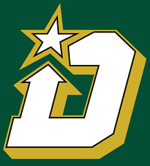
During the Stars’ home opener, there were several kids in attendance wearing what appeared to be youth league hockey jerseys with a “D-Star” logo. They were shown several times on TV and also ended up in several wire photos.
“I designed that logo,” says reader Matthew Duke. “Seeing it on those jerseys comes as a complete surprise.”
He continues:
This was one of the first logos that I designed, more than three years ago. You can see it listed on this Icethetics page, which is dated Oct. 25, 2009. There have been a few variations and it has been cleaned up since then, but the basic design remains unchanged. This is just one of hundreds of things I have designed and have had published on multiple design sites over the years (including on Uni Watch). It makes me wonder what else of mine might have been taken and used.
Now, there have been far worse cases of logo theft and copyright infringement out there, and I don’t think a youth team can be making any money off of my work, but it’s still unnerving to see my hard work where it doesn’t belong without my knowledge and consent.
Designers and artists out there should be careful about what they post online, and where. You do not want to go unrecognized and/or uncompensated for all of your efforts.
Interesting. What do the rest of you designers think of this? Can anything be done? Should everyone be watermarking their logos and concepts, or would that not even make a difference?
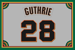
Collector’s Corner
By Brinke Guthrie
Congratulations to the Super Bowl Champion Ravens! Now that the NFL has wrapped up, it’s almost time for spring training, so let’s start off with this eBay auction of Reggie Jackson snacks! What, no straw?
Here’s the rest of this week’s haul:
• Here’s an absolutely huge lot of NFL and MLB gumball helmets from the 1970s through the 1990s.
• I don’t remember these 1970s MLB helmet banks, or I woulda had a Reds one, for sure. [I totally remember these! I didn’t have one, but they were advertised in Mets programs and yearbooks. ”” PL]
• Come to think of it, I don’t recall this 1970s MLB card album either. They say the memory is the first to go.
• One more from 1970s MLB item: a nice-looking pin set.
• Volpe alert! This one for a 1968 tumbler featuring Deacon Jones of the L.A. Rams’ Fearsome Foursome. What, you’re too young to know about them? Here, educate yourself.
• Here’s a cool 1970s NY Islanders snow globe! (Speaking of the NHL: Sorry, no new 1970s NHL posters this week. If you find an auction, send it over. They seem to be quite popular here at Uni Watch!)
• Paul, you’ll like this one: a 1950s NHL scrapbook created by some 10-year-old boy. [You know what I like, Brinke. I especially love the hand-drawn cover illo! ”” PL]
• Almost psychedelic-looking graphics on this 1969 New Orleans Saints poster. [Wow! Never seen an NFL poster that looked anything like that before. ”” PL]
• And finally, here’s a 1960s NFL record album of “In The Huddle,” featuring “sound tracks from actual games!” (And if you don’t own a record player anymore, eBay has you covered there too!)
Seen something on eBay or Etsy that you think would make good Collector’s Corner fodder? Send your submissions here.

Culinary Corner: I like English muffins. Who doesn’t, right? But I don’t eat them all that often — maybe once a week — so I keep them in the freezer (they toast up just as well when frozen as they do when fresh). It’s impossible to split the top from the bottom when they’re frozen, so I split them before freezing them. But the two halves often stick to each other in the freezer and end up being hard to separate. Sometimes they stick so much that one of the frozen halves even breaks apart when I’m trying to separate it from its mate. Grrrrrr.
So about a week ago, after buying a new pack of English muffins and preparing to freeze them, I got an idea: What if I tore off six little squares of parchment paper and slipped them between the muffin halves before popping everything in the freezer?
So the sequence went like this:
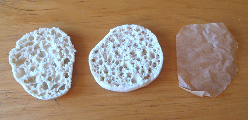
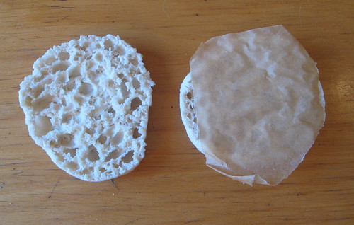
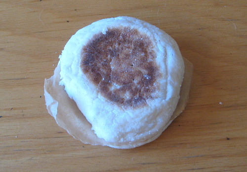
A week later, I’m happy to report that it works! The parchment-separated halves don’t stick at all. And I won’t even have to cut new parchment squares in the future, because I can just keep reusing the same squares over and over again. Success!
DC party reminder: Remember, Uni Watch party in Washington tomorrow, 7:30pm, at Hamilton’s. See you there.
OMFG: The latest installment of my “One-Man Focus Grouup” column is up now at The New Republic. It’s about the new Heineken bottle.
Uni Watch News Ticker: As you’ve probably heard many times, the producers of Pride of the Yankees had to use backwards-lettered jerseys for all the scenes involving Gary Cooper and then flip the film, because Cooper was right-handed and Lou Gehrig was left-handed. Or at least that’s been the party line for decades. But is it true? Hall of Fame curator Tom Shieber has done some positively heroic work to find the answer. I strongly recommend that you stop whatever you’re doing and check out his superb report. Highly, highly recommended. ”¦ “Saturday was a special day for football (not soccer) in Poland,” writes Kacper Kowalski. “It was the debut of the Polish national team, which played indoors against Sweden, and you can see both teams’ uniforms here.” Looks like Poland had CNOB. ”¦ New logo branding for Ohio State (from Eric Reyes). … “Jose Torres is an American soccer player who plays in the Mexican League,” says Christopher Peterson, which presumably explains this rather questionable nickNOB. … Gerry Dincher is intrigued by this old photo of Greensboro College cheerleaders. “Note the stars on the one woman’s uniform,” he says. “Are these early captaincy patches?” … No more penny for Canada (thanks, Kirsten). ”¦ “This is Carlos, one of my son Noah’s friends, wearing his Chivas/Mexico mash-up jersey,” says Cort McMurray. “I wasn’t able to frame the photo to include his purple (actually, they’re more of a vibrant lavender) soccer shoes. It’s quite the ensemble.” … New fifth-season logo for the Gwinnett Braves (from Chris Wright). … “This weekend I picked up this vintage tackling dummy,” says Ryan Dowgin. “I got it from a guy who contacted me through my Colgate football memorabilia web site. He said his dad played at Colgate in the ’30s and had saved this tackling dummy. I looked at the pictures he sent me and knew exactly where it was from, because I had colorized this photo. I was digging around for more info and came across the Goldsmith football catalog that you posted about in 2011, which included a similar tackling dummy. Figured you might want to see what one looked like in real life.” … Here’s a piece about the Phillies’ equipment staff gearing up for spring training (from Erik Autenrieth). … Interesting that the T-shirts the Ravens were wearing in the wake of their victory appear to have been swoosh-free (from Andrew Cosentino). … Joni Pitkanen of the Hurricanes has always worn his sock stripes too low. The other day, though, he did something new: He added white tape in the middle of his red stripe, creating an entirely new stripe pattern (screen shot by Nick LaRosa). … Love this Tulane warm-up jacket. … A guy in Ohio has built his own curling sheet in his backyard (thanks, Vince). … Illinois State wore 1972 throwbacks on Saturday — yabba-dabba do! Too bad about the baggy shorts, which look nothing like the originals (from Kevin Driscoll). … Michigan and Ohio State will meet on the basketball court tonight, and Adidas and Nike have taken the opportunity to make both teams look as ridiculous as possible (from Steve Sayre). … Two notes regarding the Pensacola Ice Flyers: (1) The team wore Mardi Gras-themed jerseys on Saturday, and (2) the have advertising on the goalposts. Sigh (from Ryan Bohannon). … New baseball uniforms for Houston (from Chris Rodriguez). … People, I will be frank with you: Until yesterday, I had never heard of Pete & Pete. But P&P are apparently quite popular among the Uni Watch readership, because a bunch of you wrote in to tell me that one of my “Meats” T-shirts appears in this Pete & Pete reunion video. Skip ahead to the 4:19 mark to see it. … New softball uniforms for Oregon (from Leo Thornton). ”¦ Ducks goalie Viktor Fasth had been wearing a mask with bars that were orange on one side and white on the other, but now he’s switched to solid white. “I wonder if there’s a rule for NHL goaltenders concerning the color of their facemasks,” says Jose Niebla. Anyone know?
A lot of kids teams (be it with a school or a minor league) like to poach logos from pro leagues or the internet. So no harm no foul here, in my opinion– I’d be flattered. But if it was a pro team or a commercial organization THEN we have a problem.
Hold on a minute. You design a logo and somehow, some way, a kids team ends up with it. And you’re flattered. I get it.
The backstory is this team went to a sporting goods store. And that sporting goods store found the logo, turned it into vector art, made the jerseys by screen or stitch, charged the customer for “art” and “design” and they made money. You didn’t.
Even if the team mom took a clipping of the artwork to the store, they STILL converted it to vector art (ripoff #1) and used it to make money (rip off #2).
The logo you made is a brand, if you think like that or not…it’s still a brand. If they use it, it becomes THEIR brand (ripoff #3). Without your permission.
Still no harm, no foul?
I’d rather see elementary and secondary students design the logos for their school’s sports teams to use, but what if a school district sought to own (not just use) those original creations:
link
I don’t care if its for kids, for charity, something non-commercial, or all of the above… you still have to ask permission. End of story.
I agree with Mitch. I had an article with a logo I created from scratch and I asked myself at one point, “What if someone steals it and uses it?”….in fact, someone might have, I really haven’t looked. Anyways…
I decided sharing it without protecting it would leave it open to that and just hope no for profit entity stole it and used it for it’s own purposes. I would have felt a bit of pride to see a youth organization use it just so I known someone else got to enjoy it as much as I did.
As it turns out, it is the Dallas Stars Elite Hockey Club which is affiliated with the actual Dallas Stars. Not only is this team using the logo, but all of the 8-10 different teams (age/gender separation) is using it as well. Dsehc.com
They have contact info for the “Apparel Coordinator” on the site. Maybe she knows how long they have been using and where they found the D logo.
If that is the case, I believe this theft is completely different from a single hockey team using the pilfered design. The PR hit on trying to get that team to remove their team logo would cost more than it was worth; however, if a league affiliated with the Dallas Stars is using this logo design, you could get resolution through corporate channels.
Although, the Dallas Starts could come back and say the design belongs to them, since it is a derivative of their branding.
Once things are posted on the Internet, the masses take over and “proper” usage becomes a mess. Top photographers have (paid) access to a tool that tracks usage their images everywhere. Watermarks are a possibility. Though, if you’re savvy enough to nick a logo design from the web, you may be savvy enough to remove it, or easily replicate the design.
Bottom line: you post it, you risk somebody nicking it.
That said, the Stars organization (mentioned here that this kids team is a subsidiary) should step up and take responsibility to compensate or properly request/acknowledge usage from Matt Duke.
Similarly, the uniform outfitter that did the “nicking” should be ashamed of themselves. Come clean, acknowledge the usage and reimburse Matt in advance of him ratcheting it up with the Stars organization (or risk losing the business relationship when they find out).
This kind of stuff chaps my rear, because it’s the result of: a) lazy business practices, or, b) unethical business practices (someone trying to get something that doesn’t belong to them for free).
PS, as Glen mentioned, the Stars may counter that Matt’s mark violates their (assumed) trademark for the original Stars logo.
Good luck, Matt. Stand up for what you created (at least to the point of being officially acknowledged for your work).
… “Saturday was a special day for football (not soccer) in Poland,” writes Kacper Kowalski. “It was the debut of the Polish national team, which played indoors against Sweden, and you can see both teams’ uniforms here.” Looks like Poland had CNOB. …
Poles look great. Love how they featured the white eagle motif.
Isn’t it a falcon?
Nope. White Eagle. Big deal in Poland’s iconology.
Agreed, nice Motif without replicating the Ducks or Eagles. Couldn’t make out the makers mark, any ideas?
It’s “Lerda”, a small Polish company that makes uniforms for several other Polish teams.
My mistake. “Lenda”
Watermarking it won’t help. To create apparel with it, someone is putting it into a graphics program for a screen printer to print (or embroiderer to sew) and would just trace it regardless. It sucks and it’s not right, but it’s also probably not worth the legal battle with a youth team. You’d also have to show proof it was stolen, that you designed it first and have a legal right to it even if someone else came up with the same design later without seeing your version. Also, if it was a big company, good luck going up against their lawyers.
While the youth team probably isn’t making money from the logo design, you don’t know if they lifted it themselves, or if they actually paid someone for a design and that person stole it! That person could be stealing designs left and right. Because of that, it’s worth the investigation.
Best point I’ve seen made on the subject all morning.
I don’t know how you’d go about monetary compensation through the letter of the law, but i’d at least be asking for a Jersey from the team.
Unfortunately, I bet this happens all the time!
ALL the time!
I’m sorry, but he took the North Stars N-star logo and turned it into a D-star. It’s not exactly an original concept in & of itself. Tell 50 designers to create a North Stars style logo using a letter D, and 45 of them are going to give you something really close to Mr Duke’s “stolen” logo.
It looks suspiciously similar to a Stars concept logo I made circa 2003, which was then posted to the Chris Creamer boards – but as you say The, it’s not exactly an original idea (I think I’d seen a similar logo which inspired me to make my own).
Still, original idea or no, it’s never nice to have something you’ve worked on ripped off with no credit.
The Jeff,
This was going to be my comment. It is clearly the same logo as the North Stars but with a D instead of an N. I would venture to say he would have a hard time proving they stole his logo, as you are right, many people could easily come up with this same design when thinking about the old Stars.
Agreed 150% – not an original concept at all.
I would also point out that the Dallas Stars (most likely) own all intellectual property associated with the old Minnesota North Stars, and thus would own the rights to create derivative works based on that IP, as well as protect such works as trademarks.
If this Dallas Stars Elite Hockey Club is affiliated with the actual Dallas Stars, as Matthew Duke points out above, then their rights to that logo probably stem from the Dallas Stars directly, and Duke could actually be at risk for a copyright/trademark claim if he were to use the logo he designed (not that they should…)
My exact reaction: How can anybody totally rip off the Minnesota North Stars’ logo and then cry foul when somebody else uses it? Am I missing something here? Where’s the originality? I can imagine being a little disappointed, but to whine so publicly?
As a former full-time creative, there’s really nothing you can do if someone wants to appropriate your picture once it’s on the web. For something like a logo, a watermark isn’t going to make a difference, either – they can simply redraw it without the watermark.
Also, the person who steals a graphic/photo/logo would never have been a paying customer in the first place.
So the question comes down to…is your presence on the web a net benefit to you? I’d think in most cases, the answer is yes. So, live with it – and definitely ask for a jersey or something from the youth team.
ed
PS. I’m speaking more of the realities of having your work on the web, and trying to ensure that it best represents you and your work. Definitely pursue any cases of infringement.
I see visual artists blur, unsubtley watermark their images, use low-resolution, or otherwise make their images less than good looking so someone can’t “steal” it. This seems ultimately self-defeating to me – you’re not showing your real clients the best you can do.
As a designer myself, I’d be happy to give permission to a youth league team looking to use a logo I’ve created–but I’d also be just as happy to publicly shame them for not simply asking permission. I think many (if not most) designers would also be game if asked, or even do a pro-bono logo for a youth team if asked. Most of us are just happy to do something fun like that for a change (we’re can’t all be Fraser Davidson).
Watermarking won’t make a difference, as it only takes a competent production artist at a printing house a few minutes to trace a logo from a printout or screenshot.
All that aside, I’m not sure how much recourse Matthew would have on something that’s so derivative of a pro logo anyway. On an entirely original logo maybe you’d have an argument, not sure about his “Dorthstars” logo.
Can’t leave well enough alone re yesterday’s list of literature-referent football franchises…
Boston Blackies
Connecticut Yankees
Seattle Insomniacs
Salem Gables
Chicago Augies
Lenox Fromes
San Francisco Spades (well…)
Caporetto Retreats
Albany Ironwoods
Brighton Rocks
Mansfield Parks
voices in my head… stop them.. voices…can’t help it… voices…
I’m impressed. I’ve tried to think of some myself, but I must not be reading enough books.
I do love me some English Muffins. My wife’s grandmother had English Muffin bread a few weeks back. All the flavor of an English muffin, but in a lice of bread. I haven’t been able to find it any stores. She got it in this English muffin/ fruit of the month club thing.
Sure it wasn’t a crumpet? I’ve had something similar to what you’ve described and thought it to be an English Muffin bread. Turns out it was a delicious crumpet!
Thats pretty much what an ‘English Muffin’ is – a crumpet adapted for American tastes.
Bill Wyman, while writing about the Stones’ first visit to the US in 1964, tells about getting served english muffins for their first American breakfast, and not recognizing the term!
Thomas really does have that market pretty much sewn up – perhaps because the process to make them with those Nooks and Crannies(tm)is a pretty tightly held secret on the order of the Coke(tm) formula.
I picked up a recent issue of cook’s illustrated and there’s a recipe for English muffin bread. You might want to check out America’s test kitchen and hunt it down. I’ve thought of making it recently
Safeway used to sell in english muffin bread in D.C. area stores. They probably still do, I just hadn’t looked for it.
If you ever find yourself in a small-town family-owned bakery in Minnesota, Wisconsin, or Michigan, see if they have Cholmondley’s (pronounced Chumleys) English Muffin Loaf.
It is, as the kids say, the bomb. We always bring a dozen loaves back from our summer vacation.
In the last link for Fasth, the Sharks Logan Couture is wearing Warrior shorts. When did Warrior become an official supplier of the on ice equipment. I understand with the sticks and gloves, but the shorts? I thought that it was Reebok.
Players with their own individual equipment contracts trump the league-wide Reebok contract. Reebok can’t legally have a monopoly on equipment, but they can say if you don’t have an equipment deal, you have to wear our stuff.
Whoa! Never saw these before. Epic cartoon representations of team nicknames. Some are hysterical.
link
Those are from Austin Madison, an animator for Pixar. He’s been doing them all season… really neat work!
Bears v. Cardinals?? Someone ‘splain that one to me.
Cardinals in the religious sense. Same as the one vs the 49ers with the subtle Monty Python reference.
Didn’t hone in on the albs, etc. before. Look like gauchos to me.
Featured today on Deadspin. A modern-day Ricko.
link
A Drizzt Do’Urden reference for the Panthers? Both awesome and frightening.
Easily my favorite: the Bills (Messrs. Cosby, Clinton, Gates, and Murray) in jaguar-print attire.
link at the Colgate memorabilia site.
Thanks, constantly updating the site. Recently picked up a program from 1906, so I now have programs from 100 of the 122 years.
Ryan, I love that tackling dummy. What a magnificent piece of history and art. Works as a sculpture.
Hang it on the wall!
Hadn’t thought about hanging it on the wall, I may just do that. It is currently closed in my closet so my dog does not attack it thinking it is an intruder.
Definitely a thumbs up for getting to see the tackling dummy. Very cool indeed.
The Gwinnet Braves have a fifth-season logo?? Okay, I’m sorry, but that crap is just getting completely out of hand. If you’re going to start doing THAT, then you might as well just have “Xth Anniversary/Season” patches for every damned year.
Personally, I think that any similar patch that doesn’t cover a significant year (10th, 25th, 50th, 75th) ought to be moth-balled forever.
Agree completely. Somebody probably got paid to make that. And that’s not meant to ridicule the designer, it’s just ridiculous that it was ever conceptualized in the first place. I’ve been at my current job for five years this May. Should I try to get one of you creative types out there to start working on a patch I can wear on my polo shirts? Jeez.
Based on their attendance, a 5th Year patch is an accomplishment. But the text “Thank you Gwinnett County Taxpayers” is somehow missing from the design.
Regarding the bars on a goalie’s mask, no rules whatsoever. There have been lots of single colors worn: gold, orange, silver, yellow, etc. Fasth may have worn two colors, but maybe he found it distracting? This is his first season wearing the new mask, after all.
They should have asked, youth team or not. I’m sure most designers would have been flattered and given permission. But you don’t just take someone’s work. What lesson does that teach the kids? Just cause it’s on the internet it’s fair game?
Paul, you must really like the One Man Focus Group. U’r in it twice!
(don’t worry … slapping self in the back of the head)
Hey Paul,
Long time. Glad to hear your arm is better and hope your 2013 is off to a bangin start.
I was disappointed to see this morning’s Uni Watch post about the guy getting his Stars/Northstars logo lifted, and that you asked for feedback on his behalf. Not disappointed in him, the youth team, or you. I’m not giving you a hard time at all. But in myself because I thought I’d done a teeny bit to help “The Cause” with my detailing of how those mother*(%#@^%&*?! ers at New Era stole a concept of mine and proceeded to let me hang myself trying to pursue legal action. I thought I’d painted such a gruesome portrait (and simple solution) that at least somebody would have committed it to memory.
As I’ve told you previously, it’s really hard cause on the one hand I’d love to be a tireless advocate to my fellow designers and work hard to dispell the myths surrounding copyright to the degree I understand it. On the other hand I really want to just take my bitterness and lumps and sock them away into the “life experience” drawer and move on.
The fifty cent recap is this: If you create a logo, that is not work for hire (client driven) but is worth using or showing publicly; that in any way you’d be pissed to find being used without your approval? Then register it with the US Copyright Office before showing it to anyone. Period. Everything else about watermarking or proving authorship via digital means or post mark is all bogus window dressing.
If you do this? The government will have your back….in a big way. In fact there’s a lot of dialogue (especially on Slate) lately that compellingly argues that copyright protections are in fact over zealous and draconian in nature and it’s hurting our culture and economy. But that’s a larger debate not applicable here.
The point is, without registering the work do you still own it? Yes. Can you still sue for infringement? After you register it after the fact, Yes. Will you win or find satisfaction? Probably not. err. NO. That’s just reality. It’s the statutory protections that intimidate and leverage quick resolution to any dispute. Otherwise it’s he said/she said and you have to go out of pocket to argue your case like you would in small claims court or divorce court or anything else. I was $4K in the red in the blink of an eye and tapped out (if memory serves) when we hit $6K and faced with the proposition of $30K more just to begin the discovery phase just to bring action at the lawsuit level. Daunting for any individual who isn’t independently wealthy no? $30K isn’t unheard of if you’re fighting for you kids or your home, but for a logo? And btw, none of that guaranteed I would have been made whole on my legal expenses or rewarded damages. I hated having my work stolen. It’s hard to qualify the rage you feel when that happens. But it’s easy to QUANTIFY it when you bleed your savings dry. Hit the heavy bag for a while. Down a beer. Do some yoga. Be flattered. Put it behind you however you can. And then take responsibility so that next time it doesn’t happen. $35 is all it takes to register the work.
The government (however clumsy or inefficient it can be) does demand that you actually get in the game if you want to enforce your rights. It’s like bitching about who’s President if you didn’t vote. I’m incredibly sympathetic (even if I don’t sound like it) but we can’t just stumble through life all artsy, putting stuff on the ………INTERNET! of all places……and then expect the logo equivalent of Judge Dredd to swoop in and dispense justice on the spot when something goes sideways. It. does.not.work.that.way.
All the best as always
Dave Mann
Sometimes I’d wonder if my work was good enough to steal. I’d probably feel validation if someone swiped it. But one thing is for sure: If I left it lying around on the internet, shame on me if I thought nobody would take it.
Two things I noticed about link:
One, the left side extends out from the large O about 20% further than the right side (which does bring the bottom corner of the left O level with the bottom corner of the E).
Two, the wordmark is not traditionally vertically arched. The letters are vertically aligned on a series of radial arcs originating from (as far as I can tell) the same point; the radius of the bottom arc is smaller than the radius of the top arc.
This is, far and away, the most consideration I’ve ever given anything relating to the Buckeyes, but the odd geometry was just something I couldn’t ignore.
So Matthew worked for the NHL in the mid-60s? Because that’s when the “hard work” was done on that logo.
It’s a Minnesota North Stars logo but a “D” instead of an “N.”. The only ones who should want compensation are the Stars owners and the NHL.
If the NHL/Stars ownership went after either Duke or the youth hockey club using ‘his’ logo, I wonder how long it would take for would such action be labeled douchebaggery.
If Duke pursued this issue in the courts rather than just offering up a cautionary tale, would he be heralded as a hero for ‘starving artists’ everywhere or would he be viewed as being no different than the IOC?
Regarding design work…
Did you do the original on spec, for free?
Why?
This gets back to my arguement that if you place no value on the things you do (you did it for free, right?) then no one else will either.
It’s why my skin crawls everytime someone posts on here how they need a design for free, or for a few trinkets. Someone on here always will, because they think they can do it as well as the pros do. Except now they’ve cost the pro a job. AND they did it for almost nothing.
“Free” music has made everyone a DJ. Ubiquitous phones have made everyone a photographer. The internet has made everone a columnist.
Slipppppppery slope.
I think free design work from amateurs is just going to be a given when it comes to team redesigns, etc. There’s just too many people who are fans of it willing to give it away for free. If the team wants to do the additional leg work with an amateur thats up to them. I don’t think this is taking any work away from a professional graphic designer, especially if the team is not willing to pay for it anyway.
If the team is willing to pay for it and doesn’t want to deal with the issues an amateur designer will present, then by all means they spend the money to hire a design firm.
Brinke’s great find of 1970s snack goods offers a chance to share a joke I remember going around the playground back in the day: Guy sees a Reggie Bar and asks the cashier, “How do I know whether this is any good?” The cashier replies, “Don’t worry, when you unwrap it it will tell you how great it is.”
I think I remember learning later that it was actually Rollie Fingers or Catfish Hunter who was actually the source of that line.
That joke, or a variation on it, appears in Sparky Lyle’s book The Bronx Zoo. Apparently this line was running thru the Yankees clubhouse: “When you open a Reggie bar, it tells you how good it is.”
On a side note, the bar shown in the auction is the 1990s version. The original one had a wrapper folded around the candy, while this one is sealed on the ends; also, the originals didn’t come with Upper Deck cards, since Upper Deck didn’t open for business until 1988.
Wait, what? Was the Reggie Bar in continuous production into the 1990s, or did it make a comeback? And in either case, Why?
The Reggie Bar comeback was thanks to the Ken Griffey Jr. bar. Every newspaper story about the Ken Griffey Jr. bar included the obligatory “Reggie Jackson used to have a candy bar” line.
But, the official reason was to commemorate Reggie’s induction into the HOF, and a portion of the profits would be used to construct baseball fields for inner-city youth…
I am pretty sure there is not any rule about the color of a goalie’s mask because Fasth is not the first goalie to do this. Kevin Weekes had a multi-color cage when he was with the Rangers and with the Hurricanes a few years ago. I imagine that Fasth switched to a white cage because the colors were distracting. In fact, many goalies with colored masks have the inside of the cage painted white so it is easier to see out of (actually, Weekes did that with his mask — I guess he had a 3-colored mask then).
Here is a picture of Weekes’ mask with the Rangers.
link
And the Hurricanes:
link
In that eBay auction of Reggie Jackson snacks, I was hoping to buy some Reg-Otch. (As seen on “The Life and Times of Tim”.)
MLS teams wear a star on their crest for every MLS Cup they’ve won. Since a while back, the stars were not added until two seasons later, as the immediate cup defense retained the same number of stars plus a scudetto. For example, last season the Galaxy wore [url=http://gay4soccer.toughtechnology.com/wp-content/uploads/2012/01/galaxy-jersey-2012-close-up.jpg]two stars and a scudetto.[/url]
This season they might be [url=https://twitter.com/LAGalaxy/status/298487600723947520/photo/1]skipping that[/url], subject to adidas’ aprroval.
Apropos of nothing, but since I’m in a Warshington state of mind…
It seems the writer of this WaPo piece thinks its a bad idea for the Nats to have a big fat fuck (WHT) as a role model who is now running in the Presidents’ race.
Or, as he so eloquently puts it, “The lovable fat guy is a dangerous anachronism, one that should be discarded in our cultural dustbin, along with the sexy smoker and the affable drunk.”
Personally, I’m upset that my favorite President has been replaced, so perhaps I’m unfairly taking it out on his successor.
I’m sure Arr will want to discuss this tomorrow at Hamilton’s…perhaps Conn as well.
No one is being replaced. They’re running with five. Like when Milwaukee added Chorizo.
The WaPo also published this piece endorsing Taft as a strike against cultural anti-fat bias:
link
And fear not: Nobody has been replaced. Taft is an addition. Think of him as the Chorizo of the Prexy Race.
“Nobody has been replaced.”
~~~
My bad. I thought I’d heard WHT would be succeeding TR. This is a positive development. So long as he does not try to pack the bullpen, reduce the hotdog tariff, or cause Nats Ballpark to lose its LEED Silver Certification, we’re good. I’m also hopeful he won’t get stuck in the whirlpool.
Speaking as a guy who spent every single week of little league football, for TWO STINKING YEARS, stripping down to my girdle and cup and standing on a scale in the league offices, while a gaggle of coaches and officials stood around debating whether they should grant a weight waiver to this pink and fleshy child (my Coach always made the winning argument: “Guys, it’s not like he’s gonna actually play!”), I say, “Hail, President Taft!”
Us fat guys gotta stick together.
“…stripping down to my girdle and cup and standing on a scale in the league offices, while a gaggle of coaches and officials stood around debating whether they should grant a weight waiver…”
~~~
You sure they were debating giving you a “weight waiver”?
He’s succeeding him as the “one that loses all the time,” but TR will still be there.
Who knows, Phil? It was the Seventies. It was a crazy time.
I had that wild Saints poster when I was a kid. Part of the amazing NFL Collectors Series where the unexpected was the norm…
link
Wearing a purple Ravens jersey to the DC party would probably get me kicked out, huh?
Meh. I wore a Randy Moss vikes jersey to one of the Brooklyn Gatherings. Wait, shouldn’t you be a fan of that NFC East team that calls Washington home?
I grew up in Annapolis. It’s equidistant from both cities and falls on that diagonal line that separates the fan bases. Technically, Annapolis is put in the Baltimore media market. I have lots of friends who cheer for both teams. And some who pull for both. The Washington Football Club is my “NFC team,” but I enjoy watching Dan Snyder lose. I don’t own any Redskins stuff. I might have my old Redskins Huddle in a box in my mom’s attic.
Interesting assessment of the fan bases in the area now: link
Yes, I live in Virginia now. But I’m a Ravens fan.
Oops. I might have put the wrong URL. But that one links to the story: link
MLS teams wear a star on their crest for every MLS Cup they’ve won. Since a while back, the stars were not added until two seasons later, as the immediate cup defense retained the same number of stars plus a scudetto. For example, last season the Galaxy wore [url=http://gay4soccer.toughtechnology.com/wp-content/uploads/2012/01/galaxy-jersey-2012-close-up.jpg]two stars and a scudetto.[/url]
This season they might be [url=https://twitter.com/LAGalaxy/status/298487600723947520/photo/1]skipping that[/url], subject to adidas’ approval.
I am now starving for english muffins.
Nice to see Jumbo’s (Al Hirt’s) image on the Saints’ player’s chest. Big Al played at halftime (Remember the goofy viking- horned helmet he wore?)of the Chiefs-Vikings Super Bowl at Tulane Stadium in 1970. One of the greatest trumpet players ever. RIP Jumbo, we miss you.
Al Hirt was a big loss to New Orleans when he passed on. I was a bit too young and missed out on his club in the French Quarter, but in his later years he would come to different events around town and was a great, regular guy. And that gravelly voice. Man! If you get a chance, try to watch the 1968 Charlton Heston movie “Number One”. Film captures an “over the hill” Saints QB facing retirement …. Lots of early Saints footage, locker room and practice scenes, lot’s of Tulane Stadium, etc. Good scenes with Al Hirt and his Bourbon Street club ….
A similar case happened recently to webcomics artist Jeph Jacques (“Questionable Content”). He designed a T-shirt based on the hip/hop Twitterism “YOLO”, an acronym for You Only Live Once (in other words, doing something stupid and probably life-threatening). He took four owls, each saying “YOLO”, standing on top of large letters saying YOLO, with the caption underneath, “You Obviously Love Owls.” A couple of weeks ago, an online boutique started selling small cases with a slightly adapted design of four owls, each saying YOLO atop a large YOLO with the saqme caption. After howls from Jacques’ fans and Jacques himself, the company dropped the item.
So with some complaining and pressure, changes can be made.
I love QC. I bought my daughter one of those YOLO shirts from Jeph.
Pretty cheesy for someone to take that and use it as their own.
I posted my copyright email to Paul only as a grander FYI to designers. Register your work before displaying it, or put a bow on it cause you’re giving it away.
But a specific reply to Matthew would be: Only the original author of any work, is allowed to make derivative works by law. In other words, the mythical “But I changed it X%” or “It’s my take on…” arguments don’t hold (legal) water. The Dallas Stars very likely still hold the licenses for the North Stars logos. I can’t say that with certainty but it wouldn’t surprise me. Whomever owns the Northstars logo are the only ones allowed to derive other works from that source material.
None of which is to say what you did is illegal or not cool as an exercise. It’s great. But it is what it is. Sorry.
I never said I was thinking about taking any kind of legal action. Just venting a little frustration. I know this is not an original idea. It was clearly based on the N* logo, as everyone can see. I am sure there are dozens of interpretations of a D* design, but for someone to use mine without even bothering to change anything besides color just irks me. This team is actually affiliated with the Dallas Stars too…
Matthew: Gotcha. You seem zen enough about this. Just trying to share and assist. I mean, I didn’t/couldn’t tell how serious you were. The title of this blog entry is “Logo Theft” and that could be interpreted as a little strong given the Stars affiliation and likely fact that they indeed are rightful owners.
I’ll concede, lifting work from the internet is less than honorable no matter who does it. As I told Paul, it’s “weak sauce”. It was probably a staff designer less familiar with the law and brand standards and so forth.
Try and stay positive. Keep up the good work and for heaven’s sake register every great (original) concept you have.
-Best
Dave Mann
Actually, there are a few changes to the logo if they did indeed lift it…
You see, that’s the whole thing… because it is such an obvious idea, how do you know they used yours rather than simply coming up with the same idea on their own?
As an example, here on Uni Watch back in 2011, Tim E. O’Brien and myself both did uniform concepts for the Miami Marlins (this was before they revealed their current look, of course) – both of us making a Miami wordmark based on the team’s existing logotype. Working completely independent of each other, and at the same time, give or take a week, I made this: link and he did this: link – Basically, we both came up with nearly the same thing, because we were basing our ideas on the same source.
There’s only so many ways to draw a D and have it look like a North Stars N.
Forgive me, but if you admit that the design is not original and you are “sure there are dozens of interpretations of a D* design”, then how can you say/know for sure that the one used by that youth hockey club is in fact ‘yours’?
Gee…I wonder what Phil does with all those “uni tweak” (sorry…”concept”)submissions? ;)
i thought the Jaguars were revealing a new logo yesterday? i cant find a report online. also when are the new uniforms going to be unveiled?
The logo unveiling is scheduled for today at 4 PM.
ok. thanks
in other UNI news.. you can view the front page ads of this very website and the ad by FansEdge is promoting SF 49ers SUPER BOWL CHAMPS GEAR
Heh, I remember Pete & Pete. Something surreal about that show. Definitely better than anything Nickelodeon puts on now.
So I go on Chris Creamer’s site to see if the new tOSU marks were up, and I found link. I’ve never seen this before, and the fact that the logo looks like a certain shield from the other end of the State of CA, I wonder what the idea was behind it.
They’ve never used that. Ever. CC totally wrong there.
link
Looks like it was at least a legitimate prototype.
Actually you are wrong, they might not have used it but it is an official logo used from 2007-2009(when the uniforms were changed)
Reminded me a little of this one. Gotta think that’s never seen the light of day (officially). I believe one of the posters in the CC forum said that was a Madden logo.
Sooner or later someone should just stick a “4” and a “9” in the oval the way they have the “SF” there. It’s not hard.
Reminds me of the old and unloved-by-everyone-but-me 2005-07 Fresno Grizzlies look:
link
I loves me that FG … now…it’s not negative space, and it’s not interlocking…what’s that “style” known as? Because it’s subtle genius.
Never saw that one, but the shield from the 1960’s-early 1970’s is legit. I’ve seen it painted on the field in archival NFL Films footage. Always thought that logo was underrated.
Re: Ravens on field Champs shirts not having the mark of the beast, is it possible that Nike didn’t want the losing team’s shirts to have them so the 1st run was logo less?
Seems like something they might have taken into account.
Also, Creamer just added link
Not bad, definitely the “less-is-more” approach which I can’t fault after some of the clunkers they’ve produced.
Wait, the NL is blue, and the AL is red, when everyone knows that the 2013 World Series will be Nats vs Tigers?
They’re just copying the NFL… A = red, N = blue, duh.
…and I think I’ve figured out why they haven’t dropped the whole “separate leagues” thing yet – because American Baseball Conference and National Baseball Conference end up becoming ABC & NBC, and the TV networks want too much money to give up the names.
And now… the post has been deleted. So this might well have been a fake.
Final Super Bowl Trivia:
The Ravens are now the only team whose left and right helmet decals are mirror images of each other to win two Super Bowl games against teams whose decals are the same. Three other teams (Redskins, Broncos, Buccaneers) have each done it once. The Broncos are the only team to have been on both the winning and losing end (once each) of such matchups.
But, they are not *perfect* mirror images of each other, as the “B” is reversed so that it is legible on the bird’s head no matter which way the helmet is facing…
Well, I didn’t feel the need to point that out again, but appreciate the clarification for the uninitiated. The Ravens, Chiefs and Dolphins count as mirror-image teams because their decals are mirror images but for the alphabet; or, alternatively, the left and right decals are different. The Bengals also count as a mirror-image team because even though they technically don’t have left and right decals, the decals go over the top and create mirror-images on each side.
I should also note that games involving the Steelers don’t count either way, because (obviously) they only have a decal on one side. Hence an equally valid argument could be made either way, viz., that they’re a same-decal team, since there is only one decal, or a mirror-image team, since the left and right sides of the helmet are not the same. (I suppose a similar argument could be made for the Bengals with respect to having only one decal for each stripe, but since the left and right sides of the helmet are precise mirror-images of each other, as opposed to being asymetrically different as the Steelers’ helmets are, they can be counted as a mirror-image team.) Interestingly, the Steelers are 4-0 against teams with mirror-image decals (Vikings, Rams, Seahawks, Cardinals), and 2-2 against teams with identical decals (three of those four games being against the Cowboys, the other against the Packers).
So that means, if the Steelers are a same-decal team, then same-decal teams are 19-5 against mirror-image teams.
If the Steelers are a mirror-image/different-decal team, then same-decal teams are 17-7 against mirror-image/different-decal teams.
Since the Browns have never played in a Super Bowl, there’s no need to account for which category they would fall into. However, one could argue that the Browns are a same-decal team since there is no decal on either side (hence both sides are decorated the same way), or that they are a mirror-image team since, like the Bengals, the left side of the whole helmet is a mirror image of the right.
Ravens logo isn’t mirror image. There’s no way around it.
This topic has a Pete Axthelm-ish whiff to it.
The Broncos wore the old D logo on their helmets when they lost their Super Bowls. That was obviously not mirrored. They have won both appearances with the (mirrored) Evil Horse logo on their lids.
Right; the D logo lost to the mirror-image Redskins, whilst the Evil Horse beat the same-logo Packers.
The Patriots are the only other team to use both identical and mirror-image logos in Super Bowls. The identical Pat Patriot lost his only appearance (to the identical wishbone-C of Da Bears), whilst the mirror-image Flying Elvis lost to the identical Giants (twice) and Packers, and defeated the mirror-image Rams, Eagles and Panthers.
Along the same lines as the Gary Cooper story – when Anthony Michael Hall played Whitey Ford in *61 they used the same technique. Hall’s backwards jersey is in Cooperstown and the display card also refers to Gary Cooper.
link
Without the text, those english muffin photos look like step-by-step instructions for a very sad breakfast sandwich.
….and in the end, Gary Cooper still threw like a girl.
How’s this for hilarious: A 5 star linebacker just committed to Alabama…but he has an Auburn logo tattooed on his arm.
link
as for protecting your work online, there is one sure fire way to make certain it is never stolen…don’t put it online!!!
oh, wait, that doesn’t work either…
i designed this prior to the internet age, and stumbled across someone selling shirts with my design a couple of years back…
link
best advice: hire an attorney, or deal with it like the rest of us…assholes are assholes, don’t be surprised that they steal off the internet, too…
by the way, for any of you who missed the chance to get some of those pennies from above the 49th, i have uncirculated rolls of magnetic and non-magnetic 2012 pennies…not selling them for a while though…come see me in about 10 years… ;)
I’ve had logos stolen in the past. Fortunately for me, they were being sold as t-shirts on a website and when I contacted the owner of the site, he immediately informed me that he hired someone to design the shirts, apologized and took down the offending items. Hopefully he never used that design stealer again.
As for watermarks, I don’t like using them. To me it just takes away from presentation and it makes me feel like I’m legislating to the lowest common denominator – which I hate. My way of fighting theft is always put my “OB” logo on things when I feel it’s appropriate, so if I see something of mine on another website, most lazy thieves will have left my logo on.
i probably should do that with the guy who is selling my design, although he has others that i’m fairly certain aren’t legal to sell without permission either, so i have never pursued it, just in case i do need a lawyer…which would seem pretty silly to me to shell out $100s for an atty to stop a guy who has probably not sold that much in t-shirts…a quick cease-and-desist note should do the trick though…
if i knew he was making $1000s off of my design, it would be a completely different story…i’d be after part of that $ in a heartbeat…
Just threaten legal action, hopefully you wont need to hire anyone. Use the phrase cease and desist and show that you posted it well before him and therefore can prove ownership of the copyright.
How’d that work out with the Hoosier football bus?
They just sent me an email saying, we didn’t know it was yours, we just googled Indiana Football.
Not much I really can do, since the template (that wasn’t mine) is fair use and they’re not making money off of it, so I let it be.
I still have one of those helmet banks – an orange Astros helmet.
Worst. Culinary Corner. link.
I’m a huge english muffin fan. Though I never considered the paper gasket approach to speeding up the freezer to toaster process. I’ll bet waxed paper would work too. The splitting process, either with a fork, or some type of knife, has always been interesting. In a not so good, dangerous way, that is.
You should totally demand your money back.
They can’t all be beef marrow & Bailey Irish Cream. FTR Paul, I microwave mine for about 25 seconds before I pop them in the toaster to split them up; albeit I have to put the thicker one in for about minute sooner because the other one is always thinner.
I’m simply amazed that a Hall of Fame curator named Tom Shieber doesn’t know the simple layout of Wrigley Field. In the article, he says that on the map of Wrigley “North is right”. That is incorrect. Home plate is closer to the southwest corner of the city block and has been since it’s creation in 1914. Maybe it’s just a typo in his article, I could be wrong.
Wrong Wrigley field. You might wanna re-read that section of Tom’s text.
Thanks for replying, Paul. Home plate at Wrigley Field in Chicago is indeed on the southwest corner of the block, at Addison and Clark. But here we are dealing with Wrigley Field in Los Angeles, where home plate was at the southeast corner of the lot.
Wow, I had that baseball card album and still have it. My mother bought it for me early in the 1974 and it was my first year of collecting baseball cards. You can see how the logos in front are displaying the Mets and the A’s prominently because they were the reigning N.L. and A.L. champs.
Oh man. That jags logo is awful. Womp womp.
link
Jaguars new logo.
Somehow, I think it looks more feminine now. The two dashes about the eyes; the edges on the ears & chin. It looks a bit more cartoonish to me.
Maybe it’s more..uh….
I don’t know how to say it in a way as to not offend the progressive sensibilities of this site.
..uh, more.. uh… friendly to those of alternate persuasions.. uh…
Let’s just say Chris Culliver won’t be signing as a free agent with them anytime soon.
“Let’s just say Chris Culliver won’t be signing as a free agent with them anytime soon.”
(link)
I just relapsed in that laughter coma from Saturday XD
On the smaller version, the two lines above the eye come off as eye lashes; like it’s a lady jaguar.
Seeing the larger version, I get a Broadway “Cats” vibe from it. Or a really drunk & angry Hanna-Barbera character. Or a jaguar that really likes the Rolling Stones.
Soft kitty,
Warm kitty,
Little ball of fur.
Happy kitty,
Sleepy kitty,
Purr, purr, purr.
This Jags fan likes the new logo. Will take awhile to get used to, but I like the more lifelike Jag. The old logo’s “lazy eye” always bothered me a bit. But, that said, I really liked the old Jaguar.
They are really emphasizing the connection to the military, because Jax is a military town.
It also looks like they are really pushing the gold back into the color scheme. Much more prevalent in the new logo. Hopefully it will return the uniform.
And, what’s the most prominent color in the new logo?: Gold.
So appropriate for, you know, a jaguar. Maybe we can hope they bring some gold back into the uniform palette?
Personally, I like the new logo much better than the old one.
It’s already been mentioned the gold will be more predominate in the unis, and less teal.
How much so?
Guess we’ll find out in April.
The Jags new logo looks good. Hopefully the new jerseys don’t have a Shad Khan moustache like last year, which they called “piping”…
I really like the new Jags logo. The new fonts are meh, but I think they knocked the update outta the park.
Jags update: I like it. Further details tomorrow.
It’s a push to me. Nice to be realistic-looking, but it looks too amateurish to me, like it should be used in a mid-major college conference.
And like I posted a few months ago, Jacksonville still isn’t at least five years removed from their last redesign as far as uniforms are concerned. Do they get a free pass or something?
That long ear makes it look like a bobcat; it seems larger than a jaguar’s ear. Or maybe I’m just used to seeing the shorter, more angular ear in the old logo. Aside from the ear (and I might get used to it), it’s a good update.
Maybe it’s a generational thing, but as a child of the 1970s and 80s, all I can think of when I see that new Jags logo is Thundercats Ho! I like the idea of a more cartoony, hand-drawn logo, but the particular style here just seems very dated to me. It’s neither timeless nor current; more like if they’d hired Jim Aparo to draw a feline superhero circa 1986.
Plus, the teal tongue is even more prominent now. Makes it less of a sports logo, more of a veterinary disease diagram.
Though it’ll probably grow on me. I was a huge Aparo fanboy back on his run on the post-Crisis Batman.
“the teal tongue is even more prominent now. Makes it less of a sports logo, more of a veterinary disease diagram.”
~~~
YES! I knew there was something that was really annoying in an overall good looking logo.
Well, see, here I am already liking the logo a lot more. I “misread” the screen caps and thought the outer line would be more jagged. The new logo preserves the elegant, smoother outer line of the current logo even as it adds more angular detail inside the form. Which makes the Aparo comparison even apter than I intended.
Still, the roadkill tongue is a problem. Do they at least sell bumpy, tongue-shaped blue raspberry Popsicles at the stadium?
We can discuss this tomorrow night.
I just looked at the twitter account, and it has a smaller version thats a little hard to see. I instantly got the impression that it looked like a cooked chicken. But with a jungle cats face instead of a rear-end.
I didnt see this coming, a cartoony yet more fierce update to the already cartoony logo? I thought for sure nike would stylize it similarly to a Boise Bronco type logo. I’m looking forward to seeing this as a whole with uniforms and such.
I was curious about the Tulane warm up jersey. It is not Tulane University’s colors or nickname. Plus, the university would not have had an official women’s team in the 60’s. Is it some kind of connection between Tulane and LSU with the colors.
Saw this Tulane Tigers warmup on Ebay – totally perplexed.
Googled “Tulane Tigers” and came up bupkis – except for Tulane vs LSU headlines, etc.
There is no way this is connected to Tulane University – the era is wrong for women’s sports, the colors are wrong for the school, and “Tigers” would never be worn by a Tulane team.
My best guess is that it is likely a club team or corporate team NOT affiliated with the university. Perhaps an adult league team. Many New Orleanians like both LSU and Tulane, or are at least able to co-exist on the same team/group, particularly going back in the older generations (don’t get me started on the “bad winner” assholes today that want to fistfight in concession stand lines if you wear the “wrong” team shirts) and I could see a group of parents or adults wanting both identities for their club or industrial league team.
I had suspected that it maybe was a playground team, but to memory there has never been a “Tulane Playground” team in the New Orleans area.
A Presser background with two logos and neither are a corporate sponsor logo?
link
odd but cool, IMO.
My only two dislikes of the new logo:
1. Teal tongue. Looks more out of place now since everything else is less cartoonish. And “Feeding Panthers to our…” hogwash: The Panthers are light blue.
2. When viewed from afar, the two spots above the eye look like long eyelashes. Long.
Amazing that in everything I see today, the primary logo only has teal on the tongue, eyes, and nose, and there’s no extra teal on the two alternate logos and none on the wordmark logo. Much less teal-dependent now.
Also, I like the more saturated new gold, compared to the old, more washed-out Vegasy gold.
So far so good.
With 20+ years as a graphic artist, the first thing you should know is that you must copyright your work if you think there is a chance to make money from it. It’s really the only protection afforded most designers.
I never post my work online for that reason. The few times I’ve done free work (my kids sports organizations, etc)., I assumed my work would be stolen at some point. And it has happened, several times.
Watermarks are fine if you want to be able to identify your stolen work, but a watermark means nothing when it comes to logo/artwork theft.
I’m a fan o the teal tongue. Always have been. This logo seems a bit extra detailed. I’d hate to be the guy painting this on the field.
For some reason, the teal tongue has never bothered me, I think because I’ve known several chows (dogs), which have blue tongues:
link
Yes, I realize a dog is not the same as a jaguar, and blue is not the same as teal. But somehow the dog example overrides my “teal jaguar tongue does not compute” circuit.
“the teal tongue has never bothered me”
~~~
THIS Jags logo with the blue tongue and Mike & Ikes spots never bothered me.
It’s cute, campy, cartoony…
THIS new Jags logo, with the blue tongue, eye(s) and nose bugs me. It’s almost a *perfect* drawing of a, ya know, real jaguar — with dark eyes, blackish nose and a pink tongue — and they put teal eye(s), nose and tongue on it. That, to me, ruins the whole look.
I get that they’re the Jags and they’ve had a teal tongue all along. But the extra teal features on a much less cartoonish logo is stupid. Not good.
Stupid.
The old logo was totally different — it was an approximation of a jaguar…a gimmick…a quirky fun thing that looked like early 90’s clipart.
This new one is beautiful, and they just mucked it up, IMHO.
YMMV of course.
What comes to mind for me is the San Jose Sharks change from clunky shark to DC comic book shark.
In some ways the new logo is an improvement–it’s a better drawn representation– but in other ways it’s too dtailed for a helemt logo, a litle fussy. (Though this comes from someone who thinks Patriot Pat is one of the all-tuime great logos).
Mostly, I wish they had gone away from the just-a-head look entirely. Something not so literal would’ve been interesting: I dunno….jaguar spots…a full-body jaguar…something offbeat.
It’s probably the most prominent tongue in a logo next to this
link
From the get go – something has struck me as different, and quite agreeable with the lighting at the Barclay Centre(er if south of the border) Tonight I turn on the Lakers/Nets game – I’ve never seen the Lakers uni look so “purple” on TV, it normally has more blue hues (than reality) – I’m not sure the two are connected.
As for the Jags – nothing wrong with the new logo, but I had no issues with the old logo – so there’s some aspect of change for change sake. My impression – probably wrong – while gold may have increased influence, it might be at the expense of black as opposed to teal?
I can see the Jags getting the Mizzou helmet treatment.
you posted something on the internet voluntarily and you are shocked someone took it? um, where do you leave your wallet and why?
I wish the new Jaguars word marks were better.
Do they/have they ever used “JAGS” as a word mark?
those kids should have used this logo. it is much sweeter
link
lol, this Matthew guy acts like he creatively spent all this time coming up with the Dallas Stars concept. He ripped off what was already done and simply changed the “N” to a “D”. Not the most genius move ever accomplished by man, happens all the time on the internet, and here he is…demanding some sort of royalty?
LOL, you’re the one who should be ashamed for jacking designs my man.
Where did I say I was looking for any royalties? This was more of a PSA.
No comments about these atrocious Michigan uniforms? I feel like I’ve looked directly into the sun. Why is this non-legible name/number, monotone nonsense allowed?
Those could be some of the ugliest uniforms I have ever seen. Yellow top to bottom is not a good look at all. Worse than all purple. Also the names and numbers were very hard to read, which made it tough to tell one player from another. Especially when you are unfamiliar with the team.
That once-two-toned goalie cage. Hmm. I don’t think there’s anything illegal with that, per se. But that two-faced look is just so bizarre, I’d imagine that while it looks cool, it was too annoying from the goalie’s view. Never seen anything like that before. What I HAVE seen before, is a goalie cage with polished chrome on the outside, but painted solid white on the outside. This is different because the color split is left-right, not inside-outside. Just my non-authoritative two cents.
How can that guy get mad about his ripoff of the stars logo being ripped off? That doesn’t make any sense.