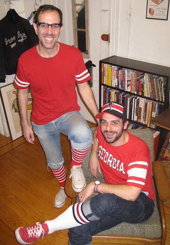
Photo by Jesse Buccafusco
Remember Jesse Buccafusco, who made that great stirrup card catalog for her husband, Marty? Jesse and Marty are from Georgia, so they’re big Falcons fans, and of course I’m a 49ers fan, so I invited them over to Uni Watch HQ for yesterday’s NFC championship game. As you can see in the photo above, Marty and I both dressed for the occasion.
Not the most uni-eventful pair of games, but there were a few items of note:
• 49ers running back Frank Gore has been wearing biker shorts for several years now. But he compounded the problem yesterday by going bare-legged. Let’s hope he doesn’t do that in the Stupor Bowl.
• Referee Bill Leavey, who was working the Pats/Ravens game, didn’t have a position designation on the back of his jersey.
• Tom Brady was wearing a cap with Pat Patriot, not Flying Elvis, prior to yesterday’s Pats/Ravens game (and I think I saw him wearing it during the game, too).
• CBS’s two sideline reporters for the Pats/Ravens game both had tape covering up some kind of logo creep on their jackets. Hmmmm.
Naturally, I’m pleased that my favorite team is going to the big dance. And they’re be playing a purple-clad team to boot! Rarely has the line between Good and Evil been so clearly delineated, my friends.
(My thanks to Ethan Hopkin, Rich Paloma, and Dave Rakowski for their screen shots.)
About freakin’ time: The long-delayed NHL season finally got under way on Saturday, and there were some uni-notable details worth breaking down here:
• The Kings raised their Stanley Cup championship banner prior to Saturday’s season opener and then, in a move that hadn’t been previously announced (at least not to my knowledge), they also wore a jersey patch that was essentially a miniature version of the banner. As you may recall, the Bruins did the same thing for their season opener last season, so maybe this is the new normal for Stanley Cup champions.
• In another move that received no advance notice, the Capitals have inverted their sock design! Or maybe they’re just using last year’s socks and wearing them upside-down. They apparently plan to do the same thing with their home hose, at least judging by this scrimmage photo from last week, but we should find out for sure at tomorrow’s home opener.
• The Flyers are now using white captaincy letters on the road. Last season they used orange. Not a new thing after all, never mind.
• Here’s the memorial decal that the Sharks are wearing for original team owner George Gund III.
• Surprising to see Derek Morris of the Coyotes wearing a jersey with the Reebok vector, instead of the wordmark.
(My thanks to Brent Bollmeier, Garrett Heller, and Luke Rosnick for their contributions to this section.)
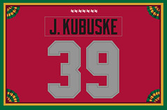
Membership update: Eight new card designs have been added to the membership card design gallery (including Jacob Kubuske’s card, based on this year’s Ohio State uniform for the Michigan game, shown at right). The printed and laminated versions of these cards should mail out in a day or two.
As always, you can order your own custom-designed membership card by signing up here.

Busy fella: There are times when life is basically steady as she goes, and then there are times when the air starts crackling and popping with new developments. I’m happy to report that I’m in one of those latter periods at the moment, as a bunch of new projects are in the works:
• Starting around the end of this month, I will begin writing a short weekly column, called “One-Man Focus Group,” for The New Republic’s web site (and maybe for the print edition as well, if the column is well-received). The concept is straightforward: I’ll be reviewing new products, services, and phenomena that wouldn’t normally receive reviews from a critic. This could include anything from Heineken’s new bottle design to MLB’s new initiative to use cell phones in the dugouts. This may sound familiar to those of you who read my “Inconspicuous Consumption” work in the 1990s, and yeah, it’s in that vein, although I hope to bring a different kind of voice to it. Should be fun, and I’m excited by the possibilities.
• I’ve never written for a car magazine before, but that will soon change, as I’ll be doing a Uni Watch-ish piece about auto racing liveries for Road & Track. If it goes well, it may become a regular gig. I’ve never been a car guy — I mean, I own a car, and I love road trips, but I’ve never been into car culture per se — so the idea of writing for a leading car magazine is kind of a hoot. (Yes, I know a true car enthusiast would never use a word like “hoot.”)
• Some of you have recently asked me about the Candela Structures project, and there are some new developments on that front as well, as Kirsten and I are writing a story about the structures that will run in the Sunday Metro section of the New York Times, probably in May or June. It should summarize everything we’ve learned about the structures over the past four years, including how an enterprising upstate New York family managed to transform one of the structures into an unlikely summer cabin.
• It’s too soon for me to go into any details on this one, but there’s also a chance I’ll soon be doing some work for a rather well-known radio show. (Spoiler: Not Glenn Beck’s.) Even if it doesn’t work out, the initial discussions have been really illuminating and interesting, so I feel like I’m already ahead of the game. Anything else will be gravy.
• Another one that I can’t yet explain fully: I’m working on something that will involve collections and the collectors who collect them. Can’t say any more than that for now.
• Finally, if you’re an editor and are open to an offbeat project that’s sort of sports-related but sort of not, I have something to pitch to you. Curious? Shoot me a note and I’ll tell you more.
That’s enough for now. I’ll have more info (and links, of course) as these projects go live.
Browns contest reminder: I’m currently running a contest to redesign the Browns’ uniforms. Details here.
Super Bowl logo contest reminder: In case you missed it yesterday, Phil announced the five finalists for his his Super Bowl logo redesign contest. Go ahead and cast your vote.
New sponsor shout-out: As you may have noticed, we have a new advertiser in the right sidebar — Athletic Trend, a site dedicated to covering the latest developments in team apparel (jerseys, T-shirts, caps, the works). Check them out.
Uni Watch News Ticker: Last season the White Sox wore 1972 throwbacks for Sunday home games. This year they’re going with the 1983 beach blanket design. … Gonzaga hoops wore new uniforms with bulldogs fore and aft on Saturday night. Personally, I like ’em. Unfortunately, they appear to be part of a Nike program that will soon bring us lots of similar uniforms, so it’ll all end up looking like Team Swoosh. Further details here. ”¦ Holy moly, look at Baylor’s new gold chrome helmet. That’s from running backs coach Jeff Lebby’s Twitter feed (from Ryan DeFilippi). … New helmets possibly in the works for Houston, too. … Gussie Moran, who caused a sensation in 1949 by wearing a short skirt at Wimbledon, has passed away. … This is odd — look at this jersey. What do you think that “G” is for? Weird. … New uniforms for the Japanese soccer teams Nagoya Grampus, Vegalta Sendai, and Jubilo Iwata (all from Jeremy Brahm). … Maryland hoops wore black “pride” uniforms on Saturday. Game photos here. … Interesting note from Michael Rich, who writes: “I was looking at the FAQ for Final Four volunteers and noticed the following: ‘Q: Will food/drinks be provided during my shift? A: Meals will not be provided to volunteers given the short duration of most shifts (3 – 5 hours). Please make sure you eat before your volunteer shift. Volunteers will be allowed to bring Coca-Cola products and bottled water to consume during their shift.’ So you volunteer your time, and not only do they make you bring your own drinks, they specify which brand you’re allowed to bring.” … Montana men’s and women’s hoops teams wore throwbacks over the weekend. … Christopher Jones points out that BYU hoops has been wearing new home uniforms.” It appears they introduced the new uniforms against Eastern New Mexico on Dec. 18 but then reverted to the old uniforms for the next home game against Northern Arizona,” he says. “They’ve worn the new design in every home game since. Oddly, their road uniforms are still the old design.” … New basketball uniforms for Buffalo, too. “It looks like all the back-ordered Systen of Dress kits are starting to filter in now, and the jerseys that they wore in non-conference play were just temps,” says a reader who prefers not to be named. … New cycling kits for the Radio Shack team (from Sean Clancy). … Here’s a video on how to attach one of those “big grill” facemasks (from Ronnie Poore). … Someone has started an online petition to get the Eagles to return to kelly green (from Adam Szumski). … This is interesting: a glass basketball floor. Further info here (thanks, Kirsten). … New mask design for Jaroslav Halak. … Kenosha, Wisconsin, is getting a new minor league baseball team, and fans are being invited to help name the team (from Geoff Poole). … Here’s a not-very-illuminating Q&A session with the NFL’s senior VP of consumer products. … New uniforms for the Buffalo Bisons. … Gavin Orobko has finished painting the players for his MTS Centre table hockey game. ”¦ Auto racing innovator Bill Simpson is the latest to try to come up with a concussion-proof football helmet (from Blake Pass). … There’s a mystery facemask in the National Lacrosse League (from Connor Wilson). … “I purchased what appears to be a vintage Houston Cougars basketball warm-up shirt,” says Kevin Visentin. “The seller said it was from the ’70s, but I was hoping you or someone from your community of readers could help me narrow it down to a specific season or seasons.” Anyone..? … I’m not sure President Obama can ice skate, much less play hockey, but the Cincinnati Cyclones (ECHL) are having an Obama bobblehead night this Friday all the same (from Andy Rawlings). … Cal plans to unveil new football uniforms in April-ish (from Kyle Mackie). … Latest college hoops team to go GFGS: Purdue (from Drew Arnson). … “Here’s something you don’t see every day,” says Travis Chell. “A basketball court with the Penn logo at mid-court and Atlantic 10 logos at the free throw line and one baseline.” … Someone at the scorer’s table at Saturday’s Michigan State/Ohio State basketball game was wearing a sweater with an outdated Big 10 logo (from Jerry Kulig). … New mask design for Predators goalie Pekka Rinne (from James Ashby). … Can’t recall if we’ve already covered this, but U.S. Soccer released a centennial crest a few weeks ago. Many fans apparently don’t like it (from Chris McFarlane). … Something else that might have been mentioned earlier, but just in case: Matte helmets possibly in the works for Washington (from Kyle Hanks). … Yesterday’s New York Times included an illustration of President Obama in a “POTUS” baseball uniform — high cuffed, thankfully. … Kinda dig this vintage Rawlings script sweatshirt. … “Saturday was Hockey Day Minnesota, which featured two outdoor high school hockey games in Grand Rapids, Minnesota,” says David Caruso. “One of the games — Grand Rapids vs. Benilde St. Margaret’s — was throwback-on-throwback, color-on-color (red vs. orange!), and was also played in the snow.” … The Senior Bowl, which’ll be played next weekend, appears to have some NOB consistency issues, at least judging by this photo of Texas seniors Marquis Goodwin and Alex Okafor (from Mike O’Malley). ”¦ The 49ers’ new stadium may not have a corporate douchebag name, which is A-OK with me (thanks, Brinke). ”¦ New font set for MLS (from Patrick Runge). ”¦ FSU safety Nick Moody will have a new facemask for the East-West Shrine Game (from Robert Daniel Lim). ”¦ Yet another new helmet in the works for Tulane. ”¦ NC State hoops went BFBS yesterday, creating a color-on-color match-up against Clemson (from Paul Rapsawich). ”¦ This is interesting: a company that specializes in phony products for TV shows and movies, so the producers don’t have to pay royalties (thanks, Kirsten). ”¦ Very sorry to hear about the passing of Stan Musial and Earl Weaver, the latter of whom was particularly uni-notable because of the little cigarette pocket sewn into the inside of his jerseys. Personally, I’d love to see the O’s incorporate that pocket into every player’s jersey this season, which would be a much more fitting memorial than a patch. Meanwhile, this is a good time to recall Weaver’s finest recorded moment — the justly infamous prank version of his “Manager’s Corner” pregame show, which still cracks me up after all these years. Enjoy (audio NSFW):
While many auto enthusiasts are unlikely to say that something’s a hoot, some will say someone is a link. Congrats on the new gigs and on yer Niners.
The G on the Holy Name jersey is for ‘Gangsta’
G = Greatness
Gameday Box go “boom!”
I’ll guess it stands for “Ganesh”.
The Flyers wore white captains patches last year on the road, too. link shows it, note the helmet numbers and Jagr.
Those University of Houston prototypes are another example of Technocracy Run Amok. Just because we can do something — human cloning, invade Iraq, put our football players in shiny shiny helmets — doesn’t mean we should do something.
Yeesh.
I don’t like the chrome effect helmets, but the white helmet is okay.
I swear, schools that use multiple football helmets appear to be looking for ways to spend money.
I might be wrong, but I’m pretty sure that (insert evil corporation here) are giving those extra helmets out at no extra cost.
The Capitals’ socks look so much better this way, with the inversion!
And the Flyers have used white captaincy letters for some time now. Evidence should show up here (writing on my phone, forgive me if it fails)
link
This was from last year (2011-12, and probably specifically November 2011 given the mustache), you can tell because of the front helmet numbers which debuted then. Furthermore, Giroux has an A in this picture, but he is Captain now. (That gift shop glitch was clearly a leak, I knew it!) That picture of Pronger with the orange A was from the Winter Classic at Fenway Park, which was relatively a long time ago.
OK. I’ll take down the Flyers item.
Either way, the white C on the white sweater looks absolutely arse.
As someone who doesn’t watch hockey (except for the occasional Ducks game once every 5 years), I completely agree with what you said, Shane.
My bad, Paul. I even checked it with someone who works for the Flyers. Oh well.
THe CBS Jackets are made by Columbia. Seems the NFL doesn’t have a deal with them.
The Columbia Broadcasting Company? Do they not see the irony?
Oops, that would be CBC… but you all know what I meant.
And they also didn’t notice that the inside of Steve Tasker’s hood has the logo visible.
The Bruins might’ve been the first to have a Stanley Cup banner patch, but a banner patch appeared several years earlier, in 2007. And it happened with link, of all teams, when they retired Steve Yzerman’s 19. Compare the design worn by link for Brett Hull’s retirement, just a month earlier.
(Thanks, Teebz, for cataloging these patches!)
If I could find a weekend where I could sit down and update stuff, I have a bunch more to add. I’m so behind when it comes to keeping things up-to-date on the site with all planning and production stuff surrounding the radio show. Thanks for the mention, Rob, but I still have miles to go! ;o)
Like Paul, I have absorbed a ton about radio in my dealings there. If I could retain half of it, I’d be set for life. LOL
It was actually pretty lucky that my search for the Yzerman patches led me to your blog, actually, since I felt it was the best of the initial pictures that turned up in my search. I didn’t feel like doing an extensive search for some in-game pics this morning.
The light-up floor story … so good, it gets mentioned twice!
Ignoring the all-too-easy logistical jump to giant advertising screens, I will say, having sat through two different 3rd grade basketball games over the weekend where problems were caused by multiple sets of lines of the courts, I see where this concept could have some usefulness.
The glass basketball floor item and the touchscreen gym lines item go to stories about the same product. My bet: this tech will first show up in the pros with a hockey arena outfitted to project graphics from underneath the ice.
Either that, or it’ll be a special thing for an NBA all-star game. In any case, it’d likely make changing the floor between Clippers and Lakers games easier.
I would think a glass floor, unless properly cushioned underneath, might contribute to increased knee and foot injuries given the unyielding impact. Wood has a give that glass does not. Underneath an ice rink, perhaps, if the displays were sufficiently bright and focused to overcome refractory effects from the ice on top.
You mentioned the glass basketball court twice in the ticker.
link
I think Uni-Watch should do a Design-A-USSoccer-Crest competition. The winner will get basically nothing, but it would be fun to watch. I would vote for whoever best incorporates the eagle from the Presidential Seal.
I second this one!
I think we should continue to integrate the Gadsden Flag.
I could get on board with this. I just wish American soccer would get away from using the 70’s looking ball. If anything, go with the ball design used in 1913, when the federation began (if a ball needs to be included)
that grey/ silver uniform for Purdue isnt all that new. I believe they got them in 2011.
Happy MLK, Jr. Day!
link
Paul, I’m curious…How/why does a NY boy become a 49er fan? There must be a story there??
When I was six years old, I pulled this card out of a box of Corn Flakes:
link
At that moment I became a Niners fan. And thus has it ever been.
This is the beauty of sports fandom in the NY region. It is entirely possible to, very organically, grow up as a fan of a team with zero NY/NJ affiliation and not be branded as an outcast. I theorize that this is an outgrowth of having at least two local teams in each of the Big 4, which makes it “OK” to be different, since there’s a “built- in diversity”.
This isn’t to say NY is completely unique in its fan diversity, only that there is an ENTIRELY different dynamic in certain other regions that host Big 4 pro teams — such as my adopted home of Boston — where there is a standing assumption that one who lives here must be a Sox/Pats/B’s/Celtics fan.
FWIW, I should point out that I’m also a big Giants fan. But the Giants are a close #2 behind the Niners. When they play each other, I always root for SF.
Several factors cause New Yorkers to have eclectic NFL tastes. A big part of it was during the 1970s the Giants and Jets were awful, resulting in me and my friends choosing from the Rams, Vikings, Cowboys, Steelers, Dolphins and Raiders. Secondly, every team has national exposure, resulting in the Houston Oilers having a higher profile than, say, the Astros.
Also, NYC is full of people who grew up somewhere else. (Yes, I realize that’s true of every city to some extent, but more so in NYC.) So that leads to a more diverse set of team loyalties.
After reading the story about the new Nike uniforms, I think the tail might be wagging the dog at Ohio State. The article talks about how these new uniforms feature the logo from the home court. For some odd reason the Buckeyes redesigned their court in the middle of this season. Could it be to match the special unis?
Tail wagging the dog. That’d never happen.
Regarding the Penn court: St. Joseph’s plays games at Penn’s home court, the Palestra, as an alternate venue, mainly for Big 5 City Series games (the annual inter-city series between Penn, St. Joe’s, Temple, LaSalle, and Villanova), due to the Palestra having a larger capacity than their home court. St. Joe’s is in the A-10, which would explain the logos, but ultimately it’s still Penn’s home court.
Does anyone else think that the old MLS numbers look similar to the 2006 Italian World Cup shirt numbers? Anyway, glad that those are changing, finally, those numbers were godawful.
Don’t have the Italian shirt for reference, but I agree the new numbers look pretty good. EPL is obviously (well, obvious to me) the cream of the crop in terms of a classy, clean look.
I’m normally a fan of Portuguese soccer, and I don’t necessarily dig the “futuristic” (for lack of better descriptor) look of their numbering link
I like the MLS numbers; reminds me of the old footage of England first-division matches from the 70s and 80s. And the Irish GAA still uses that old number font to this day!
RE: New Gonzaga Uniforms
Haven’t we already been through this with nike?
link
link
It’s interesting that Marty and Jesse are both wearing Niners shirts in the Sleep Station photo.
Looks like the Chucks are losing that yellowish hue, Paul. Those just get better with time. When mine get to the optical white stage, I insert black laces.
Yaaaahhh…Jesse and I wanted to honor Paul’s love of the Niners with the SF stuff I’ve collected since my days as Joe Montana fan. We had no idea that we’d jinx the Falcons and change the course of events for this NFL season and all of life to come.
With great power comes great responsibility, I guess…
Sleep Station?
Oopsies.
Sleep and sheep are pretty synonymous.
That is great news about the upcoming R&T gig. I have subscribed to Car & Driver and Motor Trend nonstop for, ugh, 30+ years, but my Road & Track subscription has come and gone over the years. It looks like I will need to start it anew.
I am a serious car guy and I often wonder how many uniform nerds are also car guys. Whenever I bring up uniforms at a car club meeting, I am met with the same puzzled looks from members that I get from the general public.
We need more people to sign the Eagles Kelly Green petition. Its not like that’s gonna be the reason the Eagles get new units, but still…
I cant believe that maryland finally got the configuration correct for a pride uniform, even if it wasnt the football ones. Maybe they have realized how stupid the football ones look and fix it next season
I noticed that too… one could only hope!
Brady definitely wore the Pat Patriot tuque on the sideline during the game.
if you look at the NFL.com highlights, about the 8 min mark, sitting on the sidelines… with the hat and that face.
What era were those Montana basketball uniforms throwing back to…..2011-12? Gimme a break!
If I wasn’t old and sterile, I would name my daughter Gussie.
Tom Brady has been wearing that “Pat Patriot” sideline hat ever since their first throwback game this season. New Era makes the “normal” sideline hat, but also provided teams with throwback sideline caps this season.
Brady seems to be the only one to wear that throwback style hat, and it has caused people on eBay to dish out crazy amounts of money it. You think $200 is crazy for a polyester shirt? How about $200 for a knit hat?
link
i was flipping through the channels on Saturday, and i came across the NFLPA Collegiate Bowl…one of Senior Bowl type games for college players who aren’t good enough to make the Senior Bowl. but some of the guys on the field have helmets with many different logos on the helmets.
the facebook page has some good shots
link
what gives with all the different logos on the helmets?
Fairly common for players at these collegiate all-star games to swap helmet decals. Long-established practice.
I remember it being cool that players would swap logos at games like the Blue Gray game or the East west shrine game.
I love Michelle Obama’s new bangs, but she is wearing some *seriously* disturbing-looking false eyelashes.
Is my TV playing tricks with me, or is his tie…purple?
It’s blue. link Though all his girls are wearing shades of purple…
Also, why does Obama get two books?
Even stacked together, they’re not as big as Biden’s Bible:
link
Jeebus. Did Gutenberg print that?
One’s Lincoln’s, the other is MLK’s.
Did Gutenberg print that?
Almost. It’s been in Biden’s family for 120 years, and he’s used it for every swearing-in since he became a senator in 1973.
Also, today was a merely ceremonial swearing-in. At the constitutionally required and legally binding swearing-in at the White House yesterday, President Obama held a family Bible from Michelle’s mother. Also, note that in 2009, Obama took the oath on the same Lincoln Bible that was in the stack today. Not actually Abraham Lincoln’s personal Bible; Lincoln ordered an aide to purchase a suitable Bible to use in the 1861 ceremony, and that’s the one that remains in the archives and that Obama has used twice now in public inaugural ceremonies.
I’m wondering if it marks some kind of psychological change in his comfort with the office or the use of power. Used to be, Senator and then President Obama always reached for a red tie in high-stakes moments. Since last autumn, though, we increasingly see him choosing light blue for game-on-the-line occasions. And fair enough: any chump can put on a red cravat and call it a “power tie.” It takes real confidence to reach into pastels. If you don’t feel confident enough in the job to wear a blue tie at your Second Inaugural, then you probably shouldn’t have run for reelection in the first place.
Also, POTUS uni trivia: Obama is the first president to wear a blue shirt in his official portrait and win reelection. His second-term official portrait makes it hard to be sure of the color of his shirt, but I’m pretty sure it is also blue. Which is odd, since he rarely wears blue shirts.
link That seems blue to me…
As much as I like the 1983 White Sox throwback, they should’ve kept the 1972 ones, since they looked like the current uniforms but used red instead and thusly matched the current unis better.
I’m just disappointed they couldn’t’ve broken these out at the same time that Houston brought back their Tequila Sunrise unis…
As long as they never, ever, EVER bring back the Veeck fauxbacks…
Great Weaver tirade. NSFW of course.
link
Anyone catch 42 in the houndstooth scarf?
And Scalia’s unusual hat:
link
Pretty sure he bought that on eBay from Christopher Columbus.
Hey, let’s take it easy on Scalia. Fact is that Chief Justice Roberts realized that the only way to get Scalia to attend a second presidential inauguration for that Hussein fellow was to tell him that it was actually a ceremony to install Scalia as Doge of Venice. Imagine Scalia’s disappointment when he realized what was really up, and that it was too late to leave.
I would sign that Eagles petition, if it wasn’t for the ugly photoshop picture attached of the current look, with some kind of lime green. Some fans hate midnight green, some hate the font, some hate the head logo… (I don’t like any of it).
I’m not on this Eagles board, but I saw one of many threads talking about Kelly Green. This one debates what exactly is Kelly Green:
link
I would be happy with any green from their past, as long as it isn’t midnight, or doesn’t include the stupid fan mockups shown in that thread. Something simple, please!
Typo on Heineken.
Thanks. Now fixed.
Really wish we would see this logo for the Super Bowl instead of that generic piece of crap.
link
That looks like the packaging for party supplies that you’d get at a Ben Franklin’s store circa 1982.
RE: Frank Gore. Even his son is curious about his short pants. He asked him in the post-game show why they are so short.
Here’s the best uni-related storyline from the inauguration:
link
Ha! I was watching both PBS and MSNBC (because I couldn’t find CSPAN and the mercifully commentary-free official live Internet feed wasn’t working for me) and commentators on both networks correctly identified Russell despite sounding in both cases like they were surprised to see him. But dude, it’s a presidential inauguration. You don’t wear a ballcap. Even Scalia’s bizarre Hogwarts hat was more appropriate.
Scotty,
That’s Bill Russell, man. He can wear WHATEVER he wants.
You’re thinking of Willie Mays!
I’m just hoping to one day see Alan Page at one of these things.
Kudos on the New Republic gig. I may have to resubscribe. BTW, isn’t a redesign in the works for the mag?
A relaunch, yes. Bringing me on board is part of that.
Sadly, Purdue went GFGS last season as well.
RE: Kings moving to Seattle, done deal.
Hansen, a successful hedge fund manager backed by Microsoft billionaire Steve Ballmer, has longed to return the NBA to Seattle. Hansen intends to rebrand the Kings as the Sonics.
Read more here: link
Ugh… and the world of professional sports record keeping becomes that much more confusing.
So, we’ll have the Thunder, who used to be the Sonics, and the Sonics who used to be Kings…who used to be Royals. Nevermind the whole Jazz/Hornets/Bobcats/Pelicans thing.
Dammit, Cleveland.
I hate it when someone writes an article and uses only the last name of a person or his/her title to refer to that person. The first mention of Kevin Johnson is by his last name only, “Johnson”, and he’s never referred to by his full name or by “Mayor Johnson”, just “Johnson” or “the mayor”. That’s just sloppy writing – or editing.
He does get a full name-with-title mention in a link to another article, but that should not be an excuse for leaving out a proper introductory reference in the article itself.
If this comes to pass, has a franchise ever had as many homes? Seattle from Sacramento from Kansas City from time shared with Omaha from Cincinnati from Rochester.
hey lukas!
you are well aware that it is hard for me to get into the ravens since the NFL died to me in 1983, but i need a reason to root for something, so i propose a wager. i’ll put up a 7 pack of homemade frankfurters, and make the the brötchen to hold them to boot. wha’chu got for a frisco win? take your time and get back to me, but it better be as “tasty” as my würst.
gao rayvinz!
An interesting proposal indeed!
I’ll put up one of my primo blow-torched steaks — and I’ll throw in the torch! (Hmmmm, except I don’t think I can legally ship a blow torch. Bugger.)
Bring it on, hon.
i gots me a torch. when i first started doing stained glass in 93 my sister got me one for christmas. what does a torch have to do with stained glass? nothing. it was a hysterical moment, jo-jo bird is the best. but the bottom line is i have the torch.
so let it be written and so forth. welcome to a one time CorC moment chimpy.
and you should know that i am really really bad at picking winners, so the niners have it in the bag.
“I don’t think I can legally ship a blow torch.”
~~~
But you could bring it to the Windy City Gathering/Softball Tourney this summer, right? ;-)
(And I will vouch for the fact that rpm is really bad at picking winners.)
You both suck.
Ha ha ha ha yes.
Are the 49ers wearing red or white in the Super Bowl? (@mastersafara)
It’s the NFC champion’s turn to be the home team and, therefore, have its choice of wearing its colored or white jersey, according to the NFL.
And the 49ers always wear their red uniforms at home, so the 49ers will be decked out in red in Super Bowl XLVII on Sunday, Feb. 3, at the Superdome in New Orleans.
Oh, if only the game could be color vs color. The Niners in their gold helmets & pants with the red jerseys, vs the Ravens in the black/purple/black… Sadly, we’ll get stuck with the Ravens in white jerseys, and they’ll probably wear white pants too, just because there’s probably some Ravens EQ person who reads this blog and wants to annoy me.
Jeff’s megalomania notwithstanding, I’m sure they’ll pair the white jerseys with the black pants, since that’s what they did for the divisional and conference playoff rounds.
Actually, if the Ravens wore white pants, it’d be a marginal improvement over their black pants, black socks look. Unfortunately, I don’t see them changing it up, since they’ve stuck with the black pants throughout the playoffs, and have lost only once in the white tops-black pants combo this year (at Washington in week 14), while they lost both their white-white games.
The only possible rationale for them wearing white pants in the Supe is that they went white-over-white for their lone Super Bowl win:
link
wasn’t that a great game?! trent dilfer, best. QB. ever.*
*truth be told, i had to google to make sure he was the QB for the supa win. nertz to big blue.
They have to wear the black hats/white shirts/ and black no stripe britches. Its their second best look.
Whatever they wear, Baltimore will lose the uniform battle. It is no contest. Everything about their identity–the dismal, uncomplimentary colors, the horrid number font, the excessive borders, the leotards, and that 3rd-rate logo–puts them at the bottom of the NFL.
As a Bengals fan, I am contractually obligated to despise the 49ers (and I do–oh, the pain!) but I will pull for them in this Super Bowl. No team looking like Baltimore should ever be crowned champions.
Niners look great in the red…but the stripes need to get fixed. Ah, someday.
And all white shoes. That’s the way they wore ’em in The Walsh Era.
I enjoy that the portrait of President Obama is factual, highlighting the amount of times he has dropped the ball.
Would you care to tell us which issue is represented by each dropped ball? I’m really struggling to come up with 35 instances of Obama “dropping the ball”, as you say.
No, let’s not do that. The nice thing about Pete’s comment — and the only reason I didn’t remove it to begin with — is that it could be from a Tea Partier or a disappointed progressive, since the hard right and the hard left have both been unhappy with Obama. In any case, we’re not going to play out either of those arguments here. Let’s move on. Thanks.
From those of us who come here for uni-related stories/comments . . . thank you.
“(T)he hard right and the hard left have both been unhappy with
ObamaEVERYTHING.”~~~
(fixed)
Interesting to see Michigan hockey players without their traditional wing tipped helmets on. Don’t know why. Possibly, they have to earn their wings.
link
Part of me wonders if this is thier club hockey team, but now way Red would coach the club team.
Best view is at the 2:33 mark.
Bear with the shiny new hats….would go great when they wear the black on black with gold accents on the britches.
looking forward to getting the membership card in the mail…thanks!!!
OK, some early Uni-rumination about Super Bowl XLVII….
Let’s assume that the 49ers will wear red and the Ravens white.
* The Ravens will probably wear black pants; if they do, having worn white pants and white jerseys in Super Bowl XXXV, they will be the first team to play in a subsequent Super Bowl wearing the same jersey with different pants.
* If one considers the current 49ers uniform to be the same (or essentially the same) design as that worn by the franchise from 1964-95 (which I do), and the 1996-2008 version to be a significant change (which is debatable), the 49ers are the first team to play in the Super Bowl in one uniform, then make a significant change to its uniform, then subsequently restore the old design and then go back to the Super Bowl. (This, of course, is complicated by the 49ers themselves having worn an alternate jersey in Super Bowl XXIX, and 13 out of 16 games in 1994. This, as we all know, makes them the only team to wear an alternate uniform in the Super Bowl, but this doesn’t count as a uniform change in the sense I’m referring to here.)
* This will be the 5th time that both Super Bowl teams have the initial(s) of their home cities on their helmet logos. The Ravens and 49ers were involved in three of the other four examples (49ers vs. Dolphins in SB XIX, 49ers vs. Broncos in SB XXIV, Ravens vs. Giants in SB XXXV). The other was Packers-Chiefs in Super Bowl I.
* If the 49ers win, someone will have to check and see if this has ever happened before: A team wins the Super Bowl, then later that year a team with the same nickname wins the World Series, then a team from the same city as the World Series winner wins the Super Bowl.
* The Ravens are the only NFL team whose nickname is a bird to ever win the Super Bowl. The other bird teams (Eagles, Cardinals, Falcons, Seahawks) are a combined 0-5.
* This is the first Super Bowl matchup in which both franchises have won Super Bowls without ever having lost one.
great points. however, in the “initials on the helmets” section, you imply that the G on the Packers helmets is for Green Bay. everyone know it stands for “Greatness”. :)
What team are the White Sox playing in the May 1983 photo of Greg Luzinski?
He’e referring to this:
link
Pretty sure the catcher is Jim Sundberg of the Rangers, wearing his brimless helmet. Rangers wore blue as their standard road jersey in ’83.
It kinda looks like Sunny to me. Great Guy
According to Baseball Reference.com, the Sox did indeed play the Texas Rangers but the box score says Bob Johnson caught that keep for the Rangers.
Assuming the Ravens wear black pants, will this be the first leotard-effect Super Bowl?
This is one of the new Reebok ‘Accelerator’ t-shirts. Looks like something Sheldon Cooper would wear.
link
I went to the home opener of the Red Wings game several years ago. They handed out mini-banners as well.
So I’m sitting in a restaurant Saturday and we see the Kings putting up their championship banner, which says “2011-2012 Champions.” My wife looks at me and says, “Does the next champion put up just a 2013 Champions banner, or will they pretend like the lock out didn’t exist and do 2012-2013?” I go, “Um, no idea.” Any thoughts?
That’s a really good question. I’m betting that they just go with “2013.”
Sort of related: Last week I linked to my NHL season preview column and was gonna refer to it as “my annual NHL season preview.” But then I realized that it’s not really annual, because there wasn’t one for 2012! So I changed it to “the long-delayed NHL season preview.”
I’d suggest putting “2012-13” but with the “12” crossed out.
The NJ Devils have 1994-95 on the banner for their first championship, which was the same situation. The Spurs have just 1999 for their lockout-shortened 1998-99 NBA championship, but they have just a single year on all of their banners.
Looking forward to your New Republic column, Paul, I bet it’s gonna be entertaining.
Thanks, man — appreciated.
Auburn & Kentucky played color v color Saturday night.
link
Since the column mentioned the Flyers could I bring up my pet peeve? I hate hate hate hate how they have the white bar on the back of the jerseys with the players name in black
Why can’t they just have white letters against the orange jersey without the white bar??
It looks God Awful!!!
Spent all day traveling… sounds like some great new Lukas stuff coming up! Congrats!
Would love to see Cougar get new red shiny hats. Especially if they go red shirts and red britches.
I wish the White Sox would wear the late 1970’s outfits for a couple of games. I always loved the faux collar. The white shirts and navy pants were the best. No shorts. Did anyone else like those outfits?