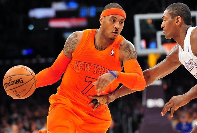
I wasn’t near a television for most of yesterday, but I got the gist of people’s feelings about the NBA’s Christmas Day uniforms via the steady stream of e-mails that kept hitting my in-box. Even comedian/activist Harry Shearer got into the act, becoming a uni-watcher for a day. But the most amusing note came from Mets radio man Howie Rose, the entirety of whose message forms today’s headline. (For those who don’t get the joke, look here.)
If you were too busy egg-nogging and mistletoeing, you can judge for yourself by checking out this gallery of photos from all five of yesterday’s NBA games.
Also: There was a brief skirmish during the Nets/Celtics game when Gerald Wallace grabbed Kevin Garnett’s shorts and wouldn’t let go. This led to a great post-game quote from Garnett: “I don’t know where in America you can jack somebody’s pants up or shorts up. I don’t know, I don’t know, I don’t know what the hell was going on.”
Also-also: All players yesterday wore green ribbons for the Newtown victims (real ribbons, not representations of ribbons) on their warm-ups. And the refs wore them on their jerseys. (No word yet on whether the Amerks and/or Bills will be wearing ribbons or decals for those firefighters who were murdered just outside of Rochester on Monday. Rumors that $1 from every gun sale will henceforth go toward the manufacturing of memorial ribbons and decals are almost completely untrue.)
Collector’s Corner
By Brinke Guthrie
Ah yes, the day after Christmas, which I have always considered to be the single worst day of the year. So let’s set that gloom aside and take a look at a few things you didn’t get yesterday morning, eh?
• Totally recommend these — a set of 1970s NFL helmet medallions, for the Niners, Bills, and Chiefs. Still have mine for the Cowboys and the Bengals.
• Love the vintage simplicity of this 1970s-look Vikes T-shirt.
• Detroit Lions/Dave Boss poster alert!
• Guess this would’ve looked good under the tree — a “Merry Christmas” signed baseball from none other than Mickey Mantle. Sent in by reader Michael Clary.
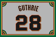
• Nicholas Schiavo sent along this Wilson Sporting Goods uniform ad for the “new” NY Mets and Houston Colt .45s.
• Chris Ross sent in this listing for a 1980 St. Louis Blues press photo. “I’m not big on collecting press photos, but as a Blues fan, this caught my eye because of the beautiful ‘St. Louis’ stitching on the jackets,” he says.
• From Johnny Garfield, a 1980s Yankees BP jersey — with an NFL tag.
• Frank Bitzer sent along some 1960s Cincinnati Redlegs decals, 1969 Fleer MLB iron-on patches, and a 1969 Seattle Pilots bank.
Seen something on eBay or Etsy that you think would make good Collector’s Corner fodder? Send your submissions here.
Raffle results: In case you missed it yesterday, here are the winners of this year’s reader-appreciation raffle.
Uni Watch News Ticker: Virginia Tech — the only school to have witnessed a bigger shooting massacre than Sandy Hook Elementary (at least for now) — is expressing solidarity with the Newtown community by wearing a dual memorial helmet decal while practicing for the irrelevant uniform manufacturer bowl. A much smaller version of the decal will be worn on the back of the helmet during the game. Rumors that $1 from the sale of each gun will now go towar — wait, is anyone else feeling a sense of deja vu? ”¦ A North Carolina baseball team uses green tequila sunrise jerseys (from Hunter Towns). ”¦ New logos for Palm Beach Atlantic University (from Marcial Santos). ”¦ Daniel Munroe was bowling in Cleveland when he spotted this Rams/NFL bowling ball. ”¦ New kit for Liverpool has apparently been leaked (from Anthony Nuccio). ”¦ Here’s an unusual sight: a soccer goalie wearing a baseball-style cap (from Alan Borock). ”¦ No photo, but Douglas King reports that there was some jersey repair going on during the Aloha Bowl. “Early in the second half, the camera was focused on SMU’s equipment manager sewing up the upper-left corner of the QB’s nameplate,” he says. … As you may recall, a recent episode of Jeopardy! featured an entire category devoted to uniforms, under the heading of “New Jersey.” You can now see all the answers and corresponding questions by scrolling down to the Double Jeopardy round on this page (big thanks to Greg Trandel). ”¦ The MVP of the freight shipping bowl wins a pretty bizarre-looking helmet (from Michael Schuhe). ”¦ Gavin Orobko continues to work on his DIY Winnipeg table hockey game. You can follow his progress here. ”¦ One of my all-time favorite actors has passed away (and no, I don’t mean Jack Klugman). RIP, Charles.
Cleveland’s an appropriate city for a Rams bowling ball. And I like the stars in the NFL logo.
Nice card, Brinke, and Jack Klugman died? Well, that’s sad. I watched the old Odd Couple Christmas episode 2 days before he died. That was when he wore the Yankee cap instead of the more closely associated mets cap.
Why does Paul hate Jack Klugman?
Maybe he doesn’t hate him. Considering his Oscar Madison character was a new york sports fan, he probably thought that it would be obvious if he said Klugman was his favorite actor
Someone needs to take his irony pills.
They make irony pills?
My internet irony detector is on the fritz, and the shop’s closed. What am i supposed to do?
“Aristophanes!”
Not enough irony? Eat more raisins.
“I’ve told you 158 times I can’t stand little notes on my pillow. “We’re all out of cornflakes. F.U.” Took me three hours to figure out F.U. was Felix Unger!”
I have it on reliable scources that Klugman was a closeted purple-wearing, indian mascot-loving,nick-name on back, black for black sake defender of the 2nd Amendment, hence Paul’s disdain for all things Oscar Madison.
Watching Sportscenter just now, they did a “reverse time lapse” showing the court going from the Clippers (the top story) to the Lakers (the next story).
What I found interesting was that the Clippers court was put together in tiles as it looked while they played. As the Lakers court was taken apart, however, it looked to me like all graphics were removed before disassembled, leaving nothing but a huge hardwood floor.
However .. in this time lapse of the court coming together, it’s all marked before assembly. I’m so confused:
link
RIP Pappy O’Daniel.
Is anyone else disturbed by the usage of the victim counts on memorials? There was a lot of “27” type tributes in the last week. The VT total numbers of victims just seems like you’re making it into a statistic.
Zoom in on the Met jersey in the Wilson ad and you see a bizarro version of the Tuscan font they actually used. Glad they eventually got it right.
Who made the other MLB team unis that Wilson did not?
Well Spalding made the Mets home unis in the 60s…like many teams, they had two suppliers. I Imagine Spalding produced other teams as well. Whent he Mets went to double-knits in 1972, Rawlings took over for Spalding and Wilson made the roads still until 1974, when Rawlings did both.
i only saw a couple of games yesterday. the mono-color jerseys should really never be used for a legit game ever again. (the heat was the exception, maybe next time have white/black trim for all the teams numbers)
readable numbers really enhance the TV experience…
Boston’s and Brooklyn’s lettering was also legible, for the reasons you mentioned (white trim). Chicago’s black trim was not helpful in that regard.
i thought jodi meeks was kobe a couple of times. pretty tough to follow the game
The Celtics’ original uniforms from 1946-47 were White quarter-sleeve jerseys with White on Kelly Green lettering ans numerals.
They probably didn’t look very good then, either.
Is that the first instance of “stealth numbers” in pro sports?
Around 1996, the Vols were ordered by the NCAA (or SEC) to get black trim for the orange lettering/numbers for their white unis
I’m fairly sure the first thing I ever saw Charles Durning in was The Muppet Movie (which, oddly enough, I happened to watch just a couple of weeks ago when I saw it available on Netflix instant watch, just for the heck of it). Probably the second thing I saw him in was Die Laughing, which I haven’t seen since the early 80s.
Of course, I’ll always associate Oscar Madison with Jack Klugman (it wasn’t until I was much older that I saw the movie). Also… “Klugman is terrific! Klugman is dynamite! Klugman is… Klugman!”
Durning: “When a Stranger Calls” (the original). Great movie!
Klugman: Once there was a man named Oscar, Ah ah ah ah ah!
Regarding the NBA uniforms… to quote the Angry Video Game Nerd, “What a shitload of fuck!”
^^^This.^^^
On one hand, the numbers on the NBA jerseys were definitely hard to read. On the other, most of the games were color vs color.
So, I give the NBA half a point.
The games actually looked OK, at least by NBA standards. (True fact: “NBA” actually stands for “Crappiest Uniforms in All of Sports,” in Latin.) But the invisible uni numbers are simply, and objectively, failed design. If we still had guilds and apprenticeships, every single “designer” who played a role in putting invisible numbers on an entire sports league would be kicked out of the guild and never again permitted to do design work for money. The whole invisible number thing is almost offensively bad. Doesn’t mean it looks bad – some of the unis looked pretty good, and better than I expected – but in terms of design, which necessarily has functional purposes that transcend mere aesthetics, the Xmas unis were among the biggest failures in the history of American sports.
Imagine a road “designer” painting black lane markers on a black asphalt road, or making white-on-white Stop signs. Imagine exit signs with green text on a green background. From the point of view of design, as opposed to art, the Xmas uni numbers were the same thing.
I look upon it as “riffing on a uniform”. It’s fun, just for a day, now be grateful you didn’t commit the whole season to it. It was also cool the way the Lakers treated white as a color instead of just a blank canvas.
I liked the Laker uniforms, especially if a player was wearing mostly-white shoes and white socks. It looked clean; a winter uniform.
But the illegibility of the numbers and letters was a big negative.
apparently all the NBA teams have “christmas” uniforms.
here’s the grizzlies : link
its funny because they all look like fashion jerseys instead of in game uniforms. there’s no difference between the grizzlies unis and the bulls unis….still cant read the numbers
Uniform related comic from Drew Litton today:
link
Thanks for the oily lapel pins Paul!
In Mexico, we were used to seeing Miguel Calero (recently deceased) wearing caps while goalkeeping. The only quirk is he used them for sponsorship.
link
link
I’m surprised they allowed the sponsorship really. Chris Kirkland(?) wore one quite often though I’m not sure if they were plain.
In Mexico it is quite normal as long as it doesn’t block the jersey’s sponsorship even when his personal sponsor was different than the club sponsor.
In Mexico, they get very clever with the sponsorships. I once noticed that players on several teams were wearing number 58, which is an unusual number in soccer, one player wearing it, you could chalk up to something personal, but not multiple players
Asked some friends in Mexico what was going on and found out that “58” was the number of a big radio station, canal 58 out of Guadalajara, and that the station was paying the players to wear it.
(oops, last sentence got cut off)
Maybe someone from the early Turner era Braves was working down there.
Is a “green tequila sunrise” jersey actually a lime margarita jersey?
Maybe some tem has these jerseys.
link
Way back when, I called that version the “Midori Sunrise.”
Midori..
link
Would love to know the reason for this jersey foul being worn earlier today at the World Junior Championships in Russia.
link
Probably an ode to vodka, which is generally at 40% ABV. All that comrade needs is a date with a #69 jersey!
Havent figuredout a sports connection, but RIP Gerry Anderson, creator of Thunderbirds, Stingray, Fireball XL5 and similar Supermariation shows.
OH NOOOOOOOOOO.
Childhood ICON. No one else CLOSE.
Also known for the 1970s live-action series UFO (whose theme was appropriated for one of the themes of the anime series The Big O) and Space: 1999, starring then-husband-and-wife duo Martin Landau and Barbara Bain.
Goalkeepers wearing caps really isn’t that unusual. It’s helpful when there’s a low setting sun in their eyes as tends to be common this time of the season.
Now, if you want to see a goalie with a more unusual headwear choice, Faroe Islands national team goalie Jens Martin Knudsen was famous for seemingly always wearing a wooly hat while playing.
link
Also, loving the random placement of the stars on the NFL shield on that Rams bowling ball.
While the Muppet Movie was probably the first movie I ever saw Charles Durning in, being that I’m in my early 30’s, I only later realized that he was the same guy from the Sting.
And between the Sting and O Brother Where Art Thou?, it turns out that Durning is in two of my favorite movies, not including the Muppet nostalgia. I never even gave it much thought till now.
Rest in peace, sir.
Also in recent years Durning made memorable guest appearances on “NCIS” as a WWII Medal of Honor winner and “Everybody Loves Raymond” as the parish priest.
Often overlooked is that he was a superb dancer. Best seen in “Queen of the Stardust Ballroom” opposite Maureen Stapleton (made for TV, I believe).
I saw him on Broadway in 1990ish, playing Big Daddy (opposite Kathleen Turner) in Cat on a Hot Tin Roof. Was already a fan of him by that time, thanks to The Sting, the CBS-TV production of Death of a Salesman, Dog Day Afternoon, and lots of other roles. Great actor. Didn’t know he’d led such a fascinating life until I read the obit.
Oh yeah, he was the cop in Dog Day Afternoon… love that flick.
Does anyone else see the hypocrisy of a site so childishly against corporate sponsorship having all kinds of ads, including pop-ups?
Nope. Internet ads are par for the course for free blogs. Corporate ads on uniforms are not–those are exploited cash-grabbing possibilities because the capitalistic society (more than economy) has determined that it can be done, regardless of whether or not it should be done. But if you get a pop-up from this site, let Paul know, because he is personally against those.
To be clear: There are indeed pop-under ads on the site. Nobody should be receiving more than one per day. If you are (and/or if you’re seeing any pop-over ads — i.e., those that cover/obscure the content), let me know. And if possible, get a screen shot.
I will try to get a screen shit next time, but about once or twice a week, I get a popup ad that fades the site’s content to white, while the small ad shows up in the middle.
Screen SHOT! Now you don’t help me autocorrect? Damn you!
Classic case of apples/oranges false equivalence. For the bazillionth time: I have never been opposed to advertising; I am simply opposed to advertising where it doesn’t belong.
A media enterprise being supported by advertising is a business model that dates back, oh, a few centuries. Especially for media enterprises that give away their content for free, like this one does.
My feeling about corporate sponssorships of bowl games, stadia, etc., is generally that the assorted parties involved already have enough revenue streams without corporate sponsorship. They sell tickets, they sell broadcast rights, they have innumerable concession deals, etc. When you’re also selling the name of your enterprise, that’s (a) greed and (b) really sad.
How much of that analysis applies to the ads on this site? Approximately zero.
Glad we cleared that up.
Pop-ups and pop-unders are advertising where it doesn’t belong. They are a blight on what is otherwise a credible site.
-Ups? Yes. -Unders? I disagree.
But you realize you can easily install a blocker, right?
Pop-unders are worse than pop-ups, though both are terrible. At least I know immediately when a pop-up happens–it’s in my face with the red X right there for me to close it. Pop-unders quietly create a new browser window that just sits there opened to whatever site for however long until I notice it and have to bring it up to close it.
As for blockers, I do have a pop-up blocker that apparently is not of sufficient quality to block your advertisers. I know how to get the more iron-clad ad-blockers, but do not wish to do so because I do believe sites such as yours should have visible advertising and I want you to get your revenue. But pop-ups and pop-unders are unbecoming of anything outside of the more shady corners of the internet.
something something…door…something something…way out
Classy!
No. The issue is not with corporate sponsorship. It’s corporate sponsorship compromising, at best, and destroying, at its extremes, the same team images, logos, colors, and entities that they are sponsoring.
We all recognize that sponsorship is required to a degree, and the pop-ups and ads on this site allow Paul to keep it running with asking any of us who read it for money. Splitting hairs, I suppose, but the degree to which is affects the product is the key. I don’t mind closing one pop-“under” every day. I do mind StubHub putting a patch on the Celtics jersey… just an example.
Where it doesn’t belong = when Paul feels you have “enough” revenue.
He’d make a great fascist.
So you like your team’s jersey with a new sponsor every couple of years? Why do I bother, probably just a troll since this subject has been discussed so many times.
Not cool. There’s no need to throw that kind of language around.
Name-calling is always easier than actually engaging with the ideas being discussed, right, “Maria”? (I use quote marks because it turns out that “Maria” is, of course, hiding behind a phony email address and, I suspect, a phony identity as well. Coward.)
Get back to us when you have a good way to explain how a web site with free content equates to a corporate enterprise with multiple pre-existing revenue streams. As for the rest of us, let’s move on. Thanks.
To bring discussion full circle, the wordmarks and numbers may have been unreadable on some teams’ unis on Chirstmas, but what are the chances the sponsor patches in two years will also be the same color as the base uni?
Was thinking that yesterday. Advertising patches sure would stand out nicely on those particular NBA unis, wouldn’t they.
“Whaddya mean we’re sublimating our team names to make the advertising stand out? The team names are there, they’re just, for example, orange on orange. That’s, ummm…a leading edge design decision, that’ all. Yeah, that’s what is, ‘innovative uni design’.”
And we’ll just roll our eyes.
SKA St. Petersburg wore “retro” jerseys against CSKA in the KHL today.
Not quite sure if they’re actual throwbacks or just fauxbacks, though. Definitely an upgrade over the current set, which are straight-up Rangers ripoffs.
link
While I applaud the table-hockey DIY guy, I wish he were tinkering with this game, which is the creme de la creme of table hockey games:
tablehockey.com
That’s a nice table Matt. The only problem is I don’t have the extra money for my hobby to buy that table. I have seen a guy who customized that table as the Joe Louis Arena.
Here’s a link.
link
The Little Caesar’s Bowl looks like a high school game. Central Michigan going mono-maroon with “Central” on the front of their jerseys, and WKU with light gray jerseys and light gray pants, but a white helmet. Just not a good looking game.
You’re leaving out the best part: CMU going TNOB.
link
Gavin, I’ve seen that! Amazing. And again, love what you’re doing with your table. Hope it didn’t come across as off-putting. Great work!
My favorite part of that Wilson ad is that the copy refers to the Houston club as “the Colts” — about 20 years ago, Larry Dierker was pushing to have the club drop the Astros nickname, and adopt “Colts” as their identity.
I have no idea why I’m typing this. It’s about 1:00 in the morning, and no one is ever going to read it. I can’t sleep, and the kids are playing that rotten WII U — they think I think they’re asleep, but the house is too small for intrigue.
I guess there are worse things I could be doing on a computer at 1:00 in the morning. Online poker, perhaps…
Geesh…the political stuff is getting old…any chance of giving it a rest? it’d be nice to have something to read that doesn’t have someone’s political views crammed down our throats. it would seem that a blog about uniforms might be just such a place…but evidently not.
Hmm? I didn’t see anything offensive.
Offensive probably isn’t the word, just political. It’s the anti-gun stuff. I respect Paul’s, and anybody else’s, position on it, even though I don’t agree. I just don’t see this as the place for it, and it’s making something that was once quite enjoyable that much less enjoyable. This site is, for me, a bit of escapism. But it’s his sandbox to do with what he likes, and I get that. It’s just my opinion.
I agree very much. Too much political – and of the failed political type of thinking. Keep on with sports pictures.
Rest In Peace, Oscar Madison–
just keep your room upstairs clean, will you?
–RKJ
Matt, no no it didn’t.