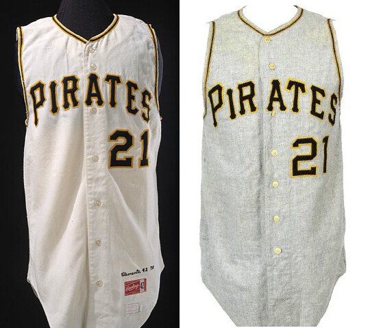
We’re all familiar with the Pirates’ unique uniform font. But what I didn’t know until the other day, when reader Jeff Flynn, Jr. brought it to my attention, is that there were actually two similar but distinct versions of this font used in the 1950s and ’60s. One was used by Rawlings (which made the Bucs’ home jerseys during this period) and the other by MacGregor (which made most of the team’s road jerseys). You can see the difference in the two jerseys shown above — Rawlings/home on the left, MacGregor/road on the right. The distinctions are most apparent in the R, T, and E (plus the numerals are different, but those weren’t rendered in the chest font anyway).
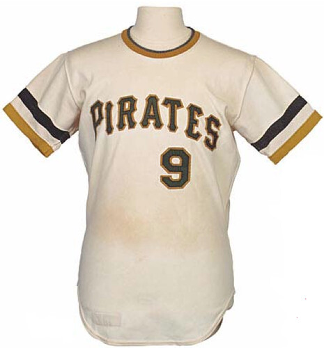
“When the team switched to the pullover knits in 1970,” says Jeff, “those were made by Rawlings and the font was consistent with the Rawlings home font of the 1960s,” as seen here:
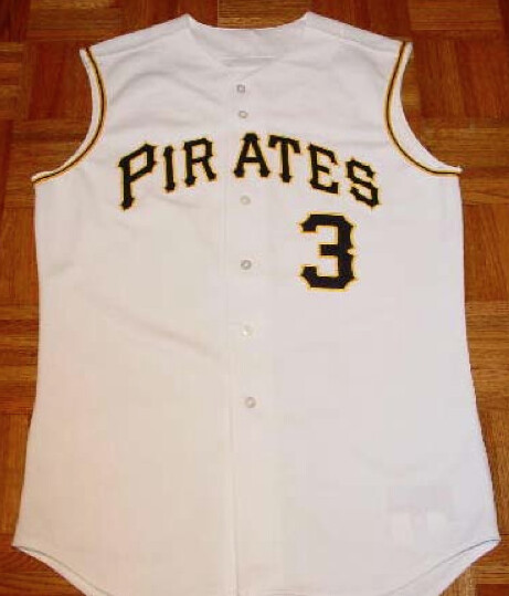
The Pirates eventually moved away from this chest mark and then returned to it in 2001. “The font they used in 2001 was clearly the old MacGregor away version, not the Rawlings home version,” says Jeff. “Someone probably said, ‘Let’s go back to the old Pirates jerseys,’ and someone else said, ‘Okay, I’ll dig up a photo.’ And they dug up a 1965 photo of Clemente in his road MacGregor vest instead of a home photo.” This photo backs him up (plus, as you can see, they created a new custom number font):
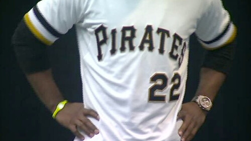
All of which brings us to the team’s new 1971 throwback. “This version is a bit closer to the actual 1971 jerseys font-wise, but it’s still just a bit off,” says Jeff. “The numerals are pretty accurate, though.” Here’s a screen shot from the unveiling:
All in all, this is some pretty serious minutiae deconstruction on Jeff’s part, relating to a typographic issue I hadn’t even been aware of. Nicely done!
Raffle reminder: My annual reader-appreciation raffle is currently underway. Details here.

Click to enlarge
Tom Hanks, Gilligan, and me: Here’s a shot of my doctor sawing off my cast yesterday afternoon. Taking photos of the procedure helped keep my mind off the fact that a sharp blade was perilously close to my skin.
New X-rays showed that both my fractures have healed perfectly. I have pretty good functionality in my hand (I can make a fist, although not a strong one), but the range of motion in my wrist is pretty limited, so tomorrow morning I’ll start a physical therapy program, which is par for the course. All in all, though, I’m in good shape. Feels great to be able to wash my hands properly, to take a shower without wearing a plastic sleeve over my arm, to sleep in various positions that weren’t possible with the cast, and to wear shirts, sweaters, and jackets that I hadn’t been able to wear because their sleeves didn’t fit over the cast.
Meanwhile, everyone told me that my arm would emerge all shriveled and pasty and smelly and full of peeling skin, etc., but that didn’t turn out to be the case. Yeah, it’s maybe a teeny bit atrophied, but otherwise it looks good as new. Well, except for that nasty scar on the underside of my wrist, where I had the surgery:
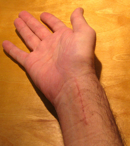
Basically, it looks like I tried to slit my wrist. At least it looks like I knew what I was doing, not like those fucking amateurs who cut across the veins (you’ll never off yourself that way, kids). Now I just have to come up with a good story about how the paramedics rescued me just in time and I’ll be all set.
Uni Watch News Ticker: Virginia Tech is going with matte helmets for the irrelevant sportswear manufacturer bowl. I asked the team’s media guy if they’d be adding a “VT” decal, and he said, “I have been told that it is yet to be determined.” … BYU hoops wore a new alternate uni on Tuesday night (from Chris Oviatt). … “For years I’ve had this vague recollection of Dallas Cowboys lineman Tom Rafferty wearing the team’s old serif numerals and sans-serif NOB lettering in the mid-’80s, after the rest of the team had changed to more modern numerals and serif NOBs in 1982,” writes Jay Braiman. “I did a little investigating regarding this ‘white whale’ and found proof. That’s from a 1984 game. This went on at least through 1987. Not sure why he alone wore this style.” … New Xmas Day sneakers for several NBA stars. … Winnipeg Jets goalie Ondrej Pavelec is spending the lockout in the KHL, where he appears to be wearing an autographed blocker (good spot by John Muir). ”¦ “During the 2012 season, the Galaxy announced a ‘3rd Kit Contest,’ for which fans submitted designs,” says Jessup Yenser. “After unveiling the fifth-, fourth-, and third-place finishers, they were supposed to wear the winning kit against RSL on Oct. 6. Not only did it never show up on the field, but they never even announced a winner. I thought it was pretty bizarre that the whole thing just kind of disappeared.” Anyone know more? ”¦ Hmmm, did the Knicks have mismatched NOB lettering weights, or is it just a trick of perspective? (From David Ryan.) … Johnny Bruno was watching an episode of Everybody Loves Raymond and noticed a blanket with a red NFC logo. Never seen that before. … Fairly boilerplate assessment of the Fiesta Bowl teams’ uniform programs (from Dale Alison). … Good piece on the evolution of the Batman logo (from Reuven Szleifer). … Last week I was at a doctor’s office and was leafing through an issue of Sports Illustrated when this photo caught my eye. Note that five of the eight players have FIOB, and two of the UGA players have identical FIOB-inclusive NOBs! As you might expect, the SI caption neglected to mention any of this. … “Earlier this year, one of our football players, named John Bloomfield, passed away,” says Sacramento State media rep Brian Berger. “As is common practice, our team wore a ‘JB’ decal for the rest of the season. What is unusual is that Holy Cross also paid tribute with a decal of their own.” This maintained a long connection between Sacramento State and Holy Cross, which you can read about here. … New cycling kit for Omega Pharma Quick Step (from Sean Clancy). … All sports teams that play in the Australian city of Canberra will be wearing special uniforms in 2013 to mark the city’s centenary (from Leo Strawn). … Pretty funny story about Carmelo Anthony’s postgame sweater (from Chris McNealy). … Jersey patches have been added for the chicken sandwich bowl. … RG3 fined $10K for 3stripe. ”¦ Franklin Morales of the Red Sox has given his No. 46 to newly acquired Ryan Dempster (from John Follett). ”¦ A feminist movement is sweeping the Mormon church, spurred by the wearing of pants. ”¦ Even if you have no interest in the CFL, you have to love this sensational poster. Super-tasty (Leo Strawn again).
I’ve seen that Batman logo infographic floating around for a few days now, and it really bothers me. It’s far from comprehensive (the huge logo from Frank Miller’s ‘The Dark Knight Returns’ is curiously absent), and I don’t like that there’s no rhyme or reason to where the logos are coming from. There’s some from the comics, movies, and cartoons.
Thank you for not only posting exactly what I was thinking, but for being the first poster of the day.
Also: Not in color. For much of Batman’s history, from Silver Age to present, there’s often been both black and yellow components to the logo. This is an assortment of randomly juxtaposed Batman logos, not an “infographic” or a “history” of the logo’s “evolution.” But it’s still a reasonably fun collection of some of the more interesting, mostly recent, takes on it.
it’s still pretty cool to see alot of the logos. my favorite is still the micheal keaton batman logo. one of the things that bothered me about the newer films is that they dont have the batman themes that i remember from growing up (like the logo, batmobile, and john williams music) but once you see that the character has had so many different takes, its not as bad.
What do you mean, newer Batman films? Batman Returns was the last Batman movie. Why would they make another one after the two with Keaton? What’s next, Terminator 3? A Matrix sequel? C’mon, don’t be silly.
Casino Royal Rises
Quantum Begins
Batman Identity/Supremacy/Ultimatum/Legacy
There was a Batman movie with Keaton? That’s heresy.
link
I also like the original music from the Keaton movies, but it was actually frequent Tim Burton collaborator Danny Elfman who composed it, not John Williams.
Danny Elfman is a great, great composer. He’s done a shit-ton of scores, but Batman is one of my favorites. Along with Pee-Wee’s Big Adventure and Beetlejuice, of course!
Has anyone even watched the 2 Keaton films recently? As boss as he was as Batman, the rest of the movies were garbage. Nicholson was awful. Sadly, those were the 2 GOOD ones from that batch of 4.
You think? Batman Returns sucked, although I did enjoy Walken being Walken. But Batman ’89 was great. My only complaint is that the Prince music kind of dates it a little bit.
Batman ’89 was great when I was 11. I watched it this summer. Nicholson was crap.
There’s no name for the Winnipeg goalie in the ticker.
Thanks. Now fixed. It’s Ondrej Pavelec.
The Autograph on Pavelec’s blocker is actually that of two different people. I know the KW is Kay Whitmore who approves each and every piece of NHL goaltending for NHL play. His auto indicates it meets specs. The other one is likely someone in the KHL who performs the same function would be my guess.
Interesting! So you’re saying that every piece of NHL goalie gear carries a signature?
Not every piece at the same time, Paul, but throughout the season. Goalies will have Kat Whitmore’s autograph on their pads as well as they measure to ensure they are within the defined length and width parameters as set by the NHL.
Every goalie is spot-checked over the season at least twice over the season. The unannounced checking ensures that goalies who play outside the rules are caught red-handed, so to speak.
Make that Kay, not Kat. D’oh!
Actually, if you link, you’ll see that it’s more than just a patch added: they moved their current uniform (or at least the jersey) over to the Nike Pro Combat/Speed Machine template. This pleases me. Although, I wish that the gold band on the cuffs went all the way around.
They got some major length out of those shoulder loops, too. It ought to look pretty good, but you never can tell until it’s on a player. The flywire on white, however, looks like they cut up a condom and glued it on the neck…
The flywire on white, however, looks like they cut up a condom and glued it on the neck…
I love this.
Agreed.
I just saw that jersey and the second thing I noticed, after that awful stripe atrocity, was how terrible that Nikelace looks. Woof.
When it’s on the player, over pads, at least I get the impression that there are sleeves…implied sleeves. A shot of just the jersey makes it look so much like a tank top, not even funny!
Good pic of Tom Rafferty. I remember that as a kid too. I also remember Troy Aikman doing the same in 94 when the Cowboys switched to their current numbering style. Aikman continued to wear the font used from ’86-93 for several games. I don’t blame him. Those Russell jerseys were much better!
Maybe Rafferty just kept wearing the same jersey he started playing in. It looks pretty beat up in that 1987 photo.
Re the SI SECCG photo: UGa #6 is senior NT John Jenkins (and this ex-NT finds 6 to be an odd number for a lineman) while #59 is freshman OLB Jordan Jenkins. Typically I’ve seen John wear FIOB but here’s link where John wears NFIOB while Jordan wears FIOB. Not sure if there’s any consistency to it.
Nice overhead shot at the instant after the snap, good view of Georgia’s unique merit decals and the bicolor (I assume Nike) socks.
Teenchy, John Jenkins wore #6 because in JC, he was also the goal line running back. There were rumors that would happen in Athens, but it never did.
Frankly, after the Charles Grant RB/DE experiment that ended disastrously, I’m happy #6 never dotted the I.
Guess I wasn’t paying attention when those rumors were about. Some days I’m glad I don’t follow alma mater’s sports programs as closely as I once did, but this isn’t one of them.
I think it would be obvious, Paul, that your wrist-scar story begins, “During Spring Training of 1998, I learned that the Mets would be wearing black caps and jerseys that season …”
And then later in the telling, a burly, elderly stranger saves the day, and everyone is convinced that it was Harmon Killebrew.
My guess is that the red NFC logo is on the back side of that blanket, but is blue on the front. Just the nature of those blankets, the back side always looks like a negative of the image.
Yeah that is exactly what it is. I have a US flag Afghan throw that is just like that. Only one side is color correct. I can’t recall if the show ever used other NFL logos. Maybe turning the blanket inside out was a way to get around using the licensed logo.
“I have a US flag Afghan throw”
~~~
that just sounds…wrong
Paul, the scar is cool. You’ll come to like it, I guarantee.
First it was Broadway Connie, then DC Connie, and now just Connie. Hmmmmm…..
I think we could have a serious problem on our hands. It looks like he’s devolving. By this time next year, he may only be C.
We’ll know that’s in the cards if he shows up as just Con one of these days.
C is just ahead of the game by shedding unncecessary appertunances before TEOTWAWKI.
How about C-man? Nah, it’s just that I changed my work computer to Connie DC without informing plain ol’ Connie over on the iPhone.
My 12-year-old son, Danny, aspiring hip-hopper embedded deep into a DC public middle school, now prefers to be addressed as D-Money.
better than “Ted”
Paul, it’s stories like the Holy Cross/Sac St one that keep me reading UW day after day. I often tell my wife about a funny article or point you or the gang have on the site about who wore what when. However, the HC/Sac St article just made us both feel good about what it means to be human. With all the bad news lately, it’s good to hear about someone caring about another, even from 3,000 miles away. Thanks.
Those Pirate jerseys show just how superior the old vests were. There’s just too much real estate between the neck and arm hole on the new ones. Yuck.
Flip, the Bucs haven’t worn a vested jersey since 2011. They adopted their current uniform design in 2009 (which is basically the same as the vested jersey but with sleeves) but kept the pinstriped white vested jersey for two more years as their Sunday home jersey.
Personally, I’m OK with the 1971 home throwback as their new Sunday alternate, but I liked the fact that the black jersey is like the Cubs’ blue jersey and is worn on a regular basis both at home and on the road without a set schedule. Except for Fridays. Last year I think they wore the black alts every Friday regardless if they were home or away.
Oh and before I forget again Paul, congratulations on getting the cast off.
Flip, you are correct about the current “vests.” They look too much like old wife-beater T-shirts of the ’50s. As an aside MacGregor made one of the best baseball uniforms of all time. Through the years they made either the home, road or both unis for Cleveland, Detroit, Phila A’s, Milwaukee Braves, NY & SF Giants, Brooklyn Dodgers, Cincinnati and Pittsburgh. That’s half of the then-16 MLB clubs. MacGregor closed their uniform division in 1969 and the Sand-Knit MacGregor uniform line has no connection whatsoever to the original MacGregor.
“like old wife-beater T-shirts”
~~~
it will never be too soon when that term disappears from the lexicon
Good pull on the Pirates’ font issues — to this day, that team has a serious issue with uni consistency.
Twice in the past year I bought Bucco home white replica jerseys, only to send them back to the Amazon.com seller because the font was off. The online pictures show the MacGregor font but the ones I received had the Rawlings font, which irritated me.
I initially chalked it up to perhaps being a made-in-Korea cheapo replica, but when I paid an in-person visit to the Bucs’ team shop, I noticed the same phenomenon in play.
Apparently, the Bucs sell two home jerseys: Replicas have the Rawlings font while the MLB Authentics use the MacGregor font.
On my right wrist, in about the same spot, are a couple of white areas that are burn scars. I splashed some hot roux on myself once while making gumbo. They count as battle scars whenever I’m in Louisiana.
Paul,
When asked what drove you to cut your wrist, you could say you heard the Mets were un-ditching the black or that some sick bastard painted your apartment purple one day and locked you in.
Never really paid too much attention to the Buccos font from the ’60s. Figured it looked the same as now.
I HAVE noticed, though, that the Bumblebee (1977-1984) and post-Bumblebee (1985-1996) uniform sets use a vertically longer/thinner typeface for the Pirates script. (The road uniforms switched to the highly-underrated “Pittsburgh” cursive script, as can be seen link) Then the 1997-2000 uniforms used that vertically-arched style that they currently use in their logo before they switched back to the 1960’s-era in 2001.
I was curious about the Galaxy design contest, as well. As a Galaxy fan, I heard about the contest shortly after they announced it on Facebook, and threw together a design that resembled the light blue kit on the page (evidently that will be either 1st or 2nd), though I used white shorts, a la Manchester City, and didn’t go for the white armpit panels. Last I remember hearing about it was when they revealed the 5 finalists to vote upon. I was figuring they’d make some sort of an announcement on the Facebooks, but I guess they were just counting on most people, like me, to simply forget about it.
Actually, sifting through the fan comments on their FB page, they stated that the winning design is now going to be announced “next season.” Which, honestly, seems like a better time to unveil a 3rd kit, but I don’t understand why they’d simply let a deadline for such a seemingly large contest (8,000+ submissions) slip by.
Over on the bigsoccer forums we have a tab on all the upcoming kit leaks for next years season link
That NFC blanket is just inside out. You can tell because it’s backwards. I don’t have proof, but my suspicion is that it’s blue on the other side.
Paul, please don’t make jokes about kids killing themselves. It is not funny, and it is incredibly offensive to those who have dealt with such tragedies.
Paul’s simply referring to this timeless image: link
Chill out.
Swilson, this is the first time in about a week that they’ve written the days headline without stepping on their you know what, so take progress where you can get it. Also, you should know that all other world events pale in comparison to a fractured wrist.
So offensive jokes aren’t offensive if they are referencing offensive 4chan memes?
Point is, there is zero reason to make that joke. There are 100 things he could say that would be just as funny (to those who found that funny), and that wouldn’t serve as a painful reminder for readers who have dealt with tragedies like this.
As someone who tried to commit suicide two years ago, I thought it was funny.
10/10 would read again
Any joke is going to “hurt” someone else’s sensibilities somehow.
That’s the way it goes.
I had a friend kill himself three weeks ago. Making jokes is about all I have left.
I’m terribly sorry to hear that, Paul. Understood.
People do need to chill about this stuff.
My best friend died 3 years ago. While myself and his other friends were gathered together at times, we made more jokes about him than crying/etc. Even on the day he died. He would have done the same.
His favorite phrase was “sorry ’bout your bad luck”… and he would say it at the most inappropriate times.
He died of a bizarre fuck up at the hospital.
When I went to see his body at rest, the last thing I sad when I left was “Sorry ’bout your bad luck!”
Too soon wasn’t anything we believed in.
Conrad Jarrett knew to cut vertically, but somehow survived. (Ordinary People)
A sad and disturbing aspect of teen suicides, most are relatively spur of the moment decisions.
link
I wouldn’t normally post an entire Chive post here in the comments, but you colorizers simply MUST see this guy’s work…
link
Wow – those are fantastic photos. Great work.
Vintage Houston Oilers and Dallas Cowboys *basketball* unis on the Bayou City History blog link.
On the photo of Dempster with the 46 jersey:
– The font on the “Boston” wordmark on the chair in the photo was retired in ’08, when the Sox changed their primary mark to be the hanging socks.
– We can see a Fenway 100 patch on the left of the shot, I’m wondering if the 46 jersey has one too, and Dempster is posing with a jersey he will never wear.
The Bridgeport Sound Tigers have announced their plans to remember the victims of Sandy Hook Elementary School. The 20 players dressed for each of the next 7 home games will be wearing the last names of the 20 children.
link
I hope they’ll at least pass out guides so fans can know who is who.
I really want a print of the Grey Cup Broadcast. I love the style of it.
I don’t see the Galaxy contest snafu as a big deal. A lot of us can claim that we’ve started big projects only to have them fade into oblivion. I know I can! I think it’s endearing that a big sports franchise can have the same faults that we mere mortals do. Maybe they just forgot to take their Herbalife and were suffering some adverse effects.
I had a troubled kid that I was mentoring at school a while back. He ended up committing suicide “on my watch.” In fact I lost 4 very close family members in 2 1/2 years. All of that is a shame, but I learned that life is for the living and our feelings don’t affect the dead b/c they are, well, dead. That’s why I try to enjoy life’s simple joys like this fun site- thanks to all for making this a part of my day.
Oklahoma City wearing their new alts (for the first time?) on TNT right now.
link
They wore them in Brooklyn on December 4th. link
Thanks, Wheels…
BUD so updated:
link
The game has a retro look to it. It should be broadcast in black and white.
Nothing retro looking about that court.
Agree overall, but I find the dark section of the floor for some reason , looks very retro to me, Kevin Martin on the bench has a real retro look as well.
Wow. Today’s CotD is super depressing. Some nice architectural salvage potential there, however.
Harry Kalas calling the first game in Philadelphia Fever (Major Indoor Soccer League) history on December 27, 1978 against the Cincinnati Kids in Cincinnati.
link
GREAT stuff on those Bucco vest home/away differences.
If I’m not mistaken, I think the 1974-1976 knits had numeral font differences as well. The road numbers seemed more blocky than the home Rawlings numbers.
Hopefully someone can confirm/deny my claim.