Courtesy of Under Armour
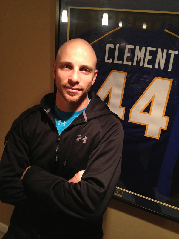
This is Adam Clement, Under Armour’s senior design manager for on-field product. I met him a month ago in Brooklyn, where we were both attending Maryland’s season-opening basketball game, and we immediately hit it off. Smart guy, good guy. I asked if he’d agree to do an interview, and he said sure. We did the interview last week, and it turned out so well that I’ve divided it into two parts, which will run on ESPN today and tomorrow. Today’s installment will be about Adam’s most notable design: the Maryland flag uniform. Check it out here.
Top 10 reminder: I’m accepting nominations for the top 10 uni-notable moments of 2012. Details here.
Uni Watch News Ticker: Contrary to what I wrote for each of the past two days, the Chiefs’ captains did indeed wear captaincy patches on Sunday, creating a serious case of patch overload (big thanks to Tyler Moody for setting me straight). … Friends in High Places Dept.: The governor of Oregon has called a special session of the state legislature to extend tax breaks for Nike. ”¦ Should D.C. United be rebranded? That question is the focus of this article (from John Muir). … On Monday I reported that Utah State’s basketball team was wearing a “12” patch in support of junior forward Danny Berger, who collapsed during a practice and nearly died. Now it turns out that the school’s football team will also be honoring Berger on their uniforms (from Mike Lundberg). … Here’s a closer look at the Christmas Day jersey for the Knicks and Lakers — or at least the Swingman replica versions — as showcased on yesterday’s episode of The Chew. … Tom Jackson was shopping at Sears and spotted a Cubs hoodie with an NFL label. … Looks like a hockey team called the Las Vegas Nevadans may be in the works. … On Monday I noted that all three of this year’s Heisman finalists had single-digit uni numbers and wondered if that had ever happened before. That sent Dan Cichalski into research mode. “While I didn’t answer that question (only 10 single-digit players have won, but info on finalists from long-ago years doesn’t seem to be easily found), I did go back to find out which numbers were the most common among winners: 14 and 20, with five winners each,” he says. “Two notes: No. 45 accounts for two winners, but both times it was Archie Griffin, so just one player has won the trophy wearing that number. And I included Reggie Bush, whose award was vacated.” … Also from Dan: I really like this Notre Dame helmet history T-shirt. … Check out this shot of Broadway Joe wearing the Jets’ 1964 helmet style. The thing is, Namath’s first season with the Jets was 1965, but the NFL and AFL both held their drafts on Nov. 28, 1964 — plenty different from today, right? — so that’s the helmet that was available for promo shots (good find by Bruce Menard). … Alex Allen found these old basketball chalkboards at the middle school where he teaches. “No three-point line!” he notes. ”¦ Here’s a good page with diagrams for all the WAC football stadiums (from Matthew Meo). ”¦ LaMaar Woodley of the Steelers is the owner of the latest Pro Bowlers Association team: the Pittsburgh Jack Rabbits. Weird logo, as you can see there — why are “Jack” and “Rabbits” misaligned? (From Jason Bernard.) ”¦ Does this T-shirt mean that Oregon will be wearing yellow helmets in the Fiesta Bowl? (From Andrew Greenblatt.) ”¦ Shin-Soo Choo was traded to the Reds last night. David Sonny points out that with Choo and Bronson Arroyo now on the same roster, that gives Cincy two double-flapped players. Pretty sure they’re the only team with that distinction right now. ”¦ Wisconsin Dells High School wore 1980s throwbacks last night. Their opponents, Reedsburg, also wore throwbacks, although theirs were more conventional (from Jeff Ash). ”¦ One more week until the fucking cast comes off.
Oregon football, Nike/Oregon government and Danny Berger (a North Medford High graduate) all in the ticker. It’s a popular day for my beloved Beaver State.
No link for the Joe Namath helmet.
no link for Broadway Joe picture from Bruce Menard (unless I’m high and can’t see it )
Labrador?
was really looking forward to the Broadway Joe link…
Fourth comment in a row that wants the Namath link. Did the picture get taken down already?
And it’s D.C. United, not “the” D.C. United.
I thought that was a great read on DCU. As an outsider (a Crew fan), I do not think ANY rebranded is needed. I think DCU looks as clean as it can come. It helps that I am a big fan of the black/red color scheme.
A new stadium will work wonders. #Crew96
Agree: that was a fine article on DC United looks. Smart and thoughtful and calm.
As a newcomer in town, I’ve come to really like going to DC United games. For one thing, I dig RFK, and am distressed that there seems to be a broad consensus to tear it down and build a replacement. What a great Space Age stadium! But mostly I like the pronounced Hispanic flavor of the fan base and, subsequently, the team emblems. That eagle, for instance, is half-US half-Mexican (cool!), and there are lots of banners and chants in Spanish and Spanglish. I worry that a freshening of the brand would be calculated to attract more suburbanites (perfectly reasonable, of course) and therefore jettison some of the latino elements. But waddayagunado?
Also enjoyed the article’s allusion to the wonderful DC flag. As Wiki says:
“…The proportions of the design are prescribed in terms of the hoist, or vertical height, of the flag as follows: the upper white portion shall be 3/10 of the hoist; the two horizontal bars are each 2/10 of the hoist; the white area between the bars 1/10 of the hoist; and the base, or lowest white space, is 2/10 of the hoist. The three five-pointed stars have a diameter of 2/10 of the hoist and are spaced equidistant in the fly, or horizontal, dimension of the flag…”
Best US city flag, by far [Chicago a distant 2nd, NYC 3rd, Milwaukee dead last]. And among the best US state flags, though I know that’s not a particularly high standard. Right up there with New Mexico, California, Washington, Colorado, Texas, Ohio. And maybe Rhode Island. And maybe New Jersey, come to think of it, just because it’s yellow.
I generally agree with the article. I wouldn’t be opposed to a tweak of the logo if they don’t mess it up (the current eagle makes me think of the hood of a Trans-Am). There’s no need to mess with the colors. MLS teams change their jersey designs regularly (much like the other leagues they aspire to), so a jersey change wouldn’t be a surprise. Heck, plenty of teams in the Big 4 change their uniforms when moving into a new facility. I’ll differ with Connie on RFK. I’ve been there for soccer, baseball, and concerts over the last 30-odd years. That place has just gotten run-down. A team with the most league titles (now tied) deserves a better place to play in. Just save a white, Hondo seat for me!
Mmmmm… Trans Am.
link
I am leery, however, of going with a red jersey as the primary home jersey. I’ve gotten tired of the Caps asking fans to wear red for every home game (regular season and playoffs) as well as a similar move by the Nationals. If you are wearing team gear, does it really matter if the shirt is white, navy, or red? I’d hate to see that creep into United games. Feel free to wear black if you want to.
Namath photo link now added. Here it is, so you don’t have to scroll back up to the Ticker to find it:
link
Why is Namath wearing a white football pant belt around his stomach?
Yeah?? And he looks SO disinterested.
He probably has the jersey pulled over his street clothes.
And that helmet looks like it’s been through hell already!!
(not to mention the logo is a an extreme angle (or so it seems).
Gotta love the Phillips Head screw holding up a corner of the suspension system.
actual game photo of the helmet logo at a rakish angle: link
The final (edited) picture was probably cropped above the belt. I imagine they were going for the tucked-in look, but rather than tuck his jersey into his regular pants, they just cinched a belt around him so it looked like it was tucked into his football pants. This is all speculation, of course, but it’s the first thing that came to mind.
…and the unbuckled chinstrap completes the look.
(btw, the Jets logo WAS at a rakish angle in th early days)
speaking of the Jets, here’s a nice shot of the short-lived jetplane helmet logo along with the Chargers All-America decal: link
Today’s ESPN column is up:
link
D.C. United does not like to be preceded by “the” in any refernce. The brand is fine, but I think the lack of a long-term home is what is holding them back.
JACKRABBITS. Maybe the mis-alignment is to allude to a jumping motion? Or maybe it was just the best way to make sure the words KRAB BITS didn’t appear.
Also, it was probably a way to ensure that people would read it as two words. I’m assuming the team was named, in part, after the locally famous Jack Rabbit roller coaster.
Who decides where patches on NFL unis are placed? Chiefs wore their captaincy patches over HOF patches while Texans had captaincy patches under the HOF ones.
So did you call Adam and his company a douche bag multiple times? Sleeping with the enemy?
Adam is aware that I’m not in love with all of his designs or all of Under Armour’s practices. But we respect each other on a personal and professional level, we have a lot of shared enthusiasm for uniforms in general, and we have somewhat similar backgrounds (more on that tomorrow).
Great strategy, John!
Obviously, I’m just being sarcastic.
Reporters would have a hard time doing their jobs if they ripped on everything they didn’t like, especially to the face of the subject they were interviewing.
Teebz – I was being sarcastic as well, you obvisouly didn’t pick up on that. In my opinion, Paul is way too harsh on Nike, Under Amour and other large corporations. My comment was a subtle jab at him. I think Paul does a great job and I assumed he would have more class than to say this to his face but having said that, I also see some hypocrasy in this as well. Paul constantly rips Under Armour and what they do so hopefully this meeting gave him a chance to put a name and face to this “evil” corporation and realize that they are not all bad. Of course they can still disagree on things but it’s nice to see them “playing nice”.
And they should continue to be ripped. Hypocrisy is the cry only of the hypocrite.
Under Armor… Dead!
Niedermeyer… Dead!
Re the Wisconsin dells throwbacks, I don’t recall that the high-sock era overlapped with the long shorts era. In fact, the high socks began to fall with the magic-bird rivalry. Maybe its a cold Wisconsin gym thing – cover the legs as much as possible. I could see a Muslim female b-ball player testing the waters with that look also.
The high sock era waned with the 1970s. And those sans-trim uniforms looked like something out of “Hoosiers” from 1952.
I was going to say something similar. Looking at those uniforms, I’m not sure when Wisconsin Dells thinks “the 80’s” occurred.
“What we really wanted was that when players were running on and off the field for substitutions, we wanted them to look almost like they were on different teams”
whaaa???
Ya – had to read that one again, too.
As a designer, I thought among your chief goals was to create an image or a brand that will unify the entire school – on a smaller level, perhaps the most basic level, don’t you want the players on the team whose image your creating to at least look like they are all at least teammates?
Why would you consciously make the decision to incorporate design elements that made the players on a single team look… not on the same team?
Beyond bizarre. And I think this is yet another argument for reversing the design on the helmet – at least in this scenario when players are running off and on you can see the same designs on each player, even if they are on different uniform pieces.
$36 to watch New Mexico State football?? That’s the biggest ripoff in sports….
I am convinced that the Knicks new look this year would be greatly improved by putting the team name in reverse arching below the number.
Every uniform would be improved by putting anything that they might be thinking of putting above the number, below it.
Particularly when there are two elements above the number, such as a NOB plus one of those insipid little logos that so many NBA teams are using these days. Maybe put one of them above the number and one below, framing the number and keeping it as the most important and most central element of the back of an athlete’s jersey.
It would have been nice to ask him if he knew what the actual NCAA requirements are for football uniforms.
Just once I’d like to see these pieces of garbage get rejected on game day.
It has happened:
link
Just sent Adam a follow-up question about that.
Oh nice- I didn’t hear about that one.
I’d be interested in his answer. Here he designed Maryland’s white uniform “to look almost like they were on different teams” when viewed from the left or right.
Red shoulder on one side, black/gold on the other. So he designed white uniforms to look like 3 differnt teams, really. How functional is that?
The Oregon Athletic Dept. has let Ducks fans know to wear yellow to the Fiesta Bowl.
link
any chance the vegas team is NHL ?
Considering the success of the other desert franchise, I’d say no. Not in a bazillion years unless someone has piles of money they no longer want.
For those who say “why Nevadans”, it’s just a placeholder for the actual team name if they ever come up with one.
LV doesnt have any other sports though. NHL could get the proposed arena built.
People don’t go to Vegas to watch sports other than boxing and UFC – sports that can be held inside a casino/hotel.
The Las Vegas CFL team played to meagre crowds (read: no one), and the IHL’s Las Vegas Thunder did horribly. The reason that the ECHL Wranglers work? Low payroll, low costs, and a great marketing department.
NHL hockey would not work there. Nor would any other of the “big four”.
And we haven’t even touched upon the issue of any team-related staff gambling on sports in any way.
Speaking of Notre Dame’s helmets….I assume this has been covered here long ago, but man do they look horrible this year. The helmets are shinier than they have in year’s past, and the pants changed from gold to a yellow-orange ish color. So now the pants and helmet are completely mismatched.
2011
link
2012
link
Yeah that’s been covered for a while on this site. I won’t bother linking the posts that have covered the new helmets but I will say that it really isn’t uncommon for ND’s helmet and pants to not match:
link
Furthermore, due to the more flat material used in recent years the pants have actual tended to be more a khaki that a gold. With the more firey gold in the helmets I actually find the new pants match better: link
All those fancy one/two-off helmets were conveniently omitted from that Notre Dame helmet history shirt
Nice WAC stadium guide. Too bad all of the fields aren’t scaled to the same size.
God, I hate those captaincy patches on the Chiefs. I do believe they were the last hold out of NFL teams to put that ridiculous thing on
No. The Steelers don’t wear captaincy patches; the Packers only wear them in the postseason; etc., etc.
Most telling quote of the ESPN article?
“There are only about 100 players, but there are tens of thousands of people in the stadium, and lots more watching on TV. Aren’t they the target audience too?
We want the players to feel strong, powerful, and invincible when they wear the uniforms. We know there will always be fans who like what or dislike what we do, but we don’t build the uniforms to impress the viewer. We build them to help the school gain visibility, to help them catch the eye of the potential recruits, and to make the current players feel special when they come out of the tunnel.”
So it’s not what we think, it’s about what gets Maryland’s name out there and gets them attention…..well, in that case, well done. Look like shit every week, that’ll really get your name in the paper and a headline on Yahoo! news. Personally, if I was a Maryland fan I would want to see them increase their profile by putting a better product on the field in terms of winning games and being competitive. NIU is going to a BCS game and didn’t need to look horrible to do it.
Good interview and I’m not hating on him, just the overall strategy being employed.
I agree that this was a very telling exchange. One of several areas in which I don’t agree with his approach, although I understand that that’s his job.
Here’s the thing about the “Oregon Strategy” of flashy-ever-changing-uniforms: its completely effective. Growing up, Oregon was never a big program. Sure I would see the occasional highlight but they never got the national attention they do now. Today, Oregon is a household name and that is critical for getting recruits. That (shuddering as I write this) brand-recognition mixed with some good coaching has transformed Oregon into a perennial powerhouse program. For teams that don’t have traditional pedigrees and/or superstar coaches, getting creative with the uniform is the easiest, most readily available way to improve the program’s success.
Please stop calling what Oregon wears “uniforms”. They wear “outfits” or “costumes”, but not uniforms.
Thanks
Lee
They all wear the same identical one on game day. Its the same template week to week. Isn’t that the definition of uniformity?
Reminds me of junior high when a friend – a soldier in the KISS Army – would celebrate updates to the musicians’ “uniforms”. Because, y’know, if they didn’t have them on, they wouldn’t be KISS.
Yeah, and how’s that worked out for Maryland?
See that’s the problem with basing an argument on proof by example — you’re really vulnerable to disproof by counter-example.
“What we really wanted was that when players were running on and off the field for substitutions, we wanted them to look almost like they were on different teams. In other words, we wanted the uniforms to look completely different depending on whether you were looking at them from the left or the right. And the approach we took gave us that effect.”
I don’t understand this. Why have players look like they were on different teams? Did this “effect” actually register with people? No. It’s a uniform, players should look like they play on the same team. I guess this is an example of the cutting edge ideas these companies claim to be generating.
I don’t know what annoyed me more reading the article. 1: All the absurd terms he used when describing the uniforms and his reasoning behind why he designed them the way he did or 2: The fact he made this design because it sadly would be liked by the younger generations and it would benefit Maryland’s recruiting/enrollment.
I see it as a drug dealer selling to addicts.
as an Oregon fan, I have really just learned to deal with whatever they choose to wear and remember that as I watch them play. my only fear is that they roll out an all yellow look. The other thing could be that they *gasp* repeat either the Game 1 or Game 12 uniform sets. Im not sure whether they are the Home or Away team for the Fiesta Bowl. Id think K-State would be Home since the Fiesta is a Big XII host game and UO is an At-Large team. I just want to know how Oregon managed to not wear Green pants all damn season, but wore the grey 5 times.
Las Vegas Nevadans is WAY worse than Houston Texans. Nevadans doesn’t roll well at all. Do they have anything close to the state identity culture that Texas has?
As I stated above, it’s just a placeholder for an actual team name. There will probably be some “name your team” contest if this LV team ever sees the light of day.
Thanks. I hadn’t thought of that and didn’t see yours before I posted.
No worries, James! It was tucked into another comment. :o)
Las Vegas Jackpot
the LV cheerleaders could be called the Slots.
Hey-Oh!!
So I had a though watching the Texans Patriots the other night. These are two teams that went through that NFL uniform change era where everyone went to a dark blue/navy jersey. But since then a few teams are starting to come out of it, Seattle has gone back to adding in gray to their uniform, Denver wears orange again. Buffalo fixed their look big time.
Are Houston and New England ripe for a jersey overhaul or what? And the Pats could and should go back to the throwbacks but what about the Texans, do they just need a total overhaul?
The Texans are fine as they are, link link link.
Not technically uni rated, but given the amount pf chatter here about public/private spavce and sports…
link
The entire time I was reading the interview I was waiting for something like this:
“And I’d like to give a shout out to the Hungry Hungry Hipster who’s obsession with flags as sports uniforms was a big inspiration in this project.”
A man can dream…
I think nfl would work in vegas. Once a week, fans fly in for the weekend, …
But i wonder if they would have to take that game off the books.
Knowing how popular soccer is in this community, I’m sure this is late news. But I’m sitting here watching the FA Cup replay between Mansfield Town and Lincoln City. LC just substituted a player with a blank rear jersey. No name. No number.
The announcer said, “No number or name, which is curious to say the least.”
Seattle will be in monogrey – wolf grey, that is, on Sunday at Buffalo, er…at Toronto.
link
MiamiDolphins.com reflects the 1972 team. Has 70s theme