As you’ve probably noticed via the ad in the left sidebar, our friends at Grey Flannel Auctions have issued another catalog’s worth of goodies. Here are some item from their latest auction to catch my eye:
• How’s this for a rarity: a Bert Campaneris nickNOB jersey.
• Holy moly, click through the photos to see the embroidered bear on this 1934 Cubs jersey.
• Back when most MLB teams were still wearing green or gray underbrims on their caps, Orel Hershiser always requested a black undervisor, because he said it helped him focus more when he looked in on home plate. Sure enough, here’s one of his caps from the 2000 season, with a black undervisor.
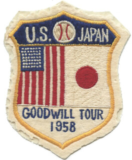
• Absolutely love this 1958 U.S./Japan goodwill baseball tour patch. Amazingly, they managed to get 49 stars on the American flag, which was the number of states back then. (Hawaii didn’t achieve statehood until 1959.)
• Mr. Met never looked better than on these 1969 NLCS and World Series tickets.
• Always fun to see one of the Denver Bears’ old strike zone uniforms.
• Check this out: The Say Hey Kid used to have a photo of himself, in full uniform, on his checks. (As a side note, that check was made out to Bob Mandt, a Mets exec who had been with the team since day one and was a real character. I had the pleasure of interviewing him about a dozen years ago. He passed away in 2010, taking with him probably the single greatest mental storehouse of Mets knowledge on the planet.)
• I’m always a sucker for Harlem Globetrotters items. This time around it’s this killer 1950s shooting shirt.
• Even if you’re not a Kentucky basketball fan, you have to like this sensational 1960 team jacket.
• How cool is this 1951-52 Minneapolis Lakers season ticket stub?! (Answer: Very, very cool.)
• Some logos lend themselves particularly well to cufflinks, as in the case of these 1960s Cincinnati Royals cufflinks.
• And as long as we’re talking sports jewelry, check out these basketball and baseball charms. I especially like the old-style stitching on the basketball charms.
• Unusual double-decker FNOB format on this “legends” jersey. Here are some additional examples.
• Some very nice chain-stitching on the front and back of this Denver Nuggets warm-up jacket.
• A captaincy designation and a subscript NOB, both on this Tiny Archibald jersey.
• And here’s a good one to go out on: Look at this sensational Chicago Bears flag.
Want to see more? You can scroll through the entire auction catalog here.

Collector’s Corner
By Brinke Guthrie
NFL players have to wear specific shoe brands on the field, but we all know it didn’t used to be that way. I don’t think either Nike or Under Armour could cook up this shoe, for example. Reader Rocky Lum submitted that one.
As for the rest of this week’s finds:
• As far as I know, there just aren’t many (if any) NFL posters marketed anymore. Remember the great graphics from — say it with me — back in the day? I’m betting that’s Mike Curtis. The seller of that poster, BTW, has several other posters of the era available.
• Here we have a nice set of 1970s NFC and AFC magnetic helmet standings boards.
• Staying with 1970s NFL, cuz it’s the coolest, these helmet goalpost kits are always a winner. Never seen them with white goalposts, either. And here’s a similar model for the NBA.
• One more from that same period: I’d swear I’ve seen these NFL playing card graphics on other products of the era.
• Last week, we included a listing for a 1960s pro football game from Marx. Here’s a good-looking one from Ideal.
• Skyline Chili dominates Cincinnati, but there’s Gold Star Chili too, and Pete Rose loves it. Well, he loved it back in the 1970s, at least judging from this glass.
• Nice 1960s Astros bobblehead, complete with cowboy hat! And here’s one for the LA Angels of the same period.
• Here’s this week’s NFL Chiquita sticker alert!
• Yes, Virginia, the Oakland A’s owned MLB in the early to mid-1970s — and here’s the mascot to prove it. (My wife had one of these.)
Seen something on eBay or Etsy that you think would make good Collector’s Corner fodder? Send your submissions here, and you can follow Brinke on Twitter and Facebook.
Uni Watch News Ticker: Panthers QB Cam Newton didn’t have the American flag decal on his helmet last night. Not sure if he had it last week, but he definitely had it the week before that (from Matt Warmuth). ”¦ College football news from Saturday that we all missed: Houston players all wore “Hayden” NOBs, as a tribute to a teammate who suffered a serious injury earlier this month. Details here (from Paul Kennedy). … Mark Fightmaster notes that Andy Dalton and Rey Maualuga of the Bengals were wearing captaincy patches for Sunday’s game against the Raiders — something they hadn’t been wearing in recent weeks. “Is it possible that this was more than just a mid-season addition?” asks Mark. “Remember, the Bengals were playing the Carson Palmer-led Raiders. Dalton replaced Palmer; Rey played at USC, as did Palmer. Ridiculous conspiracy theory? Perhaps. You decide.” … Here’s an article about the game-day locker rooms for the Grey Cup (from Roch Smith). … Good catch by Keith Winney, who noticed that NBA ref Mark Ayotte had a different (or maybe just non-bold) uni number font than that of his colleagues at a recent Suns game. … Even a confirmed Cowboys-hater like me has to like these striped Cowboys socks, from the team’s early-’90s days. “If memory serves, I spent 50 bucks for both pair about five years ago,” says Seth Jones. “Not cheap, but well worth it to me.” Why can’t the Cowboys — and other NFL teams — wear something like this today? ”¦ Here’s something I don’t recall having seen before: Dan Dierdorf wore his uni number on his nose bumper. Did other Cardinals do this back in the day? (Good spot by Bill Kellick.) … Here’s a weird one: At Saturday’s Cornell/Michigan hockey game at Madison Sq. Garden (yes, they played in NYC), Cornell went G.I. Joe — but only for the second period. They wore their usual white jersey for the first and third periods. Odd. … The Mascot for the 2014 World Cup has been given a name (from Matthew Dever ). … Aussie football news from Leo Strawn, who reports that the Adelaide Crows have a new clash jumper. … Jeff Mayer notes that the ESPN used the “Columbus Stripe” — the stripe pattern used on Ohio State’s helmets last Saturday — for its split-screen divider. “The same stripe used when split-screening Michigan, so there was definitely a home-stripe advantage,” says Jeff. … AHL jerseys currently carry the Reebok wordmark. But Garrett Heller spotted two Abbotsford Heat players wearing the old vector logo on Sunday night. … New screen shots from MLB 13 The Show depict Miguel Cabrera with the wrong belt loops and a straight NOB (from Marc Bauche). ”¦ New logo for the Aberdeen IronBirds (from Dawn Murphy). ”¦ “I went to a Tony LaRussa book signing tonight and got to meet him,” writes Chelsea Madden. “The lady in front of me was going on about her new Cardinals tattoo, her dogs, etc. And when she walked away, Tony said to me/himself/no one, “What was that jersey she was wearing?” I said it looked like the new Saturday alternate jersey. He asked what that was. I was a little surprised he asked that, then realized he probably isn’t all up in Cardinals news now. I explained that they’d come up with a Saturday throwback, and he said something about how it was just another way to make money. And I guess it’s worked so far, because that lady bought one.” ”¦ Look at these photos of George Martin and Mark Bavaro from Super Bowl XXI — one with sewn tackle twill numbers and one with screen-printed numbers (from Rich Friedman). ”¦ This is very strange: In the game when Wilt Chamberlain scored 100 points, one of the Pistons players appears to have been wearing his warm-up attire on the court. Anyone know more about this? (From Josh Hansen.)
Pretty sure ESPN weren’t using a specific “Columbus Stripe” for the split screen, just their corporate red background and shimmery chroome “bezels” look that way. Also pretty sure they’ve always been that way too
That video is from different games. Wilt scored his 100 against the Knicks, not the Pistons. Also, the shot before the video ends is of him against Bill Russell
every word is true they must have been using arcived footage of everything during the doc
OK, but it still doesn’t explain why an NBA player was playing in his warm-up suit!
BurghFan, I read the same thing fairly recently. It was an article about the photographer who took the “100” picture and that is pretty much the only photographic documentation from the game. I’ll have to look for the article
True, but it would still be interesting to know what was going on with that Piston. Nice catch, josh.
(Aside from the famous photo of Wilt holding the piece of paper with “100” on it, I don’t think there’s much, if any, visual documentation of the 100 point game.)
just an FYI, that doc showcased a lot of games from Wilt’s career. The ‘100 point game’ was against the Knicks, in Hershey, PA. The Piston game was just other footage from the timeframe.
sorry, didn’t read carefully, just saw someone else beat me to it
From just my own digging, if that clip is from 1962 the player could be either Walter Dukes or possibly Ray Scott? Just running the Googles and seeing if I can catch anything else.
I’m also trying to figure out what arena it could be. Doesn’t look like a typical Warriors or Pistons arena from that era. Maybe a neutral site? That could help answer some questions hopefully?
Plus, it certainly doesn’t look like Hershey Park Arena in that matchup.
According to link, the Warriors and Pistons played games in New York and Boston (presumably as parts of doubleheaders) as well as Philly and Detroit.
Nice NFL magnet set.. but this is the one that I remember buying helmet by helmet every allowance Friday morning in elementary school… (They were either 25 or 50 cents or a dollar apiece.)
link
I can’t believe this set is going for $99 dollars on eBay! Man I’d like it if they’d made Panthers, Jaguars, Ravens, Titans and Texans helmets in that style (and updated Bucs, Patriots, and other teams with new helmets)
Cleary the seller knows nothing about football. All the teemas are mixed–division, conference, etc.
(the seller has no other sports items for sale so I bet I am correct).
I wonder what years they made this set — I know I bought mine 1981-1983ish and I believe I had the white Buffalo helmet and this one has the red. But what really blew me away was seeing the black Falcons helmet — so this set must be from 1990-1992 (the last Pat the Patriot year)… did they keep making these helmets beyond those years I wonder? Maybe there is a Jaguar and Panther or even a Texan in this magnet set after all!
As to the seller not knowing anything about football — players confuse the terms “division” and “conference” all the time, and plus they don’t even know things like after one fifteen minute overtime period the game ends in a tie.
Big difference between listing it for $99 and actually selling it for $99. But either way, I’m kinda ticked I recolored mine as teams changed colors. My original Falcons helmet was red, but I took a China Marker and turned it black. Also, I used white out to turn the yellow lightning bolt from my mid-80’s Chargers helmet white.
Had both of those!
The Bengals captain patches aren’t a conspiracy, Marvin Lewis is just treating them as an honor that needed to be earned.
link
The Lakers’ season ticket is fascinating. I guess in those days, the ticketholder was expected to use the tickets himself.
English football teams use something similar today – season ticket holders are issued your standard plastic wallet card that they swipe at the turnstyle.
I love having the whole season ticket on one card, even if it’s less interesting without them notching it. On the other hand, lost cards aren’t the problem they were back in the Lakers’ day.
Here’s mine – a swipe card. (I’ve smudged my client code for security)
link
A Wigan fan!
Enjoy watching Roger Espinoza when he comes over in January. He works his ass off, tackles hard, and opposing fans will hate him.
Season ticket cards are working their way into the US. For example, Sporting Kansas City (MLS) tickets went that way this year. This is kind of a hassle if I want to give/sell the tickets to someone else on occasion, as I have to go online and send them via email.
Back in the 80s, my student season basketball ticket at the University of Kansas was a paper card with the numbers 1-16 around the edge. The ticket takers used hole punches to punch out each game….
I thought a friend of mine noted that the Washington Nationals were going that way as well.
It makes sense for student tickets, where the school doesn’t want you to sell to a non-student. And I guess it even makes sense in a world where tickets (or at least bar codes) can be E-mailed. I’ll miss cardboard tickets, though.
OK, I’ve mentioned before how I HAVE to look for order in things–especially when teams are listed or displayed. Those Chiquita stickers appear to be in no particular order whatsoever.
That…drives…me…crazy!
“Look at these photos of George Martin and Mark Bavaro from Super Bowl XXI – one with sewn tackle twill numbers and one with screen-printed numbers”
I don’t believe that to be the case. The numbers are way too elastic to be twill. See this photo from the same game – link
Martin’s jersey was either made with heat applied vinyl numbers which would hide the mesh holes, or the his jersey was a newer issue, and the numbers were applied with a very thick coat of ink. The ink will wear down over time and washes allowing the holes to show through.
link
link
Also it appears that they had different types of mesh available too, which could alter how the number appeared – link
I was thinking the same thing; very few teams used sewn-on numbers back then. I think it would actually be pretty hard to sew numbers on those mesh jerseys with such large holes.
I still have my HS football jersey that was made in 1985; same basic template with the big-holed nylon mesh for the torso and the regular nylon mesh for the shoulders and sleeves. The screen-printed numerals on front and back did have more thickness when the jersey was new and wore through the holes over time.
I was about to post the same link. Giants didn’t use tackle-twill until the early 90’s…1994 I believe. IIRC, in 1990, only three teams, the Browns, Raiders and Steelers, were using tackle-twill numbers.
I have a friend that did alot of purchasing of NYG items from MeiGray Sports Memorabilia in the early 2000’s. Lots of LT/Simms era jerseys and pants, I believe that MeiGray may have been the exclusive carrier of NYG gamers at that time. My friend told me that when the Giants began to again use tackle twill numerals on jerseys in the mid-1990’s, that many of the receivers complained of the new tackle twill numerals making the fronts of their jerseys slippery and that the NYG Equipment people allowed certain players to have heat-pressed numerals on the chests of their jerseys, twill numerals on the balance of the jerseys.
Maybe somebody with a NYG connection can confirm or debunk this.
The year before I got to college at SLU -1978 – the football team obtained new game jerseys with thick heat-pressed two color numerals. Many of the RB’s complained that these jerseys were slippery, and caused fumbles. Fans were treated to the early-season spectacle of the entire team wearing the new jerseys, with yellow striping and numerals, while the coaching staff allowed some of the RB’s to wear the older, plain Green with plain White numeral wide hole mesh jerseys. Truly a mismatch, but, the fumbling problems suddenly ended.
The next year, the problem and discussion was not even allowed. Everybody had to wear the newer jerseys, and that was that ….
The link doesn’t remind me so much of any previous Orioles logo as it does one of the link From thr Ripkens’ description I was expecting something similar to the link
*the Ripkens’ description
The one I was thinking of was similar to this:
link
“Even a confirmed Cowboys-hater like me has to like these striped Cowboys socks… Why can’t the Cowboys – and other NFL teams – wear something like this today?”
Stripey socks simply aren’t popular, now. Look at the majority of college football teams; they look like they should be wielding metal detectors. The only folks bucking the unfancy hosiery trend in the past few years are the Buffalo Bills.
The Bills’ socks look great. I’m so glad they made the switch to these nice uniforms. If only the team played as well as they looked. This is going to be the 13 consecutive year without making the playoffs. My kids (oldest is 18) have no memory of the Bills being in the playoffs. UGH! The uniforms are great, but the organization is a joke. (Thanks for allowing me to vent.)
This needs to be the next Uni Watch projet. Bring back sok stripes! I get pissed off every single week when I see the Pakers NOT wearing their striped socks. That’s like UCLA not having UCLA stripes. Oh, wait…
Apparently the C button on my phone is boycotting.
Matt Warmuth found a photo of Cam Newton’s flag-less helmet:
link
link
First half of the game ESPN was using the old panthers logo on their scoreboard. Everywhere else the new one was used.
This was corrected in the second half.
Was at the CU/Mich hockey game at MSG on Saturday. Cornell is auctioning off the jerseys, benefiting the Wounded Warrior project. A good cause I think…
link
Interesting 1952 Denver Bears “strike zone uniforms” … I like how the auction description says “the uniforms were designed to aid pitchers in their quest for control” .. the only way it’s going to help your pitchers is if the opponent’s batters wear them. (Until Branch Rickey got his whole league or all of baseball to adopt them) Otherwise it’s only going to have an effect on the other team’s pitchers. (Or the umpires.) But a neat idea, though. I’m guessing the umpires didn’t care for them.
There were only 48 states in 1958. Alaska was admitted to the union on January 3, 1959, with Hawaii following in August. Maybe the makers of the patch were just anticipating the 49th star for Alaska.
My best guess on the 49 star flag – they incorrectly used a square canton, instead of a rectangular one, which didn’t leave them space for a 6×8 array of stars. A 7×7 square array fit into the square space better, so they went with it.
The flag patch also had the wrong layout for 49 stars anyway – on the actual 49 star flag alternate rows were offset.
link
This sounds like the more plausible theory. But a couple of flag quibbles: First, while the government has since the late 19th century standardized the arrangement of stars in the canton for its own procurement purposes, there is no mandatory “correct” arrangement of stars. During the long 48-star era, the 6×8 arrangement became ubiquitous as by far the most sensible way to do it. But prior to 1912, and during the year-long evolution toward 50 stars, you see a lot of variations in the arrangement of stars on flags and illustrations. (Lately, you see link from advocates of DC and Puerto Rico statehood, although the U.S. Army Institute of Heraldry has already established link.)
Second, neither is there a mandatory “correct” number of stars. Which is to say, while the stars should if possible equal the number of states, any number of stars is still considered a fully correct American flag. Old flags don’t become obsolete, and back when it was against the law to burn flags, you didn’t escape punishment by proving that your flag only had 49 instead of 50 stars and thus wasn’t really an American flag. And again, if you look at old illustrations, particularly commercial ones like postcards and magazine ads, you see the flag frequently depicted with arbitrary numbers of stars.
The brighter pair of Cowboys’ socks should be used as the standard for all the blues on the Cowboys’ gear. Their usual pants should be the standard for the silver.
As to the 86 Giants jerseys, I remember in the early 90s the Broncos o-linemen had sewn on numbers while the rest of the team had screened numbers. My only guess as to why is maybe those jerseys would be harder to hold but I can’t see how that’s effective.
Regarding MLB The Show…
The reason Miguel Cabrera has the single, long belt loop is because all the teams have single, long belt loops. That is the only kind of belt loops they have on all of the pants because that is how they built their player models and uniforms. It takes too much time, disk space, or memory to go in and give the Tigers custom belt loops. The same thing goes for the throwback uniforms in the game. The teams that wore elastic waistband pants, they also have belt loops in the game, with a tri-colored belt. That is the way it has always been, since MLB 06: The Show.
As a matter of fact, if you look at the Red Sox, Yankees, and Giants uniforms in the game, all of the numbers on the back are too low. As we know, the ones in real life are more on the shoulder blades of the players. In the game, they are just as low as any other team with names on the backs of their uniforms, and for the same reason. The developers cannot afford to use extra resources to treat only a couple of teams uniforms for a special treatment. They all must fit within one template.
As for the straight, NOB. That is just because Miggy is in his follow through. The way his shoulders come through “stretches” the fabric on the uniform to make it look like it’s straight. If he was just standing there, his name would be arched.
“…The developers cannot afford to use extra resources to treat only a couple of teams uniforms for a special treatment. They all must fit within one template…”
Well then they need to try harder.
There is only so much they can do on the PS3 while also paying attention to other things such as fifty other stadiums, thousands of different players, and so much more data in other modes.
Like their PR guy, Russell, said, “If it were really that easy, it would have been done already.” You must remember how much coding goes into each and everything in that game.
Well I’m not a PS3 developer, but if they use different fonts for different teams (and I imagine they do) it seems they could create a “font” of numbers for those teams where the numbers are higher in the field of space used for the numbers so that they appear to be higher.
I don’t know if I’m explaining what I mean as best I could, and I’m sure there’s more to it than that.
Off topic but uni related.
My UniWatch radar is on all the time and I seem to notice that media outlets (primarily on television) use stock photos/video from games where the team being showcased are wearing something other than their normal uniform. Take a week or two and just pay attention to game promos, still shots of players when being talked about on Sportscenter.
It has amazed me how often they show the player wearing pink, a throwback, a fauxback, alternate. I don’t consider myself a conspiracy theorist but could it be that the idea is that the more you see these items the more likely a sale will be made on the cash cow that is the apparel market.
I really wish I had examples to post but its something that’s been burning on my mind and when I see an example I don’t have a camera handy. If anyone else sees this trend perhaps its worth further research.
Assistance, please: what’s the website that shows all the NHL teams’ on-ice graphics? I recently rescued a mini-air hockey table from a trip to the landfill and want to put the TBT Forum on-ice graphics on it. Thanks!
link ?
That’s the one, thank you!
Lots to love today….
In particular, that Mike Curtis Colts poster. I had it, along with many others of that period, on my bedroom wall. Those NFL posters were the perfect marriage of sport and art. And a lot of them embraced the use of negative space.
Also, that Tiny Archibald jersey. Such a nice look. But it’s the short-lived Omaha reference that always charms. Pro basketball, for the briefest of moments, called Nebraska a part-time home!
Lots and lots and lots to love. The Grey Flannel Auction offerings are fabulous, and all the items Paul describes as especially cool are especially cool. Wonderful.
I mean, that Chicago Bears flag?! O-M-G.
On the Cabrera MLB 13 screenshot: stirrups on the pitcher!
Also, where does McCarthy of the Packers put his pen since he’s wearing a fitted cap? (see illustration picture from yesterday)
Interesting that the price of a ticket to the ’69 World Series was only $15. Adjusted for inflation that same ticket would cost $100 today.
And on the Tiny Archibald jersey with screen-printed team name and sewn-on name and numbers. These auction houses (who mostly don’t know shit from Shinola) always insist on calling screened lettering “heat transferred.” Sand-Knit never offered heat-transfer lettering or numbers. They only offered screen printing.
I wish these auction guys would present an accurate and honest description of the items they sell. We’re usually talking serious bucks here. I don’t like seeing people being duped by someone who doesn’t know what they’re talking about.
Would mlb do anything with unis to honor marvin miller?
It would be appropriate…of course, so would inducting him into the Hall of Fame.
LOL, MLB is owned by the team owners, not the players, and I bet the owners don’t feel particularly warm toward Marvin Miller.
Also, Miller certainly helped the players. Whether he helped the game itself, I don’t know.
Lazio wore “no racism” kits today, presumably seeking some damage control after what happened last week in their match with spurs.
Of course, fans continued to be knuckleheads with different offensive chants today.
OK, fellow UniWatchers, unite!
Seeing as though my last name is Hayden – $5 (and my eternal gratitude) if anyone can find a photo of the back of Houston’s current #30: Earl Foster, showing the Hayden and 30. Going to be hard as he’s a redshirt freshman and I don’t know how much playing time he received.
Rockets wearing memorial patches tonight in honor of Sasha McHale, Kevin McHale’s daughter:
link
si story on patch
link
Don’t recall seeing this article and slide show posted before, but it does give Uni Watch a really nice plug:
link
The embroidered bear on 1934 Cubs jersey is pretty cool. The building I work in is over 150 years old, this building has gained a lot of my respect with regards to design dated wayyyyy before technology was even a word…not as much in today’s world IMO.
I’m really not loving that 2/3 arm striping the Hoosiers are wearing this season. As much as that look bugs me on the Knicks it’s bugging me just as much on Indiana. I’ve only seen them play at home, are they wearing that stupid looking cut on the road as well?
That’s not a video from Wilts 100 point game. His 100 point game was against the Knicks not the Pistons.