Click to enlarge
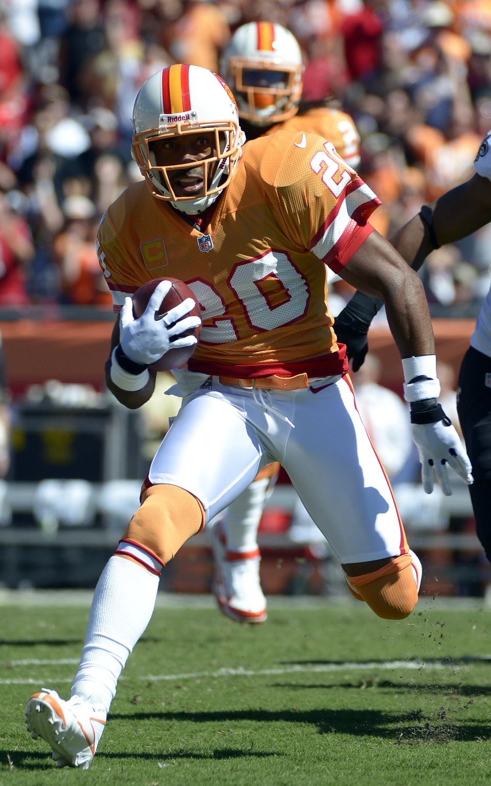
As you can see above, the Bucs wore the creamsicle throwbacks yesterday. If you click on the photo to see the full-size version, you’ll see something interesting: They used an old-school mesh with screened numbers (for another close-up view, look here). Not my favorite look from an aesthetic standpoint, but it shows an impressive dedication to period-appropriate detail. Speaking of which, look what they used for their midfield helmet graphic — a two-bar facemask. I think they’ve done this before, but it gets me every time. Very, very nice.
Other notes from yesterday’s games:
• The Texans wore their red alternates.
• Carolina wore white at home, forcing the Cowboys to wear their seldom used blue jerseys.
• The Rams wore white at home, leading to the rare sight of Green Bay wearing green on the road. I’m told that the Packers brought their white jerseys along to the game, just in case there was some sort of snafu. (I have a hunch that the Rams wore white because tomorrow they’re flying to London, where they’ll be the home team for next week’s game against the Pats. So they may have packed the blue jerseys already.)
• The Patriots wore their Pat Patriot throwbacks.
• A few weeks ago I mentioned that Mark Sanchez was wearing either black tape a taped-over ring on the ring finger of his left hand (which would be odd, since he’s not married). He was wearing that again yesterday, along with something similar on his right middle finger. Hmmmm.
• Giants running back Ahmad Bradshaw had his uni number on his eye black stickers.
• No photo, but Eli Manning ran to the sideline after a second-quarter play and swapped out his helmet for a new one. Apparently the radio function wasn’t working properly in the first one.
• The Bengals wore their orange alts>
• Look what happened to the NFL logo on Heath Miller’s jersey. Hard to tell if the logo finish got scratched off or if it just got covered with white paint from the field. Either way, looks better this way!
• There was a lot less pink yesterday. It was still there, but it was no longer so in-your-face. Did someone issue a “Let’s not overdo it” memo? In any case, it looked a lot better.
Turning to Saturday’s college action, you should start with all the info from yesterday’s post. After you’ve chewed on that for a while, here are some additional observations:
• Someone on Notre Dame was wearing a rather disconcerting mouthguard during Saturday’s game against BYU.
• Also in that ND/BYU game, someone on the sidelines was wearing a Big East vest. Obviously, the Irish and Cougars are not Big East teams, so what’s that about?
• UMass wore a black helmet with the school’s old 1990s script, even though the jersey and pants still had the current wordmark.
• Here’s something you don’t often see: FiOB and JrOB on the same NOB. That’s Arthur Brown Jr. of Kansas State, from Saturday’s game. Seems like overkill, no? Like, unless there’s another Brown Jr. on the team, he doesn’t need the initial.
• Georgia Tech painted its field logos pink.
(My thanks to all contributors, including Chris Batzinger, Richard Eddleston, Andy Henderson, Jon Solomonson, Britton Thomas, Rob Ullman, and of course Phil.)
Cupspiracy update: In 2005, Darren Rovell wrote a book about Gatorade, called First in Thirst. I read it at the time (it’s good!), although I no longer have my copy.
Robert Saunders was recently looking through First in Thirst while doing some research for a marketing paper, and he came across a passage I’d forgotten about — a passage that’s pretty relevant to our recent Gatorade discussions:
In 1989, during the week leading up to Super Bowl XXIII, the Cincinnati Bengals and the San Francisco 49ers were practicing in Miami. A few days before the day of the game, a trainer called [Gatorade marketing exec] Bill Schmidt to tell him that the coolers had Diet Coke logos on them. Schmidt soon found out that Diet Coke was the official beverage of the Super Bowl and the sponsor of the halftime show, which it paid for NBC to broadcast in 3-D. Part of the deal included the coolers and Diet Coke logo cups, an inventory that Gatorade helped define. When Schmidt found out about it, he told the NFL that under the terms of their deal, Gatorade had to be on the sidelines. They couldn’t put Gatorade in the Diet Coke cups, Schmidt reasoned, because that would constitute something called palming off, a term used to describe a situation in which one brand was representing something manufactured by another brand as its own. [Emphasis added.]
I guess it’s “palming off” if another company does it, but not when Gatorade does it, eh? What a surprise.

Research project: A friend of mine is involved in a project in which he’s examining inconspicuous visual symbols of achievement and/or status — sort of like college football merit decals, but he’s looking for examples that are less well-known than that (and not necessarily sports-related). Stealthy signifiers, if you will. If you have any suggestions, please send them this-a-way. Thanks.

PermaRec update: A coin with a swastika on one side and a Star of David on the other is our starting point for the latest entry on the Permanent Record Blog.
C-section revisited: I’ve written a follow-up to my recent ESPN column on the history of the wishbone-C.
Video reminder: In case you missed it on Friday, here’s the Bloomberg TV spot where I talk about all the Gatorade stuff.
Uni Watch News Ticker: Looks like we may be seeing a very different kind of World Series cap patch this season. They’ve never used the Commissioner’s Trophy as the basis of a patch before. ”¦ The Chargers may have been caught with their hands in the stickum jar (thanks, Brinke). ”¦ Here’s something you won’t often see: Pat Patriot and Flying Elvis being worn at the same time. That’s from last Thursday’s practice (from Tom Roddy). … Why limit yourself to selling off the name of your building when you can sell the names of individual entrances to the building? (From Paul Wajgel.) … Here’s a video clip that shows the making and maintenance of an LSU football uniform (from Jay Sullivan). … Also from Jay: In case you couldn’t guess, this kid just committed to Alabama. … Michael Orr has written a good piece about soccer coaches wearing sponsors’ logos. … The Indiana Fever have become the sixth WNBA team to have uniform advertising. … There’s something endearingly awkward about the script placement on these old uniforms for a Philadelphia department store baseball team (big thanks to Jacob Lipp). … Marc Mandin has a Bucco Bruce night light. “Had it for 18 years — still works,” he says. ”¦ According to this article K-State football coach Bill Snyder, “When he arrived [at K-State], he changed the offices and the practice schedules and the equipment and the logo and even the color purple. The old shade was too light, he decided, and light purple looked like a loser. He wanted it darker, and based the uniforms on the Dallas Cowboys” (from Britton Thomas). ”¦ Remember Greg Allred’s DIY project involving squares of artificial turf? Here’s the latest development in that project. “It has hashmarks with sort of a photo timeline of the years the turf was in use,” he explains. “This is on display in my office.” ”¦ Jason Mohr was watching an Erie Otters game and noticed two teammates with inconsistent Reebok logo creep. ”¦ UNO wore some pretty crazy hockey jerseys the other night. “The side panels have UNO’s interlocking O all over,” says David Westfall. ”¦ After last week’s ESPN column about the jersey-rental company JerseySquare, I’ve now been made aware of a company called Gearfoot, where people can buy or rent used athletic gear. ”¦ Good story about the local response to this season’s Rutgers football uniforms here (from Michael Romero). … A Giants fan in New Jersey misses Giants Stadium so much that he’s built a massive replica of it (from Mike McLaughlin). ”¦ Aussie football news: Club trainers and medical staff, who are often on the grounds during play, must now wear neutral colors, not team colors (from Leo Strawn, Jr.). ”¦ Also from Leo: New clash jumper for the Carlton Blues. ”¦ Cal is planning a gold-out for Nov. 2 against Washington. “Not sure how well it will go over with fans,” says Ethan Kassel. “Cal fans have had trouble all wearing the same color in the past. I do know that they’ll be handing out gold towels and some other gold merchandise.” ”¦ Here’s a good story on that four-eyes South Carolina placekicker. ”¦ What the hell is A-Rod wearing here? Chris Jowdy says it appeared in ESPN’s recent Broke feature. ”¦ Kenn Tomasch was taking in some Arizona Fall League action and spotted some lengthy NOBs. ”¦ Does the Minnesota football team’s new font really have a backwards-seeming lowercase n, as shown on this souvenir hot chocolate cup, or did the manufacturer just get it wrong? (From Jon Beckmann.) ”¦ “I didn’t even know it was possible for a soccer player to have no number,” says Tyler Johnson. “Probably a blood jersey.” That’s from Queens Park Rangers vs. Everton in the Premier League. ”¦ Interesting Warner Brothers studio basketball jersey here. ”¦ Rory McIlroy is supposedly on the verge of inking a deal with the Swooshkateers (Brinke again). ”¦ With all signs pointing toward the Astros going back to their old logo, Matthew McCormack knew just what to make for this year’s Jack-o-Lantern. If anyone else is carving sports logos into their pumpkins, let’s see ’em! ”¦ Gregor Blanco has a big ol’ patch where he slides (screen shot by De Rice). ”¦ “Each year Hallmark selects players in various sports, past and present, to depict as Christmas ornaments,” writes Michael Wissman. “This year, Walter Payton will have the posthumous honor of appearing on Christmas trees everywhere. But as a proud Uni Watch member, I found a fatal flaw in Hallmark’s rendition — the NFL logo on the collar didn’t start appearing until 1991, and Sweetness retired after the 1987 season.” ”¦ New road hoops uni for Georgia Tech, and I really like it (although Michael Rich finds it “too 1990s”). ”¦ “I was watching Sesame Street with our kid and thought I’d turned on a Maryland instersquad scrimmage,” says Grant Reeves. ”¦ This is really unfortunate: The girls’ volleyball team at Rainier High School in Washington, like most high school volleyball teams, wears SNOB — but the school name is misspelled. “The company that made the jerseys refused to correct the mistake, and the small high school couldn’t afford to replace them, so the Mountaineers have been forced to wear this misspelling whenever they need a white jersey,” says Brandon Sparks. Maybe we should take up a collection or something. ”¦ RIP, George. Good man, decent man.
Re: ND-BYU
Game had a Big East officiating crew (both schools are independents in football).
I am pretty sure that Big East vest at the ND game was worn by a member of the officiating crew. ND gets its officials from the Big East…
Erie Otters…not Eerie.
To answer the A-Rod question, that’s the single-A affiliate Tampa Yankees, probably a rehab start.
More here: link
Though its football team remains independent, Notre Dame is still a member of the Big East in its other sports. It will jump to the ACC, but not this season.
“Why limit yourself to selling off the name of your building when you can sell the names of individual entrances to the building?” – I know Reliant Stadium has the same deal, where they have the Ford gate, Coke gate, Amegy bank gate, comcast gate, and the verizon east and west club entrances.
Snoopy Stadium in the Meadowlands also has gate and scoreboard sponsors.
The Bradley Center was a gift to the city from the Lynn Bradley foundation. A few years back when the idea to sell the naming rights was floated, the foundation rightfully said something along the lines of, “Yeah, we kind of bought the naming rights forever when we PAID FOR THE ENTIRE THING TO BE BUILT.” Thus, they will sell the naming to right to every other part of the dump instead.
And oh, pardon me, the “BMO Harris Bradley Center.”
Reliant Stadium in Houston has been doing this for years. They’ve had the Bud Light Gate (or Coors Light… it’s basically the same thing, right?), and I think the Halliburton Gate. They change every couple of years. Hey, whatever. I don’t care–it barely even registers when I’m there. It helps me find which gate to go in and doesn’t sway me in my beer choice, so I say let ’em sell it to the highest bidder. I’m there for the football, anyway.
I don’t mind teams selling the names of gate entrances. In fact, it probably makes each gate easier to distinguish/remember. Lambeau Field sold the naming rights to all of its gates to compensate for keeping the traditional name of this historic stadium.
They had a Gallery Furniture gate but rumor has it that the owner of Gallery dropped the sponsorship when the Texans passed over Vince Young. The owner is a big UT alum/booster.
Consol Energy Center also does this with the American Eagle Outfitters Gate and the Trib Total Media Gate. Me and my friends, however, refer to the gates as the Fifth Ave entrance and the Mario Statue entrance
The Death Star(Cowboys Stadium) does the same thing.
When Coors Field was built, one family that owned some of the land (I think for the parking lot) wanted a Coors Field gate named after them as a condition of sale. They didn’t get that, but they may have increased their take on the sale a bit with the gambit.
re: the Warner Brothers studios basketball jersey….
Warner Bros has never used that logo. There ‘s no discription, etc for that item so I have serious doubts it’s from WB studios.
It just happens to be a WB in a shield.
Was there supposed to be a link in the “no number soccer jersey” QPR/Everton item?
Why’d you have to use Rondé, especially that full pic, as the headliner? Props to him wearing the QB/K/P style sleeves, but the combination of his bike shorts, and his uppers only covering his knees, just kills the effect.
Why’d you have to use Rondé, especially that full pic, as the headliner?
If you go back and read the first two sentences, you’ll find out exactly why I used that photo.
The first sentence established the throwback design, and the second establishes the throwback-style material (mesh w/screened numbers). And there are plenty of other pics from the game… yet you make no specific mention of Mr. Barber’s pants style, which just strikes me as a little odd.
I know you’ve complained about the bike-short look before, but since it just seems even more amplified by this particular scheme, it just surprises me that you didn’t make a comment about it.
Yes, there are lots of pics from the game — but very, very few pics big/high-res enough to show the mesh. That’s why I chose that shot.
By this point, an NFLer in biker shorts is dog-bites-man. Not saying I’ll never remark on it ever again, but the news value in that photo is the fabric and the screened numbers.
Actually, the QB-style sleeves, which you pointed out, are much more noteworthy than the pants. Thanks for that!
The thing that jumped out at me in the Ronde Barber photo was his gloves. No pattern, not even a maker’s mark. Just plain white gloves. I’ve not seen those before.
Paul, I think the Buc logo at midfield always had the two bar facemask back when they rocked the creamsicle look full time. Doing so yesterday added a nice touch of both nostalgia and authenticity.
You know what I like about that photo? The fact that the captain’s “C” is also in an orange tint and thus so non-salient that you can forget it’s even there.
Me thinks the Rainier volleyball team had someone from the high school (the coach?) sign off on the “proof” for the uniforms…hence the refusal to correct them. Either that, or there was a huge price concession.
I think I agree. If I owed a sports uni business I don’t think I throw away an entire teams’ (or maybe even school’s) business over a handful of VB shirts. I bet the the proof at the school was goofer.
But then again, the business’s proofer maybe should have caught it too and double checked with the buyer.
My wife runs a different sort of printing biz and she is contantly having to ask people if they *really* want something spelled the way they’ve ordered it.
Agree. Probably approved by the school and/or. If that’s the case, I definitely wouldn’t replace a thing.
You are correct, I included that in my email to Paul. The company fouled up the spelling and the proofer failed to notice the misspelling on their phone and gave the go ahead.
It’s just unfortunate that it happened and unfortunate that Rainier is a really small school with a very tight budget that doesn’t allow for them to replace something like this no matter how embarrassing it might be. Luckily, they were 2-0 in those jerseys until the other day.
Odd thing about the Pats’ throwback… the collar design is definitely the same shape as the flywire, but I have not been able to make out the telltale glossy wire-pattern on the front collar panels in any of the pictures I’ve seen of the game.
And I consider it a good thing if they were indeed absent.
Pats are one of a handful of teams that don’t wear flywire/Nikelaces.
Throwback collar
link
The Levy’s department store (and its baseball team) were apparently based in Houston, not Philadelphia. Link on team photo page references source link
I see the Bucs went to the trouble of a throwback logo mid-field, but the Pats didn’t.
natural grass vs field turf
…and the end zones, and the draping on the walls, and the coaches attire. They can’t blame it all on the playing surface.
Tyler’s correct about the no number jersey being a “blood jersey” – although I’ve never heard it called that. If a replacement is needed then a shirt with no number is often used.
Diakite ended the game with a bandage round his head and no number on his shirt.
Paul, Met Life Stadium also has naming rights to the 4 entrances….
This bothered me through the game yesterday…
link
Take a look at the back of the jersey on the far left. Didn’t the Bucs have way too much space between the name and numbers? They looked like counterfeit Chinese jerseys.
try this…
link
link
Indeed, it looks hideous. Seemingly all jerseys these days are pushing the numbers further and further down the back.
And some teams can turn otherwise great throwbacks into something just plain disgusting.
A UM INSTERSQUAD scrimmage?? I might have to take the INSTERSTATE to get there in time…
Years ago the Sabres had the “Satanic Goat head” logo that had a lot of white space – perfect for carving. I used to do a lot of jack-o’lanterns with it.
(This is an old scan of a photo)
link
Oooh, nice!
I did a Sabres Pumpkin as well a couple years ago. It’s their newer logo. It was my first time doing this type of carving so it didn’t turn out as well as planned.
link
In the “Something That Didn’t Happen” Department, there was virtually no pink on players in the Cardinals-Vikings game yesterday.
There was a lot less pink yesterday. Much more tolerable.
Maybe I’ll add a note to the text about that…
Doesn’t it sorta happen that way every year? The month starts with far too much pink, then it tapers off as everyone remembers how stupid it looks.
Yup, that’s why I thought it was worth noting.
I didn’t notice any pink on players on the field in the Ravens/Texans or Jets/Patriots games, though I didn’t watch the entirety of either. Still, from what I saw, much better.
I still think it wouldn’t be quite as bad if it were a softer, less saturated pink, instead of the eye-searing hot magenta they’re using.
the A-Rod pic is from his rehab pic with the Tampa Yankees
link
Paul, there is no link to the blank jersey from the Queens Park Rangers-Everton match.
I watched a little bit yesterday and that blank jersey is the result of blood; Samba Diakite had a cut on his lip and while wiping away the blood, he was smearing it on the left side of his jersey. After a few minutes he went to the sidelines, took off his jersey, and a trainer put a blank one on.
Thanks — now fixed. Here’s the link, so you don’t have to go back up to the Ticker to see it:
link
If you’re done with the pop-unders, thank you. I appreciate it.
Not sure if it was me and my computer or what, but it would load the page, and as soon as i would click on the first link, Chrome would block the link and let the pop under come through, and then I wasn’t able to open any of the links until i closed Chrome and then re-opened it.
Big East vest: also says Instant Replay. Often the replay folks are from a different conference than the officiating crew. Must have been a Big East officiating crew.
Or Replay crew.
If you’re referring to the BYU/ND game, both the on-field and the replay officials were from the Big East.
Nice Sesame Street video – clearly Humpty Dumpty should’ve been kept out a few plays to be monitored for concussion despite insisting he wanted to play – where’s Goodell on this?
Love those Bucs creamsicles. Much more interesting & unique than the current drab pewter, red & black (which looks like a darker & much more poorly executed 49ers look) with the crappy modern computer drawn clunky font & generic logos. If they bring it Bucco Bruce back, maybe darken the orange slightly or to a burnt orange & white pants only – absolutely no orange pants.
I used to hate this look but it has definitely grown on me over the years. Too many dark colors & schemes in the NFL.
I don’t think you can bash the pewter for not being unique. It may be a bit drab, and I’d even agree that there’s too many teams wearing dark colors lately – but I can’t think of another team on the planet (in any sport) wearing pewter. Meanwhile, the Volunteers of Tennessee readily come to mind as being another team wearing light orange.
The Bucs’ two uni sets are a perfect example that unis can be about the nickname OR about geography. There ain’t no “rule” that says has to be about the name.
The current set is great for the nickname (personally not crazy about the alt white pants, though). Very ruffian-ish, and the pewter was an inspired move to make them unique. With silver would just have been a version of the Tampa Bay Bandits.
The creamsicles? All about Tampa-St.Pete and Florida. Oranges, the sunshine state, white slacks & shoes…the traditional relevant stereotypes.
I think they’re both winners.
Well said.
Couldn’t agree more. Two of my favorite uni sets in the NFL are Tampa Bay and Tampa Bay. Every time I toy with trying to find an NFL team to root for – the Denny Green era bled all the purple pride from this Minnesotan, and I can’t back the Skins until they find a new name – I always seem to come down to the 49ers on account of growing up in the Joe Montana era and the Buccaneers, on account of their unis, colors, and piratical theme.
To me, pewter looks like a dark tan & muddy gold; like dirty pennies. It just doesn’t appeal to me or grab my attention. Just another metallic color in a league with too much of that already. Orange tragically gets reduced to only a miniscule trim color & the football on the logo. Orange & red – nobody else had that scheme & the way they executed it was great. They took a scheme & just darkened the hell out of it to look tough. DFDS.
Oh Arr. It’s too bad Bud Grant didn’t build enough Viking equity with you. To think you made it past Jerry Burns, then got miffed once Denny Green fizzled out. I’ve seen it all with this team. Unlike yourself, I’m in for the long haul. Wish I had a special drink for the day they finally win the big one. Anyone know where I could get that special drink?
You know I always liked the Bucs’ orange. I hated that all the complaints seemed to be of the nature of the color being a “pastel” — the Houston Oilers’ blue wasn’t any more intimidating, but I think just because the Bucs were losers for so long up until that point (their whole history except for 1979, 81 & 82) the color (in part) became the scapegoat. That they changed the colors in 1997 and became a winner didn’t help the creamsicle reputation. (Oh by the way they’ve had some sucky years in the pewter, to… 2006, 2009, 2011)
The Oilers had a lot of really bad years, too (64-66, 70-73, 75, 81-86, 94) but it was always Luv U Blue, no one that I know of tried to blame the Oilers’ losing on the pansy color. When they moved to Tennessee and rebranded as the Titans, they even kept the light blue.
It wasn’t the orange’s fault the Bucs’ sucked so much for so long.
Now they wear it as a throwback once a year and everyone loves it.
Tell you what, if Culverhouse hadn’t cheaped-out on Doug Williams, the creamsicles might have become quite associated with winning, thank you very much.
The Patriots have been to 6 Super Bowls with Flying Elvis, but I will never like that logo & or the unis. I don’t like a single thing about their current set.
I would like to see the 3-point stance Pat Patriot on the white helmet, but with a royal blue uni in white block numbers with red trim.
So you do prefer the blue jerseys to the red jerseys?
I’ve suggested this here before, it seems like a lot of the issues with the creamsicle uniforms had to do with the, how do you put this delicately, flamboyant logo?
Put the current logo in creamsicle colours, or render Bucco Bruce as some sort of zombie pirate, and I think you’ve got a winner.
(I suggested zombie bucco Bruce a while back and somebody whipped up a winner logo, can’t remember who)
Here we go, from 2009
link
link
That would be me… wow, 2009… how time flies.
Some said Bucco Bruce looked like a 1970s porn star, but I see it more as “Captain Morgan” now; which is what the players called it (read it on here).
Maybe skull & bones works for the Bucs, but it’s not what I think comes to mind. It’s Bucco Bruce & creamsicles.
link
I was at the notre Dame game on Saturday. The ND-BYU game was officiated by a Big East crew, hence the Big East vest on what, I believe, was a member of the chain gang.
Since 2002, the Green Bay Packers have sold naming rights to the five entrance gates. From the north going clockwise, they are: Miller Brewing (atrium gate), the Oneida Tribe of Indians of Wisconsin (east gate facing Oneida Street), Mills Fleet Farm stores (southwest gate), Associated Bank (west gate and private box entrance), and Verizon (northwest gate). The new north tower gate is sponsored by Bellin Health and the new south tower gate is sponsored by Shopko. Miller Brewing is also a sponsor of the atrium, and has a section in one end zone called the “Miller Lite End Zone”, giving away tickets in that area with various beer promotions.
mark me down as i LOVE a mesh, screen printed, NFL jersey! (and not just some cheap quality, overpriced renike replica)
BFS
It was a good day for the alternates in the NFL.
For Houston, I was never a fan of yet another professional franchise wearing a combination of navy and red, but I wish they’d now wear the red jerseys all the time. That’s a solid look.
The Patriots have a decent “modern” uni set, but seriously, how can they NOT want to wear the Pat Patriot set all the time? Love that jersey as well (I obviously have a thing for red).
And while I do like red jerseys, I actually think Tampa Bay needs to revert to the creamsicles. Why did everyone hate them years ago, when they look so darn good? Well, I know it was the losing, but still. I don’t mind the red and pewter, but just think the orange IS Tampa Bay.
Speaking of orange… Cincinnati, you look awful. In any combination.
*ahem*
I strongly disagree with your assessment of the Bengals jerseys. While the current uniform could use a bit of tweaking, the orange jerseys are a much better fit for the team. They probably should have never worn black at all, as evidenced by this image from early 1968: link
Well, if the Bucs aren’t going to wear orange (or maybe even if they do), then I would be fine with Cincy wearing it. That’s not a problem. It’s the design of their uniforms I loathe. Black, orange… whatever. It’s the white side panel, striping on the pants, etc., that just makes it a bad set. It’s all too busy, IMO.
The helmet is classic and shouldn’t be touched. Everything else… kill it and start over.
The Bengals sans helmet, need to be blown up & start over. Too much crap going on in that uni.
How do you think the Boomer Esiason-era helmet might look with the Essex Johnson-era uniform?
Me? Honestly that uni looks too much like the Browns. Dare I say… black jersey & orange block numbers with no white trim? Maybe some white & orange Northwestern shoulder stripes, or maybe a single orange shoulder stripe or orange collar & sleeve trim with white numbers outlined in orange. Hmmm.
I really like the orange jerseys, although all the piping, collars, panels, stripes just muddy it up. What’s up with a white side stripe on the jersey, then tiger sie stripes on the pants? C’mon.
I know I’m hoping against hope, but given the awesome helmet, Nike has something solid to work with moving forward. Of course they’ll make a mess of it but one can dream, no?
Texans: Couldn’t agree more. I like the red jersey/white pants combo best of all their combos. Would like to see the red pants worn on the road with the white jerseys also.
Pats: Also agree, that game looked so AFL, it was awesome. Every team in that division, sans Pats, has great white helmet/AFL looks, and the Pats havae that ugly silver/red facemask deal.
Can’t agree on the pewter. Love the pewter.
If I were in charge of the Bengals unis, I would have black jerseys and orange pants at home, and white jerseys and orange pants on the road (kinda like the old Browns unis), With some sort of tasteful tiger striping on the pants.
I used to hate the Bucs creamsicle uniforms back when they were the team’s primary uniforms. Mostly because they were associated with an incompetent losing franchise. When the team adopted the pewter uniforms, I thought it was one of the best upgrades and modern unis I had ever seen. Immediately, the Dungy/Gruden era established Tampa Bay as winners (and Super Bowl champions) in that look. But since bringing these uniforms back as throwbacks in 2009, I think they are amazing. The league has so many “tough-looking” dark colors that the pastel is an amazing contrast. The colors look brilliant and beautiful. The Bucs attention to detail is also incredible. Not only are the uniforms era-appropriate, but the entire field/stadium is decked out in the look. Very impressive. These have got to be, at least visually, the most well-done throwback games ever.
This is exactly what I was saying above…. everybody hated the orange because they were mostly losers when they wore them, and now everyone’s all nostalgic for them.
It wasn’t the orange color’s fault they sucked, it was Hugh Culverhouse’s.
which explains why the patriots fans love the shit they’re wearing now and mets fans cream for the awful racing stripes
winning in bad uniforms trumps losing in great ones
Honestly, when there is such division over whether to wear one primary color home jersey over another, why not (and I know this is a crazy idead) let the fans decide? Seriously. Run a poll at the stadium. On the website. Wherever you can. Forget jersey sales – that’s not a good indicator, IMO.
It would be interesting to see if Cincy fans preferred black or orange, Carolina fans blue or black, etc.
Then again, a lot of fans are stupid and uni-unaware. Maybe that’s not such a great idea…
“but the orange jerseys are what they should be wearing.”
Indeed. If we want to go all zoological, a tiger is an orange and white cat with black stripes. Just gotta look a photo of one to see that.
link
I never saw a midnight green eagle…or a kelly green one for that matter.
Not the point.
At all.
I said IF we go all zoological…IF. Point is that for a team DOES opt to wear the colors of the animal from which their name is taken, orange might be a better primary color for the Bengals than black.
NO WHERE did I say a team MUST chose colors based on the beastie in question. Wouldn’t. Except maybe when a particular color or combination of colors is endemic to the identification and/or name of the creature, or species of creature. And that’s a relatively short list. Cardinals and Orioles, for example. Or for a team called, say, the Palominos.
I’m a bit bothered by the Creamsicle throwbacks. If all the claims from Reebock, Nike, and the NFL over the last decade are true, then modern football jerseys are better, safer, and give the athlete wearing them a competitive advantage over the athlete wearing old-fashioned mesh jerseys. So either the Bucs “attention to detail” endangered their players and tilted the playing field in favor of their opponents, or all the claims about “performance” athletic wear are empty BS.
Now, I happen to suspect it’s the latter, and a simple mesh shirt is just as good as Nike’s latest choke-yoke, sweatbox, combat-ready ops jersey. But that’s not what the league and the manufacturer say, and both have a financial stake in the purchasing public believing that modern jerseys are objectively superior to old-fashioned simple mesh numbers. So if we take their claims at face value, then Tampa Bay just endangered its players and chose to play on an uneven playing field. Which is maybe even worse than lying to fans for money.
Perhaps the Bucs just thought that they were so superior to their opponent that it wouldn’t matter.
Eh. Your point is well taken, but remember that several teams have chosen to go with “no innovation” this season (Raiders, Eagles, Packers, Falcons) and are sticking with the old Reebok-style jerseys. So are they making their players play with one arm tied behind their back? Or can different teams come to different conclusions about whether any of this stuff really matters?
OMG, have they forgotten the rash of mesh-related injuries back then???
Shameful disregard for player safety.
What I’m really saying here is that the nonchalant use of 1970s-style mesh jerseys in an actual NFL game means that the “performance” claims made by Nike (and Reebok before) and the NFL are demonstrably just as false as the implicit claim that Davey Johnson’s water was really Gatorade. The league in either case is complicit in lying to fans in order to persuade them to purchase a product. Only MLB doesn’t see any direct cash profit from the sale of Gatorade products, whereas the NFL does see direct cash profit from each sale of a “performance” Nike jersey. So in terms of the moral corruption at work, the jersey thing is objectively worse than the Gatorade thing.
Similarly, though without a morally pernicious dimension, the fact that baseball teams can all wear 42 on their backs for a game proves that the justifications for names or numbers on the back of any baseball jersey are false. If the game can be played without different numbers on each player’s back, then numbers are not necessary to play the game, and so MLB’s rule requiring numbers ought to be voided. MLB’s behavior makes it plain that jersey numbers exist entirely due to some combination of deference to false tradition and a desire to sell individually differentiated jerseys.
Exactly.
Much of this is flat-out baloney.
As you said of another situation, solutions in search of a problem.
“and thought I’d turned on a Maryland instersquad scrimmage,” says Grant Reeves”
Very good, Grant. I like that.
The wishbone-G images and the asymmetrical wishbone-C of the Bears makes me think that their wishbone-C originally came from a wishbone-G.
I believe it was both a Big East officiating (certain of that one) and replay crew (that doesn’t understand “controlling the catch”).
The Cleveland Browns originally sold the naming rights to Cleveland Browns Stadium’s gates. They are no longer corporately named, I have not been able to find a date as to when this change happened, but they were originally named Cleveland Clinic gate, National City Bank gate, CoreComm gate or Steris Corp. gate.
link
“Looks like we may be seeing a very different kind of World Series cap patch this season. They’ve never used the Commissioner’s Trophy as the basis of a patch before.”
I can’t find a shot of the back of the hat but I’m almost positive that the 2008 Phillies National League Champions Locker Room hat had the Commissioner’s Trophy as a patch on the back. It’s this hat, but on the back:
link
Dinamo Riga of the KHL are wearing a third jersey that looks like a hybrid between the Senators crappy “SENS” alt (styling) and the Stars’ set (front name/numbers).
So bad.
I think I saw someone post this on this site a while ago, but what if the Buccs used their old color scheme with the modern logo (Creamy orange with the pirate flag)? That would look cool.
You mean this: link
yea, i think maybe i’d make the flag the darkest color in the scheme, but yeah thats it
Yes the Golden Gophers have backwards lowercase n’s in their new font. I have no idea if that is only the case in the font or if they just decided to randomly use a backwards lowercase N for their capital N in their team name.
Here’s what it looks like on the back of the gold jerseys:
link
I’m getting a page not found error following your link, but mostly I wanted to let people know that you and I are not the same person contradicting… ourself. ;-)
Okay, this should work:
link
So it looks like there is some inconsistency in which direction that “n” should face. Given what the rest of the font looks like, I’d be inclined to guess that the backwards “n” is actually what it’s supposed to look like, and instances where it looks “forward” is probably the work of a well-intentioned third party. Here’s another “forward” example:
link
And then we have this:
link
As a U of M alum, I’m more than a little embarrassed upon seeing the whole alphabet in that type. And not just for how the W makes my eyes bleed. The serif on the A violates the apparent “rule” for serifs on other letters. And the V has no serif at all, the J needs a serif, the T is less than half-baked, and the “rule” of an angled upper-left corner is inconsistently applied. That is a sub-amateurish typeface, in that an amateur would be expected to do better. A shame also that U of M didn’t build its type around the athletic M logo. It would be a challenge, but a successful type built around that M would be really distinctive.
… and this:
link
I tweeted @GopherFBEquip — not sure why I didn’t think to do that earlier — and they got back to me with this response: “When 1st done it was one way and then was changed for a better look.”
That would make sense why the promo photo differs from the actual in-game photo. It would also make sense why the souvenir cup has the old way since I’m guessing they sent designs to the manufacturer prior to changing it.
I assume “changed for a better look” means “we got tired of people telling us it was backwards.”
Looks like the n’s (I hate to use apostrophes there, but don’t know a better way to get the point across) are backwards on that Minnesota Football cup, if we can take the graphic below as authoritative. Personally, I don’t get the occasional lower-case in a field of caps, but that’s a whole other story…
link
Re: Wishbone C’s…
Did anyone mention that when the NY Stars of the WFL apruptly relocated to Charlotte, they literally cut and pasted a Chigago Bears C over their existing star logo?
Not in this current round.
But it’s been mentioned.
I remember watching the first game after they’d re-located. Was painfully obvious what they’d done. Sorry, no screen grab.
Yes…one Jim Baker pointed that out in the last installment.
link
Also RIP Native American activist Russell Means. Here he is talking about why Cleveland “Indians” and Chief Wahoo are bullshit.
link
On the St. Louis Cardinals’ official Facebook page, a picture was posted about an hour ago of three of Carlos Beltran’s bats.
It shows Beltran’s bats adorned with the David Sulecki-style bat knob decals as detailed link last year.
Here’s the link to the pic: link
Anyone previously aware of the Cardinals using these? Anyone know if they’re actually being used in games? (My guess is no on both accounts.)
I goofed that up really well. :P
Here’s the Uni Watch (ESPN) article from 2011: link
And here’s the Facebook pic of Beltran’s bats: link
Am I the only person in history that prefers the Cowboys blue jersey to the white? So mind-numbingly BORING.
No. I love the blue jerseys. The white jerseys look like absolute shit. Plastic-y iron-on- ish looking numbers and sleeve stripes. If I were playing the ‘Boys, I’d always wear white at home and force these idiots to wear the blue.
+5 for Jen.
I’d definitely love to see more teams who have the Cowboys on their home schedule pick white for their team in those games.
The “bad luck blues” are, relative to the common whites, AWESOME. They yield the navy socks and the “non-greenish” pants => lo and behold, everything matches! I’m normally biased against “redundant” double-outlined numbers (i.e.: white numbers with a navy outline, and then another white outline), but it works here, IMO, because it evokes the double-outline star logo.
Nope, I love them too. As much as I dislike the Cowboys, I have to say that’s one of the best NFL unis out there. I wish we could see it more often.
On a related note, concerning the Bill Snyder blurb in the ticker, I was thinking how much K-State’s white unis look like the Cowboys, albeit in a lilac-lavender-purple scheme. Under-rated and should be in the 5 & 1 one of these days.
I will never understand why anyone would go into a football game without the requisite padding, knee and thigh. These are the same dumbasses that hop on their Harley’s and ride in shorts, t-shirt, and no helmet.
I didn’t see it posted anywhere about the new helmets that Toledo wore vs. Cincinnati on Saturday (link).
I took a quick look at their website and found four helmets that they have worn this year.
link
link
link
The picture from the WMU game is not from this season, is it?
I didn’t think so either, but it was the lead photo for their game story.
Paul, thought you might like this. NFL Shop can’t fit Michael Hoomanawanui’s name on his jersey
link
Hey Paul, Im a 17 year old from Ct who has been reading UW for about 2 and a half years. This was probably already posted, but Uconn has ordered Morgan High School in Clinton to “phase out” its 59 year old Husky logo and adopt a new one. I just think its weird that Uconn is going after an in state high school.
here’s the link: //www.wfsb.com/story/19884615/high-school-in-clinton-remaking-its-logo-after-uconn-notices-similarities
I love this site, have for years, but shame on you for publishing what you did about Terrell Suggs. It’s irrelevant, and an unwarranted cheap shot at Suggs.
He’s in athletics and that’s part of his aesthetic…
Thanks, Raleigh — I think you’re right. I didn’t need to do that. In fact, I’ll take it down now. Thanks for the reality check.
That’s really cool, Paul. Thanks for hearing what I had to say. Now, back to uni-watching!
Very big of you, Paul.
Briggs with no Nike shoulder logos tonight.
Briggs with no Nike shoulder logos tonight.
I CAN’T UNSEE IT!!! AAAAAHHHHHH
Don’t have pictures but noticed garza with no nike swooshes on sleeves for the bears tonight.
Notre Dame home games typically feature the opposing conference’s officials on the field and Big East officials (by contract–other ND sports are in the Big East) in the replay booth. Since BYU is also independent, they must have agreed to also use Big East officials on the field because a Big East crew worked that game. But the guy with the vest holds the Instant Replay headset.
Big East officials work ND away games under the agreement they typically have for home-and-home series.
The player with the funky mouthguard is Cierre Wood (RB #20).