[Editor’s Note: Today we have a guest entry from Kyle Kendall, who recently got the opportunity to redesign an entire team. Enjoy. ”” PL]
By Kyle Kendall
I’ve been reading Uni Watch every day since the beginning. I wanted to tell you about a pretty large project I’ve been working on for the Dubois County Bombers, which is a good example of the influence that Uni Watch can have on design.
At first glance, the Bombers look like just about any other summer collegiate wood bat team. For years they’ve worn softball tops and long pants, and have lacked a visual identity. The one thing that makes a Bombers home game memorable, at least for me, is that they play their home games in Huntingburg League Stadium in Huntingburg, Indiana. It’s a great old stadium whose original grandstand dates back to 1894. It’s had various expansions and additions, the biggest of which was in the early ’90s, when it was renovated to be used as the home stadium for the Rockford Peaches in the movie A League of Their Own.
I’ve attended quite a few Bombers games over the years, and it’s always driven me nuts that they didn’t embrace this beautiful stadium. Yes, they played in it, but just because it was there. As a graphic designer and baseball collector, I always saw this as a missed opportunity.
Well, the past two seasons my younger brother worked for them, first as an intern and then as the assistant GM. At the time, I was working for a small marketing firm, and we were able to kick a few ideas around. We did a few small projects, the gameday programs, some photos, etc. Nothing major, but it planted the seeds for the bigger ideas that my brother and I wanted to pursue.
A year later, my brother has moved on to full-time work, and I’ve changed jobs as well. But I’ve continued to work with the Bombers as a marketing and design consultant. And this is where it gets fun.
Bombers GM Gary Freymiller and I have become pretty good friends, and he’s completely bought into our ideas. We’ve decided to embrace the stadium and the name “Bombers” to rebrand the team as a 1940s-era squad. Essentially the idea is that every night should feel like a turn back the clock night. With a limited budget, we couldn’t get everything done in one year, but we did bite off the first few big chunks this season, including the following:
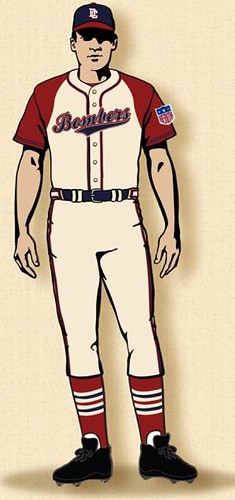
• New uniforms: Obviously the biggest key. I proposed a few different throwback designs, and the one we settled on is a real beauty. It’s somewhat based on the red-sleeved KC Monarchs of the ’40s, but with beautiful striped stirrups (I’m a Cardinals fan). We also added the “Health” patch to the sleeve, to give it the authentic feel of the era. And I was thrilled that we were able to get Ebbetts Field Flannels to make the uniforms — they’re supposed to ship this week. I’ll definitely be sending photos when they come in. If all goes well this year, we’ll add the road uniform in 2013.
• New team bus: In A League of Their Own, there’s a great old bus that the Peaches use, so we got an old school bus and renovated it to capture that feel. It turned out beautiful. It’s not an exact reproduction of the movie bus — more of a faux-back — but we put the Bombers logo on one side and the Peaches logo on the other. We figured it’s good advertising as a rolling billboard and will be a nice photo op for tourists who still stop in to see the field.
• New stadium branding: The City of Huntingburg commissioned me and my former employer to create a new logo and brand identity for League Stadium. We also added bunting to the outside of the stadium. We have other signage ideas, but they’ll probably be tabled until 2013.
• Scoreboard: We are only using the old manual scoreboard in left field. The new digital scoreboard that the local high school team uses is going to be covered up for Bombers games.
There are other things we want to do — have our beer maids dressed in Peaches uniforms, maybe add a turnstile to the main gate, cut a dirt path from the mound to home plate, you get the idea. But we’re on a budget, obviously.
As an aside, the Bombers’ GM and I took a field trip down to Louisville about a month ago to see uniform designer Todd Radom speak to the Louisville Graphic Design Association. About a 90-minute drive each way, but well worth it. We got to speak to Todd, show him what we were working on, and even talked Uni Watch a bit. A great story for another day.

Collector’s Corner
By Brinke Guthrie
You know when you search eBay and you come across something you’ve never seen … ever? That feeling of, “Whoa, what’s this?” A lot of those make it into CC, and that’s what this week’s entry is devoted to — eBay firsts, all from the 1960s. So we’ll lead off with this gem: a set of Heinz NFL pins — er, Booster Buttons. A lot of bids as of this writing, so expect this one to go to the moon.
Here’s the rest of this week’s haul:
• I love the box art on this Wilson uni set, featuring Griese, Sayers, and Brodie.
• Can’t resist this terrific set of Green Bay Packers drinking glasses.
• Rams fans will dig this “Acrometal” L.A. Rams plaque. Note the NFL shield has just two stars!
• Looks like ol’ Herman Weiskopf had a free ride for Red Sox games in 1963.
• Here’s a nice heavy-duty 1960s Chicago Black Hawks mug in pristine condition.
• This one’s for Paul: a New York football Giants sideline jacket. Love the label from Thorp Sporting Goods on W. 40th St.
• This cool NFL lamp has the old “Officially Licensed Product” logo on the bottom, and it totally has the Sears NFL vibe, right?
• I included this basketball jersey in this week’s listing simply because the college is called “Tougaloo.”
Seen something on eBay or Etsy that you think would make good Collector’s Corner fodder? Send your submissions here, and you can follow Brinke on Twitter and Facebook.
Stirrups Club Update
By Comrade Robert Marshall
Greetings comrades in looped hose,
While the Revolutionary Stirrup Party is as committed as ever to holding back the heathen hordes and their pajama horrors, I realize news from the front lines has been long overdue. First and foremost, the revolution must announce that we are packing up the trucks after a year and a half in Kansas City and moving the underground bunkers of right proper lower-leg aesthetics back to the City of Broad Shoulders on June 15th…huzzah! huzzah!! While the City of Fountains has proven to be a wonderful place with even better people, the revolution just misses those wunderbar Chicago winters. Because of the impending move of the stirrupburo, I have already ordered and in some cases already procured the latest batch of hose. And what I do not already have in the revolution’s armory, I expect this week, so turnaround times for new orders will be much faster than in the past.
Let’s begin with this month’s à la carte re-releases, which consist of magnificently striped stirrups from the Cardinals, Red Sox, Rays, Pirates, and Orioles. Since these have already been ordered for quick shipment, there are limits to the number of orders I can fill, so act fast. (A quick note on other à la cartes: I realize that stockpiles of the revolutionary armaments are low, but I’ve had to do that because of the impending move. Please be patient — I will start replenishing the stockade soon, and I already have some fun stuff running through the old brain-pan for future orders, so stay tuned.)
Now on to the latest new offerings. The first one, as you can see there, is listed as “TCK oops,” and therein lies a tale: The knitters of the revolution — Twin City Knitting — sent central offices a load of stirrups that had never been ordered, took the money out of revolutionary accounts, and said, “Well, we sent them, they are yours.” Does that make any kind of sense on any level? I didn’t think so. Nonetheless, they are pretty great stirrups, so I wasn’t too disappointed. They’re like the 1967 Sens stirrups we did a couple years ago, but the navy is black this time around. A pretty swell hose, and I have to say it was well made and sized correctly, so it is a real winner.
The other new offering was designed by Comrade Chris Lamping of Minneapolis, who plays baseball for a team representing the Wobblies. (For those of you who are unfamiliar with the Wobblies, you owe your eight-hour workday to them, among other things.) The stirrup is a takeoff of the Oakland Oaks’ design, except in black, and I imagine the single red stripe represents the IWW creed of one big union. Whether you agree with the politics of this baseball team or not is really of little consequence; the fact is that the concept jibes with the concept of this very stirrup revolution, in that we are united in one big union to further the cause of the proper aesthetic, so I decided to stock Chris’s design for the madcap revolutionaries here.
For more information on how to order stirrups, look here, and of course feel free to contact me with any questions.
From each according his stirrvp, to each according his strype,
Yours in aesthetic solidarity,
Comrade 91200
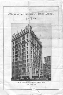
PermaRec update: I was recently provided with an amazing document: a 1930s promotional brochure from the Manhattan Trade School for Girls (or, as it had just been renamed at that point, Manhattan Industrial High School — shown at left). I’ve written an entry about it for the Permanent Record blog.
Also, I don’t mind saying that last week’s full-length PermaRec feature on Slate was really, really good. Try it — I think you’ll like it.
Uni Watch News Ticker: New football uniforms apparently on tap for Arkansas, and holy fuck are they ugly. … Last week Vinnie Dinolfo proved, despite my initial skepticism, that Joe “Turkey Joe” Jones really did wear a nickNOB. His other NFL nickNOB claim, which I also doubted, was that 49ers RB Kevin Cunningham wore “Goober.” Still no photo of that one, but Vinnie has now provided contemporaneous confirmation. Excellent work! ”¦ Baseball Hall of Fame curator Tom Shieber has written a good blog post about how the Babe Ruth jersey that recently sold for $4.4 million was authenticated. … Good video clip on how Brazil’s soccer uni design came about (from Jeremy Brahm). … Reprinted from yesterday’s comments: In Saturday’s Giants/Cubs throwback game, Sergio Romo apparently cut the bottom strap of his stirrups — or maybe just untucked them from under his feet — and let them flap in the breeze. … Good story about Liverpool’s new deal with Warrior (from Lucas Ravenscraft). … “I was wearing an old Washington Senators hat on a tour of Nationals Park a few weeks ago,” writes Alan Chewning. “On my way out, some staffer in a suit walked past me and said, ‘Nice hat.’ Then she said, ‘The Nats are going to wear something similar in July when they play the Braves. Actually, they’ll both be wearing throwbacks.’ I tried to get more details, but she wouldn’t budge.” … Back in 1966, fans were suggesting names and designs for new teams, just like we do today. Check out what one New Orleans fan suggested as a helmet concept for the Saints. “One Chris Creamer member said the logo design reminded him of a nuclear blast,” says Russell Goutierez. ”¦ This is pretty cool: bracelets made from baseball stitching (thanks, Kirsten). ”¦ Title IX-themed uniforms on tap for the WNBA (from Kevin Brown). ”¦ The Nats have begun listing their players’ Twitter handles on the Jumbotron (from Aaron Rich). ”¦ Rob and David Arnold note that this year’s Stanley Cup finals match-up was foreshadowed way back in 1991 by the box cover photo of this hockey video game, which featured the Devils and Kings. … With this year’s Mets/Yanks subway series about to get started, Dunkin Donuts has started running a commercial featuring Terry Collins and Joe Girardi standing around a batting cage. I understand that they didn’t want to pay to use a real player’s NOB on that batter in the cage, but couldn’t they have either (a) invented a fictitious NOB to slap on that jersey or (b) just used a Yankees batter instead? Also, one of the skips should’ve been wearing a road jersey (screen shot by Dave Rakowski). … John Moist recently attended a Pacific Coast League reunion event and took a bunch of cool jersey photos. … Here’s a sport I hadn’t previously known about: blind tennis. No, really! … Cool find by Jake Greenand, who scored this old MLB windshield screen at a garage sale for two bucks! … Remember that red Arizona helmet from yesterday’s Ticker? According to Arizona athletic director Greg Byrne, it’s not the real deal (from Kevin Wos). ”¦ Lots of new soccer kits from Jon Forbes: Liverpool away; LOSC Lille home and away; West Hame United away; Paris Saint-Germain home; Real Madrid home, away, home keeper, and away keeper; and Everton away. ”¦ Funny article on 10 embarrassing pieces of UConn merch (from Gregory Koch). ”¦ Kudos to Chris Chase of Yahoo Sports, who came up with a great lede graf for his story about Caroline Wozniacki’s new line of underwear (thanks, Brinke). ”¦ Sam Lam spotted Jemile Weeks wearing the old A’s helmet logo last night. I sent a note to A’s equipment manager Steve Vucinich, saying, “I thought you got rid of all those old helmet decals!” He quickly responded: ” So did I! Turns out we had to get him a new helmet today and had to dig deep into storage to get the correct size (dreads and all). It has now been changed!” … Intriguing find by the Hungry Hungry Hipster, who writes: “I was watching highlights from the 1980 Falcons/Cowboys playoff game in Atlanta and spotted a banner with what looks like a combination of the original and current Falcons logos.” … There’s something really sweet and understated about this faded snapshot of a teenage girl posing in her softball uniform. … Here’s a story I missed from a few weeks ago: The Jags have fired longtime equipment manager Drew Hampton. Hampton often posted uni-notable news on Twitter, so that’s a real loss (from Robert Lim). … While looking for something else, I came across something disturbing: Former Angels pitcher Frank Tanana throwing out the first pitch at a game last year in sandals. Ewww. … Indie-rock-o-rama tonight at Le Poisson Rouge, with the Clean and Times New Viking on the same bill, whoop-whoop! I’ll be there. You too, I hope.
what have ya got against sandals (flip flops, thongs, etc)?
mandals don’t belong on the bump
That’s why he’s my bench coach.
Phil,
I can think of one person who disagrees… link
Kudos to Kyle and the bombers, and thanks to Kyle and to Paul for bringing us today’s lead. Awesome story, and great work! Two thoughts.
First, I wonder how the players will respond. Do young men today notice or embrace this kind of attention to detail and celebration of heritage, or is it just another set of pajamas and they really just want their long pants back?
Second, since Ebbets is making the unis, this may be a good opportunity for the team to raise a little extra revenue not usually available to summer teams: Let EFF sell the jerseys via their own retail channel with a percentage cut kicking back to the team. I know I would strongly consider the road jersey in particular if it were available.
I love what the Bombers (and Kyle) have done! It’s great that the level of attention is being given to summer wood-bat teams. We have a local Atlanta Crackers summer wood bat team and their uni’s are NOTHING like the Crackers uniforms of yore.
A peeve of mine is when teams wear no NOB’s, but the numerals are sewn so that names can be added later. That’s what the back of the Bombers redesign looks like. Other than that, kudo’s to a job well done. Let’s hope the rest of the league tries to outdo you!
I wonder also whether Ebbets is making this in the traditional wool (Paul- can you clarify?)
If so, it’ll be interesting to see whether the additional heat (vs. say a coolmax type jersey) and cleaning and durability issues (again vs. polyester) will cause some practical reconsideration.
I love the idea and the design, but given how cash strapped many of these teams and leagues are, I hope expense considerations don’t cause this to die a premature death…
ed
We did them in double-knit, for a lighter weight and we had to be able throw them in the washer in order to have them clean in 24 hours.
Great – thanks for the response!
And that is why baseball is the best sport there is.
Top notch lede.
Thumbs up for Kyle. Nice effort all around!
Ditto.
“Cool find by Jake Greenand, who scored this old MLB dressing screen at a garage sale for two bucks!”
Looks more like a windshield shade, especially since it’s sitting on a car door.
Duh. Thanks. Will fix.
Check your spelling
Outstanding job by Kyle and his bro. Knowing the economics of independent ball, I doubt they got paid much at all, so this truly feels like a labor of love. Big-time kudos!
sweet job kyle
Sandals with long pants make a guy look like a douchebag. Sandals with jeans are even worse.
Rex Ryan probably loves ’em.
I love the Prospect League. I grew up right by Danville, IL, and have taken in many a Dans game. I’m still working on trying to get a team in that league in Lafayette.
Mets jersey without the NOB looks fantastic. Maybe they’re going to use those in the future… Okay, maybe they’re just cheap, but one can dream.
Agree; I got mine (2012 road gray replica) done up with no NOB, and standard skyline patch on right sleeve.
Note though that in the DD commercial, the Mets’ pinstriped unis are white, not off-white. While I’d like to see this change, I’m wondering why they did the commercials this way, viz., why they took the extra step to have white Mets pinstripe unis with no drop-shadow and 2012 patches custom-made instead of using existing stock.
On my monitor link.
But that Met looks great NNOB. Loved it when the Amazins did it in ’99. Would look even better today, without the black.
I wonder if they would consider doing that with the pins, since it’s a deliberately retro look.
Definitely not the same shade as the NYY uni.
OK, sort of, maybe, but I saw a giant cardboard standee in a DD store the other day and the uni looked white to me. Maybe it’s just the lighting…..
That one might well have been color-correction by a graphics department that didn’t realize the uniform wasn’t supposed to be white.
Anybody remember the anecdote from STAR TREK with the early makeup tests? Nobody told the developer that they were trying to color the actress green, so he kept adjusting the mix to correct, no matter how dark they made her makeup?
Could be. Either that, or they thought the off-white uni looked “dirty” next to the white one, as if the Mets were too cheap or lazy to do laundry as opposed to the clean, classy Yankees. :)
OK; I finally saw the TV spot in HD and Terry’s uni is definitely off-white. Still doesn’t explain the standee, but……
UW complaining about a (fictional) NNOB jersey?? I think north is facing east & east is facing south today.
Seconded, Scott. All teams look better without NOBs, particularly pinstripe-wearing teams. The Mets need to go back to that classic look — at least at home.
Thumbs up to Kyle and the Bombers. I live in southern Indiana about half an hour from Huntingburg and I’ve never been to a Bombers game, but I’m thinking that needs to change. :)
If I was in driving distance I’d definitely take in a game. For the stadium alone, but Kyle’s overhaul would seal the deal.
Bravo, Kyle.
I’m a good friend of Kyle’s, went to college with him and used to talk uniforms long before there was a UNI-WATCH blog to fuel this obsession… We typically agree on most things, not all, but most. He did a great job on these and deserves kudos. However, I’ve seen the finsihed product, why no pictures here in this story? Was me seeing the actual uniforms a Kyle Knedall exclusive!?!?
Kyle will be providing me with photos for a follow-up item shortly.
Check them out on Facebook, lots of great pics there.
I was watching game 3 of Kings-Devils last night and as I lamented the lack of color (uni-wise), I started to think about past SC Final match-ups and realized it’s been a really LONG time since the Eastern Conference representative had a uniform without any black. Who knows what team/year I’m talking about?
Off the top of my head?
1993 – Montreal Caandiens vs. Los Angeles. Montreal does not wear black anywhere on their uniforms.
without cheating, off the top of my head, 94 rangers? 93 habs before that? (or did i mix that up?)
You’re pretty spot-on, Ryan. Both of those work. It was before the all-black era in the late-1990s. :o)
you’re quicker on the “submit” button!
i just narrowed it down to teams in the east that don’t wear black. i almost always use the 92 pens as a benchmark for talking cup winner trivia. i REALLY get confused in the devils-avs-stars era though. sprinkle in a detroit, and my head hurts…
Ah so close. I’ll forgive you guys for forgetting the red/blue/yellow clad Florida Panthers who were swept by the Avs in 1996.
But they have black on their uniforms. Pretty sure Florida uses it as an accent color on the Panther logo. That’s what I went with in terms of “without any black”.
ah, damn! forgot all about the panthers! good trivia
I don’t see any black on the panther logo. That’s just navy.
I’m gonna say you’re all wrong. It was the 1989 Habs.
All the teams you mentioned had the black and orange NHL shield on their unis.
Heh.
Seesm you’re right, FYSD. I was checking out the blue Panthers jersey where some of the embroidered navy looks really dark compared to the surrounding air-knit fabric before realizing they wore red on the road in ’96. Good call! Great question!
I might be missing the punch-line, but that’s not Joe “Turkey” Jones? Jones was a linebacker, front 4 I believe on defence, the guy that rammed Terry Bradshaw head first into the ground. The picture, looks to be a wide receiver.
Jones originally wore No. 80, back in the days when defensive linemen (which is what he was, not a linebacker) were allowed to wear numbers in the 80s. Then he left the Browns and came back, at which point he wore No. 64. The nickNOB photo is from his earlier stint with the Browns.
Well I think I just found another spot to check out this summer. Huntingburg, Indiana here we come.
Chris Chase is an effing tool. Can’t believe he was mentioned here.
Is that eBay seller kidding? They have to put “Lesbian” in the listing for the picture of the teenage softball player? WTF?
It’s just a search-optimization trick, like when sellers put “rockabilly” in a listing for a bowling shirt. A photo of girl in a softball uni may of interest to people who collect lesbian ephemera, so he put that word in the headline for people who search on that term.
“A photo of girl in a softball uni may of interest to people who collect lesbian ephemera…”
~~~
is there a big market for such? (serious question)
I’m hoping that technique will work as I’m trying to sell my lesbian vintage steampunk canoe.
That’s kinda creepy. Truly, I work in social media/web design and while it may be an SEO trick, it toes the line with pedophilia.
Not saying that this guy is, as he sells a lot of old photos, but it’s in bad taste to have the first description be “TEENAGE GIRL” and then end with “Lesbian”.
Why exactly is it in bad taste? Is it in any worse taste than if he had simply put “Sexy”?
it toes the line with pedophilia.
Um… no?
Pedophilia is an attraction to pre-pubescent children. Teenagers don’t generally fall into that category. I mean, seriously, a guy who finds the latest 16-year old pop singer to be attractive is not a pedophile.
Yeah, it’s a bit lame to put that in his auction descriptions, but come on.
Yup. The age of consent being artificially high (high school backseat antics are a felony in some states) in an attempt to impose some artificial moral standard does not change biology. Teenagers, especially in the later stages (16ish and up) are adults in terms of sexual development.
link
THE…you seem awfully well-versed in this
The way eBay works is when a seller posts an item that they think would appeal to various types of people, they put additional key words in the auction title.
Vintage sports t-shirts get “Emo” in the title because sellers think it would appeal to emo kids.
Vintage photos of bodybuilders get “Gay Interest” in the title because the seller thinks it would appeal to homosexual men.
And this vintage photo of a teenage girl in a softball uniform gets “Lesbian” in the title because the seller thinks it would appeal to lesbians. Yes, that’s a stereotype that lesbians would be interested in softball, but if stereotypical keywords help potential costumers find your products and therefore increase sales, it throws political correctness out the window.
It’s all about the bottom line.
Anybody else notice that Terry’s uniform in the DD commercial is white and not off-white? Don’t get me wrong, I like white better, but (1) why not make it accurate? and (2) why have white pinstriped dropshadowless jerseys with 2013 patches custom-made instead of using existing stock?
That said, putting Joe in pinstripes and Terry in road grays would be a thing of beauty uni-wise. We’ll see that this weekend….
Correction; that’s 2012 patches. Duh.
As I said above, link on my monitor.
For the Saints proposed helmet logo, I’d have to say the fleur-de-lis looks a LOT better than that proposal. Looks too amateur-ish. You know, for a team that until recently and except for the Dome Patrol years has largely been unsuccessful, the Saints have kept their uniforms largely unchanged since their inception, save for a few minor changes. I hope it stays that way, they have some of the better-looking uniforms in the NFL, except when they wear all-black.
As for the WNBA celebrating Title IX: why don’t the NBA just fold the WNBA and have the girls play in the men’s league?
As for the WNBA celebrating Title IX: why don’t the NBA just fold the WNBA and have the girls play in the men’s league?
Because, one of the unfortunate truths of reality is that women are not as strong/fast/athletic as men. Women playing in the NBA would be a joke, and not the funny kind.
Well, the NBA needs to fold the WNBA regardless.
Why do you call adult females “girls” but not call adult males “boys”?
The NBA has no reason to fold the WNBA, despite your obvious sexist distaste for it.
In line with today’s “A League of Their Own” theme:
“Ballplayers? I don’t have ballplayers, I’ve got girls. Girls are what you sleep with after the game, not, not what you coach during the game.” – Jimmy Dugan
No, they don’t “need” to.
Lee
I’m not being sexist, just stating a fact. While sports fans in general disagree on favorite teams, players, rivalries, whether a losing team keeps a coach or not, etc…, there is always going to be two thing fans will generally agree on and one of them is questioning the existence of the WNBA. (The other is a playoff for FBS college football, though we’re finally heading that way anyways.) I’m not saying the players of the WNBA need to be at home making babies and their husbands a sandwich. But NBA itself barely avoided contraction recently, let alone the future of the WNBA. Basketball is one of those sports that both men and women can play together. It is possible. Look at it this way: among the “Big Four”, the NBA is already being compared to the WWE more than the others. And the WWE has had both its male Superstars and the Divas wrestle each other for years. It could work.
Depends on what your definition of “need” is. Is it a money loser? Probably. But it’s David Stern’s money loser, and as long as he’s willing to give the women their pro league on his dime, like a service, I can’t help but applaud it. I might not follow the league, but I can applaud the fact that it exists.
Now, if only the US media could supply television viewers with straight-up NEWS, instead of money-making opinion “news” on both sides…
Mike, I completely agree with you about the news. Unfortunately, media bias dates back to the days of William Randolph Hearst, so I don’t think it will end anytime soon.
As for a proposed one-league, two-gender NBA, I could see it working. The NBA would contract all WNBA teams except the Seattle Storm (which would be rebranded as the SuperSonics), since the other teams are either in existing NBA markets or are close enough to existing NBA markets (Connecticut Sun=Boston Celtics, Tulsa Shock=Oklahoma City Thunder) that they would be redundant. Toss a team in Kentucky to give the NBA 32 teams and increase the roster to 14 players, with a minimum four to be female and a minimum 2 be female in the instances that teams are down to the minimum eight players due to injury or suspension. (The CFL already requires teams to have half of their roster be Canadian, or “non-import” as the league officially classifies it.) The Storm/SuperSonics would be able to protect four players while the rest as well as all players on the remaining teams get distributed throughout the NBA in a dispersal draft. I could see the NBA looking like this:
Eastern Conferene:
Atlantic Division:
Boston Celtics
New York Knicks
Philadelphia 76ers
Washington Wizards/Bullets
Southeast Division:
Atlanta Hawks
Charlotte Bobcats/Jordans/whatever they might be called down the road
Miami Heat
Orlando Magic
Northeast Division:
Brooklyn Nets
Cleveland Cavaliers
Detroit Pistons
Toronto Raptors
Central Division:
Chicago Bulls
Indiana Pacers
Kentucky NBA franchise
Milwaukee Bucks
Western Conference:
Midwest Division (yep, going old-school here):
Denver Nuggets
Memphis Grizzlies
Minnesota Timberwolves
Oklahoma City Thunder
Southwest Division:
Dallas Mavericks
Houston Rockets
New Orleans Hornets/whatever name Tom Benson decides to give them
San Antonio Spurs
Northwest Division:
Golden State Warriors
Portland Trail Blazers
Seattle Storm/SuperSonics
Utah Jazz
Pacific Division:
Los Angeles Clippers
Los Angeles Lakers
Sacramento Kings
Phoenix Suns
Gender quotas? I don’t think so. Do you really want to see LeBron or Wade take down some broad on a hard foul?
And it comes down to this: boys & girls are different. They can play in their own leagues.
“increase the roster to 14 players, with a minimum four to be female”
Obviously the four females would be permanent bench warmers unless they made a rule that each team had to have at least 1 female player on the court at all times.
@Joseph Gerard
You gave yourself away as sexist when you called professional adult women “girls”.
Questioning the existence of the WNBA is old folks thinking. Kinda like Bobby Riggs 40 years ago with women’s tennis. Kids in college now have no memory of a time when the W didn’t exist. They won’t be questioning it because they don’t know of a world without it to use as a frame of reference.
“Do you really want to see LeBron or Wade take down some broad on a hard foul?”
~~~
really?
“really?”
Boy, good thing I didn’t go with the Don Imus version. Kidding!
What I meant was, I don’t think we’d want to see some big clumsy ox knocking down some lady. Seeing LeBron or Wade clothesline Candace Parker in the lane would setup a pretty ugly situation.
there is always going to be two thing fans will generally agree on and one of them is questioning the existence of the WNBA.
No.
There is one thing two male fans will generally agree on, perhaps. But that’s rather the point.
Yinz do realize that there is precedence to this, right? Just ask Ann Meyers and the Indiana Pacers.
Ann Meyers didn’t really have a great long career… or any career at all. And she was a freak — the best of the best. So I think she actually tends to prove the point of those who argue that the WNBA is needed.
Maybe some day women’s basketball will get enough funding and attention that some female players can overcome the various biological disadvantages and find a way to play in the NBA. That is not the case right now.
TEENAGE GIRL, Softball Uniform Displays Glove, Vtg Old Color Photo 1970s Lesbian
Wait… What?
See my comment above.
The seller is confident that she’s cool with that description?
The seller doesn’t give a rat’s rear end. If it gets him more hits, yay.
You don’t understand how photo collecting works. It’s a found snapshot from 40 years ago….
“Goober” nickNOB: appears he only added the nick-nameplate for his retirement ceremony?
I think it was the nickNOB jersey that was retired, not the player.
I assume people have seen the new purported color change coming to the Charlotte Bobcats.
link
It’s amazing how popular gray is.
really cool project Kyle!
IMHO, some of the best stirrups I’ve seen that happen to be solid, are the late-70’s Pirates, with either solid black or solid yellow (gold)that changed in whatever unifoorm combo they were wearing.
Kyle you have hit the ball out of the ballpark! Great job. Love what you are doing.
The signage in the outfield is breath taking. So cooooooool!
Great work, Kyle. While reading that I got to thinking, while most of us would enjoy seeing uniforms like that every time we go to the ballpark, the effect of “turning back the clock” in the stadium is something that will make this whole project so unique. If every team did that, it would lose its luster. I’d personally love to attend a game there and see the Bombers in action.
As an aside, how many fans typically show up at these kind of games? Here in a town of 200k we only average a few thousand every night for our AA team. While I love minor league games, these amateur (?) events might even be more fun.
Also, what the hell is wrong with you, R-kansas? Do you actually want to be the biggest joke in the SEC? You’re making Mississippi State look good.
Love the work going into the Bombers identity. The only pointers I’d offer: The DC in the center of the roundel might be better in solid white to more closely mimic the star that normally takes the space. The Bombers script is the only thing that really doesn’t look 1940s at all. It looks very modern; very digital. I don’t think there were many examples of scripts with two outlines back then, for one, and it really makes it the script look muddy and difficult to read from a distance. Blue with a single red outline, like the numeral, would work, or they both could be one-color. A real hand-drawn script would also have helped, as opposed to using whatever script font that is.
Love the whole approach to the identity and fan experience, though. I’ll have to try and make it to a game for sure.
I understand where you’re coming from. But 2 items predated my project that we tried to tie in. The DC hat, and the Bombers script from their logo.
That’s what I figured. Design is great until something ruins your vision, right? :-)
I agree with the Bombers script. A bit unfortunate you couldn’t have done a more hand-drawn script. Otherwise, great job!
Those PCL reunion photos look like pages out of the Ebbets Field Flannels catalog.
So much goodness today. Wonderful project, Kyle!
I just love that Manhattan Industrial High School for Girls brochure. What a great find.
When we met in Louisville on March 29 I found Kyle’s commitment to detail and overall enthusiasm for design to be infectious and inspiring. His Bombers project represents a rare opportunity, one of “total branding,” not just a franchise identity but environmental graphics, a uniquely realized and expansive theme, including a branded vintage team vehicle(!)
He shared some images of what we’re looking at here and I immediately grasped the singular nature of what he was involved with. Wish we could have had more time to chat that night, but I enjoyed every second.
a branded vintage team vehicle(!)
Which is without a doubt the coolest thing about the entire project. Literally the extra mile.
And a terrific vehicle (pardon the pun) that helps define the franchise in a fun and relevant way. Awesome and unique, super memorable.
20-something player: “Does this thing have wi-fi? And how come these seats don’t recline? Where’s the TV monitor?”
excellent work Kyle. really like all the stuff you did for the Bombers. i’m digging that military aircraft DC logo…that would look cool somewhere on the bus.
“It’s somewhat based on the red-sleeved KC Monarchs of the ’40s, but with beautiful striped stirrups (I’m a Cardinals fan).”
AND the McAuliffe font! Nice!
“The Nats are going to wear something similar (to an old Washington Senators hat) in July…”
Why do they continue to deny their true franchise history?
link
Still no Gary Carter tribute?
Maybe an Expos throwback in 2014, for the 20th anniversary of the franchise’s only “championship”?
But more importantly, which Senators cap was Alan wearing? The Nats seem often to break out a “1936” throwback Senators uni, with a navy cap with a red block W outlined in white. They’ve worn several variations on that Depression and WWII-era uniform over the years. What we haven’t seen is the Nats wearing the first generation of expansion Senators curly-W caps, the navy cap with red W outlined in white and red soutache stripes. Please please please let that be the uni the Nats are throwbacking to.
Agreed! link
Include the windbreakers under the jerseys!
My favorite all-time Washington cap. I fervently hope it makes its return one day, and NOT as part of a throwback uni.
My favorite too, but I’m happy to settle for a throwback, as long as they use the correct curly W logo. Not the f’ed-up garbage logo they put on “Cooperstown Collection” versions of that cap.
Actually, I wish they’d have adopted an updated version of either that or the Expos pinwheel cap for the team’s cap. Could be color-swapped, so a red cap with a navy W outlined in white and either navy or white soutache piping. White especially would have a flag vibe that would be perfect for the Nats.
I don’t know when the Nats will eventually do an Expos throwback, but it’s easy to understand their reasoning. MLB has failed twice in Washington before, and this current Nats team is finally a real playoff contender. Washington has to go back many decades before they were a postseason team. It hasn’t been that long in baseball terms since the Nats began play when the Expos moved. The Nats really need to gain traction in Washington before going the throwback route.
In terms of recognizing their franchise history, there’s plenty of time for that once the Nats establish themselves. I would be willing to bet if you polled Washington Nats fans right now, the interest in a Montreal uniform throwback is minimal. Why? Because save for a few Montreal transplants, nobody really cares since they didn’t experience that Expos history. It’s really simple, and as time goes on that low number will dwindle even more.
Nats can and should honor the likes of Gary Carter and Andre Dawson, but not go too far, like a statue. Something like a statue should be reserved for the likes of a future Nats great who played in Washington.
I realize the marketing aspects/justifications for throwbacks, but throwing back to another team’s (or teams’, since the Twins are the ‘real’ Senators, as are the Rangers…IIRC, they still hold the rights to the Senators’ monicker) history even if they played in the same town is just odd to me. If the Tennessee Titans can dress like the Houston Oilers and the KC Chiefs become the Dallas Texans for a game, why won’t the Nats properly honor their history(and Gary Carter for that matter)?
“I would hope you would support who we are (or were). Not, who we are not (or never were).” – My apologies to Coach Norman Dale.
I know it’s very unlikely (but who knows?) that the Carolina Hurricanes will ever dress as the Hartford Whalers or that the Baltimore Orioles will don the uniforms of the St. Louis Browns, but when say, the Mariners paid homage to the Pilots’ one-season MLB season in Seattle before leaving to become the Brewers or when they dress up like minor leaguers, it’s as fundamentally disappointing to me as wearing pajama pants or not wearing stirrups is to others.
I think that there is just as much precedence for relocated teams NOT keeping their previous incarnations history as there are for. Look at the teams that do: the Dodgers, the Giants, and maybe the Braves. Then the teams that really don’t: the Orioles, the Rangers, the Twins, the A’s. It may be as simple as name recognition. When a team changes cities and names, the history of the old team seems to be relegated to the abandoned city. This would certainly seem to be the case with the Nats.
The Rangers dressed as the Senators at least once:
link
Was that before or after the Nationals existed?
If the Twins aren’t permitted to do so(?), why do the Nationals get away with it? Is it OK so long as they steer clear of having the word “Senators” on the jerseys?
Oakland dressed as the Philadelphia A’s once did this season and looked sharp:
link
Here’s hoping the O’s channel the Browns the next time the Cards come to Camden Yards!
The Orioles link.
Thanks!
C’mon Nats…Expos yourselves!
Notice that in all of these examples, the team in question is wearing road uniforms? Usually the throwbacks are at the request of the home team. I wouldn’t say that these teams are exactly “embracing” their history, just acknowledging it for the sake of authenticity for another cities throwback. For what it’s worth, I’m only playing devil’s advocate. I’d love to see the Nats in an Expos throwback at some point in the future.
The A’s wore Philadelphia throwbacks link.
And the Brewers have worn Pilot gear at both County Stadium and Miller Park.
Remember, the first time the Braves returned to Milwaukee (after the Brewers joined the N.L.), both sides wore Braves’ uniforms. The Brewers’ hats had M’s, Atlanta’s had A’s. Cognitive dissonance, if you ask me; just plain confusing.
I believe the Braves wore a ‘B’ not an ‘A’ v Brewers
No, Atlanta wore “B” caps.
It was link as 1958 home uniforms v. 1958 road uniforms, but by the time the game rolled around Atlanta was outfitted in link. So it was more like 1958 v. 1952.
Arkansas’s white jersey is great looking, but the “Pro Combat” has potential to be a super train wreck depending on what helmet they put on us. The inside collar appears to say “Ring the Bell,” which is a shame because we have plenty of slogan worthy fodder already (the fans’ favorite is “Never Yield” from the fight song). At least they haven’t covered us in graphite/platinum yet…
Odd that the red jersey didn’t get its picture taken…
link
The red jersey (and pants) is shown too.
Ignoring the black crap, I’m not sure what’s so horrible/ugly/whatever about them.
Yeah, I’ve seen the red, just not in those “up close” shots that were in advance of a photo shoot done last night at the stadium.
Pro Combat is a known quantity at this point, but calling all of them ugly throws the baby (the beautiful white jersey) out with the bathwater.
…anddd the Flat for Flat’s Sake helmet! SO trendy!
Nah, the helmet still looks like it’s round… you’re thinking of those cubee things. Now those are flat helmets.
The numbers look like the colors ran in the wash.
WOW. Great lead story. Lots of smiles and goosebumps thinking about sitting in that old wooden grandstand instead of being at work… :)
It wasn’t all that long ago that Arkansas had a great looking football team…
link
What, exactly was wrong with those? Nothing. Not a thing.
Uh, you don’t see any black on those do you? You don’t see any gray/slate/graphite do you? There aren’t swooshes and swirls and patterns are there? And those colors? Looks too, I don’t know, “official”, ya know?
Gosh, what’s RIGHT about them???
/sarcasm
Lee
While it was a very nice uniform, the ONLY good reason I can see for changing things up would be the faint resemblance to ‘Bama. Yeah, the hardcore fans among us would never confuse the two, but maybe being in the same division they (Ark) thought it would be a good idea.
Or, you know. They’re attracted to fads and shiny objects.
If only the would keep this in mind when they redesign uniforms:
link
It’s literally a carbon copy of Oklahoma in almost every sense, but taking that uniform and doing something subtle to make it unique to Arkansas would be my preference.
Sam Lam,
How does one get in contact with the A’s equipment manager? Are all MLB equipment managers as accessible as he is?
Sam didn’t get in contact with the A’s guy; I did.
Oooooh, that makes more sense. Is that contact info that you would be willing to share? I would love to talk with him about possibly wearing something unique at Coors Field next week.
Sorry if this has been discussed before, but following up from yesterday’s conversation about fans running onto the field at the end of notable games, I read this morning that the Bobby Thomson “Shot Heard Round the World” cap
Yes. Stolen property, period with a dot.
As sleazy as calling anonymous teenagers lesbians.
Well, no. Since you asked.
Outright theft and search term boosting aren’t even in the same area code.
You have beer sold at collegiate games?
Lucky.
Kyle, great job! I’d wear that.
Comrade Marshall…”2019 Rays”? I thought you were moving to Chicago, not the future.
Have a feeling that “Goober” column will be seen in another ticker. Scroll down to where it says “Apple Pie, etc.”
And that team bus may actually be my favorite part of the whole project! I’d ride that.
What he said.
Unbelievable story about the Bombers. Never been through that area of Indiana, but if I ever do, I will definitely try to see a game there. Looks like a step back in time.
Great work, Kyle! I especially love that you married the uniforms with the bus.
Paul, thanks for featuring Kyle’s work.
I know the halo in that Saints helmet concept is also supposed to be an “O” for Orleans, but halos have ALWAYS appeared *above* someone’s head in art, so it makes absolutely no sense for it to encircle the N. It looks more like a ring around a planet.
But then it would be “ON”, and that’s why it wound up on the cutting room floor.
Make it smaller and tilt it off to the right side, at a jaunty angle, and the logo could work well while still reading correctly.
How about a ring around the top of the helmet, like the old California Angels did?
TENNIS UPDATE++++++++++
Head to ESPN.com—Djokvic in danger of going out, 4th set tiebreak.
Dilemma: I’m drooling over ALL the new offerings from Comrade Marshall, but finances will only permit me to order one set of ‘rups…
decisions, decisions…
-Jet
send me an email.
Who knew the Benchies guy got so political – link
;)
Actually I think Ricko has been political on here in the past. Or at least I thought I picked up some of his tendencies.
That’s my desk.
Cereal?
Yahoo cereal!
You got too much shit on your desk.
Thank you very little.
TimE O’Brien: Desk Police.
nah, man
that’s a LOT of shit on that desk
Not a single Post-It note on the monitor.
What a neat freak.
concealed78 looking for an opportunity to take me to task?!
No way, Never!
;)
Nice work, on the uni’s AND the article! Live just up the road from Huntingburg and love takin’ in a Bomber’s game! This is a GREAT look for a team playing in a throw-back stadium!
I have officially switched my New York alliance from the Mets to the Yankees.
link
I used to go see the Mets at Al Lang Field in downtown St.Petersburg before they moved to Port St. Lucie. The best was going over to the Payson Complex when pitchers and catchers reported.
Because you like every executive/officer of Yankee Global Enterprises better than Bill Maher? How much do you actually know about them?
Don’t most New Yorkers have both team’s caps in their closets & wear whomever is in 1st place anyway?
Um, no.
As far as Maher goes, it’s a little like refusing to go to Starbucks because somebody you hate owns some of their stock.
No, because he compared “dogs to retarded children” (his words).
Have a mentally challenged child and see how that sits with you.
Perhaps what he said was misinterpreted and simultaneous oversimplified, but the point that he was trying to make was over completely looked.
Perhaps he apologized for saying what he did.
…
Oh wait, he did.
“Don’t most New Yorkers have both team’s caps in their closets & wear whomever is in 1st place anyway?”
~~~
don’t most chicagoans have both team’s caps in their closets and wear whomever is not in last place anyway?
Bah! *shovels more stuffed deep dish pizza into mouth*
You know the NY thing was true, at least before the last Yankees dynasty.
it’s as true as the chicago thing
which is to say, not at all
about the only time i ever rooted for the yankees was after the braves beat the mets in ’99 and chipper basically said the same thing as you
something to the effect of “all yew new yorkers can go home and y’all can put on yer yankee geah now”
fuck you chipper…imo root against you just to spite you
I’VE ROOTED FOR THE CUBS!!!!!!
This is catharsis.
When I was a child Sammy was my favorite player and I rooted for the Cubs.
My parents (both south siders) loved me so they didn’t argue. I grew out of this phase before he became a confirmed cheater (corked bat), however, and I’ve never switched back since. (though I did root for the Cubbies on my brothers bachelors party a couple years ago)
Flea from The Red Hot Chili Peppers taking batting practice with the Reds in full uniform (high cuffed and red socks!).
link
Gotta love that NickNOB jersey for Flea! On a related note, anyone else think Chad Smith and Wil Ferrell are separated at birth?
Big time. Even more than Marino and Hasselhoff. Pedro Martinez and Brittney Spears are up there also.
I have a probable answer for a question posed on May 21st. (Yes, I am that far behind.) I hope that this hasn’t already been answered. Jack Schenddorf found a hockey jersey for an unidentified team. Well…my guess is that it isn’t a hockey team. Based upon the “HU” and the colors , I think it is for Howard University in DC, which doesn’t have a hockey team. In the 90’s hockey jerseys were just in style.
Very nice story about the Bombers. I’ll be driving thru Indiana next month but my schedule doesn’t coincide with their home games. :-( I guess I’ll have to make another road trip. Also, would have been nice to throw in a link to their website ;)
link
ok seriously, the website is dcbombers.com? Does anyone else see the problem there?
Speaking of Indiana teams….would love to see a redesign of The AAA Indianapolis Indians.
Yes!!! The Indians have been wearing the same (terrible) uniforms since Victory Field opened and thier “II” indian face logo is horrific. I grew up during the polyester pullover era of Razor Shines and I’d welcome a return to those! LOL
Loved watching games those games at Bush Stadium in the 80s/90s. I agree the Uniforms & Logo are both horrific. Would love to see them go retro. The Unis from the 50s & 60s are really nice. Ebbets Field Flannels has some nice retro Indians gear.
A couple of points:
1) Terrible job on ALL of that Bombers stuff. Tear that stadium down and start over. Those unis suck too, as does the bus.
2) The eBay seller should have put “dyke hoe”
Thanks, Joe. You were definitely our target demographic. Stay classy.
oh kyle…please don’t feed the troll