.
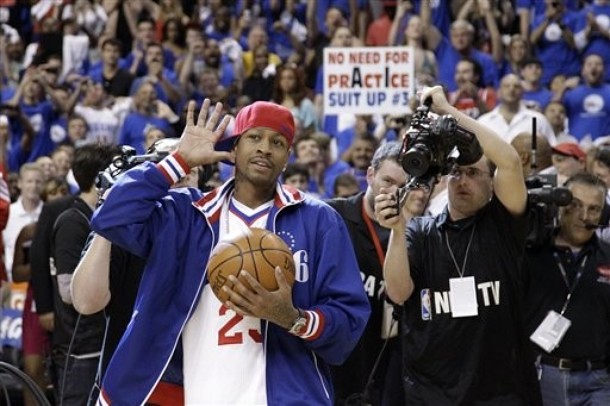
There’s something really odd about an athlete wearing another athlete’s jersey. That’s Allen Iverson, who showed up at last night’s Sixers/Celtics game in a Lou Williams jersey. Love the sign being held up in the background, too.
New ESPN column today, expanding on a topic we discussed here earlier in the week — enjoy.
Uni Watch News Ticker: The Astros will apparently be going back to wearing orange. ”¦ New copper helmet for Arizona. ”¦ The NAHL’s Alaska Avalanche are moving to Johnstown, Pennsylvania and are getting a new name — the Tomahawks. “I guess the name is meant to capitalize on nostalgia for the Chiefs,” says Rob Ullman. “I don’t have a problem with that, but the colors are pretty lousy. And really, a brand-new team that decides to go with an Indian head for a logo? In 2012? Strikes me as incredibly tone-deaf, if not willfully stupid. Still, it’s the NAHL, so it probably doesn’t even matter.” ”¦ In a related item, a U.S. Navy exercise called an Indian Run may be renamed (from Chris Bisbee). ”¦ Interesting article on the state of modern football helmet design (from Jeremy Brahm). ”¦ Mike Hersh has scanned the super-cool 1971 kids’ gift catalog that he recently scored on eBay. Note the silhouetted logo at the upper-right corner of most of the spreads — never seen that one before. ”¦ New football helmet design for Bowling Green. “Love the brown facemask,” says Chad McNeal. ”¦ The Astrodome might not be demolished after all (thanks, Brinke). ”¦ There are pajama pants, and then there are full-on pajamas. Yeesh (blame Tom Arnel). ”¦ Super-sweet stirrups being worn by the Oklahoma baseball team (from Bryan Brazelton). ”¦ Two great NHL finds by Steve May: a 1942 all-star sweater and a rare sighting of the North Stars’ 1967 preseason jersey. ”¦ Got an excited note yesterday from A’s equipment manager Steve Vucinich, promising that “the return of Outmania” would be taking place in Oakland today in the form of Josh Reddick. I wouldn’t go that far, but Reddick’s logo-emblazoned stirrups were still plenty nice. ”¦ I might not mind jersey advertising so much if the ad patches all featured the Natty Boh guy. Details here. ”¦ Our Cubees du jour: Omar Jalife made Cubees of F1 driver Michael Schumacher and Mexican race car driver Pedro RodrÃguez, and Zach Conrad created a template for a Michigan State football Cubee.
really?
Seriously. SERIOUSLY. Even if you think people are being a bit oversensitive towards the issue (I don’t), it’s a LITTLE ridiculous and, as Ullman puts it, tone deaf. When re-naming a team, being at least a tiny bit aware of the world around you seems like a good idea.
ever been to Johnstown or the J-Town area?
They should have called them the Floods, and made this their logo:
link
Even if nobody is killing them over the Native American imagery and even if they ARE living under a rock, shouldn’t people at LEAST be complaining that all the did was grossly simplify the UND logo and superimpose it on top of two recolored Atlanta Braves tomahawks?
That was my thought.
link plus link equals link.
More whining about faux racist names and logos. Shocking.
Surprised UW didn’t have a Re-Name the Shawinigan Cataractes in honor of them hosting the Memorial Cup.
That’s not the first time the Swagga Suit’s been mentioned…
I read too late last night to bother mentioning, but didn’t Mark Grace play tic tac toe in the dirt with other first basemen on a regular basis?
The Astros will always be Orange and Blue to the long time fans. The change to Gold and Navy was because Drayton’s wife hated Orange, but the fans loved orange.
Seeing the news of going back to the old colors, and the hints at a return of the Shooting Star jersey, just makes me happy. Also means all of the orange retro Astros stuff I just bought will not look out of place like it does now.
Orange is becoming a really popular color in baseball. Giants, Orioles, Marlins, now the Astros returning to it. Just so long as the Tigers and Mets don’t start to overemphasize the color…
I say good for orange, it just needs to start being paired with something other than blue or black. Let’s have an orange & red or orange & green team.
Orange and Kelly Green as a nod to the Astroturf, even though that color scheme will remind me of a team that should be playing in Florida…
Tampa Bay Rays should do creamsicle. And bring back the ‘Devil’.
Still think ‘Rays’ sounds twee.
Like a year before the Tampa Bay Devil Rays dropped the “Devil” in their name, I had the idea they should change their name to just “Tampa Rays”. Even though I now like how the original name rhymed, back then I didn’t think having the word “Devil” in it was a good marketing choice, especially if you want to appeal to kids (how many parents are going to buy something for their child that has the word “Devil” on it?)
Plus, “Tampa Bay” isn’t a city, it’s the name of an area. So shortening the name to “Tampa Rays” both makes the team specific to the city of Tampa, AND at the same time it still sounds like Tampa Bay, since it rhymes with it.
I was surprised to see my idea almost become a reality. I still think “Tampa Rays” sounds better and rolls off the tongue more smoothly than Tampa Bay Rays.
Just out of curiosity, HHH, are you from the Tampa area?
Orange is becoming a really popular color in baseball. Giants, Orioles,
Marlins,now the Astros returning to it. Just so long as the Tigers and Mets don’t start to overemphasize the color…(fixed)
YES! If the Astros go back to orange caps and helmets I will get off the Marlins’ case. As long as *some* team does it.
And you’re right about the Tigers and Mets. Sure, they’d look cool with more orange, but it isn’t in their DNA. Keep it as a trim for them, but show it off boldly and proudly, Astros!
If the Astros do go back to using Orange, I can see them using the color for the helmets too.
One thing that has not been said/suggested is the shade of Orange.
1971 was a darker shade of Orange. Ricko, I know Orange is Orange, but it had more Red than Yellow in the mixture.
1972-1980 was Orange. 50% Red + 50% Yellow.
For the throwbacks, the Orange has been brighter than the Giants and the Orioles shade of orange. The Marlins are using that “throwback” shade of Orange now, but it is not the same-still-as the Giants or the Orioles.
Thus my question: What shade of Orange will they wear?
I like orange and yellow together, which makes me an iconoclast with fans of traditional uniforms.
Philadelphia/Vancouver Blazers.
link
link
Have I mentioned how much I *LOVE* the way old goalie masks were decorated back in the day?
I like orange and silver.
Come to think of it, orange, white and silver with black lettering was a sort of defacto color combo for experimental and training aircraft, missiles and rockets for a while. Definitely reminds one of 1960s and 70s aviation and technology.
Kind of precedent uni-wise, too.
link
2nd try.
link
Probably the most famous X-plane is the one that first broke the sound barrier in 1947:
link
I think it’s telling that when you go to Astros games, you see as many or more people wearing orange and blue as you do wearing brick and black.
Their odd Texaco style old gas station/train motif never really caught on. In the outfield, you’ve got a train pulling a cart of oranges a tier above a gas pump. Lots of stuff going on there. Maybe not as much as Miami, but well, there’s no accounting for Miami.
In any case, the orange and blue shooting star uni’s, if that’s what’s coming, will be welcome.
The same is true of the Phillies and maroon/powder. By dint of the Law of Conservation of Dark Red, if the Astros drop Martian-soil red for fan-favorite orange, the Phillies should also give in to deep-seated fan preference for the Schmidt-era unis.
For some reason, it feels to me like orange-and-blue Astros unis will look better in the AL than they did in the NL.
The Astros have a chance to steal a march, actually, and do what the Marlins should have done: Make orange the primary color, as with red for the Nats, Phillies, or Angels, and blue (or whatever) the secondary color. Orange cap, predominantly orange uni trim, orange alt jersey & hitting rehearsal smock. Mostly blue with orange highlights and the Astros go back to being the Texas Mets. Mostly orange with blue highlights and the Astros could have one of the most distinctive looks in pro sports.
Interesting that you call them the Texas Mets since the teams came into the league together. I’m not sure what give the Mets precedence for the orange/blue other than the fact the Astros have abandoned it for a while.
I’m expecting the shooting star uni’s or something very close.
Thought: Spacesuits famously have white helmets with gold visors. What about a color scheme (predominant orange and gold) that would allow the Astros to wear white caps with gold brims at home?
link
Much as I like the idea of orange caps, an orange cap says “hunter” or “rural dude with gun rack in his F-150”, not “bleeding-edge engineering on the high frontier”. Nothing against the farmer with the deer permit and the baitcasting rod behind his seat, but he’s not an astronaut.
Something a little like this, perhaps?
link
And use this as a secondary option:
link
I do love me some orange and gold as well.
And lookee here: An Astros cap with a white crown and gold brim:
link
Imagining that with a better logo, I could see it working.
For me the Astros have been the biggest loser in the retro-modern ballpark trend. You take a team with a history of innovation (the Astrodome, Astroturf) and stick them into an olde tyme ballpark with a wild west train and you have such a cluster of mismatched identity.
I don’t know what kind of physical changes can be made to the ballpark, but I would love to see the team embrace its own history of pushing the envelope and leave the retro-modern feel to everyone else.
I do not see the train being removed from the ballpark as it is so big that it was actually constructed there on the tracks. It is 1.5x-2x the historical train just so you can see it from the other side of the park.
I can see the changes to the stadium happening over a period of time and not just during the off-season. One move I would love to see is brnging back Orbit!
The train is there because the park was built around the old Union Station.
I Love the orange and blue combo. Unique and a great color combo
I didn’t see where in the article that stated orange was going to be the primary color.
““We’ll blend some of the new with the history of the team and some of the colors in the past,” Crane said.”
This concerns me. Not of a fan of mishmashing old looks with current ones which looks like pandering to multiple generations without having a real identity. So much for bringing back the 1965-70 set. I hope they bring back a block number font or some retro version of it. The current one is way too narrow, rounded & condensed.
Perhaps the Shooting Star uniform with the slight tweak of making the streaks in the word mark red, orange, and gold, to evoke the Tequila Sunrise era?
You could still go with orange caps, undershirts, socks, etc. Navy lettering and numbering, trimmed in orange.
You mean something like link
no…do that same uni but with a blue cap, sleeves and solid blue socks with the shooting star on them
you know…
something like this
link
And N.L. forever, man – the 2005 World Series must remain defended in both leagues. Otherwise it would be you know, link
I’m only disappointed by the Johnstown team because they could have done much better given the towns history
I used to do “Indian Runs”in high school, thats not going away and who cares?
Because of Uni-watch, I am now hoping for the eradication of any & everything Native American…we need to get rid of any inkling of the past and never acknowledge them again!! [sarcasm]
I agree. I am so sick of all of this political correctness. I normally don’t follow minor league hockey, but I am definitely going to get some merchandise from the tomahawks. I really like the new logo.
What exactly is “political correctness”? Can you define it (without googling it)? I’m not joking — I really want to know what you think it means.
Even if you don’t find it the least bit offensive, it’s still a pretty terrible logo. It has a real “fifth runner-up in the Puck Drawn rebrand the Blackhawks contest” feel to it.
My definition of political correctness is behavior trying to minimize a perceived slight against certain groups. For example, I am of Irish heritage and am sometimes referred to as a Mick. I absolutely have no problems with that and I am very proud of my heritage. However some people will say that it it not politically correct to use that term as it is offensive. Offensive to whom? Something is going to be offensive to everyone. There are much bigger problems in the world instead of fretting over a team nickname/mascot. For those who don’t like, don’t watch it.
Oh, please. I am so tired of Irishmen boasting about their thick skins as compared to the overly-dainty sensibilities of other demographic groups. It’s very simple: we won. There is no anti-Irish prejudice of any statistical significance in this country. JFK dynamited the last bastion of important prejudice back in 1960. Self-identified Irish-Americans are one of the wealthiest cohorts tracked by the Census Bureau.
Winners are best advised to be gracious and empathetic.
Yah feckin’ eejit.
Bit offers a very good definition.
The problem is, the word Bit has defined is not “Political Correctness,” it is “Manners”. In America, we used to call avoiding unnecessary offense “common courtesy” or “decent manners” or “good breeding” or “being a gentleman”. To a person of conservative disposition, upholding this traditional social value is a virtue.
The general attitude toward those offenses was much more lax (and thus, the manners and common courtesy worse) in the past, which is why we no longer see barbershop quartets in blackface or mascots doing rain dances around a teepee.
I always love how the members of groups that haven’t been systematically discriminated against at best, persecuted in the middle and eradicated at worst always believe they can tell members of groups that have how they should feel about them being reduced to caricatures and stereotypes.
I always thought “Politically Correct” meant “With all the potentially offensive material taken out.”
I do think people have the right to be offensive if they choose, but also need to be ready for all the flack that comes with it.
I think the more interesting discussion is where does offense cross the line into injury? I think the argument is not that these individual groups are being injured by the use of their imagery, names, etc., but that society as a whole is being lessened by their continued use.
Essentially, the argument and the question is “Aren’t we better than that?”
I think it’s a bad-looking ripoff of the UND Sioux (of which I am the most conflicted because I love the logo, if they had a Chief Wahoo-type stereotype I could be 100% for abolishing all Native American nicknames).
No matter where one stands on the Native American nickname debate, I think most will agree that the logo just doesn’t look good.
“Something is going to be offensive to everyone. There are much bigger problems in the world instead of fretting over a team nickname/mascot.”
That is a completely BS argument. 99% of team nicknames are inoffensive, except to the insane. When was the last time you saw someone protesting the Jets, Blue Jackets, Kings, Jazz, Hornets, etc etc etc. It isn’t even the name. Why have a member of one of the most downtrodden, shat-upon societies in the history of this country as your logo? Today? It just doesn’t make sense.
Think about if England had just pushed all the Irish right into the sea in the early 1900s, and then some affluent Brits decided to call a soccer team the Micks in 2012? How would that be for a perceived slight?
I’ll offer my definition of political correctness.
Its a lazy shorthand description used to smear another person’s argument that something is offensive.
I find Indian logos offensive. I might be right or wrong. If you have your arguments together and your position thought out, you can tell me why I’m wrong.
But if you don’t have your position thought out, you can just call my views “political correctness” as a shorthanded way of dismissing them without having to think about the merits.
Indeed.
And Caucasian males of European descent, who (largely) had the run of the place for the first 400 years or so, aren’t exactly the best judges of what is or isn’t an offense against people who haven’t.
What’s the red, white & blue baseball logo in Mike Hersh’s catalog? The current version has been in use since 1969, and I tried GIS for ‘old mlb logo,’ but didn’t notice it after scrolling through a few hundred images.
Also in that catalog, the replica uniform is referred to as being “MBA-approved.” What organization is that?
I think the baseball logo is something that Market Promotion Inc. created. I don’t think it was ever affiliated with Major League Baseball.
From that catalog: I recall Charlie Finley’s A’s of that period being referred to as the “Swingin’ A’s” and have seen that phrase incorporated into link I don’t remember the “Go-Go A’s” as on the bumper sticker, which I find ironic placed next to a White Sox bumper sticker.
Also note the huge flourish underneath the Braves script on its bumper sticker.
On that same page, I find it odd that “dad” (creepy uncle/neighbor?) is wearing a Cubs hat, just like the kid, with a Tigers shirt.
Maybe he’s a big 1935 & 1945 World Series fan. Or some western Michiganer.
actually Bowling Green had brown facemasks last year. And that same decal too.
(link)
Looks like the change theyre talking about is that the helmet is Matte Orange. Look closely
matte??? or “flat for flat’s sake”
you be the judge…
The matte/flat helmets are one trend I like. They tend to lead to better color matching with the rest of the uniform, and I find that to be a good thing.
I appreciate RyCo’s FFFS comment as it does seem to be a trend. My gut tells me it might be a good move from a practical POV – less sun/light glare off helmets to get in players’ eyes.
I don’t know how high/low maintenance matte helmets are cf. gloss helmets however, nor do I know if maintenance is even a factor with big-budget programs.
“They tend to lead to better color matching with the rest of the uniform”
that’s actually a pretty good point. i still think too many teams are doing it though. plus, those helmets get scuffed all to hell very easily.
i always loved the fact that the Steelers helmets seemed to be a flatter finish than other dark helmeted teams (ravens, jags, texans come to mind)
Glare from shiny shells is not a real problem, unless you’re playing Oregon in the chrome lids. The frictional difference in a glossy shell vs. a matte one, though, can add up over time, as a glossy shell deflects impact better than a matte shell, and with the prevailing belief that the head trauma football players are experiencing is an accumulation of many small blows over time, well…
I’ll just say every little bit counts, and I would want the slipperiest helmet finish I could get.
Thank you Andy. I’m constantly looking for reasons to shine my helmet.
The frictional difference in a glossy shell vs. a matte one, though, can add up over time, as a glossy shell deflects impact better than a matte shell, and with the prevailing belief that the head trauma football players are experiencing is an accumulation of many small blows over time, well…
Do we really want instantly deflected impact? Wouldn’t the friction between the helmets actually strip away some of the energy of the impact?
I’m sure I had that catalogue when I was a kid. God knows I owned much of the merchandise pictured. Back then–pre-internet, per-merchandising boom, pre-cable TV–that little mailer was a goldmine for kids…like us.
I think the waiting 4 to 6 weeks for delivery, pouring over the pictures again and again, was as exciting as the day the box or package arrived in the mail.
Yup. I still have the Baseball First 100 Years record album. Has a lot of classic, historic radio calls that are very familiar to most fans now, but I’d never heard any of them then. Man, I wore the grooves outta that thing.
That was the Fleetwood Company record albums from that time period, they did championship teams from major sports. It was a combination of radio calls and narration.
Back when I was 10 or 11 I ordered a catalogue from an ad in one of the American sports magazines I used to get – it took months to get here, but when it did it quickly became one of my most prized possessions. It was a full-colour, 100-page beauty, with merch from all 4 major leagues. I was only really familiar with the NBA & NFL at that point, and seeing the logos and uniforms of teams I’d never heard of before fascinated me. I’d spend hours drawing the logos and unis, over and over again – I think it was this catalogue that really pushed sports logos & uniforms from an interest, to a full-blown obsesssion…
Being from Johnstown I can say that the Indian/Chiefs homage is a lot more than simply because that was the team name in Slap Shot. For years the main youth program in the town (really Cambria County) has been the Johnstown Warriors. When hockey came back to Johnstown in ’88 and they decided they would be the Chiefs, the team actually used for it’s original logo, the same logo of the Warriors at that time.
We knew all along the Chiefs name wouldn’t be allowed to be used in this instance, I think Tomahawks is a good homage. And it will no doubt be shortened to “Hawks” for fans chanting not unlike the Blackhawks.
The logo/colors don’t really bother me that much, but I don’t have an artistic bone in my body so I respect Rob’s, Connelly’s et al opinion on that matter.
As a promoter of my hometown, I’m just glad hockey is back, even if it’s only the NAHL. I hope the community supports it.
Yeah, I talk shit about the NAHL, but if they dropped a team in Richmond I’d probably be there on opening night!
Yeah, I’d be there if I still lived there. I’m not optimistic about my hometown though. When they lost the Chiefs, they got a 10-game gift from the ECHL, having the Wheeling Nailers play home games in J-town. Couldn’t even draw 2,000! And that’s a Penguins affilate.
Rumors on the street were that Mario didn’t like being in Wheeling, wanted to move out of the arena and was really using those games as a dry run to see if they could make the team work better in J-town. But the people in the community pretty much failed.
It was an odd set up though. Wheeling was forever a rival, so it was odd asking fans to root for them, but I’d have gone to the games if it meant possibly getting a team of our own back.
I have no idea of the economic makeup of the NAHL and what they’re breakeven point has to be as far as average attendance, but I hope things work out for them.
I have to say, I seldom went to games in the two years our most recent team, the SPHL Renegades, was here. It was just kind of an inferior product. Rather save up and make the trip to Raleigh!
The SPHL….oh! Yeah, I would skip that, from what I recall hearing and seeing (youtube grainy vids), that league is barnstorming goonery, probably like the Iron League that the Hansons came from!!!!
this was my reply/opinion to kek in an e-mail this morning:
“Cool name, especially for that region. Lousy logo and color scheme.
I’m not saying “Tomahawks” is cool just to “stand my ground” on my whole opinion of Native American imagery. I really think it’s decent. would I use an Indians head as a logo? No. there’s only 2 “humanoid” logos that grace the front of NHL jerseys. One pretty much sucks (senators), and the other is probably one of the best, most classic logos in sports (sharks… kidding. Chi-town). I would follow suit with the big boys”
I agree. “Tomahawks” as a name is fine with me. Nothing inherently exploitative or disrespectful about it. (Personal bias: I’ve done a bit of tomahawk throwing, and it’s insanely fun, as far as throwing sharp objects at wooden poles goes.) In fact, the tomahawk was quickly adopted by early white settlers as a tool and weapon.
A tomahawk also resembles a hockey stick in shape, so it has great potential as a hockey logo.
It’s the ND-ripoff Indian head that I object to. That’s going out of the way to create potentially exploitative or disrespectful context for a team identity that would not otherwise have it. Plus, it’s ugly. Personally, I think the ND logo is pretty poor – it’s like a product demo for Illustrator 2 – but side-by-side the Tomahawks head makes the ND head look like an Edward Curtis exhibit.
NAHL is fun hockey – you’ll enjoy it. We’ve had it here in Fresno for a couple years now (had quite the rivalry with your new team, the former Alaska Avalanche).
As for the logo, it’s tone deaf, indeed, but then I’m sitting at my desk eating a bag of these…
link
This is one of my link, even if it is made in Wisconsin. Must mention Goose Island & 312 as well.
I always find it weird when a pro athlete in one sport will wear a hat with a logo of a pro team in another sport. For example, NFL players wear MLB caps during interviews ALL THE TIME.
When did this start becoming normal? If an athlete did this in the 80’s or early 90’s, people would’ve been like, “What the hell is he doing? Why would a 49ers player wear a Red Sox hat during an interview???” It seems like there’s no rhyme or reason to what team’s logo an NFL player will wear. I think I even saw a prominent NFL player entering the stadium for a playoff game wearing a Yankees hat. I can’t remember who it was, but come on! Show some team pride at least during the playoffs!!!
If anyone can post some photographic evidence of this phenomenon I’d appreciate it because I’m having a hard time finding anything.
Bettis wore a Detroit Tigers hat
Letang and Neal (and a few other Pens), wear Pirates hats. pretty sure the Pirates give the Penguins hats at the end of the Pens season when they’re picking up their gear… no shit
Bettis is from Detroit so it makes sense that he’d wear a Tigers hat.
The Penguins wearing Pirates hats makes sense because both teams are located in Pittsburgh.
It would be interesting to find out if most NFL players wear MLB hats for fashion/style/trendy reasons, for personal significance reasons, or for a combination of both.
“It would be interesting to find out if most NFL players wear MLB hats for fashion/style/trendy reasons, for personal significance reasons, or for a combination of both”
hate to be harsh, but no it wouldn’t
brett favre wearing a beat up hat from his hometown that he’s worn for years… only semi-interesting
some over-payed jerkoff wearing a crisp lifestyle fitted because the jerkoff in the next locker, or the superstar on the other team wears one… not remotely interesting
IMO, of course :-)
“some over-payed jerkoff wearing a crisp lifestyle fitted because the jerkoff in the next locker, or the superstar on the other team wears one…”
That’s a big assumption. You can’t assume they are only doing it for trendy reasons. There might be something deeper going on, like how Bettis wore the Tigers hat because he’s from Detroit.
That’s why I find this topic interesting, because we don’t know each individual’s motivation for wearing a hat of a team from a different sport.
The only thing we know for certain is that so far it’s taboo to wear a hat from a different team in the same league as yours. If THAT ever becomes normal, I think I might have to stop being a sports fan.
Theory: If the NFL player’s MLB cap still has the sticker on the bill, it’s a meaningless trend-sheep fashion statement. If it has the brim sticker removed, then it’s at least plausibly a sign of civic or team loyalty.
@arr scott , you still could be a fan of a team and keep the bill flat and the sticker on.
@arr scott , you still could be a fan of a team and keep the bill flat and the sticker on.
Ahem. link
different generation different styles.
just because you think that leaving the sticker on the brim is dumb, doesn’t mean that they are considered any less of fans than you are.
i never understood the fashion myself. i use to work at lids and had to deal with people being particular about this stickers on a daily basis. i use to have people that would ask me to take a sticker off another hat because the one on the hat they were buying was messed up a bit. my theory is that a rapper was given a hat during a video shoot and he wasn’t allowed to take the sticker off because he had to give it back and from there it caught on. that or people just keep it on to prove they aren’t wearing a generic/counterfeit hat
Nah, there’s right and there’s wrong, and the sticker on the brim is wrong. I mean, take the argument about proving that it’s authentic.
1. I can tell an authentic from a fake with a good look at 20 feet away, and so can anyone who would actually care about the difference. This ain’t rocket science, and New Era and MLB have conspired to make the signs rather conspicuous.
2. If a person can request that the store take the supposedly authenticating stickers off of one cap and put it on another, then we have just demonstrated definitively that the presence of the sticker has zero bearing on the authenticity of the cap anyway.
3. The one sticker that does tend to demonstrate authenticity is the holographic MLB sticker, which is typically affixed to the underside of the brim, and which the brim-sticker-keepers almost always remove.
those holographic stickers are the worse. majority of them would just fall off during shipping.
Remember the flak when Lebron wore a Yankees hat when the Yanks were playing the Indians in the playoffs?
And that was one time where I defended him.
Sure, it’s good PR to identify with all the local teams, but if you like another team better, it’s a free country.
Had he stayed and actually won a title, I’m sure there would still be people complaining, “Yeah, but he wears a Yankees hat in Cleveland!”
See, for me, that was the moment I realized “He’s gonna break Cleveland’s heart.”
What are your favorite teams Lebron James, who was living in Akron, Ohio and 12 years old in 1996? The Cowboys, Yankees and Bulls, of course. Front runner, front runner, front runner.
I didn’t see it that way, but that’s probably because I only root for one team here and that’s the Cavs. I’ve always worn out-of-town stuff for other sports…and gotten grief for it, but it doesn’t faze me. Blind allegiance to all the home teams is a Soviet thing in my opinion.
Looking back, though, that *was* a lineup of front-running teams for LeBron. Guess that’s why he spurned the Knicks, which is where I thought he was going.
Wow. I never heard about that.
And he wore it while attending an Indians vs Yankees playoff game at Jacobs Field.
I guess he had more allegiance to his favorite baseball team than the city he played in.
Classy.
*If* he ever owed any allegiance to anyone, it was Dan Gilbert and the Cavs fans. He didn’t owe the city itself, or those in the city who don’t follow the NBA.
If the Cavs ever signed me to a contract, you can be sure I’m still going to wear my Pirates (or Nats, Twins, Orioles or teal Marlins) cap, but I’m sure not gonna put on a Tribe cap.
“If the Cavs ever signed me to a contract, you can be sure I’m still going to wear my Pirates (or Nats, Twins, Orioles or teal Marlins) cap”
You have five favorite baseball teams?
Who do you root for when two of your favorites play each other?
In order:
1) Pirates
2) (tie) Nats and Orioles
3) Twins
4) Blue Jays (as long as they’re the BLUE Jays)
5) Rangers
6) (tie) Tigers, Royals, Padres
Some other teams could be added if they went back to better unis. I’m talking to you, Houston. Same with the Marlins if they wore their inaugural kit.
The Pirates are my team, but I spent enough time in Akron as a kid that I like to see the Indians do well as well. I have lots of caps, though…Nats, Twins, White Sox, Cubs…part of having your team be so bad for so long is that you just kinda give up on rivalries. I still wouldn’t wear a Yanks or Red Sox cap, tho.
I might wear a Yanks cap, but only if someone gave me one.
Another team I’d add to my list is Milwaukee, but they’d either have to go to the ball-in-glove look or something equally awesome. Right now they probably have my least favorite unis in the majors.
Got a bunch of NBA teams I like, too. Even though I like the Cavs the most, I wear my Kings and Mavs shirts all the time. Not if I went to a Cavs game, but just about anywhere else here.
So if the Twins are playing the Blue Jays, you root for the Twins.
What happens when it’s an O’s/Nats game? Or if two of the Tigers/Royals/Padres trio are playing each other?
As a diehard Twins and Nats fan, I love it when they play each other. Which they have yet to do in Washington seven-plus seasons and two turns of NLE-ALC interleague into the Nats’ existence. First, I root for a good game. Second, I root for whoever needs the win more. Third, I root for a close series. Fourth, if I’m at the game, I root for the home team, though I totally wear a mix of hat/tshirt from each.
Pretty much what Arrr said, James.
I remember Joe Montana wearing a San Francisco Giants hat on the sidelines during a game in the early 80’s. Almost hard to believe there was a time without offically licensed sideline apparel.
Last season Alex Smith would wear a San Francisco Giants hat after every game (well, at least every home game) in post game interviews.
Lets take Tim Tebow for instance. Grew up in Jacksonville, probably a Jags fan and perhaps a Magic fan, Rays fan and Lightning fan (for arguments sake.) Then he goes to the best football program around at the time, Gainesville, still wearing all his Jax/Tampa/Orlando stuff. Then he gets drafted to Denver. He better not be caught dead wearing any other football garb than Bronco’s gear. But does that mean he’s got to suddenly drop his other teams to? I don’t think so. So many pro’s grow up rooting for their teams, then get drafted to another city and in no way lose their dedication.
It kind of goes back to Pauls civic entities idea though, where the public would expect your teams athletes to be 100% pro-your local teams. Does the fact that Tebow plays(ed) in Denver suddenly mean he must be a Denver fan for all sports? I don’t think so I don’t see any reason why he should have to root for the Nuggets if the Magic are truly where his lifelong dedicaiton lies.
“When did this start becoming normal? If an athlete did this in the 80′s or early 90′s, people would’ve been like, “What the hell is he doing?”
Except Ronnie Lott routinely wore a San Jose Sharks hat in the early 1990s. And I don’t remember there being much fallout. It was a pretty cool hat.
And while I don’t think you necessarily have to adopt every team in other sports in the area in which you happen to be playing, it’s probably not the best idea to wear a bitter rival’s gear around town. Of course, if you’re Tom Brady and you wear a Yankees hat. Because you’re Tom Brady. Scott Zolak probably wouldn’t have been well served to do that.
The Pistons took that even further during their 2004 championship season. Rasheed Wallace wore either a Flyers jersey (Bernie Parent, to be exact) or a Chiefs jersey (Derrick Thomas) during post-game interviews. Larry Brown did it during the playoffs as well – he did post-game interviews wearing Tigers, Red Wings and Lions jerseys.
Today’s ESPN column is up:
link
Kudos to my editor, Dave Wilson, for the brilliant headline.
Good column!
How long before we see TMOB (trademark on back), DCOB (dot com on back), or THOB (twitter handle on back)?
I could totally see adidas trademarking “rgIII”, and then if the NFL allows NickNOBs one day, we could see “rgIIIâ„¢” on a jersey, complete with the little “TM” symbol. And eventually it would become “rgIII®” with a circled R symbol if it became a registered trademark.
What if an NFL player legally changed his last name to the URL of a website? I don’t think the NFL could stop him from having it printed on his jersey, especially if it was spelled with “dotcom” at the end instead of “.com”.
I know twitter handles have appeared as NOBs on jerseys in other leagues but not yet in the Big 4. I think it’s only a matter of time before that happens.
“A matter of time” ia meaningless term that lets the speaker sound like he/she has some sort of profound predictive ability without actually having to predict anything.
“A matter of time” — like, 80 years? 120 years? Five years?
I don’t know how long it will take.
I just think it’s inevitable.
There’s precedent for dotcom:
link
I suspect that @NOB will start showing up with regularity sooner than later.
I don’t watch 30 Rock so I wasn’t aware there was a character named Dot Com on the show. Can you tell me more about him?
I agree that @NOBs are unavoidable. But what about #NOBs (hashtag on back)? An @NOB would let you see personal tweets from an athlete, but a #NOB would let you see what everybody is tweeting about him.
Didn’t some college paint a hashtag on their football field recently?
I believe you’re thinking of Mississippi State. We mentioned that here a while ago.
Michigan, Arkansas, and NC State had hashtags painted on their football fields too.
Has there even been a glossary entry for “first name on back?”
Off the top of my head, the ones I could think of in the Big Four were Nene and Ichiro.
Maybyner Nenê (né Maybyner Hilario) had to change his name to make it look like a NickNOB (or, basically, a Brazilian-style NOB).
link
I posted this the other night but, my favorite all-time unifrom–the 1971-2-73-74 Baltimore Bullets–featured several FiNOB…
link
…That’s Phil Chenier’s. I know Elvin Hayes’ jersey back said simply Elvin. John Tresvant’s nickname, Tres, adorned his jersey back. If memory serves, Jack Marin’s said Jack. I can’t find any photographic evidence, but I’m pretty sure Wes Unseld’s said Wes. Regardless, I found this stunning image of Wes (front view) battling Kareem that I share just because it’s so good looking…..
link
The Bullets also had a nickNOB. Nick Weatherspoon wore SPOON on his #12 jersey:
link
I’m probably missing something here, but no mention of Billy Ripken with his father & brother on the 1987 & 1988 Orioles?
“… Interesting article on the state of modern football helmet design (from Jeremy Brahm)…”
Very interesting. Crimson pride item, too, so forgive me. Jeremy’s link tells all about the Xenith, a new enhanced-protection helmet developed by Dr. Vin Ferrara, Harvard QB in the 1990s. The first NFL veteran to organize against the silent conspiracy about pro football concussions was Isaiah Kacyvenski, All-Pro linebaker for the Seahawks after a stellar career in Cambridge. And – for what it’s worth — they are both really nice guys.
Yes, that article was extremely interesting. The following quotes are notable albeit macabre:
1) In 1968, “32 football players died in the United States during organized games from head injuries…”
32 players is more than an entire roster at some schools.
2) “It wasn’t until 1990 that zero deaths were recorded. This statistic has been tracked since 1931.”
That is more sobering than an AA meeting.
Makes you wonder if getting paralyzed while playing football is rarer than getting killed.
We used to do Indian Runs in high school for XC. They were also known as Catch-ups
RNOB note: I don’t think he ever wore it on ice, but when you tried to customize an Islanders jersey on the NHL.com shop for Freddy Meyer, it always stuck a “MEYER IV” NOB on the preview.
Although, upon further review, much along the lines of Acie Law, Meyer wore #44.
My goodness, that link is gorgeous (even with the superfluous mark of the beast.) Just made my day.
Wow, you are so right.
Can anyone make a Notre Dame CUBEE ?? I’m terrible with photoshop and don’t know how to create one. Thank you.
Pop Chart Labs has a cool Baseball Team Name chart up: link
This will look nice next to my Yankee Stadium Homerun Pop Chart.
forgot the link to the second chart: link
That popchart is riddle with inaccuracies.
oh?
Yeah, check the comments form a couple weeks ago: link
Plus the facade is upside down!
Thank you for pointing that out. I never saw that in the previous comments.
i found this interesting about the kids gift catalog…
what kid wouldn’t want one…?
link
“CIGARETTE LIGHTER
Handy, wind-resistant lighter is “light as a feather” and is complimented with the official insignia and colors of your home town major league baseball team. Teams available: Phillies, Pirates, Reds, Senators, Cubs, Cardinals, Mets, White Sox, Orioles, Indians, Tigers.
Each $1.75″
Back in those days, kids needed a lighter because they carried all sorts of things like a pocket knife, loose change, gum, firecrackers, their cigarettes, dope or opium to smoke.
i well remember those days
LOL.
If it’s the 1980s, it’s cocaine.
If it’s the 1990s, it’s marijuana & extacy.
If it’s the 2000s, it’s meth & heroin
If it’s the 2010s, it’s Oxycontin/prescription meds & bath salts.
Give me the good ‘ol fashioned spray paint & a huffin’ rag. While working in the shop environment with wood, tools & stain, of course.
It’s no shock to me this country is so obese. Cigarettes are what kept this country skinny.
you forgot doses, bro
Doses of what? Nyquil? Oh, LSD. Guess it made a comeback in the late 1990s.
I’m almost positive my next-door neighbors have the exact link. The 7-year-old wears it from time to time and it still looks great.
Roy Halladay bobble-head… how do one pitch again?
link
That’s just the old ball-stuck-in-the-glove-so-toss-the-whole-glove thing, nothing to see here.
Wow! That is so wrong on a lot of levels. Not the first time a bobble-head looked nothing like the player, but damn…that one didn’t even try!
Only thing that would have made it worse would be if they gave him the wrong skin tone…
…which has happend in the recent past. It was a West Coast team (A’s?) and the promo was a bobble-head of an African-American player, and the bobble-head that was sent to the team was the agreed upon sculpt, but it was painted to look like a White guy. I could have the skin tones swopped, but I remember the story. I believe the team gave the errant bobble-head out anyway because the money had already went to pay for the piece.
Was that the one where Brian Roberts looked more like Bip Roberts?
Backhand pitching. Brilliant!
Adidas… “rgIII”… gee, it’s like the guy’s got three stripes built into his name or something.
Bleh.
Bears will be wearing orange pants for a select game or games this season in the same cut and pattern as their navy and white classic pants.
link
Bears.
If I had no idea who the Chicago Bears were, and if I were completely ignorant to their history, I’d say that the orange pants look pretty good.
But as it stands, that’s not the case. So I’m gonna have to say, those orange pants are at odds with my longstanding image of the Bears. Just too jarring.
Eh, they’re no more jarring and just as much of a semi-throwback as this: link
Weird that this was missed at the Nike NFL Corporate Hootenanny back in April? Did Paul see these there? A lot of the new threads are in fact appearing on the NFL.BIZ site now. I would assume Ripon is catching up and as prototypes are approved, designers are creating pdf’s in InDesign and uploading to their team pages. Looking for more goodies now.
Well, the Nike event only unveiled the basic home uniforms.
As for the Bears, those orange pants were leaked in a Madden screenshot a few weeks ago, so it’s not exactly shocking to hear that they are in fact going to wear them. We also know the Bills are probably going to wear blue pants on the road.
link
It looks weird around the air chuck thingy on the back of this helmet. Whats Up With That?â„¢
Not uni related, but keep with me on this one.
Every year in Europe there is on TV the “Eurovision Song Contenst” – a fest of awful music where political voting weighs more than the quality of the songs (which is consistently abysmal anyaway).
Just seen the Dutch entry in the semi-final, and with recent debates here on the Washington You-know-whos, wonder what you make of this attempt to be “interesting” ;) She is half-Dutch, half-Turkish btw.
link
Well, the Nike event only unveiled the basic home uniforms.
Now you actually have substantiated proof… instead of having to rely on Madden to get your leak info.
link
That is ugly.
As for Arizona’s copper helmet, the SB Nation guy who wrote that it was “for some reason” obviously doesn’t understand that copper production is kind of a big deal here in Arizona.
As for Arizona’s copper helmet, the SB Nation guy who wrote that it was “for some reason” obviously doesn’t understand that copper production is kind of a big deal here in Arizona.
Purple and orange would have been more appropriate. :-)
Seattle Seahawks full program. link
Hey Paul, what about Terry “Tank” Johnson – link
He managed to get a FNOB and a nickNOB.
Somebody was inquiring about the Bills pants and blue. Looks like the real deal?
link
As for the Bears, those orange pants were leaked in a Madden screenshot a few weeks ago, so it’s not exactly shocking to hear that they are in fact going to wear them. We also know the Bills are probably going to wear blue pants on the road.
Say the orange pants. Seems like somehow the Bears have become the Broncos East and as a Bears fan that to me is a brand sin. Bears are a navy team with orange accents ONLY!
While I would tend to agree, there is precedent for orange everything:
link
link
link
I really don’t see the point or need for orange pants, it’s not like there’s any merchandising in NFL pants. If I had to guess, they’ll probably wear them October 28th against Carolina since it’s near Halloween & the Bears like to wear orange around that.
Navy over orange looks too much like the Illini & I really don’t like the navy pants for the road. They should wear white over white for that.
link
Rams “new” retro logo is pretty classy.
Hmmm, does that suggest a blue and white throwback uni this year?
I’m comfortable making my Bears minimal orange statement and would argue that your gridironunifrom resource is simply wrong.
link
You can have you’re opinion (I’m a bears fan too and I hate the orange jersey but I’m keeping an open mind about the orange pants until I see someone wear them), but those uniforms are historical fact. link
the GUD isn’t wrong
they also wore the orange pants during the sid luckman years (1949, to be pre-zact)
Gee, thanks for today’s COTD. I’m a map geek so now I’ll have even less time to sleep. Great site.
Watching my first game @ Miami on the TV—why is there no corporate name for this big ol sucker?
Cowboys never got a sponsor either did they?
Recession?
What brand is bigger than the Dallas Cowboys? At least in Jerry’s mind, right?
Why are the Twins and White Sox wearing their dark alts for the second night in a row?
Because they’re bad people, that’s why. With the Indians coming to town AGAIN for the 10th, 11th & 12th match-up already this season, if the Tribe wears their navy alts it will look like the same team is playing the Sox again.
fathers playing @mets tonight…wearing their blue softball tops
don’t they realize how good those would look if they were ALL gold or all gray — because they have the sweeeeeeeeet interlocking SD on the jersey with a headspoon
but a blue top, with all white lettering and placket piping with gray trou?
looks like a fuckin softball team
on another note…several padres coaches are wearing dugout jackets that feature the pads script in the old piss color…didn’t they retire that 2 years ago?
here…
look how shitty this looks
but put that same exact uni design in this colorscheme, and you’ve knocked it outta old shea
Blue pants, man.
Or do *this* uniform in all sand. The sand color wasn’t the problem two years ago…it was the SanDiegO on the jersey.
the sand was the problem — but not because it wasn’t *gray* — it was just a shitty color…
and that SanDiegO was AWESOME…almost as good as the interlocking SD
the *worst* wordmark is the current padres script OVER a headspoon
total shite
“look how shitty this looks”
Blech. That’s how the Yankees would look if they had one. Awful.
I’ll see that, Phillip, and raise you those God-awful gray with brown pinstriped road uniform the Dads wore 1985-1990. No doubt, they looked more like a prison softball team and an actual Major League Baseball club with those clown suits.
Agreed on your third point. And that’s it.
I LOVE that vintage BP jersey. THAT should be their next game jersey with matching pants.
Oh yeah…forgot to click on Reply…
“forgot to click on Reply”
~~~
idjet ;)
dude…that SanDiegO was great — shouldn’t YOU be the one liking it (you like everything different) and shouldn’t I be the one hating it (since you think i want everything to look ‘uniform’)?
you know what it reminds me of? a cheezy lighthouse painting (with the beam coming out BOTH sides — which doesn’t happen — in a real light house the light shines ONLY out of one side of the lens)…
but that’s what it reminds me of…and i like it
I like different things, but within the realms of reality (real reality, not reality TV). So I like light coming out of only one side of a lighthouse, and I like words that are capitalized at the beginning only.
Didn’t like the old GiantS or RangerS jerseys, either.
Aaawww, man…just realized there’s an exception to every rule.
link
But it would still look better if only the C was big.
I haven’t been able to get the authentic number fonts on Justin Hinds’ Cubee template. Any suggestions?
The White Sox are now wearing two different diamond shaped memorial patches, but one has a White outline and one doesn’t, and it looks pretty dumb on the black alts. You can see this at link
Paul’s ESPN piece is cited as the research basis for a ripoff piece on the MSN homepage link (set 5 of 7), RG3 himself must have seen Paul’s work and even tweeted his reaction to being the first with a Roman numeral.