
Click images to enlarge
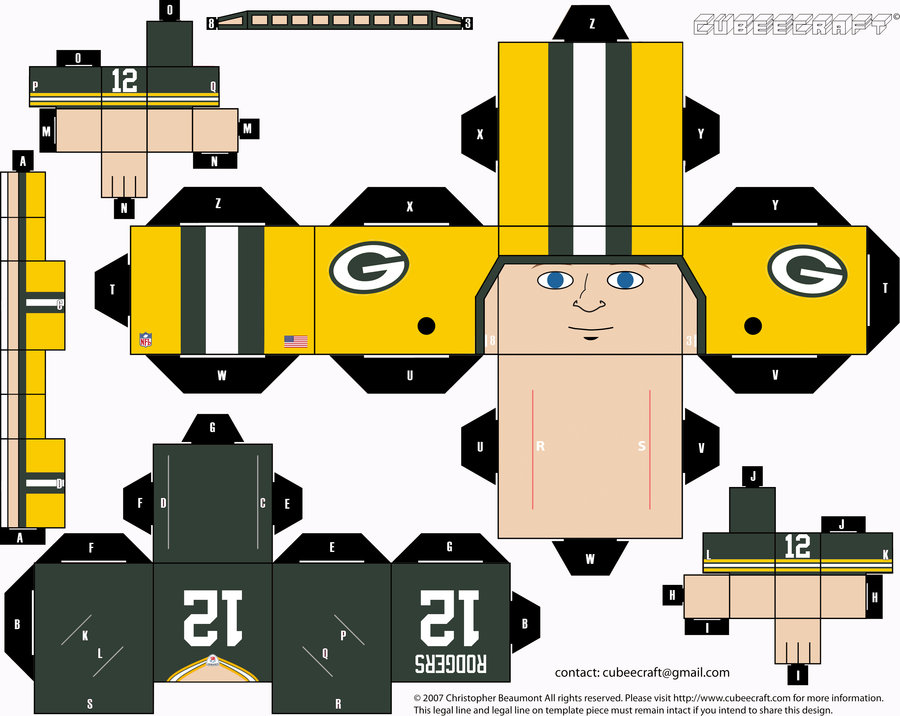
What you see at the top of the page is a set of little Packers toy figures. Underneath it is the template from which one of the toys was built.
Aren’t they cool? They’re called Cubees (KYOObeez) — little paper figurines that are printed out as a single sheet of paper that you can then cut, fold, and construct. There’s no glue, tape, or other adhesive involved — just lots of “Insert tab A into slot B.”
The Packers Cubees were designed and made by Uni Watch reader Justin Hind, and you can make them too — for any NFL team! — by going to a site that he’s set up. We’ll get to that in a minute, but first I’ll let Justin give us an introduction to the project:
I discovered Cubeecraft a few years ago. The basic design was created by a guy named Chris Beaumont. He shares all of his Cubeecraft designs and templates for free under the stipulation that people who use them can’t sell them. I thought they were a cool idea and started to create some of my own designs in Photoshop and post them on my DeviantArt site. I soon realized that very few people were making sports Cubees, so I decided to try that.
With the help of a friend named Andy Adamietz, I started creating different Packers players (my favorite team). The two of us started challenging each other to come up with more Packers who were “worthy” of Cubees, sort of as a joke. Eventually we were making a lot of them, and people started requesting designs for other teams, so I started making those too. Eventually I decided to just make a site that offered an interface with all the NFL teams. I tried to be as accurate as possible with the uniforms, right down to the non-Riddell nose bumpers. I recently updated all the teams to conform with the new Nike uniform designs. (You can see my collection of completed NFL players here.)
In the future I think it might be cool to make these for other sports too, but it’s quite a time-consuming process, so I don’t know if that will ever happen.
Fun, right? I’m about to show you how to make your own NFL Cubees, but first there’s a big stipulation: Justin’s interface doesn’t work for Internet Explorer. So if you’re using that browser, stop now and use Firefox or Chrome or Safari or whatever. Also, if you have slightly heavier-than-standard paper, that’s helpful, although you can still use regular printer paper if that’s all you have available.
Once you’re set up with the proper browser and paper, here’s what you do:
1. Go to Justin’s NFL Cubeemaker site. (It may take a minute or two to load.)
2. Start your design by choosing an NFL team from the little menu of choices at top-center of the page. Note that for some teams (the Broncos, Bucs, Chargers, Eagles, Jets, Packers, Seahawks, and Titans), you can get throwback uni options by clicking on the team’s logo more than once. Justin has created a wide range of uni designs for the Packers, which you can toggle through by continuing to click on the Pack’s logo.
3. At the top right, see those icons that look like fu manchu mustaches? Those are actually for hair. Choose your player’s hair color and then click on the icon multiple times to toggle through various hair styles.
4. Beneath that is the menu for eyes and eyebrows. Choose an eyebrow color and then click on the icon multiple times to toggle through various eye shapes. Note that the icon at far right lets you add eye black.
5. The next menu is for facial hair. Again, choose a color and then click on the icon multiple times to toggle through various facial hair styles.
6. Use these icons to choose your player’s skin tone, mouth shape, and nose shape.
7. Add the front and back uni numbers and the NOB in these fields.
8. Add the TV numbers in these two fields.
9. Click the “Hide Buttons” button.
10. Now it’s time to print your Cubee. But if you’re looking for a “Print” button, there isn’t one. “I tried very hard to include some sort of export button on the site for completed Cubees, but I couldn’t figure out how,” says Justin. “It’s easy enough to do manually, though. One option is to print the browser window using Safari; just make sure to check the ‘Print backgrounds’ checkbox in the print dialogue box. But the better option is to take screenshots. There’s an extension called Awesome Screenshot that works pretty well for this purpose; there are Chrome, Safari, and Firefox versions. Otherwise there’s always the trusty Cmd-Shift-4 shortcut for Macs, or the PrtScn button for PCs. The site is fully zoomable, so you can hit Cmd – to zoom out and Cmd + to zoom in for a higher-resolution screenshot.”
11. Once you’ve printed your Cubee, cut out the six shapes, use a knife to cut the slits where indicated, and then insert the tabs into the same-lettered and -numbered slots. Presto!
It’s tricky, but it works. Once you’ve assembled a few of them, send photos, yes? Yes!
One last word from Justin: “The site works great on the iPad, too. If you use a full-screen browser like Atomic Lite, you can just take a screenshot by pushing the home button and the power button simultaneously.”
When in Roman: Several readers have noted that Robert Griffin III has been wearing RNOB — that’s Roman numeral on back — on his practice jersey. Maybe you like this, maybe you don’t, but here’s what I want to know: Has there ever been a professional player in a Big Four sport who’s worn RNOB in a game? There’ve definitely been college players who’ve done so, but I can’t recall seeing RNOB being worn by a professional player. And what about “Jr.” or “Sr.” — have those ever been included as part of a professional NOB? Again, I can’t recall any examples of that on the professional level. Am I missing anyone? If so, please shoot me a note. Thanks.
What part of “It’s all about me” do you not understand? Here are a few news bulletins about some other stuff I’ve been pursuing lately:
• Sometimes I can tell ahead of time when an ESPN column is going to be popular, and then there are times when a column’s popularity catches me off-guard. Yesterday’s column, about a small Pennsylvania college and an Italian clothing label that are joined at the sweatshirt, falls into the latter category. I mean, it’s a fun story, I enjoyed working on it, and I think it turned out well, but I didn’t really think it’d move the needle that much. Instead, it quickly began racing up ESPN.com’s list of most-emailed stories (as of 8:35am today, it was the site’s #1 most-emailed story of the preceding 24 hours), it racked up decent numbers on the Twitter and the Facebook, and I got lots of very positive feedback on it. A nice surprise.
• Some of you may recall that about a year and a half ago I started hosting an event here in Brooklyn called Open Mic Show-and-Tell, which is exactly what it sounds like: People can bring an object of personal significance and talk about it for up to three minutes. I haven’t mentioned it here on the site lately, but Show-and-Tell is still going strong as a monthly event and has turned out to be a really interesting project. Even better, next month I’m going to be teaching a one-day design criticism course called “Show-and-Tell: Using Objects as the Basis of Narratives” at the School of Visual Arts. Who’da thunk? I’ve never taught a class before, so this should be at least as edumacational for me as it is for the students.
• There’s a new entry on the Permanent Record blog, about some very cool legal documents from the mid-1800s. Also, the next feature-length PermaRec article on Slate will be published either next week or the week after that, and I don’t mind saying it’s a doozy. Also-also, my friend Lianne Smith, who’s a kickass singer-songwriter, has agreed to collaborate with me on a song called “Permanent Record,” which could function as a sort of theme song for the project. I’ve never written a song before, but this one is already writing itself in my head, so I’m cautiously optimistic.
• Remember when I cooked a steak with a blow torch? I cooked another one last night, and I think I’ve now perfected the method. The first time, I only torched one side of the steak before putting it in the slow oven (because the things I had read about this technique all said to do that), and as a result the other side had no char. The next time I torched both sides, but the side sitting in the pan ended up getting mushy even though it was charred, because it was sitting in a small pool of its own slow-cooked juices. So last night I torched both sides and then put the steak on a rack over a pan, instead of directly onto the pan. That did the trick.
• Incidentally, I’ve recently set up a Show-and-Tell mailing list and a Permanent Record mailing list (but no blow torch steak mailing list — yet). If you want to be added to either of those, shoot me a note and I’ll hook you up.
Okay, now you can go pay attention to someone else.
Uni Watch News Ticker: The state of Oregon has banned Native American mascots for high schools. Slowly but surely, people. ”¦ Yesterday was apparently MLB Wacky Travel Theme Day, as Mets players wore hockey jerseys for their trip to Toronto and Cardinals players wore ’70s prom suits (or at least that’s what I think those are supposed to be). ”¦ There was some buzz in NFL circles yesterday when Browns linebacker Chris Gocong tweeted a photo of himself wearing a white-facemasked helmet. I checked with Browns spokesman Neal Gulkis, who wrote back: “We are not changing to a white facemask this year. He probably just grabbed an older helmet that had been sitting in the equipment room.” … Bryce Harper appears to be wearing a lower-back pad. “Maybe due to the Cole Hamels beanball?” speculates Jim Mellett. ”¦ Market society update: The corporate sponsor of the Nets’ new arena is now defiling my local subway stop. Grrrrrr. … Laurence Holland notes that the Mets have already used three different colored logos on the back of the Shea mound this season. … Awesome set of 1947 ballpark illustrations showcased in this thread (from Chad Todd). … New rugby uniforms for the Northampton Saints (from Lucas Ravenscraft). … Finland took the unusual step of wearing two different white jerseys at the 2012 IIHF Worlds (from Jay Danbom). … “I wanted to share with you a DIY hoodie I made,” writes Jack Nicolaus. “It’s inspired by the novel The Art of Fielding by Chad Harbach, which takes place in a fictional Division III college in Wisconsin, with a baseball team called the Harpooners (à la Moby Dick). A leitmotif of the book is the Harpooners’ navy-and-ecru uniforms — hence the sweatshirt colors.” … Here’s new Philadelphia Eagle Fletcher Cox, getting his photo taken for Sunday Night Football on NBC (according to the Eagles’ Facebook page) while wearing a Reebok jersey (from Jon Bishop). … Check out the cool Brewers uni-history jacket being worn by the guy standing in the second row (from Jon Solomonson). … “According to this article, Blackburn Rovers, newly relegated to the English Football Championship from the Premier League for 2012-13, will begin selling their 2012-13 Umbro kit totally blank — no sponsor on the front, no player names or numbers on the back, and no league patches on the sleeves,” writes Michael Kramer. “It appears that Rovers haven’t secured/announced a shirt sponsor for next year yet. Fans can opt to have the sponsor and player names and numbers added at a later date.” … Oooh, everyone will like this: an interactive map of every Big Four championship. ”¦ Some good stories behind the uni numbers for two Seahawks rookies (from Rob Schumacher). ”¦ New marching band uniforms for San Jose State (from Scott Winters). ”¦ You can see all 30 of MLB’s G.I. Joe caps here. The funniest/saddest one is Miami’s — great to see that the stylized marlin is “supporting the troops” (which of course is not what Memorial Day is supposed to be about, but why let facts get in the way of pandering?). The whole thing is an embarrassment. ”¦ This photo of a copper Arizona State helmet began circulating last night. No idea if that’s intended for on-field use, but ASU only had four helmets last year, so it’s easy to see why they’d need another. … Big thanks to everyone who wished the blog a happy birthday yesterday. I’ll be off the grid for most of today, starting at about 10am. Have a great weekend and I’ll see you on Monday.
I checked with Browns spokesman Neal Gulkis, who wrote back: “We are not changing to a white facemask this year. He probably just grabbed an older helmet that had been sitting in the equipment room.”
DAMMIT CLEVELAND! :(
It’s an old helmet. That melony shade of orange seemed to be the norm in the 80s and 90s. It’s more yellow-tinged now.
Logo creep just got a bit creepier:
link
Never seen this with a logo before, but I know Disney has been doing this for years with tomatos and other fruits:
link
And I saw a few years back that they’re growing watermelons in cubes in Japan, to make them more convenient to store in a refrigerator.
link
Reference the “stars and stripes” hat, if I were to purchase a gimmick like these, I would rather have the camo than a defaced American flag. I still can’t figure out what was wrong with the good ol American flag on the side of the hat.
I still can’t figure out what was wrong with the good ol American flag on the side of the hat.
link
Touche, although if they embroidered them on, there would be no problems.
oddly enough, New Era was showing off a navy version of the Tribe S&S hat but LIDS has the red version for sale. link
wonder if that means that the Tribe will be wearing both hats
makes Paul’s head explode?
link
I agree with Andrew, and loathe though I am to admit it, I might not be able to resist buying a Nats GI Joe cap. But as to what was wrong with a good ol American flag on the side of the hat, putting a flag there violates the U.S. Flag Code and is thus a form of flag desecration. At least when it’s part of an actual on-field uniform; for a fan, who’s not likely to go sliding into second base or diving onto the grass to make a catch and thus soil the flag on his uniform, a flag patch is arguably kosher.
I just wish they wouldn’t wear the camo caps on Memorial Day. It’s like they don’t even know (read: don’t care) what the actual holiday is for, or how it is properly celebrated.
The worst part about these “Stars & Stripes” caps is that they are one of the only New Era official on-field caps that are exclusively made in China. Other on-field caps are still made in USA.
That’s pretty bad, but worse for me is that New Era is still using the old Nats curly W logo:
link
You can see by the squared off joint of the beginning stroke with the left-hand loop and also by the pinched widths where the loops overlap in the middle. The Nats redrew their W logo two years ago, and New Era is still using the old logo even for brand-new cap designs like this. Shameful that a supplier would deliberately use the wrong team logo, and shameful that the team accepts this.
Check out the cool Brewers un-history jacket being worn by the guy standing in the second row
You forgot a letter.
Thanks. Now fixed.
That’s a t-shirt, not a jacket.
Yes its a shirt made by majestic. I have the same one but for my SF Giants
Glad no white facemask on Browns helmet. I love the throwback, no frill look of gray. Love the Colts with the gray facemask too. Now, to get teams to stop with the dark colored pants. Unless your pants are yellow or silver, stick with white. Dark colors look awful.
Wow… I disagree with everything you just said there.
Lee
Word, Randy. Dark pants are for high school football and softball.
And Curling
IMO the 49ers, Saints, Buccaneers, and Rams all look better with gold/pewter pants rather than white (or any other color).
Also, given that they are worn with white jerseys, I prefer the Bears navy blue pants, the Dolphins aqua pants, and the Chiefs red pants to their white counterparts.
In addition, I’d like to see the Bills wear blue pants with the white jerseys.
Wow. I ABSOLUTELY AGREE with everything that you said there.
White facemasks for the most part look incredibly STUPID. I can not think of one example where a Gray facemask does not look better than White, and often times a team color may look better. For Colts and Browns, and Cowboys, Gray is certainly better. If I had my way, the Lions would ditch the Black and use Gray facemasks.
Dark football pants belong on High School JV’s, the 1981 BYU road unis, and on every Jackass Junior College wanting the Arena/SWAC look. They certainly do not belong in the NFL.
White facemasks belong ONLY on “The U” Miami thuggerama helmets, just like Jimmy Johnson, Michael Irvin and Luther Campbell would want them ….
My nephew’s been doing papercraft for some time now; I actually have a cubeecraft Mega Man from him, and he gave his mom (my sister) a papercraft Dalek for Mother’s Day.
I follow my beloved Cardinals on Facebook, and they posted pics in an album titled “Tacky Tuxedo Travel Day.”
link
I personally liked Jason Motte’s camo tux (the way he wore it, with the vest and collared shirt put Matt Holliday’s rendition of the same motif to shame). Lance Lynn & Jake Westbrook also did well, I thought.
Puma killed the pink tux, and I can’t tell who they are but there is a Dumb and Dumber tux set in the group. The head-to-toe spandex “tux” body suit looks creepy…
Cubees and (Cubeemaker) are fantastic! Nice job and really cute too. Any way we can get helmet numbers added to make my Steelers guy complete? Great job Justin. Thanks for giving me a reason not to work on a Friday.
Glad to know others have enjoyed the F&M article as much as I did. A few possible reasons for the article’s appeal:
1) The second photo, which is clearly in Europe (or at least clearly not at the actual F&M campus). It’s eye catching and when I saw it I immediately registered that there was more to the story, so it helped hook me.
2) The absence of uni-related anger. Oftentimes (for understandable reasons!) there is an undercurrent of anger in the uni articles. This story didn’t have that. Instead it was just a straightforward account of how this association between F&M and Europe happened.
3) I’m sure that lots of ESPN online readers have traveled abroad and noticed American sports or collegiate or generally “preppy” clothing being worn by the locals and wondered how/why that is (Paul & Shark is another example link). This article gave an account of how one specific example came to be and I could relate it to personal experience.
Anyhow, a fun and enlightening read. Glad it has gotten some attention.
As of right now, it’s the #1 most-emailed story of the past 24 hours!
link
That list will change as time goes on, natch. But I’ve captured the moment for posterity:
link
Now to go ask for a raise….
Are most of the readers viewing/emailing this story located in Europe? Since Franklin & Marshall is such a popular clothing brand over there I’m sure any exclusive info about it, especially in an article that originates from the exotic U.S., would really appeal to Europeans who wear it.
Either that, or the entire Franklin & Marshall community (students, faculty, alumni, & administration) that wasn’t aware of the clothing brand just blew a gasket and is relaying your article all over the interwebs.
It’s probably a combination of both.
Not sure if I’m going color blind or not, but the Arizona State helmets looks more pewter than copper to me, I’m thinking copper is more orangy/brown.
I know this is saying the un-sayable, but if that’s an accurate shade of green of the Packers uniform (the cubee), which is often the way it looks on television, it’s rather a dull shade of green. I put the cavaet “often looks on television”, because if I was just going by the way things look on tv as being completely accurate, I would think the Lakers wear deep blue, not purple.
I don’t think you’re going color blind, because I agree… BUT, I’m sure it’s supposed to be copper. Probably just a trick of the camera lighting.
And I really hate to say I like an alternate helmet two days in a row, because I am a big supporter of traditional unis and one, MAYBE two helmets at the most. But, I like the idea of ASU in a copper helmet as a one-off thing. I think it would look good with their uniform set. Plus it obviously has an Arizona tie-in. Was the Copper Bowl ever played at Sun Devil Stadium?
Dunno, but the Arizona Wranglers of the USFL did, and they had copper lids: link
While obviously a lot closer to copper, I even think the Wranglers looked more bronze than copper, copper – I mispoke earlier when I said orangy/brown, it’s more orangy/pink/brown – I actually worked at a copper refinery in the 1990’s
link.,cf.osb&biw=1007&bih=545&wrapid=tljp1337357556661024&um=1&ie=UTF-8&tbm=isch&source=og&sa=N&tab=wi&ei=-3S2T48ry4rpAZLiofsK
Looks like someone Instagramed link. A shame, because we can’t tell how “copper” the helmet is. It looks more like the Bucs’ helmet. If done right, the copper could look like link, and combined with the metallic flake, it can actually look really cool… assuming that they do it right and this actually makes it on the field, however. Arizona State mentioned adding copper to the official color palette last year, but didn’t see anything of note.
If you remember the old USFL Wranglers, their gold-flake helmets resembled copper. And the first batch of Diamondbacks’ uniforms had coppery thread, like a burnt metallic orange. Those ASU helmets look purple or pink to me.
Well done Paul on the Franklin & Marshall story. Neat stuff.
Those 1947 ballpark drawings were awesome.
I to enjoyed the old ball park drawings. When I was a kid I always liked looking at overhead views of the 16 Major League parks.
I think we’ve seen those illos on here before, but looking at them today I’m curious if anyone knows why a section of the RF wall at Ebbets was concave?
“The corporate sponsor of the Nets’ new arena is now defiling my local subway stop. Grrrrrr.” – So by defiling you mean they renamed it to reflect the current building that stands there? gosh that is so horrible!!
So by defiling you mean they renamed it to reflect the current building that stands there? gosh that is so horrible!
There are many buildings that stand there. But only one of them bought subway station corporate naming rights (the very notion of which is abhorrent). So yes, that *is* horrible, because it represents yet another incursion of corporate advertising in the public/civic realm.
or a convenient way for fans headed to the barclay center to know which stop to get off at
Right. Because everyone headed for Madison Square Garden gets lost because the stop is just called “34th St.” Happens all the time.
Back here on planet Earth, this is just another douchebag move by a douchebag company invading my public space. #IStillCallItAtlanticAve
sure if they are from out of town which hopefully some fans will be. But hey maybe there wont be any out of towners because they’ll be too worried about running into hipster douchebags who have nothing more to do with their time but complain about the name of a subway station that in no way, shape, or form belongs to them and has been here long before and long after said douchebags leave this earth.
When you can’t win an argument on the merits, try to make it personal. Standard loser’s strategy.
When you’re ready to address the real issue — the notion of selling naming rights to a subway station — we’ll all be eager to hear your thoughts on that.
Um, it does in fact belong to him. Public space, owned by the people…What on Earth are you talking about?
Let’s forget the namecalling and go with just plain dumb. If the subway stop is at 34th, it’s at freaking 34th street. If it’s at Atlantic Avenue, it’s at freaking Atlantic Avenue. There’s no reason to name it after a company that puts money up to do it. Anyone in town for the weekend most likely has a map that has the street names on it, not the names of every corporation at every corner.
Shit. Just gave ’em an idea.
So what happens when the corporate sponsor contract ends? They change the name to another corporate sponsor and need to spend millions in updating all the subway maps to show the new name? Who pays for that?
It’s just plain wrong, even just changing names. In Mexico, they recently wanted to change 2 stations from Etiopia (Ethiopia) and Viveros (Greenhouse, it’s a park) to Plaza de la Transparencia (Transparency Plaza) and Derechos Humanos (Human Rights). Due to the backlash they kepot the old name and just added the new one with a slash and changed the logo a little bit.
The name was intended to change just because the government opened 2 big buildings near those stations and wanted to show them off.
Etiopia (originally just that kickass lion) link
Viveros (originally without the hands that are below)
link
Do they still have the Black & Orange tiles in the subway station where the Polo Grounds used to be? It seems I saw them there many years ago when in NYC. I can not recall the train or the stop.
Did NYU pay to have NYU on the signs at 8th Street/Broadway on the N/R?
2 years ago, AT&T bought the naming rights to the Pattison Ave. (Sports Complex) station…the last stop on the Broad Street Line in Philly.
link
SEPTA pocketed a cool $3M, which I’m sure they spent on keeping fares low and enhancing the commuter experience.
Did they rename the entire station Barclays Center or is it a combination of Atlantic Avenue/Barclays Center?
Renaming the entire thing Barclays Center IMO ain’t right.
What’s more interesting to me is that there used to be a stop on the subway (and LIRR) called “Shea Stadium.” When Shea closed, they renamed the stop “Mets-Willets Point.” They did not call it “Citi Field.” I wonder why the MTA agreed to one bank name and not the other?
Because Shea Stadium wasn’t a sponsored/advertised name. The MTA specifically said they wouldn’t use Citi on the subway station unless the Citibank people paid for the privilege, which they declined to do, so the station is just called Mets-Wiletts Point.
This reinforces my longstanding arguments that teams are civic entities (hence they can be part of the subway station name). Citi and Barclay’s, obviously, are not — and I don’t think they should be allowed to buy a subway station name, even if they want to. That type of civic property should not be available for sale.
The stop on Chicago’s Red Line has been called Sox-35th for many years. The station itself was renovated a couple of years ago with a black, gray, and silver color scheme, and the Sox logo inlaid in the floor.
Another example is when the London Underground renamed (in the 30s? 50s?) the tube station near the Highbury stadium “Arsenal.”
There’s also a stop on the Red line called the Apple Stop – link.
And I don’t know what they’re talking about, the North and Clybourn stop was just dirty enough to feel like a subway stop. My buddy lived on Halsted right at North Ave for years and we always used that stop.
Though it did get a lot nicer when Apple moved in next door…
Why this is OK…
link
…but “Atlantic Avenue/Barclays Center” is not?
I am torn on this one.
Like or not the new arena is named the Barclay’s Center and a lot of out-of-town visitors will be trying to get there. So adding “Barlay’s Center” to an existing name might be okay. I am not okay with replacing a more generic name if the owners are willing to pay all associated costs.
That being said, subway station names should be short. In the DC Metro system the names have gotten completely out of control for PC reasons (“U St./African-American Civil War Memorial/Cardozo” springs to mind). The signs just get too cluttered.
I wish I was surprised that station naming rights can be bought outright. Sadly I am not.
I think there is some merit to having signage in the station confirming you’re at the right place. Be it Barclays Center or Brooklyn Nets on the sign, I think the idea of that is fine. Luckily, Barclays is forced to stay within the NYC Transit standards, the real insult would have been if they were allowed to use non-standard signage.
And if you’re REALLY outraged over Barlcays buying signage in the station, you can always write a letter to them stating that you will specifically not do anything Barclays related since they decided to advertise where it is traditionally not allowed, show them that their advertising is having the opposite of the intended effect.
The whole “out of towners” argument is stupid. If out of towners are going to a Nets game, they’re going to either look up subway directions on the Internet, or ask someone.
No one is just going to hop on a random subway and look for the “Barclay’s Center” stop.
If an out of towner was joining me at a White Sox game, I’d be the one telling them… take the Red Line south, get off on the 35th street stop.
Its a nice gesture for them to now call it “Sox/35th St.”… but its actually meaningless.
Also, NYC has thousands of tourist attractions. 99.99% of them aren’t part of their relevant subway stations names.
I’ve never been to NYC, but if I wanted to see a Broadway musical for cheap…. I’d get on the internet or ask a local “What line and stop should I get to, to get to TKTS”
But the NYC Subway has many stations with alternate names after the street name.
81st ST/Museum of Nat His
8th ST/NYU
Queens Center
68th ST/Hunter College
161st ST/Yankee Stadium
42nd ST/Times Square (as mentioned earlier)
World Trade Center
Those all appear on Subway signage and there are plenty of others so it’s not a unique situation at all. They haven’t gotten rid of the Atlantic Avenue part, they just ameneded the name.
Yes, be mad that the MTA sold station naming rights, thats shady, but you can’t use the argument that other private entities don’t have their names on subway stations.
Was there supposed to be a link to the two different white Finland sweaters?
Yes:
link
Now fixed in the Ticker. Thanks!
Those Cubees have been around for a while: The Denver Post published a complete set of Colorado Rockies for the team’s push to the World Series back in 2007. I still have them all around here somewhere. You wouldn’t like them, though – they’re all purple.
The Marlins camo hat is bad, but my vote for worst of the worst goes to the Jays. Sorry Canada.
The term ‘beanball’ is being thrown around loosely, here and in the media, from the Hamels-Harper dust-up. A beanball is when the ball is thrown at a player’s head, correct? Hamel’s hit him in the back. Unless Harper had his head up his ass (which may be true in certain circumstances).
I disagree. In my book, a beaning is any intentional HBP. And since Hamels freely admitted doing so, I’d say his encounter with Harper qualifies.
technically Hank is right
beanball definition
n.
a pitched baseball that strikes the batter on the head, usually by accident. (Baseball.) : He got hit by a beanball and went after the pitcher with a bat.
link
merriam-webster agrees link
Yeah, but baseball terminology, like its unwritten rules, is being rewritten and redefined all the time. There’s an official definition of a stolen base or a balk, but there’s no rulebook definition of beaning. That’s why I said, “In my book…”
We all have our own book for this kinda stuff.
I agree with Paul on this (kinda) I look at a term like beanball as universal like Ibuprofen has become a catch all for asprin or Xerox for any copy machine.
In 32 years of playing organized baseball on and off, I’ve never before encountered anyone objecting to the use of the term “beanball” to describe a pitch thrown at a batter that did not hit him in the head. Huh. I’ve so frequently heard “beaned” used as a synonym for “drilled” or “pegged” or “hit” that it never occurred to me that it might have a more specific meaning to anybody.
I think you mean Advil is a name used commonly for Ibuprofen similar to Kleenex/Xerox.
Ibuprofen and Aspirin are completely different meds.
link
link
This image on the aspirin article made me laugh.
link
I can’t think of any other adequate shorthand for a ball intentionally thrown to hit the batter (regardless of target extremity). Whatever the original connotations of “beanball,” it’s a handy word to use when a pitcher drills the hitter anywhere. Deliberately throwing at the head is rare (thank God), so the far more common fastball to the ribs/arm/wherever seems more deserving of a pithy term.
Riffing on band uniforms again, and the San Jose State duds are definitely that. You need something like this: link
I agree that the SJSU band unis are duds, but don’t love what you linked to either. I still enjoy (especially at the collegiate level) marching band unis that at least marginally reference the military units (via hat style or jacket style) that they originally were.
For example, Purdue (link) or O$U (link) both use hats and general styles that are traditional. IMO, that’s the better look than this DCI inspired junk SJSU invested in.
I hear ya – the link is for our local HS marching band. I could do without the ostrich feather, but still an improvement over this: link
“… New marching band uniforms for San Jose State (from Scott Winters). …”
***
Well, of course they’re ridiculous. Ninety percent of college marching bands are ridiculous. Lovable sometimes, campy fun, but essentially riffs on 19th Century Prussian / Austro-Hungarian military unis. Immigrants to the US from German-speaking cultures made marvelous contributions (Milwaukee, beer, graduate schools), but maybe the best was a passion for music (Africans+Irish/Scots+Germans+Jews = American music). But they also gave us those silly threads.
(link)
I still think Adidas told RG3 to’ wear roman numerals so they’d have walking ads (III resembles the three stripes quite a bit, no?)
At first I thought this was a ridiculous statement because RG3 was wearing III on his NOB in college, but after seeing the following video on YouTube, I actually think you might be right. Note how they stylized “rgIII” in the video. The III looks EXACTLY like adidas stripes.
Here is the video:
link
Don’t any three san-serif capital Is inherently look exactly like three stripes?
But why is the “rg” lowercase then? If Adidas is going lowercase, shouldn’t it be “rgiii” instead of “rgIII”?
He’s had the III on his jersey throughout his college career. Its acknowledging that he is not the 1st RG, there was no reason for him to include the III in college other than recognizing his lineage. He copyrighted RGIII (for apparel reasons), and he will use that moving forward even if he eventually moves on to another sponsorship.
It’s his own doing, addidas is certainly taking advantage of it (they be dumb not to), but to suggest that his decision to continue doing what he has done is simply because Addidas told him to is ridiculous. I couldn’t find any pictures of his NOB in High School but found plenty of recruiting sites and stories about his team where his name included the III, well before he won the Heisman.
Happy Stirrup Friday! Today’s stirrup is a repeat, but it is to show thst I was finally able to remove the pink caused by bleeding from the red stripes:
Before – link
After – link
Mudcat Grant would be pleased.
Did you at least leave them pink until after Mother’s Day?
Actually, no, but my wife was the one who found the stuff to remove the pink.
The cubees are really cool. I’ve done a few myself but since I like racing, they are drivers although not as cool as the ones above. Only 9 have seen the light of day, but I have about a dozen ready to publish. In case you want to do one, the last link before the images “enlace para plantilla” is a blank one. No logo creep on the helmets, but the nomex are a different story.
The link for the image for printing is the name of each driver.
link
i can’t get mine to print out right. maybe its because i am using Chrome
I normally print from the image, just save it and probably there will be no problem
Cubee page not loading on Firefox. Too many hits?
“i can’t get mine to print out right. maybe its because i am using Chrome”
Same here
wonder what would happen if Native American mascots were banned on a Federal Level (you could make a case for civil rights). that would be crazy
In terms of private groups, you can’t do that — 1st Amendment. I can call my group anything I like, no matter how offensive it is. And that’s how it should be.
But you could tie it to various Federal funding programs. “You can’t get Federal funding for your new stadium [or whatever] unless you meet certain conditions, including…”
question Paul. Could a sports team be considered a private group ?
Legally speaking, I see no reason why a sports team can’t call itself anything it wants to (notwithstanding any bylaws of the league to which it belongs, etc.).
But there’s a lot more at work here than legalities. I’m not calling for Native American team names to be made illegal (that would be censorship); I’m calling for a greater public awareness of the fact that such team names are inappropriate, with the hope of persuading others to share that view. A team can call itself the Nazis if it wants, but that wouldn’t play well in the public sphere. Eventually a team name like Redskins will be viewed similarly.
I have to run now. Great weekend, everyone!
Sure they’re private groups. But since they extort cities for millions of dollars for stadiums they can use for personal ATMs, I’ve wondered why municipalities don’t require ownership stakes when they agree to these stadium deals.
so just to wrap my mind around the big picture. Leaglly a private group, team or bands can call itself whatever they want but common sense and good taste should rule the day.
Under federal law you can not trademark or copyright offensive names. So while you could call your club something horribly offensive and racist you should not be able to trademark that name. Then anyone could make Jerseys, t-shirts, flyswatters with your logo on it and not pay you jack for it.
The Redskins were sued over this in the later part of the last decade and the Court of appeals decided that they people challenging it were essentially too late and should have challenged it earlier. There is currently other cases pending involving similar issues with Chief Wahoo and other team names.
I like the Lloyd Christmas orange tuxedo look, but does does that guy seriously have to go all pajama pants style off the field? On the other hand, I would have enjoyed seeing the blousing with socks.
I could have sworn Griffey The Younger wore JOB when he and his dad were with the Mariners, but apparently not:
link
The Catch of the day is really how every city should do it
But there is no money in the city budget for enhanced manhole covers. Now if the city sold advertising on the sides of police cars and fire trucks there would be money available for enhanced manhole covers.
Way to go editing the comments you douchebag faggot
I seriously doubt you had anything interesting to say. Seriously.
Lee
OK, slightly O/T, and I may be late to this party, but WTF is going on with Facebook and Nike? For the past couple of weeks my news feed has been overrun with pictures of Nike sneakers, particularly ones with glow-in-the-dark sole rims, with the caption saying that one of my friends has been tagged in the photo.
Is this a new marketing campaign where Nike is telling people to tag their friends in pictures of sneakers? Or does Nike have a spam-bot or something that’s doing it automatically? I didn’t mind so much at first but there are so many of them now it’s starting to annoy the p!$$ out of me.
Anybody know what this is about?
It’s a spammer trick. You have to change your FB settings so that only your “friends” can tag you in photos.
Not Nike, whichever website is selling the kicks.
Meaning, my friends have to change their settings; they’re the ones getting tagged and the fact that they’ve been tagged is showing up in my news feed.
Ah, yes. Misunderstood. You can probably change your settings so that you don’t get an update when they’re tagged.
Have you been searching Nike products? I see ads for everything I search.
Hell no.
AWESOME CUBEES!!
One small beef. The G on the Packers throwback helmets is wrong. The G on the helmet has gone through some slight changes since 1961.
In the 60’s through … … … it was oriented horizontally, less egg-shaped than today, and was positioned in the center of the side of the helmet. It also started with very thin “piping” on the outside of the G, which got thicker magically as time went on.
– link
– link
By the 1980’s the G began to tilt slightly backwards but was still positioned at the center of the side of the helmet. I can’t find the exact year when this tilt happened. It also became slightly more egg-shaped, more like a football and less like a rugby ball.
– link
– link
In the 1990’s the G began its migration to the top and back of the side of the helmet:
– 1994: link
– 1995 (most noticeable jump): link
– 1996: link
– 1999: (still horizontally centered): link
– By the time Aaron Rodgers was the starting QB, the G almost appears to be sitting at the top and back of the helmet: link
Justin’s NFL Cubeemaker site is really buggy.
Sometimes it won’t let me click on certain areas/buttons, other times when I’m choosing noses it instead changes the mouth.
Anyone else encountering problems with it?
It doesn’t seem to work for me either, I’m using Firefox. The numbers and NOB seem to be in wrong position.
link
Suddenly the font of the names and numbers are rounded, like the Steelers use but for ALL the teams. Weird!
Since you are co-writing PERMANENT RECORD w/a musician, I’m certain she’ll know how. But a typical mistake made by the first timer is using words that just don’t sing. Unless you will be emulating Bob Dylan’s early epics or worse, current low end Hip Hop, make it a song. which means rhythmic punchy phrases Not a bunch of sentences that rhyme.
I only hope I live long enoughto see the demise of the travesty that is the NE flat brim 5950. They should come with a buglight & zapper.
I love the entry today at Permanent Record.
This is a topic I know something about, I’ll email you later today. In the meantime, let me just say that eBay is a great resource for this sort of thing. If you search terms like “indenture” and “antique deed” in eBay, you get many great examples of antique documents.
I have a great framed indenture from 1763 in my office, complete with the revenue stamp and wax seals. Its an amazing piece of history.
link
link
Lools like Finland could be wearing a throwback jersey dating back to the late 80’s early 90’s. They wore something like that in the 1987 and 1991 Canada cup tournaments.
Serious question (sad that I have to specify that, but much of what’s said on the internet seems to be interpreted in ‘extremist argumentative tone’ by default):
Is the Barclays Center subway signage the same as this? Is it more acceptable? Less acceptable? Why?
link
Seems unlikely that Tropicana or the Rays actually paid to have that sign put up.
Yeah, if the stop were, “Atlantic Avenue (Exit for Barclays Center)” And no one paid for it, Paul wouldn’t (probably) complain, since that is just informational, like highway signage. But Changing the name of a stop is going a bit further.
In principle they are the same, but driving somewhere on a highway and getting off at a train station are two completely different things. That said though, who’s to say Tropicana didn’t pay to have that sign put up?
Plenty of times signs just say “Stadium” and since the Trop is right off of 275 (and you can see it) I doubt there would be any confusion if the sign just said stadium.
link being renamed after sports teams? It’s a bit old hat…
I don’t think Paul’s issue is with a stop being named after a team (since this stop ISN’T named after a team). It’s with an established subway stop having it’s name changed to reflect the name of a stadium who is sponsored by a company. So the station’s name now essentially becomes an advertisement.
Barclays PAID for the right to have the station stop renamed. So it isn’t “essentially” an advertisement, it IS an advertisement.
Speaking of the Nets, have y’all seen link yet?
Target Field (home of the Minnesota Twins) has a ‘named’ Metro Transit station:
link
It’s one of the many stops on their (gasp!) Hiawatha Line.
Logo Creep or Logo Creepy?
link
According to the online subway map it is called “Atlantic Avenue – Barclays Center” so they’ve just amended the name of the station.
Although according other parts of the MTA website, the station was called “Atlantic Avenue – Brooklyn Academy of Music”. I guess we were all ok with that name.
According to this article they’re spending $200k per year for the naming rights to the station.
link
It was Altantic Avenue / Pacific Street.
I think it’s terrible that even though the Oregon public school system is totally strapped for cash, the board thinks it’s a good idea to force these schools to incur the cost of changing their names. In addition, most of the schools in question are in rural areas, and are already at an extreme disadvantage as far as funding goes. It’s typical Oregon politics – I’ve lived here for my whole life and it’s always been about Portlanders making decisions for the rest of the state. Now, with an unfunded mandate like this, Oregon schools are going to be put in a really awkward situation.
Updated logos for Weber State University have just been released. link
Just a note about the Barclays Center stop.
In Chicago, the El stops are just “Sox/35th Street” and “Cubs/(whatever stop they’re on, I forget).
It’s not US Cellular/35th street, though…
it’s just “Addison”, not “Cubs/Addison”. not sure why the Sox are special but there you go.
and apparently it’s been called “Sox-35th” since that branch opened in 1969: link. learn something new every day
Welcome to the future. Corporate naming rights for everything.
This future sucks.
I don’t think it’s been mentioned yet, but the Giants will be wearing the following patch tonight in honor of the 75th anniversary of the Golden Gate Bridge…
link
The same logo will be on the grass behind home plate…
link
So, the Pittsburgh Penguins now have link. Big freakin’ whoop. I’m sure other teams have already been on that bandwagon anyway. (Though I’ll gladly accept the Mike Lange tees.)
Seeing that entry on the Pens’ Facebook feed probably wouldn’t have drawn my attention as much if the image that went up with it was one of those tees… but instead, the image on the post was of their white Edge uni. And it just served to remind me of how much I hate that uni. I just don’t like that particular Edge template at all, especially on that team, and I really wish the Pens would make a change. I also really, really, REALLY want to see them ditch that flat matte beige they’re passing off as “Vegas gold”. If they can’t go back to the shiny material they had on the 2000-2007 unis, then go back to the shade of yellow they should be wearing – Pittsburgh Gold! It’s the Steel City, after all, not goddamn Las Vegas!
Yeah, I’m feeling a little cranky this evening. A sore ankle’ll do that to a guy.
Fridays are ‘Orange Fridays’ for the Giants but they renamed it to ‘International Orange Friday’ today after the name of the color which the Golden Gate Bridge is painted.
TO: UNI WATCH BLOG
FR: BG
DT: 05/18/12 18:56
Lincecum CleatWatch:
Back to Mizuno.
link
The cubee website is being blocked. My computer says it’s a virus!
Padres are wearing link and the Brewers are in the link (and playing an AL team) As. It. Should. Be.
Astros are in the link As. Phil. Intended.
Orange would be better, but it’s still cool.
And Marlins in black caps again, blah blah blah.
Only good thing about the Marlins/Tribe game:
link
I miss Phil Niekro. At Municipal Stadium they used to play polkas between innings when he pitched. That, and I’m a sucker for a knuckler.
Oh, and let’s not forget the green vs. orange battle of the bay:
link
Is there an alternative way to get to those Sporting News stadium drawings? When I call it up, it shows Briggs Stadium, and a bunch of “Bandwidth Exceeded” signs….
Giants vs. A’s is Color-vs.-Color… Also, the Giants are sporting a sleeve patch commemorating the 75th anniversary of the Golden Gate Bridge…