Click to enlarge
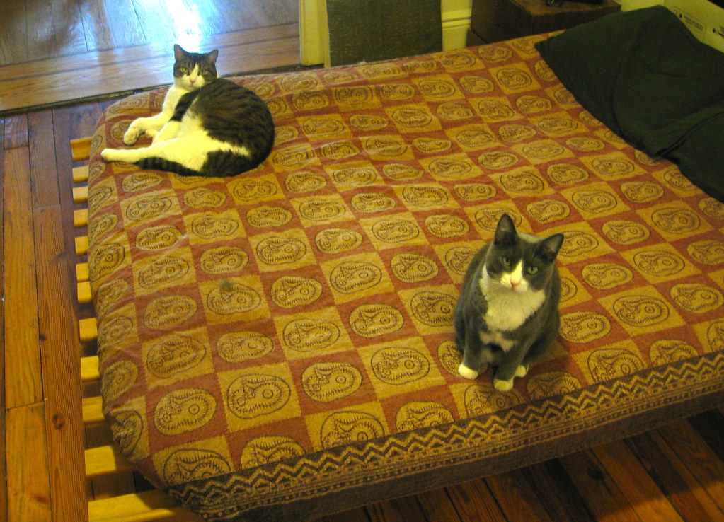
Uni Watch mascots Tucker (left) and Caitlin will be getting some extra-special catnip today, because they’re turning seven years old. That means they’ve almost caught up to me in cat years, so now we’re more or less the same age and can really relate to each other as equals when discussing important shit (the Mets, pork chops, bowling, chicks, etc.). Happy birthday, cuties!
Okay, now on to less important matters. Por ejemplo: Got a note the other day from reader Blake Pass, who wrote, “The lettering on the Gwinnett Braves home jersey is really off-center. It drives me bonkers.” Seemed like a simple enough issue — I figured I’d put it in the Ticker and that would be that. But once I started investigating, it turned out Blake had sent me down a surprisingly deep rabbit hole.
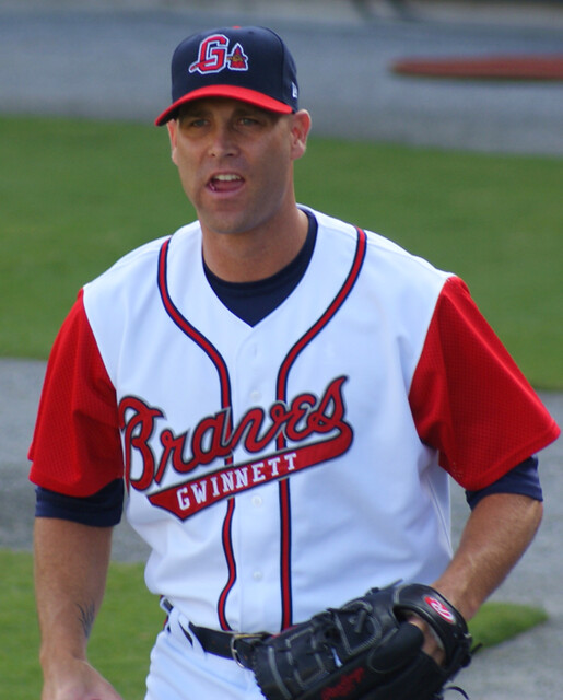
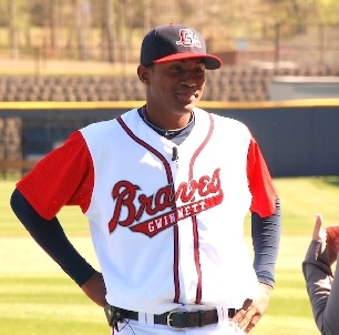
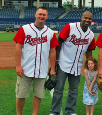
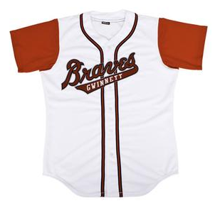
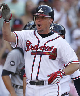
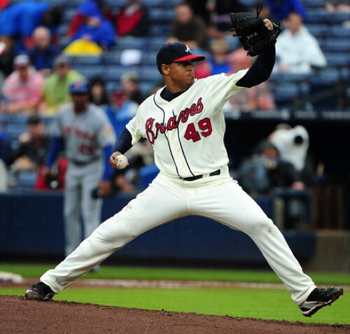
First, the basics: The Gwinett Braves are Atlanta’s triple-A affiliate. They wear a version of the parent club’s script, and it does seem disproportionately weighted to one side:
———
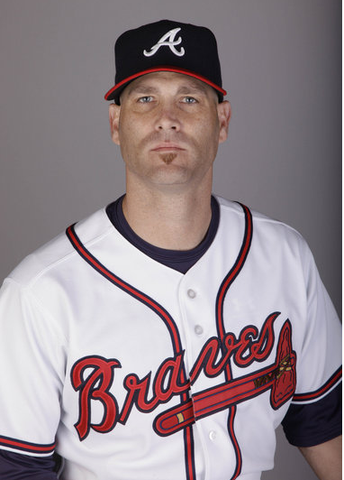
As you can see in all of those photos, the “v” in the script falls squarely on the placket. So if the Gwinett script looks lopsided, how is the Atlanta script positioned? Let’s take a look:
———
So the script on the big league jerseys is positioned just a wee bit over toward the left sleeve (as you can see, the “v” is no longer quite centered on the placket), but the real difference is that the tomahawk head extends past the end of the script and makes the whole thing feel balanced. The Gwinett jersey doesn’t have the tomahawk, and they apparently didn’t compensate for that when deciding where to position the script.
Then I thought, “Hmmm, the Braves’ new alternate jersey doesn’t have the tomahawk either. How did they handle the script on that design?” Here’s the answer:
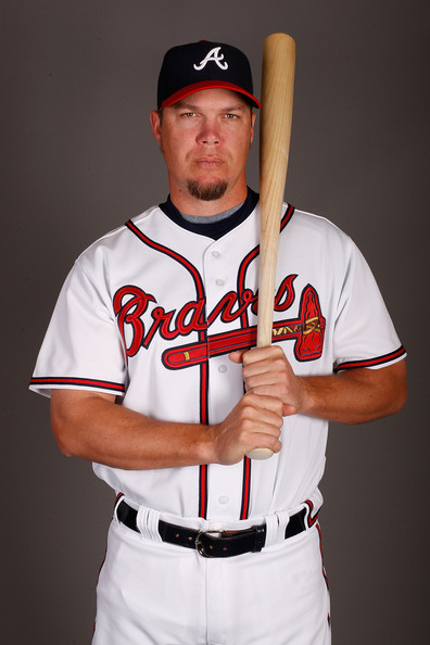
Now the script has been shifted more significantly, with the “a” now landing flush on the placket. So they accounted for the absence of the tomahawk. And of course the front uni number adds a bit of weight to that side of the jersey, but the script still looks balanced even without the number, as you can see here:
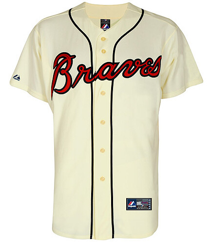
So it seems like the Gwinett club would be better off shifting their script over so that the “a” lands on the placket. And as it turns out, they’ve actually done that — but only on their alternate jersey. Now if they could just make the adjustment on their primary.
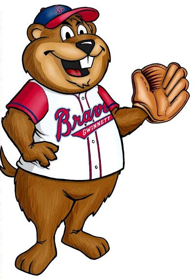
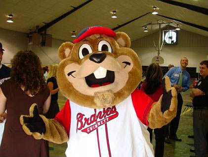
As a footnote to all of this, it turns out that the Gwinett mascot, Chopper, wears a properly centered script in his cartoon representation, but the live mascot is saddled with the off-center script:
And as a footnote to the footnote, I’ll add that the cartoon Chopper is wearing a five-fingered glove, even though he (like most cartoon characters) appears to have only four fingers.
Cleveland renaming contest reminder: In case you missed it yesterday, Phil’s contest to rename the Indians is moving along nicely. If you scroll down a bit on that link, you can vote for your favorite designs among the semi-finalists.
Uni Watch News Ticker: Stay classy, Nike. ”¦ Adam Jones of the Orioles has been going high-cuffed lately, and he talks about it at the 0:25 mark of this video (big thanks to Jack Krabbe). … Good piece about how Nike lettered up the jerseys at the draft. … New kit for the Leicester Tigers (from Josh Jacobs). … Sporting KC fans are upset because the team doesn’t have a jersey sponsor. “The perception is that only teams that are ‘good enough’ or ‘interesting enough’ get sponsors, so it is a mark of pride to have your team turned into a billboard,” says Patrick Runge. Sigh. … Good query from Dan Dove, who writes: “With the NFL expanding offseason roster limits to 90, a few teams will run into the problem of not having enough numbers to issue. For instance, the Panthers only have two numbers right now they can give to Luke Kuechly — 51 and 59 (90-99 are all taken). 51 is retired for Sam Mills, so 59 seems like the logical choice. But what if they draft or sign another LB? Do they temporarily switch a starter’s number to 51 or give the retired number to a guy unlikely to make the team?” Dan points out that several teams have more than ten retired numbers, including the Bears (13), Giants (11), and Niners (12), so those clubs will presumably come up against this problem soonest. … Mike Frick was backstage at the NFL draft and got this shot of the draftees’ hat sizes. … Betsy Flood of the Iowa women’s track team wears a captain’s “C” (from Jesse Gavin. … Eric Wright has noticed a tiny adjustment to the Titans’ jersey that the rest of us missed: In the past, the colored shoulder yoke extended all the way down to the base of the sleeve, but now it stops just above the sleeve cuff. … Jerry Layne’s memorial patch for Harry Wendelstadt was upside-down the other day (from Evan Stein). … Here’s another one of those QBBOB jerseys — that’s QB busts on back (from Kellen Dargle). … The Lightning have put up an infographic that breaks down, among other things, the uniform Steven Stamkos was wearing for each of his 60 goals this year (from Nick Hanson). … I’m quoted at length in this article about Texas A&M’s football uniforms, plus there’s a sidebar that’s basically a monologue, or maybe a soliloquy, by me. ”¦ Here’s Vanderbilt’s SEC championship ring (from Lee David Wilds). ”¦ Royals shortstop Alcides Escobar has been wearing teammate Yuniesky Betancourt’s shoes (screen shot by Clayton Snodgrass). ”¦ Here’s a video of Niners equipment manager lettering up the jersey for first-round pick A.J. Jenkins’s press conference (from Peter Whiteford). ”¦ “A high school near my hometown in Indiana recently had a student die in a car accident while driving home after her softball game,” writes Derek Linn. “To honor her memory, the team didn’t just wear purple ribbons (purple was her favorite color), they actually went out and bought purple jerseys, even though their school colors are navy and orange. They also painted her number on their cheeks.” ”¦ Really interesting article about color names. No mention of athletic gold, alas, but still good stuff (from Tom Mulgrew). … Yadi Molina, who normally goes pajama-pantsed, went high-cuffed the other day (from Caleb Yorks). … You know how MLB teams all have that “How to wear your uniform” poster in the locker room? According to a report that Kevin Gee saw on the MLB Network, the Marlins have a full-sized mannequins instead of the poster. ”¦ Also from Kevin: Matt Downs didn’t have the Astros’ 50th-anniversary cap patch on Saturday. ”¦ The Japanese Trampoline Assocation has a fun logo (from Joba Chamberlain Jeremy Brahm). ”¦ Kudos to Bryce Harper, who wore stirrups and mostly-plain black cleats in his MLB debut on Saturday. ”¦ The problem with these new fabrics is that they’re often too transparent (from Steven Brown). ”¦ Oregon football unveiled new jerseys, similar to what they wore in the Rose Bowl, for their spring game (from Desmond Jones). … Chris LaHaye spotted a St. Joseph’s Academy softball player wearing work gloves instead of batting gloves over the weekend. … Rutgers football will reveal new uniforms tomorrow afternoon. … New research data has led Hockey Uniform Database honcho Andrew Greenstein to revise his assessment of what the 1928-29 Pittsburgh Pirates looked like (from Tim Brulia). … Two soccer notes from Jon Forbes: (1) New away kit for Bayern Munich. (2) New home kit for Rangers. “Like rivals Celtic, they’re making their sponsor logo smaller and placing it under the club crest,” says Jon. “The kit is paying tribute to the 1972 Rangers squad that defeated Dinamo Moskva to win the Cup Winners’ Cup. ‘1972’ is stitched on the inside of the collar.” … Phil had a good assessment of the new Utah State football logos and uniforms, including a slideshow of all the new looks, in yesterday’s entry. If you want more, here’s a video of the new gear, a timeline of Utah State logos, and the official logo slick, including Pantone colors, for the new design. Plus there are new designs for the basketball team, the student rooting section, and the football field and basketball court (my thanks to Brian Watts and Karson Kalian for their contributions). … Justin Hatfield spotted a vendor at Coors Field with some serious blousing. … A black matte BYU helmet is floating around the web. No idea if it’s legit. …Adam Villa recently toured the Louisville Slugger factory in Kentucky. “They were hard at work making those ridiculous pink bats for Mother’s Day, and the tour guide mentioned that they were switching to a neon pink this year instead of the previous Pepto Bismol shade,” says Adam. “Photography was prohibited on the tour, but I couldn’t resist grabbing a photo of the side-by-side comparison of the pink bats. No word on whether the blue is changing for Father’s Day.” ”¦ Gregg Cook reports that Erik Gustafsson of the Flyers has been wearing mismatch uni numerals for months now: The 6 is clearly smaller than the 2. ”¦ Speaking of the Flyers, Jaromir Jagr wears gloves with no logo creep (from Steve Werner). ”¦ Ben Zobrist of the Rays wore a right-handed batting helmet for a left-handed plate appearance yesterday (from Christopher Mycoskie).
The logo on Jagr’s gloves are actually blacked out. They’re Combat gloves, but the company didn’t pay the licensing fee to the NHL, so they can’t show their logo.
Just thought you’d like to know, Paul, that we went to Olneyville on Saturday and those were some amazing dogs. My wife and I each got the deal with two weiners, fries and drink but I’d probably skip the fries next time. The locals there definitely made it a very colorful place! I’d go back for sure, probably check out the north providence location next time since it’s slightly closer
Good query from Dan Dove, who writes: “With the NFL expanding offseason roster limits to 90, a few teams will run into the problem of not having enough numbers to issue.
I’d be willing to bet that they’ll just use duplicate numbers. It’s not like pre-season number assignments really mean anything.
I know it (possibly) isn’t your fault, but that photo of the Utah State basketball uni revamp shows “2011-2012 season” over both sets of pics. Kinda confusing at 730am on a Monday.. had to use brain far too much.
Gotcha. Will fix.
Two easy solutions for the potential NFL numbering problem:
duplicates: link
or triple digits: link
It’s bound to happen….
I’d say you’ll see duplicate jerseys (it has happened before in the preseason) or you’ll see guys wearing numbers outside those prescribed for their position (like Vicotr Cruz did with #3).
link
It’s odd that there’s only three quarterbacks on an NFL team, and yet they’re given such a wide range of numbers to choose from, that being 1 to 19.
So 3 minus 19 leaves 16 different numbers available.
There is also one kicker and one punter per team, and they can choose from the same numbers.
So 2 minus 16 leaves 14 different numbers available.
Yes, wide receivers can choose numbers between 10 and 19, but there may be less available if the quarterbacks, kicker, and punter all don’t pick numbers between 1 and 9. So wide receivers wearing numbers 1 to 9? Sure, why not?
So I say instead of duplicate numbers, which would be REALLY confusing for everyone, I’m totally all for players wearing numbers outside those prescribed for their position.
I mean, all eligible receivers wear numbers from 1 to 49 and 80 to 89 anyway so as long as we don’t have o-linemen wearing those numbers there won’t be any problems.
I also think it would be really cool to see NFL runningbacks wearing single digit numbers like college runningbacks did in the 90’s.
And when you add retired numbers to this problem, I think it only makes sense that the NFL should allow #0 and #00 as available numbers, at least in the preseason. What position(s) those numbers would be prescribed to is anyone’s guess. Maybe make #0 the kicker and #00 the punter, since there is only one each per team? That would make their current numbers available to any other skill position players.
Seems to me there are a lot of solutions: fractions, decimal points or even combining letters with numbers.
A while ago there was a link in the ticker to a newspaper article from the 80’s about a guy who patented a football jersey numbering system that combined letters and numbers. Quarterbacks were Q1 up to Q9, Runningbacks R1 to R9, etc.
Google shut down it’s newspaper archive search so unfortunately I can’t link to it.
Looking forward to the first NFL 0. Why not? It works in the NBA
Jim Otto wore 00 (aught-oh) when he played for the Raiders, before the NFL banned the use of jerseys #0 and #00.
The NHL put a ban on 00 in the late ’90s…the last player to wear that # was Marty Biron:
link
And then there’s George Plimpton of the Lions
link
Steeler legend Johnny Clement:
link
First in a long time:
link
But yes, it works in the NBA. In fact, the Nets had a 0 and a 00 on the roster in one season.
link
Works fine in baseball too:
link
My 2nd favorite ballplayer. If I ever get a Blue Jays or Expos jersey, it’s getting a 0 on it.
I remember Omar Olivares of the St. Louis Cardinals wearing the double-aughts back in the early ’90s. Baseball-Reference.com says it was ’93, but they also list that he wore 26 from ’90 to ’94 with the Cards. Also wore 00 with the Phils in ’95.
link
And what’s with leagues banning the use of 0 and 00, anyway?
With hockey, I think it had to do with the fact that some scoreboard computers couldn’t compute a 0 or 00 in their program. Teebz said something like that once, I believe. With the NFL, I think it’s just one of those No Fun League things, but I could be wrong.
How about numbers with zero in front? That would make nine more numbers available if they really needed them.
01, 02, 03, 04, 05, 06, 07, 08, 09.
After living through the 2000’s decade we should all be used to hearing “oh” before a number when referring to years. Why can’t that work as jersey numbers? My idea is these types of numbers would be considered different from single digit numbers.
Wasn’t there a player on the Marlins in the 90’s who had the number 09 or something? Was that Marlins player’s number still considered a single digit even though he had a zero in front?
I think Benito Santiago wore 09.
He did.
link
Back when the Marlins looked fabulous.
I went to the game yesterday, and sadly, he link link link link.
Of course, he, being Adam Jones
Button Gwinnett was(is)a signator of the Declaration of Independence from Georgia. And their mascot is called Chopper? Hmmmm
BTW I voted on the Cleveland re-brand unis, though dial up makes it hard going to fully see so many pics. Kudos to all the artists, some exccellent work as usual. MLB should take note. No doubt, being myopic fossils, they won’t.
Dial-up? What year are you writing from? Is dial-up internet still available?
“Chopper” refers to Gwinnett County’s own groundhog, General Lee, who accurately predicts whether (weather?) Gwinnett Countians will see an early Spring or not (link). TMI I know, but there’s a method to the madness.
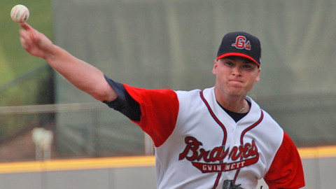
The pictures of the Gwinnett Braves features all of last years jerseys. This season, they’re wearing all-white home jerseys (link) made with Majestics “Cool Base” fabric, but the off-center “Braves” is still…off center.
Last season’s faux-vest design was pretty awful.
“… Betsy Flood of the Iowa women’s track team wears a captain’s “C” (from Jesse Gavin…”
I would love it if there were more coverage here of track & field unis. Lots of colors and patterns to talk about, of course, but also issues of one-piece versus two-piece, loose versus tight, etc. Besides, the Olympics are upon us, and there’s no subject more diverting than how nationhood is expressed through athletic gear.
I realize that one of the many virtues of this site is that readers are encouraged to guest-edit and tackle their own uni enthusiasms. But I’m too lazy and inept for that. So please, Dad, would you dedicate some space and time to track and field? Check’s in the mail.
New Nets merchandise (with new logo) is already available on the NBA Store. link
Complete with a spelling error (in the description, not the goods)…
link
Booklyn
Isn’t that how they say it?
And I’m pretty sure there is a slight difference between “round” and ’rounded corner’.
link
“Behind the logo” commentary from the Nets website.
link
Good tip. Check this out, UW comrades:
“…The new primary logo — created by Brooklyn’s own JAY Z — retains the shield from its previous iteration, and adds that iconic Brooklyn ‘B’ to the basketball that has been part of every logo since the franchise’s 1967 inception as the Americans. The Dodgers had their lettermark, and the Nets have added another model for the borough to bear. “Brooklyn,” of course, is spelled out below. Nets CEO Brett Yormark called this “the new badge for Brooklyn,” and JAY Z believes the design’s boldness demonstrates confidence in the new direction…”
…the basketball that has been part of every logo since the franchise’s 1967 inception as the Americans
Um, what? link
A blue & red circle is not a basketball.
“Brooklyn,” of course, is spelled out below.
Meaning, of course, that the NBA has required another team to create a “primary logo” that they won’t ever link if they can link.
great… jay-z redesigned his team so that him and kanye can wear a black hat in a video…
cha-ching!
Yes, finally. Somebody sees their branding for what it really is. I guarantee there will be more merchandise made up with only “Brooklyn” on it, than there will be that displays the basketball logo. It will be a lifestyle brand, not a basketball brand.
And, as of 11 AM EDT, link Not even a mention yet on the main ESPN NBA page, not even so much as a tweet!
Granted, I’m sure the teams and leagues have some responsibility in releasing graphic packages to the outlets covering them, and it could take a little time to change over the team pages, but not even a little blurb to say “Brooklyn Nets now official”?
Of course, a cursory examination of the other sports outlets has revealed that FoxSports.com is apparently the first one to even have a mention of the changeover – and that link goes to another blog.
Seems that, without a press conference, the major outlets don’t see this as particularly newsworthy. Of course, the logos did get leaked, and I don’t recall seeing anything on when the unis would be revealed, so…
I think I like link.
Doesn’t that shirt convey the message that you can buy drugs in Brooklyn?
I thought that was how gangs marked their territory… It’s even titled the “Corner T-shirt” as in this is our corner.
The Nets are a gang? Who knew?
I’m not really sure what you guys are implying is gang related… “The corner”? The sneakers?
Neither of those are gang related, I think you guys are reaching.
Ask ten people what it means and you might get ten different answers.
I’ve heard (among other things) that it’s a way to mourn the dead, like if someone was run over by a car or shot to death near the spot where the shoes are hanging.
I actually thought the sneakers were just another way for bullies to pick on kids… it’s been going on for decades.
Hooray Google:
link
I’ve heard the virginity thing before, think that was in some movie.
Another one:
link
And if you ask ten people which of the explanations they would most closely associate with Brooklyn…. ?
Hence, snowdan’s comment.
That’s also the only explanation I’ve ever heard for it, other than the presumed “bullying/picking on” reason.
I used to think nuclear war or maybe famine and pestilence might bring the end of the world.
After seeing another fool(Nike designer) make an ass of himself, I am convinced Twitter might end our universe.
I think you’re overreacting. Twitter is just part of Skynet’s human monitoring system. Our world will still end in nuclear war.
Kyle Reese, the soldier sent back in time to protect Sarah Conner from the original Terminator, wore Nike high tops in the film:
link
“I have better things to do than worry about the 140 misspelled characters that angry and bitter people use to tweet-and-run.” – John Popovich – WCPO-TV
Long-time reader, first-time nitpicker… Could you perhaps specify that the link in the ticker is for Leicester Tigers? I clicked on it expecting it to be for Leicester City. Plenty of association football anoraks will probably assume the same.
It’s an ugly kit, anyway. And that’s saying a lot, as a Harlequins supporter.
Done.
Maybe I just see things differently, but I’d be thrilled if the LA Galaxy took Harbalife off of their kits (I have one of their jerseys from before the sponsorship). Of course, LA’s deal is the one other teams look at as a model, so KC fans needn’t worry. Their jerseys will be whored out soon enough.
I am amazed at how easily we accept (demand) the sponsored kits because the other int’l soccer leagues do it. Other int’l leagues have sponsors all over the unis of EVERY sport, though. I don’t see why we would demand it on our soccer kits, but won’t accept it on our baseball unis.
Ask the Philadelphia Union’s fans if they’d like to take the sponsor logo off link…
Perfect example of a sponsor’s mark wrecking an otherwise nice kit. SMH at fans crossing their fingers in hopes of a jersey sponsor. The saddest comment I saw on that KC Star article was one from a fan who said he’d be first in line to get a jersey as soon as Sporting lined up a sponsor, as if it’s a sign that the team has arrived. Call me crazy, but I don’t get quite as excited when my team makes it’s own brand secondary to that of some corporation or product.
Here’s a thought – what if the sponsor turns out to be one that a particular fan abhors? Like, say, Pepsi for a Coke diehard, or Walmart for, well, an anti-Walmart type?
When the Union announced that they would have “Bimbo” across their chest, I bought the jerseys from their first season with no corporate sponsor. Vote with the wallet. Some delusional fans pointed out that the sponsorship allowed them to sign Mondragon in goal. Well, now he’s gone (as well as their top goal scorer in LeToux), so you’re just left a slutty bakery across the jerseys.
I like the sponsorship on the Union’s jersey. Plus their colors remind me a little bit of Pitt:
Forgot the image:
link
Two notes:
Re: Sporting KC not having a jersey sponsor – For those fans that are disappointed they don’t have one because it’s a sign you’re good enough or big enough, FC Barcelona didn’t have one for quite a long time (roughly 100 years) before finally succumbing to having one a couple of years ago, and they’re one of the biggest clubs in the world.
Re: Utah State rebranding: The link reminds a lot of link
And of course when Barcelona did finally have a jersey “sponsor,” it worked the opposite of the usual way — THEY paid UNICEF, rather than the other way around. But then in 2011-12 they finally made a more traditional sponsorship deal, with the Qatar Foundation.
Sporting KC’s sole major sponsorship is Lance Armstrong’s Livestrong, which currently has the naming rights to the stadium (Livestrong Sporting Park). The Livestrong organization gets some percentage of stadium revenues.
I suspect Sporting KC would have “Livestrong” on their jerseys, if it weren’t for sheer world-ending-impossibility of putting a Nike brand on an adidas shirt.
I’ve wondered before why they didn’t simply use the Livestrong logo on the shirt, but that makes sense now.
Also raises another question: what are the odds of the league allowing teams to pursue their own kit manufacturers? I’d think, for a big name team like Galaxy, they’d want to be able to get the best deal for them out there, rather than (presumably) sharing the money from the deal with the other teams. I vaguely remember, from drawing and coloring teams’ uniforms back when MLS started, that all the teams used to have Nike kits, and they used the same two or three templates. Now, there’s some variation, though it’s still kind of boring seeing the same three stripes on every shirt, shorts, and socks.
From the article:
This is a group that has very, very high expectations as to what they think the value of that jersey is, and the league is very supportive of that. So they’re economically in reasonably good shape, selling out every game, have lots of luxury product within their stadium, doing well financially … and if they needed it, they would do it.
So they don’t really need it, but the fans are complaining because they don’t have a sponsor logo? Boo hoo. Buy a plain jersey and sew some sponsor logo on it for yourself.
I took some flak for suggesting if ads were the *only* way to keep a team or league afloat, then so be it, regrettably. But if you can survive and thrive without them, then I fully agree with Paul that a heavy sigh is in order here.
How about we make MLS into a world-class league without every team needing ads? Then maybe the rest of the world (who may not like us, but they sure love our fashions) will come around to say, “You know, those sponsorless kits are quite smashing. I wish my team would do that.”
question, since i never watch soccer (unless it’s the olympics, then i’m on that like white on rice)…
are MLS games televised? if so, do they have commercials between periods (halves?)
if so, then why do shirts NEED ads, and if not, then why don’t they just have commercials?
They’re televised, but they’re no longer on ABC…so someone who gets ESPN2 will have to answer that for you.
TV commercial revenue goes to the TV channel. Shirt ad revenue goes to the team.
Also, it’s strange that your only soccer viewing is the Olympics rather than the World Cup.
yeah…forgot — world cup too
U-S-A! U-S-A!
Regional sports channels carry the local teams. For me Fox Sports West carries the LA Galaxy games, plus occasional coverage on Fox Soccer or ESPN. No commercials except at the half, ads all over the boards and on the kits, depending on who’s playing.
The article said a portion of the sponsor revenue is shared, so Sporting wouldn’t get all of that money anyway. Since the league also uses a salary cap, I’m not sure how much of the money can be spent on players. But MLS’s ownership structure is such that the league owns all of the teams, so I suppose the league decides how to divvy up the sponsorship pie.
Let me assure you, as a Sporting KC fan, not all of us want a shirt sponsor. Theres actually quite the debate roiling about that right now among the fans. The majority actually seem to like the empty shirts we have now, and think its a clean, streamlined look. I love our current shirts, but I wouldn’t be upset with a good sponsor. It’s soccer, so shirt sponsors are the norm.
Interesting opinion piece on CNN about ads on NBA jerseys…
link
More of the tired “inevitability” argument. Why is that narrative so persistent?
Because it tends to work. Same reason a salesperson nods when saying, “Wouldn’t you agree?” They’re setting you up.
True. It reminds me of my sales training from years ago. We always led the customer with closed-ended questions. That said, what’s a journalists stake in this? Why is he running with the inevitability argument? I could see if it were written by Mark Cuban.
If advertising on NBA jerseys is “inevitable” (which I don’t think it is), then it would be inevitable that I would stop buying NBA jerseys.
The numbers is nothing new Paul. There have been numerous cases where lineman during the Steelers preseason have shared jersey numbers, and some linebackers have even wore jersey numbers in the 30’s. (Somehow, thr 40’s got exhausted after using the 50’s and 90’s.) Long-term, the NFL just needs to do away with the jersey number requirement, even for lineman. I mean, come on? It’s not the 1960’s where lineman were close enough in size to position players that they needed to know who is eligible. If you can’t tell the difference between a 180-pound running back and a 375-pound offensive tackle, then you shouldn’t be a referee.
There is still the occasional “lineman reporting as eligible” issue.
The number rules need to be relaxed a bit – defensive players should be able to wear any number they want and there doesn’t need to be any difference between RB numbers and WR numbers, but keeping a small range of numbers specifically for offensive linemen isn’t a bad idea.
True, but I’m not sure how in the preseason, the Steelers quickly exhaust linebacker numbers. Only link, link, and link are out of circulation (although in my opinion, link should be, too), yet there have been years in the preseason that the Steelers have had linebackers wear numbers like 37 or 38, because they exhaust all the 40’s numbers for tight ends and linebackers–two positions that don’t normally have players wearing 40’s numbers, and with link none of the 80’s (including link and link) are currently out of circulation, so tight ends have no excuse.
Interestingly enough, the Steelers have kept link alive link. Nothing against Mel Blount’s fellow Hall of Famers, but aside from Hines Ward (who just retired), did any of them literally change the NFL rules like Blount did? He’s the reason why a lot of emphasis is placed on pass interference.
The 49ers generally have OL and DL players double up in the 60’s and 70’s in preseason and any additional LBs end up in the 40’s where they double up with the extra TEs.
Just lineman end up doubling up with the Steelers, and this was happening BEFORE the expanded training camp rosters. There’s a reason why the NFL officially “discourages” teams from retiring numbers. The lineman is interesting because out of 30 numbers from 50-79, only six of them are either out of circulation (the aforementioned 52, 58, & 59, as well as link and link) or, in the case with number link the only jersey number officially retired by the Steelers. Still, though, come final roster time the Steelers only tend to keep about 8-9 offensive lineman, 6-7 defensive lineman, and 8 linebackers, with the latter two also using 90’s numbers. (There are currently no 90’s numbers in Pittsburgh removed from circulation, although as I mentioned before a case could be made for 95 and maybe, in link, for link.) In any case, offensive lineman can use 24 possible numbers for the Steelers, linebackers 17, and theoretically-speaking, 34 numbers for defensive lineman, even though the Steelers don’t issue 50’s numbers for defensive ends like a lot of teams have been doing lately, and link have they issued even 60’s numbers for defensive lineman since the link.
Agreed.
Modified number rule proposal:
0-19 QB, K, P, WR, RB, DB
20-39 WR, RB, TE, DB
40-49 WR, RB, TE, DB, LB
50-79 OL, DL, LB
80-89 WR, TE
90-99 DL, LB, WR, TE
Defense:
0-99
Offensive line:
50-79
Everyone else on offense and kickers:
0-49, 80-99
^^ that
Oops. I just noticed a typo. That should have been 80 thru 99 for the last group.
nah…no typo
Did Deion Sanders ever wear 2 in a preseason game with the Cowboys? I remember him practicing in that number during his time there, but in games that counted it was always 21…
Here’s Prime Time wearing #2 for Washington:
link
That’s a practice jersey. Deion was notorious for wearing #2 at practice.
Sad to see Oregon’s link go, if in fact link is an indication of their demise.
The heck is that reflective crap in the diamond pattern on their shoulders?
And what’s with the light yellow jerseys? That makes them look like a squad of walking Post-It notes!
Stylized link. And since the patch indicates these are part of some “Support Our Troops” initiative, I’m guessing they’d either call that color “sand”, or “dress khaki”, or something.
My Aunt Christine had a couch that looked something like that. She kept her hair pulled back tight in a bun and wore big lace collars and clunky sensible shoes with nylons that stopped below her knee.
So you’ll understand why I don’t think that kind of jersey styling particularly suggests “athletic endeavor”.
My Great Aunt Christine, that is.
“you’ll understand why I don’t think that kind of jersey styling particularly suggests “athletic endeavor”.”
~~~
i know, right! there should be some tough colors like black or blue or red!
none of these pussy colors
or…
you could say that pale yellow/tan (which is more of a school color, albeit not by much, than the black and gray they currently wear) is a refreshing change
i’d have no problem if some team wanted to wear that as a color, particularly if it could be worn against a dark color (giving us a nice color vs. color matchup)
oh, right…not enough “separation” … gotta have black vs. white for that
That new Duck collar treatment is also on the new Utah State jersey – at least on the dark one. I had hoped it was a unique feature for those Aggies, but it’s just one of the boxes on the Nike jersey checklist. Feh. And furthermore, feh.
I realize that they were honoring our troops in numerous ways and that the stadium was packed (At least it looked that way in the pictures), but a military fly-over seems a bit excessive. We’re talking about practice [Cue Allen Iverson]. Granted, I’m that kind of northeaterner that cares more about pro sports than college sports, but we’re still talking about a practice/scrimmage. The money used for that fly-over could have been used to increase the contributions to veteran charities.
While the flyover may be a bit excessive, the UO does pay for the cost of the jets to do it. As for the game, The UO does a lot of things to benefit different groups. To get into the game, fans must donate at least 3 non-perishable food items, that goes to the local food bank. A select number of troops who attend the game get to run out of the tunnel with the players. After the game, the players give the jerseys away to selected troops, first responders, and veterans.
“The money used for that fly-over could have been used to increase the contributions to veteran charities”
they (pilots, military) need practice too.
“strike target X, at XX:00 hour”
sure, seems like a lay-up… but NBA players practice lay-ups too…
although:
link
It was cool while it lasted. However, I do like the spring training jerseys. Well, except for the link one.
this bothers me:
“Photography was prohibited on the tour, but I couldn’t resist grabbing a photo…”
What’s bothersome, the fact that some places treat people taking photos like shoplifters, or the fact that the rule was broken deliberately by the tourist?
a deliberate breaking of a simple rule…
company is cool enough to show a behind the scenes… asks that no pics are taken… yet someone feels above that, and entitled to snap a quickie…
but hey, now we can all sleep well tonight knowing what shade the “ridiculous pink bats” are
i certainly don’t follow all rules to the letter, but in this case it just bugs me
jesus christ, ryco, it’s not like the guy was photographing plans for the bomb or stealing apple’s newest patent
it’s a pixture of a bat ferchrissake…what’s the big deal in keeping that lovely shade of pink under embargo? and if they really didn’t want pix taken, then they shouldn’t have had the tour…surely they can’t be that naive
That BBC article on colour names isn’t available to me in the UK for some reason.
And I wonder why I bother paying the license fee…
If you look at the picture of that sign with all the NFL draftees cap sizes on it, you can see a pretty big spelling error. The spelled Michael Floyd’s last name F-L-Y-O-D.
As someone who link for years in Richmond, I couldn’t be less surprised that they’ve managed to fuck up their own uniforms. I’m betting that the secret is they just don’t give a shit. What an embarrassment of a baseball franchise.
So, basically, what you’re saying is… link
I found it interesting that the Braves demanded that taxpayer money (not their’s) be used to build a new stadium in a trendy (thus, higher property value) part of town. Building a stadium on a flood plain that had suffered a pretty vicious flood a few years prior and has worse access to the city’s highways? Yeah, that was a great idea by the Braves. If anything, I wish Richmond would have torn down The Diamond and built a new stadium on the same spot before the Flying Squirrels came in.
Despite the fact that the Flying Squirrels have been an unquestionable success, they city and counties are still hemming and hawing about a new park…to the extent that even the new team is questioning its long-term viability. It’s an embarrassment.
The latest plan I’ve heard is to build across the street, on the site of an unused (I believe) Greyhound facility. Who knows if it’ll happen? Sure, money for ballparks could always be better spent elsewhere, but I just can’t imagine how a town of Richmond’s size and general prosperity/livability can’t get its act together to have a decent baseball stadium.
Yep, that’s an old Greyhound bus station. That’d be a decent spot for a stadium. The access to 95 is just too good to ignore. Richmond does deserve a AAA team, but it’ll probably take a new venue for that to happen. backtracking a bit, remember the Braves did this to another city as well when they moved the Macon Braves to Rome because Macon refused to build a new stadium entirely on the taxpayers’ dime.
I’d need to look at the Redskin’s QBBOB jersey again, but one thing I immediately noticed that the two have in common: a former BYU QB. Go Cougars!
Ewww… I misplaced the apostrophe in Redskins’. I’m sorry, everyone.
Just a pair of “Look at me!” jerseys. No sense whining over one’s own poor decision to buy a jersey of an aging, brittle, slower quarterback (McNabb) playing in front of a porous offensive line. Way to invest in a train wreck of a jersey.
Yadi Molina is apparently mourning the loss of Albert Pujols by wearing his shoes…notice the “5” logo on the back of the shoes in the pic displayed in today’s ticker.
If he is, that makes it all the more strange that he already extended his stay in St. Louis without testing free agency.
Happy birthday, Tucker & Caitlin!
I wear gardening gloves while playing softball. For me, sliding always results in regular batting gloves getting chewed up but the dirt used on some infields. That’s a $20-30 investment every time.
My solution? About four years ago, I began wearing basic gardening gloves. I bought my new pair this weekend at Canadian Tire for $4. A quick modification, and I have gloves that not only stand up to the rigors of batting – including having padded palms for excellent sting absorbers on colder days – but I have gloves that I can slide in until the cows come home without ruining them.
If they do “wear out”, it’s not a tough investment of $4 for a new pair that will last me at least a couple of seasons.
And if there’s a thistle on the field, I’m quite well-suited for fixing that problem too. LOL
In the 70’s, batting gloves were pretty spendy for me. So I found a store selling handball gloves (pairs!) for the same price as a single batting glove. They looked just like batting gloves. Made by the same mfr. (Champion? Tiger head logo I believe) plus they had a little more padding in the palms. Great for inside a mitt. Those garden gloves triggered a memory for me. In the 80’s, slow pitch was my game, and a teammate of mine would get all over players who would wear blue jeans. Some teams had official uniforms and some didn’t. But most guys would at least wear some old hardball pants. His needle was always the same. “At least you won’t have to change clothes when you go home and work in the garden.” I guess baseball and a little bit of razzing, have always gone together.
brrr, pttttt~
browl, brrr-brrr-rowl. brppt, brrrpt. meh. brrrowl- rowl. meeeeeeew.
I’m sure they will eventually, but I like that Sporting KC doesn’t have a jersey sponsor and that they don’t seem to feel like they absolutely need one. It’s nice to see that they can do just fine financially without a multi-million dollar corporate sponsorship. It says a lot about the organization and the fan base.
The thing that bothers me the most about Sporting, Colorado, and San Jose’s kits is that they’re designed like they’re waiting for a sponsor’s logo right on the middle of the jersey. Why not just put an enlarged team logo or wordmark on there?
Perhaps what’s so annoying to some fans is that, while important teams do have sponsors, it stands out even more without anything across the chest, like they’re some broke-ass NASCAR team.
All this time watching the Flyers and i never noticed Gustafsson’s numbers lol, even after he scored in game 6 vs the Pens
Was watching WWE last night, and it was nigh-on bizarre seeing all the advertising on Brock Lesnar’s shorts. I can’t ever remember a wrestler wearing in-ring ads before.
Damn you, logo creep.
It’s part of his new contract, and gives him a “MMA” feel. But yes, you are correct. WWE does not allow in ring sponsors.
Many wrestling rings in Japan have ads pasted on the ring itself. Very busy and distracting.
Nothing against WWE (I was a fan growing up, and I still enjoy watching the older , pre-2007 matches, though I tend to follow UFC more often these days.), but it’s blatantly fake and really shouldn’t be mentioned as far as sports uniforms are concerned.
With that said, though, the WWE does have sponsorships. I can remember during the Attitude Era the company having promotional tie-ins with Lugz Shoes, Stacker 2, Snickers, the U.S. Navy, etc… NONE of these items ever had WWE-related products, such as Stone Cold Steve Austin-style Lugz Shoes. Yes, the WWE does market its own items subliminally, such as tee shirts, DVD’s, the occasional WWE Studios flick, and until a few years ago some of the WWE Divas posing nude in Playboy. But they have had sponsors that were not related to the product. I have no interest in ever buying Lugz Shoes or Stacker 2.
I was born and raised in Atlanta, and take my word for it: any exhibition of taste or proportion would be flat-out contrary to the spirit of Gwinnett County … nearly as bad as something not designed by committee. I’m astonished they haven’t worked black into the design somehow, or an X-TreMe “GBraVe” holding a Red Bull.
Love your pen name.
As a resident of Gwinnett County, the whole stadium deal has us all seeing black, as in the black ink on our property taxes now that revenues aren’t hitting projections, G-Braves attendance sucks, and the stadium cost twice as much to build as originally planned.
Man, dig those link.
~~~~~~~~~~~~~~~~~~~~
link? When did they start doing that?
~~~~~~~~~~~~~~~~~~~~
Happy birthday to the Lukas kids.
Astros were wearing the red, er, brick, er, Martian soil caps in DC earlier in April, too.
Gotta say, I much prefer the Astros in that hat to the Astros in the black hat. Even though the black hat actually makes sense with the team name.
“Martian soil”…finally, someone’s found a way to favorably spin that choice of color for me. I’d still prefer orange. Shoot, it’s not as if the Marlins are ever going to wear theirs.
Although, if the Diamondbacks would switch to copper-colored hats, or (risking UW banishment) even go back to purple, then I’d be more than OK with Martian-soiled hats for the AL Astros.
“Martian-soiled hats”
~~~
that pretty much describes em…and i don’t mean the color
I consider the current Astros color scheme to be the most appropriate to their name of any they’ve worn. Nothing against orange, which the Astros in the past have worn better than any other team ever. But. The sine qua non of a team named after space exploration is that you don’t wear blue. If you look out your window and you see the color blue, you are not in space.
Once we’ve dispensed with blue, which a team named the Astros must never, ever, under any circumstances wear, the obvious next choice is black. Check.
Now, the truth is that in space, most light is white. All those beautiful colorful photos of nebulae and distant galaxies from telescopes? Fake. The colors, anyway, in most cases. But black and white tends to be dull, unless you’re a Brooklyn hipster.
So. Let’s take stuff in order. The moon? Lunar soil is vaguely taupe, but mostly just gray. Blah. Mars? Now we’ve got some color: rusty brick red. Check. Venus? Well, the surface of Venus is actually the color of pain, for about 30 seconds until your eyeballs melt and the pressure crushes your skull. But before you make the fatal mistake of going down to have a look-see, from space Venus is a pleasantly neutral sort of yellowish tan color. Anyway the tops of the clouds that completely cover the planet are. Check. Also, Saturn is about that color.
So. The Astros colors are the color of space itself; the color of Mars, the next great target for human space exploration; and the color of Venus and Saturn, the two planets that more than any others spurred human interest in unlocking the mysteries of space with the invention of telescopes.
Not the color scheme I’d have picked, but certainly more Astros-y than blue and orange ever were.
Fair points one and all, but here’s why I still like orange:
link
Astro – a word from the Greek, roughly translating to star.
Stars come in many colors: red, orange, yellow, yellow-white, white, blue-white and blue.
So if your name is Astros, blue and orange is a very appropriate color scheme.
vilk: “forbidden”
huening: +1
best astros uniform ever? this…and they got it right the first time
“best astros uniform ever? this…and they got it right the first time”
Goddamned right!
The Astros have crumpled everything up and started over so many times, a “clean sheet” approach rings pretty hollow. So, absolutely, I would embrace the “Suddenly, it’s 1965” uniform. Extra points for leaving the Astrodome on the left sleeve.
One more time…here’s why I like orange:
link
“One more time…here’s why I like orange:
link….link“
(fixed)
Given the color of the graphics on the grey uniform, the brick hats make sense. I have a funny feeling when the Astros redesign everything next year, a few grumblers are going to agitate about how “they don’t look anywhere near as good as the uniforms we got rid of.”
Jadier Molina is still wearing Albert Pujol’s cleats as he did during the world series.
We’re living in the 21st century and the Nets are moving into a $1 billion arena, and they get stuck with a color scheme that pre-dates color TVs. I would have just as soon stuck with the old logo. This is the UniWatch equivalent of the Emperor’s New Clothes–it better not last any longer than that “one-day logo” the 49ers had back in 1990.
So in a world that is a swirl of color doing something to stand out is wrong?
The proper approach is to blend in and disappear?
Maybe “it’s not chock full of color” is actually insightful. Or is there simply no chance that’s possible?
I think black-and-white is a color choice you go with in the following scenario: Your franchise is moving in mid-season and the city you’re leaving wants you to leave its colors, history, uniforms, etc. behind, and you play out the rest of the season in black-and-white unis until such a time as you’ve come up with a new name, logo, color scheme, etc. Which is obviously not the scenario the Nets are in.
As someone who lives in Brooklyn and was very on the fence about the arena (an arena on mass transit! awesome! as part of a development with 6,500 units of housing that will be up to 10 times as tall as surrounding buildings…not so awesome!) I was hoping to be excited by the move and the logo, but the new logo strikes me as way, way, way too severe, saying “small, self-important architecture and design firm” rather than, “awesome basketball experience!” Or perhaps, “club that I would never go to because the cover was too high or that I could never get into because it was filled with supermodels and pretentious people.”
And the infatuation with Jay-Z…ugh, what a drag. People can’t tell the difference between class and crass anymore. We get it, Jay-Z makes a ton of money, mostly by being famous these days. Enough already.
The Brooklyn Nets. Understated. Refined. With Bottle Service beginning at $800. Black Card, only, please.
Pfeh. I’ll just go to the hockey game, thanks.
They’re definitely pushing the Jay-Z thing too much, but as far as rap goes, Mr. Carter is a dignified elder statesman. For a billionaire, with an impossibly beautiful wife, the guy is pretty down to earth. Fact is we don’t know if he’s an asshole or not, but at least he doesn’t seem like one. I’m not gonna assume he is just because he’s famous and wealthy.
The Hello Brooklyn slogan is a nice touch – as it’s the name of one of his songs, but otherwise they are way overplaying his minority stake.
I plan to consume this team on television, like most of us, so Jay-Z and bazillion-dollar luxury suites mean almost nothing to me. It’s going to be all about the uniforms (duh) and I’ll predict the ones that say “Brooklyn” go down better than ones that bear a “Nets” script.
I wouldn’t be surprised if they go with the Brooklyn on teh front of both the home and away jerseys like the Knicks do with New York.
I’m surprised that no one has noticed that the Braves use a different version of their wordmark for uniforms and printed material.
In print, the wordmark has fairly consistent kerning. However, on uniforms, the “v” is positioned significantly further to the right of the “a”. I assume they do this because of the piping on the jersey.
If you photoshop a Braves uniform and remove the piping, the difference between the uniform wordmark and the printed wordmark is glaring – at that point, the “v” on the uniform looks strangely out of position.
many teams elongate the connection between the letters that bridge the placket of the jersey.
And more teams should.
I was tweaking with the Dodgers jersey, trying to break up the letters evenly,
link
but until TimE elongated the connection for me it didn’t look right. Now it does.
link
Agreed. Check out what happens to the lower case ‘a’ on their blue road jerseys: link
Atlonta?
SI doing a Babe Ruth photo gallery today – interesting shot here – Check out the lettering on this jersey – that don’t look Yankee to me.
link
I admit to getting a pleasurable chill up my spine reading about the color discovery of the 28-29 Pittsburgh Pirates.
-Jet
So it looks like the Utah State student section is being renamed, or is that just for football? The basketball student section is called “The Refraction” as they play in the Smith Spectrum (quite nerdy/clever). One of the best student sections in America, they’re completely insane (and the home of mega-fan Wild Bill)
link
link
link
link
It’s possible these have been posted here before, but there are a couple of gorgeous color shots of Army playing at the original Yankee Stadium down link Plus a b/w from 1929.
Mets have gotten onto the link bandwagon. Word is they’ll be breaking out hockey sweaters for a roadtrip to Toronto later this year.
from Peter King:
Quote of the Week V
“Because 1 plus 7 equals 8.”
— San Francisco first-round draft pick A.J. Jenkins, a wide receiver from Illinois, talking about why he picked the number “17” to wear as a pro. He wore “8” in college, at Illinois, but because “8” is the number of Hall of Fame quarterback Steve Young, the Niners aren’t giving it out, and Jenkins had to improvise.
Read more: link
Apparently nobody told Peter King that recievers can’t wear #8 in the NFL, regardless of whether it’s been retired…
He probably just assumed the rules had been changed. If a fullback can wear 15…
+1
The initial reaction to the Nets’ new logo seems to be mixed, at least outside of Brooklyn. Current results of a Washington Post poll:
Don’t like it- 50%
Like it- 25%
It’s fine, I guess- 25%
You can put me with the “It’s fine, I guess” group.
If Blake Pass is “driven bonkers” by the G-Braves uniform lettering minutia, I could only imagine his response to the mid-1980’s Boston Red Sox road jerseys.
link
Half the players had the BO on one side of the buttons and the other half had BOS there. There was a lack of consistency, it seemed, in the way the jerseys were made.
Nope.
Wilson made the road jerseys in 1986 and Rawlings made the road jerseys in 1987.
According to this site: link
“In 1986 the Red Sox road jersey had a peculiar lettering with BO on one side of the buttons, and STON on the other. In 1987 Rawlings undertook to manufacture all MLB uniforms, with their name on one sleeve. The Red Sox and (I believe) the Tigers and Yankees chose to not to use Rawlings for their home uniforms (the BoSox stayed with Wilson) but used Rawlings on the road. These had the more symmetrical BOS || TON lettering. However, some players, such as Clemens and Rice, disliked the fit of the Rawlings jerseys and continued to wear ‘last years model’ during 87.”
A Browns fan here. That Browns jersey with qb busts was hilarious and true. They should have drafted Big Ben, but they would have given him a year or so and moved on.
Utah State look was surprisingly not bad.
The White Sox wore there 1972 throwbacks on Sunday. I know Paul mentioned this on Thursday or Friday that the hats weren’t historically accurate because they have a red squatchee. Interesting enough, the helmets actually had a white squatchee.
link
I was at the Rangers/Rays game last night and *totally* noticed Zobrist wearing the wrong helmet.
Tonight’s Rangers/Blue Jays game features what has to be the all-time lowest combined total of starting pitcher uniform numbers: Darvish (11) vs. Drabek (4).
Watching antiques roadshow where they occasionally show sports stuff. This one guy had Willie Mays’ jersey and pants, rated at a 9 or 10, and they appraised it for 25-30k
Good stuff
Look at the huge front number on this 1853 Milwaukee Braves jersey. Are there any pictures of others from that years with the huge numbers on the front?
link
The 28 minute piece on the great Bill Veeck titled “Veeck: A Man For Any Season”. Originally aired in 1985, it is narrated by Mary Frances Veeck. Great stuff: link
Orange Hats Held Hostage: Game 22
link
No end in sight, although the alternate jerseys may be a faint glimmer of hope. We will continue to monitor this situation until there is an orange hat sighting. Good night.
There is no orange hat.
You didn’t happen to meet these two gentlemen,
link
did you?
I just sighted the orange hat. link