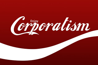
Some folks out there think I’m opposed to advertising, but that’s not true. I’m just opposed to advertising where it doesn’t belong. And do you know where it doesn’t belong? Here, I will tell you:
On the sidewalk. In a historic district. Where sidewalk advertising is illegal. Tied to a sporting event whose advertising tie-ins were supposed to be strictly regulated. All orchestrated by a douchebag corporation.
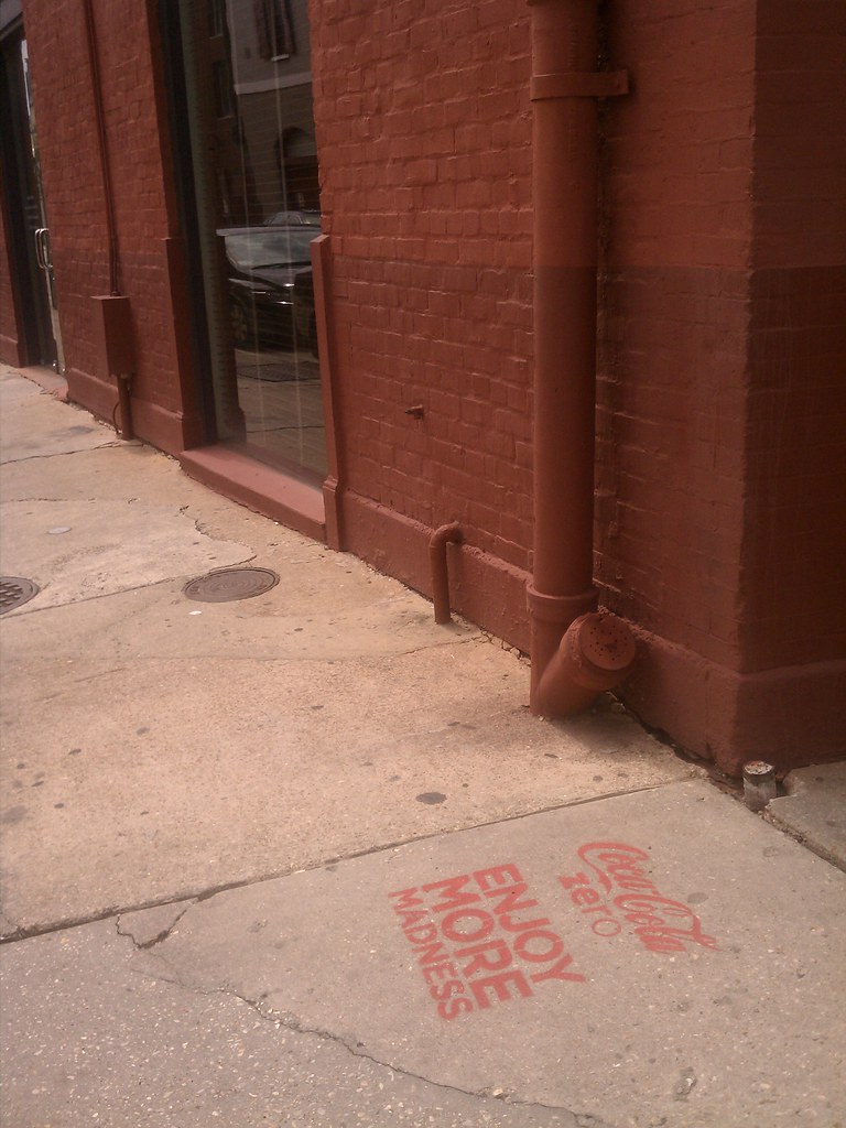
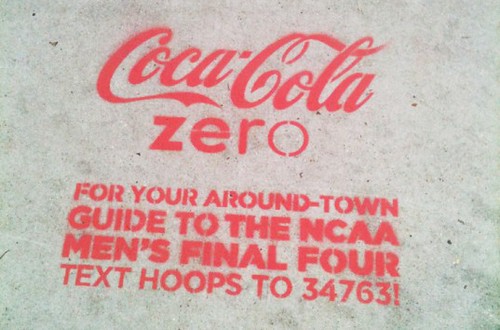
That’s the story that unfolded over the weekend in New Orleans, which is the host city for the Final Four. On Friday morning, Big Easy residents — including those in the historic French Quarter and Tremé neighborhoods — woke up to find that Coca-Cola had stenciled hundreds of corporate graffiti ads with Final Four-related messages on the city’s sidewalks. There was a huge public backlash, and with good reason, since the ads were in direct violation of at least three city laws: a general ban on advertising in public spaces; a further provision that makes graffiti in the French Quarter a felony; and a “Clean Zone” ordinance passed by the City Council in September, specifically for the Final Four weekend.
Uni Watch reader Chris Falvey lives in New Orleans. I asked him what he thought of all this. Here’s how he responded:
I have strong feelings on the matter. For starters, I generally agree with your opinions regarding advertising in public spaces. But doing it in New Orleans brings something new to this issue. We pride ourselves on keeping everything historic in its original shape. And
by “everything” I don’t mean just a statue or cemetery — the sidewalks are historic here. My house was built in 1888, and it looks the same as it did in 1888. Because that’s the law.So corporate douchbaggery strikes a particular nerve down here. We don’t view our historic nature as merely a quaint way to generate tourism — it’s our soul. It means something. It’s the ghosts of 200 years of all sorts of good, bad, and weird. So spray-painting a Coca Cola ad on sidewalks is akin to defacing our soul. Maybe that seems like hyperbole, but it really does feel that way when you see it.
Even scummier than the ads themselves is the way they came about. According to local reports, ads were placed on Craigslist seeking “street artists to assist with sidewalk stencils for well known beverage company.” One of the ads said, “We will be placing these stencils without city permission and [they] will be placed near Final Four trafficked areas.” Participants were promised $600 for a night’s work. (The ads — which, like most Craigslist ads, were anonymous and didn’t use real e-mail addresses — have now been taken down.)
When the story broke, Coca-Cola officials conveniently denied any knowledge of what had happened, chalking the whole thing up to a “misunderstanding” by a local ad agency that had “misinterpreted” the instructions from Coke HQ. It’s a classic case of corporate cowardice: Outsource the dirty work to some small-timers and then hang them out to dry when the shit hits the fan, all while feigning surprise and regret over the way things turned out. Douchebags.
Coke agreed to have the ads power-washed off of the sidewalks. So instead of being covered in corporate graffiti, the historic areas were crawling with fluorescent-vested clean-up workers. Wonderful!
This is all a sad example of something I mentioned about 10 days ago — our nation’s shift from a market economy to a market society. It’s what happens when every square millimeter of public space is presumed to be up for sale (or worse, just there for the taking), when people accept “It’s just business” and “Hey, they got attention for it” as blanket justifications for any corporate activity, when the line between our civic institutions and business institutions gets blurred, and when sports marketing runs amok. (Speaking of which, guess where the 2013 Super Bowl is taking place: New Orleans.) Good for all the New Orleanians who stood up and said, “No!”
Now, as some of you are aware, I drink a lot of Diet Coke — like, a lot. I hesitate to use the word “addiction,” but it’s definitely the one thing I put in my body that I have the hardest time going without. I figure it can’t be good for me, so I’ve periodically tried to cut down, but I’ve always failed. This New Orleans situation, however, may be the motivation I need to finally get over the hump. I’m definitely going without Diet Coke today (I know I can do that), and I’ll try hard to do it again tomorrow (that’ll be harder). If I get through two days, I’ll go for three. Ideally, I’d like to go this entire week without consuming any of the stuff. After that, we’ll see.
Will any of this make a difference in Coke’s bottom line? Of course not. But it’s good to feel some solidarity with the good people of New Orleans, who’ve been through enough crap in the past seven years without having some douchebag corporation treating their city like a bunch of free billboard space.


———
In a related item, a small weekly newspaper in Wisconsin reported the other day that the state had decided to raise revenue by selling a bike trail in a state park to Disney. Turns out it was an April Fool’s prank, but people around the state believed it — a disturbing indicator of how plausible such a scheme apparently is in many people’s minds.

Collector’s Corner
By Brinke Guthrie
With the Swoosh Mothership Death Star preparing to land tomorrow, I thought we’d showcase some of the NFL’s dearly departed licensees today. Each of these companies had its own style and take on how to portray each team’s image — imagine that. One person might view it as a cluttered mishmash of designs. Others might say that having different suppliers gave teams a more distinctive look. Anyway, off we go.
• Gotta start with Starter. Here’s their iconic satin jacket, presented here in all its Browns and Bengals glory. “Iconic” is an overused term, but Starter really was the name in satiny team jackets.
• Before Reebok took over the whole league, they were just one of the many. The 49ers flew the Reebok flag, but that didn’t stop them from also going with Wilson and Adidas at various points.
• I remember Troy Aikman promoting this style hat from Logo Athletic. It was quite properly called “Sharktooth.”
• Puma took over the Logo Athletic (née Logo 7) license at some point. Here’s a Puma-branded Vikings jersey. Wait, did I say Puma? Here’s a Vikings jersey from Adidas. And while we’re at it, let’s go for the Vikings trifecta with the Starter.
• Peyton may be a Bronco now, but here’s his old Colts look, again with the Puma brand.
• Maybe Angry Hoodie Man wore these Adidas Patriots shorts at some point. Wait, did I say hoodie?
• I owned this very sweatshirt — a clean, simple Cowboys design from Russell Athletic. Everything was embroidered and the fleece was soft as velvet.
• Staying with Russell, look at this blank jersey with the NFL 75th Anniversary patch, and this Eagles Keith Byars jersey.
• Apex was a big player in the mid-1990s. I had a ton of Cowboys Apex stuff but I didn’t have this style jacket, which I believe was called the “Dart.” Fun fact: The original company name was “Apex One.” Notice the logo on these NY Giants shorts is different than the one on this Eagles parka.
• Apex also made football shoes. They were very comfortable. Check out these lineman high-tops. And let’s not forget the fabled Cowboys double-star design that Apex whipped up for Jerry. What a design that was.
• Wilson did more than footballs. Here’s a Mark Brunell Jaguars jersey.
• Champion was also involved, as you can see from this Air McNair Oilers jersey.
Seen something on eBay or Etsy (or anywhere else) that you think would make good Collector’s Corner fodder? Send your submissions here.
It’s not every day that you can see a 101-year-old film about a special school — especially one that’s clear enough for you to be able to read the writing on the blackboards. That’s the subject of the latest installment on the Permanent Record blog.
Uni Watch News Ticker: Good story about Boston College’s gold hockey jerseys (from Christian Eidt). … A jet with a Giants livery is one thing, but here’s a Virgin America jet with a Brian Wilson-esque beard (thanks, Brinke). … Hmmm, is Superman going BFBS? (From Andrew Levitt.) … I got my hands on a copy of that comic book that had the cover illo of a gorilla pulling a gun on a librarian. Fair warning: It’s a really weak story, nowhere near as good as the cover design. But if you insist, I scanned the story for you. … Hey, you can still buy square-toed kicking shoes. Who knew? (HHH knew, that’s who.) … Here’s what Tiger Woods will be wearing in the Masters. … Here’s more about the slowly decaying Astrodome (from Matthew Bradford). … In a bizarre case of cultural imperialism, NHL jerseys have become status symbols in Africa (from Chris Bisbee). … Virginia Tech football will be wearing G.I. Joe helmets on Sept. 22. The article says this will be a Wounded Warrior Project game, which is interesting, because WWP has previously worked only with Under Armour schools ”¦ Braves catcher Brian McCann has switched to the hockey-style mask (from Michael Rich). ”¦ Reprinted from Friday’s comments: Jason Terry lost a bet and played the first half of Friday’s Mavs/Magic game without his usual headband and high socks, supposedly for the first time in his career. But that’s demonstrably untrue: Here’s a shot of Terry sans headband in 2002. ”¦ Southeastern Louisiana baseball looks a lot like the A’s, past and present (from James Breazeale). … Kent State baseball wore throwbacks over the weekend (from Dylan Buell). ”¦ Speaking of college baseball throwbacks, check out these Notre Dame beauties (from Dan Cichalski). ”¦ Why would a sign for St. Louis Blues parking have an illustration of a New Jersey Devil? (From Brian Rich.) ”¦ Don Montgomery notes that several Kentucky players wore a Final Four patch in the first half but not the second half on Saturday. … Michael Platt took an old Brewers bobblehead of CC Sabathia and repainted it as a Yankees bobble. Only problem: Uni isn’t nearly baggy enough. … This isn’t new, so maybe you’ve seen it before, but I don’t watch much TV and only saw it for the first time a few days ago: Delta Faucets has a cool commercial in which people literally wash uniforms off of their bodies. (See, I told you I don’t hate all advertising.) ”¦ Several readers have asked me why Baylor’s football and basketball teams are outfitted by different companies (Nike for football, Adidas for hoops). I put that question to Baylor associate athletic communications director Chris Yandle (a Uni Watch fan, as it turns out), who responded, “The main reason is that it’s more lucrative for each sport to have its own apparel deal. For instance, Baylor football and women’s basketball are Nike; men’s basketball is Adidas; men’s and women’s golf are Ping; I believe track and volleyball are both Nike; soccer, baseball, and softball are Under Armour. As I understand it, each sport gets a better individualized deal with its respective apparel provider. And those sports with differing suppliers have developed relationships with those providers and prefer to maintain them.” Fair enough. But if it’s that simple, it kinda makes you wonder why other schools don’t do it that way. ”¦ Very nice article about Roberto Clemente, using his batting helmet as a point of discussion. ”¦ Aston Villa captain Stiliyan Petrov was diagnosed with leukaemia last Friday, so Villa players wore T-shirts in support of him prior to Saturday’s game with Chelsea. And hey, what would a heartfelt gesture be without a corporate signpost? “A new low for logo creep,” says Denis Hurley. Douchebags, sez I. ”¦ Latest reason to love Joe Maddon: Check out the shorts he wore the other day (from Ryan Lind). ”¦ Want a Seahawks-themed car? There’s one for sale on Craigslist (from Daniel Klempner). ”¦ There’s a push in South Carolina high schools to make bass fishing a varsity sport — complete with NOB jerseys. Feels like an April Fool, I know, but the story is actually dated March 22, so it’s legit (from Jason Hillyer). … Anyone know the story behind the cap that Ricky Nolasco’s wearing in his 2012 Topps card photo? (From Sidney Helfer.)
As for tomorrow: I’ll be watching tonight’s KU/UK (palindromic!) game at an authentic North Jersey beefsteak taking place in a VFW hall. Won’t get home until late and, realistically, won’t have any coverage of the game tomorrow morning unless there’s a major uni-related storyline. But I’ll eat some extra beef for you.
The Nike/NFL unveiling event is set to commence tomorrow at 11am Eastern. I plan to cover it by making extensive use of a communication tool I rarely employ: Twitter. I’ll have a widget of my Twitter feed installed here on the site tomorrow, so you can follow my reactions and photos as I post them during the event. Afterward, I’ll run home and summarize my thoughts in an ESPN column that’ll be published at some point in the afternoon. And then maybe I’ll have some additional thoughts here on Wednesday. Or maybe not. We shall see.
nolasco is wearing the stars & stripes cap (july 4th)
Duh. Right.
Isn’t the Ricky Nolasco cap the Red/White/Blue ones they wear on Memorial Day & the Fourth of July?
That’s what I thought, too.
“Afterward, I’ll run home and summarize my thoughts in an ESPN column that’ll be published at some point in the afternoon.”
Run? We thought you were cycling!
Coke is probably gonna slash his bike tires after today.
Good point.
But without his Diet Coke caffeine will Paul up to any running?
Jesus Christ Coke…look at what you have done. Ya dun goofed. Consequences will never be the same.
Just a question: not trying to suggest that what Coke did was in any way right, but do you think it would have been a little better if they would have used something washable like chalk? Or, you know, NOT DO IT AT ALL.
Couldn’t they do something simple, like asking for fucking permission?
Yeah… this really is a new low.
Maybe one day these companies will realize that less is more. When advertising is FUCKING EVERYWHERE, no one pays much attention to it. They definitely aren’t helping themselves by breaking local laws to do it, that’s for sure.
They don’t care…they actually got a lot of free publicity for Coke Zero.
They got free publicity by breaking the law.
Kyle, I live in New Orleans but I haven’t been downtown in a few days. The Coke sidewalk ad thing was in the newspaper…with pictures of the stenciled ads. I would imaging Coke probably has either booths or people on the street giving away free samples of their products as is sometimes the case for big events. We were upset about the sidewalk ads but I doubt if Coke or visitors care.
And you don’t find it a problem? Just ’cause no one cares doesn’t make any less wrong. I live in Pennsylvania, and I have a problem with it.
Kyle, I said “WE” in New Orleans care…but I doubt seriously if Coke gives a rat’s a$$. They got what they wanted…and the little negative publicity they got is far outweighed by the having their name and product splashed all over the place for few days. Coke’s ad executives are probably high-fiving at this moment…
Touche.
This sums it up nicely. Advertising has become so insidious that it no longer has the intended effect. hence the efforts to become ever more “outrageous.” Not everyone subscribes to the idea that “any publicity is good publicity,” however.
Maybe I’m just being cynical, but I can’t imagine in any way that Coke didn’t know about this beforehand. In fact, it wouldn’t surprise me if Coke fully expected (and wanted) this reaction – what was a local ad scheme has gone national, resulting in way more attention…
Unless and until some executive goes to jail for a stunt like this, as a kid with a can of spray paint and without $X,XXX/Hour lawyers would, it won’t stop. (For that matter, if the cops had caught the ‘street artists’, who were the low-level suckers, in the act, that $600 they were promised wouldn’t go all that far.)
Those Coke sidewalk ads are warts.
Just a question… does anybody pay any mind to the ads all over Times Square? That’s got to be the perfect example of sensory overload.
Oh, and I just realized… this scene is perfect for today:
link
Superman, and the destruction of a Coke sign!
This whole Nike switchover is getting far too much attention. There’s only a few things we really want to see/know.
1. Seahawks new uniforms.
2. Are the Panthers the same design with the new logo or did they change anything?
3. How truncated are the Colts stripes on Nike’s jerseys compared to the dashes that Reebok had reduced them to?
4. Do the jerseys have those “sweatboxes” that we’ve seen at the college level?
That’s pretty much it, barring any unexpected weirdness. Whatever sort of “20% cooler” junk that is spouted, at the end of the day we all know that the Bears are still going to look like the Bears.
And there you have it, the world according to The Jeff, the end.
Except he left out a few things:
1) Will the jerseys have Flywire collars?
2) What will the Steelers’ throwback be?
3) Will any other teams have new alternate jerseys?
4) “That’s pretty much it, barring any unexpected weirdness.” Well, yes, the possibility of “unexpected weirdness” IS THE FUCKING POINT.
You’re slipping.
Jeff, I think we’re likely going to see subtle changes in striping treatment…fabric and width of stripes, in particular. When Nike took over as LSU’s uniform supplier it changed up the pants striping by adding a slight seaparation between the white and purple stripes which, in effect, added a tiny gold stripe between them. Now the pants stripes are made of a mesh material and the gold separating stripe has varied in width over the years. If memory serves me correctly, when Reebok took over as supplier of NFL uniforms, Minnesota’s shoulder stripes on their white jerseys (which were almost idential to LSU’s) became narrower. Now, I’ve notice that LSU’s shoulder stripes have gotten wider in recent years. So, what I would look for in teams that will keep their traditional uniforms (such as the Packers and the Colts) are simply subtle changes in the stripes…and I hope Nike can figure out how to make UCLA shoulder stripes again.
Nike makes the current Duke uniforms, so I’d expect the Colts’ new unis to look similar to that.
link
What’s next for South Carolina high schoolers…stock car racing? Oh, what…they already have that?
no worse than chess club or cup stacking
Except for the crashes, of course…
Chess crashes can be pretty nasty.
RE: Baylor multi-logo creep sports.
Other schools probably don’t do it since more ‘lucrative’ deal for each sport usually equals more money put out for each sport. In other words, it’s cheaper to buy in bulk (just like for food shopping).
Or it means that your school does not have a big enough fan base for a manufacturer to give a big contract to.
Bingo.
Darren Rovell just tweeted this pic of the NFL pop-up shop in NY.
link
I haven’t been this excited since Geraldo Rivera opened Al Capone’s vault…!
I’m headed to it on my lunch break, although I fear that link won’t be available yet even there.
It seemed like the Final Four patches had a harder time staying on the Nike jerseys than the Adidas ones. Doron Lamb’s was off by the middle of the first half with lots of teammates patches just flapping around as the game went on. I didn’t see any problems with Louisville or Kansas though.
Notice how even the people in Africa shun the Islanders alternate sweater?
Reminds me of a cartoon by Bill Tidy I saw many years ago.
A lorry from Oxfam is handing out a mass of red and white scarves and one of the locals says “I see Arsenal lost again”.
A couple of those Habs jerseys are DIY jobs?
Jennifer Government would be proud!!
link
Hmm…anyone up for texting QUIT DEFACING NEW ORLEANS to that number?
Dammit. I just finished off a fully-leaded Coke to use its 65g of sugars and 35mg in a paper-writing all-nighter. What do I need to do as penance for contributing to the graffitization of the French Quarter?
Pepsi Max instead of Coke Zero for a couple of days? Yeah, I can do that.
As stupid as this stunt was, not only did coke get national coverage on this…but FREE advertising on uni-watch!! Brilliant!!
My point exactly…publicity and secondary publicity.
If you honestly believe attention is self-justifying, I feel sorry for you.
When a 2-year-old gets attention by yelling and screaming, we don’t call that brilliant — we call that a tantrum.
When a creepy guy in the park gets attention by walking over to you and opening his trenchcoat, we don’t call that brilliant — we call that a criminal act.
The notion that getting attention in and of itself is a successful act is false and reductive. Here at Uni Watch, the bar it set higher than that.
Agreed. It’s really sad that companies see the ‘exposure’ as advertising success, whether the perception of such advertising is positive or negative. Advertising is becoming to much about who can out-shock the public, especially in sports. It’s like a Howard Stern segment.
*too much*
Jeeez…what do I have to do to make myself understood? I am offended by what Coke did…New Orleans is my home. All I am saying is that the reality is that this was probably a net win for Coke…and that is indeed a sad commentary on society. There’s a reason for corporate douchebaggery…apparently it pays.
But obviously it IS a time-tested method that works…that amount of money they are paying out right now is nothing compared to what they spend on a national campaign.
Advertising is all about attention. Comparing it to a 2 year old is a poor analogy. I still find hysterical that you have not 1, 2 or 3 but 4 logos up on your site…and they will stay there!!
Sometimes I think you get a penny every time NIKE is displayed on this site…I know if I was a Nike executive, I would send you a basket thanking you for hating us…you put out more info on Nike (good or bad) in a week than I see anywhere else during the rest of the year plus you almost ALWAYS show their products…you’re a free catalog!!
I still find hysterical that you have not 1, 2 or 3 but 4 logos up on your site…and they will stay there!!
Please go back and read the first two sentences of today’s post. You may find them edifying.
….I think he was referring to the coke logos…
I’ve seen other photos of Henry Cavill as Superman; they’re not going BFBS. It’s a darker shade of blue than what’s been used in other Superman movies, but it’s still blue. Just Google “Henry Cavill Superman suit.”
I’m a big Superman fan, and I’ve been following all the news about the new movie. You’re absolutely right. The suit is still blue, but it’s not without it’s controversies. (At least within the fan/geek community.) Forgive me if I go off on a tangent, but it’s exciting when one of my obsessions is mentioned when talking about another.
The exact tone of blue (and red, for that matter) is still unknown. The only official picture released so far is the one shown on the facebook page Paul linked to. There have been “spy pictures” from the set that show it is quite blue, though the tone varies depending on the camera taking the picture, and the film will surely use filters and color correction in post production.
link
link
The big issue among fans has been the decision to get rid of Superman’s trunks (underwear on the outside). Some love it, some hate it. There are some that view the trunks as an essential piece of the costume, and not having them is an affront to the character. Some even go so far as to say this new costume “looks nothing like Superman”, an argument I find downright silly.
I’m curious to hear what non fans think of it. I suspect it will be a non issue, but I’ve been wrong before.
A couple other quick notes, the villain, Zod (played by Michael Shannon), will at some point be wearing a black version of a similar (if not mostly identical) suit.
link
And the official logo kind of looks like it has an inadvertent (I hope) Nike logo on it.
link
If people got over Superman with long hair and Electric Blue Superman, no underpants on the uniform will be accepted too.
Of course, DCU books have gone downhill since the re-heat last year, but that’s a separate issue. :>
I don’t know if people ever really did get over those two things. Neither lasted too long. I think the main thing is that the general public just won’t see it as a problem in the first place.
And Superman did have a black suit at one point, though it was a temporary suit – his “recovery suit” from the end of the “Reign of the Supermen” storyline that brought him back from the dead. (It was also the start of the long hair period.)
I have to admit, the Death of Superman storyline did its job, as it got me reading Superman comics for the first time, though I dropped out before the infamous “Electric Blue” period.
It’s not like the trunks were just eliminated from the movie costume; the comic version link.
Personally, I think trunks-on-the-outside are an essential part of comics iconography, and these new costumes are less interesting. But then again, I’m not the target audience for these books, something I realized a long time ago.
The Richard Lester version of Superman II, along with films III, IV, and Superman Returns were greater affronts to the character than the decision to dump the red briefs for Man of Steel. As long as the script and acting is good this go around, I wouldn’t care if Supes came on screen in a Steelers ‘Batman’ outfit.
Good point, Chris. Everyone focuses on Christopher Reeve, but they forget just how bad those movies were.
Quiet, Vilk. Those movies are awesome, you just need to be in the proper frame of mind when watching them.
Like…drunk?
…yeah, pretty much. Or watching with friends and doing the MST3K thing.
Y’know, big corporations are sometimes targets.
Who’s to say Coke wasn’t the victim in this, set up by an unscrupulous, publicity-seeking Hew Orleans power washing firm?
Speaking of Geraldo, perhaps he’ll break the story.
Ricko, you know, you have to understand New Orleans, too…there really is an outlaw mentality here. Hustlers and operators…it’s a cultural thing. So while there are many people in New Orleans, myself included, who are offended by Coke’s outlaw sidewalk ads I am sure there are also many New Orleanians who don’t think it’s a big deal. In fact, weren’t locals hired to apply the stencils? And there are some people here who simply don’t take pride in the City. If you drive enough you are likely, one day, to find yourself stopped behind someone at a red light who proceeds to roll down his window and throw out a bag full of the remnats of his Popeye’s fried chicken lunch. I love New Orleans…but sometimes it’s maddening.
It’s sort of the “flash mob/guerila” approach to advertising, isn’t it.
Doesn’t matter if you’re annoying, disruptive, incompetent or stupid…as long it gets you the attention you wanted, that makes it okay.
Sadly, there’s an element of truth to that…it doesn’t make it okay but let’s just say it has the desired effect.
I wouldn’t credit this as being guerrilla marketing – it’s just vandalism. Actual guerrilla marketing usually contains some element of creativity. Like, I don’t know, leaving crates of Coke Zero at each spot for people to just take, instead of vandalizing the sidewalk. Or, if vandalizing the sidewalk, doing so with some artistic merit and in chalk or other temporary medium. I mind the roteness and stupidity a lot more than I mind the scofflawery here.
I meant that seems to be society’s attitude toward this sort of thing, both the instigators’ and the viewers’.
Not ascribing blame, just lamenting the whole situation.
Prevailing mood seems to be “Look what somebody got away with, good for them.”
Coke could have taken out ad space on pedicabs…it’s not like the marketing department is low on dough.
So the buck stops… with the little guy? Gimme a fucking break….
See my comment above.
“Good men doing nothing” appears to be the new touchstone.
Timbers looked great last night :)
link
Yeah, but the Timbers link look link.
Agree… from top to bottom, the Timbers have the best look in MLS.
Lee <– Earthquakes fan, hates their black primary kit
As a member of the Timbers Army I would say yes we always look good! I always feel like I’m guilty of home cooking when I put them at the top of my MLS uniform rankings, but they just look so darn good.
Yeah but they were wearing their alternate at home. I do not like this trend in football of wearing alternates at home. Plus the Timbers Home and Road kits are the best in the league. That alternate looks pedestrian compared to them.
LOL… Dixie would have a bass fishing team! Talk about a podunk school in the middle of nowhere! Go Green Hornets!
I, for one, hopes that this bass fishing thing catches on (Pun intended). It’s just one more thing to get kids involved in that could lead to more great things for them to be involved in, such as wildlife conservation.
That Nike Tee is a plain white tee with a left chest swoosh that they printed over the top of.
Just happened to look like it lined up.
I have nothing to back this up with but common sense.
And what is the common sense explanation for why no plain white t-shirts WITHOUT a swoosh were available?
My guess is that because Villa are still under Nike, that’s what was laying around the kit room.
Simple – they’re s a sports team with a Nike contract. They already *had* Nike-provided “blank” shirts, so they used those rather than actually going to a store and buying new blank shirts. Laziness is a powerful force.
Doesn’t it seem more likely that they wanted to do the shirts, so they called up their friendly Nike rep, who graciously had the t’s worked up for them? And all it cost them was a little swoosh right there on the heart.
In addition to Aston Villa supporting Stiliyan Petrov as he battles leukemia, Chelsea also supported Petrov during warmups. Rather than wearing a Nike branded shirt, they had shirts with league lettering saying “Our thoughts are with you” on the front and with Petrov’s name and number on the back.
It’s worth noting that Chelsea are an Adidas team and easily could have used Adidas branded shirts but did no.
link
Very nice move, Chelsea.
It’s funny how they are so obsessed with “logo creep” but don’t understand it. If Nike made those shirts and made them with logo creep in mind then they would have put the logos in a more prominent spot, like under the writing and centered
It’s obvious an equipment manager grabbed some shirts in the locker room to make those, whenever soccer undershirts have writing on them, that is not made a player’s marker, they are like that
link
Paul, I have to tell you that I used to suffer from a similar Diet Coke addiction. Yes, I call it addiction, because I remember what I felt like the morning of Day 2. Like you, I’m an active, in-shape guy. Diet Coke was my main vice. I’m talking like…3-4 liters a day here. The 12 2 liter bottle for $12 sale at my local grocery store was like a God-send. I worried that it probably wasn’t good for me, but I figured, “Oh, leave me be! I don’t smoke, I barely drink, I work out. I’m fine!” Once I got married this summer, I knew that if there was even a chance it was bad for me, I had a responsibility to someone else to kick the habit. It took me a while to work out the courage to kick it, but finally, I just had enough. I knew the apartame probably wasn’t good for me, so I quit cold turkey. Problem was, it was my main source of caffeine. I quit at 10:30AM on a Friday. I woke up at 7:30 Saturday morning, shaking, nauseous. You name the addiction symptom, I had it. It was brutal. Now, I drink two cups of coffee and day and water the rest of the time. Feel AMAZING and lost 6 pounds and a couple of inches on my waist. Tomorrow will be 40 days! Let’s call it a proactive response to corporate douchebaggery.
Yeah I was going to suggest a home brewed [black] coffee (none of that Starbuck or Dungit Donut shit) or tea alternative or a generic Diet Coke substitute if the personal preference is the flavor or if it’s just a caffeine fix. Generic soda pop has come a long way in the past 20 years. Tho some are still pretty putrid like molten plastic or licking the underside of a lawnmower.
Good luck to Paul & breaking his addiction.
Way to go, Brian!
MaxPreps has been doing a pretty good series on unique mascots state by state every Monday, with pictures of the logos for the schools. They’re on Indiana today. It’s nice to see HS with some creativity rather than just eagles and tigers. If you go to the link you can access the archive of all the states they’ve already done.
link
I think the Speedway Sparkplugs might be one of the coolest mascots out there.
That’s a great list and worthy of a UW headline one of these days. I can think of a few from my home state that I’m sure will get coverage.
LOL @ “Deaf Hoosiers” XD
I worked at River Forest (home of the Golden Ingots) for three years. They have a massive steel Ingot on a plinth in the rotunda of the school. It really is quite impressive. The only thing that bothered me was that their girls’ teams were called the “Lady Ingots” which of course made no sense. It isn’t as bad as the Lady Popes, but it still bothered me.
I used to have a dream of a history project for my juniors where they would take schools with standard mascots (Tigers, Knights, Eagles) and re-brand them with a mascot that was based on the name or location of the school. I thought it would be cool, but I never made it happen.
Once upon a time, Speedway’s mascot was “Sparky the Jackass”. While I had a pretty fierce rivalry with the sparkplugs in HS, I still think they had the market cornered on nicknames.
They’re running through them alphabetically so unfortunately it will be a while before they get to my home state of Washington. We definitely have some great ones though.
Ridgefield Spudders: link
Camas Papermakers: link
Not really uni-related, but cool nonetheless, love the “Coke whip” Ryan Newman appears to be holding after winning the Sprint Cup race on Sunday:
link
Yeah…looks like a poster for “Indiana Newman and the Kingdom of Corporate Douchbaggery”, right?
Only $1.00 for Blues parking? That lot may very well be near New Jersey.
My thoughts exactly. That would get you a single shift worth of time in Boston.
I would wear those square toe kicking shoes as regular shoes.
Well, without the cleats…yeah, so would I.
BFS
Bass fishing is already a sport/activity here in Illinois:
link
Paul,
In a slightly related note, I just wanted to say thank you for recommending Hamilton Nolan’s work at Gawker. I finally got around to reading that “Celebrity Gifting Suites” article, and it was fantastic. Beautifully and simply written, while funny and poignant. I will certainly be going back to read some of his other work.
I would love it, if you made reading recommendations that aren’t uniform related (and as such, don’t fit in the ticker) a regular feature.
Thanks. Remember, there’s always the Catch of the Day (which I just updated a few minutes ago).
Is the WordPress login thing intentional? Because that’s what I’m getting on my screen when I click the CotD.
Oops. Now fixed.
Right. Thanks, I had forgotten about that. I can’t help but ignore sidebars, because my mind reads them as advertisements. I was thinking something like Culinary Corner that’s occasionally in the feature, but I’ll try to remember Catch of the Day.
I will be visiting New Orleans for Jazz fest at the end of the month, hope they are gone by then. Just paying for repairing the dammages seems wrong to me, there should be further punishment.
Speaking of Jazz Fest, one day last year as I was leaving Jazz Fest I passed a guy wearing one of Paul’s “Meats” t-shirts..cracked me up. Have a good time at Jazz Fest…I’m sure you will.
Anyone else notice the Nike Swoosh in the new Superman logo?
April, 1938.
Superman debuts in Action Comics #1, his nostrils occasionally being an upside-down Nike swoosh, subliminally promoting shoes that will be marketed sometime in the distant future.
Amazingly, no one notices for 74 years.
And, of course, this subtle pre-sell a couple decades before the first waffle-iron-produced kicks…
On cigarettes, yet.
link
Sorry, I was too busy doing things outdoors to obsess over comics.
For some strange reason I really want a Coca-Cola Classic…..
Me too…like a big picture popped in my head
Coke has been dead to me since they got rid of New Coke. I prefer Pepsi, but what I really prefer is tea (antioxidants, baby) with lemon and coffee. If I want some fizzy, I’ll drink seltzer water – crisp and clean with no sugar or nutra sweet.
Seltzer is the best! Zero calories and good for you! It’s even better when it’s flavored. Polar brand has some really uncommon flavors available in 1-liter bottles now:
link
And around the holidays they had limited-time seasonal flavors: eggnog, pumpkin pie, candy cane, cinnamon, and granny smith apple.
Makes drinking seltzer a lot more fun and interesting!
Don’t remember the brand, but lately I’ve been drinking raspberry lime seltzer. Good by itself, or mixed with something stronger.
And of course, there’s always lemon lime.
Wow! Other seltzer water drinkers here! Yippee!! I like lemon-lime seltzer the best.
Good for Mt. St. Helen’s style burps, too!
Just be careful not to spill in on any of that Nike gear you recently bought on impulse!
The Houston Cougars showed off a new helmet to some potential recruits over the weekend:
link
link
Yep. New logos and colors to come as well, apparently.
Damn, those old link were awesome. I’ve got a Warren Moon #1 jersey in my closet that I picked up at a Champion outlet store in 1994. One of my favorites in the whole collection.
I really like the Titans baby/navy blue combo, might be my favorite of the “modern” style uniforms. I just wish they had some red accents in there to make it “pop” (yeah, a designers cliche, I know.)
This may have been covered and I missed it, but will the Nike NFL uniform unveiling be streamed live? If so, where can I watch that?
To my knowledge, no.
I’ll be at the event tomorrow bright and early…follow me on twitter: blancoshadow
Bass Fishing has been a part of Illiniois State High School Athletics for 4 years now. link
I’d like to think that the link in the shower commercial were intentional (because it’s a 2-in-1 shower) but I’m guessing that’s not the case.
Is it even possible to depict a difference between stirrups and 2-in-1’s with body paint?
Yes.
jesus christ THE
of course it is
Dammmm. Superman going BFBS…sad, very sad…..in nothing sacred anymore?
Paul, try some supermarket brand diet cola. Tastes just as good(maybe better) imao and it is cheaper. There is a Wegams near my home and their soda is terrific.
Zevia
Where did the actual stencils come from? Answer that and you’ll have your guilty party. Then you can punish them by:
Having them hand out free Pepsi Max samples in New Orleans for a month, then ….
Paying to repair all sidewalk cracks/ bumps/issues within 100 feet of any ad placement from this stunt.
I was trying to remember who stenciled SF sidewalks; I think this is the one I recall.
link
I saw Versus TV Stanley Cup stencils on the sidewalks in DC last year when the Caps made a playoff run.
I think it’s a bit odd that large corporations think that this is a good way to create an “edgy” campaign… seeing as it’s vandalism and all.
link
There’s Jimmy Buffett wearing a ‘FREE SEAN PAYTON’ shirt on stage..and then Payton goes up to play congas on stage.
Seems to me if he’s going to appeal, he oughta be a little more low profile and contrite, no?
Free Sean Payton? Isn’t Payton already free to do pretty much anything he wants to (not NFL-related) for an entire year?
Now I have an urge to DIY a “FIRE SEAN PAYTON” t-shirt.
How’s link (Not a “Fire”, but amusing nonetheless.)
Maybe we should get stencils and spray paint “FREE SEAN PAYTON” all over New Orleans sidewalks.”
So I boot up my work-related Gmail today, and there’s MORE MLB food correspondence! Just incredible. UW community, you are amazing.
Thanks to your input, I will actually be running a two-part series! The stories will run on Wednesday and Thursday (that’s maluba day and the day after maluba day, in George Carlin-ese). Who knows, maybe Paul will try one of the recipes out for a Culinary Corner?
Yet another reason not to buy Coca-Cola. Do these companies forget that sometimes we John Q. Publics see their names all over the place and remember not to buy their products?
Why spend money on power washers? Just make them pour all their Coke Zero on the graffiti. It’ll be gone in no time and they’ll be out of some product.
Apparently Coke figured it was easier to ask for forgiveness than for permission. Hope they’re proven to be wrong.
Wow. Not only is Joe Madden wearing home-made shorts…one of the photos shows him in home-made *spats*. Now, that’s a a classy look…
On Friday I went to a Charlotte Bobcats game. They were wearing their Carolina Cougars throwbacks. In the program for the game they had a feature on former Cougar, Doug Moe. In the picture they had edited out the Cougar wordmark on the jersey. Does anyone know why they would do that?
Good luck kicking Diet C***. I had a 12-can-a-day habit for years. Cold turkey is the only way that worked for me.
CotD = Spirograph without the plastic pieces.
Paul, the story about the trail name being sold to Disney hits close to home, even if it was an April Fools Day prank. One of the newer trails in the Boise foothills is called “Fat Tire Traverse” – named after Fat Tire beer. New Belgium Brewing comes to town each summer as a stop on their “Tour de Fat.” Profits from beer sales are donated to local bike-related non-profits, one of which is our local mountain biking organization, SWIMBA. $10,000 of the funds one year went to build the trail now known as Fat Tire. I’m not sure that’s corporate douchebaggery, since the funds were technically donated and the name was voluntarily chosen by SWIMBA and our local land manager, but still – it’s always struck me as a little odd.
Fat Tire is awesome. I used to go to Wyoming on business regularly and drinking a few Fat Tires was always a highlight.
On my last trip there, I bought an awesome Fat Tire jersey which I wear regularly to ride and race, and it always gets a bunch of compliments.
link
I’m inclined to give things like that a break – where the sponsor is giving something to the community, like a trail or wilderness area or something. I object much more when its a pure advertising promotion, like what Coke did.
I agree on giving them a break. The money they’ve donate to our local trail system has been huge and allowed for work that couldn’t have been done otherwise. I just thought that the naming of a trail after a product was one of those “life imitates fiction” moments.
Not sure if these NBA twitter jersey tees have been covered before. If so, I missed it.
link
I would not wear that.
I wouldn’t even wear my own Twitter handle, much less anyone else’s. Of course, I don’t actually use Twitter, except to follow others…
As far as the Nike NFL press conference, I’m looking to see if the unnecessary “NFL Equipment” patch is gone. The NFL shield by itself is all that is needed.
Nothing is needed. It wasn’t there for 50+ years, it doesn’t really need to be there now. I’d rather see a team logo in that space instead of an NFL shield or an NFL EQUIPMENT logo. The NFL shield is better than the NFL-EQ logo, but still.
Paul, since these stencil ads are for Coke Zero and you admitted that you’re addicted to Diet Coke, do you know what Coke Zero really is? It’s Diet Coke marketed towards men. According to Coca-Cola, apparently it isn’t manly to drink diet sodas so Coke had to invent a new brand of low calorie cola for men who are watching their calorie intake.
I think the Coke Zero logo is deceptively simple, and therefore brilliant:
link
The thickness of each letter in the “zero” wordmark gets thinner and thinner until you get to the O, which is the thinnest and which doubles as the number zero. This is basically a subliminal message telling the potential buyer “drink this and you’ll get thinner”.
I find it humorous that these sidewalk stencil ads were specifically for Coke Zero. Um, maybe more people would drink it if it didn’t taste like ass?
You’re oversimplifying. Coke Zero wasn’t created just to pitch toward men — it was also pitched toward a younger demographic.
And it’s not the same thing as Diet Coke — tastes completely different (and has always been touted as such).
Also, while Coke Zero is made out of the Original Formula of Coca-Cola (with artificial sweeteners in place of HFCS), Diet Coke was an all-new formula and, interestingly enough, is the closest thing on the market to New Coke. Yes, Coke took the Diet Coke formula and replaced the artificial sweeteners with HFCS plus a few minor tweaks to make New Coke.
Yes, I know Diet Coke and Coke Zero taste different. I think Diet Coke tastes good and Coke Zero tastes terrible. I should have typed “Coke Zero is *a version of* Diet Coke *with a different taste* marketed towards *young* men.”
why didn’t you then?
Doesn’t Coke Zero use a different artificial sweetener than Diet Coke? If they’re the exact same thing, that’s just sad. At least Pepsi Max actually does have more caffeine in it than Diet Pepsi so there’s some difference.
They’re both sweetened with Aspartame (NutraSweet), I believe. If Coke Zero were sweetened with Sucralose (Splenda) instead, I’d be all over it.
I once sampled Coke C2. (Remember that?) Most vile piece of crap ever. “All the taste of regular Coke, but half the calories.” Bullshit. Lemme tell you, it tasted like Coke at first, but it instantly turned into Diet (which I hate) for the aftertaste. Betcha it was, literally, a 50/50 mix of regular and diet in the same bottle.
When I was in Canada back in 1994 or so, there was a completely different version of Pepsi Max that had like one-third the calories of regular Pepsi.
I thought it was great, but apparently it was discontinued about ten years ago.
JTH, the Pepsi Max you’re talking about is still sold in Europe. Pepsi ONE is closely related to that version of Pepsi Max.
I thought C2 was half the carbs, not half the calories. You know, for the whole Atkins Diet phenomenon of the mid-aughts. I was out of the country from 2003-2005, and coming back to find everyone all obsessed with eating burgers without buns or glasses full of meat-related slop for breakfast was as close as I’ve ever felt to being trapped in a Twilight Zone episode.
You’re completely correct. I misremembered. Still, GARBAGE!
New 80th season logo for the Steelers, now on their website.
link
I really like that. Straightforward and manages not be over-designed but still has a lot of symbolism.
Steelers got it right with the 50th season logo as well, that one had “50” attached to a golden triangle.
I like this one better than the 75th Anniversary one, although that one wasn’t bad, either.
Interesting that the Blues/Devils parking sign shows a player wearing #4 — Scott Stevens, who also played for the Blues. Though he wore #2 with St. Louis.
Not all schools select uniform suppliers the way Baylor does is that not all schools are the same. Not a very satisfying answer, I know, but different schools sponsor different sports and have varying levels of visibility. In some cases, the supplier will pay a premium to be an all-sports supplier (I know this happened with Under Armour and South Carolina). Although Baylor is currently a high-profile school, it wasn’t that long ago that it was an after-thought. You have to figure suppliers weren’t fighting too hard to supply the Bears, so letting every program find its own best deal probably made more sense.
Didn’t Microsoft get in trouble for slapping butterfly decals all over public structures and in public places?
Was it only in New York, or in several major markets?
Ah, yes…
link
Nike got in trouble as well when they marked walking/running/bike paths throughout Chicago….
Since my opinion on the Coke matter is in the main post itself, I’ll just throw out a big thanks to you Paul for making this the lead today!
I admit that I like the Virginia Tech Camo helmet. Plus I like camouflage quite a bit. I believe there is a 12-step programme for a fellow like me. I’ve had a few friends to go to the Polytech and one was in the Cadet Corp. She told me about the time when Va Tech and Texas A&M played in which it was a big deal to them because both schools have cadet corps and to win meant a lot to them. Not sure how this all ties in, but it brought back a random memory. Carry On.
GolDurn… I’m random.
It doesn’t surprise me that South Carolina is pushing to put Bass Fishing as a varsity sport. I’m surprised it hasn’t caught on in NC either. It would be really interesting to see more of the team uniforms for the sport.
Regarding the sidewalk signage: Yes, it does appear that Coke acted in willful defiance of the law in this, but there may have indeed been miscommunication as to the execution of the ad campaign; we don’t know what the exact instructions given to the “street artists” were(ex.-Did ‘the suits’ tell them use red spray chalk?), and when I saw this video (from a 2011 clothing retailer’s French Quarter ad campaign, which as you can see is green and clean) I can see where Coke may have gotten the impression that this sort of practice was acceptable?
link
Oh, please. If they don’t have proper oversight over their contractors, then that’s just as bad as if they willfully told the contractor to do it. The buck stops at the top.
@The Jeff, I agree….
new here?
Just had a thought.
Cleveland Trogs
(“Wild thing, I think I luuuvvvv you.”)
Nah.
The logo probably would piss off the Geico cave man.
Lest an explanation be in order.
And I screwed up, maybe should be spelled “Troggs”…
link
i love when ricko just talks to himself…
Nebraska football will wear an alternate uniform for one game this fall. Here’s the AP story (with a few good quotes about the whole process from Tom Osborne):
link
The local media doesn’t have any additional information up yet, but I would assume this Omaha World-Herald article will be updated later on today:
link
Let’s see if this link works better for the first article that I posted:
link
Can’t say anything other than this: everyone will hate it.
And it will be justified.
Anyone else think it’s a one-day-late April Fool?
Let us diverge from the Coca Cola and Nike references and stay a word of thanks for a momentous event.
The 49ers new Santa Clara stadium groundbreaking is April 19.
We now return to our regular programming.
Paul, since you’re now off the Diet Coke, what will be your beverage choice for tonight’s beefsteak? Beer? Water?… Sprite?
Damn, didn’t want that there.
Thanks Brinke! BTW, if you have any more early 70’s photos of the Cowboys stadium, please post them, those were sweet. Appreciate it!
Futurama’s take on ubiquitous advertising.
link
OMG, absolutely AMAZING Catch Of The Day, Paul!!!!!!!!!
There is a link in the final paragraph that brings you to a video of a special record player that “plays” cross-section wooden discs of tree trunks. The years of rings are converted into piano music. What an incredible concept!!!
Just found a clip of the Nike NFL takeover where you can see part of (what appears to be) the Shehawks’ new silver/gray alternates. no other leaks
link
Not bad from what you can see, IMO…
Well played, son.
;)
fuckin douchebag
Rockford and Milwaukee of the AHL engaged in a 70’s style bench clearing brawl whilst going color (red) on color (light blue). Side note: check out the socks on the Admirals..yukko!
link
Love how it ends with the mascot delivering a pizza.
What about this black Panthers’ helmet? i.imgur.com/MtuE2.jpg
Link’s busted, but I know what you’re talking about, and I can tell you that the black helmet is *unfortunately* fake.
Not sure if this is really uni-related, but it’s interesting nonetheless:
link
Some minor details on the Nike uniforms from the Detroit Lions site, including:
“One difference that could be noticeable for Lions fans right away is a duller grey for their pants. It’s not shiny silver the team has had in previous years.”
link
Must…be…muted…grim…
Those kickass Starter jackets made me think of those kickass Finisher bags from No Mas.
And the kickass video.
link
It would be entertaining if people spray painted the sidewalks near the homes of Coca-Cola executives (or Coke’s HQ) with stencils of the New Orleans municipal code.
Or just stencils saying…
CLASS.
Get some.
Graffiti ads should be punished in a way that fits the crime: graffiti on the faces of the folks behind the stunt.
Paul, since you’re now off Diet Coke, what will be your beverage choice for tonight’s beefsteak? Beer? Water? …Sprite?
OMG, I mus be going blind. I thought you asked Paul if he was going to drink beefwater.
Hmm. Come to think of it, might be worth a try.
If Coke and the NCAA, professional baseball, football or whatever commercial league wants to embroider, “DRINK COKE”, on a player’s ass- more power to them.
BUT when they break the law, you hold them accountable. Don’t slap them in the hand and say bad. You slap them on the face and say, “DON’T EVER FUCKING DO IT AGAIN.”
IF Coca Cola broke the law, prosecute the fucks who did it and I don’t mean the jokers who did the actual painting. Just make sure some life-long tax-burdening bureaucrat didn’t give Coca Cola the green light.
Let’s ask ourselves…
Iif a bunch of kids with cans of spray paint got caught doing something like that, what would happen to them?
They would be subject to a strip search, apparently: link
Then again, we can’t go turning defacing public property into a white collar crime, now can we.
In New Orleans, in a historic district? They’d have a massive fine ($1000 I believe) and could go to jail. I think it may be a felony now. Its something we’re cracking down on HARD.
Was being facetious.
They shouldn’t get a pass just because it’s a corporate shenanigan.
Frankly, they need to be reminded that laws apply to them, too.
That would be $1,000 per stencil, I hope.
$1000/stencil given the exposure they got (foot traffic, ‘public outcry’, etc) in a place no one else could advertise – I’m guessing they’d feel it was worth it. They were already paying $600 to have them painted. Ban distribution in New Orleans for an undetermined time – that might hurt.
Love the pics of the square kicking shoe. Thanks HHH. It triggered me to search pics for a type of shoe lacing technique I remember seeing back in the 60’s and maybe even 70’s, of “straight-on” kicking shoes. I think they would wrap the lace around the ankle and then around the forward cleat or somewhere up in front. It was nuts, since the whole thing looked like a hot mess of shoelace. I seem to recall the kicker having to literally “hobble” out to get in to kicking position. God forbid something went wrong, and he becomes the last line of defense. Funny how things change. Love this site Paul.
Was thinking one of them kicked for Marshall.
Found this, from 1986…
link
Goes back farther than that, of course.
Darn. Marlins aren’t wearing their home whites. I am pretty excited to see those in action
Those orange batting helmets are crazy.
the orange lids are sweet
but not with the black tops
Au contraire, mon ami. It sets them apart from the other two orange and black teams in the majors.
Although, if the Astros go back to orange hats, we could see something similar there.
The Marlins are wearing orange hats, socks, and sleeves with their black jerseys, and it looks really weird/bad. Why not match the hats and jerseys?!?!
Their new unis have so much potential, but not if they wear them like this.
The orange helmets look cool, though, but they’d look even better if they weren’t worn with the black jerseys.
Very nice view out to left field at Marlins Park. Not quite as good as beyond the outfield in Pittsburgh, but nice.
I also like the green color that’s part of the stadium’s color palette (inspired by Joan Miro).
Yeah, nice-lookin’ ballpark.
The stadium itself looks cook, but I hate the green! It looks so artificial! It looks like a green screen. Hell, the Marlins could project background images on it during telecasts if they wanted to.
Not digging the green either. Or the blue seats.
My opinion could change as I get used to it though.
The whole place matches the color palette the Marlins are debuting. A festival of sorts.
May not like it, but is part of their new total package. Very South Florida.
*cool
The combination of the orange and green makes me feel like I’m on a tour of Nickelodeon Studios.
why the fuck are they wearing the orange caps with the black jerseys?
because you touch yourself at night.
im touching myself now, d-bag
no likey the Family Guy reference?
link
i dig, TimE, i dig. one of my personal favorite comebacks as well
weird stuff going on here. this is an add from espn.com today (april 2, the day after nike took over as the official supplier for the nfl) showing a peyton manning jersey manufactured by reebok. but, the weirder thing is that the helmet they display appears to have the new helmet striping shown on the new t-shirts made by nike. anybody know whats going on there?
link
Nah, it looks like the normal helmet. It’s probably just at a different angle or something.
at second glance i think your right about the helmet. but about the jersey, didnt nike just have a huge hissy fit over the jets selling rbk tebow merch when they still had the contract with the nfl? and now that nike has the contract, espn, by far the most influential sports business in the world, is selling reebok merch. seems a little odd/infuriating
the fuck?
Just go with it, mannnn.
Again, very South Florida.
Very South Beach.
lotta 100′ high flying dolphin … er, marlin sculptures in south beach?
When are they gonna light that puppy up? I wanna see some Marlin acrobatics already.
Lotta giant apples in New York, are there?
no…but i don’t claim the “mets apple” is “very new york” either
Ballparks shouldn’t reflect their community or the ball club?
Then that beer slide has NO place in Miller Park.
And those palm trees around Dodger Stadium gotta go.
Brick walls with only IVY for padding? Seriously? What, it’s some kind of old ballpark right in the neighborhood?
Home runs reaching a cove where people with nets are paddling around in kayaks? Silliness.
;)
You forgot the racing pierogies/sausages/presidents.
Holy crap! There’s a pay-for-view idea:
Teddy Roosevelt vs. A Sausage (any sausage)
Famed multimedia pop artist Red Grooms designed this piece. It cost Miami owner Jeffery Loria $2.5 million. Loria is also known as being a very high end art dealer.
And an asshole.
@Wheels – Sometimes you regret what you ask for…
link
ricko just came
i hope they play that song for 2 minutes after each marlin dinger, too
/i want a bacon-wrapped hotdog from vanessa
We can quarrel with some of the things they did, but it’s hard to fault the apparent basic premise:
“It’s a ballgame; let’s have some fun.”
And the definition of that can, and probably should, differ from market to market…and be based on how those markets see themselves.
so, what are you saying?
Far out.
They should put down some lovely 70s Astroturf to match those walls.
God damn, my retinas. The other photographs I’ve seen looked a lot more muted & olive green.
Wow… it really does look like a Terry Gilliam-animated fever dream come to life.
I work in the athletic department of the school I go to (William & Mary) and although we are small and not quite comparable to somebody like Baylor, we definitely have variations in sponsorship across sports, ranging from Nike to UA to Wilson and some others. Each sports works independently and has its own vendors they deal with on a personal level, much like the situation described above so I wonder if it is even that rare or if it is just less noticeable among the big money sports at big money D1 programs where a company wants to establish a brand.
Hoo boy. Seahawks fans are going nuts. A fat helmet stripe (a la UGA’s pro combats) in a carbon fiber pattern. A weird grey horizontal collar to shoulder stripe (a la Boise St). You can see some lightened images at this link here. link
Scroll through the comments. Hope it’s not raining tonight there.
link
not uni-related, just tuned into nat’l champ are Jim Nance’s sidekicks former NBAers? or college guys (I don’t know shit of bskball). But I did hear Jim say a crowd of 70,000?? wow-cause it seems boring and sounds quiet and very neutral. A Superbowl sounds more exciting.
A closer game would help…
Yeah, both commentators played in the NBA. I turned over to the radio feed, though. Former coaches Bill Raftery and John Thompson are the commentators there, with John Tautges calling the play by play. Raftery’s the man! Thompson’s *alright*, but 1) he’s a Georgetown man (which this Villanova fan doesn’t like) and 2) he needs a filter for his mouth. He’s always letting swear words “slip out.”
That would be Kevin Kugler on play-by-play. Tautges does the studio stuff.
The NCAA is a money-printing organization that cares only about its perpetuation and licensing sales. It exploits the athletes and uses their images without paying them (see covers of video games), while sanctioning them, the schools and coaches if someone buys them a burger or gives them a ride from the airport. The ads are just the tip of the iceberg, to me.
I saw this interesting response from Ebbets Field Flannels’ Facebook page regarding the making of their hats:
The scoop on leather hat bands (because people keep asking): The last time leather was available for sweatbands was about 12 years ago. At the time, customers kept accusing us of not using real leather (this, because of the finish on the bands available). In the interim the remaining two leather suppliers have gone out of business. In short, it’s not worth the effort or expense for the few people …who want them. Even if we could find another supplier it would raise the cost of the hats about $10, and most customers prefer the cotton bands anyway. So, it’s probably not a good use of our resources to reinvent the wheel again to satisfy 10% of hat customers and piss off the other 90%. That’s the bottom line.
how long before cal vacates?
So Werner is the official ladder of the NCAA championship. What about the scissors they used to cut down the nets? What a missed sponsorship opportunity.
(he said, while rolling his eyes)
Maybe they should have been “advertising” kosher Coca-Cola instead. I mean, it’s that time of year again.
Here’s the Steelers’ 80th season logo. Expect to see this on their (likely) new alternates tomorrow. link
Hi Uni Watch and fans.
Sorry but my english its not good.
I have one question:
Im writing about Vancovuver Grizzlies uniform and i see pictures of the first road uniform. I knew the uniform was teal but i see other pictures which pacific blue colour. Is posible? when change the colour in the uniform six seasons?
Thank for all and i hope that you have the answer.
after reading all these posts, i’m ready for a fountain coca cola with lots of ice, just messing, funny you must admit, lol.
I love the Puma Titans hat I got 12 years ago. With a fuzzy football and embroidered “TITANS TENNESSEE”. It looked like this: link It has since faded from dark blue to a weird gray and frayed along the front of the bill–perfect for wearing to the beach or pool.
Just so we’re clear, New Orleans, the bastion of debauchery, drunkeness and disorderly conduct is concerned about Coke ads? They have more vomit and alcohol on their sidewalks than can be cleaned in a lifetime, but these stencils, they are deplorable! No one wants to spew a night’s worth of hurricanes on a defaced sidewalk. D’ohkay. I’m not complaining about New Orleans, it’s a fun town, with great food, interesting people, great music and a rich history. I would hate to see those landmarks defaced and I tire of the constant barrage of advertising and these are amateurish at best, but still, this reeks of people in need of a cause. I don’t drink soda/pop, but this response almost drove me to buy a case.