Last summer I wrote an ESPN column about the small but growing trend of MLB teams putting decals on their bat knobs. Now the man behind that trend — Pro Helmet Decals owner David Sulecki — has checked in with the latest developments on the bat knob front:
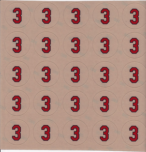
• The Indians will be going with this simple design:
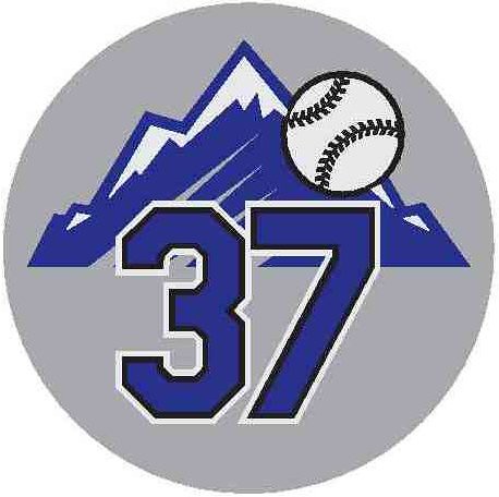
• David says Rockies equipment manager Keith Schulz originally wanted to go with standard purple-and-white numbers on a black background, but David convinced him that he could come up with a design that included the team’s logo. They eventually settled on a design with a silver background:
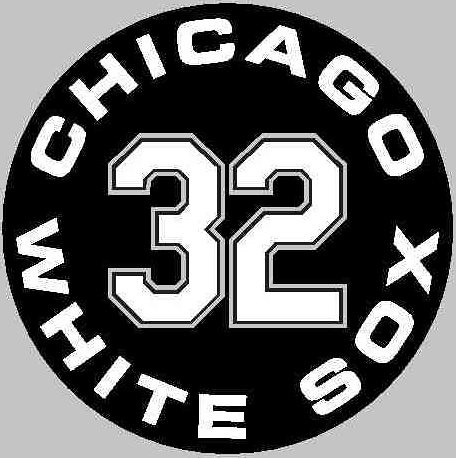
• Last year the White Sox just went with block numbers, but this year they’re going with this:
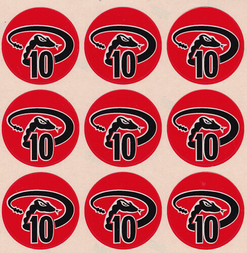
• “Diamondbacks equipment manager Bob Doty wanted me to come up with something using either their ‘A’ or ‘D’ logo,” says David. “These were two of the more challenging designs to work with, because of all the angles and curves — simply putting a number in the middle wouldn’t work.” Here’s what he eventually came up with:
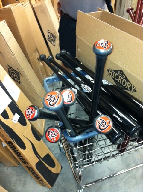
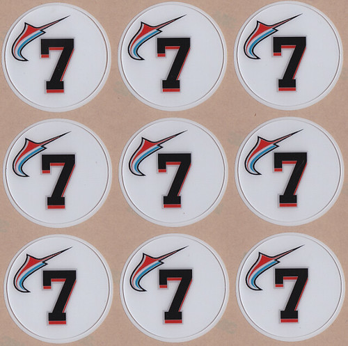
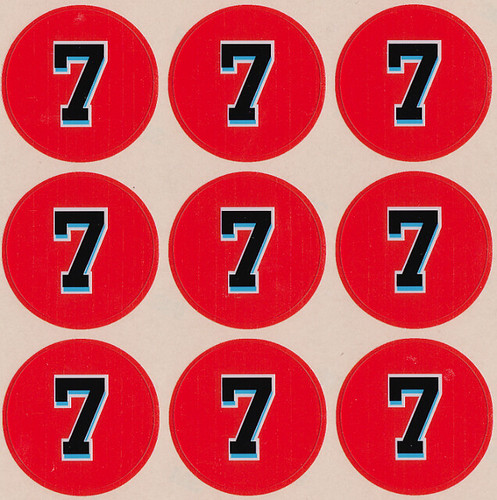
• At least three Marlins — Jose Reyes, Emilio Bonifacio, and Hanley Ramirez — will be using these decal designs:
• The Mets are sticking with the same design from last year — except, in keeping with the New Way, they’re ditching the black shadow.
• No changes for the Rays or Dodgers.
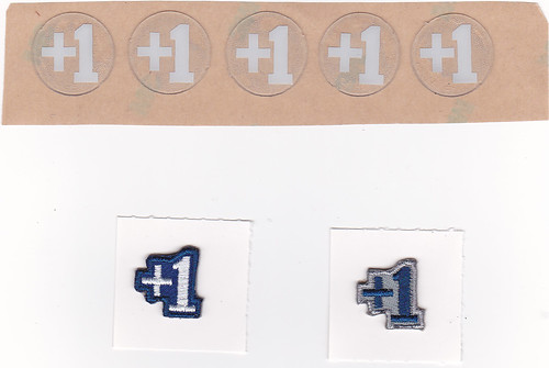
David is also getting lots of new NCAA clients. Here are some of the more notable designs he’s created for them. But here’s the best story, which I’ll let him explain:
BYU baseball coach Vance Law contacted me last fall and asked if we could do small “+1” award decals for their batting helmets. That was simple enough, but then he asked if I thought the decals could be used for their caps as well. I immediately thought of the adhesive-backed star “Stargell Star” patches from the 1970s (I actually had one in my desk) and mentioned that I thought that those would work better. He said he knew what I was referring to because he used to play with the Pirates back then. I didn’t make the connection with his name at first but then realized this was the same Vance Law that had played for the Pirates. I’m not sure if anyone has ever used similar cap patches since then. Here are the decals and patches I created for them:
All very interesting. Still waiting for David to create a “Fuck Face” bat knob decal, though.

Collector’s Corner
By Brinke Guthrie
NFL posters seem to be a lost art form. Most of us remember these classic posters from Sports Illustrated. They did all sports — I had a great one of Bjorn Borg — and they always had the big white border. The Costacos Brothers were big in the poster biz back in the day, too. But for my money, this terrific late-1960s NFL poster here is just outstanding. Dig the three stripes on Don Meredith, and the black Saints helmet.
More eBay goodness:
• Did someone say, “Black Saints helmet?” That helmet phone would look sleek on the Saints’ draft-day table.
• Get your 1970s Rawlings “NFL Silver Bullet” football here.
• Remember when life was simpler? You will when you see this Cubs bike spoke clicker from the 1950s!
• Lotsa great 1970s logos on this NHL bedspread.
• Love the old-school pose on this 1960s photo of 49er Clark Miller , and no doubt PL will appreciate the classic sock action. [Indeed. ”” PL]
• Let’s go authentic (and pricey) with this Texas Chaparrals practice jersey. And if you have any cash left over, you can go for this 1979 Cleveland Cavs game jersey worn by Dave Robisch.
• Here’s one submitted by reader John Koziol: If you look at the photo on the back of this minor league A-Rod card, you’ll see him wearing a watch on the field.
• And we wrap up this week’s listings with this awesome 1952 baseball program cover, submitted by none other than my wife, Cindi.
Seen something on eBay or Etsy (or anywhere else) that you think would make good Collector’s Corner fodder? Send your submissions here.
Uni Watch Mailbag: Some years ago I had a girlfriend whose parting line to me as we broke up was, “You know, Paul, you’re not normal.” I later told that story to a subsequent girlfriend, who laughed and said, “Well, duh. Since when was being normal the goal? Did she even realize she was paying you a compliment?”
I thought of that yesterday after receiving a particularly juicy piece of hate e-mail. As is usually the case, the hate e-mailer had no trouble spending several hundred words critiquing all sorts of aspects of my life but was too much of a gutless coward to include the two little words that comprise his name. He made it clear that he’s a daily Uni Watch reader, however, so he knows who he is and is no doubt reading this right now. Hi, Mr. Gutless Coward!
I won’t embarrass Mr. Gutless Coward by reprinting most of what he wrote. Instead, I’ll just reprint the parts that made me think of that long-ago girlfriend:
Come on, Paul, enough with the crap about trying to be weird or different. ”¦ [E]nough with the weird shit you do just for the sake of being weird. ”¦ Lose the attitude and the weird shit you do [that] you think is cool and different. It’s not, it just makes you look like an idiot.
I’m not mentioning the things that Mr. Gutless Coward thinks I do “just for the sake of being weird,” in part because most of the specifics were incredibly wrong-headed, but mainly because the specifics don’t matter. My work has prompted many responses like this over the years, because fixating on the inconspicuous — which is more or less how I’d summarize what I do — tends to fuck with people’s assumed hierarchies of what does and doesn’t matter. Certain sports fans, for example, get angry (like, viscerally angry) at the very notion of Uni Watch, because uniforms don’t matter to them and they don’t think they should matter to anyone else. They find the mere existence of Uni Watch and its readership to be upsetting. And to a certain extent I know how they feel, because there are all sorts of things in this world that I find upsetting, things that definitely challenge my sense of what does and doesn’t matter. Still, that’s life, no?
I didn’t really need Mr. Gutless Coward (or that long-ago girlfriend) to tell me I’m a bit eccentric. I’ve known it since I was a kid, and I certainly know it now. I mean, I collect pencil sharpeners, I ask for an odd-numbered room when checking into a hotel, I have a Brannock Device tattooed onto my arm, and I spend most of my time writing about uniforms and report cards. But contrary to what Mr. Gutless Coward seems to think, I don’t do any of this for show, or for its own sake. I do it because it sincerely makes sense to me. I realize that not everyone will Get Itâ„¢, but at this point of my life I don’t worry too much about being “normal” or “look[ing] like an idiot.” (Although if I did, I might think twice about sending anonymous hate e-mail to someone who might reprint it on his web site. Just sayin’.)
The nice thing about my work — and I think most of you understand this, at least implicitly — is that it’s provided a productive and self-supporting outlet for those eccentricities, and has also created a social hub for like-minded eccentrics. Sure, I’m a bit of a weirdo — and if you read Uni Watch, so are you.
And that brings us back to Mr. Gutless Coward. Although he has umpteen issues with me personally (okay, so maybe we won’t have lunch), he grudgingly acknowledged in his hate e-mail that Uni Watch “is good and interesting.” In other words, he’s part of an eccentric little subculture that certain sports fans find weird and stupid, a subculture that makes them viscerally angry. Some of those sports fans would probably be happy to tell Mr. Gutless Coward, “Reading about uniforms isn’t good or interesting. It just makes you look like an idiot.”
That’s why I find it so funny — and, really, so sad — when a Uni Watch reader accuses me of being too esoteric, or too weird, or too whatever. Dude, look in the mirror: You’re one of us.
(Oh, and if Mr. Gutless Coward is looking for a date, I know a girl who might fit the bill. At the very least, they’d have one thing to talk about.)

Membership update: For the first time in aaaages, we are fully caught up on membership card designs (including Chaz Norenberg’s 1990s Pats design, shown at right). The card gallery is fully up to date, and all the designs except the last five have been printed, laminated, and shipped. We print the cards in sheets of eight, so those last five cards will be produced when we get three more orders to fill out the next batch.
Speaking of which: As always, you can order a membership card — along with stickers based on your card design — on the membership sign-up page. Just don’t go waving your card around in public, or else someone might tell you that you look like an idiot.
Too good for the Ticker: I’ve just learned about a company called StoryKeep, which creates multi-media memory albums — family histories, company archives, etc. If you go to this page and click on the upper-left thumbnail about the Mohawks Athletic Club, you’ll get an amazing video filled with incredible sports photos and stories. It sounds a little squishy, I know, but it’s almost certainly gonna be the best thing you see today. Trust me.
Uni Watch News Ticker: The Lake Erie Monsters will wear Browns-themed jerseys this Saturday (from Tom Pachuta). ”¦ Unusual to see a captain’s “C” on a track uniform (from Jesse Gavin). ”¦ This is odd: three shots of Larry Kenon wearing Adidas on one foot and Chucks on the other at Amarillo College. Never seen anythig like that before. Anyone know more, and/or know of any similar examples? (Good spot by Phillip Wells). … Reprinted from yesterday’s comments: David Wright, having lost a Sugar Bowl bet to Michigan alum (and Mets VP) Jeff Wilpon, had to wear a Michigan jersey yesterday (from Ben Fortney). … While looking for something else, I came upon this photo of Ty Cobb with a safety pinned jersey collar. … Here’s our first shot of Manny in full A’s regalia. Note the gray underbrim — they must be using old stock for spring training pics. … New Gazoo review: Here’s Martin Prado of the Braves wearing the latest version of the S100 helmet (from Jonathon Binet). … This is pretty cool: Some old Ikea tables resurfaced with old basketball court flooring (fro Ben Marciniak). … In a move that’s certain to give Archbishop Santorum fits, A.J. Burnett has obtained Dan McCutchen’s uni number in exchange for opening a college fund for McCutchen’s daughter. Good for them — much better than the usual number-for-bling exchange (from Matt Harris). … Dig this: video footage of the Big Train! Back then, NNOB stood for “No nothin’ on back.” Amazing stuff (thanks, Phil). … A U.S. Congressperson wants the NFL to make all its replica jerseys in America. Uh, good luck with that one (from Jeremy Brahm). … Also from Jeremy: Michael Jordan is suing a Chinese sportswear manufacturer for using the Chinese version of his name. … If you go to this page and click on the “full screen” icon, you’ll see that Nike didn’t get the memo about the Marlins’ name change (good spot by Jared E. Peterson). … Robert Griffin III was announced as the cover boy for NCAA Football 13 yesterday, so they did a photo shoot of him in his Baylor gear. The thing is, Baylor is a Nike school, but Griffin signed a deal with Adidas after graduating, which made for a weird mishmash of logo creep at the photo shoot (from David Westfall). ”¦ “The Senators never wore their mid-’60s pinstripes with their late ’60s red caps and undersleeves — except it looks like they did,” says our own Scott Turner. “Weird.” Indeed. ”¦ Yesterday I linked to a cool old Longhorns program cover design. That prompted the following from Mike Klug: “Back in 2009 I bought a Texas calendar that featured a different vintage program cover each month. Some are pretty great.” ”¦ Can’t recall if we’ve already covered this, but just in case: Penn State baseball is wearing a cap memorial for Joe Paterno (from Gerry Dincher). ”¦ New away kit for Croatia (from Kenny Loo). ”¦ Adrian O’Sullivan notes that some Blue Jays are wearing BP caps and others aren’t. ”¦ Several readers noted that the Rock was wearing an NFL captain’s patch on last night’s WWE show. ”¦ Excellent article about a former Hull City player who tore holes in his socks for comfort (from Les Motherby, whose e-mail subject line was “ripping yarn” — good one). ”¦ I had previously reported that the South Carolina and, I think, Auburn baseball teams were switching their cap manufacturers from The Game to Under Armour. But Grayson James says it isn’t that simple: “These caps are still manufactured by The Game. UA asked permission to stitch their logo on the side of the hat, which was granted, but all internal branding remains that of The Game.” … Jason Varitek, the only current MLBer to wear a captaincy “C,” is reportedly set to retire, which will leave MLB “C”-less for the first time in, uh, I’ll need to do a bit of research, but it’s the first time in a while.
Yes, I hear it too: The company that serves most of our ads appears to be sending us some audio ads today. Some of you have mentioned this problem before, but I had never heard one of these ads myself until today. I find it as annoying as you probably do, and I just asked to have them removed from the site. Sorry for the hassle, and thanks for your patience.
“I’m a bit of a weirdo – and if you read Uni Watch, so are you.”
~~~
i’ll have you know i was a weirdo before i started reading uni watch, tyvm
I thought being a weirdo was a prerequisite to do anything on the net! BTW I bet the gutless coward email author has a favorite uni in his closet he’s much too large to get into. I know that kind of thing makes me wackadoo. For sure, they don’t make any of the good caps for pinheads.
A disturbing trend in this country is anything that’s off the beaten path is considered different..Jesus Christ..isn’t that what makes America unique. I love your blog. For a sports geek like myself, it’s a great diversion and a fun read. Fuck Gutless Coward..let him enjoy the goddamn Wall Street Journal.
Me too, Phil. Paul, there’s nothing wrong with you…….keep doing what you’re doing.
Seeing that new Marlins logo isolated like that, it comes off as Buffaslug meets a seahorse.
As for the bat knob number/logo stickers, I actually did the same exact thing back in the mid/late 1990s, designed in MS Paint for my bats (including both ends for the corked one complete with Indians logo & #8). Oh, impressionable MLB.
I had exactly the opposite first reaction to the Miami knob decals (NOK, or Number on Knob?). For the first time ever, the Apostrofish actually looked like a Marlin to me and so worked as a logo. But then I read your Buffaslug comparison, and now I can’t unsee it. The Apostrofish really is baseball’s Buffaslug, isn’t it? Except there’s zero chance the Apostrofish will be retired anytime soon as the Buffaslug was.
Much as I prefer the NOK stickers without logo clutter, the D-Backs decals actually work for me. Nicely done.
The fact that it has no tail & basically the same exact color shading style from the Buffaslug of color/white/color on the body is what sinks it. I’m no fan of teal, but it makes me appreciate their original look that much more.
I see what you’re saying about the Buffaslug, but I still think the new logo/wordmark/color scheme is SO fresh and SO Miami. Love it.
All that said, I think these bat knob stickers are pretty silly. And good luck picking yours out of link at a glance.
And good luck picking yours out of this mess at a glance.
Oh come on, it’s not like baseball is a fast paced sport where there’s actually any real rush to grab a bat.
All in all, excellent work by David. In time, perhaps, the bottom of bat handles will feature corporate ads. But for now, at least, it’s clever and fun. Go get ’em.
Not a problem at all–those bats all belong to the same #27, Geoff Blum! ;-)
In time, perhaps, the bottom of bat handles will feature corporate ads.
Question: Why didn’t bat manufacturers put their logos on the bottom of the knob decades ago? Seems a massive missed opportunity for early logo creep, no? Were there MLB equipment regs that prevented maker’s marks on the knob?
Being a fan of the WWE, I can tell you that captaincy patch has been with the rock for a while now. (When I say a while, I mean his last MNR appearence before last night’s show.)
Several readers noted that the Rock was wearing an NFL captain’s patch on last night’s WWE show
Uh, isn’t that on the same level as a sitcom actor wearing an MLB/NFL/NBA jersey? As in – not noteworthy/who cares? I’m wearing an Ohio State t-shirt right now, wanna put that in the ticker?
Sitcom actors wearing jerseys have shown up in the Ticker before. Perfectly legit, even if you don’t care about the WWE (I certainly don’t).
Melissa McCarthy was wearing a Brian Urlacher jersey on “Mike & Molly” last night; looked authentic because the sleeve numbers were fat & round. That jersey as well as a Gale Sayers one behind a picture frame has been shown before. Other sports items include a Sammy Sosa bobblehead and an Opening Day trip to Wrigley Field with Mike in a cheap adjustable Cubs cap & replica jersey: link
Cripes, aren’t there any White Sox references in sitcoms based in Chicago? Other than the awful “Still Standing” that one episode that dealt with the Cubs/Sox civil war.
I think there have been a couple in Shameless on Showtime.
I’ve never seen an episode of the original version, which is set in Manchester — wonder if they’re United or City supporters…
I didn’t make it clear & was speaking ironically. I actually really don’t care if there’s more Cubs than Sox references – it just seems cliche to me to always mention the Cubs.
I never check the comments section until 11:30 pm or so (when I get home from work). I felt compelled to skim through today early as I knew when I saw WWE mentioned in the ticker that someone would troll in a smarmy manner. Congrats on winning TOTD.
We get it, you only like highbrow entertainment. Go back to your Bachelor and Real Housewives you rube.
I don’t know what those are.
I was just about to point out that on last night’s “To Tell The Truth”, Orson Bean was wearing a “Skull & Bones” cravat, but then I thought, “Ah, fuck it”..
Are we sure that “C” on the track uni doesn’t stand for “Cameltoe”?
Gosh, Paul.. you’re so weird and finicky. Give us more!
Is it just me or does the new blue jays ensemble feel a little bit Texas rangers-ish when its all on a blue background? At just a quick glance, the red in the maple leaf right next to the white in the logo on a blue jersey looks like the Texas state flag on the rangers’ sleeve.
It’s not just you. They should have just stolen my concept from last year and used 2 shades of blue instead of having white or gray pants involved. They could’ve owned monochrome blue, but no…
Assuming they wanted to.
Oops, forgot this. ;)
The Blue Jays were… first? I mean, when the Blue Jays joined the league with their white and powder blue, the Rangers were still wearing blue-and-red together. And they’ve even gone all-red at times.
Then again, I’m just excited my ticker item got in. :D
Paul, to sum up my high school baseball teammate:
“If you look good, you feel good. If you feel good, you play good.”
Grammar not withstanding, always made sense to me.
Always loved that sentiment.
Hell, it applies to life in general.
Just change “play good” to “do good.”
(grammar not withstanding)
To quote Fernando: “It is better to look good, than feel good.”
PS: “You look marvelous!”
The problem with all of this, of course, is that most players have a fucked-up sense of what looks good (pajama pants, e.g.).
natch
To which I will reply with words similar to ones you heard once before:
Well, duh. Since when was looking like what you think is “good” the goal? Do you even realize you are paying them a compliment?
don’t forget the NBA dress code
My brother and I both gear up to the nines when we play pick up sports games just for this reason….can say it really helps, but it makes me feel great!
I thought that was from Deion
I really like the new Croatia kits. I figured just like most of the new kits Nike is unveiling, there would be a random stripe on the right shoulder with the uniform number under it. Good to see it not happen on the Croatia one. And oh man, those socks are B-E-A-UTIFUL.
I’ll be honest. To me, there’s not a lot of “random stripe on the right shoulder with the uniform number under it” going on with this year’s Nike kits, but I completely agree on the Croatia unis. Those socks are too awesome for mature eyes.
The only ones I’ve seen so far were the Netherlands away and the Australia away.
The swoopy ribbon thing on the South Korea shirt though, that is frigging awesome.
link
Yeah I agree now that I have gone back and looked through them. Not as many uniforms with the random striping on the shoulder as I first though.
I love those Croatia uniforms — the color and the number font are just like that of the link. (The photo comes from Kyoya Sports, a great retro-sports-uniform customizing shop in the middle of Kyoto city that I’ve been in several times before; I found that photo on Google randomly.)
link seems to have a slightly different number font than the rest of the guys; I hope the Arial-like font that he has isn’t the real one.
And who doesn’t like seeing those link? Pure awesome.
Maybe it went over my head, but why would opening a college fund give Santorum fits?
he’s not a snob
Yeah, I didn’t get that one either.
link
Between Tressel and Santorum, the sweater vest really has taken a hit over the past year. And before you say they always sucked, there are plenty of people that rocked them.
link
link
link
link
I would like to sincerely thank Rick Santorum for RUINING sweater vests.
I’m wearing one today and no shit, three people have asked me if I liked Santorum or something.
….and some other wiseass asked if I would park his car.
Jerks….all of them.
Look, if people give you crap about your sweater vest, just mention that you have a friend link.
With 3 degrees himself, I don’t think Santorum is saying people shouldn’t go to college, just that thinking everyone should is being snobish. That, or he’s just a total douche. Probably the latter.
I agree. I think it was more of a sentiment of “some people are 100% happy not going to college, make a fine life for themselves without college, and you shouldn’t be telling them they’re doing it wrong because they didn’t go to college”. Earning a higher education is a great thing. But soem people simply don’t feel it’s right for them, and some can go and immediately find a job they love without going to college. And if that’s the case, who cares? Sounds to me like they’re doing just fine.
Sorry for the 100% non-uni related post. To make amends, here’s one of my favorite sports uniforms:
link
link
@Mike K — I thought the same exact thing when I first clicked on the link.. almost forgot they had changed unis and thought there was a mistake in the link. More proof the Rangers need more red in their ensemble.
I’d argue the Blue Jays need more powder blue in their uniforms, even if it’s only used as an accent color.
All the more power to Kathy Hochul. If she manages to get that done, I’ll go find her and give her a high five…probably until it costs $300 to buy a 3×3 square of colored fabric remotely related to an Eagles jersey.
“Archbishop Santorum”
That just made my day. Thanks Paul!
re: Senators wearing their old pins with their new red hats and gear.
link
I’ve seen several other photos of that combination, and all were from spring training. Back then teams wouldn’t break out their full new sets until opening day. There was precious little visual coverage of spring training, nothing like now, so they probably believed it didn’t matter much. Because, well, it didn’t.
For example, as late as ’87 the Twins wore their new “M” hats and stirrups with the old gear before goin’ north.
link
And yet I swear that we knew what the new Twins unis would look like sometime in fall of ’86. Not like today, where the new design is kept secret as long as possible to build suspense for the announcement, and then the old gear is never seen again from the moment of the unveiling on. I think the Twins redesign was basically just press-released with illos for the Strib and PiPress to run so fans could get a look.
The Twins did also publish a poster calendar with their schedule that included a huge photo full-length photo of Gary Gaetti and Kirby Puckett standing together in the road and home unis, respecively. Have it somewhere but it’s too big to fit in my scanner.
(let’s see if this ebay link works..)
link
And, of course, the new “M” hats went on sale early and sold like crazy.
I should have said, “Sold like hotcakes”, today being National Pancake Day n’ all.
You beat me to this and I knew Arr Scott would have something to say. Most Nats v2.0 pics I’ve seen with home 63-68 pinstripes and red 69-71 caps were taken during spring training.
That pic (Sport – June 1969) must be from spring training for another important reason: There’s no 100th Anniversary Patch on the sleeve. Btw, the HOF uniform database “Dressed To The Nine’s” shows the 1968 Senators home uniforms as pins/red cap like Ted is wearing – link
I’d be willing to bet those patches might not have shown up til opening day. Cuz was spring training, and wasn’t 100th anniversary til the season started.
Don’t think DTTN has that right. Pretty sure the Senators didn’t wear the pins in regular season. In fact, the pins are so faint I often wondered if Okkonen was saying, “I’m sure about this.”
Here’s Ted with Bowie Kuhn and Nixon on Opening Day ’69 (in color – no pins for sure): link
Here’s a B&W shot from the same time where you can see part of the 10th Annv.Patch on Ted’s left sleeve: link
I obviously meant “100th Annv.”
arrgh.
“I’m NOT sure about this.”
Here’s a link to another shot of the red Senators uniform with pinstripes (link), a photo I came across a couple years ago because I’d vaguely remembered this player, Ron Hansen, pulling off an unassisted triple play back in 1968 and was thinking about him the day after the Phils ended a game against the Mets with backup 2B Eric Bruntlett’s unassisted triple play. This looks clearly to be from spring training, but it still seems possible (if unlikely) that the Senators wore the pins through the 1968 season then switched to no pins in 1969. Oh, and here’s a link to Frank Howard also in red and pins (link), but I can’t say if it looks like spring training or not.
Hondo wore #9 with the Senators until Ted Williams was signed as manager. He then gave up the number to Williams and took #33.
Several sources reflect that the Nats wore the pins with red caps in spring training ’69 and switched to solid whites at the start of the regular season. link was used in ’69 spring training and has a bit of a backstory, featuring a #9 yet worn neither by Howard nor by Williams.
Paul, can I enquire as to why you ask for odd-numbered rooms in hotels?
I find this profoundly intriguing.
Probably the same reason that the time I set my alarm for has to end in a 2… He’s weird!
I intentionally set my clock eight minutes ahead, not to trick me into hurrying up, but just because it feels right. Don’t know why.
That isn’t weird. I do that.
“… I ask for an odd-numbered room when checking into a hotel…”
Deeply troubling.
Well, I always….as in ALWAYS…put the left sock on first. Without fail.
Does this qualify as any kind of weirdness?
And PL, please clarify the difference between “weird” and “Quirky.”
Since I am right and left handed, I definitely qualify as quirky.
Nope, I have to put my left sock on first, my left leg through my pants/shorts first, and my left shoe on first.
Ever since I learned the difference between odd numbers and even numbers, I preferred odd numbers. Can’t explain why. They just feel better to me. And prime numbers feel best of all (whenever I bid on an eBay item, my bid is always a prime number on both sides of the decimal point).
When we were taught the difference between odd and even (2nd grade, maybe..?), we were also taught that if you added two evens or two odds, you got an even, but if you added an even and an odd, you got an odd. So I raised my hand and said the following:
“So there are TWO ways to make an even [i.e., by adding two evens or adding two odds], and TWO is an even number. But there’s only ONE way to make an odd [i.e., by adding an even and an odd], and ONE is an odd number.”
I said that because I liked the way it all fit together, and I assumed that the universe must have been intentionally structured in this pleasing, satisfying way. It all made sense, it all reflected a larger pattern of perfection.
But my teacher looked at me and said, in not so many words, “Stop trying to be weird for the sake of being weird. It just makes you look like an idiot.”
“I said that because I liked the way it all fit together”
Kinda like the logos for Super Bowls XLI and XLIV were both blue and orange, they were both held in South Beach, and had it not been for those damn Bears in the NFC Championship five years ago, the same two teams would be playing each other in both games.
Yeah, but the Colts still would have won XLI.
One… is the loneliest number that you’ll ever do…
you people are freaks, thank corn i don’t have such eccentricities.
QOTD
waaaaaaaaay to many round letters in that acronym, i find this disconcerting. which i am pretty sure is what all non-weirdo people would say.
Roly-poly letters rock. Take up lots of space. Fun and Bouncy. You must be some rigid square.
What it really means is “Quit Obsessing To Death”.
It wasn’t until a few years ago that I read about how the creative mind simply works differently than other minds. Not better or worse, just different. Often, creativity comes with (some form or another of) mental illness, from mild to extreme. We see things differently, react to things differently, put the universe we experience into certain orders and make sense of patterns that others don’t.
Once I learned that, it was a huge relief. Just embrace the fact that this is the way your brain is. Don’t let anybody try to make you feel badly about it.
/the more you know
Which is why my number on my UW Membership card is the highest 2-digit prime number.
i gotta admit i didn’t know of this eccentricity until the curling nats, but sure enough, at check-in at the holiday inn, paul’s first words, after “reservation for Lukas” were “do you happen to have an odd-numbered room?”
that actually didn’t stirke me as an ‘odd’ request (pun firmly intended) at all…my ex-wife would never stay in a first-floor hotel room either
Until my comment comes out of moderation, I guess I’ll share this: out of the 50-100 hotels/motels that I crashed at for vacations and such, I’ve only stayed in a first-floor room twice in my life: one time in 2008 (I think), and the second during the 2011 BCS title game in January, 2011.
re: relative weirdness.
A very smart man I know once told me, “Most people, when they criticize others, really are saying, ‘Why aren’t you more like me?'”
It annoys me when Paul mixes political remarks with the uni-related content, but the fact of the matter is that his failure to be normal is what brought us this blog which is without a doubt link. His “weirdness” is what has made him a success.
Congratulations, Paul. I for one am glad that you’re a complete flipping weirdo.
Guthrie,
Love those old SI posters too but the older ones (early 70’s) didn’t have the white border and the really old ones (late 60’s) had no border as well AND were printed on a matte finished paper.
Also, the Nike series which I believe began in the late 70’s with George Gervin “Iceman’, Darryl Dawkins ‘Chocolate Thunder’, etc. werew also beauties
New photo link for Catch of the Day. Nice!
The NHL bedsheet is rather curious… while the 16 team logos place it within the 1972-74 timeline, the Leafs logo – a rounded, outlined version of the 1967-70 logo – looks out of place.
A friend of mine used to have MLB wallpaper (for walls, not computer desktops) with every team but the Blue Jays: licensing issues.
Hate mail? Uni Watch gets hate mail? I can understand that Paul, simply by virtue of being a Mets fan, has some issues; but I am just befuddled that Uni Watch gets hate mail.
Uni Watch is ripe with hate mail, along with vast overreactions, daily bitching and egocentric pointless complaining. I honestly don’t get why people get so worked up/obsessed over a blog or website. There are a lot more important problems in the world. I always thought Paul has a lot of patience to put up with people than I ever would; that’s for sure.
I gotta agree one hundred percent. I read this thing (maybe not the comments as much, but the articles) every single day. I just can’t fathom what would be that is so offensive to get upset enough to take the time to sit and write hate mail.
“… vast overreactions, daily bitching and egocentric pointless complaining…”
You say that like those are bad things.
It gets annoying when people complain about things they really don’t understand/follow closely. You know, like a person who doesn’t follow NHL or MLB & complains about that sport.
…or the NBA, or other people’s religions, etc.
Anyway, I’m the last person to think anyone should tone it down on the weirdness dial. Even if I had time to argue about stuff, it wouldn’t be over someone else’s eccentricities. Keep being yourself.
Hmm…I wonder if there should be a UW version of this shirt?
link
It’s but one of the issues that’s kept me from starting a site of my own.
man, in this day and age, mr. snuffleupagus probably gets hate mail. with 7 billion people on the planet, there are more assholes alive now than at any other point in history. welcome to the future.
Sigh. Naivete, thy name is Pinstripes67.
naivete? or optimism?
because you are right, there is no reason uni watch SHOULD get hate mail.
Sometimes the content may elicit some negative feedback (I remember he used an entry about Yankee Stadium’s final game to be a rant about the Yankees in general whereas the story about Shea Stadium’s final game was much more positive and Mets-centric) but it is still his blog after all. The content will contain Paul’s opinions and not every opinion will be looked at favorably. I respect his right to an opinion, even if I don’t agree with it.
And certain people will go to further extremes to express their displeasure with certain opinions–especially when they feel “anonymous” since they aren’t interacting with him face-to-face.
Actually, the Yankee Stadium piece used the stadium as a metaphor for the decline of American empire.
For some reason, Mr. Gutless Coward sounds like a song by this guy …
link
Not even.
Me thinks that Gutless Coward has no soul.
Maybe Paul needs some shirts made up with some sort of “not normal” logo….
Paul, as I read your remarks about Mr. Gutless Coward I was reminded of an episode of Glee where Kurt confronts the football player who terrorizes him for being gay. Kurt yelled at the boy, who finally breaks and grabs Kurt, appearing ready to strike him again, but, instead of kicking his ass, the football player kisses him, leaving Kurt shocked and surprised.
Uni-Watch haters go somewhere else with your pettifog.
hehehe, you watch Glee #buttheadvoice
Sorry, this post today has my maturity at an all time low!
Sadly, Mr. Gutless Coward is symbolic of a growing trend in this nation – people who cannot stand anybody having any ideas different than theirs. We see it in politics (disagree with me? that’s treason!), in religion (worship a god with a different name? that’s blasphemy!), in entertainment (you think he/she can sing? you’re an idiot!), in education (you teach THAT theory? you’re a fool!) and so on…we are offended, truly offended, when something is different or somebody has a different idea.
And before you think this post was really done by PBS, I’ll just add … that NFL poster (gotta be ’69 because of the Saints black helmet) is dominated by the Green Bay Packers. As it should be. You gonna disagree with that, you’re crazy… :)
Well said…
Except for the Packers part. ;-)
Two things: I am close to ape over that Dave Robisch Cavs’ uniform. Garish bumblebee stripes; yellow home kit; capitalized first and last letter. It would thrill me if Cleveland brought these back, but I suspect I’m in the minority.
Also, I geek over the printing process (particularly silkscreening) and love how the Marlins’
bat knob stickers came out slightly out of register, creating an unintended drop shadow.. especially since they already have an *intended* drop shadow.
Here’s my quirk, if we’re all going to unburden ourselves. I like to subtract my left turns from my right turns, in a quixotic quest to make sure I’m facing zero degrees from the way I was when I woke up. Oh, yes, and I like to take my high-powered rifle and shoot randomly out my bedroom window ;)
Walter, I think the drop shadow on the numbers on the Marlins’ bats is intentional; the real jerseys are going to look like that. The shadow extends downward but not to either side.
Is this the first time a team has used a shadow effect that’s only shifted on one axis? Most of the shadows that you normally see, whether they’re the “slide” kind like the Mets, or the 3-D block kind like the New York Rangers, are at a 45 degree angle from the main body of the number.
Atlanta Hawks did a straight-down drop shadow, if memory serves, before they went to the giant sublimated bird graphic in the 90s.
See how the black “7” on the orange sticker seems a little too far to the left, leaving a sliver of white between the numeral and the blue color? The white shadow is unintended, the blue one is intended:)
For all of Paul’s eccentricities (and I thank Paul for sharing them with us, because that’s why we’re all here), he’s not as weird as the guy who chooses to spend his time insulting another person for being who they are. You chose to devote a portion of your day to sending an insulting e-mail. Who the hell does that? Who thinks that that is a good use of their time? Go take a walk or read a book or something, weirdo.
I think this same thought every time I read scathing criticism from someone who isn’t paid to write scathing criticism.
So you think scathing criticism should be the sole province of professionals, you elitist scum? :P
While looking for something else, I came upon this photo of Ty Cobb with a safety pinned jersey collar.
Now THAT’s a strong reaction. I mean, it’s a cool picture, but sheesh.
+1!!!!
If that new Marlins marlin was solid teal instead of goofy rainbow, I would consider it a success, a nice abstract logo in a time of gnarling, heavily shaded, hyper-clawed beasts. It would look good (without the M) on a black cap.
If the Marlins new wordmark was just teal with a black border, that would look good on the uniform.
But they lost me with the rainbrow theme.
I appear to be one of the very few who like the rainbow fish (and please, let’s not call it the apostrofish — it’s facing the wrong way for that). As Jim says, it’s refreshing to see an animal logo that doesn’t have a furrowed brower, gritted teeth, ferocious claws, etc., and I like how it’s just representational enough to suggest a marlin without BEING a marlin. Works for me.
Yes, boss, agree.
I’ve liked the rainbow look for a few months now. I was REALLY excited that it would bring us a multitude of colors, even if it meant the dreaded softball tops. At least they would be fun – orange, teal, maybe even a yellow version. I just don’t understand why they had to default back to black. It’s just so boring and anti-Miami. The color scheme would be so much better without it.
I like the psuedo-Marlin, as well.
Damn. “Apostrofish” was my favorite new word of the day :(
since goofball points out that it is pointed the wrong way and could not be referred to as an apostrofish, would that make it a catastrofish?
I don’t have paintshop open right now, or I’d attempt to create a cat-astro-fish. I’m thinking an Astros star with eyes, whiskers and a fish tail…
facing away from the viewer to make it a catastrophe.
You impugn my honor, sir, and this will not stand! “Apostrofish” is appropriate precisely because it’s facing the wrong way – apostrophe catastrophe being the norm, not the exception, in today’s sports design.
Seriously, does the new Marlins cap not look at first glance like an apostrophe catastrophe? The very first thing I see whenever I look at the new Fish cap logo is an apostrophe facing the wrong way, and it makes my brain bleed inside not to be able to take a red pen to it and correct it like a good little copy editor.
I think you are. I can’t stand it. I looks ugly. The colors just don’t go together, I think that’s my big problem.
Then call it (if you must) a catastrofish. But apostrofish just reinforces the false notion that that shape is an apostrophe. The last thing we want is to lend legitimacy to that notion.
freak
Stupid Orioles. They started this whole mess!
What? You object to the meta-critical nature of my coinage? You demand a literalist approach to prescriptive grammar? Get out of Brooklyn, you straightlaced normal!
As much as it pains me to compliment a fellow NL Easter (go Nats!), I do like the new look. However, I do not think the hat logo is big enough…to be seen by satellite. Christ! That thing is huge!
Looks like somebody already made it; roughly:
link
Speaking of furrowed-browed animals, I think a great name for a team would be the “Rabid Rabbits.”
Always a fan of the teal, silver and black combo. That’s why I prefer the old design. The new color scheme/design isn’t bad really though, i just prefer the old color combo, as well as a more realistic logo over a stylized one.
I noticed no mention of the supposed 1920 Babe Ruth jersey that’s been in the news. Tho there is a precedence of things like this being fakes.
Yeah, found that and sent that in- very nice looking. PS, shouldn’t it be: Gutless Cowardâ„¢?
Weird is in the eye of the beholder.
What I find strange or weird are people who are critical of others tastes on this board when their tastes differ.
Just my observation.
I hope a vigorous comparing and contrasting of foibles and idiosyncrasies doesn’t come off as criticism. If we fancy ourselves as hipsters, we’re all going to use sarcasm and irony, and that looks bitter in print. You can’t hear the smile in our voices.
I’m glad Paul pointed out that for all his(?) crabbing, Gutless Coward is still a UniWatch aficionado. Reminds me of the scene in Do The Right Thing where Spike Lee asks John Turturro how he can be so racist but also be a fan of Magic Johnson and Eddie Murphy, and Turturro answers it’s because they’re “more than black.”
We love you Paul! To us, you’re more than BFBS!
Paul – I’m having a great time with the catch of the day site … I hope they can continue to build up their cache of old streetscape photos. Nice find. Thanks!
Joe Johnson, your (moderated) comment just made my day. Seriously! You’re a gutless coward too, of course, but for some reason that suits you. Don’t ever change.
“[E]nough with the weird shit you do just for the sake of being weird”
What a weird thing to say…
Our man Vince is working on something more important than uniforms today:
link
Good job, Vince!
Those bat number stickers are cool and all and I’m glad David S. is making a good business out of them. I like how they can be customized and so on, but I think I still prefer a hand written number. I think that still looks the best on the end of a bat. Just my opinion.
I agree. I enjoy documenting it, because it’s a new front in the uni-verse and it’s interesting to see how it’s developing, but I think it’s a case of over-design (or, more specifically, design where none is needed).
But it’s *also* marginally useful! What if you get traded, and your Sharpie’d numbers on the knob don’t match anymore? Just add a new decal.
Weirdo? Absolutely, this site is a place I have trolled for years and while I rarely post anything I definitely make it the top 2-3 sites I visit literally everyday. I have a personal rule of no internet on the weekend yet I find myself making this site and ESPN the exception.
Keep up the good work Paul, I do miss the work on the Fleisher’s blog so more culinary corners here would fucking rock!
Ditto on mas culinary corners, the Fleishers Blog was great, and you sir certinaly have broadened our food consciousness, well at least mine with homemade smoked almonds, the marrow “luge”, and wing tips. Keep it up.
Mr. Gutless Coward not need apply to the weird club, he simply isnt wierd enough. Weirdo’s unite!
Paul — keep doing what you’re doing! If anyone doesn’t like it, there are plenty of other sites out there in the inter-web….
Name ONE.
link
/you can do anything…
link
I didn’t say Uni-sites. This is a blog, and the administrator has to right to do as he pleases. You don’t necessarily have to agree with the all of the admin’s opinions, but everyone should be respectful of their efforts. If you don’t like what they’re dishing out, thanks for stopping, and please move along….
I don’t understand why someone would take so much energy to produce hate mail like that? If you don’t like someone for something, just move on and let them be.
All of my friends tease me about my uni-obsession, but I take it as compliment and am proud of it and my other quirks. It seems like you’re taking this the same way Paul. Good for you for keeping it real buddy!
Because some people are small and it makes them feel better about themselves to try and make other people feel worse about themselves.
This years Auburn baseball hats are Under Armour. The UA logo doesnt just appear on the exterior of the hat, but in the sweat band of the hat, and tagging of the hat in the stores.
I bought one last week and will get some pics.
Wow, I never thought Uni Watch would get hate mail about its general subject matter (as opposed to a specific think like the Mets dropping the black).
I know I’m weird (and not just about my obsession with uniforms- I love the number 13 but hate the number 12 for some strange reason) , but like Paul, it makes sense. Uniforms are about design, and I love a good design. And yes its inconspicuous but that’s what makes it great.
That’s funny, I don’t like numbers that end in ‘2’ or ‘9’, unless it’s 42.
“42” doesn’t end with a ‘9’. Dummy.
The 9 is silent, obviously. Sheesh.
I like the number 17. But only a tall 17. Squatty 17s are wrong.
Good link
Bad link
And coincidentally, that’s my favorite number. No joke.
Were it not for this weird blog about a weird pursuit, I never would have made weird friends (and not just cyber-friends, I’ve-had-beers-with-them friends) in weird locales from New York, to Philly, to Baltimore, to Chicago, to St. Louis, to Kansas City, and even in my own weird little city of Pittsburgh. So let’s get weird!
^^THIS!
Good for you PL not to return anger. I’m sorry there are so many Internet trolls out there. U do what you enjoy, how awesome is that? Personally, I skip over sections about curling, and DIY, but that stuff just doesn’t interest me, but I’m glad there are plenty of weirdos out there to talk about color and aesthetics and plainness and logo creep and meat. Props and keep it up.
People are too serious about shit that isn’t serious. I got over myself long ago. I differ in opinion with Paul, Phil and many of you but I’m not a f-ing maniac about it. I cheer for the guys with the better uniforms in many cases. God knows the level of play is deteriorating as we speak.
audio ads / mute key. bjorn borg poster reference. bueno.
There will never be anyone cooler on court than Borg. Fed is close.
My collage dorm room @ Miami U was dominated with tennis posters–got ’em direct from FILA, they were the cool ones with Borg and Vilas.
only one who approaches borg for cool is mr guillermo. behind me are the SI covers of borg, mac, and fed. vilas never covered. too many a morning spent watching you tube vids of borg and vilas from, um, back in the day… may i recommend the 86 shot rally between the two at the french open in 1978…
Paul, do you know if the Brewers are going to finally start using link from last season?
Dunno. Will ask.
I’ve read your pieces, Paul, going back to your work at the Village Voice, and this is because you not only discuss a topic that’s obviously of interest to many people, but you do it well, and smartly. I work in what I consider to be a “serious” field, in a competitive environment, and the few minutes I take to skim or digest each posting is a welcome break for me. I think we all can agree that someone who sends a message like the one from Mr. Gutless Coward probably is sad and frustrated. Or, maybe he was just having a bad day and decided to poison the well. It’s a shame, Paul, but you obviously have a loyal following, and we think you’re good at what you do.
Proud to be a uni-weirdo. Proud to be Team Paul.
“Proud to be a uni-weirdo” I think would look good on a t-shirt
I am not weird.
…Pissing into jars and refusing to cut your fingernails is beneficial to the humors, especially the chole.
Jub-Jub.
Paul, the odd-numbered hotel room requests are a bit…odd? Haha. But hey, we appreciate it. Press on with the weirdness, my friend!
Have we talked about the link? The Times is putting its old photo archives link.
And, this being New York, two of the first eight photos are link.
Thank you, Chance, for this link. Awesome!
Paul, Creating a community is one of the most magical things a person can do. You’re doing it here. I’m honored to be a card-carrying Uni Watch member.
Creating a community is one of the most magical things a person can do.
This.
I generally prefer odd numbers, but not always. Given the choice between 2 and 9, I’ll go with 2 because I like prime numbers. I’d also take 4 over 15 because 4 is a perfect square
9 is also a perfect square, plus it’s odd, so I prefer that over 4.
2 or 3? 3 it is. Both prime, but give me the odd number.
22 or 15? Neither are prime nor perfect squares so it’s gotta be 15, right? Nope — 22, because it’s a multiple of 11.
My son plays on 2 hockey teams. He’s #6 (meets none of my criteria) on the team with the nice-looking jerseys and #16 (perfect square) on the ugly team. So at the end of the season, he gets to keep a crap jersey with a good number and a good jersey with a crap number.
Last spring, it was a mediocre jersey with a great number – #17 (prime).
My daughter has requested #6 for her baseball jersey this coming spring. She did this in tribute to her brother, which is sweet. But why couldn’t she have chosen one of the other numbers (he also had #7 for baseball) he’s worn?
Kids these days…
The first players I remember rooting for were (in no particular order):
link
link
link
link
I’m not sure why…
Since then, I’ve had several favorite numbers, but they have nothing to do with math. They’re either because of the players who wore them, or because I like the way the numbers look.
Yeah, I’m no math geek. I’m not sure why my numerical preferences work out this way.
Maybe my reasons are similar to yours. My first favorite players were Rick Monday and then Bobby Murcer. They wore #7 for the Cubs. When Monday went to the Dodgers, he wore #16. Murcer wore #2 when he went back to the Yankees.
Then came Bill Buckner — #22. He went to #16 at first with the Red Sox and then he switched to #6. And we all know what happened link.
Then on the other side of town, I liked Chet Lemon, Oscar Gamble and Don Kessinger (44, 17, 11).
There are always exceptions to my “rules”, of course. 34 is a great number, but it fits none of my categories.
Huh. My first favorite player was John Wathan of the KC Royals. He was also the first pro ballplayer I ever met, and kind of a hometown hero in my hometown. I had no recollection of Wathan’s number, but he wore #12, and the summer after the winter when I met him was my first season of youth ball. I distinctly remember telling the coach I wanted to be #12, and that was my number about half the years I played youth ball. I had forgotten about Wathan wearing #12, which must have been why I wanted to wear it myself.
Since then, my favorite players have had numbers all over the place – 20, 14, 34, 32, 5, 11 – so I don’t think there’s any connection to my preference for uni #s with a 4, esp 24, 44, 4, and 42. But John Wathan’s #12 shaped my number preferences for at least a decade.
I ended up with either 12 or 14 on all my baseball teams because I was always one of the biggest kids on the team and they numbered the jerseys by size so it was low numbers for the little kids, high numbers for the big kids.
Just typed my #17 thoughts above. Most numbers are okay but there are a few that are deal breakers.
#2 is all wrong. It’s a loser number. Means you aren’t good enough to be #1. #1 is also wrong though. Too arrogant. #3 is okay. High enough to be out of the 1 vs. 2 debate, and worn by the Mad Bomber.
#6 may be the worst. Ever since Marc Wilson wore it for the Raiders it’s looked awful. It’s 5 + one more. Like 5 didn’t have enough so you stick on another one thinking that will fix it. But it doesn’t.
#11 is okay, but all others that end in 1 are bad. #41, #71, etc. Fat on one side, skinny on the other. It’s okay if switched, i.e. #14 or #17. Except for #19. It’s not acceptable. Actually, #71 is so bad it’s good.
That’s my scientific breakdown. And I’m right too.
I don’t have those kinds of associations with numbers. For me, it’s all about the digits themselves. For whatever reason, I find 4 to be simply the most aesthetically pleasing number in form. 5 has a majesty to its composition, and 3 is almost always a striking, attention-grabbing digit. 2 is well constructed; not as perfect as a 4 or as evocative as a 3 or 5, but right up there. 6 and 9, bleh, plus which, hello, the nearly identical shapes are kind of insulting, in a Clark-Kent-wearing-glasses-and-assuming-we-don’t-notice-that-he’s-Superman kind of way. 1 is OK at best, and only with a serif at the bottom and a notch at the top. 7 is like 1; sometimes it looks OK, often it’s just an ugly, lazy scratch. 0 ticks me off; since it looks like the letter O, people are always saying their numbers “five-oh-five, four-three-oh-one,” which makes my skin crawl. It’s pronounced “zero,” not “oh.”
Which leaves 8, a number with a lot going for it, but it’s often poorly executed. A good 8 is a 3 taken to the next level; too often, though, 8 is just a couple of tiny 0s squashed together.
Having shared this, I can only say thank God I’m not some weirdo like that Lukas freak.
#22 was all about the digits. Same with 00. I also like 2 – it signifies you try harder, as Avis used to say. Rarely can someone pull off wearing #1 without seeming arrogant. I like how 9 looks by itself, same with 4.* I like 13 just to prove I’m not superstitious.
After 22, my favorite number became 8. The first time I saw Willie Stargell he became my favorite player, so I started liking his number. I didn’t like 6 until Dr. J. started wearing it.
Some, I like for both the number itself, and for a player.
Actually, I suppose 8 falls in this category, along with
10 and 11 (Manute Bol), 0 and 16 (Al Oliver), 21 (Campy Russell and World B. Free), 25 (Bill Raftery), 42 (for the best band in the land, Level 42) and 54 (Ed Pinckney).
Some I like for several reasons, such as 3, 5, 19, 83 and 84.
* 4 depends on the font.
link I like. link not so much.
And of course, no number looks good in Bellotti Bold.
“Rarely can someone pull off wearing #1 without seeming arrogant.”
Here’s the yin and the yang of that statement. (Or maybe the yang and the yin?)
Rose might be pulling it off. With Bosh, I’m not sure it’s arrogance, but it’s more like “Well, I *should* have worn #1 in Toronto, so I’ll wear it now instead.”
What year is the Chinese Tigers photo from. I would call myself a reasonably informed Hawaii sports fan. I am unaware of any Negro league team based (even in theory) in Hawaii, and most information available online contradicts a Negro league presence in the islands. I am very intrigued.
Was the letter writer the same guy who was apoplectic about the chicken wings? I see a similar pathology there.
I wore 9 playing hockey, not because I thought I was a star (trust me, I wasn’t) but because I liked the way it looked on a jersey. As far as numbers go, I always count the change I put in my pocket in the morning and make it a number I like (42, 24, 37, 19). I guess that makes me a Uni-Weirdo, too.
Reilly has an article up on ESPN and he explores if using a Nike putter has thrown off his short game. It contains this quote from Peter Jacobsen –
“I think Nike would much rather see Tiger hoisting trophies over his head again than see their swoosh lined up next to his ball.”
99.9% sure that is not true.
What is the date they give for the Nats on that Grapefruit League shirt?
There seem to be inconsistencies with the other teams that have moved their summer homes (1901 Twins, 1954 Orioles).
Always appreciate a good headline.
In today StarTribune, the headline for their Daytona coverage is…
“They saw fire, and they saw rain”
Paul – If writing about stirrups and underbrim colors makes you an idiot, what does that make a guy who gets angry about it? Oh right – Mr. Gutless Coward. Like everyone else, I have a life full of stressors and responsibilities and obligations, and Uniwatch is one of my favorite – and yes, necessary – diversions. I wouldn’t even call it a guilty pleasure – it’s just a pleasure and I’m not ashamed to be a uni-geek. On the other hand, I’m the Rockies fan who suggested Purple Amnesty Day on UW anniversaries, so naturally I think your hatred of all things purple is kind of idiotic. But hey – it wouldn’t be any fun if we all agreed on everything.
Keep on keepin’ on,
Tim C.
There are no guilty pleasures; there are just pleasures.
Dear Mr. Lucas,
I love your site- keep up the great work!
Rich Watson
I have nothing new to add except that I dig this site to death and I hope Paul keeps on doin’ what he’s doin’. I don’t read the odes to meat, but so what?
I don’t read the odes to meat…
That’s it, Wykes — you’re out.
“I don’t read the odes to meat, but so what?”
Me either. I consider eating a necessary burden, which probably makes me even more strange than the uni-freaks around here. But I also (like you) sign my name (1/3 of it anyway) to my comments. And know how to make fun of myself. And appreciate someone taking the time DAILY to write about a subject that obviously makes more than just me waste too much time at work. And meeting these same freaks in person only to find out they are actually normal contributing members of society. Anonymous criticisms are for file 13, and amusement.
apostrofish catastrofish
apostrofish catastrofish, definitely.
buncha weirdos for not figuring that out before now …
Football players wearing bike shorts?
Baseball players (MANNY) wearing pajamas?
Basketball teams in grey?
What’s this uni-world coming to?
I also have to mention how in the D-Backs pic, there is that one box that says, “Singles Suck!”
I got a little kick out of that. Not sure what company it is as it doesn’t have the same design on the box as the Old Hickory boxes do. Just a fun little thing I like to see some companies still do.
Memo to self: never piss off Paul.
The discussion of the eccentricities of even/odd numbers reminded me how, when I use multiple punctuation marks at the end of a sentence or thought (ellipsis, exclamation point, or question mark), I always use an odd number. With the ellipsis, that’s pretty obvious why, but I don’t care for the look of 2 or 4 exclamation points at the end of a sentence. One, three, or five will do nicely, however.
If you need more than one exclamation point or question mark, it just means you didn’t use the right words.
Yeah, I’m a weirdo too! Paul, could I get a new uni-watch membership card with a picture of Gonzo from the Muppets (the ultimate weirdo mascot)?
Keep doing wonderful work & F’get the haters…
Regarding Baylor’s RGIII and his mash-up of Nike and Adidas gear, I was wondering if someone could clarify who is Baylor’s uniform/equipment provider. Did they just switch over to Adidas, or do they use different manufacturers for different sports? Their football team has been wearing Nike, as illustrated in the RGIII photos from the NCAA Football cover, and seen from last year.
link
But their basketball team has been wearing Adidas.
link
It seems apparent that Baylor has yet to sign an all-sports deal with a single company. It might be a matter of synching up the expiration dates of the individual contracts before Baylor can negotiate with the various companies for a deal.
Paul pushes my buttons from time to time, but that’s a big part of the reason I come here daily and have a membership card (hint, hint, if you are a daily reader, donate some cash!).
The chicken wing tips really lit my fuse, but damnit, Paul’s been right about every other culinary concoction he’s lead me to, so I’m sure I will love those.
As an aside, I really disliked the Marlins uniform at first, but every time I see it (or the logo), it screams South Beach. I think that’s the point. I’m coming around to the damn thing.
Now, Paul….entertain me with your weirdness!
Do away with those “weirdos” that care about the minutiae of things and the big, important shit that “normal” folks care about will inevitably suffer. Would they notice?
If memory serves me correctly, you had previously posted a link to a program from a MLB tour of Japan that had Lefty Grove on the cover. Putzing around Youtube, I found this video of Mr. Grove. Given the lettering at the bottom of the video I presume this came from the same tour (unless he made numerous tours).
link
I presume that, at the time, Moe Berg was out taking pictures of industrial sites.
“I’ll just reprint the parts that made me think of that long-ago girlfriend:”
Ah…the crazy ex-girlfriend.
Ya can’t live with em, and ya can’t help but laugh when they get caught embezzling money.
She wasn’t crazy. If anything, that was the problem — not crazy enough.
There are several degrees of crazy.
There are the good crazies (zany crazy, interesting crazy, etc.)
Then there are the bad crazies (angry crazy, boring crazy, etc.)
Then there are the people with a specific diagnosis.
Everyone’s in the pool.
from the ticker..love the new/old BLUE Jay colors, to me it looks normal. The bed sheet, I recall watching Hockey Night in Canada back in the early to mid 70’s and that was the maple leaf logo used on centre ice of Maple Leaf Gardens-historic. And the Canucks wore their black orange and gold in the 70’s, the hockey stick/ice rink was not used in the 70’s..”Black Hawks” was two words back then?? It seems that this sheet was um..made in chi**?? and passed quality control. But I loved looking at retro logos, I can go on (the NHL shield was even retro)..
It was “Black Hawks” until 1992, I think. They changed it to “Blackhawks” to match the spelling on the document that granted Chicago its NHL franchise.
well I searched the Canucks jerseys in the 70’s it was indeed the stick ice rink, I was incorrect, the logo with the skate black orange yellow colors was in the 80’s. Guess I got too excited and jumped the gun, or how some people would say ‘you are weird’..but those damn old logos do it to me all the time, they are unbeatable in any sport of the top 4.
1986, not 1992. But it wasn’t consistently a two-word nickname.
Right, link?
“love the new/old BLUE Jay colors, to me it looks normal.” Looks like somebody didn’t pick up the theme of today’s entry!
there’s really one rule…
pants first, then shoes
*Socks* first, then shoes.
I’ve broken your rule a couple of times, I must admit.
Remember when Meathead went sock, then shoe?
Archie was pissed that he didn’t put on both socks first.
Paul-
The highlight of every day of my life is dinner while reading Uni Watch. (Bachelor’s delight.) Don’t change a thing, sir.
Enjoy a classic:
link
Free NBA preview time again, kids.
Timberwolves and Clippers are wearing their awesome ABA throwbacks tonight.
Earlier, the Rockets wore their fantastic ketchup and mustard alts at home against Toronto.
Speaking of ketchup (and weirdness), it’s nice to know someone who eats ketchup on a hot dog can come here and fit in with weirdos of all shapes and sizes.
Yes Jim Vilk, ketchup on hot dogs is where it’s at!
on the island of misfit toys, the ketchup on a dog eater is not even welcome
That is so true & on sausage. Don’t even try it in Chi-town.
Meh. REAL weirdos would have listened to 78s. You’re slacking, Paul.
Thanks a lot for sharing this with all of us you actually realize what you’re talking approximately! Bookmarked. Please also talk over with my website =). We may have a hyperlink exchange arrangement between us